Choosing a gold paint color for your walls might feel like a truly exciting and significant step, but it’s also one that requires incredible carefulness and attention! Gold is fundamentally a color of joy, optimism, and boundless warmth, and when you select the shade correctly, your home can genuinely feel like a ray of sunshine every single day.
As an interior designer, I know that many people worry about gold looking too bright, too glaring, or, even worse, resembling a school bus. The true secret to successfully using gold is finding a sophisticated, multi-layered shade that feels rich, cozy, and deep, rather than shockingly yellow or artificial.
For 2026, I have meticulously put together my absolute top list of gold shades, focusing intently on the beautiful, earthy, and sun-kissed tones that truly make a room feel happy, established, and incredibly welcoming.
These are the precise shades I rely on to make my clients’ homes feel instantly welcoming, luxurious, and expensive.
I will personally walk you through my favorite colors from the best professional brands and share the exact, proven methodology I use to pick the perfect gold every single time. Get ready to find the specific gold that will truly warm up your home and bring you pure, daily happiness.
Why I Always Trust Sherwin-Williams and Benjamin Moore for Gold Wall Colors
When I am specifying a color as impactful and complex as gold, I exclusively rely on Sherwin-Williams and Benjamin Moore—they are simply the undisputed masters of paint formulation. These two powerhouses excel at creating colors with a complexity and depth that cheaper paints just cannot hope to match, which is critically important for a demanding color like gold.
Gold must possess that beautiful, earthy undertone to avoid looking cheap or plasticky, and these manufacturers consistently nail that balance. Their superior quality means the color will not fade or look thin or weak on your walls, guaranteeing a rich, consistent finish that truly looks high-end and lasting.
As a designer, my final result must look perfectly polished and enduring, and these brands deliver the pigment richness that makes the crucial difference between a simple yellow and a truly luxurious, grounded gold.
I trust their gold colors to provide a warm, beautiful glow that elegantly changes throughout the day, ensuring the room always feels inviting and happy, no matter the time.
Using their paint is a significant investment, and the incredible, beautiful result is absolutely worth every extra penny for a flawless, sunny finish.
How I Choose the Perfect Gold Shade for Any Room
Selecting the right gold is all about understanding how light and neighboring colors affect the paint on your wall. The biggest mistake with gold is picking a shade that is too primary or electric, resulting in a wall that screams rather than glows. My first consideration is the function of the room: for a dining room, I might choose a deeper, richer gold to create an intimate, sophisticated atmosphere, but for a kitchen or breakfast nook, I often go for a lighter, more vibrant golden-yellow to encourage energy and cheerfulness.
I always analyze the fixed elements, such as wood cabinetry, flooring, or stone, because the undertones of those materials must relate to the gold. If your wood is very red, the gold needs a bit of a brownish or mustard undertone to harmonize and prevent the colors from clashing harshly.
I also look at the light—in rooms with low, weak light, a lighter, cleaner gold is necessary to brighten the walls and make the room feel bigger. Finally, I always preach the importance of testing. A tiny swatch is useless; you need a large sample on the wall for a full day to see how the gold interacts with the changing light.
This proven process ensures the gold I choose is sophisticated, warming, and gives the room the happy, sunny mood my clients desire.
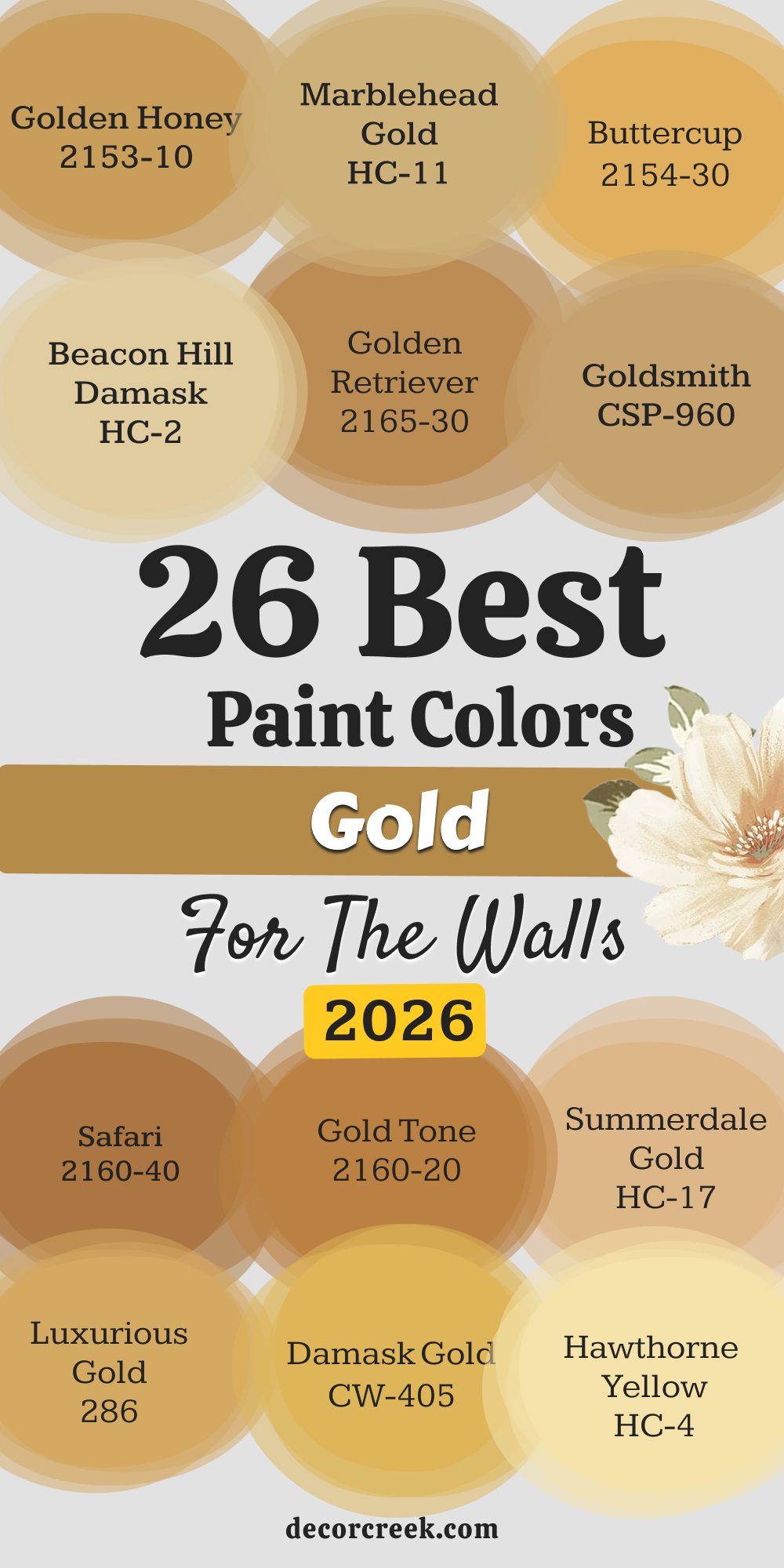
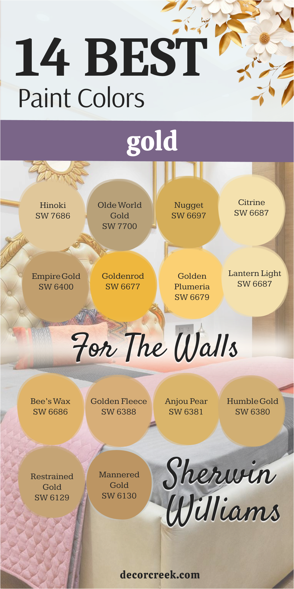
26 Gold Paint Colors For Walls
Mannered Gold SW 6130
Mannered Gold is a beautiful, refined, and gentle gold that acts as a sophisticated neutral, bringing warmth without being overly bright. Mannered Gold has soft, earthy brown and mustard undertones that ground the color, preventing it from ever looking harsh or too vivid on the wall.
I often recommend this shade for living areas or primary bedrooms where the client wants a warm, comforting wall color that still acts as a refined backdrop. It is an excellent choice for pairing with dark wood furniture and natural textures, as its earthiness harmonizes beautifully with these elements. This shade provides a lovely, quiet glow that is noticeable but never distracting, contributing to a feeling of relaxed sophistication.
When used with creamy off-white trim, the entire room takes on a buttery, enveloping warmth that feels incredibly luxurious and established. It has enough depth to look rich on the wall, even in bright sunshine, avoiding that washed-out feeling that lighter yellows can suffer from.
I love using this color in dining rooms, as the warmth of the gold truly flatters people’s skin tones under evening light, making everyone look wonderful.
This dependable gold provides a perfect, quiet sunny warmth that is easy to live with and looks entirely high-end. It is a fantastic choice for those seeking an approachable gold.
Restrained Gold SW 6129
Restrained Gold is a classic, mid-toned gold that strikes an ideal balance between rich color and inviting warmth, making it one of my most requested shades. Restrained Gold has noticeable brown and beige influences that give it a sophisticated, muted quality, meaning it reads as a true, substantial gold and not a plain yellow.
I often choose this color for family rooms or hallways where a durable, grounding color is needed to connect different areas of the home with continuous warmth. This shade is one step darker than Mannered Gold, providing a bit more punch and saturation on the wall, which is perfect for rooms with high ceilings.
It works beautifully to highlight white trim and crown molding, making those architectural details look crisp and clean against the rich gold background. When the sunlight hits it, it truly radiates a warm, happy glow, contributing to a cheerful and positive atmosphere in the room. This color is fantastic for pairing with jewel tones like deep reds and blues in artwork and accessories, as the gold provides a strong, anchoring contrast.
It is a dependable, high-performance gold that always delivers on richness and a welcoming feel.
Restrained Gold is the quintessential, sophisticated gold I recommend for almost any room needing a serious dose of luxurious warmth.
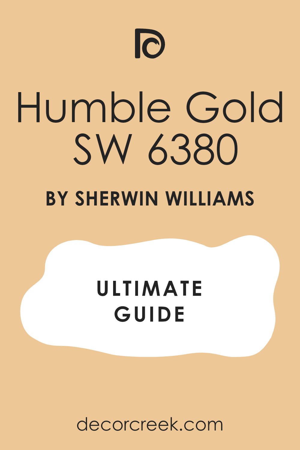
Humble Gold SW 6380
Humble Gold is a beautiful, soft, and light-hearted gold that leans more towards a happy yellow-beige, making it an excellent choice for rooms needing a gentle wash of sunlight. Humble Gold has subtle, creamy undertones that prevent it from ever looking harsh or overly saturated, giving it a wonderfully airy and soft presence on the wall.
I often recommend this shade for laundry rooms, kitchens, or children’s play areas where a feeling of clean, bright energy is the main goal. It is an excellent choice for rooms with low light because its high lightness value helps to reflect available light, making the room feel open and much larger than it is. This shade provides just enough color to move away from white, but remains light enough to act as a very cheerful and adaptable neutral background for all your décor.
When paired with bright white trim, the gentle contrast looks clean and crisp, enhancing the overall brightness of the room. It works beautifully with natural wood tones and provides a fresh, optimistic quality that is perfect for starting the day in a good mood. Humble Gold is a delightful, easy-going gold that brings a perfect, gentle smile to any room without demanding too much attention.
👉 Read the full guide for this color HERE 👈
Goldenrod SW 6677
Goldenrod is a vibrant, deeply saturated gold that captures the true essence of the flower—a rich, powerful yellow with a sophisticated, earthy heart. Goldenrod is a bolder choice, perfect for accent walls or rooms like a dining room or powder room where you want to create a high-impact, memorable statement.
I often use this shade when the client wants a gold that truly announces itself with confidence, bringing a strong, sun-drenched energy to the walls. It has enough brown and orange pigment to ground the color, preventing it from looking acidic, but it is undeniably bright and full of life. This color works beautifully to create a stunning contrast with deep, rich wood tones and fabrics in colors like charcoal, navy, or deep moss green.
When the light hits it, the color seems to glow from within, creating a warm, celebratory atmosphere that is wonderful for entertaining. I caution clients to use this color strategically, as its intensity is best balanced by lighter, more neutral elements in the surrounding furniture and trim. Goldenrod is a gorgeous, powerful, and truly happy gold that brings immediate energy and richness to any carefully considered space.
👉 Read the full guide for this color HERE 👈
Anjou Pear SW 6381
Anjou Pear is a unique and wonderfully complex gold that leans into a sophisticated, earthy green-gold territory, offering a rich and grounded color for your walls. Anjou Pear has distinct yellow-green and brown undertones, giving it a muted, historical quality that is perfect for creating a classic or traditional atmosphere.
I often choose this color for libraries, studies, or formal living rooms where the goal is a deep, cozy, and established feeling with a color that is not afraid to show its complexity. This shade provides a beautiful, muted backdrop that feels deeply comforting and restful, unlike a stark yellow. It works exceptionally well with dark wood paneling, antique furniture, and richly textured fabrics like velvet and wool, enhancing its inherent, grown-up quality.
When paired with creamy trim, the color retains its depth and sophistication, avoiding any harsh contrast. It has enough pigment to look rich and substantial on the wall, ensuring the color never feels flimsy or washed out, even in overhead lighting. Anjou Pear is a truly refined and earthy gold that provides a beautiful, complex warmth, making it a wonderful choice for creating an intimate and deeply personal room.
👉 Read the full guide for this color HERE 👈
Citrine SW 6714
Citrine is a clean, bright, and incredibly cheerful gold that perfectly captures the clear, sunny quality of the gemstone it is named after. Citrine is a vibrant yellow-gold with minimal brown undertone, meaning it is one of the cleaner, happier, and less muted golds on my list, making it ideal for high-energy rooms.
I often recommend this shade for kitchens, breakfast nooks, or sunrooms where the main goal is to maximize the feeling of light, energy, and pure happiness throughout the day. This shade works brilliantly in rooms with lots of white cabinetry or trim, as the sharp contrast between the bright white and the sunny gold is truly refreshing and clean.
It has enough depth to provide a clear, noticeable color on the wall without being neon or shockingly loud. When the sun streams into the room, Citrine truly radiates, making the whole room feel like a giant, happy sunflower. I suggest pairing this color with clean, bright colors like white, light gray, or turquoise for a very modern and upbeat look. Citrine is a delightful, honest gold that brings an immediate, unmistakable feeling of pure sunshine and optimism to any wall it graces.
Lantern Light SW 6687
Lantern Light is a warm, beautifully muted gold that offers a fantastic blend of earthy richness and inviting light, reminiscent of a comforting, aged glow. Lantern Light is a complex color with strong brown and almost copper undertones, giving it a deep, sophisticated richness that is perfect for creating a traditional or cozy atmosphere.
I often choose this shade for a formal living room, a study, or an entryway where I want to convey a sense of established luxury and enduring quality. It is an excellent choice for rooms where the existing wood elements, such as trim or furniture, have a warm, reddish tone, as this gold harmonizes with them beautifully.
This shade provides a wonderful, deep background that makes bright white trim and artwork stand out with clarity and crispness. When lit by lamps in the evening, the color truly comes alive, casting a warm, intimate glow over the entire room that is absolutely wonderful for relaxing. It has enough pigment to hold its own without being too dark, ensuring the room feels rich, not heavy. Lantern Light is a gorgeous, grounded gold that provides a deep, comforting warmth and a sophisticated, adult sense of style to your walls.
👉 Read the full guide for this color HERE 👈
Empire Gold SW 0012
Empire Gold is a magnificent, rich, and truly saturated gold that evokes the feeling of opulent, historical elegance and established luxury. Empire Gold is a bold, deep gold with strong brown-orange undertones, giving it a burnished, almost coppery quality that is intensely rich and dramatic.
I often recommend this shade for powder rooms, dining rooms, or accent walls where the client wants to create a truly high-impact, statement-making moment of sophistication. This color works beautifully to create a stunning, velvety backdrop that makes white porcelain, mirrored surfaces, and metal fixtures truly shine and command attention.
Because of its intensity, it is a great choice for a room that sees a lot of evening use, as it glows magnificently under artificial lighting, creating an intimate, celebratory mood. I caution clients to balance this depth with plenty of white trim and lighter furniture to prevent the room from feeling too heavy or closed in during the day. Empire Gold is a powerful, courageous, and utterly beautiful gold that brings instant, uncompromising luxury and a profound sense of established quality to any space.
👉 Read the full guide for this color HERE 👈
Full Moon SW 6679
Full Moon is a light, fresh, and wonderfully cheerful gold that is infused with plenty of clean yellow, making it feel optimistic and entirely happy on the walls. Golden Plumeria is one of the cleaner, less earthy golds, sitting closer to a warm, bright yellow, which is perfect for maximizing light and energy in a room. I often choose this shade for children’s rooms, bright sunrooms, or craft areas where a feeling of pure, unadulterated energy and creativity is the ultimate goal.
This shade works brilliantly to make a room feel bigger and brighter, especially when paired with clean white trim and light-colored furniture, giving the whole area a fresh look. It has a sunny, airy quality that makes it a fantastic choice for kitchens, where it complements white or natural wood cabinetry beautifully.
When the sun hits it, the color truly shines, casting a warm, delightful glow that is impossible not to smile at. It is a wonderfully simple and honest gold that doesn’t rely on brown undertones, providing a straightforward, happy feeling.
Golden Plumeria is a perfect choice for bringing a light, pure, and genuinely joyful splash of color to any wall.
Olde World Gold SW 7700
Olde World Gold is a deep, highly traditional gold that carries a rich, historical weight, giving walls a feeling of established age and quiet sophistication. Olde World Gold has strong brown and green undertones, which mute the yellow significantly, resulting in a color that feels earthy, grounded, and deeply textural, like an ancient tapestry.
I often choose this shade for formal libraries, traditional dining rooms, or older homes where the goal is to enhance the existing architecture and convey a sense of time and quality. It is an excellent pairing for dark, rich wood tones like mahogany and walnut, creating a seamless and very luxurious, warm aesthetic.
This color provides a wonderful, deep background that allows art and decorative objects to stand out with a sophisticated contrast. When lit by lamps, the color glows with a comforting, intimate warmth that is perfect for quiet conversation or reading. It has the kind of mature, developed look that instantly makes a room feel expensive and well-dressed without relying on brightness.
Olde World Gold is a truly refined, earthy gold that provides a deep, cozy warmth and a profound sense of enduring style to the wall.
Nugget SW 6697
Nugget is a clear, vibrant, and energetic gold that perfectly captures the brilliance of newly discovered, raw treasure. Nugget is a pure, clean gold with a very low brown undertone, making it one of the brighter and more assertive golds on this list, ideal for injecting a powerful dose of sunshine.
I often recommend this shade for accent walls, hallways, or entryways where a quick burst of happy, positive energy is desired to greet visitors and lift the spirits. This color works exceptionally well with clean white trim and modern furnishings, as its clarity keeps the overall look feeling contemporary and upbeat.
It has a wonderful, strong presence that ensures the color is noticeable, providing a bold statement without being childish or too primary. When used sparingly or in small doses, it is incredibly effective at bringing light and cheer into a space that might otherwise feel dull or shadowy. I suggest pairing it with cooler neutrals like light gray or crisp white to balance its intensity and keep the overall feeling fresh. Nugget is a gorgeous, clear, and unashamedly happy gold that provides a powerful, delightful jolt of sunshine to any wall.
👉 Read the full guide for this color HERE 👈
Golden Fleece SW 6388
Golden Fleece is a lush, creamy, and wonderfully soft gold that has a beautiful, almost buttery quality, making it incredibly inviting and gentle on the eyes. Golden Fleece is a very warm, pale gold with strong beige and soft brown influences that mute the yellow, resulting in a color that feels airy but still substantial.
I often choose this shade for primary bedrooms or guest rooms where a restful, very comforting, and luxurious atmosphere is the main goal. It is an excellent neutral gold that harmonizes beautifully with a wide range of bedding colors, from blues to greens to soft pinks. This shade provides a wonderful, luminous backdrop that reflects light gently, making the room feel open, bright, and completely soft all day long.
When paired with creamy off-white trim, the entire room is enveloped in a monochromatic, comforting warmth that feels incredibly high-end and spa-like. It has enough pigment to be distinctly gold but is gentle enough to be used on all four walls without feeling at all dominating. Golden Fleece is a truly beautiful, soft, and luxurious gold that provides a deep sense of quiet comfort and warmth.
Lemon Chiffon SW 6686
Lemon Chiffon is a beautiful, warm, and highly authentic gold that perfectly captures the rich, honeyed quality of the natural material it is named after. Lemon Chiffon is a deep, rich gold with lovely brown and slight orange undertones, giving it a highly organic, natural, and earthy feeling on the wall.
I often recommend this shade for rooms that have a lot of natural wood, as its organic warmth complements and enhances the wood tones beautifully, creating a harmonious look. This shade provides a wonderful, rich backdrop that is perfect for creating a cozy, grounded, and very traditional atmosphere in a living room or study.
It has enough saturation to provide a distinct, noticeable color that feels intentional and well-chosen, not like a weak yellow. When lit by lamps in the evening, the color glows with a deep, comforting amber warmth that makes the room feel incredibly intimate and relaxing. It is a fantastic choice for pairing with colors like deep burgundy, forest green, or navy blue, as the gold provides a gorgeous, earthy contrast. Lemon Chiffon is a truly rich, honest gold that brings a deep, honeyed warmth and a classic, established feel to any wall.
👉 Read the full guide for this color HERE 👈
Dorset Gold HC-8
Dorset Gold is a classic, rich, and highly traditional gold from Benjamin Moore that has an established, historic quality perfect for formal rooms. Dorset Gold is a deep, saturated gold with strong brown-orange undertones, giving it a sophisticated, aged look that feels wonderfully luxurious and permanent.
I often choose this shade for a formal dining room or a library where the goal is a rich, warm, and intimate atmosphere that evokes a feeling of history and quality. It works beautifully to highlight white crown molding and baseboards, making those architectural details stand out sharply against the deep color.
This color provides a substantial, grounding backdrop that allows classic furniture and artwork to truly shine and look their absolute best. When lit by candlelight or warm lamps, the color glows with an unmistakable, deep amber warmth that is absolutely wonderful for evening gatherings.
It has enough pigment to be truly rich without feeling heavy, maintaining a beautiful, velvety depth on the wall.
Dorset Gold is a handsome, enduring gold that brings a profound sense of traditional warmth and elegant sophistication to the wall.
Hawthorne Yellow HC-4
Hawthorne Yellow is a bright, clear, and wonderfully traditional yellow that is infused with enough gold pigment to give it a sophisticated, mature quality. Hawthorne Yellow is one of the cleaner, less earthy golds, sitting closer to a historical yellow, perfect for creating a bright, cheerful, and airy atmosphere.
I often choose this shade for kitchens, sunrooms, or hallways where the main objective is to maximize light and create an immediate feeling of freshness and optimism. This shade works brilliantly to make a room feel open and much bigger, especially when paired with crisp white trim and light-colored furniture, giving the whole room a very clean look.
It has a beautiful, sun-drenched quality that is perfect for starting the day with energy and a good mood. When the sun hits it, it radiates a cheerful, light-hearted glow that is very inviting and happy. It is a very easy-to-live-with shade that manages to be bright without being harsh, which is a key to using yellow effectively. Hawthorne Yellow is a delightful, classic gold-yellow that brings a clean, pure, and genuinely joyful light to any wall.
👉 Read the full guide for this color HERE 👈
Damask Gold CW-405
Damask Gold is a beautiful, muted, and highly historic gold from Benjamin Moore that offers a sophisticated, earthy warmth perfect for traditional settings. Damask Gold has strong beige and brown undertones, which heavily mutes the yellow, resulting in a color that feels deep, grounded, and textural, like an aged fabric.
I often choose this shade for older homes, formal living rooms, or bedrooms where a cozy, established, and very peaceful atmosphere is the main goal. It works exceptionally well with antique furniture, dark wood trim, and rich, natural textures, enhancing its inherent, traditional elegance.
This shade provides a beautiful, restful backdrop that is substantial enough to define the walls but gentle enough not to feel dominating. When lit by soft lamps, the color glows with a gentle, honeyed warmth that makes the room feel incredibly inviting and intimate. It is a fantastic choice for those who are nervous about a bright yellow but still want the comforting glow of a mature, historic gold.
Damask Gold is a truly refined, earthy gold that provides a deep, quiet warmth and a sense of enduring quality to the wall.
Luxurious Gold 286
Luxurious Gold is a sophisticated, clean, and beautifully balanced gold from Benjamin Moore that lives up to its name by offering a rich, high-end look without being brassy. Luxurious Gold is a mid-toned gold that avoids heavy brown or orange undertones, allowing it to read as a very clear, pure gold that feels modern and polished.
I often choose this shade for a formal living room, a primary bedroom, or a guest suite where the goal is a sleek, refined, and inviting atmosphere. It works beautifully to highlight crisp white trim and architectural details, as its clarity provides a wonderful, sharp contrast. This color provides enough saturation to look substantial on the wall, ensuring it never feels weak or washed out, even in bright overhead lighting.
When the sun shines on it, the color reflects a clean, warm light that makes the room feel happy, optimistic, and welcoming throughout the day. It is an excellent choice for pairing with both dark wood and light, modern furniture, proving its versatility in different design styles. Luxurious Gold is a gorgeous, clear, and perfectly balanced gold that brings a sophisticated, clean warmth to any wall.
Summerdale Gold HC-17
Summerdale Gold is a wonderfully warm, soft, and slightly muted gold that evokes the gentle, sun-warmed feeling of a late summer day. Summerdale Gold has subtle beige and creamy undertones that prevent it from being overly bright, giving it a delicate, comforting quality that is very easy to live with.
I often recommend this shade for bedrooms or reading nooks where the main goal is a relaxing, gentle, and utterly soft atmosphere for quiet contemplation. It is an excellent choice for rooms that lack plenty of natural light, as its warmth and high light reflection help to brighten the walls and make the room feel much more open.
This shade provides a beautiful, airy backdrop that is just enough color to move away from white, but gentle enough to pair with almost any accent color. When paired with creamy off-white trim, the entire room is wrapped in a luminous, comforting warmth that feels incredibly peaceful and high-end. Summerdale Gold is a truly delightful, gentle gold that provides a perfect, soft sunny glow and a high degree of restful comfort to the wall.
Turmeric 2160-20
Turmeric is a rich, intensely saturated, and wonderfully warm gold that delivers a strong, luxurious presence on the wall, perfect for making a confident statement. Gold Tone is a deep, dramatic gold with strong orange and brown influences, giving it a burnished, almost coppery quality that is incredibly rich and visually grounding.
I often choose this shade for accent walls, powder rooms, or dining rooms where a memorable, intimate, and sophisticated atmosphere is the main objective. It works beautifully to create a velvety, deep backdrop that makes metallic fixtures, mirrors, and bright white porcelain truly pop and command attention.
Because of its saturation, it is an ideal choice for a room that is used frequently in the evening, as it glows magnificently under artificial lighting, creating an intimate, celebratory mood. I suggest balancing this intensity with plenty of light-colored elements, like white trim and light rugs, to prevent the room from feeling too heavy during the day. Gold Tone is a powerful, rich, and truly beautiful gold that brings instant, uncompromising luxury and a deep sense of style to any wall.
Safari AF-335
Safari is a clean, bright, and vibrant gold that is infused with plenty of sunshine, making it feel energetic and full of life on the walls. Safari is a cheerful yellow-gold with minimal brown undertone, meaning it is one of the cleaner, happier, and less muted golds on my list, ideal for high-energy, positive rooms.
I often recommend this shade for children’s rooms, bright play areas, or kitchens where the main goal is to maximize the feeling of light and sheer happiness throughout the day. This shade works brilliantly in rooms with lots of white cabinetry or trim, as the crisp contrast between the bright white and the sunny gold is truly refreshing and clean.
It has enough depth to provide a clear, noticeable color on the wall without being shockingly loud or aggressive. When the sun streams into the room, Safari truly radiates, making the whole room feel like a big, happy, warm embrace. I suggest pairing this color with clean, bright colors like white, light gray, or pops of orange for a very modern and upbeat look. Safari is a delightful, honest gold that brings an immediate, unmistakable feeling of pure sunshine and optimism to any wall it graces.
Goldsmith CSP-960
Goldsmith is a nuanced, beautifully muted, and highly refined gold that offers a sophisticated, earthy warmth perfect for creating a classic, established atmosphere. Goldsmith is a complex color with strong beige and soft green undertones, which heavily mute the yellow, resulting in a shade that feels grounded, textural, and very high-end, like aged silk.
I often choose this shade for formal living rooms, studies, or dining rooms where a rich, cozy, and highly personalized feeling is the main goal. It works exceptionally well with dark wood, antique furniture, and richly textured fabrics, enhancing its inherent, mature quality beautifully.
This shade provides a beautiful, substantial background that is deeply comforting and prevents the walls from ever feeling cold or stark. When lit by soft lamps, the color glows with an intimate, subtle warmth that is absolutely wonderful for quiet evenings and conversation. It is a fantastic choice for those seeking a gold that feels more brown-neutral than purely yellow, providing a soft but substantial color.
Goldsmith is a truly refined and earthy gold that provides a deep, quiet warmth and a sophisticated sense of quality to the wall.
Golden Retriever 2165-30
Golden Retriever is a warm, incredibly cheerful, and wonderfully balanced gold that has a familiar, happy quality, making it an excellent, inviting choice. Golden Retriever is a mid-toned gold that sits perfectly between a clean yellow and an earthy brown, giving it a delightful, friendly warmth that is highly approachable.
I often recommend this shade for kitchens, family rooms, or bright reading nooks where the main goal is a relaxed, happy, and genuinely welcoming atmosphere. It works beautifully to highlight white trim and molding, creating a crisp contrast that enhances the room’s architecture and cleanliness.
This color provides enough color presence to feel intentional, ensuring the walls are noticeable but never dominating, acting as a supportive backdrop for your life. When the sun hits it, the color radiates a pleasant, gentle warmth that makes the room feel cozy and bright all day long. It is a very easy-to-live-with gold that is universally loved for its balance and its genuinely cheerful nature. Golden Retriever is a delightful, dependable gold that provides a perfect, happy warmth to any wall.
👉 Read the full guide for this color HERE 👈
Beacon Hill Damask HC-2
Beacon Hill Damask is a sophisticated, deeply traditional gold that carries a rich, historic weight, giving walls a feeling of established age and quiet refinement. Beacon Hill Damask is a deep, saturated gold with strong brown-orange undertones, giving it a rich, old-world look that feels wonderfully luxurious and permanent.
I often choose this shade for an older home, a formal dining room, or a library where the goal is a rich, warm, and intimate atmosphere that evokes a feeling of history and quality. It works beautifully to highlight white crown molding and baseboards, making those architectural details stand out sharply against the deep color.
This color provides a substantial, grounding backdrop that allows classic furniture and artwork to truly shine and look their absolute best. When lit by candlelight or warm lamps, the color glows with an unmistakable, deep amber warmth that is absolutely wonderful for evening gatherings. It has enough pigment to be truly rich without feeling heavy, maintaining a beautiful, velvety depth on the wall. Beacon Hill Damask is a handsome, enduring gold that brings a profound sense of traditional warmth and elegant sophistication to the wall.
Buttercup 2154-30
Buttercup is a clean, bright, and incredibly cheerful yellow-gold that perfectly captures the fresh, delightful feeling of the flower it is named after. Buttercup is a vibrant, sunny gold with minimal brown undertone, meaning it is one of the cleaner, happier, and less muted golds on my list, making it ideal for high-energy rooms.
I often recommend this shade for kitchens, breakfast areas, or sunrooms where the main goal is to maximize the feeling of light, energy, and pure happiness throughout the day. This shade works brilliantly in rooms with lots of white cabinetry or trim, as the sharp contrast between the bright white and the sunny gold is truly refreshing and clean.
It has enough depth to provide a clear, noticeable color on the wall without being neon or shockingly loud. When the sun streams into the room, Buttercup truly radiates, making the whole room feel like a giant, happy sunflower. I suggest pairing this color with clean, bright colors like white, light gray, or pops of spring green for a very modern and upbeat look. Buttercup is a delightful, honest gold that brings an immediate, unmistakable feeling of pure sunshine and optimism to any wall it graces.
Marblehead Gold HC-11
Marblehead Gold is a rich, powerful, and deeply saturated gold that brings a strong, grounded presence and a wonderful sense of historic weight to any wall. Marblehead Gold is a deep, dramatic gold with strong orange and brown influences, giving it a burnished, almost coppery quality that is intensely rich and visually grounding.
I often choose this shade for accent walls, powder rooms, or formal spaces where a memorable, intimate, and sophisticated atmosphere is the main objective. It works beautifully to create a velvety, deep backdrop that makes metallic fixtures, mirrors, and bright white trim truly pop and command attention. Because of its saturation, it is an ideal choice for a room that is used frequently in the evening, as it glows magnificently under artificial lighting, creating an intimate, celebratory mood.
I suggest balancing this intensity with plenty of light-colored elements, like white trim and light rugs, to prevent the room from feeling too heavy during the day. Marblehead Gold is a powerful, rich, and truly beautiful gold that brings instant, uncompromising luxury and a deep sense of style to any wall.
Golden Honey 297
Golden Honey is a beautiful, warm, and incredibly soft gold that has a rich, honeyed quality, making it incredibly inviting and gentle on the eyes. Golden Honey is a very warm, pale gold with strong beige and soft brown influences that mute the yellow, resulting in a color that feels airy but still substantial.
I often choose this shade for primary bedrooms or reading nooks where a restful, very comforting, and luxurious atmosphere is the main goal. It is an excellent neutral gold that harmonizes beautifully with a wide range of bedding colors, from blues to greens to soft pinks. This shade provides a wonderful, luminous backdrop that reflects light gently, making the room feel open, bright, and completely soft all day long.
When paired with creamy off-white trim, the entire room is enveloped in a monochromatic, comforting warmth that feels incredibly high-end and spa-like. It has enough pigment to be distinctly gold but is gentle enough to be used on all four walls without feeling at all dominating. Golden Honey is a truly beautiful, soft, and luxurious gold that provides a deep sense of quiet comfort and warmth.

14 Gold Paint Colors For Walls From Sherwin Williams
Mannered Gold SW 6130
Mannered Gold is a beautiful, refined, and gentle gold that acts as a sophisticated neutral, bringing warmth without being overly bright. Mannered Gold has soft, earthy brown and mustard undertones that ground the color, preventing it from ever looking harsh or too vivid on the wall. I often recommend this shade for living areas or primary bedrooms where the client wants a warm, comforting wall color that still acts as a refined backdrop.
It is an excellent choice for pairing with dark wood furniture and natural textures, as its earthiness harmonizes beautifully with these elements. This shade provides a lovely, quiet glow that is noticeable but never distracting, contributing to a feeling of relaxed sophistication. When used with creamy off-white trim, the entire room takes on a buttery, enveloping warmth that feels incredibly luxurious and established.
It has enough depth to look rich on the wall, even in bright sunshine, avoiding that washed-out feeling that lighter yellows can suffer from. I love using this color in dining rooms, as the warmth of the gold truly flatters people’s skin tones under evening light, making everyone look wonderful. This dependable gold provides a perfect, quiet sunny warmth that is easy to live with and looks entirely high-end.
It is a fantastic choice for those seeking an approachable gold.
Restrained Gold SW 6129
Restrained Gold is a classic, mid-toned gold that strikes an ideal balance between rich color and inviting warmth, making it one of my most requested shades. Restrained Gold has noticeable brown and beige influences that give it a sophisticated, muted quality, meaning it reads as a true, substantial gold and not a plain yellow.
I often choose this color for family rooms or hallways where a durable, grounding color is needed to connect different areas of the home with continuous warmth. This shade is one step darker than Mannered Gold, providing a bit more punch and saturation on the wall, which is perfect for rooms with high ceilings. It works beautifully to highlight white trim and crown molding, making those architectural details look crisp and clean against the rich gold background.
When the sunlight hits it, it truly radiates a warm, happy glow, contributing to a cheerful and positive atmosphere in the room. This color is fantastic for pairing with jewel tones like deep reds and blues in artwork and accessories, as the gold provides a strong, anchoring contrast. It is a dependable, high-performance gold that always delivers on richness and a welcoming feel.
Restrained Gold is the quintessential, sophisticated gold I recommend for almost any room needing a serious dose of luxurious warmth.
Humble Gold SW 6380
Humble Gold is a beautiful, soft, and light-hearted gold that leans more towards a happy yellow-beige, making it an excellent choice for rooms needing a gentle wash of sunlight. Humble Gold has subtle, creamy undertones that prevent it from ever looking harsh or overly saturated, giving it a wonderfully airy and soft presence on the wall.
I often recommend this shade for laundry rooms, kitchens, or children’s play areas where a feeling of clean, bright energy is the main goal. It is an excellent choice for rooms with low light because its high lightness value helps to reflect available light, making the room feel open and much larger than it is.
This shade provides just enough color to move away from white, but remains light enough to act as a very cheerful and adaptable neutral background for all your décor. When paired with bright white trim, the gentle contrast looks clean and crisp, enhancing the overall brightness of the room. It works beautifully with natural wood tones and provides a fresh, optimistic quality that is perfect for starting the day in a good mood. Humble Gold is a delightful, easy-going gold that brings a perfect, gentle smile to any room without demanding too much attention.
👉 Read the full guide for this color HERE 👈
Anjou Pear SW 6381
Anjou Pear is a unique and wonderfully complex gold that leans into a sophisticated, earthy green-gold territory, offering a rich and grounded color for your walls. Anjou Pear has distinct yellow-green and brown undertones, giving it a muted, historical quality that is perfect for creating a classic or traditional atmosphere.
I often choose this color for libraries, studies, or formal living rooms where the goal is a deep, cozy, and established feeling with a color that is not afraid to show its complexity. This shade provides a beautiful, muted backdrop that feels deeply comforting and restful, unlike a stark yellow. It works exceptionally well with dark wood paneling, antique furniture, and richly textured fabrics like velvet and wool, enhancing its inherent, grown-up quality.
When paired with creamy trim, the color retains its depth and sophistication, avoiding any harsh contrast. It has enough pigment to look rich and substantial on the wall, ensuring the color never feels flimsy or washed out, even in overhead lighting. Anjou Pear is a truly refined and earthy gold that provides a beautiful, complex warmth, making it a wonderful choice for creating an intimate and deeply personal room.
👉 Read the full guide for this color HERE 👈
Golden Fleece SW 6388
Golden Fleece is a lush, creamy, and wonderfully soft gold that has a beautiful, almost buttery quality, making it incredibly inviting and gentle on the eyes. Golden Fleece is a very warm, pale gold with strong beige and soft brown influences that mute the yellow, resulting in a color that feels airy but still substantial. I often choose this shade for primary bedrooms or guest rooms where a restful, very comforting, and luxurious atmosphere is the main goal.
It is an excellent neutral gold that harmonizes beautifully with a wide range of bedding colors, from blues to greens to soft pinks. This shade provides a wonderful, luminous backdrop that reflects light gently, making the room feel open, bright, and completely soft all day long.
When paired with creamy off-white trim, the entire room is enveloped in a monochromatic, comforting warmth that feels incredibly high-end and spa-like. It has enough pigment to be distinctly gold but is gentle enough to be used on all four walls without feeling at all dominating.
Golden Fleece is a truly beautiful, soft, and luxurious gold that provides a deep sense of quiet comfort and warmth.
Lemon Chiffon SW 6686
Lemon Chiffon is a beautiful, warm, and highly authentic gold that perfectly captures the rich, honeyed quality of the natural material it is named after. Lemon Chiffon is a deep, rich gold with lovely brown and slight orange undertones, giving it a highly organic, natural, and earthy feeling on the wall.
I often recommend this shade for rooms that have a lot of natural wood, as its organic warmth complements and enhances the wood tones beautifully, creating a harmonious look. This shade provides a wonderful, rich backdrop that is perfect for creating a cozy, grounded, and very traditional atmosphere in a living room or study.
It has enough saturation to provide a distinct, noticeable color that feels intentional and well-chosen, not like a weak yellow. When lit by lamps in the evening, the color glows with a deep, comforting amber warmth that makes the room feel incredibly intimate and relaxing. It is a fantastic choice for pairing with colors like deep burgundy, forest green, or navy blue, as the gold provides a gorgeous, earthy contrast.
Lemon Chiffonis a truly rich, honest gold that brings a deep, honeyed warmth and a classic, established feel to any wall.
👉 Read the full guide for this color HERE 👈
Lantern Light SW 6687
Lantern Light is a warm, beautifully muted gold that offers a fantastic blend of earthy richness and inviting light, reminiscent of a comforting, aged glow. Lantern Light is a complex color with strong brown and almost copper undertones, giving it a deep, sophisticated richness that is perfect for creating a traditional or cozy atmosphere.
I often choose this shade for a formal living room, a study, or an entryway where I want to convey a sense of established luxury and enduring quality. It is an excellent choice for rooms where the existing wood elements, such as trim or furniture, have a warm, reddish tone, as this gold harmonizes with them beautifully.
This shade provides a wonderful, deep background that makes bright white trim and artwork stand out with clarity and crispness. When lit by lamps in the evening, the color truly comes alive, casting a warm, intimate glow over the entire room that is absolutely wonderful for relaxing. It has enough pigment to hold its own without being too dark, ensuring the room feels rich, not heavy. Lantern Light is a gorgeous, grounded gold that provides a deep, comforting warmth and a sophisticated, adult sense of style to your walls.
👉 Read the full guide for this color HERE 👈
Full Moon SW 6679
Full Moon is a light, fresh, and wonderfully cheerful gold that is infused with plenty of clean yellow, making it feel optimistic and entirely happy on the walls. Full Moon is one of the cleaner, less earthy golds, sitting closer to a warm, bright yellow, which is perfect for maximizing light and energy in a room.
I often choose this shade for children’s rooms, bright sunrooms, or craft areas where a feeling of pure, unadulterated energy and creativity is the ultimate goal. This shade works brilliantly to make a room feel bigger and brighter, especially when paired with clean white trim and light-colored furniture, giving the whole area a fresh look.
It has a sunny, airy quality that makes it a fantastic choice for kitchens, where it complements white or natural wood cabinetry beautifully. When the sun hits it, the color truly shines, casting a warm, delightful glow that is impossible not to smile at. It is a wonderfully simple and honest gold that doesn’t rely on brown undertones, providing a straightforward, happy feeling.
Full Moon is a perfect choice for bringing a light, pure, and genuinely joyful splash of color to any wall.
Goldenrod SW 6677
Goldenrod is a vibrant, deeply saturated gold that captures the true essence of the flower—a rich, powerful yellow with a sophisticated, earthy heart. Goldenrod is a bolder choice, perfect for accent walls or rooms like a dining room or powder room where you want to create a high-impact, memorable statement.
I often use this shade when the client wants a gold that truly announces itself with confidence, bringing a strong, sun-drenched energy to the walls. It has enough brown and orange pigment to ground the color, preventing it from looking acidic, but it is undeniably bright and full of life. This color works beautifully to create a stunning contrast with deep, rich wood tones and fabrics in colors like charcoal, navy, or deep moss green.
When the light hits it, the color seems to glow from within, creating a warm, celebratory atmosphere that is wonderful for entertaining. I caution clients to use this color strategically, as its intensity is best balanced by lighter, more neutral elements in the surrounding furniture and trim. Goldenrod is a gorgeous, powerful, and truly happy gold that brings immediate energy and richness to any carefully considered space.
👉 Read the full guide for this color HERE 👈
Lucent Yellow SW 6400
Lucent Yellow is a magnificent, rich, and truly saturated gold that evokes the feeling of opulent, historical elegance and established luxury. Lucent Yellow is a bold, deep gold with strong brown-orange undertones, giving it a burnished, almost coppery quality that is intensely rich and dramatic.
I often recommend this shade for powder rooms, dining rooms, or accent walls where the client wants to create a truly high-impact, statement-making moment of sophistication. This color works beautifully to create a stunning, velvety backdrop that makes white porcelain, mirrored surfaces, and metal fixtures truly shine and command attention.
Because of its intensity, it is a great choice for a room that sees a lot of evening use, as it glows magnificently under artificial lighting, creating an intimate, celebratory mood. I caution clients to balance this depth with plenty of white trim and lighter furniture to prevent the room from feeling too heavy or closed in during the day. Lucent Yellow is a powerful, courageous, and utterly beautiful gold that brings instant, uncompromising luxury and a profound sense of established quality to any space.
👉 Read the full guide for this color HERE 👈
Citrine SW 6714
Citrine is a clean, bright, and incredibly cheerful gold that perfectly captures the clear, sunny quality of the gemstone it is named after. Citrine is a vibrant yellow-gold with minimal brown undertone, meaning it is one of the cleaner, happier, and less muted golds on my list, making it ideal for high-energy rooms.
I often recommend this shade for kitchens, breakfast nooks, or sunrooms where the main goal is to maximize the feeling of light, energy, and pure happiness throughout the day. This shade works brilliantly in rooms with lots of white cabinetry or trim, as the sharp contrast between the bright white and the sunny gold is truly refreshing and clean.
It has enough depth to provide a clear, noticeable color on the wall without being neon or shockingly loud. When the sun streams into the room, Citrine truly radiates, making the whole room feel like a giant, happy sunflower. I suggest pairing this color with clean, bright colors like white, light gray, or turquoise for a very modern and upbeat look. Citrine is a delightful, honest gold that brings an immediate, unmistakable feeling of pure sunshine and optimism to any wall it graces.
Nugget SW 6697
Nugget is a clear, vibrant, and energetic gold that perfectly captures the brilliance of newly discovered, raw treasure. Nugget is a pure, clean gold with a very low brown undertone, making it one of the brighter and more assertive golds on this list, ideal for injecting a powerful dose of sunshine.
I often recommend this shade for accent walls, hallways, or entryways where a quick burst of happy, positive energy is desired to greet visitors and lift the spirits. This color works exceptionally well with clean white trim and modern furnishings, as its clarity keeps the overall look feeling contemporary and upbeat.
It has a wonderful, strong presence that ensures the color is noticeable, providing a bold statement without being childish or too primary. When used sparingly or in small doses, it is incredibly effective at bringing light and cheer into a space that might otherwise feel dull or shadowy. I suggest pairing it with cooler neutrals like light gray or crisp white to balance its intensity and keep the overall feeling fresh. Nugget is a gorgeous, clear, and unashamedly happy gold that provides a powerful, delightful jolt of sunshine to any wall.
👉 Read the full guide for this color HERE 👈
Olde World Gold SW 7700
Olde World Gold is a deep, highly traditional gold that carries a rich, historical weight, giving walls a feeling of established age and quiet sophistication. Olde World Gold has strong brown and green undertones, which mute the yellow significantly, resulting in a color that feels earthy, grounded, and deeply textural, like an ancient tapestry.
I often choose this shade for formal libraries, traditional dining rooms, or older homes where the goal is to enhance the existing architecture and convey a sense of time and quality. It is an excellent pairing for dark, rich wood tones like mahogany and walnut, creating a seamless and very luxurious, warm aesthetic.
This color provides a wonderful, deep background that allows art and decorative objects to stand out with a sophisticated contrast. When lit by lamps in the evening, the color glows with a comforting, intimate warmth that is perfect for quiet conversation or reading. It has the kind of mature, developed look that instantly makes a room feel expensive and well-dressed without relying on brightness. Olde World Gold is a truly refined, earthy gold that provides a deep, cozy warmth and a profound sense of enduring style to the wall.
Hinoki SW 7686
Hinoki is a beautifully clean, bright, and incredibly fresh gold that leans into a very light, warm yellow-green territory, offering a modern, airy feel. Hinoki is a unique gold that has distinct green undertones, which gives it a subtle, botanical quality that is perfect for bringing the feeling of natural light indoors.
I often choose this shade for kitchens, bathrooms, or bright sunrooms where a clean, refreshing, and slightly unique gold is desired to lift the mood. This shade works brilliantly with bright white trim and light wood finishes, creating a fresh, contemporary contrast that feels clean and modern. It has enough color presence to be noticeable but is light enough to keep the room feeling open and bright throughout the day.
When the sun hits it, the color seems to reflect a gentle, happy glow, contributing to a very positive and cheerful atmosphere. I suggest pairing this color with clean neutrals or pops of natural green and blue to enhance its airy, organic quality. Hinoki is a gorgeous, fresh gold that provides a beautiful, light-filled warmth and a very modern, clean feel to any wall.
👉 Read the full guide for this color HERE 👈
12 Gold Paint Colors For Walls By Benjamin Moore
Dorset Gold HC-8
Dorset Gold is a classic, rich, and highly traditional gold from Benjamin Moore that has an established, historic quality perfect for formal rooms. Dorset Gold is a deep, saturated gold with strong brown-orange undertones, giving it a sophisticated, aged look that feels wonderfully luxurious and permanent.
I often choose this shade for a formal dining room or a library where the goal is a rich, warm, and intimate atmosphere that evokes a feeling of history and quality. It works beautifully to highlight white crown molding and baseboards, making those architectural details stand out sharply against the deep color. This color provides a substantial, grounding backdrop that allows classic furniture and artwork to truly shine and look their absolute best.
When lit by candlelight or warm lamps, the color glows with an unmistakable, deep amber warmth that is absolutely wonderful for evening gatherings. It has enough pigment to be truly rich without feeling heavy, maintaining a beautiful, velvety depth on the wall. Dorset Gold is a handsome, enduring gold that brings a profound sense of traditional warmth and elegant sophistication to the wall.
Luxurious Gold 286
Luxurious Gold is a sophisticated, clean, and beautifully balanced gold from Benjamin Moore that lives up to its name by offering a rich, high-end look without being brassy. Luxurious Gold is a mid-toned gold that avoids heavy brown or orange undertones, allowing it to read as a very clear, pure gold that feels modern and polished.
I often choose this shade for a formal living room, a primary bedroom, or a guest suite where the goal is a sleek, refined, and inviting atmosphere. It works beautifully to highlight crisp white trim and architectural details, as its clarity provides a wonderful, sharp contrast. This color provides enough saturation to look substantial on the wall, ensuring it never feels weak or washed out, even in bright overhead lighting.
When the sun shines on it, the color reflects a clean, warm light that makes the room feel happy, optimistic, and welcoming throughout the day. It is an excellent choice for pairing with both dark wood and light, modern furniture, proving its versatility in different design styles. Luxurious Gold is a gorgeous, clear, and perfectly balanced gold that brings a sophisticated, clean warmth to any wall.
Damask Gold CW-405
Damask Gold is a beautiful, muted, and highly historic gold from Benjamin Moore that offers a sophisticated, earthy warmth perfect for traditional settings. Damask Gold has strong beige and brown undertones, which heavily mutes the yellow, resulting in a color that feels deep, grounded, and textural, like an aged fabric.
I often choose this shade for older homes, formal living rooms, or bedrooms where a cozy, established, and very peaceful atmosphere is the main goal. It works exceptionally well with antique furniture, dark wood trim, and rich, natural textures, enhancing its inherent, traditional elegance.
This shade provides a beautiful, restful backdrop that is substantial enough to define the walls but gentle enough not to feel dominating. When lit by soft lamps, the color glows with a gentle, honeyed warmth that makes the room feel incredibly inviting and intimate. It is a fantastic choice for those who are nervous about a bright yellow but still want the comforting glow of a mature, historic gold. Damask Gold is a truly refined, earthy gold that provides a deep, quiet warmth and a sense of enduring quality to the wall.
Heirloom Gold 255
Heirloom Gold is a classic, rich, and highly traditional gold from Benjamin Moore that has an established, historic quality perfect for formal rooms. Heirloom Gold is a deep, saturated gold with strong brown-orange undertones, giving it a sophisticated, aged look that feels wonderfully luxurious and permanent.
I often choose this shade for a formal dining room or a library where the goal is a rich, warm, and intimate atmosphere that evokes a feeling of history and quality. It works beautifully to highlight white crown molding and baseboards, making those architectural details stand out sharply against the deep color.
This color provides a substantial, grounding backdrop that allows classic furniture and artwork to truly shine and look their absolute best. When lit by candlelight or warm lamps, the color glows with an unmistakable, deep amber warmth that is absolutely wonderful for evening gatherings. It has enough pigment to be truly rich without feeling heavy, maintaining a beautiful, velvety depth on the wall. Heirloom Gold is a handsome, enduring gold that brings a profound sense of traditional warmth and elegant sophistication to the wall.
Metallic Gold 2163-40
Metallic Gold is a specialty, highly saturated gold that delivers a strong, intense shimmer and true opulence on the wall, perfect for high-impact statements. Metallic Gold is a bold, dramatic gold that contains actual metallic particles, giving it a reflective, luminous quality that changes dramatically with the light.
I often recommend this shade for powder rooms, accent ceilings, or formal entryways where the client wants to create a truly glamorous, statement-making moment of sheer luxury. It works beautifully to create a stunning, sparkling backdrop that catches the light and makes every other element in the room look expensive and refined.
Because of its unique nature, it is a great choice for a room that sees a lot of evening use, as it glows magnificently under artificial lighting, creating a celebratory, dazzling mood. I caution clients to use this shade sparingly, as its intensity is best appreciated in small, controlled doses to avoid a feeling of visual noise. Metallic Gold is a powerful, courageous, and utterly beautiful gold that brings instant, uncompromising luxury and a theatrical sense of drama to any wall.
Westminster Gold 200
Westminster Gold is a sophisticated, deeply saturated, and highly traditional gold that brings a strong, luxurious presence and historic weight to the wall. Westminster Gold is a deep, dramatic gold with strong orange and brown influences, giving it a burnished, rich quality that is intensely grounding and visually substantial.
I often choose this shade for formal rooms, libraries, or accent walls where a memorable, intimate, and highly refined atmosphere is the main objective. It works beautifully to create a velvety, deep backdrop that makes metallic fixtures, mirrors, and bright white trim truly pop and command attention.
Because of its saturation, it is an ideal choice for a room that is used frequently in the evening, as it glows magnificently under artificial lighting, creating an intimate, exclusive mood. I suggest balancing this intensity with plenty of light-colored elements, like white trim and light rugs, to prevent the room from feeling too heavy during the day. Westminster Gold is a powerful, rich, and truly beautiful gold that brings instant, uncompromising luxury and a deep sense of style to any wall.
Old Gold 167
Old Gold is a rich, beautifully muted, and highly refined gold that offers a sophisticated, earthy warmth perfect for creating a classic, established atmosphere. Old Gold is a complex color with strong beige and soft green undertones, which heavily mute the yellow, resulting in a shade that feels grounded, textural, and very high-end, like aged silk.
I often choose this shade for formal living rooms, studies, or dining rooms where a rich, cozy, and highly personalized feeling is the main goal. It works exceptionally well with dark wood, antique furniture, and richly textured fabrics, enhancing its inherent, mature quality beautifully.
This shade provides a beautiful, substantial background that is deeply comforting and prevents the walls from ever feeling cold or stark. When lit by soft lamps, the color glows with an intimate, subtle warmth that is absolutely wonderful for quiet evenings and conversation. It is a fantastic choice for those seeking a gold that feels more brown-neutral than purely yellow, providing a soft but substantial color. Old Gold is a truly refined and earthy gold that provides a deep, quiet warmth and a sophisticated sense of quality to the wall.
Fields of Gold 203
Fields of Gold is a clean, bright, and incredibly cheerful gold that perfectly captures the clear, sunny quality of a summer meadow. Fields of Gold is a vibrant yellow-gold with minimal brown undertone, meaning it is one of the cleaner, happier, and less muted golds on my list, making it ideal for high-energy rooms.
I often recommend this shade for kitchens, breakfast nooks, or sunrooms where the main goal is to maximize the feeling of light, energy, and pure happiness throughout the day. This shade works brilliantly in rooms with lots of white cabinetry or trim, as the sharp contrast between the bright white and the sunny gold is truly refreshing and clean.
It has enough depth to provide a clear, noticeable color on the wall without being neon or shockingly loud. When the sun streams into the room, Fields of Gold truly radiates, making the whole room feel like a giant, happy sunflower. I suggest pairing this color with clean, bright colors like white, light gray, or turquoise for a very modern and upbeat look. Fields of Gold is a delightful, honest gold that brings an immediate, unmistakable feeling of pure sunshine and optimism to any wall it graces.
Golden Honey 297
Golden Honey is a beautiful, warm, and incredibly soft gold that has a rich, honeyed quality, making it incredibly inviting and gentle on the eyes. Golden Honey is a very warm, pale gold with strong beige and soft brown influences that mute the yellow, resulting in a color that feels airy but still substantial.
I often choose this shade for primary bedrooms or reading nooks where a restful, very comforting, and luxurious atmosphere is the main goal. It is an excellent neutral gold that harmonizes beautifully with a wide range of bedding colors, from blues to greens to soft pinks. This shade provides a wonderful, luminous backdrop that reflects light gently, making the room feel open, bright, and completely soft all day long.
When paired with creamy off-white trim, the entire room is enveloped in a monochromatic, comforting warmth that feels incredibly high-end and spa-like. It has enough pigment to be distinctly gold but is gentle enough to be used on all four walls without feeling at all dominating. Golden Honey is a truly beautiful, soft, and luxurious gold that provides a deep sense of quiet comfort and warmth.
Turmeric 2160-20
Turmeric is a rich, intensely saturated, and wonderfully warm gold that delivers a strong, luxurious presence on the wall, perfect for making a confident statement. Turmeric is a deep, dramatic gold with strong orange and brown influences, giving it a burnished, almost coppery quality that is incredibly rich and visually grounding.
I often choose this shade for accent walls, powder rooms, or dining rooms where a memorable, intimate, and sophisticated atmosphere is the main objective. It works beautifully to create a velvety, deep backdrop that makes metallic fixtures, mirrors, and bright white porcelain truly pop and command attention.
Because of its saturation, it is an ideal choice for a room that is used frequently in the evening, as it glows magnificently under artificial lighting, creating an intimate, celebratory mood. I suggest balancing this intensity with plenty of light-colored elements, like white trim and light rugs, to prevent the room from feeling too heavy during the day. Turmeric is a powerful, rich, and truly beautiful gold that brings instant, uncompromising luxury and a deep sense of style to any wall.
Honeywheat 179
Honeywheat is a warm, beautifully muted gold that offers a fantastic blend of earthy richness and inviting light, reminiscent of a comforting, aged glow. Honeywheat is a complex color with strong brown and almost copper undertones, giving it a deep, sophisticated richness that is perfect for creating a traditional or cozy atmosphere.
I often choose this shade for a formal living room, a study, or an entryway where I want to convey a sense of established luxury and enduring quality. It is an excellent choice for rooms where the existing wood elements, such as trim or furniture, have a warm, reddish tone, as this gold harmonizes with them beautifully.
This shade provides a wonderful, deep background that makes bright white trim and artwork stand out with clarity and crispness. When lit by lamps in the evening, the color truly comes alive, casting a warm, intimate glow over the entire room that is absolutely wonderful for relaxing. It has enough pigment to hold its own without being too dark, ensuring the room feels rich, not heavy.
Honeywheat is a gorgeous, grounded gold that provides a deep, comforting warmth and a sophisticated, adult sense of style to your walls.
Buttercup 2154-30
Buttercup is a clean, bright, and incredibly cheerful yellow-gold that perfectly captures the fresh, delightful feeling of the flower it is named after. Buttercup is a vibrant, sunny gold with minimal brown undertone, meaning it is one of the cleaner, happier, and less muted golds on my list, making it ideal for high-energy rooms.
I often recommend this shade for kitchens, breakfast areas, or sunrooms where the main goal is to maximize the feeling of light, energy, and pure happiness throughout the day. This shade works brilliantly in rooms with lots of white cabinetry or trim, as the sharp contrast between the bright white and the sunny gold is truly refreshing and clean.
It has enough depth to provide a clear, noticeable color on the wall without being neon or shockingly loud. When the sun streams into the room, Buttercup truly radiates, making the whole room feel like a giant, happy sunflower. I suggest pairing this color with clean, bright colors like white, light gray, or pops of spring green for a very modern and upbeat look.
Buttercup is a delightful, honest gold that brings an immediate, unmistakable feeling of pure sunshine and optimism to any wall it graces.
26 Gold Paint Colors For Walls To Warm Up Your Home This Year
Honeycomb SW 6375
Honeycomb is a rich, deeply saturated, and wonderfully authentic gold that perfectly captures the dense, comforting quality of natural honey. Honeycomb is a deep, warm gold with strong brown and orange undertones, giving it an organic, earthy richness that is incredibly cozy on the wall.
I often choose this shade for a dining room or study where a deep, comforting, and grounded atmosphere is the main goal to encourage conversation and relaxation. Honeycomb works beautifully with dark wood furniture and natural textures, as its inherent warmth complements these elements perfectly, creating a harmonious look.
This shade provides a wonderful, rich backdrop that is substantial enough to define the walls but gentle enough not to feel heavy during the day. When lit by lamps in the evening, the color glows with a deep, inviting amber light that makes the room feel intimate and exclusive. It is a fantastic choice for pairing with clean white trim, which provides a crisp contrast that enhances its richness and structure. Honeycomb is a gorgeous, deep gold that provides a profoundly comforting warmth and a sophisticated, established feel to any wall.
👉 Read the full guide for this color HERE 👈
Nankeen SW 6397
Nankeen is a light, fresh, and wonderfully cheerful gold that is infused with plenty of clean yellow, making it feel optimistic and entirely happy on the walls. Nankeen is one of the cleaner, less earthy golds, sitting closer to a warm, bright yellow, which is perfect for maximizing light and energy in a room.
I often choose this shade for children’s rooms, bright sunrooms, or craft areas where a feeling of pure, unadulterated energy and creativity is the ultimate goal. This shade works brilliantly to make a room feel bigger and brighter, especially when paired with clean white trim and light-colored furniture, giving the whole area a fresh look.
It has a sunny, airy quality that makes it a fantastic choice for kitchens, where it complements white or natural wood cabinetry beautifully. When the sun hits it, the color truly shines, casting a warm, delightful glow that is impossible not to smile at. It is a wonderfully simple and honest gold that doesn’t rely on brown undertones, providing a straightforward, happy feeling. Nankeen is a perfect choice for bringing a light, pure, and genuinely joyful splash of color to any wall.
Friendly Yellow SW 6680
Friendly Yellow is a clean, bright, and incredibly cheerful gold that perfectly captures the clear, sunny quality of a happy afternoon. Friendly Yellow is a vibrant yellow-gold with minimal brown undertone, meaning it is one of the cleaner, happier, and less muted golds on my list, making it ideal for high-energy rooms.
I often recommend this shade for kitchens, breakfast nooks, or sunrooms where the main goal is to maximize the feeling of light, energy, and pure happiness throughout the day. This shade works brilliantly in rooms with lots of white cabinetry or trim, as the sharp contrast between the bright white and the sunny gold is truly refreshing and clean.
It has enough depth to provide a clear, noticeable color on the wall without being neon or shockingly loud. When the sun streams into the room, Friendly Yellow truly radiates, making the whole room feel like a giant, happy sunflower. I suggest pairing this color with clean, bright colors like white, light gray, or turquoise for a very modern and upbeat look. Friendly Yellow is a delightful, honest gold that brings an immediate, unmistakable feeling of pure sunshine and optimism to any wall it graces.
👉 Read the full guide for this color HERE 👈
Icy Lemonade SW 1667
Icy Lemonade is a very light, delicate, and airy yellow-gold that offers just a whisper of color, perfect for rooms needing a gentle wash of sunlight. Icy Lemonade is so faint it nearly reads as a slightly warmed-up white, giving it a wonderfully soft and bright presence on the wall.
I often recommend this shade for rooms with low light or small sizes because its high lightness value helps to reflect available light, making the room feel open and much larger than it is. This shade provides just enough color to move away from stark white, but remains light enough to act as a very cheerful and adaptable neutral background for all your décor.
When paired with bright white trim, the gentle contrast looks clean and crisp, enhancing the overall brightness of the room. It works beautifully with natural wood tones and provides a fresh, optimistic quality that is perfect for a clean, simple aesthetic. Icy Lemonade is a delightful, easy-going gold that brings a perfect, gentle smile to any room without demanding too much attention.
👉 Read the full guide for this color HERE 👈
Afternoon SW 6675
Afternoon is a clear, warm, and delightfully sunny gold that evokes the beautiful, relaxed feeling of late-day sun pouring through a window. Afternoon is a mid-toned gold that sits beautifully between a bright yellow and a muted earth tone, giving it a perfect, inviting balance. I often choose this shade for family rooms or bedrooms where a comfortable, happy, and genuinely welcoming atmosphere is the main goal for everyday living.
It works beautifully to highlight white trim and molding, creating a crisp contrast that enhances the room’s architecture and cleanliness. This color provides enough color presence to feel intentional, ensuring the walls are noticeable but never dominating, acting as a supportive backdrop for your life.
When the sun hits it, the color radiates a pleasant, gentle warmth that makes the room feel cozy and bright all day long. It is a very easy-to-live-with gold that is universally loved for its balance and its genuinely cheerful nature. Afternoon is a delightful, dependable gold that provides a perfect, happy warmth to any wall.
Pineapple Cream SW 1668
Pineapple Cream is a rich, creamy, and wonderfully soft gold that has a beautiful, almost buttery quality, making it incredibly inviting and gentle on the eyes. Pineapple Cream is a very warm, pale gold with strong beige and soft brown influences that mute the yellow, resulting in a color that feels airy but still substantial.
I often choose this shade for primary bedrooms or guest rooms where a restful, very comforting, and luxurious atmosphere is the main goal. It is an excellent neutral gold that harmonizes beautifully with a wide range of bedding colors, from blues to greens to soft pinks. This shade provides a wonderful, luminous backdrop that reflects light gently, making the room feel open, bright, and completely soft all day long.
When paired with creamy off-white trim, the entire room is enveloped in a monochromatic, comforting warmth that feels incredibly high-end and spa-like. It has enough pigment to be distinctly gold but is gentle enough to be used on all four walls without feeling at all dominating. Pineapple Cream is a truly beautiful, soft, and luxurious gold that provides a deep sense of quiet comfort and warmth.
Decisive Yellow SW 6902
Decisive Yellow is a clear, vibrant, and energetic gold that perfectly captures the brilliance of newly discovered, raw treasure. Decisive Yellow is a pure, clean gold with a very low brown undertone, making it one of the brighter and more assertive golds on this list, ideal for injecting a powerful dose of sunshine.
I often recommend this shade for accent walls, hallways, or entryways where a quick burst of happy, positive energy is desired to greet visitors and lift the spirits. This color works exceptionally well with clean white trim and modern furnishings, as its clarity keeps the overall look feeling contemporary and upbeat. It has a wonderful, strong presence that ensures the color is noticeable, providing a bold statement without being childish or too primary.
When used sparingly or in small doses, it is incredibly effective at bringing light and cheer into a space that might otherwise feel dull or shadowy. I suggest pairing it with cooler neutrals like light gray or crisp white to balance its intensity and keep the overall feeling fresh. Decisive Yellow is a gorgeous, clear, and unashamedly happy gold that provides a powerful, delightful jolt of sunshine to any wall.
Gusto Gold SW 6904
Gusto Gold is a vibrant, deeply saturated gold that captures the true essence of the flower—a rich, powerful yellow with a sophisticated, earthy heart. Gusto Gold is a bolder choice, perfect for accent walls or rooms like a dining room or powder room where you want to create a high-impact, memorable statement.
I often use this shade when the client wants a gold that truly announces itself with confidence, bringing a strong, sun-drenched energy to the walls. It has enough brown and orange pigment to ground the color, preventing it from looking acidic, but it is undeniably bright and full of life. This color works beautifully to create a stunning contrast with deep, rich wood tones and fabrics in colors like charcoal, navy, or deep moss green.
When the light hits it, the color seems to glow from within, creating a warm, celebratory atmosphere that is wonderful for entertaining. I caution clients to use this color strategically, as its intensity is best balanced by lighter, more neutral elements in the surrounding furniture and trim. Gusto Gold is a gorgeous, powerful, and truly happy gold that brings immediate energy and richness to any carefully considered space.
Hinoki SW 7686
Hinoki is a beautifully clean, bright, and incredibly fresh gold that leans into a very light, warm yellow-green territory, offering a modern, airy feel. Hinoki is a unique gold that has distinct green undertones, which gives it a subtle, botanical quality that is perfect for bringing the feeling of natural light indoors.
I often choose this shade for kitchens, bathrooms, or bright sunrooms where a clean, refreshing, and slightly unique gold is desired to lift the mood. This shade works brilliantly with bright white trim and light wood finishes, creating a fresh, contemporary contrast that feels clean and modern. It has enough color presence to be noticeable but is light enough to keep the room feeling open and bright throughout the day.
When the sun hits it, the color seems to reflect a gentle, happy glow, contributing to a very positive and cheerful atmosphere. I suggest pairing this color with clean neutrals or pops of natural green and blue to enhance its airy, organic quality. Hinoki is a gorgeous, fresh gold that provides a beautiful, light-filled warmth and a very modern, clean feel to any wall.
👉 Read the full guide for this color HERE 👈
Butter Up SW 6681
Butter Up is a rich, creamy, and wonderfully soft gold that has a beautiful, almost buttery quality, making it incredibly inviting and gentle on the eyes. Butter Up is a very warm, pale gold with strong beige and soft brown influences that mute the yellow, resulting in a color that feels airy but still substantial.
I often choose this shade for primary bedrooms or guest rooms where a restful, very comforting, and luxurious atmosphere is the main goal. It is an excellent neutral gold that harmonizes beautifully with a wide range of bedding colors, from blues to greens to soft pinks. This shade provides a wonderful, luminous backdrop that reflects light gently, making the room feel open, bright, and completely soft all day long.
When paired with creamy off-white trim, the entire room is enveloped in a monochromatic, comforting warmth that feels incredibly high-end and spa-like. It has enough pigment to be distinctly gold but is gentle enough to be used on all four walls without feeling at all dominating. Butter Up is a truly beautiful, soft, and luxurious gold that provides a deep sense of quiet comfort and warmth.
👉 Read the full guide for this color HERE 👈
Afternoon SW 6675
Afternoon is a clear, warm, and delightfully sunny gold that evokes the beautiful, relaxed feeling of late-day sun pouring through a window. Afternoon is a mid-toned gold that sits beautifully between a bright yellow and a muted earth tone, giving it a perfect, inviting balance. I often choose this shade for family rooms or bedrooms where a comfortable, happy, and genuinely welcoming atmosphere is the main goal for everyday living.
It works beautifully to highlight white trim and molding, creating a crisp contrast that enhances the room’s architecture and cleanliness. This color provides enough color presence to feel intentional, ensuring the walls are noticeable but never dominating, acting as a supportive backdrop for your life.
When the sun hits it, the color radiates a pleasant, gentle warmth that makes the room feel cozy and bright all day long. It is a very easy-to-live-with gold that is universally loved for its balance and its genuinely cheerful nature. Afternoon is a delightful, dependable gold that provides a perfect, happy warmth to any wall.
Solaria SW 6688
Solaria is a brilliant, clear, and intensely sunny gold that perfectly captures the dazzling light of a warm, bright day. Solaria is a pure, clean gold with a very low brown undertone, making it one of the brighter and more assertive golds on this list, ideal for injecting a powerful dose of sunshine.
I often recommend this shade for accent walls, hallways, or entryways where a quick burst of happy, positive energy is desired to greet visitors and lift the spirits. This color works exceptionally well with clean white trim and modern furnishings, as its clarity keeps the overall look feeling contemporary and upbeat.
It has a wonderful, strong presence that ensures the color is noticeable, providing a bold statement without being childish or too primary. When used sparingly or in small doses, it is incredibly effective at bringing light and cheer into a space that might otherwise feel dull or shadowy. I suggest pairing it with cooler neutrals like light gray or crisp white to balance its intensity and keep the overall feeling fresh.
Solaria is a gorgeous, clear, and unashamedly happy gold that provides a powerful, delightful jolt of sunshine to any wall.
Full Moon SW 6679
Full Moon is a light, fresh, and wonderfully cheerful gold that is infused with plenty of clean yellow, making it feel optimistic and entirely happy on the walls. Full Moon is one of the cleaner, less earthy golds, sitting closer to a warm, bright yellow, which is perfect for maximizing light and energy in a room.
I often choose this shade for children’s rooms, bright sunrooms, or craft areas where a feeling of pure, unadulterated energy and creativity is the ultimate goal. This shade works brilliantly to make a room feel bigger and brighter, especially when paired with clean white trim and light-colored furniture, giving the whole area a fresh look.
It has a sunny, airy quality that makes it a fantastic choice for kitchens, where it complements white or natural wood cabinetry beautifully. When the sun hits it, the color truly shines, casting a warm, delightful glow that is impossible not to smile at. It is a wonderfully simple and honest gold that doesn’t rely on brown undertones, providing a straightforward, happy feeling. Full Moon is a perfect choice for bringing a light, pure, and genuinely joyful splash of color to any wall.
Yellow Marigold 2155-30
Yellow Marigold is a rich, intensely saturated, and wonderfully warm gold that delivers a strong, luxurious presence on the wall, perfect for making a confident statement. Yellow Marigold is a deep, dramatic gold with strong orange and brown influences, giving it a burnished, almost coppery quality that is incredibly rich and visually grounding.
I often choose this shade for accent walls, powder rooms, or dining rooms where a memorable, intimate, and sophisticated atmosphere is the main objective. It works beautifully to create a velvety, deep backdrop that makes metallic fixtures, mirrors, and bright white porcelain truly pop and command attention.
Because of its saturation, it is an ideal choice for a room that is used frequently in the evening, as it glows magnificently under artificial lighting, creating an intimate, celebratory mood. I suggest balancing this intensity with plenty of light-colored elements, like white trim and light rugs, to prevent the room from feeling too heavy during the day. Yellow Marigold is a powerful, rich, and truly beautiful gold that brings instant, uncompromising luxury and a deep sense of style to any wall.
Soleil AF-330
Soleil is a clean, bright, and incredibly cheerful gold that perfectly captures the clear, sunny quality of the sun itself. Soleil is a vibrant yellow-gold with minimal brown undertone, meaning it is one of the cleaner, happier, and less muted golds on my list, making it ideal for high-energy rooms.
I often recommend this shade for kitchens, breakfast nooks, or sunrooms where the main goal is to maximize the feeling of light, energy, and pure happiness throughout the day. This shade works brilliantly in rooms with lots of white cabinetry or trim, as the sharp contrast between the bright white and the sunny gold is truly refreshing and clean.
It has enough depth to provide a clear, noticeable color on the wall without being neon or shockingly loud. When the sun streams into the room, Soleil truly radiates, making the whole room feel like a giant, happy sunflower. I suggest pairing this color with clean, bright colors like white, light gray, or turquoise for a very modern and upbeat look. Soleil is a delightful, honest gold that brings an immediate, unmistakable feeling of pure sunshine and optimism to any wall it graces.
👉 Read the full guide for this color HERE 👈
Golden Straw 2152-50
Golden Straw is a very light, delicate, and airy yellow-gold that offers just a whisper of color, perfect for rooms needing a gentle wash of sunlight. Golden Straw is so faint it nearly reads as a slightly warmed-up white, giving it a wonderfully soft and bright presence on the wall. I often recommend this shade for rooms with low light or small sizes because its high lightness value helps to reflect available light, making the room feel open and much larger than it is.
This shade provides just enough color to move away from stark white, but remains light enough to act as a very cheerful and adaptable neutral background for all your décor.
When paired with bright white trim, the gentle contrast looks clean and crisp, enhancing the overall brightness of the room. It works beautifully with natural wood tones and provides a fresh, optimistic quality that is perfect for a clean, simple aesthetic. Golden Straw is a delightful, easy-going gold that brings a perfect, gentle smile to any room without demanding too much attention.
Sunrise 829
Sunrise is a clean, bright, and incredibly cheerful gold that perfectly captures the clear, sunny quality of a happy morning. Sunrise is a vibrant yellow-gold with minimal brown undertone, meaning it is one of the cleaner, happier, and less muted golds on my list, making it ideal for high-energy rooms.
I often recommend this shade for kitchens, breakfast areas, or sunrooms where the main goal is to maximize the feeling of light, energy, and pure happiness throughout the day. This shade works brilliantly in rooms with lots of white cabinetry or trim, as the sharp contrast between the bright white and the sunny gold is truly refreshing and clean.
It has enough depth to provide a clear, noticeable color on the wall without being neon or shockingly loud. When the sun streams into the room, Sunrise truly radiates, making the whole room feel like a giant, happy sunflower. I suggest pairing this color with clean, bright colors like white, light gray, or pops of spring green for a very modern and upbeat look. Sunrise is a delightful, honest gold that brings an immediate, unmistakable feeling of pure sunshine and optimism to any wall it graces.
Concord Ivory HC-12
Concord Ivory is a classic, rich, and highly traditional gold from Benjamin Moore that has an established, historic quality perfect for formal rooms. Concord Ivory is a deep, saturated gold with strong brown-orange undertones, giving it a sophisticated, aged look that feels wonderfully luxurious and permanent.
I often choose this shade for a formal dining room or a library where the goal is a rich, warm, and intimate atmosphere that evokes a feeling of history and quality. It works beautifully to highlight white crown molding and baseboards, making those architectural details stand out sharply against the deep color.
This color provides a substantial, grounding backdrop that allows classic furniture and artwork to truly shine and look their absolute best. When lit by candlelight or warm lamps, the color glows with an unmistakable, deep amber warmth that is absolutely wonderful for evening gatherings. It has enough pigment to be truly rich without feeling heavy, maintaining a beautiful, velvety depth on the wall. Concord Ivory is a handsome, enduring gold that brings a profound sense of traditional warmth and elegant sophistication to the wall.
Sun Valley 350
Sun Valley is a warm, beautifully muted gold that offers a fantastic blend of earthy richness and inviting light, reminiscent of a comforting, aged glow. Sun Valley is a complex color with strong brown and almost copper undertones, giving it a deep, sophisticated richness that is perfect for creating a traditional or cozy atmosphere.
I often choose this shade for a formal living room, a study, or an entryway where I want to convey a sense of established luxury and enduring quality. It is an excellent choice for rooms where the existing wood elements, such as trim or furniture, have a warm, reddish tone, as this gold harmonizes with them beautifully.
This shade provides a wonderful, deep background that makes bright white trim and artwork stand out with clarity and crispness. When lit by lamps in the evening, the color truly comes alive, casting a warm, intimate glow over the entire room that is absolutely wonderful for relaxing. It has enough pigment to hold its own without being too dark, ensuring the room feels rich, not heavy. Sun Valley is a gorgeous, grounded gold that provides a deep, comforting warmth and a sophisticated, adult sense of style to your walls.
Autumn Gold 2152-30
Autumn Gold is a clean, bright, and incredibly cheerful gold that perfectly captures the clear, sunny quality of a happy afternoon. Autumn Gold is a vibrant yellow-gold with minimal brown undertone, meaning it is one of the cleaner, happier, and less muted golds on my list, making it ideal for high-energy rooms.
I often recommend this shade for kitchens, breakfast nooks, or sunrooms where the main goal is to maximize the feeling of light, energy, and pure happiness throughout the day. This shade works brilliantly in rooms with lots of white cabinetry or trim, as the sharp contrast between the bright white and the sunny gold is truly refreshing and clean.
It has enough depth to provide a clear, noticeable color on the wall without being neon or shockingly loud. When the sun streams into the room, Autumn Gold truly radiates, making the whole room feel like a giant, happy sunflower. I suggest pairing this color with clean, bright colors like white, light gray, or turquoise for a very modern and upbeat look.
Autumn Gold is a delightful, honest gold that brings an immediate, unmistakable feeling of pure sunshine and optimism to any wall it graces.
Adobe Dust 2175-40
Adobe Dust is a unique, earthy, and beautifully muted gold that leans into a sophisticated, sandy-brown territory, offering a rich and grounded color for your walls. Adobe Dust has distinct yellow-brown and terracotta undertones, giving it a rustic, textural quality that is perfect for creating a warm, Southwestern or organic atmosphere.
I often choose this color for sunrooms, reading nooks, or informal areas where the goal is a deep, cozy, and established feeling with a color that feels connected to nature. This shade provides a beautiful, muted backdrop that feels deeply comforting and restful, unlike a stark yellow. It works exceptionally well with natural wood, rattan, and richly textured fabrics, enhancing its inherent, organic quality.
When paired with creamy trim, the color retains its depth and sophistication, avoiding any harsh contrast. It has enough pigment to look rich and substantial on the wall, ensuring the color never feels flimsy or washed out, even in overhead lighting. Adobe Dust is a truly refined and earthy gold that provides a beautiful, complex warmth, making it a wonderful choice for creating an intimate and deeply personal room.
Sundance 2022-50
Sundance is a clean, bright, and intensely sunny gold that perfectly captures the dazzling light of the sun itself. Sundance is a pure, clean gold with a very low brown undertone, making it one of the brighter and more assertive golds on this list, ideal for injecting a powerful dose of sunshine.
I often recommend this shade for accent walls, hallways, or entryways where a quick burst of happy, positive energy is desired to greet visitors and lift the spirits. This color works exceptionally well with clean white trim and modern furnishings, as its clarity keeps the overall look feeling contemporary and upbeat.
It has a wonderful, strong presence that ensures the color is noticeable, providing a bold statement without being childish or too primary. When used sparingly or in small doses, it is incredibly effective at bringing light and cheer into a space that might otherwise feel dull or shadowy. I suggest pairing it with cooler neutrals like light gray or crisp white to balance its intensity and keep the overall feeling fresh. Sundance is a gorgeous, clear, and unashamedly happy gold that provides a powerful, delightful jolt of sunshine to any wall.
Tawny Day Lily 2012-10
Tawny Day lily is a rich, intensely saturated, and wonderfully warm gold that delivers a strong, luxurious presence on the wall, perfect for making a confident statement. Tawny Daylily is a deep, dramatic gold with strong orange and brown influences, giving it a burnished, almost coppery quality that is incredibly rich and visually grounding.
I often choose this shade for accent walls, powder rooms, or dining rooms where a memorable, intimate, and sophisticated atmosphere is the main objective. It works beautifully to create a velvety, deep backdrop that makes metallic fixtures, mirrors, and bright white porcelain truly pop and command attention.
Because of its saturation, it is an ideal choice for a room that is used frequently in the evening, as it glows magnificently under artificial lighting, creating an intimate, celebratory mood. I suggest balancing this intensity with plenty of light-colored elements, like white trim and light rugs, to prevent the room from feeling too heavy during the day. Tawny Daylily is a powerful, rich, and truly beautiful gold that brings instant, uncompromising luxury and a deep sense of style to any wall.
Buttered Yam AF-230
Buttered Yam is a unique, earthy, and beautifully muted gold that leans into a sophisticated, rich saffron territory, offering a cozy and deeply grounded color for your walls. Buttered Yam has distinct orange and brown undertones, giving it a rustic, harvest quality that is perfect for creating a warm, cozy, and inviting atmosphere for gathering.
I often choose this color for dining rooms, kitchens, or informal areas where the goal is a deep, established, and very comforting feeling with a color that feels connected to tradition. This shade provides a beautiful, muted backdrop that feels deeply cozy and substantial, unlike a stark yellow.
It works exceptionally well with dark wood, leather, and richly textured fabrics, enhancing its inherent, mature quality. When paired with creamy trim, the color retains its depth and sophistication, avoiding any harsh contrast. It has enough pigment to look rich and substantial on the wall, ensuring the color never feels flimsy or washed out, even in overhead lighting. Buttered Yam is a truly refined and earthy gold that provides a beautiful, complex warmth, making it a wonderful choice for creating an intimate and deeply personal room.
Yellow Oxide 2154-10
Yellow Oxide is a rich, intensely saturated, and wonderfully warm gold that delivers a strong, luxurious presence on the wall, perfect for making a confident statement. Yellow Oxide is a deep, dramatic gold with strong brown and slight green influences, giving it a burnished, rich quality that is incredibly warm and visually grounding.
I often choose this shade for accent walls, powder rooms, or dining rooms where a memorable, intimate, and sophisticated atmosphere is the main objective. It works beautifully to create a velvety, deep backdrop that makes metallic fixtures, mirrors, and bright white porcelain truly pop and command attention.
Because of its saturation, it is an ideal choice for a room that is used frequently in the evening, as it glows magnificently under artificial lighting, creating an intimate, celebratory mood. I suggest balancing this intensity with plenty of light-colored elements, like white trim and light rugs, to prevent the room from feeling too heavy during the day. Yellow Oxide is a powerful, rich, and truly beautiful gold that brings instant, uncompromising luxury and a deep sense of style to any wall.
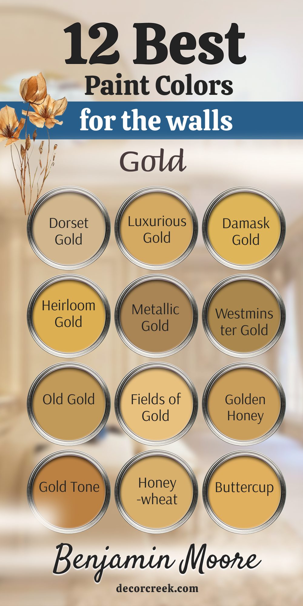
My Final Thoughts about 26 Gold Paint Colors For Walls in 2026
My carefully curated 2026 list of 26 best gold paint colors from the masters at Sherwin-Williams and Benjamin Moore provides you with a comprehensive and impressive range of options. This spectrum spans from the soft, creamy, and airy warmth of comforting shades like Golden Fleece and Humble Gold, which function like buttery morning sunlight, to the deep, grounded, and intensely sophisticated richness of Dorset Gold and Empire Gold, which beautifully envelop a room in a luxurious, aged glow perfect for evening drama.
The gold that genuinely works best for your specific home will depend entirely on two critical factors: your unique natural light exposure and the specific emotional mood you are aiming to establish.
Ask yourself the defining question: Do you wish to create an invigorating, cheerfully bright sunroom with the clean radiance of Citrine, designed to lift spirits and maximize light? Or do you require a deeply cozy, cocoon-like, and intimate study for quiet moments, which is best achieved with the historical dignity of Olde World Gold?
Here is my most crucial, non-negotiable rule: Always, without exception, test large paint swatches (at least 2′ x 2′) directly on your wall.
You must carefully observe how that color interacts with your room’s changing light throughout the entire day—from the harsh brightness of noon to the ambient glow of evening lamps. A beautiful, high-quality gold should gently glow and shimmer, not shout or visually dominate the room. The perfect shade will instantly wrap your entire room in a profound sense of warmth, depth, and genuine joy, making it the welcoming haven you have always desired.
Get ready to finally grant your home the sophisticated, sunny, and utterly transformative makeover it deserves this year, infusing it with the color of happiness and well-being.