In the ever-evolving world of interior design, color remains a fundamental element that can define a space, influence mood, and reflect personality. Among the myriad of shades available to the discerning homeowner or designer is a refreshing hue known as Irish Spring 2038-70 by Benjamin Moore.
This particular color captures the essence of a spring morning in the Irish countryside – invigorating, fresh, and full of promise.
This article delves into the specifics of Irish Spring 2038-70, examining its compatibility with various interior styles, its temperature in terms of color warmth, the importance of its undertones, and how it coordinates with other colors.
Furthermore, we will explore the practical aspects of this color in different lighting conditions, its Light Reflectance Value (LRV), and the selection of trim colors. Let’s embark on a journey to understand how Irish Spring 2038-70 can transform a space and why it could be the color you didn’t know you needed.

What Color Is Irish Spring 2038-70?
Irish Spring 2038-70 is a gentle whisper of green, a hue that seems to have captured the ephemeral beauty of young leaves under a soft morning light. It has a luminous quality, with a Light Reflectance Value (LRV) of 84, making it a very light pastel that can almost be mistaken for white in certain lighting conditions.
This subtle color finds its strength in its ability to act as a neutral backdrop or a soft statement, depending on its application. Irish Spring 2038-70 thrives in interior styles that lean towards the airy and light, such as Scandinavian, modern minimalist, or even transitional.
It pairs exceptionally well with materials that have a natural or matte finish, such as unfinished woods, honed stone, and textured fabrics like linen or cotton. This shade invites a serene and calming atmosphere into any space, making it a versatile choice for those seeking a touch of tranquility in their interiors.

Ever wished paint sampling was as easy as sticking a sticker? Guess what? Now it is! Discover Samplize's unique Peel & Stick samples.
Get paint samples

Is It a Warm Or Cool Color?
Irish Spring 2038-70 sits on the cooler end of the spectrum. Its green hue, though pale, has the essence of early spring foliage – a time when the warmth of the sun is only just beginning to kiss the earth.
This coolness allows the color to be a breath of fresh air within a home, bringing a sense of calm and renewal. In homes, Irish Spring 2038-70 acts as a cool breath amidst warmer tones, providing balance and a modern twist.
In spaces with ample sunlight, it will appear more lively, and in rooms with less light, it maintains a subtle, soothing presence. Its cool nature makes it especially suitable for spaces where a sense of openness and relaxation is desired, such as bedrooms and bathrooms, or even as an invigorating splash in an office space.
Undertones of Irish Spring 2038-70
Understanding the undertones of Irish Spring 2038-70 is crucial, as they can dramatically affect the perception of the color. Undertones are the underlying qualities of a color that emerge under different lighting conditions or when placed alongside other colors.
Irish Spring 2038-70 has a discreet blue undertone that adds to its coolness and reinforces its calming effect. These undertones can make walls painted in this color seem crisp and refreshing. In natural daylight, the blue undertones contribute to a feeling of expansiveness and airiness.
When applied to interior walls, the undertones of Irish Spring 2038-70 will influence it to interact differently with various lighting scenarios, sometimes appearing more as a pale green and other times leaning towards a subtle, cool white with just a hint of greenery. This chameleon-like quality ensures that the color remains engaging and nuanced, never flat or static.

Coordinating Colors of Irish Spring 2038-70
Coordinating colors are hues that complement each other while creating a cohesive color scheme. These colors can either be analogous, sharing similar tones, or contrasting to create a vibrant energy within a space. The selection of coordinating colors for Irish Spring 2038-70 draws on nature’s palette to enhance its freshness and vitality.
- OC-66 Snow White is a pure and crisp white. It offers a stark, clean contrast that accentuates the freshness of Irish Spring 2038-70.
- AF-5 Frostine is a soft white with a slight cool undertone that harmonizes with the coolness of Irish Spring without creating a sharp contrast.
- BM 2040-40 Summer Basket Green is a more saturated, leafy counterpart that adds depth and interest.
- AF-495 Azores is a muted, oceanic hue that echoes the calmness and restfulness of Irish Spring, providing a seamless transition between spaces.
Adding to this palette, consider HC-144 Palladian Blue a serene and soft blue that mirrors the sky on a clear day, bringing a tranquil backdrop.
BM 2126-60 Gray Cloud is a pale gray that lends a contemporary, airy touch, and HC-172 Revere Pewter, a warm gray with green undertones, offers a subtle depth that complements without overpowering.

How Does Lighting Affect Irish Spring 2038-70?
Lighting is a pivotal factor in how a color is perceived and can significantly alter its appearance. Irish Spring 2038-70, with its high LRV, is particularly susceptible to these changes. In natural light, the color takes on a luminous quality, reflecting light and brightening the space. Under artificial light, especially warm incandescents, it may appear softer and more subdued, losing some of its crisp vitality.
In north-facing rooms, which are often graced with cooler, indirect light, Irish Spring 2038-70 may reveal its blue undertones more prominently, maintaining a consistent, soft green throughout the day. South-facing rooms drenched in warm sunlight will see Irish Spring take on a brighter, almost glowing quality as the light enhances its yellow-green components.
East-facing rooms will find this color bright and cheerful in the morning light, becoming cooler as the day progresses. Conversely, in west-facing rooms, the color will appear more neutral during the morning and gain vibrancy during the sunset hours when the light is warmest.

LRV of Irish Spring 2038-70
Light Reflectance Value (LRV) measures the percentage of light a paint color reflects. With an LRV of 84, Irish Spring 2038-70 is considered to be on the higher end of the scale, meaning it reflects much of the light that hits it. This high LRV makes it an excellent choice for making smaller rooms feel more spacious, as it naturally bounces light around the space.
For Irish Spring 2038-70, the high LRV means it can act almost as a neutral in well-lit spaces, providing a light and airy feel. In rooms with less natural light, however, the color can retain its integrity without veering into the shadowy or dull, thanks to its ability to maximize the available light. This makes it particularly versatile for use in a variety of settings and exposures.

LRV – what does it mean? Read This Before Finding Your Perfect Paint Color
Trim Colors of Irish Spring 2038-70
Trim colors are the accents used on moldings, door frames, and baseboards to define and outline spaces. They can either blend with the wall color to expand a room or contrast to create a crisp boundary.
For Irish Spring 2038-70, shades of white are excellent trim colors a they reflect the maximum amount of light, creating a sharp, clean delineation. Whites like OC-66 Snow White, AF-5 Frostine, and OC-65 Chantilly Lace from Benjamin Moore can serve as perfect companions.
Each brings its character; Snow White is stark and reflective, Frostine carries a whisper of coolness, and Chantilly Lace is balanced and neutral, ensuring the walls are the stars while the trim subtly supports the space.

Colors Similar to Irish Spring 2038-70
Recognizing similar colors to Irish Spring 2038-70 is crucial for creating a nuanced and layered color scheme within a design. BM 2037-70 Fresh Mint presents a slightly more pronounced green, imbuing a touch more spring vitality. BM 2039-70 Refreshing Teal offers a hint of blue, adding a dash of coastal breeze.
BM 2042-70 Minty Green has a yellow undertone that warms the color ever so slightly, perfect for pairing with natural materials. BM 2043-70 Frosty Mint is the closest to a neutral, with a delicate and icy appearance that feels both refreshing and calming.

Colors That Go With Irish Spring 2038-70
Utilizing a harmonious color palette is key to creating a space that feels intentionally designed and aesthetically pleasing. Colors that pair well with Irish Spring 2038-70 by Benjamin Moore include the soft OC-117 Simply White, the warm and inviting HC-173 Edgecomb Gray, the deep and rich BM 2132-10 Black, the earthy HC-111 Nantucket Gray, and the vibrant AF-505 Blue Echo.
OC-117 Simply White is bright and airy; HC-173 Edgecomb Gray offers a warm contrast; BM 2132-10 Black provides a dramatic flair; HC-111 Nantucket Gray adds an organic touch, and the Blue Echo color introduces a playful pop of color. Each of these choices complements Irish Spring 2038-70 by either contrasting or enhancing its verdant subtlety.

How to Use Irish Spring 2038-70 In Your Home?
Irish Spring 2038-70 is a versatile color that can breathe life into various rooms and suit multiple interior design styles. In contemporary homes, it can serve as a striking accent wall or a refreshing backdrop for minimalist decor.
In a coastal setting, pairing it with sandy neutrals and blues can enhance the beachy vibe. This color is particularly effective in spaces that aim to evoke tranquility and rejuvenation, such as spas or retreat-style interiors.
It’s also well-suited for a child’s playroom or a creative space, where its cheerful yet soft tone can stimulate but not overwhelm. From traditional to modern, Irish Spring can adapt to any room, whether it’s bringing serenity to a bedroom or a splash of color to a lively kitchen.
How to Use Irish Spring 2038-70 in the Bedroom
In the bedroom, Irish Spring 2038-70 invites a sense of calm and restoration. Use it as an all-over color for a serene and cocooning effect, complemented by bedding in whites and light woods for a nature-inspired palette. It also pairs beautifully with soft pinks and corals, adding a warm and nurturing ambiance.
For a modern edge, juxtapose it with dark furnishings and geometric patterns. This color is conducive to rest, making it ideal for the bedroom where relaxation is key. It’s particularly effective in rooms with ample natural light, where its full vibrancy and soothing qualities can be appreciated throughout the day.

How to Use Irish Spring 2038-70 in the Bathroom
Irish Spring 2038-70 in the bathroom creates a spa-like atmosphere, transforming the space into a refreshing oasis. It’s perfect for walls in a bathroom with white fixtures and natural wood accents, where it can enhance the feeling of cleanliness and vitality. Paired with glass and mirrored surfaces, it reflects light, making the room appear larger.
For a contemporary twist, contrast it with matte black taps and accessories. In a bathroom setting, this color supports a start to the day with a burst of freshness and provides a soothing environment for unwinding in the evening.

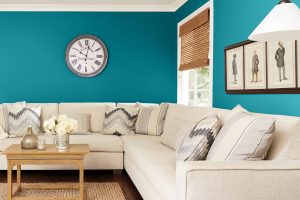
How to Use Irish Spring 2038-70 in the Living Room
In the living room, Irish Spring 2038-70 sets a lively yet balanced tone. It can be used to paint all walls for a consistent, immersive experience or on a feature wall to highlight architectural details. This color coordinates well with a broad spectrum of hues, from warm browns and grays to vibrant blues and yellows, allowing for a dynamic yet harmonious color scheme.
Soft textiles and creamy whites can soften the overall look, while bold patterns can bring an eclectic energy. In spaces used for relaxation and socializing, Irish Spring brings a refreshing yet comforting ambiance.

How to Use Irish Spring 2038-70 for an Exterior
On an exterior, Irish Spring 2038-70 can reflect the landscape around your home, especially in lush or garden-rich environments. It’s an excellent choice for doors or trim when set against a more neutral facade, providing a pop of color that’s neither overpowering nor dull.
In sunnier climates, it can maintain its vibrancy, while in cooler climates, it adds a warm note. This color works well with natural stone, dark woods, or even brick, offering an updated twist to the traditional exterior color palettes. It’s especially suitable for cottages or homes with ample natural surroundings.

How to Use Irish Spring 2038-70 in the Kitchen
In the kitchen, Irish Spring 2038-70 can infuse the heart of the home with freshness. Use it on an accent wall or as a backsplash color to invigorate the space. It complements both white and stainless steel appliances and pairs well with natural wood or butcher block countertops. For a more subtle approach, incorporate it through window treatments or accessories like vases and dish towels. This color can also define a breakfast nook or dining area within the kitchen, creating a bright and cheerful spot to start the day.

How to Use Irish Spring 2038-70 on the Kitchen Cabinets
Applying Irish Spring 2038-70 to kitchen cabinets can rejuvenate a tired kitchen space with a dash of playful yet sophisticated color. For a modern, chic look, combine it with brass or gold hardware. In a farmhouse-style kitchen, it contrasts beautifully with rustic elements and works well with open shelving.
This color on lower cabinets paired with light uppers can ground the space without overwhelming it, and when used on an island, it becomes a stunning focal point. It’s best balanced with neutral walls and countertops to allow the cabinets to truly shine.

Comparing BM Irish Spring With Other Colors
Comparing colors is vital in design because it allows one to understand the visual relationships and contrasts between different hues. It helps in creating a desired mood, achieving balance, and bringing out the best in a space. A color may seem perfect on a swatch, but its true character emerges only when viewed alongside other colors. Comparisons also reveal how a color can alter perceptions of size and temperature within a space. For homeowners, designers, and painters, this practice is critical in selecting a color palette that achieves the intended aesthetic effect and complements a room’s lighting, furnishings, and overall style.
Irish Spring 2038-70 vs. BM 2038-60 Tropical Pool
Irish Spring 2038-70 is a light, vivacious green with a refreshing clarity reminiscent of early spring foliage. In contrast, BM 2038-60 Tropical Pool is a more saturated color, hinting at the deeper, more aquatic tones of a tropical lagoon.
While Irish Spring is subtle and airy, making it suitable for creating a light and expansive feel, Tropical Pool has a more immersive quality, suitable for accentuating a vibrant and energetic space. Irish Spring can open up a room, whereas Tropical Pool might make a bold statement in an eclectic or more saturated color scheme.

Irish Spring 2038-70 vs. BM 2038-50 Return to Paradise
Irish Spring 2038-70 offers a crisp and rejuvenating touch, while BM 2038-50 Return to Paradise leans towards a more exotic and lush sensation. Return to Paradise is deeper and could evoke a sense of dense tropical undergrowth, providing a backdrop for themes of adventure and escape.
In contrast, Irish Spring is associated with freshness and cleanliness, perfect for a serene and restful environment. Return to Paradise would stand out more prominently against neutrals, whereas Irish Spring would blend more seamlessly with soft tones.

Irish Spring 2038-70 vs. BM 2038-30 Prairie Green
While Irish Spring 2038-70 evokes the first tender shoots of spring, BM 2038-30 Prairie Green brings to mind a more mature, mid-summer grassland. Prairie Green is richer and warmer, a hue that could be used to make a cozy yet statement-making space.
Irish Spring, with its lighter and cooler tone, would be more at home in a minimalist or Scandinavian-style interior, offering a breath of fresh air. The choice between the two would significantly affect the room’s atmosphere, with Prairie Green creating a more enveloping warmth.

Irish Spring 2038-70 vs. BM 2038-20 Irish Clover
Irish Spring and BM 2038-20 Irish Clover share a thematic connection but differ in intensity. Irish Clover has a depth that can be grounding, suggesting stability and endurance. Its richer, more verdant character is well-suited for spaces that aim for a connection to nature and depth.
On the other hand, Irish Spring has a lightness that gives it a more flexible role in various design schemes, particularly where a sense of spaciousness and light is desired.

Irish Spring 2038-70 vs. BM 2039-20 Emerald Isle
The contrast between Irish Spring and BM 2039-20 Emerald Isle lies in their undertones and saturation. Emerald Isle is a jewel-toned color, more profound and with a certain opulence, reflective of the precious stone after which it is named.
It’s a color with presence and luxury, suitable for formal spaces or as an accent in a neutral scheme. Irish Spring, in comparison, is more laid-back and casual, easier to incorporate into everyday living spaces for a touch of gentle color.

Irish Spring 2038-70 vs. BM 2038-10 Celtic Green
BM 2038-10 Celtic Green offers a more intense and dramatic experience compared to the soft and soothing Irish Spring 2038-70. Celtic Green, with its depth and richness, would command attention in a space, ideal for creating a focal point or for use in a room that can handle a bold color statement. Irish Spring, with its higher light reflectance value, would serve to brighten a room and make it appear larger.

Conclusion
Selecting the perfect color requires a nuanced approach, considering not just the color itself but its interplay with other hues, lighting, and the intended mood of the space. Irish Spring 2038-70 serves as a versatile base, offering a light and rejuvenating presence that can be sophisticated or playful depending on its context.
When compared with other greens, its capacity to stay subtle yet impactful becomes evident. The right green can transform a space, and Irish Spring 2038-70, with its soft and uplifting nature, is often the ideal candidate for many design scenarios.
The comparisons highlighted demonstrate the importance of choosing colors that not only stand out individually but also contribute cohesively to the overall design narrative of a home.