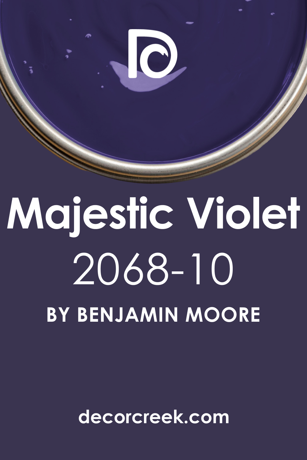
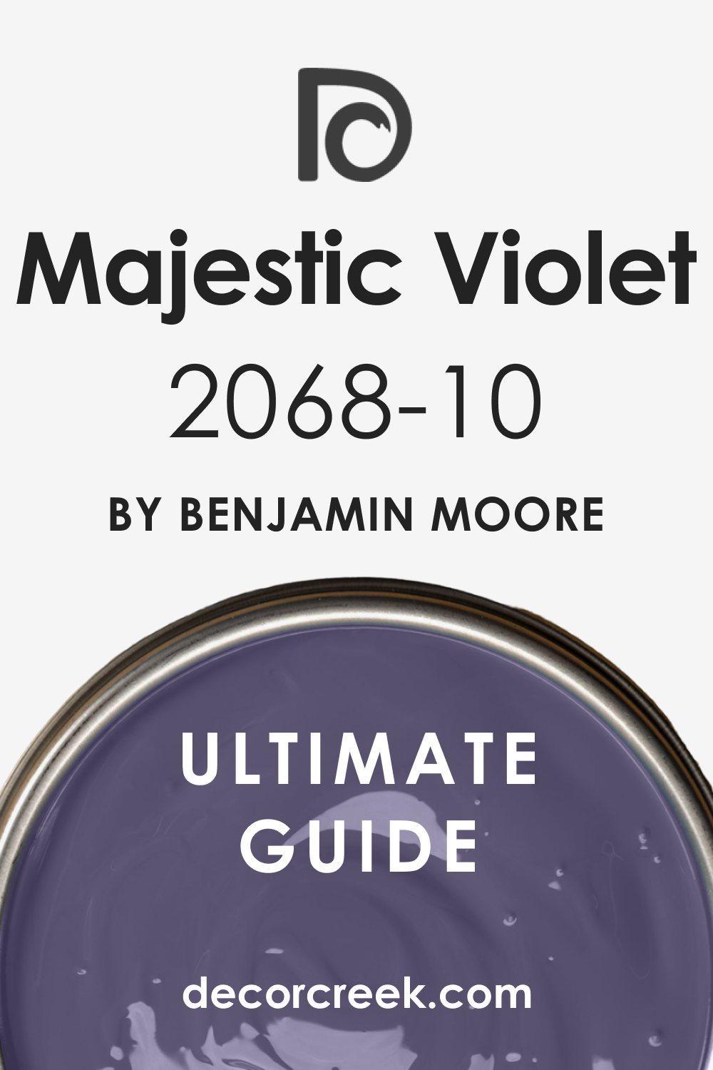
In the vast spectrum of colors that can be used to paint the walls of a home, few have the power to make as bold a statement as Majestic Violet 2068-10 by Benjamin Moore. This color, while not traditionally common in the typical household palette, carries a depth and personality that can transform a space into something truly extraordinary.
This article explores the nuances of Majestic Violet 2068-10, from its temperature and undertones to its coordinating colors and how different lighting affects its appearance.
What Color Is Majestic Violet 2068-10?
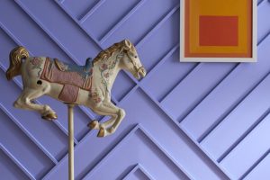
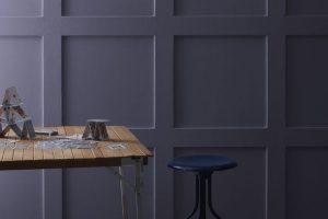
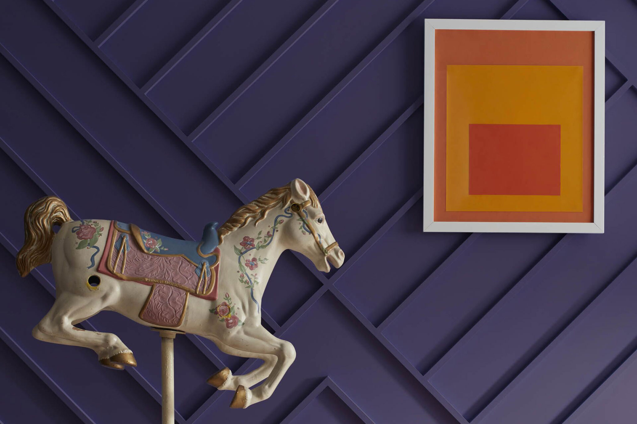
Majestic Violet 2068-10 is a color that captivates with a deep, saturated hue reminiscent of a twilight sky. It’s a rich blend that can infuse a room with a sense of drama and sophistication. Its depth and intensity can complement various interior styles, especially those leaning towards modern and contemporary, where it stands as a statement wall or an accent feature.
Traditional interiors can also benefit from this color, using it to add a regal touch that aligns with luxurious fabrics like velvet and silk. Majestic Violet works well with natural wood, metallic finishes, and textured glass, providing a backdrop that highlights the materials’ inherent beauty.
Ever wished paint sampling was as easy as sticking a sticker? Guess what? Now it is! Discover Samplize's unique Peel & Stick samples.
Get paint samples

Is It a Warm Or Cool Color?
Majestic Violet 2068-10 falls on the cooler side of the spectrum. This cool characteristic means it has the potential to create a serene and contemplative atmosphere in a home. It can make spaces feel more spacious and tranquil, a desirable effect in areas meant for relaxation or focus. In contrast to warmer hues, which pull a room in and make it feel cozier, Majestic Violet expands the boundaries, bringing a calm expansiveness to interiors.
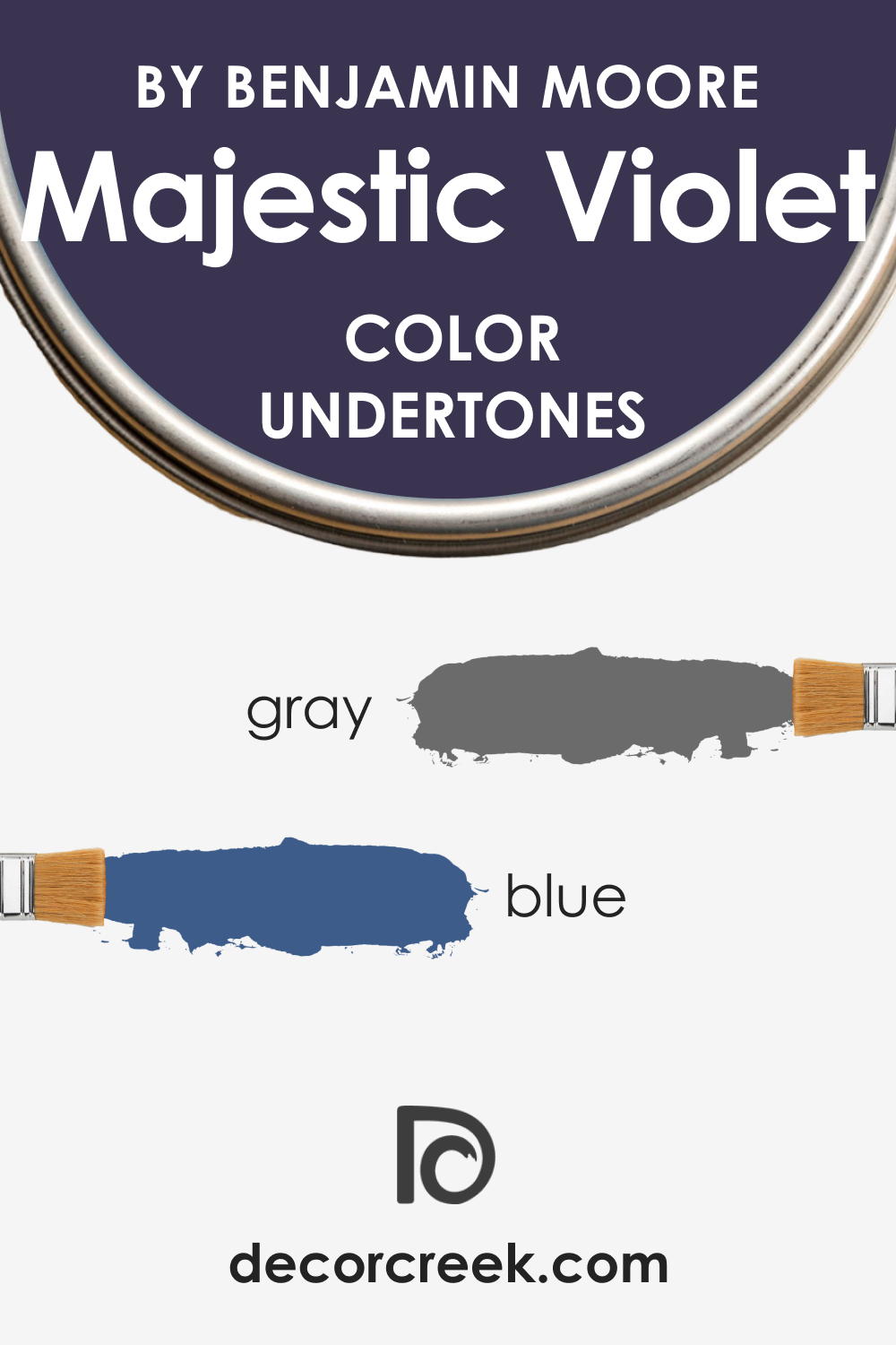
Undertones of Majestic Violet 2068-10
The undertones of Majestic Violet 2068-10 can be subtly complex, weaving together hints of deep blue and faint traces of gray. These undertones contribute to the color’s versatility and depth, allowing it to present differently depending on its context and lighting.
On interior walls, these nuanced undertones can either uplift or ground the space, imparting a dynamic feel that shifts with the day’s rhythm.
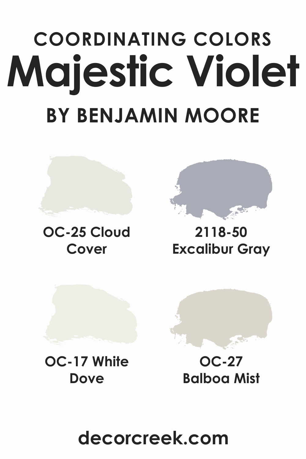
Coordinating Colors of Majestic Violet 2068-10
Coordinating colors are those that harmonize on the color wheel, creating a visually appealing palette. Majestic Violet pairs beautifully with subdued tones like OC-25 Cloud Cover , a soft and airy gray; BM 2118-50 Excalibur Gray , a bold medium-toned gray; OC-17 White Dove , a versatile and warm white; and OC-27 Balboa Mist , a light gray with a touch of warmth. Each color complements Majestic Violet by either offering a restful contrast or by enhancing its stately presence.
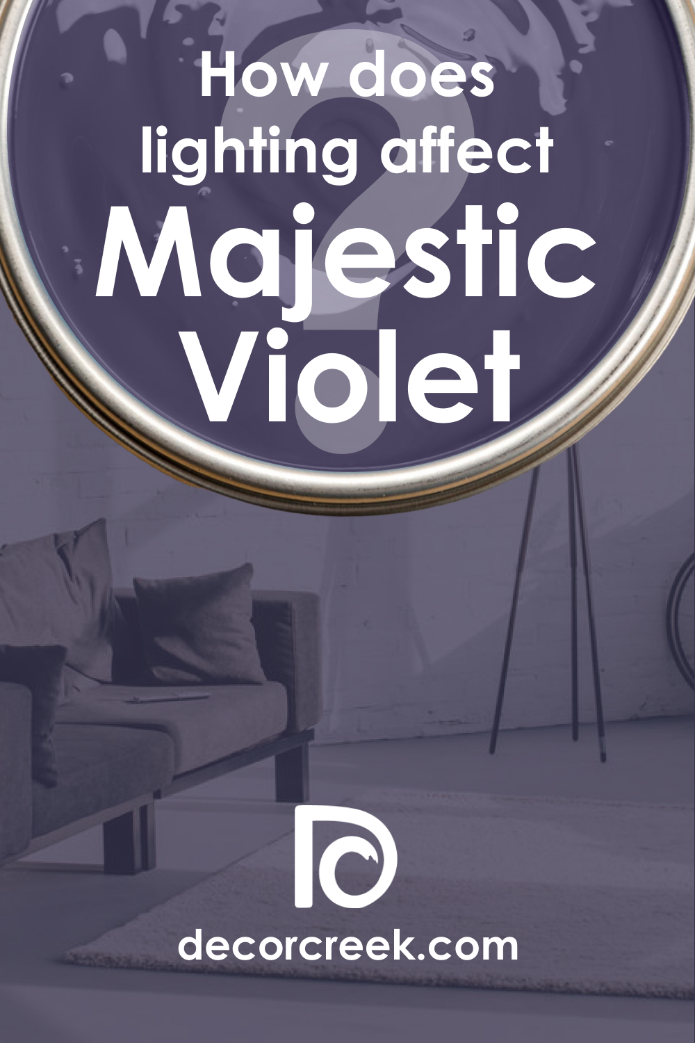
How Does Lighting Affect Majestic Violet 2068-10?
Lighting can dramatically alter the appearance of Majestic Violet 2068-10. Under artificial light, depending on the bulb’s color temperature, Majestic Violet can appear more vivid or subdued. Natural light brings out the truest form of this hue, with variations occurring throughout the day. In north-facing rooms, it may reveal more of its cooler undertones, while in south-facing rooms, it can appear slightly warmer.
East-facing rooms will see it bask in the warm, gentle light of the morning, and in west-facing rooms, the color will intensify with the bold light of the setting sun.
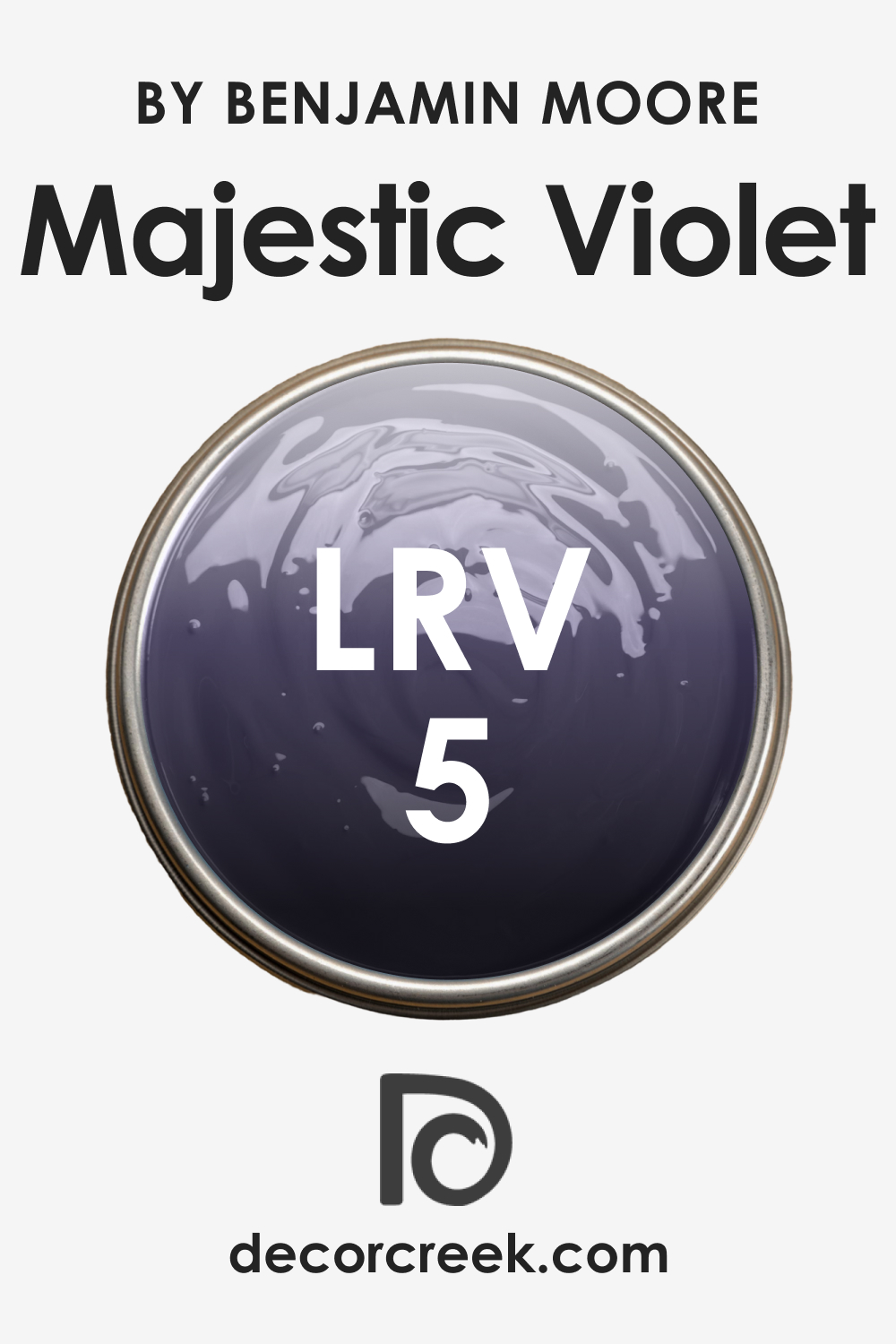
LRV of Majestic Violet 2068-10
LRV, or Light Reflectance Value, is a measure of how much light a color reflects. With an LRV of 5, Majestic Violet 2068-10 is on the lower end of the scale, meaning it reflects a small amount of light. This low reflectivity impacts how the color is perceived, often making the walls look more intimate and the space more enclosed. In spaces with plenty of natural light, this color can exhibit a dynamic range of shades throughout the day.
LRV – what does it mean? Read This Before Finding Your Perfect Paint Color
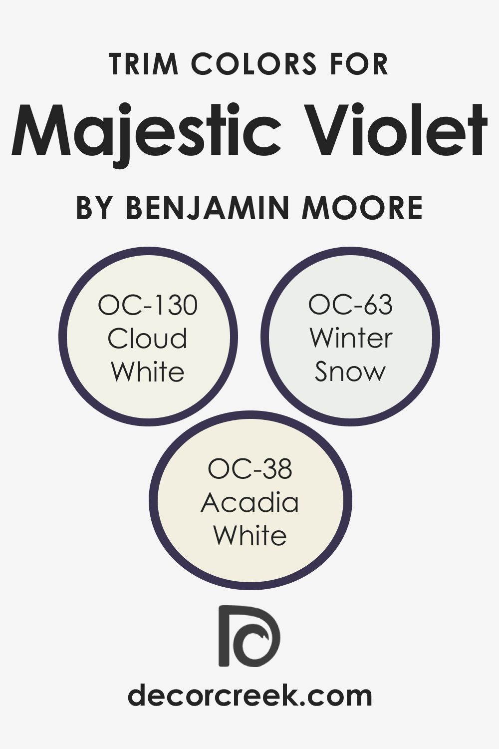
Trim Colors of Majestic Violet 2068-10
Trim colors can be used to create striking contrasts or seamless transitions. For Majestic Violet 2068-10, trim colors in shades of white can provide a crisp boundary that accentuates its depth.
Colors like OC-130 Cloud White , with its subtle warmth, or OC-63 Winter Snow , offering a crisp, clean look, and OC-38 Acadia White , with a hint of creaminess, can all serve as excellent trim options that enhance the majesty of Violet.
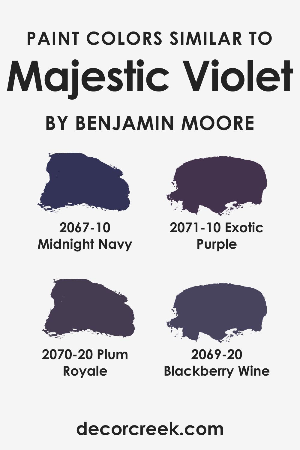
Colors Similar to Majestic Violet 2068-10
Understanding colors similar to Majestic Violet 2068-10 can be important for finding alternatives that maintain the room’s mood and style. BM 2067-10 Midnight Navy offers a deep blue alternative, BM 2071-10 Exotic Purple brings a more pronounced purple presence, BM 2070-20 Plum Royale provides a similar depth with a touch of red, and BM 2069-20 Blackberry Wine introduces a subtle raspberry undertone.
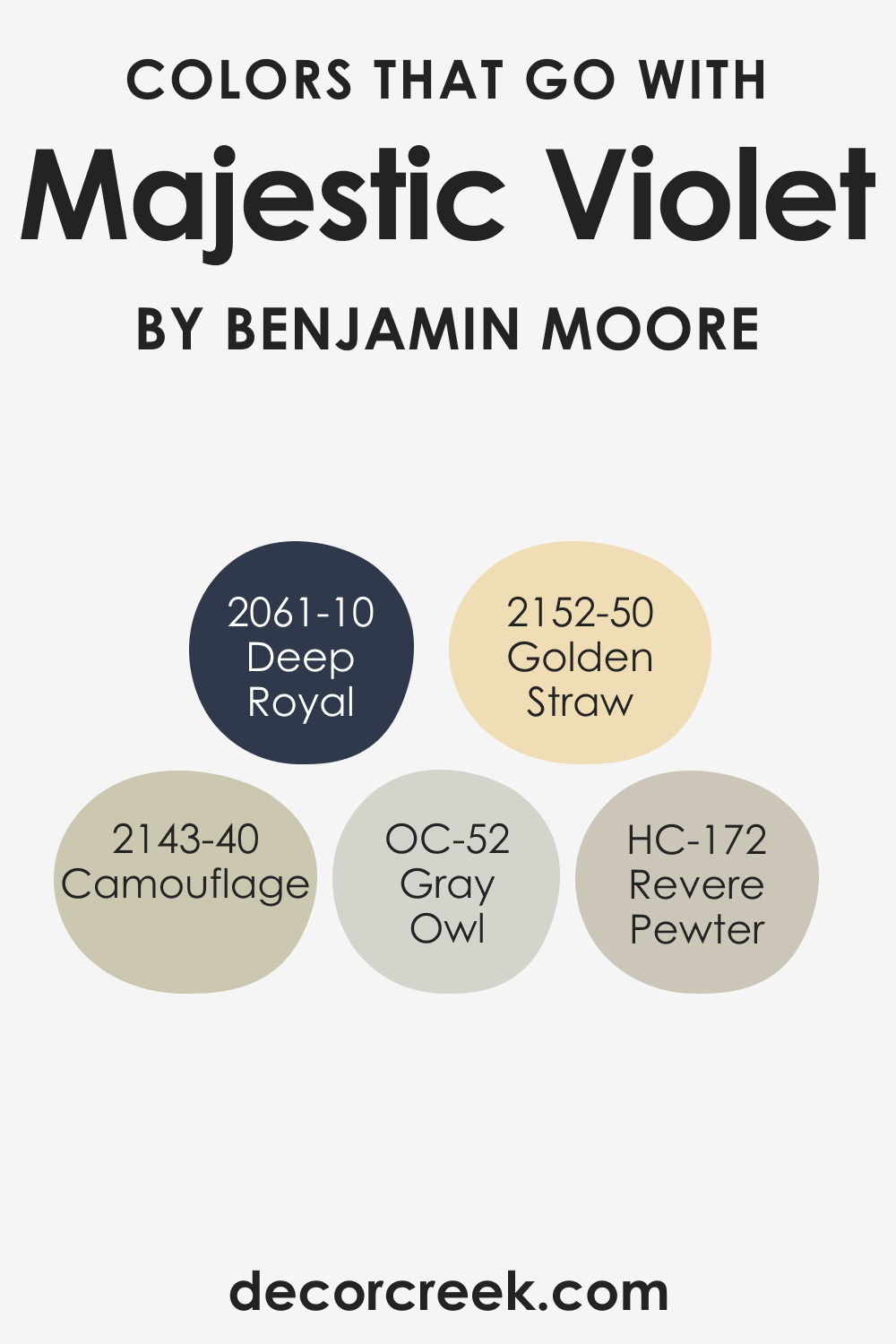
Colors That Go With Majestic Violet 2068-10
Choosing complementary colors is essential for creating a cohesive interior design scheme. For Majestic Violet 2068-10, Benjamin Moore offers a palette that includes shades such as BM 2061-10 Deep Royal , a rich blue, HC-172 Revere Pewter , a balanced gray, BM 2143-40 Camouflage , a muted green, OC-52 Gray Owl , a soft, light gray, and BM 2152-50 Golden Straw , a cheerful yellow, each adding their character while maintaining harmony with the dominant Majestic Violet.
How to Use Majestic Violet 2068-10 In Your Home?
Majestic Violet 2068-10 can bring a sense of drama and luxury to various rooms in your home. It’s particularly suited for bedrooms and living areas where its rich tones create a regal and enveloping atmosphere. For design styles, it fits seamlessly into contemporary and minimalist aesthetics when used as an accent.
In maximalist or eclectic interiors, it serves as a strong backdrop, pairing well with patterned textiles and decorative pieces. Even in traditional settings, Majestic Violet can highlight architectural details and bring depth to the space.
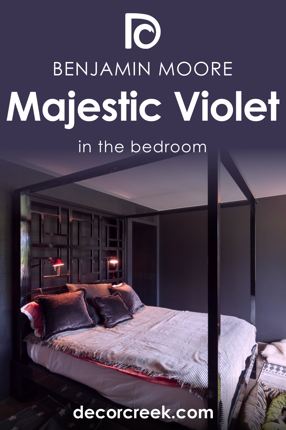
Majestic Violet 2068-10 in the Bedroom
In the bedroom, Majestic Violet 2068-10 can turn the space into a serene retreat. Apply it to a feature wall behind the headboard to anchor the room with a deep, calming presence. Pair with lighter linens and subdued lighting to soften the intensity, creating a cozy, cocoon-like feel.
For a sophisticated touch, use metallic accents in gold or silver that will gleam against the violet backdrop, offering a luxurious nighttime haven.
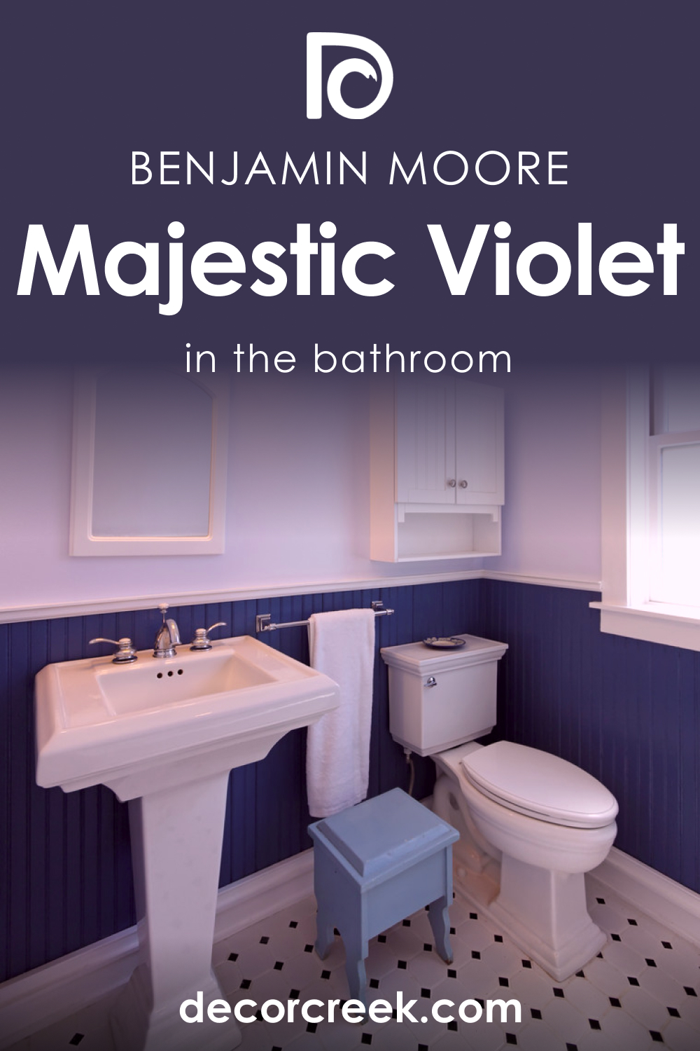
Majestic Violet 2068-10 in the Bathroom
Majestic Violet 2068-10 in the bathroom can transform a typically overlooked space into a spa-like sanctuary. Use it on one wall or as an accent in alcoves or around a vanity to add depth and intrigue. Complement it with marble countertops, chrome fixtures, and plenty of mirrors to balance its depth with reflective light.
This hue can make a striking statement against white fixtures and will bring a touch of opulence to your daily rituals.
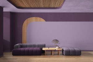
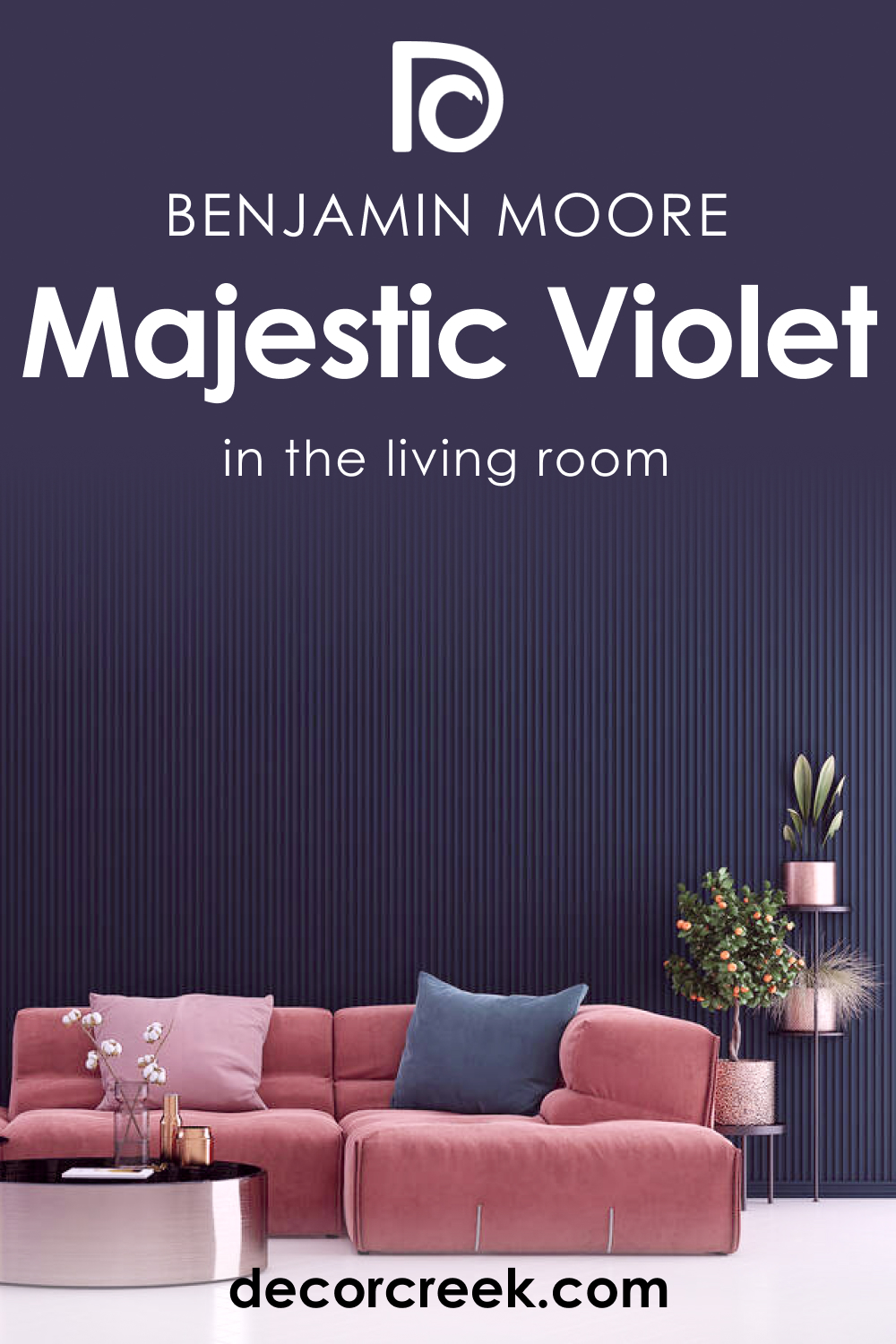
Majestic Violet 2068-10 in the Living Room
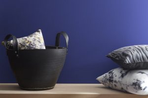
In a living room, Majestic Violet 2068-10 works beautifully as a focal point. It can be used to highlight a main wall or as a backdrop for artwork and shelves. Balance the color’s intensity with neutral furnishings, and incorporate soft textures to create a warm, inviting space. For a cohesive look, integrate accents that echo the color’s undertones, such as navy pillows or a gray throw.
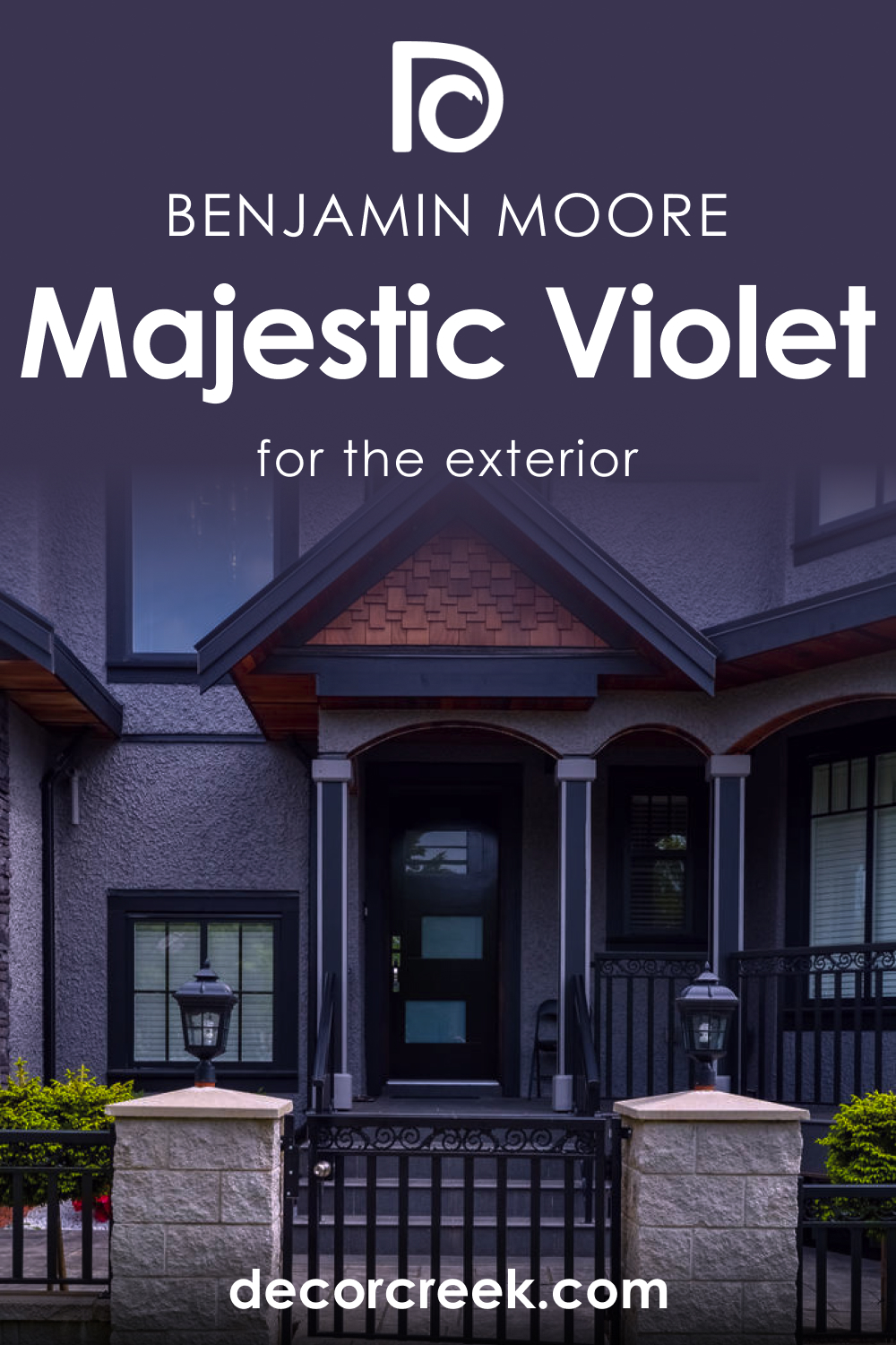
Majestic Violet 2068-10 for an Exterior
Majestic Violet 2068-10 is bold for an exterior but can be striking on a front door or shutters for homes with neutral siding. It pairs well with natural stone or brick and can be the pop of color that gives a home unique curb appeal. Ensure the surrounding landscape has elements of greenery to complement and soften its impact.
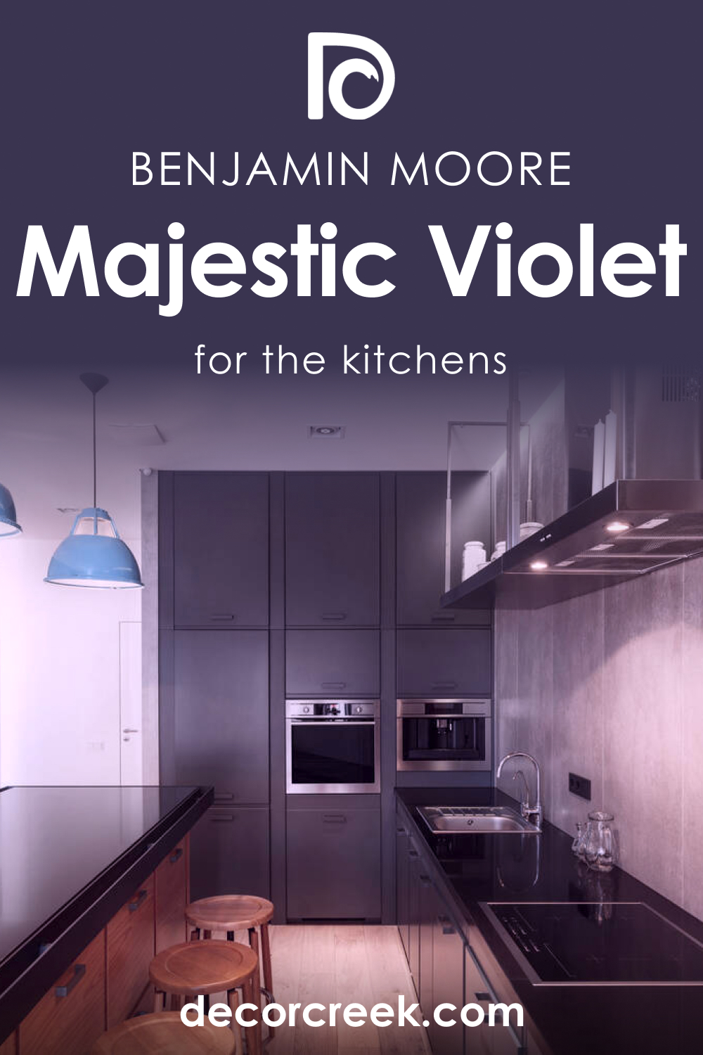
Majestic Violet 2068-10 in the Kitchen
Using Majestic Violet 2068-10 in the kitchen brings in an unexpected splash of color. Consider a feature wall, which could serve as a backdrop to open shelving or white cabinetry. For a modern and cohesive look, match it with stainless steel appliances and white countertops.
The color stimulates the senses and adds depth without overwhelming, especially when balanced with ample natural light.
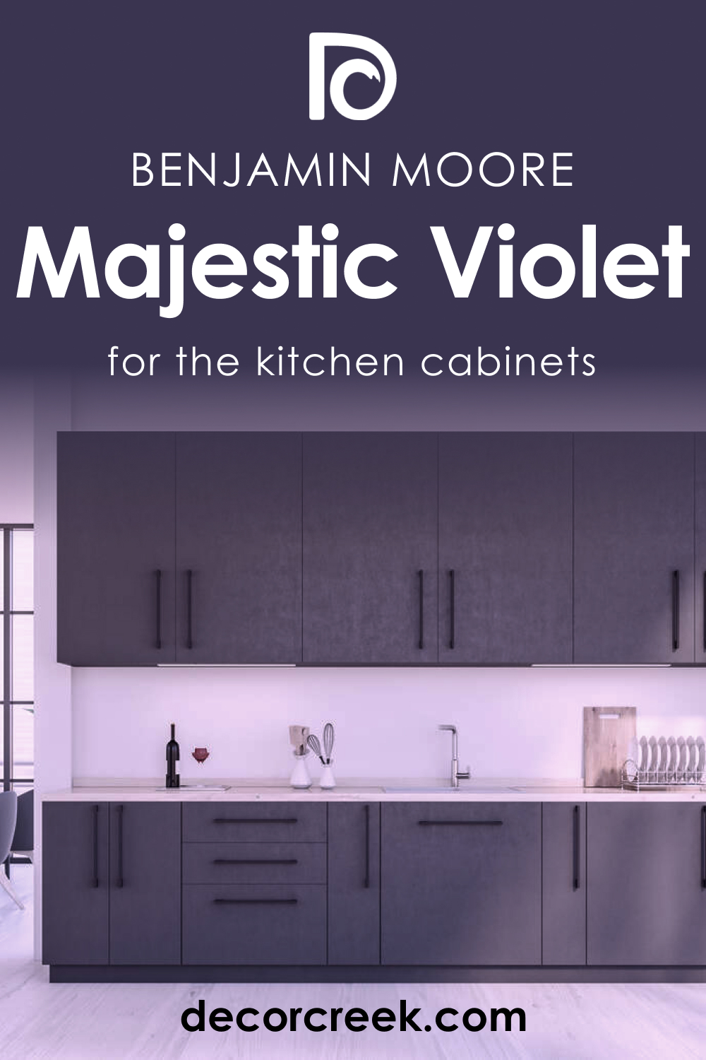
Majestic Violet 2068-10 on the Kitchen Cabinets
For kitchen cabinets, Majestic Violet 2068-10 offers a bold and contemporary twist. It’s ideal for lower cabinets, providing a grounding effect, or as an island base color that becomes the room’s focal point. Offset the deep violet with a light backsplash and countertops to maintain a balanced, airy feel. Brass or copper hardware can add a touch of elegance to the cabinetry, drawing out the warm undertones of the color.
Comparing BM Majestic Violet With Other Colors
Comparing different colors is crucial in interior design to understand how they will interact within a space and affect the overall atmosphere. Colors can complement, contrast, or enhance each other, impacting mood, perceived space size, and even the aesthetics of the furnishings. Majestic Violet 2068-10, with its deep and dynamic hue, provides a perfect example to explore these effects when paired with a variety of other colors.
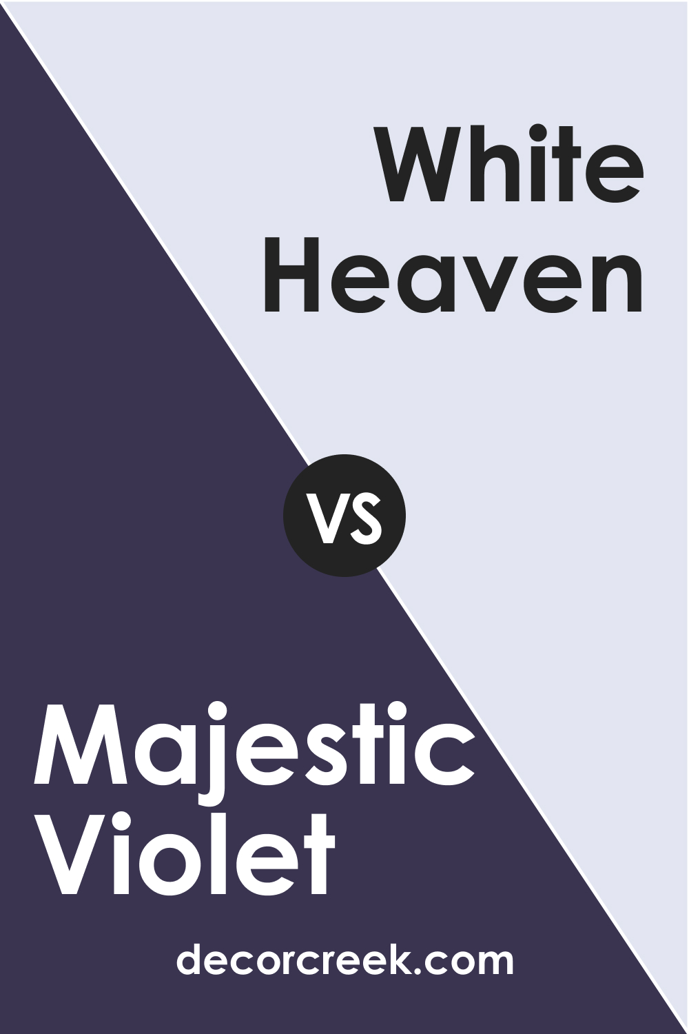
Majestic Violet 2068-10 vs. BM 2068-70 White Heaven
White Heaven is a pristine, airy white that offers a stark contrast to the deep and intense Majestic Violet 2068-10. When these two are paired, Majestic Violet becomes even more striking, as White Heaven serves to underscore its depth and richness.
This combination can create a dynamic and elegant space, with the purity of White Heaven providing a visual break from the drama of Majestic Violet, allowing for a balanced and refined design.
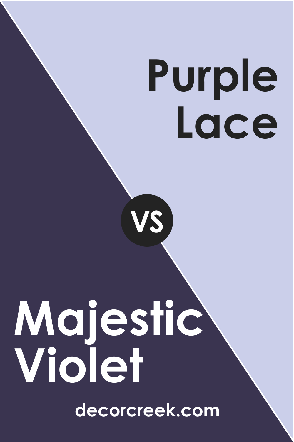
Majestic Violet vs. BM 2068-60 Purple Lace
Purple Lace is a much lighter, softer purple compared to the deep and saturated Majestic Violet 2068-10. When compared, Purple Lace can bring out the warmth in Majestic Violet, highlighting any subtle red undertones. Conversely, Majestic Violet makes Purple Lace appear almost ethereal and whimsical.
This pairing works well for a monochromatic scheme that desires depth without losing touch with softness and femininity.
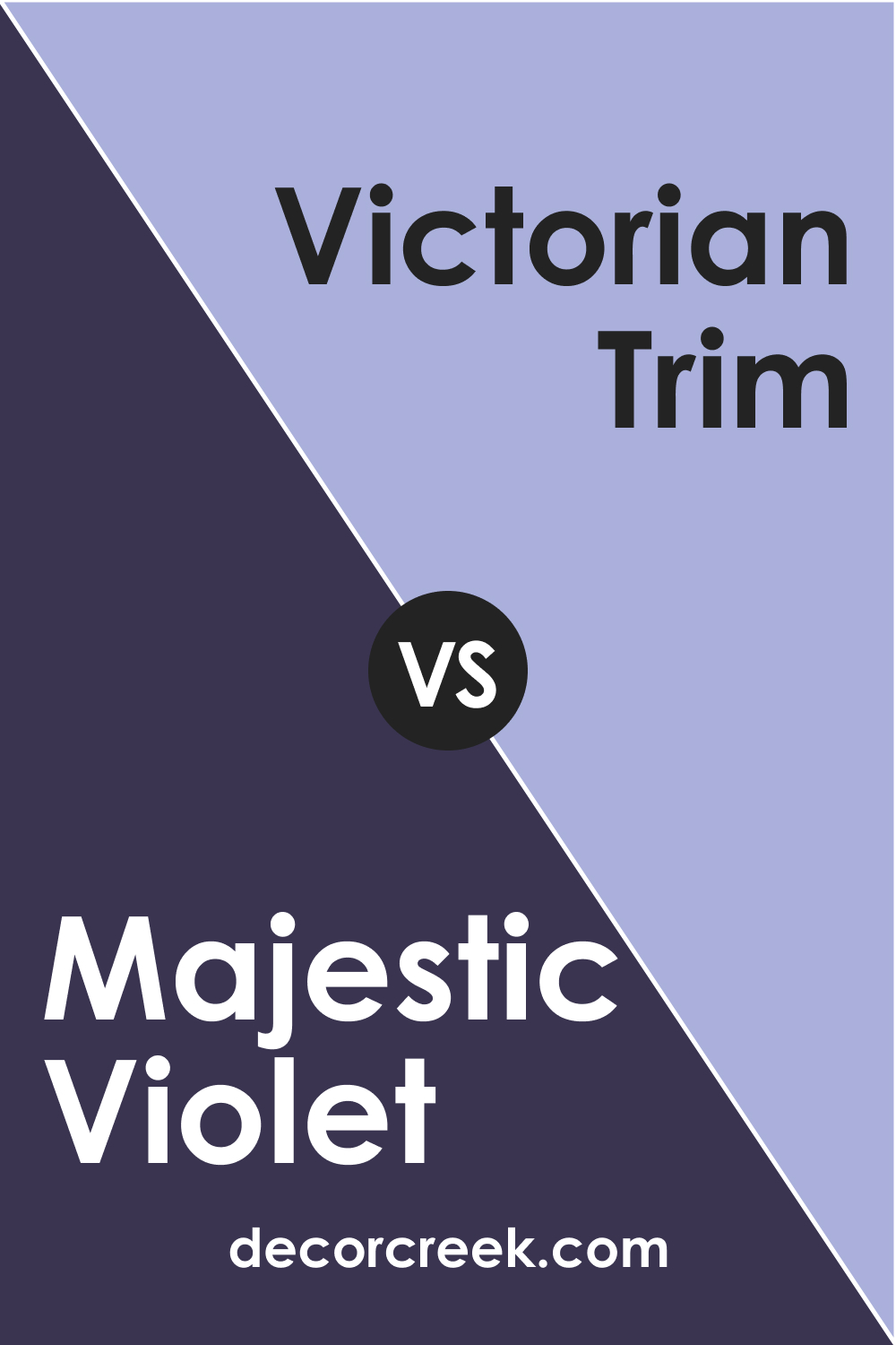
Majestic Violet 2068-10 vs. BM 2068-50 Victorian Trim
Victorian Trim is a more subdued purple, offering a less saturated counterpart to Majestic Violet 2068-10. It provides a step down in intensity, which can help in creating a gradient effect in a space. The lighter Victorian Trim can serve as a transition color, helping to soften the impact of Majestic Violet and bring a lighter, more relaxed purple into the palette that still maintains a connection to the richness of the deeper hue.
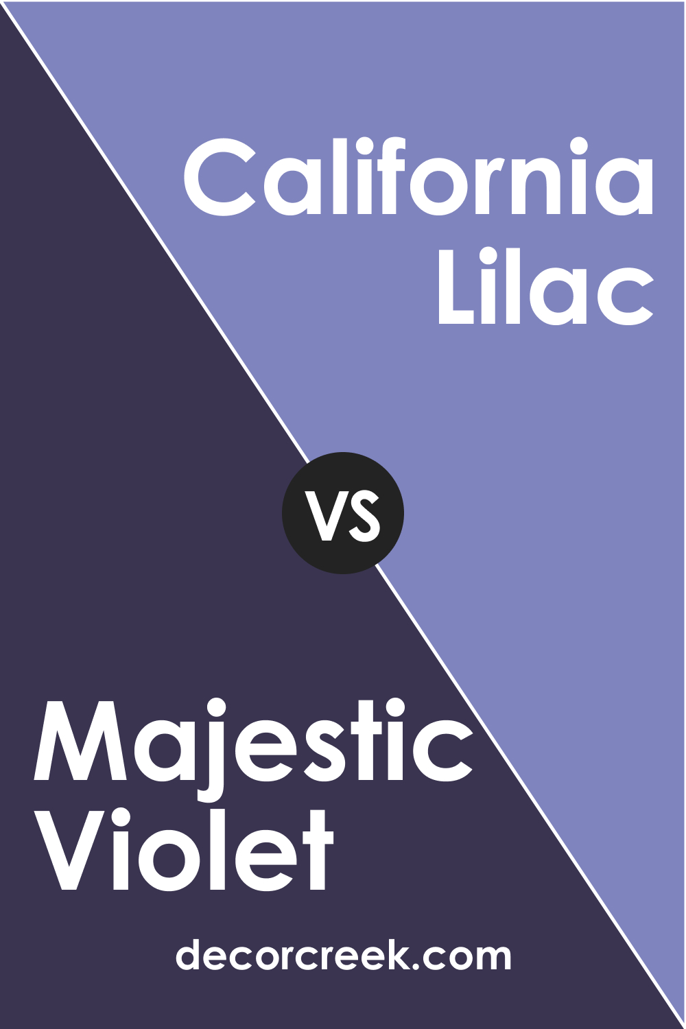
Majestic Violet 2068-10 vs. BM 2068-40 California Lilac
California Lilac possesses a lively, vibrant quality that can energize a room, in contrast to the more stately and reserved Majestic Violet 2068-10. When juxtaposed, California Lilac brings out a playful aspect, providing a color that can serve as a bright accent in a room dominated by Majestic Violet’s seriousness. It’s a pairing that can animate a space while retaining a sense of sophistication.
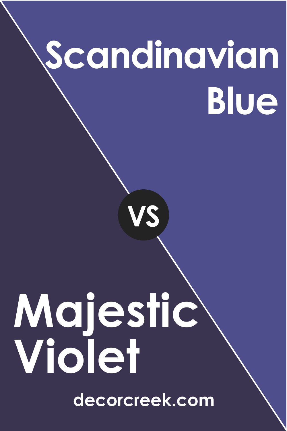
Majestic Violet 2068-10 vs. BM 2068-30 Scandinavian Blue
Scandinavian Blue , a muted, serene blue, contrasts with Majestic Violet 2068-10 by offering a cooler temperature and a more tranquil vibe. When these two colors meet, they can evoke a sense of calm and poise. Scandinavian Blue can temper the intensity of Majestic Violet, lending a breath of fresh air to spaces that might otherwise be overwhelmed by the depth of violet.
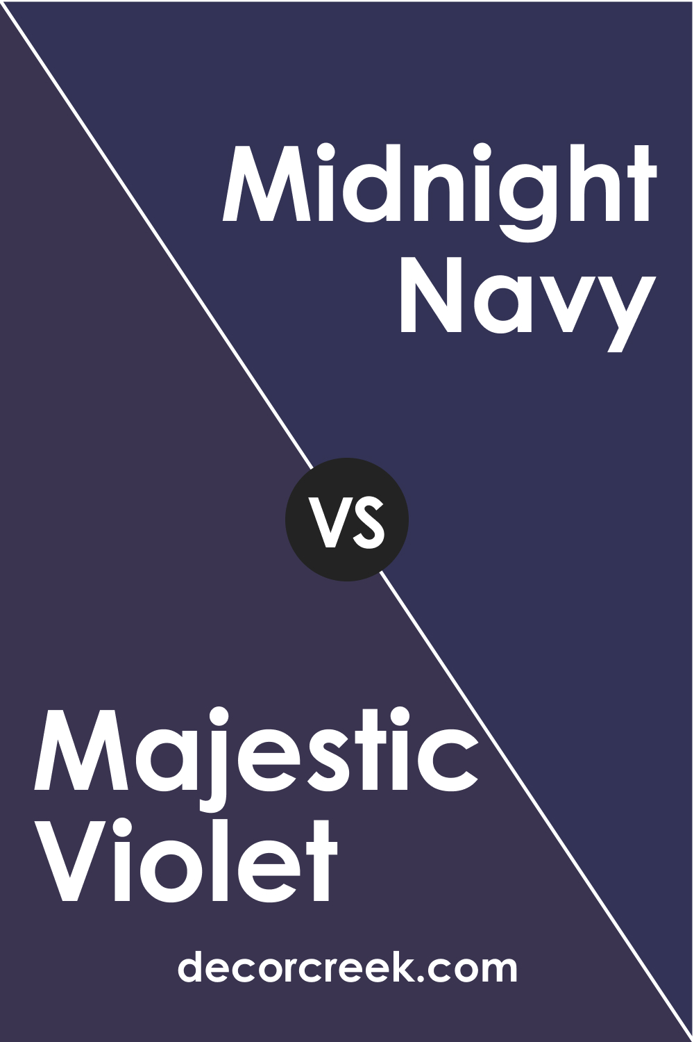
Majestic Violet 2068-10 vs. BM 2067-10 Midnight Navy
Midnight Navy is a profound, dark blue that stands shoulder-to-shoulder with the boldness of Majestic Violet 2068-10. When compared, both colors hold their own, providing a sophisticated and luxurious feel. Midnight Navy can draw out the cooler undertones in Majestic Violet, creating a duo suitable for a space aiming for a dramatic flair with a touch of formality.
Conclusion
Comparing Majestic Violet 2068-10 with a spectrum of colors from Benjamin Moore’s palette reveals the versatile nature of this deep violet shade. It can serve as a statement color or act in harmony with other hues to create a desired mood and style in any space. Understanding the relationships between Majestic Violet and other colors allows designers and homeowners to curate spaces that are both visually striking and harmonically balanced.
BM Majestic Violet 2068-10’s ability to pair with lighter, softer tones, as well as equally saturated hues, demonstrates its flexibility in design applications. Whether aiming to create contrast, cohesion, or a soothing gradient, Majestic Violet 2068-10 can adapt to different color pairings, thereby unlocking endless possibilities in interior and exterior design. It stands as a testament to the power of a single color in shaping the character and ambiance of an environment.
Ever wished paint sampling was as easy as sticking a sticker? Guess what? Now it is! Discover Samplize's unique Peel & Stick samples.
Get paint samples