It is a captivating paint color by Sherwin-Williams that is taking the interior design world by storm. This modern and versatile hue embodies the perfect balance between cool and warm tones, making it a superb choice for those looking to create a serene yet sophisticated ambiance in their spaces.
As a part of Sherwin-Williams’s vast and inspiring color palette, SW 7072 Online stands out for its ability to adapt to various styles and settings, from contemporary minimalistic homes to cozy, traditional spaces. It complements a wide range of decor elements, making it an excellent choice for walls, cabinets, or accent features.
Whether you’re embarking on a major renovation or simply refreshing a room, incorporating SW 7072 Online can transform your space into a chic, inviting haven. In this article, we delve into the unique characteristics of SW 7072 Online, offering insights into how it can enhance your home’s aesthetics and create a visually appealing and comforting environment.
Join us as we explore the versatility and beauty of this exceptional paint color, providing you with the inspiration and guidance to make your interior design project a stunning success.

What Color Is Online SW 7072 by Sherwin Williams
The color in question exudes a refined and striking depth, presenting as a sophisticated gray that veers toward the cooler end of the spectrum. This particular shade is reminiscent of the serene moments just before dawn, where the world is awash in a tranquil, yet profoundly dynamic, light.
It carries a contemporary edge, making it a versatile choice for modern interior designs, yet it retains enough classic charm to blend seamlessly with more traditional decors.
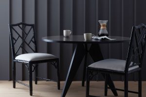
In terms of interior styles, this color finds its strength in minimalistic and Scandinavian designs, where its cool undertones complement the clean lines and natural light these spaces often feature. It also works exceptionally well in industrial and modern farmhouse aesthetics, offering a crisp contrast to natural wood elements and metallic finishes.
In these settings, it serves as a neutral backdrop that allows architectural details and curated decor to stand out.
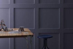
When it comes to materials and textures, this color pairs beautifully with a wide range. It enhances the warmth of natural wood, making oak, walnut, and maple stand out with a vibrant richness. In spaces with metallic accents, such as brushed nickel, chrome, or aged brass, it adds a layer of sophistication.
Textiles in rich textures, like velvet or wool, in both muted and vivid hues, are elevated against this backdrop, creating a cohesive look that is both inviting and stylish.
Its versatility and cool elegance make it a standout choice for those looking to infuse their space with a sense of calm and contemporary chic.

Ever wished paint sampling was as easy as sticking a sticker? Guess what? Now it is! Discover Samplize's unique Peel & Stick samples.
Get paint samples

Is Online SW 7072 by Sherwin Williams Warm or Cool color?
Online SW 7072 by Sherwin-Williams is a captivating hue that effortlessly brings sophistication and depth to any space it adorns. This paint color exudes a balanced blend of cool grey with subtle blue undertones, making it a versatile choice for various home styles and aesthetics.
Its unique shade can transform a room, adding a serene and calming atmosphere that encourages relaxation and tranquility.
Ideal for use in bedrooms, living rooms, or even home offices, Online SW 7072 provides a modern backdrop that pairs beautifully with both bold and muted color palettes.
The true beauty of this color lies in its adaptability; it can enhance natural light in well-lit spaces or create a cozy, intimate feeling in areas with less sunlight. This adaptability allows homeowners to apply it in different rooms with varying lighting conditions without losing its charm.
Furthermore, its understated elegance makes it a perfect complement to contemporary, minimalist, or even traditional decors, proving that a well-chosen color can elevate the home environment profoundly.
Undertones of Online SW 7072 by Sherwin Williams
Online, a unique shade by Sherwin Williams, embodies a nuanced color personality that subtly infuses a space with depth and complexity. At its core, this color carries the calmness and clarity of a soft, serene sky, yet it’s the delicate undertones that truly distinguish its character. The light blue and light purple undertones navigate a delicate balance, infusing the space with a blend of tranquility and gentle warmth.
The undertones in any color significantly influence our perception, altering how a color presents itself under different lighting conditions and in juxtaposition with other hues. The light blue undertone of this color evokes an airy, open feel, reminiscent of a breath of fresh air in a serene landscape.
This undertone contributes to a sense of calm and relaxation, making it an excellent choice for spaces meant to be retreats from the hustle and bustle of everyday life.
On the other hand, the light purple undertone adds a layer of subtle sophistication and depth. It introduces a hint of creativity and imagination, evoking a nuanced aesthetic that enriches the space without overwhelming it.
This blend of undertones means that in varying lights, the walls can shift from a calming retreat to intriguing spaces with a hint of mystery.
When applied to interior walls, these undertones come into their own. During daylight, the light blue undertone captures the sunlight, spreading a cool, calm ambiance that seems to expand the space.
As the day transitions into evening, artificial lighting brings the light purple undertone to the forefront, enveloping the room in a cozy, inviting glow.
This chameleon-like ability allows it to adapt, bringing dynamic energy or soothing calm to the room, responding intuitively to the room’s natural and artificial light. Thus, its undertones make it a versatile color choice, capable of subtly transforming a space while maintaining harmony and balance.
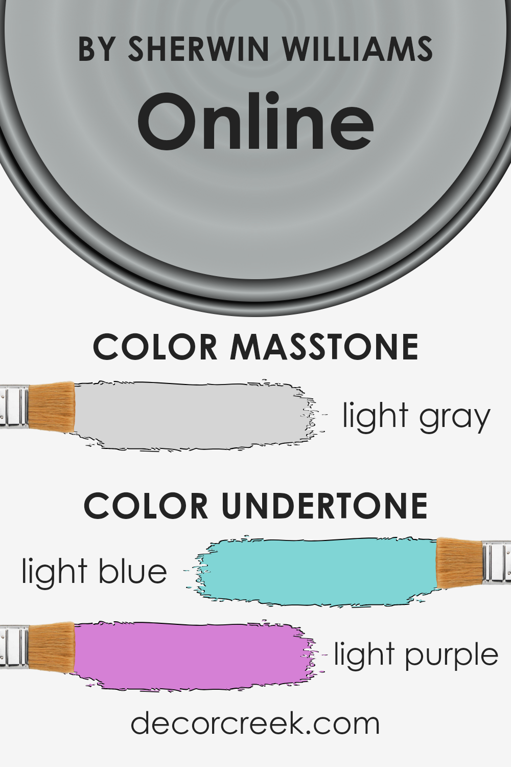
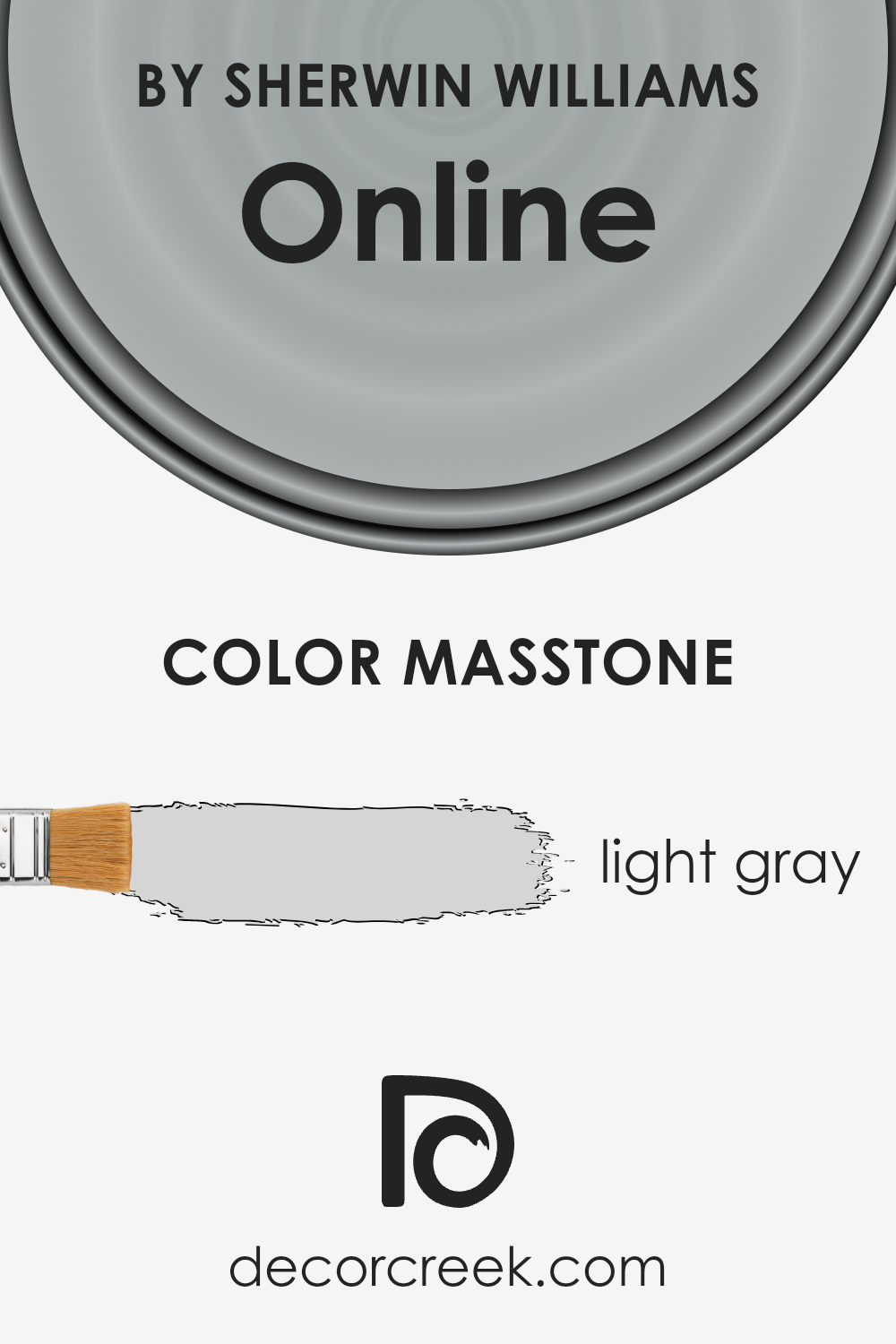
What is the Masstone of the Online SW 7072 by Sherwin Williams?
Online SW 7072 by Sherwin Williams boasts a masstone of light gray, embodied by the inviting hue of #D5D5D5. This particular shade of gray carries an intrinsic versatility and neutrality that makes it an exceptional choice for home interiors. Its light gray tone exudes a sense of openness and calmness, effortlessly harmonizing with a wide range of color palettes.
This attribute makes it especially valuable in spaces where a sense of serenity and spaciousness is desired. Whether applied in living areas, bedrooms, or even bathrooms, this color fosters a backdrop that is both uplifting and grounding.
The light gray masstone of this color not only amplifies natural light, enhancing the brightness of rooms, but also provides a subtle contrast that can make architectural details and furnishings stand out.
It effectively bridges the gap between contemporary chic and timeless elegance, enabling homeowners to craft spaces that reflect their personal style while maintaining a cohesive and inviting atmosphere. This adaptability ensures that it remains a favored choice for those looking to create a sense of continuity and flow in their home’s design.
How Does Lighting Affect Online SW 7072 by Sherwin Williams
Lighting plays a pivotal role in the perception of colors, as the quality, intensity, and type of light can significantly alter how a color appears. Different lighting conditions can transform the same color from vibrant and warm to soft and cool. Understanding this interaction is crucial in spaces where color accuracy or mood setting is important.
Taking the color Online (SW 7072) by Sherwin Williams as an example, its appearance can vary widely under various lighting conditions. Online is a sophisticated, deep gray with subtle blue undertones, offering a flexible backdrop for a range of spaces and styles. However, the impact of artificial light compared to natural light can change its perceived hue and depth.
Under artificial light, the type of bulb (LED, incandescent, fluorescent) can affect how Online appears. Incandescent lights, which emit a warmer glow, may enhance the warmth of Online, giving it a cozier feel. In contrast, LED lights, especially those with a cooler temperature, can highlight its blue undertones, making the color look more crisp and vibrant.
In rooms with ample natural light, the direction the room faces significantly influences how Online is perceived. North-facing rooms receive cooler, indirect light, which can amplify the cool undertones of Online, making it appear more pronounced and starker.
Such spaces might see Online taking on a more serious, sophisticated tone.
South-facing rooms bask in warm, direct light for most of the day, which can soften and warm up Online, reducing the prominence of its cool blue undertones. This light makes the color appear lighter and more dynamic, ideal for creating inviting spaces.
East-facing rooms enjoy bright, warm light in the morning, with the light becoming cooler as the day progresses. Online might appear vibrant and lively in the morning but become more subdued and cooler in the afternoon.
Conversely, west-facing rooms receive less intense light in the morning that grows warmer and brighter towards the evening. Here, Online could start the day appearing as a true cool gray but transform into a softer, warmer hue by sunset, capturing the changing light beautifully.
In essence, the interplay of light, both natural and artificial, and directionality considerably impacts how colors like Online are experienced, underscoring the importance of considering lighting in design decisions.

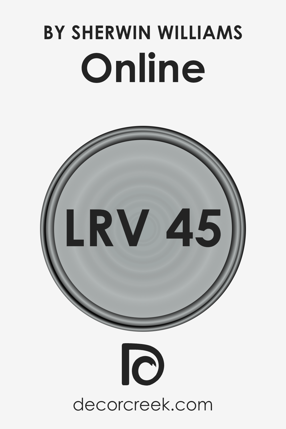
What is the LRV of Online SW 7072 by Sherwin Williams
Light Reflectance Value (LRV) measures the amount of visible and usable light that a paint color reflects or absorbs when illuminated by a light source. LRV is expressed on a scale from 0, which is completely black, absorbing all light, to 100, reflecting all light, akin to pure white. This value is critical in determining how light or dark a color will look on a wall and can significantly impact the ambiance and feel of a space.
Colors with higher LRVs make rooms feel more spacious and brighter as they reflect more light. Conversely, colors with lower LRVs absorb more light, making spaces feel cozier but potentially darker.
With an LRV of 45.487, the color in question strikes a middle ground, neither absorbing nor reflecting light excessively. This balanced LRV means it’s versatile, able to bring warmth to a space without making it feel overly bright or too intimate and dim. In different lighting conditions – be it natural daylight or artificial lighting – this color can appear to shift in intensity, sometimes looking slightly lighter and other times, a bit more muted.
This property makes it an excellent choice for various spaces, from living areas to bedrooms, as it adapts well to changing light, maintaining a steady and welcoming ambiance throughout the day.
LRV – what does it mean? Read This Before Finding Your Perfect Paint Color
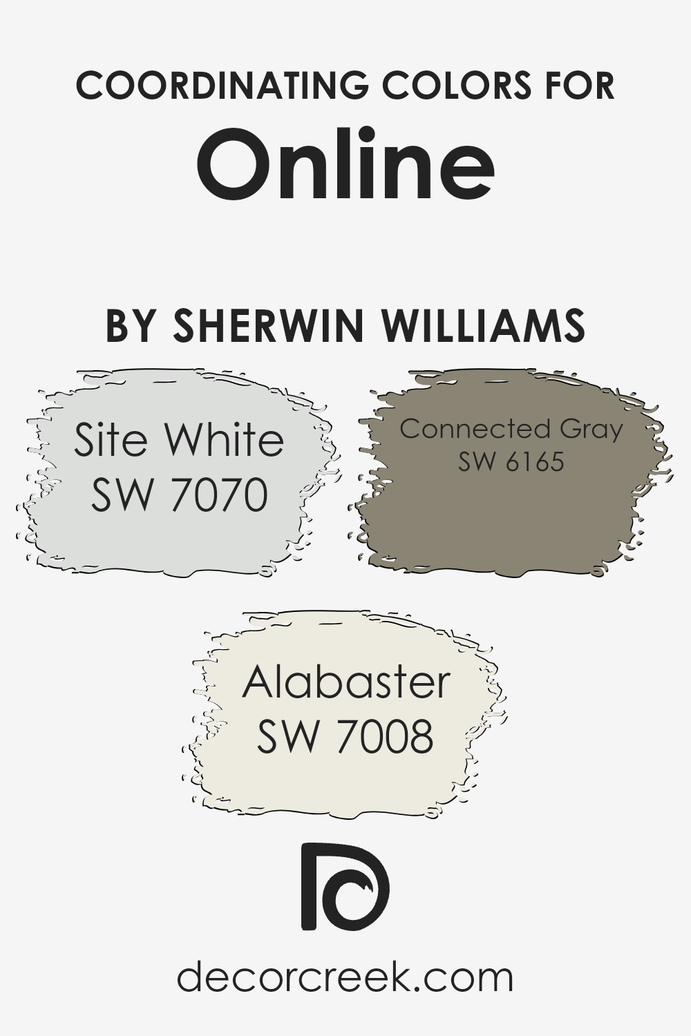
Coordinating Colors of Online SW 7072 by Sherwin Williams
Coordinating colors are shades that complement each other, creating harmony and balance within a palette for interiors or exteriors. When selected thoughtfully, these colors enhance the visual appeal of a space, making it feel more cohesive.
A perfect example can be observed through the refinement of a specific color and its coordinating associates, providing a sophisticated blend for design projects. By using coordinating colors effectively, designers and homeowners can achieve a desired ambiance, whether aiming for a soothing, vibrant, or dynamic look.
Among the coordinating colors, we have Site White, a subtle and airy hue that offers a clean and minimalistic backdrop, allowing other colors to stand out while maintaining a sense of spaciousness and light.
Alabaster, another coordinating shade, brings a warm and inviting feel to spaces, with its soft, creamy presence adding a touch of earthy yet refined elegance.
On a different note, Connected Gray serves as a versatile and grounding color, adding depth and sophistication with its rich, balanced tone. Together, these colors harmonize beautifully, each contributing unique qualities that enhance the aesthetic appeal of a space, demonstrating the power of well-chosen coordinating colors.
You can see recommended paint colors below:
- SW 7070 Site White
- SW 7008 Alabaster
- SW 6165 Connected Gray
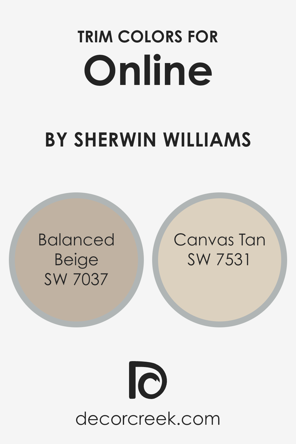
What are the Trim colors of Online SW 7072 by Sherwin Williams
Trim colors are essential aspects of interior and exterior design, serving as an aesthetic border that highlights and defines the space. When it comes to Online SW 7072 by Sherwin Williams, selecting the right trim colors can significantly enhance the visual appeal and cohesion of a room or façade.
Trim colors like SW 7037 – Balanced Beige and SW 7531 – Canvas Tan are perfect complements.
These shades are adept at subtly framing Online SW 7072, ensuring that the space feels structured yet inviting. Their ability to pair seamlessly with the cool, sophisticated hue of Online means that they can be used to craft spaces that feel cohesive and thoroughly thought out.
Balanced Beige is a warm, neutral color that envelops spaces in a calm and welcoming ambiance. It stands as a versatile choice, capable of complementing the cooler tones of Online SW 7072 by adding depth and warmth without overwhelming the primary color.
On the other hand, Canvas Tan, with its lighter, softer feel, brings a refreshing and subtle brightness to the mix. Its understated elegance makes it an ideal choice for trim, offering a gentle contrast that enhances the architectural features of a room. Together, these trim colors offer a balanced and harmonious palette that enriches the depth and sophistication of Online, making it a compelling choice for those looking to elevate their spaces.
You can see recommended paint colors below:
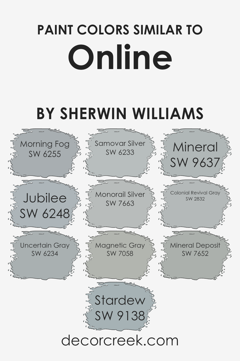
Colors Similar to Online SW 7072 by Sherwin Williams
Similar colors play a crucial role in interior design and aesthetics, particularly when creating a cohesive and harmonious space. These hues, which are closely related on the color spectrum, can offer subtle contrasts or blend seamlessly, allowing for a refined and sophisticated environment.
The essence of integrating similar colors, such as the nuanced palette inspired by OnlineSW 7072, lies in their ability to provide depth and complexity to spaces without overwhelming the senses.
Colors like Morning Fog and Jubilee, with their muted tones, evoke a sense of calm and serenity, ideal for creating a tranquil retreat. Uncertain Gray and Stardew lean towards a cooler spectrum, offering a fresh and airy feel that enhances spaciousness.
The elegance of Samovar Silver and Monorail Silver introduces a metallic edge, adding a layer of modernity and sleekness to the design theme.
Continuing along this spectrum, Magnetic Gray, Mineral, and Colonial Revival Gray navigate through a scale of gray undertones, providing versatile backdrops that can adapt to various decor styles and personal preferences.
These shades excel in reflecting natural light differently throughout the day, creating a dynamic yet cohesive ambience.
Lastly, Mineral Deposit stands out with a unique blend, capturing the essence of earthy minerals, thus rooting the space in a sense of natural elegance. Through their shared lineage with OnlineSW 7072, these colors exemplify the power of similar hues to create visually appealing and emotionally resonant spaces, proving that color, in its subtlety and depth, can dramatically alter the perception and mood of any room.
You can see recommended paint colors below:
- SW 6255 Morning Fog
- SW 6248 Jubilee
- SW 6234 Uncertain Gray
- SW 9138 Stardew
- SW 6233 Samovar Silver
- SW 7663 Monorail Silver
- SW 7058 Magnetic Gray
- SW 9637 Mineral
- SW 2832 Colonial Revival Gray
- SW 7652 Mineral Deposit
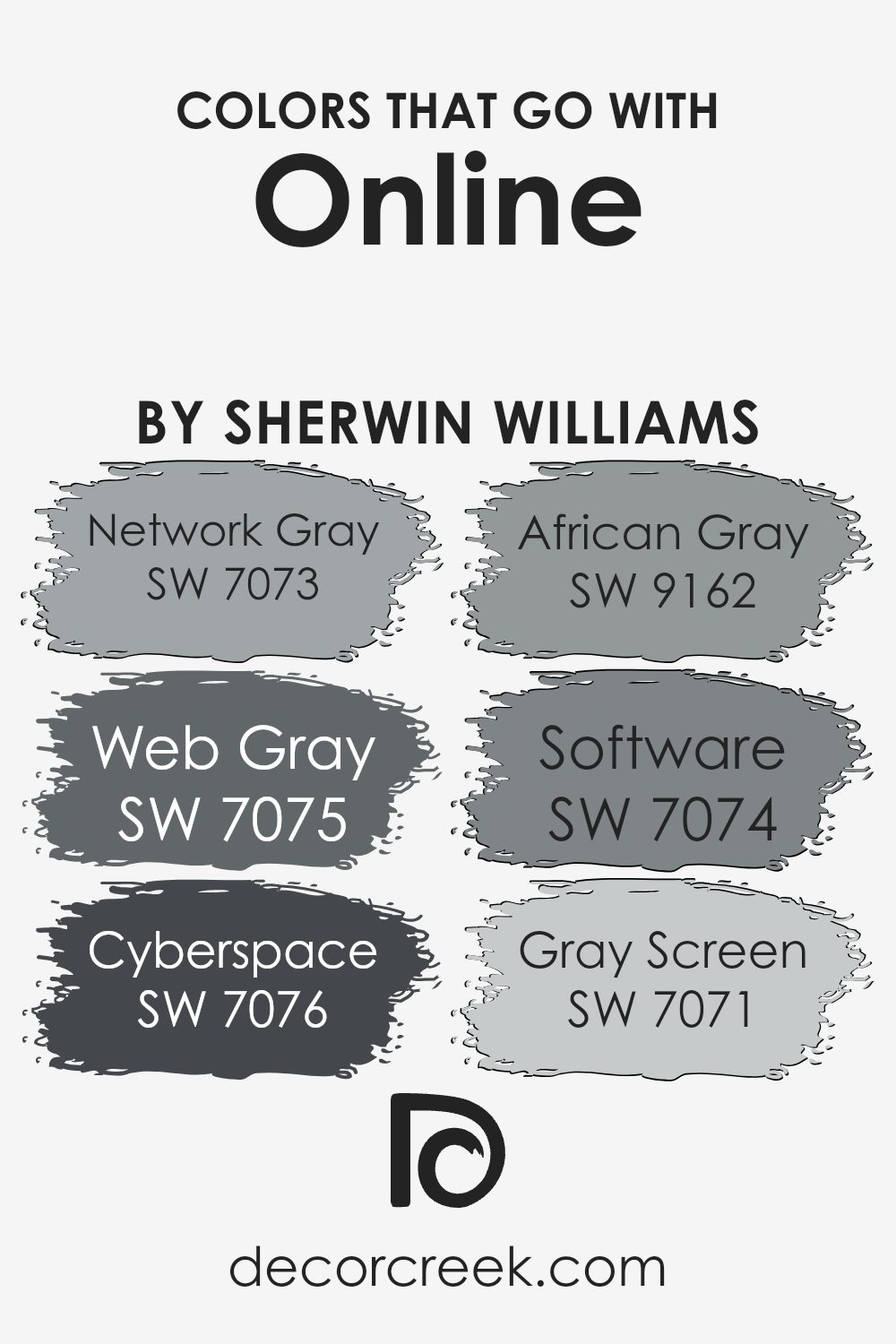
Colors that Go With Online SW 7072 by Sherwin Williams
Choosing the right colors to complement Online SW 7072 by Sherwin Williams is essential because it helps create a harmonious and appealing color scheme in any space. These colors, specifically selected to go well with Online, enhance the room’s aesthetics, setting the mood and tone, whether aiming for a calming retreat or a professional appearance.
By carefully pairing Online with its companion colors, you can design spaces that are both inviting and visually interesting.
- Network Gray SW 7073 and Web Gray SW 7075, for instance, offer subtle differences in tone that, when used alongside Online, can add depth and complexity to a room without overwhelming it. Network Gray brings a lighter, more airy feel, perfect for creating a sense of space, while Web Gray offers a slightly deeper tone, grounding the design with its solid presence.
- Cyberspace SW 7076 adds a bold, dramatic flair, offering a strong contrast that can make other elements in the room pop.
- African Gray SW 9162 lends an earthy, warm touch that softnicosities Online’s cooler hues, perfect for a cozy, welcoming atmosphere.
- Software SW 7074, a gentle gray with soft undertones, works seamlessly with Online, ensuring a smooth transition across a color scheme.
- Lastly, Gray Screen SW 7071, with its lighter, almost ethereal quality, can help brighten spaces and offer a refreshing counterbalance to Online’s deeper gray.
Together, these colors coexist beautifully, providing endless possibilities for creating elegant, cohesive spaces
How to Use Online SW 7072 by Sherwin Williams In Your Home?
Online SW 7072 by Sherwin Williams is a distinctive shade of gray that exudes a balance of warmth and sophistication, making it a versatile choice for various home decor styles. Being a neutral color, it acts as a perfect backdrop for both bold and subtle interior themes.
This particular shade can dramatically transform your living space, offering a contemporary feel while maintaining a welcoming ambiance.
Homeowners can utilize Online in multiple areas of their home, from creating a serene and calming bedroom environment to a focused and elegant home office space. In living rooms, pairing it with vibrant accessories can add a pop of color, making the room appear lively and inviting.
For a more cohesive look throughout the house, incorporating this color in hallways and open spaces can enhance the flow and continuity of your home’s design.
Moreover, its adaptability allows it to complement various finishes and materials, from wooden furniture to metallic accents, providing a seamless integration of elements. In essence, Online SW 7072 offers an excellent foundation for expressing personal style and elevating the overall aesthetic of your home.
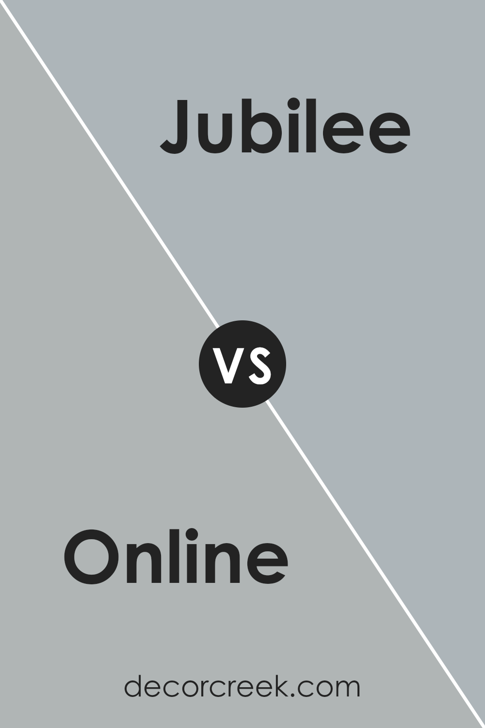
Online SW 7072 by Sherwin Williams vs Jubilee SW 6248 by Sherwin Williams
Online and Jubilee , both from Sherwin Williams, present interesting nuances in the realm of gray and blue shades. Online is a deeper, more pronounced gray, carrying an almost industrial yet sophisticated air. Its depth makes it versatile for spaces requiring a statement or a neutral backdrop with character.
On the other hand, Jubilee is a softer, lighter gray with subtle blue undertones, lending it a serene and calming effect ideal for creating a peaceful and inviting atmosphere.
While Online offers a bold, striking presence, Jubilee whispers tranquility, making it perfect for bedrooms and living areas where a gentle aesthetic is desired. The contrast between the two lies in their intensity and emotional impact; Online asserting itself with confidence and Jubilee offering a soothing embrace.
Both colors can beautifully complement each other, with Online grounding a space and Jubilee adding a touch of lightness and airiness.
You can see recommended paint color below:
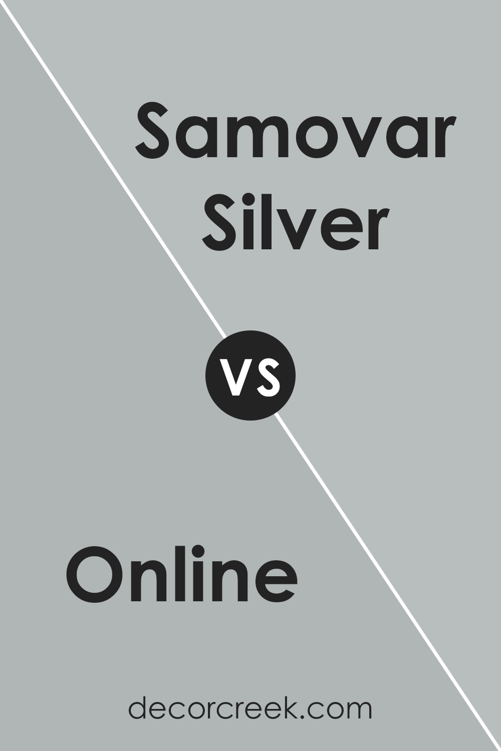
Online SW 7072 by Sherwin Williams vs Samovar Silver SW 6233 by Sherwin Williams
Online (SW 7072) and Samovar Silver (SW 6233) by Sherwin Williams are two elegant shades with distinct personalities. Online is a deep, captivating grey that exudes a sense of modern sophistication. Its richness provides a bold backdrop, offering depth and a strong foundation for any room. It has a cool undertone that makes it versatile in various lighting conditions, blending seamlessly with both vibrant and muted palettes.
In contrast, Samovar Silver is a lighter, more ethereal grey. It carries a subtle hint of blue, infusing spaces with a serene, calming aura. This color is excellent for creating a soft, inviting ambiance, ideal for bedrooms or bathrooms.
The lightness of Samovar Silver can make small spaces appear larger and more open, contrasting with Online’s ability to add drama and intimacy.
Together, these colors could complement each other beautifully in a space, with Online serving as a grounding force and Samovar Silver providing a breath of fresh air.
You can see recommended paint color below:
- SW 6233 Samovar Silver
Online SW 7072 by Sherwin Williams vs Morning Fog SW 6255 by Sherwin Williams
Online SW 7072 and Morning Fog SW 6255 , both by Sherwin Williams, present a compelling comparison within the cool color spectrum. Online is a deep, grayish-blue that evokes a sense of modern sophistication and depth. It’s a color that stands out with its boldness, making it an excellent choice for accent walls or statement pieces.
The depth of Online is versatile, adapting well to both contemporary and traditional spaces, providing a backdrop that is both striking and subtly complex.
In contrast, Morning Fog offers a lighter, misty gray with hints of blue, embodying a serene, calming atmosphere. This color is more subtle, providing a soothing backdrop that enlarges and lightens spaces.
Morning Fog is ideal for creating a tranquil environment, suitable for bedrooms and living areas where a peaceful ambiance is desired.
While Online carries a certain weight and dramatic flair, Morning Fog offers a gentle embrace, making the two colors cater to different emotional and aesthetic needs. Whether looking for the dramatic impact of Online or the soft tranquility of Morning Fog, both colors offer unique possibilities for enhancing interior spaces.
You can see recommended paint color below:
- SW 6255 Morning Fog
Online SW 7072 by Sherwin Williams vs Mineral Deposit SW 7652 by Sherwin Williams
Online (SW 7072) and Mineral Deposit (SW 7652) are two distinctive hues from Sherwin Williams, each presenting a unique aesthetic. Online is a deeper, more saturated color, veering towards a rich, gray undertone with a subtle hint of blue-green, making it versatile for spaces seeking intensity and depth without overwhelming darkness.
This shade strikes a balance, providing a sophisticated backdrop that is both commanding and adaptable to various decor styles.
In contrast, Mineral Deposit exhibits a lighter, more airy quality. This color is a muted blend that leans towards a soft, pale blue with gray undertones. It exudes tranquility and is ideal for creating a serene, calming environment.
Its lightness brings a sense of spaciousness, making it perfect for smaller rooms or spaces aiming for a relaxed, refreshing vibe.
Together, these colors illustrate the spectrum of cool tones Sherwin Williams offers, from the boldness and depth of Online to the light, soothing touch of Mineral Deposit, showcasing the versatility of gray and blue shades in home decor.
You can see recommended paint color below:
- SW 7652 Mineral Deposit
Online SW 7072 by Sherwin Williams vs Mineral SW 9637 by Sherwin Williams
Online (SW 7072) and Mineral (SW 9637) by Sherwin Williams are both sophisticated hues, yet they present distinct atmospheres in interior spaces. Online is a deep, rich gray with cool undertones that evokes a sense of modernity and chic elegance.
This color can dramatically transform a space, making it appear more grounded and defined. Its cool base makes it versatile for pairing with a wide range of decor styles, from contemporary to industrial.
Contrastingly, Mineral is a lighter, softer color that leans towards a natural, airy aesthetic. It embodies a sense of calm and serenity, making it ideal for creating a tranquil and inviting atmosphere.
Mineral’s subtle warmth allows it to seamlessly integrate into a variety of spaces, enhancing the feeling of light and openness.
While both colors share a connection through their base tones, Online offers a bolder, more striking effect, whereas Mineral provides a gentle, soothing impact. These characteristics make each color uniquely suited to different design objectives, from creating a statement with Online to fostering relaxation with Mineral.
You can see recommended paint color below:
Online SW 7072 by Sherwin Williams vs Colonial Revival Gray SW 2832 by Sherwin Williams
The main color, Online SW 7072 by Sherwin Williams, is a deep, nuanced gray that carries slightly cool undertones, projecting a modern and sleek ambiance. This shade is versatile, making it suitable for both contemporary and traditional spaces. It offers a strong statement, especially when applied in well-lit areas where its subtle blue undertones become more pronounced, providing a serene and sophisticated feel.
On the other hand, Colonial Revival Gray SW 2832 , is a lighter, warmer shade of gray with a more traditional feel. It has an innate elegance that echoes historical charm, making it ideal for spaces seeking a soft, classic touch.
Unlike Online, its warmth makes it more inviting, providing a cozy atmosphere that complements natural light and wooden accents beautifully.
Despite both being shades of gray, Online SW 7072 and Colonial Revival Gray SW 2832 stand apart in their individual appeal. Online aims for a bolder, more contemporary feel, while Colonial Revival Gray leans towards a timeless, comforting presence. Together, they showcase the versatility of gray, adapting seamlessly to different styles and moods.
You can see recommended paint color below:
- SW 2832 Colonial Revival Gray
Online SW 7072 by Sherwin Williams vs Stardew SW 9138 by Sherwin Williams
Online SW 7072 and Stardew SW 9138 , both Sherwin-Williams colors, offer distinct but complementary palettes for home interiors. Online is a deep, neutral gray with a slightly blue undertone, projecting a modern and sophisticated vibe.
It provides a strong foundation for decor, serving well in living spaces, bedrooms, and offices where a touch of formality and depth is desired.
Stardew, on the other hand, leans towards a softer, more muted hue that combines gray with subtle green undertones. This color evokes a serene, calming atmosphere, making it perfect for spaces intended for relaxation such as bathrooms and bedrooms.
While Online offers a bold statement and can anchor a room with its depth, Stardew brings a light, airy feel, enhancing the sense of space and tranquility.
Both colors reflect elegance and are versatile in styling, yet they cater to different moods and thematic preferences within a home.
You can see recommended paint color below:
Online SW 7072 by Sherwin Williams vs Monorail Silver SW 7663 by Sherwin Williams
Online SW 7072 and Monorail Silver SW 7663 , both by Sherwin Williams, present unique shades that cater to different aesthetic preferences. Online SW 7072 is a deep, intriguing grey with a subtle hint of blue, imbuing spaces with a sophisticated, contemporary flair.
Its richness offers a commanding presence, making it an excellent choice for feature walls or accents that aim to anchor a room’s decor with a touch of modern elegance.
In contrast, Monorail Silver SW 7663 leans towards a lighter, more neutral grey. It has an almost metallic finesse, reminiscent of its namesake, providing a sleek and versatile backdrop for various interior styles.
Monorail Silver’s understated hue is exceptionally adaptable, capable of complementing bolder colors or standing alone for a minimalist chic look.
While both colors share a grey base, Online’s deeper, cooler tone offers a striking contrast to Monorail Silver’s softer, warmer appeal. This difference allows them to serve distinct purposes in design paradigms, with Online leaning towards statement and depth, and Monorail Silver towards serenity and space-opening versatility.
You can see recommended paint color below:
- SW 7663 Monorail Silver
Online SW 7072 by Sherwin Williams vs Magnetic Gray SW 7058 by Sherwin Williams
Online (SW 7072) and Magnetic Gray (SW 7058) by Sherwin Williams are both sophisticated hues residing in the gray family, yet they convey distinct vibes and visual impacts. Online presents itself as a cooler, more neutral gray. It has a modern edge, making it ideal for contemporary spaces.
It can serve as a calming backdrop in a variety of settings, providing a minimalist yet striking aesthetic.
On the other hand, Magnetic Gray tends to lean slightly warmer compared to Online. This quality gives it a more inviting and cozy feel, making it well-suited for living areas or bedrooms where warmth and comfort are desired.
Despite its warmth, Magnetic Gray retains a level of sophistication that allows it to be versatile in both casual and formal settings.
In summary, while both colors share a base in the gray spectrum, Online offers a cooler, more austere look ideal for modern designs, whereas Magnetic Gray brings a warmer, more inviting tone that can enhance the coziness of a room.
You can see recommended paint color below:
- SW 7058 Magnetic Gray
Online SW 7072 by Sherwin Williams vs Uncertain Gray SW 6234 by Sherwin Williams
Online and Uncertain Gray by Sherwin Williams are two distinct shades that evoke different moods and aesthetics in interior spaces. Online is a deep, rich gray that carries an undercurrent of blue, giving it a cooler, more vibrant feel. This color can bring a sense of sophistication and depth to a room, making it an excellent choice for modern living spaces or offices seeking a sleek, contemporary look.
Uncertain Gray, on the other hand, is a lighter, more muted gray with subtle green undertones. This color offers a softer, more relaxed vibe, making it perfect for creating a serene and inviting atmosphere in spaces like bedrooms or bathrooms.
Its versatility allows it to blend seamlessly with a variety of decor styles, from coastal to country chic.
When compared, Online’s darker, cool-blue base provides a striking contrast to Uncertain Gray’s lighter, green-tinged hue. Online is bolder and more pronounced, while Uncertain Gray is understated and adaptable, offering a lighter, airier feel.
Each color has its unique appeal, making the choice between them dependent on the desired mood and style of the space.
You can see recommended paint color below:
- SW 6234 Uncertain Gray
Conclusion
After investigating the subtle charm and versatility of Sherwin Williams’ SW 7072, it is unmistakable that this color brings a serene, elegant presence to any space it graces. Its ability to harmonize with various decor styles and settings, from contemporary to classic, makes it a truly universal choice for designers and homeowners alike.
The depth and warmth it adds, paired with its adaptability, underscore its popularity and functionality in creating inviting atmospheres.
SW 7072’s reputation for enhancing the aesthetic appeal of a room while maintaining a sense of calm and cohesion highlights its exceptional utility in interior design. Whether it is applied as a primary color scheme or an accent, its elegance and understated sophistication shine through.
This color embodies a timeless appeal that transcends fleeting design trends, ensuring its relevance and demand for years to come.
Ever wished paint sampling was as easy as sticking a sticker? Guess what? Now it is! Discover Samplize's unique Peel & Stick samples.
Get paint samples