If you’re considering repainting a room in your home or maybe just a piece of furniture, you might be looking at Sherwin Williams colors and particularly SW 7671 On the Rocks. It’s important to know what this shade is like and how it might change your room.
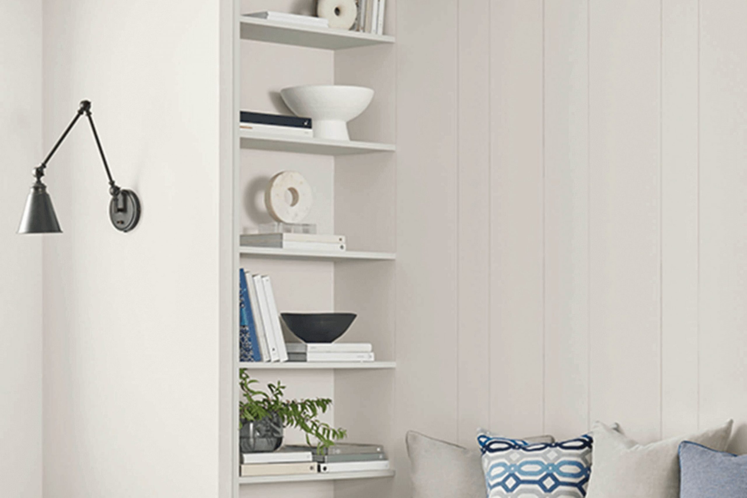
On the Rocks is a subtle, neutral gray that offers a clean and modern look. It tends to blend well in various settings, making it a flexible choice whether you’re styling a busy family kitchen or aiming for a minimalist bedroom theme.
When choosing a paint color, lighting is crucial. On the Rocks can appear lighter or darker depending on the light exposure in the room. In a well-lit room, it has a lighter, almost uplifting quality, whereas in rooms with less light, it can present a more solid and grounding appearance.
Furthermore, think about the colors that will surround On the Rocks. This gray works harmoniously with many palettes, but it’s helpful to consider your existing furnishings and decor or any that you plan to add. Sampling this color in your intended room is a wise step to ensure it meets your expectations in matching your design vision.
Is On the Rocks SW 7671 Right for My Home?
As an interior design enthusiast, I’ve come across a delightful shade called On the Rocks by Sherwin Williams. It’s a gentle gray that strikes a perfect balance—not too dark and not too light. What I really appreciate about this color is its subtle neutrality; it blends beautifully with almost any color scheme or decor style.
From my experience, On the Rocks works wonderfully in modern and minimalist interiors. It creates a clean and uncluttered look, which is often the goal in these styles. For those who favor a more traditional or transitional atmosphere, this shade offers a smooth backdrop, complementing classic wood furniture and richer textures.
When it comes to materials, On the Rocks pairs exceptionally well with natural elements. I love combining it with smooth white marble or warm wood tones, which enhance its cool undertones. Metal accents in silver or brushed nickel also work well, giving rooms a fresh and cohesive aesthetic.
In terms of fabrics, a tactile contrast works wonders—think soft wool throws or plush velvet pillows against this calm, collected backdrop. All these combinations help create a welcoming yet stylish room that feels put together yet effortlessly chic.
So, whether you’re revamping a room or just giving it a little upgrade, consider On the Rocks a flexible option to create soothing interiors with a stylish flair.

decorcreek.com
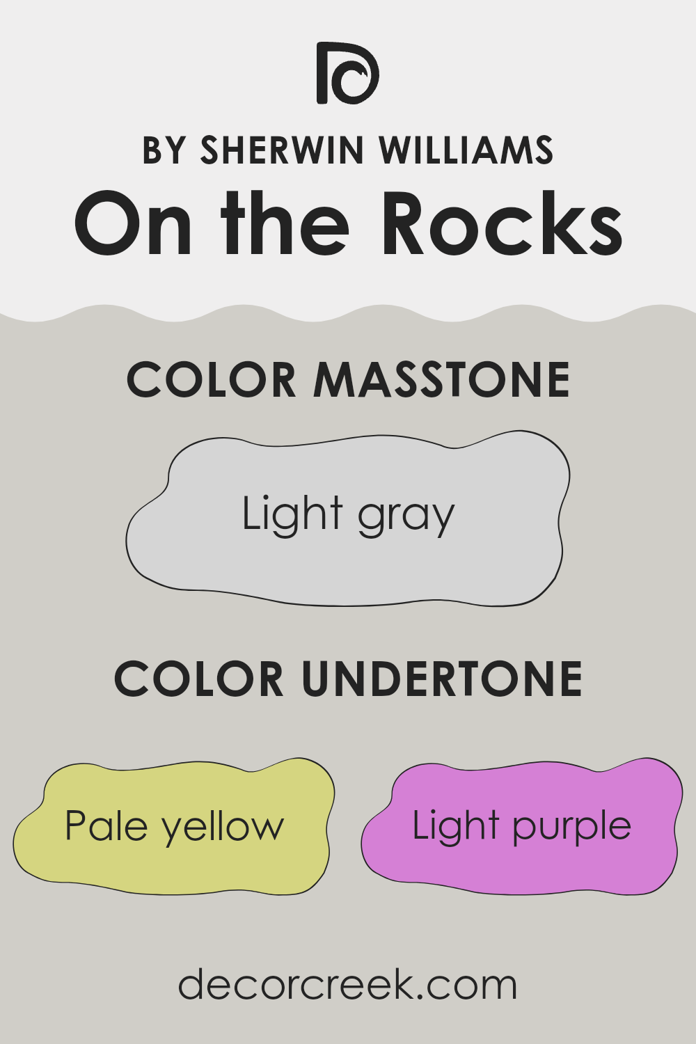
What are the right undertones of On the Rocks SW 7671 ?
On the Rocks by Sherwin Williams is a flexible paint color that subtly shifts its appearance depending on the lighting and surrounding colors. Its undertones include pale yellow, light purple, light blue, pale pink, mint, lilac, and grey. These undertones play a significant role in how we perceive the color.
In general, undertones are background hues that emerge under different lighting conditions or when a color is next to other colors. They can make a color appear cooler or warmer and can greatly influence the ambiance of a room.
With On the Rocks, these varied undertones can cause the color to change throughout the day. Under natural light, the light blue or mint might become more noticeable, giving a fresh and calming feel to the room. In artificial light, the pale yellow or light purple might stand out, adding a soft warmth to the room.
When used on interior walls, the interaction of On the Rocks with its undertones can make it a flexible choice for many styles and rooms. It’s not just a simple grey; its complexity allows it to adapt to different decor and themes.
Whether complementing a modern, minimal look or balancing a brightly colored room, the subtle shifts in this paint can enhance and adapt to various interior settings. This ability to subtly alter its presence makes On the Rocks a popular choice for those who want a neutral yet dynamically adaptable color.
decorcreek.com
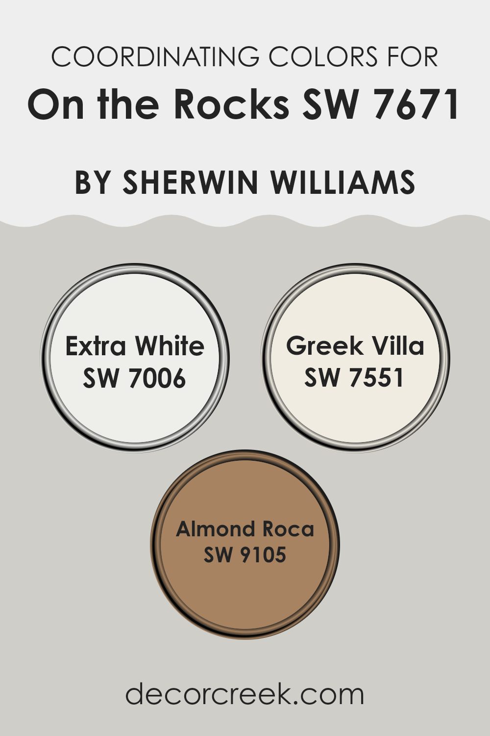
Best Coordinating Colors to use with On the Rocks SW 7671 by Sherwin Williams this year.
Coordinating colors work together to create a harmonious and aesthetically pleasing palette in any room, complementing each other in a way that enhances the overall look without feeling too much against the main color.
For instance, when using a nuanced shade like On the Rocks by Sherwin Williams, which is a subtle and flexible gray, certain coordinating colors can refine the balance and add to the visual appeal. These coordinating shades harmonize different aspects of the décor, pulling in elements of lightness or providing a gentle contrast to create a well-rounded palette.
A great coordinating color is Extra White (SW 7006), a clean and bright white that brings out the cooler undertones of a soft gray, making any room seem more spacious and open. Another good companion is Greek Villa (SW 7551), which offers a slightly warmer, off-white tone that softens the environment, providing a subtle, cozy backdrop that complements the stony neutrality of gray shades.
Lastly, Almond Roca (SW 9105) introduces a gentle, earthy brown that provides a richer contrast without clashing, ensuring the mix feels grounded and welcoming, perfect for areas where you want a touch of warmth balanced with cool notes from the primary color. By coordinating these shades carefully, you can enhance the ambience in any room, providing visual continuity and a touch of elegance.
You can see recommended paint colors below:
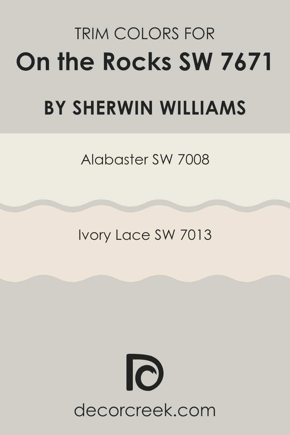
Trendy Trim Colors of On the Rocks SW 7671 by Sherwin Williams to use this year.
Trim colors are specific shades used to highlight or enhance the architectural features of a room, including door frames, window casings, and baseboards. Choosing the right trim color can provide a subtle contrast that beautifully frames a room, enhancing the overall look without feeling too much against the primary wall color.
For a crisp look with a neutral-toned wall paint like On the Rocks by Sherwin Williams, trim colors like Alabaster and Ivory Lace are excellent choices. These lighter trim shades help define the room gently while complementing the understated style of the wall color.
Alabaster SW 7008 is a soft, warm white with a creamy texture that provides a gentle contrast against more subdued wall colors, making it perfect for creating a cozy and inviting atmosphere. Ivory Lace SW 7013, on the other hand, leans towards a slightly off-white hue with subtle hints of yellow, offering a warm and welcoming feel that pairs beautifully with cooler tones like On the Rocks. Both colors add a fresh and crisp finish to the edges of a room, ensuring the walls are neatly framed and visually appealing, increasing the room’s overall charm and cohesiveness.
You can see recommended paint colors below:
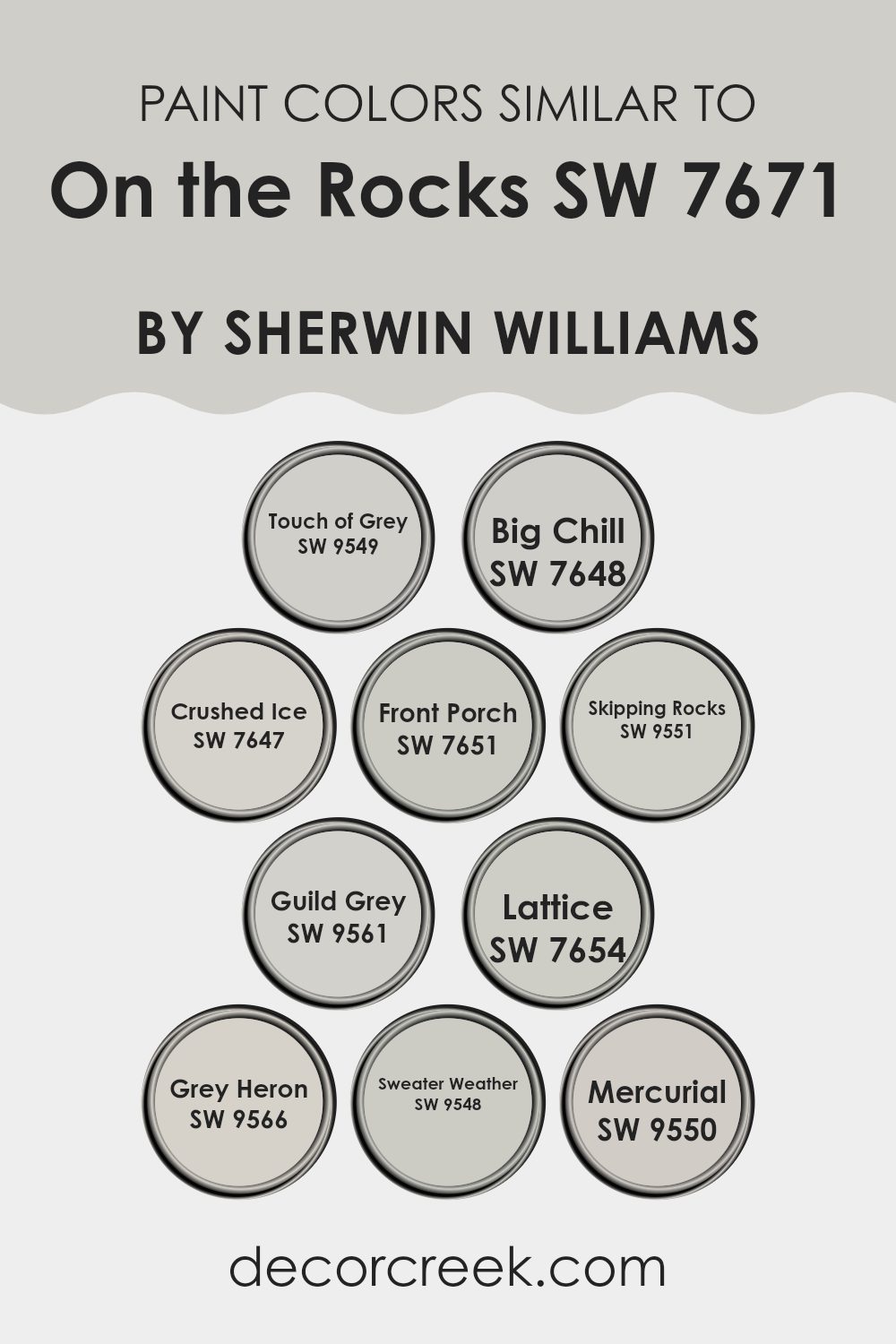
Evergreen Colors Similar to On the Rocks SW 7671 by Sherwin Williams
Similar colors around a specific shade, like On the Rocks by Sherwin Williams, are crucial in design for creating a cohesive and harmonious look. By using tones like Touch of Grey or Big Chill, decorators achieve a subtle blend in their room, avoiding harsh contrasts that might disrupt the visual flow.
Each of these shades, while unique, shares a common foundation which makes them naturally compatible when used together in interiors. This similarity allows for seamless transitions between rooms, or within single areas that might feature coordinated accessories, wall colors, and furniture.
For example, Crushed Ice is a slightly lighter grey that brings a fresh, airy feel to rooms, making it a great choice for smaller rooms or areas without much natural light. Nearby on the spectrum, Front Porch steps in with a hint of blue, suggesting a crisp morning sky, ideal for creating a calm, inviting entryway.
Skipping Rocks and Guild Grey both lean towards warmer tones, offering a cozy vibe, reminiscent of smooth pebbles and dense fog. Lattice, Grey Heron, and Sweater Weather introduce a slatey style that adds depth, making them perfect for accent walls or furniture pieces.
Lastly, Mercurial, with just a touch of silver, works beautifully for adding a subtle sparkle, an excellent choice for enhancing textures such as upholstery or draperies. These shades work together effortlessly, providing a flexible palette for a variety of design ideas without feeling too strong for the senses.
You can see recommended paint colors below:
- SW 9549 Touch of Grey
- SW 7648 Big Chill
- SW 7647 Crushed Ice
- SW 7651 Front Porch
- SW 9551 Skipping Rocks
- SW 9561 Guild Grey
- SW 7654 Lattice
- SW 9566 Grey Heron
- SW 9548 Sweater Weather
- SW 9550 Mercurial
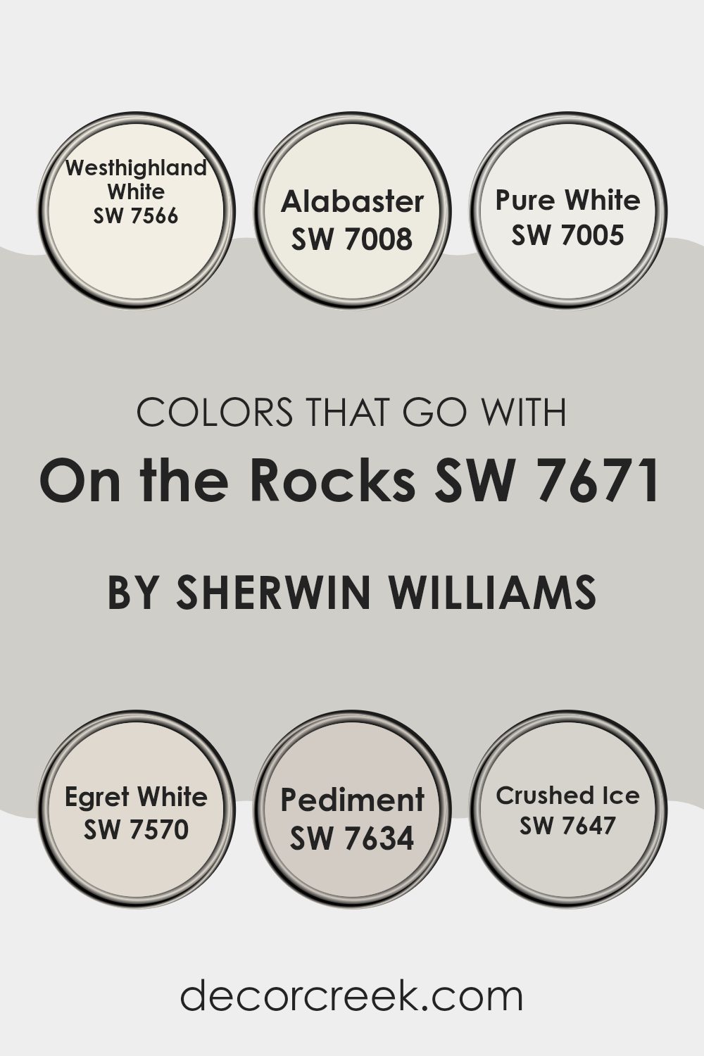
Colors that Go With On the Rocks SW 7671 by Sherwin Williams
Colors that complement On the Rocks SW 7671 by Sherwin Williams play a crucial role in improving the aesthetic appeal and coherence of a room. Since On the Rocks is a subtle, gray-toned paint, pairing it with the right colors can either create a soft, unified palette or introduce contrasting elements that add visual interest.
For instance, pairing it with lighter shades like Westhighland White or Pure White can brighten a room and give it a fresh, clean look. These whites act as a perfect backdrop, making rooms appear larger and more open.
On the other hand, Alabaster, with its slight creaminess, adds a hint of warmth to the cool tones of On the Rocks, offering a gentle contrast that’s pleasing to the eye. Egret White has a touch of gray, which complements the base tones of On the Rocks, ensuring that the room feels connected.
For those preferring a bit more depth, Pediment and Crushed Ice are excellent choices. Pediment provides a deeper gray that can highlight the lighter tones of the walls without feeling too much in the room, while Crushed Ice offers a slight variance in gray that brings subtle texture and layering in the design. Together, these colors work harmoniously to create an inviting and well-balanced atmosphere.
You can see recommended paint colors below:
- SW 7566 Westhighland White
- SW 7008 Alabaster
- SW 7005 Pure White
- SW 7570 Egret White
- SW 7634 Pediment
- SW 7647 Crushed Ice
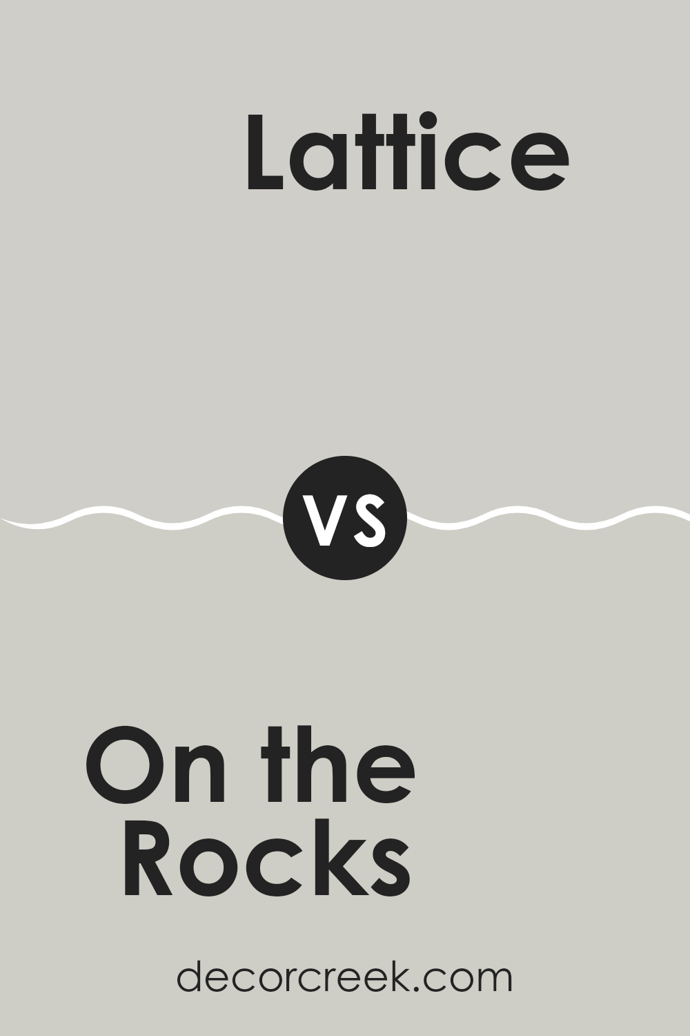
On the Rocks SW 7671 by Sherwin Williams vs Lattice SW 7654 by Sherwin Williams
On the Rocks is a soft gray shade with a hint of warm undertones, creating a comfortable and inviting feel in any room. It’s a flexible color that can make small areas appear more open.
On the other hand, Lattice is a slightly darker gray that leans towards a cooler, more neutral palette. This color provides a subtle contrast without feeling too much in the room. Both On the Rocks and Lattice work well in various home settings, from modern to traditional.
They pair nicely with brighter colors for a vibrant look or can be matched with other neutrals for a toned-down style. While On the Rocks gives off a warm and cozy vibe, Lattice offers a more restrained and straightforward appeal, making it ideal for those who prefer their rooms to have a hint of crisp modernity.
You can see recommended paint color below:
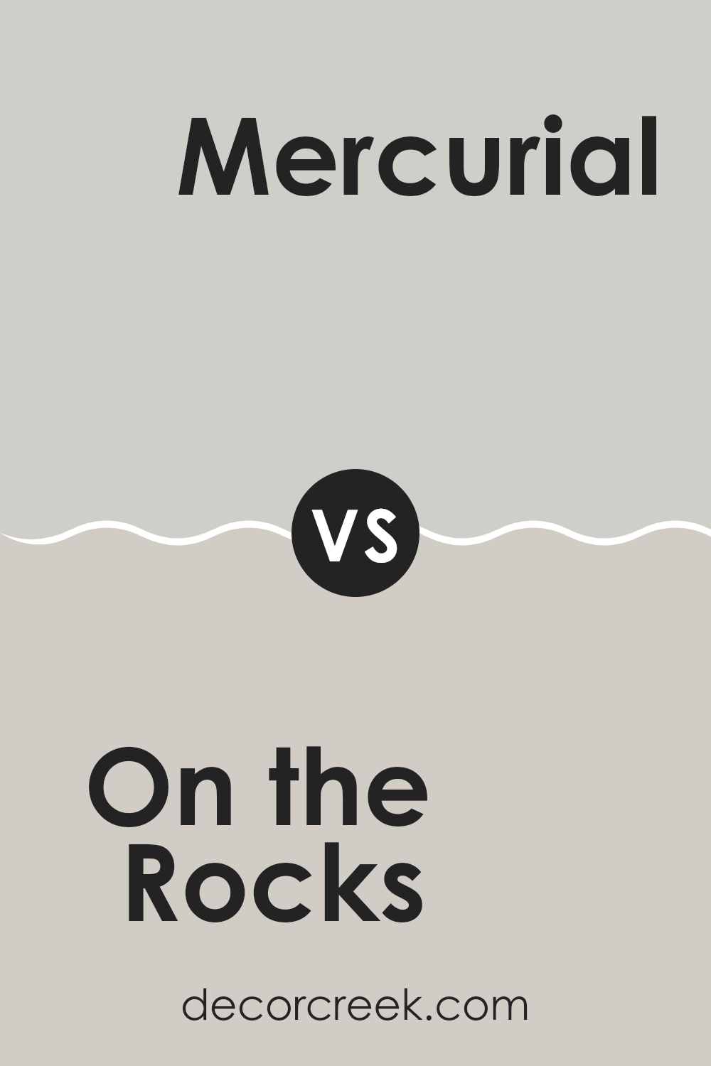
On the Rocks SW 7671 by Sherwin Williams vs Mercurial SW 9550 by Sherwin Williams
The main color, On the Rocks, is a gentle, neutral grey with soft qualities that make it a flexible choice for any room. It has a very subtle warmth to it that keeps it from feeling cold, making it great for both modern and cozy settings.
In contrast, Mercurial, the second color, is significantly darker and leans towards a bold, slate grey. This hue has a deep intensity that gives a strong, pronounced feel to walls or accents in interior design, making it ideal for creating striking contrasts, especially in areas where a dramatic effect is desired.
While On the Rocks provides a calm and light background, Mercurial offers a more dramatic and moody atmosphere. Both colors can work beautifully in different contexts or even together, with On the Rocks brightening areas and Mercurial serving as an excellent feature or focus color.
You can see recommended paint color below:
On the Rocks SW 7671 by Sherwin Williams vs Crushed Ice SW 7647 by Sherwin Williams
“On the Rocks” and “Crushed Ice” by Sherwin Williams are two neutral shades that have subtle differences. “On the Rocks” is a slightly warmer grey, giving it a cozy feel suitable for areas where you want a touch of warmth without feeling too much in the room.
It fits well in living areas or bedrooms where you want a calming backdrop. On the other hand, “Crushed Ice” is cooler and lighter, offering a fresher look. This color is excellent for smaller areas or rooms with less natural light, as it can help make the area appear brighter and more open.
Both colors are flexible and can work well with various decor styles and other colors, but the choice between warm or cool tones can impact the mood and feel of the room.
You can see recommended paint color below:
On the Rocks SW 7671 by Sherwin Williams vs Grey Heron SW 9566 by Sherwin Williams
On the Rocks and Grey Heron are both gray colors from Sherwin Williams, but they have noticeable differences in tone and depth. On the Rocks is a lighter gray that offers a subtle, soft backdrop in a room. It’s a neutral shade that pairs well with almost any color, making it ideal for areas you want to keep bright and open.
On the other hand, Grey Heron is a deeper, more pronounced gray. This color has a stronger presence and can make more of a statement in a decor scheme. It works well in areas where you want to add some drama or anchor the room with a bolder shade.
Both colors provide a modern and clean look, but their impact is quite different due to their varying intensities. On the Rocks is better for creating a gentle, airy feel, while Grey Heron is excellent for a bit more visual weight and contrast.
You can see recommended paint color below:
On the Rocks SW 7671 by Sherwin Williams vs Guild Grey SW 9561 by Sherwin Williams
On the Rocks and Guild Grey are two distinct colors by Sherwin Williams, each bringing its own unique vibe to a room. On the Rocks is a lighter, softer gray that has a gentle, almost neutral tone. It’s flexible and commonly used in areas where a calming yet fresh look is desired. This makes it a great choice for living rooms and kitchens where you want a clean and open feel.
Guild Grey, on the other hand, is a deeper gray with a slightly more pronounced presence. It has a stronger character and can give a room a more grounded and defined appearance. This color is excellent for accent walls, furniture, or cabinets where you want to add a bit of depth to your decor.
Both colors work well in modern designs but serve different purposes depending on the mood and style you aim to achieve. While On the Rocks offers a subtle backdrop, Guild Grey steps forward a bit more, making a bolder statement.
You can see recommended paint color below:
On the Rocks SW 7671 by Sherwin Williams vs Sweater Weather SW 9548 by Sherwin Williams
On the Rocks by Sherwin Williams is a light grey shade that has a fresh and airy feel, making it a perfect choice for creating a bright and open atmosphere in any room. Its subtle tones can adapt well in various lighting, adding a gentle neutrality to rooms without feeling too much with color.
In contrast, Sweater Weather by Sherwin Williams is a darker grey that gives a cozy and comforting feel, ideal for creating a snug and inviting room. This color works well in areas like living rooms or bedrooms where you want to promote a sense of warmth and comfort.
Both colors offer their unique charm, with On the Rocks bringing a lightness that can make small areas seem larger, and Sweater Weather offering a warmth that’s welcoming. Each can be paired effectively with a range of décor styles, but the choice between them depends on the mood and function you want to create in your room.
You can see recommended paint color below:

On the Rocks SW 7671 by Sherwin Williams vs Front Porch SW 7651 by Sherwin Williams
On the Rocks and Front Porch by Sherwin Williams are two neutral shades that can subtly change the mood of a room. On the Rocks is a light grey with a slight warm undertone, making it welcoming and bright. This color works well in areas that need a soft touch without feeling too stark.
Front Porch, on the other hand, is slightly cooler and has a hint of blue, giving it a fresh, airy vibe. This makes it ideal for creating a calm, relaxed environment. It’s especially good in areas where you want to promote a sense of cleanliness and order.
Both colors are quite flexible but serve different aesthetic purposes. On the Rocks tends to blend smoothly with warmer decor elements, whereas Front Porch pairs nicely with more minimalist, modern styles because of its cooler undertones. Depending on the lighting and accompanying decor, each color can enhance your room in its unique way.
You can see recommended paint color below:
On the Rocks SW 7671 by Sherwin Williams vs Big Chill SW 7648 by Sherwin Williams
“On the Rocks” and “Big Chill” are two gray shades from Sherwin Williams. Each creates a calm environment but has different undertones influencing their style. “On the Rocks” is a light gray with slightly warm undertones, making it a good choice for rooms that need a soft, neutral backdrop.
It pairs well with various decor styles, helping to keep areas feeling open and airy. In contrast, “Big Chill” is cooler with subtle blue undertones. This color tends to give areas a fresher, crisper look.
It’s excellent for modern settings or bathrooms and kitchens, providing a cleaner and more straightforward appearance. Depending on your room’s natural light and the furniture colors, choosing between these two can really affect the mood and visual temperature of your room.
You can see recommended paint color below:

On the Rocks SW 7671 by Sherwin Williams vs Touch of Grey SW 9549 by Sherwin Williams
On the Rocks by Sherwin Williams is a light gray paint that leans towards a soft, neutral tone. It can brighten up a room while maintaining a subtle, soothing presence. It works well in many areas, making it flexible for decorating.
Touch of Grey by Sherwin Williams is another light gray shade but has a slightly cooler undertone compared to On the Rocks. This quality makes Touch of Grey feel more modern and fresh. It’s perfect for areas that get a lot of light, as it helps maintain a crisp, airy feel.
Both colors are excellent choices for those seeking a clean and understated look, but their undertones make them suitable for different types of decor and lighting. On the Rocks, with its warmer hints, complements wood finishes and soft textiles nicely, making it ideal for living rooms or bedrooms. Touch of Grey, being cooler, is great for a more contemporary room, like a modern kitchen or bathroom, where its crispness can really shine.
You can see recommended paint color below:
On the Rocks SW 7671 by Sherwin Williams vs Skipping Rocks SW 9551 by Sherwin Williams
On the Rocks and Skipping Rocks by Sherwin Williams are both nuanced, neutral tones, but they differ subtly in mood and color depth. On the Rocks is a lighter gray with a slightly warm undertone, making it a flexible choice for brightening rooms without feeling too stark. It’s perfect for a modern look that still wants to keep a cozy vibe.
On the other hand, Skipping Rocks is a deeper, more mid-toned gray. This color carries a bit more weight, making it ideal for creating a cozy, inviting atmosphere in areas like living rooms or bedrooms, where a sense of calm is often desirable.
The choice between the two colors depends on the desired impact and room usage—On the Rocks for a lighter, airier feel, and Skipping Rocks for a more anchored, cozy ambiance. Both can be paired with a wide range of decor styles and colors, adding to their flexibility in home design.
You can see recommended paint color below:
Writing about ‘SW 7671 On the Rocks’ by Sherwin Williams has truly opened my eyes to how a simple paint color can make a big difference in a room. This color is a very light gray that somehow manages to add both warmth and brightness to any area it’s used in. It’s perfect for anyone looking to freshen up their home without making things too bold or dramatic.
Throughout this piece, I’ve learned that ‘On the Rocks’ isn’t just for walls. It works really well on cabinets, ceilings, and even furniture, making it a really handy color to have in your decorating toolbox. Its light shade helps other colors in the room stand out more, creating a lovely balance that feels just right.
Whether you’re painting your kitchen, bathroom, or even a small corner that needs a new look, ‘SW 7671 On the Rocks’ is a great choice. It’s like a quiet helper that makes everything else look better without stealing the spotlight. For anyone trying to brighten up their home in a soft and simple way, this color could be the perfect solution.
Writing about this has made me appreciate how powerful a good paint choice can be in turning a house into a home.

Ever wished paint sampling was as easy as sticking a sticker? Guess what? Now it is! Discover Samplize's unique Peel & Stick samples.
Get paint samples

