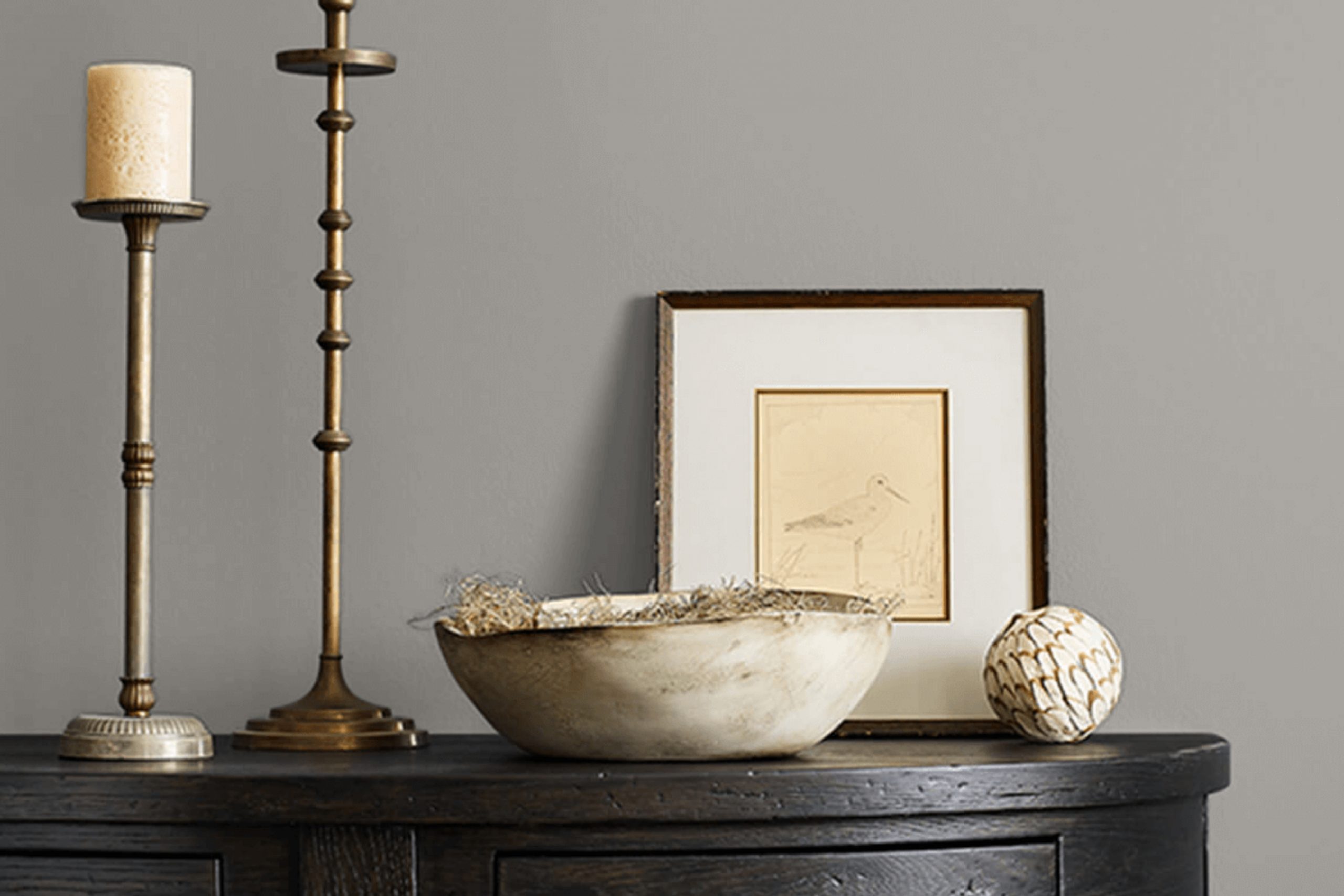
When picking the right paint for a room makeover, I often rely on shades that bring both versatility and subtlety to a space. That’s why I’m drawn to SW 7673 Pewter Cast by Sherwin Williams. This particular shade is a medium gray that leans slightly towards the cool side. The color’s understated elegance provides a solid foundation for any room, serving as a versatile backdrop that can complement various decor styles and color schemes.
Pewter Cast is particularly helpful when I want to achieve a modern, yet cozy atmosphere. It works beautifully with both bright colors and pastel tones, making it a great choice for living areas, bedrooms, and even offices. The durability and excellent coverage of Sherwin Williams paints mean that introducing this shade into your home is not just an aesthetic choice but a practical one too.
As I continue to use Pewter Cast in various projects, I find that its ability to balance other elements in the room constantly impresses me. Whether it’s used on all walls for a subtle, sophisticated look, or just on an accent wall to highlight a particular area, Pewter Cast proves to be both functional and stylish.
So if you’re looking for a gray that provides a clean, neutral base while still adding character, this might be the perfect pick for you.
What Color Is Pewter Cast SW 7673 by Sherwin Williams?
Pewter Cast is a versatile gray shade that straddles the line between cooler and warmer tones, offering a neutral backdrop that’s suitable for various interior designs. Its understated elegance complements both contemporary minimalism and classic styling. This color works exceptionally well in living rooms, bedrooms, and kitchens due to its inviting yet unobtrusive nature.
In terms of interior styles, Pewter Cast fits seamlessly into modern farmhouse aesthetics, where it can be paired with rustic wood elements and soft white accents to create a cozy yet polished look. It also aligns well with industrial themes when combined with exposed brick and metal finishes, adding a chic, urban edge to the space.
Material-wise, Pewter Cast pairs beautifully with natural textures. Think along the lines of wooden furniture, linen fabrics, and woven baskets, which help to warm up its gray hue. It also looks striking against leather, enhancing the richness of the material while maintaining an overall muted palette.
When it comes to metals, Pewter Cast coordinates well with both brushed nickel and matte black, offering a clean and modern finish. Whether used as a primary color scheme or as an accent, this color maintains balance and provides a steady foundation for layering various design elements.

Is Pewter Cast SW 7673 by Sherwin Williams Warm or Cool color?
Pewter Cast by Sherwin Williams is a unique gray shade that has a subtle blue undertone. This color is versatile, making it easy to pair with various decor styles, from modern to traditional. It works well in spaces that need a neutral backdrop that still offers a hint of character. The cool tone of Pewter Cast can help to create a calm atmosphere in a home, ideal for rooms like bedrooms or offices where a peaceful environment is beneficial.
Because it doesn’t lean too heavily towards dark or light on the color spectrum, Pewter Cast is great for small spaces as it can make them appear larger and more open. It’s also an excellent choice for larger areas, as it can help unify different spaces without feeling too overwhelming.
Pewter Cast really shines when used with complementary colors such as soft whites or even bold hues like navy, which can create an appealing contrast. Whether on walls, cabinets, or as an accent color, it manages to be both practical and stylish, making it a popular choice for those looking to freshen up their home.
Undertones of Pewter Cast SW 7673 by Sherwin Williams
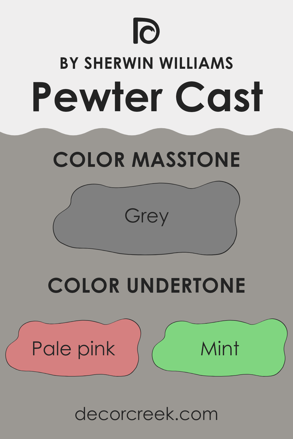
Pewter Cast is a versatile gray paint color from the popular paint brand Sherwin Williams. This color is unique because it has a range of subtle undertones that can influence how it looks in different lighting conditions and environments. Understanding undertones can help you predict how a color might appear once it’s on your walls. It’s not just about the color in the can; it’s about how light and surrounding colors impact the final look.
The undertones in Pewter Cast include light gray, which gives it a clean and neutral base. However, there are also hints of other colors such as light blue and olive, which can bring a cooler or slightly earthy feel to the space, depending on the lighting. In rooms with lots of natural light, the blue and gray tones might become more noticeable, giving a calm, fresh look.
In artificial light, the olive might become more pronounced, adding warmth.
When using Pewter Cast on interior walls, these undertones play a crucial role. For instance, in a room with green or blue furnishings, the corresponding undertones in the paint can complement these elements, making the room feel more cohesive.
However, if the room has a lot of orange or red, the cooler undertones might clash a bit. This effect means Pewter Cast is excellent for spaces where you want a balance of warm and cool tones, offering a harmonious backdrop to a variety of decor styles and colors.
In summary, the mixture of undertones in Pewter Cast makes it a flexible choice for many interior spaces, able to adapt subtly to different settings and styles.
It’s a great option if you’re looking for a gray that offers a bit more complexity and interaction with your home’s natural and artificial lighting.
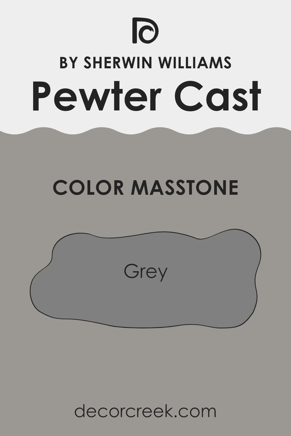
What is the Masstone of the Pewter Cast SW 7673 by Sherwin Williams?
Pewter Cast SW 7673 by Sherwin Williams has a strong grey masstone, resembling the color code #808080. This particular shade of grey is very versatile and blends well in a variety of home environments. It provides a solid, neutral background that pairs beautifully with both bold and subtle hues. This means you can easily match it with bright colors for a lively vibe or softer tones for a more understated look.
Because of its neutral base, Pewter Cast can help to unify diverse decor elements, making the room feel more cohesive. It’s ideal in spaces where you want a color that doesn’t dominate but rather supports a balanced, harmonious look.
Think of it as a sort of canvas, ready to work well with whatever furniture, artworks, or fabric colors you choose to highlight. This makes it a reliable choice for common areas, bedrooms, or spaces where you want lasting appeal without frequent repainting.
How Does Lighting Affect Pewter Cast SW 7673 by Sherwin Williams?
Lighting plays a crucial role in how colors are perceived in different environments. Depending on the type of light—whether natural or artificial—the same paint color can appear quite different. Pewter Cast is a neutral shade that can shift its appearance based on the lighting conditions.
In artificial light, such as that from incandescent bulbs, this color tends to look warmer, bringing out a cozy and inviting feel.
Fluorescent lighting, which is cooler, might make it appear slightly grayer and more subdued, losing some of its warmth.
In natural light, the effect on Pewter Cast varies throughout the day and depends on the direction of the room’s windows.
North-facing rooms typically don’t get a lot of direct sunlight, which can make the color appear consistent but slightly darker and cooler throughout the day. This might give a calm, understated vibe to the room.
South-facing rooms, however, receive a substantial amount of sunlight, which can make the color lighter and warmer, especially during the middle of the day when the sunlight is strongest. This can make the room feel brighter and more airy.
In east-facing rooms, Pewter Cast will be illuminated with warm sunlight in the morning, making the color appear softer and slightly warmer in the morning light. As the day progresses, the natural light diminishes, returning the color closer to its original neutral state by the afternoon.
West-facing rooms experience the opposite effect. The color will start cooler in the mornings and become warmer and more vibrant in the evenings as the sunset light fills the room. This can create a soothing environment towards the end of the day.
Understanding these dynamics can help in making informed decisions about room colors based on their orientation and the kind of light they receive most.
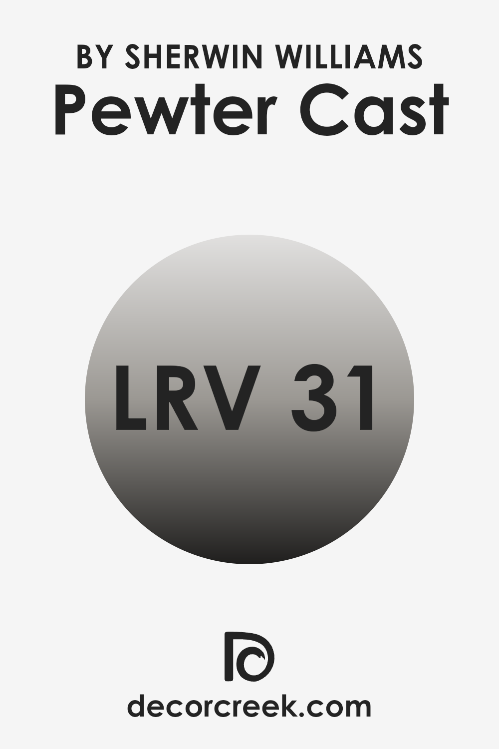
What is the LRV of Pewter Cast SW 7673 by Sherwin Williams?
LRV, or Light Reflectance Value, is a measure used to describe the percentage of light a paint color reflects when it is applied to a wall. It helps you understand how light or dark a color will look once it’s on your surface.
Essentially, LRV ranges on a scale where a higher number means the color reflects more light and will appear lighter, while a lower number means the color reflects less light and will look darker. This metric is crucial when choosing paint colors, as it influences how a room feels – a higher LRV can make a space feel airier and more open, while a lower LRV can make it feel more enclosed and cozy.
Considering Pewter Cast, with an LRV of about 31, this color falls into the darker spectrum. It won’t reflect a lot of light, influencing the atmosphere of the room by potentially making it feel smaller or more intimate.
This can be particularly effective in spaces where a sense of warmth or closeness is desired. However, if the room has limited natural light, using a color with such an LRV might make the space feel even darker. It’s important for homeowners to consider the natural light available in their room and their aesthetic goals when selecting a color like this for their walls.
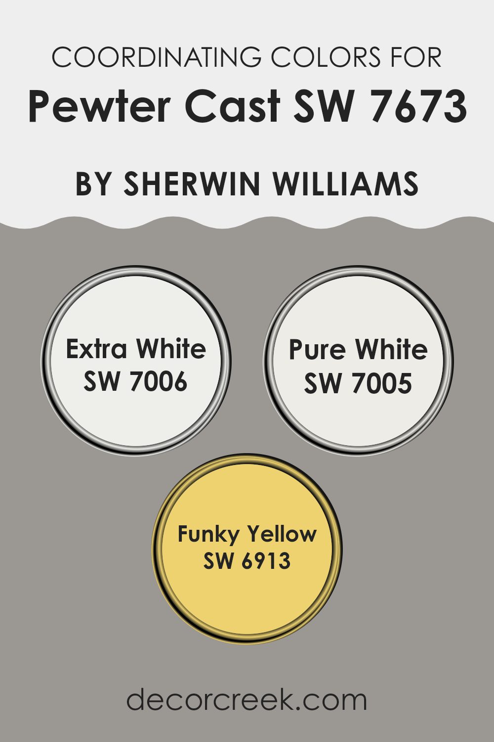
Coordinating Colors of Pewter Cast SW 7673 by Sherwin Williams
Coordinating colors are those that complement each other and work well together in a design, enhancing the overall aesthetic without overpowering the main hue. For instance, Pewter Cast by Sherwin Williams is a versatile gray shade that pairs beautifully with a variety of coordinating colors to create a harmonious look. The selection of coordinating colors often involves choosing shades that either contrast with or complement the main color, enhancing the room’s design by adding depth and interest.
One excellent coordinating color for Pewter Cast is Extra White (SW 7006), a clean and bright white that brings a crisp freshness to the gray tones of Pewter Cast. It’s perfect for trim, ceilings, or areas where you want to add a burst of lightness, giving a neat, finished look to any space.
Another great coordinating shade is Pure White (SW 7005), which offers a slightly softer take on a white tone, providing a smooth transition that complements the coolness of the gray without creating a stark contrast. For those looking to add a lively pop of color, Funky Yellow (SW 6913) offers a vibrant, cheerful yellow that injects energy and contrast into spaces featuring Pewter Cast, ensuring a fun and appealing color palette.
You can see recommended paint colors below:
- SW 7006 Extra White
- SW 7005 Pure White
- SW 6913 Funky Yellow
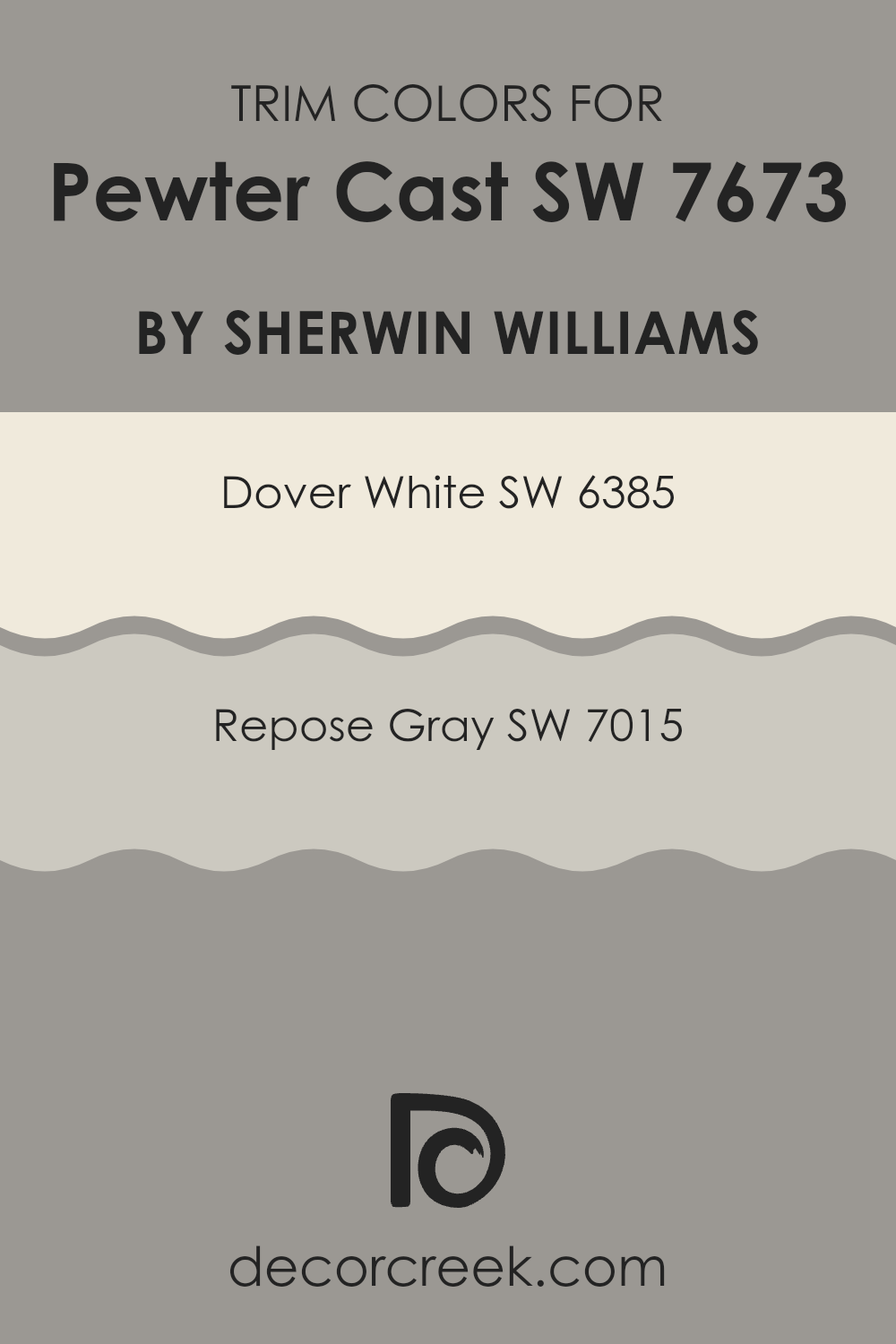
What are the Trim colors of Pewter Cast SW 7673 by Sherwin Williams?
Trim colors are the shades used to paint architectural elements like door frames, window casings, and baseboards, distinguishing them from the main wall color. Opting for the right trim colors can enhance the visual appeal of a room, create depth, and define spaces effectively.
When paired with a neutral like Pewter Cast by Sherwin Williams, trim colors such as Dover White and Repose Gray help to bring a clean, sharp look to the overall design, making the wall color stand out and the space feel more defined and finished.
Dover White SW 6385 is a warm, creamy white that offers a soft contrast to Pewter Cast, providing a light, airy feel that makes spaces appear larger and more inviting. On the other hand, Repose Gray SW 7015 is a light to medium gray that adds a touch of contrast without overwhelming the subtle tones of Pewter Cast. This combination allows for a gentle transition between the walls and trim, creating a cohesive look that is pleasing to the eye.
You can see recommended paint colors below:
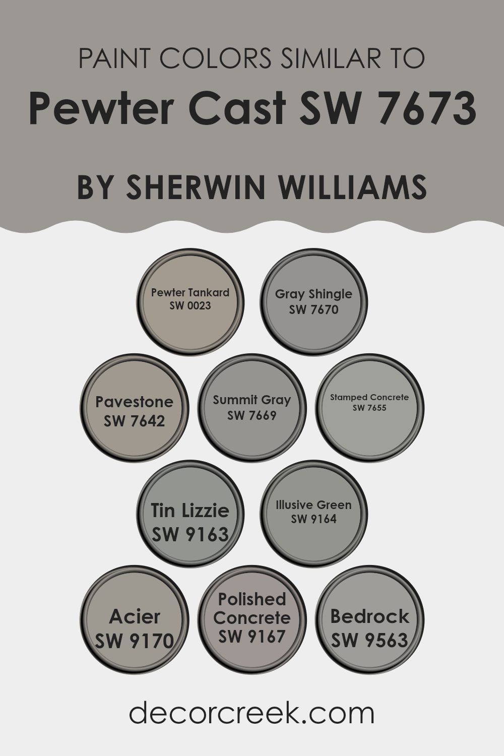
Colors Similar to Pewter Cast SW 7673 by Sherwin Williams
Choosing similar colors, like those akin to Pewter Cast by Sherwin Williams, is crucial for creating a cohesive and harmonious look in your space. By using shades that share similarities, you allow for a smooth visual flow and greater versatility in design. These colors, subtly linked, can be paired effortlessly or used in different combinations throughout different rooms to maintain an aesthetic connection without repetition.
Starting with Pewter Tankard, this grey exudes a classic charm that’s neither too dark nor too light, making it a versatile choice for any space. Gray Shingle offers a slightly lighter touch with a soft, welcoming feel, perfect for cozy areas.
Pavestone brings a stronger, earthier tone that anchors spaces with its depth. Summit Gray, carrying a hint of blue, offers a fresh perspective that’s ideal for modern settings. For a solid foundation, Stamped Concrete provides a robust grey that pairs easily with brighter or contrasting hues. Tin Lizzie introduces a subtle metallic hint, reflecting light beautifully and adding a touch of elegance.
Illusive Green is a unique blend that hints at green tones, ideal for those looking to add a natural yet subtle twist. Acier showcases a steely gray that works well in both traditional and contemporary settings. Polished Concrete has a sleek, slightly glossy feel, adding sophistication without overpowering.
Lastly, Bedrock presents itself as a sturdy, deep gray that can create a strong base in a room, perfect for laying the groundwork for vibrant accents. By integrating these similar colors, you can achieve a cohesive environment that feels fluid and thoughtfully put together.
You can see recommended paint colors below:
- SW 0023 Pewter Tankard
- SW 7670 Gray Shingle
- SW 7642 Pavestone
- SW 7669 Summit Gray
- SW 7655 Stamped Concrete
- SW 9163 Tin Lizzie
- SW 9164 Illusive Green
- SW 9170 Acier
- SW 9167 Polished Concrete
- SW 9563 Bedrock
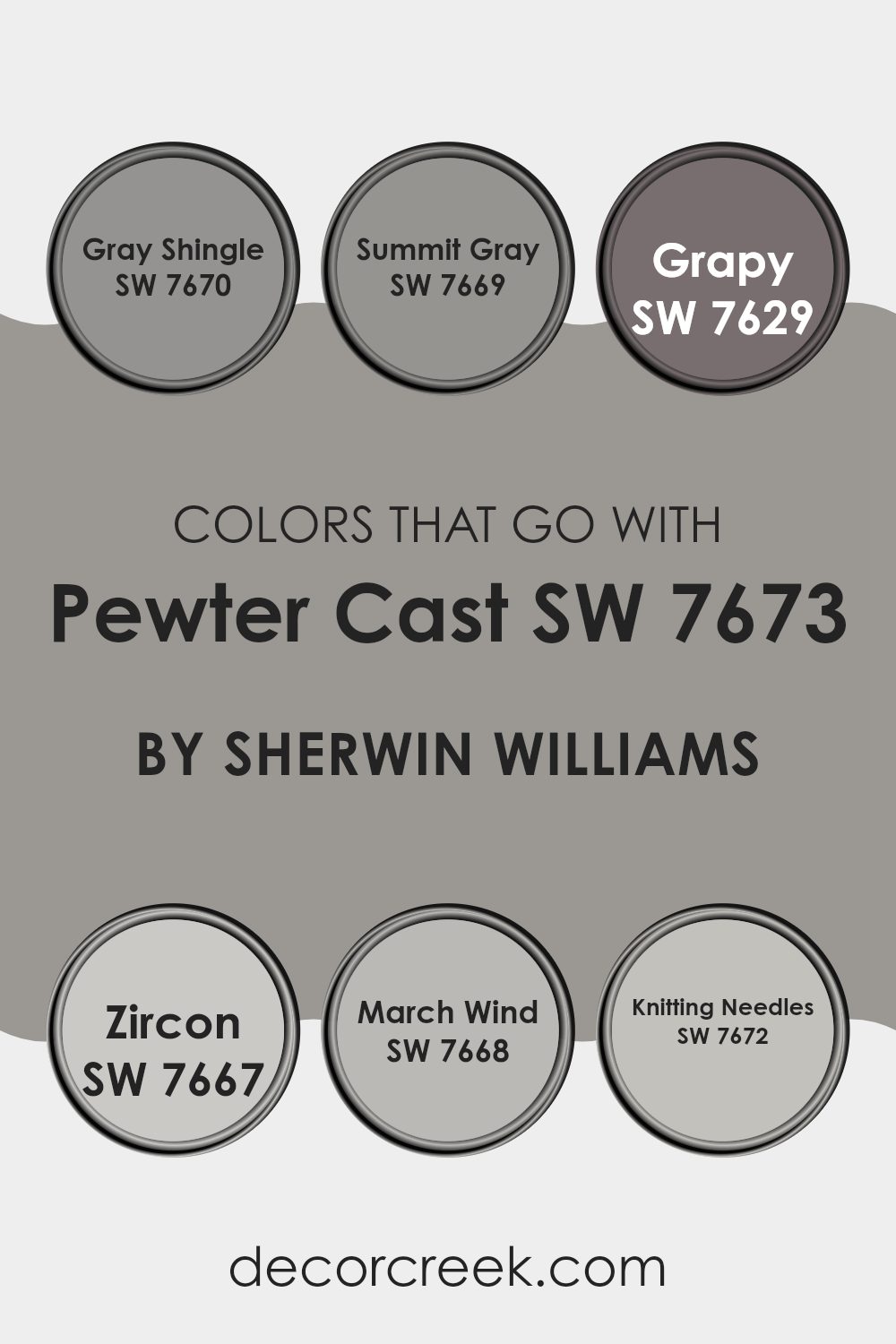
Colors that Go With Pewter Cast SW 7673 by Sherwin Williams
Choosing the right colors to pair with Pewter Cast SW 7673 by Sherwin Williams is crucial because it helps create a harmonious environment in your home. Pewter Cast is a versatile gray that serves as a strong foundation for various interior themes but pairing it with the right shades can enhance the overall aesthetic.
Colors like Gray Shingle, Summit Gray, Grapy, Zircon, March Wind, and Knitting Needles are perfect companions as they belong to the gray family but vary in undertones and intensity, enabling a dynamic yet cohesive look.
Gray Shingle SW 7670 offers a lighter, almost silvery gray that can brighten spaces while maintaining a cool, neutral palette. Summit Gray SW 7669 is slightly warmer, bringing a soothing presence to rooms that complements the depth of Pewter Cast. Grapy SW 7629 injects a subtle hint of purple, adding a unique but understated twist to the decor. Zircon SW 7667 is another light gray, though with a hint of blue, providing a calm, refreshing vibe.
March Wind SW 7668 steps up as a stronger, more commanding gray that can anchor lighter furnishings or accent pieces. Lastly, Knitting Needles SW 7672 blends beautifully as it mirrors the softness of Pewter Cast but with a hint of added warmth, perfect for creating a gentle and inviting space.
Together, these colors provide a palette that enhances the flexibility and beauty of Pewter Cast, making it easy to achieve a professional-looking design in your home.
You can see recommended paint colors below:
- SW 7670 Gray Shingle
- SW 7669 Summit Gray
- SW 7629 Grapy
- SW 7667 Zircon
- SW 7668 March Wind
- SW 7672 Knitting Needles
How to Use Pewter Cast SW 7673 by Sherwin Williams In Your Home?
Pewter Cast by Sherwin Williams is a versatile gray paint that has a slightly warm tone, making it perfect for creating a cozy atmosphere in any room of your home. This color works great in living areas and bedrooms where you want a neutral backdrop that still adds a touch of warmth. Pair it with white trim for a clean, classic look, or coordinate with darker colors like navy or rich brown for a more dramatic feel.
This shade is also ideal for painting kitchen cabinets or bathroom vanities because it pairs well with both stainless steel and chrome fixtures, giving a modern but homey vibe to these spaces. If you’re looking for a quick way to refresh your home, applying Pewter Cast on an accent wall can add interest and depth to a room without overwhelming it.
Overall, Pewter Cast is a smart choice if you need a paint color that is easy to work with and can fit into a variety of decorating styles. Whether your home has a contemporary or traditional look, this color can help tie your décor together.
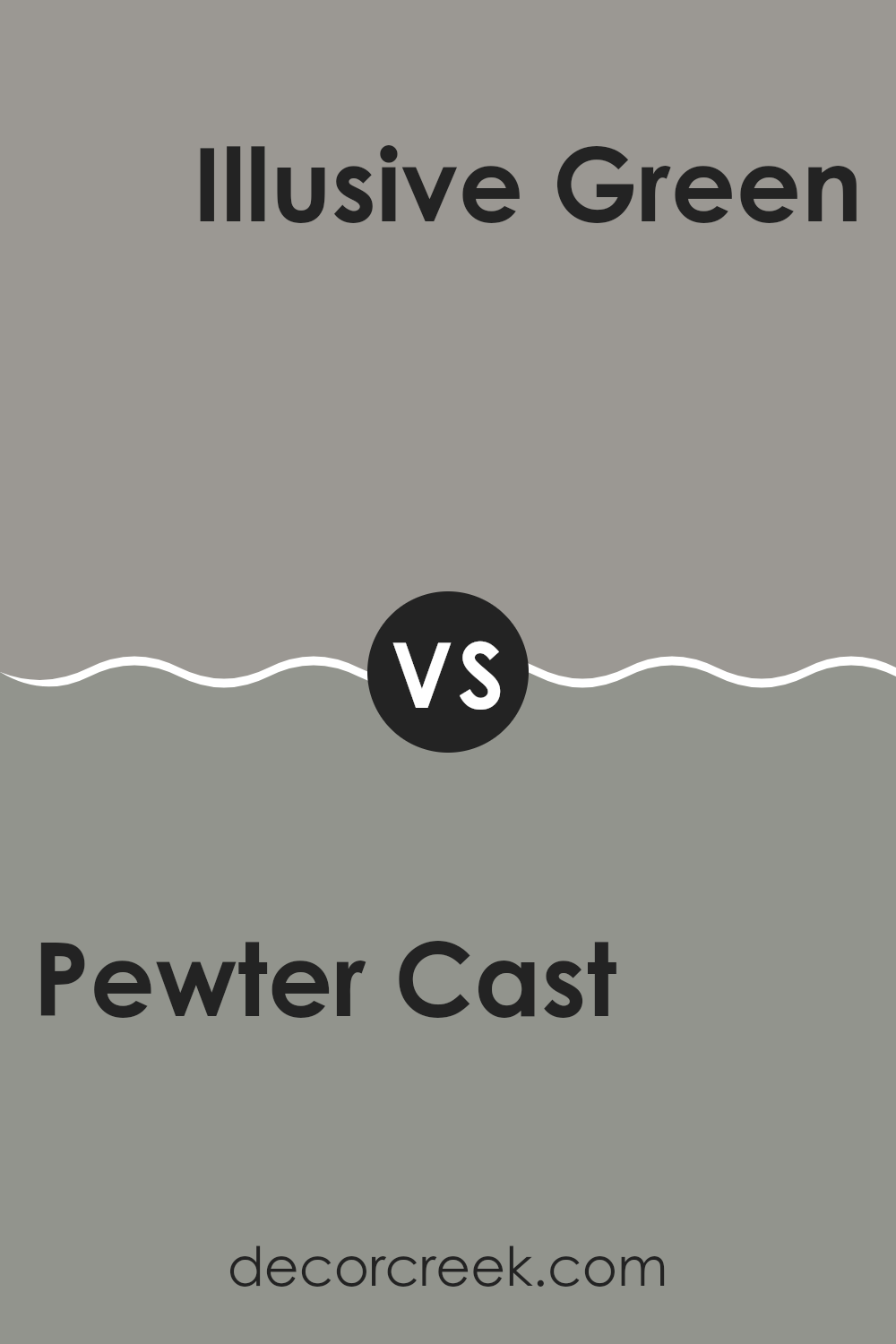
Pewter Cast SW 7673 by Sherwin Williams vs Illusive Green SW 9164 by Sherwin Williams
Pewter Cast and Illusive Green, both by Sherwin Williams, offer distinct vibes for any space. Pewter Cast is a deep grey with a touch of blue, giving it a strong, sturdy look that works well in modern and industrial designs.
It makes spaces feel grounded and secure. On the other hand, Illusive Green is a soft, muted green that leans slightly towards grey. This color brings a subtle, natural feel to rooms, making it perfect for creating a relaxed and comforting atmosphere. It is versatile, fitting well in both contemporary and traditional settings.
While Pewter Cast adds depth and definition, Illusive Green offers a gentle backdrop that can make your furniture and decor pop. These colors can also complement each other effectively when used in the same area, balancing cool strength with soothing nature.
You can see recommended paint color below:
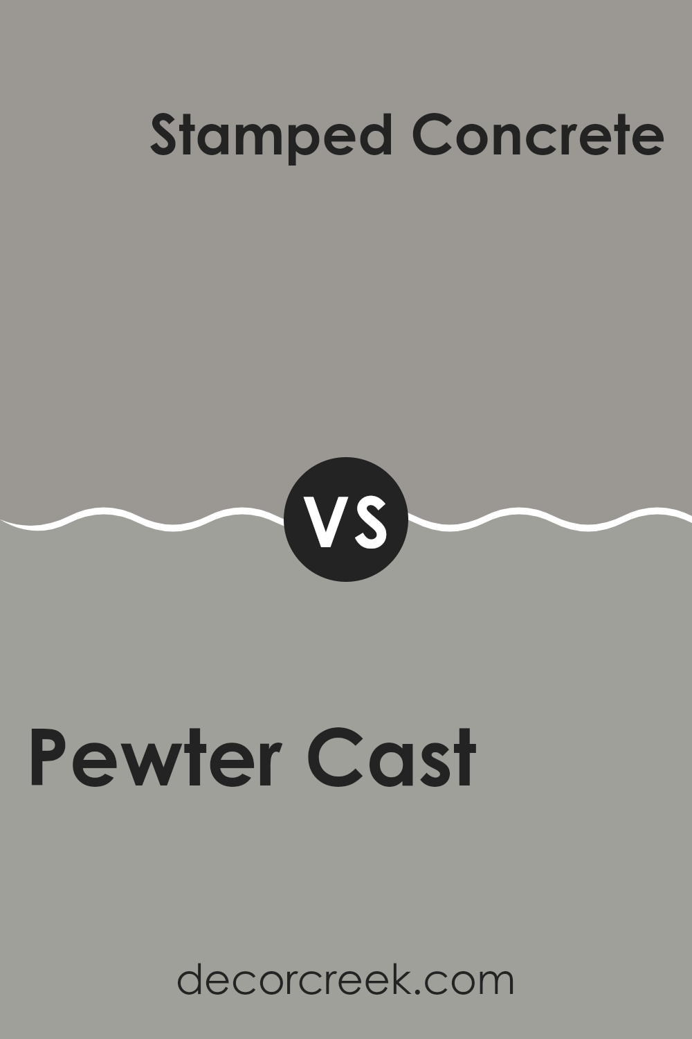
Pewter Cast SW 7673 by Sherwin Williams vs Stamped Concrete SW 7655 by Sherwin Williams
Pewter Cast and Stamped Concrete are both gray shades offered by Sherwin Williams, but they have noticeable differences in their tones and vibes. Pewter Cast is a warmer gray with a subtle hint of beige, making it soft and welcoming.
This color is versatile and fits well in spaces where you want a cozy, inviting atmosphere. On the other hand, Stamped Concrete is a cooler gray that leans slightly towards blue. This gives it a more modern and crisp look, ideal for contemporary settings or when you want a cleaner, more defined appearance.
Stamped Concrete might also seem a bit darker and more striking than Pewter Cast, making it suitable for accent walls or furniture pieces. Both colors are great choices depending on the mood you want to set in your room.
You can see recommended paint color below:
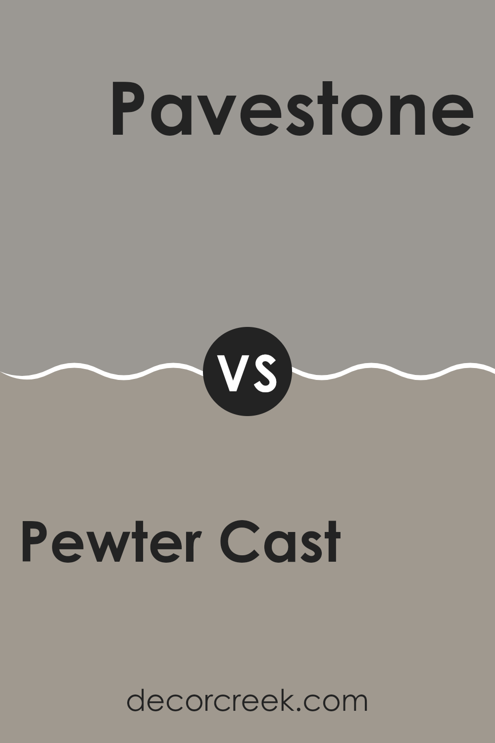
Pewter Cast SW 7673 by Sherwin Williams vs Pavestone SW 7642 by Sherwin Williams
Pewter Cast and Pavestone, both by Sherwin Williams, offer subtle yet distinct tones suitable for various settings. Pewter Cast is a deeper gray with a touch of blue, giving it a cooler feel.
This color is great for adding a calm, grounding effect to a room, making spaces like living rooms or bedrooms more inviting. On the other hand, Pavestone leans towards a warmer taupe-gray. This shade is slightly lighter than Pewter Cast and works well in spaces where you want a cozy yet airy atmosphere, such as kitchens or bathrooms.
Both colors pair well with a wide range of decor styles, from modern to rustic, but their different undertones can influence the mood and visual temperature of a room. Choosing between them depends on the desired ambiance and the specific characteristics of the space, like lighting and size.
You can see recommended paint color below:
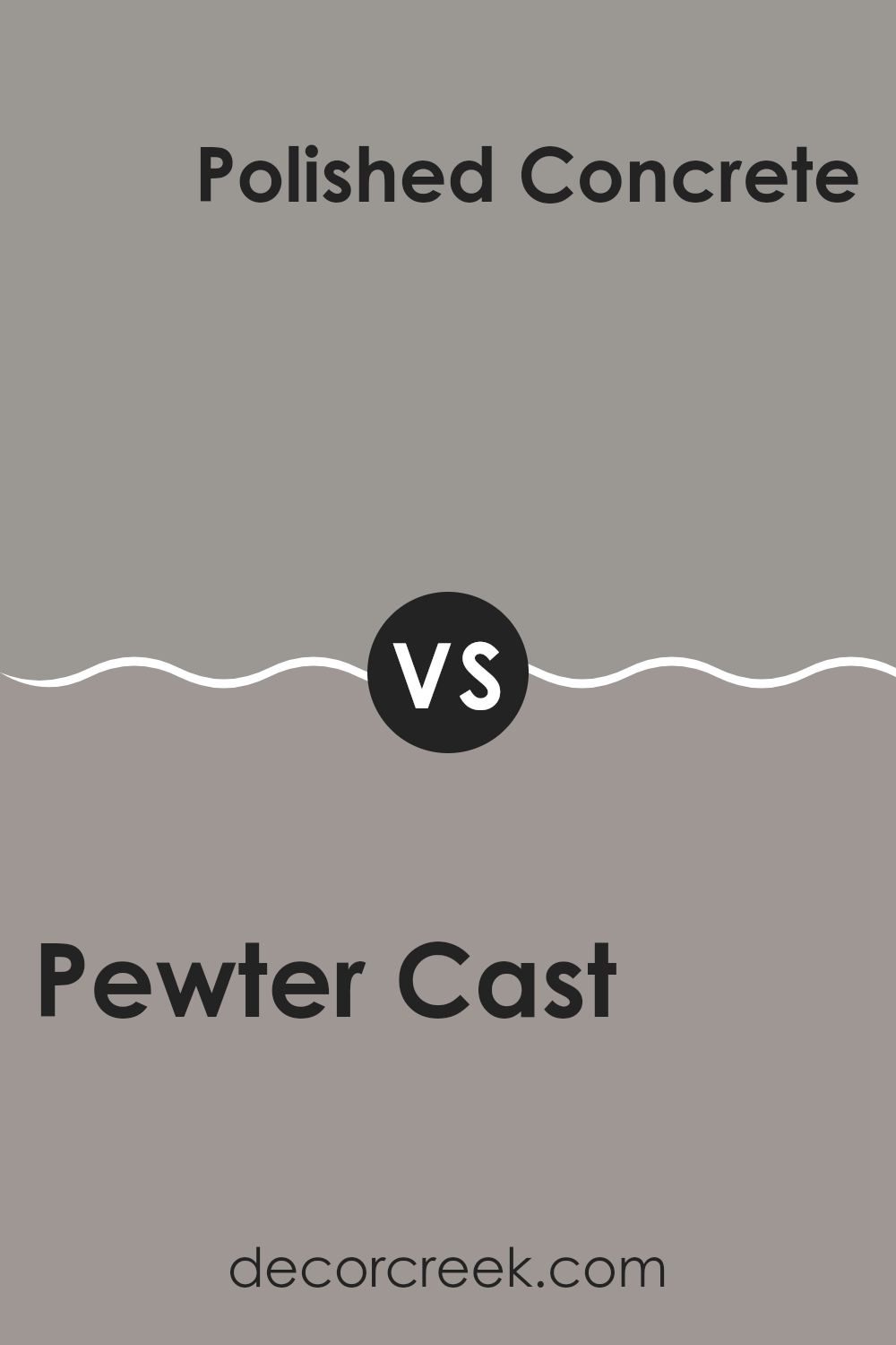
Pewter Cast SW 7673 by Sherwin Williams vs Polished Concrete SW 9167 by Sherwin Williams
Pewter Cast is a deep grey that has a touch of warmth, making it inviting and versatile for use in most spaces. This shade adds depth to a room and pairs well with brighter colors for a striking contrast.
On the other hand, Polished Concrete is a lighter grey that looks very modern and clean. It offers a more minimalist vibe, making it great for achieving a sleek, contemporary look. Where Pewter Cast can create a cozy, enveloping feel, Polished Concrete keeps spaces feeling open and airy.
Both colors work well with a variety of decor styles, but Polished Concrete might be the better choice in a smaller room or a space where you want to maintain a feeling of spaciousness, while Pewter Cast is ideal for adding a bit of drama and warmth to a larger space.
You can see recommended paint color below:
- SW 9167 Polished Concrete
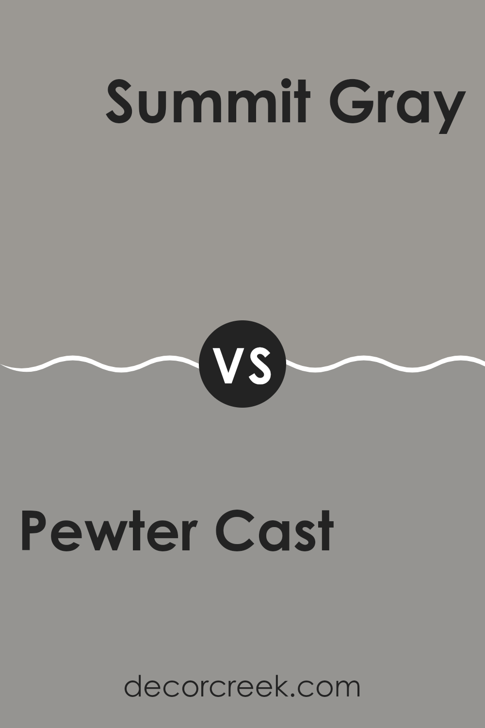
Pewter Cast SW 7673 by Sherwin Williams vs Summit Gray SW 7669 by Sherwin Williams
Pewter Cast and Summit Gray, both by Sherwin Williams, are two gray hues with subtle differences that affect their overall appearance and feel. Pewter Cast leans slightly towards the cooler side with a hint of blue undertones, giving it a crisp, modern edge.
It pairs well with stark whites or muted colors for a clean aesthetic. On the other hand, Summit Gray is a tad lighter than Pewter Cast, offering a soft, neutral backdrop that works nicely in various settings. It carries a warmer tone compared to Pewter Cast, making it feel more inviting and slightly cozier.
This color is great for spaces where you want a calm and pleasant atmosphere without veering too cold. Both colors are versatile and can be used in contemporary or traditional designs, but Pewter Cast is better for a sharper look, while Summit Gray provides a gentler touch.
You can see recommended paint color below:
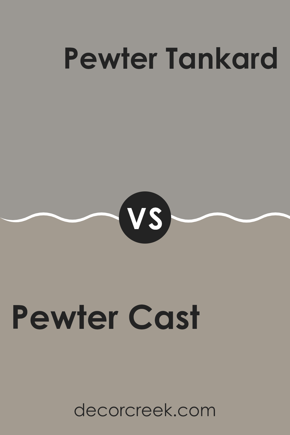
Pewter Cast SW 7673 by Sherwin Williams vs Pewter Tankard SW 0023 by Sherwin Williams
Pewter Cast and Pewter Tankard are two gray shades from Sherwin Williams, both featuring subtle differences that set them apart. Pewter Cast is a cooler gray, leaning slightly towards a charcoal tone, which gives it a modern and neutral look. This makes it great for contemporary spaces or any area where you want a crisp, clean aesthetic.
On the other hand, Pewter Tankard is a warmer gray with a tad more depth, almost hinting at a taupe. This warmth makes it ideal for creating a welcoming and cozy atmosphere, suitable for living rooms or bedrooms where a softer ambiance is desired.
While both colors offer the versatility of gray, their different undertones mean Pewter Cast pairs well with cooler decor elements, such as blue or silver accents. Pewter Tankard, with its warmer feel, matches nicely with rich colors like burgundy or deep greens, enhancing its inviting quality. So, your choice between the two should depend on the mood and style you want to achieve in your space.
You can see recommended paint color below:
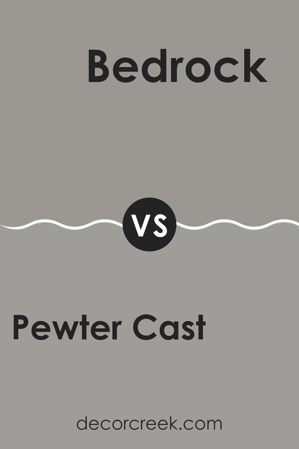
Pewter Cast SW 7673 by Sherwin Williams vs Bedrock SW 9563 by Sherwin Williams
Pewter Cast and Bedrock by Sherwin Williams are both neutral colors, but they have distinct tones that set them apart. Pewter Cast leans more towards a gray with cooler undertones, making it a great choice for spaces where you want a calm, subdued feel without getting too dark. It’s versatile enough to work well in many rooms, particularly in living areas and bedrooms where a soft gray can complement various decor styles.
Bedrock, on the other hand, has warmer tones and veers slightly towards taupe. This warmth brings a cozy and inviting atmosphere, ideal for settings where you want to add a bit of depth without overwhelming the space with too dark a color. It pairs well with earthy accents and can be a perfect backdrop for a more lived-in, homey feel.
Choosing between Pewter Cast and Bedrock depends largely on the mood you’re aiming to achieve and the existing colors in your furniture and decorations. Pewter Cast is cooler and more neutral, while Bedrock offers a touch of warmth.
You can see recommended paint color below:
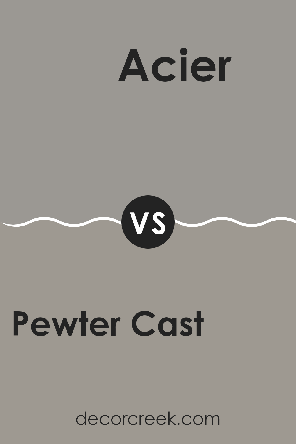
Pewter Cast SW 7673 by Sherwin Williams vs Acier SW 9170 by Sherwin Williams
Pewter Cast and Acier, both by Sherwin Williams, are distinctive shades of gray that provide a subtle yet effective difference in their tones which makes them suitable for various decorating styles. Pewter Cast is a lighter gray that carries a soft, warm undertone. It’s great for spaces where you want a hint of coziness without making the room feel too closed in. It reflects light well, making it an excellent choice for smaller or darker rooms.
On the other hand, Acier is a deeper gray with a cooler, more neutral undertone. This makes it a good fit for more modern or industrial designs, as it gives a sharper, cleaner look. It’s ideal for larger spaces or as an accent wall, where it can make a bold statement without overwhelming the room.
Both colors are versatile, yet each offers a unique vibe – Pewter Cast brings warmth and light, while Acier offers a more grounded, robust feel. Your choice between the two would depend on the mood you want to set and the natural light in your space.
You can see recommended paint color below:
- SW 9170 Acier
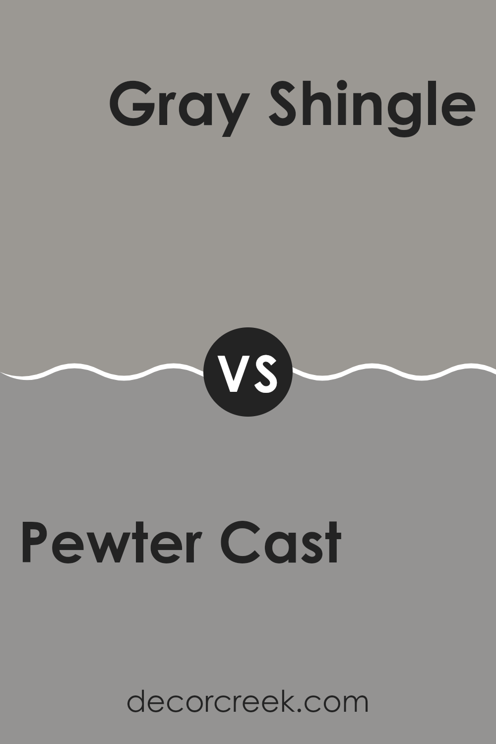
Pewter Cast SW 7673 by Sherwin Williams vs Gray Shingle SW 7670 by Sherwin Williams
Pewter Cast is a deeper, slightly warm gray that can add a cozy and calming feel to any room. It works well in spaces where you want a bit of a stronger presence without overwhelming the area with too dark a color. This shade pairs nicely with both brighter colors for a lively contrast, and softer tones for a more subdued look.
On the other hand, Gray Shingle is a lighter gray that gives a fresher, airier feel. It’s perfect for small spaces or rooms with less natural light, as it helps to make the area appear more open and bright. This color is versatile and works well in many different settings, blending nicely with other neutrals or serving as a quiet backdrop for more vibrant accents.
Both colors offer a modern and clean look, but Pewter Cast leans towards a slightly more moody and enveloping atmosphere, whereas Gray Shingle brings a lighter, more refreshing touch.
You can see recommended paint color below:
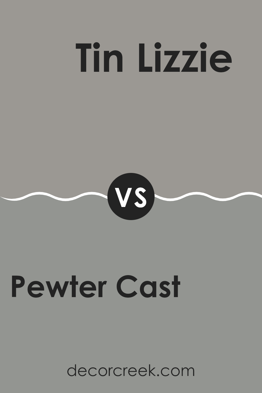
Pewter Cast SW 7673 by Sherwin Williams vs Tin Lizzie SW 9163 by Sherwin Williams
Pewter Cast and Tin Lizzie, both by Sherwin Williams, offer subtle differences in their gray tones that can impact the feel of a room. Pewter Cast is a warmer gray with a slightly brownish undercurrent, making it cozy and inviting. This color works well in living spaces or bedrooms where a soft, welcoming atmosphere is desired.
On the other hand, Tin Lizzie is a cooler gray with hints of blue. This gives it a more neutral and balanced look that’s perfect for modern settings. It suits areas like home offices or bathrooms where a clean, crisp ambiance is preferable.
Choosing between them depends on the room’s purpose and your personal taste. Pewter Cast adds warmth, while Tin Lizzie offers a fresher, more balanced appeal. Both colors are versatile and fit well in various design styles, but the warmth of Pewter Cast is better for a cozy feel, whereas Tin Lizzie’s cooler tones provide a sleeker look.
You can see recommended paint color below:
Conclusion
As we come to the end of our look at SW 7673 Pewter Cast by Sherwin Williams, I’d like to share a few final thoughts. This color is a soft grey that can fit into many rooms and styles. Whether you’re updating your kitchen, giving your living room a new look, or adding a calm touch to your bedroom, Pewter Cast is a great choice. Its ability to pair well with many other colors and decorations makes it a helpful color for anyone thinking of giving their home a fresh feel.
We learned that Pewter Cast isn’t just any grey; it has a special quality that brings warmth to spaces, which can make a room feel more welcoming. It’s perfect for people who want something simple yet effective at making their home look nicer. This color works in big areas and small corners alike, always looking clean and neat.
So, if you’re thinking about painting a room or two, remember how Pewter Cast might just be what you need. It’s easy on the eyes, flexible for different themes and accessories, and most of all, it creates a nice setting without being too loud.
That’s why I think SW 7673 Pewter Cast by Sherwin Williams is a solid choice for anyone looking to update their space.
Ever wished paint sampling was as easy as sticking a sticker? Guess what? Now it is! Discover Samplize's unique Peel & Stick samples.
Get paint samples

