Selecting the perfect paint color for your home can be a surprisingly tricky task. I learn something new with every decorating project, and this time my focus was on SW 6071 Popular Gray by Sherwin Williams. Before you decide to paint your walls with this flexible shade, there are a few insights I’d love to share with you.
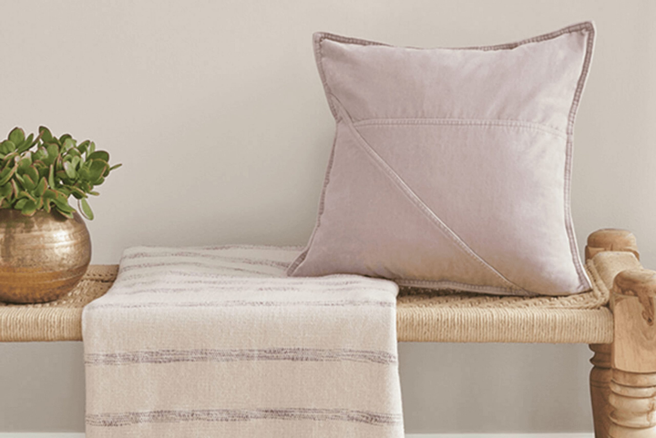
Popular Gray is a soothing neutral that functions beautifully across various rooms due to its warm undertones. If you’re searching for a color that offers a cozy ambiance without the starkness some grays can have, this could be the one for you.
However, lighting plays a crucial role in how this color presents itself in your home. In rooms with ample natural light, Popular Gray shows a brighter, more uplifting vibe, whereas in rooms with limited light, it takes on a richer and more subdued appearance.
Moreover, it’s essential to consider the existing colors in your furniture and decor. Popular Gray pairs well with many palettes, but it particularly complements blues, greens, and earthy tones. So spend a moment reflecting on your current furnishings before making a final decision.
This shade has the potential to bring a calm and elegant feel to your living room, but it’s crucial to see if it aligns well with what you already own.
Is Popular Gray SW 6071 Right for My Home?
I recently painted my living room with a shade called Popular Gray, and I’m thrilled with the cozy and stylish atmosphere it’s created. This color is a soft, warm gray that feels incredibly inviting. It’s flexible enough to work in almost any room, adjusting beautifully to different lighting conditions, from bright morning light to dim evening lamps.
I’ve found that Popular Gray pairs wonderfully with natural materials like wood and stone, highlighting their organic textures. In my living room, the gray backdrop has really allowed my wooden furniture and stone fireplace to stand out, giving the room a harmonious and balanced look.
When it comes to interior styles, this color is a chameleon. It fits perfectly in modern settings with its clean, neutral vibe, and also complements traditional decors that rely on classic hues. In my home, which combines a bit of both styles, Popular Gray has offered a smooth connection between various decorative elements.
I recommend pairing this paint color with plush fabrics like velvet or soft wool to add a touch of luxury without overpowering the room. Metallic accents in silver or brushed nickel also work really well with this color, adding just the right amount of sparkle and contrast to the calming gray. Whether you’ve got a minimalist loft or a classic cottage, this color can work its magic, making your decorating process a lot of fun.
What are the right undertones of Popular Gray SW 6071 ?
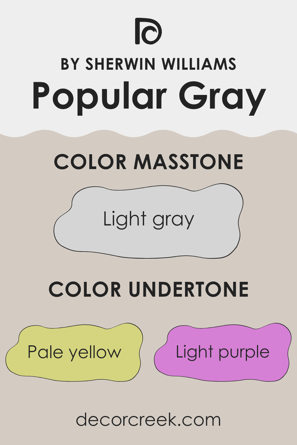
Popular Gray is a flexible paint color, often chosen for its balance between warmth and neutrality. The color can subtly shift in appearance depending on its undertones—variations in hue that influence how a color looks under different lighting conditions or when placed next to other colors.
For Popular Gray, the undertones are pale yellow, light purple, light blue, pale pink, mint, lilac, and gray. These undertones affect how we perceive the color on interior walls. For example, in a room with a lot of natural light, the pale yellow undertone might make the wall appear slightly warmer, giving a cozy feel to the room. In artificial light, the light purple or lilac undertones could come forward, adding a gentle hint of coolness.
The presence of light blue and mint undertones can give the walls a fresh and airy feel, making the room feel more open and relaxing. The pale pink undertone can add a soft, welcoming touch, which is great for living areas.
Gray as an undertone serves to anchor the color’s neutrality, making it a safe choice for various rooms without the risk of clashing with other colors in the decor.
Overall, the undertones in Popular Gray make it adaptable for use in many different types of rooms, from bedrooms to home offices, as they subtly influence the mood and visual temperature of the room.
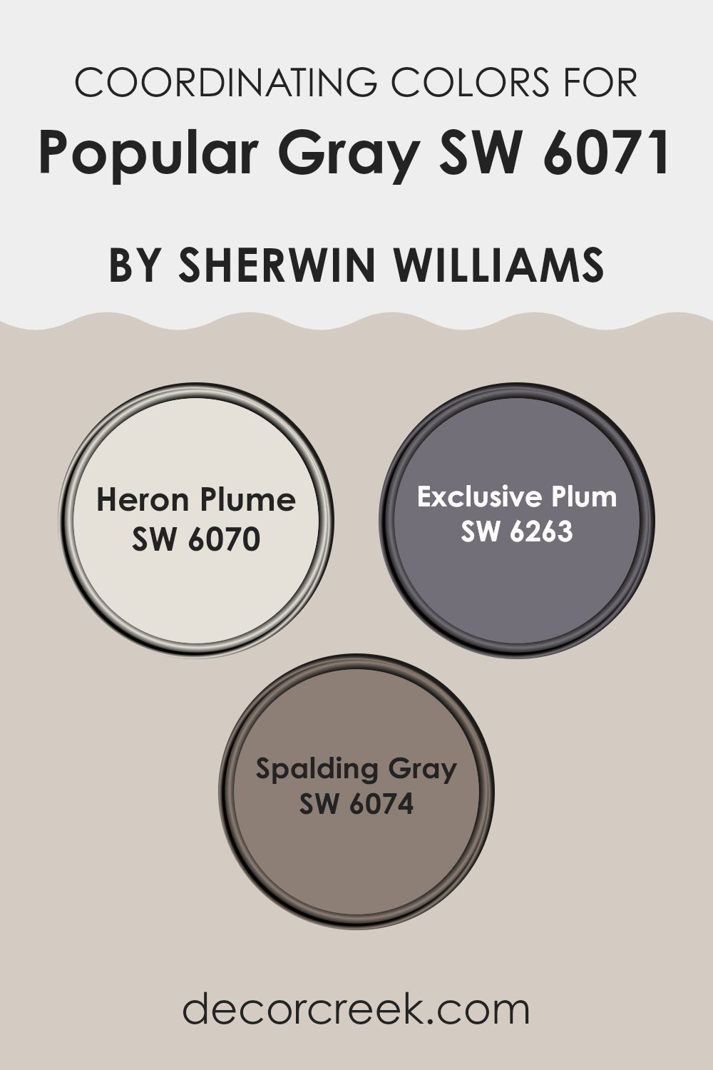
Best Coordinating Colors to use with Popular Gray SW 6071 by Sherwin Williams this year.
Coordinating colors are those that complement each other beautifully when used together in decor and design. These colors share a harmonious relationship, usually based on their positions on the color wheel, their tones, saturation, or brightness levels. When selected carefully, coordinating colors can create a pleasing visual experience and bring balanced aesthetics to any room.
Popular Gray by Sherwin Williams is paired expertly with shades like Heron Plume, Exclusive Plum, and Spalding Gray to offer a flexible palette for interior rooms. Heron Plume is a soft, almost white hue with subtle warm undertones, perfect for creating a light and airy feel in a room.
It contrasts gently with the deeper tones of Popular Gray, providing a lift to darker rooms. Exclusive Plum brings a much richer, deeper purple tone that adds a touch of drama and depth, ideal for accent walls or textile highlights. Lastly, Spalding Gray steps in as a darker, more muted companion to Popular Gray, offering an excellent option for grounding the room or adding gravitas through furniture or cabinetry. These coordinating colors, when used with Popular Gray, enable a fluid and harmonious color scheme that enhances the aesthetic value of any interior.
You can see recommended paint colors below:
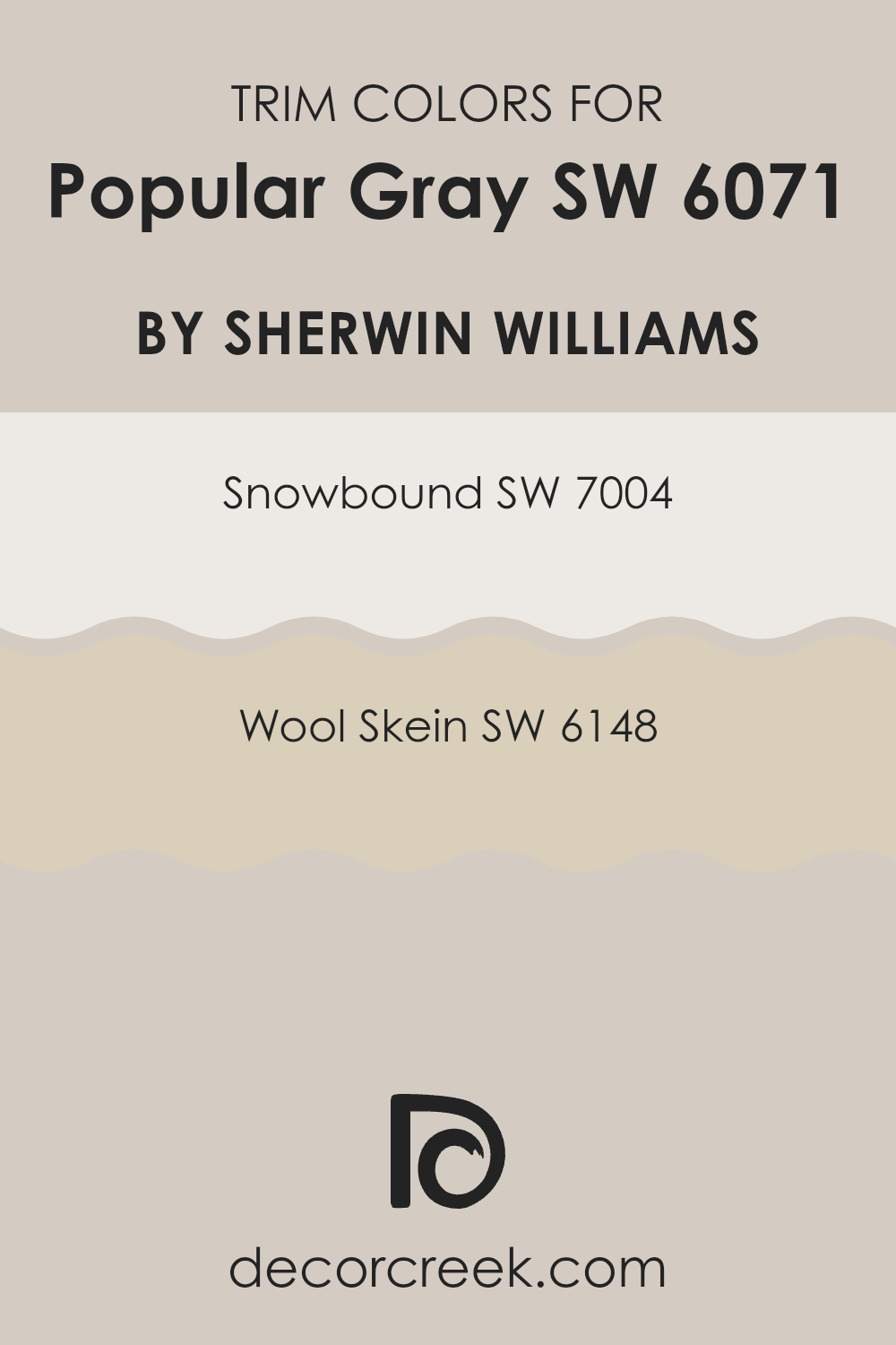
Trendy Trim Colors of Popular Gray SW 6071 by Sherwin Williams to use this year.
Trim colors like Snowbound (SW 7004) and Wool Skein (SW 6148) are essential for accenting the main wall color in a room, in this case, Popular Gray (SW 6071) by Sherwin Williams.
These colors are utilized for elements such as door frames, skirting boards, moldings, and window trim, helping to define each section of the room or outside area clearly by creating depth and distinction. This is particularly important when using a neutral color like Popular Gray, as it prevents the room from appearing too monotonous by adding a subtle yet effective contrast.
Snowbound (SW 7004) is a soft white with a slightly warm undertone, making it an ideal choice for trims as it adds a fresh and clean look without stark contrast. On the other hand, Wool Skein (SW 6148) is a warm neutral with earthy tones that provides a slightly bolder frame to the walls, lending a comforting and cohesive feel to interiors. Both colors complement Popular Gray beautifully by highlighting its flexibility and ensuring that the environment remains inviting and well-balanced.
You can see recommended paint colors below:
Evergreen Colors Similar to Popular Gray SW 6071 by Sherwin Williams
Similar colors play a significant role in interior design by creating a cohesive and harmonious environment. When colors are closely related in tone and shade, like the companions to Popular Gray, they effortlessly blend with one another, allowing for a smooth aesthetic transition from one room to another. This unity is essential for achieving a balanced look that is pleasing to the eye. These similar shades also provide flexibility in decor, making it easier to match furniture and accessories without clashing.
For instance, Gossamer Veil is a soft gray with a subtle warmth that makes it adaptable for rooms looking for a touch of coziness without overpowering darkness. Pediment, another gray, leans more towards the cooler side, providing a calm backdrop that works well in minimalist or contemporary interiors. Modern Gray offers a slightly more upbeat vibe with hints of beige, warming up the room subtly. Realist Beige is a true beige that brings a classic, understated elegance to any room.
Worldly Gray is a mid-tone gray with warm undertones, perfect for creating a refined yet welcoming room. Agreeable Gray is highly popular for its adaptability, balancing both gray and beige tones beautifully. Symmetry is a richer, deeper gray that lends a hint of elegance and depth to interiors. Whirlwind is a cooler gray, offering a fresh, modern feel that pairs exceptionally well with vibrant accents.
Mercurial is a unique blend of gray with blue undertones, ideal for a more dynamic and fresh look. Lastly, Reticence is a paler, almost ethereal gray that offers a subtle and calming backdrop, perfect for a peaceful retreat room. All these colors reflect subtle variations of Popular Gray, ensuring that they can work beautifully in many home settings.
You can see recommended paint colors below:
- SW 9165 Gossamer Veil
- SW 7634 Pediment
- SW 7632 Modern Gray
- SW 6078 Realist Beige
- SW 7043 Worldly Gray
- SW 7029 Agreeable Gray
- SW 9601 Symmetry
- SW 9576 Whirlwind
- SW 9550 Mercurial
- SW 6064 Reticence
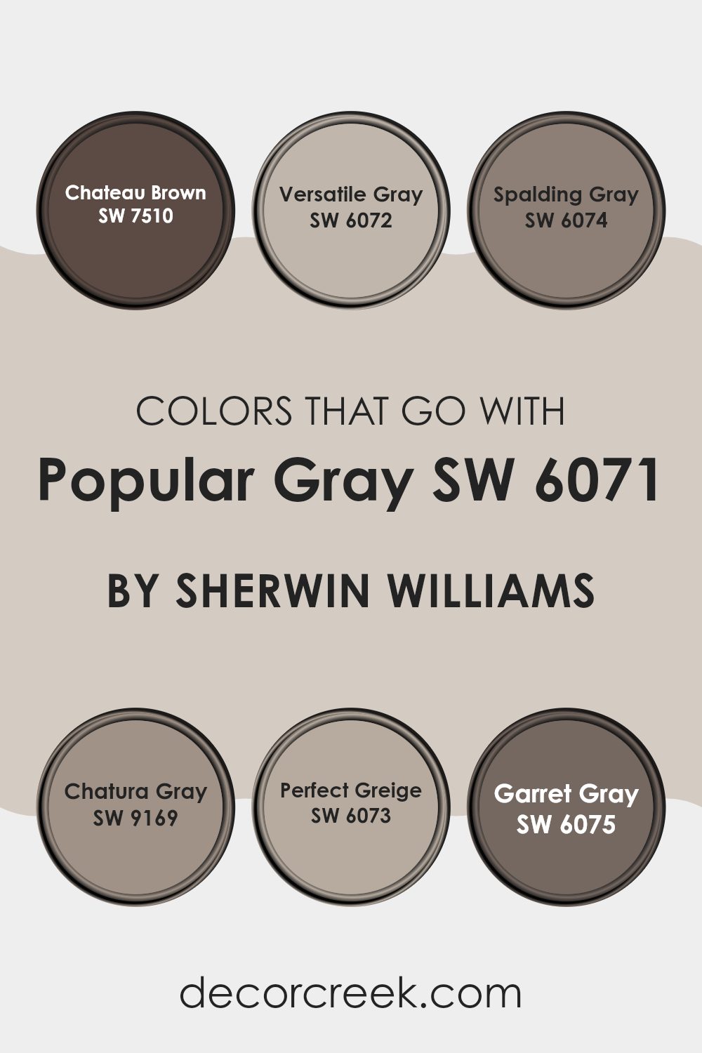
Colors that Go With Popular Gray SW 6071 by Sherwin Williams
Choosing complementary colors for Popular Gray SW 6071 by Sherwin-Williams is crucial because it ensures that the aesthetic balance and harmony of a room are maintained. Popular Gray is a flexible color that serves as an excellent backdrop for a variety of tones, helping to pull different design elements together. When paired with the right colors, such as Chateau Brown, Adaptable Gray, Spalding Gray, Chatroom Gray, Perfect Greige, and Garret Gray, Popular Gray can create a cohesive and inviting atmosphere.
Starting with Chateau Brown, its deep, rich tone provides a grounding effect that contrasts nicely with the lighter, softer hue of Popular Gray. It’s ideal for creating a warm, cozy feel in a room. Adaptable Gray, as its name suggests, is a flexible shade that blends smoothly with Popular Gray, enhancing the overall neutral scheme while adding a bit of depth.
Spalding Gray offers a darker shade that adds drama and intensity to the room, making it a great choice for accent walls or furniture. Chatroom Gray has a robust, earthy quality that pairs well with Popular Gray, offering a subtle contrast that is pleasing to the eye.
Perfect Greige combines the best of gray and beige, providing a balanced, warm tone that complements the cooler notes of Popular Gray. Lastly, Garret Gray, which is a muted, elegant shade, works well to create a peaceful yet stylish room when used alongside Popular Gray. All these colors help in achieving a harmonious design that looks thoughtfully put together.
You can see recommended paint colors below:
- SW 7510 Chateau Brown
- SW 6072 Versatile Gray
- SW 6074 Spalding Gray
- SW 9169 Chatura Gray
- SW 6073 Perfect Greige
- SW 6075 Garret Gray
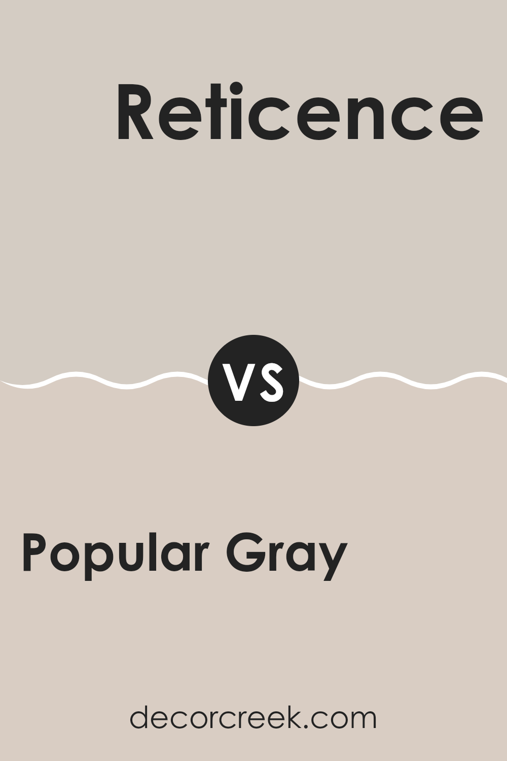
Popular Gray SW 6071 by Sherwin Williams vs Reticence SW 6064 by Sherwin Williams
Popular Gray and Reticence are two subtle colors offered by Sherwin Williams. Popular Gray is a warm gray with a touch of beige, making it very flexible and easy to use in many rooms. It gives a cozy feel to rooms and works well with a variety of decor styles.
On the other hand, Reticence is a cooler gray that leans more towards a pure gray tone. This color is ideal for creating a modern, clean look in a room. It can add a fresh, neat appearance to rooms but may appear slightly starker compared to the warmth of Popular Gray.
Overall, while both colors are grays, Popular Gray offers warmth and adaptability, making it suitable for rooms where you want comfort, while Reticence is great for achieving a crisper, more contemporary feel.
You can see recommended paint color below:
- SW 6064 Reticence
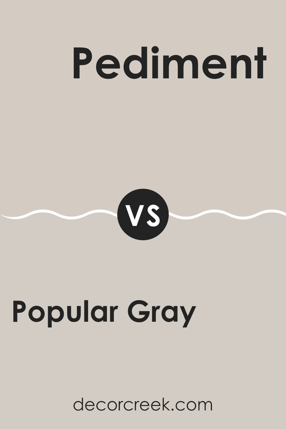
Popular Gray SW 6071 by Sherwin Williams vs Pediment SW 7634 by Sherwin Williams
Popular Gray and Pediment, both by Sherwin Williams, are subtle and flexible shades, ideal for creating a cozy and inviting atmosphere in any home. Popular Gray is a light to medium gray with warm undertones, making it a perfect choice for rooms where you want a soft, neutral backdrop that feels welcoming. It pairs well with a variety of decor styles and enhances the room without overpowering it.
On the other hand, Pediment is a slightly darker shade, leaning towards a taupe-gray. Its neutral yet warm undertone offers a comforting hue that is excellent for rooms needing a bit more depth without making the room feel closed in. It’s particularly effective in areas that receive a lot of natural light, as the color shifts subtly throughout the day, adding interest to the walls with its dynamic changes.
Both colors offer their own unique charm, whether you prefer the lighter touch of Popular Gray or the richer feel of Pediment. They work well in many settings, from modern to traditional, making them highly adaptable for various decorating projects.
You can see recommended paint color below:
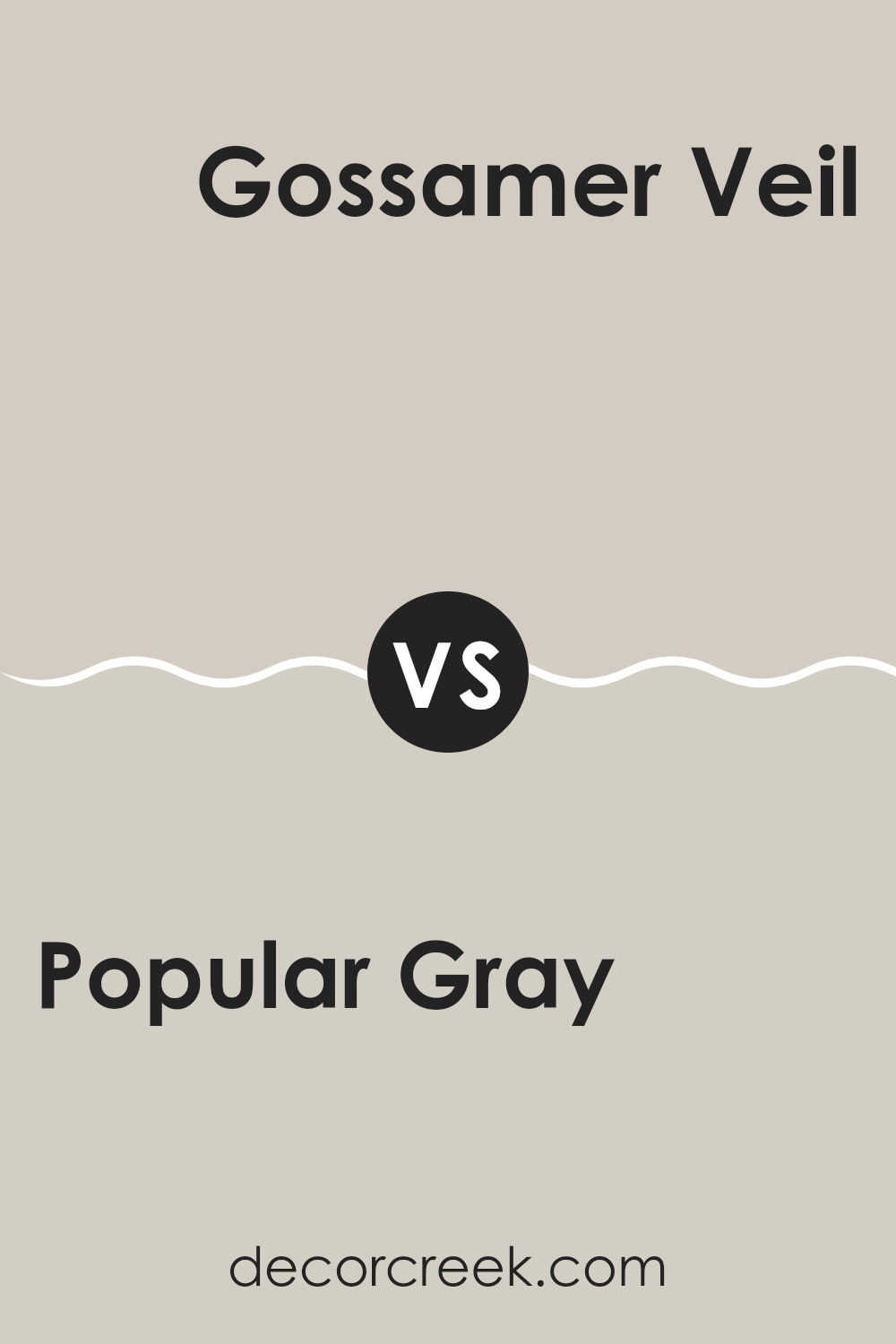
Popular Gray SW 6071 by Sherwin Williams vs Gossamer Veil SW 9165 by Sherwin Williams
Popular Gray and Gossamer Veil by Sherwin Williams are both neutral paint colors, but they have different tones that set them apart. Popular Gray is a warm gray that often looks beige in certain lighting. It creates a cozy and inviting feel, making it great for living rooms or bedrooms.
Gossamer Veil, on the other hand, is cooler and lighter than Popular Gray. It leans more towards a subtle off-white with gray undertones. This color works well in rooms that aim for a fresh and clean look, such as kitchens or bathrooms.
Both colors can easily match with various decor styles and color schemes, but the choice between them depends on the mood you want to set and the natural light in your rooms. Gossamer Veil can make small rooms appear larger due to its lighter shade, while Popular Gray adds warmth to a room.
You can see recommended paint color below:
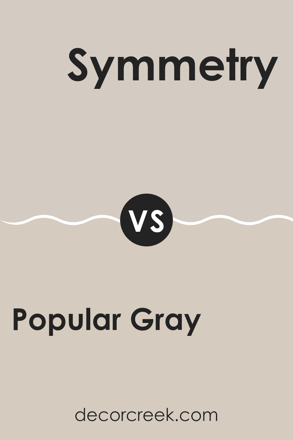
Popular Gray SW 6071 by Sherwin Williams vs Symmetry SW 9601 by Sherwin Williams
Popular Gray and Symmetry are two distinct shades from Sherwin Williams. Popular Gray is a warm, soft gray that has a welcoming tone. It works well in most rooms due to its flexibility and subtle warmth, making rooms feel inviting without overpowering them with color.
On the other hand, Symmetry is a deeper, cooler gray that offers a sharper look. It’s a bit more modern and striking, providing a strong presence in a room without being too bold.
As a darker color, Symmetry can make rooms feel smaller or cozier, depending on the lighting and surrounding decor. While Popular Gray is excellent for achieving a gentle, neutral backdrop, Symmetry is ideal for those who want a more pronounced shade that still maintains a clean and crisp feel.
You can see recommended paint color below:
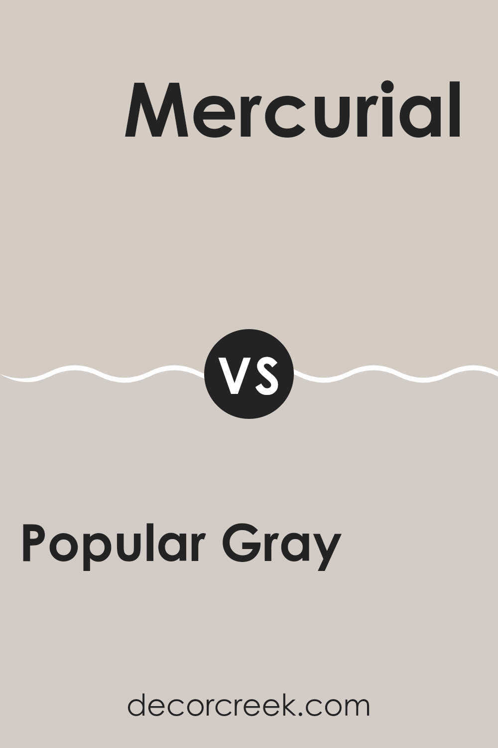
Popular Gray SW 6071 by Sherwin Williams vs Mercurial SW 9550 by Sherwin Williams
The main color, Popular Gray, is a warm neutral shade with a blend of beige and gray tones, making it flexible and welcoming.
It’s designed to work well in various rooms, creating a cozy and inviting atmosphere without overpowering the room’s aesthetic. This color beautifully complements both bright accents and darker furnishing, offering a balanced backdrop for a range of interior styles.
On the other hand, the second color, Mercurial, is a darker and moodier shade. It leans more towards a deep gray with a hint of blue, giving it a more noticeable presence in a room. This hue is perfect for making a statement, whether as an accent wall or in a room that can handle darker tones without feeling too closed in. While both colors share a gray base, Mercurial adds drama and contrast, setting a different tone compared to the lighter, softer feel of Popular Gray.
You can see recommended paint color below:
Popular Gray SW 6071 by Sherwin Williams vs Modern Gray SW 7632 by Sherwin Williams
Popular Gray and Modern Gray by Sherwin Williams are two nuanced shades, but they have distinct differences when it comes to setting the mood and style in a room. Popular Gray is a warm hue with a soft, welcoming vibe.
It’s slightly darker, which makes it perfect for creating a cozy and comfortable environment. On the other hand, Modern Gray is lighter and carries a hint of beige, giving it a more neutral and subtle appearance. This makes Modern Gray a great choice for rooms that aim for a sleek, clean look.
Both colors provide excellent flexibility and serve as solid backdrops for various types of decor. However, your choice between them might depend on whether you prefer a warmer, more inviting atmosphere or a cleaner, more understated aesthetic.
You can see recommended paint color below:
Popular Gray SW 6071 by Sherwin Williams vs Agreeable Gray SW 7029 by Sherwin Williams
Popular Gray and Agreeable Gray, both by Sherwin Williams, offer subtle yet distinct vibes for decorating. Popular Gray is a touch darker, lending a cozy warmth to rooms. This neutral shade has a blend of grey with warm undertones, which makes it flexible for blending with various decor styles.
On the other hand, Agreeable Gray is lighter and is known for its adaptability in different lighting conditions, appearing almost as a greige (a mix of grey and beige). This color is great for creating a light and airy feel in a room, often making small rooms appear larger.
Both colors are neutral, making them easy to match with a wide range of furniture and accessories. Popular Gray works well in areas that benefit from a more anchored, warmer tone, whereas Agreeable Gray is ideal for rooms where a brighter, more open feel is desired.
You can see recommended paint color below:
Popular Gray SW 6071 by Sherwin Williams vs Whirlwind SW 9576 by Sherwin Williams
Popular Gray and Whirlwind are both colors by Sherwin Williams, but they offer different tones and vibes for your room. Popular Gray is a warm gray with soft, brown undertones. It creates a cozy and inviting atmosphere, making it a flexible choice for any room in your home. It pairs well with a wide range of decor styles and colors, adding a subtle, comforting presence.
Whirlwind, on the other hand, is a cooler gray that leans toward a light blue or silvery shade. It brings a fresh and airy feel to rooms, perfect for modern or minimalist themes. This color is excellent for bathrooms or kitchens, where you want a clean and crisp look.
Both colors provide a neutral base, but while Popular Gray adds warmth, Whirlwind offers a hint of cool freshness. Depending on your room’s purpose and the mood you want to set, choosing between these two can significantly affect the overall feel of your room.
You can see recommended paint color below:
Popular Gray SW 6071 by Sherwin Williams vs Worldly Gray SW 7043 by Sherwin Williams
Popular Gray and Worldly Gray by Sherwin Williams are two neutral colors, but they have distinct tones that set them apart. Popular Gray has a slightly warmer undertone, making it feel cozy and inviting. This hue brings a subtle warmth to a room, making it ideal for living areas and bedrooms where a soft, welcoming atmosphere is desired.
Worldly Gray, on the other hand, leans slightly cooler than Popular Gray. This color presents a more reserved and neutral backdrop, which can be perfect for modern and minimalistic designs. It’s a great choice for rooms that aim for a balanced, more understated look.
Both colors are flexible and work well in various lighting situations, but the choice between them might depend on the mood you want to create in your room. Popular Gray adds a touch of warmth, while Worldly Gray offers a cleaner, more muted aesthetic.
You can see recommended paint color below:
Popular Gray SW 6071 by Sherwin Williams vs Realist Beige SW 6078 by Sherwin Williams
The main color, Popular Gray, and the second color, Realist Beige, are both neutral shades from Sherwin Williams, but they have subtly different tones that set them apart. Popular Gray leans more towards a true gray, providing a soft and quiet backdrop that is flexible in many rooms. This shade is perfect for rooms where you want a modern, clean look without too much warmth.
On the other hand, Realist Beige includes more warmth due to its beige undertones, giving a cozier feel to any room. This color works especially well in rooms where you want a touch of warmth without overpowering the area with too deep or vibrant colors. It’s particularly suited for living areas and bedrooms where a calm and welcoming atmosphere is desired.
Both colors go well with a variety of decor styles and can be used to create a unified look in homes with an open floor plan. Their subtle differences allow you to choose based on the warmth and mood you’re aiming to achieve in your room.
You can see recommended paint color below:
In wrapping up my thoughts on SW 6071 Popular Gray by Sherwin Williams, it’s clear why this paint color is a favorite for many people. Its soft gray shade has just the right mix of warm and cool tones, making it perfect for any room. Whether it’s your living room, kitchen, or bedroom, Popular Gray creates a cozy and welcoming feel without being too dark or too light.
It pairs well with lots of other colors, which means you can add things like blue pillows, green plants, or even bold red artwork, and it will still look great. This makes it a very handy color when you want to change up your room without redoing everything. Also, if you’re selling your house, this color can help make your home look neat and appealing to potential buyers.
After trying out and looking at SW 6071 Popular Gray in different lights and settings, I can confidently say it’s a fantastic choice if you’re thinking of a new paint color. It’s calm, not too flashy, and just simple in the best way. So, if you’re looking to freshen up your room or even your whole house, you might want to consider Popular Gray.
It could be exactly what you need to make your home look and feel great.
Ever wished paint sampling was as easy as sticking a sticker? Guess what? Now it is! Discover Samplize's unique Peel & Stick samples.
Get paint samples

