Are you thinking about refreshing your room with a new paint color? If SW 9165 Gossamer Veil by Sherwin Williams has caught your eye, there are a few things you should know before you pick up a paintbrush. I’ve done the research and would like to share my insights and experiences with you.
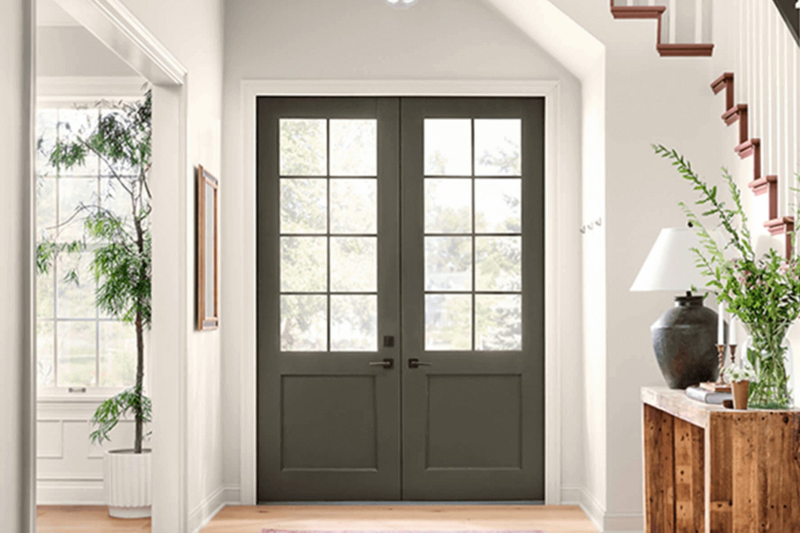
Gossamer Veil is a flexible neutral with a warm undertone that can create a cozy atmosphere in any room. Its subtle elegance makes it perfect for living areas, bedrooms, and even kitchens, adjusting easily to different lighting conditions and complementing various decor styles. However, it’s important to understand how it behaves in your specific environment before making a commitment.
Firstly, testing the color in your own room is crucial. The way Gossamer Veil looks can vary dramatically depending on the natural and artificial lighting it’s exposed to. I recommend applying a sample on a good-sized area of your wall and observing it at different times of the day. This step ensures that you won’t have any surprises after the walls are painted.
Furthermore, considering the colors of your current furniture and decorations is essential. Gossamer Veil pairs beautifully with a wide range of hues, but it’s always wise to visualize the overall harmony before taking the plunge. So, if you’re armed with a little knowledge and prepared to test it out, you’ll be much closer to achieving the look you’re hoping for with SW 9165 Gossamer Veil.
Is Gossamer Veil SW 9165 Right for My Home?
Gossamer Veil by Sherwin Williams is a color I’ve grown to really appreciate. It’s a soft gray that has a warm undertone, making it incredibly flexible and easy to fit into many decorating themes. When I first used it in my own home, I noticed how it blends smoothly with so many styles and materials, which makes it a go-to choice for many of my projects.
From my experience, Gossamer Veil works wonders in minimalist and Scandinavian-style interiors. Its soft gray shade adds just the right amount of warmth without overpowering the room. I also find it particularly beautiful in modern farmhouse settings, where it complements natural wood elements and woven textures superbly.
In terms of pairing, Gossamer Veil is like a friendly neighbor who gets along with everyone. It looks stunning with soft textiles like linen or cotton, which enhance its warmth. When it comes to materials, I love matching it with light woods for a fresh, airy feel, or with darker furniture pieces for a bit of contrast that isn’t too stark. Metals, especially brushed nickel and matte black, also look great against this color, providing a modern twist that really brings a room to life.
Overall, I find Gossamer Veil incredibly easy to work with, whether I’m aiming for a light and bright look or a cozy, inviting atmosphere. It’s a color that just seems to get it right every time.
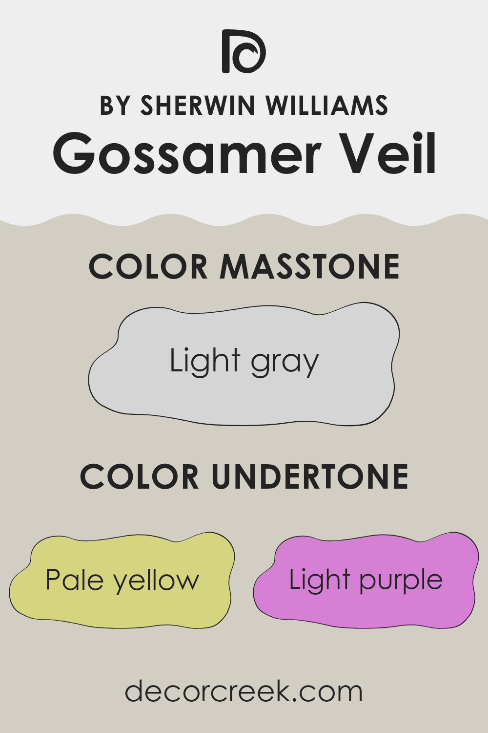
What are the right undertones of Gossamer Veil SW 9165 ?
Gossamer Veil is a flexible paint color that often appears differently depending on the lighting. The undertones of a paint color are subtle hints of other colors that can be seen under certain lighting conditions. These undertones influence how we perceive the main color, and they can make a color look warmer or cooler.
For Gossamer Veil, the undertones are pale yellow, light purple, light blue, pale pink, mint, lilac, and grey. Each of these undertones can have a slight effect on the appearance of this color on interior walls. For example, in a room with a lot of natural light, the pale yellow or light blue undertones might make the walls appear more vibrant and fresh. In artificial light, the grey or lilac undertones might become more noticeable, giving the room a more muted feel.
This variety of undertones means that Gossamer Veil can work well in many different room settings and match a wide range of décor styles. It’s important to test this paint in the specific lighting conditions of your room to see which undertones are most prominent and how they affect the overall look of the room. Choosing decor and accessories that complement these undertones can help you achieve a harmonious look.
Best Coordinating Colors to use with Gossamer Veil SW 9165 by Sherwin Williams this year.
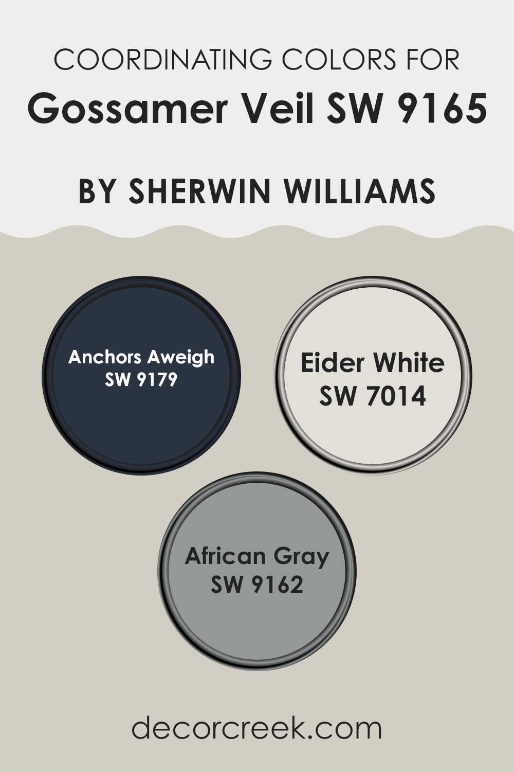
Coordinating colors are shades that complement a primary color, enhancing the overall aesthetic of a room by creating balance and harmony. In the context of Gossamer Veil SW 9165 by Sherwin Williams, a subtle, light gray hue, specific coordinating colors have been chosen to provide contrast and depth, thus allowing for a more dynamic design scheme. These coordinating shades include darker or varied tones that can highlight, support, or softly contrast the primary color to achieve a cohesive look.
For example, Anchors Aweigh SW 9179 is a deep, nearly black navy that offers a striking contrast to the lightness of Gossamer Veil, making it ideal for accent walls or furniture to draw attention and add a sense of depth. Eider White SW 7014, on the other hand, is a clean, crisp white with a hint of gray, providing a subtle transition that softens and blends well with the muted tones of Gossamer Veil, perfect for ceilings or trims to create a seamless color flow throughout the room.
Lastly, African Gray SW 9162 is a medium gray that harmonizes beautifully with Gossamer Veil, suitable for adjoining rooms or furnishings, adding a touch of variation without straying too far from the primary hue, ensuring the color palette remains unified and pleasing to the eye.
You can see recommended paint colors below:
Trendy Trim Colors of Gossamer Veil SW 9165 by Sherwin Williams to use this year.
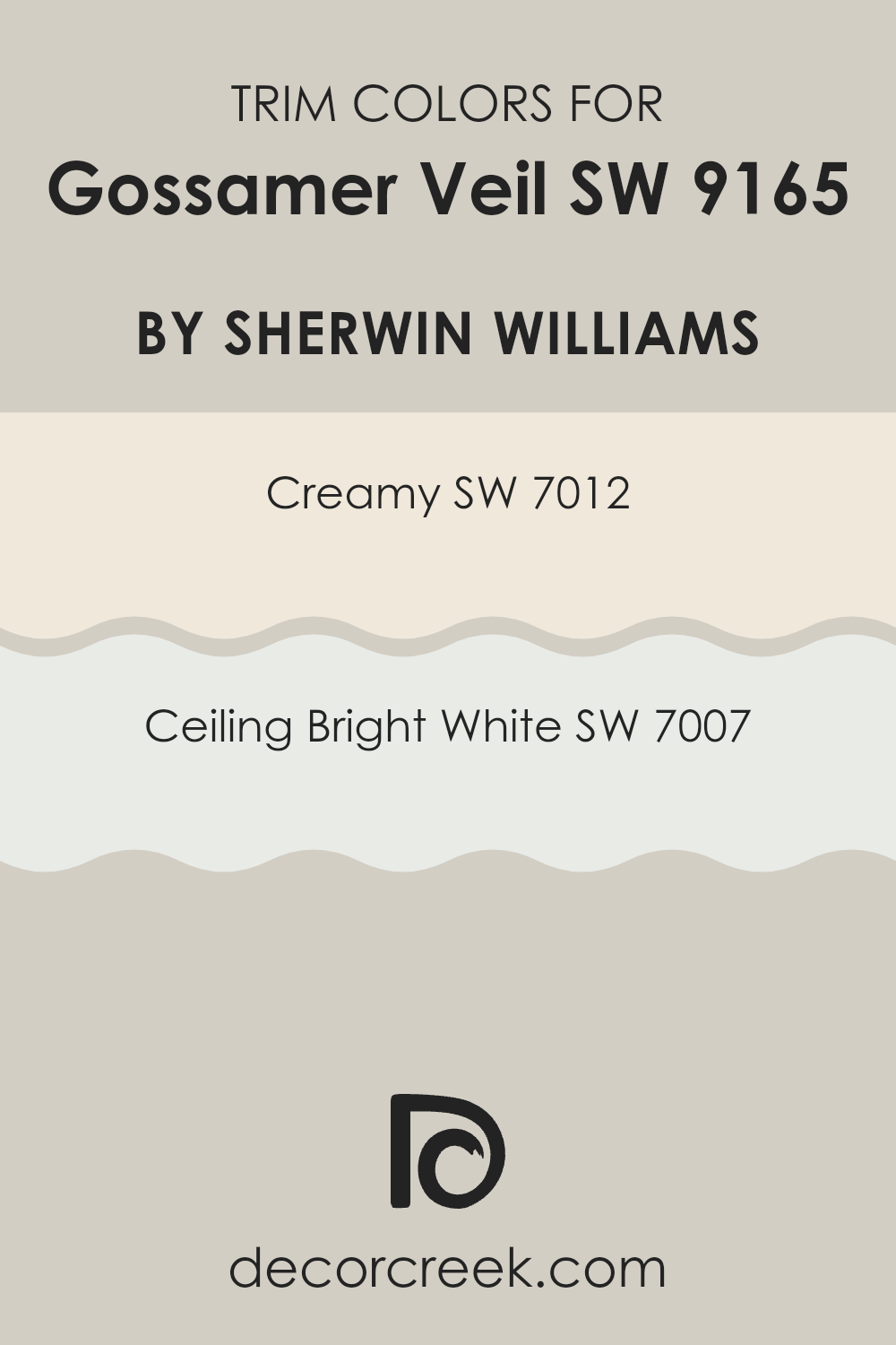
Trim colors are used to highlight and accentuate the architectural details of a room, such as baseboards, moldings, door and window frames, creating a refined contrast that enhances the overall aesthetics of a room. When paired with a soft and neutral hue like Gossamer Veil by Sherwin Williams, selecting the right trim color is crucial as it frames and defines the room, giving it a polished and cohesive look.
Trim colors like Creamy and Ceiling Bright White by Sherwin Williams are excellent choices for this purpose as they can complement and subtly contrast with Gossamer Veil, making the walls stand out in a pleasing manner.
Creamy SW 7012 by Sherwin Williams is a warm, inviting shade of off-white that adds a hint of coziness to any room without overpowering the primary color. This shade works beautifully next to Gossamer Veil, providing a gentle, warm boundary that is visually comforting. On the other hand, Ceiling Bright White SW 7007 is a crisp, clean white that offers a fresh and sharp edge, enhancing the light in any room and allowing colors like Gossamer Veil to appear more vibrant and airy. Using these colors on trims can effectively frame the walls, contributing to a balanced and inviting atmosphere.
You can see recommended paint colors below:
Evergreen Colors Similar to Gossamer Veil SW 9165 by Sherwin Williams
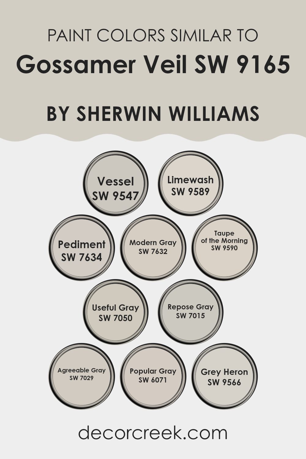
Similar colors, like variations of a core hue, play an essential role in achieving coherence and harmony in decoration. They provide a subtle yet powerful way to unify a room without the stark contrasts that come with using highly differing shades. Such colors are particularly handy when aiming to improve a room with layers of similar but distinct tones, lending a seamless and cohesive look to the environment.
Starting with SW 9547 – Vessel, this shade brings a muted earthiness reminiscent of clay pots cured under a warm sun. It’s part of the same color family as SW 9589 – Limewash, which evokes a softer feel mimicking the classic limewash paint finish. SW 7634 – Pediment has a dusty stone vibe, perfect for adding a touch of antiquity. In a lighter vein, SW 7632 – Modern Gray offers a fresh and contemporary approach, leaning toward minimalism.
SW 9590 – Taupe of the Morning introduces a dawn-like, gentle gray taupe that is ideal for peaceful settings. Meanwhile, SW 7050 – Useful Gray is exactly what its name suggests; a practical, adaptable gray that works almost anywhere. SW 7015 – Repose Gray is particularly loved for its calming influence, a neutral that’s neither too warm nor too cool.
For those who prefer a bit more warmth, SW 7029 – Agreeable Gray is a welcoming, friendly hue that plays well in varied lighting. SW 6071 – Popular Gray offers a gentle, popular touch with wider appeal. Lastly, SW 9566 – Grey Heron stands out as a deeper tone that resembles the majestic bird, perfect for an accent in a lighter themed room. These colors function exceptionally well together by creating visual continuity, making them ideal for thoughtful interior design strategies that aim for a synchronized appearance.
You can see recommended paint colors below:
- SW 9547 Vessel
- SW 9589 Limewash
- SW 7634 Pediment
- SW 7632 Modern Gray
- SW 9590 Taupe of the Morning
- SW 7050 Useful Gray
- SW 7015 Repose Gray
- SW 7029 Agreeable Gray
- SW 6071 Popular Gray
- SW 9566 Grey Heron
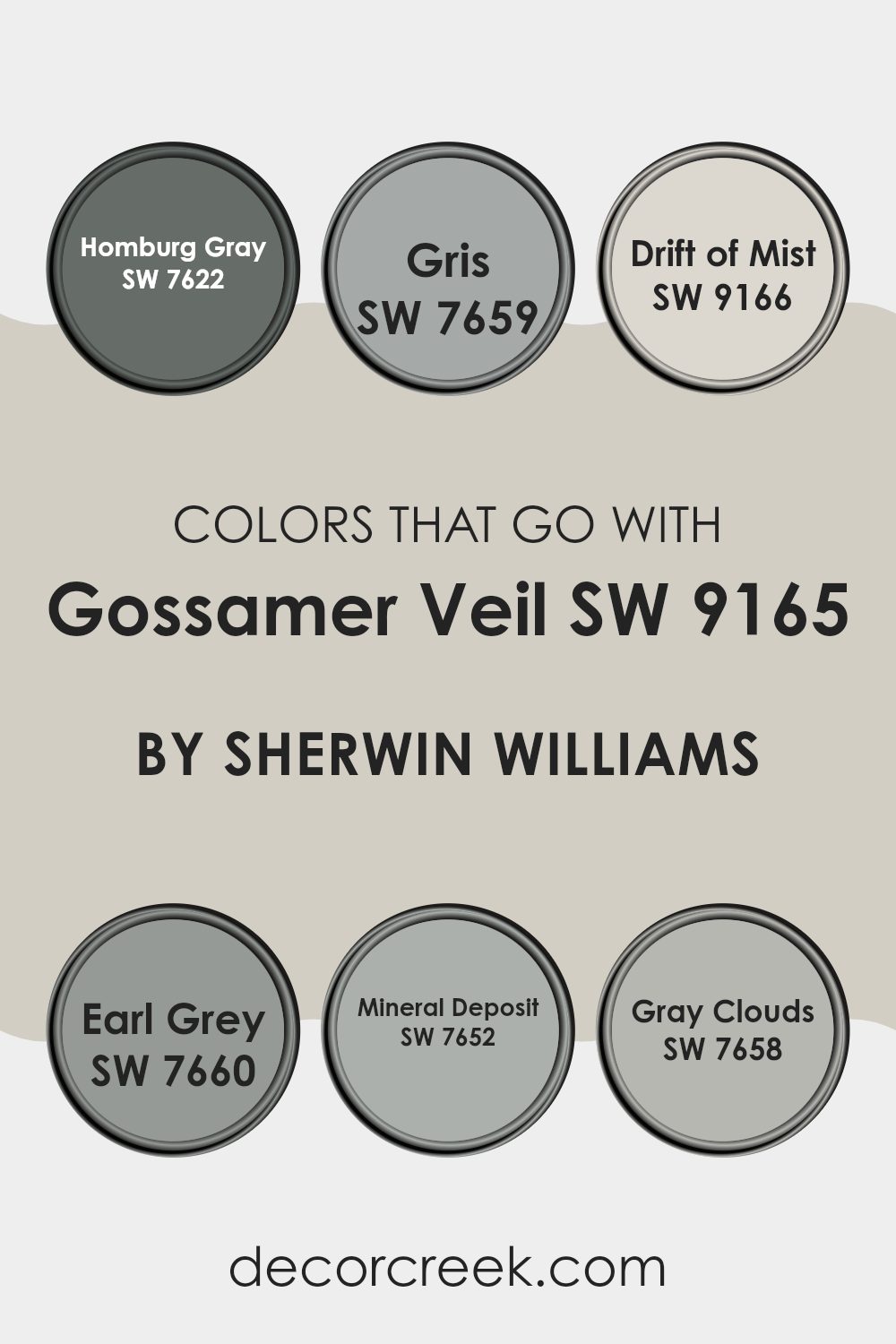
Colors that Go With Gossamer Veil SW 9165 by Sherwin Williams
Choosing the right colors to go with Gossamer Veil SW 9165 by Sherwin Williams is key in achieving a harmonious and appealing look in any room. Gossamer Veil is a subtle and light gray with warm undertones, making it an excellent base for creating a soothing atmosphere. It pairs beautifully with a variety of other colors, enhancing flexibility in design choices.
For a richer contrast, Homburg Gray SW 7622 offers a deep, almost charcoal gray that can anchor lighter tones like Gossamer Veil, providing balance and depth to a room. Gris SW 7659 is a medium-tone gray that complements Gossamer Veil by adding a slightly stronger color without feeling too intense.
Drift of Mist SW 9166 follows closely in tone to Gossamer Veil, adding just a hint of a warmer gray to bring subtle variation and richness to the design. Earl Grey SW 7660, another dark gray, can give a more pronounced, striking contrast to the softness of Gossamer Veil, ideal for accent walls or furniture.
Mineral Deposit SW 7652 has a cool, steely gray hue that can refresh and uplift the overall aesthetic when used alongside Gossamer Veil. Lastly, Gray Clouds SW 7658 is a lighter, airier gray that promotes a sense of openness and light when paired with the foundational tone of Gossamer Veil, perfect for creating a relaxed and inviting environment. Selecting any of these complementary colors allows for a layered, cohesive look that enhances the base color and brings a polished finish to interior rooms.
You can see recommended paint colors below:
- SW 7622 Homburg Gray
- SW 7659 Gris
- SW 9166 Drift of Mist
- SW 7660 Earl Grey
- SW 7652 Mineral Deposit
- SW 7658 Gray Clouds
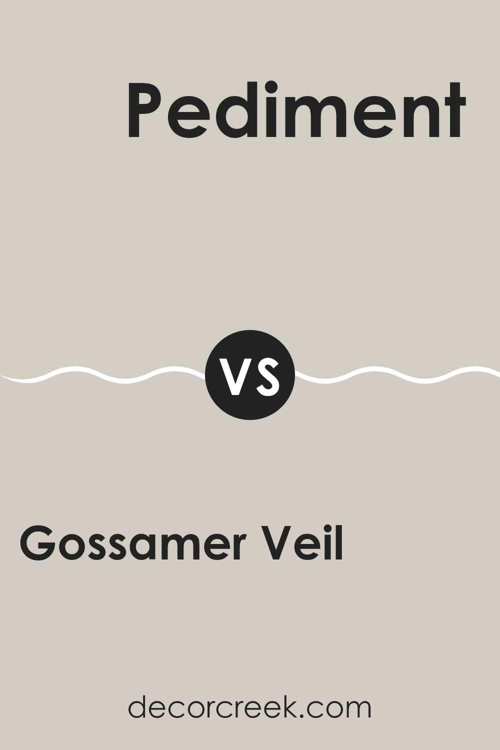
Gossamer Veil SW 9165 by Sherwin Williams vs Pediment SW 7634 by Sherwin Williams
Gossamer Veil and Pediment by Sherwin Williams are both neutral shades, but they offer distinct tones that can affect the ambiance of a room. Gossamer Veil is a soft gray with warm undertones, making it a flexible choice for any room, adding a subtle hint of warmth to the walls without feeling too strong within the room’s overall aesthetic.
On the other hand, Pediment is a slightly darker gray that leans toward a taupe-like appearance. This color is great for those looking to introduce a bit more depth into their room, while still keeping things fairly light and airy.
Both colors are quite neutral, but Gossamer Veil is lighter and warmer, making a room feel cozy. Pediment, being darker, can be used to create a stronger statement yet remains soft enough to maintain a relaxed atmosphere. These qualities make each suitable for various decorating styles, from modern to rustic.
You can see recommended paint color below:
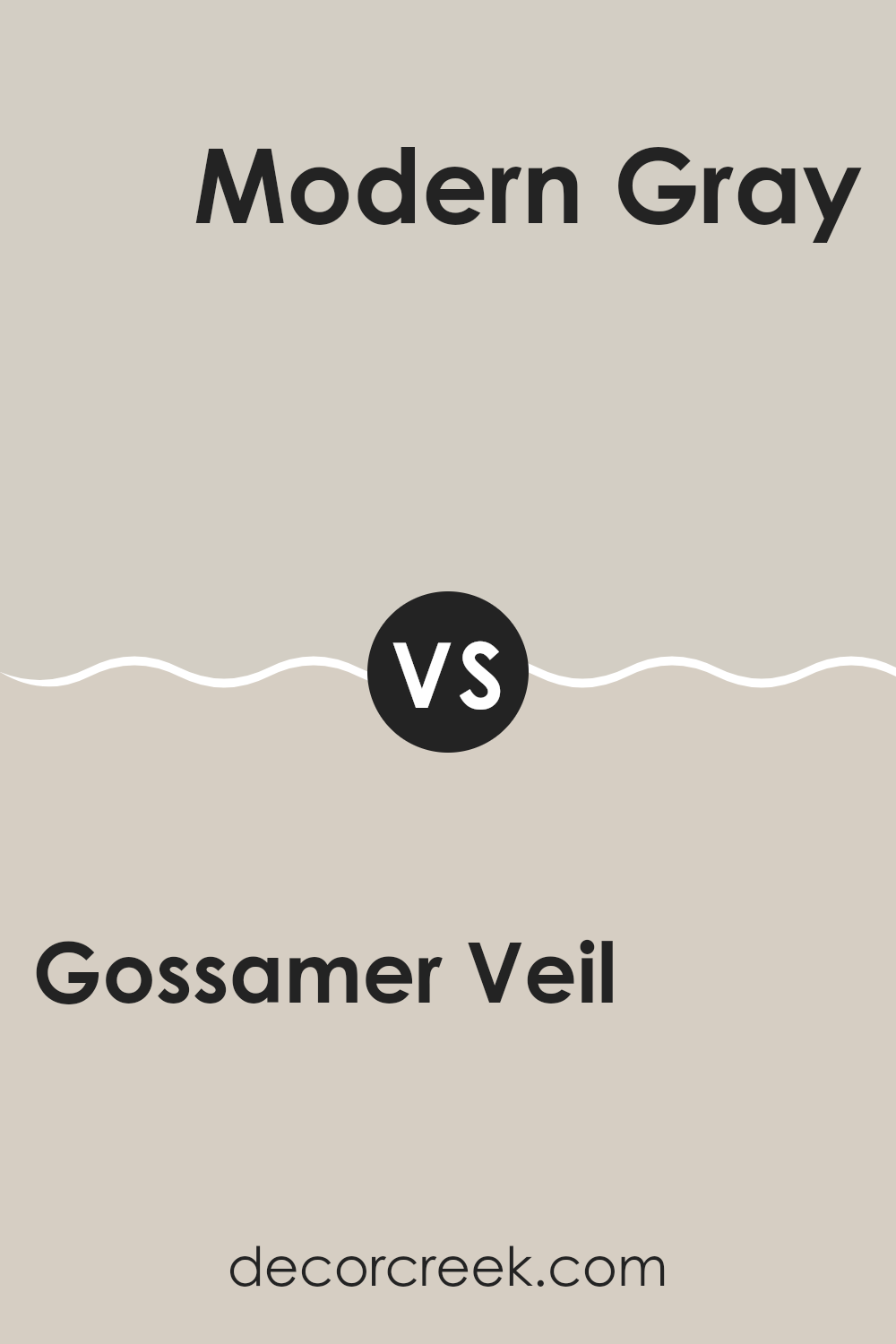
Gossamer Veil SW 9165 by Sherwin Williams vs Modern Gray SW 7632 by Sherwin Williams
Gossamer Veil and Modern Gray, both by Sherwin Williams, share a muted, soft palette that’s great for creating a calm room, yet they have distinct tones. Gossamer Veil leans toward a warm greige (a blend of gray and beige), making it an excellent choice for rooms where a cozy, inviting atmosphere is desired. Its subtle warmth means it pairs nicely with a variety of decor styles and colors.
On the other hand, Modern Gray has a cooler tone, staying truer to a light gray without veering into beige territory. This color is perfect for those looking for a clean, straightforward backdrop that maintains a fresh and airy feel. It’s particularly effective in rooms with plenty of natural light or in a minimalist setting where simplicity is key.
Both colors are flexible and understated, making them suitable for nearly any room, yet their differences in undertones can influence the mood and visual temperature of a room.
You can see recommended paint color below:
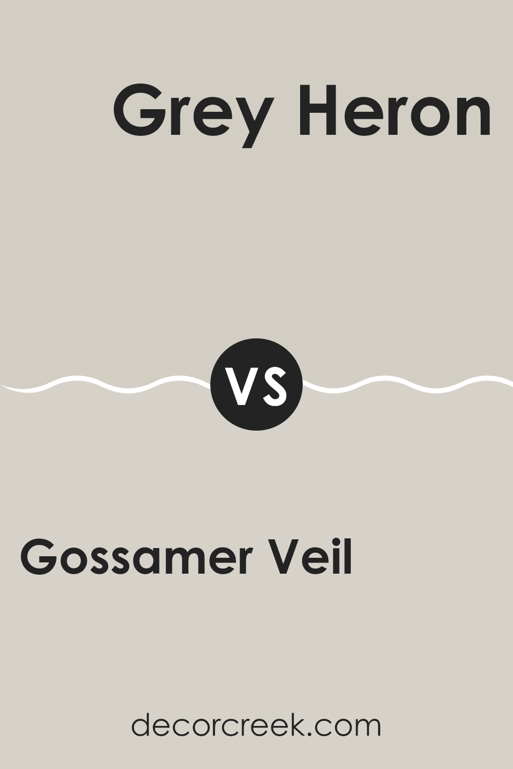
Gossamer Veil SW 9165 by Sherwin Williams vs Grey Heron SW 9566 by Sherwin Williams
Gossamer Veil and Grey Heron are two different shades of gray from Sherwin Williams. Gossamer Veil is a soft, light gray with warm undertones, making it cozy and inviting. It’s flexible and works well in many rooms, brightening interiors without feeling too stark.
On the other hand, Grey Heron is a darker gray that leans slightly toward a cooler tone. This color gives a bolder look and can add a sense of depth to a room. It’s great for creating a strong presence in a room, whether it’s applied on an accent wall or throughout a larger area.
Comparatively, Gossamer Veil is better for those who prefer a gentler and warmer atmosphere, while Grey Heron suits those looking for a more striking and cooler backdrop. Both colors support various decor styles, but the choice between them depends on the mood and visual impact you want to achieve in your room.
You can see recommended paint color below:
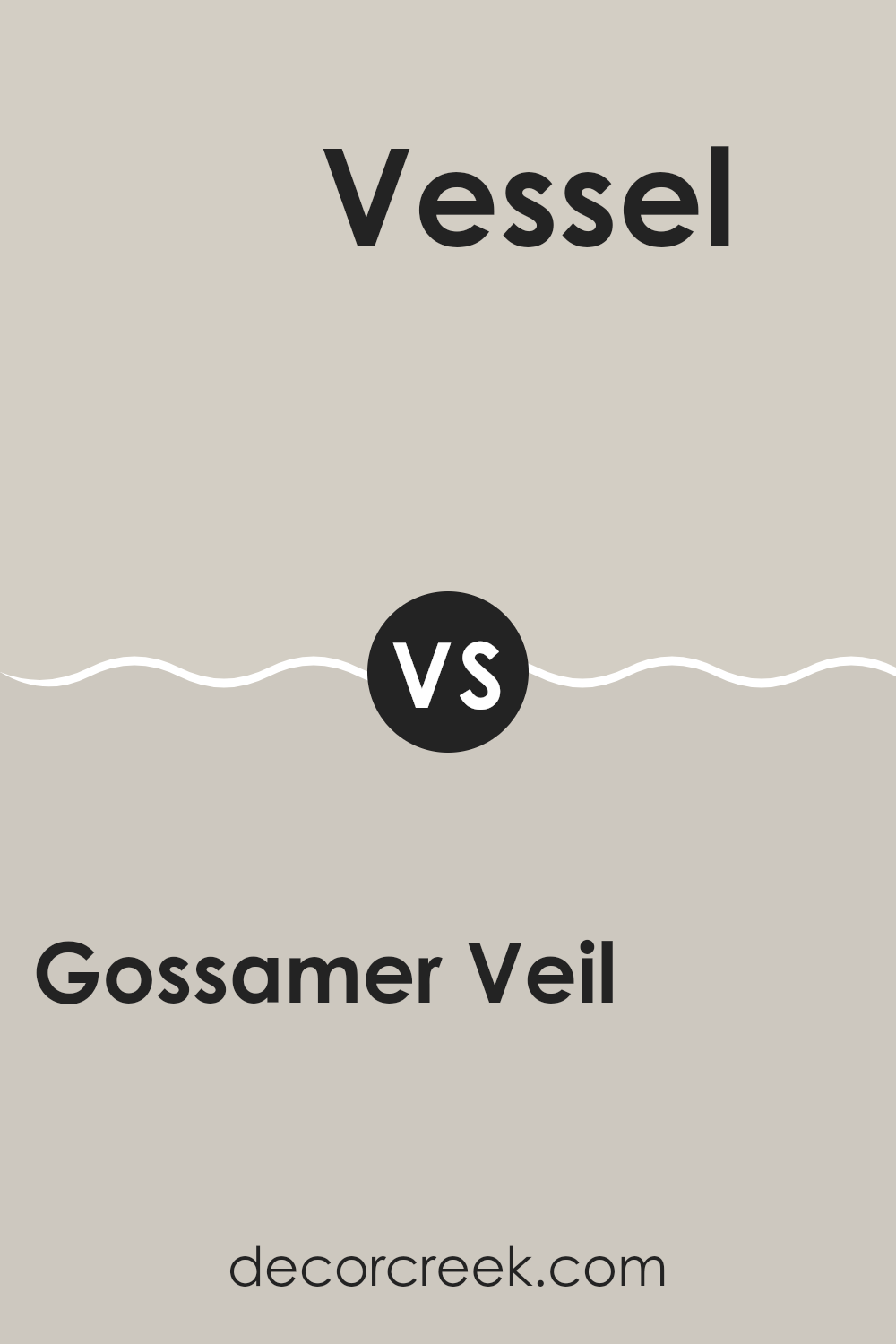
Gossamer Veil SW 9165 by Sherwin Williams vs Vessel SW 9547 by Sherwin Williams
Gossamer Veil is a soft, warm gray with beige undertones that gives it a cozy and welcoming vibe. It’s flexible, making it a great choice for any room in your house, whether you want to paint an entire living room or just an accent wall in a bedroom. It pairs well with both bright and muted colors, allowing for easy decorating.
Vessel, on the other hand, is a deeper, bolder gray with a much cooler tone. It’s a color that stands out more, making it ideal for making a statement in a room. Vessel works well in modern settings or as a contrast against lighter hues, especially in places where you want to draw attention like a dining area or an entryway.
Both colors reflect a modern trend in home design that favors grays, but they serve different moods and purposes. Gossamer Veil offers a lighter, airier feel, while Vessel provides depth and drama. This makes them suitable for different styles and rooms.
You can see recommended paint color below:
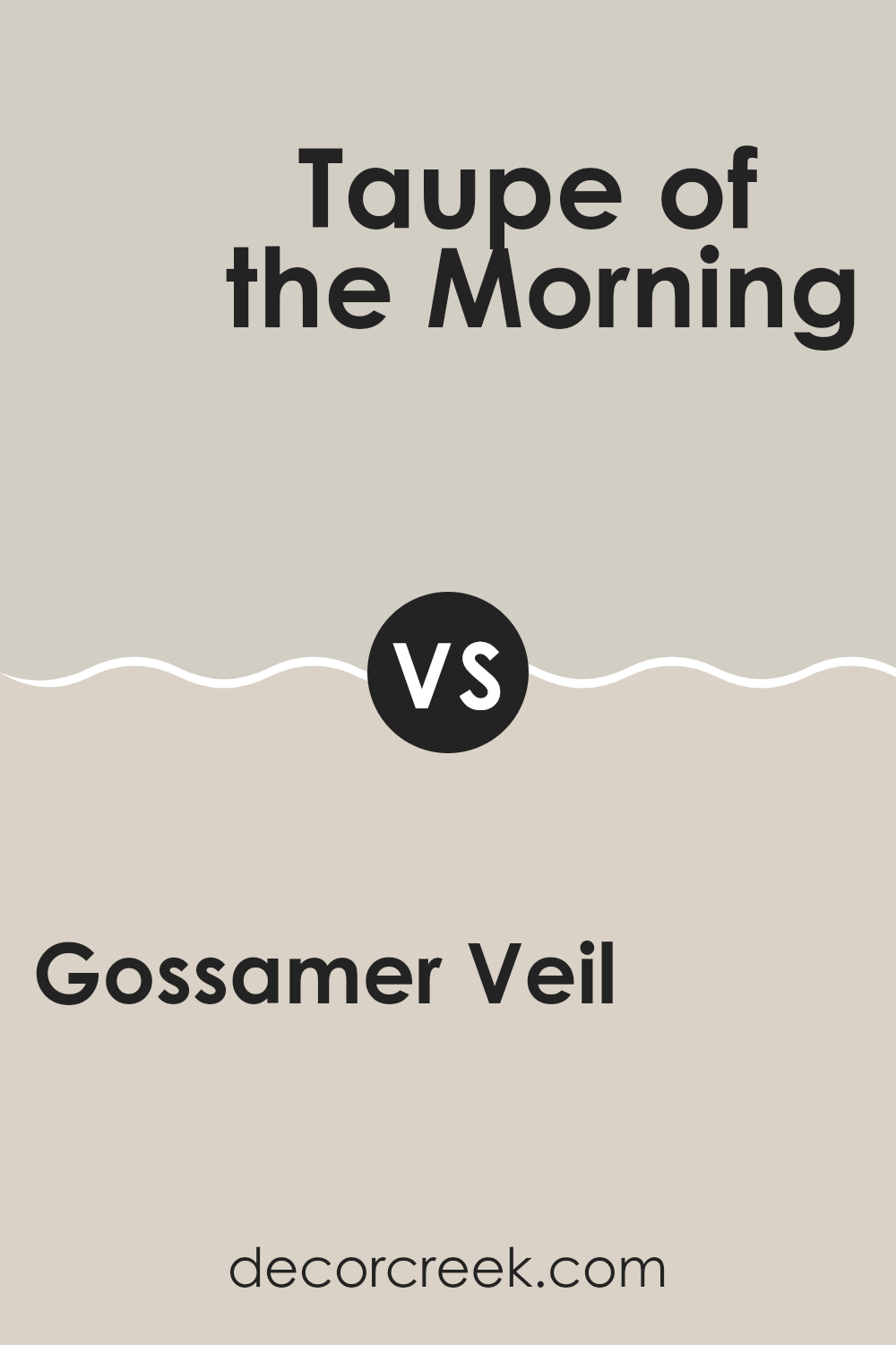
Gossamer Veil SW 9165 by Sherwin Williams vs Taupe of the Morning SW 9590 by Sherwin Williams
Gossamer Veil and Taupe of the Morning are two popular paint colors from Sherwin Williams, each with a unique appeal for home interiors. Gossamer Veil is a soft, light grey with warm undertones, making it a flexible choice that works well in various rooms. It reflects light nicely, which can make small rooms appear larger and more open.
On the other hand, Taupe of the Morning is a deeper, warm taupe. This color provides a cozy feel, perfect for creating a welcoming atmosphere in living areas or bedrooms. It pairs well with a wide range of decor styles and adds a touch of warmth to rooms that might feel too stark with lighter colors.
While both colors offer a neutral palette, Gossamer Veil is lighter and cooler, potentially making it better for a modern look or rooms you want to feel more spacious. Taupe of the Morning, with its richer, warmer tones, is ideal for setting a relaxed, comfy vibe.
You can see recommended paint color below:
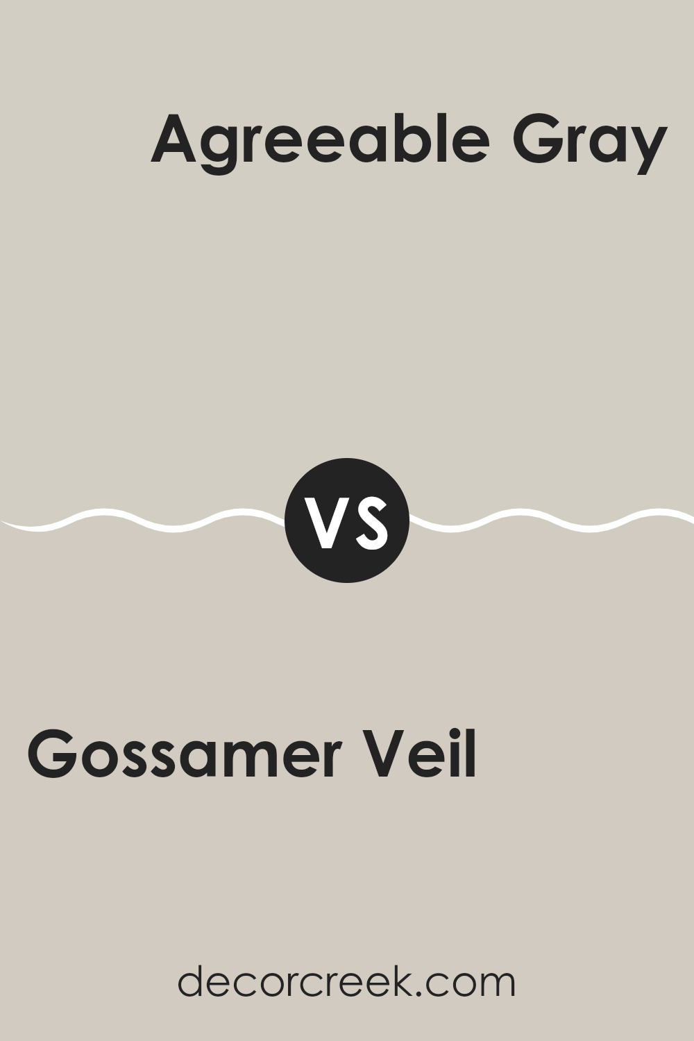
Gossamer Veil SW 9165 by Sherwin Williams vs Agreeable Gray SW 7029 by Sherwin Williams
Gossamer Veil and Agreeable Gray are both popular paint colors by Sherwin Williams, often chosen for their neutral and flexible qualities. Gossamer Veil is a soft, light gray with a warm beige undertone that makes it slightly warmer than a typical gray. This color is great for a subtle background that allows furnishings and art to stand out.
Agreeable Gray, on the other hand, is a bit deeper and could be described as the perfect blend of gray and beige, often referred to as “greige.” It is one shade darker than Gossamer Veil, providing a slightly stronger presence in a room without becoming too strong.
Both colors work well in different rooms and lighting conditions, creating a cozy and inviting atmosphere. Their subtle differences in depth and undertones allow them to cater to different tastes or room needs, making them a go-to choice for many homeowners aiming for a modern and neutral look.
You can see recommended paint color below:
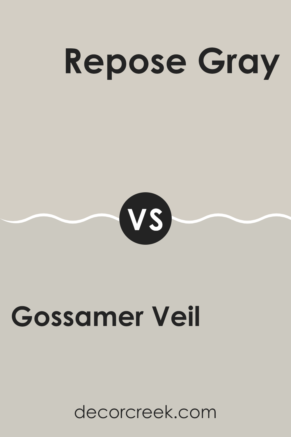
Gossamer Veil SW 9165 by Sherwin Williams vs Repose Gray SW 7015 by Sherwin Williams
Gossamer Veil and Repose Gray, both by Sherwin Williams, are popular choices for neutral paint colors, though they offer distinct tones that set them apart. Gossamer Veil is a soft, warm gray with beige undertones that make it very flexible for rooms needing a subtle touch of warmth, without feeling too strong in the room. This makes it a great candidate for combining with a variety of decor styles and colors.
Repose Gray, on the other hand, is a true gray that is slightly cooler and has a more noticeable presence in a room. It can act almost like a chameleon, adapting a bit to the surrounding light and colors, but generally maintains a more neutral, balanced gray tone.
When deciding between the two, Gossamer Veil works wonderfully in rooms where you want a cozier feel, and Repose Gray is ideal if you’re looking for a cleaner, more straightforward gray that still provides a warm backdrop. Both colors are great for creating a refined look, but your choice would depend on the specific mood and style you wish to achieve.
You can see recommended paint color below:
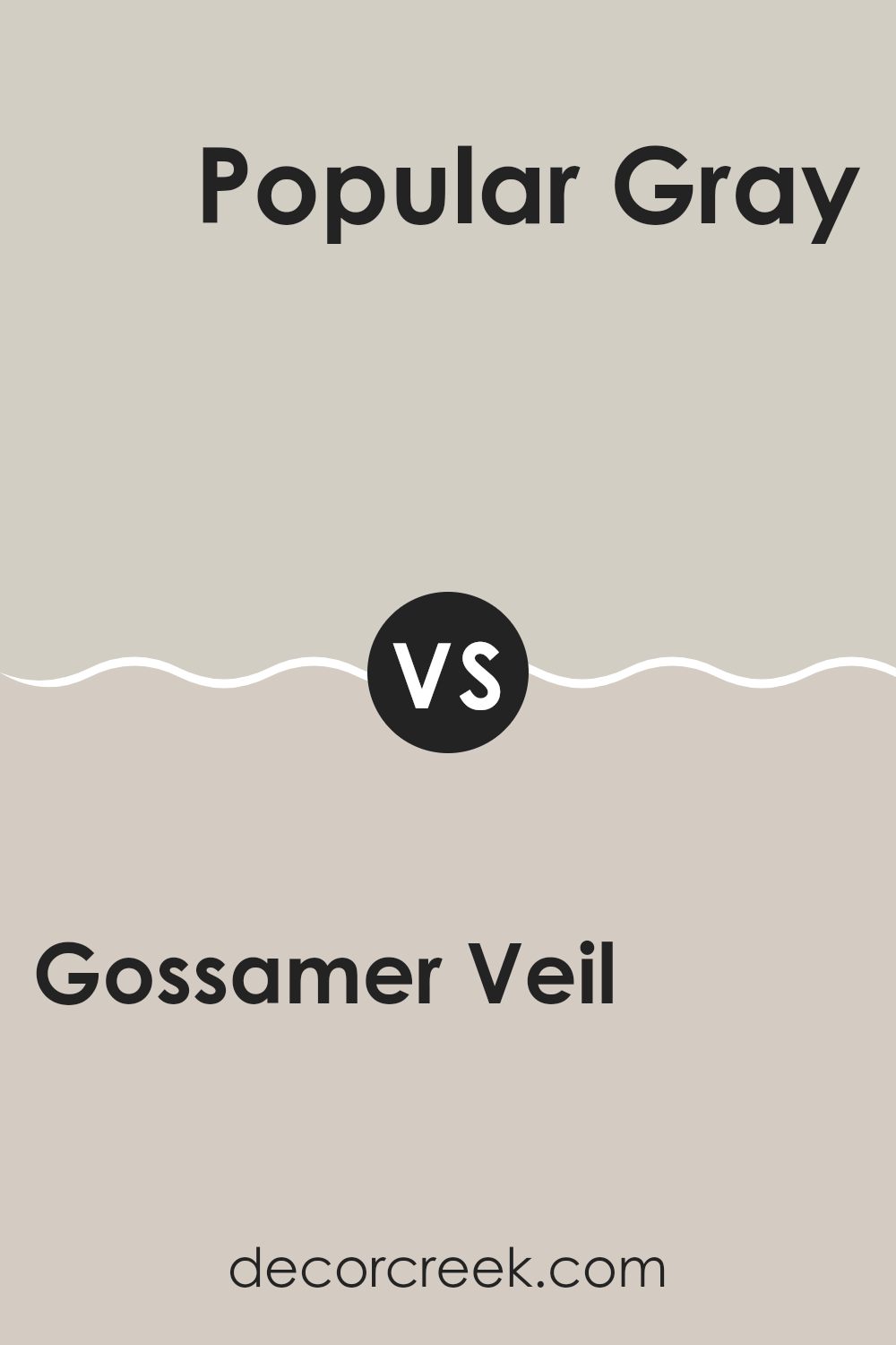
Gossamer Veil SW 9165 by Sherwin Williams vs Popular Gray SW 6071 by Sherwin Williams
Gossamer Veil and Popular Gray, both from Sherwin Williams, are neutral colors that offer subtle variations in hue that can affect the mood and aesthetic of a room. Gossamer Veil has a lighter, greige tone that combines gray with hints of beige, making it very flexible and an excellent choice for those who want a modern yet warm look. It’s particularly effective in brightening rooms that don’t get a lot of natural sunlight.
In contrast, Popular Gray is a warmer shade that leans more toward a true gray but still maintains a touch of warmth from the beige undertones. This color is great for creating a cozy atmosphere in rooms that are meant to feel relaxing and inviting, like living rooms and bedrooms.
Both colors are stylish and can work well in many different types of decor. However, choosing between them depends on the specific needs of your room and the overall vibe you’re aiming for. Lighter Gossamer Veil can make small rooms appear bigger, while Popular Gray can add depth and warmth to a larger area.
You can see recommended paint color below:
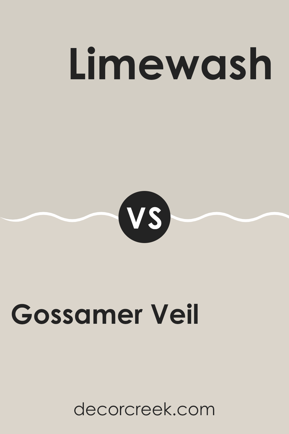
Gossamer Veil SW 9165 by Sherwin Williams vs Limewash SW 9589 by Sherwin Williams
Gossamer Veil and Limewash, both by Sherwin Williams, are unique neutral shades but carry different tones and vibes for rooms. Gossamer Veil is a soft, warm gray that lends a cozy yet clean look to walls.
It’s ideal for someone wanting a subtle backdrop that pairs well with both bold and muted décor. On the other hand, Limewash has a distinctly more beige tone, radiating a slightly richer and earthier feel. This color works well in rooms where you want to introduce warmth without overpowering with darker hues.
In lighting, Gossamer Veil tends to maintain its gray subtlety, providing a stable, soothing presence, whereas Limewash might shift toward a creamier presence under different lights, offering a comforting, homely vibe. Both colors are flexible, but your choice between them would depend on the kind of warmth and the specific neutral tone you are aiming to achieve in your room.
You can see recommended paint color below:
Gossamer Veil SW 9165 by Sherwin Williams vs Useful Gray SW 7050 by Sherwin Williams
Gossamer Veil and Useful Gray by Sherwin Williams are both neutral shades, but they bring different vibes to a room. Gossamer Veil is a soft, warm greige (a mix of gray and beige) that offers a light and airy feel, making it a great choice for creating a cozy and welcoming atmosphere in rooms. It has a subtle warmth that pairs easily with a variety of decor styles and colors.
On the other hand, Useful Gray is a slightly cooler tone. While still in the neutral family, it leans more toward a true gray compared to Gossamer Veil. This color is a bit deeper, providing a stronger presence that can serve as a beautiful backdrop for both modern and traditional settings. It works well in rooms that require a bit of a sharper contrast without feeling too strong.
When choosing between the two, consider the mood and style you want to achieve. Gossamer Veil works well in rooms where you want a touch of warmth, while Useful Gray is ideal if you prefer a more muted and straightforward gray.
You can see recommended paint color below:
In wrapping up my thoughts on Sherwin Williams’ paint color SW 9165 Gossamer Veil, I have to say it’s truly a wonderful choice for anyone looking to give their room a gentle and pleasant look. This color is soft and light, sort of like a mix between gray and white. It’s perfect for rooms where you want to relax and feel calm, like your bedroom or living room.
Gossamer Veil pairs really well with different colors – you can pair it with dark blues for a nice contrast or keep things mellow with soft greens and creams. It’s easy to match with your furniture too, whether it’s dark or light. This is great because it means you won’t have to buy new stuff to make your room look nice.
Also, whether the light in your room is bright or a bit dim, Gossamer Veil will still look good. It doesn’t get too dark in dim light or too bright when it’s sunny, which makes it a good choice for any room, no matter the lighting situation.
In conclusion, if you are thinking about painting a room and you want a color that is easy to work with, calming and fits well with other colors, SW 9165 Gossamer Veil by Sherwin Williams might just be the perfect pick for you. Give it a try and see how it makes your room feel fresh and cozy!
Ever wished paint sampling was as easy as sticking a sticker? Guess what? Now it is! Discover Samplize's unique Peel & Stick samples.
Get paint samples

