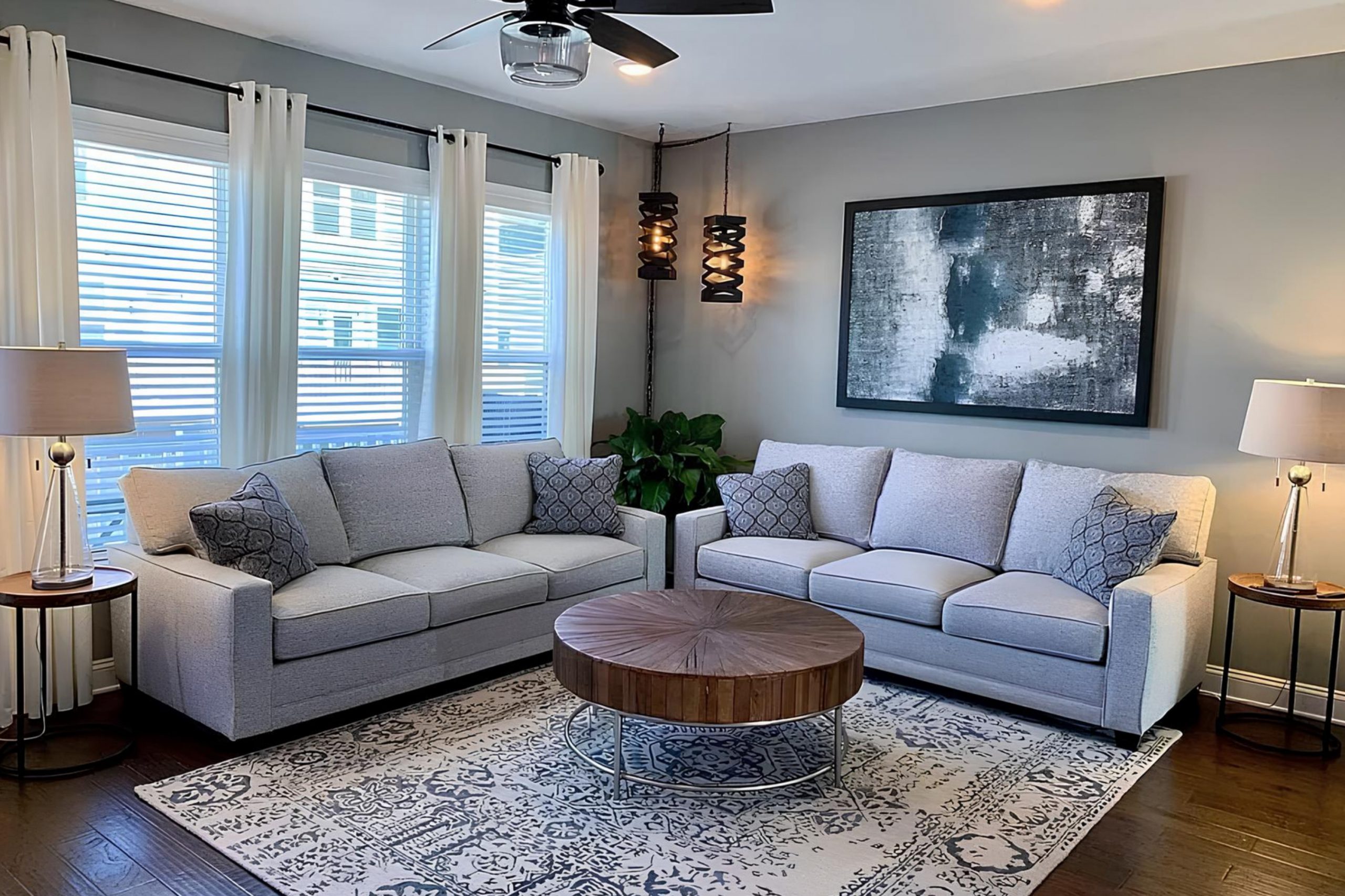
When I decided to refresh a room in my home, I searched for a color that could bring a subtle yet distinct atmosphere without overwhelming the space. I settled on SW 7650 Ellie Gray by Sherwin Williams and was pleased by its versatile shade. Ellie Gray stands out as a beautiful gray that boasts subtle green undertones. This unique blend makes it suitable for rooms where tranquility and neutrality are desired, yet it retains enough warmth to create a welcoming vibe.
The color adapts effortlessly to various lighting conditions, showcasing a softer side under natural light and a more profound and anchoring presence when illuminated by indoor lighting. This adaptability makes it an excellent choice for living areas, bedrooms, and even offices where the mood can shift from the functional brightness of day to the cozy ambiance of evening.
The calming influence of Ellie Gray has transformed my space into a serene retreat that feels both modern and timelessly elegant.
Choosing Ellie Gray was a decision that stepped up the overall feel of the room, providing a backdrop that complements both minimalist and vibrant decor schemes.
So, if you’re looking for a paint color that holds its own without taking center stage, Ellie Gray could be just what your home needs.
What Color Is Ellie Gray SW 7650 by Sherwin Williams?
Ellie Gray is a versatile shade of gray that balances cool undertones with a hint of warmth, making it adaptable for various interior styles. This color is particularly effective in achieving a modern, sleek look but works equally well in traditional settings due to its understated elegance. Ellie Gray pairs seamlessly with materials like natural wood, helping to warm up spaces, while also complementing metallic finishes like brushed nickel or stainless steel which enhance its modernity.
When used in interiors, this color can add a clean and uncluttered feel to the space. It’s particularly striking when combined with whites or off-whites to create a refined contrast. Alternatively, it can be paired with bold colors like navy or burgundy for a more dramatic effect. Textures such as velvet or silk add a layer of interest and comfort when used alongside Ellie Gray, while rough textures like burlap or linen can create a more relaxed, rustic vibe.
Ideal for styles ranging from contemporary to industrial and even minimalist, this color supports light-filled spaces as well as cosier, dimly lit rooms.
Whether applied on walls, as an accent, or for cabinetry, Ellie Gray provides a subtle, yet impactful backdrop that enhances the aesthetic of a room without overwhelming it.

Is Ellie Gray SW 7650 by Sherwin Williams Warm or Cool color?
Ellie Gray by Sherwin Williams is a versatile paint color that fits well in many rooms of a house. Its balanced gray tone works well as a neutral base, making it easy to match with a wide range of furniture and decor styles.
Whether you’re looking to paint your living room, bedroom, or even your kitchen, Ellie Gray provides a calm, understated backdrop that doesn’t overpower the space. It’s especially good for rooms that don’t get a lot of natural light, as its brightness can help make the space feel larger and more open. It also pairs well with both warm and cool tones, allowing flexibility in choosing accent colors and decorations.
If you’re redoing your home or just a room, Ellie Gray is a reliable choice that adapts well to different lighting and surrounding colors, helping you create a comfortable and inviting atmosphere.
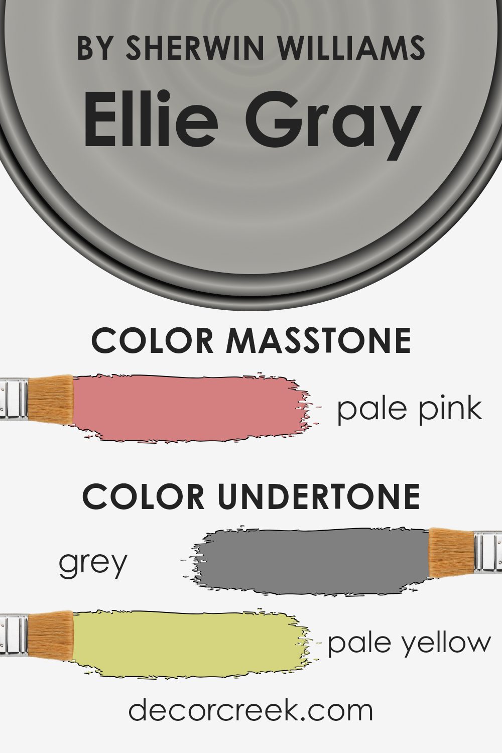
Undertones of Ellie Gray SW 7650 by Sherwin Williams
Ellie Gray is a versatile paint color that subtly changes hue depending on lighting and surrounding colors because of its various undertones. When thinking about undertones, consider them as the shadow or secondary colors that lie beneath the main color. These undertones can significantly influence how we perceive the primary color itself.
In the case of Ellie Gray, it has a blend of gray base with hints of other colors, making it unique. For example, the gray undertone keeps it neutral and flexible in various settings, blending well in most interior designs. The pale yellow and light purple undertones add a touch of warmth and softness, making the walls look welcoming rather than cold, which is a common concern with gray shades.
Similarly, undertones like mint and light blue bring a fresh, almost airy feel, perfect for creating a relaxed atmosphere in places like bedrooms or bathrooms. When used in spaces with plenty of natural light, these lighter undertones can make Ellie Gray look almost luminous, adding to the room’s overall brightness.
However, in areas with less natural light, darker undertones like olive or brown may become more pronounced, giving the color a more anchored, earthy feel. This characteristic makes Ellie Gray adaptable to various decor styles and personal tastes, from modern minimalist to cozy traditional.
Overall, understanding these undertones helps in choosing the right color combinations and decor elements to complement the primary color, ensuring that the final appearance of your walls is harmonious and appealing.
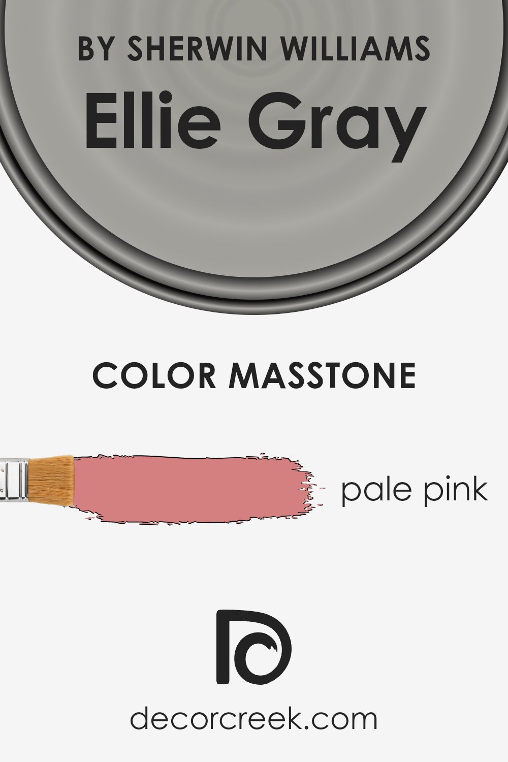
What is the Masstone of the Ellie Gray SW 7650 by Sherwin Williams?
Ellie GraySW 7650 by Sherwin Williams has a masstone of Pale Pink, with the RGB code #D58080. This subtle shade of pink brings a soft and warm feel to any room. Its gentle tone makes it versatile enough to work well in various spaces, from bedrooms and living rooms to even kitchens and bathrooms. This color tends to create a cozy atmosphere without feeling overwhelming.
Perfect for those looking to add a touch of softness without going overly bright, Pale Pink can also help make a small space seem larger due to its light and airy quality. It pairs well with neutral tones such as whites, grays, and creams, making it easy to integrate into existing color schemes.
Additionally, because of its understated charm, this color can be particularly helpful in homes with a lot of natural light, enhancing a sense of warmth and welcome. It’s an ideal choice for anyone looking to add a gentle splash of color to their home without making a space feel cramped or too bold.
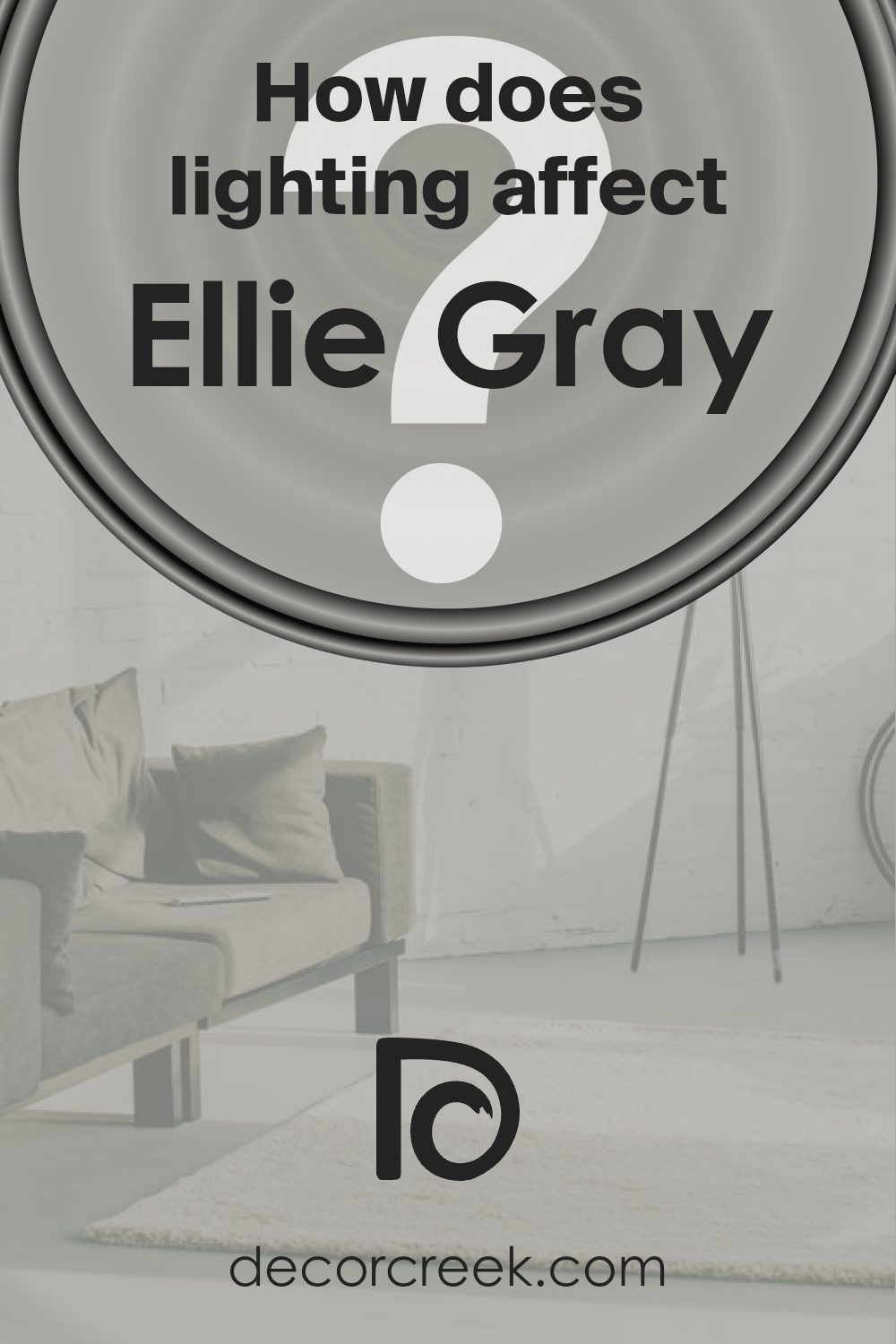
How Does Lighting Affect Ellie Gray SW 7650 by Sherwin Williams?
Lighting plays a crucial role in how we perceive colors. Depending on the type of light, a color can look very different in one setting compared to another. For example, natural light brings out the truest hue of a color, while artificial light can alter how a color appears.
When considering Ellie Gray by Sherwin Williams, its appearance changes under different lighting conditions. Ellie Gray is a versatile shade of gray that can look slightly different depending on the light source. In natural light, Ellie Gray displays a clean and clear gray tone. The color is steady and neutral during the day, making spaces feel open and calm.
Under artificial light, such as LED or fluorescent bulbs, Ellie Gray can take on a slightly different tone. In warmer light, it may appear softer and more inviting, whereas cooler light can make it look more austere and sharper. This difference occurs because artificial lighting can either highlight or mute certain tones in the paint.
The orientation of a room also affects how Ellie Gray looks throughout the day. In a north-facing room, which receives less direct sunlight, Ellie Gray tends to appear consistent but a bit cooler and more shadowed. This can make the room feel more confined without adequate lighting.
In south-facing rooms, abundant sunlight can make Ellie Gray look lighter and more vibrant, enhancing the spacious feel of a room. The color brightens up nicely, making the space feel airy and lively.
East-facing rooms get ample morning light, which can make Ellie Gray look soft and pleasant in the morning, gradually transitioning to a neutral, true gray as the light changes throughout the day.
In west-facing rooms, the color will experience the most change throughout the day, appearing neutral during midday and transforming into a warmer gray towards the evening as the sunlight becomes redder.
Therefore, Ellie Gray’s versatility makes it suitable for various rooms and lighting conditions, adapting uniquely to each setting.
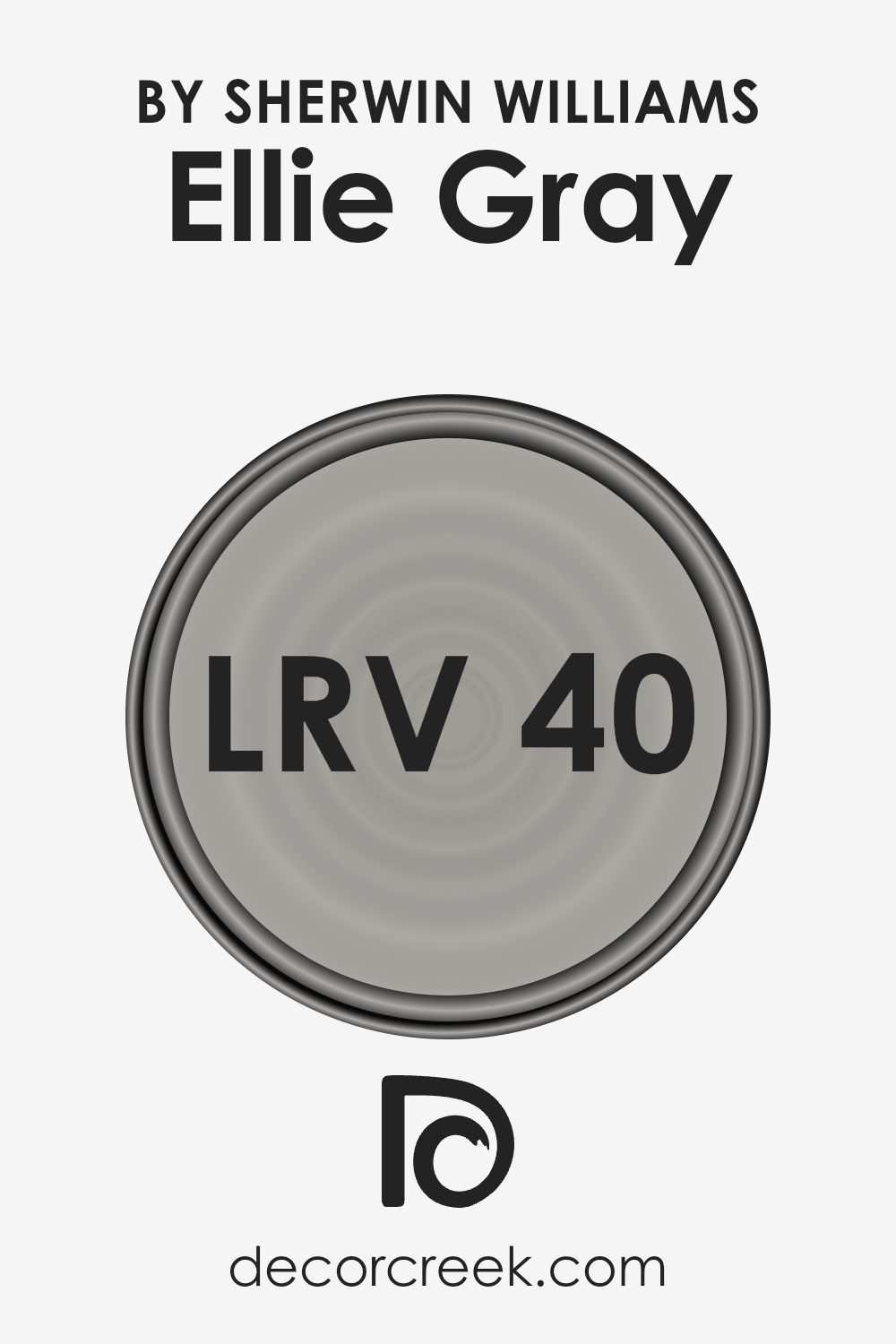
What is the LRV of Ellie Gray SW 7650 by Sherwin Williams?
LRV, or Light Reflectance Value, is a measurement used to determine how much light is reflected by a painted surface compared to how much it absorbs. It’s a scale typically from zero to one hundred, where zero means no light is reflected (completely black surface) and one hundred means all the light is reflected (completely white surface).
This value is crucial when choosing paint colors because it helps to predict how light or dark a color will appear in different settings. A high LRV means the color will appear brighter and reflect more light, making a room feel more open and airy. Conversely, a low LRV suggests the color will absorb more light, giving a room a cozier, more enclosed feel.
For the color with an LRV of 39.786, like Ellie Gray, it’s on the darker side of the middle range. This means it won’t reflect a lot of light but isn’t among the darkest shades either. In practical terms, this LRV suggests the color can add some depth to a room without making it feel too cramped. It’s a good middle ground for spaces that want some sophistication without the heaviness of a very dark color.
The shade can work particularly well in areas that receive a fair amount of natural light, as it will balance nicely with the brightness without looking washed out, maintaining its distinct hue throughout different times of the day.
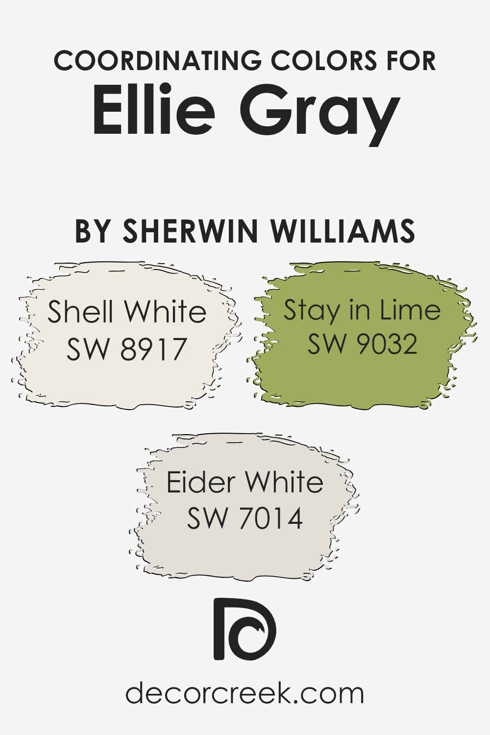
Coordinating Colors of Ellie Gray SW 7650 by Sherwin Williams
Coordinating colors are those that complement or enhance each other when used together in decor or design, creating a cohesive and appealing look. These colors are selected carefully to ensure they harmonize well. For instance, Ellie Gray by Sherwin Williams finds great coordinating colors in shades such as Shell White, Eider White, and Stay in Lime. Each of these colors serves to balance or accentuate the main hue, depending on their use in the space, be it on walls, trims, or as accent decorations.
Shell White has a gentle warmth to it, perfect for balancing the cool tone of Ellie Gray, creating a calm environment. It works well as a trim or main wall color that quietly complements without overwhelming the space. Eider White is slightly cooler but still maintains a neutrality that pairs beautifully with Ellie Gray for a modern, clean aesthetic.
It’s particularly effective in spaces that aim for a minimalistic look. Meanwhile, Stay in Lime offers a zesty contrast that can add a lively pop of color, ideal for accent details or a feature wall that brings a refreshing twist to the overall palette. This green hue injects vibrancy, making it perfect for spaces needing a dash of energy.
You can see recommended paint colors below:
- SW 8917 Shell White
- SW 7014 Eider White
- SW 9032 Stay in Lime
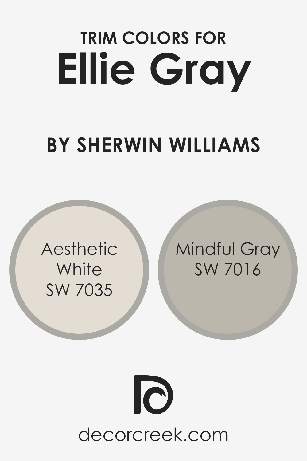
What are the Trim colors of Ellie Gray SW 7650 by Sherwin Williams?
Trim colors are specific shades used to accentuate or highlight the architectural features of a room, such as baseboards, moldings, door frames, and window sills. They play an essential role in interior design by defining and framing spaces, adding contrast, or enhancing the aesthetic appeal of a wall color.
For example, when using Ellie Gray by Sherwin Williams, picking the right trim color can make a significant difference. Using lighter trim colors like Aesthetic White or Mindful Gray can create a subtle yet appealing contrast that helps to outline and bring attention to the details of a room.
Aesthetic White SW 7035 is a gentle off-white that has a soft and muted tone, making it an excellent choice for trim as it provides a light contrast without overwhelming the main color. Its neutrality allows it to blend seamlessly with lighter and darker shades alike. On the other hand, Mindful Gray SW 7016 offers a touch of warmth with its gray hue.
This color is slightly darker than Aesthetic White and works well as a trim color to add depth and definition to spaces, presenting a smooth transition from the more pronounced Ellie Gray walls. Both colors serve as versatile options that complement Ellie Gray, creating a harmonious interior that is visually appealing and cohesive.
You can see recommended paint colors below:
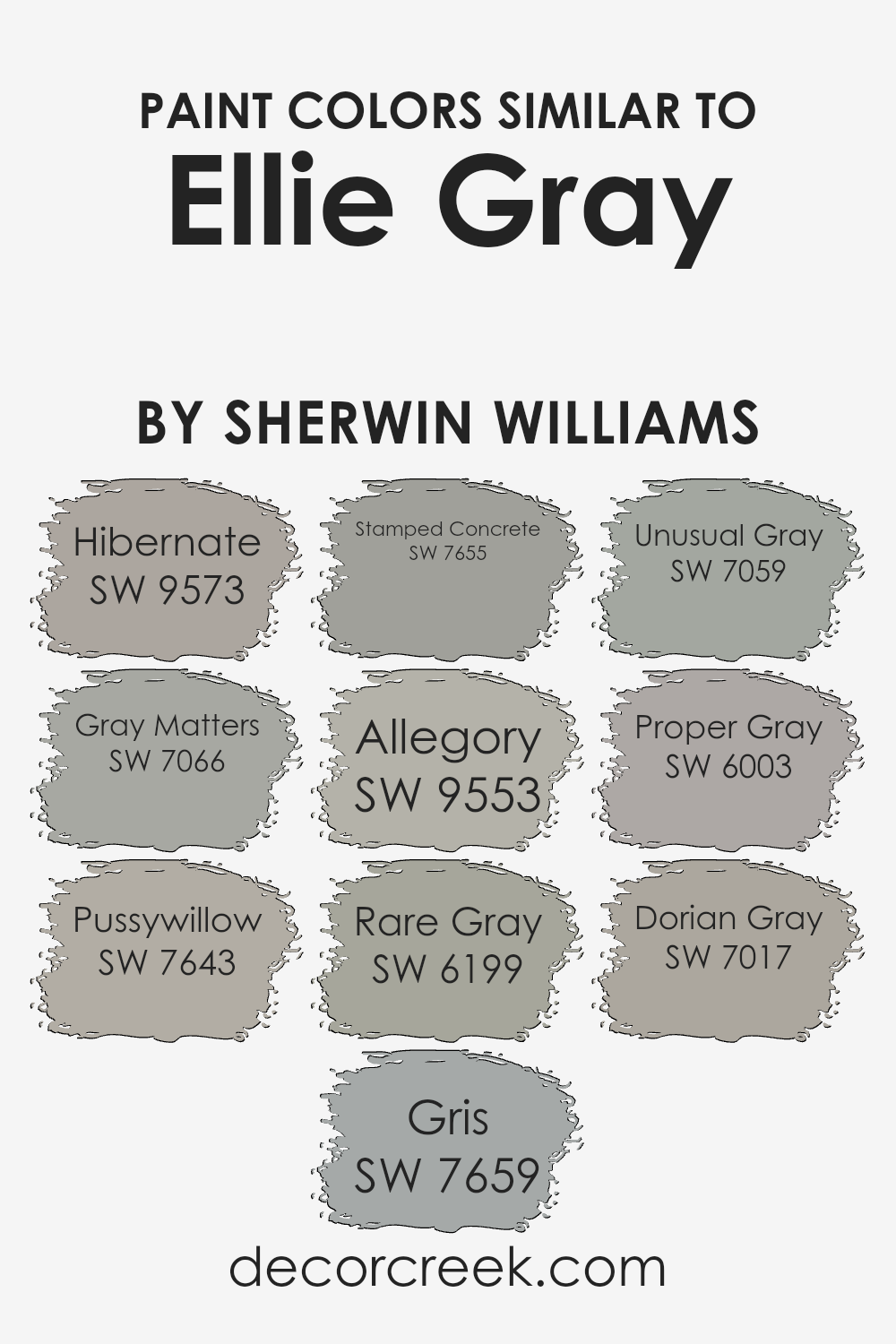
Colors Similar to Ellie Gray SW 7650 by Sherwin Williams
Choosing similar colors is important in design because it ensures that all elements in a space harmonize well, creating a cohesive and balanced atmosphere. Colors that are alike have the characteristic of blending smoothly with one another, making a room feel put-together without harsh contrasts that might strain the eye.
For example, when looking at similar colors to Ellie Gray by Sherwin Williams, you can consider using shades like Hibernate or Gray Matters which provide subtle variations that enrich the environment without overpowering it.
Hibernate is a warm gray that suggests a quiet, cozy feel, perfect for spaces where you want to relax and unwind. Gray Matters, meanwhile, is slightly cooler, offering a more neutral backdrop that works well in modern and minimalist settings. Pussywillow adds a touch of softness and versatility, doing well in almost any room, while Gris has a gentle warmth that’s understated yet inviting.
Stamped Concrete provides a strong, solid foundation when you want a bit deeper tone in the space. Allegory, with its faintly green undertone, brings a unique twist to a classic gray, making it ideal for spaces looking for a hint of differentiation without straying too far from neutral tones. Rare Gray has a slight blue hue that captures a subtle maritime vibe, good for bathrooms or bedrooms.
Unusual Gray stands out with its slightly more pronounced undertones, giving character to office spaces or libraries. Proper Gray is clean and crisp, embodying a professional yet welcoming feel for any entryway or home office.
Lastly, Dorian Gray rounds out the selection with a deeper, more prominent gray that makes a statement whether used for accent walls or entire rooms, defining spaces distinctly. By selecting from these shades, you ensure your decor not only meets your aesthetic needs but also maintains a visual flow throughout the space.
You can see recommended paint colors below:
- SW 9573 Hibernate
- SW 7066 Gray Matters
- SW 7643 Pussywillow
- SW 7659 Gris
- SW 7655 Stamped Concrete
- SW 9553 Allegory
- SW 6199 Rare Gray
- SW 7059 Unusual Gray
- SW 6003 Proper Gray
- SW 7017 Dorian Gray
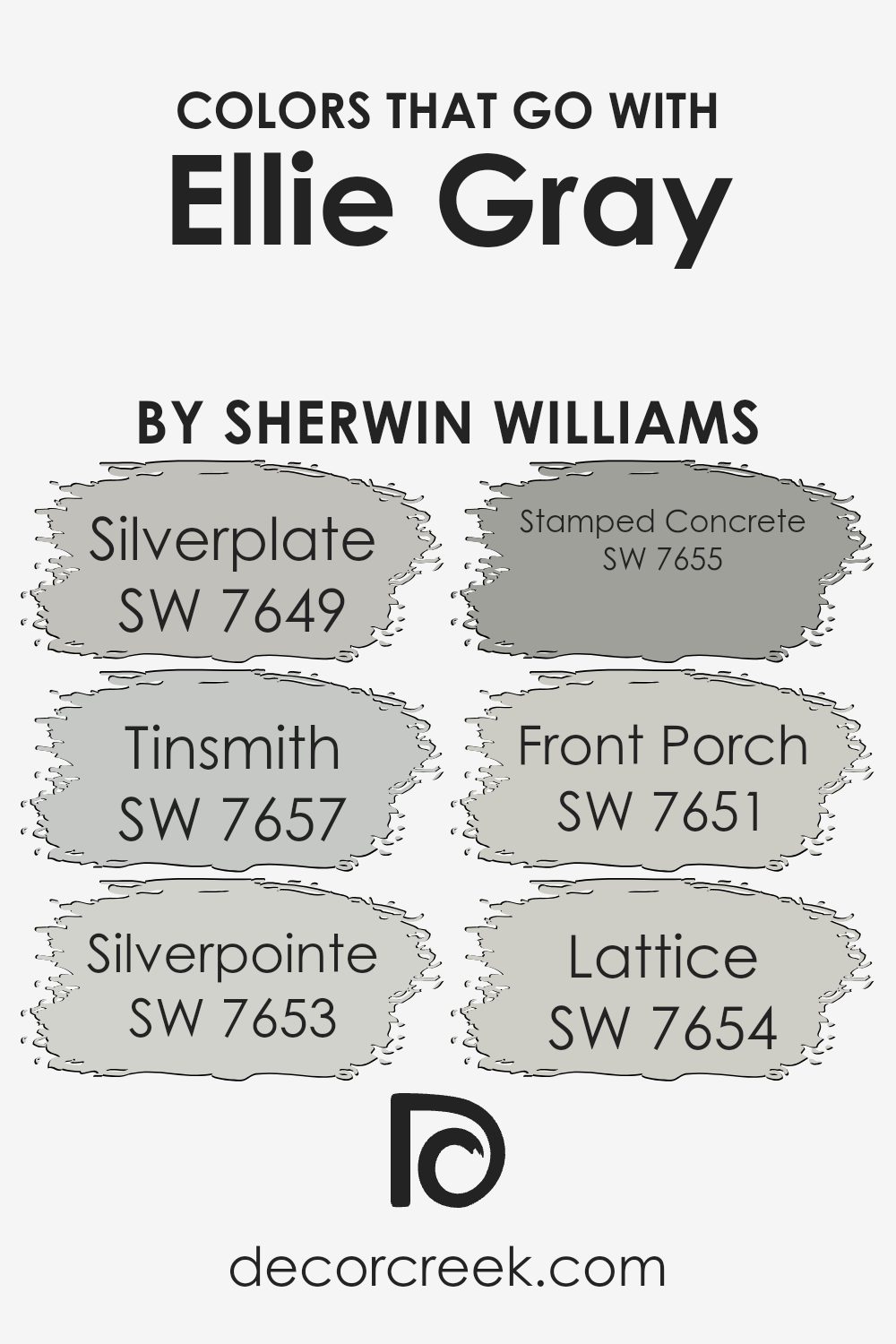
Colors that Go With Ellie Gray SW 7650 by Sherwin Williams
Choosing the right colors to pair with Ellie Gray SW 7650 by Sherwin Williams is crucial as it helps create a cohesive and appealing look in any space. This particular shade of gray serves as a versatile backdrop, allowing other colors to stand out or blend in harmoniously.
Coordinating colors like Silverplate, Tinsmith, Silverpointe, Stamped Concrete, Front Porch, and Lattice can enhance the overall aesthetic by providing varying depths and contrasts that enrich the environment. For example, using lighter or darker shades in conjunction with Ellie Gray can emphasize its understated elegance without overwhelming the senses.
Silverplate is a lighter gray that provides a subtle contrast, brightening spaces that might otherwise feel too muted with Ellie Gray alone. Tinsmith, on the other hand, is a slightly warmer gray, adding a gentle touch of warmth to the color scheme. Silverpointe is another light gray but with cool undertones that can help in areas receiving plenty of sunlight, keeping the ambiance fresh and lively.
Stamped Concrete offers a deeper gray option, giving weight and grounding to more expansive areas. Front Porch is a pale gray that leans towards blue, ideal for creating a calm and inviting atmosphere. Lastly, Lattice is a unique gray with green undertones, perfect for adding a hint of natural vibrancy to a room. Together, these colors support and enhance the flexibility and beauty of Ellie Gray, making it easy to achieve a stylish and coherent look.
You can see recommended paint colors below:
- SW 7649 Silverplate
- SW 7657 Tinsmith
- SW 7653 Silverpointe
- SW 7655 Stamped Concrete
- SW 7651 Front Porch
- SW 7654 Lattice
How to Use Ellie Gray SW 7650 by Sherwin Williams In Your Home?
Ellie Gray SW 7650 by Sherwin Williams is a versatile, neutral gray paint that can create a cozy and inviting atmosphere in any room. It’s not too dark or too light, making it a perfect choice if you’re unsure about what shade of gray to choose.
Ellie Gray can work beautifully in various spaces, such as living rooms, kitchens, and bedrooms. Its neutral tone pairs well with both warm and cool colors, so you can easily match it with your existing furniture and decor.
For a harmonious look, consider using Ellie Gray in rooms with plenty of natural light, as this will complement its cool undertones. It’s also ideal for painting cabinets or accent walls if you’re not ready to commit to painting an entire room. Additionally, Ellie Gray provides a clean and modern backdrop for art and other wall hangings, enhancing their visual impact without overpowering them. Overall, Ellie Gray offers a fresh and modern feel, suitable for many styles and preferences.
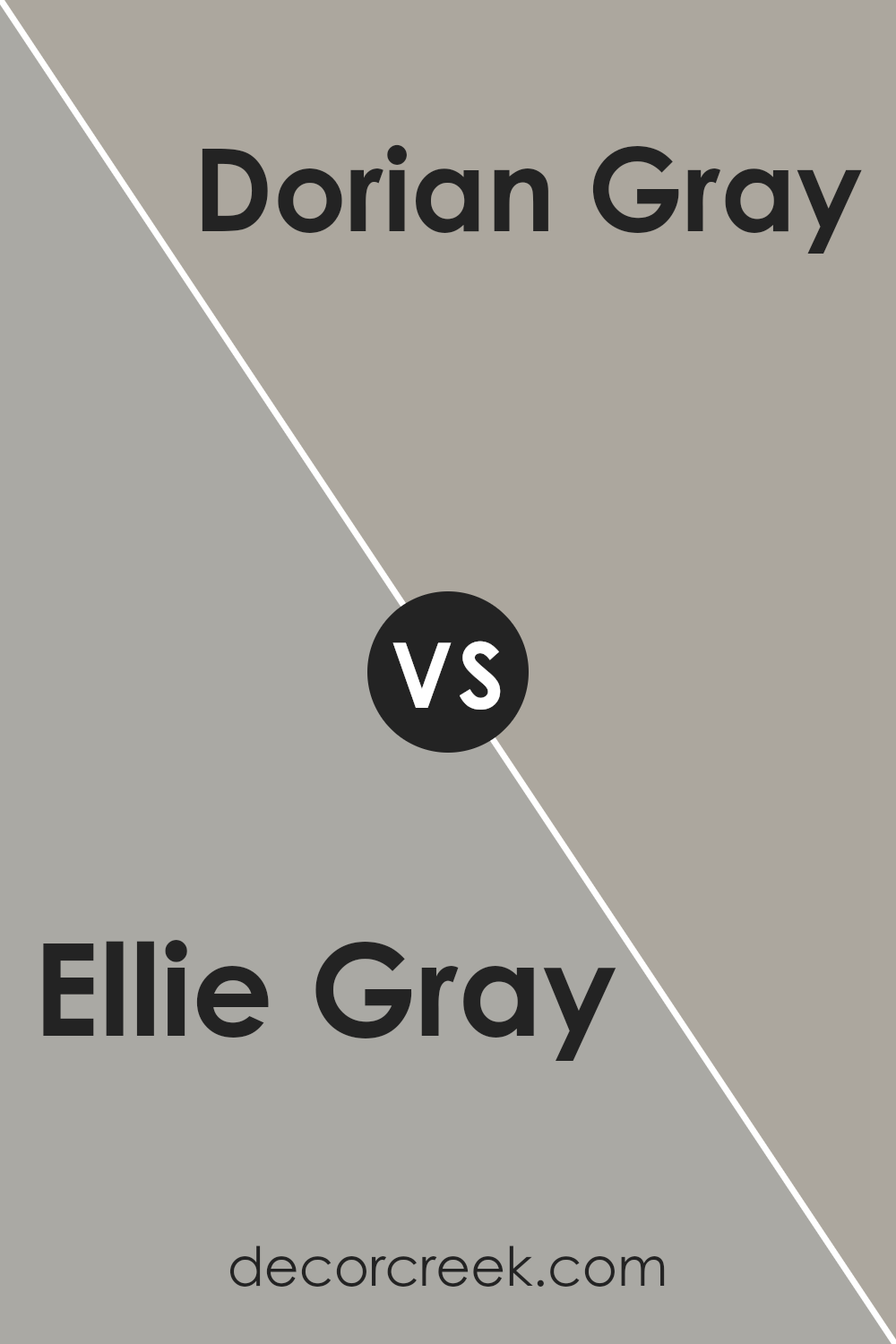
Ellie Gray SW 7650 by Sherwin Williams vs Dorian Gray SW 7017 by Sherwin Williams
The two shades, Ellie Gray and Dorian Gray, both from Sherwin Williams, offer subtle variations in the gray color family. Ellie Gray has a cooler tone which gives it a crisp, clean look that can make spaces feel more open and airy.
It’s a lighter shade, which works well in rooms that aim for a fresh and modern feel. On the other hand, Dorian Gray is a deeper gray with warm undertones. This makes it an excellent choice for adding warmth to a room, making it feel cozy and inviting. The richer hue of Dorian Gray is ideal for those who prefer a stronger presence of color in their decor, as it stands out more distinctly against other elements in a space.
Essentially, while both colors maintain a neutral palette, Ellie Gray leans towards a lighter, cooler appearance, and Dorian Gray offers a warmer, more pronounced vibe.
You can see recommended paint color below:
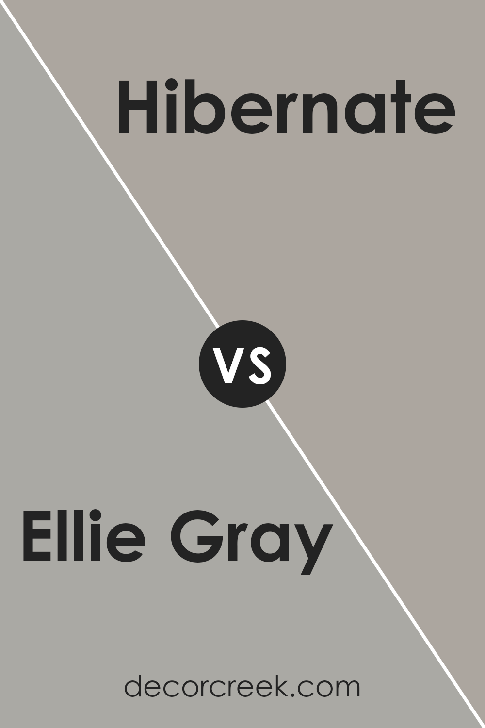
Ellie Gray SW 7650 by Sherwin Williams vs Hibernate SW 9573 by Sherwin Williams
Ellie Gray and Hibernate are two distinct paint colors offered by Sherwin Williams, each suited to create unique ambiences in a room. Ellie Gray is a softer, light gray with a touch of blue, making it bright and airy.
It suits spaces that want to feel open and refreshing, perfect for living rooms or kitchens. On the other hand, Hibernate is a much darker, brown-based hue that gives a cozy and warm feeling, ideal for creating a snug and inviting atmosphere in bedrooms or dens.
While Ellie Gray reflects more light, enhancing the sense of space, Hibernate absorbs light, which can make a room feel smaller but more intimate. Choosing between them depends on the mood and utility of the space you’re decorating.
You can see recommended paint color below:
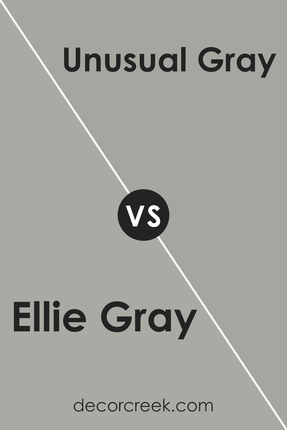
Ellie Gray SW 7650 by Sherwin Williams vs Unusual Gray SW 7059 by Sherwin Williams
Ellie Gray and Unusual Gray are two colors from Sherwin Williams. Ellie Gray is a soft, gentle gray with a hint of green, giving it a slightly cooler tone. This color is versatile, fitting well in various spaces like kitchens or bedrooms to create a calm feel.
On the other hand, Unusual Gray leans more towards a bluish-gray which makes it look fresher and slightly more modern. It’s a great choice for spaces where you want a clean and contemporary vibe. Both colors are fairly muted, making them easy to match with different decor styles and furnishings.
Whether you choose Ellie Gray for its soothing tones or Unusual Gray for a crisp look, both offer a beautiful backdrop for any room.
You can see recommended paint color below:
- SW 7059 Unusual Gray
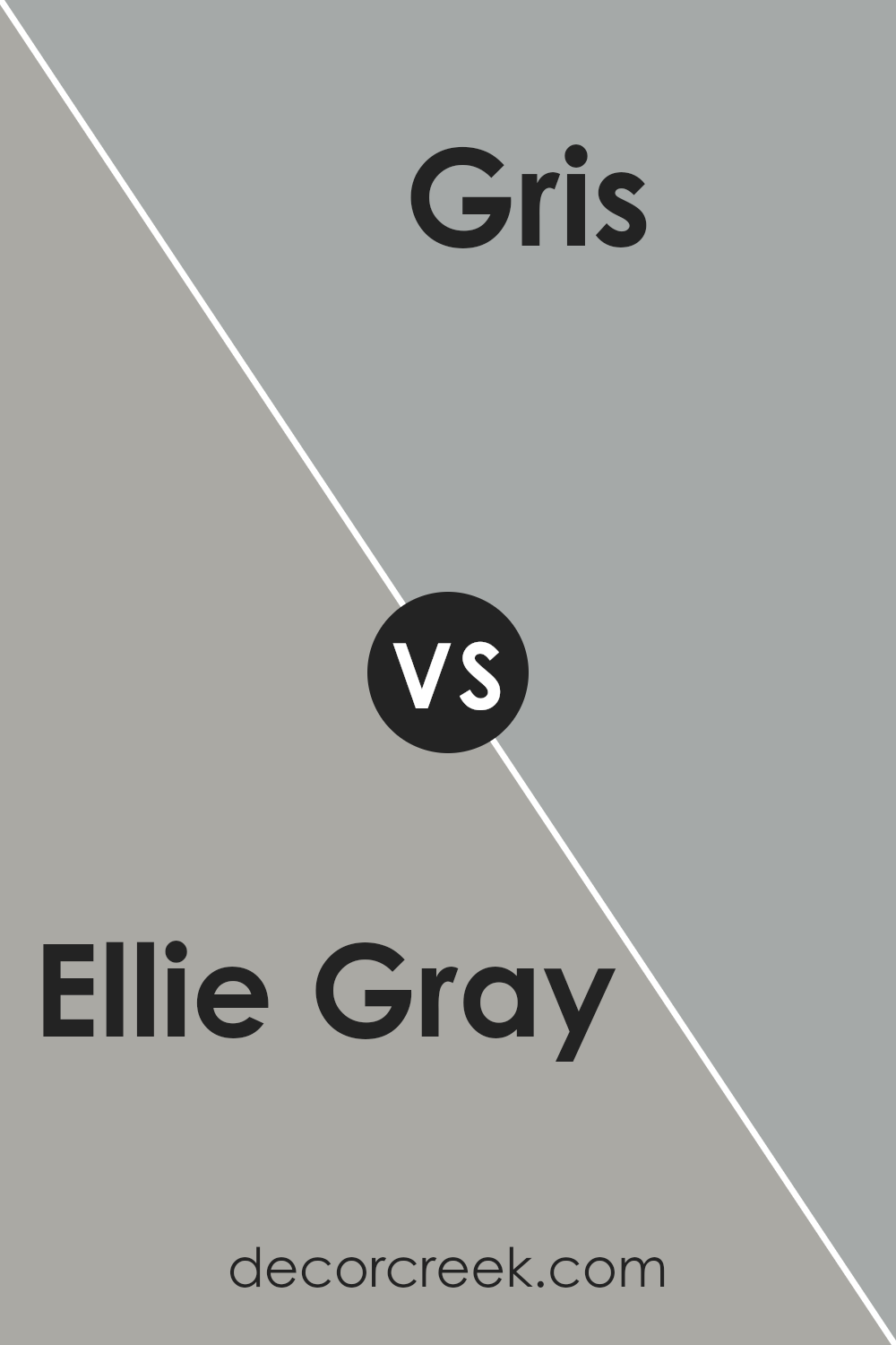
Ellie Gray SW 7650 by Sherwin Williams vs Gris SW 7659 by Sherwin Williams
Ellie Gray and Gris, both by Sherwin Williams, are two distinct shades that cater to different tastes in interior design. Ellie Gray is a soft, cool gray with a gentle hint of blue. This color offers a fresh and airy feel to spaces, making it ideal for creating a calm and welcoming atmosphere in rooms like living areas or bathrooms.
On the other hand, Gris is a darker gray that leans towards a true neutral gray. This shade is versatile and provides a strong backdrop for both vibrant and subdued color palettes. It’s particularly effective in areas where you want to establish a more defined or cozy feel, such as in bedrooms or home offices.
While both colors share a gray base, Ellie Gray brings a lighter, more reflective quality, enhancing smaller or less brightly lit spaces. Gris, with its deeper tone, adds depth and can make larger spaces feel more intimate and grounded.
You can see recommended paint color below:
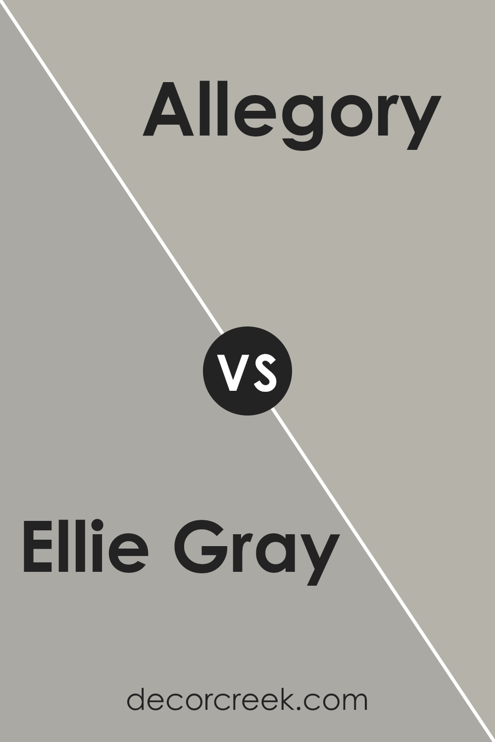
Ellie Gray SW 7650 by Sherwin Williams vs Allegory SW 9553 by Sherwin Williams
Ellie Gray and Allegory are both paint colors from Sherwin Williams, but they bring different vibes to a room. Ellie Gray is a gray shade that leans a bit towards blue, giving it a slightly cool and modern feel.
It’s a versatile color that works well in spaces that need a subtle boost of character without overwhelming the room. On the other hand, Allegory is a much darker color that can be described as a deep, rich teal.
This color is bolder and more dramatic, making it a great choice for someone looking to add a touch of intensity and depth to their space.
While Ellie Gray might be more suitable for a calm and neutral backdrop, Allegory stands out and can be the focal point in a design. Depending on the feel you’re going for, both colors offer unique possibilities to style a room beautifully.
You can see recommended paint color below:
- SW 9553 Allegory
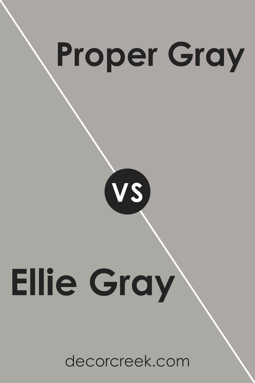
Ellie Gray SW 7650 by Sherwin Williams vs Proper Gray SW 6003 by Sherwin Williams
Ellie Gray and Proper Gray are two popular gray shades by Sherwin Williams, each offering unique qualities that could enhance different spaces. Ellie Gray is a softer, lighter gray with cool undertones, making it perfect for creating a fresh and open feel in a room. It’s versatile enough to work well in various lighting conditions, helping to make small rooms appear more spacious.
On the other hand, Proper Gray is a deeper shade that leans towards a more neutral gray, giving it a stronger presence. It’s ideal for adding a sense of grounding and sophistication without overpowering a space. Because of its depth, Proper Gray works well in larger or well-lit areas where it won’t make the space feel confined.
Overall, Ellie Gray is better suited for those wanting a lighter, airier vibe, while Proper Gray is excellent if you’re going for a more defined, robust aesthetic. Consider the size and lighting of your room when choosing between these shades.
You can see recommended paint color below:
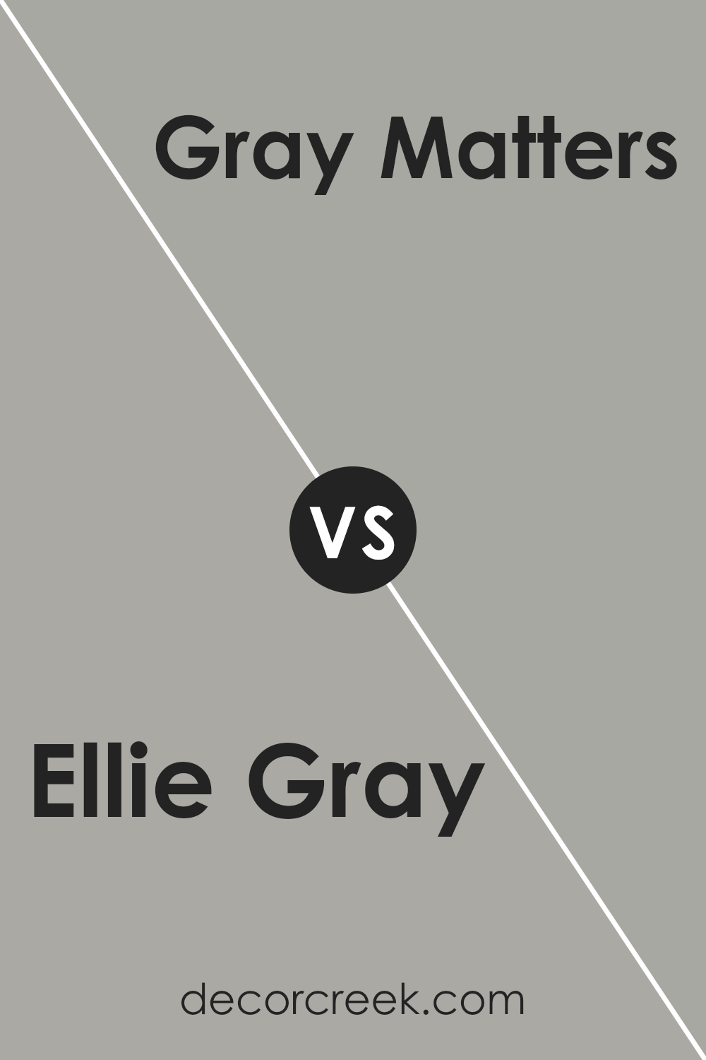
Ellie Gray SW 7650 by Sherwin Williams vs Gray Matters SW 7066 by Sherwin Williams
Ellie Gray and Gray Matters are two distinctive shades by Sherwin Williams. Ellie Gray is a lighter shade that leans toward a soft, calm grey with subtle hints of blue. It’s great for spaces where you want a refreshing and airy feel, making rooms look more open and inviting.
On the other hand, Gray Matters is darker and presents a stronger grey tone that holds a slightly more serious, grounded vibe. It’s excellent for achieving a solid, definitive presence in a room, providing a strong backdrop for both vibrant and muted decor themes.
While both colors share a grey base, the mood they set can significantly differ due to their varying intensities and undertones. Ellie Gray works wonderfully in a sunlit kitchen or bathroom for a gentle, refreshing look, whereas Gray Matters suits areas like home offices or dining rooms where a more defined statement is desired. Together, these colors offer versatile options for styling any space.
You can see recommended paint color below:
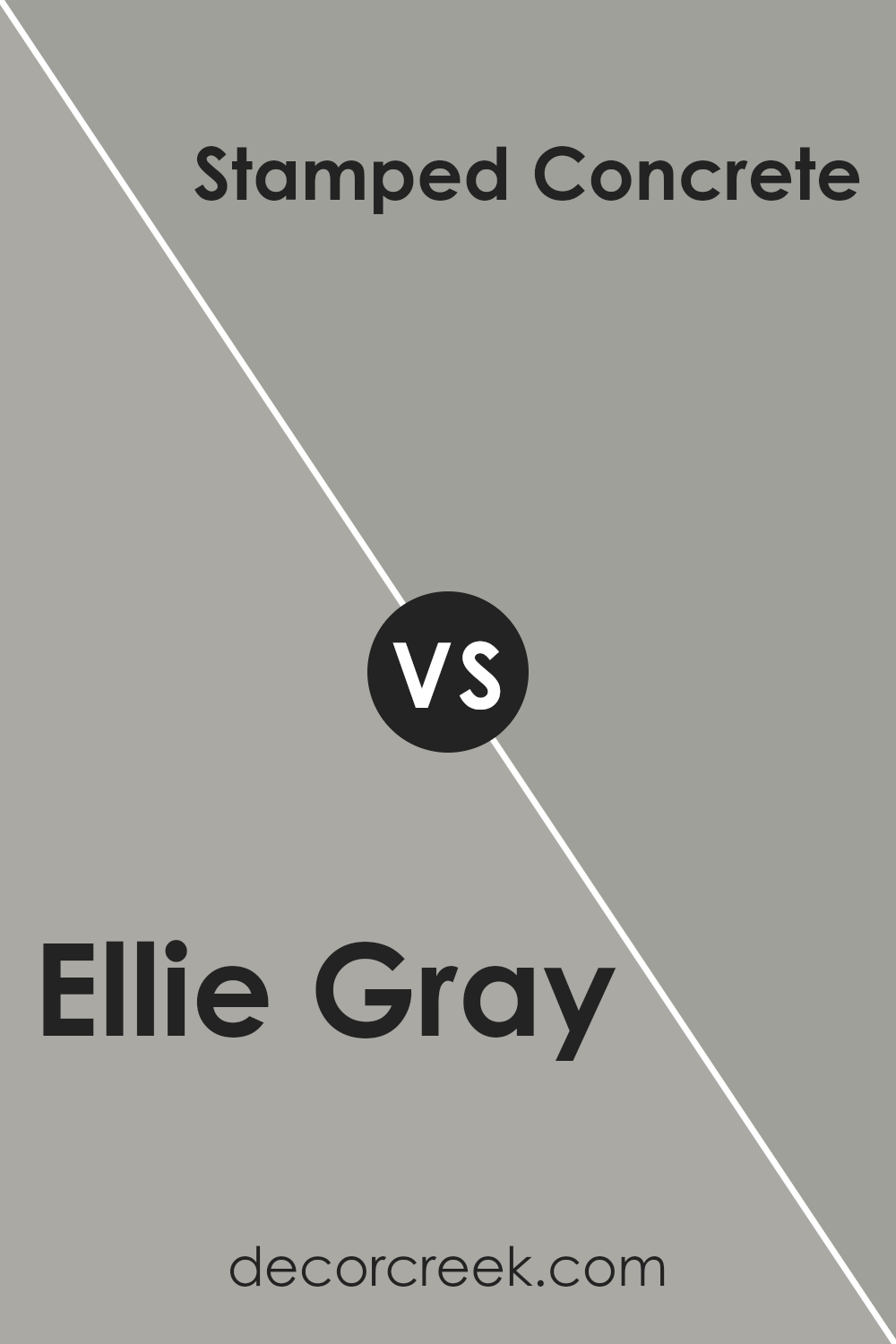
Ellie Gray SW 7650 by Sherwin Williams vs Stamped Concrete SW 7655 by Sherwin Williams
Ellie Gray and Stamped Concrete are two shades from Sherwin Williams. Ellie Gray is a soft, light gray with a hint of blue that adds a mild, tranquil feel to spaces. It is versatile and works well in places like living rooms and bedrooms where a gentle atmosphere is desired. Stamped Concrete, on the other hand, is a darker gray that resembles the color of wet cement.
This shade is bolder and more pronounced, giving a stronger statement in design. It’s great for areas that benefit from a more striking, distinct look like accent walls or exteriors.
While both colors are gray, Ellie Gray offers a lighter, airy charm, making spaces feel open and light. Stamped Concrete provides depth and can highlight the architectural features of a home. The choice between them depends on what mood or style you’re looking to create: soft and subtle with Ellie Gray or bold and grounding with Stamped Concrete.
You can see recommended paint color below:
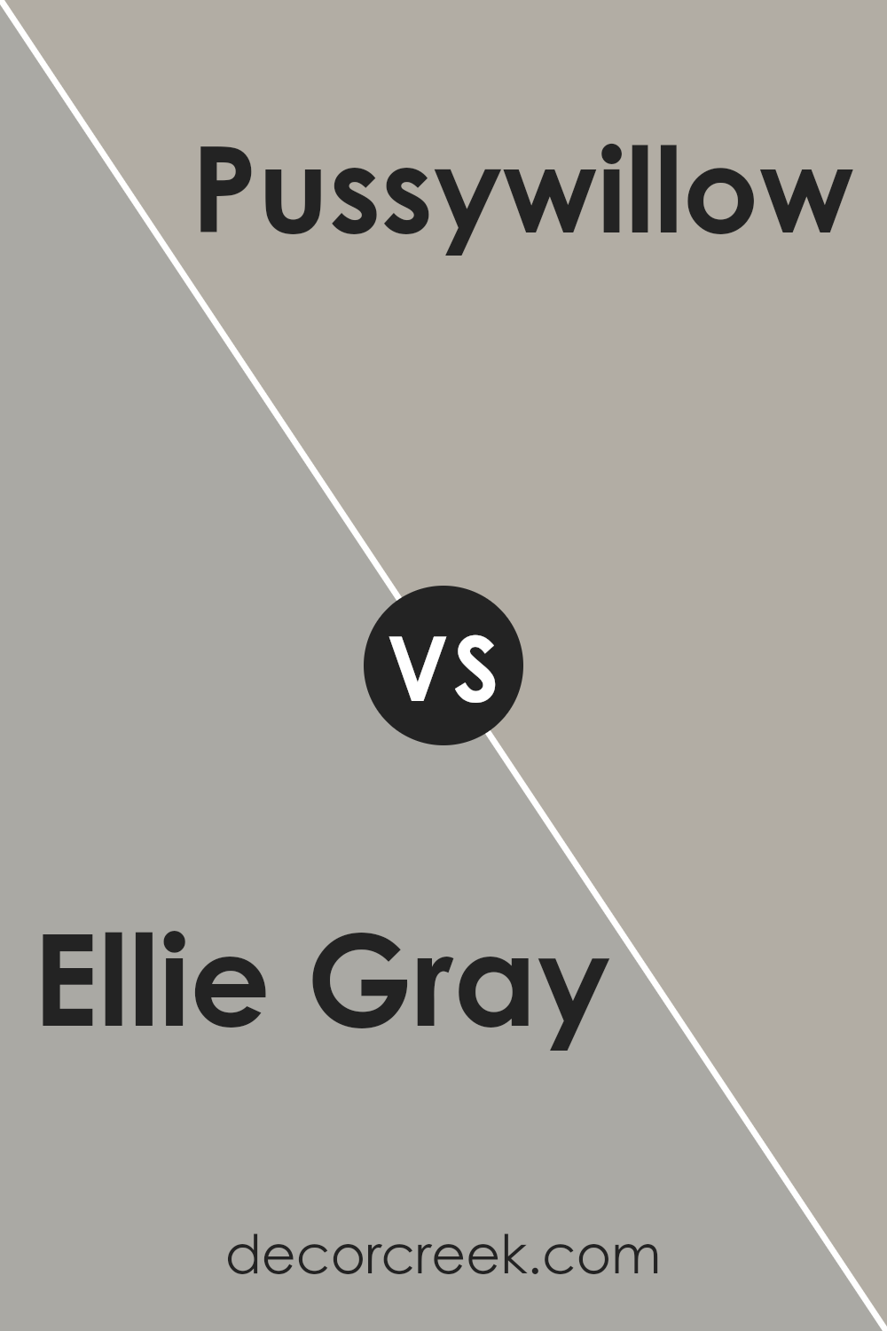
Ellie Gray SW 7650 by Sherwin Williams vs Pussywillow SW 7643 by Sherwin Williams
Ellie Gray and Pussywillow are both modern grays from Sherwin Williams, but they have unique tones that set them apart. Ellie Gray has a slightly greenish undertone that gives it a cool, fresh look. It’s a versatile color that works well in spaces where you want to add a bit of depth without overwhelming the room with darkness.
Pussywillow, on the other hand, leans towards a warmer, taupe-like gray. It’s a soft, gentle color that can help make a space feel cozy and inviting. Because of its warm undertones, it pairs well with a variety of color schemes and can be a great choice for living areas and bedrooms.
Both colors are quite neutral, making them easy to match with other colors and decor. Whether you choose Ellie Gray for its crisp, cool tone or Pussywillow for a warmer, welcoming vibe, both can refresh and enhance any space effectively.
You can see recommended paint color below:
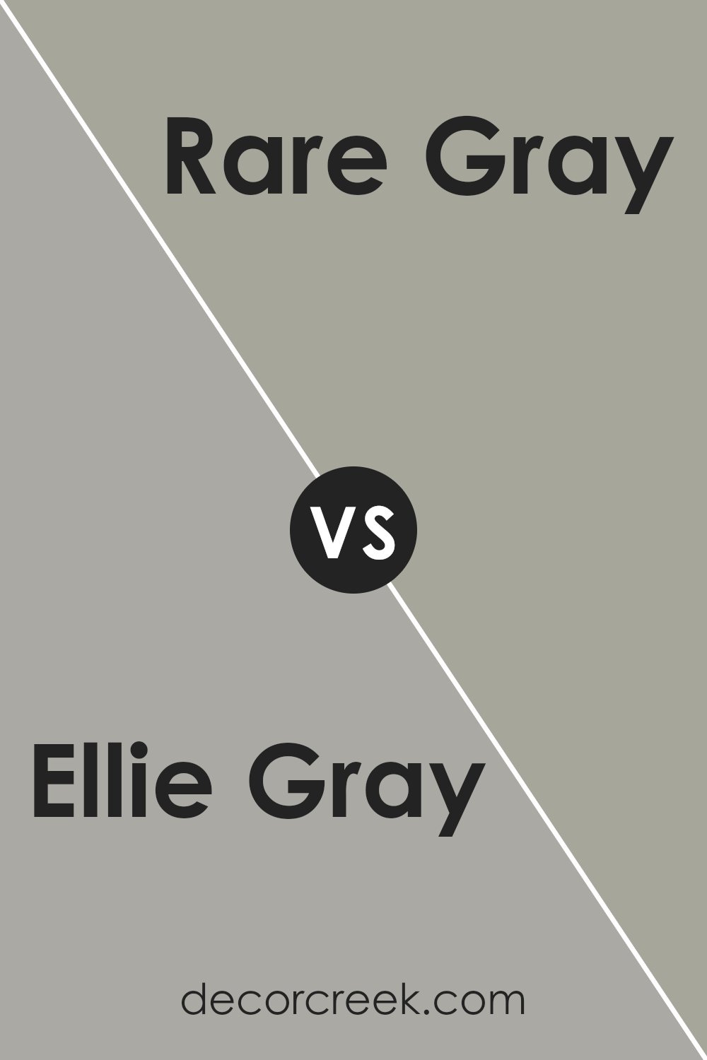
Ellie Gray SW 7650 by Sherwin Williams vs Rare Gray SW 6199 by Sherwin Williams
Ellie Gray and Rare Gray, both from Sherwin Williams, offer unique shades of gray suitable for modern home decor. Ellie Gray is a cooler tone that can make a room feel more spacious and cleaner in its aesthetic. It works well in spaces that get a lot of natural light, which emphasizes its subtle blue undertones.
Rare Gray, on the other hand, leans towards a warmer palette. It includes a hint of green, which adds a subtle touch of nature and warmth to the atmosphere. This color is ideal for areas where a cozy, welcoming feel is desired, such as living rooms or bedrooms.
While both colors are versatile, the choice between Ellie Gray and Rare Gray depends on the mood you want to set and the natural lighting of your space. Ellie is better for a fresh, open feel, whereas Rare Gray suits a more comforting, grounding environment.
You can see recommended paint color below:
- SW 6199 Rare Gray
As I wrap up my thoughts on SW 7650 Ellie Gray by Sherwin Williams, I realize just how much I like this color. It’s like a friendly gray that doesn’t scream for attention but still makes any room feel just right. Imagine a cloudy sky before the rain, that’s the color we’re talking about.
Ellie Gray is perfect if you want something that looks good all the time, in big rooms or small corners. It’s not too dark or too light, which means it plays nicely with other colors like blues, whites, or even some fun pinks and greens for a kid’s room. It’s like a good friend that gets along with everyone.
Painting with Ellie Gray is a smart idea because it helps hide little marks or smudges that might show up, thanks to its ability to act like a shadow. So if you’re someone who doesn’t want to be cleaning walls all the time, this color could be a hero for you.
In summary, choosing SW 7650 Ellie Gray can make decorating simple. It’s a color that brings calm to a room without being boring. Whether you’re redoing your bedroom, living room, or even the bathroom, Ellie Gray is a choice that you’ll likely be happy with. It’s gentle, it’s forgiving, and it always looks neat.
Ever wished paint sampling was as easy as sticking a sticker? Guess what? Now it is! Discover Samplize's unique Peel & Stick samples.
Get paint samples

