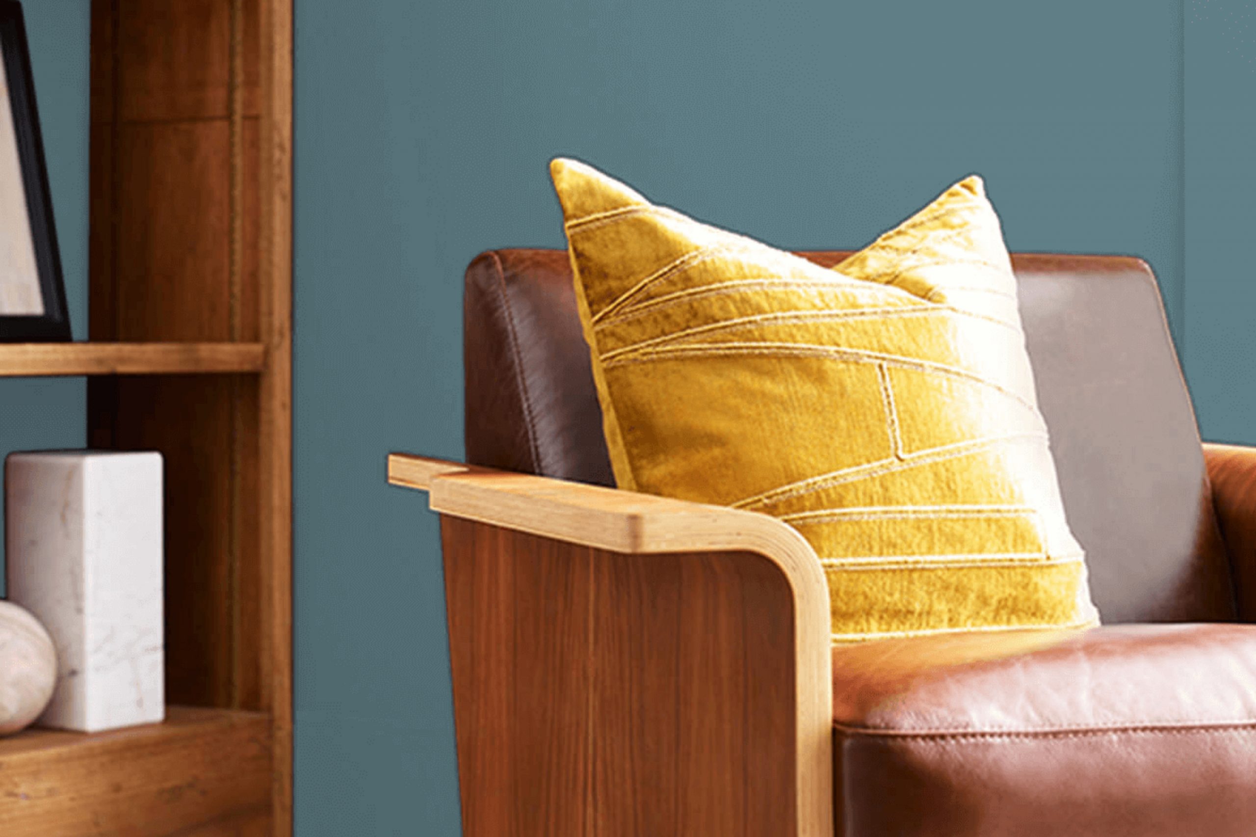
As you consider refreshing a room or perhaps painting a new space, you might feel a bit overwhelmed with all the color choices out there. I recently had the pleasure of using SW 6228 Refuge by Sherwin Williams, a shade that stands out for its unique charm. It’s a deep, serene blue-green hue that quietly soothes the senses and brings a peaceful atmosphere to any room.
You might worry that choosing a darker color could overpower your space, but Refuge has a beautiful way of blending in while also making a statement. It works wonderfully in a bedroom where calm is key or an office where you need a touch of subdued inspiration. In well-lit areas, the color gathers light, softening to a gentler tone, while in dimmer spaces, it holds its richness.
Using Refuge, I found that it pairs well with natural elements like wooden furniture and white accents, which highlight its depth and prevent the color from feeling too heavy.
Whether you’re aiming for a bold feature wall or a complete transformation, SW 6228 Refuge offers a versatile palette that can help you achieve your vision without overwhelming your decor style.
What Color Is Refuge SW 6228 by Sherwin Williams?
Refuge by Sherwin Williams is a deep, blue-green color that evokes a sense of calm and relaxation. Its subtle hints of teal make it versatile and modern, while still being warm enough to create a cozy atmosphere in any room. This particular hue works well in various lighting conditions, showing off different facets of its blue and green tones depending on the natural light available.
This color is ideal for those looking to add a touch of personality to their home without overwhelming the space. It pairs exceptionally well with natural materials like wood and stone, helping to ground the airy qualities of the color and bring a cozy, natural feel to the environment. Textures such as linen, wool, and cotton also complement the depth of Refuge, adding layers of interest and comfort to the design.
In terms of interior styles, Refuge is perfect for contemporary and minimalist homes, as it adds a splash of color while maintaining a clean and uncluttered look. It also fits beautifully in rustic and coastal settings, where its natural tones harmonize with elements like reclaimed wood furniture and pebble mosaics. Whether used as a feature wall in a living room or as cabinetry in a bathroom, Refuge brings a refreshing and stylish look to any space.
Is Refuge SW 6228 by Sherwin Williams Warm or Cool color?
Refuge by Sherwin Williams is a deep, rich blue that brings a strong presence to any room. It works well as an accent wall color in living rooms or bedrooms, adding depth and interest without overwhelming the space. This shade can also make smaller areas, like a bathroom or reading nook, feel cozy and inviting.
In homes with lots of natural light, Refuge takes on a vibrant, lively character, while in spaces with less light, it presents more subdued and subtle. It pairs beautifully with neutral shades like white, gray, or beige, which help to balance its boldness. Additionally, wood finishes, from light to dark, complement its cool tones, creating a welcoming environment.
Using Refuge in your home can help define spaces, add a focal point, or act as a backdrop for artwork and furniture. It’s a versatile color that adapts well to various decorating styles, from modern to traditional.
Undertones of Refuge SW 6228 by Sherwin Williams
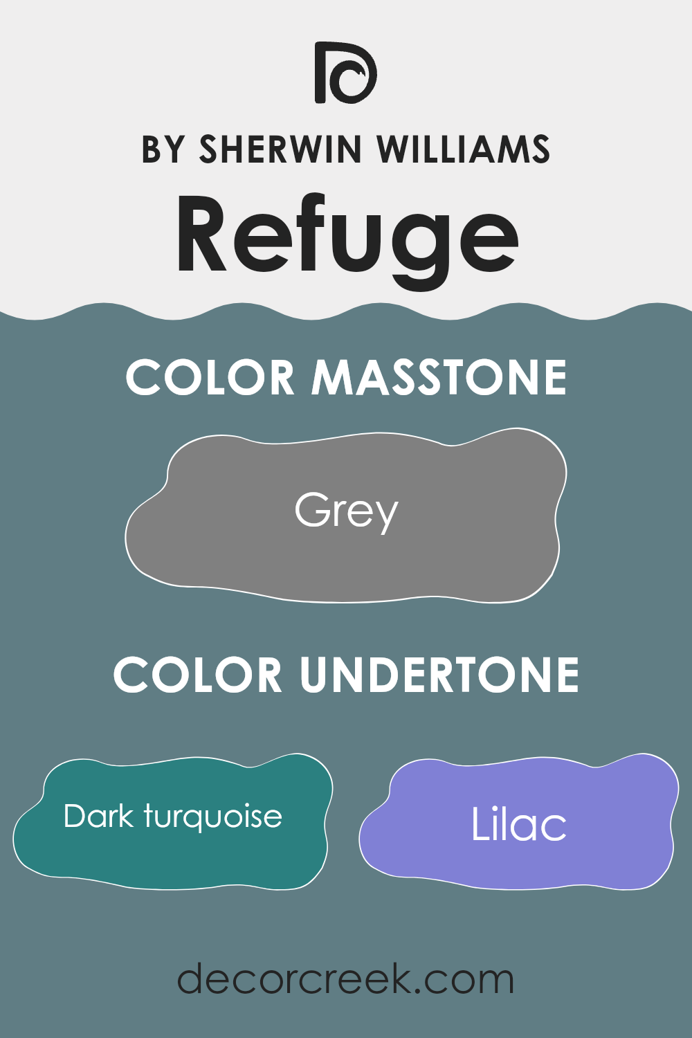
Refuge SW 6228 is a vibrant color that includes a blend of various undertones. These undertones can subtly influence the perception of the main color, affecting how it looks in different lights and against different decors. Undertones are the colors lurking beneath the main hue. In the case of Refuge, undertones range from dark turquoise to yellow, adding depth and complexity.
When used on interior walls, the broad spectrum of undertones in Refuge can make the wall color appear differently based on lighting and surrounding elements. For example, in natural light, the blue and light turquoise undertones might make the walls feel more refreshing and lively. In contrast, in a room with less natural light, darker undertones like navy or dark grey could become more prominent, giving the room a more grounded feel.
These subtle shifts are important in interior design because they can enhance or alter the mood of a space. Warm undertones like orange or pale yellow can make a room feel cozier, whereas the cool undertones like mint or light blue can give a fresher, calmer feel.
The mix of undertones also means that Refuge is versatile; it can pair well with various decor styles and color schemes. Whether you have modern furnishings or more traditional pieces, the array of undertones within this paint can complement and enrich the overall aesthetic of a room. Thus, choosing accessories, fabrics, and furniture that highlight some of the undertones in Refuge can create a harmonious and appealing look.
What is the Masstone of the Refuge SW 6228 by Sherwin Williams?
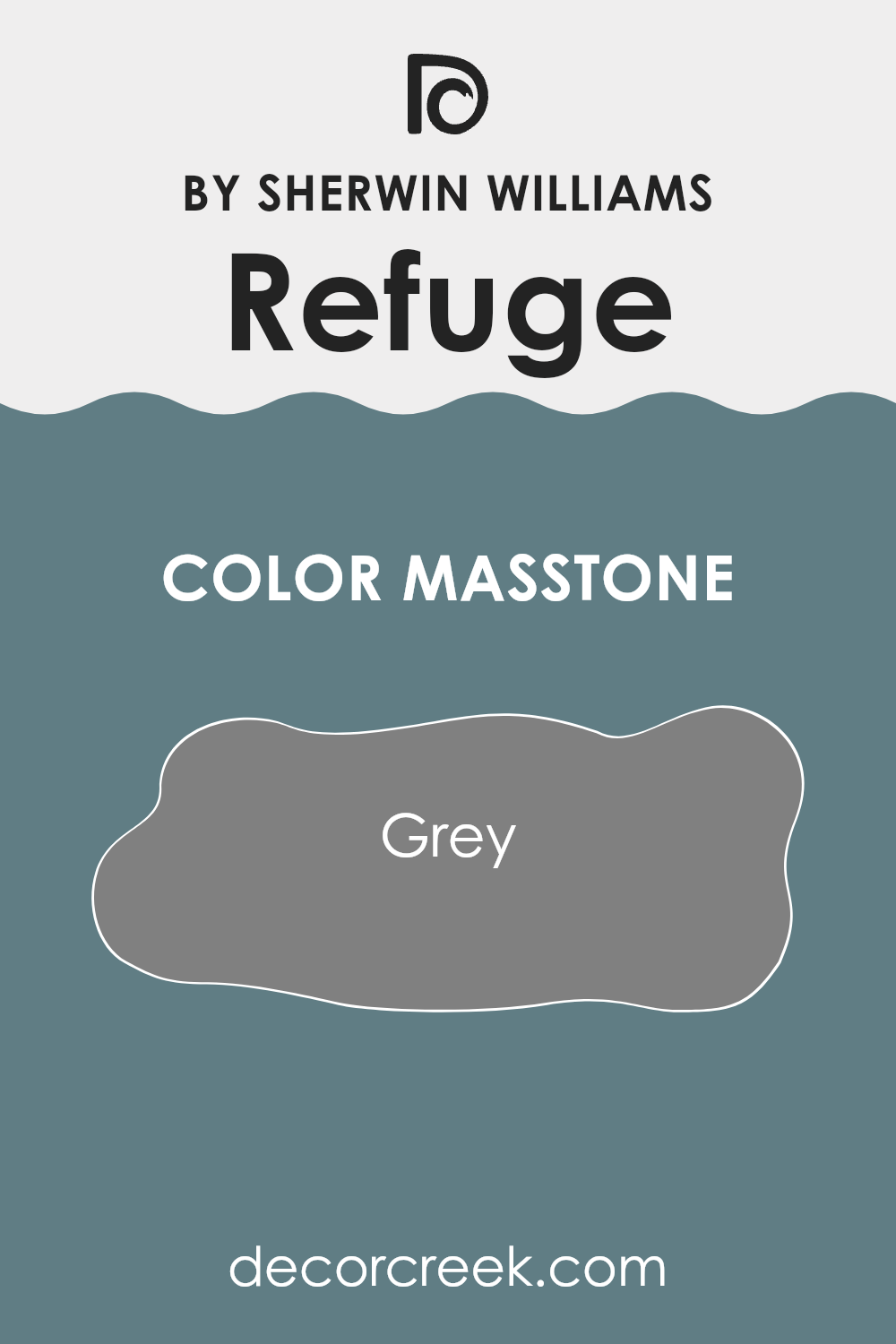
Sherwin Williams’ Refuge SW 6228 has a masstone of Grey (#808080), giving it a balanced and neutral look. This shade’s mid-tone grey nature makes it incredibly versatile for home decor. It works beautifully in various settings, from modern to traditional, because it pairs easily with brighter colors and softens bolder hues.
This grey can also create a calm background, helping furniture and art to stand out. In rooms that get lots of natural light, it keeps spaces feeling airy without the starkness that sometimes comes with pure white walls. In darker rooms, it adds depth without overwhelming the space with too dark a color.
Extremely practical for busy areas like living rooms or hallways, it hides minor imperfections and daily wear better than lighter shades. Refuge SW 6228 is a go-to choice for creating a stylish and homey atmosphere.
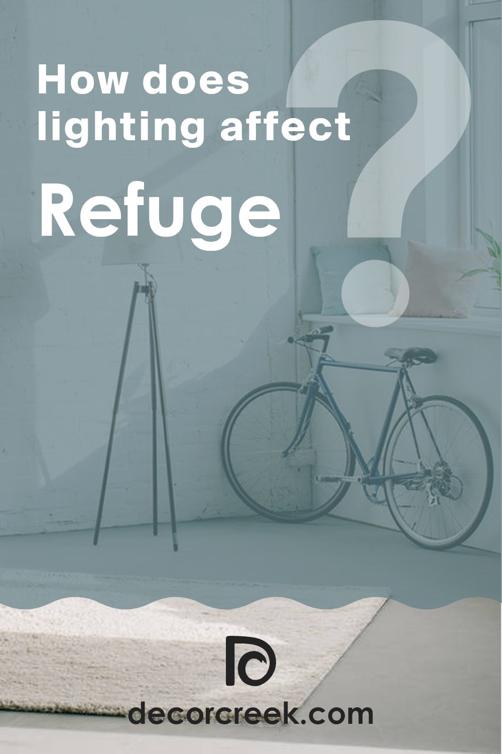
How Does Lighting Affect Refuge SW 6228 by Sherwin Williams?
Lighting plays a crucial role in how colors appear to us in different environments. The color perception of any paint, such as Refuge SW 6228 by Sherwin Williams, can vary significantly based on the type of light it is exposed to, be it natural sunlight or artificial lighting.
In artificial light, the appearance of a color like Refuge SW 6228 can change depending on the nature of the bulbs used. Incandescent bulbs, which emit a warm, yellowish glow, will make this shade appear cozier and slightly darker, bringing out more of its green undertones. In contrast, fluorescent lighting or cool LED lights give off a bluer, more stark light, which can make the same color look sharper and somewhat more vibrant.
Natural light, the gold standard for true color representation, also affects how this color appears, though differently throughout the day and depending on room orientation. In rooms facing north, which receive less direct sunlight and mostly softer, diffuse light, Refuge SW 6228 will look cooler and more subdued. The reduced light intensity can highlight the depth of the color but may also make the room feel slightly chillier.
South-facing rooms benefit from abundant, warmer sunlight during the day, which can make the color appear brighter and more dynamic. This can help the room feel more lively and welcoming, particularly in spaces where light is continuously present.
For east-facing rooms, morning light is stronger and can bring out the vibrant and lively qualities of the color, making it feel fresh and active. As the day progresses and the natural light dims, the color might then lean towards a more muted tone.
Lastly, west-facing rooms get the evening sun, which can cast a golden hue, making the wall color look warmer and richer later in the day. This shift can add a comforting feeling to the room as it transitions into night.
Overall, understanding how lighting affects color can help in effectively utilizing colors like Refuge SW 6228 to achieve the desired ambiance in a space.
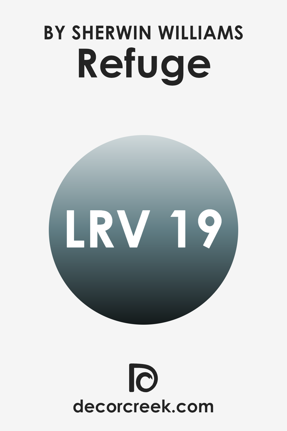
What is the LRV of Refuge SW 6228 by Sherwin Williams?
LRV stands for Light Reflectance Value, which measures the amount of light a paint color reflects back into a room. It’s a useful guideline when choosing paint as it helps anticipate how light or dark the color will appear once on your walls. Colors with higher LRV reflect more light, making spaces appear brighter and larger. Conversely, colors with lower LRV absorb more light, which can make a room feel cozier but also darker.
Refuge, with an LRV of around 18.71, is a deeper, absorbing hue that can significantly influence the ambiance of a space. This darker shade will absorb more light, reducing the overall brightness of an area. It’s an ideal choice if you’re looking to create a more intimate or subdued atmosphere in a room.
However, if used in a small or poorly lit space, it might make the environment feel tighter and dimmer. Proper lighting and complementary decor will be key to balance its deep tone and enhance the overall feel of the space.
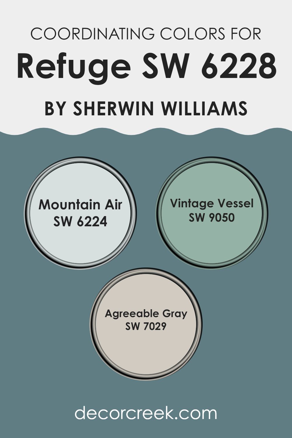
Coordinating Colors of Refuge SW 6228 by Sherwin Williams
Coordinating colors are those that complement each other well when used together in decorating. These colors generally share certain hue, saturation, or brightness values that make the individual colors look more appealing when combined. For example, the coordinating colors for Refuge by Sherwin Williams include Mountain Air, Vintage Vessel, and Agreeable Gray. These colors harmonize with Refuge due to their complementary tones that create a visually cohesive space.
Mountain Air is a soft, airy blue that brings a fresh and uplifting feel to a room, making it a fantastic contrast to the deeper tone of Refuge. It is especially effective in creating a light, breezy atmosphere.
Vintage Vessel, on the other hand, is a rich navy with a hint of teal, which adds a touch of drama and depth to the palette, providing a bold counterpoint that highlights the calmness of the lighter shades. Agreeable Gray is a versatile neutral gray that blends seamlessly with other colors, ensuring that the ensemble doesn’t overwhelm the senses. It acts as a grounding color that ties the brighter and darker tones together harmoniously.
You can see recommended paint colors below:
- SW 6224 Mountain Air
- SW 9050 Vintage Vessel
- SW 7029 Agreeable Gray
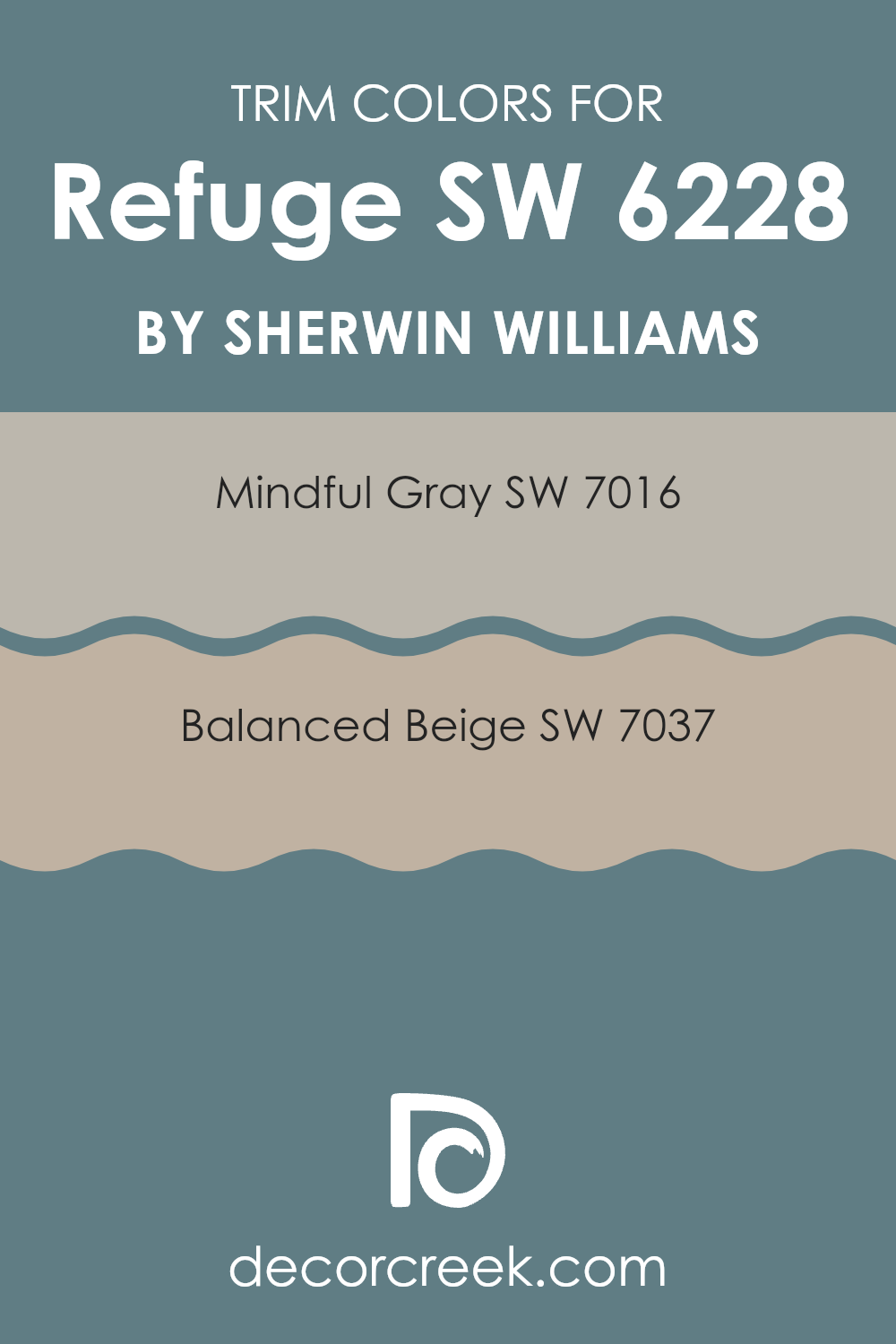
What are the Trim colors of Refuge SW 6228 by Sherwin Williams?
Trim colors, such as the ones used with Refuge by Sherwin Williams, play a crucial role in defining the architectural details and accents of a room. By choosing complementing trim colors like SW 7016 – Mindful Gray and SW 7037 – Balanced Beige, the overall aesthetic of the space is significantly enhanced, helping to frame and define the areas painted with the main color.
Trim colors help in creating a cohesive look that adds depth and character to the room. They are especially important in bringing out the best features of the main wall color, making it stand out while seamlessly integrating with the decor.
Mindful Gray is a warm, gentle gray that has the ability to make other colors pop while maintaining a subtle presence itself. It’s a versatile color, perfect for trims, that works well in various lighting conditions, adding a touch of elegance without overwhelming the space.
Balanced Beige, on the other hand, is a soft and warm beige shade that offers a comforting presence. It pairs excellently with deeper hues, providing a soothing contrast and a polished finish to any room. These colors are well-suited for enhancing the appealing qualities of Refuge, ensuring a smooth and harmonious interior space.
You can see recommended paint colors below:
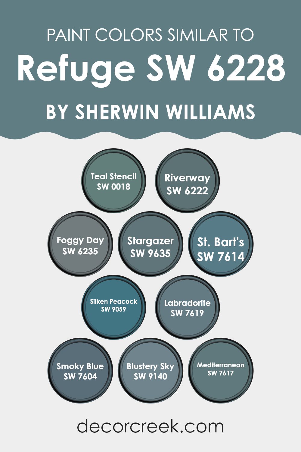
Colors Similar to Refuge SW 6228 by Sherwin Williams
Similar colors are crucial in design because they create a harmonious and seamless visual experience. They work by maintaining a thread of consistency in hue or tone throughout a space, which can make smaller rooms appear larger and any space feel more thoughtfully designed. For example, using colors like Teal Stencil and Riverway together can add depth while keeping the atmosphere cohesive, as both have green-blue undertones.
Colors such as Foggy Day and Stargazer are slightly muted, making them perfect for those looking for a subtle, yet rich backdrop. Moving into darker tones, St. Bart’s and Silken Peacock offer lush, deep blues that bring in a sense of calmness without being overwhelming.
If someone is looking for something with a bit more complexity, Labradorite, with its grayish-blue tone, works wonderfully. Smoky Blue and Blustery Sky, provide lighter options that still align with the blue-green palette but add brightness to any room. Lastly, Mediterranean grants a brighter, more vibrant feel, tying back to the blues but with a more dynamic energy. All these colors pair well together to create design continuity, while still allowing each to stand out on its own.
You can see recommended paint colors below:
- SW 0018 Teal Stencil
- SW 6222 Riverway
- SW 6235 Foggy Day
- SW 9635 Stargazer
- SW 7614 St. Bart’s
- SW 9059 Silken Peacock
- SW 7619 Labradorite
- SW 7604 Smoky Blue
- SW 9140 Blustery Sky
- SW 7617 Mediterranean
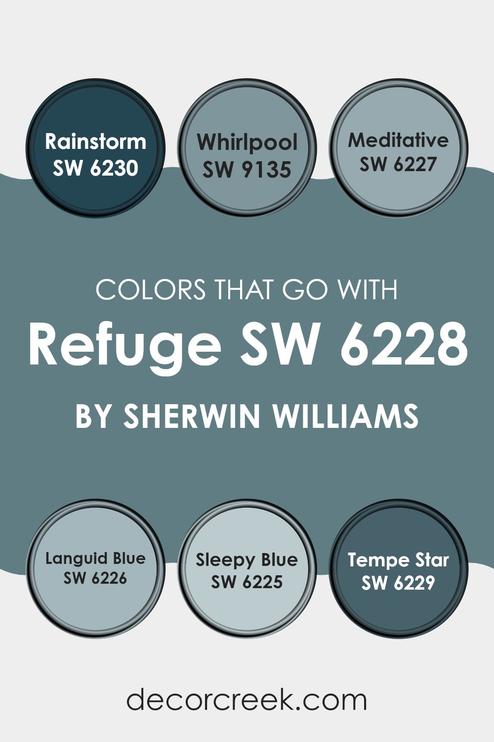
Colors that Go With Refuge SW 6228 by Sherwin Williams
Choosing the right colors to go with Refuge SW 6228 by Sherwin Williams is crucial because it helps create a cohesive and appealing look in any space. Colors like SW 6230 – Rainstorm and SW 9135 – Whirlpool complement Refuge by offering deeper or aquatic hues that enhance the primary color’s character. These matching shades work by balancing or contrasting with the main color, which can enhance the overall aesthetic of a room and make it feel more inviting.
For instance, Rainstorm is a deep, intense blue that provides a bold contrast, adding depth and interest when paired with Refuge. Meanwhile, Whirlpool is a lighter, more fluid blue that mimics the soothing qualities of water, adding a soft touch to the more muted Refuge. Meditative offers a calm, steady blue that harmonizes beautifully, ensuring the space feels cohesive.
Languid Blue and Sleepy Blue are lighter and more airy, promoting a relaxed atmosphere when used alongside Refuge. Lastly, Tempe Star is a darker blue that provides a strong anchor, enriching the palette and creating a stable feel in the décor. Choosing any of these colors to pair with Refuge can define the mood and style of a room, whether you’re aiming for a bold statement or a gentle retreat.
You can see recommended paint colors below:
- SW 6230 Rainstorm
- SW 9135 Whirlpool
- SW 6227 Meditative
- SW 6226 Languid Blue
- SW 6225 Sleepy Blue
- SW 6229 Tempe Star
How to Use Refuge SW 6228 by Sherwin Williams In Your Home?
Refuge SW 6228 by Sherwin Williams is a rich teal paint color that can add a lively and warm touch to any room. With its deep, vibrant tone, it makes a perfect choice for creating a standout feature wall in a living room or bedroom.
This color pairs well with neutral shades like whites or grays, allowing it to stand out without overwhelming the space. It’s also a great option for painting cabinets in the kitchen or bathroom for a fresh, modern look.
Additionally, Refuge can be used outside the home, such as on front doors or shutters, giving your home’s exterior a welcoming pop of color. If you’re looking for a change that isn’t too drastic but still makes a noticeable difference, incorporating this shade into your home décor through accessories like throw pillows or curtains can also be an effective way to bring its unique charm into your living environment.
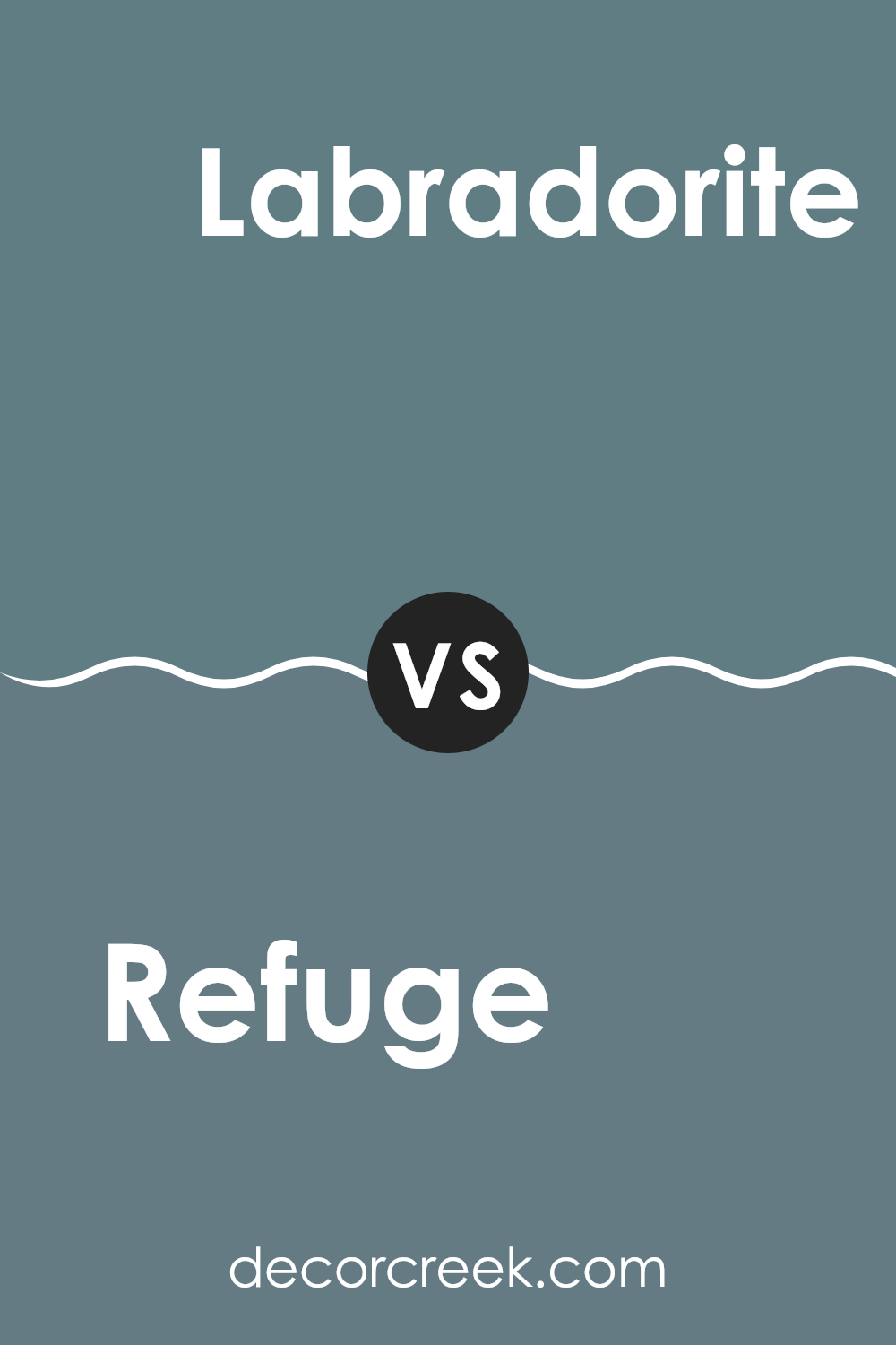
Refuge SW 6228 by Sherwin Williams vs Labradorite SW 7619 by Sherwin Williams
Refuge SW 6228 by Sherwin Williams is a deep, rich blue with a hint of green. This color is strong and can make a statement in any room, providing a sense of coziness and comfort. It works well in a space where you want to foster a feeling of warmth and security, such as a bedroom or living area.
On the other hand, Labradorite SW 7619 by Sherwin Williams is a darker, more muted gray with blue-green undertones. It’s a versatile shade that pairs nicely with a wide range of decors, adding depth to spaces without overpowering them. This color is perfect for those looking to add a touch of elegance without making the space feel too heavy.
While both colors share some similarities in their blue-green undertones, Refuge is noticeably bolder and warmer, whereas Labradorite is subtler and cooler. This makes Refuge a good choice for making a strong visual impact, while Labradorite is better for achieving a balanced, understated look.
You can see recommended paint color below:
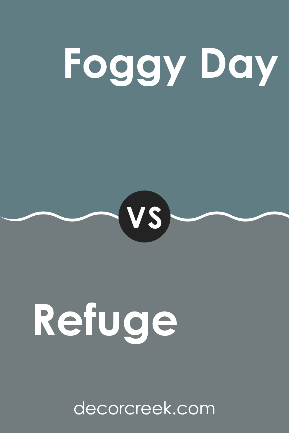
Refuge SW 6228 by Sherwin Williams vs Foggy Day SW 6235 by Sherwin Williams
The main color, Refuge, is a deep blue with a hint of gray, creating a calming and moody atmosphere. It’s a strong color that makes a statement and works well in areas where you want depth and a touch of drama. In contrast, Foggy Day is a lighter shade of gray that also contains elements of blue.
However, this color is softer and more subtle compared to Refuge. Foggy Day is excellent for creating a gentle and soothing environment, making it ideal for spaces where you want to relax.
While both colors share a blue-gray base, Refuge is significantly darker and more intense, whereas Foggy Day is lighter and less overwhelming. The choice between these two would largely depend on the kind of mood you want to set for the room. Refuge would best suit a bold, cozy space, while Foggy Day would better complement an area where light and calmness are preferred.
You can see recommended paint color below:
- SW 6235 Foggy Day
Refuge SW 6228 by Sherwin Williams vs Teal Stencil SW 0018 by Sherwin Williams
Refuge and Teal Stencil are two distinct colors by Sherwin Williams, each offering a unique feel. Refuge is a deep, rich blue with a hint of gray, creating a soothing atmosphere in any room. It’s perfect for spaces where you want to create a calm, yet strong presence.
On the other hand, Teal Stencil leans towards a brighter, more vibrant shade. This color combines blue and green tones, which gives it a more lively and fresh look. Teal Stencil is ideal for areas where you want to add energy and a sense of cheerfulness.
Both colors work well in different settings. If you are looking for a more muted and reserved look, Refuge is the go-to. It’s great for bedrooms or offices where focus is needed. In contrast, Teal Stencil works well in spaces that benefit from a splash of brightness like kitchens and bathrooms. When deciding between the two, consider the mood you want to set and the function of the room.
You can see recommended paint color below:
Refuge SW 6228 by Sherwin Williams vs Riverway SW 6222 by Sherwin Williams
Refuge SW 6228 and Riverway SW 6222 from Sherwin Williams are both cool, soothing colors, but they have distinct differences. Refuge is a darker shade, leaning towards a deep blue with a hint of gray, making it a strong choice for a statement wall or an accent area.
It adds depth and intensity to a space, perfect for creating a cozy, secure atmosphere. On the other hand, Riverway is a bit lighter and veers more towards a teal or sea green. It’s an excellent option for bringing a refreshing and calming feel to a room, yet still holds enough depth to make a distinct impression.
Both colors work well in spaces where you want a sense of calm, but the choice between them depends on how bold or subtle you want the color impact to be. Riverway could brighten up a space more, while Refuge might be ideal for settings where a more muted, grounding effect is desired.
You can see recommended paint color below:
Refuge SW 6228 by Sherwin Williams vs Mediterranean SW 7617 by Sherwin Williams
Refuge SW 6228 and Mediterranean SW 7617 by Sherwin Williams are two distinct colors that offer unique vibes for any space. Refuge is a deep, rich blue with gray undertones, giving it a calm and subtle feel. It’s perfect for creating a peaceful and simple atmosphere, ideal for bedrooms or quiet areas.
On the other hand, Mediterranean is a bolder teal that combines blue and green tones. This color is lively and fun, making it great for spaces where you want a touch of cheer and energy. It can really liven up a kitchen or living room.
Both colors are versatile and can work well in various decor styles, but they create very different moods. Refuge is more reserved and down-to-earth, while Mediterranean is vibrant and playful. Whether you choose one or the other depends on the type of environment you want to create in your home.
You can see recommended paint color below:
- SW 7617 Mediterranean
Refuge SW 6228 by Sherwin Williams vs Blustery Sky SW 9140 by Sherwin Williams
Refuge SW 6228 by Sherwin Williams is a rich, deep teal that exudes a cozy and inviting atmosphere. It pairs beautifully with neutral tones and can create a striking contrast when used with bright colors. This shade is versatile, making it suitable for living rooms, bedrooms, or even kitchens for those looking to add a bold touch to their home decor.
Blustery Sky SW 9140, also by Sherwin Williams, is a lighter and airier blue with gray undertones. This color feels more open and refreshing compared to Refuge, making it ideal for smaller spaces or rooms with less natural light. Blustery Sky works well in bathrooms or as an accent wall in a modern office space, providing a clean and calming background.
Both colors offer distinct vibes – Refuge with its deep, cozy blue tones is more dramatic, while Blustery Sky offers a gentler, more laid-back feel. Choosing between them depends on the mood and style you want to achieve in your space.
You can see recommended paint color below:
- SW 9140 Blustery Sky
Refuge SW 6228 by Sherwin Williams vs St. Bart’s SW 7614 by Sherwin Williams
Refuge and St. Bart’s are two distinct paint colors by Sherwin Williams, each offering a unique vibe for your space. Refuge is a deep, soothing blue with gray undertones, making it perfect for creating a cozy and calming atmosphere in any room. It often looks great in bedrooms or offices where a calming effect is desired.
On the other hand, St. Bart’s leans towards a greenish-teal shade, brighter and more vibrant than Refuge. It provides a fresh and energetic feel, which can liven up spaces like kitchens or living rooms. This color can make small spaces appear bigger and more inviting.
When deciding between these two, consider the mood you want to achieve and the room’s function. Refuge is ideal for a quiet and peaceful setting, while St. Bart’s is better for a cheerful and lively environment. Both colors demonstrate Sherwin Williams’ knack for creating versatile and appealing paint options.
You can see recommended paint color below:
Refuge SW 6228 by Sherwin Williams vs Smoky Blue SW 7604 by Sherwin Williams
Refuge and Smoky Blue are two colors from Sherwin Williams that feature distinct blue tones, each bringing its own unique mood to a space. Refuge is a deep, rich blue with hints of teal, creating a cozy and inviting atmosphere in any room. It’s a bold choice that pairs well with warm whites or gray accents for a balanced look.
On the other hand, Smoky Blue is a softer, more muted blue. This color has a subtle gray undertone that makes it versatile and easy to pair with a variety of decor styles. Smoky Blue works particularly well in spaces that aim for a relaxed and calm feeling, as it isn’t as intense as Refuge.
Overall, if you’re looking for a blue that stands out and adds a sense of depth, Refuge is a great pick. If you prefer a lighter, more understated blue, Smoky Blue might be the better choice. Each color offers a unique vibe, so the best one really depends on the mood you want to set in your space.
You can see recommended paint color below:
Refuge SW 6228 by Sherwin Williams vs Stargazer SW 9635 by Sherwin Williams
Refuge SW 6228 by Sherwin Williams is a deep, rich blue with a hint of teal, giving it a strong and composed look. It’s a color that stands out and can make a statement in a room, perfect for creating a bold backdrop or accent wall.
On the other hand, Stargazer SW 9635 by Sherwin Williams is a lighter, softer blue with a soothing presence, which makes it great for spaces where you want a calm and relaxed feel. This color brings a gentle touch to any room, making it ideal for bedrooms or bathrooms where you seek a lighter, airy atmosphere.
When comparing these two, Refuge is definitely bolder and more dramatic, while Stargazer offers a lighter and gentler vibe. Depending on the mood you want to set in your space, either could be a great choice. Refuge might be better suited for an energetic, vibrant room, and Stargazer for a quiet, peaceful area.
You can see recommended paint color below:
Refuge SW 6228 by Sherwin Williams vs Silken Peacock SW 9059 by Sherwin Williams
Refuge and Silken Peacock, both by Sherwin Williams, offer distinct blue hues, but each brings its own unique vibe to a space. Refuge is a deep, rich blue with a subtle hint of green, making it a strong choice for a room where you want a touch of nature and a calm, grounded feeling. It’s particularly great for creating a cozy corner or accent wall, adding depth and interest without overwhelming the senses.
On the other hand, Silken Peacock has a brighter, more vibrant tone. This color stands out more and can really liven up a space. It’s perfect for an area where you want to add a splash of cheerfulness and energy, like a bathroom or kitchen, or even as a welcoming color on a front door.
While both colors can be used for similar purposes, Refuge tends to blend into a decor scheme more smoothly, providing a backdrop that supports other colors. Silken Peacock, however, demands more attention and works well as a focal point in a room. Both colors reflect different moods and can significantly impact the atmosphere of any space depending on how they are used.
You can see recommended paint color below:
- SW 9059 Silken Peacock
Conclusion
After studying the color SW 6228 Refuge by Sherwin Williams, I’ve realized it’s a really special blue that can make any room look lovely. It’s darker than sky blue and has a bit of green mixed in, which makes it cool and comforting. The great thing about this blue is that it works well in different places like bedrooms, bathrooms, or even an office.
This color makes a room feel cozy, just like when you get a big, warm hug. It’s not too bright or too dark, so it fits perfectly if you want a room that feels like a safe place to relax. Refuge looks good with both light and dark furniture, which means you don’t have to buy new stuff to make your room look good.
Using this color can really change how a room feels – it adds a sense of calm and joy. So, if you’re thinking of painting a room and want something that feels peaceful and happy, SW 6228 Refuge could be a perfect choice. It’s not just about making the room look nice; it’s about how it makes you feel when you’re in it.
Ever wished paint sampling was as easy as sticking a sticker? Guess what? Now it is! Discover Samplize's unique Peel & Stick samples.
Get paint samples

