The world of colors is fascinating and diverse, opening up many options for anyone keen on exploring the magic of interior and exterior design. At the heart of this multihued spectacle is the Sherwin-Williams’ color palette, renowned for its exquisite assortment of shades.
One such captivating color is SW 7614 St. Bart’s. Immensely versatile and subtly striking, it bears the power to transform any space into a stylish, welcoming haven.

What Color Is SW 7614 St. Bart’s?
In the vast sea of colors, SW 7614 St. Bart’s stands out with its uniqueness. It captures the essence of earthy green, delicately blending hues of deep sage and mossy green, embodying the soothing tranquility of a forest canopy. This rich tone, saturated yet calming, invokes a sense of connection to the natural world, offering a breath of fresh air amid our urban lives.
The beauty of SW 7614 St. Bart’s lies in its balance. Despite its depth, it retains a neutral tone, offering a sense of serenity and peace without being overly demanding. Its muted green undertones elegantly capture the verdant lushness of a secluded woodland, making it a popular choice for those yearning for a touch of nature within their homes.

Ever wished paint sampling was as easy as sticking a sticker? Guess what? Now it is! Discover Samplize's unique Peel & Stick samples.
Get paint samples

Is It a Warm Or Cool Color?
SW 7614 St. Bart’s subtly treads the line between warm and cool colors, veering slightly more towards the cool spectrum. It possesses a calming coolness reminiscent of a forest’s depth yet carries within its folds a hint of warmth akin to sun-dappled foliage. This unique blend provides a refreshing take on traditional greens, offering a perfectly balanced hue.
Undertones of SW 7614 St. Bart’s
Undertones play a crucial role in influencing our perception of color. They serve as subtle background hues that come to life under different lighting conditions or when paired with coordinating colors. They shape the overall ambiance of the space, impacting its mood, style, and aesthetic appeal.
- Deep Sage Undertone: This undertone brings a sense of depth and richness to the color, giving it a distinctive and appealing look.
- Moss Green Undertone: This undertone adds an earthy feel, connecting the color to the lush greenery of nature.
- Subtle Brown Undertone: This undertone grounds the color, providing it with warmth and an inviting aura.

Coordinating Colors of SW 7614 St. Bart’s
Coordinating colors are those that harmonize well with a particular shade, enhancing its beauty while creating a cohesive design. They work together to balance the color scheme, either by contrasting with the main color or resonating with its undertones, thereby enriching the space with a harmonious visual appeal. If you have SW 7614 St. Bart’s on your walls, consider the following colors to coordinate it:
- SW 7006 Extra White: This pristine white hue serves as a perfect contrast to St. Bart’s, brightening up any space while allowing the green undertones to shine.
- SW 7001 Marshmallow: A slightly creamier white, it provides a softer contrast to St. Bart’s, exuding a warm and cozy feel.
- SW 6340 Baked Clay: This terracotta shade pairs beautifully with St. Bart’s, adding a rustic charm and earthy warmth to the overall design.
Additional Coordinating Colors:
- SW 6217 Topsail: A serene light blue hue, it resonates with the cool undertones of St. Bart’s, creating a soothing, natural palette.
- SW 6044 Doeskin: A rich neutral beige, it subtly complements St. Bart’s, adding depth and sophistication.
- SW 6048 Terra Brun: A deeper earth tone, it beautifully accentuates the earthy warmth of St. Bart’s, enriching the overall aesthetic.

How Does Lighting Affect SW 7614 St. Bart’s?
Lighting plays a pivotal role in showcasing the true essence of SW 7614 St. Bart’s. In natural daylight, the cool green undertones come to life, making the space feel fresh and invigorating. During sunset, the shade warms up, revealing the subtle brown undertones and adding a cozy charm to the room.
In artificial light, the color’s depth becomes more apparent. Warm light enhances the sage undertones, creating an inviting, relaxing ambiance. Meanwhile, cool white light emphasizes the moss green undertones, infusing the space with a refreshing vibe.

LRV of SW 7614 St. Bart’s
The Light Reflectance Value (LRV) of color is a measurement of how much light it reflects, influencing both its apparent brightness and the overall ambiance of the space. With an LRV of 18.58, SW 7614 St. Bart’s falls on the lower end of the scale, implying it absorbs more light than it reflects.
This relatively low LRV translates into a rich, deep hue that adds depth and sophistication to any room. It creates a cozy, intimate feel, ideal for spaces where a peaceful, relaxing atmosphere is desired.
However, care should be taken when using it in smaller spaces, as the low LRV might make the room feel smaller or more confined. It’s best complemented with lighter furnishings or accents to maintain a balance.

LRV – what does it mean? Read This Before Finding Your Perfect Paint Color
Trim Colors of SW 7614 St. Bart’s
Trim colors define and highlight architectural details such as doors, windows, and moldings. They create a border that distinguishes walls from the rest of the space, adding depth and definition to the room.
The right trim color can enhance the overall design, subtly elevating the room’s aesthetic appeal. For SW St. Bart’s, take these colors into consideration for your trim:
- SW 7006 Extra White: This crisp white trim provides a striking contrast, allowing St. Bart’s to take center stage.
- SW 7004 Snowbound: A softer white with gray undertones, it offers a subtle contrast, softening the overall look.
- SW 7008 Alabaster: With a slight hint of creaminess, it provides a warm contrast, enhancing the cozy feel of the room.

Colors Similar to SW 7614 St. Bart’s
Understanding colors similar to SW 7614 St. Bart’s can offer more options for designing a space. If you are looking for colors that have the same earthy green tones as St. Bart’s but vary in intensity and undertones, check out these options:
- Behr Ocean Shadow
- BM Schooner
- PPG Prussian Blue
- Valspar Play Me a Melody
Knowing these alternatives can help create a cohesive color scheme, allowing for more flexibility and creativity in design.

Colors That Go With SW 7614 St. Bart’s
Choosing colors that go well together creates a harmonious, balanced color scheme, enhancing the overall aesthetic appeal of the space. It ensures a cohesive design where every element works together to create a visually pleasing environment. SW St. Bart’s will work well with the following colors:
- SW 7542 Cottage Cream: A light creamy hue that complements the earthy vibe of St. Bart’s.
- SW 6120 Believable Buff: A soft beige that resonates with the warm undertones of St. Bart’s.
- SW 7536 Bittersweet Stem: A deep, warm green that contrasts beautifully with St. Bart’s.
- SW 7551 Greek Villa: A creamy white that provides a crisp, clean contrast.
- SW 6108 Latte: A rich taupe that adds depth and warmth to St. Bart’s.
- SW 7005 Pure White: A true white that offers a striking contrast, accentuating the richness of St. Bart’s.

How to Use SW 7614 St. Bart’s In Your Home?
SW 7614 St. Bart’s is a remarkably versatile color, its earthy green tones offering a soothing, natural ambiance that is perfect for virtually any room in the house. From bedrooms and bathrooms to kitchens and living areas, this robust color can infuse a touch of calming serenity into your surroundings.
It is also an excellent choice for the exterior of your home, lending it a timeless appeal that harmonizes beautifully with natural surroundings.
This color is an ideal fit for various interior design styles, including rustic, farmhouse, traditional, coastal, and even modern designs. Its versatile nature allows it to adapt and enhance these styles effortlessly.
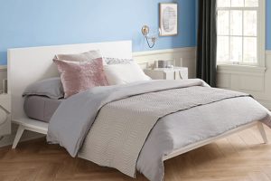
How to Use SW 7614 St. Bart’s in the Bedroom?
Bedrooms are sanctuaries, places where we unwind and rejuvenate, and St. Bart’s perfectly encapsulates this calmness. By painting the walls with this soothing shade, you can create a peaceful, relaxing environment that promotes restful sleep. To maximize its effect, you can pair it with soft neutral colors such as whites or creams for the bedding and window treatments. This combination ensures a fresh, airy feel that complements the grounding influence of St. Bart’s.
Additionally, St. Bart’s is versatile enough to adapt to various bedroom themes. For instance, in a modern setting, it can be paired with sleek gray or black accents for a contemporary touch. On the other hand, in a rustic or farmhouse-styled bedroom, combining St. Bart’s with warm woods and distressed finishes can create an earthy, cozy ambiance.

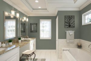
How to Use SW 7614 St. Bart’s in the Bathroom?
In bathrooms, St. Bart’s can impart a tranquil, spa-like atmosphere. The cool undertones of this color create a refreshing feel that is quite appropriate for a space devoted to cleansing and relaxation. Whether it’s a powder room or a full-size bathroom, St. Bart’s can bring a sense of calm. Pairing it with crisp whites for the sink and bathtub, along with warm wood for the vanity, can create a balanced, harmonious space.
You could also consider using St. Bart’s as an accent color in the bathroom. A single accent wall painted in this color can be a striking addition that brings depth and character to the space. Pair this with lighter walls and reflective surfaces such as mirrors and glossy tiles to ensure the bathroom stays bright and open.

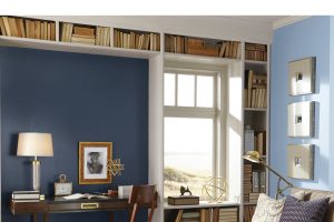
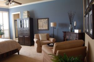
How to Use SW 7614 St. Bart’s in the Living Room?
The living room, being a communal space, requires a color that can evoke a sense of warmth and invitation. St. Bart’s fits this description perfectly. Its rich green tones make it a welcoming color, perfect for a space where family members gather, and guests are entertained. Complement it with light neutral furniture to create a pleasing contrast and warm the room.
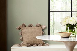
Further, you can play with various textures and patterns to bring out the best of this color. Incorporate furnishings with natural materials such as jute, rattan, or wood to enhance the earthy vibe of St. Bart’s. Likewise, patterned throws and pillows can add an exciting dimension to the room, making it even more inviting.

How to Use SW 7614 St. Bart’s for an Exterior?
Exterior house colors are crucial as they significantly impact the overall appeal of your home. St. Bart’s is a wonderful choice for exteriors as it has a timeless appeal and blends well with natural surroundings. The richness and depth of this color lend a sense of elegance to your home’s facade, and it works beautifully with a variety of architectural styles, from country cottages to modern minimalist designs.
When using St. Bart’s for the exterior, consider using contrasting trim colors to highlight architectural details. Whites or creams can offer a stunning contrast, while more earthy tones can provide a more subtle effect.
Additionally, consider the landscape around your home. St. Bart’s can be a fantastic backdrop for colorful gardens, harmonizing with greenery and other natural elements.

How to Use SW 7614 St. Bart’s for the Kitchen?
The kitchen, often considered the heart of the home, deserves a color that brings warmth and character. St. Bart’s can add a lively yet soothing touch to this space. You could use it on the walls to set a refreshing backdrop for white or wood-toned cabinets or on an island as a statement piece.
If you want a bold, dramatic look, consider painting all the cabinets in St. Bart’s. This creates a striking contrast with lighter walls or countertops, resulting in a kitchen with a lot of personalities. For a harmonious look, incorporate elements like a subway tile backsplash in neutral tones or stainless steel appliances.

How to Use SW 7614 St. Bart’s for the Kitchen Cabinets?
Choosing St. Bart’s for kitchen cabinets is a bold move that can pay off beautifully. The color adds depth and personality to the kitchen, giving it a unique character. However, as it’s a rich and vibrant color, it’s essential to balance it with lighter elements to prevent the kitchen from feeling smaller or darker.
For the walls and countertops, consider using light neutrals or whites. These colors will offset the richness of St. Bart’s, keeping the space open and airy. For the hardware, you can opt for brass or copper finishes that complement St. Bart’s earthy tones and add a touch of sophistication.
Lastly, consider open shelving or glass-front cabinets to break up the color and introduce some variety.

Comparing SW 7614 St. Bart’s With Other Colors
By comparing different colors, you can better see their distinctions. Below, we compare SW St. Bart’s with several other hues. Check this description out to see how SW St. Bart’s may read if you use it with other colors.
SW 7614 St. Bart’s vs. SW 6108 Latte
SW 7614 St. Bart’s and SW 6108 Latte are both earthy hues, but they bring different vibes to a space. St. Bart’s, with its cool green tones, evokes a sense of freshness and tranquility reminiscent of a serene forest or tranquil seaside landscape.
On the other hand, Latte, with its warm, rich brown tones, gives off a cozy, inviting vibe that speaks of comfort and relaxation. It’s akin to a warm cup of coffee on a cozy morning. Both colors are versatile and can work beautifully in various settings, but your choice between them would depend on the ambiance you wish to create.

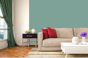
SW 7614 St. Bart’s vs. SW 7001 Marshmallow
SW 7001 Marshmallow is a pure, bright white that contrasts sharply with the deep, earthy green of SW 7614 St. Bart’s. While St. Bart’s adds depth and character to a space, Marshmallow opens it up, making it appear larger and brighter.
SW Marshmallow can serve as a wonderful accent color to St. Bart’s, with its brightness highlighting the richness of St. Bart’s. Used together, they create a balanced, refreshing color palette that combines serenity and brightness.

SW 7614 St. Bart’s vs. SW 7536 Bittersweet Stem
SW 7536 Bittersweet Stem is a deeper, more intense green compared to SW 7614 St. Bart’s. Its rich tones can give a room a bold, dramatic look, while St. Bart’s, though deep, has a more soothing, serene quality due to its cooler undertones. Bittersweet Stem is excellent for making a statement, while St. Bart’s is a great choice for creating a tranquil, inviting environment.

SW 7614 St. Bart’s vs. SW 7006 Extra White
SW 7006 Extra White is a clean, bright white with no strong undertones. This crisp clarity offers a stark contrast to the earthy richness of SW 7614 St. Bart’s. Extra White brings a feeling of freshness and openness to a space, making it feel larger and brighter, while St. Bart’s creates a soothing, grounded ambiance. Paired together, they create a striking balance that is both calming and invigorating.

SW 7614 St. Bart’s vs. SW 7542 Cottage Cream
SW 7542 Cottage Cream is a warm, soft off-white with a hint of beige, providing a light, comforting aura that differs from the more intense, deeper tones of St. Bart’s. While St. Bart’s evokes a sense of grounding and tranquility, Cottage Cream speaks of warmth and coziness. It’s softer, more subtle, and can make a room feel cozy and intimate, making it a great companion to St. Bart’s earthy charm.

SW 7614 St. Bart’s vs. SW 6340 Baked Clay
SW 6340 Baked Clay is a warm, earthy red with brown undertones. This color is significantly warmer than St. Bart’s and offers a vibrant, energetic vibe as opposed to St. Bart’s cool tranquility. Baked Clay can add a dash of warmth and excitement to a room, whereas St. Bart’s is more calming and grounding.
In combination, they can create a dynamic and balanced palette, with Baked Clay providing a warm counterpoint to the cool serenity of St. Bart’s.

Conclusion
In conclusion, Sherwin-Williams SW 7614 St. Bart’s is a unique color that successfully combines depth, tranquility, and a sense of grounding to create an inviting and serene ambiance. Its versatility allows it to shine in any room, from kitchens and bathrooms to bedrooms and living spaces.
Furthermore, its adaptability across different design styles, and its beautiful interaction with a variety of color palettes, make it a desirable choice for those seeking to introduce a touch of nature and tranquility into their homes.
Whether used as a statement wall, a soothing backdrop, or a distinctive choice for kitchen cabinets, St. Bart’s offers a timeless appeal that can transform any space into a peaceful haven.

Ever wished paint sampling was as easy as sticking a sticker? Guess what? Now it is! Discover Samplize's unique Peel & Stick samples.
Get paint samples
Frequently Asked Questions
⭐What type of rooms is SW 7614 St. Bart’s best suited for?
St. Bart's is a versatile color that works beautifully in a wide range of rooms. Its earthy, calming green tone can bring a sense of tranquility to bedrooms, bathrooms, living rooms, and even kitchens. It's also an excellent choice for the exterior of your home, blending well with natural surroundings.
⭐What are some coordinating colors for SW 7614 St. Bart’s?
SW 7614 St. Bart’s pairs well with several colors. Whites like SW 7001 Marshmallow and SW 7006 Extra White can provide a fresh, clean contrast, while warmer hues like SW 6340 Baked Clay add a cozy, inviting touch. It also works beautifully with various shades of beige and brown for a more earthy color palette.
⭐How does lighting affect the appearance of SW 7614 St. Bart’s?
Lighting can significantly impact how St. Bart's appears. In natural light, it shows off its true, earthy green tone, but in rooms with less light or under artificial lighting, it can appear darker and more muted. To ensure you get the color you desire, it's recommended to test the paint in different light conditions before committing to it.
⭐What is the Light Reflectance Value (LRV) of SW 7614 St. Bart’s and what does it mean?
The Light Reflectance Value (LRV) of St. Bart’s is 18.58. LRV measures the percentage of light a paint color reflects. A lower LRV means the color absorbs more light, making it appear darker and heavier. St. Bart's relatively low LRV indicates it's a deeper color that can add depth and character to a space.
⭐Can I use SW 7614 St. Bart’s for my kitchen cabinets?
Absolutely! St. Bart's can be a bold, distinctive choice for kitchen cabinets. It can add depth and personality to your kitchen, giving it a unique character. However, it's important to balance this rich color with lighter elements, like walls and countertops, to ensure your kitchen feels open and bright.