SW 7529 Sand Beach by Sherwin Williams paints a picture of warm, sunny afternoons by the sea with its soothing shade. If you’re thinking about giving your room a fresh coat of paint, this color might just be what you need. Sand Beach is a soft beige that brings a sense of calm and simplicity to any area, making it feel more welcoming and cozy.
I’ve noticed that this color works particularly well in living rooms and bedrooms where you want to create a peaceful retreat from the busyness of everyday life. It pairs beautifully with a wide range of decor styles, from modern minimalism to rustic charm. When used on the walls, Sand Beach acts as a neutral backdrop, allowing your furniture and art pieces to really stand out.
Moreover, if you’re unsure about committing to a full room makeover, consider using it for an accent wall or in smaller decorative touches. This adaptable shade adjusts well to any lighting, looking equally lovely under natural sunlight as it does under soft, artificial light.
Whether you’re looking to sell your home or simply update it for your own enjoyment, Sand Beach provides an enduring elegance that is hard to beat.
What Color Is Sand Beach SW 7529 by Sherwin Williams?
The color Sand Beach by Sherwin Williams is a warm, soft beige that evokes the feeling of a calm, sandy shore. It’s a flexible neutral that brings a cozy warmth to any room it graces. With its subtle yellow undertones, this color works wonderfully to create a friendly and welcoming atmosphere, making it perfect for living areas, bedrooms, and even kitchens.
When it comes to interior styles, Sand Beach fits best with designs that lean towards the casual and comfortable, such as rustic, coastal, or traditional. Its understated nature allows it to seamlessly integrate with a variety of decor themes, enhancing the area without overpowering it.
Pairing well with natural materials and textures, Sand Beach truly shines when combined with elements like wooden furniture, linen textiles, and woven baskets. These combinations emphasize its organic, earthy qualities, reinforcing a sense of relaxation and warmth. When considering metals, opting for bronze or brushed copper can add a lovely hint of glamour to the gentle backdrop that Sand Beach provides. Ideal for those looking to create a cozy, homey interior, this color makes rooms feel more inviting and roomy.
Is Sand Beach SW 7529 by Sherwin Williams Warm or Cool color?
Sand Beach SW 7529 by Sherwin Williams is a warm, inviting paint color that resembles the soft, golden sands you might find at your favorite beach. This shade is incredibly flexible and can be used in a variety of settings in a home, working especially well in living rooms, bedrooms, and entryways.
The warm undertones of Sand Beach can create a cozy and welcoming atmosphere, making rooms feel more comfortable and homely. In rooms with a lot of natural light, this color brightens even more, embodying a friendly, open aura.
When used in smaller rooms, it can make the area feel larger and more open. Sand Beach pairs beautifully with darker and rich-toned woods, adding a naturalistic element to the decor. It also complements well with a wide range of colors from gentle creams to bold blues, allowing for flexibility in decorating choices. Overall, using Sand Beach in a home can provide an appealing, soft backdrop that enlivens furnishings and accents.
Undertones of Sand Beach SW 7529 by Sherwin Williams
Sand Beach is a unique paint color that may appear simple at first glance but actually has complex undertones which influence how it looks in different settings. Undertones are subtle colors that lie beneath the primary color, affecting the overall hue seen in various lighting conditions.
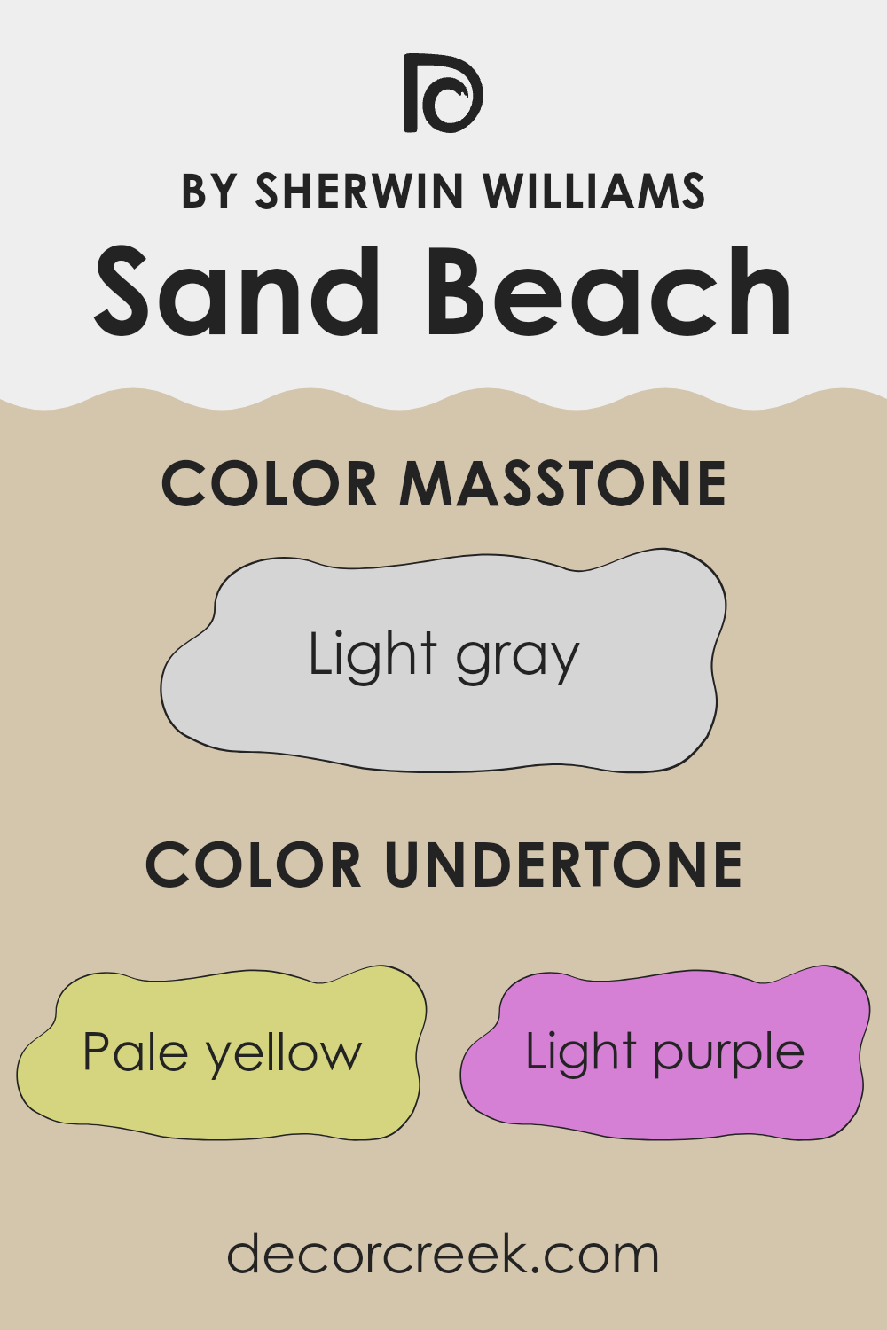
The specific undertones in Sand Beach include pale yellow, light purple, pale pink, light blue, mint, lilac, and grey. These undertones can make Sand Beach adaptable, allowing this color to adjust subtly to different decor styles and lighting conditions.
For example, in a room with lots of natural sunlight, the pale yellow and light blue undertones might make the color appear warmer and more vibrant. In contrast, in an area with less light or during the evening under artificial lighting, the grey and lilac undertones could make it appear cooler and more muted.
When used on interior walls, these undertones can bring a room to life in surprising ways. Sand Beach can act as a neutral backdrop that shifts and reacts to its surroundings. The presence of mint and pale pink can introduce a soft and welcoming feel, which is perfect for living areas or bedrooms.
This ability to interact dynamically with both natural and artificial light makes Sand Beach a practical choice for many different types of rooms, providing a subtle, lively backdrop to a wide range of home furnishings and decor styles.
What is the Masstone of the Sand Beach SW 7529 by Sherwin Williams?
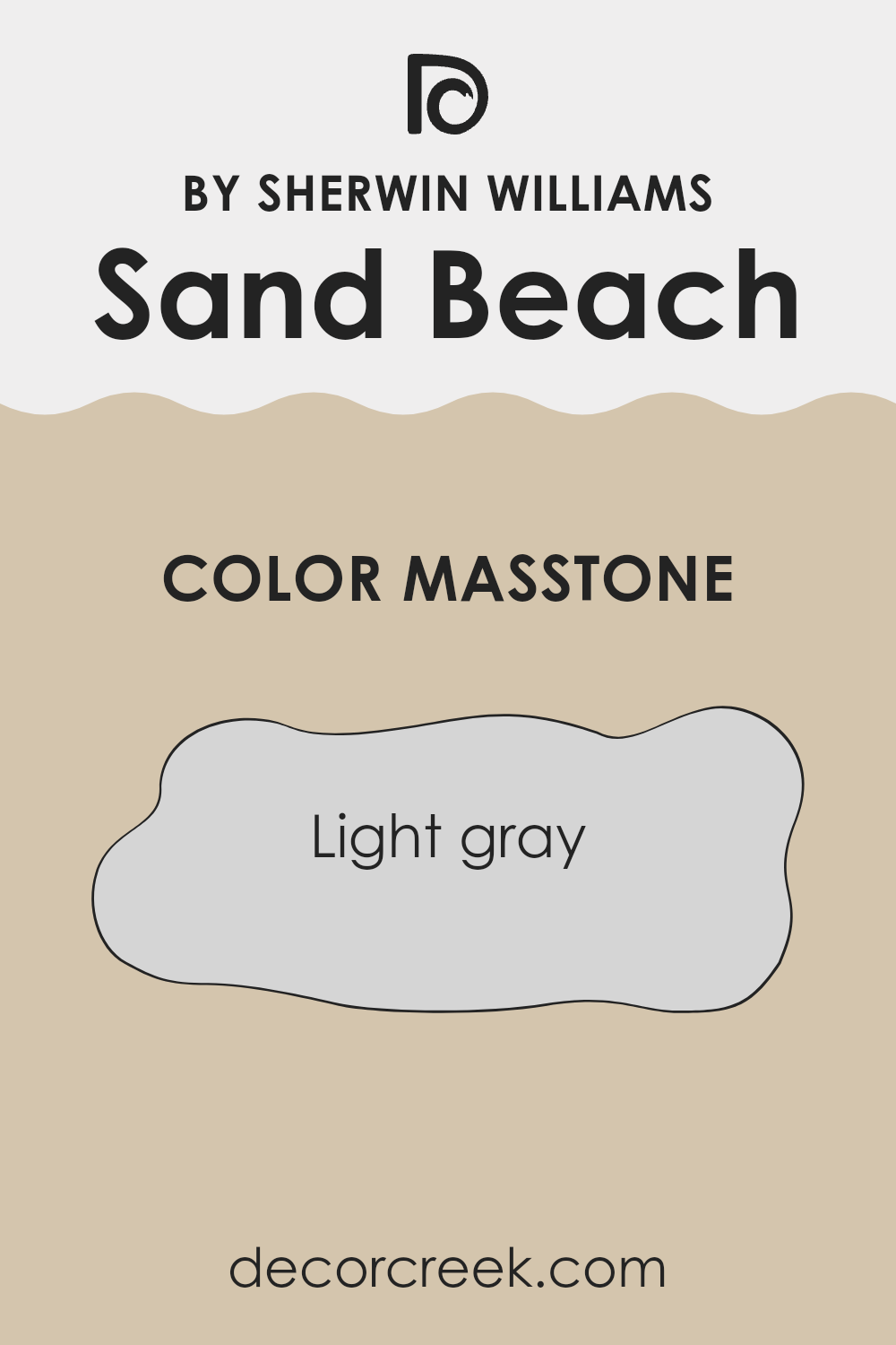
Sand Beach SW 7529 by Sherwin Williams has a masstone of Light Gray (#D5D5D5), making it a flexible paint color for home interiors. This light gray shade provides a subtle, neutral backdrop that can complement various decor styles and color schemes. Its lightness helps to brighten rooms, making smaller areas appear larger and more open.
Because it does not lean heavily towards any specific color tone, it works well in rooms that get either a lot of sunlight or very little, maintaining its true color under different lighting conditions. This shade is particularly useful in living areas, bedrooms, and kitchens where a clean, fresh look is desired.
Additionally, being a neutral color, it allows homeowners to easily switch up their accents and furnishings without having to repaint, giving them flexibility in decorating and updating their room. Overall, Sand Beach SW 7529 is a practical choice for creating a light and airy feel in the home.
How Does Lighting Affect Sand Beach SW 7529 by Sherwin Williams?
Lighting plays a crucial role in how we perceive colors, largely because different types of light can dramatically alter the appearance of a color in a room. Let’s focus on Sand Beach SW 7529, a warm neutral paint shade from Sherwin Williams. This color, like all others, can look different depending on whether it’s lit by natural or artificial light and the direction the room faces.
Artificial Light: Under artificial lighting, Sand Beach SW 7529 generally appears warmer and richer. This means in environments lit by standard incandescent bulbs, the color will show more of its yellow and beige undertones, giving rooms a cozy feel. If the room uses fluorescent lighting, the color might lean slightly cooler, but being a warm hue, it maintains much of its inviting quality.
Natural Light: In natural light, the true character of Sand Beach SW 7529 often shines through. However, the amount and quality of natural light can change throughout the day and according to the room’s orientation.
- North-Faced Rooms: Rooms that face north typically receive less direct sunlight, which can make colors appear slightly muted and cooler. In these rooms, Sand Beach might look more subdued and slightly grayer — losing some of its warmth.
- South-Faced Rooms: South-facing rooms enjoy abundant light for most of the day, which can make the paint color look brighter and more vibrant. Here, Sand Beach will mostly retain its warm, inviting quality, possibly appearing a bit lighter at peak sunlight.
- East-Faced Rooms: These rooms get plenty of light in the morning, making colors look soft and warm early in the day. As the light fades, Sand Beach may appear less vibrant, but still holding onto a warm hue.
- West-Faced Rooms: Light in these rooms peaks in the afternoon to evening, where Sand Beach can look exceptionally warm and glowing during sunset, then considerably cooler and muted when the sun is not shining directly.
Overall, Sand Beach SW 7529 is a flexible color that adjusts differently depending on the lighting conditions, enhancing its appeal under various lights and making it suitable for many rooms and settings.
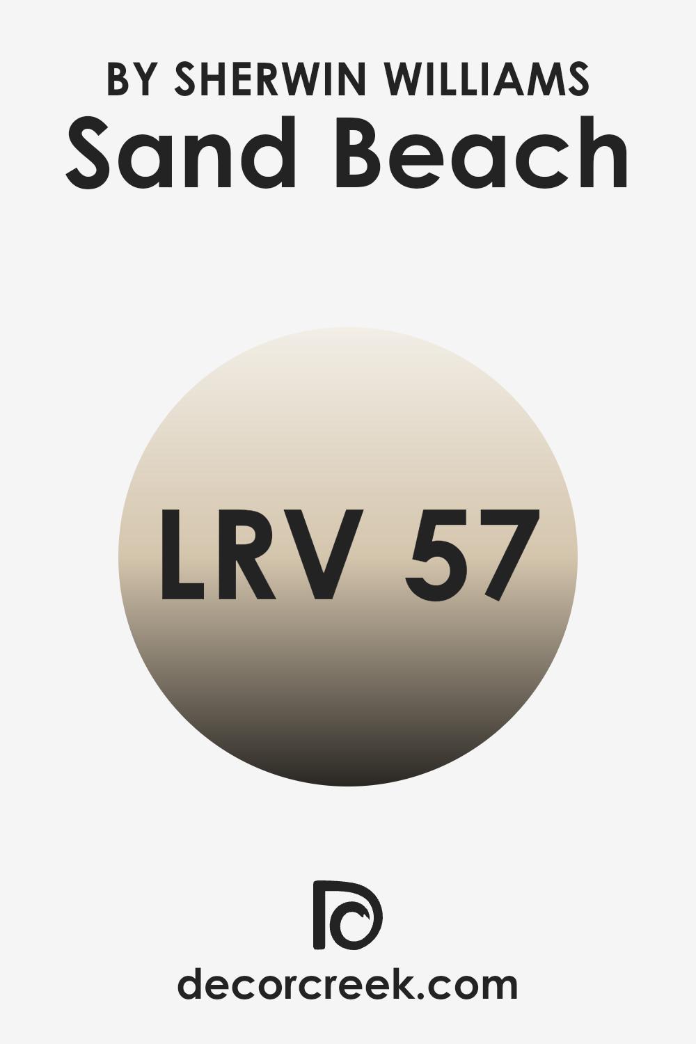
What is the LRV of Sand Beach SW 7529 by Sherwin Williams?
LRV stands for Light Reflectance Value, a measurement used to determine how much light a color reflects or absorbs. It ranges from 1 to 99, where a higher number indicates that the color reflects more light and appears lighter, and a lower number means it absorbs more light and looks darker.
This value is particularly handy when choosing paint colors, as it helps to predict how the color will look under different lighting conditions. For example, a room painted in a high-LRV color will generally seem lighter and may even feel more open, while a low-LRV color might make the same room feel cozier but smaller.
In the case of the color with an LRV of 56.848, it sits in the mid-range of light reflection. This means it neither reflects nor absorbs light excessively, providing a balanced option for those wanting a moderate brightness in their room. The effect of such an LRV is that the color, when applied to walls, will offer a sense of warmth and neutrality without overpowering the area with brightness.
It’s a flexible choice, suitable for areas where neither too much brightness nor too much absorption of light is desired. The moderate LRV makes it easier to work with under most lighting conditions, letting the natural characteristics of the color show through without significant alteration.
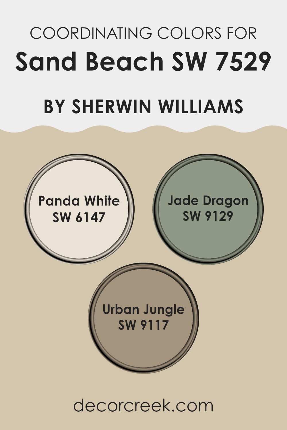
Coordinating Colors of Sand Beach SW 7529 by Sherwin Williams
Coordinating colors are hues that complement each other visually and create a balanced, harmonious look when used together in a room. When working with a base color like Sand Beach by Sherwin Williams, selecting the right coordinating colors can enhance the aesthetics of any interior.
The idea is to pick shades that either contrast or blend smoothly with the main color, depending on the desired effect. For instance, tones like Panda White, Jade Dragon, and Urban Jungle have been deemed suitable complements by Sherwin Williams.
Panda White is a gentle off-white with a warm undertone that pairs beautifully with the soft neutrality of Sand Beach, offering a clean and subtle contrast. It’s perfect for creating a light and airy feel in a room where Sand Beach is the dominant color. On the other hand, Jade Dragon introduces a lush, medium-dark green hue that adds depth and an element of nature’s calmness to the environment.
This color is ideal for adding a touch of color to a neutral palette without overpowering it. Lastly, Urban Jungle brings a darker, earthy green into the mix, which works well in grounding the lighter tones of Sand Beach and Panda White, while providing a rich backdrop that enhances the overall warmth of the room.
You can see recommended paint colors below:
- SW 6147 Panda White
- SW 9129 Jade Dragon
- SW 9117 Urban Jungle
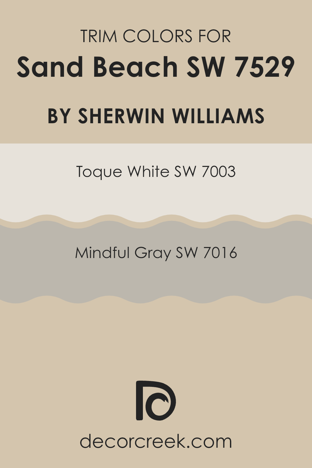
What are the Trim colors of Sand Beach SW 7529 by Sherwin Williams?
Trim colors are the shades used for detailing elements such as door frames, window sills, moldings, and baseboards in a room. These colors play a critical role in defining the area and enhancing the main color on the walls, ultimately affecting how the room feels and flows.
For instance, using trim colors like SW 7003 – Toque White or SW 7016 – Mindful Gray by Sherwin Williams with a neutral hue like Sand Beach can finely highlight the edges of a room, creating a clear visual structure and making the main wall color stand out more. This subtle delineation helps in adding depth and dimension to the area.
Toque White SW 7003 is a clean and bright shade that lends a fresh and airy feel to a room. Its lightness complements more subdued wall colors by providing a crisp contrast, which can make smaller areas appear bigger. On the other hand, Mindful Gray SW 7016 offers a balance of warm and cool tones, making it highly adaptable. It provides a soft but significant contrast with deeper or vibrant wall colors, promoting a cohesive yet defined look that supports a variety of decorating styles.
You can see recommended paint colors below:
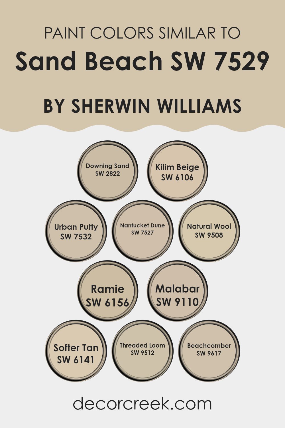
Colors Similar to Sand Beach SW 7529 by Sherwin Williams
Similar colors are important because they help to maintain a cohesive look within a design or room, creating a sense of harmony and continuity. Colors like SW 2822 – Downing Sand, which is a warmer beige, or SW 6106 – Kilim Beige, a subtly richer tone, are great examples. They act as neutral bases, ready to support a variety of decor styles and color accents.
SW 7532 – Urban Putty offers a slightly grayer beige, introducing a cool touch that is flexible, while SW 7527 – Nantucket Dune brings a deeper beige that is cozy and grounding. Natural hues like SW 9508 – Natural Wool provide a soft, almost untouched look that echoes raw textures and materials.
SW 6156 – Ramie has a hint of green, adding a unique twist to its beige foundation, which makes it perfect for rooms looking for a natural yet distinct background. Similarly, SW 9110 – Malabar introduces a touch of elegance with its muted, earthy beige that blends seamlessly into various settings. On the other hand, SW 6141 – Softer Tan is exactly what its name suggests; a gentle tan that offers warmth.
SW 9512 – Threaded Loom features a soft blend of beige tones, reminiscent of handcrafted fabric, while SW 9617 – Beachcomber is a pale, sandy shade that brings to mind a windswept beach at dawn, perfect for creating a quiet, cozy corner. These colors, similar yet distinct, can easily be interchanged or used together to create a layered effect that enhances any room with smooth transitions and aesthetic appeal.
You can see recommended paint colors below:
- SW 2822 Downing Sand
- SW 6106 Kilim Beige
- SW 7532 Urban Putty
- SW 7527 Nantucket Dune
- SW 9508 Natural Wool
- SW 6156 Ramie
- SW 9110 Malabar
- SW 6141 Softer Tan
- SW 9512 Threaded Loom
- SW 9617 Beachcomber
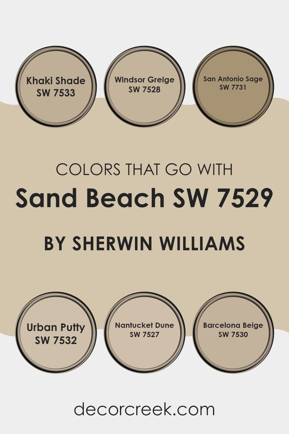
Colors that Go With Sand Beach SW 7529 by Sherwin Williams
Choosing the right colors to complement Sand Beach SW 7529 by Sherwin Williams is essential in creating a harmonious and inviting room. These colors help achieve a balanced aesthetic that feels warm and welcoming, using shades that blend well together without overpowering the senses. Each chosen color has its own unique character yet works seamlessly with Sand Beach, which is a neutral, soft beige tone that serves as a flexible backdrop for any area.
Khaki Shade SW 7533 is a deeper, earthy hue that offers a comforting robust contrast to the softness of Sand Beach. This color is great for adding depth and interest in rooms that require a bit more warmth. Windsor Greige SW 7528, on the other hand, is a milder blend that pulls both gray and beige tones together, creating a perfect middle ground that enhances the softness of Sand Beach without clashing.
San Antonio Sage SW 7731 brings in a subtle hint of green, providing a touch of nature-inspired freshness that complements the earthy quality of Sand Beach. Urban Putty SW 7532 carries a taupe-like quality that ties beautifully with wooden elements and other natural textures in a room, providing a cohesive look. Nantucket Dune SW 7527 offers a slightly lighter cream that pairs effortlessly with Sand Beach, ensuring areas feel open and airy.
Lastly, Barcelona Beige SW 7530 is a smooth, neutral beige that supports the calm palette, helping create a uniform look without being dull. These colors not only work together to enhance the beauty of each other but also help in achieving a visually appealing room that’s cozy and stylish.
You can see recommended paint colors below:
- SW 7533 Khaki Shade
- SW 7528 Windsor Greige
- SW 7731 San Antonio Sage
- SW 7532 Urban Putty
- SW 7527 Nantucket Dune
- SW 7530 Barcelona Beige
How to Use Sand Beach SW 7529 by Sherwin Williams In Your Home?
Sand Beach SW 7529 by Sherwin Williams is a warm, neutral beige paint color with a soft and inviting tone. It’s a great choice for those looking to create a cozy and welcoming atmosphere in their home. This color works beautifully in living rooms or bedrooms, providing a calm backdrop that complements a variety of decor styles and furniture colors.
Its neutral shade makes it easy to match with other colors, whether you’re looking to pair it with bright accents like blues and greens or keep things subtle with creams and browns. In the kitchen, Sand Beach can add a touch of warmth to cabinets or walls, making the room feel more homely.
It’s also an excellent choice for hallways and entryways, where it can help to brighten the area without dominating it with strong colors. Because it’s so adaptable, Sand Beach can help unify different rooms throughout your home with a consistent and pleasant hue.
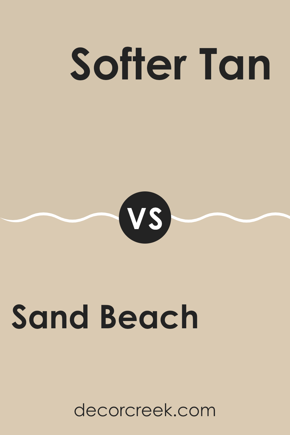
Sand Beach SW 7529 by Sherwin Williams vs Softer Tan SW 6141 by Sherwin Williams
Sand Beach and Softer Tan, both by Sherwin Williams, are warm neutral hues that share a comforting, earthy base, ideal for creating a cozy atmosphere in any room. Sand Beach has a slightly lighter, softer appearance, tending towards a creamy beige.
This makes it great for rooms where you want to invite more light in or make the area feel more open and airy. On the other hand, Softer Tan stands as a deeper shade with more pronounced golden undertones, offering a cozy, inviting feel.
It can help make larger rooms feel more intimate and welcoming. Both colors pair well with a wide range of furnishings and decor, making them flexible choices for a home. Whether you choose the lighter Sand Beach or the richer Softer Tan depends on the mood you want to set and the size of your room.
You can see recommended paint color below:
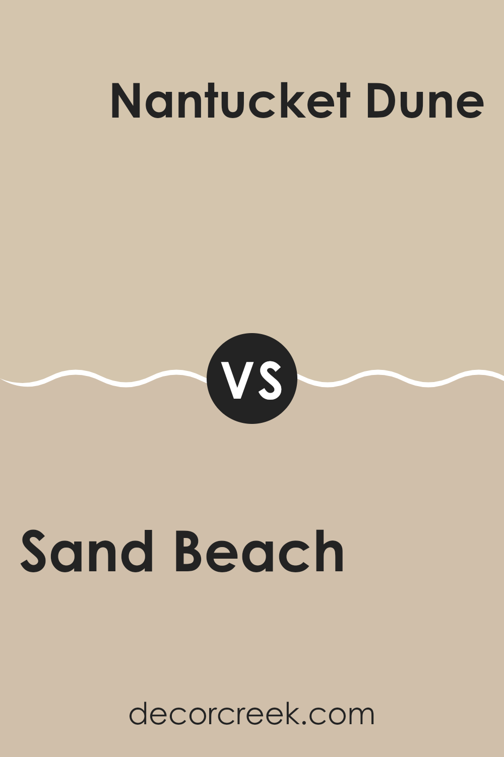
Sand Beach SW 7529 by Sherwin Williams vs Nantucket Dune SW 7527 by Sherwin Williams
Sand Beach and Nantucket Dune are two paint colors offered by Sherwin Williams. Both shades are subtle and lend themselves well to creating a warm, inviting room. Sand Beach has a slightly lighter, warmer tone that can make an area feel cozy and bright.
It acts as a soft background, perfect for rooms where you want a calm, relaxed vibe. On the other hand, Nantucket Dune is a bit deeper and cooler, which adds a sense of richness to its environment. This color can make a room feel more grounded and steady without overpowering the senses.
Both colors work well in a variety of settings, blending easily with different decor styles and color schemes. When choosing between the two, consider the amount of natural light your room gets and the atmosphere you’re aiming to create.
You can see recommended paint color below:
- SW 7527 Nantucket Dune
Sand Beach SW 7529 by Sherwin Williams vs Natural Wool SW 9508 by Sherwin Williams
Sand Beach and Natural Wool by Sherwin Williams are both neutral colors, but they have distinct tones that set them apart. Sand Beach is a warmer hue, reminiscent of the soft, light color of sandy shores. It brings a cozy and welcoming feel to any room, making areas feel open and airy.
On the other hand, Natural Wool has a cooler undertone, similar to the gentle shade of undyed sheep’s wool. This color is great for creating a calm, understated ambiance in a room.
Both colors are adaptable and work well in various settings, but Sand Beach might be a better choice for those wanting a hint of warmth, while Natural Wool is ideal for a more muted, subtle look. Either option suits a variety of decorating styles, from modern to traditional.
You can see recommended paint color below:
Sand Beach SW 7529 by Sherwin Williams vs Beachcomber SW 9617 by Sherwin Williams
Sand Beach is a soft beige with warm undertones, which gives off a comforting and inviting vibe. It’s like the color of a sandy shore, making it adaptable for use in any room that aims for a cozy and unassuming atmosphere.
On the other hand, Beachcomber is a little darker and has more earthy hints, resembling wet sand or pebbles found along the coast. This shade is great for adding a touch of warmth and grounding to areas. Both colors bring elements of the beach into a home but in subtly different ways.
Sand Beach, being lighter, can make a small room feel larger and more open, while Beachcomber, with its deeper tone, offers a stronger presence and can help define an area more clearly. Together, these colors can work beautifully in a layered look that’s welcoming and down-to-earth.
You can see recommended paint color below:
Sand Beach SW 7529 by Sherwin Williams vs Ramie SW 6156 by Sherwin Williams
Sand Beach by Sherwin Williams is a warm, light beige tone that leans slightly towards the yellow end of the spectrum. It offers a cozy, inviting feel, making it perfect for rooms where a neutral, cheerful backdrop is desired.
On the other hand, Ramie by Sherwin Williams is another neutral, but it shifts closer to a grayish, cooler beige. This color provides a muted, soft look that pairs well in areas meant for relaxation or minimalistic style since it doesn’t attract too much attention.
While Sand Beach adds more warmth due to its subtle yellow undertones, making it ideal for living rooms or kitchens that benefit from a sunny, pleasant vibe, Ramie steps back with its cooler, more restrained grayish hue, excellent for creating a calm, understated environment in bedrooms or offices. Their differences allow them to suit varied decorative styles and uses within a home, depending on the atmosphere you want to achieve.
You can see recommended paint color below:
- SW 6156 Ramie
Sand Beach SW 7529 by Sherwin Williams vs Malabar SW 9110 by Sherwin Williams
Sand Beach and Malabar, both by Sherwin Williams, offer distinctive yet subtle color tones. Sand Beach has a light, warm beige shade that easily brightens up any room, giving it a cozy and calm feeling. It’s perfect for creating a relaxed environment, making it ideal for living rooms or bedrooms where comfort is key.
On the other hand, Malabar presents a deeper, taupe-like color. It’s darker than Sand Beach and carries a hint of gray which adds a touch of depth to the hue. This color works well in rooms that need a bit more gravity without overpowering the area with a too-dark shade.
Malabar is suited for settings where a sense of quiet focus or groundedness is desired, such as studies or home offices. Both colors provide flexible options for home decor, catering to different moods and styles. Sand Beach illuminates, while Malabar grounds.
You can see recommended paint color below:
- SW 9110 Malabar
Sand Beach SW 7529 by Sherwin Williams vs Kilim Beige SW 6106 by Sherwin Williams
Sand Beach and Kilim Beige are both warm neutral colors from Sherwin Williams, each providing a cozy backdrop for any room. Sand Beach is a lighter, softer beige with hints of taupe, giving it a fresh, airy feel.
This color is great for making small rooms appear larger and brightens areas that don’t receive much natural light. In contrast, Kilim Beige has a deeper, richer tone with warm, earthy accents. It’s excellent for adding a sense of warmth to rooms and pairs well with a wide range of decor styles.
Both colors are adaptable, but Sand Beach leans more towards a minimalistic, modern vibe, while Kilim Beige is ideal for a traditional or rustic setting. Depending on the room’s purpose and the ambiance you want to create, either color could be the perfect choice. Overall, both offer a cozy atmosphere, with Sand Beach reflecting a lighter mood and Kilim Beige creating a more grounded feel.
You can see recommended paint color below:
Sand Beach SW 7529 by Sherwin Williams vs Downing Sand SW 2822 by Sherwin Williams
Sand Beach SW 7529 and Downing Sand SW 2822 by Sherwin Williams are both neutral colors but have distinctive tones. Sand Beach is lighter and resembles the soft, pale color of a sandy beach on a sunny day. It gives a room a fresh, airy feel, which can make small areas appear more open and bigger.
On the other hand, Downing Sand has a deeper, warmer hue that resembles wet sand. This color adds a cozy and comforting feel to rooms, making it ideal for areas where you want to relax and feel more enclosed, like bedrooms or living rooms.
While both colors are adaptable and can blend well with various decor styles and other shades, Sand Beach works better if you want to brighten a room, and Downing Sand is preferable for a more grounded, warm ambiance. They suit different decorating goals depending on whether you want a lighter, area-enhancing effect or a warmer, snug atmosphere.
You can see recommended paint color below:
Sand Beach SW 7529 by Sherwin Williams vs Threaded Loom SW 9512 by Sherwin Williams
Sand Beach and Threaded Loom, both from Sherwin Williams, offer distinct vibes for any room. Sand Beach is a light beige that adds a warm, subtle backdrop to an area. It pairs beautifully with a variety of decor styles, making it adaptable for any home.
On the other hand, Threaded Loom has a deeper taupe hue that provides a rich, inviting feel. It’s perfect for creating a cozy and comfortable atmosphere in areas like living rooms or bedrooms. While Sand Beach brings gentle brightness, Threaded Loom offers a touch of depth that can make larger rooms feel more intimate.
Depending on your decorating goals, Sand Beach is great for achieving a light, airy feel, whereas Threaded Loom works well when you want a stronger, more grounded color impact. Both colors work well with other shades and can help in achieving a harmonious look, whether you prefer something subtle or a bit more dramatic.
You can see recommended paint color below:
Sand Beach SW 7529 by Sherwin Williams vs Urban Putty SW 7532 by Sherwin Williams
Sand Beach and Urban Putty are two pleasant neutral paint colors from Sherwin Williams. Sand Beach has a soft, light beige tone that resembles the color of a sandy beach. This shade is ideal for creating a cozy and inviting atmosphere in rooms like living rooms or bedrooms. It has a warm undertone, making it easy to pair with various decor styles.
On the other hand, Urban Putty is a shade darker than Sand Beach. It’s a muted beige with gray undertones, giving it a more grounded and earthy feel. This color works well in rooms where you want a bit of a stronger presence on the walls without moving too far from neutral tones. It can help define an area better and is excellent in larger rooms or those with lots of natural light.
Both colors are flexible and work well in many settings, but the choice between them might depend on how bright or subdued you want the room to feel. Sand Beach is lighter and warmer, while Urban Putty provides a more solid, cooler background.
You can see recommended paint color below:
- SW 7532 Urban Putty
In finishing up my thoughts on SW 7529 Sand Beach by Sherwin Williams, I’ve really come to appreciate what a warm and lovely paint color it is. This shade resembles the softly golden sands you might find at the beach on a sunny day. It carries that cozy and welcoming vibe that makes any room feel more comforting. From living rooms to bedrooms, Sand Beach added a touch of subtle warmth that wasn’t too bold but still made the rooms stand out in a gentle way.
Using this paint was easy and fun since it went well with a lot of different colors and decorations. Whether I put it next to bright shades like blues and greens or kept things calm with creams and browns, everything seemed to fit perfectly. It’s really a great choice if you want to make your room feel like a friendly hug.
Sand Beach also has this neat quality where it shifts a bit depending on the light. Sometimes it looks a little more yellow, and other times, it has a hint of tan. This keeps things interesting and stops the area from looking plain or dull.
If I were to suggest a paint to help make your room feel warmer and welcoming, without being too flashy, I’d definitely recommend giving SW 7529 Sand Beach a try. It’s easy to love and works so well in making your home feel just a bit more special.
Ever wished paint sampling was as easy as sticking a sticker? Guess what? Now it is! Discover Samplize's unique Peel & Stick samples.
Get paint samples

