When choosing the perfect paint color for your home, the options can feel endless. If you’re considering SW 6203 Spare White by Sherwin Williams, here are a few key insights to help you make an informed decision. As someone who has used this color in various rooms, I’ve noticed a few things about its characteristics and how it behaves in different lighting conditions.
First, Spare White is a soft, delicate shade that gives a clean and airy feel to any room. Despite its name, it isn’t a stark white but carries subtle undertones that can shift with the lighting. This is worth keeping in mind, especially if you’re aiming for a specific warmth or coolness in your room. Additionally, this color pairs beautifully with a wide range of decor styles, making it a flexible choice for any room in your home.
Understanding how Spare White reacts to the surroundings and the size of your room is important. Larger rooms filled with natural light can make this shade appear more vibrant, while smaller, less lit areas might bring out its cooler tones.
Always consider testing a swatch on your walls to see how it looks throughout the day before making your final decision.
Is Spare White SW 6203 Right for My Home?
As an avid interior design enthusiast, I have a fondness for colors that offer flexibility and a sense of calm to a room. Spare White by Sherwin Williams is one such color that truly stands out for its subtle warmth and flexibility. This color has a slightly cool undertone, making it an excellent choice for creating a bright and airy feel in any room.
From my experience, Spare White works incredibly well in a variety of interior styles, particularly in modern, minimalist, and Scandinavian designs. These styles often focus on clean lines and a neutral palette, allowing this gentle white to provide a fresh, uncluttered backdrop.
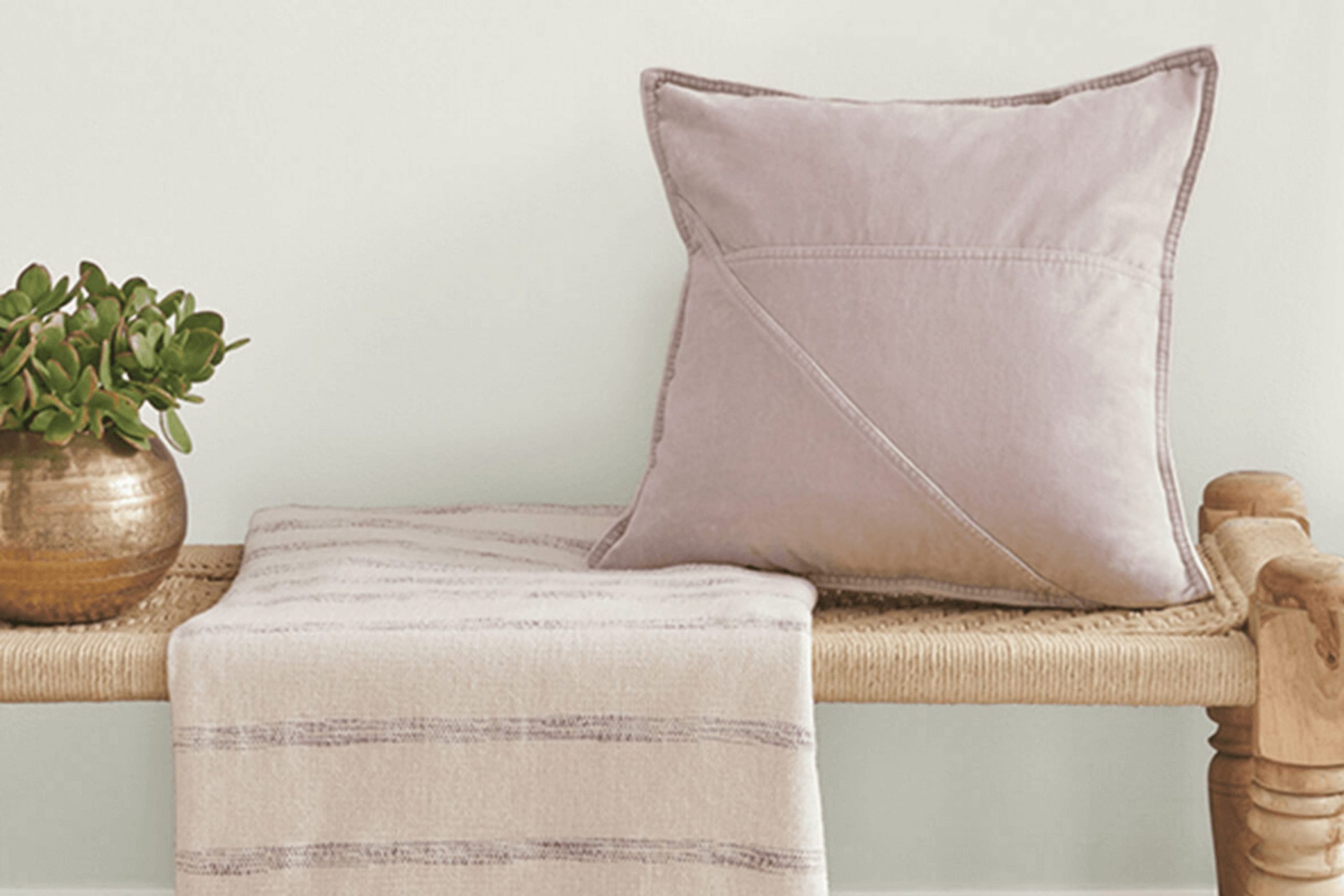
When thinking about materials, Spare White pairs beautifully with natural wood, which adds warmth and texture to the simplicity of the hue. It also goes very well with metallic finishes like brushed nickel or chrome, adding a crisp, modern edge that complements its cool undertone. For those who enjoy a bit of contrast, incorporating soft, plush textures in furnishings like velvety throw pillows or a chunky knit blanket can really make this color stand out, providing a cozy, inviting feel to the living areas.
Incorporating Spare White in my home projects has been a delight. It’s a go-to color that brings a sense of lightness and openness, perfect for creating a relaxed feel that’s both chic and functional. Plus, it’s a wonderful backdrop that allows other design elements to stand out. Whether you’re looking to refresh your living room, bedroom, or even the kitchen, this color is definitely up to the task.
decorcreek.com
What are the right undertones of Spare White SW 6203 ?
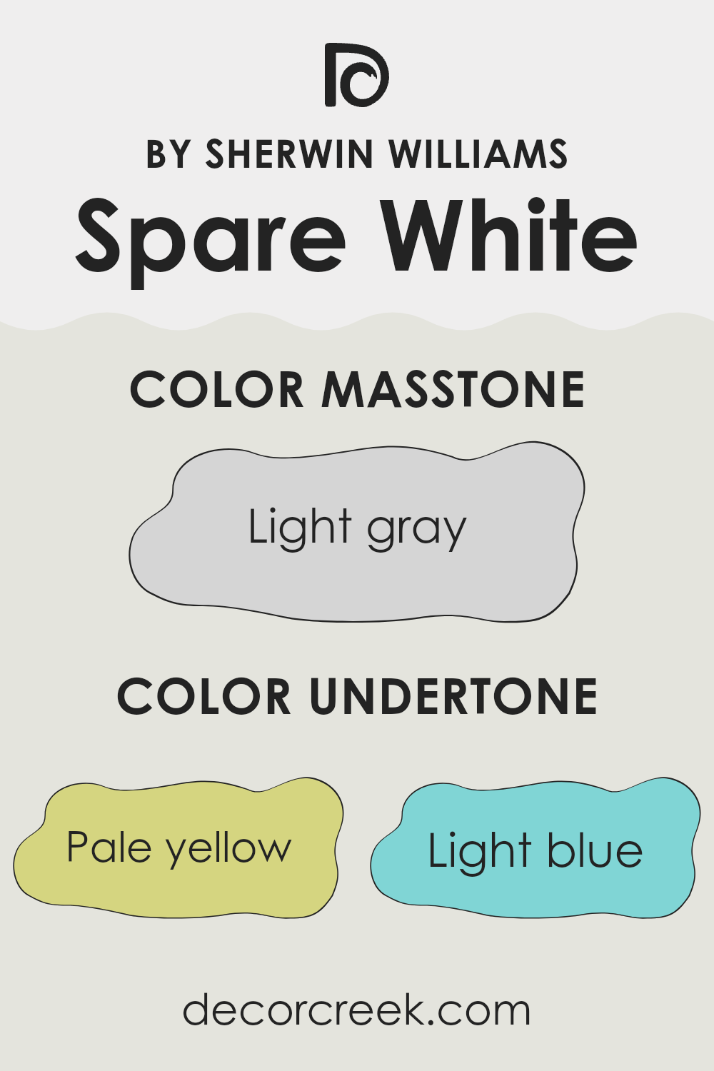
Spare White by Sherwin Williams is a subtle and flexible paint color that can change its appearance based on its undertones and lighting conditions. Undertones are the colors hiding beneath the surface of the paint, affecting how it looks in different environments. For Spare White, these undertones include pale yellow, light blue, light purple, mint, pale pink, lilac, and grey.
Each of these undertones can play a significant role in how the paint appears on interior walls. For instance, in a room with lots of natural light, the pale yellow or mint undertones might make the walls seem warmer and more welcoming. In contrast, in a room with less light, the grey or light blue undertones could make the walls appear cooler and more neutral.
The variety of undertones in Spare White means it can look quite different from room to room or even at different times of the day, as the changing light highlights different undertones. This can be a great advantage when aiming for a paint color that adapts to various settings and décor styles without needing multiple colors throughout the home.
On interior walls, the subtle play of undertones in Spare White allows it to complement a wide range of furnishings and finishes. Whether paired with bold colors or soft neutrals, it provides a clean, fresh backdrop that can make a room feel gently refreshed. Moreover, the mix of undertones offers a soft complexity that prevents the color from being stark or sterile, adding layers of visual interest to any room.
decorcreek.com
Best Coordinating Colors to use with Spare White SW 6203 by Sherwin Williams this year.
Coordinating colors are selected to complement a primary color, creating a harmonious look in any room. For instance, when working with a neutral base like a soft, warm grey, choosing shades that enhance without feeling too strong is key. Each coordinating color serves a unique purpose, either contrasting with or enhancing the primary shade to achieve balance and visual appeal in decor.
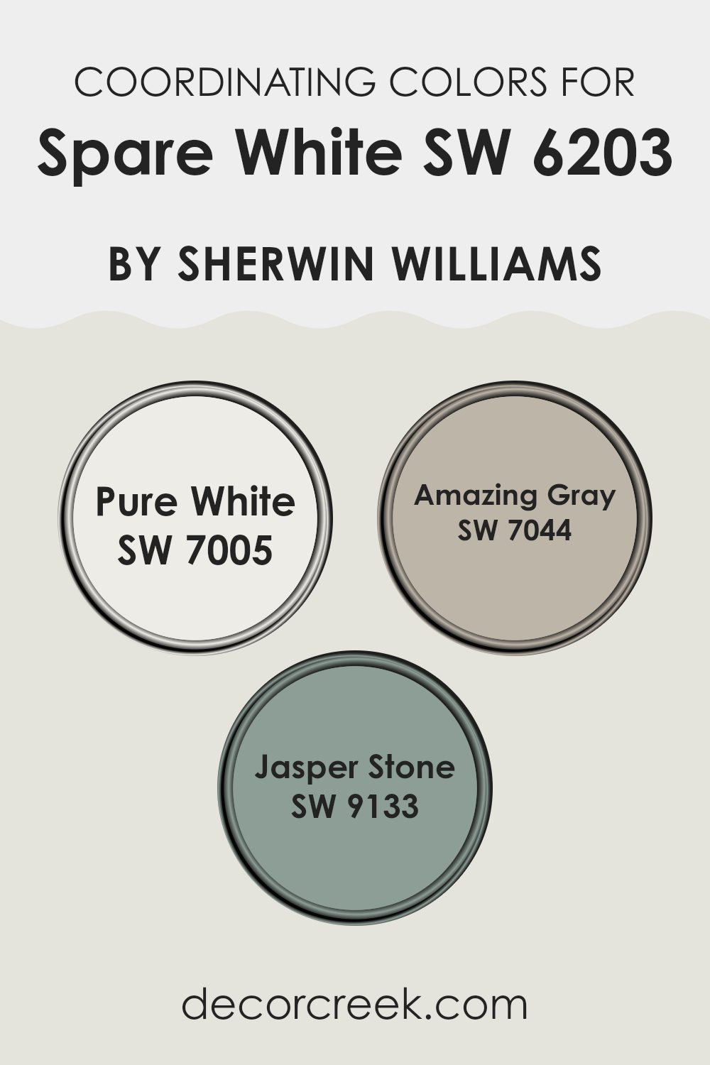
Pure White (SW 7005) is a clean and crisp white that provides a sharp contrast, making it ideal for trims or ceilings to create a fresh and bright look. Amazing Gray (SW 7044) is a flexible muted gray that pairs beautifully with lighter tones, offering a subtle depth to rooms without dominating.
Jasper Stone (SW 9133) is a rich, earthy green with a calming presence, perfect for accent walls or decor elements to add a natural touch to interiors. These coordinating colors work together to support the primary color by providing visual interest and layers that improve the overall design scheme.
You can see recommended paint colors below:
- SW 7005 Pure White
- SW 7044 Amazing Gray
- SW 9133 Jasper Stone
Trendy Trim Colors of Spare White SW 6203 by Sherwin Williams to use this year.
Trim colors are specific shades selected to complement or contrast the main color used on walls or the exterior of a home, improving the overall appearance and defining architectural details. For example, when Spare White by Sherwin Williams is used as the primary wall color, it creates a clean and subtle backdrop which can be beautifully framed by the right trim colors.
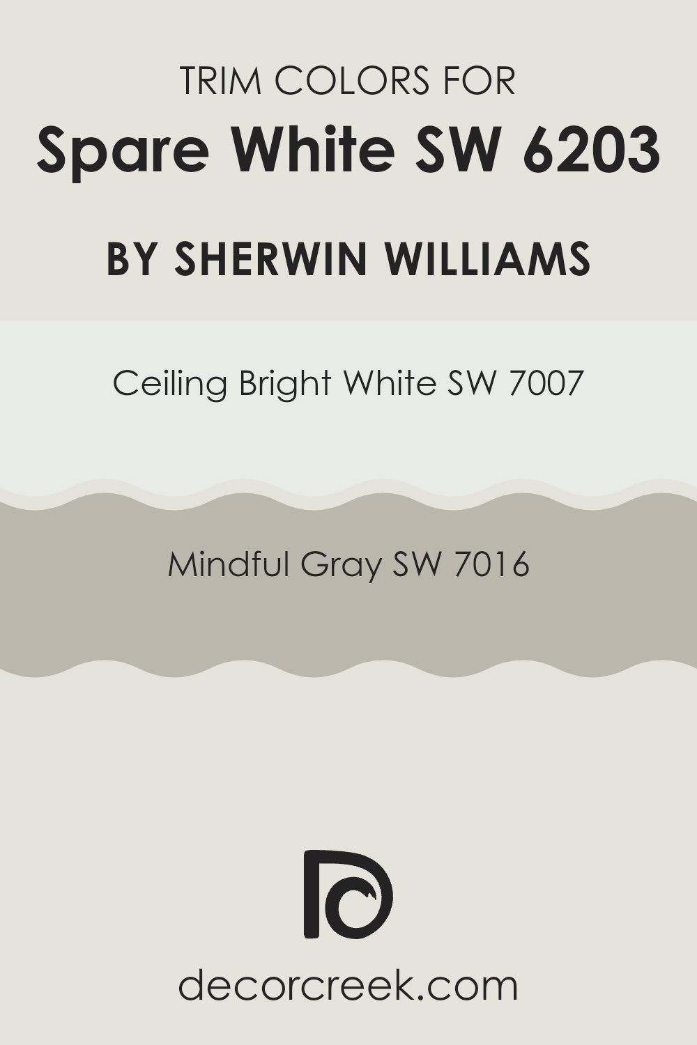
Choosing trim colors like Ceiling Bright White or Mindful Gray can impact the feel of any room, highlighting the clean, open nature of Spare White with a crisp or gentle transition that naturally defines rooms and edges.
Ceiling Bright White SW 7007 is a pure and luminous shade that provides a crisp and clear boundary when used as a trim color with Spare White walls. It’s ideally suited to highlight the light and airy feel of a room without creating a stark contrast.
On the other hand, Mindful Gray SW 7016 offers a warmer, middle shade that smoothly complements the cooler undertones of Spare White, providing a subtle distinction that improves the overall look. This color is perfect for adding depth and dimension while keeping an inviting and balanced atmosphere.
You can see recommended paint colors below:
Evergreen Colors Similar to Spare White SW 6203 by Sherwin Williams
When it comes to designing a cohesive room, using similar colors can be a game-changer. By carefully selecting shades that share common undertones or are close on the color wheel, designers create a harmonious and visually pleasing environment. Similar colors enhance each other, creating a subtle flow that is easy on the eye without feeling too strong with contrast. For example, using a palette of similar tones around a color like Spare White can soften the transitions between surfaces and elements in the room.
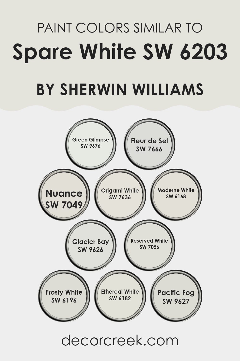
Take Green Glimpse, a gently muted green that brings a sense of freshness into a room, similar to early spring foliage. Pair it with the quiet feel of Fleur de Sel, a soft and light hue that feels gentle and calm. Nuance, a flexible gray, works well to give depth and grounding. Origami White brings a clean, crisp feel to interiors, offering a backdrop that makes other colors stand out subtly.
Modern White, with a refined feel, fits perfectly into any modern setting. Glacier Bay cools down rooms with its icy tones, while Reserved White softly brightens a room without harshness. Frosty White has a pure, clear quality that lifts the atmosphere. Ethereal White provides a soft, diffused lightness, ideal for creating a calming mood. Finally, Pacific Fog offers a hint of color, similar to a misty morning skyline, which can add an interesting layer to decor. Using these colors together provides many ways to achieve a balanced and inviting room.
You can see recommended paint colors below:
- SW 9676 Green Glimpse
- SW 7666 Fleur de Sel
- SW 7049 Nuance
- SW 7636 Origami White
- SW 6168 Moderne White
- SW 9626 Glacier Bay
- SW 7056 Reserved White
- SW 6196 Frosty White
- SW 6182 Ethereal White
- SW 9627 Pacific Fog
Colors that Go With Spare White SW 6203 by Sherwin Williams
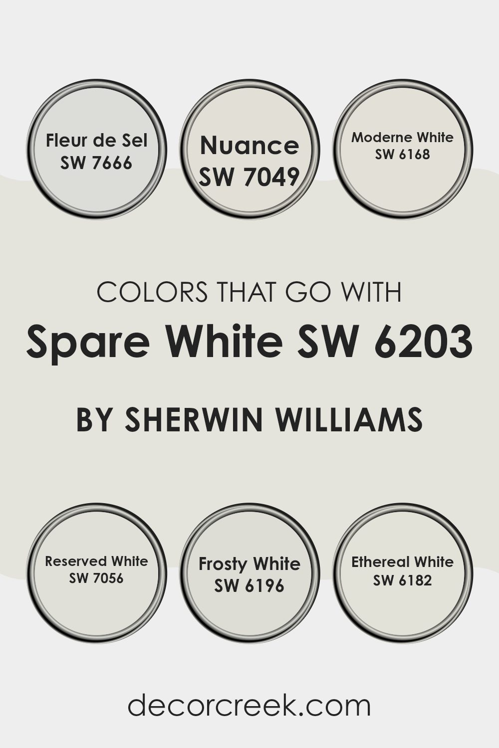
Choosing the right colors that pair well with Spare White SW 6203 by Sherwin Williams is important in creating a harmonious and visually pleasing room. Colors like Fleur de Sel, Nuance, Moderne White, Reserved White, Frosty White, and Ethereal White each offer unique nuances that can complement Spare White beautifully, adding subtle contrasts and improving the overall look of a room.
These pairings are especially important as they help in setting the tone and mood of the environment, whether cozy, inviting, or clean and airy. By selecting the right complementary colors, homeowners ensure that rooms feel cohesive and thoughtfully designed.
Fleur de Sel SW 7666 has a gentle touch, which brings a light, airy feel to rooms, making it perfect for rooms aiming for a soft, open feel. Nuance SW 7049, a hint of gray, blends smoothly with Spare White for an understated yet refined look. Moderne White SW 6168 adds a slightly warmer tone, creating a cozy atmosphere without overpowering the lightness of Spare White. Reserved White SW 7056 offers a neutral base, slightly deeper than Spare White, ideal for areas where you want some contrast while keeping a bright feel.
Frosty White SW 6196 has a hint of freshness, improving the sense of room and light in a room. Lastly, Ethereal White SW 6182 provides a touch of softness, making it perfect for rooms that aim for a subtle, calming feel without harsh contrasts. Together, these colors work with Spare White to create flexible and inviting environments.
You can see recommended paint colors below:
- SW 7666 Fleur de Sel
- SW 7049 Nuance
- SW 6168 Moderne White
- SW 7056 Reserved White
- SW 6196 Frosty White
- SW 6182 Ethereal White
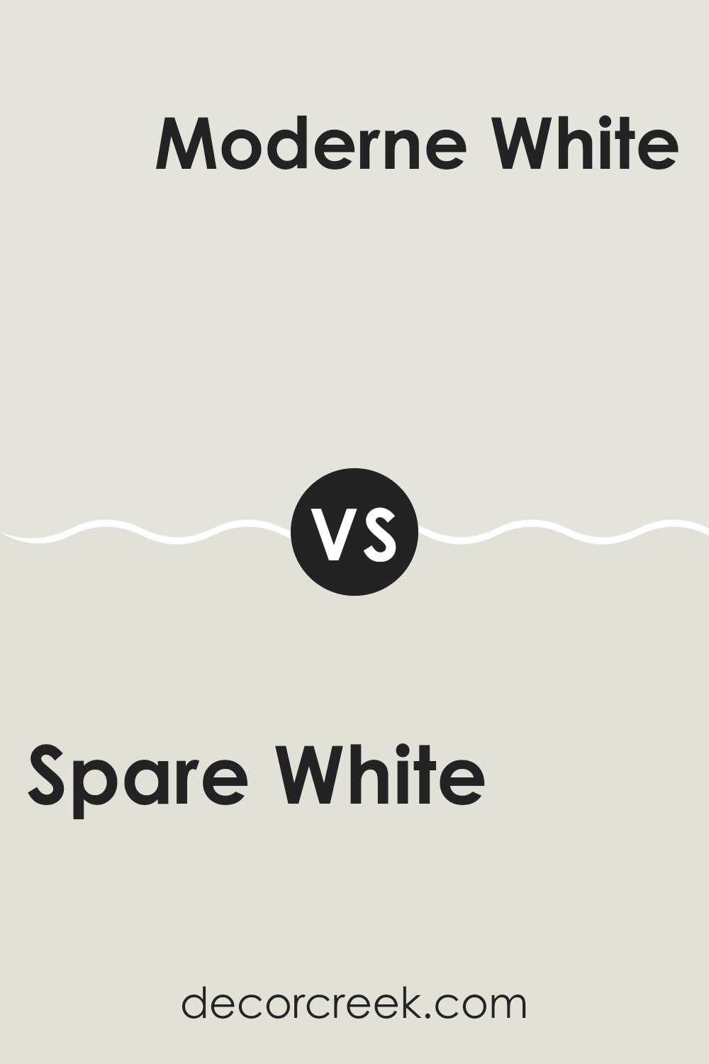
Spare White SW 6203 by Sherwin Williams vs Moderne White SW 6168 by Sherwin Williams
“Spare White” and “Moderne White” by Sherwin Williams are two subtly different shades of white. Spare White has a cool undertone that gives it a slightly more grayish hue, making it a great choice for rooms that you want to feel fresh and open. It tends to work well in rooms with plenty of natural light, reflecting the light to make the area seem more open.
On the other hand, Moderne White leans towards a warmer tone, incorporating a hint of beige which makes it ideal for creating a cozy and inviting atmosphere. This color can help soften a room and works well in areas like living rooms or bedrooms where a more comforting feel is desired.
While both colors are whites, the choice between them depends on the mood you’re aiming to create—cooler and more refreshing with Spare White, or warmer and welcoming with Moderne White.
You can see recommended paint color below:
Spare White SW 6203 by Sherwin Williams vs Pacific Fog SW 9627 by Sherwin Williams
Spare White and Pacific Fog are both paint colors by Sherwin Williams, but they serve different design purposes because of their respective hues and undertones. Spare White is a soft, gentle grayish-white color that can make a room feel open and airy.
Its light tone makes it a great choice for rooms you want to appear larger or more inviting. On the other hand, Pacific Fog offers a deeper gray tone with a hint of blue, providing a more defined color that still keeps a neutral and flexible feel. It can add a touch of depth to a room while remaining subtle and easy to match with various decor styles.
While Spare White is excellent for creating a bright, clean look, Pacific Fog is better for adding a cooler, slightly more noticeable color to a room without feeling too dark or heavy. Together, they could work well in a home, with Spare White in well-lit, open areas and Pacific Fog in cozy corners or accent walls.
You can see recommended paint color below:
Spare White SW 6203 by Sherwin Williams vs Fleur de Sel SW 7666 by Sherwin Williams
Spare White and Fleur de Sel are both subtle shades from Sherwin Williams, but they each bring a unique feel to a room. Spare White is a gentle, light gray with a warm undertone, making it perfect for creating a cozy and inviting feel.
It pairs excellently with brighter colors or can stand alone for a minimal look. On the other hand, Fleur de Sel is slightly cooler, leaning towards a soft, pale gray with hints of blue. This color works well in rooms meant to have a fresh, clean look, like bathrooms or modern kitchens.
Though both are pale and neutral, Spare White provides warmth, while Fleur de Sel offers a crisp backdrop. Depending on the mood you want to set and the natural light in your room, you might choose one over the other.
You can see recommended paint color below:
Spare White SW 6203 by Sherwin Williams vs Ethereal White SW 6182 by Sherwin Williams
Spare White and Ethereal White, both by Sherwin Williams, are subtle shades of white that offer unique tones for interior rooms. Spare White has a cooler undertone, which gives it a crisp, clean look often used to give a fresh feeling to a room. It’s great for making small rooms appear larger and more open.
On the other hand, Ethereal White has a slightly warmer tone, giving a cozy and welcoming feel. This makes it ideal for living areas or bedrooms where a soft, comforting atmosphere is desired.
When choosing between the two, consider the lighting and purpose of your room. Spare White works well in rooms with lots of natural light or in more modern settings, while Ethereal White is better suited for areas with softer lighting or where a more relaxed feel is wanted. Both colors are flexible, but your choice depends on the mood you want to create.
You can see recommended paint color below:
Spare White SW 6203 by Sherwin Williams vs Reserved White SW 7056 by Sherwin Williams
Spare White and Reserved White are both neutral paint colors offered by Sherwin Williams, but they do have their subtle differences. Spare White has a slightly warmer tone, making it a good choice for creating a cozy and welcoming feeling in a room. It’s particularly well-suited for living areas and bedrooms where you want a soft, inviting feel.
On the other hand, Reserved White leans a bit cooler and has a clean, more stark appearance. This quality makes it ideal for modern rooms or places where you want to maintain a crisp, clear look, such as in bathrooms or kitchens.
Although both colors are quite flexible and can easily fit with various decor styles, the warmer hints in Spare White tend to pair well with earthy textures and colors, while Reserved White is great for matching darker colors and metal finishes.
You can see recommended paint color below:
Spare White SW 6203 by Sherwin Williams vs Frosty White SW 6196 by Sherwin Williams
Spare White and Frosty White are both paint colors from Sherwin Williams, offering subtle variations for those looking to refresh their rooms. Spare White has a slightly warmer tone, which makes it a great choice for creating a cozy, inviting atmosphere in a room. It reflects light beautifully, giving a soft, airy feel wherever it’s used.
On the other hand, Frosty White leans towards a cooler tone, which can help make a room feel more open and clean. It’s particularly good in areas that get a lot of natural light, as it improves the light’s brightness without overpowering the room.
When deciding between the two, consider the mood you want to set. Spare White works well in bedrooms or living areas where warmth is key, while Frosty White is ideal for kitchens, bathrooms, or any room where a crisp, fresh look is desired. Both colors are flexible and subtle, making them easy to include with various decor styles.
You can see recommended paint color below:
Spare White SW 6203 by Sherwin Williams vs Origami White SW 7636 by Sherwin Williams
Spare White and Origami White are both paint colors from Sherwin Williams, each offering a unique shade of white for your walls. Spare White is a subtle, soft white with a hint of cool gray. This color is great for creating a clean and calm environment. It keeps rooms feeling fresh without being too stark, ideal for someone wanting a gentle backdrop that isn’t too bright.
Origami White, on the other hand, is a warmer white with beige undertones. This color adds a bit more warmth to a room compared to Spare White, which makes it perfect for areas where a cozy atmosphere is desired. It’s particularly effective in rooms that need a touch of softness with a natural, light feel.
Both colors are flexible, but the choice between them depends on the mood you’re aiming for in your room. Spare White works well in more modern or minimal designs, while Origami White fits beautifully in traditional or warm-toned decor.
You can see recommended paint color below:
Spare White SW 6203 by Sherwin Williams vs Green Glimpse SW 9676 by Sherwin Williams
The main color, Spare White, is a soft and subtle shade of white with a touch of gray. It’s very light, making it a popular choice for creating a clean and open feel in any room. It can make rooms look larger and is flexible enough to work in various decorating styles.
On the other hand, Green Glimpse is a vibrant, bold green that stands out much more than Spare White. It adds a pop of color and energy to a room, perfect for making a statement or highlighting a specific area. This shade of green can bring a fresh and lively feel to a room, especially when used on accent walls or for decor pieces.
Overall, Spare White and Green Glimpse are quite different. Spare White is all about creating a calm, neutral backdrop, while Green Glimpse is more about adding vibrancy and life into a room. Each has its own beauty and can suit different moods and styles depending on what you are looking to achieve in your decorating projects.
You can see recommended paint color below:
Spare White SW 6203 by Sherwin Williams vs Glacier Bay SW 9626 by Sherwin Williams
Spare White and Glacier Bay, both by Sherwin Williams, are quite distinct in their hues and vibes. Spare White offers a soft, subtle feel that leans towards a light grayish tone, making it incredibly flexible for various rooms and styles.
It creates a clean, fresh backdrop which allows other colors in the room to stand out. On the other hand, Glacier Bay is livelier, bringing a cool, refreshing blue that reminds one of a calm seascape or the crisp sky on a clear day. This color works especially well in bathrooms or bedrooms where a calm, refreshing feel is desired.
While Spare White is neutral and understated, perfect for those seeking simplicity, Glacier Bay adds a touch of color while still keeping a peaceful atmosphere. The choice between the two would largely depend on the desired mood and color palette of your room.
You can see recommended paint color below:
Spare White SW 6203 by Sherwin Williams vs Nuance SW 7049 by Sherwin Williams
Spare White and Nuance by Sherwin Williams are two distinct shades that can bring a unique feel to any room. Spare White is a light, almost airy gray, with hints of blue that give it a calm and clean look. It’s perfect for creating a subtle backdrop that makes rooms feel larger and more open.
On the other hand, Nuance is deeper and warmer, leaning more towards a true gray. This color provides a strong base that can be easily matched with a wide range of decor styles and colors, offering a more grounding effect than Spare White.
Both colors reflect light well but in different ways. Spare White tends to brighten rooms with its lighter, cooler tones, whereas Nuance offers a cozier feel, making it ideal for areas where you want a bit more of a subdued atmosphere. Whether for large living areas or small accents, these colors can fit your needs with their flexible gray tones.
You can see recommended paint color below:
Concluding my thoughts on SW 6203 Spare White by Sherwin Williams, I find it to be a truly refreshing and clean shade of white. It’s clear now that this color can make any room look bright and airy, giving the feeling of a bigger, more open area. Whether you’re looking to refresh your living room, bedroom, or even your kitchen, Spare White is a solid choice that pairs well with many other colors.
It’s not just about looking good either. Having walls painted in Spare White can lift your mood because it creates such a light and positive atmosphere. It’s perfect for places where you do important things like cooking or spending time with family because it doesn’t distract you with strong colors.
In summary, if you’re thinking about painting any part of your home and want a color that is both clean looking and easy to match with different decorations, SW 6203 Spare White is a great pick. It is simple, yet effective in making any room look fresh and well-cared-for again and again.
decorcreek.com
Ever wished paint sampling was as easy as sticking a sticker? Guess what? Now it is! Discover Samplize's unique Peel & Stick samples.
Get paint samples

