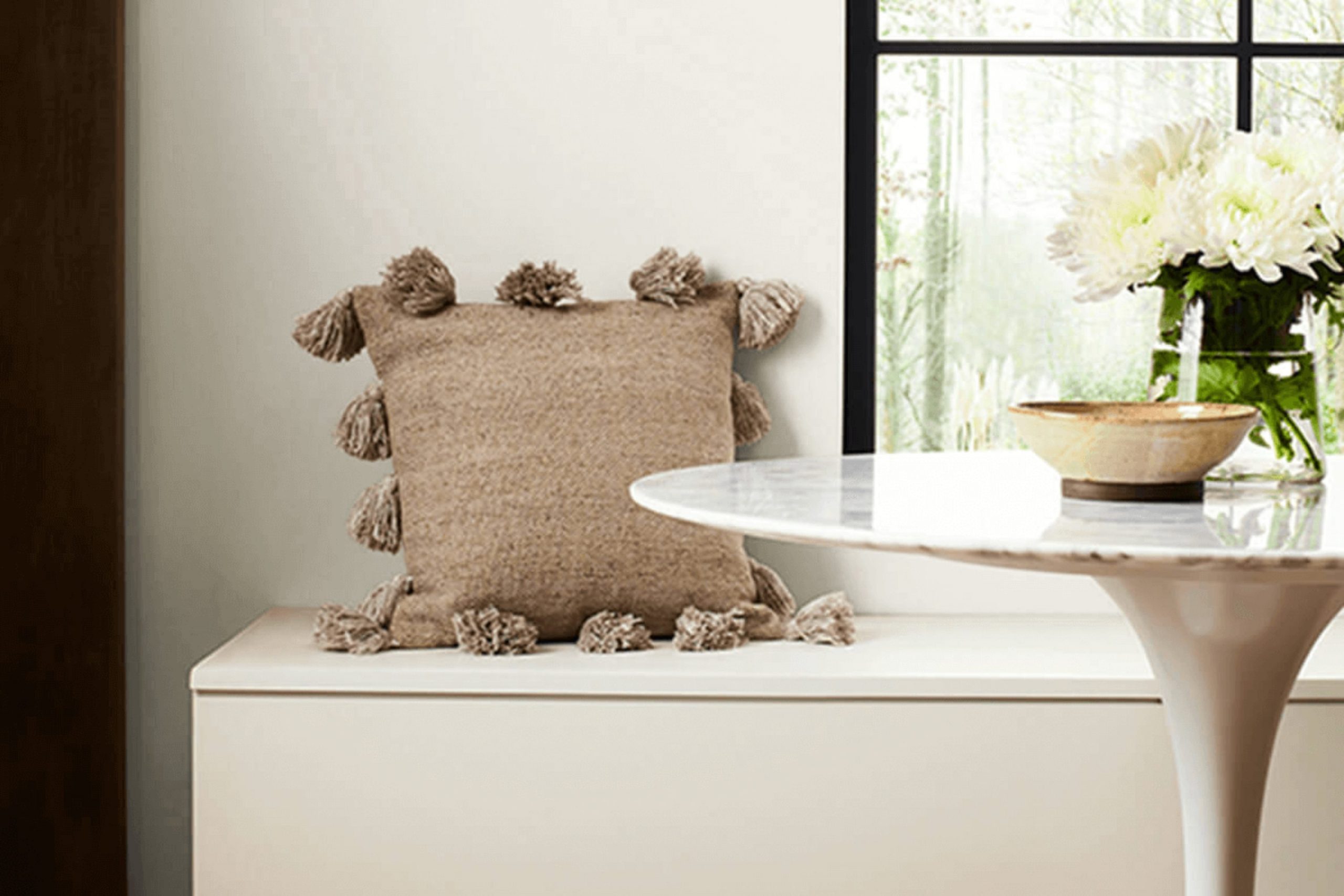
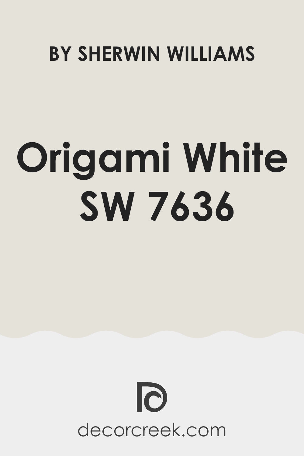
Choosing the perfect paint color for your room can sometimes feel daunting with all the options out there. As you prepare to refresh your walls, SW 7636 Origami White by Sherwin Williams merits serious consideration if you’re aiming for a clean, subtle backdrop in your home.
This shade is not just a plain white; its nuanced undertones make it flexible enough to work beautifully in various lighting conditions, room sizes, and with different decor styles.
Whether you’re updating a cozy bedroom or brightening up a spacious living room, Origami White offers a soft, elegant palette that can help highlight the other elements in your room. Before you make your final decision, you’ll want to consider how this color reacts to the natural light in your room and complements your existing furnishings.
Let me share some key insights I’ve found helpful while selecting this particular color for different rooms.
Is Origami White SW 7636 Right for My Home?
I recently discovered Origami White by Sherwin-Williams, and I must say, it’s a wonderfully flexible shade of white. It has a subtle warmth to it that feels welcoming, not stark like some whites can be. The color has a slight undertone that keeps it from looking too clinical, making it perfect for creating a cozy atmosphere in any room.
I’ve found that Origami White works beautifully in modern and minimalist interior styles, as well as in traditional or even rustic settings.
It’s like the perfect backdrop that lets your furniture and decor stand out. Whether it’s a sleek modern kitchen or a comfy living room with traditional vibes, this color fits right in.
I love pairing Origami White with natural materials like wood and leather, as it highlights their natural beauty without overpowering them.
Textures also play well with this color. A knitted throw or a soft linen sofa in front of an Origami White wall makes the room feel more inviting. Even metallic accents like bronze or copper give a lovely contrast against this subtle white, adding a touch of warmth to the room.
Overall, Origami White is a go-to for me when I want a fresh, crisp look that feels warm and inviting at the same time. It’s truly a color that works with anything and brightens the room subtly yet effectively.
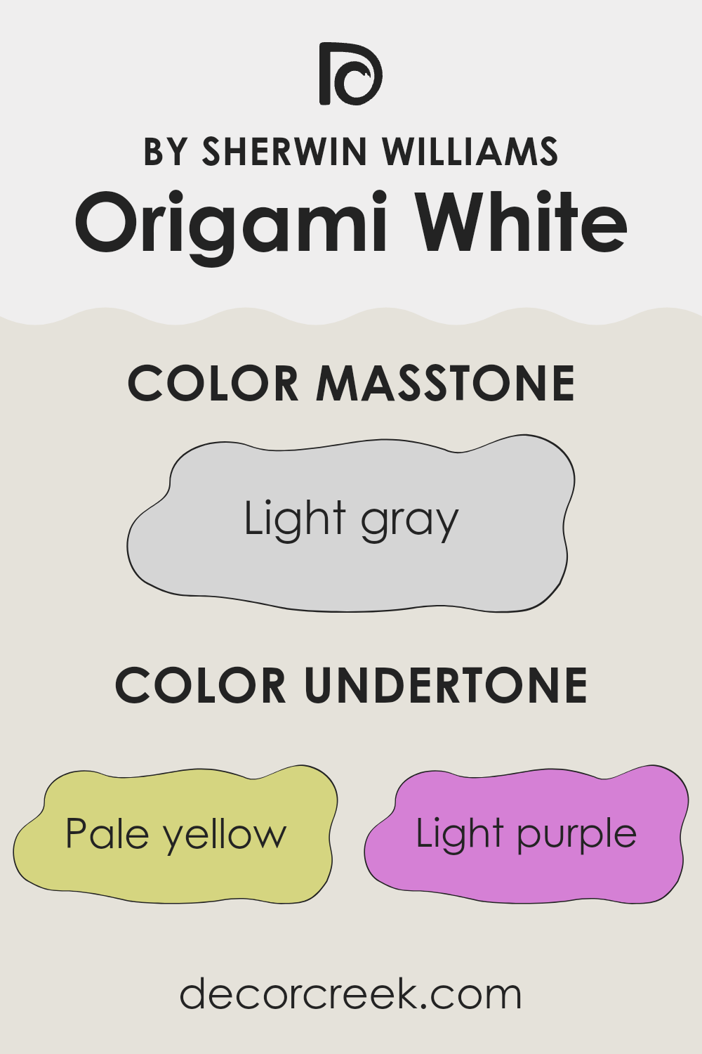
What are the right undertones of Origami White SW 7636 ?
Origami White is a unique paint color because it contains a variety of subtle undertones, which include pale yellow, light purple, light blue, pale pink, mint, lilac, and grey. These undertones play a significant role in changing the way the paint looks under different lighting conditions and in different rooms.
Undertones are the faint colors that lie beneath the primary color you see in the paint. They can affect the overall ambience of a room without being overtly noticeable.
For example, a color with a pale yellow undertone might make a room feel slightly warmer, while a grey undertone could give a room a cooler, more neutral appearance.
In the case of Origami White, the mixture of undertones means it can appear differently based on room lighting and surrounding colors. The pale yellow and mint undertones can make a room feel warm and welcoming, while the grey and light blue undertones can offer a fresh, crisp look.
Depending on the room’s natural light or the type of artificial lighting used, Origami White can shift from looking bright and airy to soft and cozy.
When used on interior walls, Origami White’s complex undertone blend makes it highly flexible. It can complement a wide range of decor styles and work well with different color schemes. This adaptability makes it a popular choice for anyone looking to refresh their room while keeping options open for future changes in decor.
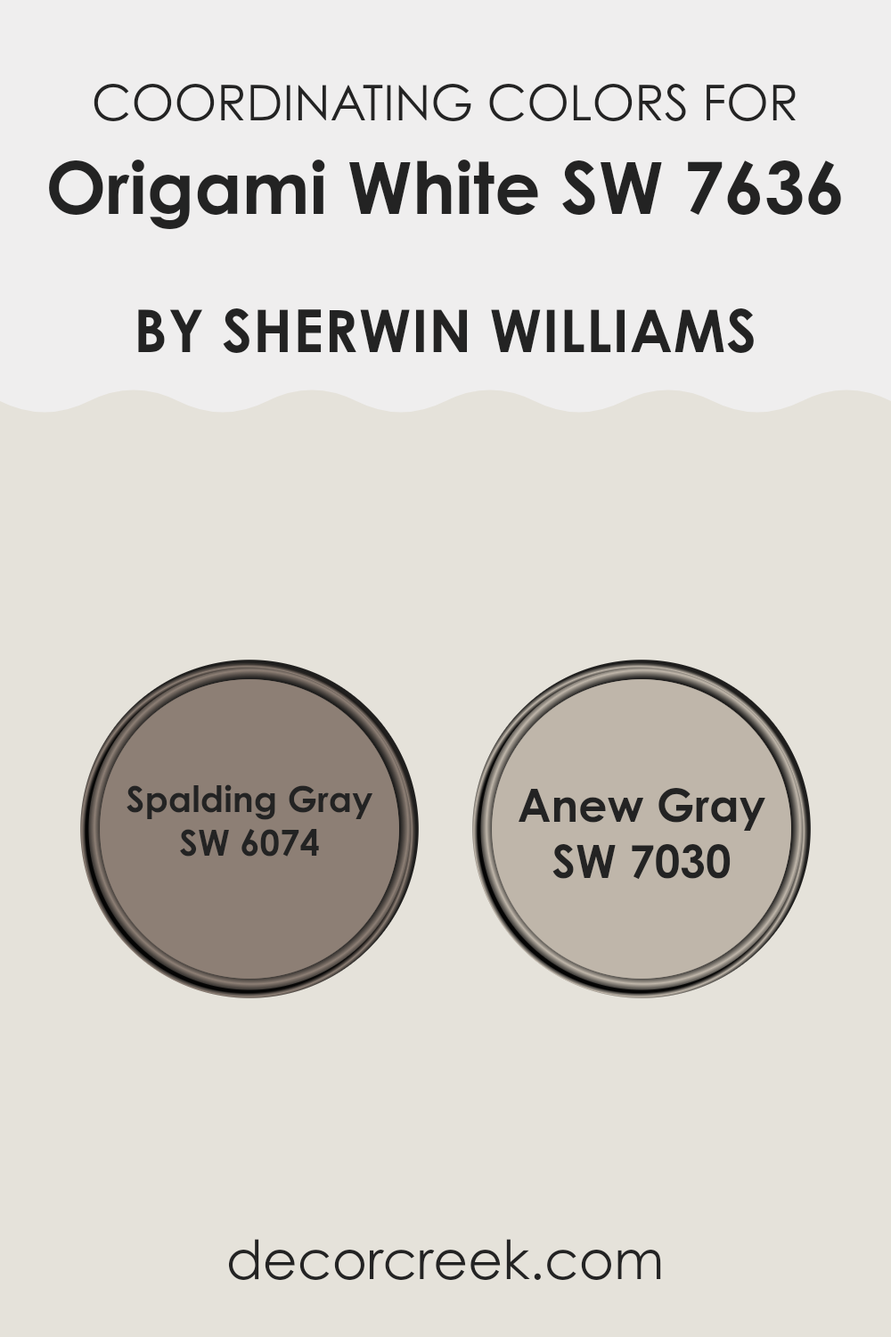
Best Coordinating Colors to use with Origami White SW 7636 by Sherwin Williams this year.
Coordinating colors are selected to complement a primary color, enhancing the overall aesthetic of a room without overpowering it. By choosing shades that go well together, one can create a harmonious and pleasant atmosphere.
For instance, when working with a neutral base like Origami White by Sherwin Williams, picking coordinating colors like Spalding Gray and Anew Gray can achieve a balanced and inviting look.
These colors work well together because they share similar undertones that blend smoothly, promoting a sense of continuity and flow in the room.
Spalding Gray is a deeper, muted shade that adds depth and interest to rooms primarily painted in lighter hues such as Origami White. It is well-suited for accent walls or furniture, providing a subtle contrast that is both appealing and easy on the eyes.
On the other hand, Anew Gray is a lighter gray that serves as a perfect intermediate between the starkness of white and the boldness of darker grays.
This shade works wonderfully for larger areas, offering a soft, minimalistic backdrop that complements the simplicity of Origami White while still adding a hint of color to the environment. Together, these shades create a cohesive look that is both stylish and comfortable.
You can see recommended paint colors below:
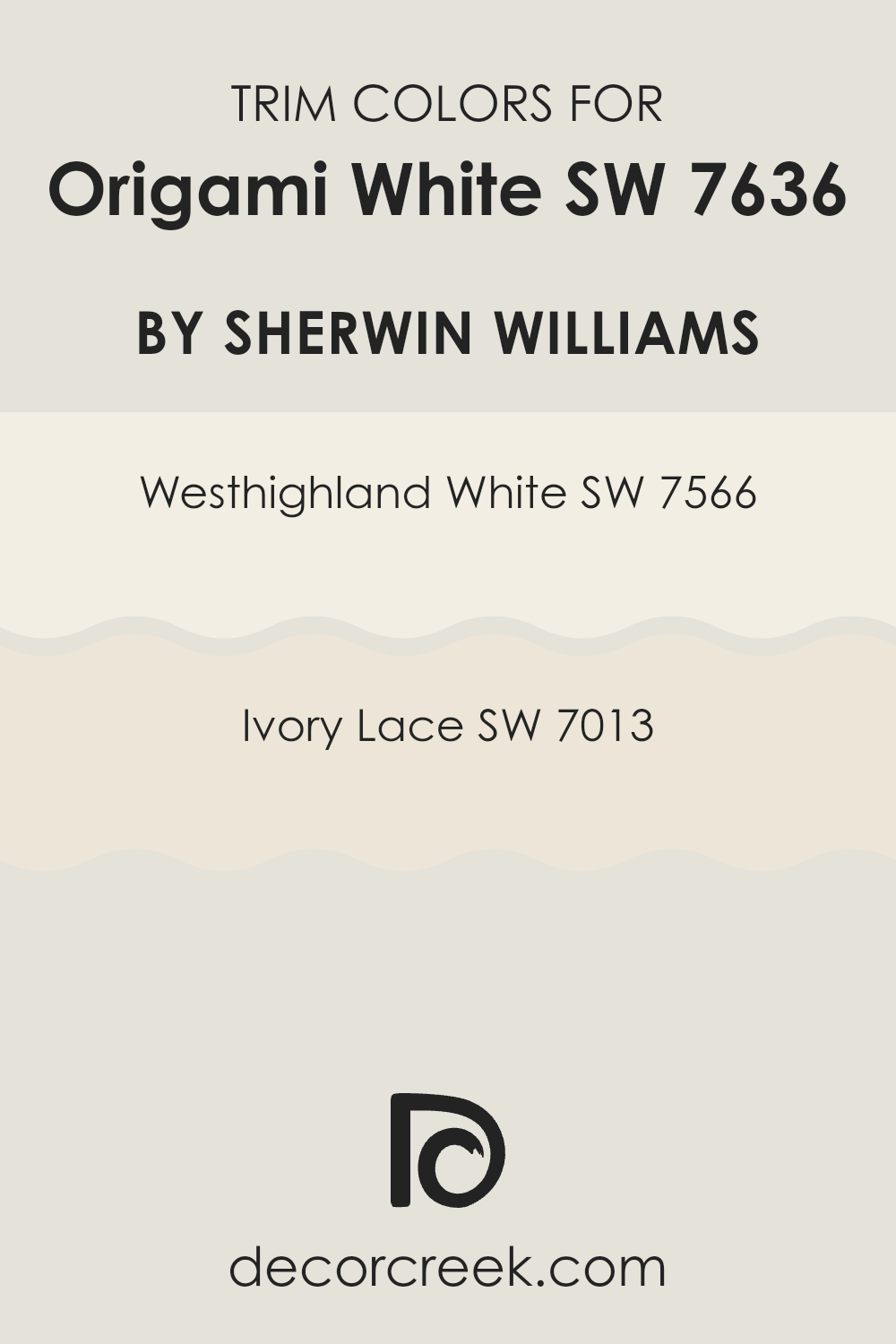
Trendy Trim Colors of Origami White SW 7636 by Sherwin Williams to use this year.
Trim colors are used to highlight or accentuate the architectural features of a room, providing contrast or complement to the main wall color. In the case of Origami White by Sherwin Williams, which is a warm and soft white, choosing the right trim color is essential to enhance its aesthetic without overpowering it.
Trim colors like Westhighland White and Ivory Lace can work beautifully by creating a subtle differentiation that enriches the overall ambience of the room.
These selected hues help in defining the room crisply, making features like crown moldings, window frames, and baseboards pop subtly, which can make the room appear more polished and well-finished.
Westhighland White SW 7566 is a slightly warmer white that blends harmoniously with Origami White, offering a gentle transition between the wall and trim.
This color has just enough warmth to add a cozy feel to the room without causing a stark contrast.
On the other hand, Ivory Lace SW 7013 has a touch of creaminess, giving it a soft and inviting feel. This trim color is slightly more distinct against Origami White, suitable for those wanting to subtly highlight architectural details without overpowering the senses. Together, these trim colors provide options for achieving a refined and appealing look, complementing the laid-back charm of Origami White.
You can see recommended paint colors below:
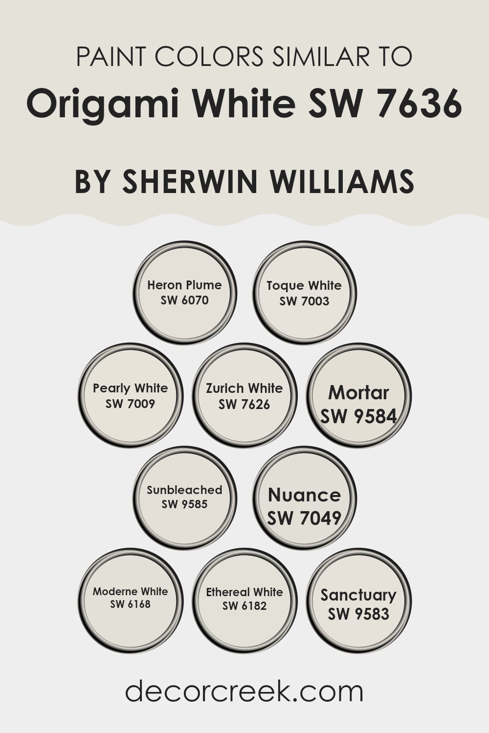
Evergreen Colors Similar to Origami White SW 7636 by Sherwin Williams
Choosing similar colors when designing a room can create a harmonious and visually appealing room. Similar hues, like those close to Origami White by Sherwin Williams, have subtle differences yet provide enough variation to enhance the depth and interest in a room’s décor. Such shades include Heron Plume, Toque White, and Pearly White which offer slight deviations in warmth and brightness, allowing for a cohesive yet textured look.
Heron Plume is a soft, muted shade with a hint of warmth, ideal for creating a cozy atmosphere.
Toque White, slightly cooler, works well in rooms that get plenty of natural light, making the room feel airy and light. Pearly White has a gentle lustrous quality that reflects light beautifully, adding a subtle shimmer to the walls.
Zurich White leans towards a crisper white, providing a clean backdrop ideal for showcasing art or furniture.
Mortar and Sunbleached offer a dustier tone, which pairs well with rustic elements or industrial décor. Nuance, a nearly neutral white, blends smoothly with various color palettes.
Moderne White presents a fresh and modern feel, perfect for minimalist rooms.
Ethereal White, true to its name, imparts an almost celestial feel to any room, enhancing other decor elements softly. Lastly, Sanctuary creates a peaceful setting, allowing for relaxation and a sense of calm in a busy home. Each of these shades, while similar, gives decorators the opportunity to fine-tune the ambience of their rooms without straying too far from their chosen color scheme.
You can see recommended paint colors below:
- SW 6070 Heron Plume
- SW 7003 Toque White
- SW 7009 Pearly White
- SW 7626 Zurich White
- SW 9584 Mortar
- SW 9585 Sunbleached
- SW 7049 Nuance
- SW 6168 Moderne White
- SW 6182 Ethereal White
- SW 9583 Sanctuary
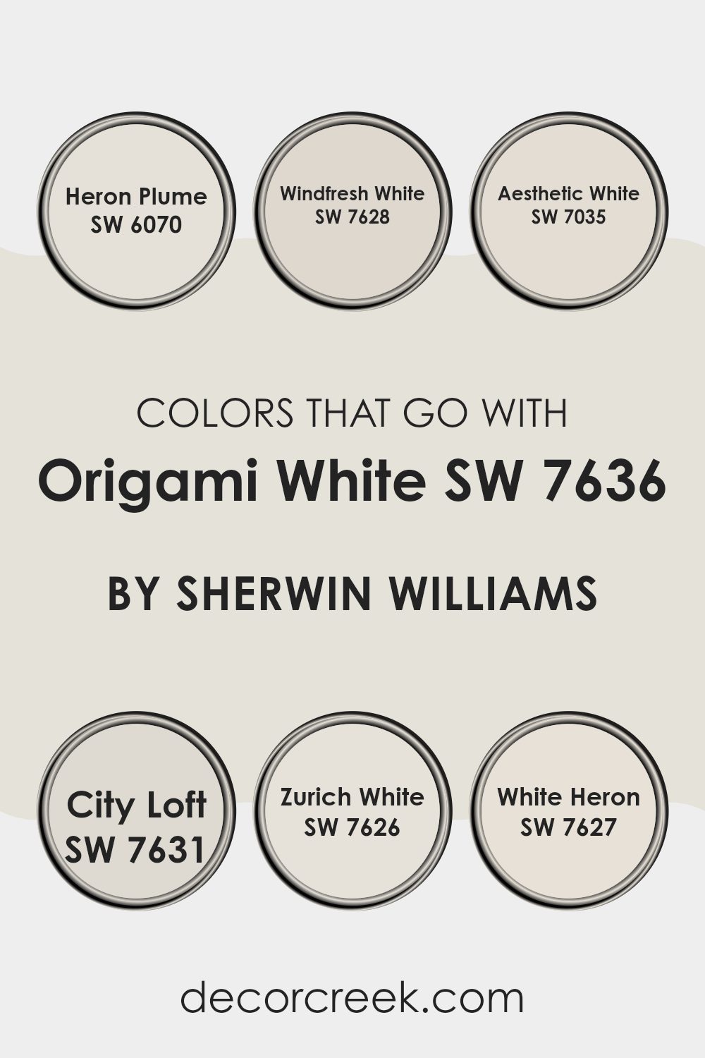
Colors that Go With Origami White SW 7636 by Sherwin Williams
Choosing the right colors that complement Origami White SW 7636 by Sherwin Williams is crucial because they help create a cohesive and appealing look in any room. Origami White is a flexible color that serves as a soft, neutral backdrop, making it easier to pair with a variety of other shades.
For instance, Heron Plume SW 6070 is a slightly warmer neutral that adds a cozy touch without overpowering the gentle nature of Origami White.
In a similar vein, Windfresh White SW 7628 brings a crisp, clean feel to the room, emphasizing a fresh and airy atmosphere when used alongside Origami White.
On the other hand, Aesthetic White SW 7035 offers a subtle hint of beige, providing a beautiful contrast that highlights the depth and warmth of the room. City Loft SW 7631 is another excellent choice; its light gray undertones offer a modern twist and can make any room look more contemporary and inviting.
Zurich White SW 7626 blends smoothly with Origami White, as it introduces a soft touch of gray that bridges traditional and modern elements easily.
Lastly, White Heron SW 7627 is brighter and more reflective, which can help in brightening rooms and giving the illusion of a bigger area when combined with Origami White. Each of these colors supports a different aspect of interior styling, ensuring flexibility and beauty in design when paired with Origami White.
You can see recommended paint colors below:
- SW 6070 Heron Plume
- SW 7628 Windfresh White
- SW 7035 Aesthetic White
- SW 7631 City Loft
- SW 7626 Zurich White
- SW 7627 White Heron
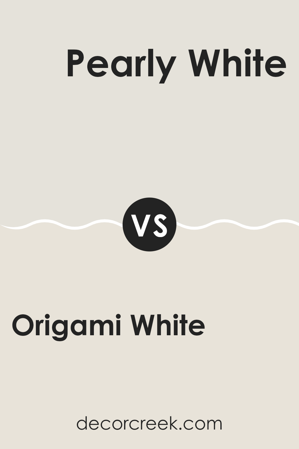
Origami White SW 7636 by Sherwin Williams vs Pearly White SW 7009 by Sherwin Williams
Origami White SW 7636 and Pearly White SW 7009 by Sherwin Williams are both excellent choices for anyone looking for a neutral, but the two have distinct tones that set them apart.
Origami White leans towards a warm, soft gray with a comforting and gentle presence, making it perfect for creating a cozy and inviting room.
On the other hand, Pearly White has a slight pearl-like sheen to it, offering a subtle hint of luster and a creamy quality without becoming too stark or cold.
This makes it ideal for rooms that aim for a soft, elegant atmosphere. Whether you’re painting a busy kitchen or a quiet bedroom, each of these colors provides a flexible backdrop.
The main difference lies in their undertones: Origami White brings warmth, while Pearly White gives off a softer, more luminous glow.
You can see recommended paint color below:
Origami White SW 7636 by Sherwin Williams vs Ethereal White SW 6182 by Sherwin Williams
Origami White and Ethereal White are both paints from Sherwin Williams but have subtle differences. Origami White has a slightly warmer and creamier tone, making it a great choice for a cozy feel in a room. It reflects light beautifully and can help make rooms appear more inviting and softer.
On the other hand, Ethereal White is cooler and has a hint of gray. This color gives off a cleaner and more modern vibe, which can be perfect for a minimalist decor. It can make a room feel fresh and crisp without feeling too stark or cold.
Both colors are fairly neutral, so they work well in various rooms and complement different decor styles and color schemes. However, your choice might depend on the atmosphere you want in your room—warm and cozy with Origami White, or cool and sleek with Ethereal White.
You can see recommended paint color below:
Origami White SW 7636 by Sherwin Williams vs Mortar SW 9584 by Sherwin Williams
Origami White and Mortar by Sherwin Williams are two distinct shades that can change the feel of a room. Origami White is a light, soft white with a hint of warmth, making it a popular choice for creating a bright and inviting atmosphere. It reflects light well, which can make small rooms appear larger and more open.
On the other hand, Mortar is a much darker, gray color. It offers a bold and grounding effect, perfect for making large rooms feel more cozy and defined. Mortar works well as an accent wall or for trim, providing a strong contrast against lighter colors like Origami White.
Together, these two colors can be used effectively to balance each other. Origami White can brighten up a room, while accents in Mortar add depth and interest. This combination is flexible and can work in various settings, whether modern or traditional.
You can see recommended paint color below:
Origami White SW 7636 by Sherwin Williams vs Zurich White SW 7626 by Sherwin Williams
Origami White and Zurich White, both by Sherwin Williams, offer subtly different tones that can affect the mood of a room. Origami White has a slightly warmer tone, making it ideal for rooms where a cozy, welcoming feel is desired. It reflects light beautifully, brightening rooms without feeling stark.
On the other hand, Zurich White leans towards a cooler tone, which can make a room feel more spacious and open. This shade is excellent for modern rooms that want a hint of freshness without the clinical feel that some pure whites can create.
When choosing between the two, consider the natural light in your room and the atmosphere you want to create. Origami White works well in dim, warmer lit areas, whereas Zurich White suits well-lit, airier rooms.
You can see recommended paint color below:
Origami White SW 7636 by Sherwin Williams vs Moderne White SW 6168 by Sherwin Williams
Origami White and Moderne White are two shades from Sherwin Williams that share similarities but also have distinct differences. Origami White is a softer, more muted white with a gentle gray undertone that gives it a calm and clean appearance.
It’s great for creating a cozy and inviting room without feeling too stark. On the other hand, Moderne White leans towards a warmer tone, containing hints of beige which makes it feel slightly richer and cozier compared to Origami White.
This warmth in Moderne White is excellent for rooms that aim for a comfortable, welcoming atmosphere with a touch of modernity. Both colors are flexible, but the choice between them depends on the mood and style you want to achieve in your room, with Origami providing a cooler, subtle backdrop and Moderne offering more warmth.
You can see recommended paint color below:
Origami White SW 7636 by Sherwin Williams vs Sanctuary SW 9583 by Sherwin Williams
Origami White and Sanctuary by Sherwin Williams are two distinct shades with unique tones. Origami White is a light, soft white color with a slight creaminess, making it gentle and unobtrusive. This makes it ideal for rooms where you want a clean and calming backdrop that won’t overpower your decor.
On the other hand, Sanctuary is a deeper, warm beige, with earthy undertones that offer a grounding effect. It’s perfect for creating a cozy and welcoming atmosphere in rooms.
The warmth of Sanctuary provides a comforting feel, making it suitable for living areas or bedrooms where you want to create a relaxed environment.
When comparing the two, Origami White tends to bring more light into a room and offers flexibility in decor, complementing various colors easily.
Sanctuary, with its richer presence, sets a moodier tone, suitable for a more defined, warm aesthetic. Together, these colors provide options that range from bright and airy to warm and soothing.
You can see recommended paint color below:
Origami White SW 7636 by Sherwin Williams vs Toque White SW 7003 by Sherwin Williams
Origami White and Toque White, both by Sherwin Williams, are subtle yet distinct shades of white that bring their unique flair to any room. Origami White has a slightly creamy feel, which adds a touch of warmth. It’s great for creating a cozy, inviting atmosphere in your home. This shade works well in living areas and bedrooms where you want a gentle backdrop that feels welcoming.
On the other hand, Toque White leans towards a cooler tone. This color has a crispness to it that makes it ideal for modern rooms or areas where you want to promote a clean, fresh look.
It’s especially suited for kitchens and bathrooms where the sharpness can help highlight lighting and give the illusion of a more spacious room.
Although both colors are whites, their underlying tones set them apart, making Origami White a better choice for a softer, warmer environment, and Toque White excellent for a brighter, sharper feel.
You can see recommended paint color below:
Origami White SW 7636 by Sherwin Williams vs Nuance SW 7049 by Sherwin Williams
Origami White and Nuance are both neutral colors by Sherwin Williams, but they have subtle differences in tone. Origami White is a warmer white with a hint of beige, making it feel cozy and welcoming in any room. It works well in rooms where you want a soft backdrop that isn’t stark white.
On the other hand, Nuance is a light grey with slightly cooler undertones. This color lends itself to a more modern, clean look but still remains inviting.
When comparing both shades in a home setting, Origami White can help create a homely, calming environment, while Nuance offers a fresher, more contemporary vibe.
Both shades pair well with a variety of decor styles and can act as a base for contrasting colors or materials. Ultimately, choosing between them would depend on the specific atmosphere you want to achieve in your room.
You can see recommended paint color below:
Origami White SW 7636 by Sherwin Williams vs Heron Plume SW 6070 by Sherwin Williams
Origami White and Heron Plume are both neutral paint colors by Sherwin Williams, each offering a distinct tone for interior rooms. Origami White leans towards a clean, bright white with subtle warm undertones. This makes it a great choice for rooms where you want to amplify the natural light, giving rooms a fresh and airy feel. It’s quite flexible, fitting well whether you aim for a modern look or something more traditional.
Heron Plume, on the other hand, is slightly darker with a soft, grayish tint. It presents a more muted option compared to Origami White, providing a gentle warmth to the rooms it’s used in.
This color is excellent for creating a cozy atmosphere and works well in areas that require a bit of softness to smoothen sharp lines and bright colors around.
When choosing between the two, consider the amount of natural light your room gets and the mood you want to set.
Origami White is better in rooms with lots of light and Heron Plume works well in places where a touch of warmth is needed without darkening the room too much.
You can see recommended paint color below:
Origami White SW 7636 by Sherwin Williams vs Sunbleached SW 9585 by Sherwin Williams
Origami White and Sunbleached are two distinct paint colors by Sherwin Williams, each offering a unique vibe for your walls. Origami White is a soft, warm white that provides a clean and straightforward backdrop. It’s gentle and subtle, making it a perfect choice for almost any room looking for a calm and soothing atmosphere without feeling too stark.
On the other hand, Sunbleached steps into the realm of muted earth tones. It carries an almost sandy feel, reminiscent of a light, faded wood or a well-worn beach.
Sunbleached is ideal for rooms where you want to add a hint of color while maintaining a light and airy feel. It wraps the room in a cozy, warm feeling, making it particularly suitable for areas where relaxation and comfort are key.
Together, both colors offer opportunities to create a room that feels both welcoming and fresh, with Origami White providing a clear, clean canvas and Sunbleached adding a touch of warmth without overpowering.
You can see recommended paint color below:
In wrapping up, I find SW 7636 Origami White by Sherwin Williams truly special. It’s a paint color that can make any room look bright and clean. Whether it’s your living room, kitchen, or even your bedroom, this white shade adds a fresh touch without making things look boring. It’s especially good because it doesn’t turn yellow over time like some other whites do.
Also, Origami White goes well with many different colors. This means you can use it with dark blues, soft pinks, or even bold reds, and it will still look nice.
It’s like a good friend to other colors, helping them stand out more. Whether you want a room to feel calm for reading or lively for playtime, Origami White can help set the mood.
Moreover, it’s a smart choice when selling your house since rooms painted in this color can help make your home look more appealing to buyers. The light and airy feel it brings can make your house seem more inviting and easy to live in.
To sum up, SW 7636 Origami White by Sherwin Williams is more than just basic white paint. It brings light and life into rooms, works well with many designs, and can even help in selling your home. It does a lot!
Ever wished paint sampling was as easy as sticking a sticker? Guess what? Now it is! Discover Samplize's unique Peel & Stick samples.
Get paint samples

