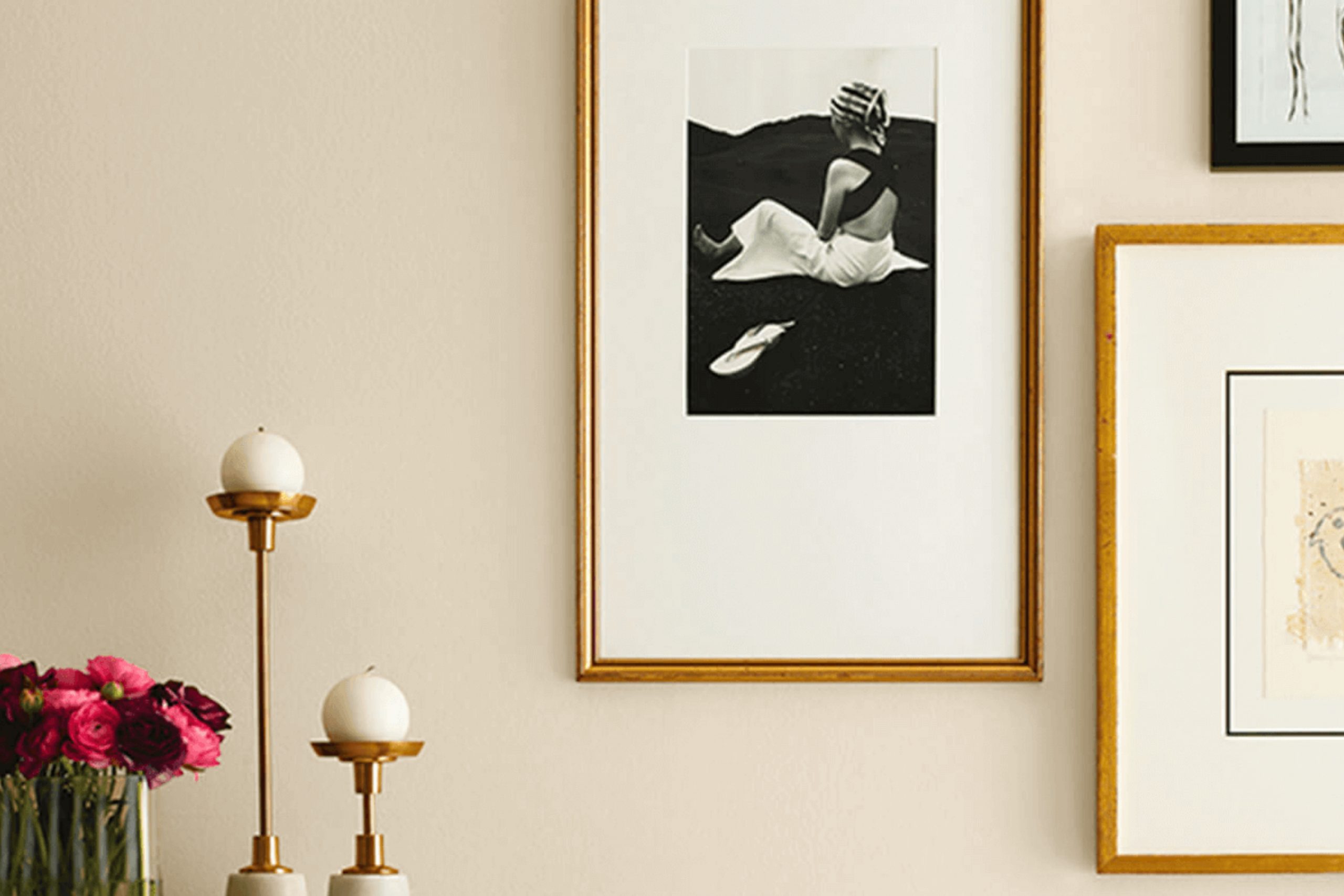
If you’re looking for a paint color that brings a warm, natural feel to your room, SW 7569 Stucco by Sherwin Williams might just be what you need. In my experience, choosing the right paint color can set the tone for your entire home, and Stucco has a unique quality of being both inviting and refined. Its earthy tones pair beautifully with natural materials like wood and stone, making it particularly effective in living rooms and bedrooms where coziness is key.
Using Stucco in various lighting conditions has taught me that its shade can subtly shift from a creamy beige in bright daylight to a richer, more muted hue as the sun sets. This adaptable nature makes it an excellent choice if you’re seeking a color that adjusts throughout the day, providing a consistently warm backdrop to both your daily activities and relaxation times.
Consider pairing it with crisp whites for trim and ceilings to enhance its warmth without overpowering your room. The result is a balanced and harmonious environment that you and your guests will appreciate.
Whether you’re redecorating a single room or planning a larger renovation, SW 7569 Stucco offers an enduring appeal that complements a wide range of styles and tastes.
What Color Is Stucco SW 7569 by Sherwin Williams?
Stucco by Sherwin Williams is a warm, inviting beige that adds a subtle elegance to any room. Its muted tones make it highly adaptable, enabling it to blend seamlessly with a variety of decor styles and settings. The color works particularly well in interior styles such as modern farmhouse, traditional, and rustic. It’s perfect for creating a cozy, homely atmosphere that’s both welcoming and stylish.
In terms of materials, Stucco pairs beautifully with natural wood, helping to highlight the rich textures and colors of oak, walnut, or pine. This color also goes well with soft, plush fabrics like cotton or linen, adding depth and warmth to the room. It complements leather very effectively, creating an appealing contrast between the smooth, refined surface of the leather and the gentle, understated tone of the paint.
This beige also works well with stone elements, such as a natural stone fireplace or marble countertops, enhancing the organic feel of these materials. For a more contemporary touch, incorporating metallic accents in copper or bronze can really set off this color, providing a slight shimmer that catches the eye. Overall, Stucco is a flexible color that helps create a friendly and relaxed room, perfect for homes looking to achieve a stylish yet comfortable aesthetic.
Is Stucco SW 7569 by Sherwin Williams Warm or Cool color?
Stucco SW 7569 by Sherwin Williams is a neutral paint color that brings a warm and cozy feel to any room in your home. Its earthy tone is adaptable, making it easy to match with different decor styles and furniture.
This shade is particularly good at making small rooms seem bigger and brighter because it reflects light well. On walls, Stucco creates a subtle backdrop, allowing other design elements like art and textiles to stand out. It works well in living rooms, bedrooms, and even kitchens, adding a calm and inviting atmosphere.
Because it’s a soft and muted color, it doesn’t clash with bolder hues, making it a great choice for accent walls or as a base for layering different shades. Whether your home has a modern or rustic vibe, this color fits in beautifully, providing a simple yet effective way to refresh your room.
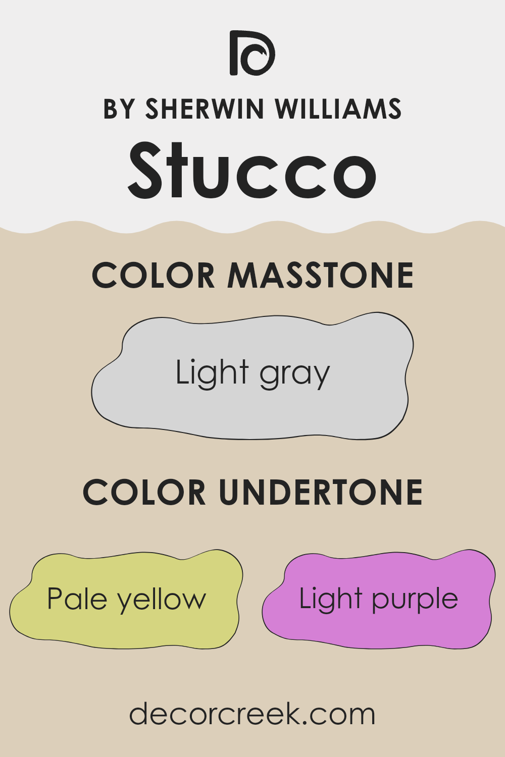
Undertones of Stucco SW 7569 by Sherwin Williams
Stucco by Sherwin Williams is a unique paint color with a variety of subtle undertones that can influence the overall feel and appearance of a room. Undertones are the colors hidden beneath the surface of the paint which become apparent under different lighting conditions. They can affect our perception of the primary paint color and contribute to creating a specific mood or style in a room.
Stucco has undertones of pale yellow, light purple, light blue, pale pink, mint, lilac, and grey. Each of these colors plays a role in softening or enhancing the main hue. For instance, pale yellow can add a hint of warmth, making a room feel cozier.
Light blue and mint bring a refreshing touch which can make a smaller room seem larger and more airy. Pale pink and lilac offer a gentle, soothing effect, ideal for creating a peaceful environment. On the other hand, grey undertones keep the color neutral and adaptable, allowing it to blend smoothly with different decors.
When applied to interior walls, these undertones give Stucco a chameleon-like ability to adjust to various settings and lighting changes. Natural light can bring out its warmer yellow or cool blue tones, while artificial lighting might highlight its pink or lilac traces.
This adaptable nature makes it suitable for many rooms, whether you’re looking for warmth in a living area or a soothing hue in a bedroom. The subtle complexity of Stucco’s undertones provides a flexible backdrop that complements a wide range of furnishings and styles.
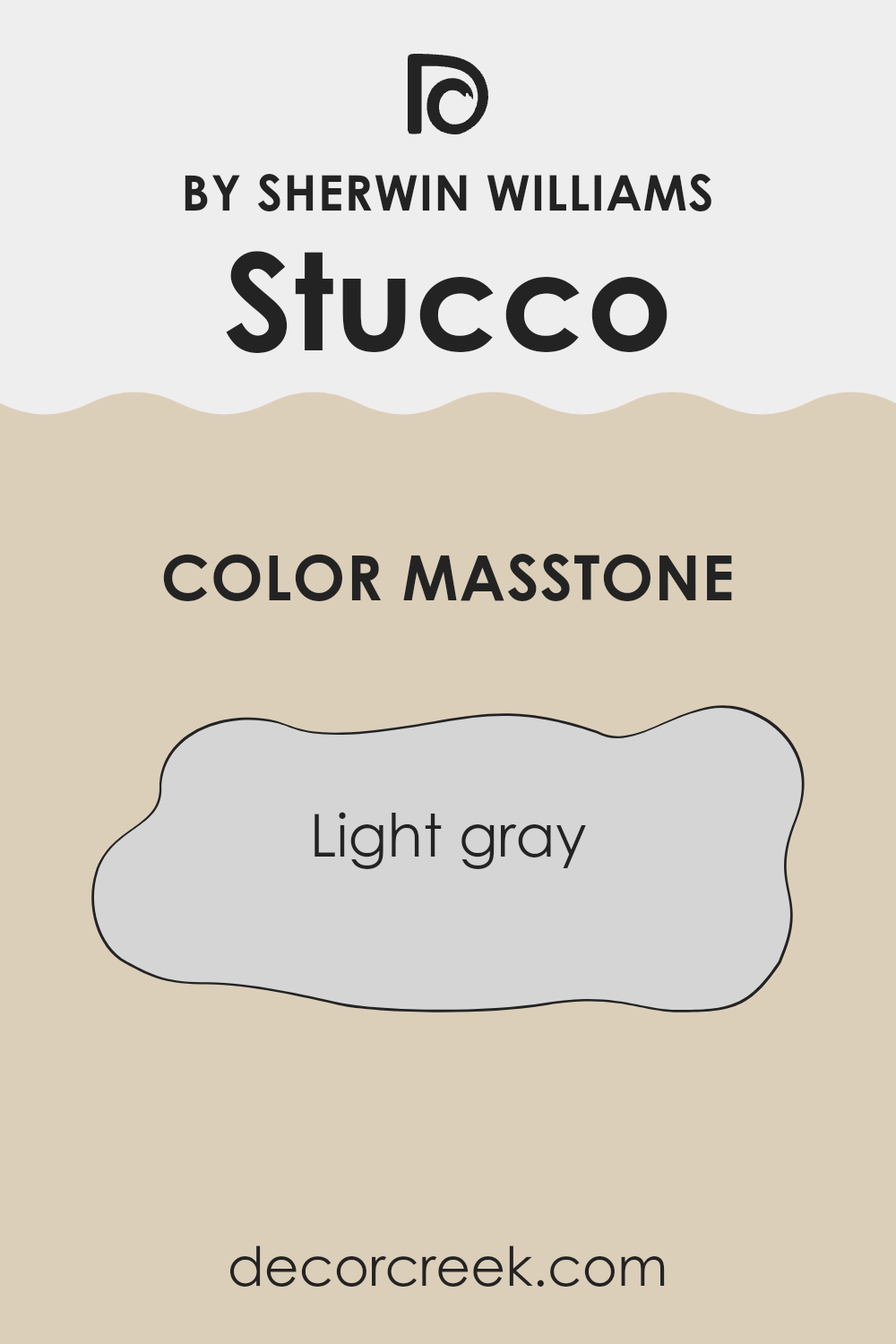
What is the Masstone of the Stucco SW 7569 by Sherwin Williams?
Stucco SW 7569 by Sherwin Williams has a masstone of light gray, coded as #D5D5D5. This shade of gray is highly adaptable and neutral, making it a popular choice for homes. It provides a clean and subtle backdrop that works well in various rooms, from modern to traditional settings.
The light gray color is not overpowering, which allows for easy pairing with different décor styles and colors. Whether used for living room walls, kitchen cabinets, or bedroom accents, this color adds a gentle contrast without clashing with other elements in the room.
The neutrality of light gray also means it can help other colors stand out more. For instance, brighter colors or unique textures in furniture or decorations can pop against a light gray background, allowing homeowners to highlight specific pieces without the wall color competing for attention. This makes it an excellent choice for those wanting a flexible color scheme that adjusts easily to changes in decor styles over time.
How Does Lighting Affect Stucco SW 7569 by Sherwin Williams?
Lighting is a crucial factor when it comes to how colors look in a given room. The type and intensity of light a room receives can significantly change the appearance of a color. The color in question, classified as Stucco SW 7569 by Sherwin Williams, is a perfect example to showcase these effects. This neutral shade tends to appear differently under various light settings due to its subtle undertones.
Artificial Light vs. Natural Light: In artificial lighting, the color can look warmer and more inviting. Artificial lights, particularly warm white bulbs, can bring out the creamy undertones of the color, making the room feel cozy. In contrast, under natural light, especially during the midday when the sun is brightest, Stucco might appear lighter and more muted. This is because the natural sunlight tends to wash out delicate undertones.
Room Orientation:
- North-Faced Rooms:
North-facing rooms receive less direct sunlight, which can make light colors appear flatter. Here, Stucco might look slightly cooler and more shadowed, potentially bringing out any grey undertones. - South-Faced Rooms:
In south-facing rooms, which are awash with warm, bright light for most of the day, the color can appear much warmer and brighter. The warm undertones of Stucco would be enhanced, making the room feel warm and welcoming. - East-Faced Rooms:
Rooms facing east benefit from the morning sunlight, which is generally cooler and can make colors look slightly blue or green. In the case of Stucco, morning light might make it appear as a crisp warm beige at sunrise, transitioning to true neutral as the light fades. - West-Faced Rooms:
West-facing rooms get the full intensity of the afternoon and evening light, which is warmer and often more intense than morning light. Here, the Stucco color will likely reveal a deeper, richer tone in the afternoons, syncing well with the golden hues of the setting sun.
In conclusion, understanding how lighting affects colors can greatly assist in choosing the right paint for a room. It’s important to test a color in different lighting conditions to see how it will truly look throughout the day.
decorcreek.com
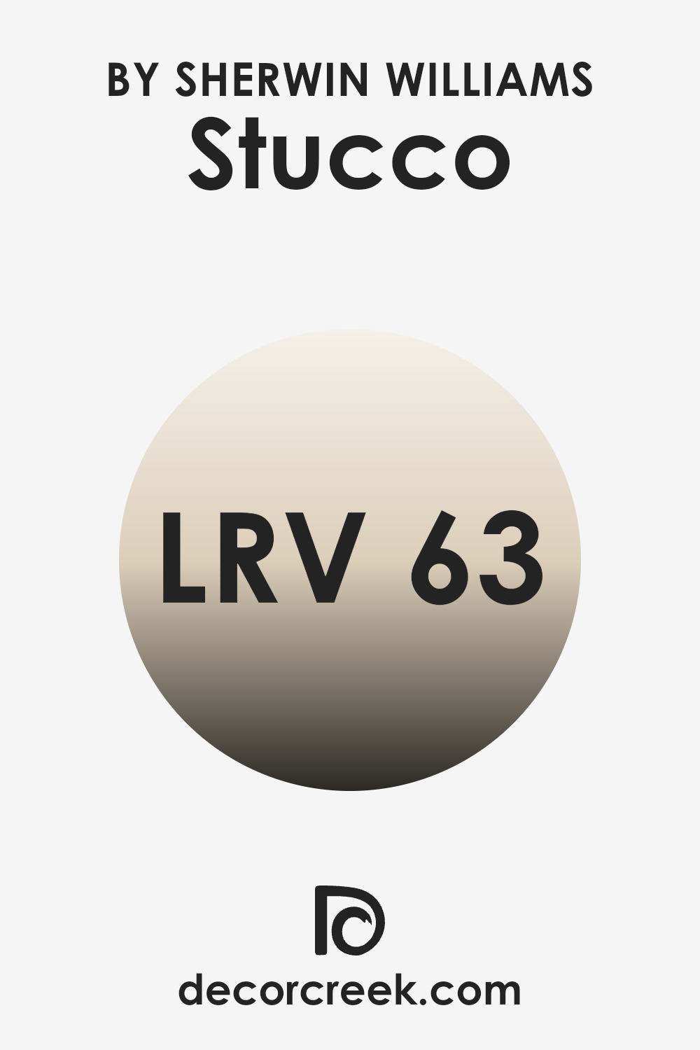
What is the LRV of Stucco SW 7569 by Sherwin Williams?
LRV stands for Light Reflectance Value, a measurement that indicates what percentage of light a paint color reflects back into a room. This figure ranges between 1, which reflects very little light, and 99, reflecting nearly all incoming light. Colors with higher LRV make a room appear larger and more open because they enhance the brightness through their ability to reflect more indoor or natural light.
Contrarily, colors with lower LRV absorb more light, making a room feel more confined and darker, ideal for creating a cozy atmosphere. Regarding the color in question, with an LRV of around 63, it sits on the brighter side of the scale. This means the color is quite effective at reflecting light, making rooms appear luminous and more expansive.
It’s an excellent choice for smaller rooms or darker areas with limited natural light exposure, as it can help brighten the area without the need for additional lighting. This moderate to high reflectance makes it adaptable for various settings, enhancing its usability in both residential and commercial rooms looking for a fresh and airy feel.
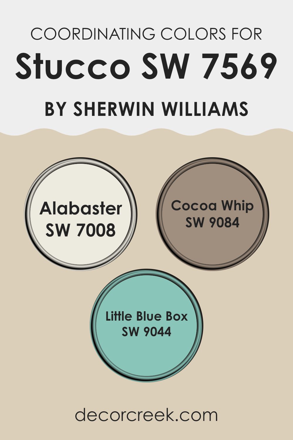
Coordinating Colors of Stucco SW 7569 by Sherwin Williams
Coordinating colors work by complementing each other, either by being in harmony or by offering a contrasting accent that enriches the overall aesthetic. For instance, when decorating a room with a neutral base such as beige or light brown, the addition of coordinating colors can enhance the room without overpowering it. This principle is well illustrated by the colors suggested to pair with a neutral shade like Stucco by Sherwin Williams.
Alabaster SW 7008 is a soft, warm white that provides a clean and airy feel to any room, making it a fantastic choice for trim or ceilings to lift the overall tone of the room. Cocoa Whip SW 9084 adds a deeper, richer dimension with its warm, inviting brown tone, perfect for creating a cozy and comfortable atmosphere, especially in living areas or bedrooms.
Little Blue Box SW 9044 offers a fresh, vibrant splash of color, reminiscent of a clear sky, which can be used to add a lively contrast, especially useful in smaller details or as an accent wall to inject a playful yet chic element into the décor. These colors together create a balanced and pleasant environment, ensuring each hue supports and enhances the others.
You can see recommended paint colors below:
- SW 7008 Alabaster
- SW 9084 Cocoa Whip
- SW 9044 Little Blue Box
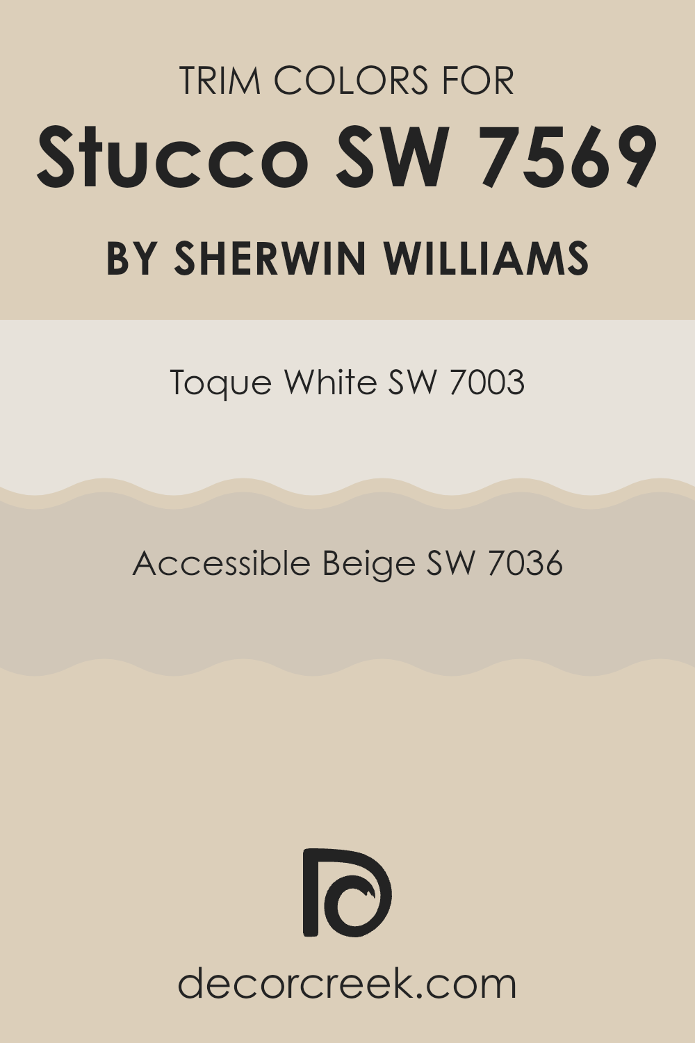
What are the Trim colors of Stucco SW 7569 by Sherwin Williams?
Trim colors, such as Toque White and Accessible Beige, play a crucial role in enhancing the overall look of a building when used with a base color like Stucco by Sherwin Williams. These colors help to define architectural features, emphasize unique details, and create harmonious transitions from one area to another.
By smartly using these trim colors, homeowners can achieve a seamless yet distinct appearance that both complements and contrasts with the main stucco color, adding a refined touch to the exterior design. Toque White is a clean, bright shade that brings a fresh and airy feel when used as a trim color.
It has the ability to make the main color stand out more vividly while maintaining a light and inviting atmosphere. On the other hand, Accessible Beige is a warm and neutral color that offers a subtle contrast, enhancing the depth and warmth of the surroundings. This color works exceptionally well to offer a soft yet striking boundary to more dominant colors, rounding out the visual presentation with an elegantly understated effect.
You can see recommended paint colors below:
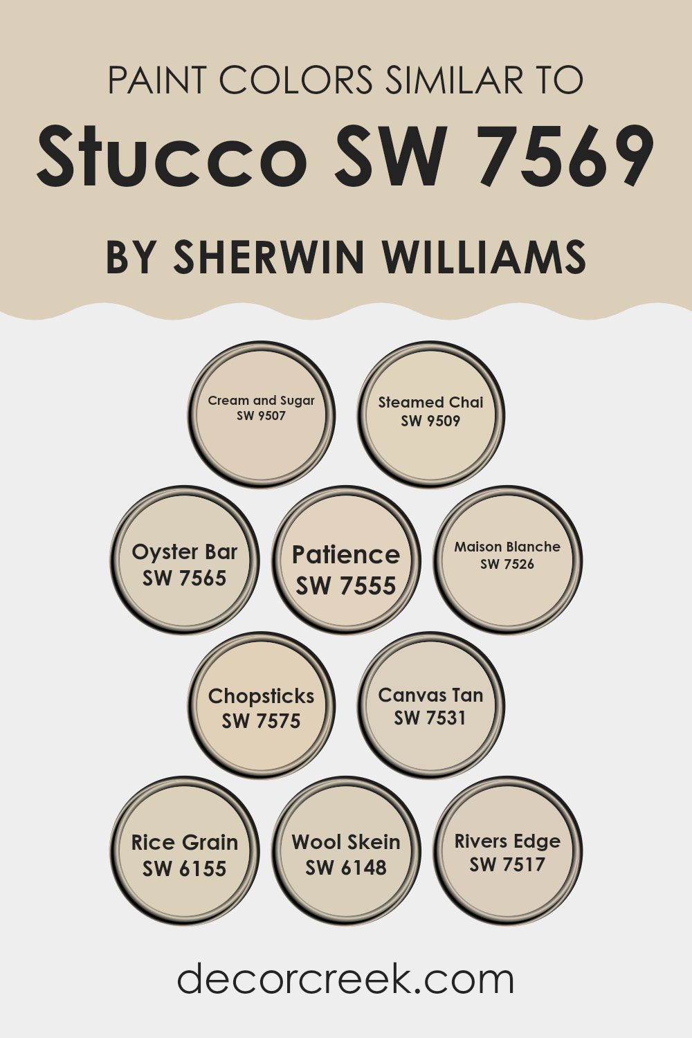
Colors Similar to Stucco SW 7569 by Sherwin Williams
Choosing similar colors in a design project can really bring a room together by creating a subtle yet cohesive look that feels harmonious and welcoming. When working with a base color like Sherwin Williams’ Stucco, which presents as a warm, soft neutral, pairing it with similar colors enhances the aesthetic coherence of the room without overpowering the senses. Colors like Cream and Sugar, a gentle beige, and Steamed Chai, a subdued tan, offer a light backdrop that complements without contrasting too sharply.
Oyster Bar and Patience, both of which lean toward muted taupe, blend beautifully with more grounded shades like Maison Blanche, a creamy off-white, ensuring a smooth transition in tonality across the room. For a slightly earthier feel, Chopsticks adds a dash of dusty earth, drawing together the neutral palette.
Canvas Tan provides a hint of sandy warmth, while Rice Grain offers a soft golden hue that subtly enlivens the environment. In the same family, Wool Skein, which features a hint of greenish-gray, links the neutrals to natural elements. Finally, Rivers Edge, standing out with its unique blend of cool gray undertones, provides a refreshing contrast that still aligns with the overall warm theme, ensuring all elements are in sync.
You can see recommended paint colors below:
- SW 9507 Cream and Sugar
- SW 9509 Steamed Chai
- SW 7565 Oyster Bar
- SW 7555 Patience
- SW 7526 Maison Blanche
- SW 7575 Chopsticks
- SW 7531 Canvas Tan
- SW 6155 Rice Grain
- SW 6148 Wool Skein
- SW 7517 Rivers Edge
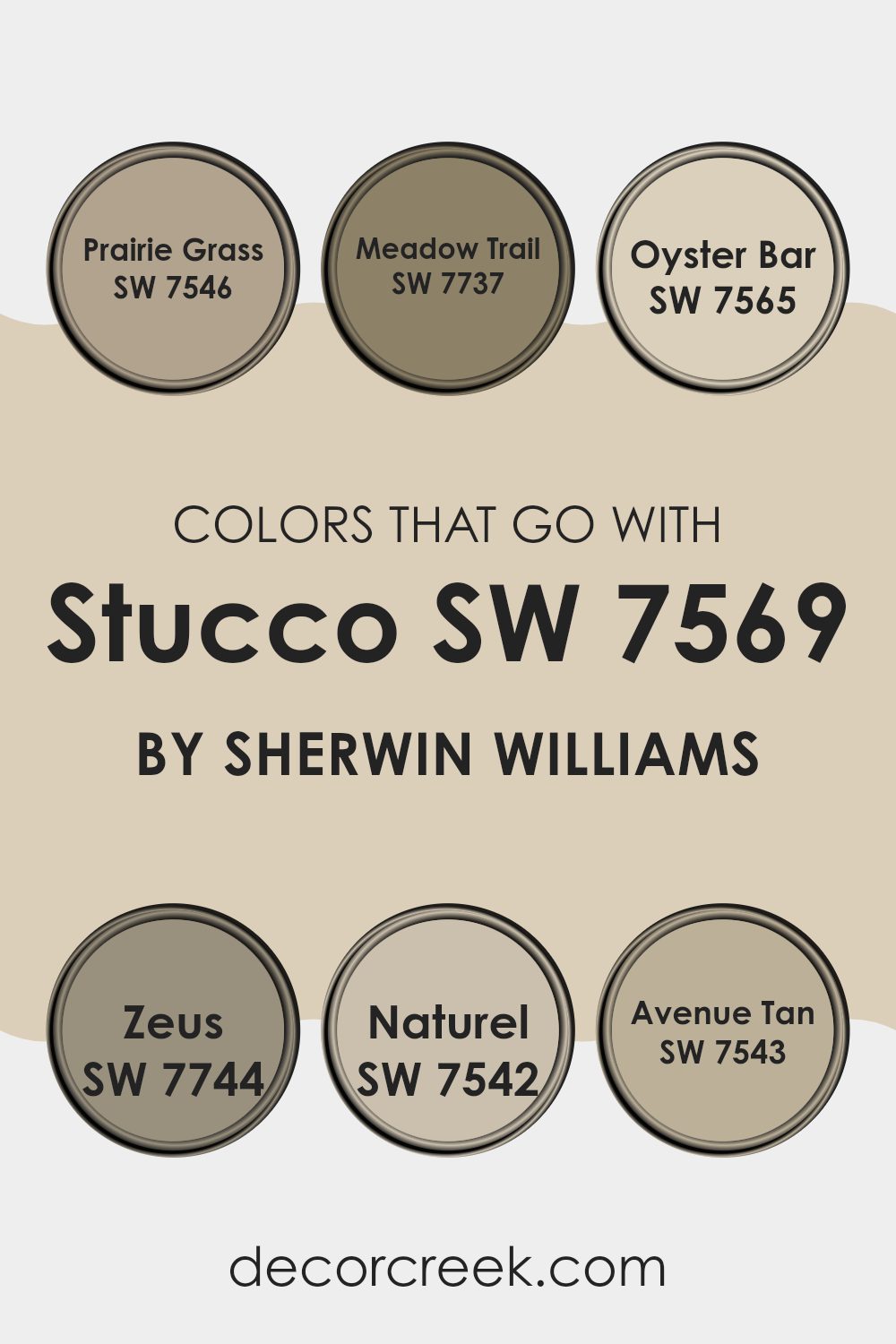
Colors that Go With Stucco SW 7569 by Sherwin Williams
Choosing colors that complement Stucco SW 7569 by Sherwin Williams is important because it helps create a cohesive and visually appealing color scheme in your room. Stucco SW 7569 is an adaptable neutral shade, and when paired with the right colors, it can enhance the overall appearance of a room.
For example, Prairie Grass SW 7546 brings in a touch of earthy green, adding a subtle natural feel, while Meadow Trail SW 7737, a deeper green hue, offers a rich contrast that makes the neutral base of Stucco stand out more.
Colors like Oyster Bar SW 7565 can add a sense of lightness and airiness to a room, functioning almost as a refreshing cleanse from the more grounded tones of Stucco. Zeus SW 7744 is a dark gray that can provide a strong, grounding effect, anchoring a room and adding depth.
Naturel SW 7542, a soft beige, harmonizes effortlessly with Stucco, enhancing a warm and inviting atmosphere. Avenue Tan SW 7543 is another excellent companion, providing a slightly more pronounced color that still maintains the gentle, calming environment created by Stucco. By carefully selecting these complementary colors, you can create a room that feels interconnected and well-designed.
You can see recommended paint colors below:
- SW 7546 Prairie Grass
- SW 7737 Meadow Trail
- SW 7565 Oyster Bar
- SW 7744 Zeus
- SW 7542 Naturel
- SW 7543 Avenue Tan
How to Use Stucco SW 7569 by Sherwin Williams In Your Home?
Stucco SW 7569 by Sherwin Williams is a warm, neutral paint color with earthy undertones. This adaptable shade is perfect for creating a cozy and welcoming atmosphere in any home. It works exceptionally well in living rooms and bedrooms where you want to create a relaxing vibe that makes everyone feel at home. Additionally, its subtlety allows it to be used as a background color, complementing brighter or richer colors on furniture or decor items.
Using Stucco SW 7569 in the kitchen can also add a touch of warmth, especially when paired with wood finishes or white cabinets for a clean, balanced look. In bathrooms, this color can help renew the room into a soothing retreat where you can unwind.
For those looking to update their home’s exterior, Stucco SW 7569 can provide a modern yet enduring appeal, making it a good choice for front doors or main walls. Its capability to blend well with natural surroundings while still standing out is a definite plus. Whether you’re painting a room or revamping your home’s façade, Stucco SW 7569 offers a reliable and attractive option.
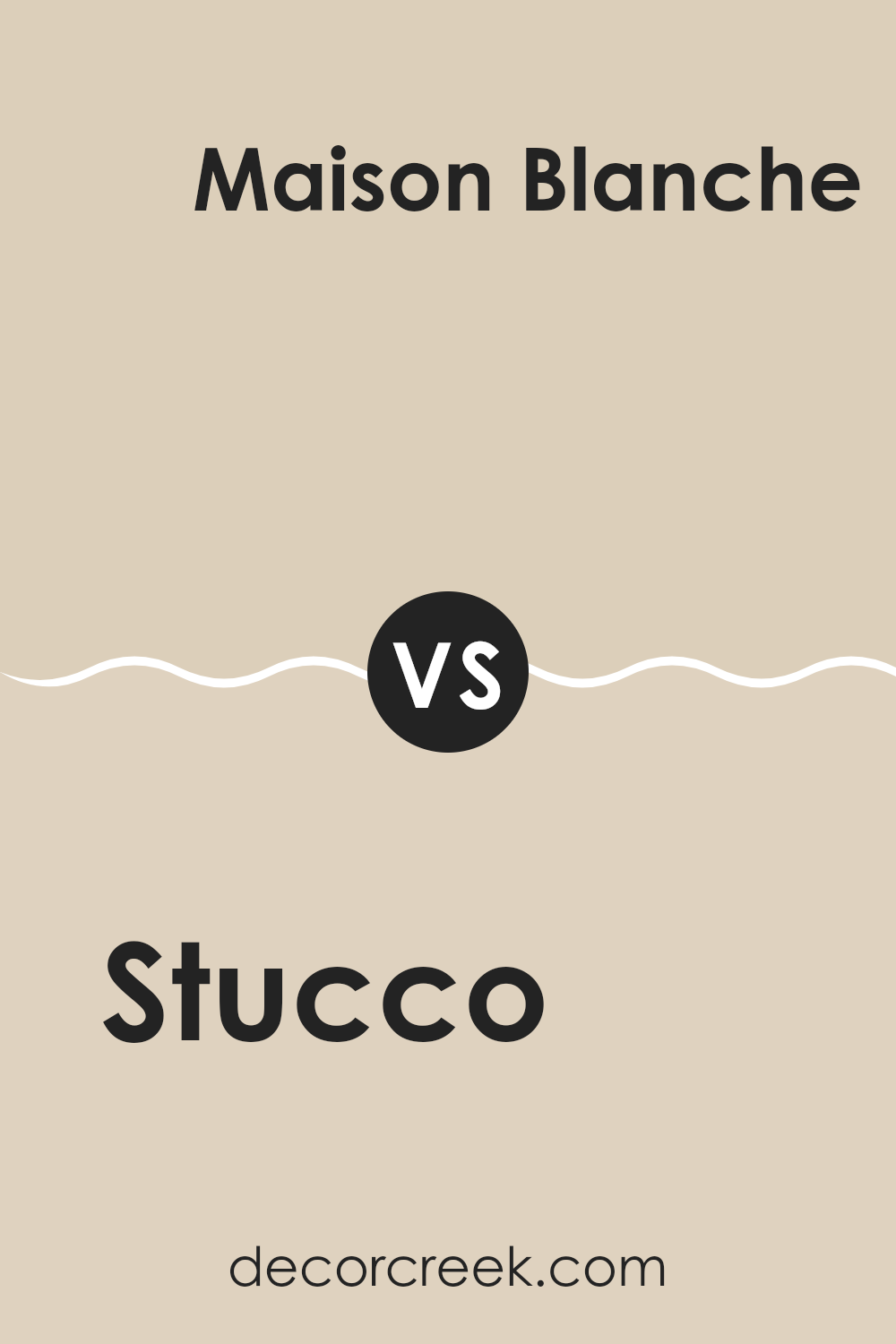
Stucco SW 7569 by Sherwin Williams vs Maison Blanche SW 7526 by Sherwin Williams
Stucco (SW 7569) and Maison Blanche (SW 7526) are both neutral shades from Sherwin Williams, but they have distinct tones that set them apart. Stucco has a deeper, warmer beige tone that adds a cozy feel to any room.
It’s more grounded and earthy, making it a great choice for living rooms or bedrooms where a calming effect is desired. In contrast, Maison Blanche is lighter, resembling an off-white with subtle gray undertones.
This color is excellent for creating a bright and airy feeling, ideal for smaller rooms or areas with less natural light. While Stucco provides a sense of warmth, Maison Blanche offers a clean and open atmosphere, making both colors adaptable for different home styles and preferences.
You can see recommended paint color below:
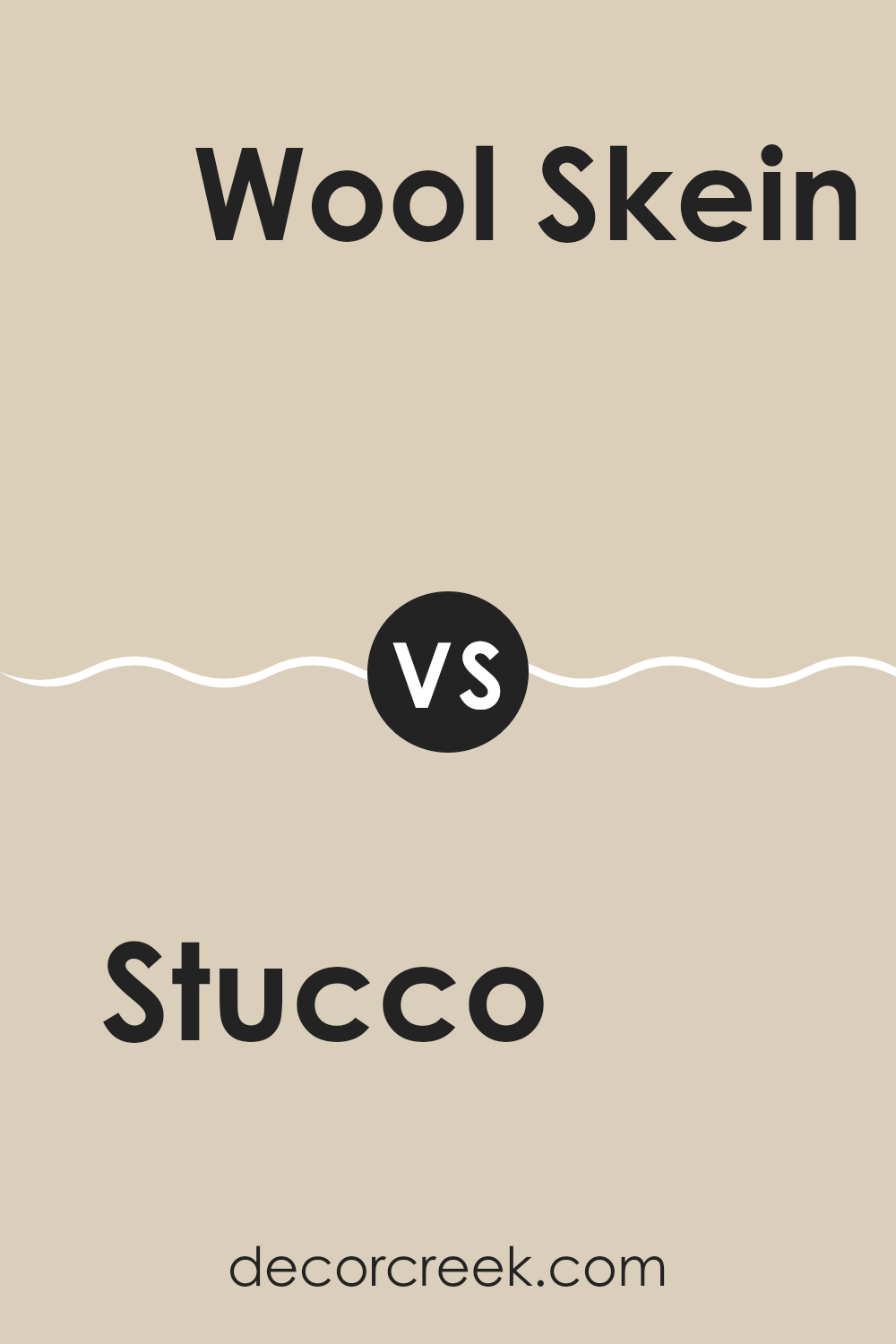
Stucco SW 7569 by Sherwin Williams vs Wool Skein SW 6148 by Sherwin Williams
Both Stucco SW 7569 and Wool Skein SW 6148 by Sherwin Williams are neutral colors, but they bring different vibes to a room. Stucco is a warm beige with a sandy tone that makes rooms feel cozy and welcoming.
It works great in living areas and bedrooms where you want a soothing background. On the other hand, Wool Skein is lighter, leaning towards a soft grayish-beige. This color is excellent for rooms where you want to enhance natural light, such as kitchens and bathrooms.
Both colors are adaptable and pair well with a variety of decor styles, but Stucco offers a warmer touch, while Wool Skein provides a cleaner, airy feel. Each can set a unique mood, making them good choices depending on the atmosphere you’re aiming to create.
You can see recommended paint color below:
Stucco SW 7569 by Sherwin Williams vs Oyster Bar SW 7565 by Sherwin Williams
The color Stucco by Sherwin Williams is a warm neutral tone, resembling the natural color of traditional stucco plaster, which can be an inviting option for any room. It carries a slightly earthy, beige hue that projects a welcoming and cozy vibe, making it ideal for living rooms or bedrooms.
On the other hand, Oyster Bar is also a neutral, but it leans more towards a lighter, more delicate gray. This color has a subtle coolness to it, which gives a fresh and clean look, suitable for rooms like bathrooms or kitchens where a sense of cleanliness is often desired.
Both colors can work well together, as their neutral bases allow them to complement rather than compete with each other. While Stucco provides warmth, Oyster Bar offers a contrast with its crisp, calming gray tone, making them a great pairing for a balanced and harmonious color scheme in home decorating.
You can see recommended paint color below:
Stucco SW 7569 by Sherwin Williams vs Chopsticks SW 7575 by Sherwin Williams
Stucco and Chopsticks, both by Sherwin Williams, present subtle but distinct tones for interior rooms. Stucco offers a gentle, warm beige that creates a comfortable, inviting atmosphere. It’s ideal for living rooms or bedrooms where a soft, neutral backdrop is preferred.
In contrast, Chopsticks steps a shade darker, providing a stronger presence of gray in its beige mix. This color can add a hint more depth and definition to rooms, making it a good choice for areas that benefit from a slightly more pronounced shade, like dining rooms or entryways.
Though both colors maintain a simplicity that works well with various decor styles, Stucco might be better for those seeking a lighter, airy feel, while Chopsticks suits those looking for something with a bit more grounding. Together, these colors could also complement each other effectively in a single area, using Chopsticks as an accent to the lighter Stucco base.
You can see recommended paint color below:
Stucco SW 7569 by Sherwin Williams vs Rice Grain SW 6155 by Sherwin Williams
Stucco SW 7569 and Rice Grain SW 6155 by Sherwin Williams are two neutral hues that offer subtle differences in tone and mood. Stucco leans towards a warmer, almost beige-like grey with a cozy and inviting feel, making it a great choice for living rooms or bedrooms where a calm, friendly atmosphere is desired.
On the other hand, Rice Grain incorporates slightly more yellow undertones. This gives it a slightly warmer and lighter appearance compared to Stucco. Rice Grain can brighten rooms while maintaining a laid-back, welcoming vibe, perfect for kitchens and living rooms wanting a touch of warmth.
Both colors work well in various lighting conditions and complement a wide range of decor styles, from modern to traditional. They provide a flexible backdrop for both furniture and artwork, making them practical options for anyone looking to refresh their room with a warm neutral palette.
You can see recommended paint color below:
- SW 6155 Rice Grain
Stucco SW 7569 by Sherwin Williams vs Steamed Chai SW 9509 by Sherwin Williams
Stucco and Steamed Chai are two distinct colors from Sherwin Williams, each presenting a unique vibe for interior rooms. Stucco is a warm, beige color that offers a solid, earthy base, making it an adaptable choice for many rooms. It tends to bring a cozy and welcoming feel to rooms, suitable for living rooms or bedrooms that aim for a relaxed atmosphere.
On the other hand, Steamed Chai is a lighter and softer shade. It leans more towards a creamy, almost off-white color with warm undertones. This color is particularly good at making small rooms appear larger and brighter, contributing to a soothing environment.
When used together, Stucco can be the grounding force in a room, while Steamed Chai can be used to brighten or highlight specific areas. Both colors work well in a variety of lighting conditions, making them practical choices for a cohesive look in home decorating.
You can see recommended paint color below:

Stucco SW 7569 by Sherwin Williams vs Canvas Tan SW 7531 by Sherwin Williams
Stucco and Canvas Tan, both Sherwin Williams colors, are earthy hues that bring warmth to any room. Stucco is a darker, more muted shade often resembling the natural look of clay or plaster. Its understated elegance makes it adaptable for common areas like living rooms or hallways, where it adds a cozy, welcoming feel without being too bold.
On the other hand, Canvas Tan is lighter, providing a soft, creamy background that brightens up a room. It’s perfect for creating a relaxed, airy atmosphere in rooms such as kitchens and bathrooms. Because of its lighter tone, Canvas Tan also pairs well with a range of other colors, providing a neutral canvas that lets furniture and decor stand out.
Both colors offer their unique appeal, with Stucco giving depth and solidity, while Canvas Tan offers a gentle uplift to interiors. They can be used together to balance darker and lighter tones, achieving a harmonious look.
You can see recommended paint color below:
Stucco SW 7569 by Sherwin Williams vs Cream and Sugar SW 9507 by Sherwin Williams
Stucco SW 7569 and Cream and Sugar SW 9507 are both paint colors from Sherwin Williams, but they offer different vibes for room settings. Stucco has a deeper, warmer beige tone that gives a cozy feel to any room. It’s an adaptable color that works well in areas where you want a comforting and inviting atmosphere like living rooms or bedrooms.
On the other hand, Cream and Sugar is much lighter, leaning towards a soft off-white with just a hint of warm undertones. This color is perfect for making small rooms appear larger and brighter. It’s an excellent choice for rooms that you want to feel airy and open, such as kitchens and bathrooms.
When paired together, these colors complement each other beautifully, with Stucco providing a rich base that highlights the light and refreshing feel of Cream and Sugar. This combination can deliver a balanced look, ideal for creating a welcoming home environment.
You can see recommended paint color below:
Stucco SW 7569 by Sherwin Williams vs Patience SW 7555 by Sherwin Williams
Stucco SW 7569 and Patience SW 7555, both by Sherwin Williams, are warm neutral colors but they have different tones. Stucco is a solid, medium beige with earthy undertones, giving it a rich and welcoming feel.
This color is adaptable and can easily anchor a room while pairing well with both bright and muted accents. Patience, on the other hand, is lighter and leans more towards a creamy beige. It has a softness to it that makes it great for creating a relaxed and cozy atmosphere.
It’s particularly effective in rooms that aim to be calming and gentle. While both colors support a range of design styles, Stucco might be better suited for those looking for a bit more warmth and grounding, whereas Patience is ideal for rooms aiming for a lighter, airier feel. Both can be used in different settings like living rooms, bedrooms, and kitchens, adjusting beautifully to various lighting conditions and decor styles.
You can see recommended paint color below:
Stucco SW 7569 by Sherwin Williams vs Rivers Edge SW 7517 by Sherwin Williams
Stucco SW 7569 and Rivers Edge SW 7517 are both colors by Sherwin Williams, but they create different atmospheres. Stucco is a warm beige with a hint of gray, giving it an adaptable and welcoming vibe. This color works well in many rooms, like living rooms or bedrooms, as it pairs easily with various decor styles and colors, creating a cozy and comfortable environment.
On the other hand, Rivers Edge is a darker and cooler color, a deep taupe that leans more towards gray. This color is perfect for adding a touch of drama or grounding a room with a more neutral palette.
It’s particularly effective in areas that benefit from a darker color to enhance other elements, such as art or furniture, providing a strong backdrop. Overall, while Stucco is light and warm, making rooms feel open and airy, Rivers Edge offers depth and strength, ideal for adding character to a room.
You can see recommended paint color below:
In finishing up my thoughts about SW 7569 Stucco by Sherwin Williams, I must say that I’m really impressed with this color. It’s a kind of light brown or sandy beige that looks super cozy and calm. When I put it on the walls in my room, it made everything feel warm and welcoming, almost like being hugged!
This paint color is great because it’s like a chameleon—it can fit in almost anywhere. Whether you have a room full of bright colors or more muted tones, Stucco will complement them nicely without taking over the show. It’s sort of like the quiet kid in class who gets along with everyone.
Cleaning the walls isn’t a hassle either. The paint stays looking fresh and neat without too much work, which is awesome because, let’s be honest, nobody likes cleaning all the time!
So, if you or your folks are thinking about giving a room a new look, I’d recommend giving SW 7569 Stucco a shot. It’s simple, pretty, and does a fantastic job at making your room feel cozy. Plus, it’s easy to live with—you can add all sorts of decorations and it still looks great. Definitely a thumbs up from me!
Ever wished paint sampling was as easy as sticking a sticker? Guess what? Now it is! Discover Samplize's unique Peel & Stick samples.
Get paint samples

