If you’re considering sprucing up your interior with a new paint color, SW 6106 Kilim Beige by Sherwin Williams is a choice worth looking at. Before you make a trip to the store, there are a few things you should know about this popular hue. Kilim Beige is more than just a simple beige; its warm undertones can create a cozy and welcoming atmosphere in almost any room.
However, the lighting in your interior plays a crucial role in how this color appears. In rooms with plenty of natural light, Kilim Beige tends to look lighter and more vibrant, while in areas with limited light, it can give off a richer and deeper appearance.
Additionally, considering what colors to pair with Kilim Beige can greatly affect the overall feel of your room. It works beautifully with soft whites and rich wood tones, providing a balanced backdrop that allows furniture and decor to stand out. It’s also adaptable enough to complement both modern and traditional styles, making it a flexible choice for any redecorating project.
So, if you’re planning to give your home a new look, Kilim Beige could be the perfect foundation to build upon.
Is Kilim Beige SW 6106 Right for My Home?
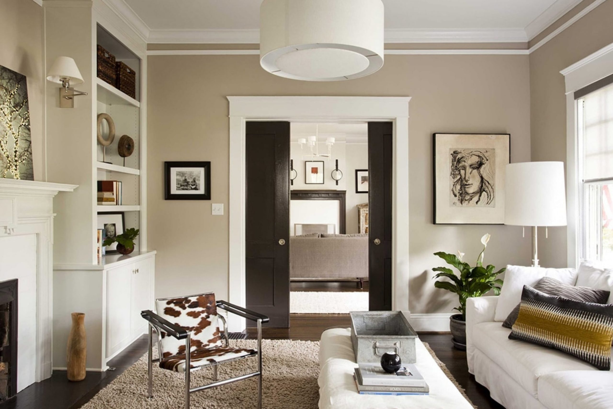
Kilim Beige is a warm, inviting shade that really makes my house feel like a home. It has a subtle, soothing presence with just enough depth to add character to a room without feeling too heavy. The color sits comfortably between beige and light brown, which makes it incredibly adaptable. It’s this natural simplicity that allows it to work beautifully in a variety of interior styles, particularly rustic, traditional, and casual contemporary interiors.
I love pairing Kilim Beige with a range of materials and textures. It looks fantastic with natural wood, helping to highlight its rich grains and organic finish. In my living room, I’ve paired it with soft, creamy textiles and a plush wool rug, which really makes the room feel cozy and welcoming. Additionally, this color goes well with stone elements — like a stone fireplace or backsplash — enhancing their organic beauty.
Whether it’s in a sunny kitchen or a calm bedroom, Kilim Beige provides a solid foundation that invites other colors to stand out. It’s also great for showcasing metal accents in bronze or gold tones, adding a touch of warmth to the décor. Overall, it’s a go-to color for me when I want to create an interior that feels grounded and cozy, yet still thoughtfully styled.

What are the right undertones of Kilim Beige SW 6106 ?
Kilim Beige by Sherwin Williams is a popular paint color known for its warm, neutral tone. It’s a flexible shade often chosen to create a cozy and inviting atmosphere in homes. While it may appear simply beige at first glance, the undertones in this color add subtle complexity that can change the perception of the color under different lighting.
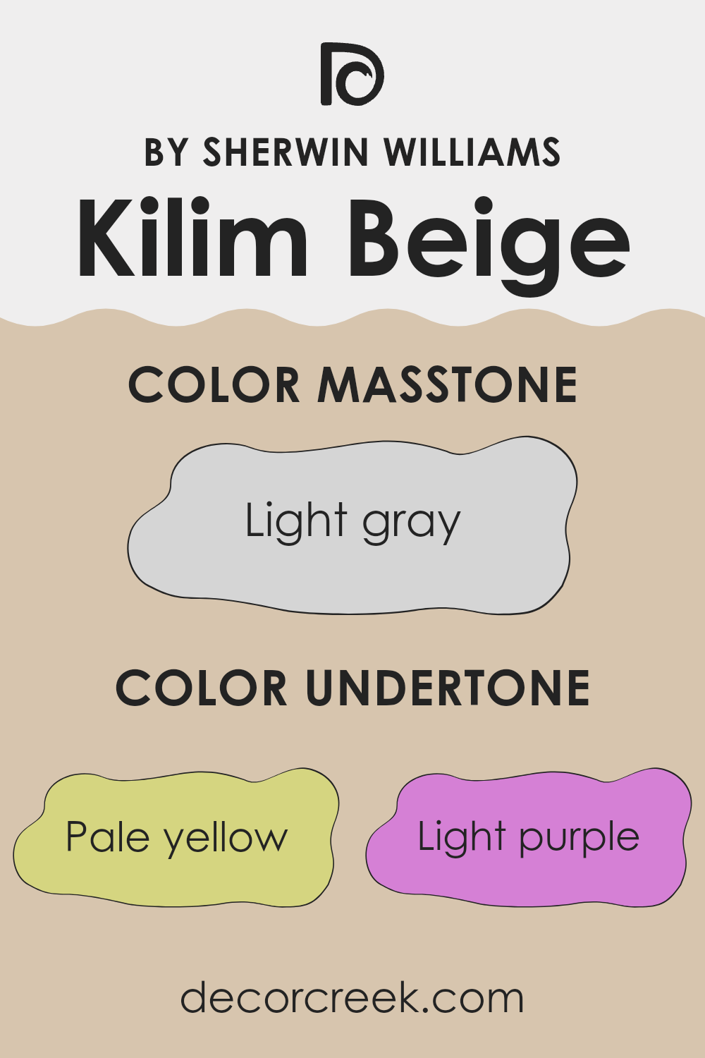
Undertones are the underlying hues that subtly influence a color’s overall appearance. They play a crucial role in how we perceive color, especially in different lighting conditions. Kilim Beige, for instance, has hints of pale yellow, light purple, pale pink, light blue, mint, lilac, and grey. These undertones can make the paint look warmer or cooler depending on the light sources in a room.
When applied to interior walls, the undertones in Kilim Beige can influence the mood and feel of the room. For example, the pale yellow undertone might make a room feel warmer and sunnier in natural light, while the light blue undertone could give a slightly cooler feel in a room with lots of shade or fluorescent lighting. The mint and lilac undertones might not be distinctly noticeable but contribute to the overall warmth of the color, preventing it from feeling flat or dull.
The presence of these undertones means that Kilim Beige can look slightly different from one room to another, sometimes appearing more creamy and at other times feeling almost soft gray. This variability makes it a highly adaptable color choice that can complement various furnishings and styles. When choosing decor or additional paint colors, it’s useful to consider these undertones to achieve a harmonious look.
Best Coordinating Colors to use with Kilim Beige SW 6106 by Sherwin Williams this year.
Coordinating colors are those that complement each other well and create a pleasing aesthetic when used together in decor. They can enhance the overall look of an interior by adding depth, contrast, or harmony. One such example includes the colors that pair well with Kilim Beige, a popular shade from Sherwin Williams. When choosing these coordinating shades, it’s essential to consider how each one interacts with the base color to achieve the desired atmosphere in a room.
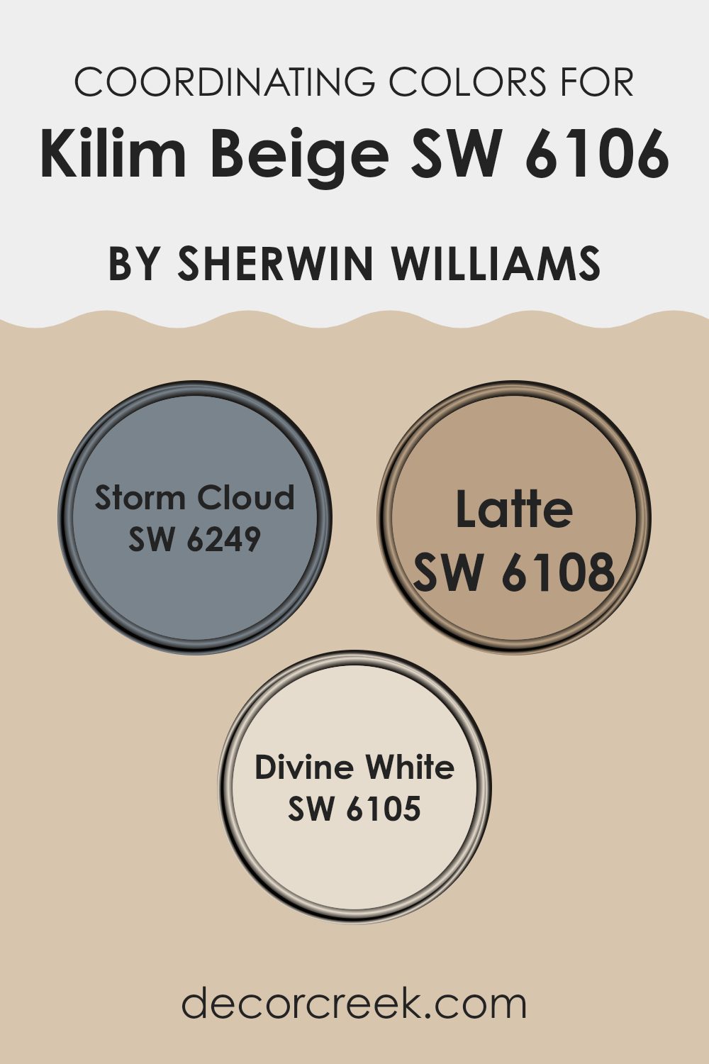
Among the coordinating colors for Kilim Beige are Storm Cloud, Latte, and Divine White. Storm Cloud is a deep, grayish-blue that adds a bold contrast to the soft warmth of Kilim Beige, perfect for creating a focal point or accentuating architectural features. Latte, on the other hand, is a much warmer color, closely resembling the creamy richness of coffee with milk. It offers a slight contrast to Kilim Beige, making it ideal for creating a cozy, unified look in areas like living rooms or bedrooms.
Lastly, Divine White is a light and airy shade that provides a subtle contrast, brightening up interiors effortlessly without feeling too heavy against the gentle nature of Kilim Beige. Together, these colors create a harmonious palette that works beautifully in various combinations, suitable for any room looking for balance and a modern touch.
You can see recommended paint colors below:
Trendy Trim Colors of Kilim Beige SW 6106 by Sherwin Williams to use this year.
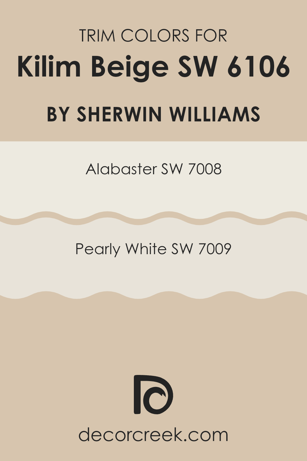
Trim colors play a pivotal role in defining and enhancing the appearance of a primary wall color. In the case of Kilim Beige by Sherwin Williams, selecting the right trim color can accentuate its warm and inviting tone. Alabaster (SW 7008) and Pearly White (SW 7009) are both excellent choices for trims as they subtly contrast with the softness of Kilim Beige without feeling too strong. Using a lighter trim color can help frame the walls, making the room feel more defined and orderly. It’s a simple yet effective way to add a visual lift to your interiors.
Alabaster is a gentle, creamy white that offers a soft and clean contrast, perfect for a cozy and welcoming vibe when paired with Kilim Beige. Pearly White, on the other hand, has a slightly cooler undertone that provides a crisp, but not stark, boundary to richer wall colors like Kilim Beige.
Both these shades are flexible enough to be used in a variety of lighting conditions, enhancing the overall aesthetic of a room while maintaining a harmonious look. Choosing between them depends on whether you prefer a hint of warmth (Alabaster) or a touch of freshness (Pearly White) to complement your main wall color.
You can see recommended paint colors below:
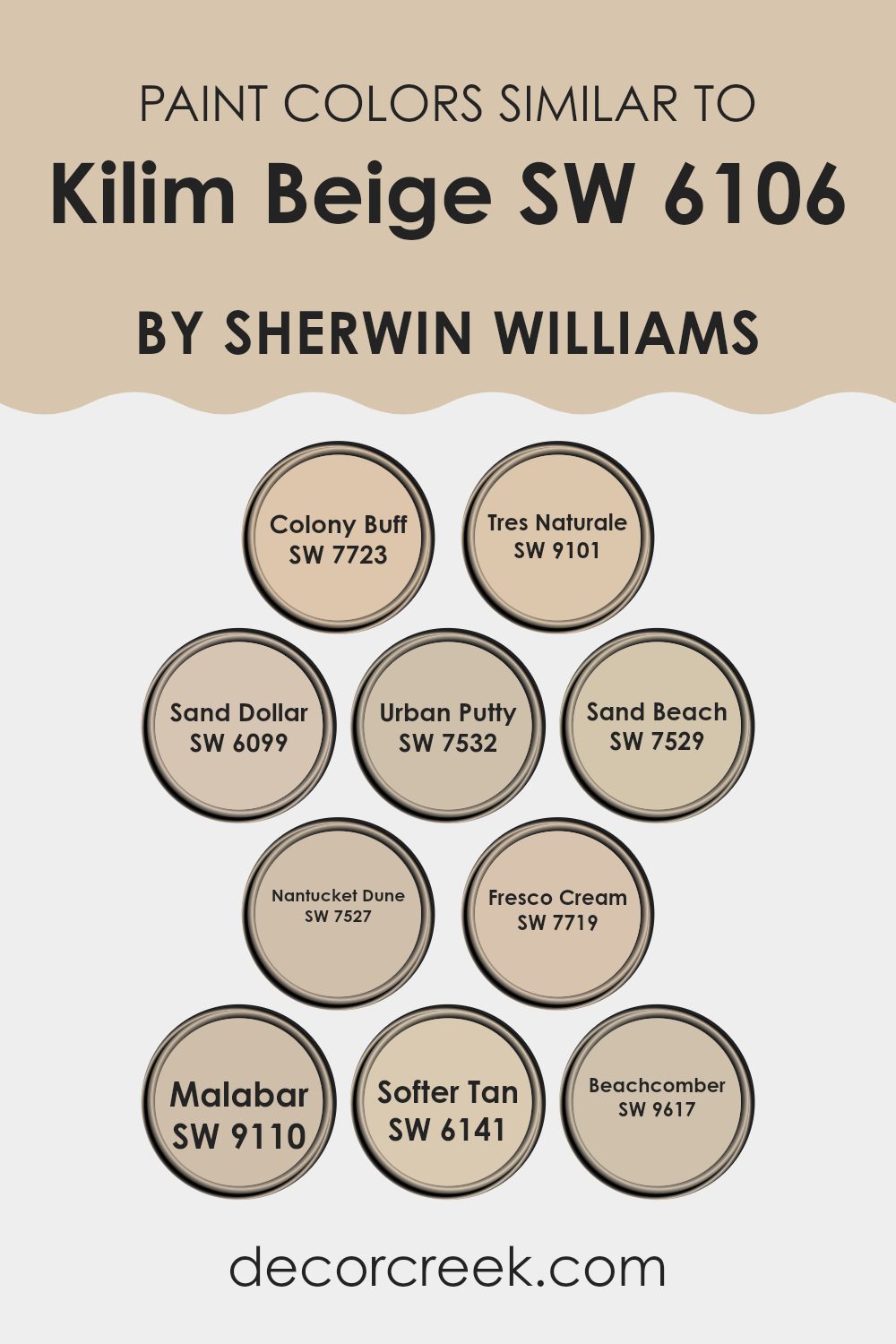
Evergreen Colors Similar to Kilim Beige SW 6106 by Sherwin Williams
Similar colors play an essential role in creating a cohesive and visually appealing décor scheme. They work by setting a uniform mood and flow throughout an interior, enhancing the overall aesthetic without strong contrasts. This smooth transition is ideal for achieving a balanced interior.
Taking inspiration from Kilim Beige, colors like Colony Buff and Tres Naturale offer subtle variations that provide a warm and comforting ambiance. Colony Buff is a soft, muted yellow with a hint of earthiness, ideal for creating a cozy feel in living rooms. On the other hand, Tres Naturale is a deeper beige that brings a touch of nature’s tones indoors, perfect for rooms that aim to reflect the calmness of the outdoors.
Moving to colors like Sand Dollar and Urban Putty, each adds its own character; Sand Dollar is a gentle sandy beige that brightens rooms with its soft glow, while Urban Putty shifts toward a grayer tone, giving a sturdier appearance to the interior. Sand Beach and Nantucket Dune lean toward a slightly golden hue, enhancing areas with a brighter, sun-kissed effect. Fresco Cream, with its creamy presence, can brighten rooms effortlessly, making it ideal for more compact interiors.
Malabar introduces a hint of muted green, offering an earthy feel that is calming and grounded. Softer Tan echoes the qualities of Kilim Beige but with a bit more depth, making it suitable for rooms that call for extra warmth. Lastly, Beachcomber completes the palette with a touch of pale, neutral charm, welcoming a light and open feeling that complements minimalist or casual settings well. Each color, while similar, adds its own contribution to the palette, allowing for a customized yet coordinated look that feels thoughtful and unified.
You can see recommended paint colors below:
- SW 7723 Colony Buff
- SW 9101 Tres Naturale
- SW 6099 Sand Dollar
- SW 7532 Urban Putty
- SW 7529 Sand Beach
- SW 7527 Nantucket Dune
- SW 7719 Fresco Cream
- SW 9110 Malabar
- SW 6141 Softer Tan
- SW 9617 Beachcomber
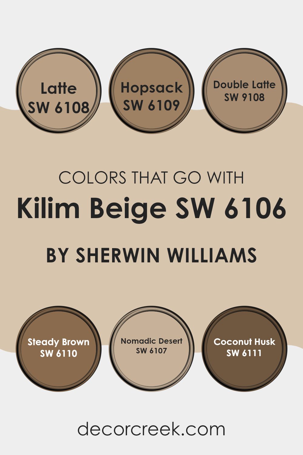
Colors that Go With Kilim Beige SW 6106 by Sherwin Williams
Choosing the right colors to complement Kilim Beige SW 6106 by Sherwin Williams can greatly enhance the aesthetic of any interior. Kilim Beige is a warm, adaptable hue that serves as an excellent backdrop for deeper or contrasting shades, creating a welcoming and harmonious environment. When pairing it with colors like Latte SW 6108, a slightly darker beige, you add depth while maintaining a soothing sense of consistency. Hopsack SW 6109, which carries a richer, more golden tone, introduces a feeling of warmth that makes the interior feel cozy and inviting.
On the slightly darker end, Double Latte SW 9108 offers a robust coffee color that provides a striking contrast while staying within a comforting, earthy palette. Steady Brown SW 6110, a deep, grounding brown, anchors lighter shades like Kilim Beige and adds an element of strength to the décor. Nomadic Desert SW 6107 is just a step darker than Kilim Beige, blending smoothly to create a subtle, layered look.
Lastly, Coconut Husk SW 6111 is a deep, warm brown that brings a natural feel, reminiscent of rich soil, which can enrich the interior with an organic vibe. Pairing Kilim Beige with these complementary colors enhances the room’s character and creates a cohesive look.
You can see recommended paint colors below:
- SW 6108 Latte
- SW 6109 Hopsack
- SW 9108 Double Latte
- SW 6110 Steady Brown
- SW 6107 Nomadic Desert
- SW 6111 Coconut Husk
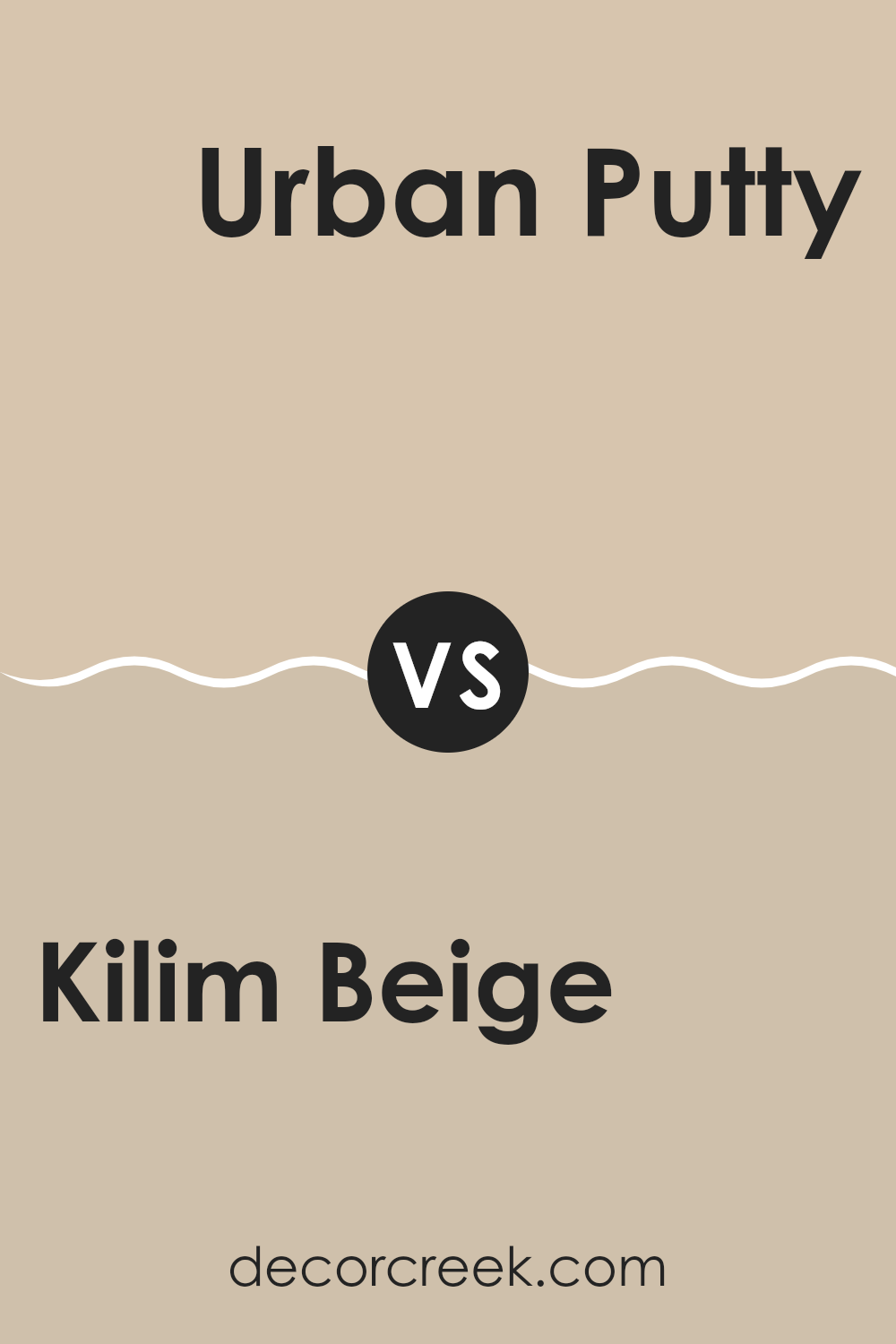
Kilim Beige SW 6106 by Sherwin Williams vs Urban Putty SW 7532 by Sherwin Williams
Kilim Beige and Urban Putty are two neutral shades from Sherwin Williams, each bringing its distinct vibe to an interior. Kilim Beige has a warmer tone that feels cozy and inviting. It’s an adaptable option, fitting well in living rooms or bedrooms where a soothing backdrop is desirable. On the other hand, Urban Putty leans toward a greener undertone, offering a slightly more reserved and subtle look.
This color works great in areas where a calm, understated elegance is needed without the warmth of a typical beige. It’s particularly effective in office interiors or modern kitchens. Both colors are light enough to make rooms feel larger and are excellent for pairing with a wide variety of decor styles and furniture choices.
Whether you choose the warmer Kilim Beige or the cooler, more muted Urban Putty depends on the atmosphere you want to create in your home.
You can see recommended paint color below:
- SW 7532 Urban Putty
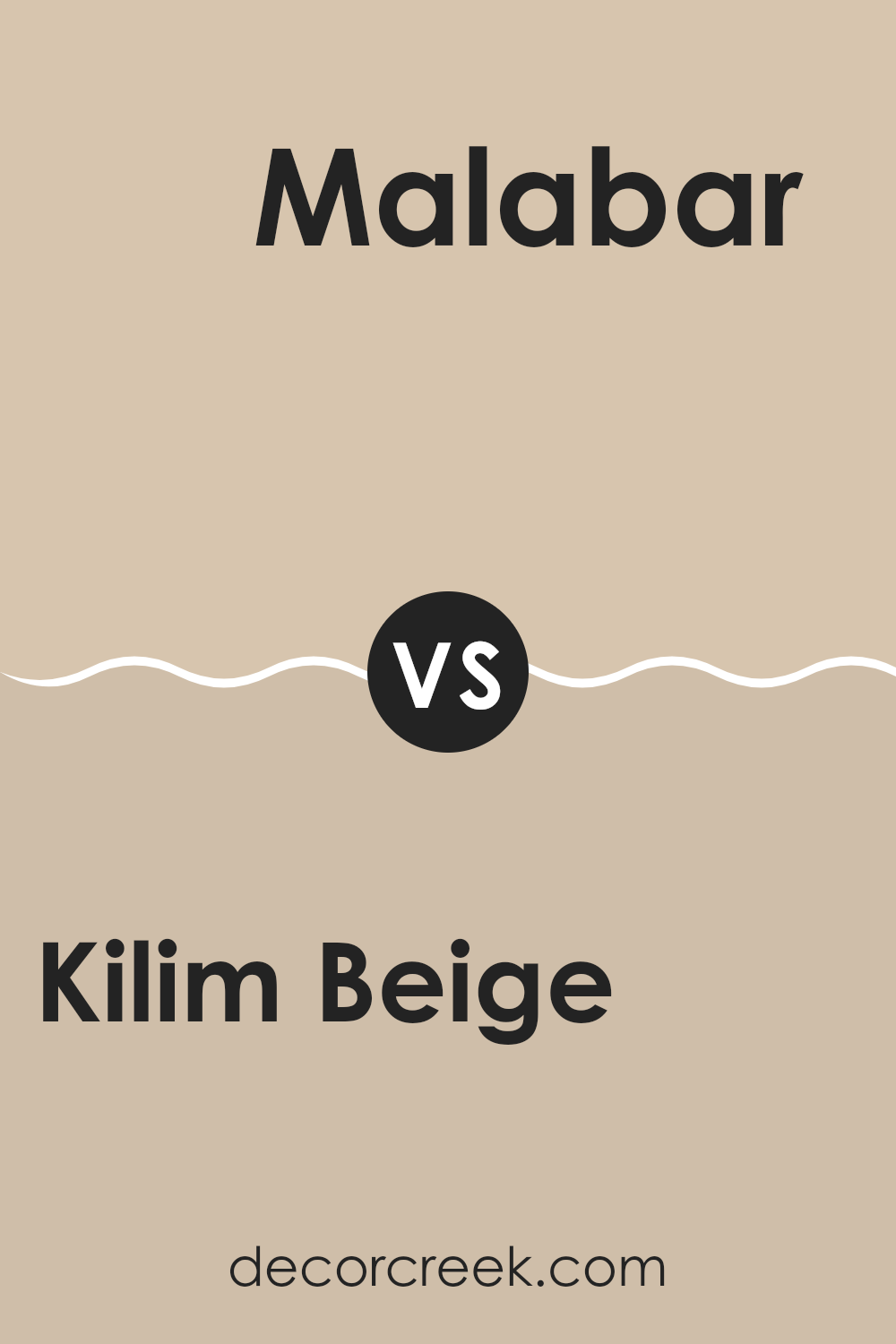
Kilim Beige SW 6106 by Sherwin Williams vs Malabar SW 9110 by Sherwin Williams
Kilim Beige and Malabar are two warm neutrals from Sherwin Williams that offer subtle yet distinct atmospheres to any interior. Kilim Beige is a light, sandy color reminiscent of a warm, sunlit beach.
It has a welcoming vibe, making it a great choice for living rooms and hallways where you want a cozy feel. On the other hand, Malabar is a bit darker and leans toward a grayish taupe.
This color provides a grounding, more muted look, ideal for creating a calm and collected setting in bedrooms or studies. While both colors share a neutral palette, Kilim Beige feels brighter and more open, whereas Malabar adds depth and a hint of refinement without being too bold. Both are highly adaptable, but the choice depends on the mood you want to set and the natural light in your room.
You can see recommended paint color below:
Kilim Beige SW 6106 by Sherwin Williams vs Fresco Cream SW 7719 by Sherwin Williams
Kilim Beige and Fresco Cream, both from Sherwin Williams, are warm neutral shades, but they have different undertones and effects in an interior. Kilim Beige has a soft, welcoming appearance with a slightly pinkish tint, making it cozy and inviting.
It suits almost any room, complementing a wide range of décor styles from traditional to modern. In contrast, Fresco Cream is lighter and has a creamy yellow undertone that brings a bit more brightness and warmth. This color is great for areas where you want to create a cheerful, airy feel.
It works especially well in kitchens and living areas where the extra brightness can make the room feel more lively and open. Overall, while both colors offer warmth, Kilim Beige leans toward a more subdued, subtle look, while Fresco Cream brings in extra cheer and light.
You can see recommended paint color below:
- SW 7719 Fresco Cream
Kilim Beige SW 6106 by Sherwin Williams vs Beachcomber SW 9617 by Sherwin Williams
Kilim Beige and Beachcomber are both colors by Sherwin Williams that bring a warm and welcoming feel to any interior, but they differ in tone and depth. Kilim Beige is a relatively neutral shade that leans toward a soft, creamy beige. It’s quite adaptable, making it easy to pair with a wide range of decor styles and colors. It’s perfect for creating a cozy and subtle backdrop in any room, providing a light and airy feeling.
On the other hand, Beachcomber is a darker and richer color. It offers a hint of olive, making it feel warmer and more grounding compared to Kilim Beige. Beachcomber works well in areas where you want to add a bit of drama or depth without feeling too heavy. It pairs beautifully with natural elements and materials like wood or stone.
In essence, while both colors provide warmth, Kilim Beige is lighter and more neutral, making rooms feel open and calm. Beachcomber, with its deeper tones, adds a more robust and cozy dimension to an interior.
You can see recommended paint color below:

Kilim Beige SW 6106 by Sherwin Williams vs Colony Buff SW 7723 by Sherwin Williams
Kilim Beige and Colony Buff are two warm, neutral colors from Sherwin Williams that share similar qualities but differ in tone and depth. Kilim Beige has a softer, lighter feel, making it ideal for rooms where you want to bring in a cozy, inviting atmosphere without feeling too heavy alongside other design elements. It pairs well with a variety of decor styles and helps enhance the brightness of a room.
Colony Buff, on the other hand, has a deeper, richer tone. This color can add extra warmth to a room compared to Kilim Beige. It’s great for adding character and a sense of comfort, especially in well-lit areas or rooms that need a stronger color presence. Its earthy undertones make it a good match for interiors with natural wood features or rustic elements.
Both colors are flexible and work well in many settings, but the choice between the two depends on the desired impact and the specific characteristics of the room where they will be used.
You can see recommended paint color below:
Kilim Beige SW 6106 by Sherwin Williams vs Sand Dollar SW 6099 by Sherwin Williams
Kilim Beige and Sand Dollar are two colors offered by Sherwin Williams that share some similarities but also have distinct differences. Kilim Beige is a warmer tone that draws inspiration from earthy hues. It tends to add a cozy and welcoming feel to interiors, making it a great choice for living rooms and bedrooms. This color pairs well with a variety of decor styles, particularly those that incorporate natural materials like wood or stone.
On the other hand, Sand Dollar is a lighter shade that presents a more neutral background. It provides a subtle, clean look, which makes it a flexible choice for various parts of a home, including kitchens and bathrooms.
Sand Dollar can feel more like a background color than Kilim Beige, offering a gentle base that allows other elements in the room to stand out. Both colors offer warmth and flexibility, but Kilim Beige leans deeper into warmth, while Sand Dollar feels closer to a soft, neutral canvas.
You can see recommended paint color below:
Kilim Beige SW 6106 by Sherwin Williams vs Softer Tan SW 6141 by Sherwin Williams
Kilim Beige and Softer Tan, both by Sherwin Williams, are neutral hues well-suited for creating warm, inviting interiors. Kilim Beige is a light, sandy color with a slightly warmer undertone, which gives off a cozy feel without overpowering a room. It pairs beautifully with a variety of other colors, enhancing wood tones and other natural materials especially well.
On the other side, Softer Tan is a bit darker than Kilim Beige and has a creamier quality, making it feel slightly richer and more grounding. This color works well in rooms where you want a touch more warmth and depth but still prefer to keep the palette light and airy.
Both colors are adaptable and can be used in various settings, from living rooms and kitchens to bedrooms and bathrooms. Whether you choose Kilim Beige for its slightly lighter and warmer feel or Softer Tan for a bit more depth, both colors offer a fantastic backdrop for decorating in styles ranging from modern to traditional.
You can see recommended paint color below:
Kilim Beige SW 6106 by Sherwin Williams vs Nantucket Dune SW 7527 by Sherwin Williams
Kilim Beige and Nantucket Dune are two subtle and warm neutral paint colors from Sherwin Williams, but they have distinct differences. Kilim Beige is lighter and has a soft, welcoming beige tone that gives an interior a cozy feel. It works well in areas where you want to create a gentle, inviting atmosphere. It pairs nicely with brighter colors and wood finishes, adding a touch of warmth without feeling too heavy.
On the other hand, Nantucket Dune is a deeper, richer beige with gray undertones, making it a good choice for those who prefer a more muted and grounded look. It offers a sense of depth and can be used in rooms that aim for a more subdued or calm aesthetic. Nantucket Dune is excellent for creating a neutral backdrop that complements a wide range of decor styles, from modern to traditional.
Overall, both colors offer flexibility and warmth, but the choice between them depends on the desired impact and the undertones that best complement the surrounding elements.
You can see recommended paint color below:
- SW 7527 Nantucket Dune
Kilim Beige SW 6106 by Sherwin Williams vs Tres Naturale SW 9101 by Sherwin Williams
Kilim Beige and Tres Naturale are two paint colors by Sherwin Williams that offer subtle yet distinct tones for interiors. Kilim Beige is a warm, inviting beige with a slightly peachy undertone that makes interiors feel cozy and welcoming.
It pairs well with a wide range of decor, making it an adaptable choice for any room. On the other hand, Tres Naturale is a muted beige with a green undertone, giving it an earthy, natural feel. This color is excellent for creating a calm, grounded atmosphere in a home.
While both colors aim to bring warmth to an environment, Kilim Beige leans more toward a classic sandy beige, making it ideal for traditional and casual settings. In contrast, Tres Naturale offers a touch of subtlety with its greenish cast, suitable for those looking to bring an element of nature indoors. The choice between them depends on the desired mood and the specific style of the room.
You can see recommended paint color below:
- SW 9101 Tres Naturale
Kilim Beige SW 6106 by Sherwin Williams vs Sand Beach SW 7529 by Sherwin Williams
Kilim Beige and Sand Beach are two popular paint colors from Sherwin Williams, each offering a unique vibe to an interior. Kilim Beige is a warm, welcoming beige that adds a cozy, soft look to rooms. It pairs well with a variety of decor, making it adaptable for many settings. This color often brings a gentle warmth to interiors without overpowering them, and it’s especially good for creating a relaxed atmosphere.
On the other hand, Sand Beach has a slightly cooler tone, leaning toward a sandy, neutral color. It offers a clean and crisp look, making it ideal for those who prefer a more understated elegance. Sand Beach works beautifully in rooms that aim for a bright, airy feel. It reflects more light, which can make smaller rooms appear more spacious.
Both colors are excellent choices for a neutral palette but offer different undertones and moods. Kilim Beige conveys warmth and comfort, while Sand Beach provides a lighter, fresher look.
You can see recommended paint color below:
In conclusion, SW 6106 Kilim Beige by Sherwin Williams is a great paint color if you want to make your home feel warm and welcoming. I found it really easy to match with different styles and furniture, which makes decorating a lot simpler. It’s not too bright or too dark, so it creates a nice, cozy feeling in any room.
From testing it in different rooms, Kilim Beige looks beautiful both in natural light and under lamps or ceiling lights. During the day, it has a soft, warm glow, and in the evening, it adds a comfortable, calm feeling to the room. It also hides little marks and smudges well, which is a big bonus, especially in homes with kids.
If you’re thinking about repainting and want a color that feels like a warm hug, Kilim Beige might be a great choice. It’s also a smart option if you plan to sell your house because it makes rooms look neat and appealing without being too specific, helping potential buyers imagine living there. I’d recommend trying out a sample in your home to see how it looks with your lighting and decor. Overall, Kilim Beige is a color that made the rooms in my home feel just right, and I think it might do the same for you too.
Ever wished paint sampling was as easy as sticking a sticker? Guess what? Now it is! Discover Samplize's unique Peel & Stick samples.
Get paint samples

