If you’re thinking about refreshing your interior with a new coat of paint, choosing the right color can really change the look and feel of a room. I want to talk to you about SW 9560 Night Out by Sherwin Williams, a shade that might just be the perfect choice for your next project. Before you go out and buy a gallon, there are a few things you should consider.
This color is quite unique and can add a refined touch to any interior, but like any color, it has its nuances. It can look different depending on the lighting and can either soften or dramatize a room. Knowing how it behaves in various environments will help you decide whether it’s right for your room.
It’s also important to think about the existing colors in your interior; SW 9560 Night Out can either complement or clash, depending on what’s already there.
Let’s take a closer look at how this color performs, which rooms it works best in, and some style tips to make sure you get the effect you’re hoping for.
Is Night Out SW 9560 Right for My Home?
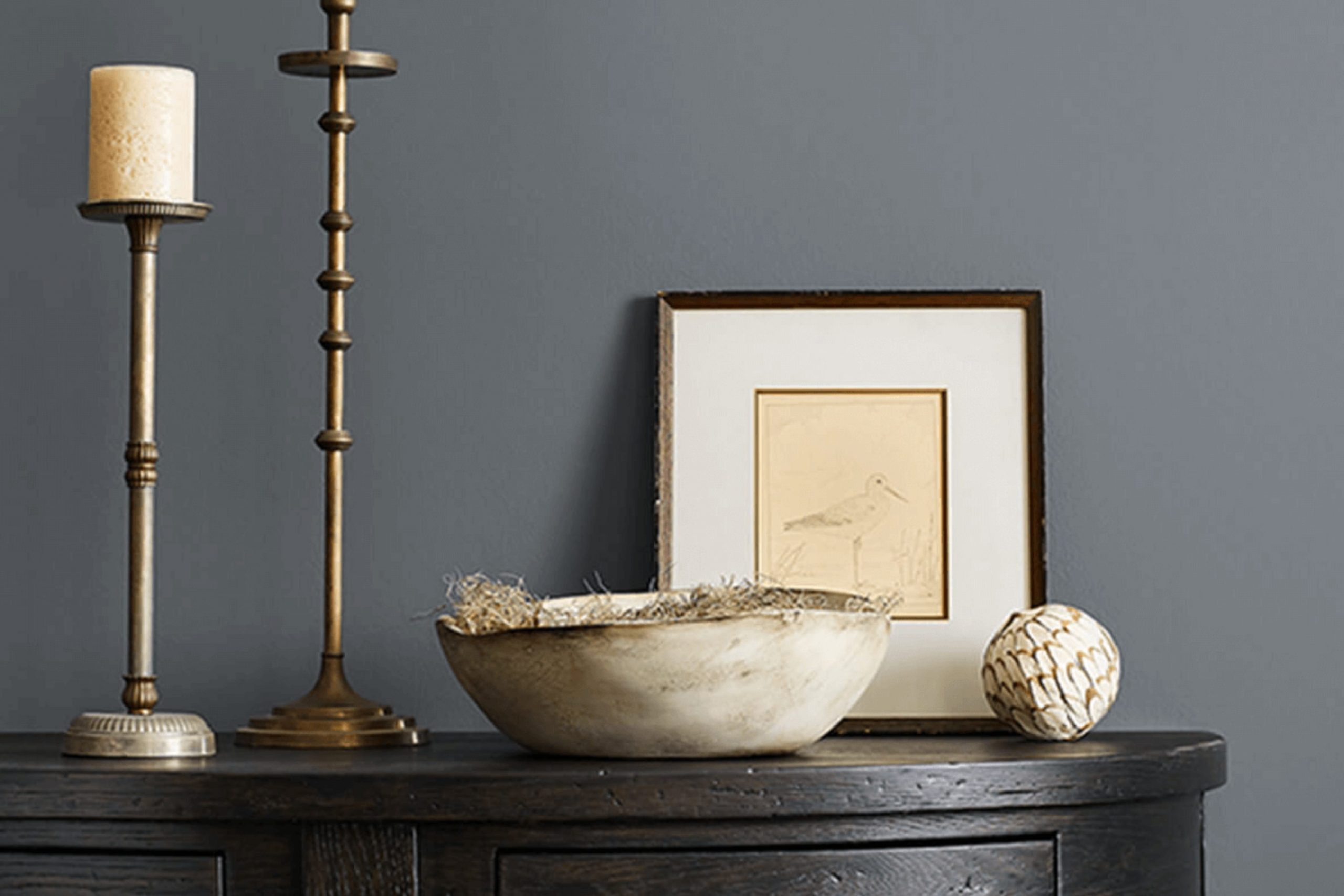
When I first laid eyes on Night Out, a color by Sherwin Williams, I was struck by its deep, intense tone that resembles a clear night sky. This paint color is rich and dark, with a velvety depth that almost seems to absorb light, giving walls a plush, luxurious feel.
In terms of interior styles, Night Out fits beautifully with modern and minimalist designs due to its bold simplicity. It also works well in industrial settings, where its depth can complement exposed metal fixtures and raw wood elements seamlessly.
I find that this color pairs best with natural materials and textures. In a room with Night Out walls, hardwood floors with a natural or light stain can create a stunning contrast, bringing warmth to balance the cool depth of the walls. Metals, particularly brushed nickel or stainless steel, also work wonderfully, providing a sleek, modern look that’s still quite cozy.
Soft furnishings in lighter hues like creams or soft grays can prevent the room from feeling too dark, while adding fabrics like velvet or silk will enrich the surroundings, absorbing the light and softening the room’s atmosphere.
Honestly, using Night Out is a bold choice but incredibly rewarding when styled thoughtfully. It’s the kind of color that can make a room feel intimate and personal, like a cozy retreat at the end of a long day.
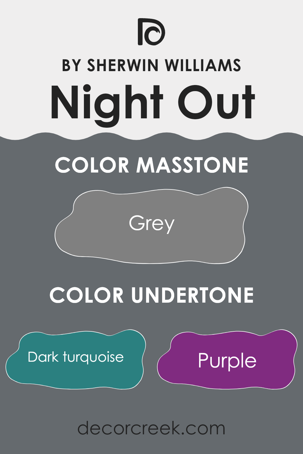
What are the right undertones of Night Out SW 9560 ?
Night Out by Sherwin Williams is a unique paint color that carries multiple undertones, which can subtly or noticeably shift its appearance under different lighting conditions or when paired with various decor elements. Undertones are secondary colors that influence the primary color, affecting how it looks on interior walls.
When considering undertones like dark turquoise, purple, and navy, these cool tones can make Night Out feel cooler, perfect for creating a calm, soothing atmosphere in a room. On the other hand, warmer undertones such as brown, orange, and red add a sense of warmth to the paint, making an interior feel more inviting and cozy.
Decorating with Night Out means paying attention to these undertones. In a room with plenty of natural light, cooler undertones like blue and mint might become more noticeable, giving the walls a vibrant, fresh look. In contrast, in an interior with less light or at night under artificial lighting, warmer undertones like brown or olive might stand out, providing rich depth to the room.
The impact of these undertones is significant on interior walls, as they can complement or clash with the room’s furniture, fabrics, and decorative items. For example, furniture in light woods or metallic finishes can highlight the cooler undertones like light turquoise and mint, whereas darker, rich wooden furniture might enhance warmer undertones like orange and red.
In thoughtful design, understanding and using the undertones of Night Out can help achieve a desired mood and style, ensuring the final design feels coherent and visually pleasing.
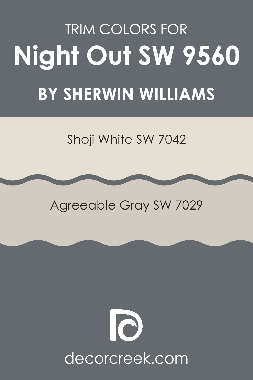
Trendy Trim Colors of Night Out SW 9560 by Sherwin Williams to use this year.
Trim colors are specific shades used to highlight or accentuate architectural features like door frames, window sills, and baseboards, setting them apart from main wall colors. When paired with a deep hue like Night Out by Sherwin Williams, trim colors should not only complement the main shade but also brighten and define the room effectively.
Shoji White and Agreeable Gray are ideal choices for this purpose, each offering a unique way to frame and enhance the overall aesthetic without feeling too heavy next to the boldness of the primary color.
Shoji White, a soft and clean off-white, provides a subtle contrast that can make darker shades like Night Out stand out, adding clarity and brightness to the room’s edges. On the other hand, Agreeable Gray is a warm and light gray that offers a slight yet noticeable contrast with richer and darker wall colors. This shade is excellent for softening transitions between colors and contributing to a balanced atmosphere while maintaining a fresh and modern look.
You can see recommended paint colors below:
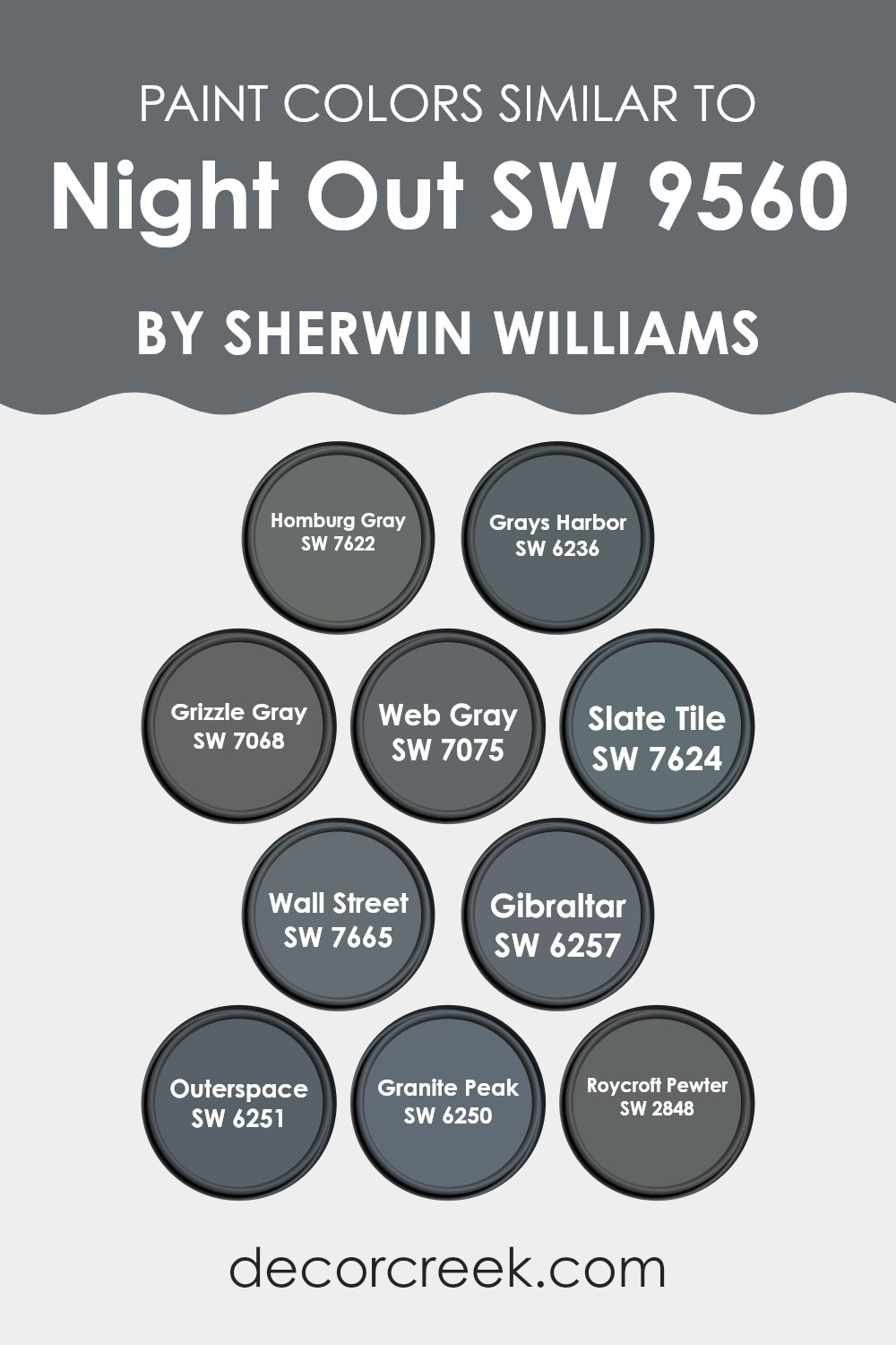
Evergreen Colors Similar to Night Out SW 9560 by Sherwin Williams
When choosing paint colors for a room, selecting shades that complement each other can create a harmonious and aesthetically pleasing environment. Similar colors, such as those close to Night Out by Sherwin Williams, work well together because they share a common hue, varying mostly in saturation or brightness. This subtle variance allows for a cohesive yet diverse appearance, enabling each color to contribute unique elements without clashing.
Colors like Homburg Gray and Grays Harbor, for instance, offer a soft, gentle gray shade that feels warm and inviting. Grizzle Gray and Web Gray deepen the atmosphere slightly, adding a touch of gravity and depth to rooms without feeling too heavy. Slate Tile and Wall Street lean toward a sturdier, more pronounced gray that anchors the room, providing a solid base for decor.
In a lighter vein, Gibraltar, Outerspace, and Granite Peak brighten interiors by introducing a bluish-gray tone that reflects more light and creates a sense of openness. Roycroft Pewter, with its slightly earthen gray, brings a hint of the outdoors inside, connecting interiors with natural elements. All these colors pair well, allowing for flexible design choices that can suit various personal tastes and styles, from modern minimalist to cozy traditional.
You can see recommended paint colors below:
- SW 7622 Homburg Gray
- SW 6236 Grays Harbor
- SW 7068 Grizzle Gray
- SW 7075 Web Gray
- SW 7624 Slate Tile
- SW 7665 Wall Street
- SW 6257 Gibraltar
- SW 6251 Outerspace
- SW 6250 Granite Peak
- SW 2848 Roycroft Pewter
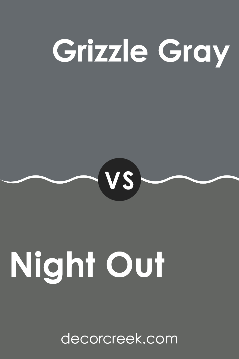
Night Out SW 9560 by Sherwin Williams vs Grizzle Gray SW 7068 by Sherwin Williams
Night Out and Grizzle Gray are both colors from Sherwin Williams that have their own unique appeal. Night Out is notably darker, resembling the color of a deep, dark evening sky. This shade can give a room a cozy and intimate feeling, making it perfect for areas designed for relaxation and comfort.
On the other hand, Grizzle Gray is a lighter shade of gray compared to Night Out. It has a more neutral tone, which makes it highly adaptable for various rooms. It brightens interiors more than Night Out and works well in areas you want to feel more open and airy.
Both colors can complement each other well in an interior, with Night Out adding depth and a sense of coziness, while Grizzle Gray can be used to soften and balance the darker tone with its lighter, calming gray hue. Each color brings its own unique mood, with Night Out leaning toward a more wrapping atmosphere and Grizzle Gray providing a lighter, balancing touch.
You can see recommended paint color below:
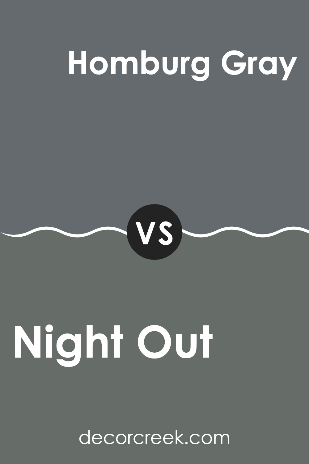
Night Out SW 9560 by Sherwin Williams vs Homburg Gray SW 7622 by Sherwin Williams
Night Out and Homburg Gray, both by Sherwin Williams, offer distinct moods for any interior. Night Out is a deep, near-black hue with a strong presence. It’s perfect for creating a striking and bold look in areas like dining rooms or accent walls. This color tends to give a dramatic flair and can pair nicely with bright decorations or furniture to balance its intensity.
On the other hand, Homburg Gray is much lighter, sitting comfortably in the realm of medium grays. This color has a cooler undertone and brings a more reserved, classic feel to rooms. It works well in various types of interiors, providing a calm, neutral background that complements a wide range of decor styles.
Both colors are adaptable and stylish, but Night Out makes a more assertive statement, while Homburg Gray offers a subtle and grounded atmosphere. When choosing between the two, consider the mood you want to achieve and the amount of natural light in your interior, as both factors can influence how these colors appear in your environment.
You can see recommended paint color below:
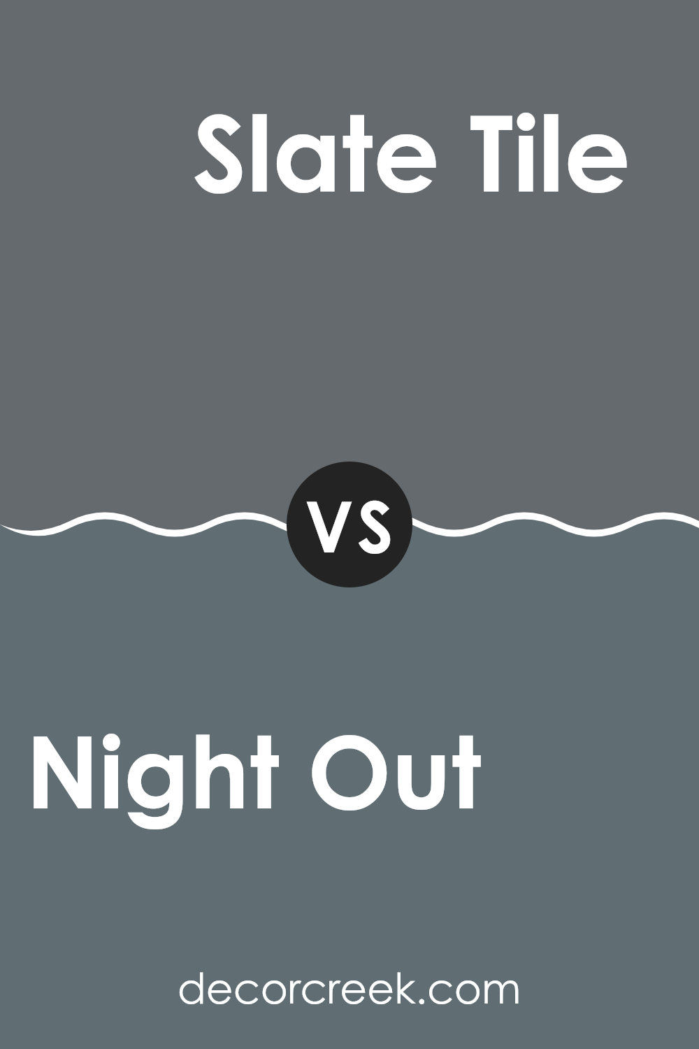
Night Out SW 9560 by Sherwin Williams vs Slate Tile SW 7624 by Sherwin Williams
Night Out and Slate Tile by Sherwin Williams are two distinctive shades of blue that each offer a unique vibe for interior spaces. Night Out is a deep, bold blue with a hint of teal, making it an intense and eye-catching color.
It’s perfect for creating a statement wall or for use in rooms that need a pop of color. In contrast, Slate Tile is a more reserved shade. This color leans toward a muted, smoky blue with gray undertones, giving it a more subdued appearance compared to Night Out.
Slate Tile works well in areas where you want to maintain a calm and understated look, such as bedrooms or offices. Both colors are adaptable and can complement various decor styles, but the choice between them depends on whether you’re looking for something striking or something more laid-back.
You can see recommended paint color below:
Night Out SW 9560 by Sherwin Williams vs Wall Street SW 7665 by Sherwin Williams
Night Out and Wall Street, both by Sherwin Williams, are darker shades, but they have distinctive tones that set them apart. Night Out is a deep, dark blue, almost mirroring the color you’d see in the sky on a clear evening.
It has a calm and subtle quality without being too bold. In contrast, Wall Street leans toward a grayish-blue, resembling the hue of a stormy sea or a cityscape under overcast skies. It’s a bit lighter than Night Out and carries a more neutral vibe, making it adaptable for various interiors.
Night Out might be preferred for a dramatic look or an accent wall, while Wall Street works well for creating a more subdued, professional atmosphere. Both colors can effectively enrich a room, depending on the desired impact and surrounding decor.
You can see recommended paint color below:
Night Out SW 9560 by Sherwin Williams vs Web Gray SW 7075 by Sherwin Williams
The main color, Night Out, and the second color, Web Gray, both from Sherwin Williams, offer distinct shades that can greatly influence the mood and style of a room. Night Out is a deep, rich navy blue that brings a strong and bold feel to interiors, making it ideal for creating a striking accent wall or for use in a room where a sense of drama and character is desired.
On the other hand, Web Gray is a cooler, mid-tone gray with a subtle hint of blue. This color is more restrained and neutral, making it easier to pair with a wide variety of decor elements. It’s perfect for those looking for a color that grounds a room without overpowering it.
While Night Out adds depth and a more pronounced statement, Web Gray offers a softer, more flexible backdrop to a room. Both colors can work well in modern home decor, but the choice between the two would depend on the desired impact and the specific nuances of the room’s purpose and lighting.
You can see recommended paint color below:
Night Out SW 9560 by Sherwin Williams vs Grays Harbor SW 6236 by Sherwin Williams
Night Out and Grays Harbor, both by Sherwin Williams, are two distinct shades of gray that offer unique vibes for any interior. Night Out is a deeper tone, almost stepping into the realm of charcoal. It’s a bold color that can make quite a statement in both large and small rooms alike. On the other hand, Grays Harbor is a lighter gray that carries a subtle blue undertone. This makes it an adaptable choice, fitting well in various settings and creating a calm, refreshing look.
If you’re aiming for a strong, powerful feel, Night Out is an excellent choice. Its darker hue works well in an interior designed to have a more grounded, profound aesthetic. Grays Harbor, with its softer and slightly bluish tint, is more forgiving and can help brighten rooms without feeling too intense.
Both colors work well with modern and traditional decor, depending on the accompanying elements like furniture and accents. Deciding between them depends on the mood you want to set and the natural lighting of your room.
You can see recommended paint color below:
Night Out SW 9560 by Sherwin Williams vs Roycroft Pewter SW 2848 by Sherwin Williams
Night Out and Roycroft Pewter are two colors by Sherwin Williams that both bring their unique vibes to any interior. Night Out is a deep, rich blue that has a bold presence. It’s perfect for creating a striking feature wall or making a room feel more cozy and intimate. It pairs especially well with bright whites or soft grays for a modern look.
On the other hand, Roycroft Pewter is a warm, earthy gray with subtle brown undertones. This color is more understated and is excellent for giving rooms a grounded, calm feeling. It works beautifully in interiors that aim for a classic appearance, fitting in seamlessly with a variety of decor styles, from rustic to contemporary.
Both colors offer distinct atmospheres: Night Out adds drama and intensity, while Roycroft Pewter provides a soothing, warm backdrop. Choosing between them would depend on the mood you’re looking to create in your interior.
You can see recommended paint color below:
Night Out SW 9560 by Sherwin Williams vs Outerspace SW 6251 by Sherwin Williams
The two paint shades Night Out and Outerspace, both from Sherwin Williams, offer distinct vibes for any room. Night Out is a very dark shade, close to black. It gives a bold, strong feel to an interior and can be a great choice if you want to make a dramatic statement. It can make small rooms feel cozy or large ones feel more enclosed and intimate.
Outerspace, on the other hand, is a deep charcoal gray that’s not quite as intense as Night Out. It’s softer and more adaptable, able to blend in more easily with different decor styles. It adds a touch of depth to an interior without the heaviness associated with darker colors like Night Out.
Both colors are great for modern looks, but your choice might depend on how striking you want your room to be. Outerspace is more likely to fit smoothly with various color schemes, while Night Out demands attention and careful pairing to balance its intensity.
You can see recommended paint color below:

Night Out SW 9560 by Sherwin Williams vs Granite Peak SW 6250 by Sherwin Williams
Night Out and Granite Peak, both from Sherwin Williams, are distinct in their tones and the ambiance they create. Night Out is a deep, dark blue that has a subtle hint of navy, making it perfect for creating a cozy and intimate setting in a room. It can give a feeling of privacy and retreat while still retaining a touch of elegance and modernity.
Granite Peak, on the other hand, is a medium-gray shade that carries a strong, stable look. It doesn’t lean too heavily toward a stark or cold gray, but instead offers a balanced, neutral backdrop that can easily complement a wide range of decor styles and colors. This color can be particularly useful in rooms where you want flexibility in choosing accent colors or where you prefer a more understated, enduring feel.
Both colors are flexible and can be used in many parts of a home, from bedrooms to offices, yet they each bring their distinctive character to the environments they are used in.
You can see recommended paint color below:
Night Out SW 9560 by Sherwin Williams vs Gibraltar SW 6257 by Sherwin Williams
Night Out and Gibraltar, both from Sherwin Williams, offer unique tones that cater to different moods and styles. Night Out is a deep, rich navy blue that gives off a cozy, secure feeling. It’s perfect for creating a strong presence in a room, making interiors feel more intimate and sheltered. This color can work well in a bedroom or living area where a calming, yet grounded atmosphere is desired.
On the other hand, Gibraltar is a softer, medium shade of grayish-blue. It’s lighter than Night Out, providing a more relaxed vibe that’s adaptable for various settings. Gibraltar can help brighten a room while still bringing depth and interest with its subtle blue undertones.
It pairs well with a wider range of colors and is easier to match with furniture and decor, making it a great choice for someone looking to maintain a lighter, airier feel in their interiors. Both colors are a great choice, depending on what atmosphere you want to achieve in your room.
You can see recommended paint color below:
After reading about the paint color SW 9560 Night Out by Sherwin Williams, I’ve learned quite a bit about how unique this color is. SW 9560 Night Out is a dark, rich shade that looks like the night sky. Using this color in a room can make it feel cozy and interesting, like having a little piece of the night inside.
This color is great for rooms where you want to relax, like a bedroom or a reading nook. It also adds a touch of elegance to places where you have friends over, like a living room. If you pair it with bright colors or shiny metals, it looks even cooler. But it’s also lovely with softer colors, making the whole room feel warm and welcoming.
Overall, SW 9560 Night Out by Sherwin Williams is not just another black paint. It makes every area it’s used in feel unique, comfortable, and very pretty. It shows that you can use dark colors in your home without making it look too heavy or small. I think it’s perfect for anyone looking to make their home a little more special.
decorcreek.com
Ever wished paint sampling was as easy as sticking a sticker? Guess what? Now it is! Discover Samplize's unique Peel & Stick samples.
Get paint samples

