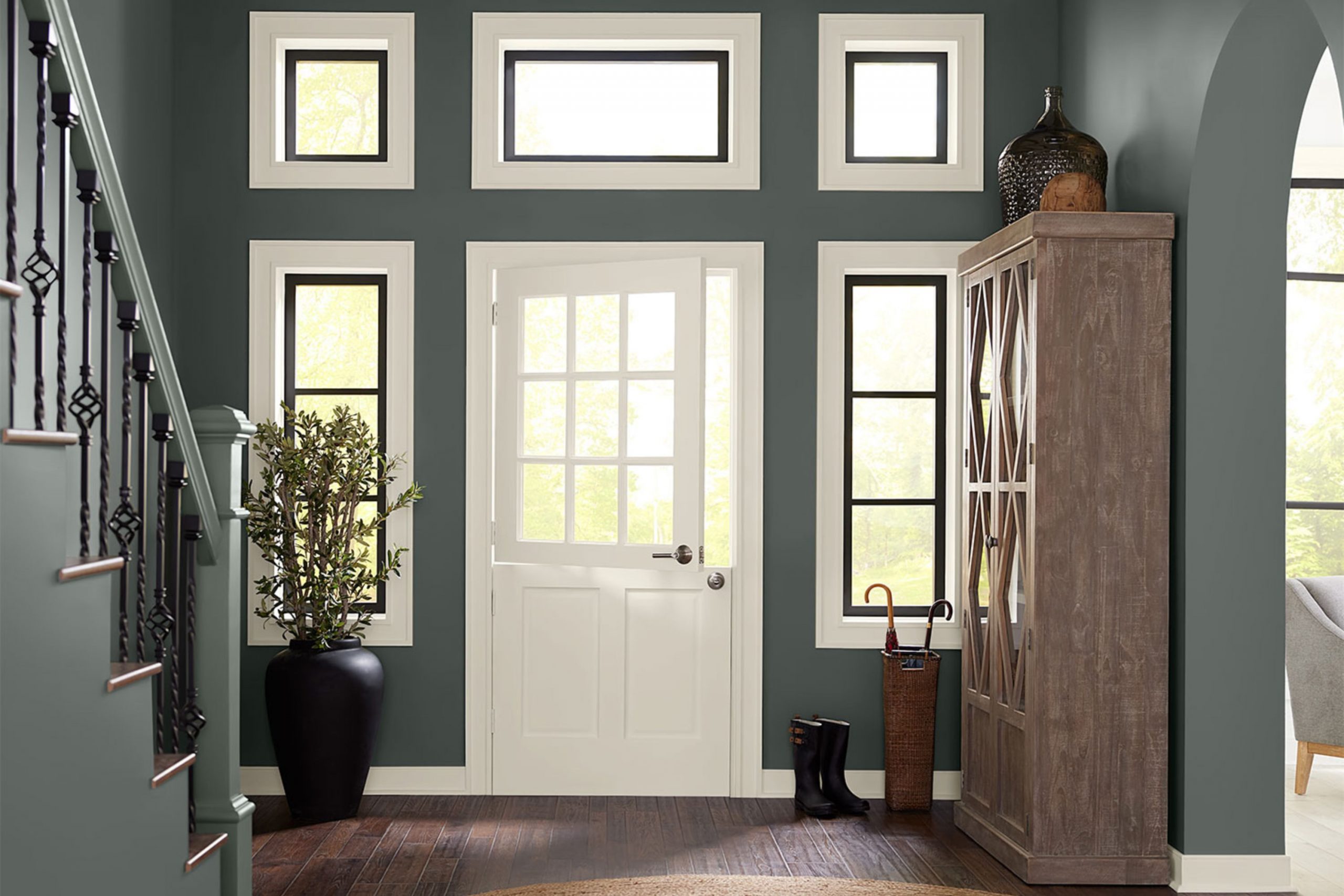
If you’re thinking about giving your interior a fresh coat of paint, you might be considering SW 7622 Homburg Gray by Sherwin Williams. As someone who has used this color in various projects, I’d like to share a few insights that could help you make a more informed decision. Homburg Gray is a flexible shade that lends a refined touch to any room, striking a beautiful balance between warm and cool tones. This makes it especially adaptable to different lighting setups and decor styles, from modern to traditional.
Before you commit to painting your walls with Homburg Gray, it’s important to understand how this color behaves under various lighting conditions. Natural light brings out its cool undertones, while artificial lighting can enhance its warmer qualities. I recommend testing the color in different areas of your room to see how it changes throughout the day.
Also, consider the existing elements in your interior like flooring, furnishings, and fabrics. Homburg Gray pairs well with a wide range of colors, but you’ll want to make sure it complements other hues in your decor.
Choosing the right paint color is a great step toward personalizing your interior, and with Homburg Gray, you have a shade that provides both flexibility and classic elegance.
Is Homburg Gray SW 7622 Right for My Home?
Homburg Gray is one of those colors that has a classic charm, feeling both warm and inviting. It’s a deep, moody gray that holds a hint of green, which gives it a unique twist compared to your standard gray. This shade is flexible; it fits naturally within various interior designs, whether adding depth to a minimalist style or complementing the rich textures of a traditional setting.
In my own home, I’ve found that this color works beautifully with natural materials. Think rich wooden furniture that brings out its warm undertones, or leather accents that contrast its depth with their buttery softness. I also love pairing it with metallic finishes like brass or copper for a touch of refinement.
When it comes to interior styles, Homburg Gray shines in settings that call for a bit of drama and coziness. It’s perfect in a study or a cozy reading nook, where its subdued hue helps create a focused and calm atmosphere. I particularly enjoy how it looks in the evening under soft lighting; it adds so much character to the room.
In summary, if you’re looking for a color that is both grounding and full of depth, Homburg Gray is a wonderful choice. It works hand in hand with a range of materials and textures, making it a delightful addition to any home looking to enhance its aesthetics with a touch of unique warmth.
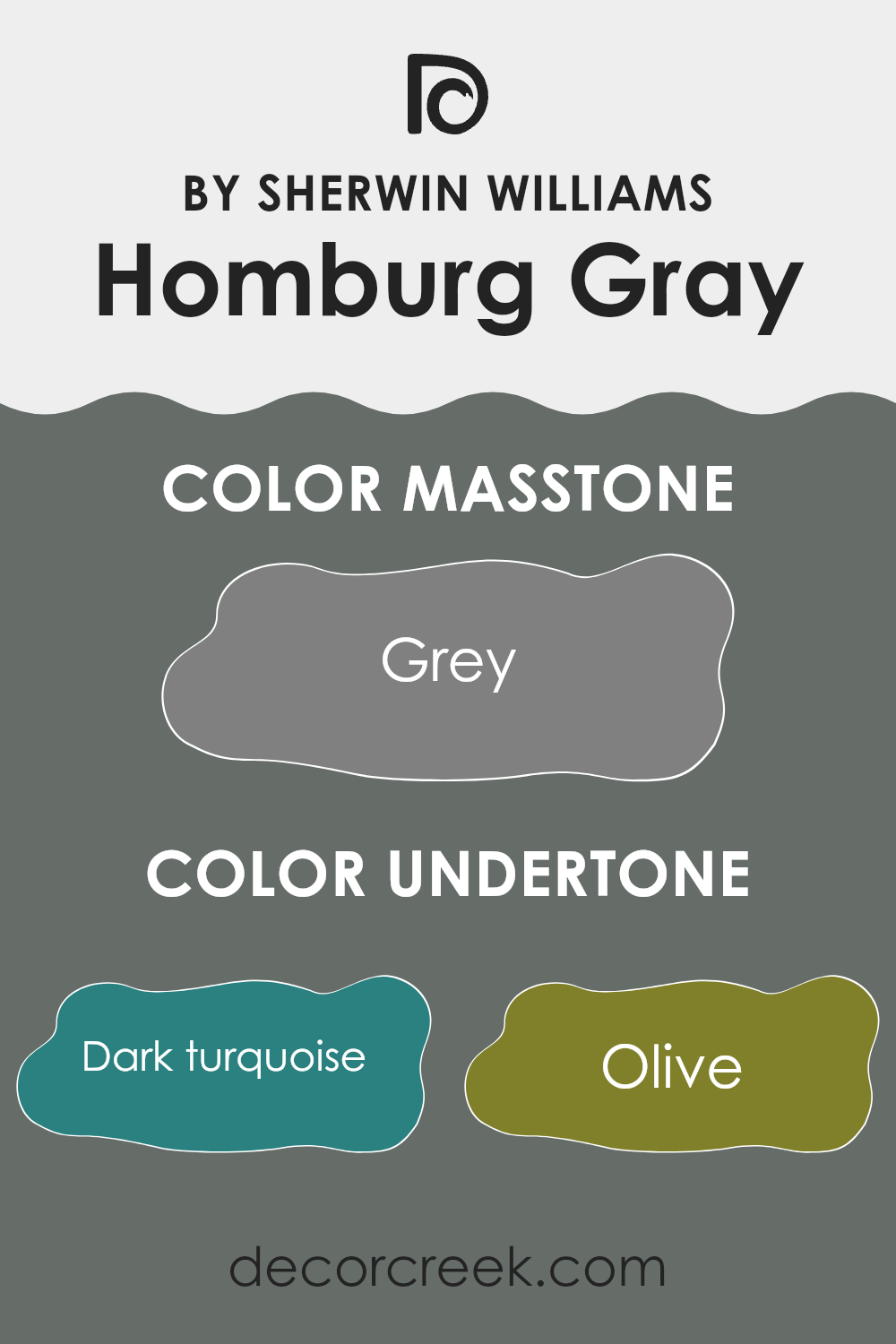
What are the right undertones of Homburg Gray SW 7622 ?
Homburg Gray SW 7622 is a flexible paint color that can add depth and complexity to any room because of its rich undertones. Undertones are subtle colors that influence the main color, affecting how it appears under different lighting conditions and when paired with other colors. Homburg Gray, although named as a gray, actually reflects a mixture of colors including dark turquoise, olive, purple, and many others, making it highly adaptable.
When you paint a wall with a color like Homburg Gray, its undertones subtly influence the atmosphere in the room. For instance, the dark turquoise and dark green undertones can bring a hint of nature and freshness, providing a calming effect. On the other hand, the hints of purple and navy can give a sense of depth and richness. This complexity can make Homburg Gray feel warm or cool depending on the lighting and the colors around it.
In interior design, using Homburg Gray on walls can be especially effective in rooms where you want a neutral backdrop that still offers a touch of color complexity. This can help in creating a more interesting and aesthetically pleasing interior. Since it has both warm and cool undertones—from brown and red to blue and mint—it can easily complement a wide range of accent colors, enhancing the overall decor without feeling too strong. Thus, this color is suitable for many different rooms, offering flexibility in interior design choices.
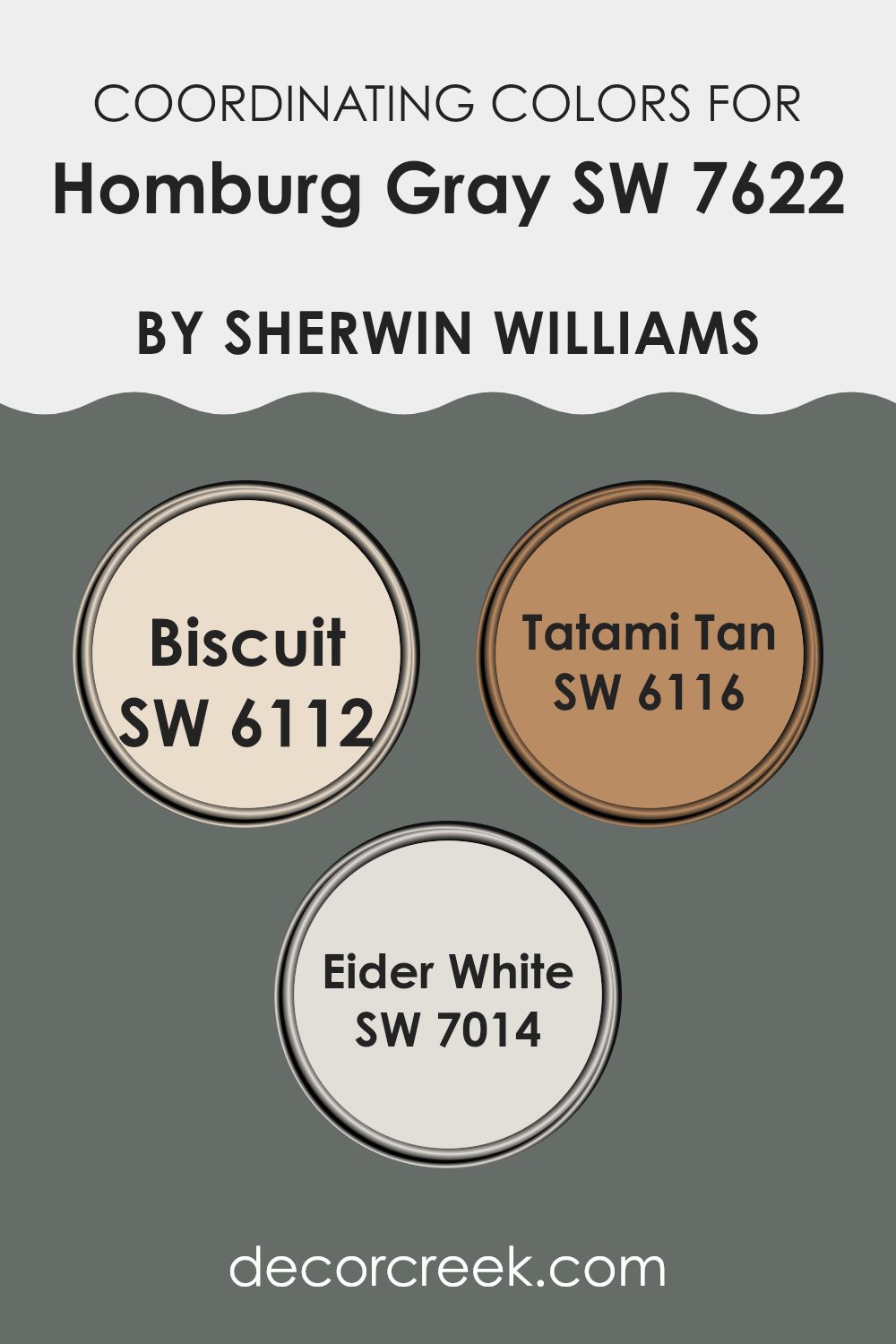
Best Coordinating Colors to use with Homburg Gray SW 7622 by Sherwin Williams this year.
Coordinating colors are those that complement each other when used together in a design or décor scheme. The idea is to create a visually appealing balance, making your interior feel harmonious without any single color feeling too strong compared to the others. For example, Homburg Gray by Sherwin Williams can be beautifully paired with shades like Biscuit, Tatami Tan, and Eider White, each of which coordinates well to offer a pleasant range that adds depth and contrast.
Biscuit is a warm, creamy color that lends a soft and inviting feel to an interior. It works well to create a gentle backdrop that makes the richness of Homburg Gray stand out. Next, Tatami Tan is a deeper, earthier hue than Biscuit, providing a grounded, soothing effect that pairs effortlessly with the cooler undertones of Homburg Gray, bringing a natural balance to the palette.
Lastly, Eider White is a crisp, clean shade that offers a fresh contrast to the more muted tones of the other colors. It’s ideal for trim or accents that highlight the depth of Homburg Gray and the warmth of the tan and biscuit shades, making the entire combination feel cohesive and thoughtfully curated.
You can see recommended paint colors below:
Trendy Trim Colors of Homburg Gray SW 7622 by Sherwin Williams to use this year.
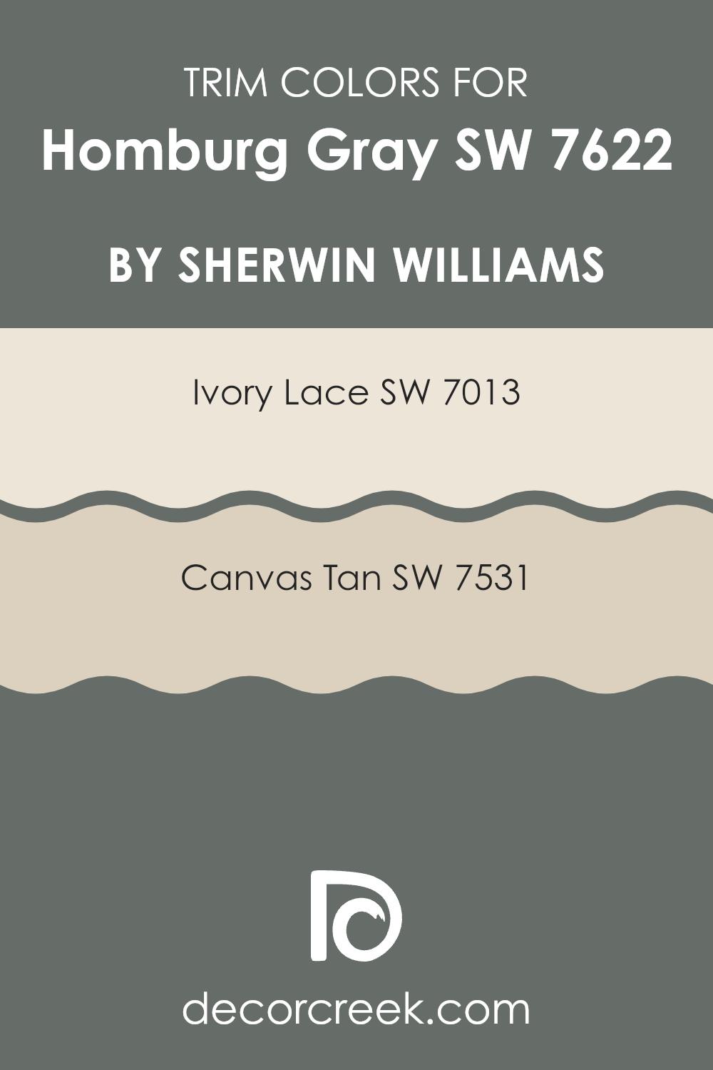
Trim colors are used to highlight architectural details and create a polished, cohesive look in a home. They frame and accentuate areas like doorways, windows, and baseboards, effectively defining the room while adding a layer of visual interest. For a flexible color like Homburg Gray by Sherwin Williams, choosing the right trim colors is crucial as it helps in achieving either a subtle or striking contrast, depending on the hue selected. Trim colors like Ivory Lace and Canvas Tan pair beautifully with Homburg Gray, balancing the gray’s cool tone with their warmer, softer qualities.
Ivory Lace is a warm, off-white paint color that brings a gentle brightness to trim, nicely offsetting the deeper tones of Homburg Gray. It adds a light, refreshing touch without feeling too strong next to the primary color, making rooms appear more open and airy.
Canvas Tan, on the other hand, is a mid-tone tan that offers an earthy richness, creating a smooth transition between Homburg Gray walls and the trim. It gives a calming, natural backdrop that works well in rooms that aim for a grounded, harmonious aesthetic. Together, these trim colors enhance the overall look of an interior painted with Homburg Gray, providing aesthetically agreeable and visually effective accents.
You can see recommended paint colors below:
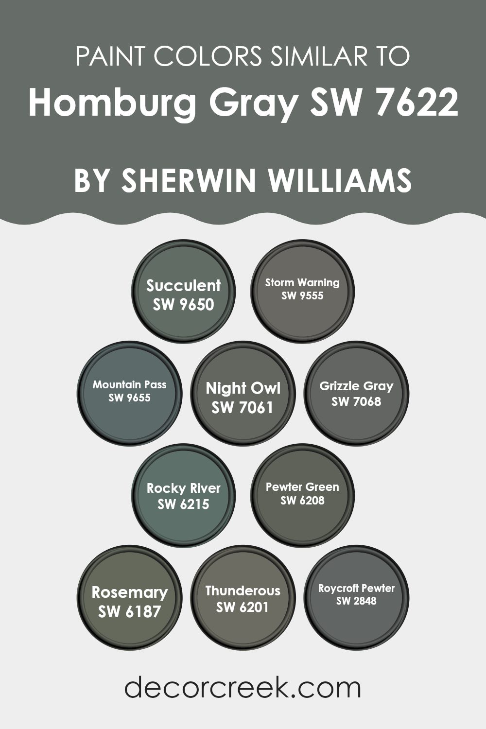
Evergreen Colors Similar to Homburg Gray SW 7622 by Sherwin Williams
Similar colors play a significant role in design by creating a harmonious and cohesive look. When colors such as the various shades related to Homburg Gray by Sherwin Williams are used together, they provide a subtle variation that adds depth and interest without a jarring contrast. These similar shades, ranging from deeper greens to soft grays, work well because they share common undertones that make the transitions between them feel smooth and natural. For example, using a more muted color next to a slightly brighter one can highlight areas of a room without feeling too strong on the senses.
Starting with SW 9650 – Succulent, one finds a deep, calming green that can act as a sturdy background or an accent. SW 9555 – Storm Warning offers a richer, shadowy hue that often appears almost slate-like. SW 9655 – Mountain Pass has an earthy, woodland appeal, often blending green and gray to mirror a misty morning hike. Its counterpart, SW 7061 – Night Owl, is a darker gray that echoes the quiet of late evenings. SW 7068 – Grizzle Gray is a robust medium gray with a presence that anchors interiors well.
The river-inspired SW 6215 – Rocky River brings a strong yet subdued blue-green into the mix, while SW 6208 – Pewter Green stands out as a smoky green with depth. SW 6187 – Rosemary tilts toward an organic feel, reminiscent of the herb after which it is named. Lastly, SW 6201 – Thunderous acts as a stormy sky gray, and SW 2848 – Roycroft Pewter, with its artisanal pewter vibe, rounds out the selection with a rich metallic undertone. These colors, by sharing similar levels of saturation and brightness, work together seamlessly, providing multiple options for creating soothing rooms with a cohesive color palette.
You can see recommended paint colors below:
- SW 9650 Succulent
- SW 9555 Storm Warning
- SW 9655 Mountain Pass
- SW 7061 Night Owl
- SW 7068 Grizzle Gray
- SW 6215 Rocky River
- SW 6208 Pewter Green
- SW 6187 Rosemary
- SW 6201 Thunderous
- SW 2848 Roycroft Pewter
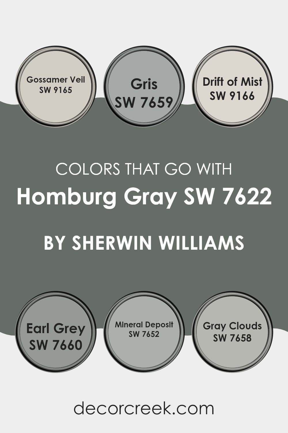
Colors that Go With Homburg Gray SW 7622 by Sherwin Williams
Choosing the right colors to complement Homburg Gray SW 7622 by Sherwin Williams is crucial in achieving a harmonious and appealing look in any interior. When paired with similar hues, such as Gossamer Veil, Gris, Drift of Mist, Earl Grey, Mineral Deposit, and Gray Clouds, you create a cohesive and calming atmosphere. These colors blend well because they share gray undertones, which helps unify a room’s aesthetic without overpowering the sense of calm that gray typically offers.
Gossamer Veil is a soft neutral that provides a light and airy feel, perfect for making smaller rooms appear larger. Gris is slightly darker, adding a touch of subtle contrast that can help define areas within an open floor plan. Drift of Mist is another gentle color, excellent for creating a seamless look when used on walls and ceilings.
Earl Grey offers a bolder option, lending a touch of drama that works beautifully for accent walls or furniture. Mineral Deposit has a hint of blue, giving a cool, refreshing vibe that pairs wonderfully with warmer accents. Lastly, Gray Clouds are slightly warmer and can add a cozy feel to a room, ideal for living areas or bedrooms where comfort is key. Each of these colors supports and complements the base tone of Homburg Gray, ensuring a polished and inviting environment.
You can see recommended paint colors below:
- SW 9165 Gossamer Veil
- SW 7659 Gris
- SW 9166 Drift of Mist
- SW 7660 Earl Grey
- SW 7652 Mineral Deposit
- SW 7658 Gray Clouds
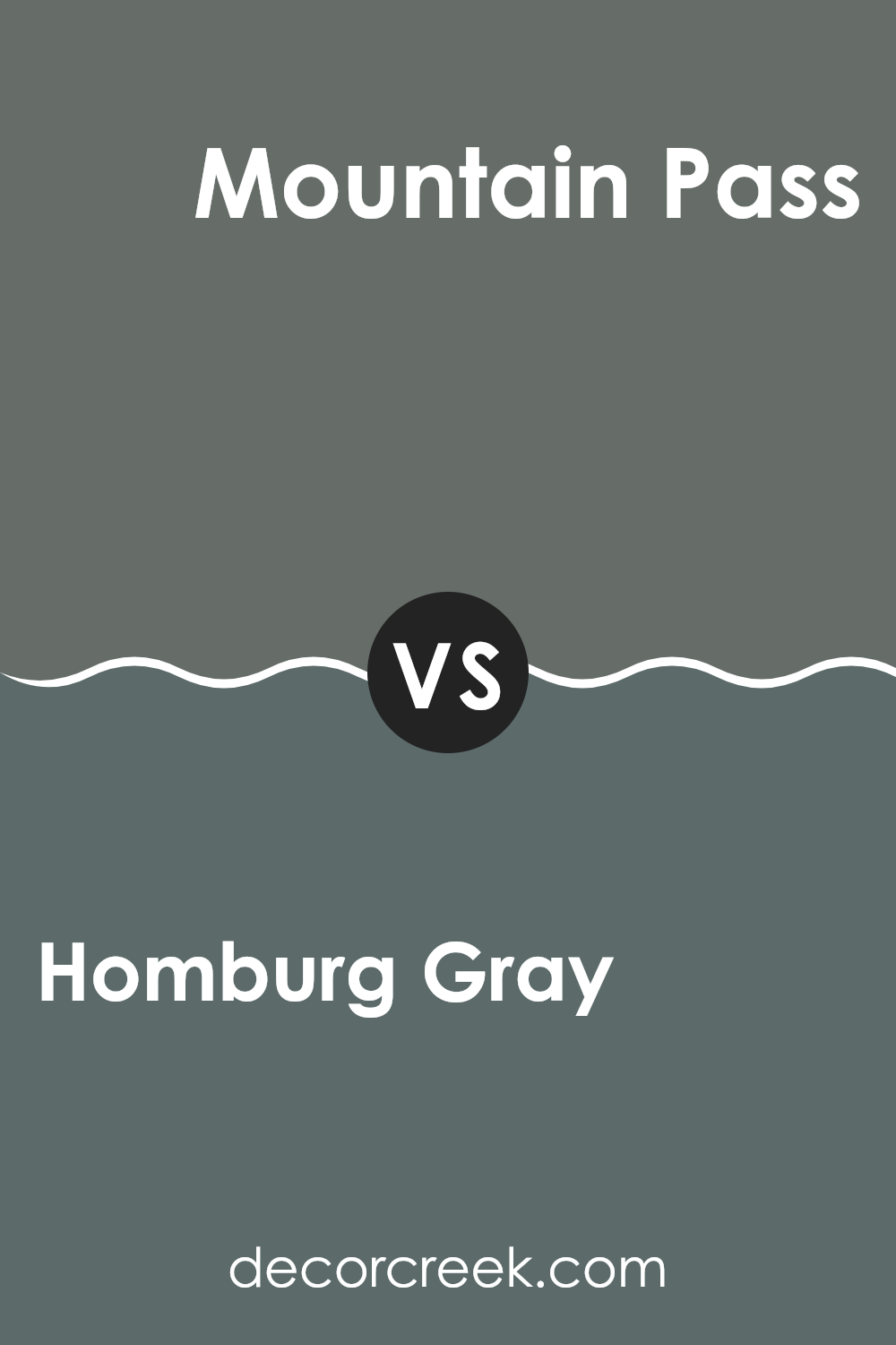
Homburg Gray SW 7622 by Sherwin Williams vs Mountain Pass SW 9655 by Sherwin Williams
Homburg Gray and Mountain Pass are two distinct colors by Sherwin Williams, each bringing a unique vibe to an interior. Homburg Gray is a deep, warm gray with a hint of green, making it cozy and welcoming.
It’s perfect for creating a comforting atmosphere in rooms like the living room or bedroom. On the other hand, Mountain Pass is a darker shade that leans more toward a forest green. It’s bold and strong, ideal for making a statement in an entryway or on an accent wall.
While Homburg Gray is more subtle and understated, Mountain Pass stands out and grabs attention. Both colors can work beautifully in a home, depending on whether you want a more muted backdrop or a dramatic focal point.
You can see recommended paint color below:
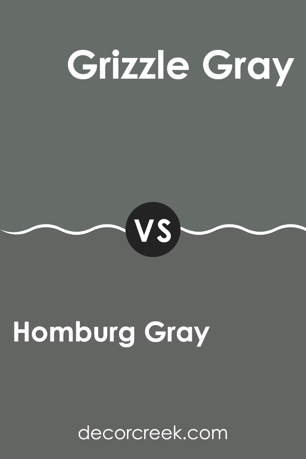
Homburg Gray SW 7622 by Sherwin Williams vs Grizzle Gray SW 7068 by Sherwin Williams
Homburg Gray and Grizzle Gray, both from Sherwin Williams, present unique shades for different decorating needs. Homburg Gray leans slightly toward blue, giving it a cooler, more understated appearance. This makes it ideal for creating a calm, subtle background in a room, especially in areas meant for relaxation or concentration.
On the other hand, Grizzle Gray has a deeper, more pronounced presence with its darker, almost charcoal-like tone. This color is perfect for making a bold statement in an interior, whether it’s an accent wall or used for exterior trim. It stands out more compared to Homburg Gray and can bring a strong, grounding effect to a room.
Both colors offer distinct vibes and can noticeably shift the mood and style of a room depending on how they are used. Homburg Gray works well in softer, more light-filled rooms, whereas Grizzle Gray thrives in settings where a powerful, impactful impression is desired.
You can see recommended paint color below:
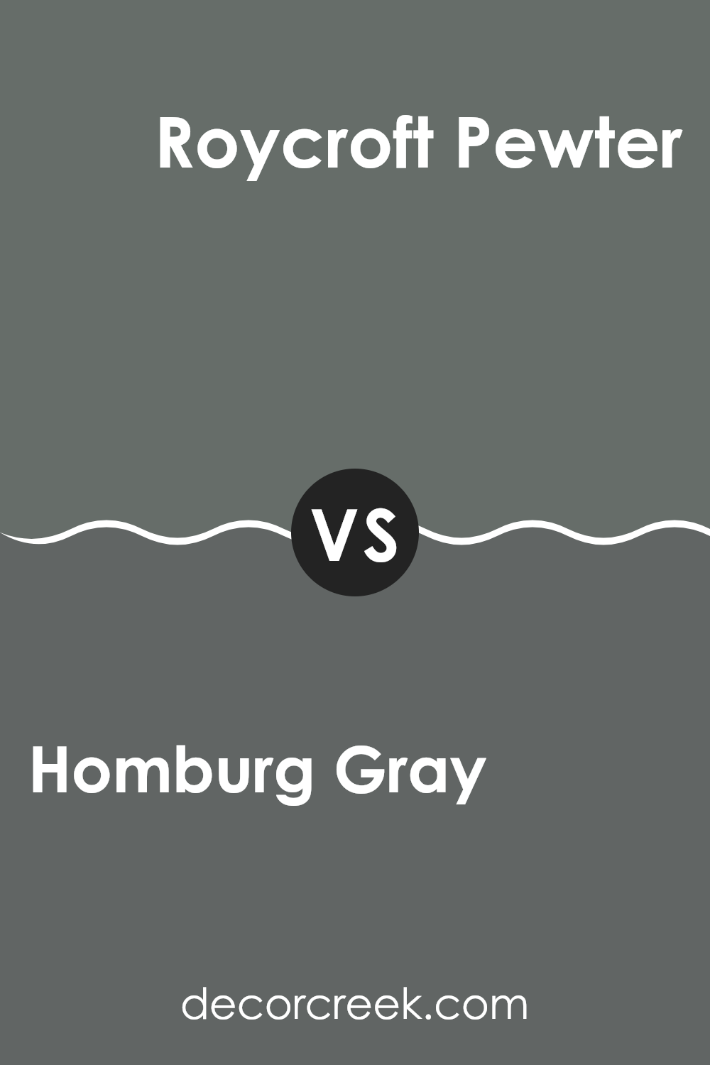
Homburg Gray SW 7622 by Sherwin Williams vs Roycroft Pewter SW 2848 by Sherwin Williams
Homburg Gray and Roycroft Pewter are both neutral shades from Sherwin Williams, but they each offer distinct vibes for room settings. Homburg Gray is a deep, smoky gray with blue undertones. It can set a calm and somewhat cooler tone to an interior, making it ideal for a modern look in living rooms or offices. It pairs well with crisp whites or vibrant colors for contrast.
On the other hand, Roycroft Pewter is a darker gray that borders on being a soft black. It has warmer undertones compared to Homburg Gray, giving a cozy feel to interiors. This shade is great for creating a snug and inviting atmosphere, perfect for dens or bedrooms. When matched with softer, lighter colors, it can make a room feel grounded yet airy.
In summary, while both colors are grays, Homburg Gray leans cooler and is lighter, making interiors feel fresh. Roycroft Pewter, being darker and warmer, offers a more comforting and homey touch.
You can see recommended paint color below:
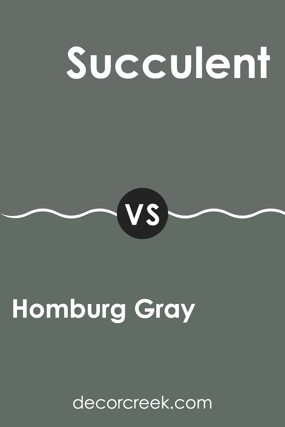
Homburg Gray SW 7622 by Sherwin Williams vs Succulent SW 9650 by Sherwin Williams
Homburg Gray and Succulent are two distinct colors from Sherwin Williams. Homburg Gray is a deep, solid gray that evokes an almost classic, enduring feel. It’s a flexible color that works well in many rooms, offering a strong foundation that complements various decor styles.
In contrast, Succulent is a vibrant, fresh green that brings a lively zest to any interior. It suggests growth and vitality, making it ideal for creating a cheerful, inviting environment.
While Homburg Gray provides a steady, calm base, Succulent adds a burst of energy and brightness, ideal for accent walls or rooms that benefit from a splash of color. Together, these colors can create a balanced, visually interesting palette that combines stability with vibrancy.
You can see recommended paint color below:
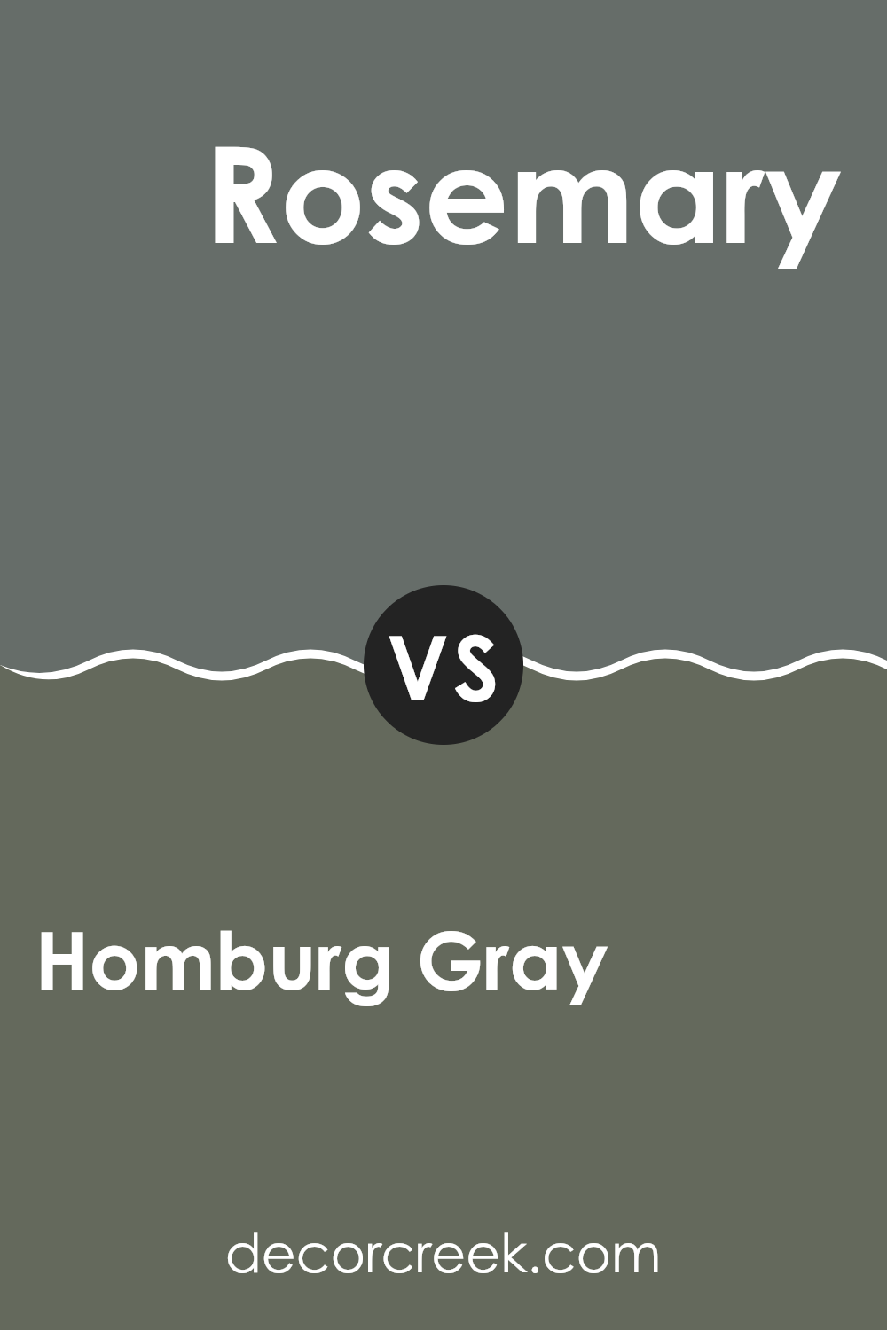
Homburg Gray SW 7622 by Sherwin Williams vs Rosemary SW 6187 by Sherwin Williams
Homburg Gray and Rosemary are two distinctly different colors offered by Sherwin Williams. Homburg Gray is a dark, cool gray with subtle blue undertones. It presents a solid and muted appearance, serving as a flexible backdrop suitable for various settings, from modern offices to cozy living rooms.
In contrast, Rosemary is a deep, earthy green with rich, slightly muted tones that bring to mind natural elements like forests or moss-covered stones. This color generates warmth and is perfect for rooms where a connection to nature or a hint of rustic charm is desired.
Used in different environments, Homburg Gray can create a calm, understated vibe, making rooms appear more open and airy, while Rosemary tends to make interiors feel closer and more intimate, wrapping them in its comforting hue. Both colors offer unique aesthetics and can significantly influence the mood and style of an interior.
You can see recommended paint color below:
Homburg Gray SW 7622 by Sherwin Williams vs Thunderous SW 6201 by Sherwin Williams
The main color, Homburg Gray, is a deep, warm gray with subtle green undertones. It offers a cozy feel and can give a room a grounded, stable look. This color works well in interiors that need a solid, comforting presence without being too dark or feeling too heavy.
In contrast, Thunderous is a lighter gray that leans toward a cooler tone. It has more of a neutral-gray base compared to Homburg Gray, making it flexible for various settings. It’s excellent for creating a calm and inviting atmosphere, providing a soft backdrop that complements brighter colors and furnishings.
When comparing these two, Homburg Gray is better for adding depth and warmth, especially in areas like living rooms or bedrooms. Thunderous, however, is ideal for those wanting a lighter, airier feel, suitable for smaller rooms or interiors needing a more open appearance. Both colors offer unique advantages depending on your room and styling needs.
You can see recommended paint color below:
- SW 6201 Thunderous
Homburg Gray SW 7622 by Sherwin Williams vs Rocky River SW 6215 by Sherwin Williams
Homburg Gray and Rocky River are both colors by Sherwin Williams, but they offer distinct vibes for interior settings. Homburg Gray is a dark, smokey gray with blue undertones that make it a solid choice for an elegant yet muted backdrop in any room. It pairs nicely with softer whites or vibrant colors for a striking contrast.
On the other hand, Rocky River stands out as a deep teal that leans toward a greenish-blue hue. This color is bold and can make a strong statement when used in home decor. It works well in interiors that aim to have a lively yet cozy atmosphere, popping against light neutrals or complementary warmer tones.
Overall, while both colors are dark and can be used as accent walls or for cabinet colors, Homburg Gray offers a more neutral palette, making it highly adaptable across various styles. Rocky River, with its rich depth, tends to command more attention and sets a moodier tone.
You can see recommended paint color below:
- SW 6215 Rocky River
Homburg Gray SW 7622 by Sherwin Williams vs Night Owl SW 7061 by Sherwin Williams
Homburg Gray and Night Owl are both paint colors by Sherwin Williams, but they offer distinct vibes for room decor. Homburg Gray is a deep, warm gray with a hint of green. This makes it ideal for creating a cozy and welcoming atmosphere in rooms like living rooms or bedrooms. It pairs well with light woods and soft textiles, adding a gentle, calming feel to any area.
On the other hand, Night Owl is a cooler, darker gray that almost edges into soft black territory. This color is perfect for those who want to make a bold statement in their interior. It works especially well in modern settings, such as a home office or an accent wall in a minimalist bedroom. Night Owl pairs nicely with metallic finishes and vibrant accents, providing a strong backdrop that highlights other decor elements.
Both colors are flexible, but Homburg Gray leans toward a softer, warmer look, while Night Owl offers a sharper, more striking appeal.
You can see recommended paint color below:
Homburg Gray SW 7622 by Sherwin Williams vs Pewter Green SW 6208 by Sherwin Williams
The main color, Homburg Gray, is a muted shade that blends gray with subtle hints of green. Its understated quality makes it highly adaptable for decorating, able to fit well with a wide range of color schemes and decor styles. It’s particularly good for creating a cozy and low-key atmosphere in rooms like bedrooms or studies.
In contrast, Pewter Green is a darker, richer color that leans more distinctly toward green, imbuing rooms with a strong sense of depth and warmth. This color is excellent for adding character to a room, especially when used on accent walls or in areas where a touch of elegance is desired.
Both these colors allow for numerous creative choices in interior design, though their effects are quite different owing to their intensity and the amount of green each contains. Homburg Gray is subtler and more neutral, making it easier to combine with other colors, while Pewter Green offers a bolder statement and can serve as a focal point in a design scheme.
You can see recommended paint color below:
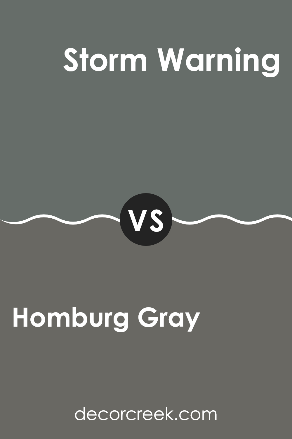
Homburg Gray SW 7622 by Sherwin Williams vs Storm Warning SW 9555 by Sherwin Williams
Homburg Gray and Storm Warning are both paints from Sherwin Williams, each offering a unique shade for walls. Homburg Gray is a deep, smoky gray with a hint of blue. This color tends to give interiors a calm and stable feel, making it ideal for rooms where relaxation or focus is desired.
On the other hand, Storm Warning is a darker, more intense color. It’s closer to a charcoal tone but has an underlying stormy blue that appears more prominently under certain lighting. This makes it an excellent choice for adding drama or a striking look to an interior.
Both colors provide a moody atmosphere but in slightly different ways. Homburg Gray is more subdued and flexible, fitting well in various room types including offices or living rooms. Storm Warning, being deeper and bolder, works great for accent walls or in interiors where you want to make a strong visual impact. This darker shade can make smaller rooms feel a bit tighter, so it’s best used in larger areas or well-lit interiors to avoid making the room feel cramped.
You can see recommended paint color below:
After taking a good look at SW 7622 Homburg Gray by Sherwin Williams, I think it’s a great paint color for anyone wanting to make their room feel cozy and stylish. Homburg Gray isn’t just any gray; it’s unique with a deep, warm vibe that makes any room feel more welcoming.
It’s perfect for a living room, bedroom, or even a kitchen. Plus, it pairs really well with lots of other colors and furniture styles, making it super easy to work with.
If you’re thinking of giving your room a new look, this color could be a fantastic choice. It’s kind of like a hug from your favorite warm blanket – comforting and always nice to come back to. So, if you want a color that’s calm, cool, and can make any room look good, Homburg Gray might just be the way to go. Happy painting!
Ever wished paint sampling was as easy as sticking a sticker? Guess what? Now it is! Discover Samplize's unique Peel & Stick samples.
Get paint samples

