When you’re picking a paint color for your home, the sheer number of options can be confusing. Sherwin Williams SW 7012 Creamy is one of those shades you might be considering, and I’d like to share a few things about it from my experience. This hue is more than just a basic beige; it has a warm, inviting undertone that can truly enhance the coziness of any room. Whether you’re thinking about refreshing your living room, bedroom, or even your kitchen, SW 7012 Creamy could be a great fit.
However, understanding how it behaves in different lighting conditions is crucial. In natural light, it tends to appear softer and more vibrant, while artificial lighting brings out its creamy depth. It’s also important to think about the colors of your furniture and décor, as they can influence how SW 7012 Creamy looks on your walls.
Matching it with contrasting or complementing colors can make a big difference in the final look of your area.
Lastly, remember that the finish you choose—be it matte, satin, or gloss—will also affect the paint’s appearance.
A gloss finish might highlight imperfections on your walls, so if that’s a concern, a matte or satin finish might be better.
Just some food for thought as you decide if SW 7012 Creamy is the right choice for your home redesign.

Is Creamy SW 7012 Right for My Home?
I’ve always been drawn to colors that offer a subtle warmth and adaptability, and Creamy by Sherwin Williams is one of those shades that always stands out for me. This color has a gentle, creamy tone that brings a cozy softness to any room. It’s not stark like pure white; rather, it has this inviting quality, thanks to its slightly yellow and warm undertones. It’s perfect for creating a welcoming atmosphere.
I find that this color works best in interior styles that celebrate comfort and simplicity, such as farmhouse, traditional, or shabby chic. Its understated elegance also fits smoothly into more modern decorations by providing a soft contrast to sleek lines and minimalist designs.
When it comes to pairing materials and textures with this beautiful paint, I prefer natural elements. For instance, wooden surfaces like oak or walnut bring out its warmth, making the area feel grounded. Linen textiles or soft cotton also complement its softness, enhancing the overall cozy feel of the room. I love how it also works well with stone elements, such as marble or granite, which add a touch of natural texture without feeling too strong against the gentle vibe of the color.
All in all, using this charming cream shade helps create areas that are inviting and calm, perfect for rooms where you want to relax and feel at ease.

decorcreek.com
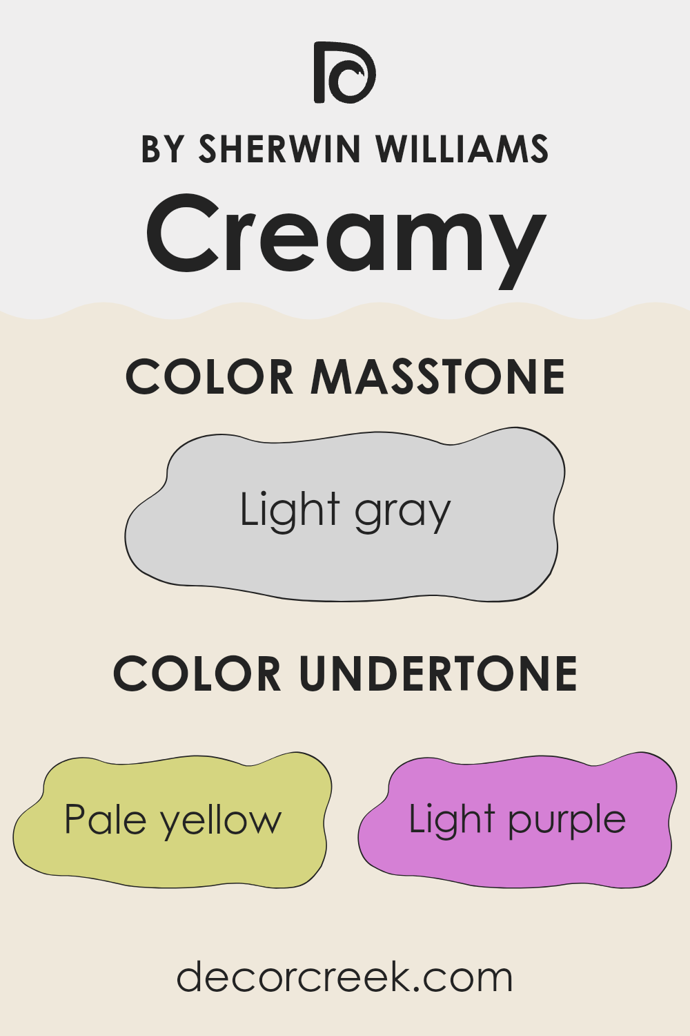
What are the right undertones of Creamy SW 7012 ?
Creamy is an adaptable neutral color that gives a soft, welcoming feel to any area. The subtlety of this color is enhanced by its intricate undertones, which include shades of pale yellow, light purple, light blue, pale pink, mint, lilac, and grey. These undertones play a crucial role in how Creamy looks under different lighting conditions and when paired with various decor elements.
Undertones are essentially subtle hints of colors that influence the primary hue. Depending on the lighting and surrounding colors, these undertones can become more noticeable, altering the overall perception of the paint. For instance, in a room with a lot of natural sunlight, the pale yellow and light blue undertones might make the walls look brighter and slightly cooler.
In contrast, artificial lighting could bring out more of the pale pink or lilac undertones, giving the room a warmer, more cozy feel.
When used on interior walls, Creamy can act as a chameleon, subtly shifting its appearance. This makes it an excellent choice for those who like to change their furnishings often, as it can harmoniously blend with a wide array of colors and styles. The grey undertone helps balance the brightness, making Creamy an ideal backdrop rather than a feature color.
This ensures that despite its complexity, it still functions as a neutral base that complements diverse interior themes without clashing or feeling too strong.
decorcreek.com
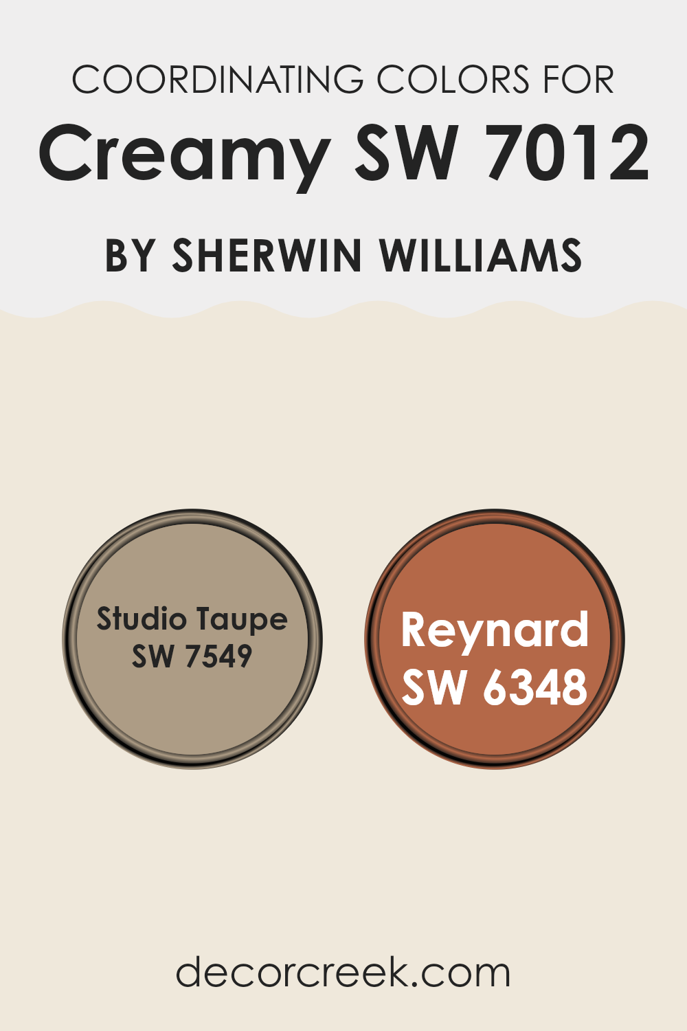
Best Coordinating Colors to use with Creamy SW 7012 by Sherwin Williams this year.
Coordinating colors are shades that complement each other well and can be used together to create harmonious and visually appealing color schemes in interior design. When selecting coordinating colors, like in the case of Creamy by Sherwin Williams, it’s essential to pick shades that enhance the main color while maintaining a balance that is pleasing to the eye. For example, Studio Taupe and Reynard are excellent coordinating colors for Creamy because they share similar undertones that create a seamless look.
Studio Taupe is a warm, inviting taupe that leans towards earthy gray with just enough depth to add interest without feeling too strong in an area. This color is adaptable and works well in various settings, providing a subtle yet striking backdrop that complements the softer, lighter Creamy.
On the other hand, Reynard is a rich, deep russet color that provides a bold contrast to Creamy’s softness. This striking shade adds a dash of drama and is perfect for accent walls or for tying together larger color schemes that need a bit of warmth and depth to truly stand out. Together, these colors offer a balanced palette that enhances the base color and creates an inviting area.
You can see recommended paint colors below:
- SW 7549 Studio Taupe
- SW 6348 Reynard
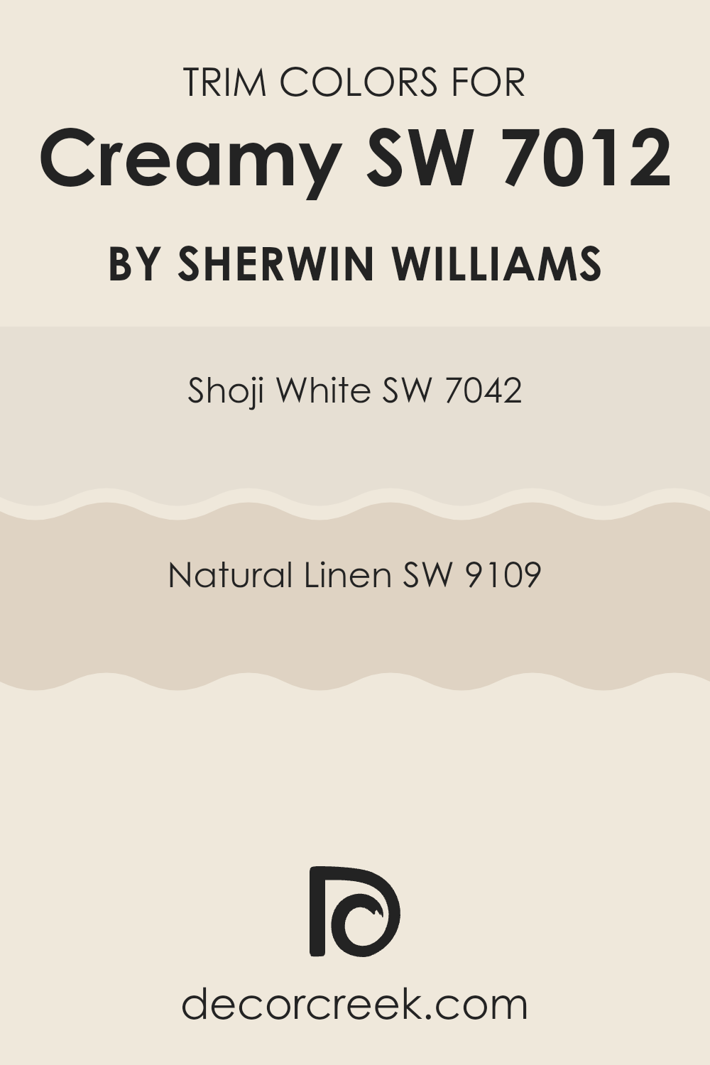
Trendy Trim Colors of Creamy SW 7012 by Sherwin Williams to use this year.
Trim colors are specific shades used to accent or highlight architectural features such as door frames, window sills, and baseboards, contrasting with the primary wall color for added visual interest and definition.
When paired with a base color like Creamy (SW 7012) by Sherwin Williams, choosing the right trim color is vital because it can enhance the overall look of the room, making the wall color stand out and giving a finished look to the area.
SW 7042 – Shoji White and SW 9109 – Natural Linen are excellent choices for trim with Creamy, as their subtle hues complement without feeling too strong next to the gentle warmth of the wall color.
Shoji White is a soft white with a touch of warmth that prevents it from appearing too stark against Creamy.
It’s an ideal trim color if you want a clean and airy feel around doors and windows without creating too sharp a contrast. On the other hand, Natural Linen is a warmer, beige-like color that offers a slightly richer and more cozy frame for the walls. It works particularly well in areas where a softer, more cohesive blending of colors is desired, helping to create a harmonious environment.
You can see recommended paint colors below:
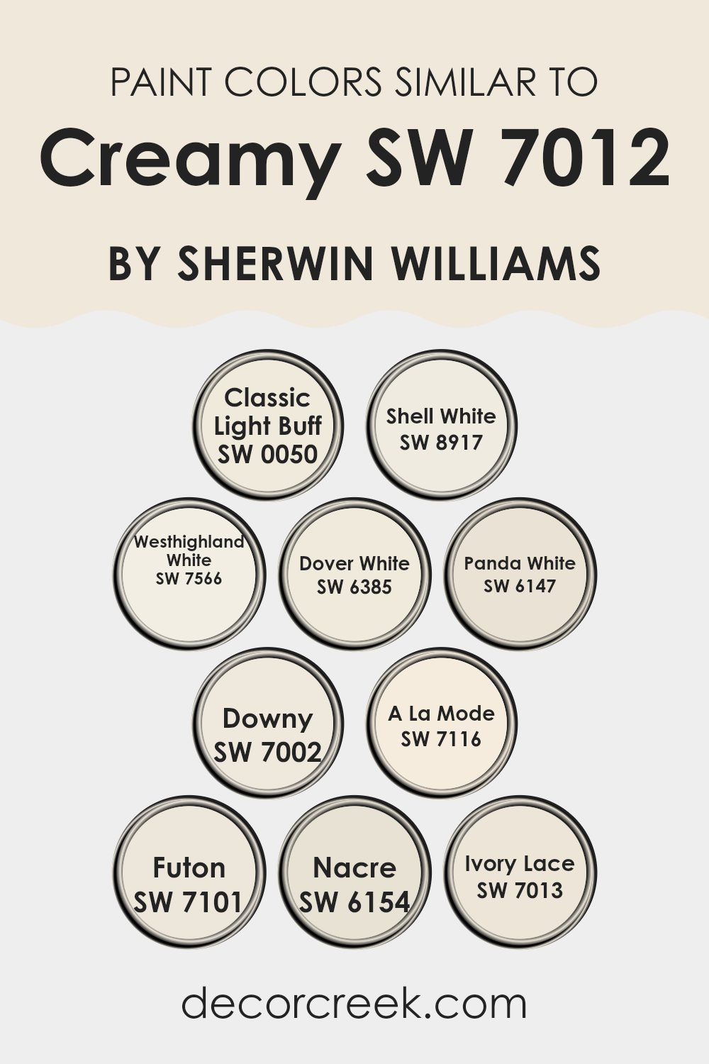
Evergreen Colors Similar to Creamy SW 7012 by Sherwin Williams
Similar colors can be crucial in design because they create a harmonious and cohesive look. When colors such as Classic Light Buff, Shell White, Westhighland White, Dover White, Panda White, Downy, A La Mode, Futon, Nacre, and Ivory Lace are used together, they help maintain a consistent theme while still allowing for subtle differentiation.
Each hue shares a warmth and softness associated with Creamy by Sherwin Williams, making them adaptable for use in various settings. These colors are especially useful in environments where a calm and gentle ambiance is desired, such as bedrooms and living areas. Their closeness on the color spectrum allows for an easy mix and match approach without the risk of clashing tones.
Classic Light Buff presents a subdued yellow undertone, offering a warm and inviting feel. Shell White is slightly brighter, giving a clean and fresh appearance. Westhighland White leans towards a soft, creamy touch, ideal for creating a subtle contrast. Dover White adds a hint of vanilla, enhancing areas with a rich yet understated elegance.
Panda White offers a slight gray cast, perfect for modern settings. Downy is airy and light, providing a delicate backdrop for any decor. A La Mode has a dulcet creamy texture, warm and neutral; it’s excellent for a balanced look. Futon highlights a more muted, clay-like quality, grounding environments with its earthier presence.
Nacre shows a pearly finish that reflects light beautifully, increasing a room’s brightness. Lastly, Ivory Lace displays a hint of antique charm, making it ideal for elegant areas. Together, these colors support smooth interior transitions, creating a visually soothing experience.
You can see recommended paint colors below:
- SW 0050 Classic Light Buff
- SW 8917 Shell White
- SW 7566 Westhighland White
- SW 6385 Dover White
- SW 6147 Panda White
- SW 7002 Downy
- SW 7116 A La Mode
- SW 7101 Futon
- SW 6154 Nacre
- SW 7013 Ivory Lace
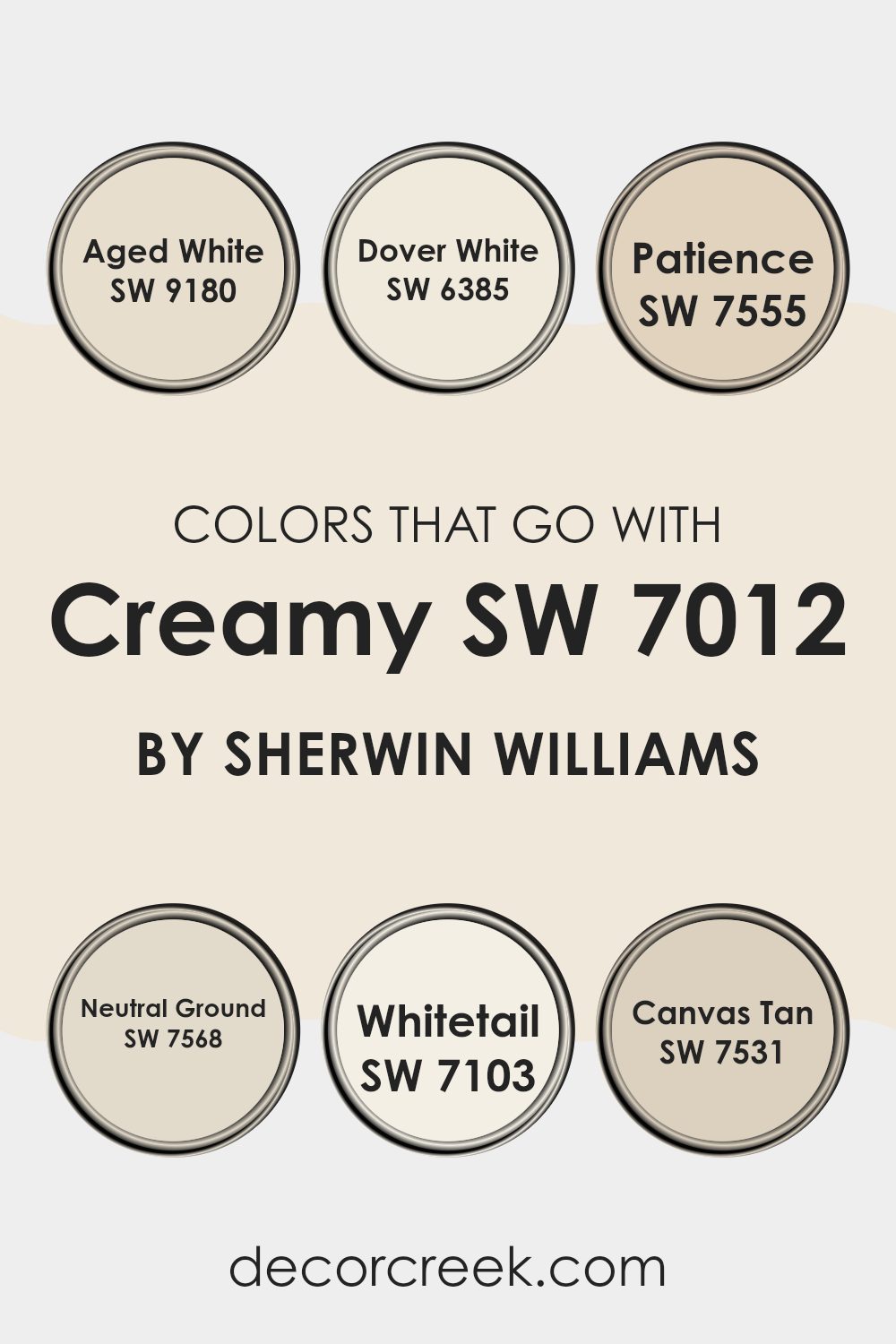
Colors that Go With Creamy SW 7012 by Sherwin Williams
Choosing the right colors to complement Creamy SW 7012 by Sherwin Williams is crucial for achieving a harmonious and appealing aesthetic in your area. Creamy is a gentle and inviting shade of off-white that sets a soft and welcoming tone.
When paired with colors like Aged White SW 9180, which has a slightly antiqued vibe that warms up any room, or Dover White SW 6385, a brighter white with a touch of warmth, you create a layered, cozy feel. These combinations make rooms feel more interconnected and thoughtfully designed.
Adding colors like Patience SW 7555, a subtle and gentle beige, enriches the environment, providing depth and a sense of calm. Neutral Ground SW 7568 offers a slightly darker beige tone that grounds the lighter shades while maintaining a light, airy feel. Whitetail SW 7103, the lightest of the group, acts almost like a fresh canvas, reflecting light and making the area appear larger and brighter.
Lastly, Canvas Tan SW 7531 provides a slightly more pronounced tan hue, adding character and a natural element that allows for easy decor matches. Together, these colors support Creamy SW 7012 in creating a soothing, beautiful living or working area.
You can see recommended paint colors below:
- SW 9180 Aged White
- SW 6385 Dover White
- SW 7555 Patience
- SW 7568 Neutral Ground
- SW 7103 Whitetail
- SW 7531 Canvas Tan
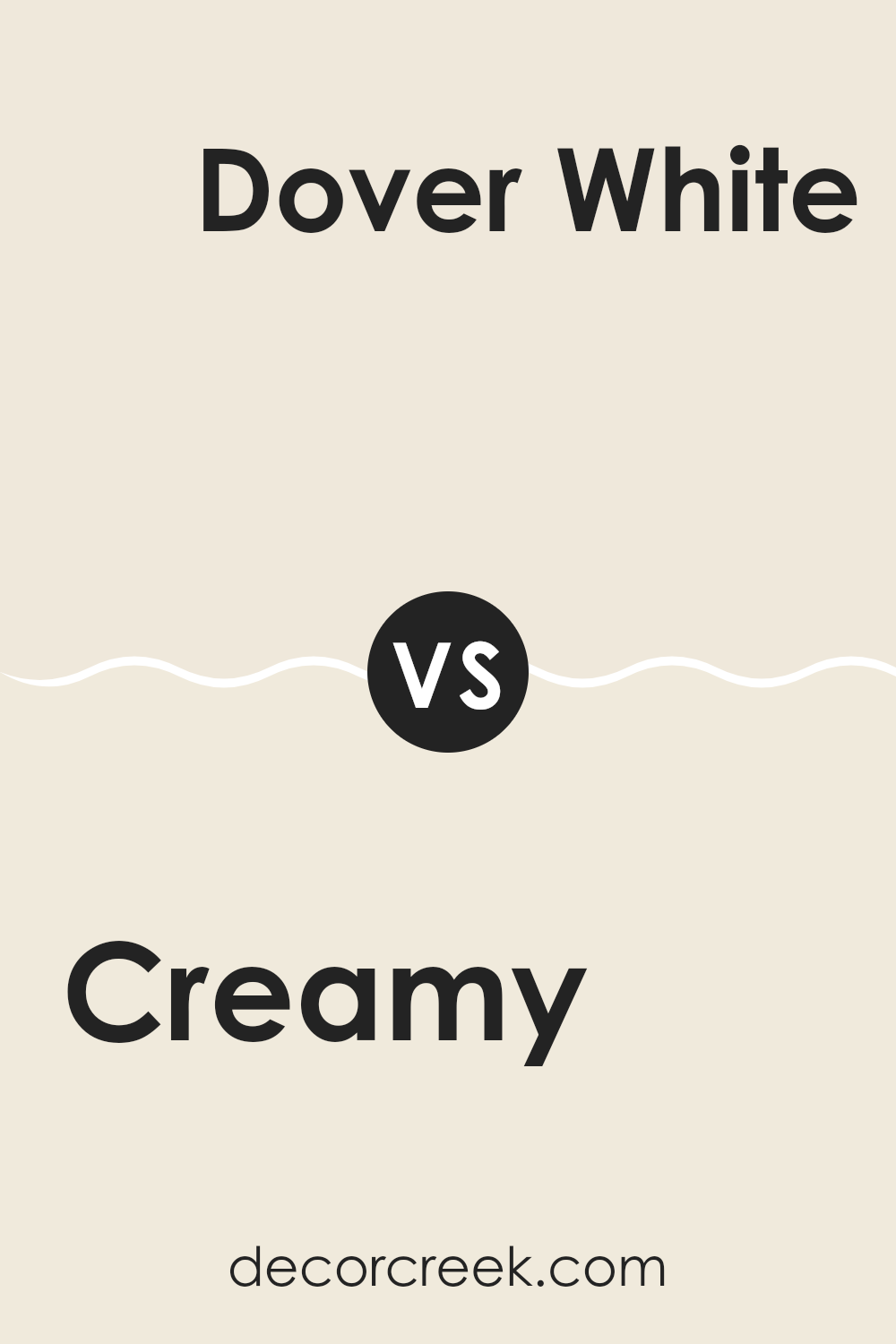
Creamy SW 7012 by Sherwin Williams vs Dover White SW 6385 by Sherwin Williams
Creamy and Dover White, both by Sherwin Williams, are subtle yet distinct colors mainly used to create warm, welcoming areas. Creamy is a soft, muted beige with a slightly yellow undertone. Its warm profile is excellent for making rooms feel cozy and inviting.
On the other hand, Dover White is a bit brighter and leans more towards a pure, clean white with a warm undertone. Compared to Creamy, Dover White is almost like a fresh coat of classic warm white that can easily brighten up any area without feeling stark.
Both colors work well in various settings, complementing a wide range of decor styles. However, while Dover White is ideal for those who prefer a brighter, crisper look, Creamy offers a richer depth, ideal for a subtle, more nuanced aesthetic.
You can see recommended paint color below:
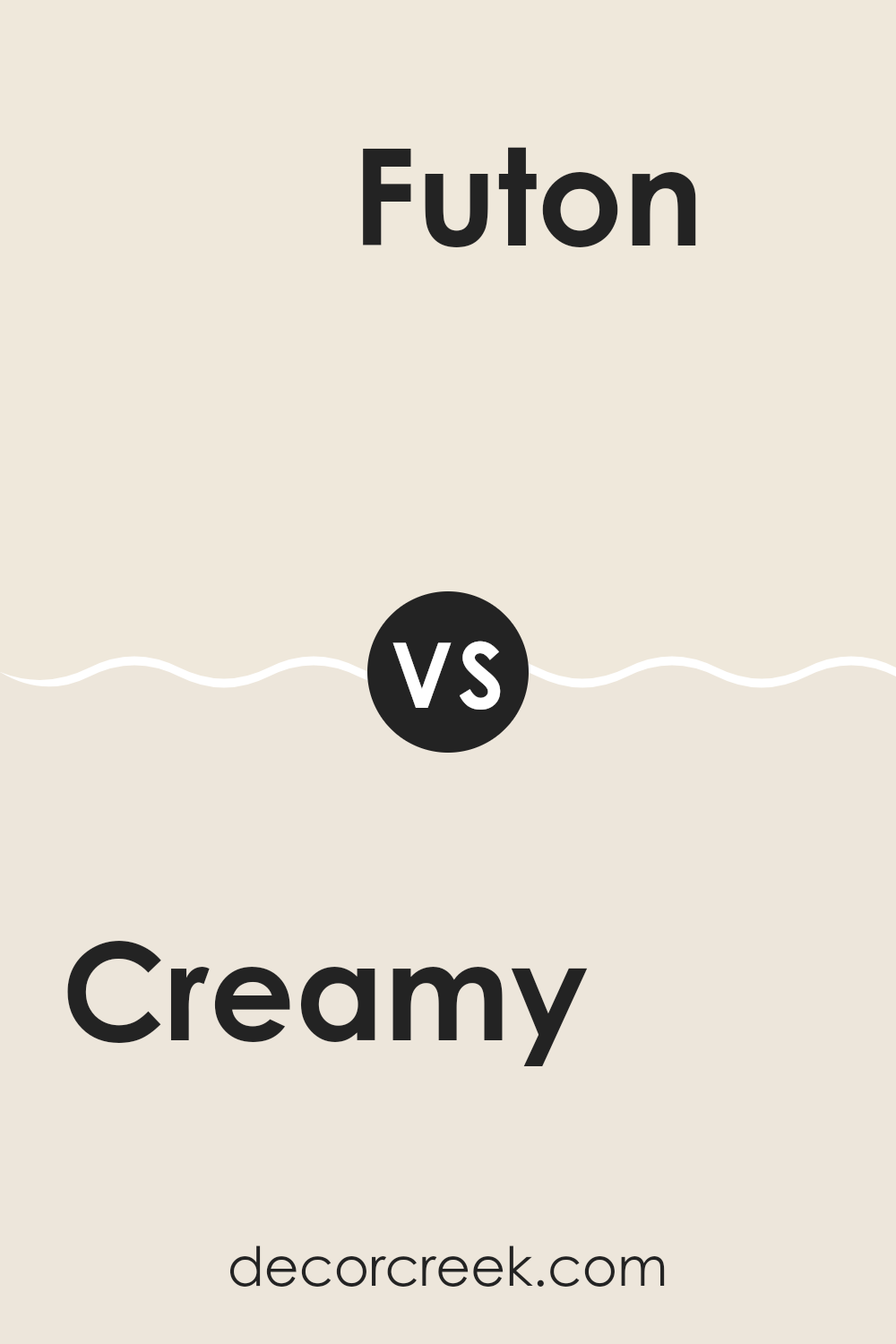
Creamy SW 7012 by Sherwin Williams vs Futon SW 7101 by Sherwin Williams
Creamy SW 7012 and Futon SW 7101, both by Sherwin Williams, each offer a unique tone that can set a different atmosphere in a room. Creamy SW 7012 is a soft, warm white with a slight buttery undertone that gives it a cozy, welcoming feel. This color is great for areas where you want a calm and inviting ambiance, such as living rooms or bedrooms.
On the other hand, Futon SW 7101 is a neutral, light gray with soft hints of beige that make it quite adaptable. It is a bit cooler in tone compared to Creamy, giving areas a clean and fresh look. Futon is ideal for modern settings and works well in areas that receive a lot of natural light, as it helps maintain a light, open feel.
Both colors are subtle yet significantly different in warmth and mood. Choosing between them depends on the desired atmosphere and other elements in your area such as lighting, furniture, and accessories.
You can see recommended paint color below:
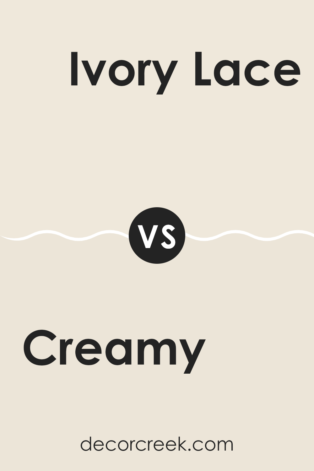
Creamy SW 7012 by Sherwin Williams vs Ivory Lace SW 7013 by Sherwin Williams
Creamy SW 7012 and Ivory Lace SW 7013, both from Sherwin Williams, are closely related in hue but differ in subtle ways that could impact the feel of an area. Creamy has a warmer undertone, bringing a cozy and soft atmosphere to rooms. It pairs well with a variety of decor styles and adds a touch of warmth, especially useful in areas that don’t get a lot of natural sunlight.
On the other hand, Ivory Lace is slightly lighter than Creamy and has a cooler undertone. This color is ideal for creating a brighter, more open feel in a room. It works particularly well in smaller areas or areas with limited light, as it helps reflect light around the room, making the area appear larger.
Choosing between the two depends on the kind of warmth and brightness you want to achieve in the area, as well as how each color complements other elements in the room like furniture and fabrics.
You can see recommended paint color below:
Creamy SW 7012 by Sherwin Williams vs A La Mode SW 7116 by Sherwin Williams
Creamy SW 7012 and A La Mode SW 7116 are both neutral colors from Sherwin Williams, but they have distinct tones that set them apart. Creamy has a warm, off-white hue with a subtle yellow undertone, making it feel cozy and welcoming in an area. It’s an adaptable color that works well in many settings, adding a gentle warmth to the room.
On the other hand, A La Mode is a bit cooler compared to Creamy. It’s closer to a pure white but still maintains a softness that prevents it from being stark or cold. This color is excellent for making smaller areas appear larger and brighter.
Both colors are great for creating a calm and pleasant atmosphere in interiors. They pair well with other colors and can be used as a background for bolder accents or furnishings. Whether choosing Creamy for its warm appeal or A La Mode for a cleaner, crisper look, both offer a subtle charm that enhances the aesthetic of a room.
You can see recommended paint color below:
- SW 7116 A La Mode
Creamy SW 7012 by Sherwin Williams vs Nacre SW 6154 by Sherwin Williams
Creamy and Nacre, both from Sherwin Williams, showcase subtle yet distinct differences. Creamy is a soft, warm neutral with a yellow undertone, giving it a cozy and inviting feel that’s very adaptable in home decor.
It pairs well in areas that aim for a relaxed yet cheerful atmosphere, like living rooms or kitchens. On the other hand, Nacre has a slightly cooler tone, leaning towards a pale taupe with soft gray influences.
This color is great for creating a calm, understated look, making it ideal for bedrooms or areas where you want a more muted backdrop. Both colors are light enough to make small rooms appear larger and can be easily matched with a variety of decor styles and other colors. However, Creamy’s warm hue offers a hint more warmth, while Nacre provides a cleaner, crisper boundary with its cooler undertones.
You can see recommended paint color below:
Creamy SW 7012 by Sherwin Williams vs Shell White SW 8917 by Sherwin Williams
“Creamy” by Sherwin Williams is a warm and soft shade that leans towards a light beige, giving it a cozy and inviting feel. This color can make areas feel more intimate and welcoming, suitable for living rooms and bedrooms where comfort is key. It pairs well with darker furnishings, providing a harmonious contrast that enhances the overall coziness of a room.
On the other hand, “Shell White” is a brighter, cleaner white with subtle warm undertones. This color is perfect for creating a light and airy feel, making it ideal for kitchens, bathrooms, and smaller areas that you want to appear more open and spacious. It acts as a great backdrop for colorful décor or artwork, allowing other colors to stand out beautifully.
While both shades are rooted in warmth, “Creamy” offers a more muted, cozy vibe compared to the brighter and sharper feel of “Shell White.” Each color can significantly affect the mood and perceived area within a room, depending on what atmosphere you’re aiming to achieve.
You can see recommended paint color below:
Creamy SW 7012 by Sherwin Williams vs Classic Light Buff SW 0050 by Sherwin Williams
Creamy SW 7012 by Sherwin Williams is a soft, warm, off-white color with just a hint of yellow, giving it a cozy and welcoming feel. It’s adaptable and can easily fit into any room, complementing a wide range of decor styles.
On the other hand, Classic Light Buff SW 0050 is also a warm color but it leans more towards a beige tone, which makes it slightly darker than Creamy. Classic Light Buff offers a bit more depth, making it a great option for areas where you want to add warmth without going too bold.
Both colors are great for creating a relaxed atmosphere in your home, but the choice between them depends on the specific ambiance you’re aiming for. If you prefer a lighter, brighter feel, Creamy might be the way to go. If you’re looking for something a tad richer and with a bit more presence, Classic Light Buff could be the better option. Both shades work well with natural light and enhance other natural or earthy elements in the décor.
You can see recommended paint color below:
Creamy SW 7012 by Sherwin Williams vs Westhighland White SW 7566 by Sherwin Williams
Creamy and Westhighland White are both colors by Sherwin Williams that provide a soothing and warm atmosphere to an area, but they showcase different hues and effects. Creamy, as its name suggests, has a richer, more buttery tone which gives off a cozy, welcoming vibe. It has a yellowish undertone that makes it feel warmer. This makes it great for common areas like living rooms or kitchens where you want a relaxed, inviting feel.
On the other hand, Westhighland White is lighter and more neutral, leaning closer to pure white with just a hint of warmth. This color is excellent for areas that you want to feel bright and airy. It’s a good choice for small rooms or areas without much natural light, as it can help make them appear larger and more open.
In essence, if you’re looking for a color that adds a bit of warmth and depth, Creamy is the way to go. If your goal is to brighten up an area and give it a fresh, clean look, Westhighland White is likely a better choice. Both colors are adaptable and work well in various home styles.
You can see recommended paint color below:
Creamy SW 7012 by Sherwin Williams vs Panda White SW 6147 by Sherwin Williams
Creamy by Sherwin Williams is a warm, off-white color with a soft, inviting presence. It leans towards a light beige or ivory, making it highly adaptable for use in different settings and designs. It gives off a cozy vibe, ideal for creating a welcoming atmosphere in your home, especially in living areas or bedrooms.
On the other hand, Panda White by Sherwin Williams is another off-white color but with a slightly different tone. It’s a bit cooler compared to Creamy, featuring subtle gray undertones. While still neutral, Panda White offers a clean and fresh look, making it suitable for modern areas or to add a subtle contrast when paired with darker colors.
Both colors are excellent choices for those looking to achieve a neutral palette, but your preference may depend on the mood you want to set or the specific design aesthetics of your room. Creamy works well where you want warmth, while Panda White is perfect if you prefer a cooler, crisper background.
You can see recommended paint color below:
Creamy SW 7012 by Sherwin Williams vs Downy SW 7002 by Sherwin Williams
The two colors, Creamy and Downy by Sherwin Williams, offer subtle differences in their appeal. Creamy has a warmer tone, leaning towards a soft beige with a hint of yellow. This color is excellent for creating a cozy and inviting atmosphere in any room.
On the other hand, Downy is softer and slightly cooler, resembling the gentle hue of early morning light. It’s closer to a traditional white but with a touch of warmth that prevents it from feeling too stark. Both colors are light and airy, making rooms feel open and larger.
Creamy is perfect for those who prefer a hint of warmth in their decor, while Downy suits those looking for a cleaner, crisper background. These colors work well on their own or combined, offering subtle contrast that enhances the feeling of calm and comfort in a home.
You can see recommended paint color below:
To wrap up my thoughts about SW 7012 Creamy by Sherwin Williams, I have to say I’m a big fan! This paint color is a soft off-white that just makes every room feel warm and welcoming. I think it’s perfect for pretty much any room in your house, whether it’s a cozy living room or a bright kitchen. It’s not too bright but has just enough warmth to make a room feel like a sunny day.
If you’re thinking about giving your walls a new look, SW 7012 Creamy could be the way to go. It works really well with other colors too, so you could add colored decorations or furniture and they’ll look great against this paint. It’s kind of like a gentle background that lets other colors shine.
One of the things I liked best about Creamy is that it doesn’t change much under different lights. Some paints look different when it’s sunny versus when it’s cloudy, but Creamy stays pretty much the same, which is nice because it always looks good.
In summary, Sherwin Williams’s SW 7012 Creamy is a solid choice if you want a paint color that makes your home look and feel happy and welcoming. It’s easy to match with other colors, pleasant to look at, and keeps its look no matter the lighting. I think it would make just about anyone happy with their home’s appearance!

decorcreek.com
Ever wished paint sampling was as easy as sticking a sticker? Guess what? Now it is! Discover Samplize's unique Peel & Stick samples.
Get paint samples

