Walking into a room painted with Sherwin Williams’ SW 6235 Foggy Day is like stepping into a soft landscape wrapped in a gentle mist. The cool, muted gray of this color is reminiscent of early mornings when the world is quiet, and everything feels peaceful. It’s a shade that doesn’t just sit on walls; it weaves itself into the fabric of your daily life by creating a calming atmosphere.
Imagine sipping your morning coffee in the kitchen, with Foggy Day surrounding you, offering a soothing start to the day. Or perhaps, in the evening, as you unwind after a long day, the soft tones envelop you, helping you relax. It’s a flexible color that works well in any room, from living areas to bedrooms, offering lasting elegance and comfort.
Foggy Day’s neutral palette balances perfectly with both warm and cool accents, allowing you to easily change decor around it, highlighting personal style while keeping a cohesive look. Whether you want a modern, minimalist vibe or a cozy, traditional feel, this shade adjusts beautifully.
Engaging yet understated, SW 6235 Foggy Day brings effortless style and balance to your rooms, making them feel like a haven.

What Color Is Foggy Day SW 6235 by Sherwin Williams?
Foggy Day by Sherwin Williams is a soft, muted gray with subtle blue undertones, giving it a calming and airy feel. This quiet shade works beautifully in various interior styles, making it a flexible choice for many homes. It pairs particularly well with modern, contemporary, and coastal designs, where its understated grace can shine.
In a modern setting, Foggy Day complements clean lines and minimalist decor. It creates a peaceful backdrop that highlights sleek furniture and metal accents. In contemporary interiors, it can be paired with bold colors or patterns to balance out the area, adding a touch of sophistication.
The coastal style benefits from Foggy Day’s cool tones, which mimic the gentle shades of the ocean and sky. Here, it works wonderfully alongside natural materials such as driftwood, wicker, and sisal. This color enhances rooms with soft fabrics like linen or cotton, contributing to a relaxed atmosphere.
For textures, Foggy Day coordinates well with natural stone, such as marble or slate, bringing out their rich details. It also looks great with light-colored wood finishes, adding warmth and depth to a room. Overall, this shade is a great choice for those seeking a flexible and peaceful backdrop for their home.
Is Foggy Day SW 6235 by Sherwin Williams Warm or Cool color?
Foggy Day SW 6235 by Sherwin Williams is a soft, muted blue-gray color that can bring a calming and relaxed atmosphere to a room. This color works well in both small and large areas , lending a sense of coziness without making the area feel closed in.
It pairs beautifully with crisp whites for a fresh, clean look or with deeper grays for a more dramatic effect. Foggy Day can complement various styles, from modern to traditional, by adding a subtle touch of color that doesn’t overwhelm. This hue is particularly effective in bedrooms and bathrooms where a soothing environment is desired.
It also works well in living rooms when combined with natural elements like wood and stone. Because of its gentle tone, Foggy Day can serve as a neutral base, allowing other colors and textures in the room to stand out. It’s a flexible color choice that brings peace and comfort to any home setting.
Undertones of Foggy Day SW 6235 by Sherwin Williams
Foggy Day by Sherwin Williams is a unique paint color with a range of undertones that can shift how it appears on your walls. Undertones are subtle hints of color that can change the main color’s appearance depending on lighting and surroundings.
Foggy Day seems to have a base color that is grayish with touches of blue and green, creating an overall calming vibe. The undertones include hints like dark turquoise, purple, and olive, which can give the color a warmer or cooler feel.
For instance, under natural daylight, you might see more of the blue undertones, making the room feel fresh and airy. Under warm lighting, the olive or pale pink might come out, giving the walls a cozier look.
The variety of undertones such as navy, lilac, and mint means this color can adapt to different styles and themes in a room. If combined with cool, modern furniture, you might see the color’s cooler side, while with wooden or earthy decor, the warmer undertones may dominate.
Choosing this color with its rich undertones is a smart choice for those who want a flexible backdrop in their home, one that changes subtly with the light and complements many decor styles.
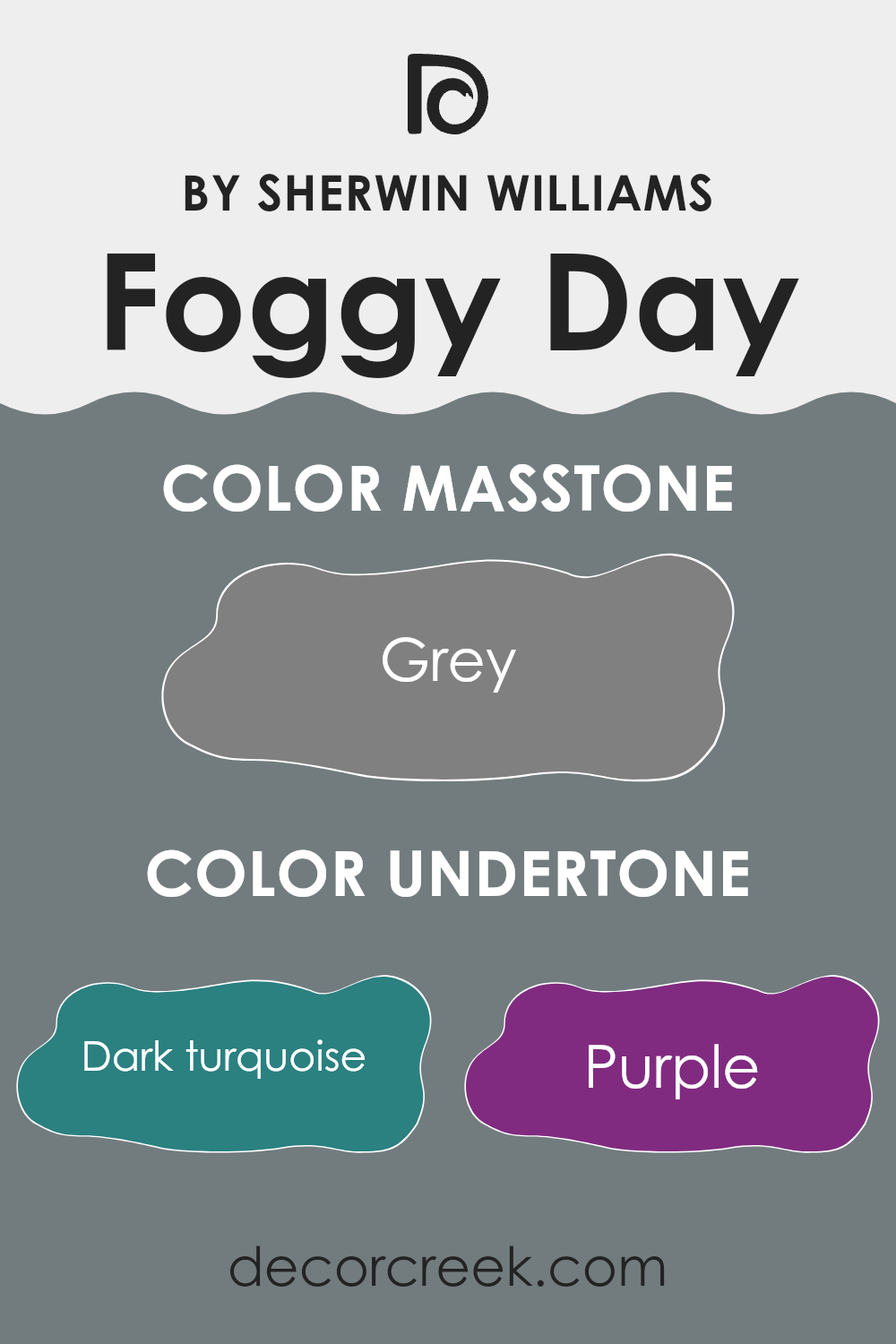
What is the Masstone of the Foggy Day SW 6235 by Sherwin Williams?
Foggy Day (SW 6235) by Sherwin Williams is a flexible shade of gray with a masstone of #808080. This color provides a simple and modern backdrop for homes, balancing well with brighter accents or bolder design elements.
Its gray tone offers a neutral palette that can accommodate various styles and personal tastes, making it an excellent choice for any room. The soft, muted nature of Foggy Day helps create a cozy atmosphere, making it suitable for living rooms, bedrooms, or kitchens.
It pairs beautifully with both warm and cool colors, providing flexibility in decor planning. Additionally, this color can help open up smaller rooms by reflecting light without being too harsh or intense. Overall, Foggy Day is a practical and reliable choice, allowing homeowners to easily update their rooms while maintaining a sense of comfort and style.
How Does Lighting Affect Foggy Day SW 6235 by Sherwin Williams?
Lighting can have a big impact on how we perceive colors. Different types of light can make colors look different, which is important to consider when choosing paint for a room. The way Foggy Day SW 6235 by Sherwin Williams looks can vary depending on the light source and the direction of the room.
In natural light, this color can appear differently at different times of the day. In a north-facing room, which gets less direct sunlight, Foggy Day can appear cooler and more muted. The light in these rooms is usually consistent and indirect, so the color might feel slightly grayish.
In a south-facing room, which gets more direct sunlight, the color can look brighter and warmer. This is because the warm sunlight enhances the undertones of the paint, making it appear more vibrant.
East-facing rooms catch the morning light, which is soft and warm. Early in the day, Foggy Day can appear brighter and softer, but as the day progresses and the sun moves, the color can look a bit more subdued.
West-facing rooms receive warm evening light, which can make the paint look warmer and richer later in the day. In the morning, these rooms can seem cooler and subdued until the sun starts setting. Under artificial light, such as incandescent bulbs, Foggy Day may look warmer and creamier, enhancing its undertones.
With cooler LED or fluorescent bulbs, the color might appear more muted and cooler. Therefore, the type of artificial lighting can play a huge role in how the paint color is perceived. It’s always a good idea to test paint samples at different times of the day and with different lighting to ensure the color meets your expectations in your specific room.

What is the LRV of Foggy Day SW 6235 by Sherwin Williams?
Light Reflectance Value, or LRV, is a measurement that tells us how much light a color reflects. It’s on a scale from 0 to 100, where 0 means the color absorbs all light and is completely dark, and 100 means it reflects all light and is completely light or white. The LRV is important in choosing paint colors because it gives you an idea of how bright or dark that color will look on the walls once it’s applied. A color with a low LRV, like 19.545, means it will absorb a lot of light and appear darker. In contrast, colors with a high LRV reflect more light and look brighter and lighter on your walls.
The color Foggy Day, with an LRV of 19.545, absorbs a significant amount of light, meaning it is a darker shade. When painted on walls, it will create a cozy and intimate atmosphere as it doesn’t reflect much light back into the room.
This can be perfect for areas where you want a more grounded and soothing environment. However, because it’s on the darker side, it’s important to consider the amount of natural light in the room. In a room with plenty of natural light, Foggy Day will balance out nicely, providing richness without feeling too heavy. On the other hand, in a room with limited light, it might make the areas feel smaller or more enclosed.
Knowing the LRV helps you decide if the color will work well in your room’s lighting conditions.

Coordinating Colors of Foggy Day SW 6235 by Sherwin Williams
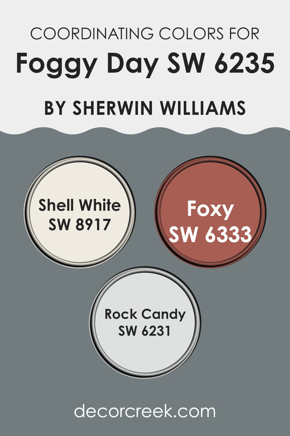
Coordinating colors are hues that complement each other well, creating a balanced and cohesive look in any rooms. These colors work together to bring harmony to a room, enhancing its visual appeal without taking over the main color. For instance, Foggy Day by Sherwin Williams is a calming blue-gray that provides a flexible base for interiors. Pairing it with coordinating colors can enhance its soft depth and reliability.
Shell White (SW 8917) is a gentle, creamy shade that blends beautifully with Foggy Day, adding warmth and brightness without being too stark. It’s perfect for trim or ceilings, offering a subtle transition that enhances the room’s overall lightness.
Foxy (SW 6333) brings a bold, earthy red hue that adds a touch of drama and warmth to the room, providing a striking contrast to the cool, calm nature of Foggy Day. Rock Candy (SW 6231) is a very pale gray with a slight hint of blue, a shade that complements the main color while maintaining an airy and light feel.
Together, these colors create a pleasant and balanced palette that can make any room feel welcoming and stylish.
You can see recommended paint colors below:
- SW 8917 Shell White (CHECK A SAMPLE)
- SW 6333 Foxy (CHECK A SAMPLE)
- SW 6231 Rock Candy (CHECK A SAMPLE)
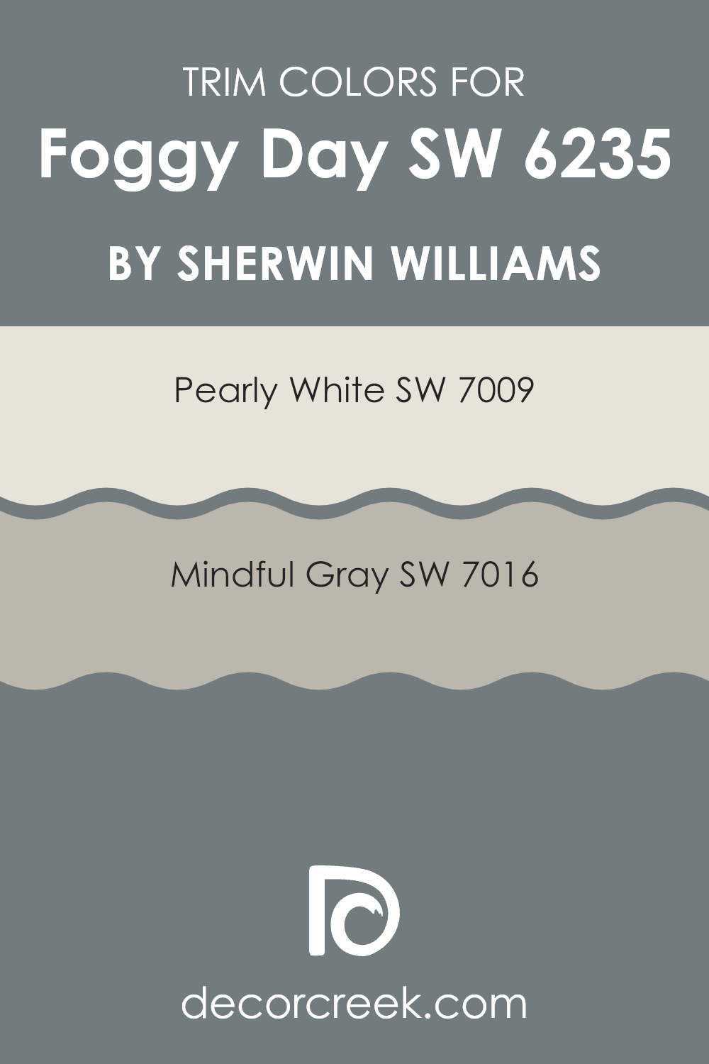
What are the Trim colors of Foggy Day SW 6235 by Sherwin Williams?
Trim colors are the shades used on the edges or borders of walls, doors, and windows to give a room a finished look. When painting a room, trim colors are important because they provide contrast and highlight architectural features. They help to frame the room and can make your main color stand out.
For Sherwin Williams’ Foggy Day, choosing the right trim colors can enhance the overall look and bring out the best in the main color. SW 7009 Pearly White and SW 7016 Mindful Gray are great choices as they complement Foggy Day, adding depth and style to any rooms.
SW 7009 Pearly White is a soft, warm white that has a gentle, creamy undertone. It brings a hint of elegance and brightness that can make a room feel more open and airy. On the other hand, SW 7016 Mindful Gray is a balanced, medium-toned gray that provides a nice contrast to light or colorful walls. It has a calming and modern feel, grounding the room without overpowering it. Together with Foggy Day, these trim colors can create a cozy and harmonious environment.
You can see recommended paint colors below:
Colors Similar to Foggy Day SW 6235 by Sherwin Williams
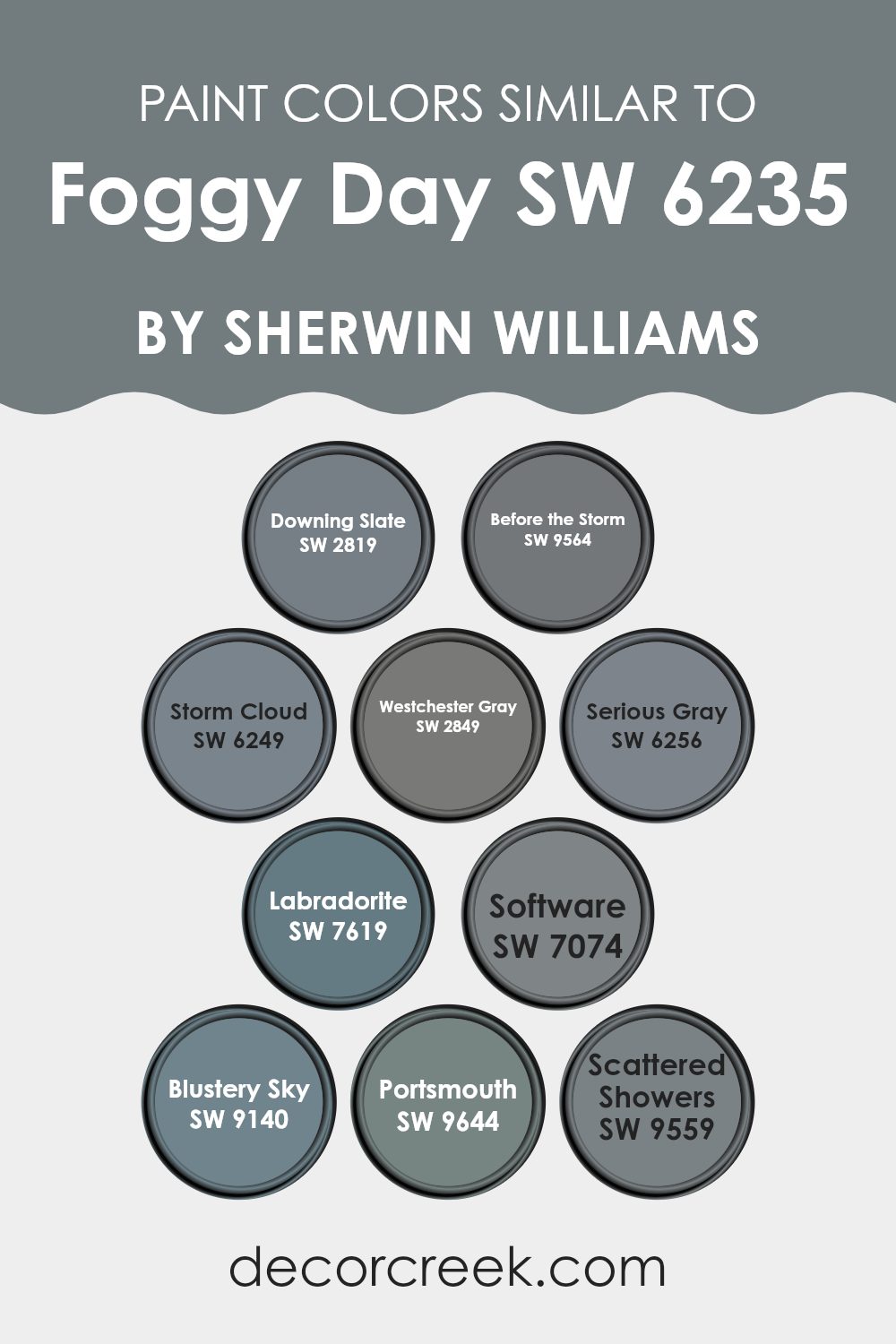
Similar colors play a crucial role in creating a harmonious and cohesive environment. For instance, shades and tones related to Sherwin Williams’ Foggy Day can add depth and interest to a room without taking over. SW 2819, known as Downing Slate, offers a muted blue-gray that provides a calm and steady feel.
Before the Storm, SW 9564, is a darker, moodier gray that can evoke a sense of coziness. Storm Cloud, or SW 6249, is a rich, deep blue-gray bringing a feeling of depth and elegance. These similar shades allow flexibility and can adapt to different lighting, making rooms look warm or cool based on time of day.
Westchester Gray, SW 2849, is a refined option with a classic medium gray tone. Serious Gray, SW 6256, has a slightly more defined blue undertone enhancing thematic consistency. Labradorite, SW 7619, incorporates a hint of teal, offering a touch of energy.
Software, SW 7074, leans towards a truthful gray, perfect for a modern vibe. Blustery Sky, SW 9140, is a soft blue likely to uplift any room. Portsmouth, SW 9644, has a maritime feel with its deep blue tinge, while Scattered Showers, SW 9559, gives off a fresh, clean vibe with a hint of green. These colors work together to create a balanced and inviting atmosphere.
You can see recommended paint colors below:
- SW 2819 Downing Slate
- SW 9564 Before the Storm (CHECK A SAMPLE)
- SW 6249 Storm Cloud (CHECK A SAMPLE)
- SW 2849 Westchester Gray
- SW 6256 Serious Gray (CHECK A SAMPLE)
- SW 7619 Labradorite (CHECK A SAMPLE)
- SW 7074 Software (CHECK A SAMPLE)
- SW 9140 Blustery Sky (CHECK A SAMPLE)
- SW 9644 Portsmouth (CHECK A SAMPLE)
- SW 9559 Scattered Showers (CHECK A SAMPLE)
Colors that Go With Foggy Day SW 6235 by Sherwin Williams
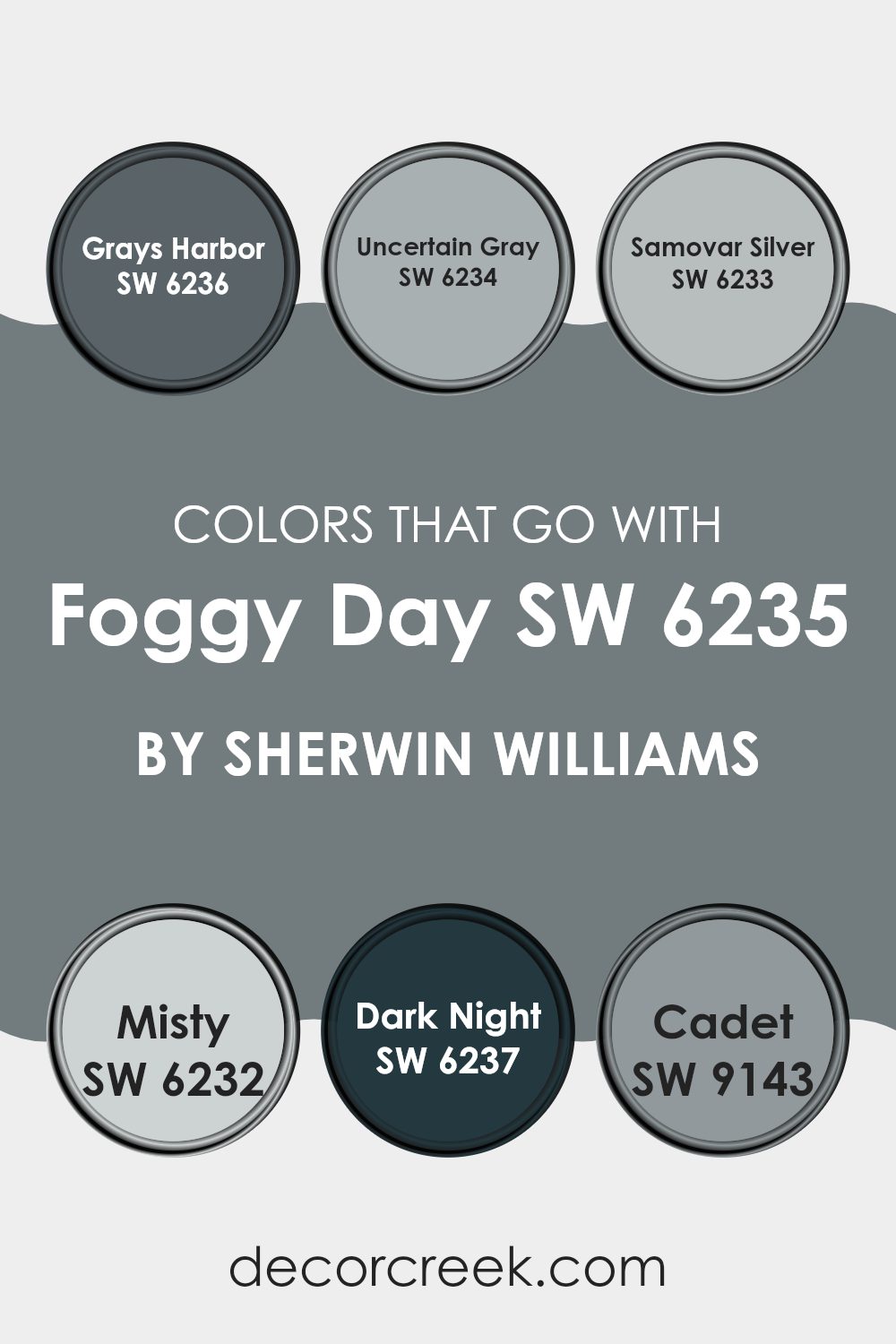
Choosing colors that complement Foggy Day SW 6235 by Sherwin Williams is essential for creating a harmonious and visually appealing room. Foggy Day is a soft gray with blue undertones, making it flexible and calming. Pairing it with the right colors can highlight its unique qualities and bring balance to any area. Grays Harbor SW 6236 is a deeper, stormy gray that can add depth and drama when used alongside the lighter Foggy Day.
Uncertain Gray SW 6234 offers a slightly warmer gray, which can introduce subtle contrast while maintaining a cohesive look. Samovar Silver SW 6233 brings a touch of elegance with its light, silver-toned hue, which can brighten a room when used in conjunction with Foggy Day.
Misty SW 6232 is a pale, airy blue-gray that works well to create a refreshing and light atmosphere, perfect for softening the deeper tones of Foggy Day. Dark Night SW 6237 provides a bold, deep blue that’s almost navy, adding richness and sophistication when paired with the more subdued Foggy Day. Finally, Cadet SW 9143 is a mid-toned slate blue that can provide a fresh and modern contrast, making the room feel more dynamic.
These complementary colors work together to create a balanced and inviting environment, enhancing the overall aesthetic of the area.
You can see recommended paint colors below:
- SW 6236 Grays Harbor (CHECK A SAMPLE)
- SW 6234 Uncertain Gray (CHECK A SAMPLE)
- SW 6233 Samovar Silver (CHECK A SAMPLE)
- SW 6232 Misty (CHECK A SAMPLE)
- SW 6237 Dark Night (CHECK A SAMPLE)
- SW 9143 Cadet (CHECK A SAMPLE)
How to Use Foggy Day SW 6235 by Sherwin Williams In Your Home?
Foggy Day SW 6235 by Sherwin Williams is a soft, muted gray with a hint of warmth. This flexible color works well in many areas of the home, creating a cozy and calming atmosphere. It’s perfect for living rooms, bedrooms, or even a home office.
The gentle tone of Foggy Day can make a room feel inviting and comfortable, offering a subtle backdrop that complements various styles and colors. In a living room, you can pair Foggy Day with creamy whites or darker grays to add depth.
Wooden furniture and natural textures enhance its warmth, making the room more welcoming. In a bedroom, use it to create a restful retreat by combining it with plush linens and soft textiles. For a fresh look, add some greenery or metallic accents. Ultimately, Foggy Day SW 6235 is a reliable choice that helps create a calming and pleasant home environment.
Foggy Day SW 6235 by Sherwin Williams vs Labradorite SW 7619 by Sherwin Williams
Foggy Day SW 6235 by Sherwin Williams and Labradorite SW 7619 are two distinct shades of paint, each offering its unique feel and aesthetic. Foggy Day is a soft, muted gray with a hint of warmth. It provides a cozy and flexible backdrop that can easily complement various decor styles.
This color is gentle on the eyes and brings a calm, relaxed atmosphere to a room. On the other hand, Labradorite is a deep and rich color that leans towards a darker, bold shade with blue-green undertones.
It creates a dramatic and refined look, making it ideal for accent walls or areas where a stronger impact is desired. While Foggy Day offers subtlety and flexibility, Labradorite demands attention and adds depth to any room. Both colors can bring different moods into your living area, depending on the ambiance you want to create.
You can see recommended paint color below:

Foggy Day SW 6235 by Sherwin Williams vs Scattered Showers SW 9559 by Sherwin Williams
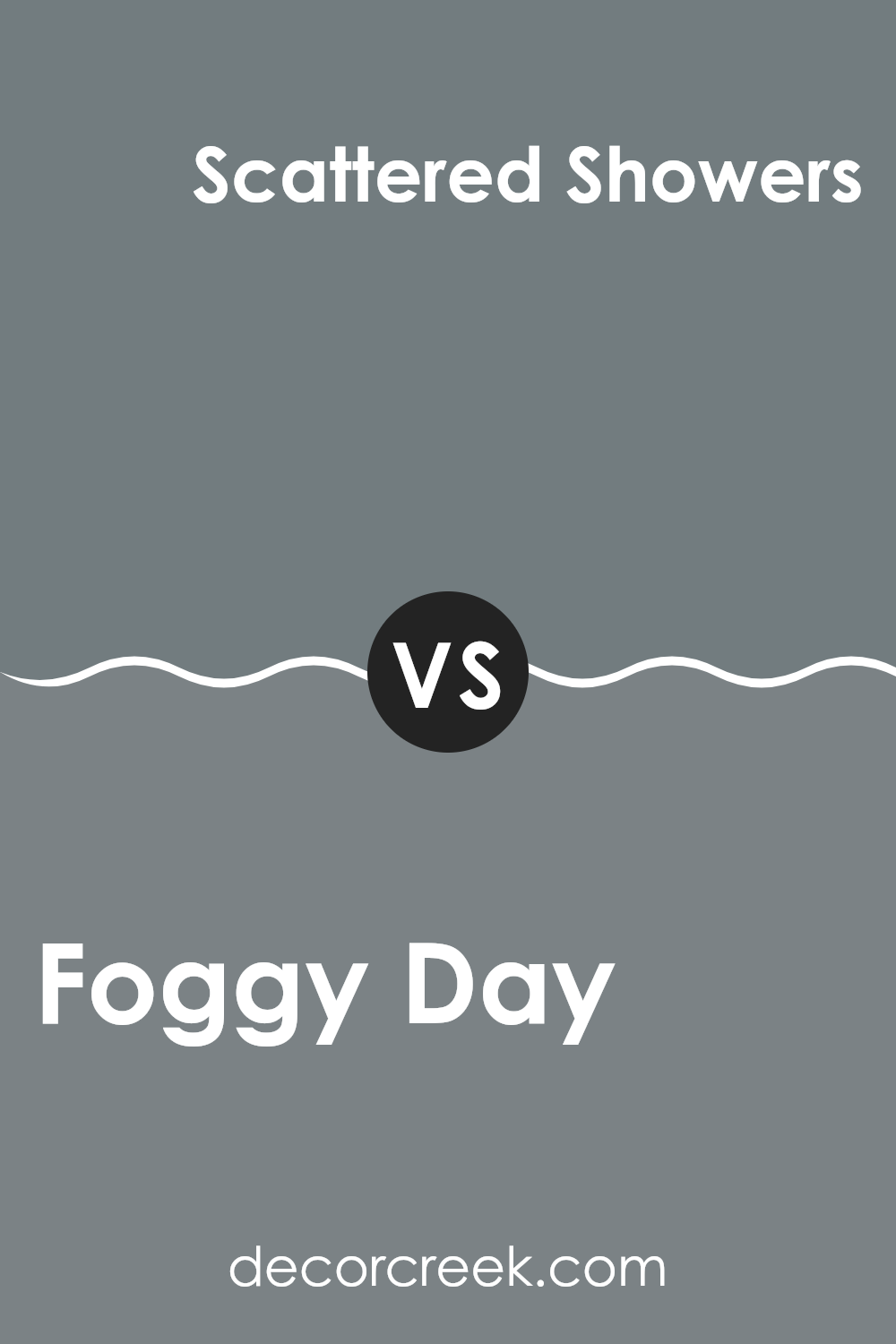
Foggy Day (SW 6235) and Scattered Showers (SW 9559), both by Sherwin Williams, are two distinct yet complementary colors. Foggy Day is a soft, muted gray with bluish undertones. It creates a calm and relaxed atmosphere, making it a flexible choice for various rooms. The subtle hue works well in areas where a gentle, neutral background is desired.
On the other hand, Scattered Showers is a deeper gray with greenish undertones, giving it a more robust and earthy feel. This color can add depth and richness to a room, making it suitable for accent walls or larger rooms where a stronger color statement is preferred.
While Foggy Day is light and airy, Scattered Showers brings a sense of coziness and warmth. Together, they can be used to balance a room, with Foggy Day providing a light backdrop and Scattered Showers offering contrast and depth.
You can see recommended paint color below:
Foggy Day SW 6235 by Sherwin Williams vs Software SW 7074 by Sherwin Williams
Foggy Day SW 6235 and Software SW 7074 by Sherwin Williams are both cool neutral colors, but they have their own unique qualities. Foggy Day is a lighter gray with subtle blue undertones, giving it a soft and airy feel.
It works well in smaller rooms or places where you want a gentle touch. On the other hand, Software is a darker gray, carrying a more pronounced depth with a stronger blue undertone. This color is ideal for creating a cozy, intimate atmosphere or adding contrast when paired with lighter shades.
Foggy Day can make a room feel fresh and open, while Software provides a bold backdrop for more dramatic settings. Both colors fit well with modern design themes and pair nicely with whites, blacks, and other shades of gray. Choosing between them depends on whether you prefer a lighter or a deeper tone for your room.
You can see recommended paint color below:

Foggy Day SW 6235 by Sherwin Williams vs Before the Storm SW 9564 by Sherwin Williams
Foggy Day (SW 6235) and Before the Storm (SW 9564) are both muted colors by Sherwin Williams, but they offer different vibes. Foggy Day is a soft, medium-toned gray with a hint of blue. It feels calm and inviting, making it a great choice for creating a cozy feel in living areas or bedrooms.
In contrast, Before the Storm is a darker, moodier gray with green undertones, lending a more dramatic and grounding effect to a room. While Foggy Day offers a lighter and more airy feel, Before the Storm adds depth and intensity.
When used together, Foggy Day can brighten a room, offering contrast to the bolder Before the Storm. Ideal for those who enjoy neutral palettes, these colors complement various design styles, from modern to traditional. Choosing between them depends on whether you want a soothing or a more dramatic look for your room.
You can see recommended paint color below:

Foggy Day SW 6235 by Sherwin Williams vs Serious Gray SW 6256 by Sherwin Williams
“Foggy Day” and “Serious Gray,” both by Sherwin Williams, are subtle shades of gray with distinct personalities. “Foggy Day” is a soft, muted gray, offering a light and airy feel. It is flexible, making rooms feel calm and open, ideal for living rooms or bedrooms seeking a gentle ambiance.
With its understated hue, it pairs well with whites and light blues, accentuating a peaceful environment. On the other hand, “Serious Gray” is a darker, more grounded shade. It brings depth and warmth to a room, making it suitable for areas where a cozy, intimate atmosphere is preferred.
It works beautifully in studies or accent walls, adding a touch of depth without overpowering the senses. While it complements other deep colors like navy or forest green, it also holds its ground alongside lighter shades. Together, these colors provide options for both light and deep settings, each adding their unique charm.
You can see recommended paint color below:
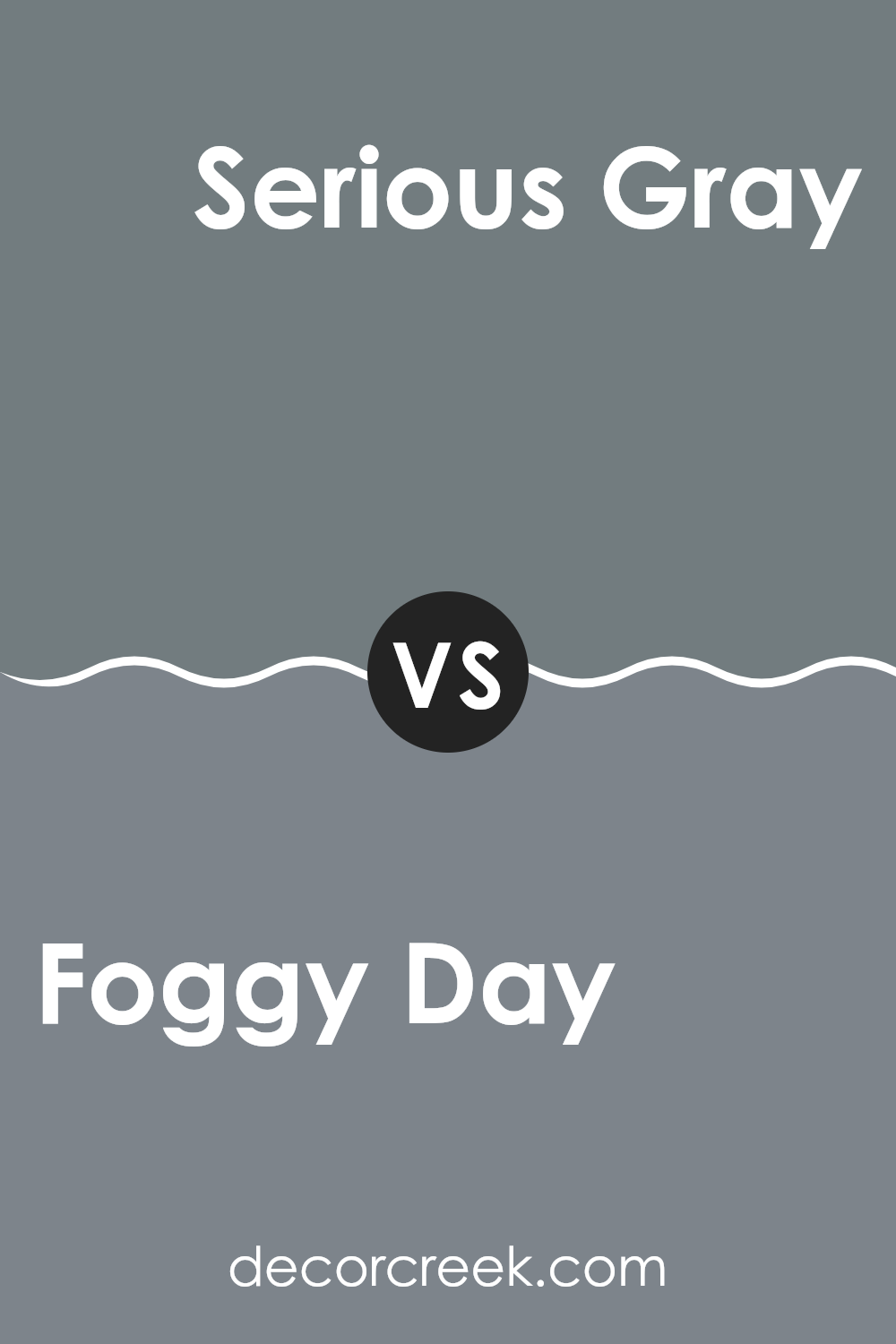
Foggy Day SW 6235 by Sherwin Williams vs Blustery Sky SW 9140 by Sherwin Williams
“Foggy Day” (SW 6235) by Sherwin Williams is a gentle, muted gray with cool undertones. It’s flexible and works well in many settings, providing a calm and neutral backdrop. The color can make a room feel cozy and gentle, offering a quiet atmosphere without making a loud statement.
On the other hand, “Blustery Sky” (SW 9140) is a much bolder choice. This color is a rich, deep blue with green undertones. It adds drama and depth to a room, making it perfect for an accent wall or areas where you want to create a strong visual impact.
While “Foggy Day” is subtle and understated, “Blustery Sky” brings intensity and energy. If you’re looking for a soothing, neutral room, “Foggy Day” might be the choice. For a more engaging and vibrant look, “Blustery Sky” could be ideal. Both colors work well in modern designs but offer different moods.
You can see recommended paint color below:
- SW 9140 Blustery Sky (CHECK A SAMPLE)
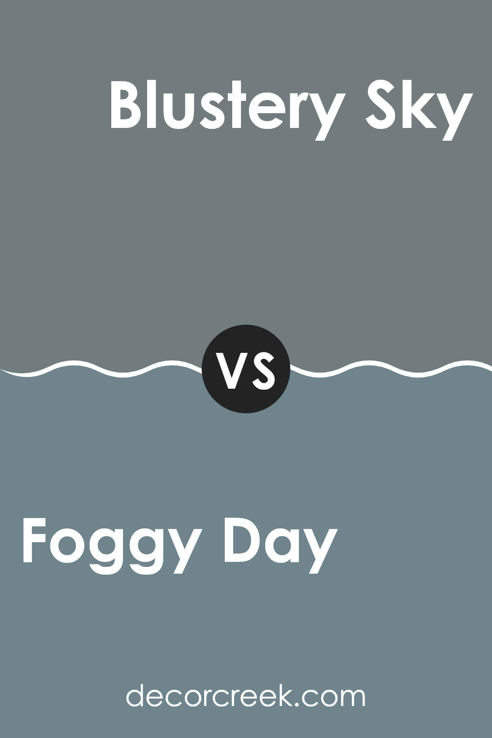
Foggy Day SW 6235 by Sherwin Williams vs Downing Slate SW 2819 by Sherwin Williams
Foggy Day (SW 6235) and Downing Slate (SW 2819) by Sherwin Williams are both shades of gray, but they have distinct differences that can affect the mood of a room. Foggy Day is a cooler, softer gray that brings a sense of calmness to a room. It has blue undertones, which make it feel fresh and airy. It’s a flexible color that works well in many settings, from living rooms to bedrooms.
On the other hand, Downing Slate is a deeper, warmer gray with brown undertones. This gives it a more cozy and grounded feel, excellent for creating a welcoming, intimate atmosphere.
It pairs beautifully with wood finishes and can add depth to dining rooms or libraries. While Foggy Day lightens up a room with its cool tones, Downing Slate offers warmth and a rich, comforting appeal. Both add a different kind of beauty and are about personal preference and the ambiance you want.
You can see recommended paint color below:
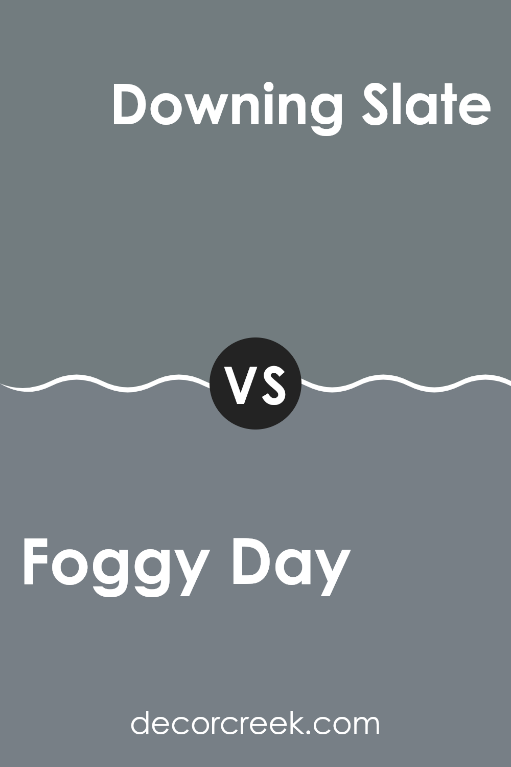
Foggy Day SW 6235 by Sherwin Williams vs Westchester Gray SW 2849 by Sherwin Williams
Foggy Day (SW 6235) and Westchester Gray (SW 2849) by Sherwin Williams are two different shades of gray that each bring their unique feel to a room. Foggy Day is a lighter, cooler gray with soft blue undertones. This gives it a crisp and airy quality, making it well-suited for creating a light and open atmosphere, ideal for smaller rooms or areas looking for a calming touch.
On the other hand, Westchester Gray is a deeper, richer gray with warm undertones. It feels more substantial and grounded, lending a sense of coziness and depth to rooms. Its darker hue makes it a good choice for accent walls or larger rooms where you want to add warmth and character.
Both colors are flexible, but Foggy Day is more suited for a fresh, bright look, while Westchester Gray offers a bolder, more intimate ambiance. They complement each other well when used together, creating balance and contrast.
You can see recommended paint color below:
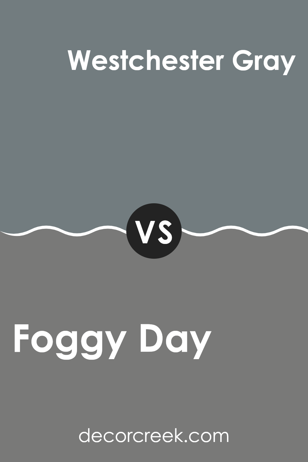
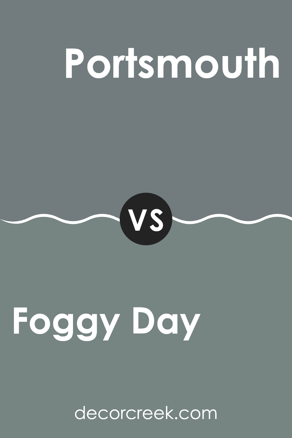
Foggy Day SW 6235 by Sherwin Williams vs Portsmouth SW 9644 by Sherwin Williams
“Foggy Day” by Sherwin Williams is a soft, muted gray with cool undertones, offering a calming and subtle backdrop for any room. It’s a flexible color that works well in a variety of areas due to its understated nature, providing a gentle, neutral canvas that can complement many accent colors.
On the other hand, “Portsmouth” by Sherwin Williams is a deeper, more intense shade. It has a rich, blue-gray tone that adds a sense of depth and boldness to a room. “Portsmouth” can create a more dramatic effect, making it a good choice for feature walls or rooms where you want a strong, defined color.
While “Foggy Day” offers a light and airy feel, “Portsmouth” brings a bold and refined presence. Both colors are flexible but serve different purposes. One provides a soft, understated backdrop, while the other makes a striking statement.
You can see recommended paint color below:
Foggy Day SW 6235 by Sherwin Williams vs Storm Cloud SW 6249 by Sherwin Williams
Foggy Day SW 6235 and Storm Cloud SW 6249 by Sherwin Williams are both shades of gray, but they have distinct characteristics. Foggy Day is a lighter and softer shade, with a gentle blue undertone that adds a sense of calmness to a room.
It’s subtle and works well in areas where you want a light, airy feel. In contrast, Storm Cloud is a darker, more intense gray with stronger blue undertones. It adds depth and a touch of drama to a room, making it ideal for accent walls or areas where you want a bit more moodiness.
Storm Cloud can create a cozy, intimate atmosphere, while Foggy Day offers a brighter, more open feeling. Depending on the desired ambiance, either color can be a great choice, with Foggy Day offering lightness and Storm Cloud bringing a more dramatic flair.
You can see recommended paint color below:
- SW 6249 Storm Cloud (CHECK A SAMPLE)

In the end, SW 6235 Foggy Day by Sherwin Williams is like a gentle, cozy blanket for any room. It’s a soft gray color that feels calm and welcoming, perfect for when you want a room to feel calm but also stylish. I think SW 6235 is great because it can be used in different rooms, like the living room, bedroom, or even the bathroom. It’s not too dark and not too light, making it a good choice for anyone who can’t decide on the perfect color.
When you use Foggy Day on the walls, it can make bright colors in the room stand out more, like a red chair or a yellow pillow. However, it can also look nice with other soft colors like white or even a light blue. Kids might like it because it feels like a quiet, cloudy day when anything fun could happen.
For grown-ups, it’s a smart color choice because it won’t go out of style quickly. Also, if you ever decide to repaint in the future, it will be easy to work with other colors.
I find Foggy Day to be a comforting and smart pick, like a friendly hug from paint, ready to make any house feel more like a home.

Ever wished paint sampling was as easy as sticking a sticker? Guess what? Now it is! Discover Samplize's unique Peel & Stick samples.
Get paint samples


