Black
Black Blue
Blue Brown
Brown Gray
Gray Green
Green Neutral
 Orange
 White
White Yellow
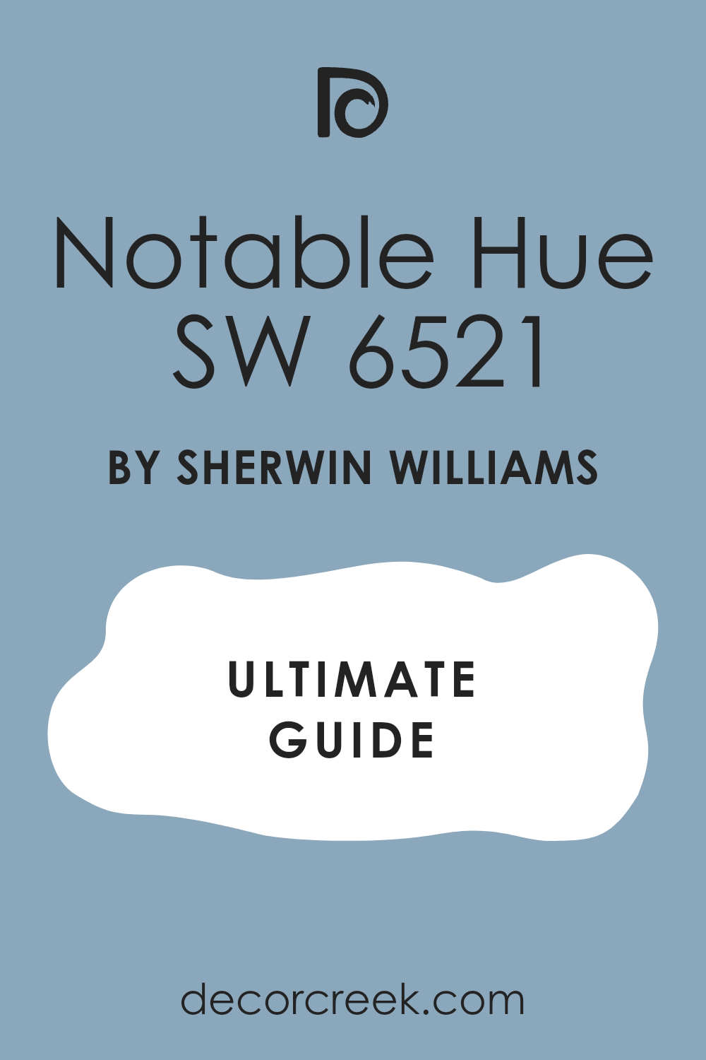
If you’ve ever looked through what feels like endless paint swatches, you know how difficult it can be to find the perfect color for your room. Luckily, SW 6521 Notable Hue by Sherwin Williams stood out as a clear favorite in my recent search for the perfect blue. This charming shade combines the calm feeling of a soft blue with a touch of brightness, bringing a fresh and lively atmosphere to any room without feeling too intense.
Notable Hue has an adaptable quality that works beautifully in many settings, whether I’m hoping to create a calming bedroom retreat or a welcoming living room. It pairs well with both modern and traditional decor, offering a backdrop that improves rather than competes with different furniture styles and accessories.
While testing this color in different lighting conditions, I noticed it adjusts subtly, maintaining its beauty from bright daylight to the softer tones of evening.
Considering its effect, I realized that choosing the right paint color is more than just a decorative decision—it influences the mood and feeling of a room.
SW 6521 Notable Hue has certainly shaped the atmosphere in my home, offering a fresh palette that brightens my everyday living environment.
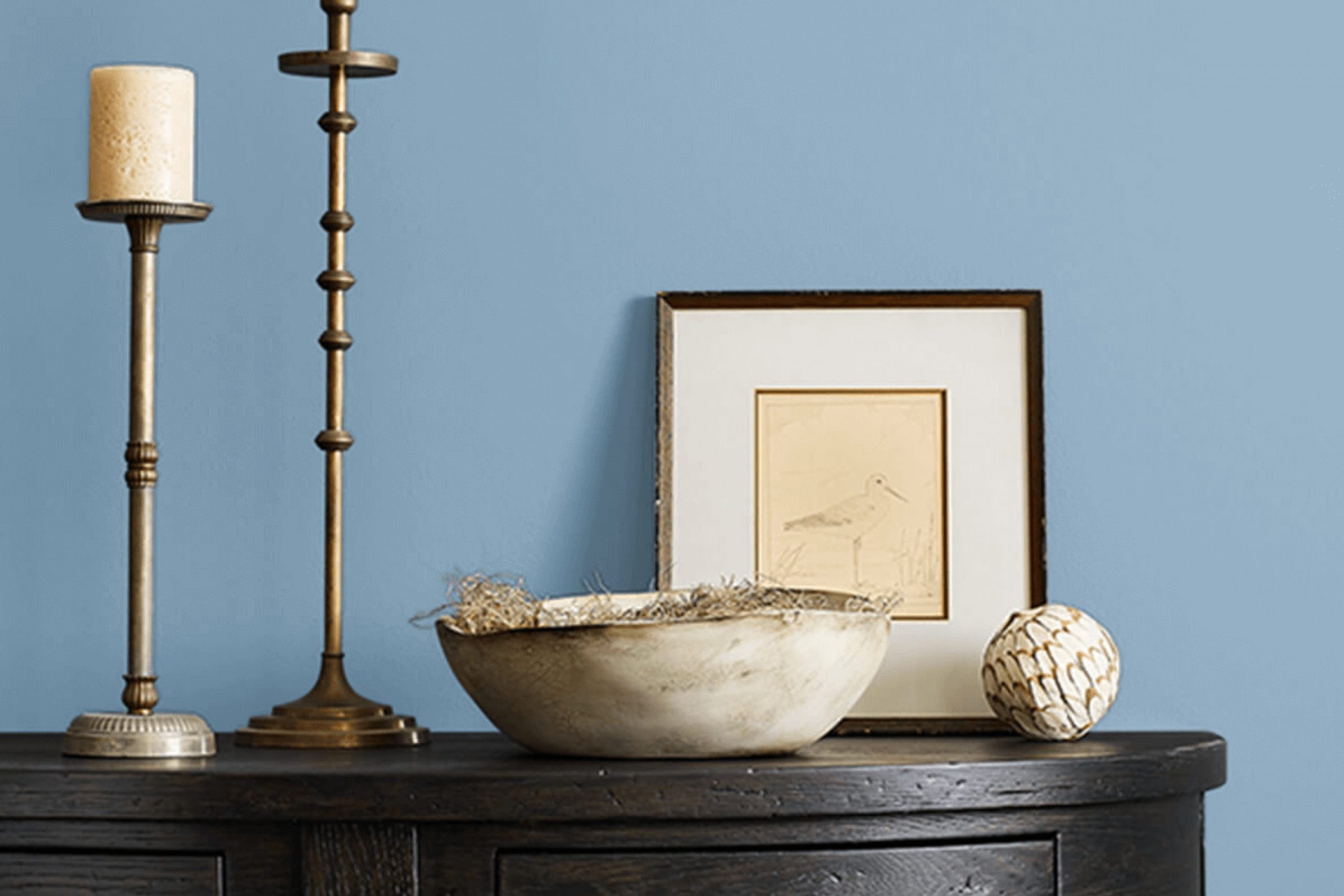
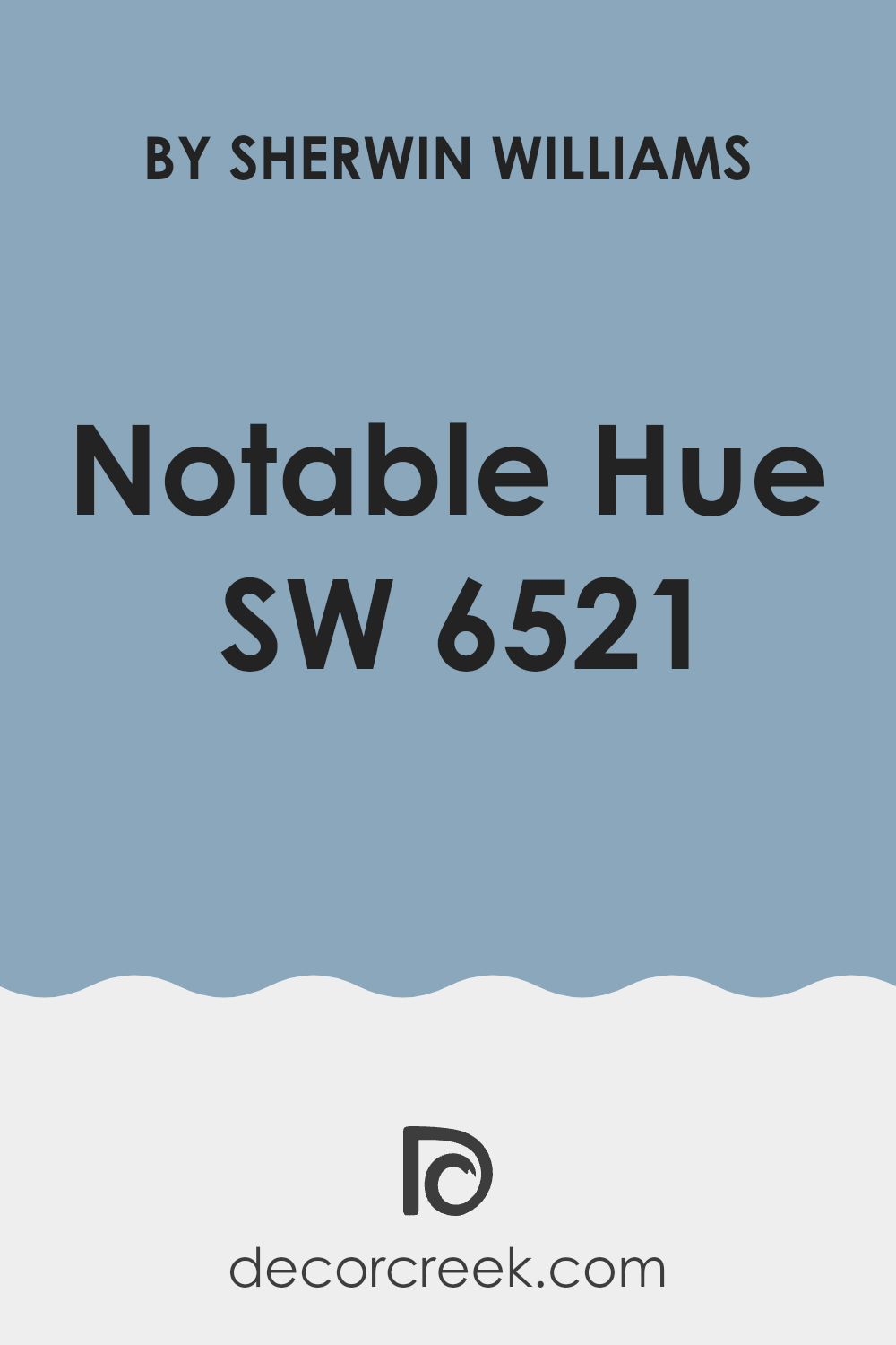
What Color Is Notable Hue SW 6521 by Sherwin Williams?
Notable Hue by Sherwin Williams is a fresh and lively shade of blue with a hint of green undertones, bringing vibrant energy into any room. This dynamic color has a bright personality that can add a cheerful touch to interiors, making rooms feel more welcoming and energetic.
This color works wonderfully in modern and coastal interior styles. Its fresh feeling is perfect for creating a breezy, beach-inspired atmosphere, especially when paired with light woods, sandy beiges, and crisp whites. Materials like linen, cotton, and rattan complement the fresh appearance of Notable Hue, improving the airy and open atmosphere of a room.
In a modern setting, Notable Hue can create striking contrasts with sleek materials such as polished metals, glass, or minimalist black accents. For a softer and cozier atmosphere, pairing it with plush textures like wool or velvet in neutral colors can soften the intensity of the shade while keeping the room lively.
Notable Hue is especially effective for accent walls, furniture pieces, or even cabinetry to add a playful splash of color to a mostly neutral palette. When used in accessories like cushions, throws, or curtains, it can be a simple yet effective way to refresh a room’s decor without feeling too intense.
decorcreek.com
Is Notable Hue SW 6521 by Sherwin Williams Warm or Cool color?
Notable Hue by Sherwin Williams is a beautiful color that can add a fun and welcoming feeling to any room. It’s a lively shade that stands out and can make your living room feel cheerful. This color works wonderfully in areas where you want to add energy and personality, like kids’ rooms, kitchens, or even a home office.
Because it’s so bold, it pairs well with neutral colors like white or gray. This can help balance the brightness and keep your room from feeling too intense. Additionally, using Notable Hue on an accent wall can be a wonderful way to introduce a splash of color without painting the entire room.
This approach can brighten your room while keeping things relatively simple and easy to manage. Overall, Notable Hue is a wonderful choice if you’re looking to add cheerful color to your home.
Undertones of Notable Hue SW 6521 by Sherwin Williams
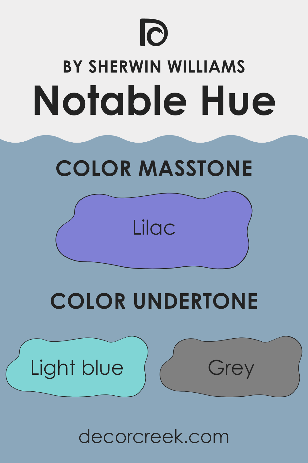
Notable Hue, a shade by Sherwin Williams, has a rich blend of undertones that influence how it appears in different settings and lighting. Undertones are subtle hues that, while not always obvious at first glance, strongly affect the overall appearance of the color. In the case of Notable Hue, it contains undertones of light blue, grey, mint, light purple, along with touches of turquoise and pink.
These subtle details play an important role, especially when you use the paint on interior walls. Depending on the light and surrounding colors, the undertones can make the wall appear cooler or warmer. For instance, natural daylight may highlight the light blue and mint undertones, giving the wall a fresh and airy feeling, while artificial light could bring out deeper shades like dark turquoise or navy, adding a slightly moodier atmosphere.
When painting a room, paying attention to these undertones can help achieve the atmosphere you want. Lighter undertones like pale yellow or pale pink can make a small room feel larger and brighter. In contrast, darker undertones like purple or navy may help create a cozier and more enclosed feeling.
Understanding and considering the undertones can make a noticeable difference in ensuring that the wall color matches your vision for the room.
decorcreek.com
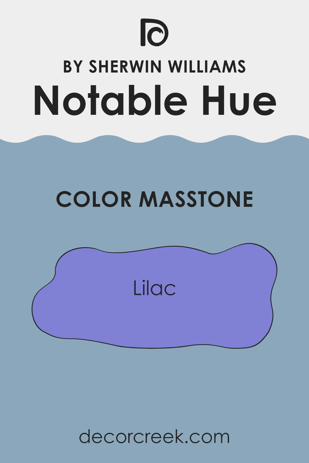
What is the Masstone of the Notable Hue SW 6521 by Sherwin Williams?
Notable Hue SW 6521 by Sherwin Williams has a masstone of Lilac (#8080D5), a soft and gentle shade of purple. This particular lilac tone is light enough to make rooms feel more spacious while still carrying enough color to add a personal touch to any room.
When used in homes, this lilac shade creates a calming atmosphere without feeling too muted. It works exceptionally well in bedrooms where a peaceful feeling is often desired, or in living rooms to add a welcoming charm.
In rooms with limited natural light, this shade helps reflect light, making the area appear brighter and more airy. Its ability to blend beautifully with other colors also allows for adaptable decor choices, pairing wonderfully with creams, grays, and even bolder colors like navy or deep green for a dynamic interior appearance. Overall, this lovely shade of lilac is a perfect choice for anyone looking to refresh their home with a touch of gentle color.
decorcreek.com
How Does Lighting Affect Notable Hue SW 6521 by Sherwin Williams?
Lighting plays an important role in how we perceive colors. Different light sources can noticeably change the appearance of a color on your walls. Notable Hue is a color that clearly shows how lighting conditions can influence its appearance.
In artificial light, Notable Hue’s true character can vary depending on the type of bulbs used. Warm-toned bulbs usually make it appear softer and more muted, improving its cozy feeling. On the other hand, cool-toned bulbs can reveal a cleaner and more lively side of this color, making it appear slightly brighter.
In natural light, this color reacts beautifully throughout the day. It tends to look more vivid and energetic under bright midday light but becomes calmer and softer during the early morning or late afternoon when sunlight is gentler.
Room orientation also affects how Notable Hue appears:
- North-facing rooms receive less direct sunlight, which can make colors appear cooler. Here, Notable Hue may seem more muted, showing more of its cooler undertones.
- South-facing rooms are filled with abundant sunlight for most of the day, which usually improves the warmth and richness of colors. In these rooms, Notable Hue will likely appear warmer and more welcoming.
- East-facing rooms receive plenty of sunlight in the morning, so Notable Hue will begin the day looking bright and cheerful but become softer as the day continues and natural light fades.
- West-facing rooms experience stronger sunlight later in the afternoon, meaning Notable Hue may appear more muted in the morning but gain richness and warmth in the evening.
Understanding these interactions between light and color can help you make better decisions when choosing paint colors for your room, ensuring you achieve the atmosphere you want in every area of your home.

decorcreek.com
What is the LRV of Notable Hue SW 6521 by Sherwin Williams?
LRV stands for Light Reflectance Value, which is a measure used to determine how much light a color reflects and how much it absorbs. An LRV scale runs from a low of 1 to a high of 99, with lower values indicating darker colors that absorb more light and higher values representing lighter colors that reflect more light.
Understanding LRV can help you choose the right paint color for your room, especially when deciding how light or dark you want the room to feel. Lighter colors can make a room feel more open and airy, while darker colors can create a cozier and more enclosed feeling.
The LRV of 36.686 for this particular paint color means that it falls on the darker side of the scale, reflecting about 36% of the light while absorbing the rest. This medium-dark shade can add depth and richness to a room, influencing the overall atmosphere.
In rooms with limited natural light, using a color with this LRV may make the room appear smaller or more enclosed. However, in a well-lit room or one with plenty of lighting fixtures, this color can add a rich and warm tone to the walls without making the room feel too cramped. It’s important to consider both the size of the room and its lighting conditions when deciding if this LRV is the right fit for your decorating needs.

decorcreek.com
Coordinating Colors of Notable Hue SW 6521 by Sherwin Williams
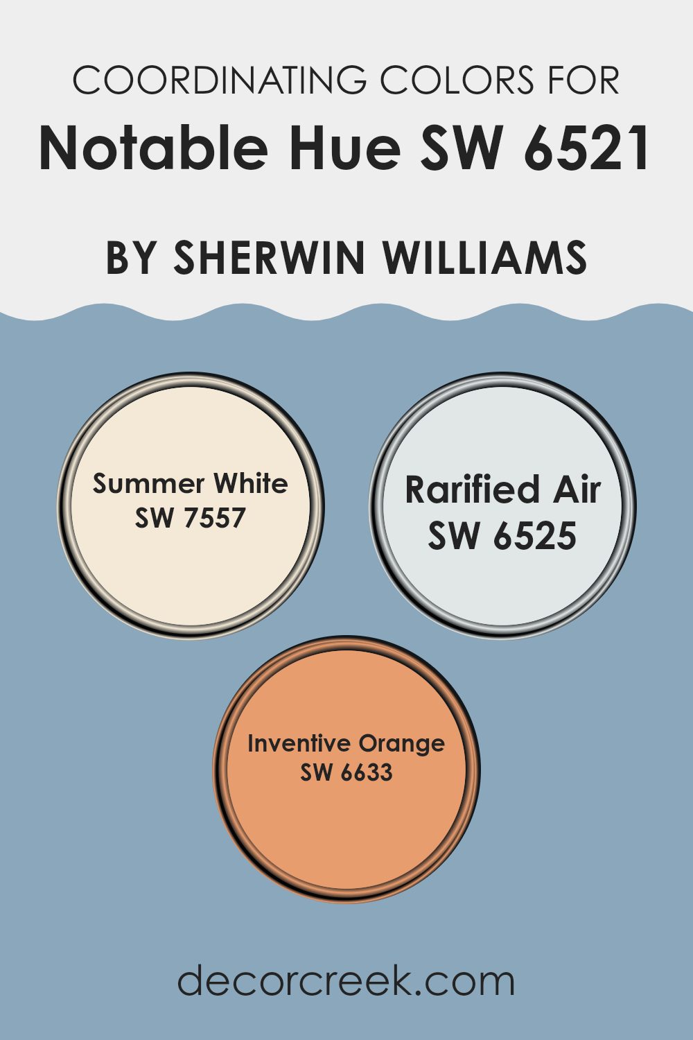
Coordinating colors are used in design to create appealing palettes that complement a primary color, helping rooms feel more balanced and visually pleasing. In the case of the color “Notable Hue” by Sherwin Williams, several coordinating colors can improve its beauty and bring different moods into a room. These coordinating shades provide options for matching furniture, accessories, or wall trims, offering designers and homeowners adaptable solutions to create the atmosphere they want in their decor.
One of the coordinating colors, “Summer White” (SW 7557), is a warm and creamy white that brings a light and airy feeling to rooms. It works beautifully to soften the brightness of stronger shades and adds gentle warmth without making the main colors feel too intense.
“Rarified Air” (SW 6525) is a pale and almost airy blue that has a calming effect, making it perfect for bedrooms or bathrooms where a relaxed atmosphere is important. Finally, “Inventive Orange” (SW 6633) introduces a bold and energetic burst of color, ideal for accent walls or decorative details that attract attention and add visual interest. Each of these colors supports and complements “Notable Hue,” helping create a connected and visually attractive design in any room using this palette.
You can see recommended paint colors below:
- SW 7557 Summer White
- SW 6525 Rarified Air
- SW 6633 Inventive Orange
What are the Trim colors of Notable Hue SW 6521 by Sherwin Williams?
Trim colors play an important role in improving and defining the appearance of a room by highlighting architectural details or creating a complementary contrast with the main wall colors.
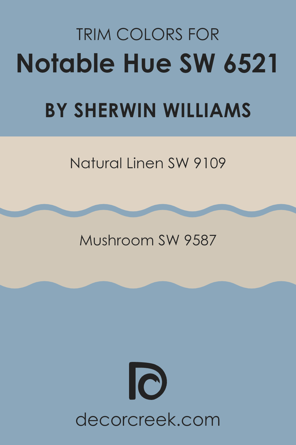
When paired with a distinctive color like Notable Hue by Sherwin Williams, trim colors should be carefully selected to either blend softly or stand out gently without making the primary color feel too intense. For instance, using colors such as SW 9109 – Natural Linen or SW 9587 – Mushroom as trim can add an elegant finish to the bold character of Notable Hue.
SW 9109 – Natural Linen is a warm and welcoming beige that provides a soft and muted contrast to richer shades, making it an adaptable choice for a cozy and connected appearance. On the other hand, SW 9587 – Mushroom is a deeper and earthy beige that creates a grounding effect, adding depth and warmth when used as trim. This helps improve the overall character of the room without competing with the main paint color.
You can see recommended paint colors below:
Colors Similar to Notable Hue SW 6521 by Sherwin Williams
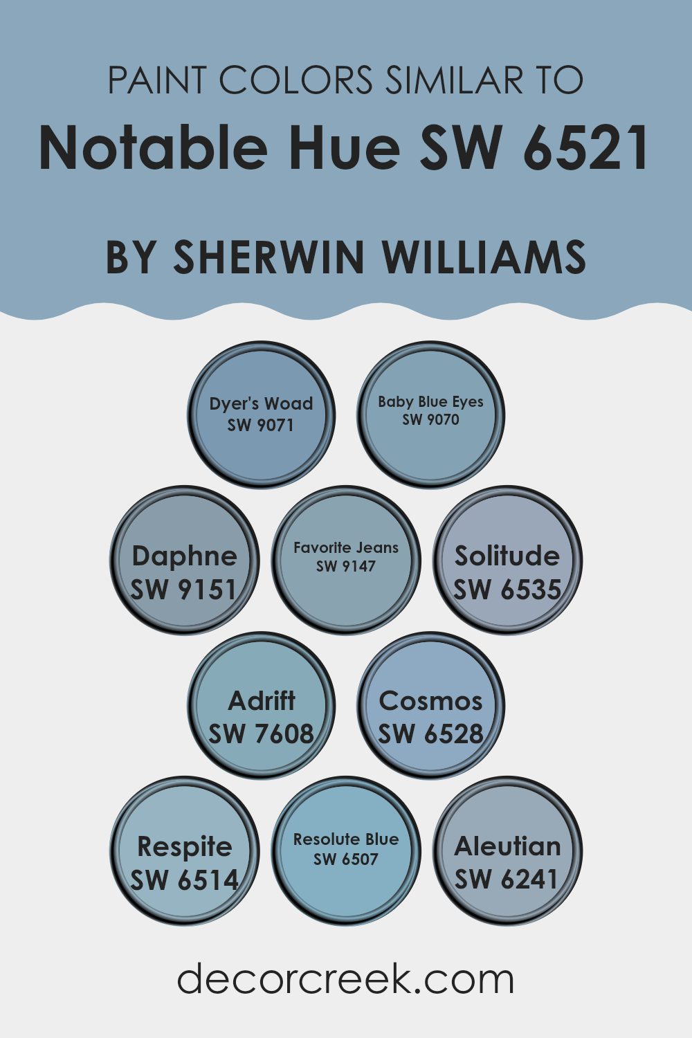
When decorating, choosing similar colors can create a connected and balanced appearance in any room. Similar colors, like variations of Notable Hue by Sherwin Williams, work beautifully together because they belong to the same color family while differing slightly in tone and intensity, allowing for a smooth yet visually interesting appearance. This approach can gently define different areas while maintaining a unified atmosphere.
For example, Dyer’s Woad is a subtle navy that creates a calm and steady feeling, perfect for building a grounded atmosphere. Baby Blue Eyes softens the mood with its lighter and more delicate blue, offering a gentle touch to nurseries or relaxed rooms. Daphne, with its hint of slate blue, provides a muted option that works beautifully in professional or elegant settings without making the room feel too intense.
Favorite Jeans has a worn and comfortable feeling, much like your favorite denim, making it ideal for casual living rooms. Solitude reflects the depth of the ocean, adding a touch of mystery and richness to any room, while Adrift offers a softer maritime blue, reminiscent of a foggy morning by the sea.
Cosmos brings a brighter and more lively blue that adds a splash of color, suitable for energizing a room. Respite resembles a clear sky, providing a fresh and airy feeling, perfect for creating a relaxing retreat in your home. Resolute Blue is bold and confident, ideal for feature walls or furniture pieces that naturally attract attention.
Lastly, Aleutian introduces a gray undertone that cools the palette, making it adaptable for blending with other neutral shades in modern interiors. These shades help create a visually pleasing atmosphere by using related hues to strengthen the overall style of a room.
You can see recommended paint colors below:
- SW 9071 Dyer’s Woad
- SW 9070 Baby Blue Eyes
- SW 9151 Daphne
- SW 9147 Favorite Jeans
- SW 6535 Solitude
- SW 7608 Adrift
- SW 6528 Cosmos
- SW 6514 Respite
- SW 6507 Resolute Blue
- SW 6241 Aleutian
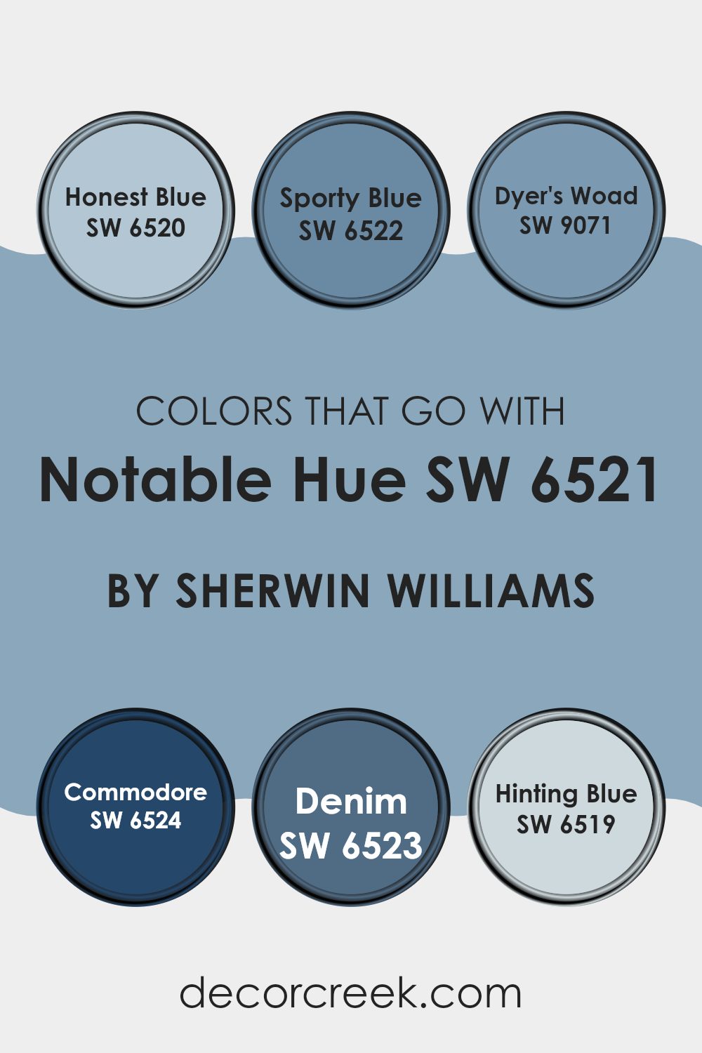
Colors that Go With Notable Hue SW 6521 by Sherwin Williams
Choosing complementary colors for Notable Hue by Sherwin Williams is important because it helps create a balanced and visually appealing color palette for any room. The colors that pair well with Notable Hue improve the overall appearance by adding balance and contrast.
For instance, Honest Blue is a soft yet noticeable blue that brings a fresh and airy feeling. It’s ideal for creating a calming atmosphere without making the room feel too intense. Sporty Blue, being slightly brighter, adds energy and movement to a room, making it perfect for lively areas like playrooms or creative studios.
Other matching colors include Dyer’s Woad, which has a deeper blue tone that adds depth and richness, perfect for accent walls or furniture pieces. Commodore is even more intense and bold, creating a strong statement in a room and often drawing attention to important areas.
Then, there’s Denim, a more relaxed and comfortable blue that brings to mind everyday ease, making it wonderful for bedrooms or living rooms. Lastly, Hinting Blue offers a subtle touch of blue that feels almost neutral, making it highly adaptable for blending with different decor styles while maintaining a light and welcoming atmosphere. Together, these complementary colors balance the brightness of Notable Hue, creating connected and visually pleasing palettes in any setting.
You can see recommended paint colors below:
- SW 6520 Honest Blue
- SW 6522 Sporty Blue
- SW 9071 Dyer’s Woad
- SW 6524 Commodore
- SW 6523 Denim
- SW 6519 Hinting Blue
How to Use Notable Hue SW 6521 by Sherwin Williams In Your Home?
Notable Hue SW 6521 by Sherwin Williams is a rich and lively blue-green shade that can add personality and depth to any room in your home. This color works beautifully in different settings, whether you’re painting a bedroom, a kitchen, or even a bathroom.
For those looking to add a splash of color, Notable Hue can be used on an accent wall, which can brighten a neutral room without making it feel too intense. This shade pairs nicely with lighter colors like creams and soft whites, which help keep a room feeling open and airy.
Additionally, for a connected appearance, you can use the same color for smaller details, like doors or cabinets, which ties different rooms in your home together. It’s also perfect for furniture pieces if you’re into DIY projects, adding a unique touch to older furniture. Given its adaptable nature, Notable Hue is suitable for those wanting something special that adds both comfort and style to their living rooms.
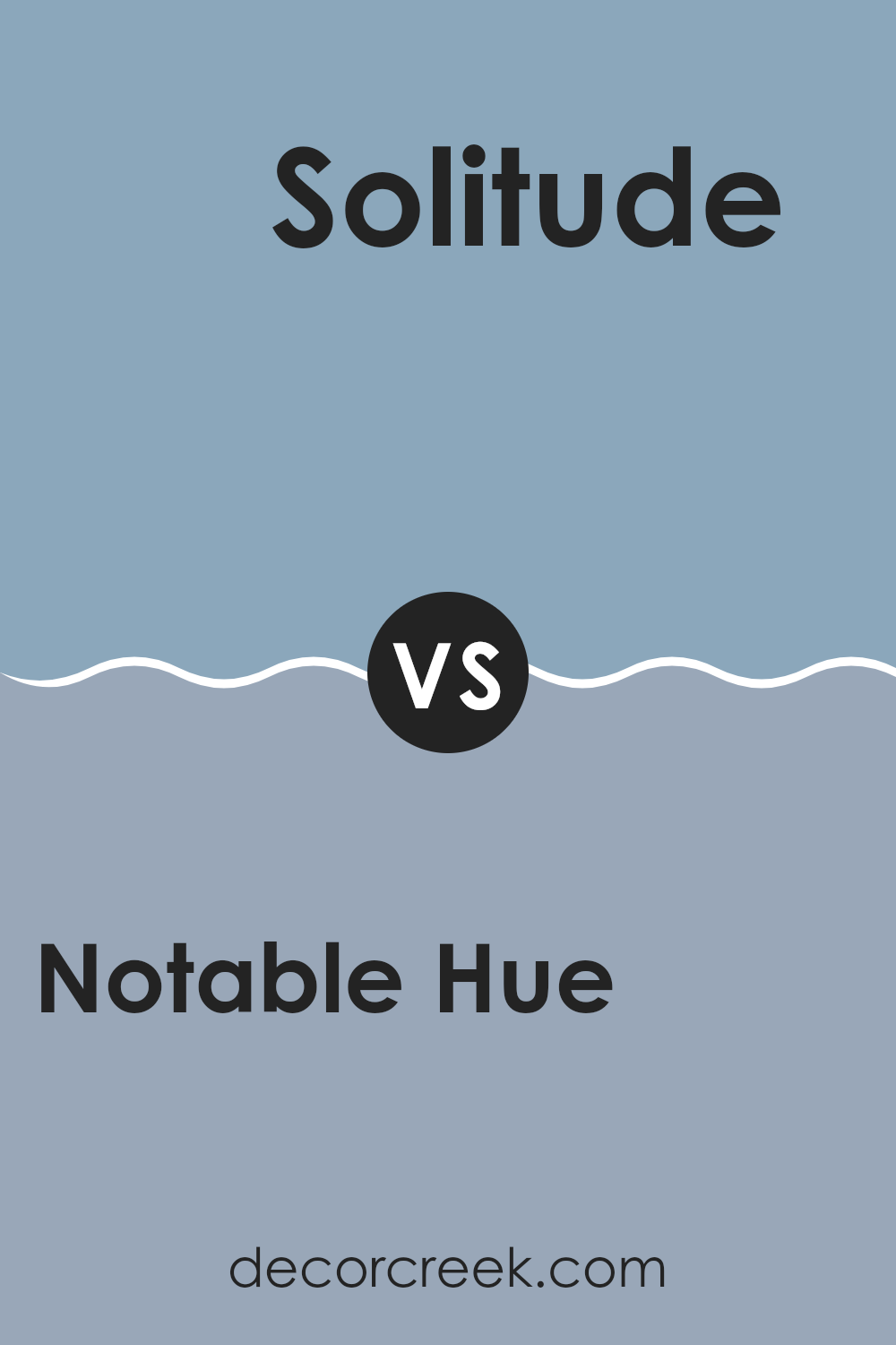
Notable Hue SW 6521 by Sherwin Williams vs Solitude SW 6535 by Sherwin Williams
Notable Hue and Solitude by Sherwin Williams are two distinct paint colors with unique qualities. Notable Hue is a lively blue that brings brightness and energy into a room. It can make a room feel cheerful and full of personality, perfect for areas like a creative office or a playful kid’s bedroom.
On the other hand, Solitude is a softer and more muted blue with a hint of gray. This color is ideal for areas where you want a more relaxed and calming atmosphere.
It works beautifully in bedrooms or bathrooms where a soothing touch is helpful. Both colors pair well with white trim and can be used with many decor styles, but Notable Hue adds a splash of color, while Solitude creates a subtle and calming backdrop.
You can see recommended paint color below:
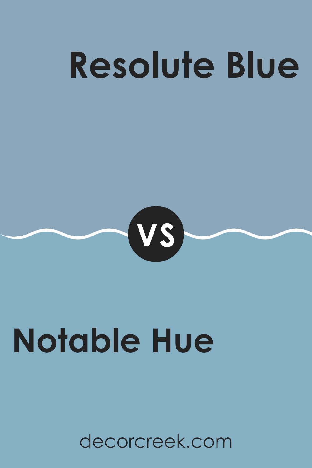
Notable Hue SW 6521 by Sherwin Williams vs Resolute Blue SW 6507 by Sherwin Williams
Notable Hue and Resolute Blue, both from Sherwin Williams, are distinct in their appearance and the moods they create. Notable Hue is a soft and calming blue with a touch of gray, making it ideal for creating a relaxed and welcoming atmosphere.
It works beautifully in rooms intended for relaxation, such as bedrooms and living rooms. In contrast, Resolute Blue is deeper and more intense. This striking blue has a lively quality that stands out more boldly on walls.
It suits areas where a dynamic and energetic atmosphere is desired, like an accent wall in a modern living room or a creative workspace. When deciding between the two, consider the type of environment you want to create; Notable Hue offers a gentle backdrop, while Resolute Blue creates a stronger visual statement.
You can see recommended paint color below:
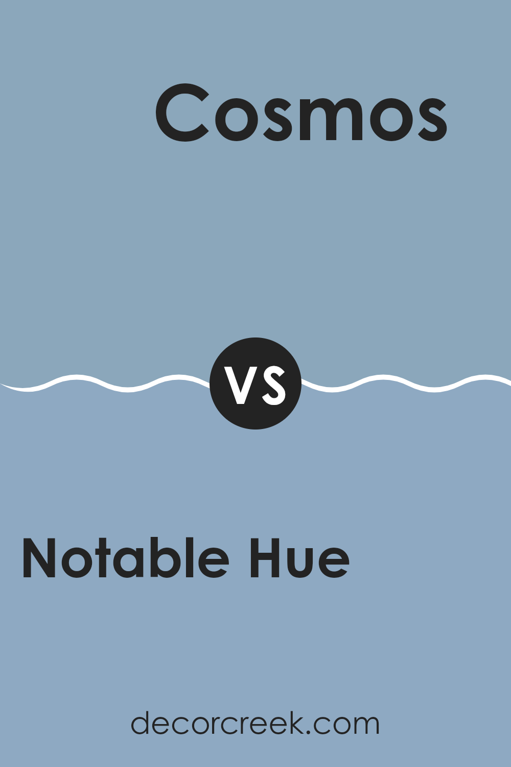
Notable Hue SW 6521 by Sherwin Williams vs Cosmos SW 6528 by Sherwin Williams
Notable Hue and Cosmos, both from Sherwin Williams, create very different moods in a room. Notable Hue is a soft and gentle blue with a calming effect, perfect for creating a soothing atmosphere. Its lighter appearance brings a fresh feeling into rooms, making them feel more open and airy.
On the other hand, Cosmos is a deeper and more intense shade of blue. This color creates a bold statement and can add strong character to any room. It works beautifully in areas where you want a touch of drama or a noticeable focal point.
Both colors are adaptable and can be used in different rooms, from bedrooms to living rooms, depending on the atmosphere you want to create. Whether you prefer the lighter feeling of Notable Hue or the deeper tones of Cosmos, each color has its own unique appeal.
You can see recommended paint color below:
- SW 6528 Cosmos
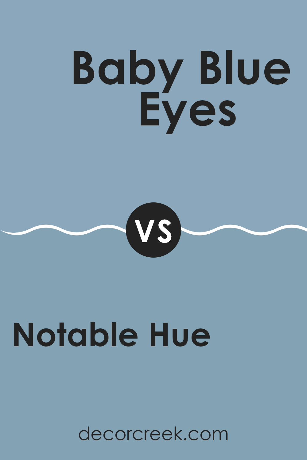
Notable Hue SW 6521 by Sherwin Williams vs Baby Blue Eyes SW 9070 by Sherwin Williams
Notable Hue and Baby Blue Eyes by Sherwin Williams are quite different. Notable Hue is a rich teal with a deep and bold presence that brings energy into a room. It leans toward green, standing out strongly on walls or when used in accents. This color can brighten an area or act as a striking backdrop.
On the other hand, Baby Blue Eyes is a soft and light blue with a calming effect. It is much gentler and can make a room feel airy and open. Its subtle tone is wonderful for creating a relaxing environment, ideal for bedrooms or bathrooms where you want to encourage a peaceful atmosphere.
Both colors offer unique visual appeal: Notable Hue brings more drama and personality, while Baby Blue Eyes provides a gentle touch and a quiet feeling. Depending on the mood you want to create in your room, either could be a perfect choice.
You can see recommended paint color below:
- SW 9070 Baby Blue Eyes
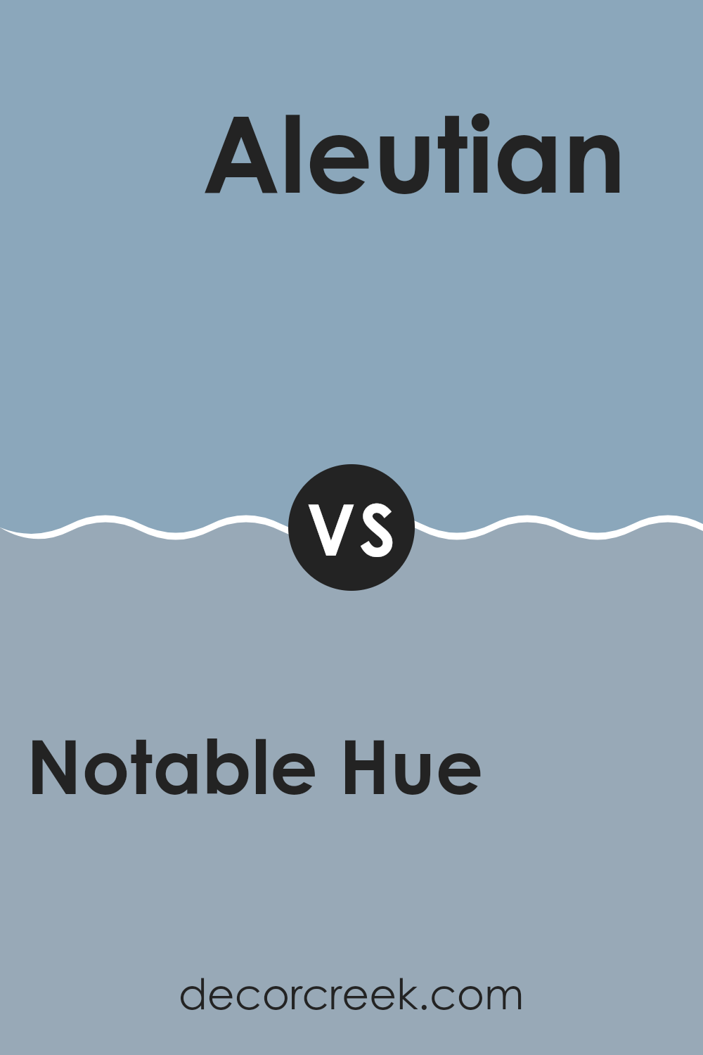
Notable Hue SW 6521 by Sherwin Williams vs Aleutian SW 6241 by Sherwin Williams
Notable Hue and Aleutian, both by Sherwin Williams, offer distinct shades that can change the feeling of any room. Notable Hue is a lively medium blue with an energetic appearance that adds a fresh splash of color to rooms. It’s a strong choice if you’re looking to introduce brightness without making the room feel too vivid.
Aleutian, on the other hand, is a softer and more muted blue with gray undertones. This color creates a more relaxed and calming feeling, making it wonderful for rooms where you want to unwind and relax, like bedrooms or quiet sitting areas.
Both colors have their own unique appeal, but your choice depends on the atmosphere you’re trying to create in your room. If you want something that stands out more, choose Notable Hue. If you’re looking for a gentler and more muted atmosphere, Aleutian is the better option.
You can see recommended paint color below:
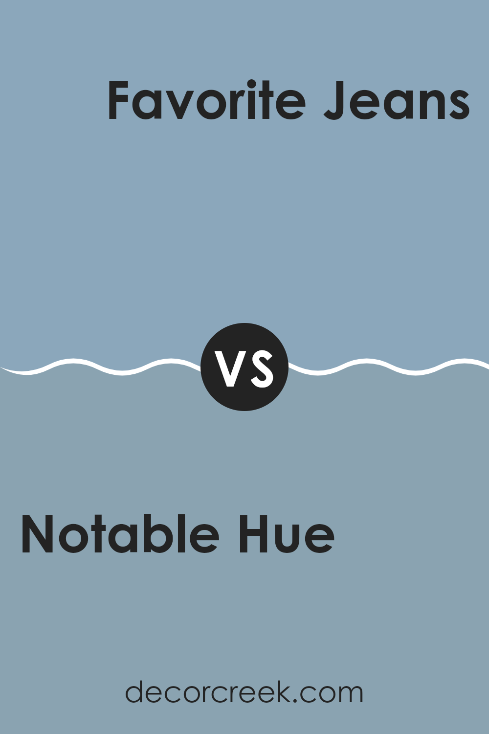
Notable Hue SW 6521 by Sherwin Williams vs Favorite Jeans SW 9147 by Sherwin Williams
Notable Hue SW 6521 and Favorite Jeans SW 9147 from Sherwin Williams present distinct color personalities. Notable Hue is a bright and lively blue, creating a cheerful and energetic feeling in any room where it’s used. Its lively tone works beautifully in areas that benefit from a splash of color, such as kitchens or playrooms.
On the other hand, Favorite Jeans is a darker and more muted blue. This color has a comforting and calming quality, reminiscent of a well-worn pair of denim jeans. It’s perfect for rooms where relaxation is important, like bedrooms or reading nooks. The deeper blue creates a sense of stability and grounding.
Both colors, while unique in their tones, offer the flexibility to create welcoming interiors, with each one setting a different atmosphere through its intensity and depth.
You can see recommended paint color below:
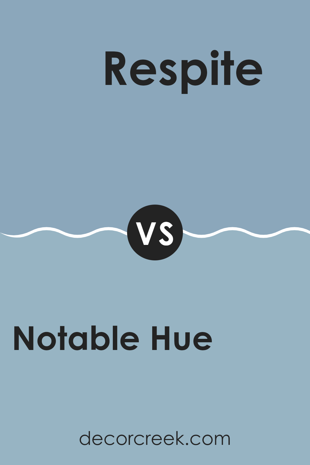
Notable Hue SW 6521 by Sherwin Williams vs Respite SW 6514 by Sherwin Williams
Notable Hue and Respite, both by Sherwin Williams, create distinct feelings in a room. Notable Hue is a deep and lively blue that adds a bold touch to interiors. It’s perfect for creating a statement wall or an accent area. This shade can make smaller rooms feel cozier and more welcoming.
On the other hand, Respite is a lighter and softer blue. It has a calming effect, making it ideal for bedrooms or bathrooms where you want a peaceful and relaxing atmosphere. It reflects more light, which can help make a room feel more open and airy.
When comparing these two, Notable Hue stands out because of its richness and depth, while Respite offers a gentler and more calming appearance. Depending on your room’s purpose and size, either can be a wonderful choice. Notable Hue works beautifully where you want drama and energy, whereas Respite is best where you prefer a light and soothing feeling.
You can see recommended paint color below:
- SW 6514 Respite
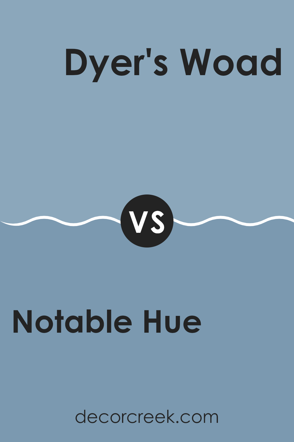
Notable Hue SW 6521 by Sherwin Williams vs Dyer’s Woad SW 9071 by Sherwin Williams
Notable Hue and Dyer’s Woad are two distinct colors by Sherwin Williams. Notable Hue is a lively and energetic shade that leans toward a bright turquoise. This color is vivid and can add a splash of freshness to any room, making it feel more welcoming and cheerful. It’s an excellent choice for areas where you want to add energy and joy.
On the other hand, Dyer’s Woad is a deeper and more muted blue with grey undertones. It creates a calming feeling and is less bold compared to Notable Hue. This color works beautifully in settings where a more relaxed and peaceful atmosphere is desired, such as bedrooms or offices.
Both colors can help define the mood and style of a room but suit different design preferences. Notable Hue, with its brightness, fits lively and energetic rooms, while Dyer’s Woad is ideal for creating a calmer and quieter atmosphere.
You can see recommended paint color below:
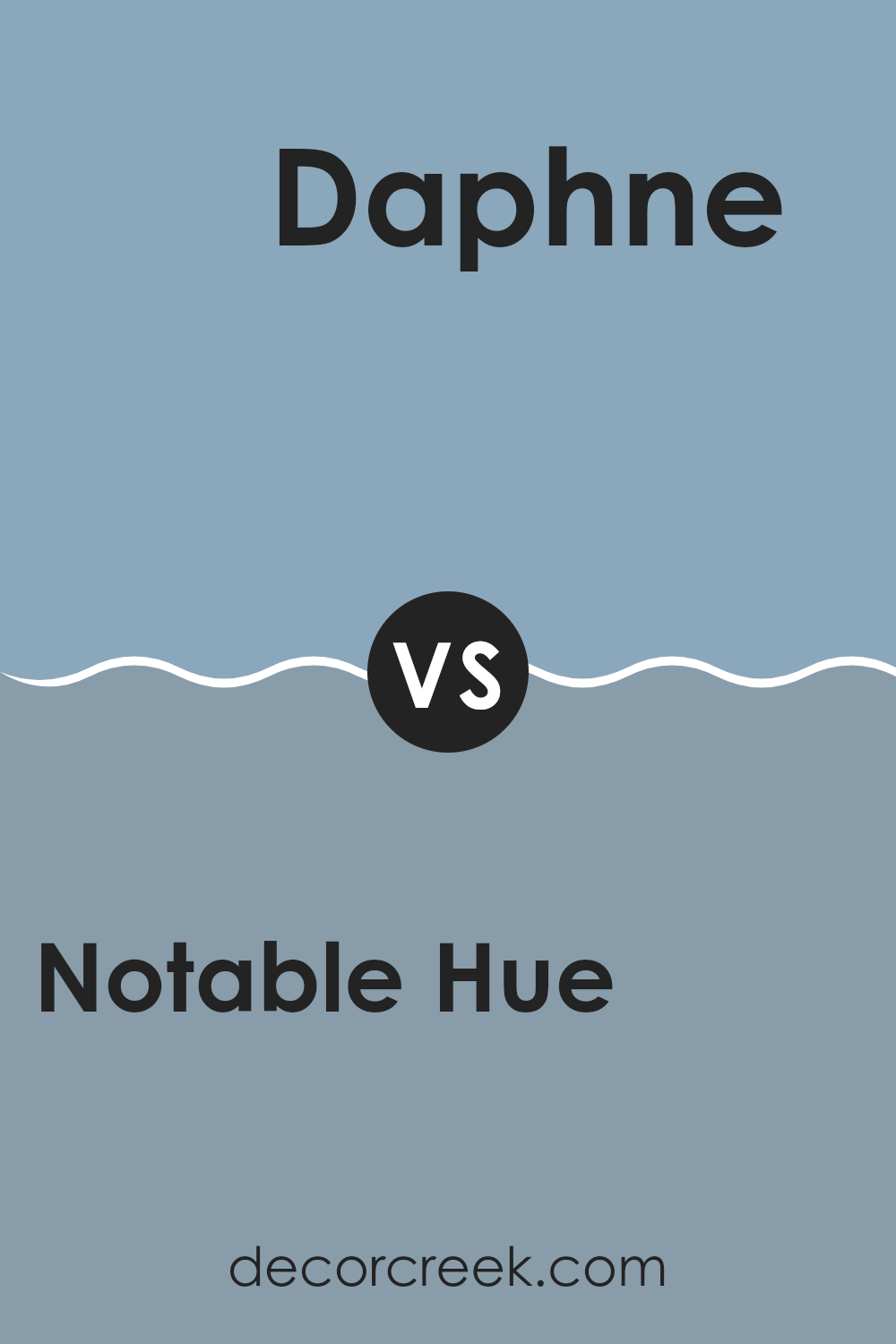
Notable Hue SW 6521 by Sherwin Williams vs Daphne SW 9151 by Sherwin Williams
Notable Hue and Daphne by Sherwin Williams are two distinct colors that can create very different moods in a room. Notable Hue is a lively and energetic teal. It has a fresh feeling that can brighten rooms and is perfect for adding a playful yet stylish touch to interiors.
On the other hand, Daphne is a deep navy blue that creates a strong and bold impression. It brings a sense of stability and formality, making it ideal for areas where a more grounded or professional atmosphere is desired.
While Notable Hue brings energy and cheer, Daphne leans toward creating a more reserved and confident atmosphere. Both colors are adaptable but work best in different settings depending on the mood you want to create.
You can see recommended paint color below:
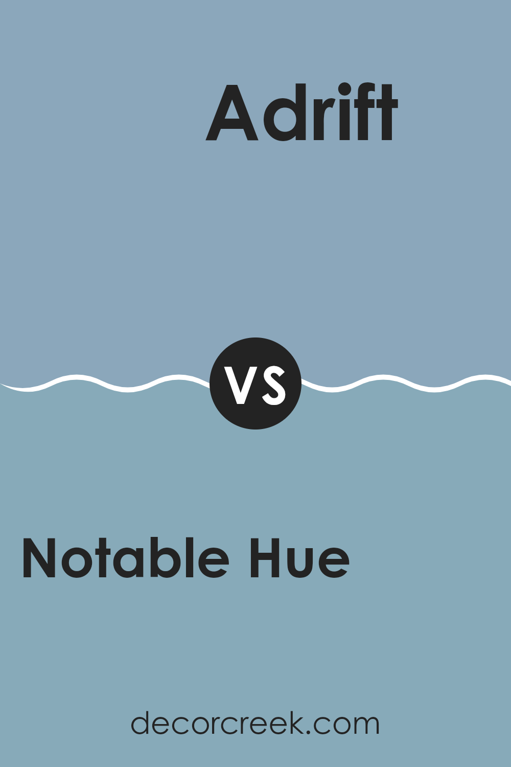
Notable Hue SW 6521 by Sherwin Williams vs Adrift SW 7608 by Sherwin Williams
Notable Hue SW 6521 by Sherwin Williams is a fresh and bright blue color that adds a lively splash of color to any room. It has an energetic feeling that can make a room feel cheerful and full of life. This color works beautifully in rooms like kitchens or children’s rooms, where you want to create a fun and welcoming atmosphere.
On the other hand, Adrift SW 7608 by Sherwin Williams is a darker and muted gray-blue. It has a more understated tone compared to Notable Hue, creating a calm and collected atmosphere that’s perfect for rooms where relaxation is important, such as bedrooms or living areas. The deeper shade of Adrift creates a grounding effect, making it a wonderful choice for creating a peaceful retreat.
Both colors create different moods and purposes—Notable Hue brings energy and fun, while Adrift offers a sense of calm and elegance, ideal for quieter and more relaxed interiors. Each color can strongly influence the appearance and atmosphere of a room depending on the feeling you want to create.
You can see recommended paint color below:
In wrapping up my thoughts on Sherwin Williams’s SW 6521 Notable Hue, I have to say this color surprises you in the best ways! It’s like a splash of freshness that can make any room in your home look bright and cheerful. Whether it’s your living room where you spend the most time or even a small corner that needs a touch of color, Notable Hue has a special quality that makes it feel more welcoming.
I noticed how the color shifts slightly under different lighting throughout the day—it changes from a calm and soft blue to a more cheerful and lively shade. That keeps things interesting, don’t you think? It’s amazing how a single color can do so much, turning your walls into part of your home’s personality.
Using this color can also be a fun project, especially if you’re thinking about giving your room a fresh appearance. It’s similar to wearing a new outfit that instantly lifts your mood. SW 6521 Notable Hue isn’t just another blue; it’s a unique shade that brings happiness and brightness into a home.
So, if you or your family are thinking about adding a fresh feeling to your home, this color is definitely worth considering. It proves that even a small change can make a big difference, making the place you live feel even more beautiful.
decorcreek.com
Ever wished paint sampling was as easy as sticking a sticker? Guess what? Now it is! Discover Samplize's unique Peel & Stick samples.
Get paint samples