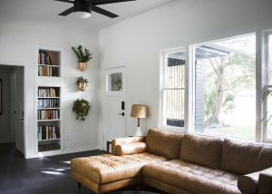
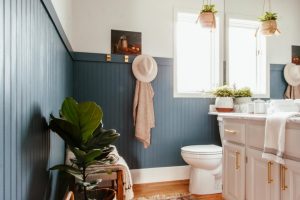
The green color is one of the most loved paint colors because it is associated with nature. Also, green is popular because it gives an atmosphere of relaxation and tranquility, making a room feel calmer. Due to this feature, shades of green are often used in spaces where we want to create a balanced and calm vibe.
Today, we will introduce you to one of the gorgeous shades of green that the Benjamin Moore brand has. This color is called Peale Green.
You will learn its undertones and LRV, find out how this shade of green works in different spaces, and how to pair it with other colors.
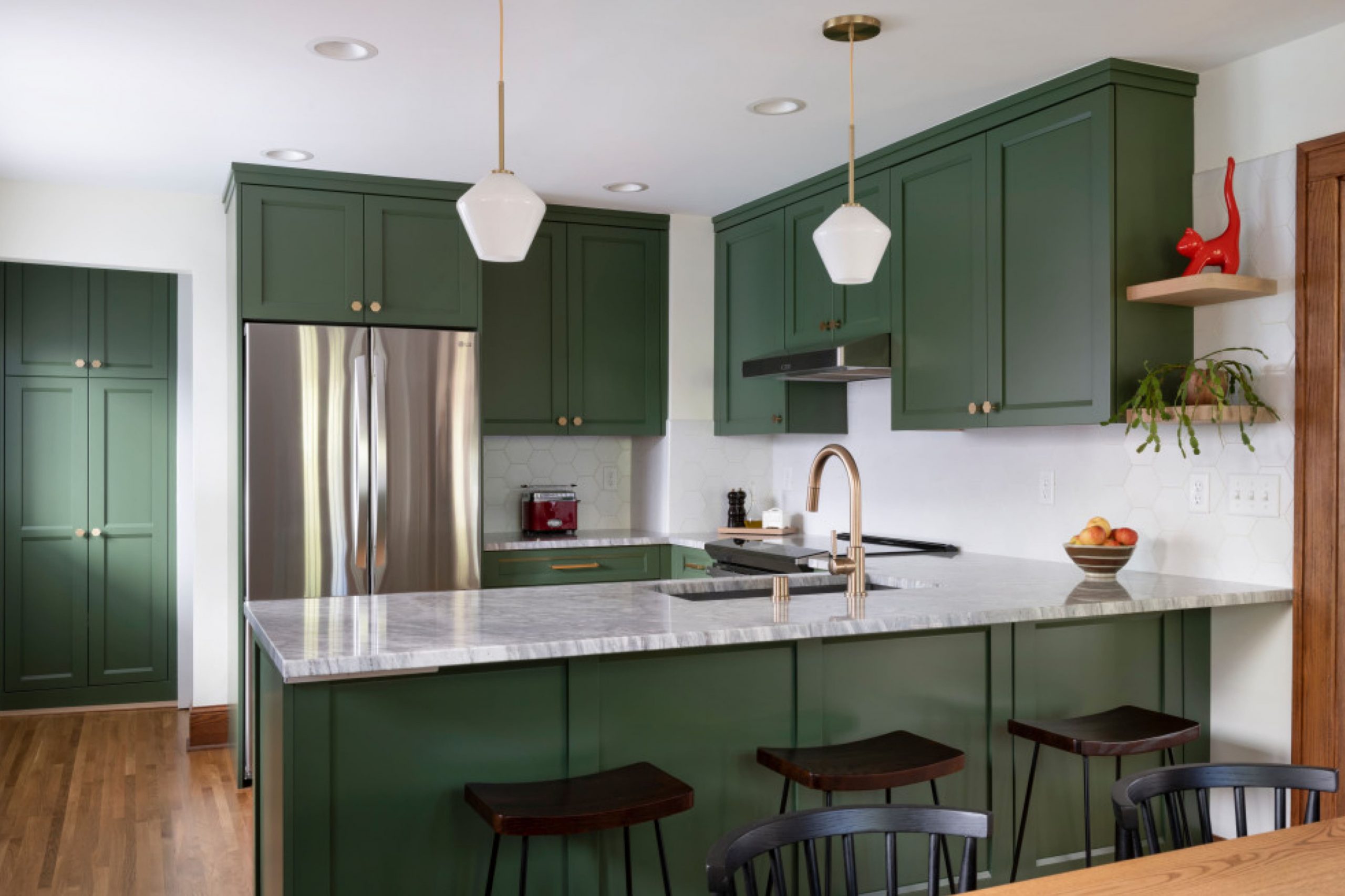
What Kind Of Green Color Is Peale Green HC-121 by Benjamin Moore?
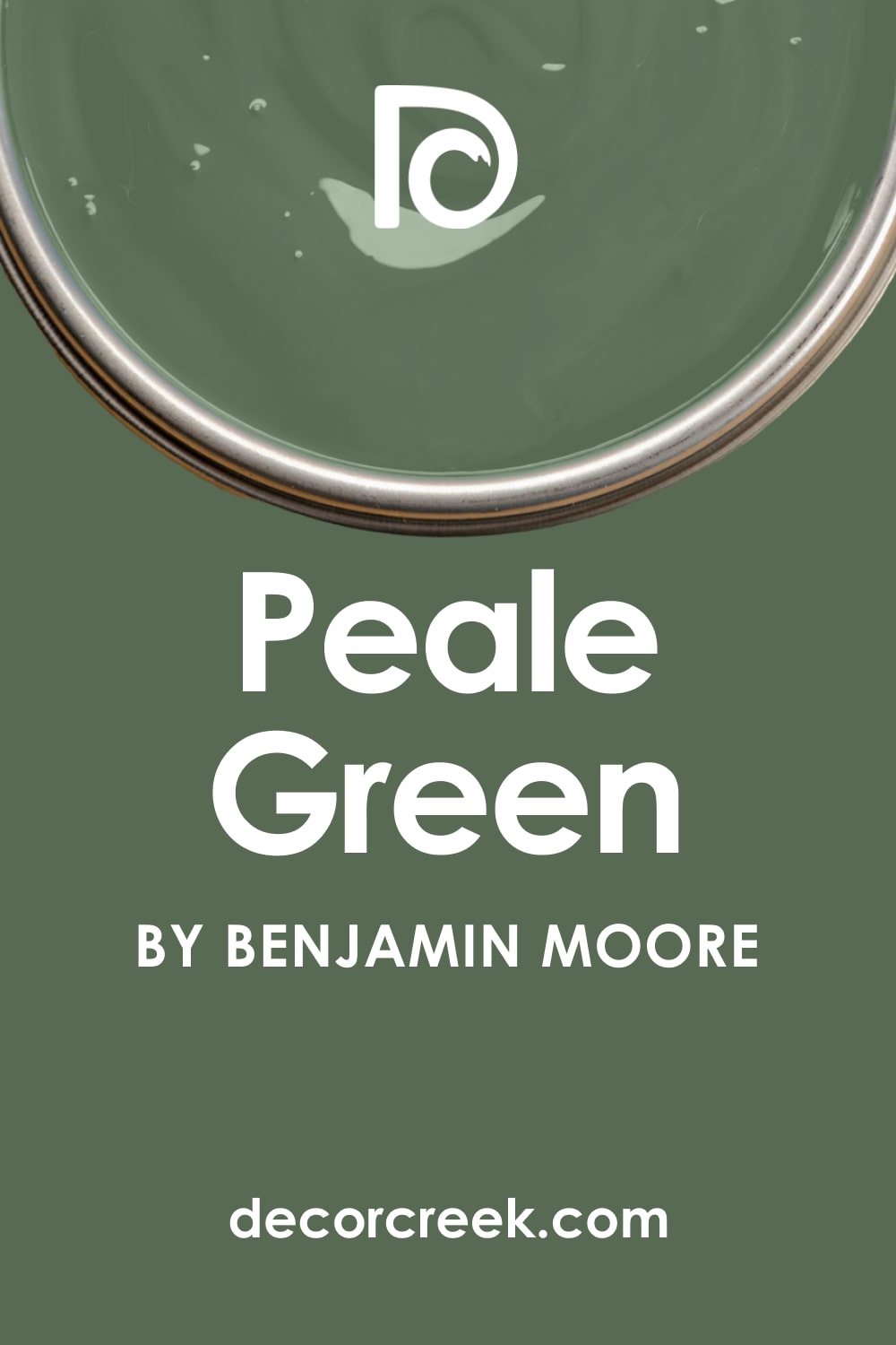
There are many shades of green out there, and each of them is unique. Speaking of the Peale Green color by Benjamin Moore, you can see that this is a fairly deep shade of green that’s also referred to as forest green or hunter green.
As Encycolorpedia says, the color is deep and moody enough, which is why it will create a pronounced color accent in your living space. Also, this shade of green is not very reflective, which means it won’t reflect enough light.
This is why you should use it carefully in smaller rooms and rooms with poor or dim light.
In general, the Peale Green color will create a noble and sophisticated vibe in any room where you use it. It is a perfect color for classy Victorian-style interiors, as well as classic-style homes.
Ever wished paint sampling was as easy as sticking a sticker? Guess what? Now it is! Discover Samplize's unique Peel & Stick samples.
Get paint samples
Undertones of Peale Green HC-121
Each paint color has undertones, and knowing them is essential if you want to use the color correctly in your home, choosing suitable locations for it. Depending on the color’s undertones, the paint may read differently in various rooms and on distinct surfaces.
The Peale Green color by Benjamin Moore has gray undertones that are well-balanced. Thanks to this feature, the color doesn’t read grayish. Instead, this medium-dark green looks deep enough and pleasantly soft on the walls and other surfaces.
However, you should use it carefully with darker colors like black because they can make this forest green seem darker than it is. In some spaces, this might not be the best solution.
What Is an LRV of Peale Green HC-121?
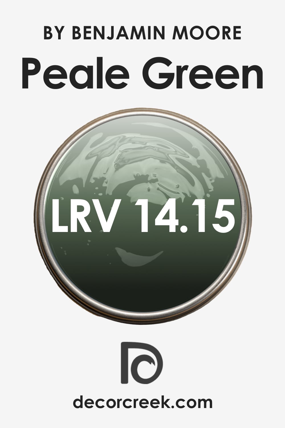
The LRV (light reflectance value) of this shade of green is 14.15, which places the Peale Green color on the darker side of the LRV scale. In simple words, this color reads dark enough on the walls since it can’t reflect enough light.
This is why we recommend you use Peale Green by Benjamin Moore in large spaces with enough natural light.
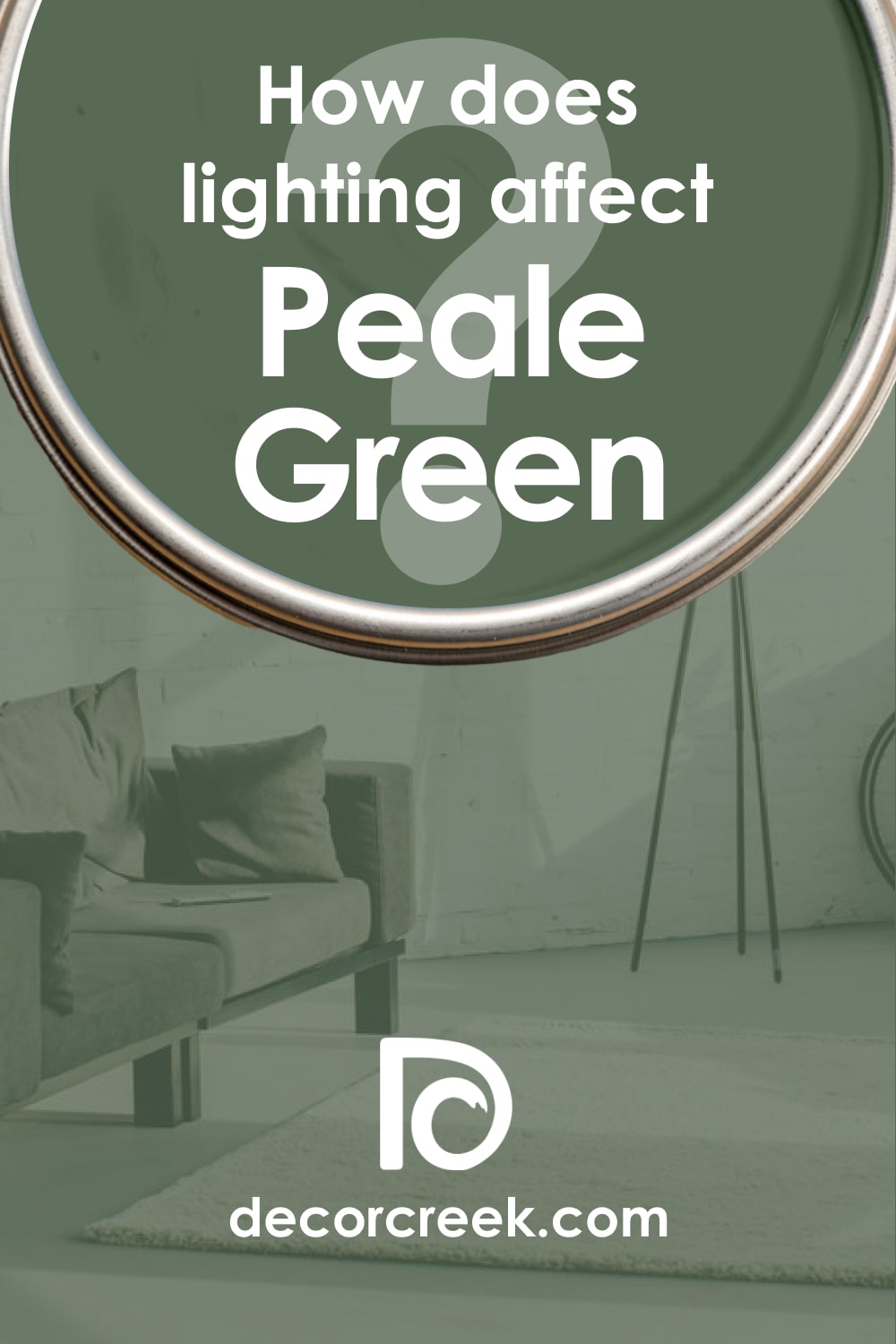
As an option, you could use this green in smaller rooms with less light or even in windowless rooms, but only if they have plenty of light colors there (e.g., brighter whites).
For example, you can use Peale Green HC-121 in a small bathroom with no windows if its ceiling and walls are painted white. In this case, this green will work well on cabinets or the vanity sink.
LRV – what does it mean? Read This Before Finding Your Perfect Paint Color
Peale Green HC-121 Coordinating Colors
By using correct coordinating colors, you can make the room look balanced and more pleasing to the eye, unlike when you just try to pair random shades. But since matching colors correctly is often challenging for people, it’s good to get some help.
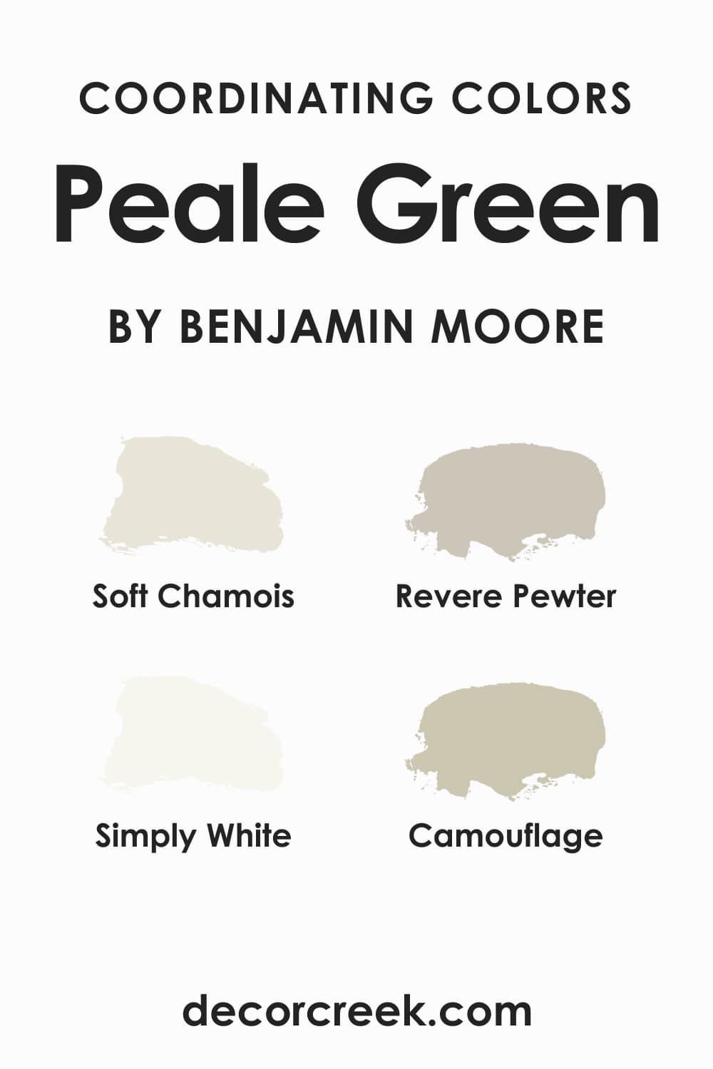
If you want to use the Peale Green color on your walls and you are looking for the right colors to coordinate with it, these will be the best options:
- Soft Chamois OC-13
- Revere Pewter HC-172
- Simply White OC-117
- Camouflage 2143-40
What Is the Best Trim Color For Peale Green HC-121?
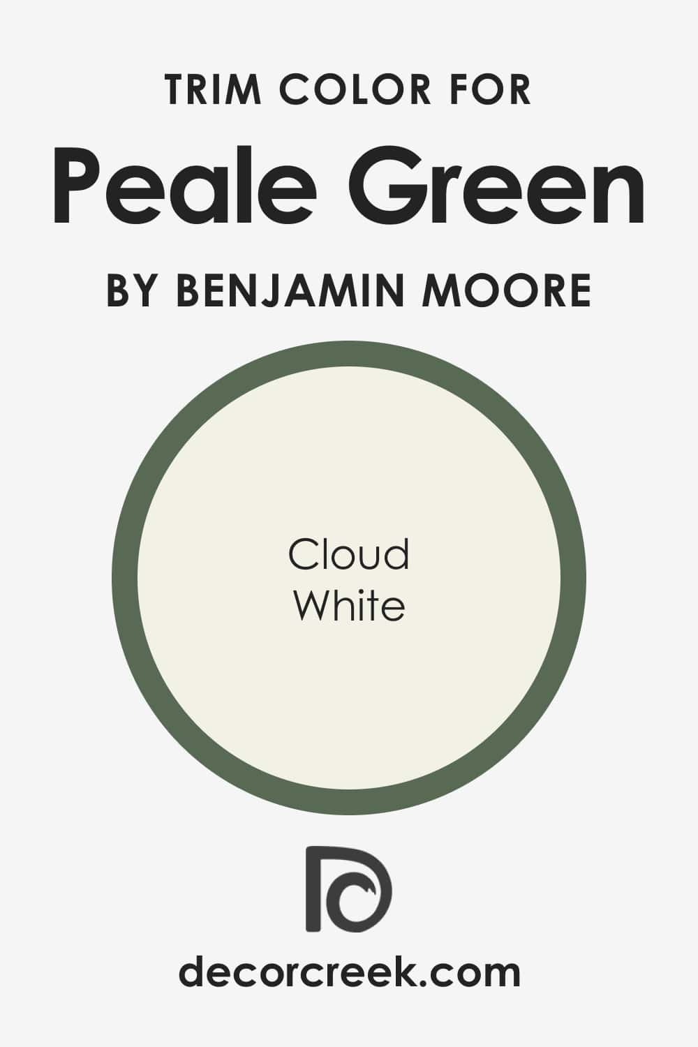
Finding a proper trim color is a tricky task! You must pick up a color that will highlight the natural beauty of the main color used on the walls and also work harmoniously with other colors in the space.
Perhaps, this is why the white color is a traditional and go-to trim color people use in their homes. It is versatile and works well with most other colors. For the Peale Green paint color, the best trim color would be BM Cloud White.
Paint Colors Similar to Peale Green HC-121
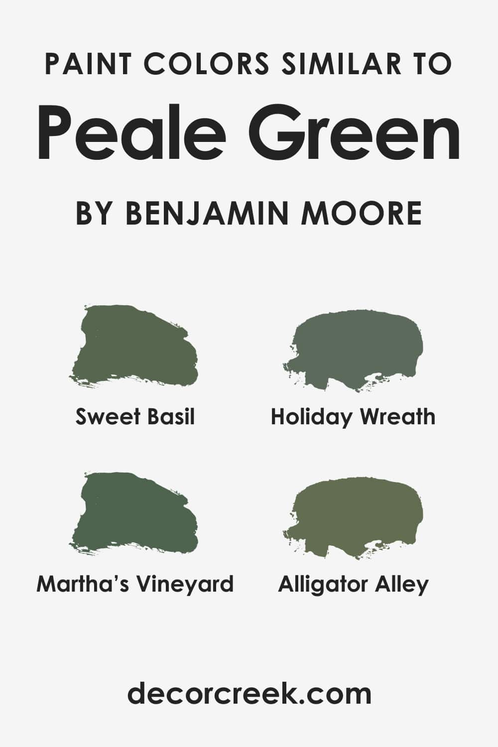
Sometimes you might need to use another paint color instead of the one you were initially going to apply to your walls. This can happen if you decide to use a slightly darker/lighter shade, or if you realize you need somewhat different undertones to match the colors in a room better.
For the Peale Green color by Benjamin Moore, there are several alternative colors that can work as substitutes:
- Sweet Basil
- Holiday Wreath
- Martha’s Vineyard
- Alligator Alley
However, you must realize that none of these colors is a 100% match with the Peale Green! There will be slight distinctions in tone and shade anyway.
For example, some colors read slightly warmer, whilst others are more cool-toned. Also, some of these similar colors have different undertones (e.g., yellow) compared to the Peale Green color.
Colors That Go With Peale Green HC-121
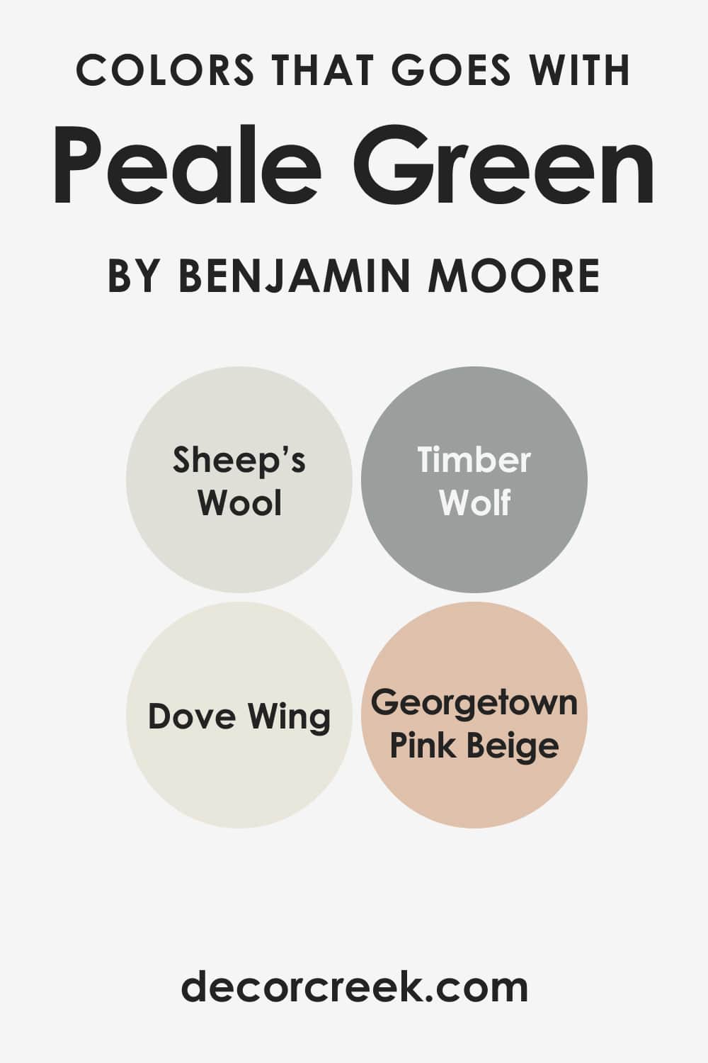
One of the most challenging tasks for homeowners is to pick up the colors that will work best with the paint used on the walls. It is essential to select the colors that read balanced and pair nicely in terms of tone and lightness.
Speaking of Peale Green by Benjamin Moore, this color might be complicated to pair with other colors. It is dark enough, which means you must be very careful and attentive when choosing the paints to use with it!
You will get the best results if you use this forest green color with black, bronze, golden, whites, lighter and darker browns, as well as warmer yellows and brighter reds.
Comparing Peale Green HC-121 With Other Colors
To help you understand what makes colors different, and specifically what makes the Peale Green paint color distinct from other greens, we have prepared several pairs of colors to compare.
Each pair contains the Peale Green color and one more shade of green. With the help of these color descriptions, you will see how different shades of the same color may vary.
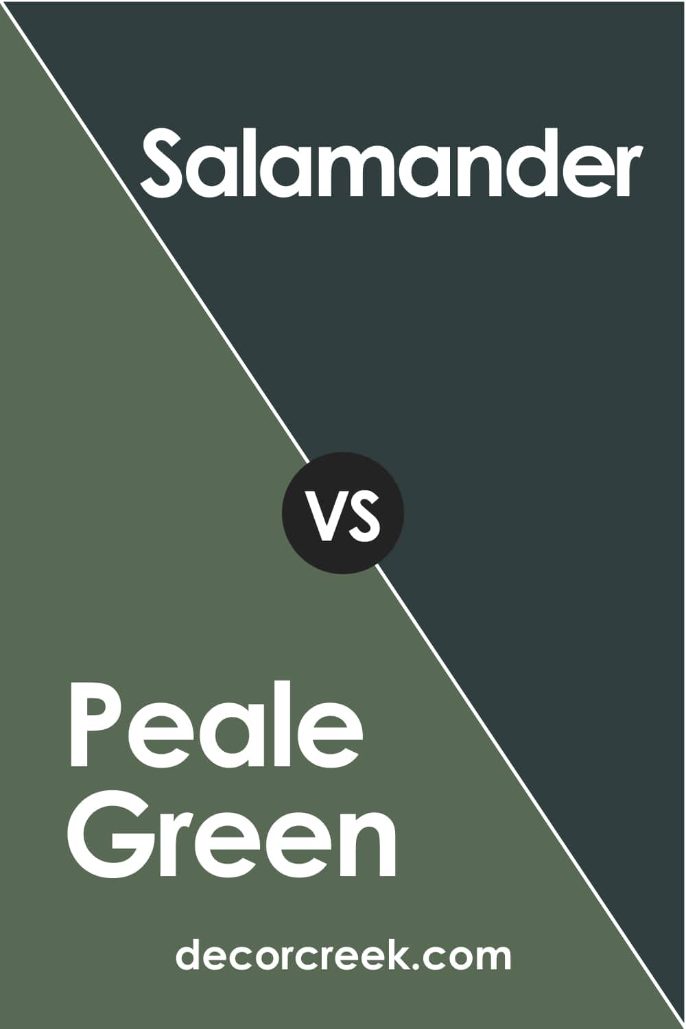
Peale Green vs Salamander
These two are very different, although both are considered green. Peale Green reads warmer and greener than BM Salamander.
That’s because the Peale Green color has warmer gray undertones and a more pronounced green hue, whilst BM Salamander has a tinge of dark cyan blue undertones that make it look colder and much darker.
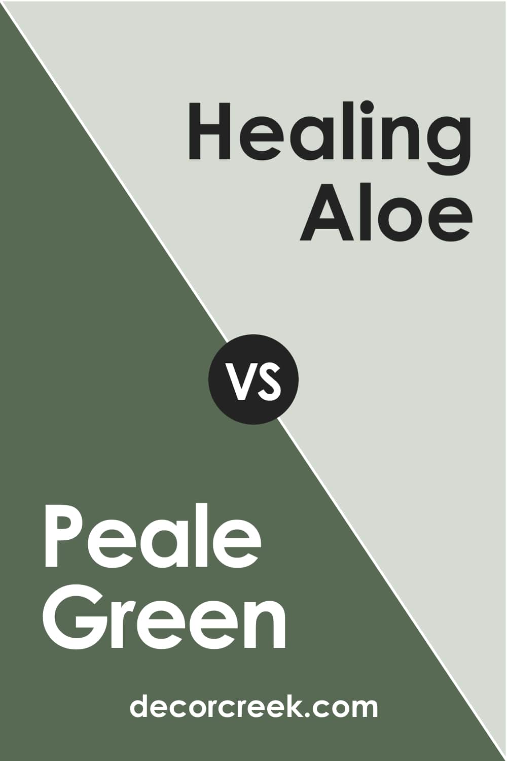
Peale Green vs Healing Aloe
BM Healing Aloe is much lighter than Peale Green. Also, these colors have different undertones. BM Healing Aloe has blue, green, and gray undertones, while the Peale Green only has gray.
Also, the LRVs of these colors are distinct. It’s 67 (Healing Aloe) vs 14 (Peale Green), which means that BM Healing Aloe reflects much more light than its darker forest green counterpart.
Peale Green vs Liveable Green
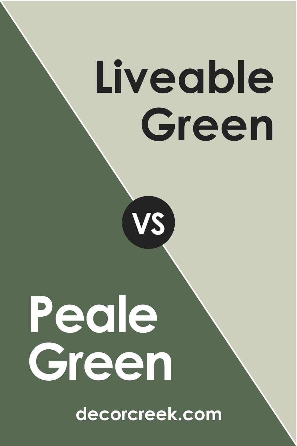
SW Liveable Green is another light shade of green. In fact, it’s a neutral color with warm yellow-gray undertones. Compared to Peale Green by Benjamin Moore, it reads much lighter and more relaxed with a very pronounced gray hue.
Peale Green vs Tarrytown Green
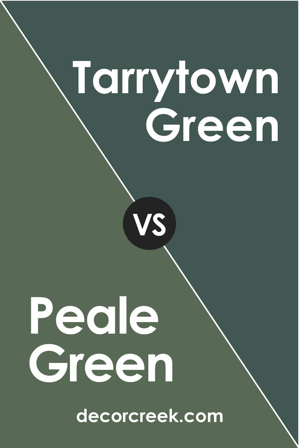
The Tarrytown Green is a dark teal green color with blue and gray undertones. Its LRV is 9, which is less than Peale Green’s 14. This is why the Tarrytown Green color reads deeper and darker on the walls, giving off a slightly cool vibe and a pine-like hue.
Peale Green vs Lafayette Green
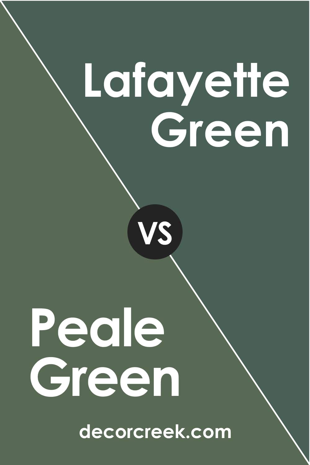
These colors look pretty much alike even though their LRVs are different ( it’s 8 of Lafayette Green and 14 of Peale Green).
Also, their undertones are distinct because the Lafayette Green color has blue, and Peale Green has gray undertones.
But despite a slight difference in tone, they can be quite successfully used interchangeably.
Now you know more about the magnificent and elegant green color called Peale Green by Benjamin Moore. Knowing its undertones, LRV, trim and coordinating colors, and more, you will incorporate it easily into your interiors.
Where to Use This Green Paint Color In Your Home?
You might think that this dark green is hard to use indoors, but in fact, this color is surprisingly versatile! You just need to use it with caution and pay attention to the lighting (as well as other colors) in a room. Below, you can see how it may work in different rooms.
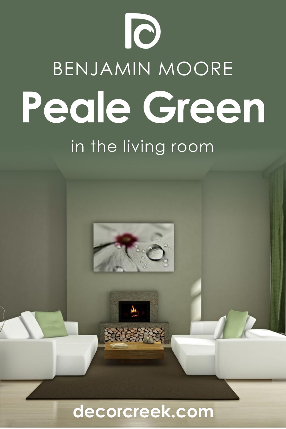
Peale Green HC-121 for the Living Room
To give your living room a classy vibe and a pinch of style, this rich shade of green will be the best option! The elegant depth of the color will add personality to a space, and if you use golden or brass elements and white on the trim and ceiling, you will make the room look balanced and sophisticated.
Peale Green HC-121 in a Bedroom
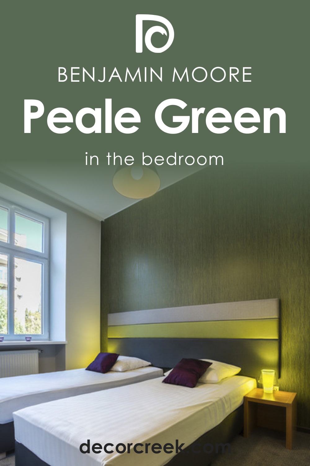
For bedrooms, this color might be a bit too dark, but you can still use it on the accent wall to add a bit of a luxurious vibe to the space.
It’s good if your bedroom has plenty of natural light and enough white used in it (e.g., on the trim and ceiling) since, in this case, the depth of this green will be balanced much better.
Lighter colors of bedding and curtains will also help to make the space read less “heavy”.
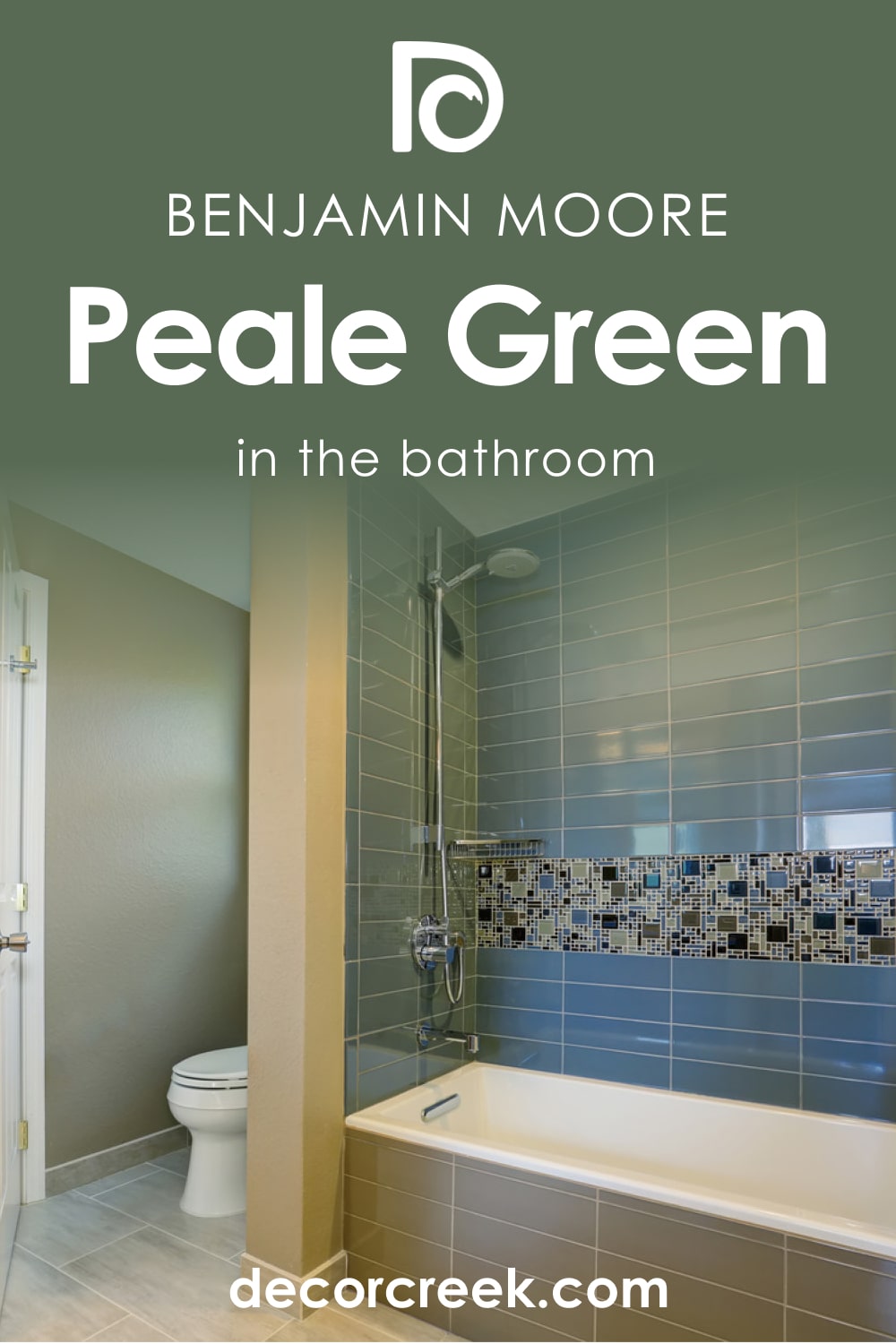
Peale Green HC-121 and Bathroom
This shade of green looks great in bathrooms with dark wooden items (e.g., shelves) and brass finishes. Also, it will pair nicely with Victorian black and white tiles. You can also give a cozy feeling to the space by painting the ceiling and the walls in the same color.
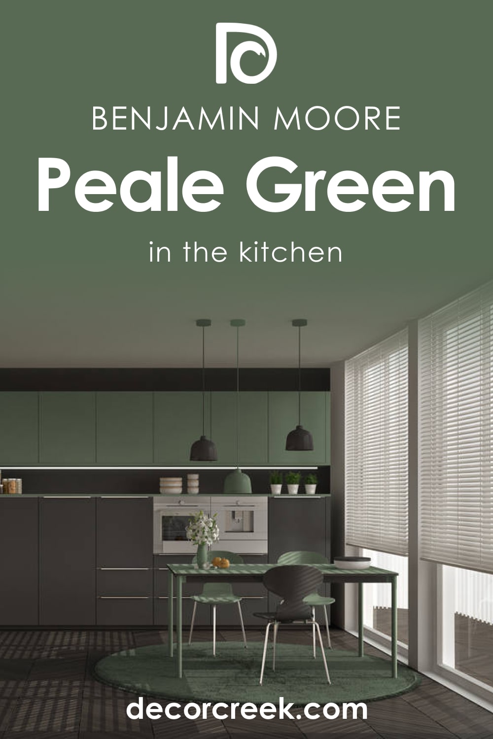
Peale Green HC-121 in Kitchen
In your kitchen, we would recommend using this dark green to add color accents, for example, to cabinets or the kitchen island. This way, you will make the kitchen look more attractive and varied by adding such a pronounced color accent. Also, this green can help you create visual accents in the room.
Peale Green HC-121 for the Exterior Walls
On exterior walls, this green looks surprisingly lovely! It’s not too dark to use outdoors even though it doesn’t reflect much light.
But on exterior walls, the Peale Green color will reveal its natural forest-like beauty exceptionally well! Pair it with white trim and moldings, and paint your front door white, and you will make your house look less weighed down by the depth of this green color.
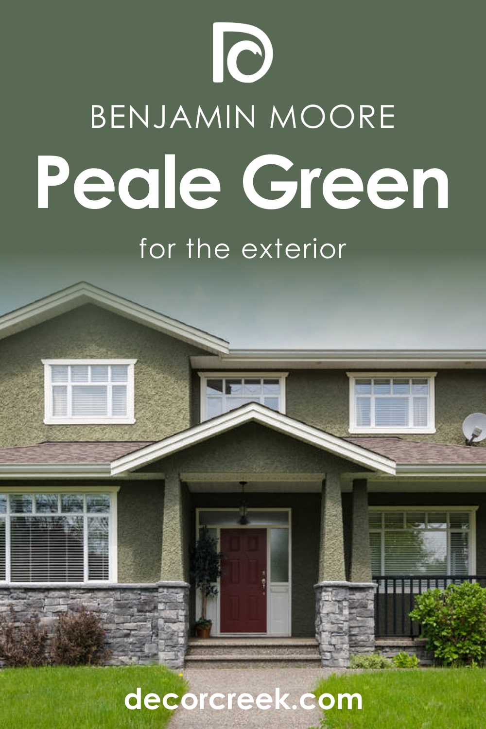
Now you know all about the green color called Peale Green by Benjamin Moore. You know its undertones, LRV, trim colors, and more. You also learned how and where to use this color to make it work best for your home both indoors and outdoors.
This will help you get the most this color has to offer.
Ever wished paint sampling was as easy as sticking a sticker? Guess what? Now it is! Discover Samplize's unique Peel & Stick samples.
Get paint samples
Frequently Asked Questions
⭐What color collection does Peale Green belong to?
This color is a part of the Historical Colors collection by Benjamin Moore.
⭐Is Peale Green color neutral?
No, this shade of green is considered dark due to the low LRV.
⭐Can I use this green in my hallway?
Yes, Peale Green usually worlds as a great transition color for hallways.


