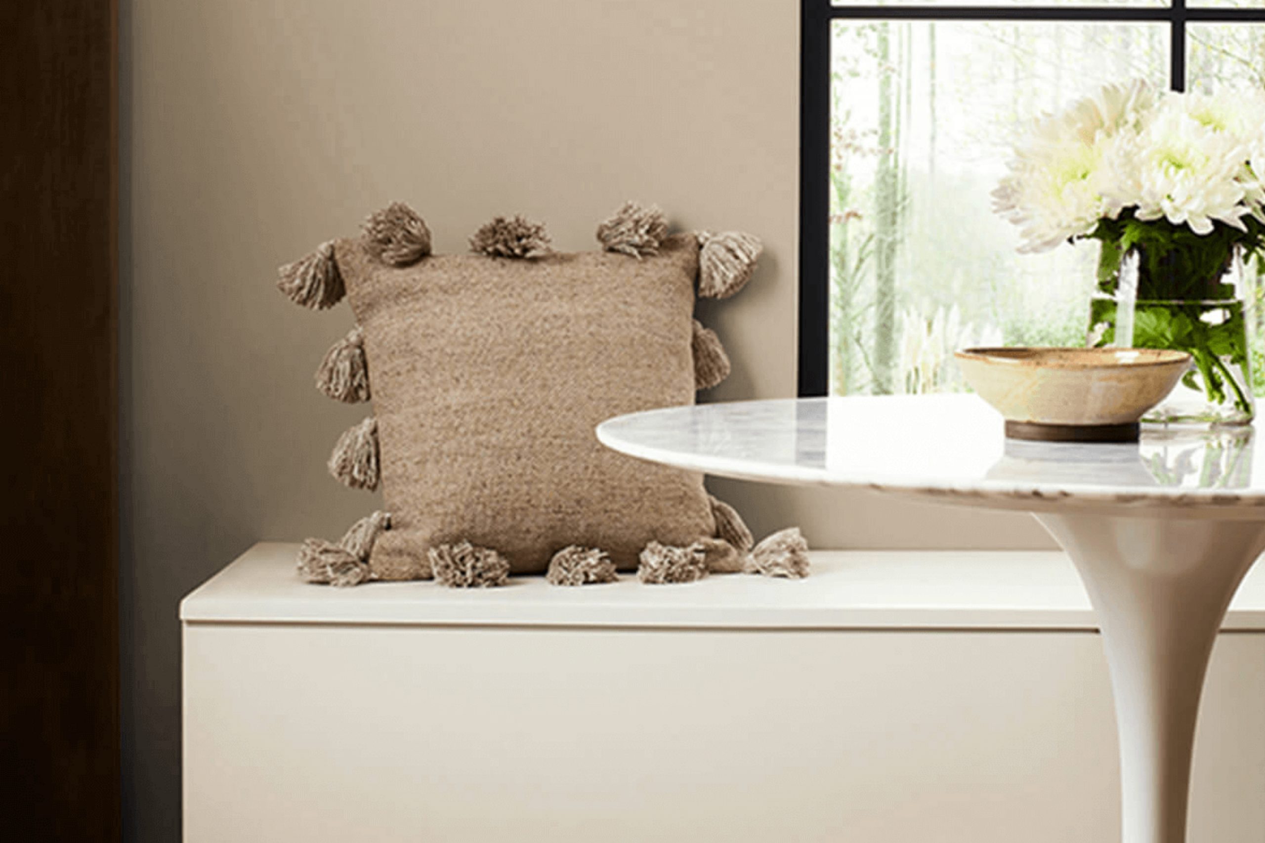
Choosing the right paint color for your rooms can be unexpectedly tricky. That’s why palettes like SW 7548 Portico by Sherwin Williams can be such a relief to find. This neutral shade has a foundational quality that makes it adaptable enough to use in virtually any area. The softness of Portico is a soothing choice, ideal for creating a calm atmosphere in busy households.
Recent projects in my home involved rejuvenating my living area, and Portico provided a subtle backdrop that complemented both modern and traditional decorations. You may wonder what makes Portico stand out amongst hundreds of other neutral options. It’s the perfect balance it offers—it isn’t too warm nor too cool, making it a seamless match with a variety of flooring, furniture, and accent colors.
Its soothing quality allows for creativity with bolder or more subdued furnishings, adapting effortlessly to both vibrant artworks and minimalist designs. If you’re looking for a color that provides flexibility and an enduring appeal, SW 7548 Portico could be the ideal choice.
As you plan your next painting project, consider how a neutral like this can serve as a canvas for your personal style and decor ideas.
What Color Is Portico SW 7548 by Sherwin Williams?
Portico by Sherwin Williams is a warm, inviting beige that brings a soothing yet robust presence to any room. Its subtle sandy tone captures the essence of soft, quiet beaches, creating a comfortable, welcoming atmosphere.
This adaptable shade works well in a variety of lighting conditions, helping to brighten areas on gloomy days while maintaining a cozy feel when the sun sets. Portico is particularly effective in interior styles that lean towards the rustic, traditional, or casual contemporary.
It serves as a perfect backdrop for farmhouse décor, with its natural, earthy vibe complementing wood accents and vintage furnishings beautifully. In a more modern setting, it helps to soften sleek lines and cool tones, making rooms feel more approachable.
When pairing materials and textures with Portico, consider natural wood, stone, and textured fabrics like burlap or linen. These elements echo the color’s organic roots and enhance the overall warmth of the decor.
Metal finishes such as bronze or copper also work well with Portico, adding a touch of refined warmth without overpowering its subtle charm. Whether used for walls or accents, Portico by Sherwin Williams is a reliable choice for creating a cozy, inviting environment.
Is Portico SW 7548 by Sherwin Williams Warm or Cool color?
Portico SW 7548 by Sherwin Williams is a unique shade that adds a gentle touch to home interiors without dominating the surroundings. This color is like a soft beige with hints of gray, making it excellent for creating a calm and welcoming atmosphere in any room. It’s particularly good because it blends well with different styles and decorations.
Whether your furniture is modern or traditional, this color forms a harmonious backdrop. It’s quite forgiving when it comes to hiding smudges or stains, which is perfect for busy households. This color also does a great job reflecting light, brightening up dim areas subtly without needing brighter or harsh lighting.
This makes it a favorite choice for common areas like living rooms and hallways, where you want a color that’s easy on the eyes and adaptable enough to match various decor elements. Overall, Portico SW 7548 is a reliable choice for anyone looking to refresh their home with a new coat of paint.
Undertones of Portico SW 7548 by Sherwin Williams
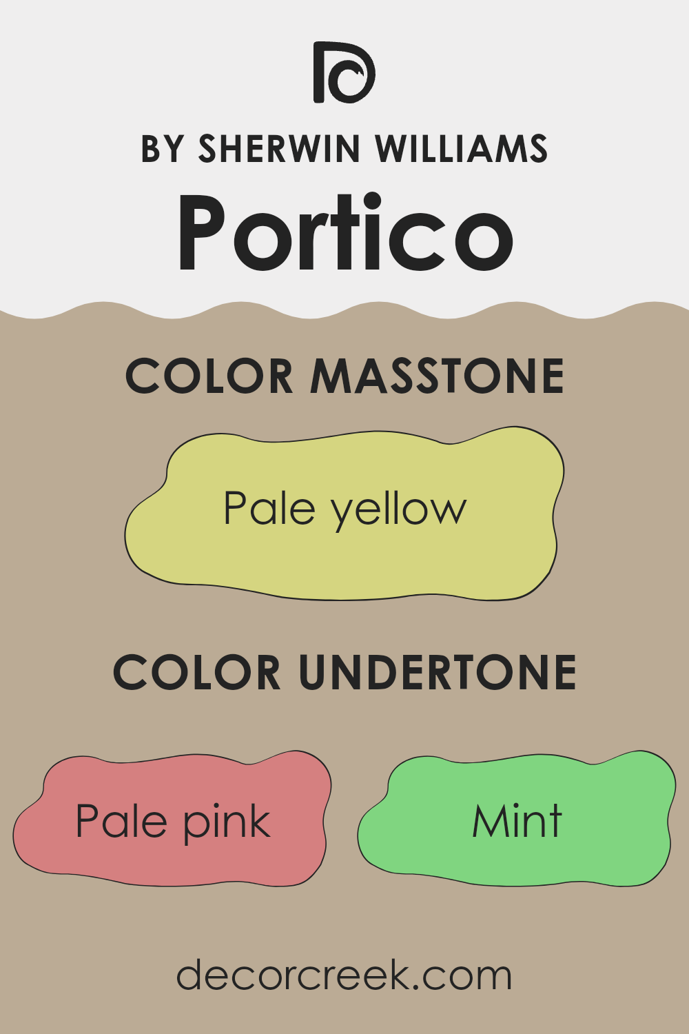
Portico SW 7548 by Sherwin Williams is an adaptable paint color characterized by a complex blend of undertones. These undertones include shades like pale pink, mint, grey, light gray, light purple, light blue, lilac, yellow, orange, light green, and olive. Each of these subtle hues contributes to the overall perception of the main color, affecting how it appears under different lighting conditions and when paired with various decor elements.
Undertones are crucial because they can significantly influence the mood and style of a room. For instance, a color with grey or light gray undertones might look cooler and more neutral, making it a great backdrop for various interior styles. In contrast, undertones like pale pink or lilac can bring a gentle warmth to the room, creating a welcoming feel.
When applied to interior walls, the complex undertones of Portico SW 7548 make it a flexible choice. The presence of light blue or mint undertones might give it a fresher look, ideal for a bathroom or kitchen, while the warmer yellow or orange undertones could make a living room feel cozy and inviting.
In areas with ample natural light, the color may reveal its cooler or warmer undertones more distinctly, adding depth and interest to the interior. This dynamic nature allows the paint color to work harmoniously with a wide range of furniture colors and home accessories, enabling easy integration into different design styles.
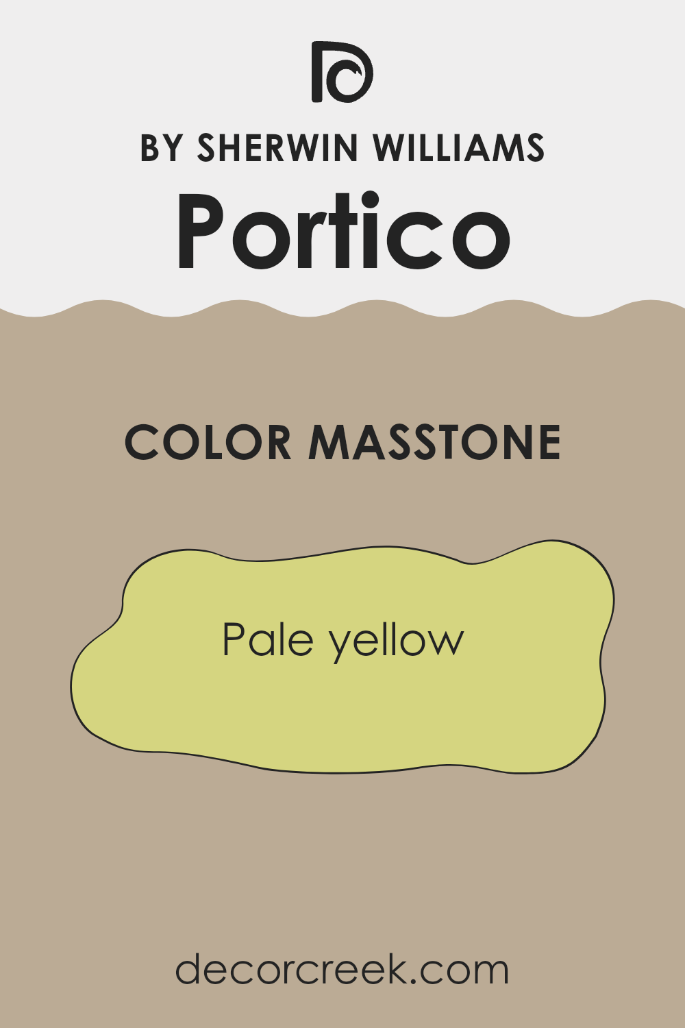
What is the Masstone of the Portico SW 7548 by Sherwin Williams?
Portico SW 7548 has a pale yellow masstone, which brings a light and cheerful tone into any room. This shade of yellow, which tends to reflect a lot of light, works well in making areas appear brighter and more open.
This is especially beneficial in rooms that might not get a lot of natural sunlight, such as north-facing rooms or smaller interiors with limited windows. The gentle pale yellow also adds a subtle warmth that makes a room feel cozy and welcoming without being overpowering.
It can be a great background color that pairs well with many decor styles and furniture colors, making it an adaptable choice for living rooms, kitchens, and even bedrooms. Whether you’re looking to create a relaxed atmosphere or just want to brighten up your living area, this specific yellow can be a practical choice that enhances the overall look and feel of a home.
How Does Lighting Affect Portico SW 7548 by Sherwin Williams?
Lighting has a significant impact on how colors appear to our eyes. Color and light share a dynamic relationship that can change the perception of how colors look in different environments. The intensity and type of light—whether natural or artificial—can make a color look different from one place to another.
Considering Portico SW 7548, a neutral shade from Sherwin Williams, let’s discuss how it varies under different lighting conditions. This color holds a warm, beige tone that provides a cozy backdrop in any room.
Artificial Light:
In artificial lighting, the type of bulb you use can influence how Portico appears. Warm white bulbs tend to enrich this color, making it look more inviting and slightly richer. On the other hand, cool white bulbs could make the color appear a bit duller, losing some of its warm charm.
Natural Light:
Natural light can usually show a color in its truest form. However, based on the direction of the room, Portico can look different throughout the day:
- North-Faced Rooms: Rooms that face north often get less direct sunlight, which can cause colors to appear slightly cooler. So, Portico in a north-facing room may seem a bit muted, with its warm tone softened.
- South-Faced Rooms: These rooms enjoy abundant light most of the day. This constant, bright light can make Portico look warm and lively throughout the day, enhancing its cozy character.
- East-Faced Rooms: Morning light in east-facing rooms is typically bright and warm, which will make Portico look very welcoming in the morning. As the day progresses and the sunlight moves away, the color can lose some of its glow and warmth.
- West-Faced Rooms: In contrast to east-facing rooms, west-facing rooms get the evening light, which is warmer. Portico will brighten up every afternoon and evening as the sun sets, looking warm and engaging.
Understanding how lighting affects your chosen paint color can help you make informed decisions about where to use it for the desired effect. Whether lit by lamps or sunlight, Portico can offer a warm backdrop that can either soothe or energize a room, depending on the lighting.
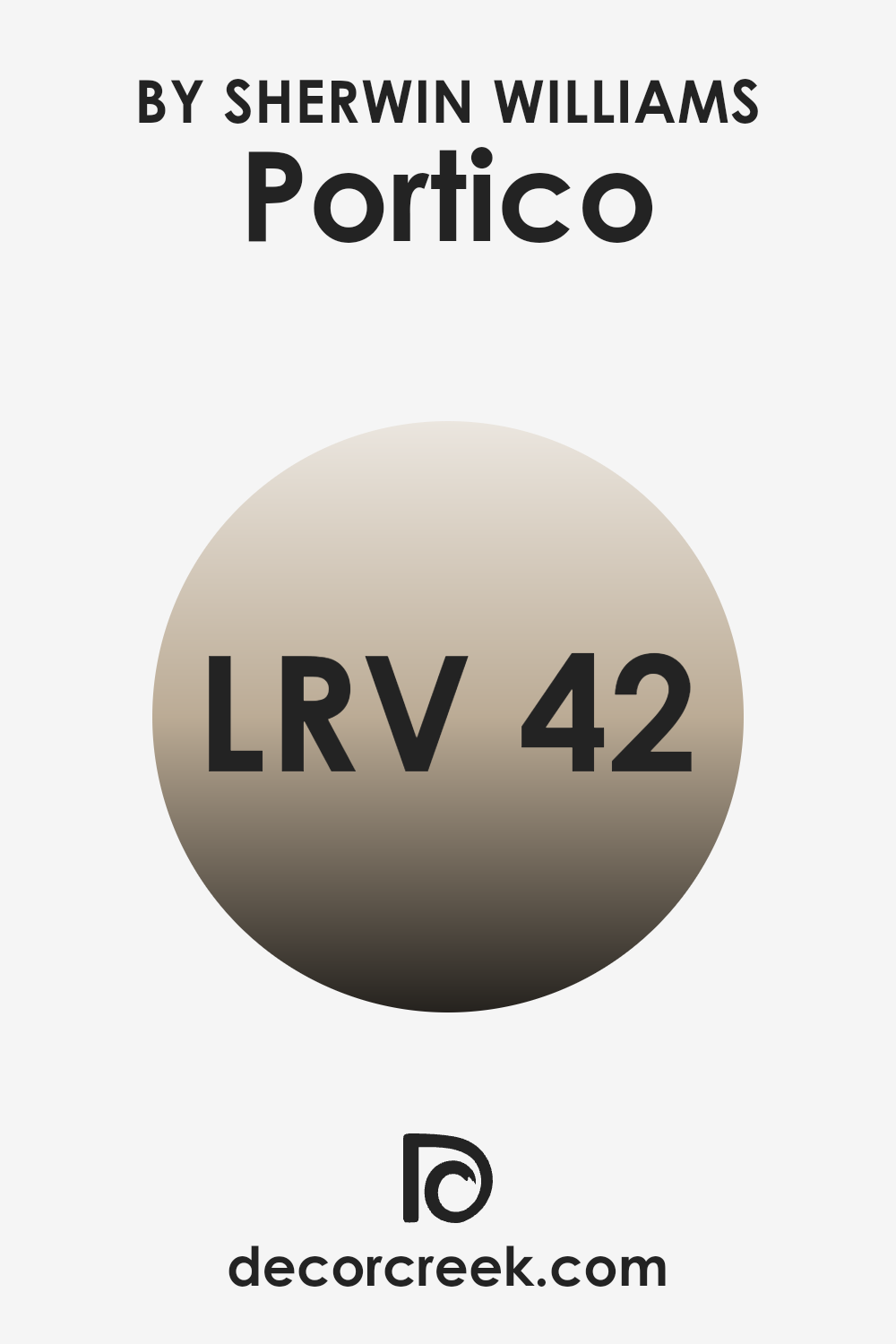
What is the LRV of Portico SW 7548 by Sherwin Williams?
LRV stands for Light Reflectance Value, which is a measurement used to determine how much light a paint color reflects or absorbs. Measured on a scale typically from zero to a hundred, LRV helps in selecting colors for your walls based on how bright or dark you want the room to feel.
A higher LRV means the color reflects more light, making a room appear brighter and more open. Conversely, a lower LRV means the color absorbs more light, which can make a room appear cozier and smaller. Considering the LRV of 41.757 for the mentioned paint color, it sits in the mid-range of the scale. This means it neither reflects light excessively nor absorbs too much.
As a result, this paint color is adaptable, suitable for rooms that you want to keep moderately bright without the stark brightness higher LRV colors might bring. This makes it a good choice for living areas where a balance between warmth and light is desired, offering an inviting atmosphere without making the room feel too enclosed.
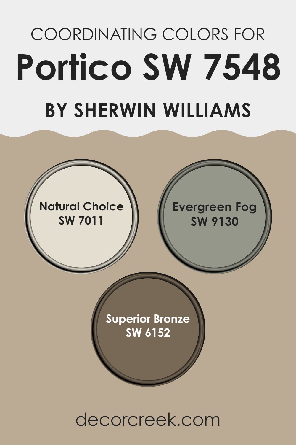
Coordinating Colors of Portico SW 7548 by Sherwin Williams
Coordinating colors are chosen to complement a main color, enhancing the overall aesthetic of a room without overpowering it. For Portico SW 7548 by Sherwin Williams, a beautiful neutral shade, several coordinating colors, including SW 7011 – Natural Choice, SW 9130 – Evergreen Fog, and SW 6152 – Superior Bronze, are designated to create harmony and balance in any interior.
Natural Choice is a soft, warm white that offers a clean and subtle backdrop, making it perfect for creating a light and airy feel in rooms that need a touch of brightness without harsh contrast. Evergreen Fog is a muted green with a gray undertone, adding a hint of nature-inspired color that feels both calming and grounding.
This shade works well in areas where the goal is to establish a relaxed and comfortable ambiance. Superior Bronze is a darker, rich tone that resembles the earthy hues of bronze. This color provides depth and a luxurious feel, ideal for adding a touch of elegance and warmth to a room. Together, these coordinating colors complement the base shade of Portico, ensuring a cohesive and inviting atmosphere.
You can see recommended paint colors below:
- SW 7011 Natural Choice
- SW 9130 Evergreen Fog
- SW 6152 Superior Bronze
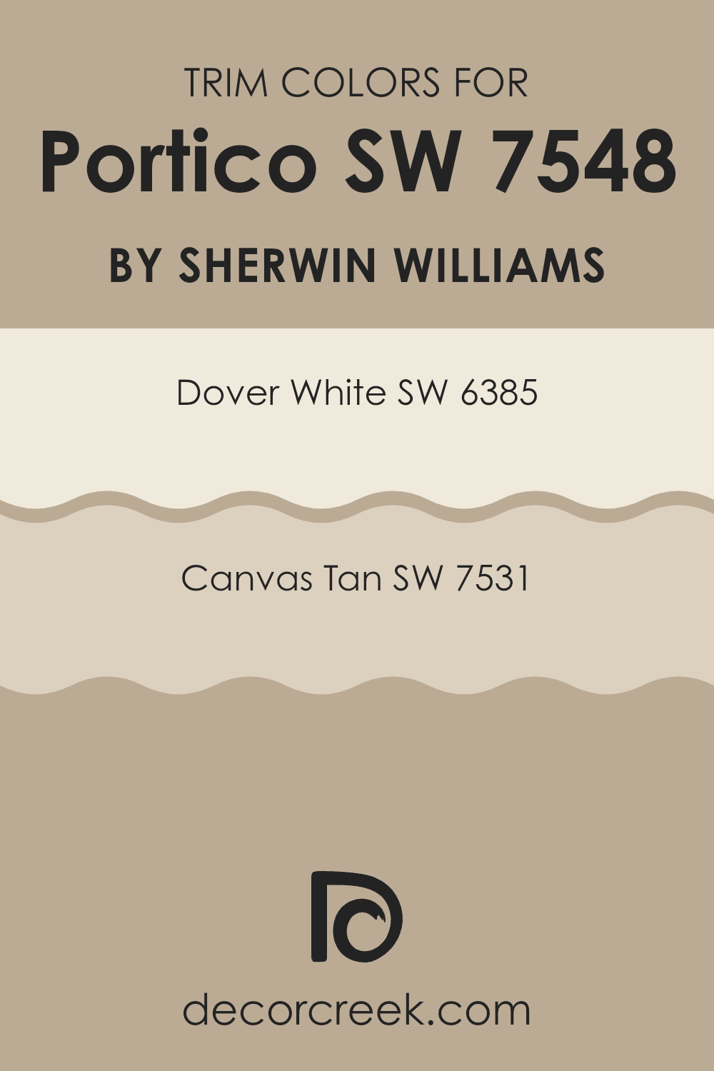
What are the Trim colors of Portico SW 7548 by Sherwin Williams?
Trim colors are used to accentuate the architectural details and edges of a room’s walls, windows, doors, and baseboards, creating a neat, finished look in any room. For a neutral yet appealing choice like Portico SW 7548 by Sherwin Williams, complementary trim colors such as Dover White SW 6385 and Canvas Tan SW 7531 are essential because they offer subtle contrast that enhances the overall aesthetic without overpowering the primary wall color.
This careful selection ensures that the room maintains a harmonious palette while also allowing the architectural features to stand out. Dover White SW 6385, a warm and gentle off-white, provides a light and airy appearance to trim, giving a clean and defined boundary that nicely frames the softer Portico shade.
Meanwhile, Canvas Tan SW 7531 offers a slightly deeper, richer creamy hue, adding a touch of warmth that complements the earthy tones of Portico. This color can bring depth and definition to a room, making it ideal for areas where a more grounded and cohesive feel is desired.
You can see recommended paint colors below:
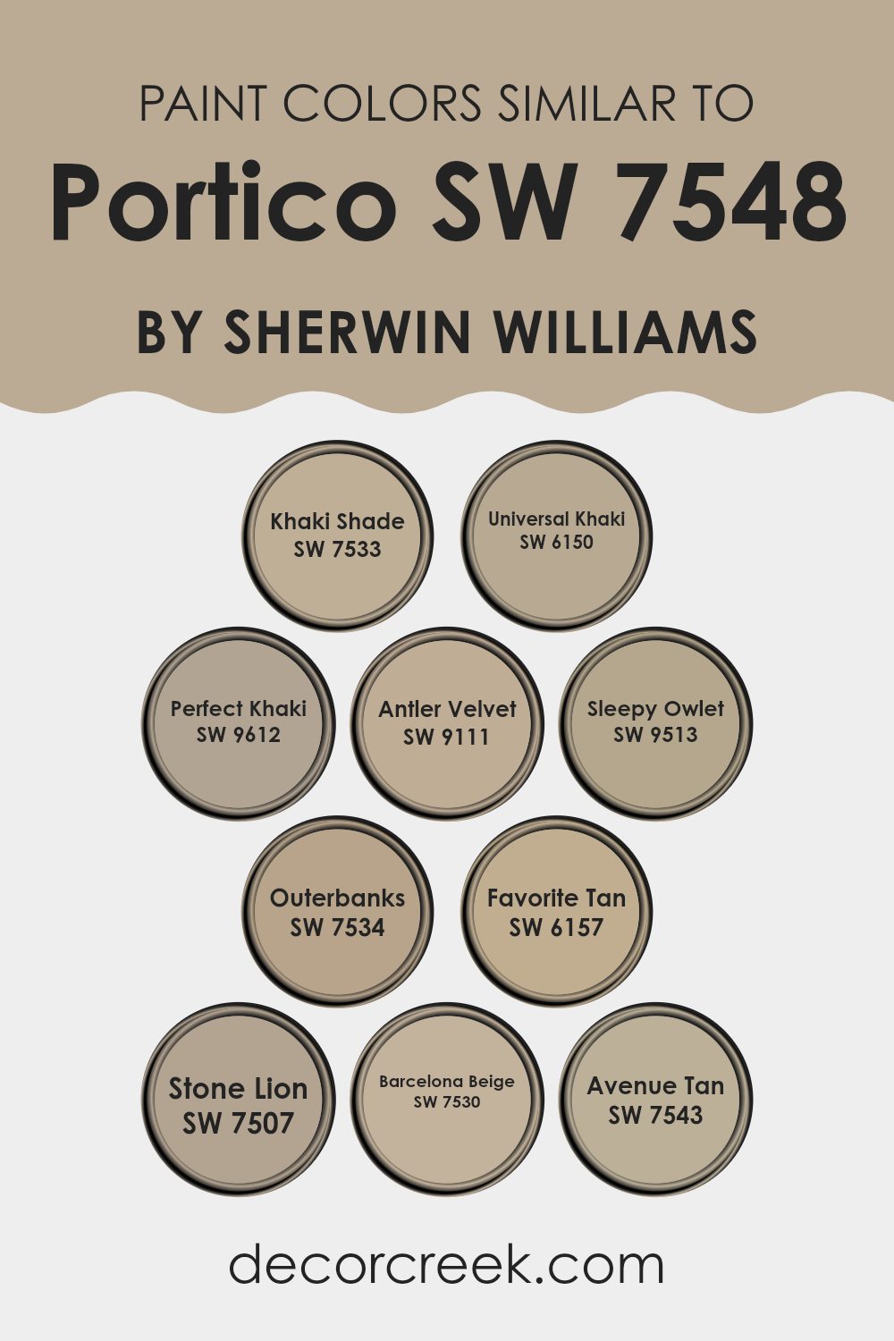
Colors Similar to Portico SW 7548 by Sherwin Williams
Using similar colors in design can enhance harmony and create a visually cohesive room. When colors like those similar to Portico by Sherwin Williams are used together, they can subtly pull a room together without any single hue dominating the look. These shades share common undertones but vary slightly in depth and intensity, making it easy to layer and create depth within the decor without overpowering the senses.
For example, Khaki Shade is a muted, earthy color that offers a solid base for any room seeking a touch of nature’s calm. Alongside it, Universal Khaki is a slightly lighter version that brightens interiors while maintaining a warm atmosphere. Perfect Khaki balances cool and warm tones, making it adaptable for various settings.
Antler Velvet introduces a smoother, more velvety finish that gives a quiet, cozy feel to surroundings. Sleepy Owlet, with its soft, subdued appearance, is perfect for creating a gentle, restful environment. Outerbanks stands out with a slightly richer tone that brings a warm, inviting presence to any room. Favorite Tan is similar but carries a hint of sun-kissed warmth, ideal for areas with abundant natural light.
Stone Lion leans toward the darker spectrum, adding depth and a sense of stability. Barcelona Beige is a gentle hue that blends seamlessly with other colors for a cohesive look. Lastly, Avenue Tan is a robust color that provides a strong foundation to any palette, ensuring that all design elements feel well-balanced. These colors work beautifully together to create a comfortable, welcoming atmosphere in any home.
You can see recommended paint colors below:
- SW 7533 Khaki Shade
- SW 6150 Universal Khaki
- SW 9612 Perfect Khaki
- SW 9111 Antler Velvet
- SW 9513 Sleepy Owlet
- SW 7534 Outerbanks
- SW 6157 Favorite Tan
- SW 7507 Stone Lion
- SW 7530 Barcelona Beige
- SW 7543 Avenue Tan
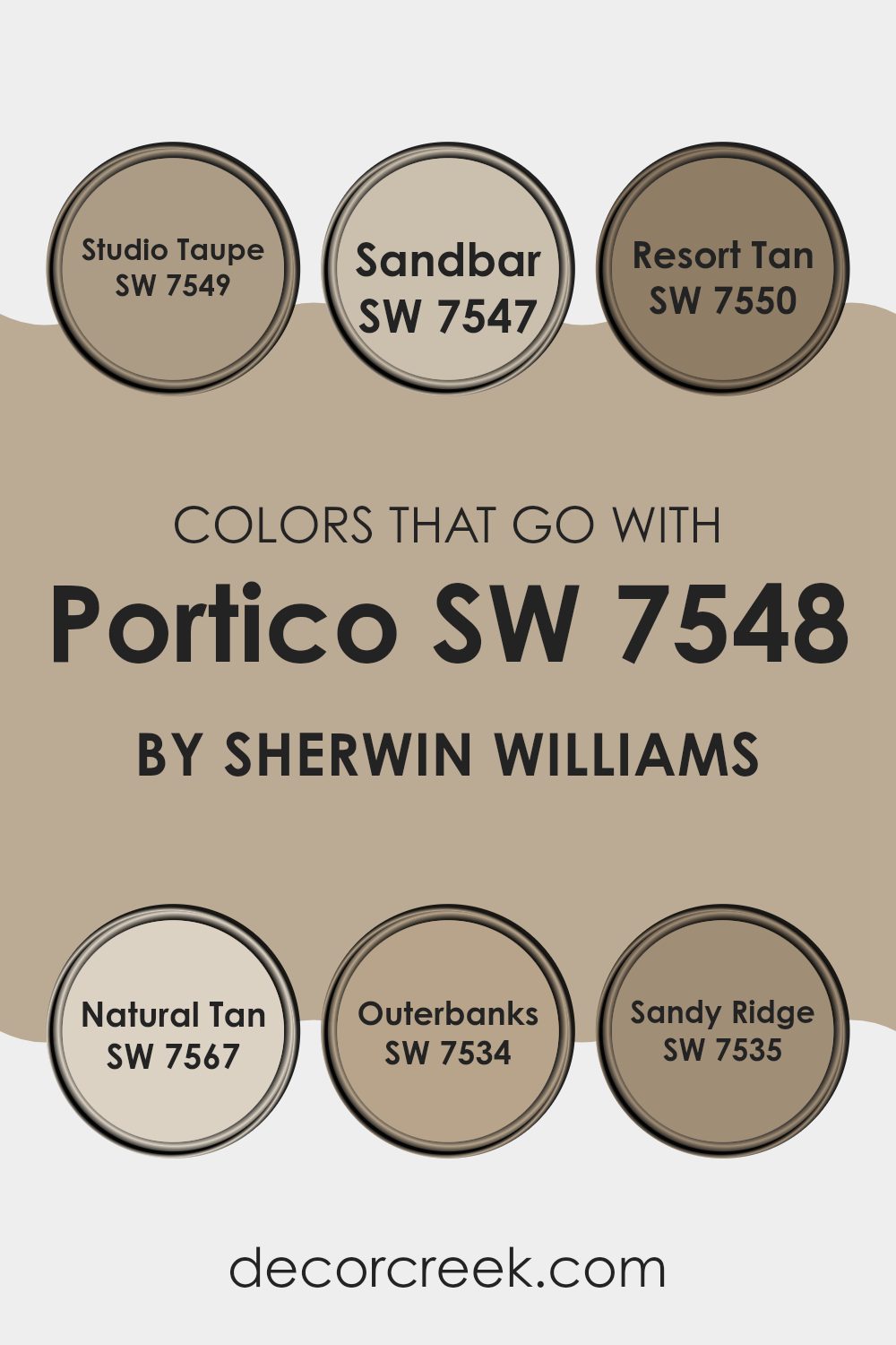
Colors that Go With Portico SW 7548 by Sherwin Williams
Colors that pair well with Portico SW 7548 by Sherwin Williams are essential when designing a room because they help create a harmonious and visually balanced environment. Portico itself is a subtle hue that provides a calming backdrop, making it adaptable for various interior styles.
For instance, pairing it with colors like Studio Taupe, which has a deeper, earthy character, adds a warm contrast that enriches the overall aesthetic of a room. On the other hand, combining it with lighter shades such as Sandbar, a soft neutral, can brighten an interior and make it feel more open. Further enhancing the look, Resort Tan introduces a slightly deeper and warmer tone, perfect for adding a touch of coziness. Complementing this, Natural Tan brings a soft, welcoming feel that’s ideal for creating comfortable, inviting rooms.
Outerbanks offers a richer, darker option that works beautifully for accent walls or furniture, providing a striking contrast to the lighter Portico. Lastly, Sandy Ridge, with its muted, dusty tone, blends seamlessly with Portico, working well in rooms that aim for a subtle yet layered appearance. Each of these colors not only complements Portico but also helps define the design and create a cohesive look that feels natural and inviting.
You can see recommended paint colors below:
- SW 7549 Studio Taupe
- SW 7547 Sandbar
- SW 7550 Resort Tan
- SW 7567 Natural Tan
- SW 7534 Outerbanks
- SW 7535 Sandy Ridge
How to Use Portico SW 7548 by Sherwin Williams In Your Home?
Portico SW 7548 by Sherwin Williams is a calming shade of green that can be a wonderful choice for refreshing the look of your home. Its soft, muted tone works beautifully in many areas, making it adaptable for decorating. For example, you can paint your living room or bedroom walls with Portico to create a relaxed and welcoming feel.
This color also pairs nicely with natural wood furniture, adding a touch of warmth to the room. Beyond walls, Portico can be used on kitchen cabinets for a gentle pop of color. It contrasts beautifully with white countertops and appliances, giving your kitchen a clean and modern appearance.
If you’re not ready to paint an entire room, consider using Portico for smaller updates like a bathroom vanity or a hallway accent wall. With its soft hue, it’s also perfect for crafting a peaceful bathroom environment, complementing touches like plush towels and earth-toned décor. Portico can help make your home feel refreshed and cozy.
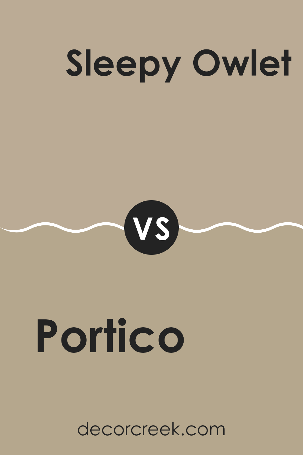
Portico SW 7548 by Sherwin Williams vs Sleepy Owlet SW 9513 by Sherwin Williams
Portico is a warm beige with a soft, sandy touch that brings a cozy and inviting look. It pairs well with various decor styles, maintaining a sense of lightness despite its earthy undertone. This color feels comfortable and adaptable, easy to coordinate with both bright and muted accents.
In contrast, Sleepy Owlet has a cooler tone, leaning toward a gentle gray with subtle hints of blue. It’s quiet and calming, offering a peaceful backdrop that’s especially suited for bedrooms or relaxing rooms. While Portico brings a brighter, warmer atmosphere, Sleepy Owlet offers a cooler, more tranquil character.
If you’re envisioning a room that feels like a sunny afternoon, Portico is the perfect match. For a look reminiscent of a misty morning, Sleepy Owlet is the ideal choice. Both shades add a gentle, welcoming mood to any room, each with its own distinct charm.
You can see recommended paint color below:
Portico SW 7548 by Sherwin Williams vs Outerbanks SW 7534 by Sherwin Williams
Portico and Outerbanks are both colors by Sherwin Williams, but they create distinct moods due to their tones. Portico is a soft, neutral beige that feels warm and inviting.
It’s excellent for creating a cozy atmosphere in any room, helping interiors feel more open and airy. Outerbanks, on the other hand, has a deeper, more earthy brown tone. This color brings a strong sense of warmth and stability, making it perfect for adding richness and depth to a room.
Both shades work beautifully across various design styles, from modern to rustic. Portico leans toward a lighter, subtler effect, while Outerbanks offers a bolder, more grounded presence. They can even complement each other within one home—Portico brightening the surroundings, and Outerbanks adding contrast and character.
You can see recommended paint color below:

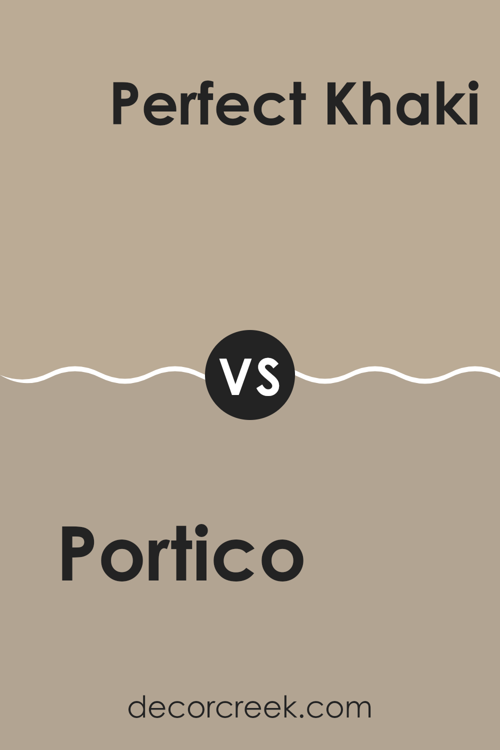
Portico SW 7548 by Sherwin Williams vs Perfect Khaki SW 9612 by Sherwin Williams
Portico by Sherwin Williams is a warm beige that carries a soothing and inviting appeal. It’s highly adaptable and can create a cozy feel in any room. This shade leans slightly toward a creamy off-white, making it an ideal option for areas where you want a gentle touch of warmth without overpowering the overall design.
In contrast, Perfect Khaki is also a neutral but has a deeper, more saturated tone that brings added depth compared to Portico. While it still maintains a warm foundation, Perfect Khaki offers a stronger presence, making it great for areas where you’d like to introduce a bit more character or contrast while keeping the look balanced and natural.
Both colors perform beautifully across different interior styles, but the choice between them depends on how subtle or expressive you want your room to feel. Portico delivers a softer, airy appearance, while Perfect Khaki adds richness and dimension for a slightly bolder effect.
You can see recommended paint color below:
Portico SW 7548 by Sherwin Williams vs Favorite Tan SW 6157 by Sherwin Williams
Portico SW 7548 by Sherwin Williams and Favorite Tan SW 6157 by Sherwin Williams are both neutral shades, yet they offer distinct characteristics. Portico is a soft, warm beige that creates a gentle, welcoming background in any room.
It feels like a gentle touch for your walls, creating an inviting and comfortable atmosphere. In contrast, Favorite Tan leans a bit darker and warmer. This shade adds more depth and richness, offering an earthier tone compared to Portico.
Think of Favorite Tan as a cozy, comforting layer—it’s ideal for areas where you want more visual weight and warmth without overpowering the room. Both shades suit a wide range of design styles and can complement various furnishings, but the choice depends on the mood you want to achieve: light and understated with Portico, or deeper and more grounded with Favorite Tan.
You can see recommended paint color below:
Portico SW 7548 by Sherwin Williams vs Khaki Shade SW 7533 by Sherwin Williams
Portico SW 7548 and Khaki Shade SW 7533 are both neutral paint colors from Sherwin Williams, but they convey different moods through their tones. Portico SW 7548 is a lighter, warmer beige that feels open and uplifting. It’s an excellent choice for rooms where you want a cozy yet bright ambiance.
Khaki Shade SW 7533, on the other hand, is a deeper and more subdued tone that closely mirrors a classic khaki. It brings a grounded, steady feeling to a room, helping larger areas feel more intimate and comfortable. While both shades are adaptable enough for living rooms, bedrooms, and hallways, Portico is perfect for those seeking a fresh, open look, whereas Khaki Shade works beautifully in rooms designed for a calm, natural atmosphere.
When it comes to pairing, Portico works beautifully with soft blues and greens to create a light, refreshing look. Khaki Shade, by contrast, complements richer, darker tones—like deep browns or muted reds—offering a balanced and grounded design.
You can see recommended paint color below:
Portico SW 7548 by Sherwin Williams vs Universal Khaki SW 6150 by Sherwin Williams
Portico SW 7548 and Universal Khaki SW 6150 are both neutral paint colors by Sherwin Williams, yet they differ noticeably in tone and character. Portico is a lighter, warmer beige that brings a soft, welcoming feel, helping rooms appear brighter and more open. It’s an excellent option for areas where you want a calm, clean aesthetic without making the room feel too stark or sterile.
Universal Khaki, on the other hand, is a deeper, richer neutral that leans toward a traditional khaki tone. It features subtle gray undertones, giving it a slightly cooler and more balanced look. This makes it perfect for adding a touch of depth and refinement to a room without overpowering the overall design.
Both shades are highly adaptable and work well across different decorating styles. Your choice depends on the atmosphere you’d like to create—Portico offers a lighter, cozier mood, while Universal Khaki delivers a more grounded and refined look.
You can see recommended paint color below:
Portico SW 7548 by Sherwin Williams vs Antler Velvet SW 9111 by Sherwin Williams
Portico and Antler Velvet, both by Sherwin Williams, offer distinct tones that suit different design moods. Portico is a warm neutral with a soft, sandy undertone that acts as an adaptable backdrop in any room. It’s light enough to make interiors feel open and bright while still having enough depth to provide a subtle contrast against white trim.
Antler Velvet, in contrast, is a deeper, richer shade that leans toward a warm gray with gentle brown undertones. It creates a cozy and grounded atmosphere, perfect for rooms where you want warmth without the weight of a true brown. This color shines in well-lit rooms, where natural light highlights its layered and refined depth.
When paired together, Portico provides a light, balanced foundation, while Antler Velvet acts as a complementary accent that adds richness and dimension. Both colors share an earthy, natural quality, making them ideal for creating a harmonious, inviting interior palette.
You can see recommended paint color below:
Portico SW 7548 by Sherwin Williams vs Stone Lion SW 7507 by Sherwin Williams
Portico and Stone Lion, both by Sherwin Williams, are neutral tones that stand apart through their undertones and overall ambiance. Portico is a warm beige with a hint of golden softness, creating a cozy and inviting feel. It’s perfect for areas like living rooms or bedrooms where you want to maintain a comforting, light-filled atmosphere.
Stone Lion, on the other hand, carries cooler gray undertones, giving it a more modern and refined character. While still neutral, it feels sleek and subtle, fitting beautifully into contemporary or minimalist rooms.
The choice between the two depends on the mood you want to evoke—Portico brings warmth and radiance, while Stone Lion offers a calm, polished presence. Both shades are adaptable and pair effortlessly with a variety of materials, finishes, and color schemes.
You can see recommended paint color below:
Portico SW 7548 by Sherwin Williams vs Barcelona Beige SW 7530 by Sherwin Williams
The two colors, Portico and Barcelona Beige, both by Sherwin Williams, offer subtle variations in tone that could affect the mood and style of a room. Portico is a light, sandy beige with a warm undertone, making it very welcoming and cozy, ideal for rooms where you want a neutral backdrop with a hint of warmth. Its adaptability allows it to pair well with a wide range of decor colors and styles, from rustic to modern.
On the other hand, Barcelona Beige is a shade darker and brings a slightly more pronounced color presence, leaning towards a medium beige with taupe undertones. This color offers a bit more depth, which can add character and a richer feel to a room without overpowering it with darkness. It’s particularly striking in areas with plenty of natural light, where its complexity is more visible.
Both colors are excellent choices for someone looking to create a calm and inviting environment. However, your choice between them might depend on how subtle or rich you want the color to feel in your room.
You can see recommended paint color below:
Portico SW 7548 by Sherwin Williams vs Avenue Tan SW 7543 by Sherwin Williams
Portico and Avenue Tan, both by Sherwin Williams, offer unique shades that can significantly influence the ambiance of any room. Portico is a lighter, warm beige with a bright, open feel. It helps rooms appear more spacious and inviting, making it perfect for living areas and bedrooms where a relaxed atmosphere is preferred.
Avenue Tan, in contrast, presents a deeper, more muted tan tone. This shade brings warmth and coziness, making it ideal for rooms where you want a more contained, intimate feel, such as dining rooms or smaller lounges.
While both shades share a beige foundation, Portico leans toward a lighter, creamier appearance, whereas Avenue Tan moves toward a richer, earthier depth. This variation in tone and warmth makes each color suitable for different moods and settings, depending on how bright or grounded you want your room to feel.
You can see recommended paint color below:
- SW 7543 Avenue Tan
Writing about SW 7548 Portico by Sherwin Williams has been really enjoyable. Portico isn’t just any paint color—it’s the perfect soft shade of beige that can make any room feel cozy yet refreshed. I’ve found that the color feels like a warm hug—it makes rooms feel welcoming and comfortable. What’s great about Portico is how naturally it blends with almost any style. Whether you have colorful decor or prefer a simple, clean look, Portico adapts beautifully.
Using this paint can give older rooms a renewed feel without changing their character too much. For anyone unsure about which color to choose, Portico is a reliable option because it’s calm and easy on the eyes. It doesn’t demand attention but still ties everything together effortlessly.
After seeing how Portico looks in different interiors, I’m convinced it’s a wonderful choice for anyone wanting to refresh their home. It’s like choosing the perfect backdrop that lets all your favorite details shine. Whether you’re painting a bedroom, living room, or kitchen, SW 7548 Portico by Sherwin Williams is a color that helps your home feel perfectly balanced and inviting.
Ever wished paint sampling was as easy as sticking a sticker? Guess what? Now it is! Discover Samplize's unique Peel & Stick samples.
Get paint samples

