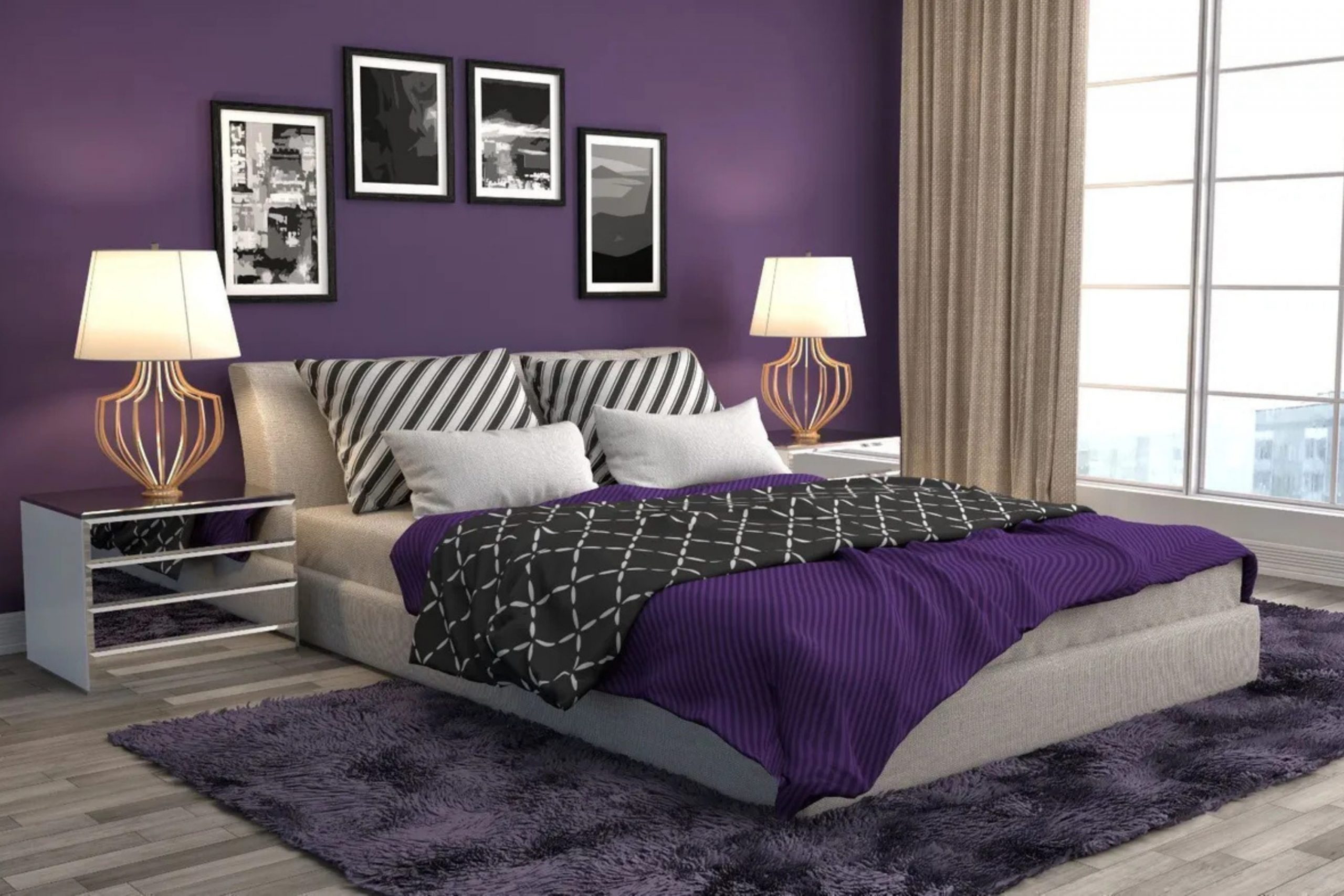
Choosing the perfect paint color for a bedroom can feel like a really big decision, but it’s also one of the most rewarding. Purple, in all its wonderful variations, has always been a personal favorite of mine for creating a truly special feeling in a resting place.
This color is associated with royalty and wisdom, and bringing it into a bedroom makes the room feel rich and personal. I want to share with you my best 47 purple paint color ideas that I’ve gathered through my years as a home interior designer and staging expert.
These ideas come from the two paint brands I trust most in my work. Getting the right shade of purple is about understanding the mood you want to set—whether it’s a cheerful lilac or a dramatic, deep violet.
This guide will walk you through my process for selecting these beautiful hues and give you a huge list of specific colors you can use in your own home for an amazing result.
Why I Always Trust Sherwin-Williams and Benjamin Moore for Purple Bedroom Paints
When I am selecting paint for a client’s home, especially for a bedroom where the color needs to feel just right, I stick with Sherwin-Williams and Benjamin Moore every single time. It’s not just a preference; it’s based on years of experience.
These companies consistently produce paints with fantastic quality and color accuracy. When I pick a color chip, I know the gallon of paint I buy will look exactly like that chip, which is so important when planning a room. Their pigments are pure, which means the purple on your walls won’t look muddy or flat.
Instead, it will have a wonderful depth that changes beautifully with the light throughout the day. I find that their formulas apply smoothly and cover well, which saves time and effort during the painting process. Trusting these brands means I can focus completely on the design and the emotional effect of the color, knowing the quality of the product is guaranteed.
They offer a vast array of purples, from the lightest lavender to the darkest plum, ensuring I can always find that perfect shade to match my design vision and make my clients happy.
How I Choose the Perfect Purple Shade for a Bedroom
Selecting the right purple for a bedroom is a careful process, not a rushed choice. The first thing I consider is the light in the room, which is the most important factor of all. A north-facing room has cool light, making colors appear a little bluer, so I might choose a warmer purple with a pink or red undertone to balance it out.
A south-facing room has warm, bright light, which can handle a cooler or deeper purple without it feeling dull.
Next, I think about the size of the room and its intended user. A lighter, softer purple can make a smaller room feel larger and more open, while a richer, darker purple can make a large room feel cozier and more intimate, perfect for an adult’s main bedroom. I always think about the existing furniture and flooring.
The paint color needs to compliment the items already in the room, like the wooden dresser or the patterned rug, to create a feeling of harmony.
It’s also important to decide on the mood; do you want a playful lilac for a child, or a regal eggplant for a sophisticated guest room?
I always recommend buying a sample pot and painting a large patch on the wall—and looking at it at different times of the day—before committing to the whole room. This simple step prevents so many costly mistakes and helps you feel completely confident in your final choice.
47 best purple bedroom paint color ideas in 2026
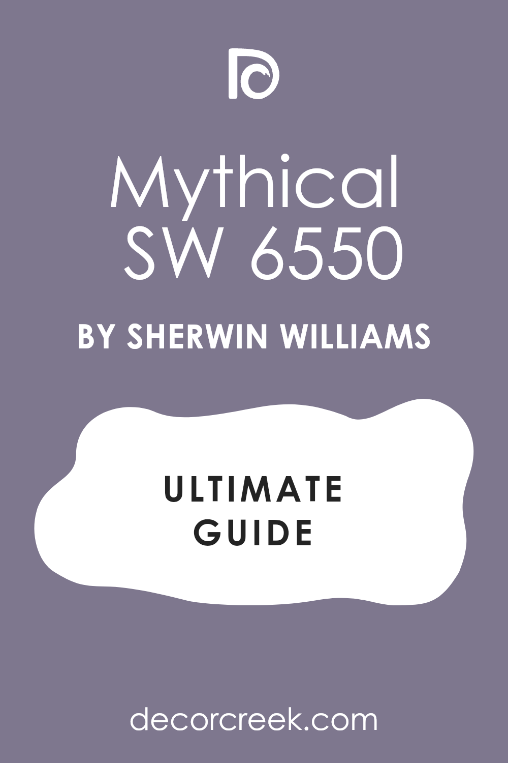
Mythical SW 6550
Mythical SW 6550 is a wonderful light shade of lavender that truly lives up to its name. Mythical is delicate and airy, offering a gentle touch of color without being too strong. Mythical works beautifully in a bedroom that receives plenty of natural light, where it glows softly. Mythical has slight pink undertones, which gives it a warmth that is really comforting.
Mythical pairs excellently with crisp white trim and pale gray furnishings for a really fresh look. Mythical is a fantastic choice for a main bedroom where you want a relaxing but happy feeling.
Mythical is part of Sherwin-Williams’ collection, known for its dependable quality. Mythical can feel sophisticated without losing its playful side, making it suitable for many ages. Mythical looks amazing when contrasted with deep, rich wood tones in furniture. Mythical is a great starting point if you are new to painting with purple but want something with real presence.
👉 Read the full guide for this color HERE 👈
Obsession SW 6548
Obsession SW 6548 is a striking, saturated purple that makes a dramatic statement in any bedroom. Obsession is not shy; it’s a bold hue that demands attention and creates a feeling of luxury.
Obsession has deep red undertones, giving it a rich, warm quality that feels inviting and comforting. Obsession is perfect for an accent wall in a main bedroom or a whole room with high ceilings. Obsession works wonderfully with metallic accents like gold or silver, making the room feel opulent.
Obsession creates a truly moody and intimate atmosphere when used with darker wood furniture. Obsession is a choice for those who want their bedroom to feel like a deeply private, special retreat. Obsession looks much richer in person than on a paint chip, so be sure to sample it first. Obsession is a Sherwin-Williams color that shows off their beautiful deep pigments. Obsession will give your room a personality that is absolutely unforgettable.
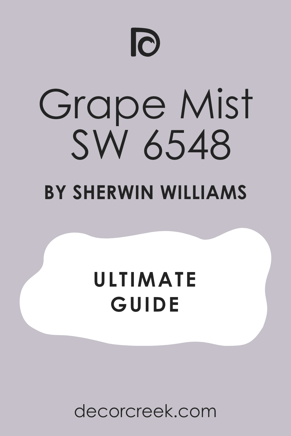
Grape Mist SW 6548
Grape Mist SW 6286 is a very deep, rich purple that leans towards eggplant or aubergine. Grape Mist is a grown-up color that adds a definite feeling of drama and sophistication to a bedroom. Grape Mist is fantastic for creating a cozy, intimate feeling, especially in a larger bedroom that needs to feel scaled down.
Mature Grape has strong, dark undertones that keep it from looking too bright or childlike. Grape Mist pairs beautifully with creamy whites or light grays for contrast in bedding and textiles. Mature Grape is a perfect choice for someone looking for a saturated, moody, jewel-toned color on their walls.
Grape Mist also works well in a room with darker, traditional furniture to enhance the feeling of warmth. Grape Mist is an excellent backdrop for showcasing artwork or interesting architectural details. Grape Mist truly feels like the color of velvet and adds a texture-like quality to the walls. Grape Mist is a confident color choice that will make your bedroom feel instantly luxurious.
👉 Read the full guide for this color HERE 👈
Wallflower SW 6281
Wallflower SW 6281 is a charming, light lavender that is very soft and wonderfully pleasant. Wallflower is a pale purple that has just enough color to be noticeable without being too bright. Wallflower is a great choice for creating a light and airy feeling in any bedroom, particularly smaller ones.
Wallflower has gentle pink undertones that make it feel inviting and warm rather than cold or sterile. Wallflower works well with almost any decorating style, from traditional to very modern. Wallflower is a beautiful color for a young person’s bedroom or a guest room because it is so easy to live with.
Wallflower looks especially fresh when paired with bright white trim and simple, light-colored furniture. Wallflower is a color that promotes a feeling of quiet happiness and contentment in a sleeping area. Wallflower is a reliable Sherwin-Williams shade that is beautifully balanced and not fussy. Wallflower is the perfect pale purple that makes your room feel refreshed and cheerful.
👉 Read the full guide for this color HERE 👈
Forget-Me-Not SW 6824
Forget-Me-Not SW 6824 is a clean, bright lilac that has a very happy, clear feeling to it. Forget-Me-Not is a fresh purple that reminds me of spring flowers and a wonderful, sunny day. Forget-Me-Not has a lightness that prevents it from feeling heavy, making it a great option for a bedroom.
Forget-Me-Not is perfect for a girl’s room or a cheerful guest room where you want to instill a joyful feeling. Forget-Me-Not pairs wonderfully with greens and yellows in accents, as well as simple white bedding. Forget-Me-Not has a clear, slightly cool undertone, which keeps it from looking too sugary sweet.
Forget-Me-Not is a playful color that brings a wonderful vitality to the walls. Forget-Me-Not looks best in a room that gets a good amount of natural light to help it truly shine. Forget-Me-Not is a Sherwin-Williams color that offers a beautiful, pure dose of purple. Forget-Me-Not is a beautiful choice for a bedroom that should feel bright and utterly delightful.
Mauve Finery SW 6282
Mauve Finery SW 6282 is a lovely dusty purple that is incredibly sophisticated and gentle. Mauve Finery is a muted shade that leans heavily on gray, giving it an understated and grown-up quality. Mauve Finery is an excellent choice for a main bedroom where you want a color that feels grounding and restful.
Mauve Finery pairs beautifully with darker neutrals, creams, and natural wood finishes like oak or walnut. Mauve Finery is a wonderful backdrop for a room with different textures, like woven blankets or linen bedding. Mauve Finery is a very versatile color that works well in both older homes and very modern apartments.
Mauve Finery avoids being too bright, making it a soothing color to wake up to every day. Mauve Finery is a Sherwin-Williams favorite because of its sophisticated, almost historic feel. Mauve Finery looks beautiful with shiny chrome or brushed nickel fixtures for a modern touch. Mauve Finery offers a beautiful, quiet color that feels very elegant and perfectly balanced.
👉 Read the full guide for this color HERE 👈
Plum Dandy SW 6284
Plum Dandy SW 6284 is a saturated, mid-tone plum that has a rich, juicy quality to it. Plum Dandy is a cheerful yet deep color that feels wonderfully warm and inviting in a bedroom setting. Plum Dandy is great for an accent wall or an entire room to create a cozier, more enclosed feeling.
Plum Dandy has strong red and pink undertones that keep it from ever looking muddy or faded. Plum Dandy pairs beautifully with light gray, beige, or white to allow the plum to truly pop on the walls. Plum Dandy is a fantastic color choice for a creative person’s bedroom or a sophisticated teenager’s room.
Plum Dandy is a Sherwin-Williams shade that is full of personality and positive energy. Plum Dandy works well with both dark and light wood furniture, making it highly adaptable for your existing pieces. Plum Dandy brings a feeling of joyful drama without feeling too dark or overwhelming. Plum Dandy is a perfect choice when you want a color that is both bold and wonderfully comforting.
Thistle SW 6283
Thistle SW 6283 is a very pale, almost ethereal shade of light purple with a hint of gray. Thistle is so light it acts almost as a neutral, adding just a whisper of color to a bedroom wall. Thistle is perfect for making a small bedroom feel as large and airy as possible while still using purple.
Thistle has cool undertones that give it a refreshing and clean quality when paired with crisp white trim. Thistle works well for someone who wants a very gentle, barely-there purple that is still noticeable. Thistle is a fantastic choice for a main bedroom where you want a restful and quiet atmosphere.
Thistle looks beautiful when paired with metallic silver accents or very pale, bleached wood furniture. Thistle is a gentle, sophisticated color that doesn’t compete with other elements in the room. Thistle is a Sherwin-Williams color that is extremely flexible for many different decorating schemes. Thistle is a lovely, quiet purple that feels wonderfully calming and endlessly refreshing for a bedroom.
Fully Purple SW 6983
Fully Purple SW 6983 is an undeniably vibrant, true purple that has a wonderfully bright, happy quality. Fully Purple is a bold, energetic color that is definitely for those who want their bedroom to make a joyful statement. Fully Purple has a pure tone without heavy gray or brown undertones, making it very clean and clear on the wall.
Fully Purple is fantastic for an accent wall or in a child’s bedroom where a lot of happy color is desired. Fully Purple pairs beautifully with bright white, lime green, or deep blue as accent colors in bedding or accessories.
Fully Purple is a color that genuinely reflects light and can make a room feel a lot cheerier and more alive. Fully Purple is a Sherwin-Williams shade that really showcases the purity of the pigment in the can. Fully Purple works wonderfully with modern, streamlined furniture to maintain a fresh, clean look. Fully Purple is a confident choice that truly celebrates the wonderful color that purple is. Fully Purple will give your bedroom a happy, positive energy that is simply wonderful to be around.
👉 Read the full guide for this color HERE 👈
Soulful Blue SW 6543
Soulful Blue SW 6543 is a fascinating color that sits right on the line between a deep lavender and a true blue. Soulful Blue reads as a wonderfully soft, almost smoky violet with blue undertones that ground it completely.
Soulful Blue is a beautiful choice for a bedroom because it brings in the relaxing qualities of blue with the personality of purple. Soulful Blue is perfect for a main bedroom where you want a color that feels sophisticated, grown-up, and moody. Soulful Blue pairs excellently with warm wood tones and creamy, off-white fabrics to create a beautiful contrast.
Soulful Blue is a unique Sherwin-Williams color that offers a depth and complexity that is truly special. Soulful Blue looks beautiful when light catches it, revealing the wonderful blend of blue and purple pigments. Soulful Blue is a fantastic backdrop for brass or copper accents that will truly shine against the wall. Soulful Blue is a wonderfully mature color that gives a room a thoughtful, deeply personal feeling. Soulful Blue is an incredibly interesting color that makes a bedroom feel immediately warm and perfectly restful.
Midnight SW 6264
Midnight SW 6264 is a deep, dramatic shade that is more of a smoky, dark indigo with strong violet undertones. Midnight is a bold, almost black color that adds a profound feeling of depth and luxury to a bedroom. Midnight is best used in a large bedroom or on an accent wall to create a very intimate, cocoon-like feeling.
Midnight requires plenty of light fabrics and white trim to keep the room from feeling too much like a dark box. Midnight is a fantastic choice for a sophisticated main bedroom where you want a moody and deeply private atmosphere. Midnight pairs beautifully with silk, velvet, or linen textures in rich cream or pale gray for a wonderfully elegant look.
Midnight is a Sherwin-Williams shade that works as a powerful neutral, making bright accessories truly pop against it. Midnight also works well with metallic accents like gold or silver to enhance its rich, jewel-toned quality. Midnight is a color that will make your bedroom feel instantly sophisticated and like a wonderful retreat from the outside world. Midnight is a choice for the confident person who wants a dramatic and truly unforgettable bedroom.
Charisma SW 6605
Charisma SW 6605 is a bright, clear fuchsia-purple that is full of playful energy and a happy spirit. Charisma is a cheerful color that leans very strongly towards the pink side of purple, giving it a lively feeling. Charisma is a fantastic choice for a girl’s bedroom, a lively guest room, or a fun accent wall in any space.
Charisma has a vibrant saturation that makes it a wonderfully happy color to wake up to every morning. Charisma pairs beautifully with very simple white trim and light gray furniture to keep the focus on the wall color. Charisma is a Sherwin-Williams color that truly stands out and offers a beautiful, pure dose of bright purple-pink.
Charisma is a bold choice, so be sure to sample it widely to ensure it works with the light in your room. Charisma is a wonderfully youthful color that brings an energetic and positive feeling to a bedroom. Charisma looks amazing when paired with black and white patterns for a truly sophisticated, fun contrast. Charisma is a color that will definitely give your bedroom a lively and truly memorable personality.
👉 Read the full guide for this color HERE 👈
Imagine SW 6009
Imagine SW 6009 is a pale, soft lilac that has a gentle, dreamy quality to it. Imagine is a light purple that is wonderfully airy and feels incredibly refreshing in a bedroom setting. Imagine is perfect for creating a light, open feeling, making it a great choice for smaller bedrooms or guest rooms. Imagine has a lovely balance of pink and blue undertones, which keeps it from reading too cold or too sweet on the wall.
Imagine works beautifully with soft, natural textures like linen and light-colored wood furniture. Imagine is a Sherwin-Williams color that is easy to live with and offers a beautiful, restful color that promotes a quiet feeling. Imagine looks beautiful when paired with white or cream-colored trim and simple, elegant window treatments.
Imagine is a fantastic backdrop for a room with a collection of soft, watercolor-like prints on the wall. Imagine is a wonderfully gentle purple that gives a room an immediately comforting and perfectly soft feeling. Imagine is a delicate color that makes your bedroom feel like a wonderful, peaceful cloud.
Veiled Violet SW 6268
Veiled Violet SW 6268 is a misty, gentle purple that is very muted and carries a beautiful gray undertone. Veiled Violet is a sophisticated shade that offers color without feeling too bright or overwhelming on the wall. Veiled Violet is a wonderful choice for a main bedroom where you want a color that feels mature, quiet, and grounded.
Veiled Violet works excellently as a backdrop for both light and dark furniture, making it a very adaptable color. Veiled Violet pairs beautifully with brass or gold accents, which truly shine against its muted surface. Veiled Violet is a Sherwin-Williams color that offers a more serious, thoughtful purple that is quite elegant.
Veiled Violet has a softness that makes it feel very peaceful and restful, ideal for a sleeping space. Veiled Violet is a great alternative to using a plain gray, as it offers much more personality and depth. Veiled Violet looks beautiful when the light changes, revealing the gentle mix of purple and gray pigment. Veiled Violet is a lovely, quiet purple that makes a bedroom feel immediately sophisticated and wonderfully tranquil.
Kimono Violet SW 6839
Kimono Violet SW 6839 is a deep, pure violet that is rich and wonderfully saturated without being overly dark. Kimono Violet is a jewel-toned purple that brings a feeling of royalty and luxury to a bedroom. Kimono Violet is a great choice for an accent wall or a whole room to create a wonderful, enveloping feeling.
Kimono Violet has a vibrant quality that makes it a confident, bold color choice for a creative person’s room. Kimono Violet pairs beautifully with creamy whites, deep greens, or navy blues in bedding and accessories for a dramatic look. Kimono Violet is a Sherwin-Williams color that offers a true, intense purple that is full of character and positive energy.
Kimono Violet looks stunning with dark wood furniture and gold accents to enhance the luxurious feeling. Kimono Violet is a color that feels very special and can make your bedroom feel instantly unique and highly personal. Kimono Violet is a wonderfully cheerful but still rich purple that is sure to make a statement. Kimono Violet is a powerful choice that gives your room an artistic and wonderfully memorable personality.
👉 Read the full guide for this color HERE 👈
Dahlia SW 6816
Dahlia SW 6816 is a bright, clean purple that leans slightly towards the pink side, giving it a wonderfully happy energy. Dahlia is a vivid color that is full of life and cheer, perfect for a room that needs a little spark of joy. Dahlia is a fantastic choice for a child’s bedroom or a playful guest room where you want a truly bright color.
Dahlia has a clear tone without any muddy undertones, making it feel very fresh and pure on the wall. Dahlia pairs beautifully with simple white trim and light gray or neutral furnishings to keep the focus on the wall color. Dahlia is a Sherwin-Williams shade that is wonderfully pure and stands out for its lively saturation.
Dahlia looks wonderful in a room that gets a lot of natural light, allowing the color to truly glow and shine. Dahlia is a youthful, energetic color that brings a definite positive feeling to the room. Dahlia is a bold choice, so be sure to sample it widely to ensure you love its brightness in your room. Dahlia is a beautiful, happy purple that makes your bedroom feel instantly playful and wonderfully cheerful.
👉 Read the full guide for this color HERE 👈
Purple Passage SW 6551
Purple Passage SW 6551 is an elegant, dusty mid-tone purple that has a slight smokiness to it, making it wonderfully complex. Purple Passage is a beautiful shade that feels sophisticated and grown-up, perfect for a main bedroom or a quiet retreat. Purple Passage has gray undertones that keep it from being too bright, giving it a very muted and gentle quality on the wall.
Purple Passage works beautifully with both white and cream trim and looks stunning with darker wood furniture for contrast. Purple Passage is a Sherwin-Williams color that offers a really lovely balance between a true purple and a soft neutral tone.
Purple Passage is a very versatile color that fits into many different design styles, from traditional to more modern. Purple Passage looks beautiful when paired with linen textures and simple, elegant bedding in white or beige. Purple Passage is a color that gives a room a thoughtful, deeply personal feeling that is very comforting. Purple Passage is a wonderfully mature purple that makes a bedroom feel instantly quiet and perfectly relaxing.
👉 Read the full guide for this color HERE 👈
Enchant SW 6555
Enchant SW 6555 is a light, dreamy lavender that is incredibly gentle and feels perfectly soft. Enchant is a very pale purple that offers just a whisper of color, making the room feel open, light, and wonderfully airy. Enchant is a fantastic choice for a small bedroom where you want to maximize the feeling of openness and space.
Enchant has warm, slightly pink undertones that prevent it from feeling cold or sterile on the wall. Enchant pairs beautifully with crisp white trim and light, natural wood finishes for a fresh, clean look. Enchant is a Sherwin-Williams color that is easy to live with and offers a beautiful, restful atmosphere in a sleeping space.
Enchant looks wonderful with simple, white or cream bedding to maintain its light and bright quality throughout the room. Enchant is a perfect choice for a child’s room or a guest room because it is so easy on the eye and gentle. Enchant is a wonderfully delicate purple that makes a bedroom feel instantly peaceful and perfectly soft. Enchant is a truly light and airy color that will make your bedroom feel like a wonderful, happy cloud.
Chinchilla SW 6011
Chinchilla SW 6011 is a dusty, medium purple that leans heavily on the gray side, giving it a very muted and sophisticated look. Chinchilla is a grown-up purple that acts almost like a neutral, adding a subtle touch of color and a feeling of warmth. Chinchilla is an excellent choice for a main bedroom where you want a color that is grounding and wonderfully restful.
Chinchilla works beautifully with natural materials, like linen, wood, and woven textures, for a very organic feel. Chinchilla pairs wonderfully with deep creams, light beiges, and even certain shades of muted green in furnishings and accents. Chinchilla is a Sherwin-Williams color that offers a beautiful complexity, changing its appearance in different lighting conditions.
Chinchilla is a very versatile shade that can look both modern and classic depending on the furniture and accessories you pair with it. Chinchilla avoids being too bright or too dark, making it a very comfortable and easy color to have on all four walls. Chinchilla is a color that gives a room a thoughtful, deeply private feeling that is very inviting. Chinchilla is a lovely, quiet purple that makes a bedroom feel instantly elegant and perfectly tranquil.
Impulsive Purple SW 6832
Impulsive Purple SW 6832 is a vibrant, saturated purple that is full of energy and playful spirit. Impulsive Purple is a bold hue that demands attention and creates a feeling of fun and excitement in a bedroom. Impulsive Purple has a strong, clear tone that avoids muddy or gray undertones, making it very clean on the wall.
Impulsive Purple is perfect for an accent wall or a child’s bedroom where a truly bright, happy color is desired. Impulsive Purple pairs beautifully with bright white, light gray, or even a citrus yellow in accents and bedding for a lively look. Impulsive Purple is a Sherwin-Williams shade that really showcases the intensity and purity of the purple pigment.
Impulsive Purple looks wonderful with modern, simple furniture that lets the wall color be the main focus of the room. Impulsive Purple is a color that brings a definite positive energy and sense of excitement to a sleeping area. Impulsive Purple is a confident choice that truly celebrates the bright, wonderful side of the color purple. Impulsive Purple will give your room a playful and utterly unforgettable personality.
👉 Read the full guide for this color HERE 👈
Darkroom SW 7083
Darkroom SW 7083 is an incredibly deep, almost charcoal black that holds a profound and beautiful hint of violet. Darkroom is a dramatic, moody color that creates an immediate feeling of high sophistication and wonderful intimacy in a bedroom. Darkroom is best used in a large room or on an accent wall to create a cozy, completely enveloping feeling that is perfect for sleep.
Darkroom requires plenty of light fabrics and reflective surfaces to keep the room from feeling too closed in or dull. Darkroom is a fantastic choice for a sophisticated main bedroom where you want a truly moody and deeply private atmosphere. Darkroom pairs beautifully with creamy whites, soft grays, and natural wood tones to create a powerful contrast.
Darkroom is a Sherwin-Williams shade that works as a powerful neutral, making metallic accents like bronze or copper truly shine. Darkroom is a color that will make your bedroom feel instantly like a luxury retreat, quiet and deeply personal. Darkroom offers a high-end look that is both modern and wonderfully classic in its deep richness. Darkroom is a confident choice for a truly dramatic and highly memorable bedroom design.
👉 Read the full guide for this color HERE 👈
Sensuous Gray SW 7081
Sensuous Gray SW 7081 is a beautiful, light gray that carries a very definite and sophisticated undertone of cool lavender. Sensuous Gray reads mostly as a soft gray on the wall but is wonderfully different from a plain gray thanks to the purple hint. Sensuous Gray is a fantastic choice for someone who wants a neutral color but with just a whisper of the personality that purple offers.
Sensuous Gray is perfect for a main bedroom where you want a color that is grounding, quiet, and incredibly restful. Sensuous Gray pairs beautifully with almost any other color, especially deep blues, rich greens, and simple white or cream. Sensuous Gray is a Sherwin-Williams color that offers a subtlety and complexity that is much more interesting than a flat, plain gray.
Sensuous Gray looks wonderful when paired with sleek, modern furniture and simple, elegant accessories in silver or chrome. Sensuous Gray is a versatile color that gives a room a thoughtful, sophisticated feeling that is easy to live with every day. Sensuous Gray is a lovely, quiet color that makes a bedroom feel immediately elegant and perfectly tranquil. Sensuous Gray is a beautiful choice for a bedroom that should feel fresh and wonderfully relaxing.
Exclusive Plum SW 6263
Exclusive Plum SW 6263 is a deep, highly saturated plum that has a rich, sophisticated quality to it. Exclusive Plum is a bold color that brings a wonderful feeling of luxury and drama to a bedroom setting. Exclusive Plum is perfect for an accent wall or an entire room to create a cozy, intimate, and truly jewel-toned feeling.
Exclusive Plum has red and blue undertones that give it a wonderful depth and prevent it from looking flat or muddy. Exclusive Plum pairs beautifully with creamy whites, soft taupes, or light grays to allow the plum to truly stand out. Exclusive Plum is a fantastic choice for a main bedroom where you want a color that feels mature, luxurious, and highly personal.
Exclusive Plum is a Sherwin-Williams shade that truly showcases the depth of their pigments and color accuracy. Exclusive Plum looks stunning with dark wood furniture and brass accents to enhance its rich, regal quality. Exclusive Plum is a color that will make your bedroom feel instantly sophisticated and like a wonderful, private retreat. Exclusive Plum is a confident choice for a dramatic and truly unforgettable bedroom design.
Midnight SW 6264
Midnight SW 6264 is a rich, very dark plum that is nearly black but with a strong, undeniable violet depth. Midnight is a dramatic color that creates an immediate sense of high elegance and wonderful intimacy in a bedroom. Midnight Plum is best used in a larger room or on an accent wall to achieve a cozy, cocoon-like feeling that is perfect for sleep.
Midnight requires plenty of light accessories and simple white trim to ensure the room maintains a feeling of balance. Midnight is a fantastic choice for a sophisticated main bedroom where you want a moody and deeply private atmosphere. Midnight pairs beautifully with soft, luxurious textures like velvet or linen in pale cream or blush pink for a lovely contrast.
Midnight is a Sherwin-Williams shade that works as a powerful neutral, making bright artwork or colorful bedding truly stand out. Midnight looks beautiful with gold or copper accents to enhance its rich, jewel-toned and wonderfully opulent feeling. Midnight is a color that will make your bedroom feel instantly like a luxury hotel suite, quiet and perfectly personal. Midnight is a confident choice for a truly dramatic and highly memorable bedroom design.
French Lilac 1403
French Lilac 1403 is a delicate, true lilac that has a wonderfully fresh and airy quality to it. French Lilac is a light purple that feels very cheerful and pleasantly soft in a bedroom setting. French Lilac is perfect for creating an open, light feeling, making it a great choice for smaller rooms or guest bedrooms.
French Lilac has a good balance of pink and blue undertones, which keeps it from feeling too cold or too sweet on the wall. French Lilac works beautifully with white and cream-colored trim and simple, elegant furniture in light wood finishes. French Lilac is a Benjamin Moore color known for its clarity and beautiful, pure pigment quality.
French Lilac looks wonderful with simple, patterned wallpaper or artwork that features soft, spring-like colors. French Lilac is a fantastic backdrop for a room with a lot of natural light, allowing the color to truly glow softly. French Lilac is a wonderfully gentle purple that gives a room an immediately comforting and perfectly soft feeling. French Lilac is a truly light and airy color that will make your bedroom feel like a wonderful, happy garden.
Mauve Mist 1264
Mauve Mist 1264 is a gentle, dusty purple that leans towards pink and gray, giving it a wonderfully sophisticated softness. Mauve Mist is a muted shade that feels grown-up and restful, perfect for a main bedroom or a guest room. Mauve Mist is an excellent choice for a color that offers warmth and personality without being too bright or distracting.
Mauve Mist pairs beautifully with darker wood tones and creamy, off-white fabrics to create a beautiful, gentle contrast. Mauve Mist is a Benjamin Moore color that offers a beautiful complexity, changing slightly in different lighting conditions throughout the day. Mauve Mist is a very versatile color that works well in both older, more traditional homes and very modern, simple apartments.
Mauve Mist avoids being too saturated, making it a truly peaceful color to wake up to every day. Mauve Mist looks beautiful when paired with metallic accents like antique bronze or brushed nickel for a sophisticated touch. Mauve Mist offers a beautiful, quiet color that feels very elegant and perfectly balanced for a sleeping area. Mauve Mist is a lovely, comforting purple that makes a bedroom feel instantly quiet and wonderfully tranquil.
Hint of Violet 2114-60
Hint of Violet 2114-60 is an incredibly pale, almost white shade that carries the lightest possible whisper of cool violet. Hint of Violet is so light it acts almost as a pure neutral, adding just a breath of color to a bedroom wall. Hint of Violet is perfect for making a small bedroom feel as large and bright as possible while still injecting a touch of purple.
Hint of Violet has very cool undertones that give it a refreshing and clean quality when paired with simple white trim. Hint of Violet works well for someone who wants a barely-there color that adds more interest than a plain white or off-white. Hint of Violet is a fantastic choice for a modern, minimalist bedroom where clean lines and a simple palette are desired.
Hint of Violet looks beautiful when paired with metallic silver accents or very pale, simple gray furniture for a contemporary look. Hint of Violet is a gentle, sophisticated color that avoids competing with artwork or furniture in the room. Hint of Violet is a Benjamin Moore color that is extremely flexible and wonderful for many different decorating schemes. Hint of Violet is a lovely, quiet purple that feels wonderfully fresh and endlessly simple for a bedroom.
Lily Lavender 2071-60
Lily Lavender 2071-60 is a light, clean shade of purple that is wonderfully cheerful and very clear. Lily Lavender is a happy color that feels truly light and airy, perfect for bringing a feeling of spring into the room. Lily Lavender is a great choice for a child’s bedroom or a bright guest room where you want a joyful and uplifting atmosphere.
Lily Lavender has a vibrant quality that makes it a noticeably colored wall without being too dark or heavy in the room. Lily Lavender pairs beautifully with crisp white trim, light gray, or simple pastel accents in bedding and accessories. Lily Lavender is a Benjamin Moore color that is loved for its wonderful purity and clear, bright tone.
Lily Lavender looks beautiful in a room that gets plenty of sunlight, allowing the color to really shine and brighten the space. Lily Lavender is a youthful, energetic color that brings a definite positive feeling to a sleeping area. Lily Lavender is a clear, confident choice that truly celebrates the bright, wonderful side of a soft purple. Lily Lavender is a beautiful, happy purple that makes your bedroom feel instantly playful and wonderfully cheerful.
Lavender Mist 2070-60
Lavender Mist 2070-60 is a delicate, beautiful soft purple that truly feels like the name suggests, a misty layer of color. Lavender Mist is a muted shade that is very gentle and highly restful, making it a perfect color for a bedroom. Lavender Mist is an excellent choice for a main bedroom or a quiet retreat where a completely peaceful atmosphere is desired.
Lavender Mist has a lovely balance of cool blue and warm pink undertones, which keeps it wonderfully balanced on the wall. Lavender Mist works beautifully with creamy off-whites, light gray, and simple, elegant bedding in natural materials. Lavender Mist is a Benjamin Moore color known for its wonderful clarity and pure, beautifully subtle tone.
Lavender Mist looks gorgeous when paired with subtle floral patterns or soft, watercolor-style artwork on the walls. Lavender Mist is a color that promotes a feeling of quiet happiness and contentment in a sleeping area. Lavender Mist is a gentle, soothing purple that makes a bedroom feel immediately comfortable and wonderfully soft. Lavender Mist is a beautiful choice for a bedroom that should feel airy and perfectly tranquil.
Spring Purple 2070-40
Spring Purple 2070-40 is a vibrant, mid-tone purple that is rich in color and full of lively, happy energy. Spring Purple is a cheerful, true purple that makes a definite statement on the wall without being overly dark or moody. Spring Purple is a fantastic choice for an accent wall or a child’s bedroom where a lot of cheerful color is desired and encouraged.
Spring Purple has a wonderful saturation that brings a feeling of vitality and fun to the sleeping area. Spring Purple pairs beautifully with simple white or light gray trim and bright, happy colors in accessories for a fun look. Spring Purple is a Benjamin Moore color that truly showcases the intensity and purity of the purple pigment.
Spring Purple looks beautiful with modern, simple furniture that allows the wall color to truly be the main focus of the room. Spring Purple is a youthful, energetic color that brings a definite positive feeling and sense of excitement to the bedroom. Spring Purple is a confident choice that celebrates the pure, wonderful side of the color purple. Spring Purple will give your room a playful and utterly unforgettable personality.
Dreamy Cloud 2117-70
Dreamy Cloud 2117-70 is an extremely pale, soft purple that is almost white but with a very definite, cool violet hint. Dreamy Cloud is so light that it acts as a neutral, adding just a whisper of color and interest to a bedroom wall. Dreamy Cloud is perfect for making a room feel as open, light, and airy as possible while still having a touch of purple personality.
Dreamy Cloud has cool undertones that give it a refreshing, clean quality when paired with simple white trim and light gray furniture. Dreamy Cloud works well for someone who wants a barely-there purple that is still more interesting and complex than a plain off-white. Dreamy Cloud is a fantastic choice for a modern, minimalist bedroom where simplicity and clean lines are highly valued.
Dreamy Cloud looks beautiful when paired with metallic silver accents or light, airy curtains that filter the natural light. Dreamy Cloud is a gentle, sophisticated color that doesn’t compete with other elements but adds a beautiful glow. Dreamy Cloud is a Benjamin Moore color that is highly versatile and wonderful for many different decorating schemes. Dreamy Cloud is a lovely, quiet purple that feels wonderfully fresh and endlessly simple for a restful bedroom.
Mauve Desert 2113-50
Mauve Desert 2113-50 is a sophisticated, mid-tone purple that leans heavily on gray and has a wonderful, dusty quality. Mauve Desert is a grown-up, muted shade that offers personality without being too bright or overly distracting on the wall. Mauve Desert is an excellent choice for a main bedroom where you want a color that feels grounding, restful, and wonderfully mature.
Mauve Desert pairs beautifully with darker wood furniture and creamy off-white fabrics to create a beautiful, rich contrast. Mauve Desert is a Benjamin Moore color that offers a beautiful complexity, changing subtly in appearance as the light shifts. Mauve Desert is a very versatile shade that works well in both traditional and modern bedroom designs with great ease.
Mauve Desert avoids being too saturated, making it a very comforting and easy color to have on all four walls. Mauve Desert looks beautiful when paired with metallic accents like copper or antique bronze for an unexpected touch of warmth. Mauve Desert offers a beautiful, quiet color that feels very elegant and perfectly balanced for a sleeping area. Mauve Desert is a lovely, comforting purple that makes a bedroom feel instantly quiet and wonderfully tranquil.
Shadow 2117-30
Shadow 2117-30 is a deep, highly saturated shade of violet that is wonderfully dramatic and deeply rich. Shadow is a bold color that creates an immediate feeling of sophistication and wonderful intimacy in a bedroom setting. Shadow is best used in a larger room or on an accent wall to achieve a cozy, cocoon-like feeling that is perfect for sleep.
Shadow requires plenty of white trim, light-colored fabrics, and reflective surfaces to maintain a feeling of balance and light. Shadow is a fantastic choice for a sophisticated main bedroom where you want a moody and deeply private atmosphere. Shadow pairs beautifully with luxurious textures like velvet or silk in pale cream or rich gray for a wonderfully elegant contrast.
Shadow is a Benjamin Moore color that is known for its intensity and depth of color, truly a statement shade. Shadow looks beautiful with gold or copper accents, which truly shine and pop against its dark, rich surface. Shadow is a color that will make your bedroom feel instantly like a luxury retreat, quiet and wonderfully personal. Shadow is a confident choice for a dramatic and truly unforgettable bedroom design.
👉 Read the full guide for this color HERE 👈
New Age 1444
New Age 1444 is a pale, cool lilac that is very clean, crisp, and wonderfully refreshing on the wall. New Age is a light purple that offers a gentle wash of color, making a room feel open, bright, and wonderfully airy. New Age is a great choice for a smaller bedroom where you want to maximize the feeling of light and openness.
New Age has cool blue undertones that give it a slightly cleaner, more modern feeling than some other pale lilacs. New Age pairs beautifully with simple white trim, light gray furniture, and metallic accents like silver or chrome. New Age is a Benjamin Moore color that is easy to live with and offers a beautiful, restful color that promotes a quiet feeling.
New Age looks wonderful with simple, patterned bedding in white or light gray to maintain its clean, fresh look throughout the room. New Age is a perfect choice for a teenager’s room or a guest room because it is so easy on the eye and feels perfectly modern. New Age is a wonderfully delicate purple that makes a bedroom feel instantly peaceful and perfectly soft. New Age is a truly light and airy color that will make your bedroom feel fresh and wonderfully cheerful.
Purple Haze 1413
Purple Haze 1413 is a mid-tone purple that is wonderfully rich and saturated, leaning slightly towards the blue side of the spectrum. Purple Haze is a beautiful, true violet that brings a feeling of creativity and thoughtful energy to a bedroom. Purple Haze is a great choice for an accent wall or a whole room to create a wonderful, slightly moody and intimate feeling.
Purple Haze has a depth of color that prevents it from looking childish, making it a perfect grown-up purple. Purple Haze pairs beautifully with creamy whites, deep greens, or even warm gray tones in bedding and accessories for a balanced look.
Purple Haze is a Benjamin Moore color that truly showcases the depth of their pigments and color accuracy on the wall. Purple Haze looks stunning with dark wood furniture and subtle brass accents to enhance its rich, lovely quality. Purple Haze is a color that will make your bedroom feel instantly unique, highly personal, and wonderfully creative. Purple Haze is a wonderfully rich purple that is sure to make a beautiful, unforgettable statement.
Nightfall 1596
Nightfall 1596 is a deep, smoky shade that is a true indigo with a significant, beautiful violet undertone. Nightfall is a dramatic, almost navy color that adds a profound feeling of depth and sophistication to a bedroom. Nightfall is best used in a large room or on an accent wall to create a very intimate, cozy, and completely enveloping feeling.
Nightfall requires plenty of light fabrics and reflective surfaces to keep the room from feeling too heavy or dull. Nightfall is a fantastic choice for a sophisticated main bedroom where you want a moody and deeply private atmosphere. Nightfall pairs beautifully with silk, velvet, or linen textures in rich cream or pale gold for a wonderfully elegant look.
Nightfall is a Benjamin Moore shade that works as a powerful, near-neutral, making bright artwork or accessories truly stand out. Nightfall also works well with metallic accents like silver or copper to enhance its rich, jewel-toned and wonderfully luxurious quality. Nightfall is a color that will make your bedroom feel instantly like a luxury retreat, quiet and deeply personal. Nightfall is a choice for the confident person who wants a dramatic and truly unforgettable bedroom.
👉 Read the full guide for this color HERE 👈
Sanctuary AF-620
Sanctuary AF-620 is a very light, incredibly soft gray that carries a beautiful, gentle hint of lavender. Sanctuary reads mostly as a pale, cool gray on the wall but is wonderfully different thanks to the very subtle purple infusion. Sanctuary is a fantastic choice for someone who wants a neutral color but with just a whisper of the personality that purple offers.
Sanctuary is perfect for a main bedroom where you want a color that feels grounding, quiet, and perfectly restful and calm. Sanctuary pairs beautifully with almost any other color, especially deep greens, rich creams, and simple white or light beige. Sanctuary is a Benjamin Moore color from their Affinity collection, known for its complexity and ability to harmonize well with other colors.
Sanctuary looks wonderful when paired with sleek, modern furniture and simple, elegant accessories in silver or chrome. Sanctuary is a very versatile color that gives a room a thoughtful, sophisticated feeling that is easy to live with every day. Sanctuary is a lovely, quiet color that makes a bedroom feel immediately elegant and perfectly tranquil. Sanctuary is a beautiful choice for a bedroom that should feel incredibly fresh and wonderfully relaxing.
Violet Mist 1437
Violet Mist 1437 is a delicate, beautiful soft purple that truly feels like a gentle layer of color on the wall. Violet Mist is a muted shade that is very gentle and highly restful, making it a perfect color for a bedroom. Violet Mist is an excellent choice for a main bedroom or a quiet retreat where a completely peaceful atmosphere is desired.
Violet Mist has a wonderful balance of cool blue and warm pink undertones, which keeps it perfectly balanced on the wall. Violet Mist works beautifully with creamy off-whites, light gray, and simple, elegant bedding in natural materials. Violet Mist is a Benjamin Moore color known for its wonderful clarity and pure, beautifully subtle tone.
Violet Mist looks gorgeous when paired with subtle floral patterns or soft, watercolor-style artwork on the walls. Violet Mist is a color that promotes a feeling of quiet happiness and contentment in a sleeping area. Violet Mist is a gentle, soothing purple that makes a bedroom feel immediately comfortable and wonderfully soft. Violet Mist is a beautiful choice for a bedroom that should feel airy and perfectly tranquil.
Portland Gray 2109-60
Portland Gray 2109-60 is a light, wonderfully complex gray that holds a definite, cool undertone of a dusty purple. Portland Gray reads primarily as a soft gray on the wall but is wonderfully unique thanks to the subtle violet hint in the color. Portland Gray is a fantastic choice for someone who wants a beautiful neutral color but with the added depth and personality that purple offers.
Portland Gray is perfect for a main bedroom where you want a color that feels grounding, quiet, and completely restful. Portland Gray pairs beautifully with almost any other color, especially deep navy blue, creamy white, and warm wood tones.
Portland Gray is a Benjamin Moore color that offers a sophistication and complexity that is much more interesting than a plain, flat gray. Portland Gray looks wonderful when paired with sleek, modern furniture and simple, elegant accessories in silver or chrome. Portland Gray is a versatile color that gives a room a thoughtful, sophisticated feeling that is easy to live with every day. Portland Gray is a lovely, quiet color that makes a bedroom feel immediately elegant and perfectly tranquil.
Hidden Sanctuary 1375
Hidden Sanctuary 1375 is a light, very clean lavender that is wonderfully refreshing and has a bright, airy feeling. Hidden Sanctuary is a light purple that offers a gentle wash of color, making the room feel open, bright, and truly welcoming. Hidden Sanctuary is a great choice for a smaller bedroom where you want to maximize the feeling of light and openness.
Hidden Sanctuary has a clean, slightly cool undertone that gives it a fresh and modern feeling on the wall. Hidden Sanctuary pairs beautifully with simple white trim, light gray furniture, and metallic accents like silver or polished chrome. Hidden Sanctuary is a Benjamin Moore color that is easy to live with and offers a beautiful, cheerful color that promotes a happy feeling.
Hidden Sanctuary looks wonderful with simple, patterned bedding in white or light gray to maintain its clean, fresh look throughout the room. Hidden Sanctuary is a perfect choice for a child’s room or a guest room because it is so easy on the eye and wonderfully gentle. Hidden Sanctuary is a wonderfully delicate purple that makes a bedroom feel instantly peaceful and perfectly soft. Hidden Sanctuary is a truly light and airy color that will make your bedroom feel fresh and wonderfully cheerful.
Orchid Pink 036
Orchid Pink 036 is a bright, clear purple-pink that is full of lively, happy energy and excitement. Orchid Pink is a cheerful color that leans very strongly towards the pink side of the purple spectrum, giving it a wonderfully fun feeling. Orchid Pink is a fantastic choice for a girl’s bedroom, a lively guest room, or a playful accent wall in any space.
Orchid Pink has a vibrant saturation that makes it a wonderfully happy color to wake up to every morning. Orchid Pink pairs beautifully with very simple white trim and light gray or neutral furnishings to keep the focus on the wall color. Orchid Pink is a Benjamin Moore color that truly stands out and offers a beautiful, pure dose of bright purple-pink.
Orchid Pink is a bold choice, so be sure to sample it widely to ensure it works beautifully with the light in your room. Orchid Pink is a wonderfully youthful color that brings an energetic and positive feeling to a bedroom. Orchid Pink looks amazing when paired with black and white patterns for a truly sophisticated, fun contrast. Orchid Pink is a color that will definitely give your bedroom a lively and truly memorable personality.
Softened Violet 1420
Softened Violet 1420 is a gentle, mid-tone purple that is wonderfully muted and has a lovely, dusty quality to it. Softened Violet is a grown-up, elegant shade that offers personality without being too bright or distracting on the wall. Softened Violet is an excellent choice for a main bedroom where you want a color that feels grounding, restful, and wonderfully mature.
Softened Violet pairs beautifully with darker wood furniture and creamy off-white fabrics to create a beautiful, rich contrast. Softened Violet is a Benjamin Moore color that offers a beautiful complexity, changing subtly in appearance as the light shifts. Softened Violet is a very versatile shade that works well in both traditional and modern bedroom designs with great ease.
Softened Violet avoids being too saturated, making it a very comforting and easy color to have on all four walls. Softened Violet looks beautiful when paired with metallic accents like antique bronze or brushed nickel for a sophisticated touch. Softened Violet offers a beautiful, quiet color that feels very elegant and perfectly balanced for a sleeping area. Softened Violet is a lovely, comforting purple that makes a bedroom feel instantly quiet and wonderfully tranquil.
Lavender Ice 2069-60
Lavender Ice 2069-60 is a very pale, cool lavender that is wonderfully crisp, clean, and beautifully refreshing on the wall. Lavender Ice is a light purple that offers a gentle wash of color, making the room feel open, bright, and wonderfully airy. Lavender Ice is a great choice for a smaller bedroom where you want to maximize the feeling of light and openness.
Lavender Ice has cool blue undertones that give it a cleaner, more modern feeling than some other pale lilacs. Lavender Ice pairs beautifully with simple white trim, light gray furniture, and metallic accents like silver or polished chrome. Lavender Ice is a Benjamin Moore color that is easy to live with and offers a beautiful, restful color that promotes a quiet feeling.
Lavender Ice looks wonderful with simple, patterned bedding in white or light gray to maintain its clean, fresh look throughout the room. Lavender Ice is a perfect choice for a teenager’s room or a guest room because it is so easy on the eye and feels perfectly modern. Lavender Ice is a wonderfully delicate purple that makes a bedroom feel instantly peaceful and perfectly soft. Lavender Ice is a truly light and airy color that will make your bedroom feel fresh and wonderfully cheerful.
Deep Mauve 1265
Deep Mauve 1265 is a rich, saturated purple that leans heavily on the red side, giving it a beautifully warm and wonderful depth. Deep Mauve is a grown-up, sophisticated shade that adds a definite feeling of drama and warmth to a bedroom. Deep Mauve is fantastic for creating a cozy, intimate feeling, especially in a larger bedroom that needs to feel more contained.
Deep Mauve has strong, warm undertones that keep it from looking too bright or overly cool on the wall. Deep Mauve pairs beautifully with creamy whites or light grays for contrast in bedding and textiles. Deep Mauve is a perfect choice for someone looking for a saturated, moody, jewel-toned color on their walls.
Deep Mauve also works well in a room with darker, traditional furniture to enhance the feeling of old-world charm and warmth. Deep Mauve is an excellent backdrop for showcasing artwork or interesting architectural details in the room. Deep Mauve truly feels like the color of rich velvet and adds a texture-like quality to the walls. Deep Mauve is a confident color choice that will make your bedroom feel instantly luxurious and wonderfully cozy.
Wisteria AF-585
Wisteria AF-585 is a gentle, dusty lilac that is beautifully muted and has a lovely, soft quality to it. Wisteria is a light purple that offers personality without being too bright or overly distracting on the wall. Wisteria is an excellent choice for a main bedroom where you want a color that feels grounding, restful, and perfectly mature.
Wisteria pairs beautifully with darker wood furniture and creamy off-white fabrics to create a beautiful, rich contrast. Wisteria is a Benjamin Moore color from their Affinity collection, known for its complexity and ability to harmonize well. Wisteria is a very versatile shade that works well in both traditional and modern bedroom designs with great ease.
Wisteria avoids being too saturated, making it a very comforting and easy color to have on all four walls. Wisteria looks beautiful when paired with metallic accents like antique bronze or brushed nickel for a sophisticated touch. Wisteria offers a beautiful, quiet color that feels very elegant and perfectly balanced for a sleeping area. Wisteria is a lovely, comforting purple that makes a bedroom feel instantly quiet and wonderfully tranquil.
Amethyst Shadow 1441
Amethyst Shadow 1441 is a deep, highly saturated violet that has a wonderful richness and depth of color. Amethyst Shadow is a bold color that brings a feeling of royalty and wonderful drama to a bedroom setting. Amethyst Shadow is great for an accent wall or an entire room to create a cozy, intimate, and truly jewel-toned feeling.
Amethyst Shadow has red and blue undertones that give it a wonderful depth and prevent it from looking flat or muddy. Amethyst Shadow pairs beautifully with creamy whites, soft taupes, or light grays to allow the purple to truly stand out. Amethyst Shadow is a fantastic choice for a main bedroom where you want a color that feels mature, luxurious, and highly personal.
Amethyst Shadow is a Benjamin Moore shade that truly showcases the depth of their pigments and color accuracy. Amethyst Shadow looks stunning with dark wood furniture and brass accents to enhance its rich, regal quality. Amethyst Shadow is a color that will make your bedroom feel instantly sophisticated and like a wonderful, private retreat. Amethyst Shadow is a confident choice for a dramatic and truly unforgettable bedroom design.
Taro 1386
Taro 1386 is a vibrant, mid-tone purple that is rich in color and full of lively, happy energy. Taro is a cheerful, true purple that makes a definite statement on the wall without being overly dark or moody. Taro is a fantastic choice for an accent wall or a child’s bedroom where a lot of cheerful color is desired and encouraged.
Purple Rain has a wonderful saturation that brings a feeling of vitality and fun to the sleeping area. Taro pairs beautifully with simple white or light gray trim and bright, happy colors in accessories for a fun look. Taro is a Benjamin Moore color that truly showcases the intensity and purity of the purple pigment.
Purple Rain looks beautiful with modern, simple furniture that allows the wall color to truly be the main focus of the room. Taro is a youthful, energetic color that brings a definite positive feeling and sense of excitement to the bedroom. Taro is a confident choice that celebrates the pure, wonderful side of the color purple. Taro will give your room a playful and utterly unforgettable personality.
31 Purple Bedroom Paint Color Ideas by Sherwin-Williams
Mythical SW 6550
Mythical SW 6550 is a wonderful light shade of lavender that truly lives up to its name. Mythical is delicate and airy, offering a gentle touch of color without being too strong. Mythical works beautifully in a bedroom that receives plenty of natural light, where it glows softly. Mythical has slight pink undertones, which gives it a warmth that is really comforting.
Mythical pairs excellently with crisp white trim and pale gray furnishings for a really fresh look. Mythical is a fantastic choice for a main bedroom where you want a relaxing but happy feeling. Mythical is part of Sherwin-Williams’ collection, known for its dependable quality.
Mythical can feel sophisticated without losing its playful side, making it suitable for many ages. Mythical looks amazing when contrasted with deep, rich wood tones in furniture. Mythical is a great starting point if you are new to painting with purple but want something with real presence.
👉 Read the full guide for this color HERE 👈
Wallflower SW 6281
Wallflower SW 6281 is a charming, light lavender that is very soft and wonderfully pleasant. Wallflower is a pale purple that has just enough color to be noticeable without being too bright. Wallflower is a great choice for creating a light and airy feeling in any bedroom, particularly smaller ones.
Wallflower has gentle pink undertones that make it feel inviting and warm rather than cold or sterile. Wallflower works well with almost any decorating style, from traditional to very modern. Wallflower is a beautiful color for a young person’s bedroom or a guest room because it is so easy to live with.
Wallflower looks especially fresh when paired with bright white trim and simple, light-colored furniture. Wallflower is a color that promotes a feeling of quiet happiness and contentment in a sleeping area. Wallflower is a reliable Sherwin-Williams shade that is beautifully balanced and not fussy. Wallflower is the perfect pale purple that makes your room feel refreshed and cheerful.
👉 Read the full guide for this color HERE 👈
Veiled Violet SW 6268
Veiled Violet SW 6268 is a misty, gentle purple that is very muted and carries a beautiful gray undertone. Veiled Violet is a sophisticated shade that offers color without feeling too bright or overwhelming on the wall. Veiled Violet is a wonderful choice for a main bedroom where you want a color that feels mature, quiet, and grounded.
Veiled Violet works excellently as a backdrop for both light and dark furniture, making it a very adaptable color. Veiled Violet pairs beautifully with brass or gold accents, which truly shine against its muted surface. Veiled Violet is a Sherwin-Williams color that offers a more serious, thoughtful purple that is quite elegant.
Veiled Violet has a softness that makes it feel very peaceful and restful, ideal for a sleeping space. Veiled Violet is a great alternative to using a plain gray, as it offers much more personality and depth. Veiled Violet looks beautiful when the light changes, revealing the gentle mix of purple and gray pigment. Veiled Violet is a lovely, quiet purple that makes a bedroom feel immediately sophisticated and wonderfully tranquil.
Imagine SW 6009
Imagine SW 6009 is a pale, soft lilac that has a gentle, dreamy quality to it. Imagine is a light purple that is wonderfully airy and feels incredibly refreshing in a bedroom setting. Imagine is perfect for creating a light, open feeling, making it a great choice for smaller bedrooms or guest rooms.
Imagine has a lovely balance of pink and blue undertones, which keeps it from reading too cold or too sweet on the wall. Imagine works beautifully with soft, natural textures like linen and light-colored wood furniture. Imagine is a Sherwin-Williams color that is easy to live with and offers a beautiful, restful color that promotes a quiet feeling.
Imagine looks beautiful when paired with white or cream-colored trim and simple, elegant window treatments. Imagine is a fantastic backdrop for a room with a collection of soft, watercolor-like prints on the wall. Imagine is a wonderfully gentle purple that gives a room an immediately comforting and perfectly soft feeling. Imagine is a delicate color that makes your bedroom feel like a wonderful, peaceful cloud.
Obsession SW 6548
Obsession SW 6548 is a striking, saturated purple that makes a dramatic statement in any bedroom. Obsession is not shy; it’s a bold hue that demands attention and creates a feeling of luxury. Obsession has deep red undertones, giving it a rich, warm quality that feels inviting and comforting. Obsession is perfect for an accent wall in a main bedroom or a whole room with high ceilings.
Obsession works wonderfully with metallic accents like gold or silver, making the room feel opulent. Obsession creates a truly moody and intimate atmosphere when used with darker wood furniture.
Obsession is a choice for those who want their bedroom to feel like a deeply private, special retreat. Obsession looks much richer in person than on a paint chip, so be sure to sample it first. Obsession is a Sherwin-Williams color that shows off their beautiful deep pigments. Obsession will give your room a personality that is absolutely unforgettable.
Mature Grape SW 6286
Mature Grape SW 6286 is a very deep, rich purple that leans towards eggplant or aubergine. Mature Grape is a grown-up color that adds a definite feeling of drama and sophistication to a bedroom. Mature Grape is fantastic for creating a cozy, intimate feeling, especially in a larger bedroom that needs to feel scaled down.
Mature Grape has strong, dark undertones that keep it from looking too bright or childlike. Mature Grape pairs beautifully with creamy whites or light grays for contrast in bedding and textiles. Mature Grape is a perfect choice for someone looking for a saturated, moody, jewel-toned color on their walls.
Mature Grape also works well in a room with darker, traditional furniture to enhance the feeling of warmth. Mature Grape is an excellent backdrop for showcasing artwork or interesting architectural details. Mature Grape truly feels like the color of velvet and adds a texture-like quality to the walls. Mature Grape is a confident color choice that will make your bedroom feel instantly luxurious.
Mauve Finery SW 6282
Mauve Finery SW 6282 is a lovely dusty purple that is incredibly sophisticated and gentle. Mauve Finery is a muted shade that leans heavily on gray, giving it an understated and grown-up quality. Mauve Finery is an excellent choice for a main bedroom where you want a color that feels grounding and restful.
Mauve Finery pairs beautifully with darker neutrals, creams, and natural wood finishes like oak or walnut. Mauve Finery is a wonderful backdrop for a room with different textures, like woven blankets or linen bedding. Mauve Finery is a very versatile color that works well in both older homes and very modern apartments.
Mauve Finery avoids being too bright, making it a soothing color to wake up to every day. Mauve Finery is a Sherwin-Williams favorite because of its sophisticated, almost historic feel. Mauve Finery looks beautiful with shiny chrome or brushed nickel fixtures for a modern touch. Mauve Finery offers a beautiful, quiet color that feels very elegant and perfectly balanced.
👉 Read the full guide for this color HERE 👈
Forget-Me-Not SW 6824
Forget-Me-Not SW 6824 is a clean, bright lilac that has a very happy, clear feeling to it. Forget-Me-Not is a fresh purple that reminds me of spring flowers and a wonderful, sunny day. Forget-Me-Not has a lightness that prevents it from feeling heavy, making it a great option for a bedroom.
Forget-Me-Not is perfect for a girl’s room or a cheerful guest room where you want to instill a joyful feeling. Forget-Me-Not pairs wonderfully with greens and yellows in accents, as well as simple white bedding. Forget-Me-Not has a clear, slightly cool undertone, which keeps it from looking too sugary sweet.
Forget-Me-Not is a playful color that brings a wonderful vitality to the walls. Forget-Me-Not looks best in a room that gets a good amount of natural light to help it truly shine. Forget-Me-Not is a Sherwin-Williams color that offers a beautiful, pure dose of purple. Forget-Me-Not is a beautiful choice for a bedroom that should feel bright and utterly delightful.
Kimono Violet SW 6839
Kimono Violet SW 6839 is a deep, pure violet that is rich and wonderfully saturated without being overly dark. Kimono Violet is a jewel-toned purple that brings a feeling of royalty and luxury to a bedroom. Kimono Violet is a great choice for an accent wall or a whole room to create a wonderful, enveloping feeling.
Kimono Violet has a vibrant quality that makes it a confident, bold color choice for a creative person’s room. Kimono Violet pairs beautifully with creamy whites, deep greens, or navy blues in bedding and accessories for a dramatic look. Kimono Violet is a Sherwin-Williams color that offers a true, intense purple that is full of character and positive energy.
Kimono Violet looks stunning with dark wood furniture and gold accents to enhance the luxurious feeling. Kimono Violet is a color that feels very special and can make your bedroom feel instantly unique and highly personal. Kimono Violet is a wonderfully cheerful but still rich purple that is sure to make a statement. Kimono Violet is a powerful choice that gives your room an artistic and wonderfully memorable personality.
👉 Read the full guide for this color HERE 👈
Fully Purple SW 6983
Fully Purple SW 6983 is an undeniably vibrant, true purple that has a wonderfully bright, happy quality. Fully Purple is a bold, energetic color that is definitely for those who want their bedroom to make a joyful statement. Fully Purple has a pure tone without heavy gray or brown undertones, making it very clean and clear on the wall.
Fully Purple is fantastic for an accent wall or in a child’s bedroom where a lot of happy color is desired. Fully Purple pairs beautifully with bright white, lime green, or deep blue as accent colors in bedding or accessories. Fully Purple is a color that genuinely reflects light and can make a room feel a lot cheerier and more alive.
Fully Purple is a Sherwin-Williams shade that really showcases the purity of the pigment in the can. Fully Purple works wonderfully with modern, streamlined furniture to maintain a fresh, clean look. Fully Purple is a confident choice that truly celebrates the wonderful color that purple is. Fully Purple will give your bedroom a happy, positive energy that is simply wonderful to be around.
👉 Read the full guide for this color HERE 👈
Dahlia SW 6816
Dahlia SW 6816 is a bright, clean purple that leans slightly towards the pink side, giving it a wonderfully happy energy. Dahlia is a vivid color that is full of life and cheer, perfect for a room that needs a little spark of joy. Dahlia is a fantastic choice for a child’s bedroom or a playful guest room where you want a truly bright color.
Dahlia has a clear tone without any muddy undertones, making it feel very fresh and pure on the wall. Dahlia pairs beautifully with simple white trim and light gray or neutral furnishings to keep the focus on the wall color. Dahlia is a Sherwin-Williams shade that is wonderfully pure and stands out for its lively saturation.
Dahlia looks wonderful in a room that gets a lot of natural light, allowing the color to truly glow and shine. Dahlia is a youthful, energetic color that brings a definite positive feeling to the room. Dahlia is a bold choice, so be sure to sample it widely to ensure you love its brightness in your room. Dahlia is a beautiful, happy purple that makes your bedroom feel instantly playful and wonderfully cheerful.
👉 Read the full guide for this color HERE 👈
Purple Passage SW 6551
Purple Passage SW 6551 is a light, dreamy lavender that is incredibly gentle and feels perfectly soft. Purple Passage is a very pale purple that offers just a whisper of color, making the room feel open, light, and wonderfully airy. Enchant is a fantastic choice for a small bedroom where you want to maximize the feeling of openness and space.
Enchant has warm, slightly pink undertones that prevent it from feeling cold or sterile on the wall. Purple Passage pairs beautifully with crisp white trim and light, natural wood finishes for a fresh, clean look. Purple Passage is a Sherwin-Williams color that is easy to live with and offers a beautiful, restful atmosphere in a sleeping space.
Enchant looks wonderful with simple, white or cream bedding to maintain its light and bright quality throughout the room. Purple Passage is a perfect choice for a child’s room or a guest room because it is so easy on the eye and gentle. Purple Passage is a wonderfully delicate purple that makes a bedroom feel instantly peaceful and perfectly soft. Purple Passage is a truly light and airy color that will make your bedroom feel like a wonderful, happy cloud.
👉 Read the full guide for this color HERE 👈
Plum Dandy SW 6284
Plum Dandy SW 6284 is a saturated, mid-tone plum that has a rich, juicy quality to it. Plum Dandy is a cheerful yet deep color that feels wonderfully warm and inviting in a bedroom setting. Plum Dandy is great for an accent wall or an entire room to create a cozier, more enclosed feeling.
Plum Dandy has strong red and pink undertones that keep it from ever looking muddy or faded. Plum Dandy pairs beautifully with light gray, beige, or white to allow the plum to truly pop on the walls. Plum Dandy is a fantastic color choice for a creative person’s bedroom or a sophisticated teenager’s room. Plum Dandy is a Sherwin-Williams shade that is full of personality and positive energy.
Plum Dandy works well with both dark and light wood furniture, making it highly adaptable for your existing pieces. Plum Dandy brings a feeling of joyful drama without feeling too dark or overwhelming. Plum Dandy is a perfect choice when you want a color that is both bold and wonderfully comforting.
Chinchilla SW 6011
Chinchilla SW 6011 is a dusty, medium purple that leans heavily on the gray side, giving it a very muted and sophisticated look. Chinchilla is a grown-up purple that acts almost like a neutral, adding a subtle touch of color and a feeling of warmth. Chinchilla is an excellent choice for a main bedroom where you want a color that is grounding and wonderfully restful.
Chinchilla works beautifully with natural materials, like linen, wood, and woven textures, for a very organic feel. Chinchilla pairs wonderfully with deep creams, light beiges, and even certain shades of muted green in furnishings and accents. Chinchilla is a Sherwin-Williams color that offers a beautiful complexity, changing its appearance in different lighting conditions.
Chinchilla is a very versatile shade that can look both modern and classic depending on the furniture and accessories you pair with it. Chinchilla avoids being too bright or too dark, making it a very comfortable and easy color to have on all four walls. Chinchilla is a color that gives a room a thoughtful, deeply private feeling that is very inviting. Chinchilla is a lovely, quiet purple that makes a bedroom feel instantly elegant and perfectly tranquil.
Soulful Blue SW 6543
Soulful Blue SW 6543 is a fascinating color that sits right on the line between a deep lavender and a true blue. Soulful Blue reads as a wonderfully soft, almost smoky violet with blue undertones that ground it completely. Soulful Blue is a beautiful choice for a bedroom because it brings in the relaxing qualities of blue with the personality of purple.
Soulful Blue is perfect for a main bedroom where you want a color that feels sophisticated, grown-up, and moody. Soulful Blue pairs excellently with warm wood tones and creamy, off-white fabrics to create a beautiful contrast. Soulful Blue is a unique Sherwin-Williams color that offers a depth and complexity that is truly special.
Soulful Blue looks beautiful when light catches it, revealing the wonderful blend of blue and purple pigments. Soulful Blue is a fantastic backdrop for brass or copper accents that will truly shine against the wall. Soulful Blue is a wonderfully mature color that gives a room a thoughtful, deeply personal feeling. Soulful Blue is an incredibly interesting color that makes a bedroom feel immediately warm and perfectly restful.
Exclusive Plum SW 6263
Exclusive Plum SW 6263 is a deep, highly saturated plum that has a rich, sophisticated quality to it. Exclusive Plum is a bold color that brings a wonderful feeling of luxury and drama to a bedroom setting. Exclusive Plum is perfect for an accent wall or an entire room to create a cozy, intimate, and truly jewel-toned feeling.
Exclusive Plum has red and blue undertones that give it a wonderful depth and prevent it from looking flat or muddy. Exclusive Plum pairs beautifully with creamy whites, soft taupes, or light grays to allow the plum to truly stand out. Exclusive Plum is a fantastic choice for a main bedroom where you want a color that feels mature, luxurious, and highly personal.
Exclusive Plum is a Sherwin-Williams shade that truly showcases the depth of their pigments and color accuracy. Exclusive Plum looks stunning with dark wood furniture and brass accents to enhance its rich, regal quality. Exclusive Plum is a color that will make your bedroom feel instantly sophisticated and like a wonderful, private retreat. Exclusive Plum is a confident choice for a dramatic and truly unforgettable bedroom design.
Darkroom SW 7083
Darkroom SW 7083 is an incredibly deep, almost charcoal black that holds a profound and beautiful hint of violet. Darkroom is a dramatic, moody color that creates an immediate feeling of high sophistication and wonderful intimacy in a bedroom. Darkroom is best used in a large room or on an accent wall to create a cozy, completely enveloping feeling that is perfect for sleep.
Darkroom requires plenty of light fabrics and reflective surfaces to keep the room from feeling too much like a dark box. Darkroom is a fantastic choice for a sophisticated main bedroom where you want a moody and deeply private atmosphere. Darkroom pairs beautifully with creamy whites, soft grays, and natural wood tones to create a powerful contrast.
Darkroom is a Sherwin-Williams shade that works as a powerful neutral, making metallic accents like bronze or copper truly shine. Darkroom is a color that will make your bedroom feel instantly like a luxury retreat, quiet and deeply personal. Darkroom offers a high-end look that is both modern and wonderfully classic in its deep richness. Darkroom is a confident choice for a truly dramatic and highly memorable bedroom design.
👉 Read the full guide for this color HERE 👈
Sensuous Gray SW 7081
Sensuous Gray SW 7081 is a beautiful, light gray that carries a very definite and sophisticated undertone of cool lavender. Sensuous Gray reads mostly as a soft gray on the wall but is wonderfully different from a plain gray thanks to the purple hint. Sensuous Gray is a fantastic choice for someone who wants a neutral color but with just a whisper of the personality that purple offers.
Sensuous Gray is perfect for a main bedroom where you want a color that feels grounding, quiet, and incredibly restful. Sensuous Gray pairs beautifully with almost any other color, especially deep blues, rich greens, and simple white or cream. Sensuous Gray is a Sherwin-Williams color that offers a subtlety and complexity that is much more interesting than a flat, plain gray.
Sensuous Gray looks wonderful when paired with sleek, modern furniture and simple, elegant accessories in silver or chrome. Sensuous Gray is a versatile color that gives a room a thoughtful, sophisticated feeling that is easy to live with every day. Sensuous Gray is a lovely, quiet color that makes a bedroom feel immediately elegant and perfectly tranquil. Sensuous Gray is a beautiful choice for a bedroom that should feel fresh and wonderfully relaxing.
Midnight SW 6264
Midnight SW 6264 is a deep, dramatic shade that is more of a smoky, dark indigo with strong violet undertones. Midnight is a bold, almost black color that adds a profound feeling of depth and luxury to a bedroom. Midnight is best used in a large bedroom or on an accent wall to create a very intimate, cocoon-like feeling.
Midnight requires plenty of light fabrics and white trim to keep the room from feeling too much like a dark box. Midnight is a fantastic choice for a sophisticated main bedroom where you want a moody and deeply private atmosphere. Midnight pairs beautifully with silk, velvet, or linen textures in rich cream or pale gray for a wonderfully elegant look.
Midnight is a Sherwin-Williams shade that works as a powerful neutral, making bright accessories truly pop against it. Midnight also works well with metallic accents like gold or silver to enhance its rich, jewel-toned quality. Midnight is a color that will make your bedroom feel instantly sophisticated and like a wonderful retreat from the outside world. Midnight is a choice for the confident person who wants a dramatic and truly unforgettable bedroom.
Thistle SW 6283
Thistle SW 6283 is a very pale, almost ethereal shade of light purple with a hint of gray. Thistle is so light it acts almost as a neutral, adding just a whisper of color to a bedroom wall. Thistle is perfect for making a small bedroom feel as large and airy as possible while still using purple.
Thistle has cool undertones that give it a refreshing and clean quality when paired with crisp white trim. Thistle works well for someone who wants a very gentle, barely-there purple that is still noticeable. Thistle is a fantastic choice for a main bedroom where you want a restful and quiet atmosphere.
Thistle looks beautiful when paired with metallic silver accents or very pale, bleached wood furniture. Thistle is a gentle, sophisticated color that doesn’t compete with other elements in the room. Thistle is a reliable Sherwin-Williams color that is extremely flexible for many different decorating schemes. Thistle is a lovely, quiet purple that feels wonderfully calming and endlessly refreshing for a bedroom.
Wisteria SW 6822
Wisteria SW 6822 is a gentle, dusty lilac that is beautifully muted and has a lovely, soft quality to it. Wisteria is a light purple that offers personality without being too bright or overly distracting on the wall. Wisteria is an excellent choice for a main bedroom where you want a color that feels grounding, restful, and perfectly mature.
Wisteria pairs beautifully with darker wood furniture and creamy off-white fabrics to create a beautiful, rich contrast. Wisteria is a Sherwin-Williams color that offers a sophistication and lovely balance between a true purple and a soft neutral tone. Wisteria is a very versatile shade that works well in both traditional and modern bedroom designs with great ease.
Wisteria avoids being too saturated, making it a very comforting and easy color to have on all four walls. Wisteria looks beautiful when paired with metallic accents like antique bronze or brushed nickel for a sophisticated touch. Wisteria offers a beautiful, quiet color that feels very elegant and perfectly balanced for a sleeping area. Wisteria is a lovely, comforting purple that makes a bedroom feel instantly quiet and wonderfully tranquil.
Forget-Me-Not SW 6824
Forget-Me-Not SW 6824 is a clean, bright lilac that has a very happy, clear feeling to it. Forget-Me-Not is a fresh purple that reminds me of spring flowers and a wonderful, sunny day. Forget-Me-Not has a lightness that prevents it from feeling heavy, making it a great option for a bedroom.
Forget-Me-Not is perfect for a girl’s room or a cheerful guest room where you want to instill a joyful feeling. Forget-Me-Not pairs wonderfully with greens and yellows in accents, as well as simple white bedding. Forget-Me-Not has a clear, slightly cool undertone, which keeps it from looking too sugary sweet.
Forget-Me-Not is a playful color that brings a wonderful vitality to the walls. Forget-Me-Not looks best in a room that gets a good amount of natural light to help it truly shine. Forget-Me-Not is a Sherwin-Williams color that offers a beautiful, pure dose of purple. Forget-Me-Not is a beautiful choice for a bedroom that should feel bright and utterly delightful.
Dahlia SW 6816
Dahlia SW 6816 is a bright, clean purple that leans slightly towards the pink side, giving it a wonderfully happy energy. Dahlia is a vivid color that is full of life and cheer, perfect for a room that needs a little spark of joy. Dahlia is a fantastic choice for a child’s bedroom or a playful guest room where you want a truly bright color.
Dahlia has a clear tone without any muddy undertones, making it feel very fresh and pure on the wall. Dahlia pairs beautifully with simple white trim and light gray or neutral furnishings to keep the focus on the wall color. Dahlia is a Sherwin-Williams shade that is wonderfully pure and stands out for its lively saturation.
Dahlia looks wonderful in a room that gets a lot of natural light, allowing the color to truly glow and shine. Dahlia is a youthful, energetic color that brings a definite positive feeling to the room. Dahlia is a bold choice, so be sure to sample it widely to ensure you love its brightness in your room. Dahlia is a beautiful, happy purple that makes your bedroom feel instantly playful and wonderfully cheerful.
👉 Read the full guide for this color HERE 👈
Passionate Purple SW 6981
Passionate Purple SW 6981 is an incredibly vibrant, pure, and very deep violet that is full of wonderful drama. Passionate Purple is a bold, energetic color that is definitely for those who want their bedroom to make a luxurious statement. Passionate Purple has a pure tone without heavy gray or brown undertones, making it very clean and clear on the wall.
Passionate Purple is fantastic for an accent wall or in a very dramatic main bedroom where deep color is desired. Passionate Purple pairs beautifully with crisp white, light gray, or gold accents in bedding and accessories for a regal look. Passionate Purple is a color that genuinely reflects light and has an amazing depth to its tone.
Passionate Purple is a Sherwin-Williams shade that really showcases the purity and saturation of the pigment. Passionate Purple works wonderfully with dark, traditional furniture to maintain a rich, sophisticated look. Passionate Purple is a confident choice that truly celebrates the wonderful, strong side of the color purple. Passionate Purple will give your bedroom a deeply personal, positive energy that is simply unforgettable.
Impulsive Purple SW 6832
Impulsive Purple SW 6832 is a vibrant, saturated purple that is full of energy and playful spirit. Impulsive Purple is a bold hue that demands attention and creates a feeling of fun and excitement in a bedroom. Impulsive Purple has a strong, clear tone that avoids muddy or gray undertones, making it very clean on the wall.
Impulsive Purple is perfect for an accent wall or a child’s bedroom where a truly bright, happy color is desired. Impulsive Purple pairs beautifully with bright white, light gray, or even a citrus yellow in accents and bedding for a lively look. Impulsive Purple is a Sherwin-Williams shade that really showcases the intensity and purity of the purple pigment.
Impulsive Purple looks wonderful with modern, simple furniture that lets the wall color be the main focus of the room. Impulsive Purple is a color that brings a definite positive energy and sense of excitement to a sleeping area. Impulsive Purple is a confident choice that truly celebrates the bright, wonderful side of the color purple. Impulsive Purple will give your room a playful and utterly unforgettable personality.
👉 Read the full guide for this color HERE 👈
Berry Frappé SW 9068
Berry Frappé SW 9068 is a cheerful, mid-tone purple that leans heavily on the pink side, giving it a wonderfully happy energy. Berry Frappe is a lively color that is full of life and fun, perfect for a room that needs a little spark of joy. Berry Frappe is a fantastic choice for a girl’s bedroom or a playful guest room where you want a truly bright color.
Berry Frappe has a clear tone without any muddy undertones, making it feel very fresh and pure on the wall. Berry Frappe pairs beautifully with simple white trim and light gray or neutral furnishings to keep the focus on the wall color. Berry Frappe is a Sherwin-Williams shade that is wonderfully pure and stands out for its lively saturation.
Berry Frappe looks wonderful in a room that gets a lot of natural light, allowing the color to truly glow and shine. Berry Frappe is a youthful, energetic color that brings a definite positive feeling to the room. Berry Frappe is a bold choice, so be sure to sample it widely to ensure you love its brightness in your room. Berry Frappe is a beautiful, happy purple that makes your bedroom feel instantly playful and wonderfully cheerful.
Forget-Me-Not SW 6824
Forget-Me-Not SW 6824 is a clean, bright lilac that has a very happy, clear feeling to it. Forget-Me-Not is a fresh purple that reminds me of spring flowers and a wonderful, sunny day. Forget-Me-Not has a lightness that prevents it from feeling heavy, making it a great option for a bedroom.
Forget-Me-Not is perfect for a girl’s room or a cheerful guest room where you want to instill a joyful feeling. Forget-Me-Not pairs wonderfully with greens and yellows in accents, as well as simple white bedding. Forget-Me-Not has a clear, slightly cool undertone, which keeps it from looking too sugary sweet.
Forget-Me-Not is a playful color that brings a wonderful vitality to the walls. Forget-Me-Not looks best in a room that gets a good amount of natural light to help it truly shine. Forget-Me-Not is a Sherwin-Williams color that offers a beautiful, pure dose of purple. Forget-Me-Not is a beautiful choice for a bedroom that should feel bright and utterly delightful.
Dewberry SW 6552
Dewberry SW 6552 is a gentle, light purple that is wonderfully soft and feels incredibly restful on the wall. Dewberry is a very pale lavender that offers just a whisper of color, making the room feel open, light, and beautifully airy. Dewberry is a fantastic choice for a small bedroom where you want to maximize the feeling of openness and lightness.
Dewberry has cool, slightly blue undertones that prevent it from feeling too sweet or warm on the wall. Dewberry pairs beautifully with crisp white trim and light, natural wood finishes for a fresh, clean look. Dewberry is a Sherwin-Williams color that is easy to live with and offers a beautiful, restful atmosphere in a sleeping space.
Dewberry looks wonderful with simple, white or cream bedding to maintain its light and bright quality throughout the room. Dewberry is a perfect choice for a guest room or a main bedroom because it is so easy on the eye and gentle. Dewberry is a wonderfully delicate purple that makes a bedroom feel instantly peaceful and perfectly soft. Dewberry is a truly light and airy color that will make your bedroom feel like a wonderful, happy cloud.
Midnight SW 6264
Midnight SW 6264 is a rich, very dark plum that is nearly black but with a strong, undeniable violet depth. Midnight is a dramatic color that creates an immediate sense of high elegance and wonderful intimacy in a bedroom. Midnight Plum is best used in a larger room or on an accent wall to achieve a cozy, cocoon-like feeling that is perfect for sleep.
Midnight Plum requires plenty of light accessories and simple white trim to ensure the room maintains a feeling of balance. Midnight is a fantastic choice for a sophisticated main bedroom where you want a moody and deeply private atmosphere. Midnight Plum pairs beautifully with soft, luxurious textures like velvet or linen in pale cream or blush pink for a lovely contrast.
Midnight is a Sherwin-Williams shade that works as a powerful neutral, making bright artwork or colorful bedding truly stand out. Midnight looks beautiful with gold or copper accents to enhance its rich, jewel-toned and wonderfully opulent feeling. Midnight is a color that will make your bedroom feel instantly like a luxury hotel suite, quiet and perfectly personal. Midnight is a confident choice for a truly dramatic and highly memorable bedroom design.
Coral Rose SW 9004
Coral Rose SW 9004 is a very dark, smoky purple that leans heavily on the brown or taupe side, giving it a wonderfully earthy quality. Coral Rose is a deep, muted shade that feels incredibly sophisticated and grown-up, perfect for a main bedroom. Fragrant Cloves is an excellent choice for a color that offers warmth and personality without being too bright or distracting.
Coral Rose pairs beautifully with lighter gray, creamy white, and natural wood finishes like oak or maple. Coral Rose is a Sherwin-Williams color that offers a wonderful depth, changing subtly in different lighting conditions throughout the day. Coral Rose is a very versatile color that works well in both older homes and very modern apartments with great ease.
Coral Rose avoids being too saturated, making it a very comforting and easy color to have on all four walls. Coral Rose looks beautiful when paired with metallic accents like antique bronze or brushed nickel for a sophisticated touch. Coral Rose offers a beautiful, quiet color that feels very elegant and perfectly balanced for a sleeping area. Coral Rose is a lovely, comforting purple that makes a bedroom feel instantly quiet and wonderfully tranquil.
Gentian SW 6817
Gentian SW 6817 is a deep, highly saturated, and vibrant purple that has a wonderful, juicy quality to it. Gentian is a bold color that brings a feeling of wonderful drama and rich personality to a bedroom setting. Concord Grape is perfect for an accent wall or an entire room to create a cozy, intimate, and truly jewel-toned feeling.
Gentian has red and blue undertones that give it a wonderful depth and prevent it from looking flat or muddy. Gentian pairs beautifully with creamy whites, soft taupes, or light grays to allow the purple to truly stand out. Gentian is a fantastic choice for a main bedroom where you want a color that feels mature, luxurious, and highly personal.
Gentian is a Sherwin-Williams shade that truly showcases the depth of their pigments and color accuracy. Gentian looks stunning with dark wood furniture and brass accents to enhance its rich, regal quality. Gentian is a color that will make your bedroom feel instantly sophisticated and like a wonderful, private retreat. Gentian is a confident choice for a dramatic and truly unforgettable bedroom design.
28 Purple Bedroom Paint Color Ideas by Benjamin Moore
French Lilac 1403
French Lilac 1403 is a delicate, true lilac that has a wonderfully fresh and airy quality to it. French Lilac is a light purple that feels very cheerful and pleasantly soft in a bedroom setting. French Lilac is perfect for creating an open, light feeling, making it a great choice for smaller rooms or guest bedrooms.
French Lilac has a good balance of pink and blue undertones, which keeps it from feeling too cold or too sweet on the wall. French Lilac works beautifully with white and cream-colored trim and simple, elegant furniture in light wood finishes. French Lilac is a Benjamin Moore color known for its clarity and beautiful, pure pigment quality.
French Lilac looks wonderful with simple, patterned wallpaper or artwork that features soft, spring-like colors. French Lilac is a fantastic backdrop for a room with a lot of natural light, allowing the color to truly glow softly. French Lilac is a wonderfully gentle purple that gives a room an immediately comforting and perfectly soft feeling. French Lilac is a truly light and airy color that will make your bedroom feel like a wonderful, happy garden.
Mauve Mist 1264
Mauve Mist 1264 is a gentle, dusty purple that leans towards pink and gray, giving it a wonderfully sophisticated softness. Mauve Mist is a muted shade that feels grown-up and restful, perfect for a main bedroom or a guest room. Mauve Mist is an excellent choice for a color that offers warmth and personality without being too bright or distracting.
Mauve Mist pairs beautifully with darker wood tones and creamy, off-white fabrics to create a beautiful, gentle contrast. Mauve Mist is a Benjamin Moore color that offers a beautiful complexity, changing slightly in different lighting conditions throughout the day. Mauve Mist is a very versatile color that works well in both older, more traditional homes and very modern, simple apartments.
Mauve Mist avoids being too saturated, making it a truly peaceful color to wake up to every day. Mauve Mist looks beautiful when paired with metallic accents like antique bronze or brushed nickel for a sophisticated touch. Mauve Mist offers a beautiful, quiet color that feels very elegant and perfectly balanced for a sleeping area. Mauve Mist is a lovely, comforting purple that makes a bedroom feel instantly quiet and wonderfully tranquil.
Hint of Violet 2114-60
Hint of Violet 2114-60 is an incredibly pale, almost white shade that carries the lightest possible whisper of cool violet. Hint of Violet is so light it acts almost as a pure neutral, adding just a breath of color to a bedroom wall. Hint of Violet is perfect for making a small bedroom feel as large and bright as possible while still injecting a touch of purple.
Hint of Violet has very cool undertones that give it a refreshing and clean quality when paired with simple white trim. Hint of Violet works well for someone who wants a barely-there color that adds more interest than a plain white or off-white. Hint of Violet is a fantastic choice for a modern, minimalist bedroom where clean lines and a simple palette are desired.
Hint of Violet looks beautiful when paired with metallic silver accents or very pale, simple gray furniture for a contemporary look. Hint of Violet is a gentle, sophisticated color that avoids competing with artwork or furniture in the room. Hint of Violet is a Benjamin Moore color that is extremely flexible and wonderful for many different decorating schemes. Hint of Violet is a lovely, quiet purple that feels wonderfully fresh and endlessly simple for a bedroom.
Lavender Mist 2070-60
Lavender Mist 2070-60 is a delicate, beautiful soft purple that truly feels like the name suggests, a misty layer of color. Lavender Mist is a muted shade that is very gentle and highly restful, making it a perfect color for a bedroom. Lavender Mist is an excellent choice for a main bedroom or a quiet retreat where a completely peaceful atmosphere is desired.
Lavender Mist has a lovely balance of cool blue and warm pink undertones, which keeps it wonderfully balanced on the wall. Lavender Mist works beautifully with creamy off-whites, light gray, and simple, elegant bedding in natural materials. Lavender Mist is a Benjamin Moore color known for its wonderful clarity and pure, beautifully subtle tone.
Lavender Mist looks gorgeous when paired with subtle floral patterns or soft, watercolor-style artwork on the walls. Lavender Mist is a color that promotes a feeling of quiet happiness and contentment in a sleeping area. Lavender Mist is a gentle, soothing purple that makes a bedroom feel immediately comfortable and wonderfully soft. Lavender Mist is a beautiful choice for a bedroom that should feel airy and perfectly tranquil.
Lily Lavender 2071-60
Lily Lavender 2071-60 is a light, clean shade of purple that is wonderfully cheerful and very clear. Lily Lavender is a happy color that feels truly light and airy, perfect for bringing a feeling of spring into the room. Lily Lavender is a great choice for a child’s bedroom or a bright guest room where you want a joyful and uplifting atmosphere.
Lily Lavender has a vibrant quality that makes it a noticeably colored wall without being too dark or heavy in the room. Lily Lavender pairs beautifully with crisp white trim, light gray, or simple pastel accents in bedding and accessories. Lily Lavender is a Benjamin Moore color that is loved for its wonderful purity and clear, bright tone.
Lily Lavender looks beautiful in a room that gets plenty of sunlight, allowing the color to really shine and brighten the space. Lily Lavender is a youthful, energetic color that brings a definite positive feeling to a sleeping area. Lily Lavender is a clear, confident choice that truly celebrates the bright, wonderful side of a soft purple. Lily Lavender is a beautiful, happy purple that makes your bedroom feel instantly playful and wonderfully cheerful.
Spring Purple 2070-40
Spring Purple 2070-40 is a vibrant, mid-tone purple that is rich in color and full of lively, happy energy. Spring Purple is a cheerful, true purple that makes a definite statement on the wall without being overly dark or moody. Spring Purple is a fantastic choice for an accent wall or a child’s bedroom where a lot of cheerful color is desired and encouraged.
Spring Purple has a wonderful saturation that brings a feeling of vitality and fun to the sleeping area. Spring Purple pairs beautifully with simple white or light gray trim and bright, happy colors in accessories for a fun look. Spring Purple is a Benjamin Moore color that truly showcases the intensity and purity of the purple pigment.
Spring Purple looks beautiful with modern, simple furniture that allows the wall color to truly be the main focus of the room. Spring Purple is a youthful, energetic color that brings a definite positive feeling and sense of excitement to the bedroom. Spring Purple is a confident choice that celebrates the pure, wonderful side of the color purple. Spring Purple will give your room a playful and utterly unforgettable personality.
Dreamy Cloud 2117-70
Dreamy Cloud 2117-70 is an extremely pale, soft purple that is almost white but with a very definite, cool violet hint. Dreamy Cloud is so light that it acts as a neutral, adding just a whisper of color and interest to a bedroom wall. Dreamy Cloud is perfect for making a room feel as open, light, and airy as possible while still having a touch of purple personality.
Dreamy Cloud has cool undertones that give it a refreshing, clean quality when paired with simple white trim and light gray furniture. Dreamy Cloud works well for someone who wants a barely-there purple that is still more interesting and complex than a plain off-white. Dreamy Cloud is a fantastic choice for a modern, minimalist bedroom where simplicity and clean lines are highly valued.
Dreamy Cloud looks beautiful when paired with metallic silver accents or light, airy curtains that filter the natural light. Dreamy Cloud is a gentle, sophisticated color that doesn’t compete with other elements but adds a beautiful glow. Dreamy Cloud is a Benjamin Moore color that is highly versatile and wonderful for many different decorating schemes. Dreamy Cloud is a lovely, quiet purple that feels wonderfully fresh and endlessly simple for a restful bedroom.
Mauve Desert 2113-50
Mauve Desert 2113-50 is a sophisticated, mid-tone purple that leans heavily on gray and has a wonderful, dusty quality. Mauve Desert is a grown-up, muted shade that offers personality without being too bright or overly distracting on the wall. Mauve Desert is an excellent choice for a main bedroom where you want a color that feels grounding, restful, and wonderfully mature.
Mauve Desert pairs beautifully with darker wood furniture and creamy off-white fabrics to create a beautiful, rich contrast. Mauve Desert is a Benjamin Moore color that offers a beautiful complexity, changing subtly in appearance as the light shifts. Mauve Desert is a very versatile shade that works well in both traditional and modern bedroom designs with great ease.
Mauve Desert avoids being too saturated, making it a very comforting and easy color to have on all four walls. Mauve Desert looks beautiful when paired with metallic accents like copper or antique bronze for an unexpected touch of warmth. Mauve Desert offers a beautiful, quiet color that feels very elegant and perfectly balanced for a sleeping area. Mauve Desert is a lovely, comforting purple that makes a bedroom feel instantly quiet and wonderfully tranquil.
Mauve Blush 2115-40
Mauve Blush 2115-40 is a gentle, soft purple that is wonderfully warm and leans noticeably on the pink side of the spectrum. Mauve Blush is a muted shade that feels incredibly comforting and restful, perfect for a main bedroom or a quiet guest room. Mauve Blush is an excellent choice for a color that offers warmth and personality without being too bright or distracting.
Mauve Blush pairs beautifully with natural wood tones and creamy, off-white fabrics to create a beautiful, gentle contrast. Mauve Blush is a Benjamin Moore color that offers a beautiful complexity, changing slightly in different lighting conditions throughout the day. Mauve Blush is a very versatile color that works well in older homes, bringing a subtle, historic feeling to the walls.
Mauve Blush avoids being too saturated, making it a truly peaceful color to wake up to every day. Mauve Blush looks beautiful when paired with metallic accents like antique bronze or brushed gold for a very sophisticated touch. Mauve Blush offers a beautiful, quiet color that feels very elegant and perfectly balanced for a sleeping area. Mauve Blush is a lovely, comforting purple that makes a bedroom feel instantly quiet and wonderfully tranquil.
Shadow 2117-30
Shadow 2117-30 is a deep, highly saturated shade of violet that is wonderfully dramatic and deeply rich. Shadow is a bold color that creates an immediate feeling of sophistication and wonderful intimacy in a bedroom setting. Shadow is best used in a larger room or on an accent wall to achieve a cozy, cocoon-like feeling that is perfect for sleep.
Shadow requires plenty of white trim, light-colored fabrics, and reflective surfaces to maintain a feeling of balance and light. Shadow is a fantastic choice for a sophisticated main bedroom where you want a moody and deeply private atmosphere. Shadow pairs beautifully with luxurious textures like velvet or silk in pale cream or rich gray for a wonderfully elegant contrast.
Shadow is a Benjamin Moore color that is known for its intensity and depth of color, truly a statement shade. Shadow looks beautiful with gold or copper accents, which truly shine and pop against its dark, rich surface. Shadow is a color that will make your bedroom feel instantly like a luxury retreat, quiet and wonderfully personal. Shadow is a confident choice for a dramatic and truly unforgettable bedroom design.
👉 Read the full guide for this color HERE 👈
New Age 1444
New Age 1444 is a pale, cool lilac that is very clean, crisp, and wonderfully refreshing on the wall. New Age is a light purple that offers a gentle wash of color, making a room feel open, bright, and wonderfully airy. New Age is a great choice for a smaller bedroom where you want to maximize the feeling of light and openness.
New Age has cool blue undertones that give it a slightly cleaner, more modern feeling than some other pale lilacs. New Age pairs beautifully with simple white trim, light gray furniture, and metallic accents like silver or chrome. New Age is a Benjamin Moore color that is easy to live with and offers a beautiful, restful color that promotes a quiet feeling.
New Age looks wonderful with simple, patterned bedding in white or light gray to maintain its clean, fresh look throughout the room. New Age is a perfect choice for a teenager’s room or a guest room because it is so easy on the eye and feels perfectly modern. New Age is a wonderfully delicate purple that makes a bedroom feel instantly peaceful and perfectly soft. New Age is a truly light and airy color that will make your bedroom feel fresh and wonderfully cheerful.
Purple Haze 1413
Purple Haze 1413 is a mid-tone purple that is wonderfully rich and saturated, leaning slightly towards the blue side of the spectrum. Purple Haze is a beautiful, true violet that brings a feeling of creativity and thoughtful energy to a bedroom. Purple Haze is a great choice for an accent wall or a whole room to create a wonderful, slightly moody and intimate feeling.
Purple Haze has a depth of color that prevents it from looking childish, making it a perfect grown-up purple. Purple Haze pairs beautifully with creamy whites, deep greens, or even warm gray tones in bedding and accessories for a balanced look. Purple Haze is a Benjamin Moore color that truly showcases the depth of their pigments and color accuracy on the wall.
Purple Haze looks stunning with dark wood furniture and subtle brass accents to enhance its rich, lovely quality. Purple Haze is a color that will make your bedroom feel instantly unique, highly personal, and wonderfully creative. Purple Haze is a wonderfully rich purple that is sure to make a beautiful, unforgettable statement.
Sanctuary AF-620
Sanctuary AF-620 is a very light, incredibly soft gray that carries a beautiful, gentle hint of lavender. Sanctuary reads mostly as a pale, cool gray on the wall but is wonderfully different thanks to the very subtle purple infusion. Sanctuary is a fantastic choice for someone who wants a neutral color but with just a whisper of the personality that purple offers.
Sanctuary is perfect for a main bedroom where you want a color that feels grounding, quiet, and perfectly restful and calm. Sanctuary pairs beautifully with almost any other color, especially deep greens, rich creams, and simple white or light beige. Sanctuary is a Benjamin Moore color from their Affinity collection, known for its complexity and ability to harmonize well with other colors.
Sanctuary looks wonderful when paired with sleek, modern furniture and simple, elegant accessories in silver or chrome. Sanctuary is a very versatile color that gives a room a thoughtful, sophisticated feeling that is easy to live with every day. Sanctuary is a lovely, quiet color that makes a bedroom feel immediately elegant and perfectly tranquil. Sanctuary is a beautiful choice for a bedroom that should feel incredibly fresh and wonderfully relaxing.
Violet Mist 1437
Violet Mist 1437 is a delicate, beautiful soft purple that truly feels like a gentle layer of color on the wall. Violet Mist is a muted shade that is very gentle and highly restful, making it a perfect color for a bedroom. Violet Mist is an excellent choice for a main bedroom or a quiet retreat where a completely peaceful atmosphere is desired.
Violet Mist has a wonderful balance of cool blue and warm pink undertones, which keeps it perfectly balanced on the wall. Violet Mist works beautifully with creamy off-whites, light gray, and simple, elegant bedding in natural materials. Violet Mist is a Benjamin Moore color known for its wonderful clarity and pure, beautifully subtle tone.
Violet Mist looks gorgeous when paired with subtle floral patterns or soft, watercolor-style artwork on the walls. Violet Mist is a color that promotes a feeling of quiet happiness and contentment in a sleeping area. Violet Mist is a gentle, soothing purple that makes a bedroom feel immediately comfortable and wonderfully soft. Violet Mist is a beautiful choice for a bedroom that should feel airy and perfectly tranquil.
Portland Gray 2109-60
Portland Gray 2109-60 is a light, wonderfully complex gray that holds a definite, cool undertone of a dusty purple. Portland Gray reads primarily as a soft gray on the wall but is wonderfully unique thanks to the subtle violet hint in the color. Portland Gray is a fantastic choice for someone who wants a beautiful neutral color but with the added depth and personality that purple offers.
Portland Gray is perfect for a main bedroom where you want a color that feels grounding, quiet, and completely restful. Portland Gray pairs beautifully with almost any other color, especially deep navy blue, creamy white, and warm wood tones. Portland Gray is a Benjamin Moore color that offers a sophistication and complexity that is much more interesting than a plain, flat gray.
Portland Gray looks wonderful when paired with sleek, modern furniture and simple, elegant accessories in silver or chrome. Portland Gray is a versatile color that gives a room a thoughtful, sophisticated feeling that is easy to live with every day. Portland Gray is a lovely, quiet color that makes a bedroom feel immediately elegant and perfectly tranquil.
Hidden Sanctuary 1375
Hidden Sanctuary 1375 is a light, very clean lavender that is wonderfully refreshing and has a bright, airy feeling. Hidden Sanctuary is a light purple that offers a gentle wash of color, making the room feel open, bright, and truly welcoming. Hidden Sanctuary is a great choice for a smaller bedroom where you want to maximize the feeling of light and openness.
Hidden Sanctuary has a clean, slightly cool undertone that gives it a fresh and modern feeling on the wall. Hidden Sanctuary pairs beautifully with simple white trim, light gray furniture, and metallic accents like silver or polished chrome. Hidden Sanctuary is a Benjamin Moore color that is easy to live with and offers a beautiful, cheerful color that promotes a happy feeling.
Hidden Sanctuary looks wonderful with simple, patterned bedding in white or light gray to maintain its clean, fresh look throughout the room. Hidden Sanctuary is a perfect choice for a child’s room or a guest room because it is so easy on the eye and wonderfully gentle. Hidden Sanctuary is a wonderfully delicate purple that makes a bedroom feel instantly peaceful and perfectly soft. Hidden Sanctuary is a truly light and airy color that will make your bedroom feel fresh and wonderfully cheerful.
Softened Violet 1420
Softened Violet 1420 is a gentle, mid-tone purple that is wonderfully muted and has a lovely, dusty quality to it. Softened Violet is a grown-up, elegant shade that offers personality without being too bright or distracting on the wall. Softened Violet is an excellent choice for a main bedroom where you want a color that feels grounding, restful, and wonderfully mature.
Softened Violet pairs beautifully with darker wood furniture and creamy off-white fabrics to create a beautiful, rich contrast. Softened Violet is a Benjamin Moore color that offers a beautiful complexity, changing subtly in appearance as the light shifts. Softened Violet is a very versatile shade that works well in both traditional and modern bedroom designs with great ease.
Softened Violet avoids being too saturated, making it a very comforting and easy color to have on all four walls. Softened Violet looks beautiful when paired with metallic accents like antique bronze or brushed nickel for a sophisticated touch. Softened Violet offers a beautiful, quiet color that feels very elegant and perfectly balanced for a sleeping area. Softened Violet is a lovely, comforting purple that makes a bedroom feel instantly quiet and wonderfully tranquil.
Deep Mauve 1265
Deep Mauve 1266 is a rich, saturated purple that leans heavily on the red side, giving it a beautifully warm and wonderful depth. Deep Mauve is a grown-up, sophisticated shade that adds a definite feeling of drama and warmth to a bedroom. Deep Mauve is fantastic for creating a cozy, intimate feeling, especially in a larger bedroom that needs to feel more contained.
Deep Mauve has strong, warm undertones that keep it from looking too bright or overly cool on the wall. Deep Mauve pairs beautifully with creamy whites or light grays for contrast in bedding and textiles. Deep Mauve is a perfect choice for someone looking for a saturated, moody, jewel-toned color on their walls.
Deep Mauve also works well in a room with darker, traditional furniture to enhance the feeling of old-world charm and warmth. Deep Mauve is an excellent backdrop for showcasing artwork or interesting architectural details in the room. Deep Mauve truly feels like the color of rich velvet and adds a texture-like quality to the walls. Deep Mauve is a confident color choice that will make your bedroom feel instantly luxurious and wonderfully cozy.
Wisteria AF-585
Wisteria AF-585 is a gentle, dusty lilac that is beautifully muted and has a lovely, soft quality to it. Wisteria is a light purple that offers personality without being too bright or overly distracting on the wall. Wisteria is an excellent choice for a main bedroom where you want a color that feels grounding, restful, and perfectly mature.
Wisteria pairs beautifully with darker wood furniture and creamy off-white fabrics to create a beautiful, rich contrast. Wisteria is a Benjamin Moore color from their Affinity collection, known for its complexity and ability to harmonize well. Wisteria is a very versatile shade that works well in both traditional and modern bedroom designs with great ease.
Wisteria avoids being too saturated, making it a very comforting and easy color to have on all four walls. Wisteria looks beautiful when paired with metallic accents like antique bronze or brushed nickel for a sophisticated touch. Wisteria offers a beautiful, quiet color that feels very elegant and perfectly balanced for a sleeping area. Wisteria is a lovely, comforting purple that makes a bedroom feel instantly quiet and wonderfully tranquil.
Amethyst Shadow 1441
Amethyst Shadow 1441 is a deep, highly saturated violet that has a wonderful richness and depth of color. Amethyst Shadow is a bold color that brings a feeling of royalty and wonderful drama to a bedroom setting. Amethyst Shadow is great for an accent wall or an entire room to create a cozy, intimate, and truly jewel-toned feeling.
Amethyst Shadow has red and blue undertones that give it a wonderful depth and prevent it from looking flat or muddy. Amethyst Shadow pairs beautifully with creamy whites, soft taupes, or light grays to allow the purple to truly stand out. Amethyst Shadow is a fantastic choice for a main bedroom where you want a color that feels mature, luxurious, and highly personal.
Amethyst Shadow is a Benjamin Moore shade that truly showcases the depth of their pigments and color accuracy. Amethyst Shadow looks stunning with dark wood furniture and brass accents to enhance its rich, regal quality. Amethyst Shadow is a color that will make your bedroom feel instantly sophisticated and like a wonderful, private retreat. Amethyst Shadow is a confident choice for a dramatic and truly unforgettable bedroom design.
Taro 1386
Taro 1386 is a vibrant, mid-tone purple that is rich in color and full of lively, happy energy. Purple Rain is a cheerful, true purple that makes a definite statement on the wall without being overly dark or moody. Taro is a fantastic choice for an accent wall or a child’s bedroom where a lot of cheerful color is desired and encouraged.
Taro has a wonderful saturation that brings a feeling of vitality and fun to the sleeping area. Taro pairs beautifully with simple white or light gray trim and bright, happy colors in accessories for a fun look. Taro is a Benjamin Moore color that truly showcases the intensity and purity of the purple pigment.
Taro looks beautiful with modern, simple furniture that allows the wall color to truly be the main focus of the room. Taro is a youthful, energetic color that brings a definite positive feeling and sense of excitement to the bedroom. Taro is a confident choice that celebrates the pure, wonderful side of the color purple. Taro will give your room a playful and utterly unforgettable personality.
Lilac Pink 2074-40
Lilac Pink 2074-40 is a gentle, light purple that leans noticeably towards a soft, dusty pink, giving it a wonderfully warm feel. Lilac Pink is a muted shade that feels incredibly comforting and restful, perfect for a main bedroom or a quiet guest room. Lilac Pink is an excellent choice for a color that offers warmth and personality without being too bright or distracting.
Lilac Pink pairs beautifully with natural wood tones and creamy, off-white fabrics to create a beautiful, gentle contrast. Lilac Pink is a Benjamin Moore color that offers a beautiful complexity, changing slightly in different lighting conditions throughout the day. Lilac Pink is a very versatile color that works well in older homes, bringing a subtle, historic feeling to the walls.
Lilac Pink avoids being too saturated, making it a truly peaceful color to wake up to every day. Lilac Pink looks beautiful when paired with metallic accents like antique bronze or brushed gold for a very sophisticated touch. Lilac Pink offers a beautiful, quiet color that feels very elegant and perfectly balanced for a sleeping area. Lilac Pink is a lovely, comforting purple that makes a bedroom feel instantly quiet and wonderfully tranquil.
Enchanted 2070-50
Enchanted 2070-50 is a mid-tone purple that has a wonderful richness and is wonderfully saturated, leaning slightly towards the blue side of the spectrum. Enchanted is a beautiful, true violet that brings a feeling of creativity and thoughtful energy to a bedroom. Enchanted is a great choice for an accent wall or a whole room to create a wonderful, slightly moody and intimate feeling.
Enchanted has a depth of color that prevents it from looking childish, making it a perfect grown-up purple. Enchanted pairs beautifully with creamy whites, deep greens, or even warm gray tones in bedding and accessories for a balanced look. Enchanted is a Benjamin Moore color that truly showcases the depth of their pigments and color accuracy on the wall.
Enchanted looks stunning with dark wood furniture and subtle brass accents to enhance its rich, lovely quality. Enchanted is a color that will make your bedroom feel instantly unique, highly personal, and wonderfully creative. Enchanted is a wonderfully rich purple that is sure to make a beautiful, unforgettable statement.
African Violet 2116-50
African Violet 2116-50 is a deep, saturated purple that has a wonderful richness and a distinct, red undertone that makes it warm. African Violet is a bold color that brings a feeling of wonderful drama and high personality to a bedroom setting. African Violet is perfect for an accent wall or an entire room to create a cozy, intimate, and truly jewel-toned feeling.
African Violet has red and blue undertones that give it a wonderful depth and prevent it from looking flat or muddy. African Violet pairs beautifully with creamy whites, soft taupes, or light grays to allow the purple to truly stand out. African Violet is a fantastic choice for a main bedroom where you want a color that feels mature, luxurious, and highly personal.
African Violet is a Benjamin Moore shade that truly showcases the depth of their pigments and color accuracy. African Violet looks stunning with dark wood furniture and brass accents to enhance its rich, regal quality. African Violet is a color that will make your bedroom feel instantly sophisticated and like a wonderful, private retreat. African Violet is a confident choice for a dramatic and truly unforgettable bedroom design.
Nightfall 1596
Nightfall 1596 is a deep, smoky shade that is a true indigo with a significant, beautiful violet undertone. Nightfall is a dramatic, almost navy color that adds a profound feeling of depth and sophistication to a bedroom. Nightfall is best used in a large room or on an accent wall to create a very intimate, cozy, and completely enveloping feeling.
Nightfall requires plenty of light fabrics and reflective surfaces to keep the room from feeling too heavy or dull. Nightfall is a fantastic choice for a sophisticated main bedroom where you want a moody and deeply private atmosphere. Nightfall pairs beautifully with silk, velvet, or linen textures in rich cream or pale gold for a wonderfully elegant look.
Nightfall is a Benjamin Moore shade that works as a powerful, near-neutral, making bright artwork or accessories truly stand out. Nightfall also works well with metallic accents like silver or copper to enhance its rich, jewel-toned and wonderfully luxurious quality. Nightfall is a color that will make your bedroom feel instantly like a luxury retreat, quiet and deeply personal. Nightfall is a choice for the confident person who wants a dramatic and truly unforgettable bedroom.
👉 Read the full guide for this color HERE 👈
Violet Pearl 1451
Violet Pearl 1451 is a gentle, light purple that is wonderfully soft and has a lovely, dusty quality to it. Violet Pearl is a muted shade that offers personality without being too bright or overly distracting on the wall. Violet Pearl is an excellent choice for a main bedroom where you want a color that feels grounding, restful, and perfectly mature.
Violet Pearl pairs beautifully with darker wood furniture and creamy off-white fabrics to create a beautiful, rich contrast. Violet Pearl is a Benjamin Moore color that offers a sophistication and lovely balance between a true purple and a soft neutral tone. Violet Pearl is a very versatile shade that works well in both traditional and modern bedroom designs with great ease.
Violet Pearl avoids being too saturated, making it a very comforting and easy color to have on all four walls. Violet Pearl looks beautiful when paired with metallic accents like antique bronze or brushed nickel for a sophisticated touch. Violet Pearl offers a beautiful, quiet color that feels very elegant and perfectly balanced for a sleeping area. Violet Pearl is a lovely, comforting purple that makes a bedroom feel instantly quiet and wonderfully tranquil.
Mystic Lake CSP-745
Mystic Lake CSP-745 is a pale, cool lilac that is very clean, crisp, and wonderfully refreshing on the wall. Mystic Lake is a light purple that offers a gentle wash of color, making a room feel open, bright, and wonderfully airy. Mystic Lake is a great choice for a smaller bedroom where you want to maximize the feeling of light and openness.
Mystic Lake has cool blue undertones that give it a slightly cleaner, more modern feeling than some other pale lilacs. Mystic Lake pairs beautifully with simple white trim, light gray furniture, and metallic accents like silver or chrome. Mystic Lake is a Benjamin Moore color that is easy to live with and offers a beautiful, restful color that promotes a quiet feeling.
Mystic Lake looks wonderful with simple, patterned bedding in white or light gray to maintain its clean, fresh look throughout the room. Mystic Lake is a perfect choice for a teenager’s room or a guest room because it is so easy on the eye and feels perfectly modern. Mystic Lake is a wonderfully delicate purple that makes a bedroom feel instantly peaceful and perfectly soft. Mystic Lake is a truly light and airy color that will make your bedroom feel fresh and wonderfully cheerful.
19 Girls Purple Bedroom Paint Color Ideas
Wallflower SW 6281
Wallflower SW 6281 is a charming, light lavender that is very soft and wonderfully pleasant. Wallflower is a pale purple that has just enough color to be noticeable without being too bright. Wallflower is a great choice for creating a light and airy feeling in any bedroom, particularly smaller ones.
Wallflower has gentle pink undertones that make it feel inviting and warm rather than cold or sterile. Wallflower works well with almost any decorating style, from traditional to very modern. Wallflower is a beautiful color for a young person’s bedroom or a guest room because it is so easy to live with.
Wallflower looks especially fresh when paired with bright white trim and simple, light-colored furniture. Wallflower is a color that promotes a feeling of quiet happiness and contentment in a sleeping area. Wallflower is a reliable Sherwin-Williams shade that is beautifully balanced and not fussy. Wallflower is the perfect pale purple that makes your room feel refreshed and cheerful.
👉 Read the full guide for this color HERE 👈
Veiled Violet SW 6268
Veiled Violet SW 6268 is a misty, gentle purple that is very muted and carries a beautiful gray undertone. Veiled Violet is a sophisticated shade that offers color without feeling too bright or overwhelming on the wall. Veiled Violet is a wonderful choice for a main bedroom where you want a color that feels mature, quiet, and grounded.
Veiled Violet works excellently as a backdrop for both light and dark furniture, making it a very adaptable color. Veiled Violet pairs beautifully with brass or gold accents, which truly shine against its muted surface. Veiled Violet is a Sherwin-Williams color that offers a more serious, thoughtful purple that is quite elegant.
Veiled Violet has a softness that makes it feel very peaceful and restful, ideal for a sleeping space. Veiled Violet is a great alternative to using a plain gray, as it offers much more personality and depth. Veiled Violet looks beautiful when the light changes, revealing the gentle mix of purple and gray pigment. Veiled Violet is a lovely, quiet purple that makes a bedroom feel immediately sophisticated and wonderfully tranquil.
Imagine SW 6009
Imagine SW 6009 is a pale, soft lilac that has a gentle, dreamy quality to it. Imagine is a light purple that is wonderfully airy and feels incredibly refreshing in a bedroom setting. Imagine is perfect for creating a light, open feeling, making it a great choice for smaller bedrooms or guest rooms.
Imagine has a lovely balance of pink and blue undertones, which keeps it from reading too cold or too sweet on the wall. Imagine works beautifully with soft, natural textures like linen and light-colored wood furniture. Imagine is a Sherwin-Williams color that is easy to live with and offers a beautiful, restful color that promotes a quiet feeling.
Imagine looks beautiful when paired with white or cream-colored trim and simple, elegant window treatments. Imagine is a fantastic backdrop for a room with a collection of soft, watercolor-like prints on the wall. Imagine is a wonderfully gentle purple that gives a room an immediately comforting and perfectly soft feeling. Imagine is a delicate color that makes your bedroom feel like a wonderful, peaceful cloud.
Innocence SW 6302
Innocence SW 6302 is a very pale, lovely blush pink that carries a barely-there hint of lilac, making it wonderfully gentle. Innocence is so light it acts almost as a pure neutral, adding just a whisper of color to a bedroom wall. Innocence is perfect for making a small bedroom feel as large and bright as possible while adding a touch of sweetness.
Innocence has warm, slightly creamy undertones that give it a soft, inviting quality when paired with white trim. Innocence works well for someone who wants a very gentle, barely-there color that feels wonderfully comforting and happy. Innocence is a fantastic choice for a nursery or a young girl’s room where a quiet, sweet atmosphere is desired.
Innocence looks beautiful when paired with light wood furniture and simple, soft textiles like cotton and linen. Innocence is a gentle, appealing color that doesn’t compete with other elements in the room but adds a beautiful glow. Innocence is a reliable Sherwin-Williams color that is extremely flexible for many different decorating schemes. Innocence is a lovely, quiet pink-purple that feels wonderfully soothing and endlessly charming for a bedroom.
👉 Read the full guide for this color HERE 👈
Lite Lavender SW 6554
Lite Lavender SW 6554 is a very pale, cool lavender that is wonderfully crisp, clean, and beautifully refreshing on the wall. Lite Lavender is a light purple that offers a gentle wash of color, making the room feel open, bright, and wonderfully airy. Lite Lavender is a great choice for a smaller bedroom where you want to maximize the feeling of light and openness.
Lite Lavender has cool blue undertones that give it a cleaner, more modern feeling than some other pale lilacs. Lite Lavender pairs beautifully with simple white trim, light gray furniture, and metallic accents like silver or polished chrome. Lite Lavender is a Sherwin-Williams color that is easy to live with and offers a beautiful, restful color that promotes a quiet feeling.
Lite Lavender looks wonderful with simple, patterned bedding in white or light gray to maintain its clean, fresh look throughout the room. Lite Lavender is a perfect choice for a teenager’s room or a guest room because it is so easy on the eye and feels perfectly modern. Lite Lavender is a wonderfully delicate purple that makes a bedroom feel instantly peaceful and perfectly soft. Lite Lavender is a truly light and airy color that will make your bedroom feel fresh and wonderfully cheerful.
👉 Read the full guide for this color HERE 👈
Enchant SW 6555
Enchant SW 6555 is a light, dreamy lavender that is incredibly gentle and feels perfectly soft. Enchant is a very pale purple that offers just a whisper of color, making the room feel open, light, and wonderfully airy. Enchant is a fantastic choice for a small bedroom where you want to maximize the feeling of openness and space.
Enchant has warm, slightly pink undertones that prevent it from feeling cold or sterile on the wall. Enchant pairs beautifully with crisp white trim and light, natural wood finishes for a fresh, clean look. Enchant is a Sherwin-Williams color that is easy to live with and offers a beautiful, restful atmosphere in a sleeping space.
Enchant looks wonderful with simple, white or cream bedding to maintain its light and bright quality throughout the room. Enchant is a perfect choice for a child’s room or a guest room because it is so easy on the eye and gentle. Enchant is a wonderfully delicate purple that makes a bedroom feel instantly peaceful and perfectly soft. Enchant is a truly light and airy color that will make your bedroom feel like a wonderful, happy cloud.
Mauve Finery SW 6282
Mauve Finery SW 6282 is a lovely dusty purple that is incredibly sophisticated and gentle. Mauve Finery is a muted shade that leans heavily on gray, giving it an understated and grown-up quality. Mauve Finery is an excellent choice for a main bedroom where you want a color that feels grounding and restful.
Mauve Finery pairs beautifully with darker neutrals, creams, and natural wood finishes like oak or walnut. Mauve Finery is a wonderful backdrop for a room with different textures, like woven blankets or linen bedding. Mauve Finery is a very versatile color that works well in both older homes and very modern apartments.
Mauve Finery avoids being too bright, making it a soothing color to wake up to every day. Mauve Finery is a Sherwin-Williams favorite because of its sophisticated, almost historic feel. Mauve Finery looks beautiful with shiny chrome or brushed nickel fixtures for a modern touch. Mauve Finery offers a beautiful, quiet color that feels very elegant and perfectly balanced.
👉 Read the full guide for this color HERE 👈
Wisteria SW 6822
Wisteria SW 6822 is a gentle, dusty lilac that is beautifully muted and has a lovely, soft quality to it. Wisteria is a light purple that offers personality without being too bright or overly distracting on the wall. Wisteria is an excellent choice for a main bedroom where you want a color that feels grounding, restful, and perfectly mature.
Wisteria pairs beautifully with darker wood furniture and creamy off-white fabrics to create a beautiful, rich contrast. Wisteria is a Sherwin-Williams color that offers a sophistication and lovely balance between a true purple and a soft neutral tone. Wisteria is a very versatile shade that works well in both traditional and modern bedroom designs with great ease.
Wisteria avoids being too saturated, making it a very comforting and easy color to have on all four walls. Wisteria looks beautiful when paired with metallic accents like antique bronze or brushed nickel for a sophisticated touch. Wisteria offers a beautiful, quiet color that feels very elegant and perfectly balanced for a sleeping area. Wisteria is a lovely, comforting purple that makes a bedroom feel instantly quiet and wonderfully tranquil.
Forget-Me-Not SW 6824
Forget-Me-Not SW 6824 is a clean, bright lilac that has a very happy, clear feeling to it. Forget-Me-Not is a fresh purple that reminds me of spring flowers and a wonderful, sunny day. Forget-Me-Not has a lightness that prevents it from feeling heavy, making it a great option for a bedroom.
Forget-Me-Not is perfect for a girl’s room or a cheerful guest room where you want to instill a joyful feeling. Forget-Me-Not pairs wonderfully with greens and yellows in accents, as well as simple white bedding. Forget-Me-Not has a clear, slightly cool undertone, which keeps it from looking too sugary sweet.
Forget-Me-Not is a playful color that brings a wonderful vitality to the walls. Forget-Me-Not looks best in a room that gets a good amount of natural light to help it truly shine. Forget-Me-Not is a Sherwin-Williams color that offers a beautiful, pure dose of purple. Forget-Me-Not is a beautiful choice for a bedroom that should feel bright and utterly delightful.
Orchid SW 0071
Orchid SW 0071 is a very pale, almost ethereal shade of light purple with a hint of pink. Orchid is so light it acts almost as a neutral, adding just a whisper of color to a bedroom wall. Orchid is perfect for making a small bedroom feel as large and airy as possible while still using purple.
Orchid has cool undertones that give it a refreshing and clean quality when paired with crisp white trim. Orchid works well for someone who wants a very gentle, barely-there purple that is still noticeable. Orchid is a fantastic choice for a main bedroom where you want a restful and quiet atmosphere.
Orchid looks beautiful when paired with metallic silver accents or very pale, bleached wood furniture. Orchid is a gentle, sophisticated color that doesn’t compete with other elements in the room. Orchid is a reliable Sherwin-Williams color that is extremely flexible for many different decorating schemes. Orchid is a lovely, quiet purple that feels wonderfully calming and endlessly refreshing for a bedroom.
👉 Read the full guide for this color HERE 👈
Lily Lavender 2071-60
Lily Lavender 2071-60 is a light, clean shade of purple that is wonderfully cheerful and very clear. Lily Lavender is a happy color that feels truly light and airy, perfect for bringing a feeling of spring into the room. Lily Lavender is a great choice for a child’s bedroom or a bright guest room where you want a joyful and uplifting atmosphere.
Lily Lavender has a vibrant quality that makes it a noticeably colored wall without being too dark or heavy in the room. Lily Lavender pairs beautifully with crisp white trim, light gray, or simple pastel accents in bedding and accessories. Lily Lavender is a Benjamin Moore color that is loved for its wonderful purity and clear, bright tone.
Lily Lavender looks beautiful in a room that gets plenty of sunlight, allowing the color to really shine and brighten the space. Lily Lavender is a youthful, energetic color that brings a definite positive feeling to a sleeping area. Lily Lavender is a clear, confident choice that truly celebrates the bright, wonderful side of a soft purple. Lily Lavender is a beautiful, happy purple that makes your bedroom feel instantly playful and wonderfully cheerful.
Hint of Violet 2114-60
Hint of Violet 2114-60 is an incredibly pale, almost white shade that carries the lightest possible whisper of cool violet. Hint of Violet is so light it acts almost as a pure neutral, adding just a breath of color to a bedroom wall. Hint of Violet is perfect for making a small bedroom feel as large and bright as possible while still injecting a touch of purple.
Hint of Violet has very cool undertones that give it a refreshing and clean quality when paired with simple white trim. Hint of Violet works well for someone who wants a barely-there color that adds more interest than a plain white or off-white. Hint of Violet is a fantastic choice for a modern, minimalist bedroom where clean lines and a simple palette are desired.
Hint of Violet looks beautiful when paired with metallic silver accents or very pale, simple gray furniture for a contemporary look. Hint of Violet is a gentle, sophisticated color that avoids competing with artwork or furniture in the room. Hint of Violet is a Benjamin Moore color that is extremely flexible and wonderful for many different decorating schemes. Hint of Violet is a lovely, quiet purple that feels wonderfully fresh and endlessly simple for a bedroom.
Dreamy Cloud 2117-70
Dreamy Cloud 2117-70 is an extremely pale, soft purple that is almost white but with a very definite, cool violet hint. Dreamy Cloud is so light that it acts as a neutral, adding just a whisper of color and interest to a bedroom wall. Dreamy Cloud is perfect for making a room feel as open, light, and airy as possible while still having a touch of purple personality.
Dreamy Cloud has cool undertones that give it a refreshing, clean quality when paired with simple white trim and light gray furniture. Dreamy Cloud works well for someone who wants a barely-there purple that is still more interesting and complex than a plain off-white. Dreamy Cloud is a fantastic choice for a modern, minimalist bedroom where simplicity and clean lines are highly valued.
Dreamy Cloud looks beautiful when paired with metallic silver accents or light, airy curtains that filter the natural light. Dreamy Cloud is a gentle, sophisticated color that doesn’t compete with other elements but adds a beautiful glow. Dreamy Cloud is a Benjamin Moore color that is highly versatile and wonderful for many different decorating schemes. Dreamy Cloud is a lovely, quiet purple that feels wonderfully fresh and endlessly simple for a restful bedroom.
Lavender Mist 2070-60
Lavender Mist 2070-60 is a delicate, beautiful soft purple that truly feels like the name suggests, a misty layer of color. Lavender Mist is a muted shade that is very gentle and highly restful, making it a perfect color for a bedroom. Lavender Mist is an excellent choice for a main bedroom or a quiet retreat where a completely peaceful atmosphere is desired.
Lavender Mist has a lovely balance of cool blue and warm pink undertones, which keeps it wonderfully balanced on the wall. Lavender Mist works beautifully with creamy off-whites, light gray, and simple, elegant bedding in natural materials. Lavender Mist is a Benjamin Moore color known for its wonderful clarity and pure, beautifully subtle tone.
Lavender Mist looks gorgeous when paired with subtle floral patterns or soft, watercolor-style artwork on the walls. Lavender Mist is a color that promotes a feeling of quiet happiness and contentment in a sleeping area. Lavender Mist is a gentle, soothing purple that makes a bedroom feel immediately comfortable and wonderfully soft. Lavender Mist is a beautiful choice for a bedroom that should feel airy and perfectly tranquil.
Violet Mist 1437
Violet Mist 1437 is a delicate, beautiful soft purple that truly feels like a gentle layer of color on the wall. Violet Mist is a muted shade that is very gentle and highly restful, making it a perfect color for a bedroom. Violet Mist is an excellent choice for a main bedroom or a quiet retreat where a completely peaceful atmosphere is desired.
Violet Mist has a wonderful balance of cool blue and warm pink undertones, which keeps it perfectly balanced on the wall. Violet Mist works beautifully with creamy off-whites, light gray, and simple, elegant bedding in natural materials. Violet Mist is a Benjamin Moore color known for its wonderful clarity and pure, beautifully subtle tone.
Violet Mist looks gorgeous when paired with subtle floral patterns or soft, watercolor-style artwork on the walls. Violet Mist is a color that promotes a feeling of quiet happiness and contentment in a sleeping area. Violet Mist is a gentle, soothing purple that makes a bedroom feel immediately comfortable and wonderfully soft. Violet Mist is a beautiful choice for a bedroom that should feel airy and perfectly tranquil.
Softened Violet 1420
Softened Violet 1420 is a gentle, mid-tone purple that is wonderfully muted and has a lovely, dusty quality to it. Softened Violet is a grown-up, elegant shade that offers personality without being too bright or distracting on the wall. Softened Violet is an excellent choice for a main bedroom where you want a color that feels grounding, restful, and wonderfully mature.
Softened Violet pairs beautifully with darker wood furniture and creamy off-white fabrics to create a beautiful, rich contrast. Softened Violet is a Benjamin Moore color that offers a beautiful complexity, changing subtly in appearance as the light shifts. Softened Violet is a very versatile shade that works well in both traditional and modern bedroom designs with great ease.
Softened Violet avoids being too saturated, making it a very comforting and easy color to have on all four walls. Softened Violet looks beautiful when paired with metallic accents like antique bronze or brushed nickel for a sophisticated touch. Softened Violet offers a beautiful, quiet color that feels very elegant and perfectly balanced for a sleeping area. Softened Violet is a lovely, comforting purple that makes a bedroom feel instantly quiet and wonderfully tranquil.
Enchanted 2070-50
Enchanted 2070-50 is a mid-tone purple that has a wonderful richness and is wonderfully saturated, leaning slightly towards the blue side of the spectrum. Enchanted is a beautiful, true violet that brings a feeling of creativity and thoughtful energy to a bedroom. Enchanted is a great choice for an accent wall or a whole room to create a wonderful, slightly moody and intimate feeling.
Enchanted has a depth of color that prevents it from looking childish, making it a perfect grown-up purple. Enchanted pairs beautifully with creamy whites, deep greens, or even warm gray tones in bedding and accessories for a balanced look. Enchanted is a Benjamin Moore color that truly showcases the depth of their pigments and color accuracy on the wall.
Enchanted looks stunning with dark wood furniture and subtle brass accents to enhance its rich, lovely quality. Enchanted is a color that will make your bedroom feel instantly unique, highly personal, and wonderfully creative. Enchanted is a wonderfully rich purple that is sure to make a beautiful, unforgettable statement.
Violet Pearl 1451
Violet Pearl 1451 is a gentle, light purple that is wonderfully soft and has a lovely, dusty quality to it. Violet Pearl is a muted shade that offers personality without being too bright or overly distracting on the wall. Violet Pearl is an excellent choice for a main bedroom where you want a color that feels grounding, restful, and perfectly mature.
Violet Pearl pairs beautifully with darker wood furniture and creamy off-white fabrics to create a beautiful, rich contrast. Violet Pearl is a Benjamin Moore color that offers a sophistication and lovely balance between a true purple and a soft neutral tone. Violet Pearl is a very versatile shade that works well in both traditional and modern bedroom designs with great ease.
Violet Pearl avoids being too saturated, making it a very comforting and easy color to have on all four walls. Violet Pearl looks beautiful when paired with metallic accents like antique bronze or brushed nickel for a sophisticated touch. Violet Pearl offers a beautiful, quiet color that feels very elegant and perfectly balanced for a sleeping area. Violet Pearl is a lovely, comforting purple that makes a bedroom feel instantly quiet and wonderfully tranquil.
My Final Thoughts on Choosing Purple Bedroom Paint Colors
I hope this curated collection of 47 purple paint color ideas gives you a huge amount of inspiration for your own bedroom. Finding the right purple is truly a personal journey, and it’s all about choosing the shade that deeply speaks to your heart and makes your own room feel perfectly right for you.
Remember that light is your best friend and worst enemy when picking paint; always test a large patch on your wall and see how it changes throughout the day before committing to the full room.
Whether you are drawn to the dramatic, deep plums and violets for a rich, sophisticated feeling or the light, airy lilacs and lavenders for a cheerful and restful atmosphere, there is absolutely a perfect purple waiting for you.
Don’t be afraid to use purple; it’s a color of wonderful depth and personality that can bring a truly unique and comforting feeling to your sleeping area.
Trust your instincts, and you will create a beautiful, unforgettable bedroom that you will genuinely love for years to come.
