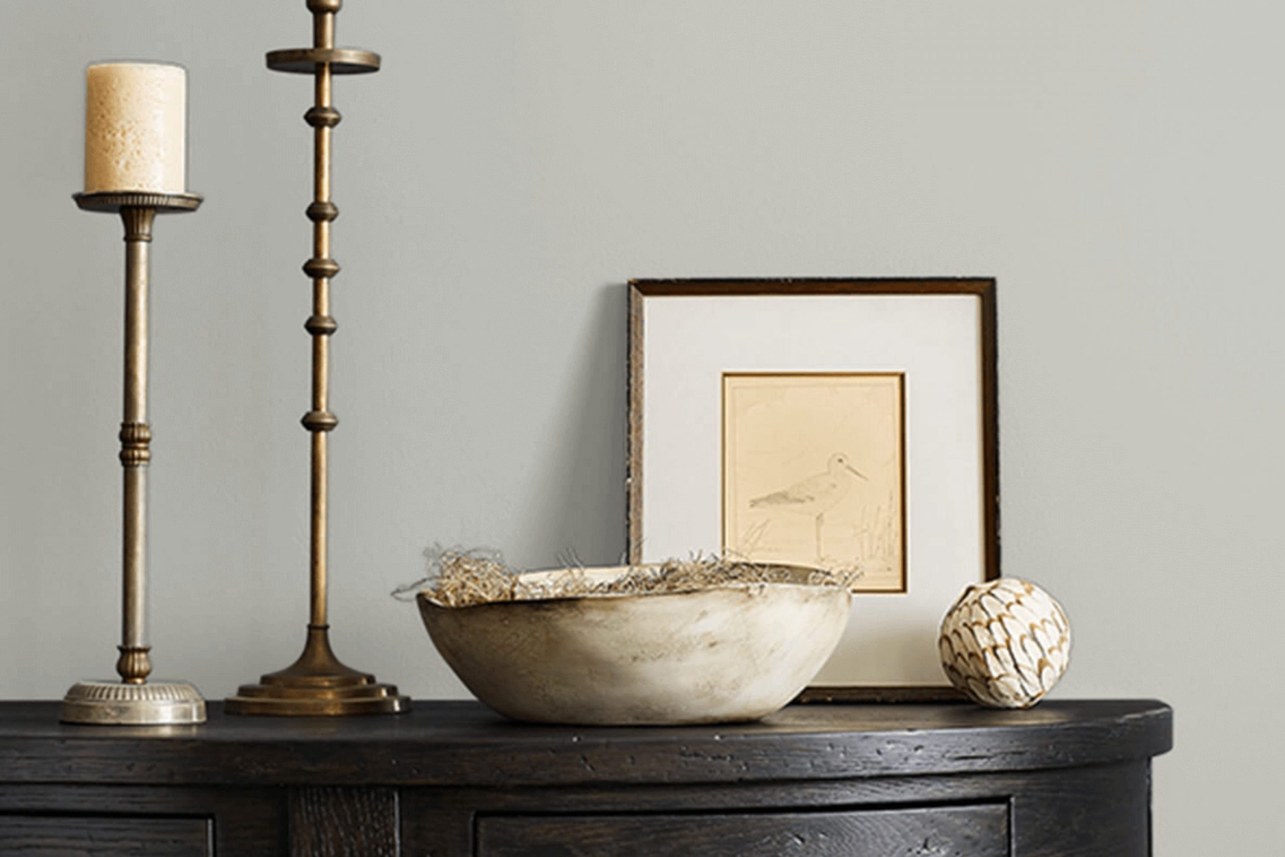
When you are considering a fresh paint color for your home, choosing the right shade can be a challenging decision. SW 7065 Argos by Sherwin Williams is a popular option, and for good reason. It’s a flexible gray that offers a modern and subtle backdrop for any room, fitting seamlessly into various design styles. Whether you’re updating your living room, bedroom, or kitchen, here’s why you might want to consider Argos.
First, it’s important to understand that Argos isn’t just any gray; it has a unique balance of cool undertones that can make a room feel inviting yet contemporary. Paired with the right accents and decor, it can enhance your furniture and artwork without feeling intense.
Before you commit to painting your walls with Argos, think about the lighting in your room, as it plays a crucial role in how this color will ultimately appear—natural light brings out its vibrant qualities, while artificial lighting can draw out its cooler tones.
In my experience, choosing the right paint color means considering these subtleties. Argos could be the perfect choice for you if you are looking for something that combines modern style with a touch of comfort. Here, I’ll share some key insights based on my own use of this color to help you make a more informed decision.
Is Argos SW 7065 Right for My Home?
I recently painted a room with this lovely shade called Argos. It’s a gentle gray that feels very modern and classic. What I love about Argos is its flexibility; it’s like the Swiss Army knife of paint colors. It works beautifully in minimal designs but does not shy away from more traditional rooms either.
From my experience, Argos particularly shines in modern interior styles, especially those that lean toward a Scandinavian or industrial vibe. It has this clean, crisp quality that pairs wonderfully with sparse and sleek furniture, creating a room that feels open and airy. For those who appreciate a bit of a classic touch, Argos can also do wonders in transitional living rooms.
This color works magic with natural materials. Think light woods like birch or ash, which keep the room feeling bright and fresh. In terms of textiles, I love mixing it with soft linens or plush velvets – they really bring out the subtle warmth of gray without feeling intense. Metallic finishes like brushed nickel or chrome also complement Argos really well, adding just the right amount of polish without going overboard. Overall, I’d recommend Argos if you’re looking for a color that offers both flexibility and a breath of fresh air to your room.
What are the right undertones of Argos SW 7065 ?
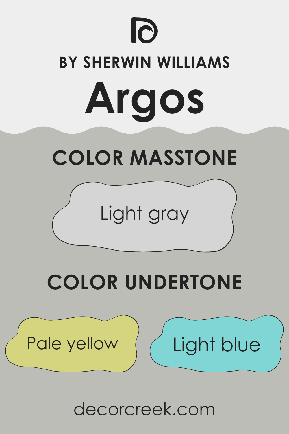
Argos by Sherwin Williams is a unique shade that has a complex composition of undertones. These undertones include pale yellow, light blue, light purple, mint, pale pink, lilac, and grey. Each undertone subtly influences the perception of the main color, adding depth and complexity that can shift depending on lighting and surrounding colors.
In general, undertones are like hidden colors within the main paint color that become more noticeable under certain conditions. They play a crucial role because they can affect how colors look next to each other and in different lights. A color might look different in the store than it does in your home, mainly because of its undertones and the lighting conditions at each place.
When applied to interior walls, the undertones of Argos can make a room feel more dynamic and interesting. The pale yellow and light blue undertones can give a sense of freshness and airiness, while the mint and pale pink add a soft, welcoming vibe. The lilac and grey help balance the color, making it flexible for many rooms without feeling intense. Whether it’s a bedroom or a living area, these undertones help ensure that the walls aren’t just a flat, single color but have a subtle richness that reacts beautifully under different lighting conditions, enhancing the overall feel of a room.
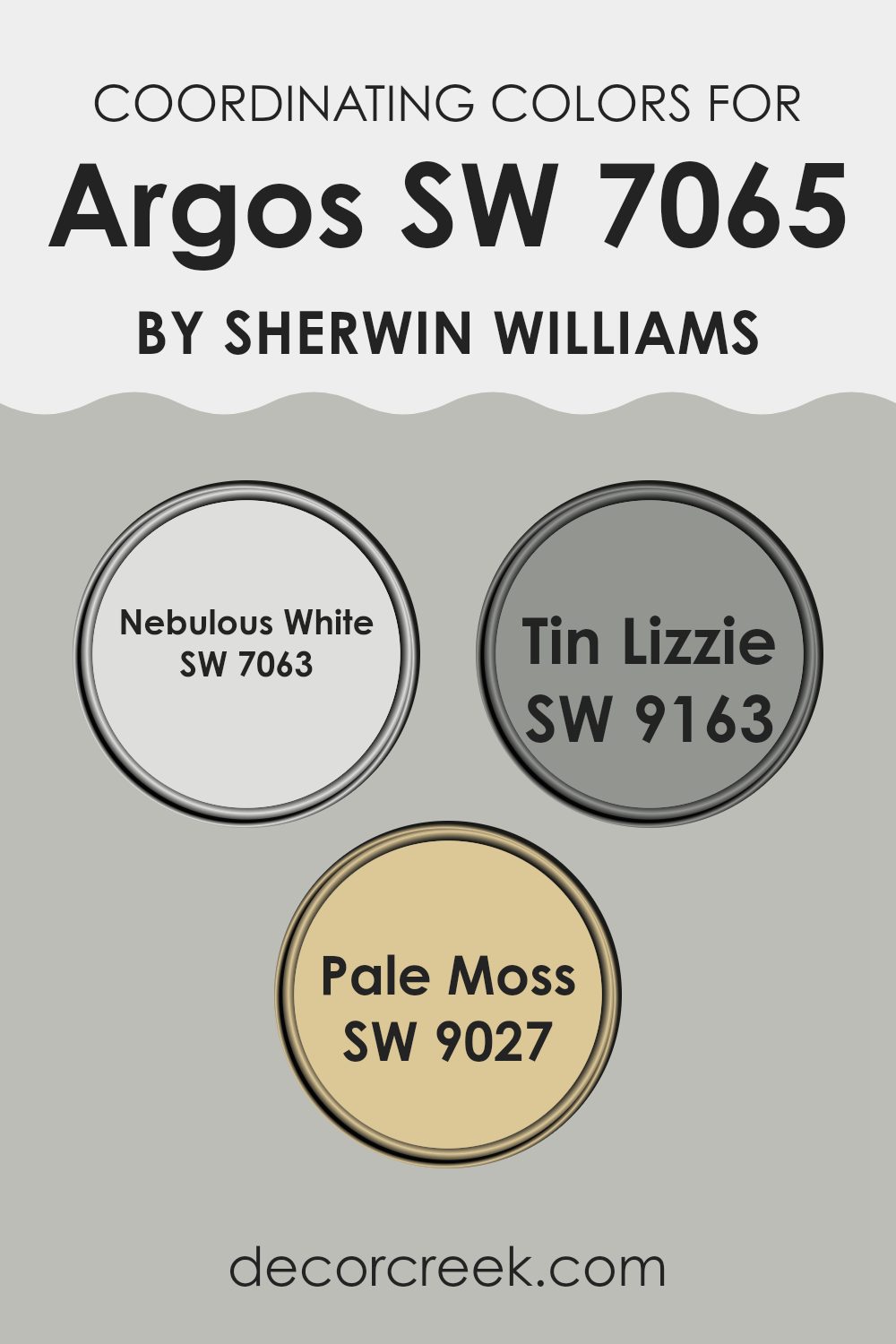
Best Coordinating Colors to use with Argos SW 7065 by Sherwin Williams this year.
Coordinating colors are those selected to harmonize within a room, accentuating the main hue while offering visual balance and contrast. For instance, Argos by Sherwin Williams pairs beautifully with colors like Nebulous White, Tin Lizzie, and Pale Moss.
Each of these shades complements Argos, contributing to a cohesive look by either contrasting or enhancing its deep, cool gray tone. Coordinating colors work by either being in the same color spectrum to provide a subtle and harmonious feel, or by standing opposite in color schemes to introduce a more dynamic and noticeable contrast.
Nebulous White, for example, is a very light gray that almost appears white, providing a clean and open feel when used alongside Argos. It’s an excellent choice for trims or ceilings to give a lifted and airy appearance to rooms.
Tin Lizzie, on the other hand, is a medium gray with slightly bluer undertones, offering a neat bridge between the lighter Nebulous White and the darker Argos for a smooth transition in color depth. Lastly, Pale Moss is a soft and muted green with gray undertones, adding a touch of nature-inspired freshness that contrasts subtly with Argos, perfect for bringing a calm and gentle pop of color into rooms that primarily feature gray tones.
You can see recommended paint colors below:
- SW 7063 Nebulous White
- SW 9163 Tin Lizzie
- SW 9027 Pale Moss
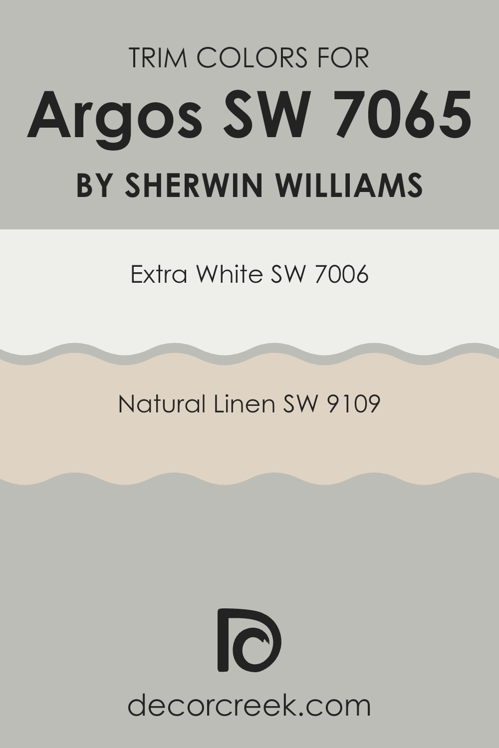
Trendy Trim Colors of Argos SW 7065 by Sherwin Williams to use this year.
Trim colors are specific shades used to accentuate or highlight the architectural details of a room, such as door frames, skirting boards, window frames, and molding. Trim colors play a crucial role in defining the areas around them, creating contrasts that can help features stand out or blend in, depending on the desired effect.
For a color like Argos SW 7065 by Sherwin Williams, a carefully chosen trim color such as SW 7006 – Extra White or SW 9109 – Natural Linen can significantly enhance its appearance by either providing a sharp, clean boundary or a soft, harmonious transition.
SW 7006 – Extra White is a pure, crisp white that offers a stark contrast to Argos, helping to outline features distinctly and making rooms appear larger and more open. On the other hand, SW 9109 – Natural Linen is a warm, subtle beige that complements the cooler tones of Argos with a more gentle differentiation, promoting a soothing and cohesive look. Both options provide flexibility in setting the mood and style of a room, either by creating a dramatic pop or by adding a gentle, unifying flow with the main wall color.
You can see recommended paint colors below:
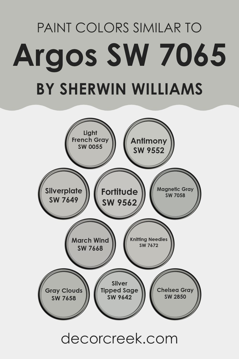
Evergreen Colors Similar to Argos SW 7065 by Sherwin Williams
Choosing similar colors can be crucial for achieving a cohesive and harmonious look in your interior design. Similar colors, like the ones comparable to Argos SW 7065 by Sherwin Williams, share common undertones or intensities, allowing them to blend seamlessly when used together.
This can enhance the aesthetic unity of a room without creating a monotonous effect. By selecting shades like Light French Gray or Silverplate, you ensure that each color complements the others, providing a soft transition between hues that can make a room feel more balanced and visually appealing.
Light French Gray offers a subtle, gentle gray that’s easy on the eyes, perfect for creating a calm environment. Antimony steps in with a slightly deeper shade, giving just a hint more depth without feeling intense. Silverplate is a true gray that delivers a clean, neutral backdrop suitable for modern decor styles. Fortitude, slightly darker, adds weight to a room, ideal for accent walls.
Magnetic Gray, flexible and understated, works wonderfully in rooms that crave a touch of warmth. March Wind and Knitting Needles, on the lighter side of the gray spectrum, inject a fresh and airy feel. Gray Clouds provides a mid-tone gray that’s highly adaptable across various settings.
Silver Tipped Sage introduces a hint of green, offering a unique twist to the typical gray palette. Lastly, Chelsea Gray stands out with its richer, deeper gray, perfect for those wanting to add a stronger character into their design scheme. Using these similar colors allows for a polished and cohesive look that can make any room feel thoughtfully curated and comfortable.
You can see recommended paint colors below:
- SW 0055 Light French Gray
- SW 9552 Antimony
- SW 7649 Silverplate
- SW 9562 Fortitude
- SW 7058 Magnetic Gray
- SW 7668 March Wind
- SW 7672 Knitting Needles
- SW 7658 Gray Clouds
- SW 9642 Silver Tipped Sage
- SW 2850 Chelsea Gray
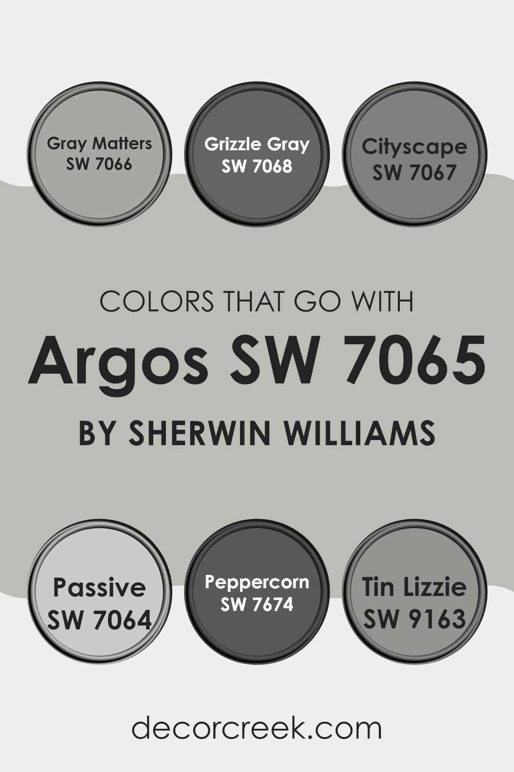
Colors that Go With Argos SW 7065 by Sherwin Williams
Choosing the right colors to pair with Argos SW 7065 by Sherwin Williams is important because it helps create a balanced and harmonious look in any room. Argos is a neutral, muted gray with slightly cool undertones, making it highly flexible and a perfect base for adding complementary colors. Pairing it with the right colors can enhance the overall look of a room, highlighting Argos’s unique tone while bringing warmth, contrast, or a cohesive feel depending on the chosen palette.
For instance, Gray Matters SW 7066 offers a lighter shade of gray which can make a room feel more open while maintaining a subtle yet distinct contrast with Argos. It’s like a soft whisper of gray that provides a gentle lift to rooms. Grizzle Gray SW 7068, on the other hand, can give a more dramatic touch with its deeper and bolder gray tone, perfect for making a statement or highlighting focal points.
Cityscape SW 7067 falls in the middle spectrum between Argos and Grizzle Gray, providing a sleek look that’s neither too light nor too dark, making it a great option for blending areas together. Passive SW 7064 is another light gray but with warmer undertones, which can soften the coolness of Argos, offering a more inviting atmosphere.
Peppercorn SW 7674 goes even darker, resembling the rich darkness of black pepper, ideal for creating a striking contrast, especially in modern and minimal designs. Lastly, Tin Lizzie SW 9163 bridges the gap with a steel-like gray that pairs beautifully with Argos for a seamless metallic tone-on-tone look. Using these colors together allows for a range of visual dynamics, from subtle to bold, enabling you to fine-tune the mood and style of any room.
You can see recommended paint colors below:
- SW 7066 Gray Matters
- SW 7068 Grizzle Gray
- SW 7067 Cityscape
- SW 7064 Passive
- SW 7674 Peppercorn
- SW 9163 Tin Lizzie
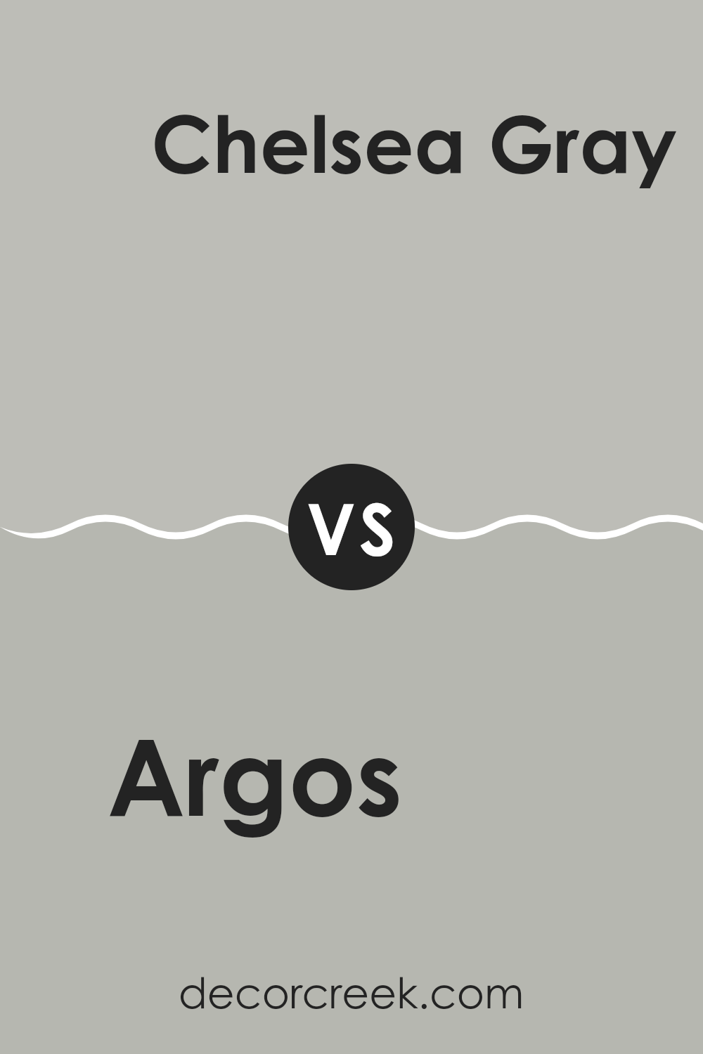
Argos SW 7065 by Sherwin Williams vs Chelsea Gray SW 2850 by Sherwin Williams
Argos and Chelsea Gray are two distinct shades offered by Sherwin Williams. Argos is a neutral gray with a hint of blue undertones, giving it a cool and crisp look. It’s flexible and works well in rooms that aim for a modern and clean look.
On the other hand, Chelsea Gray is a deeper, warmer gray that carries an earthy richness. This color can add a sense of sturdiness and grounding to a room, making it feel cozy and inviting.
While Argos reflects more light and can help make a small room appear bigger and brighter, Chelsea Gray works well in areas that benefit from a more pronounced, comforting vibe. Both colors pair well with a variety of decor styles and can be used for walls, cabinets, or accent features. Choosing between them depends on the mood and function you want to achieve in your room.
You can see recommended paint color below:
Argos SW 7065 by Sherwin Williams vs Light French Gray SW 0055 by Sherwin Williams
Argos SW 7065 and Light French Gray SW 0055, both by Sherwin Williams, offer unique shades for anyone considering a fresh coat of paint. Argos is a deep, cool gray that lends a modern and sleek look to rooms.
It has a hint of blue, making it a great choice for a contemporary vibe in rooms like living areas or bedrooms. In contrast, Light French Gray is lighter and softer. This color is very flexible, working well in almost any room and complementing various decor styles.
It provides a clean and airy feel, making rooms appear larger and more open. While Argos offers a striking and bold ambiance, Light French Gray is more subdued and gentle, ideal for creating a calm and inviting atmosphere. Both colors are stylish and can create distinctly different moods according to where they are used.
You can see recommended paint color below:
Argos SW 7065 by Sherwin Williams vs Fortitude SW 9562 by Sherwin Williams
Argos SW 7065 by Sherwin Williams is a subtle gray with cool undertones, giving it a clean and modern vibe. It’s a flexible color that works well in various rooms, providing a neutral backdrop that complements both bold and subdued decorating schemes.
On the other hand, Fortitude SW 9562 by Sherwin Williams is a deeper, more intense color. It leans toward a navy blue with gray undertones, making it an excellent choice for adding a bit of drama and interest to a room. This color tends to make a strong statement and pairs well with lighter colors for a balanced look.
Both Argos and Fortitude offer distinct moods and atmospheres. While Argos provides a lighter, airier feel, suitable for creating a calm and open room, Fortitude offers depth and richness, perfect for creating a focal point or adding character to a room. Depending on the desired effect in a room, either could be an excellent choice.
You can see recommended paint color below:
Argos SW 7065 by Sherwin Williams vs March Wind SW 7668 by Sherwin Williams
Argos SW 7065 and March Wind SW 7668, both by Sherwin Williams, are two distinct shades of gray that offer subtle nuances in tone. Argos presents a cooler, lighter gray, providing a soft and subtle appearance that works well in various rooms to create a fresh and airy feel.
In contrast, March Wind is a deeper gray that edges slightly toward a slate color, lending it a stronger presence in a room. This deeper shade can make a room feel more defined and grounded compared to the lighter Argos.
Where Argos might be better suited for a bright, open room aiming for a gentle and quiet look, March Wind could be more fitting for areas that benefit from a more pronounced color impact, such as accent walls or richer backdrops. Both colors are flexible and can be used effectively in modern home decor to achieve a clean and contemporary look.
You can see recommended paint color below:
Argos SW 7065 by Sherwin Williams vs Gray Clouds SW 7658 by Sherwin Williams
Argos SW 7065 and Gray Clouds SW 7658, both by Sherwin Williams, present subtle yet distinct tone variations suitable for various rooms. Argos leans toward a cooler gray that echoes a modern, sleek look. This color can make small rooms appear more spacious while giving large rooms a clean, organized feel.
In contrast, Gray Clouds is a lighter gray shade that offers a softer and more inviting vibe. It works brilliantly in areas that require a calming effect, such as bedrooms or living areas, as it doesn’t feel intense but provides a comforting presence.
Both colors are flexible and can be easily paired with different decor styles, but Argos suits a sharper, more contemporary environment, whereas Gray Clouds is ideal for creating a cozy, welcoming room. Depending on the desired atmosphere, each color has its strengths for enhancing the room’s character and mood.
You can see recommended paint color below:
Argos SW 7065 by Sherwin Williams vs Antimony SW 9552 by Sherwin Williams
Argos SW 7065 by Sherwin Williams is a neutral gray color that offers flexibility in its use across various rooms. It has a balanced shade that lacks strong undertones, making it easy to match with a wide range of decor and styles. This makes it ideal for those wanting a clean and simple look.
On the other hand, Antimony SW 9552 by Sherwin Williams presents itself as a darker gray that tends toward the charcoal spectrum. This deeper tone creates a more defined and bold statement, ideal for accent walls or furniture. It pairs well with both bright and muted shades, allowing for dynamic design options.
While both colors share the foundational gray tone, Argos is lighter, providing a subtle backdrop that enhances other colors. Antimony, being darker, offers a striking contrast, perfect for adding depth and focus in a room. Selecting between the two would depend on the desired effect – subtle elegance with Argos or dramatic flair with Antimony.
You can see recommended paint color below:
Argos SW 7065 by Sherwin Williams vs Knitting Needles SW 7672 by Sherwin Williams
Argos and Knitting Needles are two popular gray paint colors by Sherwin Williams, but they have different tones and vibes. Argos is a darker gray with a slate-like quality, which gives it a strong presence in a room. This color is great for creating a bold statement without feeling too intense. It works well in rooms where you want a bit of drama or a modern, minimalist look.
On the other hand, Knitting Needles is a lighter gray that feels softer and more inviting. It’s a flexible shade that pairs easily with other colors and is ideal for a cozy, relaxed room. Because it’s lighter, Knitting Needles can help make a small room feel bigger and brighter.
Both colors are neutral, so they can fit into many different decor styles, but the choice between the two depends on what mood or atmosphere you want to achieve in your room. Argos sets a more dramatic tone, while Knitting Needles offers a gentler ambiance.
You can see recommended paint color below:
Argos SW 7065 by Sherwin Williams vs Magnetic Gray SW 7058 by Sherwin Williams
Argos and Magnetic Gray are two popular shades by Sherwin Williams, each offering its own unique appeal. Argos is a neutral gray with a slightly cool undertone, making it a flexible choice for any room looking for a clean and modern look. It leans more toward a lighter shade, which can help make small rooms appear larger and more open.
On the other hand, Magnetic Gray is a bit darker than Argos and comes with a warmer undertone. This color can add a cozy and inviting feel to rooms, making it ideal for living areas or bedrooms where a more relaxed atmosphere is desired.
While both colors are gray, the key difference lies in their undertones and depth. Argos, being cooler and lighter, offers a more crisp and fresh appearance, whereas Magnetic Gray, with its warmth, tends to create a more snug and welcoming vibe. This difference makes each color well-suited for different types of rooms and looks depending on the atmosphere you’re aiming to achieve.
You can see recommended paint color below:
Argos SW 7065 by Sherwin Williams vs Silver Tipped Sage SW 9642 by Sherwin Williams
Argos SW 7065 by Sherwin Williams is a soft, cool gray with subtle blue undertones. It provides a gentle and understated backdrop, suitable for various rooms and decor styles, from modern to traditional. It pairs well with both bright colors for a dynamic contrast and with muted tones for a more cohesive look.
In contrast, Silver Tipped Sage SW 9642, also by Sherwin Williams, leans toward a unique gray with hints of green, giving it a refreshing nature-inspired feel. This color is slightly warmer compared to Argos, offering a cozy atmosphere that works beautifully in areas where you want a calm, inviting ambiance.
When comparing the two, Argos stands out as the cooler, more neutral choice, making it flexible for pairing with a wide range of decorations. Silver Tipped Sage, with its green undertones, adds a touch of earthiness and can make a room feel more connected to the outdoors. Both colors offer minimal charm and can set a relaxing mood in any room.
You can see recommended paint color below:
Argos SW 7065 by Sherwin Williams vs Silverplate SW 7649 by Sherwin Williams
The two colors, Argos and Silverplate by Sherwin Williams, share similarities yet have distinct differences that make each unique. Argos is a cool gray hue with blue undertones, giving it a subtle freshness and a modern vibe, making it a great choice for a contemporary room. On the other hand, Silverplate presents as a lighter gray that tilts more toward a neutral silver, offering a softer look that is flexible and calming, perfect for creating a relaxed environment.
The darker tone of Argos makes it suitable for accent walls or furniture pieces that need to stand out or add depth to a room. Silverplate works well as a background color, offering a clean backdrop that enhances artwork or bold furniture colors without feeling intense.
In terms of matching with other colors, Argos pairs well with cooler tones like blues and crisp whites, while Silverplate is easier to match with a wide range of colors because of its closer proximity to a true neutral. Whether you choose Argos or Silverplate depends on the mood you want to set and the other colors you plan to use in your decor.
You can see recommended paint color below:
In wrapping up my thoughts on SW 7065 Argos by Sherwin Williams, I find that this paint color is a real winner for any room looking for a touch of modern coolness. Its mild gray shade isn’t too bold or shouty, making it perfect for someone who likes a cleaner, subtler look. Because it isn’t very dark or very light, Argos is a color that can match well with lots of other colors and furniture styles. It works great in bedrooms for a calming feel or living rooms for a neat, tidy look. Also, it’s easy to apply and covers the walls nicely, leaving a smooth, even finish.
My experience testing it out showed that Argos handles different light settings really well, staying true to its polished gray without turning bluish or washed out. People who visited my home noticed it right away, often commenting on how fresh and modern my walls looked. Cleaning the paint once it dried was simple too, which is a bonus for families or anyone who doesn’t want to fuss over wall marks.
To sum it up, Argos by Sherwin Williams is a fantastic choice if you’re thinking about giving your room a fresh, stylish makeover. It’s simple yet effective, and honestly, any room can look cool and inviting with this shade of gray. Really, seeing this color on the walls made me happy about how my home looks now—it’s just what I needed!
Ever wished paint sampling was as easy as sticking a sticker? Guess what? Now it is! Discover Samplize's unique Peel & Stick samples.
Get paint samples

