Green is one of the most versatile colors you can use in your home. It evokes feelings of calm, nature, and balance while offering a wide range of tones—from soft, muted sage to deep, dramatic emerald. Whether you’re painting your walls, choosing upholstery, or accessorizing a space, pairing green with the right complementary colors is key to achieving a harmonious design.
Complimentary colors, often found on the opposite side of the color wheel, can elevate green by adding depth or contrast. For green, these colors often include shades of red, peach, or coral—but that’s just the beginning. Neutral shades like creamy whites and grays or bold tones like navy and gold also pair beautifully, depending on the mood you want to create.
In this guide, I’ve compiled two essential lists: 16 hex color codes for precision in digital or accent planning and 16 paint colors from Benjamin Moore and Sherwin Williams to bring your green-inspired vision to life.
Let’s dive into the details to find combinations that truly shine in your space.
What Are Complimentary Colors, and Why Do They Matter?
Complimentary colors are opposites on the color wheel, creating a natural balance when paired. For green, the traditional complement is red. However, in interior design, we explore a broader range of tones. Think of coral, terracotta, or even blush pink as softer alternatives to red.
These combinations are powerful because they contrast yet balance each other. For example:
- A dark emerald green wall paired with warm terracotta pillows feels earthy yet bold.
- A mint green bathroom accented with soft lilac tiles adds a light and fresh vibe.
Understanding how colors interact helps create rooms that feel cohesive, not chaotic. Below, I’ve shared some tried-and-true color pairings that work beautifully with green.
Hex Codes That Pair Beautifully with Green
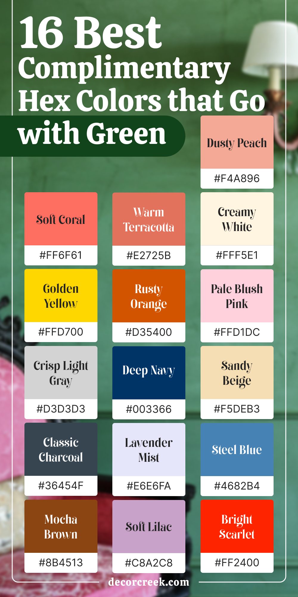
Hex codes are incredibly useful if you’re working on a digital project, sourcing textiles, or ensuring consistency across elements. Here are 16 hex color codes that complement green tones, along with tips on how to use them:
- Soft Coral (#FF6F61) – A warm shade that pops against deep forest green. Use it in accents like throw pillows or artwork.
- Warm Terracotta (#E2725B) – Perfect for earthy pairings with sage green in living rooms or kitchens.
- Creamy White (#FFF5E1) – A subtle, clean backdrop for bold emerald green.
- Dusty Peach (#F4A896) – Adds a cozy touch to olive green spaces.
- Deep Navy (#003366) – Contrasts beautifully with moss green, creating a moody palette.
- Crisp Light Gray (#D3D3D3) – Complements seafoam green for a modern, airy feel.
- Classic Charcoal (#36454F) – Works well with mint green to ground the space.
- Rusty Orange (#D35400) – Adds vibrancy to kelly green accents or trims.
- Lavender Mist (#E6E6FA) – A soft, elegant pairing for hunter green walls.
- Gold Yellow (#FFD700) – Brightens army green tones, especially in kitchens or offices.
- Pale Blush Pink (#FFD1DC) – A delicate pairing with jade green in bedrooms.
- Mocha Brown (#8B4513) – Adds richness to pistachio green furniture.
- Steel Blue (#4682B4) – Ideal for lime green accent walls or decor.
- Sandy Beige (#F5DEB3) – A classic neutral that balances teal green.
- Bright Scarlet (#FF2400) – Bold and striking against dark olive green accents.
- Soft Lilac (#C8A2C8) – A whimsical touch to chartreuse green accessories.

By mixing these tones with different shades of green, you can create spaces that feel personalized yet balanced.
Paint Colors That Compliment Green
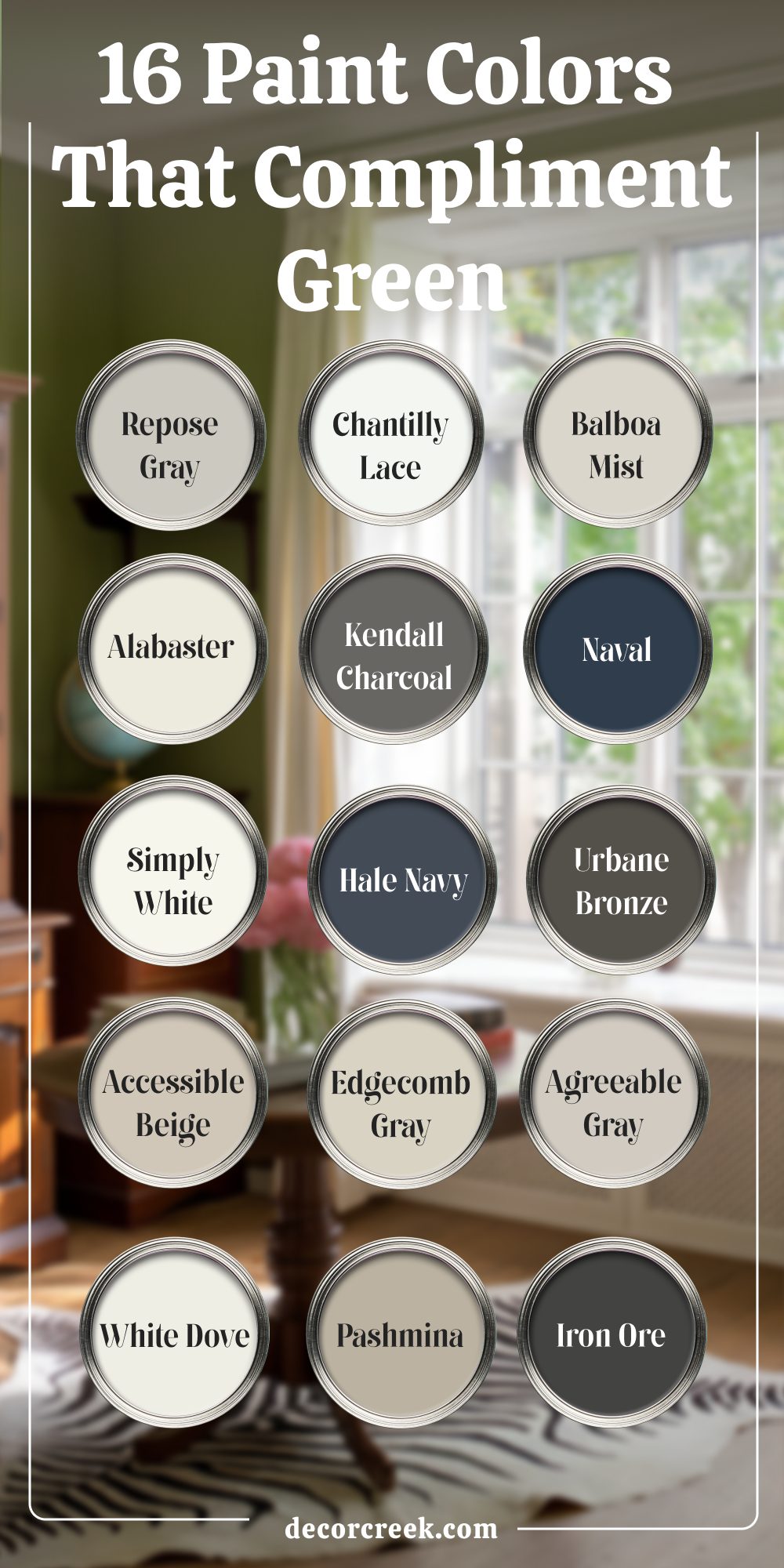
Paint is often the backbone of a room’s design, and the right complementary shades can transform a green-focused space. Whether you’re painting walls, cabinetry, or trims, these 16 paint colors offer the perfect matches for green interiors.
- Benjamin Moore Chantilly Lace – A crisp white that’s ideal for highlighting forest green accents in living rooms.
- Sherwin Williams Repose Gray – A cool, neutral gray that balances moss green walls beautifully.
- Benjamin Moore Balboa Mist – A warm gray that pairs elegantly with hunter green cabinetry in kitchens.
- Sherwin Williams Alabaster – A soft white that works wonderfully with olive green trims.
- Benjamin Moore Kendall Charcoal – A bold, grounding gray that complements kelly green furniture.
- Sherwin Williams Naval – A deep navy that adds richness to mint green decor.
- Benjamin Moore Hale Navy – A dramatic navy that looks striking alongside emerald green rugs or feature walls.
- Sherwin Williams Urbane Bronze – A dark, earthy tone perfect for chartreuse green accents or upholstery.
- Benjamin Moore Simply White – A clean white that enhances the vibrancy of teal green wallpapers.
- Sherwin Williams Accessible Beige – A warm beige that pairs beautifully with pistachio green furnishings.
- Benjamin Moore Edgecomb Gray – A subtle gray that complements seafoam green tableware or curtains.
- Sherwin Williams Agreeable Gray – A soft, balanced gray that works well with lime green accent pieces.
- Benjamin Moore White Dove – A classic white that highlights jade green trims effortlessly.
- Sherwin Williams Iron Ore – A deep charcoal gray that contrasts beautifully with dark olive green kitchens.
- Benjamin Moore Pashmina – A muted taupe that adds warmth to army green feature walls.
- Sherwin Williams Peppercorn – A rich, deep gray that enhances dark emerald green accessories or furniture.

These colors are tried and tested by designers to bring out the best in green tones while adding depth and interest to the overall design.
Closing Thoughts Let Green Be Your Anchor
Green is an incredibly versatile color, providing a strong anchor for any room. By pairing it with these complimentary shades, you can craft spaces that are elegant, inviting, and uniquely yours. Whether you’re using digital hex codes or experimenting with paint samples, the combinations are endless.
Take your time exploring these pairings, and always test your choices in natural light to see how they come alive in your space. What pairing will you try next? I’d love to hear your thoughts or see your projects come to life!

