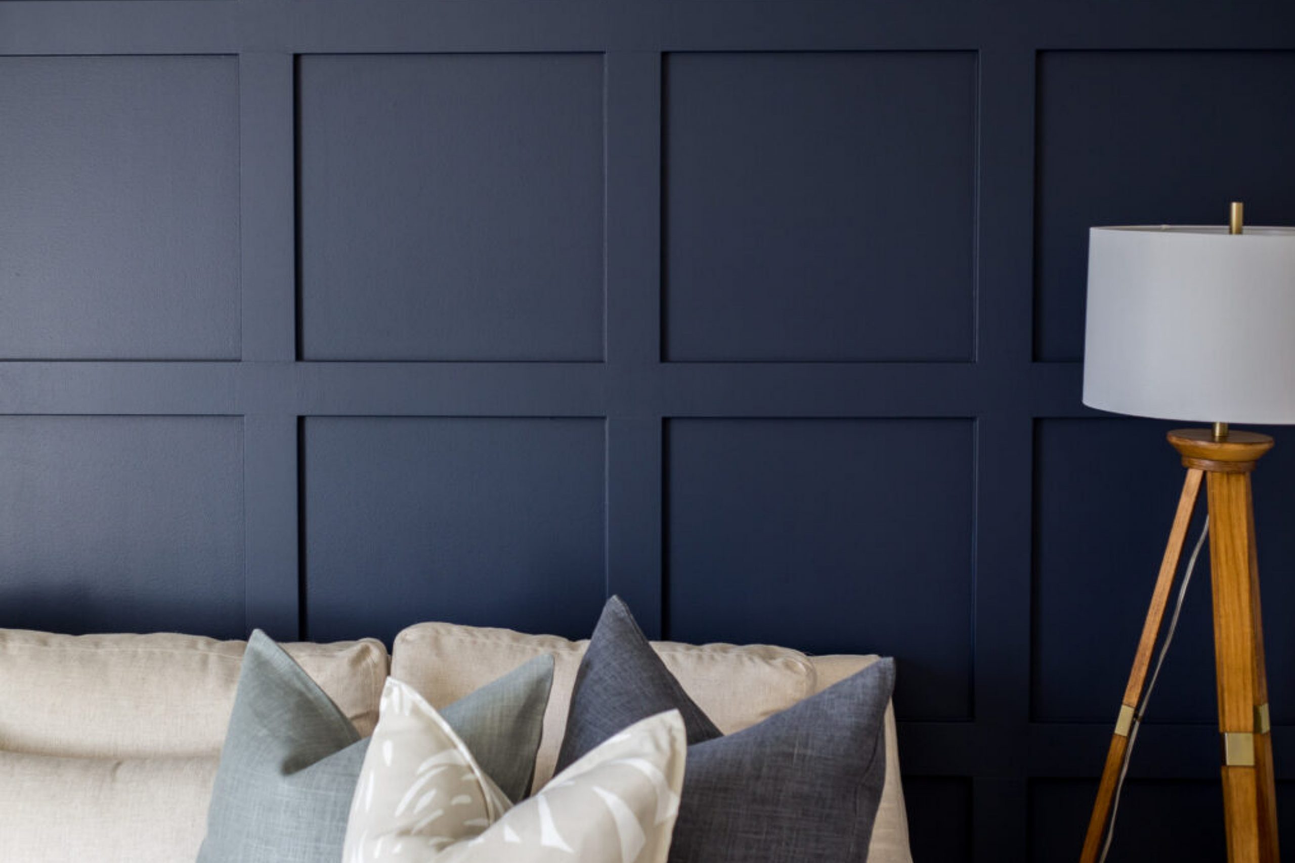
If you’re looking for a bold and timeless navy blue, Benjamin Moore’s Hale Navy (HC-154) might be just what you need. Navy blue is one of those colors that feels both strong and comforting. It works beautifully in any space, whether you’re going for a modern look or something more classic.
Let’s talk about what makes Hale Navy special and how it compares to other popular shades.
Hex, LRV, and RGB for Hale Navy:
- Hex: #434C5E
- LRV: 8.36 (It’s on the darker side, so keep lighting in mind!)
- RGB: 67, 76, 94
How Lighting Affects Hale Navy
Lighting plays a crucial role in how any paint color looks, and Hale Navy is no exception. In different lighting conditions, this bold navy can shift in tone and depth, creating varying effects throughout the day or in different areas of your home.
- Natural Light: In rooms with plenty of natural sunlight, Hale Navy may appear slightly brighter and more vibrant. The blue tones will be more pronounced, giving the space a crisp, airy feel, despite its depth. In the morning or afternoon, with cooler light, Hale Navy can show its true deep navy color, while in the golden hour of late afternoon, the color may take on a warmer, cozier hue.
- Artificial Light: Under warm, incandescent lighting, Hale Navy can appear richer and more saturated, with its warmer undertones coming forward. This makes the color feel more inviting and cozy, perfect for spaces like living rooms or bedrooms where you want a relaxing atmosphere. On the flip side, under cooler LED or fluorescent lights, Hale Navy can lean more toward a crisp, cooler blue, highlighting its classic navy tone and giving it a more modern edge.
- Low Light: In darker spaces or rooms with limited natural light, Hale Navy will appear much darker and can even read as almost black. This adds a layer of sophistication and drama but may require lighter accents or brighter complementary colors to keep the room from feeling too closed in.
To get the best effect, it’s always a good idea to test Hale Navy in different lighting conditions in your space. Whether in natural daylight or artificial evening light, Hale Navy will adapt to its surroundings, giving you a versatile and dynamic color that changes with the mood of the room.
Now, let’s get into some fun color comparisons.
Now that we’ve covered the basics of Hale Navy, let’s see how it stacks up against some other popular dark paint colors.
Whether you’re choosing between different shades of navy or debating a more neutral tone, this section will give you a clear idea of how Hale Navy compares to other favorites from Benjamin Moore and Sherwin Williams. Let’s break it down!
Fun Facts and Trends
- Versatile in Style: Hale Navy works well in many design styles, from traditional to modern and even coastal themes. Its ability to adapt to different environments makes it a go-to choice for designers looking to create depth and contrast in a space.
- A Kitchen Favorite: Dark, dramatic cabinetry is a huge trend, and Hale Navy is frequently chosen for kitchen cabinets. It offers a rich, luxurious feel while still being approachable, especially when paired with white or marble countertops.
- Exterior Star: Hale Navy is also gaining traction for home exteriors, especially for homeowners looking for a bold but classic look. It holds up well against different architectural styles, adding timeless curb appeal.
- Color Psychology: Dark blues like Hale Navy are often associated with feelings of stability, confidence, and calm. It’s a perfect choice for spaces where you want to feel grounded and focused, like a home office or reading nook.
- Celebrity Love: Many interior design influencers and celebrities have embraced Hale Navy in their own homes, using it as a bold backdrop for artwork or as a feature wall color. Its ability to stand out without overwhelming makes it a popular choice among high-profile decorators.
Hale Navy vs. Other Popular Shades
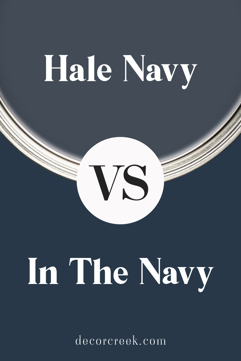
Hale Navy vs. In the Navy
Hale Navy and Sherwin Williams’ In the Navy are both rich navy blues, but they differ in subtle ways. Hale Navy has a softer, more muted tone compared to In the Navy’s deeper and crisper feel. In the Navy leans a bit cooler, giving it a more classic and striking navy vibe, whereas Hale Navy has a slightly warmer undertone that makes it more adaptable to different lighting conditions.
Hale Navy feels cozier and can create a more inviting space, while In the Navy stands out for a bold, dramatic effect. If you’re looking for something versatile that can shift with lighting, Hale Navy might be the way to go. For a true, deep navy with high contrast, In the Navy shines.
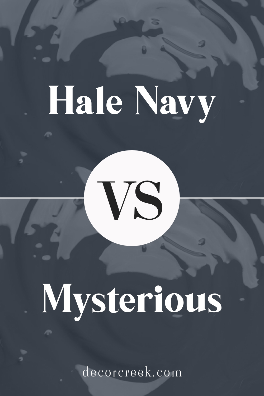
Hale Navy vs. Mysterious
Both Hale Navy and Benjamin Moore’s Mysterious are moody, dark colors, but Mysterious has a more charcoal undertone. While Hale Navy stays true to its navy roots with a subtle warmth, Mysterious leans closer to black, especially in dim lighting.
Hale Navy will always read as blue, giving a rich and classic navy feel, whereas Mysterious might look nearly black in darker spaces.
If you’re aiming for a dark color that still maintains that traditional navy blue charm, Hale Navy is your best bet. Mysterious, on the other hand, is ideal if you’re looking for something that borders on black but retains a hint of blue undertone.
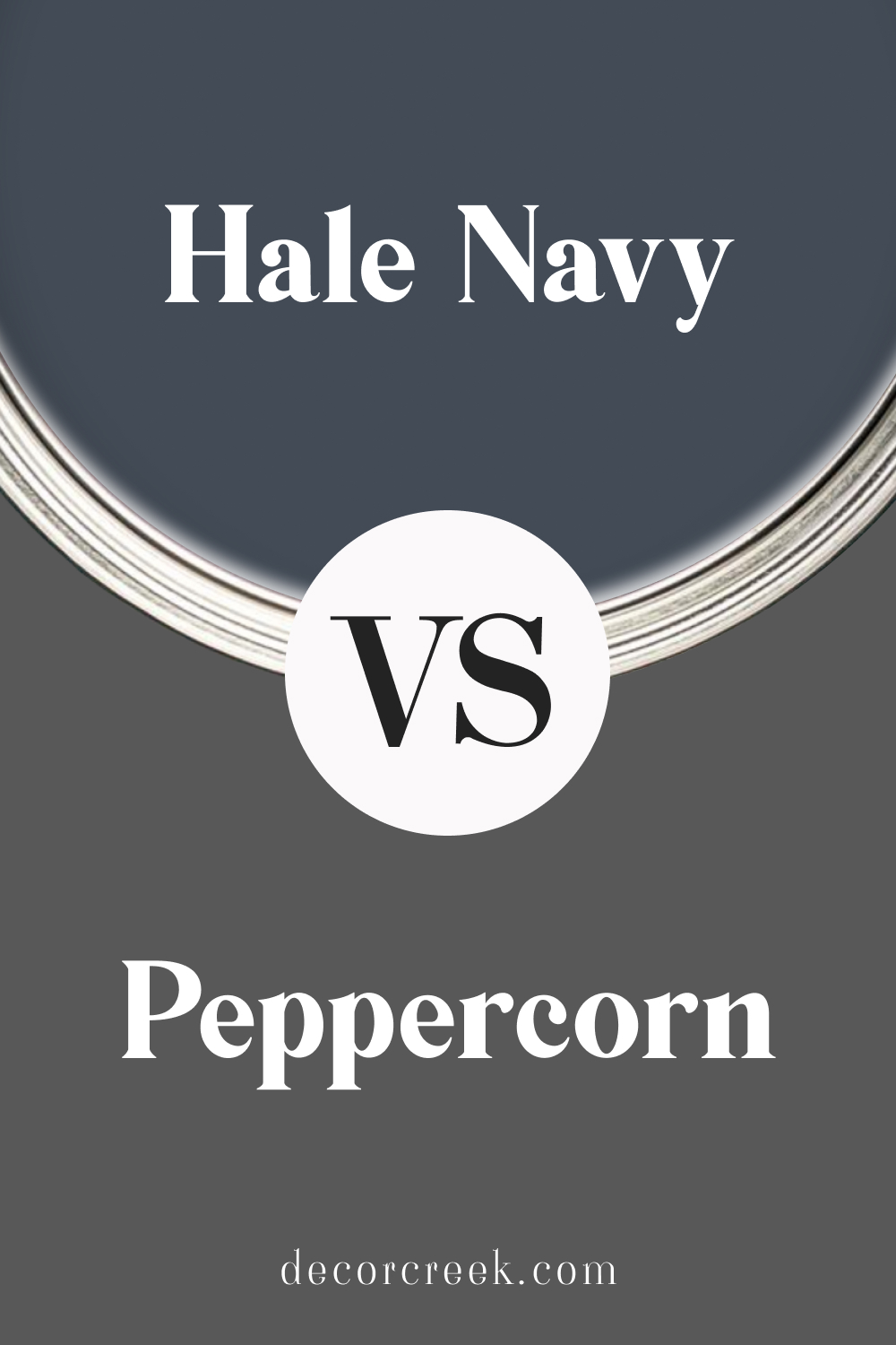
Hale Navy vs. Peppercorn
Sherwin Williams’ Peppercorn is a dark gray with slight hints of blue, which gives it a different vibe from the true navy of Hale Navy. When placed side by side, Peppercorn reads more as a neutral, whereas Hale Navy comes across as a bold, deep blue.
Peppercorn is perfect for those who want a moody, dark wall without committing to the strong color that Hale Navy brings. While Hale Navy stands out with its rich blue tone, Peppercorn feels more grounded and understated, making it ideal for spaces where you want a hint of color without going full navy.
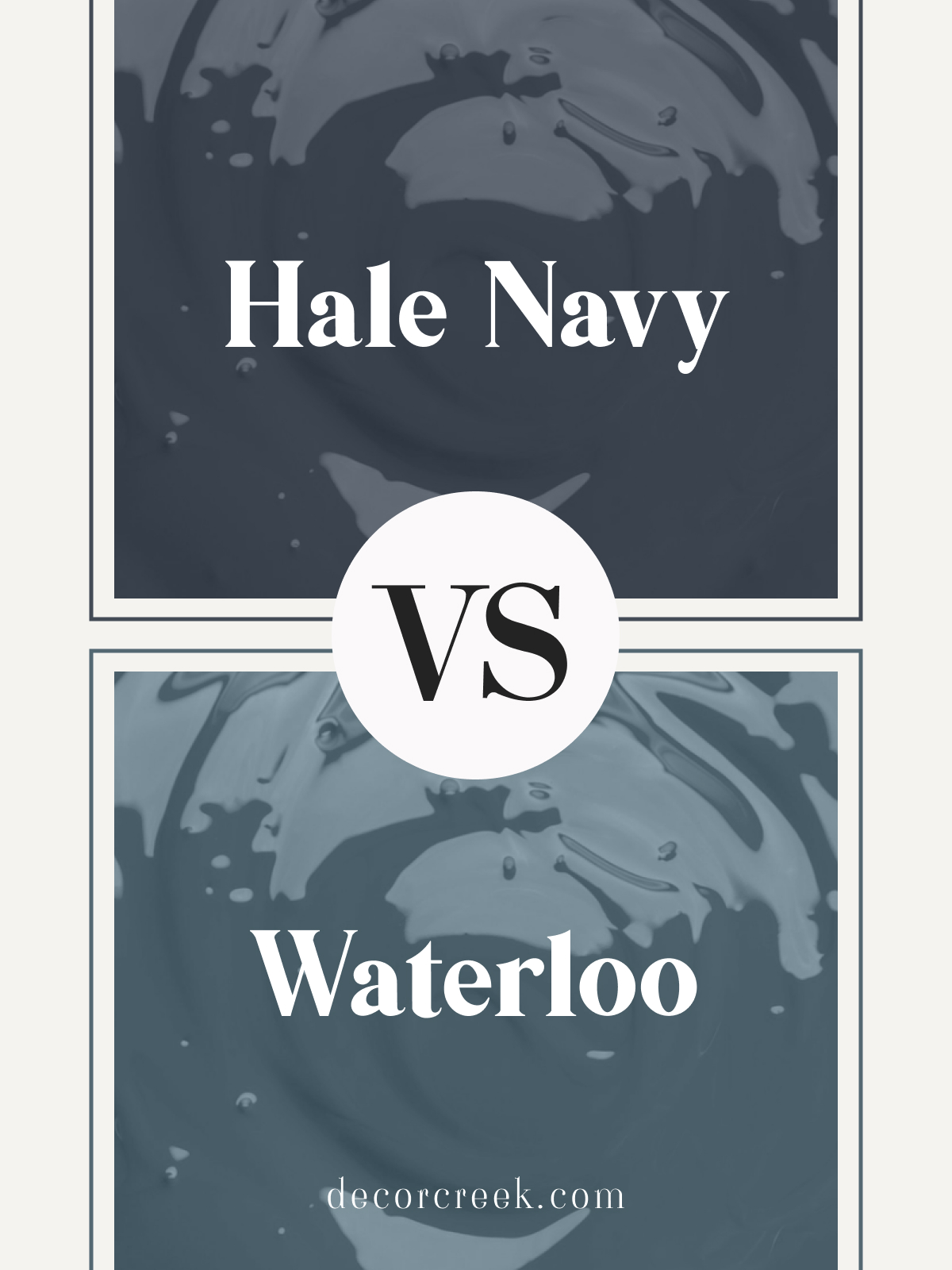
Hale Navy vs. Waterloo
Sherwin Williams’ Waterloo is a bit lighter and more subdued compared to the bold richness of Hale Navy. Waterloo has more gray undertones, giving it a softer, more relaxed appearance. In contrast, Hale Navy is darker and more dramatic, making it an excellent choice for feature walls or cabinetry.
Waterloo works well if you’re aiming for a gentler, less intense blue that still has depth but doesn’t dominate the room.
On the other hand, Hale Navy will make a bigger statement and provide that classic, bold navy presence.
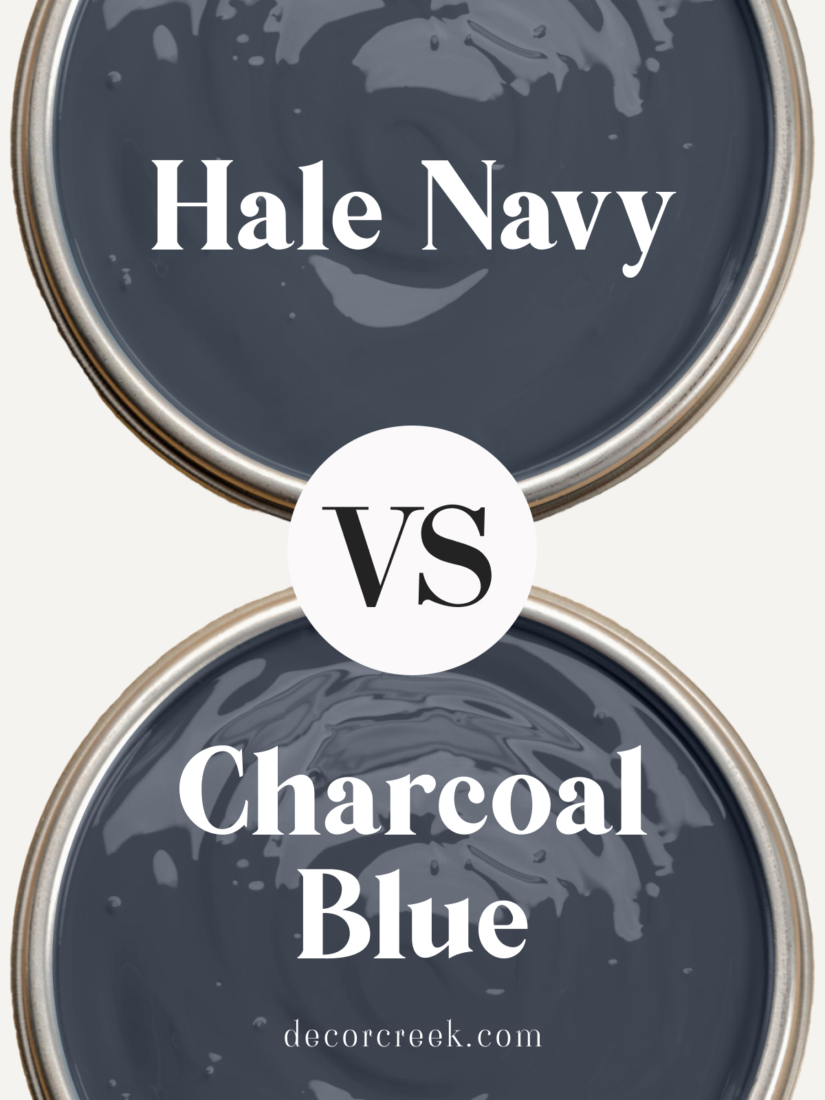
Hale Navy vs. Charcoal Blue
Charcoal Blue is another close contender to Hale Navy but has a slightly dustier, grayish undertone. While both are deep, rich colors, Hale Navy leans more into a true navy, offering a crisper, more defined blue.
Charcoal Blue has a bit of softness due to the gray undertone, making it feel slightly warmer and more muted. If you want a bold navy that really pops, Hale Navy is your go-to. Charcoal Blue, however, might be a better fit if you’re after a navy that feels a little more toned down and cozy.
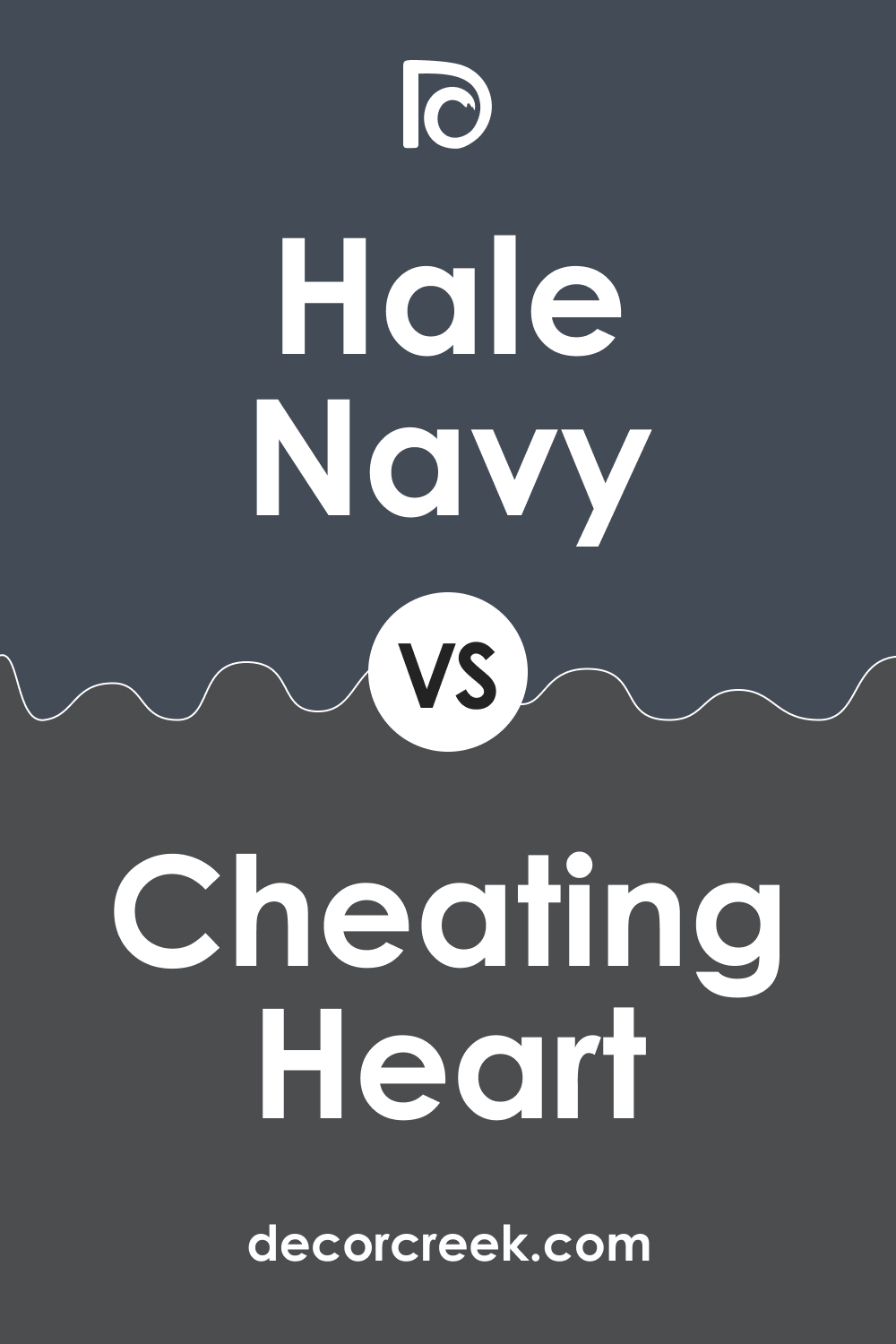
Hale Navy vs. Cheating Heart
Cheating Heart by Benjamin Moore is much darker than Hale Navy, with a more neutral charcoal tone. In low light, Cheating Heart can almost look black, whereas Hale Navy will always maintain its deep navy blue presence. Hale Navy is perfect for those wanting a traditional, bold navy, while Cheating Heart is better for anyone seeking a near-black color with just the slightest hint of blue.
If you love navy but are considering going even darker, Cheating Heart might be a good option, though it won’t provide the same richness of blue that Hale Navy does.
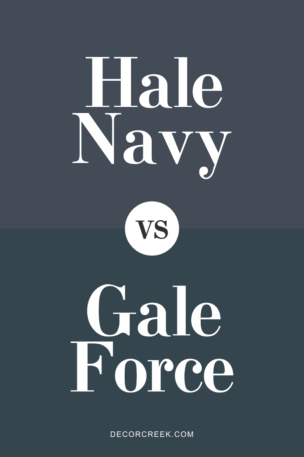
SW Gale Force vs. BM Hale Navy
Sherwin Williams’ Gale Force brings a whole new dimension to navy by blending navy with teal undertones. In comparison, Hale Navy is a straightforward classic navy blue, making it more versatile for traditional spaces. Gale Force, with its hint of teal, shifts in lighting, showing more depth and variety.
If you prefer a classic, timeless navy, Hale Navy is your color. But if you’re feeling adventurous and want a navy with a bit of green or teal surprise, Gale Force can add that extra flair.
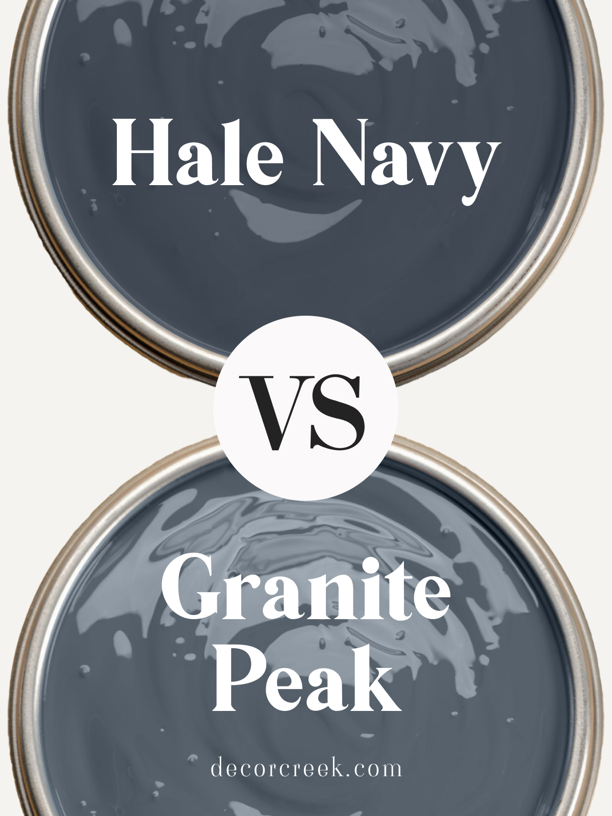
Granite Peak vs. Hale Navy
Granite Peak by Sherwin Williams is a softer, more gray-toned blue compared to the bold richness of Hale Navy. Granite Peak feels more subdued and calm, offering a lighter, more neutral version of blue, while Hale Navy is darker and stands out more.
If you’re looking for a navy that makes a statement, Hale Navy is the clear choice.
Granite Peak is perfect if you want something that feels less intense and more serene, with a balance of blue and gray tones that softens its impact.
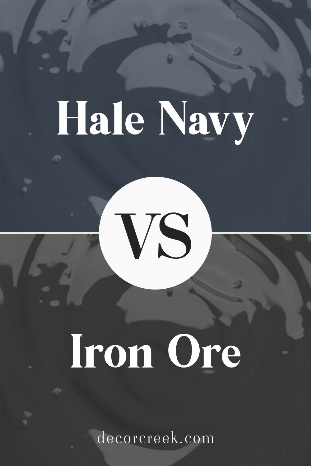
Hale Navy vs. Iron Ore
Iron Ore by Sherwin Williams is much darker than Hale Navy and reads more like a deep, almost-black charcoal with a slight warm undertone. While Hale Navy has a strong blue presence, Iron Ore comes across as nearly black, especially in dim light. If you want a dark color but are torn between navy and something closer to black, Hale Navy offers that rich, blue tone, while Iron Ore is ideal if you’re leaning toward a dark neutral that feels sophisticated and moody without the blue tones.
Hale Navy really holds its own against these other popular dark shades, offering a bold, true navy that stands out in any space while still being versatile enough to pair with a variety of other colors. Whether you want a classic navy or are considering something with a little more gray or teal, Hale Navy is a solid contender for creating a bold, cozy, and inviting look!
Hale Navy and Popular Complementary Colors
Hale Navy and Agreeable Gray
Hale Navy and Sherwin Williams’ Agreeable Gray make a perfect pair if you’re looking for contrast. Agreeable Gray is a warm, neutral greige that has a soft and calming effect, which complements the boldness of Hale Navy.
Together, they create a sophisticated balance between dark and light, where Hale Navy can ground the space, and Agreeable Gray brings warmth and openness. This combo works especially well in living rooms or bedrooms, where you want a bit of drama but still maintain an inviting atmosphere.

Hale Navy and Alabaster
Sherwin Williams’ Alabaster is a creamy, warm white that pairs beautifully with Hale Navy. Alabaster’s softness helps to tone down the richness of Hale Navy, making the space feel more balanced. Together, these two shades can create a coastal or farmhouse-inspired palette, bringing both warmth and depth to a room. Alabaster is ideal for trim or cabinetry, while Hale Navy works as a statement color on walls or even an accent piece.
Hale Navy and Chantilly Lace
Benjamin Moore’s Chantilly Lace is a bright, crisp white that contrasts sharply with the boldness of Hale Navy. This pairing is perfect for a modern, clean look, where Hale Navy adds depth and drama, and Chantilly Lace keeps things feeling fresh and bright.
It’s a great combo for kitchens, bathrooms, or any space where you want to make a strong visual impact without overwhelming the room.
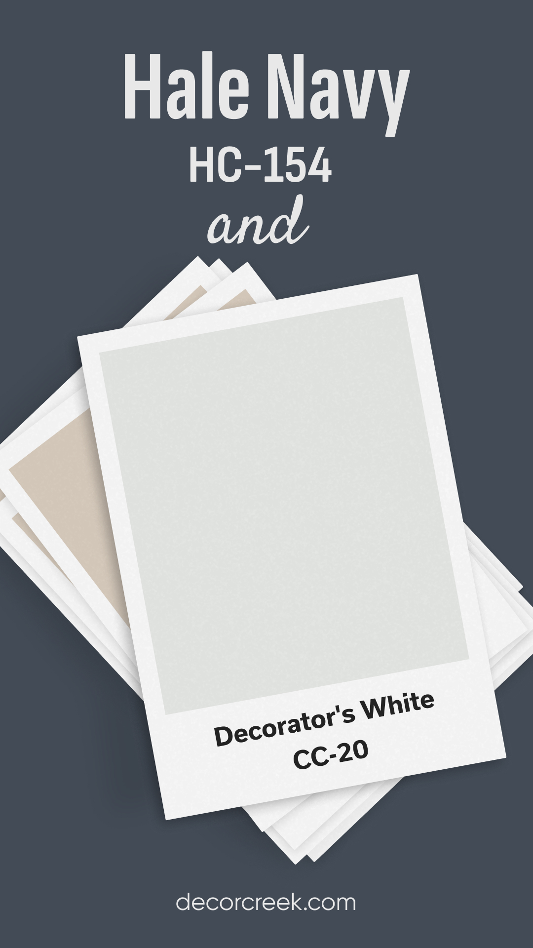
Hale Navy and Decorators White
Benjamin Moore’s Decorators White is a soft, cool-toned white that brings a subtle elegance to any space when paired with Hale Navy. Decorators White has enough brightness to balance the depth of Hale Navy while keeping the overall look clean and crisp. This duo works well in rooms where you want a timeless, sophisticated color scheme, such as a home office or a formal living room.
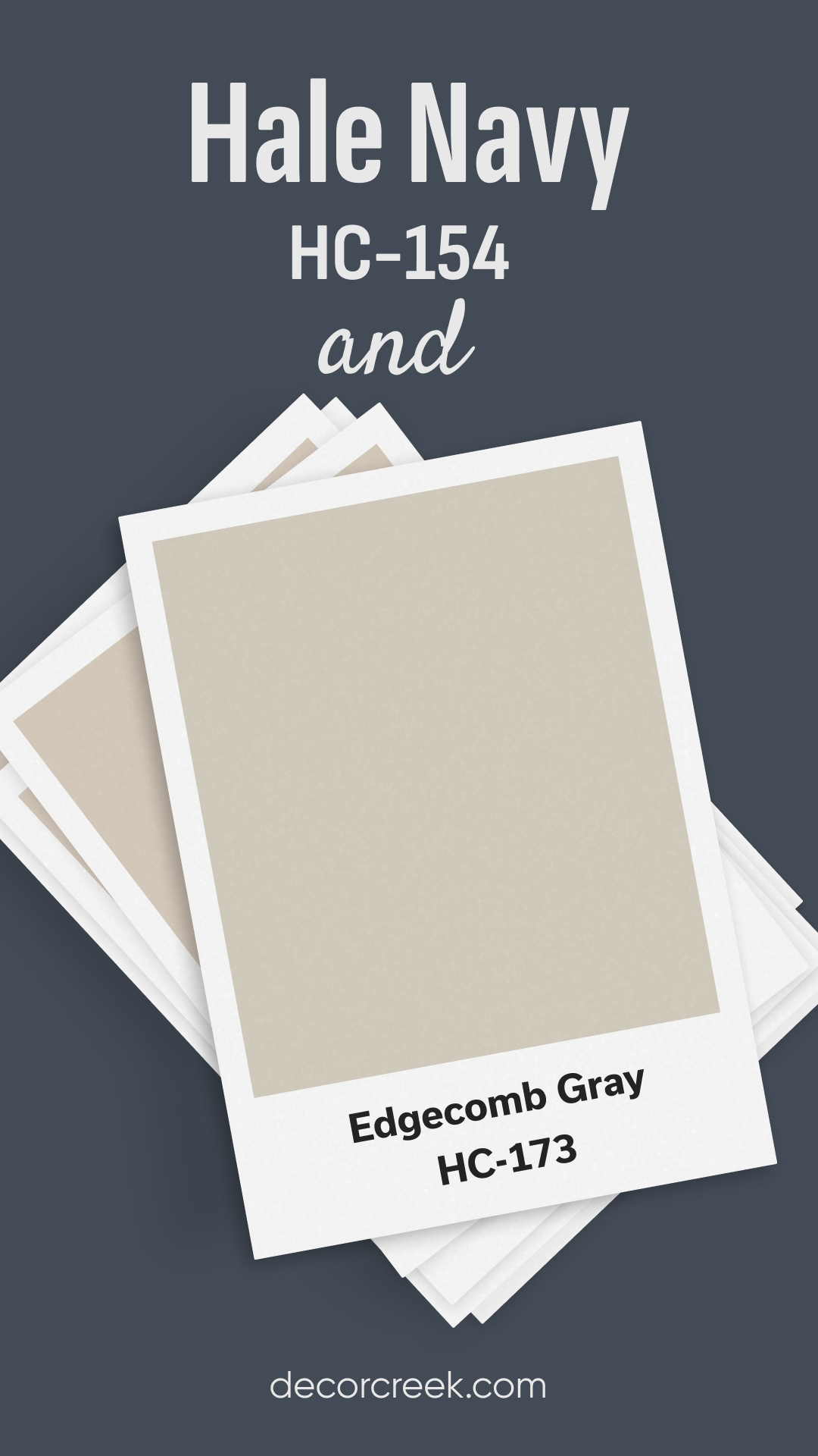
Hale Navy and Edgecomb Gray
Edgecomb Gray by Benjamin Moore is a warm, light gray that pairs beautifully with the richness of Hale Navy. Edgecomb Gray has enough warmth to complement the deep blue of Hale Navy, creating a cozy yet sophisticated vibe.
This combination is perfect for a balanced, neutral palette where you can use Hale Navy as an accent color or on cabinetry, and Edgecomb Gray can soften the space with its subtle warmth.
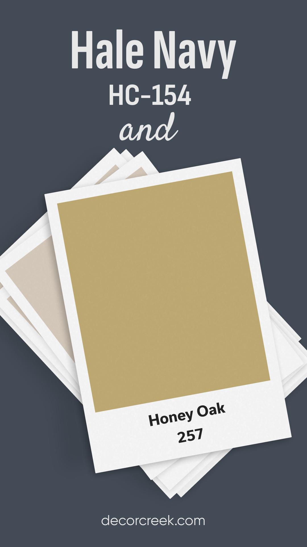
Hale Navy and Honey Oak
Hale Navy works surprisingly well with Honey oak finishes, bringing a modern touch to the warm, golden tones of oak. The deep navy creates a striking contrast with the wood’s natural warmth, making the oak appear richer and more elegant. This pairing works well in kitchens or spaces with wood cabinetry, where you want to update the look without replacing the wood entirely.
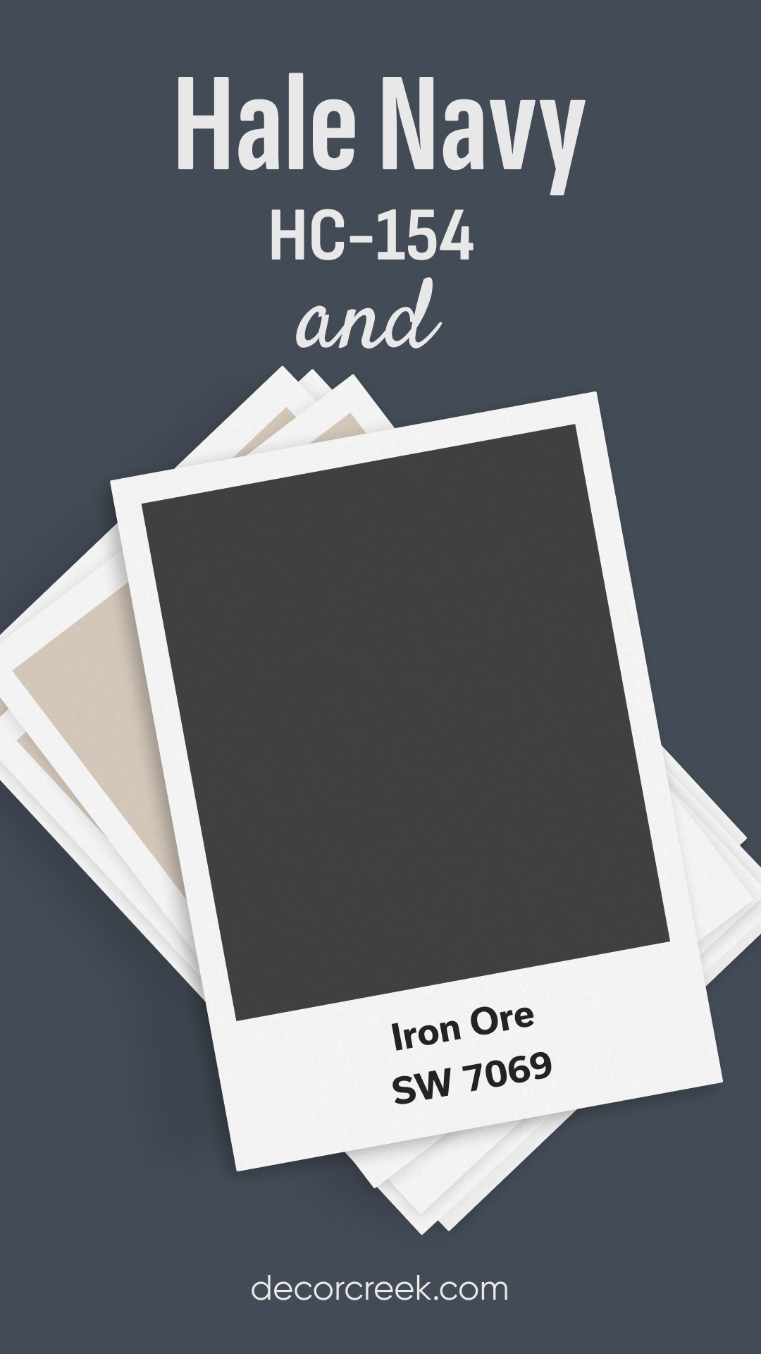
Hale Navy and Iron Ore
Sherwin Williams’ Iron Ore is a deep, almost black shade that adds a sense of mystery and sophistication to any space. When paired with Hale Navy, you get a dramatic and moody color scheme that feels both modern and timeless.
The subtle blue undertones in Hale Navy pop against the darker, more neutral Iron Ore, creating a rich contrast that’s perfect for bold spaces like dining rooms or libraries.
Hale Navy and Kendall Charcoal
Benjamin Moore’s Kendall Charcoal is a deep, warm gray that complements Hale Navy’s boldness. Together, these two colors create a rich, layered palette that works beautifully in sophisticated spaces. Kendall Charcoal’s warm undertones prevent the color from feeling too cold when paired with Hale Navy’s cool blue, making this combination ideal for elegant living rooms or bedrooms.

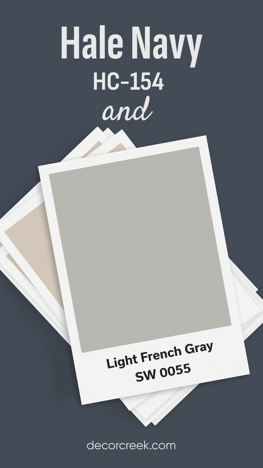
Hale Navy and Light French Gray
Light French Gray by Sherwin Williams is a cool, neutral gray that pairs effortlessly with the boldness of Hale Navy. The subtle cool undertones in Light French Gray balance out the richness of Hale Navy, creating a soft, calming contrast.
This combination works well in spaces where you want a modern, airy feel but with a touch of drama, like bathrooms or guest rooms.
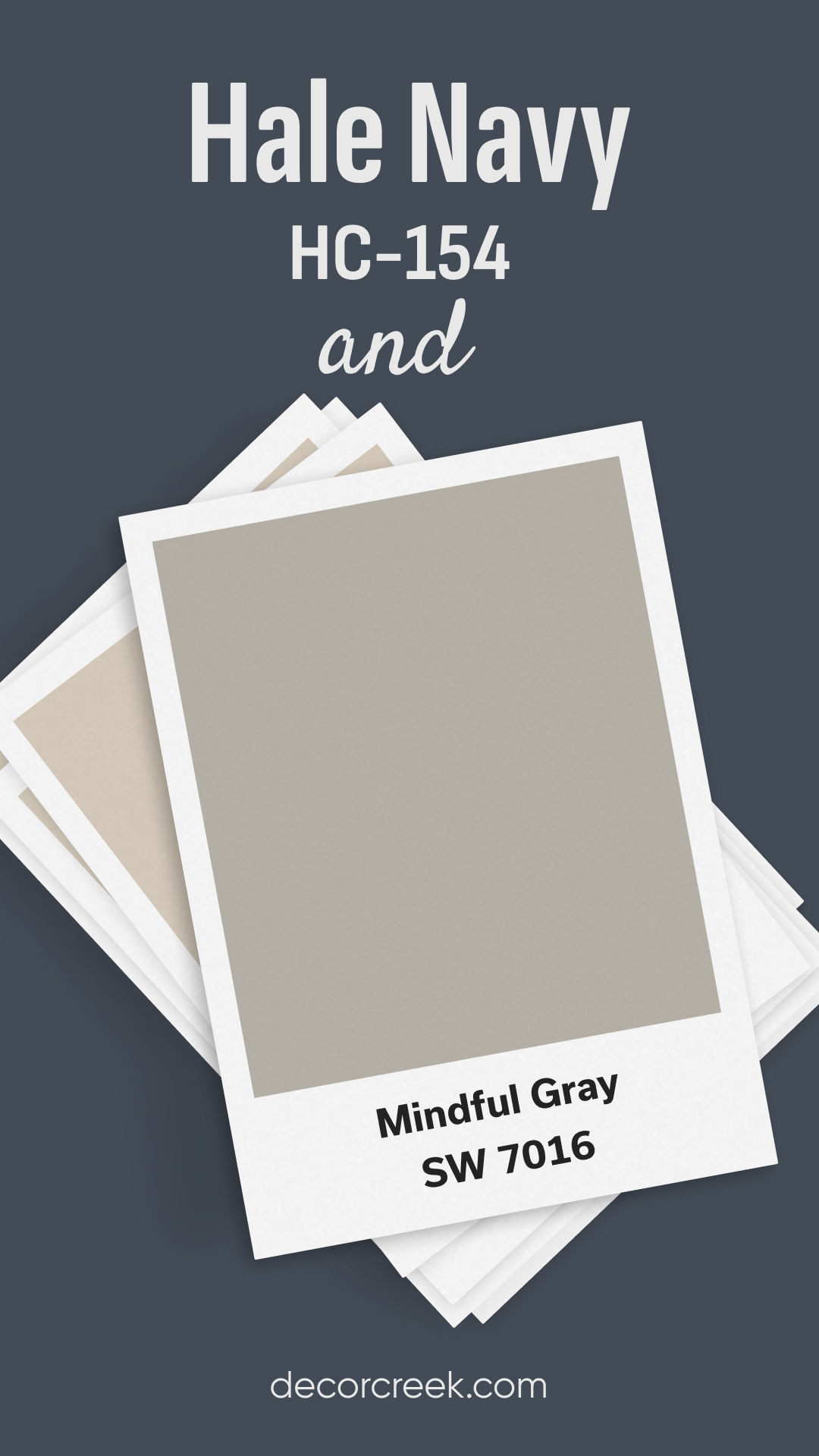
Hale Navy and Mindful Gray
Sherwin Williams’ Mindful Gray is a warm, mid-tone gray that complements the deep navy of Hale Navy. Together, they create a balanced and inviting color palette. Mindful Gray adds warmth, preventing Hale Navy from feeling too dark or cold.
This combination is perfect for open living spaces or kitchens, where you want a cozy, yet sophisticated atmosphere.
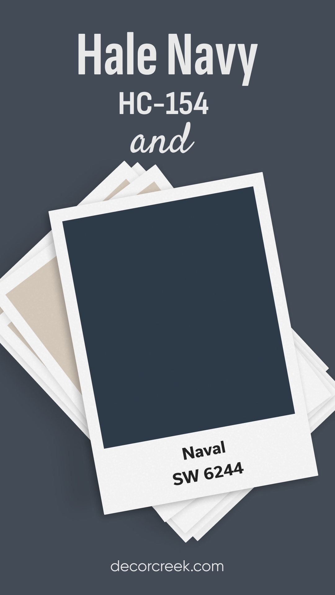
Hale Navy and Naval
Hale Navy and Sherwin Williams’ Naval are both deep navy shades, but Hale Navy is a touch warmer, while Naval has a more straightforward, cooler navy tone. If you’re deciding between the two, it really comes down to the feel you want in your space.
Hale Navy offers a bit more flexibility due to its slight warmth, making it easier to pair with other colors and materials. Naval, on the other hand, provides a crisp, classic navy that works well in more modern or minimalist spaces.
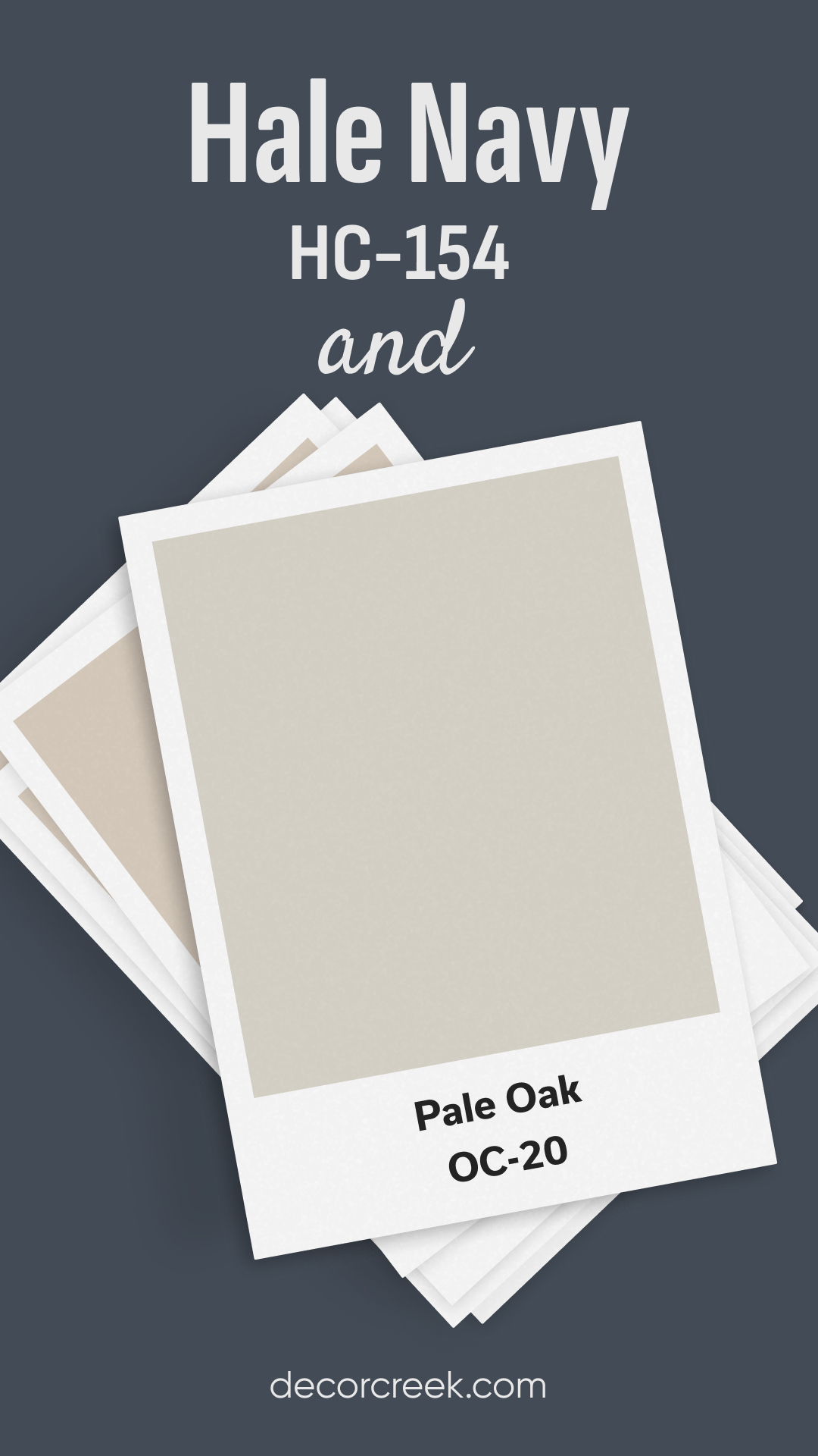
Hale Navy and Pale Oak
Benjamin Moore’s Pale Oak is a soft, warm greige that creates a beautiful, understated backdrop for Hale Navy. Together, they form a harmonious color palette where Pale Oak brings warmth and Hale Navy adds depth. This combination is ideal for bedrooms or living rooms, where you want to create a cozy, inviting atmosphere with a touch of elegance.
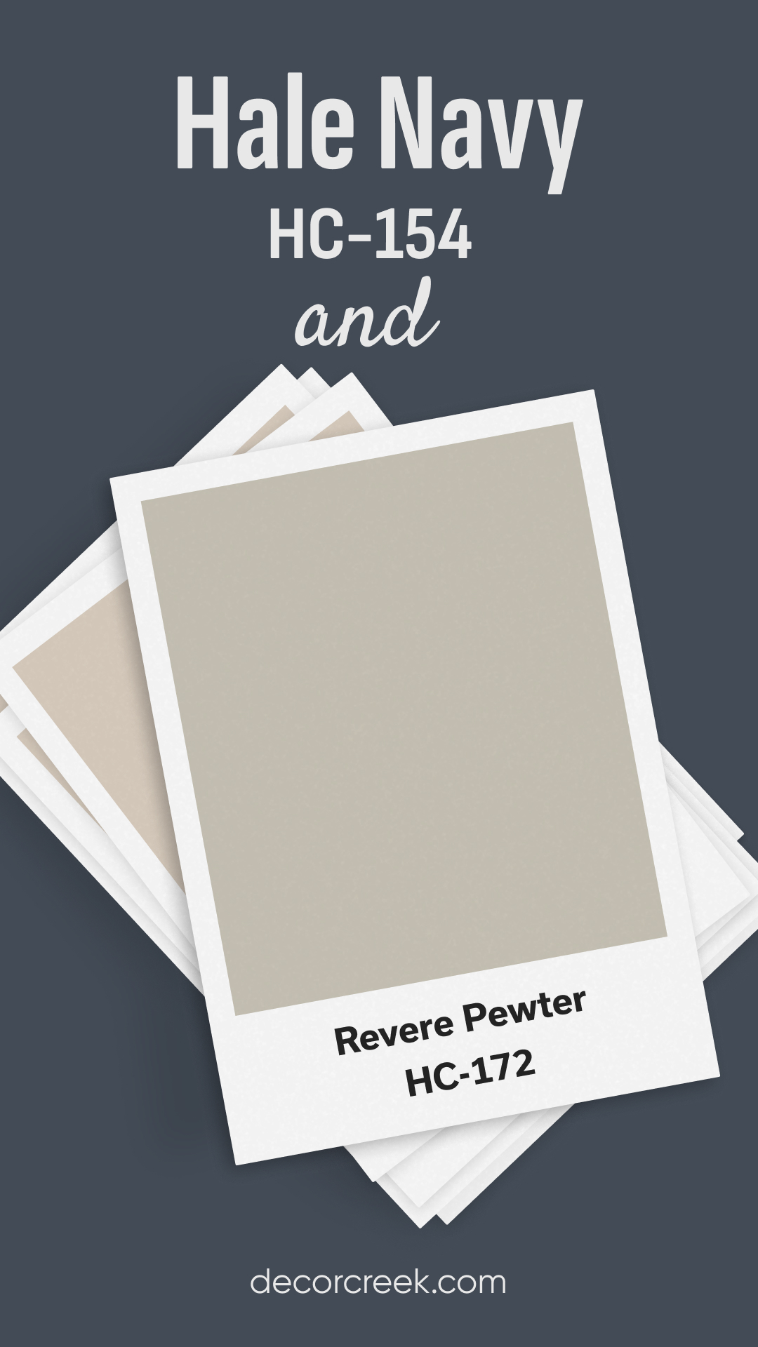
Hale Navy and Revere Pewter
Revere Pewter by Benjamin Moore is a warm, light gray that pairs wonderfully with Hale Navy’s richness. Revere Pewter’s warmth balances out the coolness of Hale Navy, creating a sophisticated and classic color palette.
This pairing works well in transitional spaces like hallways or entryways, where you want to create flow and cohesion throughout the home.
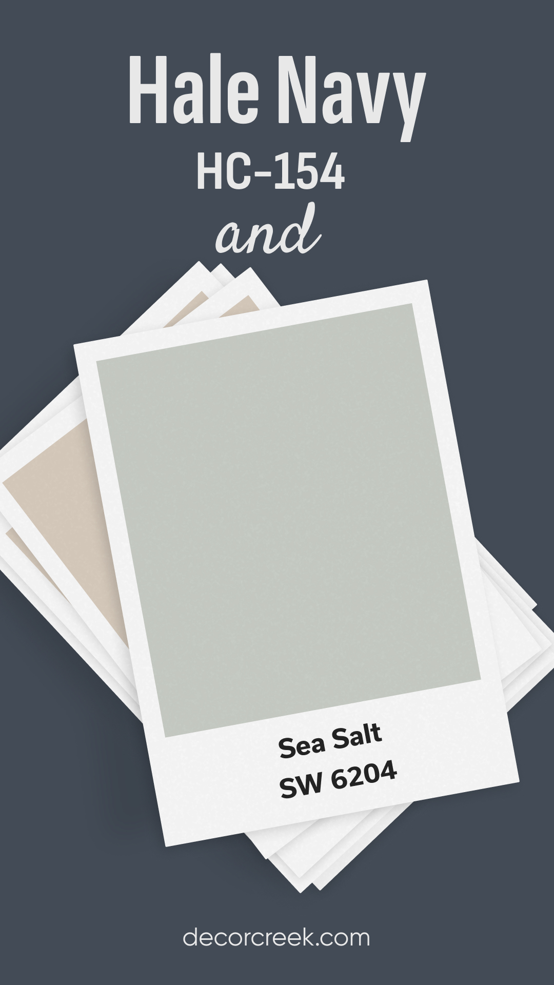
Hale Navy and Sea Salt
Sherwin Williams’ Sea Salt is a soft, light greenish-gray that complements the depth of Hale Navy beautifully. Sea Salt brings a calming, spa-like feel to any space, while Hale Navy grounds the room with its bold, rich tone. Together, these colors create a serene yet striking palette, perfect for bathrooms, bedrooms, or coastal-inspired spaces.
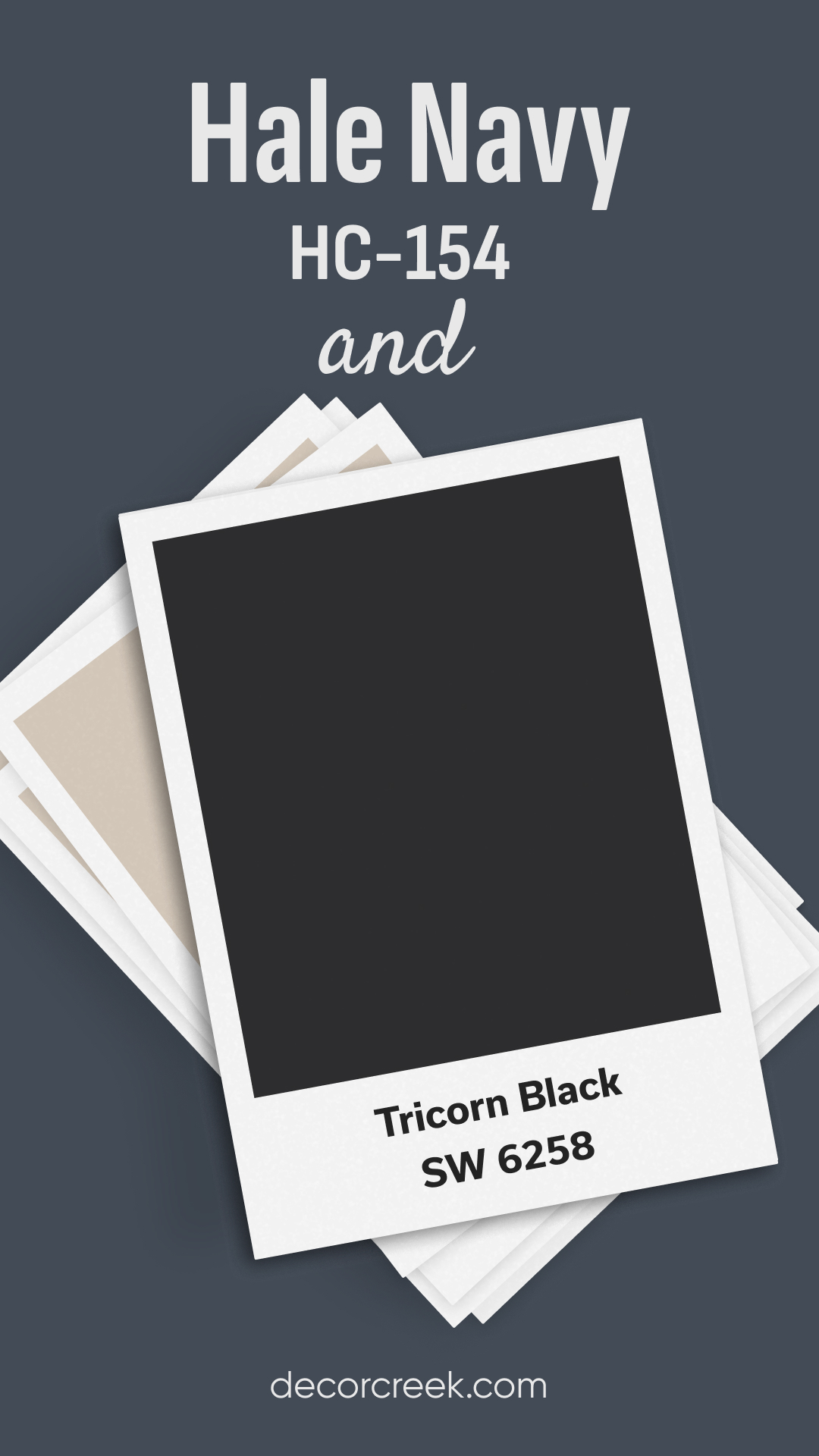
Hale Navy and Tricorn Black
Sherwin Williams’ Tricorn Black is a deep, pure black that adds a dramatic contrast to Hale Navy. This pairing is bold and moody, creating a strong visual impact. Tricorn Black can be used for accents or trim, while Hale Navy takes center stage on walls or cabinetry.
This combination is perfect for modern, industrial spaces or any area where you want to create a bold, sophisticated look.
Hale Navy and Urbane Bronze
Sherwin Williams’ Urbane Bronze is a deep, earthy bronze that adds warmth and richness to Hale Navy’s cool blue tones. Together, they create a grounded, nature-inspired palette that feels both cozy and sophisticated. Urbane Bronze brings a touch of warmth to the boldness of Hale Navy, making this combination perfect for living rooms or home offices where you want a warm, inviting atmosphere.

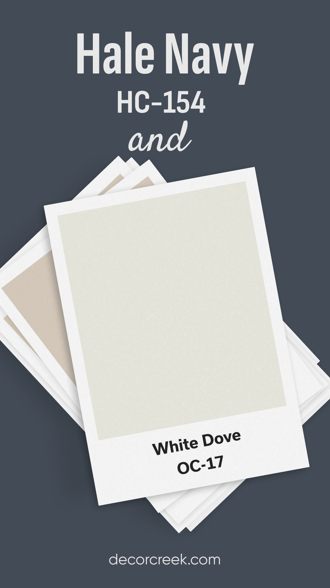
Hale Navy and White Dove
Benjamin Moore’s White Dove is a soft, warm white that pairs beautifully with the richness of Hale Navy. White Dove’s warmth balances the boldness of Hale Navy, creating a clean and classic look that’s perfect for trim, cabinetry, or even full walls. This pairing works well in kitchens, bathrooms, or any space where you want a timeless, crisp color palette.
Conclusion
Hale Navy by Benjamin Moore is a rich, timeless color that pairs beautifully with a wide range of other shades, from crisp whites to soft grays, bold blacks, and even warm wood tones.
Whether you’re looking to create a dramatic contrast or a more harmonious, cozy space, Hale Navy has the versatility to work with many popular colors. Its depth and boldness make it perfect for feature walls, cabinetry, or even exterior accents. No matter how you choose to use it, Hale Navy is a classic navy that will stand the test of time in any design.

Can Hale Navy be paired with unconventional colors like bright yellows or pinks to create a bold and unexpected look in a room, or is it best to stick with more traditional neutrals for a sophisticated feel?