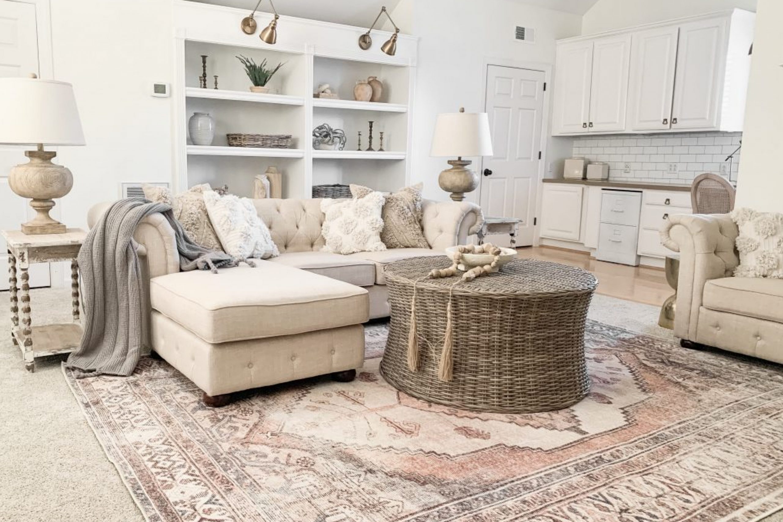
Alabaster SW 7008 by Sherwin Williams is one of those soft, creamy whites that instantly creates a warm and inviting space. Its versatility makes it a popular choice for many homeowners looking to add a gentle touch to their interiors.
In this article, we’ll explore Alabaster’s magic by pairing it with other stunning paint colors and diving into some comparisons to help you find the perfect match for your home.
Whether you’re looking for inspiration or trying to decide if Alabaster is the one, this guide will cover everything you need.
Briefly About Alabaster SW 7008
Alabaster SW 7008 is a classic off-white with a hint of warmth, but it never feels too yellow. Its neutral undertone works well with various styles, from farmhouse to modern.
With an LRV (Light Reflectance Value) of 82, it’s bright but not blinding, making it perfect for almost any space in your home.
It pairs beautifully with contrasting colors, providing a backdrop that lets other hues shine.
Alabaster Paint Color Palettes: Perfect Pairings
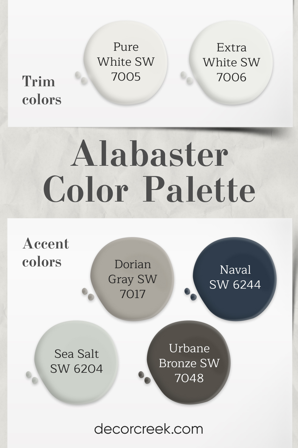
Palette 1: Classic Elegance
- Trim Colors: Pure White (SW 7005), Extra White (SW 7006)
- Accent Colors: Dorian Gray (SW 7017), Naval (SW 6244), Sea Salt (SW 6204), Urbane Bronze (SW 7048)
This palette balances Alabaster’s soft warmth with shades that bring depth and character. The trim colors keep the look crisp and clean, while Dorian Gray and Naval offer a dramatic touch.
Sea Salt adds a calming vibe, and Urbane Bronze provides a bold contrast, making this palette ideal for sophisticated and classic interiors.
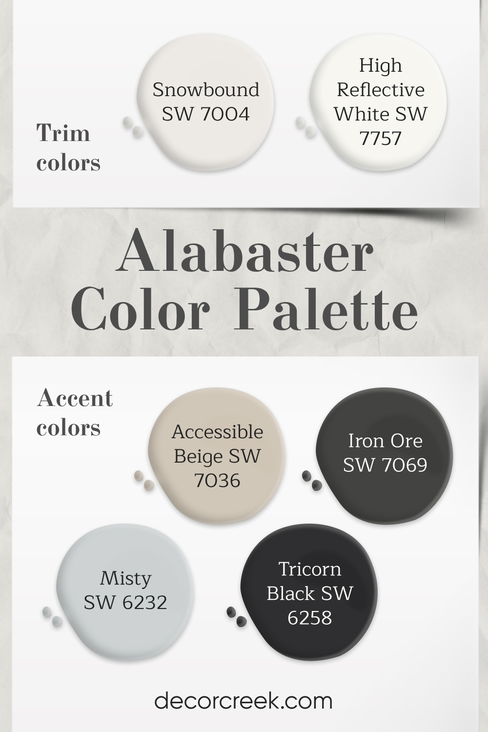
Palette 2: Modern Contrast
- Trim Colors: Snowbound (SW 7004), High Reflective White (SW 7757)
- Accent Colors: Accessible Beige (SW 7036), Misty (SW 6232), Iron Ore (SW 7069), Tricorn Black (SW 6258)
For a more contemporary feel, this palette pairs Alabaster with shades that offer contrast and depth. The trim options create a bright, clean finish, while Accessible Beige and Misty add subtle warmth.
Iron Ore and Tricorn Black bring a modern edge, making this combination ideal for chic, modern homes.
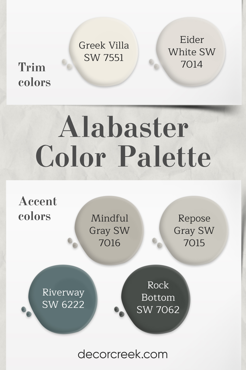
Palette 3: Soft Serenity
- Trim Colors: Greek Villa (SW 7551), Eider White (SW 7014)
- Accent Colors: Mindful Gray (SW 7016), Riverway (SW 6222), Repose Gray (SW 7015), Rock Bottom (SW 7062)
This palette offers a soft, calming aesthetic perfect for tranquil spaces. Greek Villa and Eider White enhance Alabaster’s warmth, while Mindful Gray and Repose Gray maintain a serene vibe. Riverway and Rock Bottom introduce a touch of depth, making this combination ideal for relaxing bedrooms or living areas.
Paint Pairings with Alabaster SW 7008: Colors & Inspiration
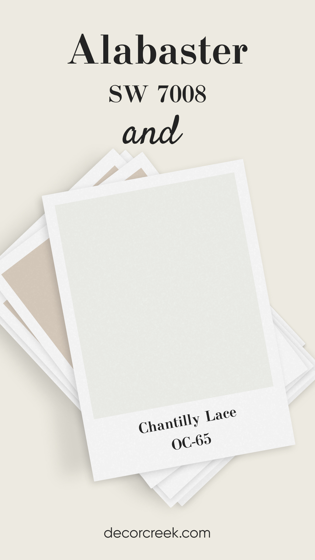
Alabaster SW 7008 and Chantilly Lace OC-65 (Benjamin Moore)
Chantilly Lace is a crisp, clean white that contrasts beautifully with Alabaster’s soft warmth. This combination is ideal for those who want a fresh and bright look without being overly stark. Alabaster adds a touch of warmth, while Chantilly Lace keeps things light and airy.
Together, they create a balanced, sophisticated space, perfect for contemporary or classic styles. This pairing is especially stunning in kitchens and bathrooms.
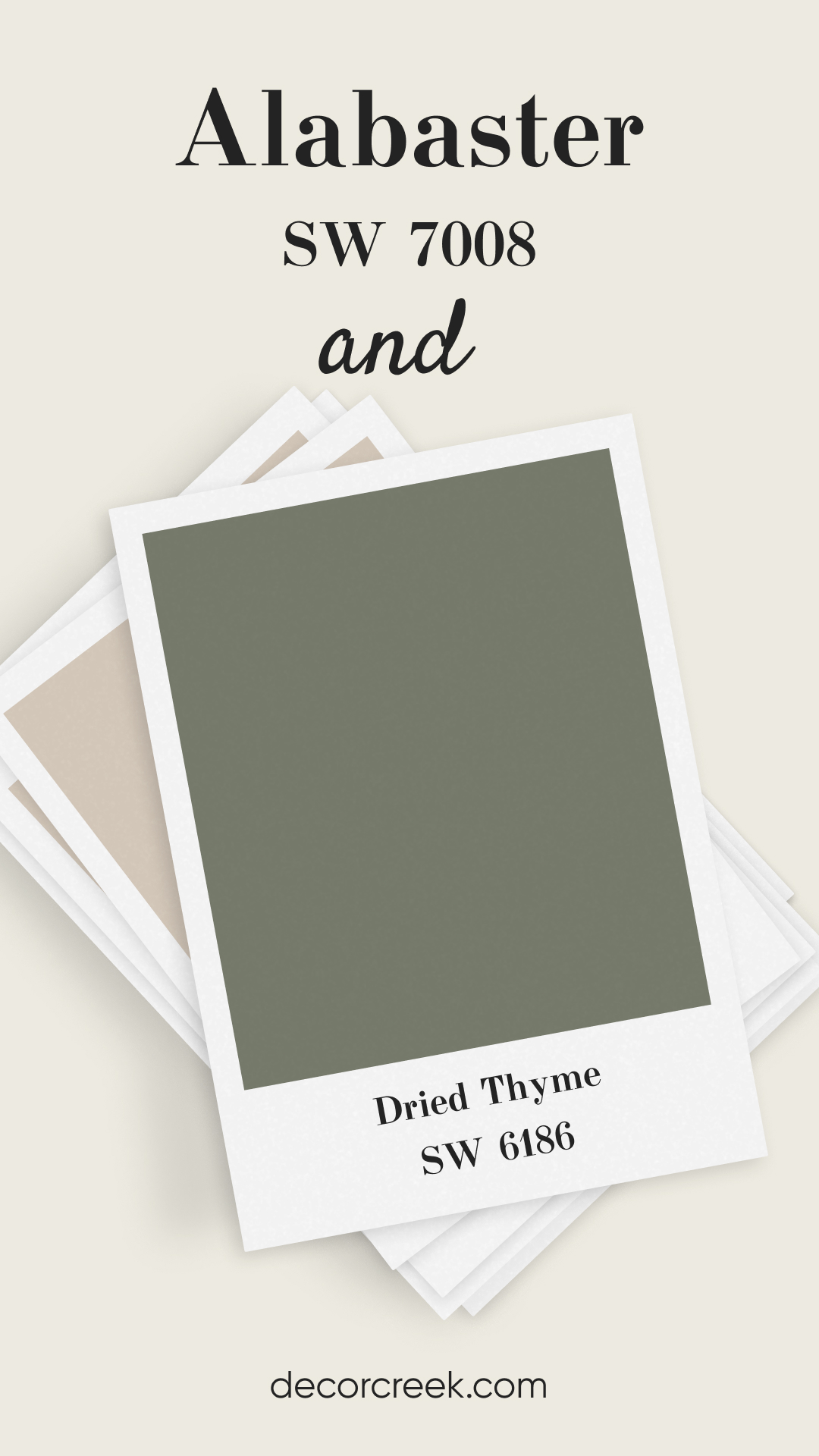
Alabaster SW 7008 and Dried Thyme SW 6186
Dried Thyme is an earthy, muted green that pairs wonderfully with Alabaster’s creamy tone. This combo offers a serene and organic feel, making it great for bedrooms or living spaces. The contrast between Alabaster’s warmth and Dried Thyme’s cool green brings a balanced, calming effect. It’s a match that feels cozy and inviting, perfect for nature-inspired interiors. This pairing is ideal for those looking to introduce a hint of color without going too bold.
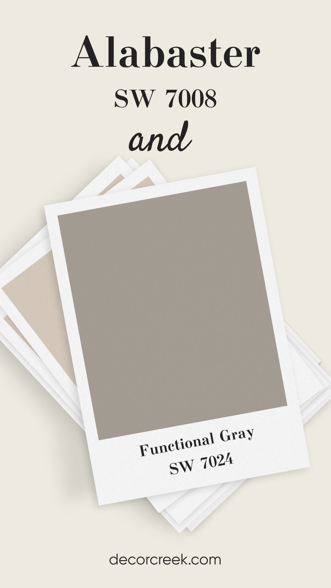
Alabaster SW 7008 and Functional Gray SW 7024
Functional Gray is a medium-toned gray with warm undertones, which pairs harmoniously with Alabaster. This combination works well in modern or transitional spaces, providing a neutral yet stylish palette. Alabaster’s soft warmth complements Functional Gray, making it feel inviting and not too cold.
This pairing works beautifully in open-plan living areas or hallways. It’s a versatile choice that brings out the best in both colors.
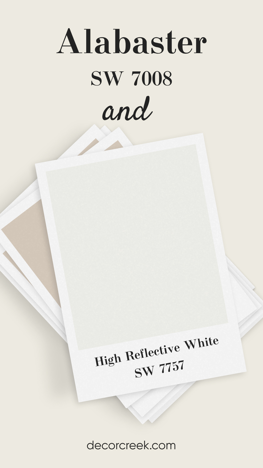
Alabaster SW 7008 and High Reflective White SW 7757
High Reflective White is a bright, true white that pairs effortlessly with Alabaster for a clean, minimalist look. This combination is perfect for spaces where you want a crisp contrast without harsh edges. Alabaster’s warmth adds softness to the brightness of High Reflective White. Together, they create a fresh, timeless look suitable for any room. This pairing is ideal for trim and walls for a subtle yet stylish contrast.
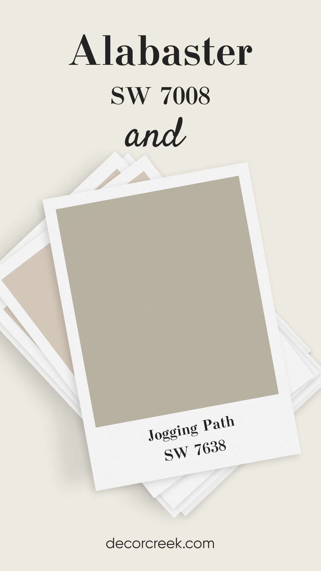
Alabaster SW 7008 and Jogging Path SW 7638
Jogging Path offers a muted taupe with slight green undertones, making it a unique pairing with Alabaster. This duo brings a modern, understated elegance to any space. Alabaster’s soft glow balances the earthy tones of Jogging Path, creating a cozy, grounded feel. It’s a great choice for those who love neutrals but want something with a bit more depth.
Ideal for living rooms or entryways where you want a welcoming vibe.
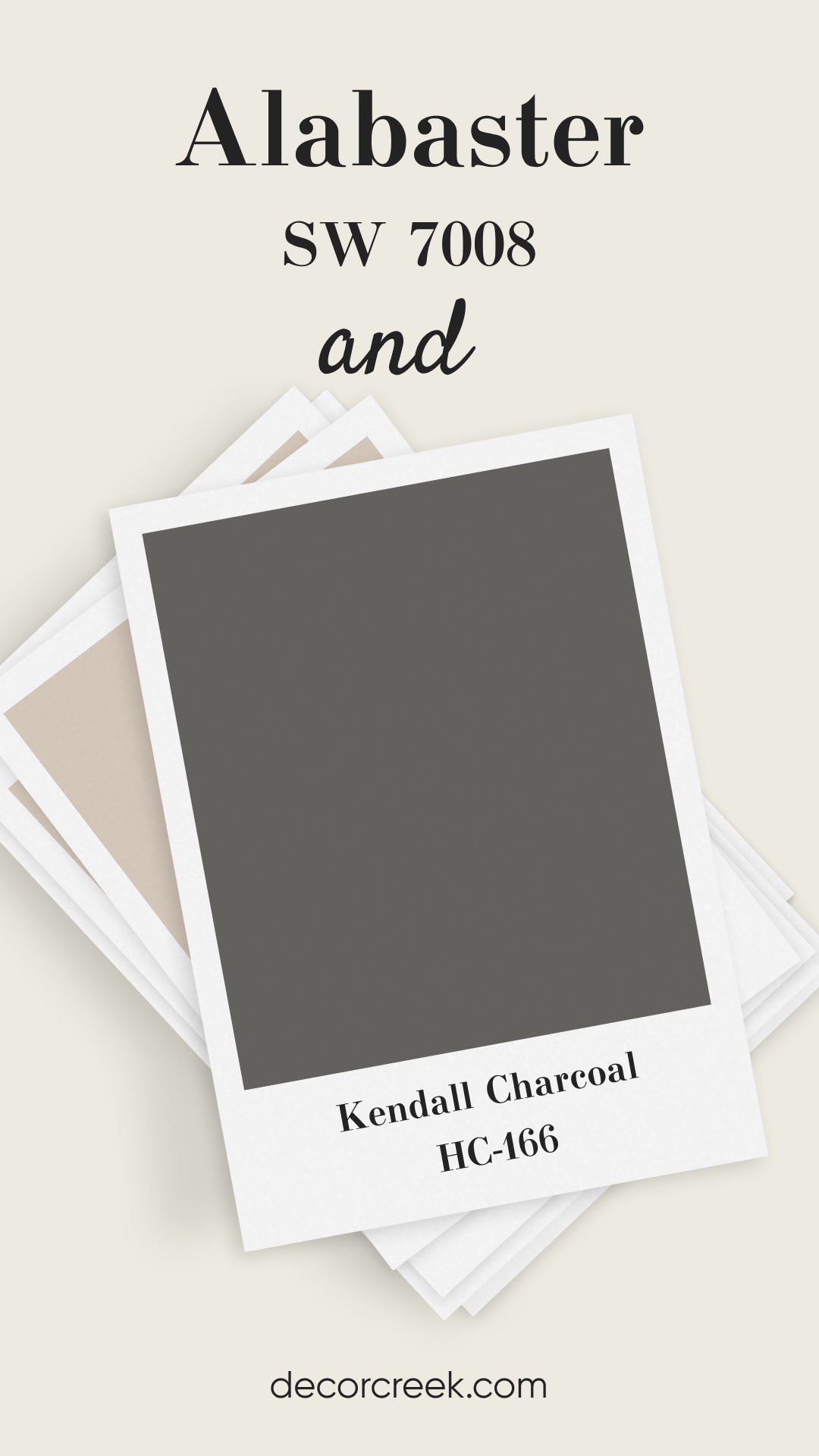
Alabaster SW 7008 and Kendall Charcoal HC-166
Kendall Charcoal, a deep, rich gray, is a fantastic contrast to Alabaster’s light warmth. This pairing makes a statement and brings drama to any room. Alabaster keeps Kendall Charcoal from feeling too heavy, offering a balanced and chic look. This combination is perfect for accent walls, kitchen cabinets, or even exterior siding. It adds depth and sophistication without overwhelming the space.
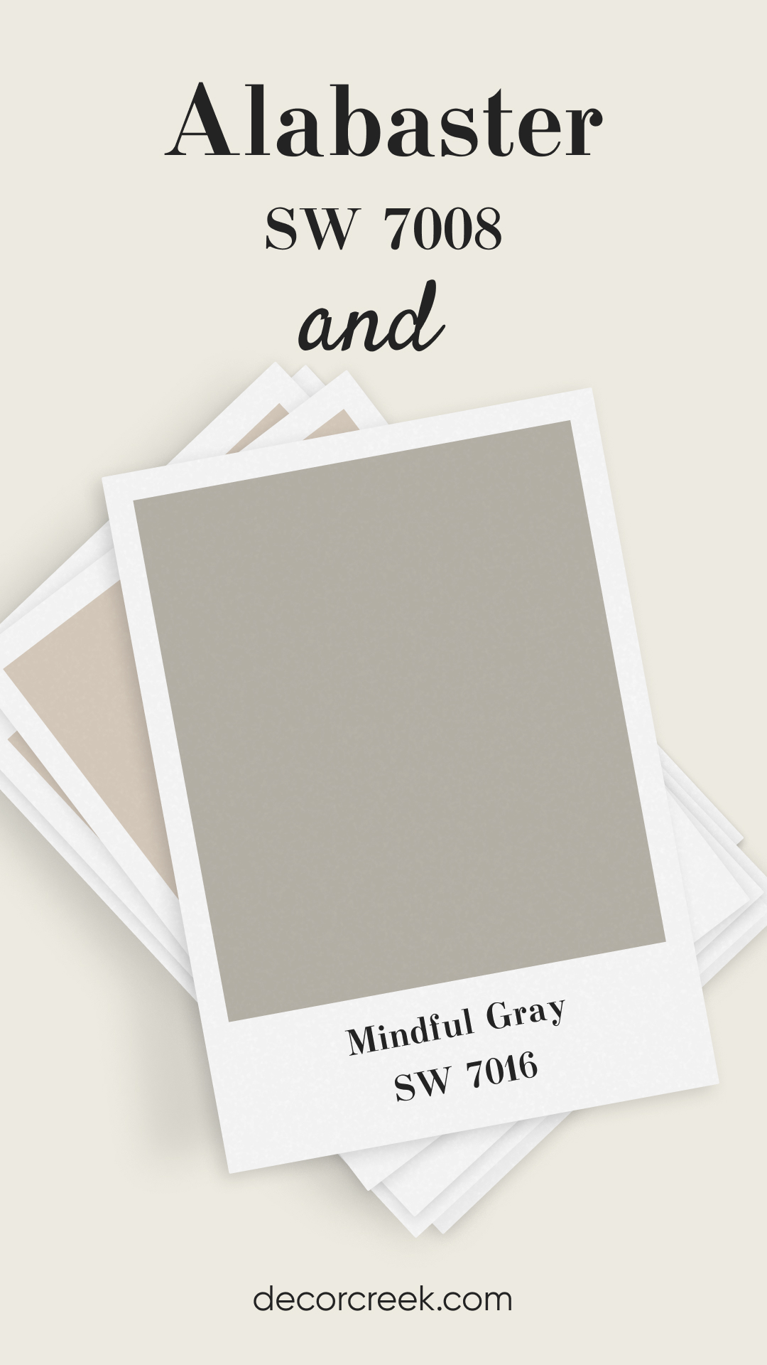
Alabaster SW 7008 and Mindful Gray SW 7016
Mindful Gray is a soft, warm gray that blends seamlessly with Alabaster’s creamy tone. This pairing is ideal for those who want a harmonious, neutral color scheme. Mindful Gray’s subtle warmth enhances Alabaster, making it perfect for open-concept spaces. Together, they create a cohesive and elegant look, ideal for bedrooms, living areas, or kitchens.
It’s a go-to combination for a relaxed, sophisticated atmosphere.
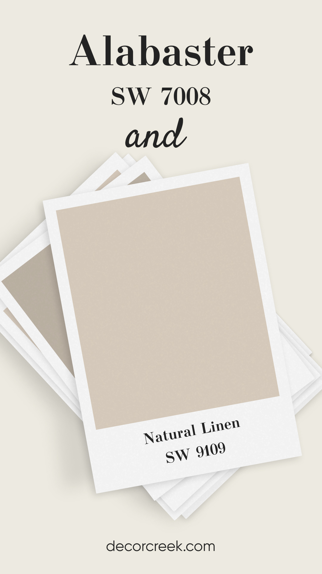
Alabaster SW 7008 and Natural Linen SW 9109
Natural Linen offers a warm beige undertone that complements Alabaster beautifully. This duo creates a cozy, inviting feel, perfect for traditional or farmhouse interiors. The warmth of Natural Linen enhances Alabaster’s soft glow, making any room feel welcoming. It’s a great choice for spaces where you want a bit of warmth without going too bold. This pairing is ideal for living rooms, bedrooms, or dining areas.
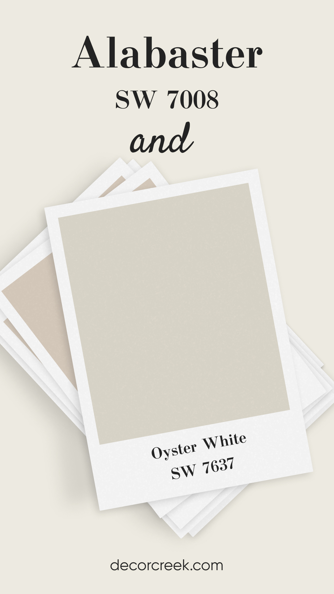
Alabaster SW 7008 and Oyster White SW 7637
Oyster White is a muted grayish-beige, pairing effortlessly with Alabaster’s warmth. Together, they create a sophisticated, neutral palette that feels calm and balanced. This pairing is perfect for open spaces or rooms with lots of natural light. Oyster White adds a hint of depth, while Alabaster keeps things light and airy.
It’s a classic combination that works well in any home style.
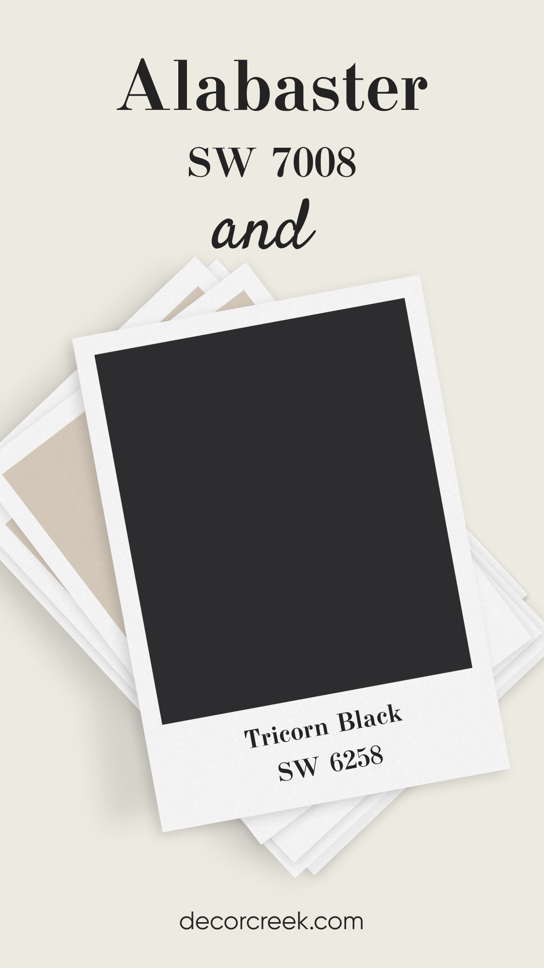
Alabaster SW 7008 and Tricorn Black SW 6258
Tricorn Black is a bold, deep black that creates striking contrast with Alabaster. This pairing is ideal for adding drama and sophistication to any space. Alabaster’s warmth softens the intensity of Tricorn Black, making it feel elegant and chic. This duo works great for accent walls, cabinetry, or exterior trim.
It’s perfect for those who want a bold yet balanced look.
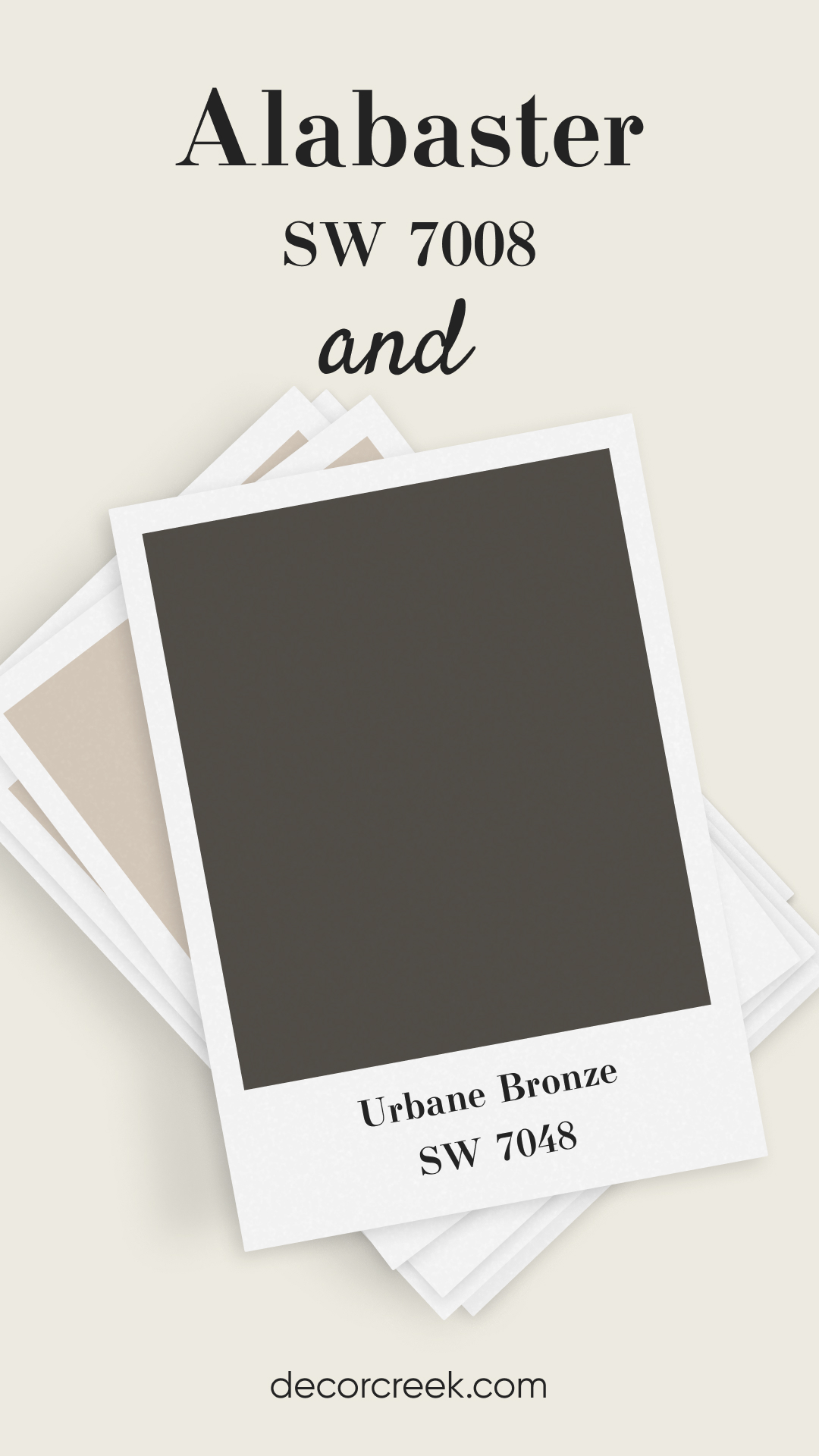
Alabaster SW 7008 and Urbane Bronze SW 7048
Urbane Bronze is a deep, earthy brown with gray undertones, making it a stunning partner for Alabaster. This combination feels rich, cozy, and modern, perfect for creating a grounded, stylish space. Alabaster lightens up Urbane Bronze, making it a beautiful pairing for accent walls or trim. This duo is ideal for bedrooms, offices, or even exterior applications.
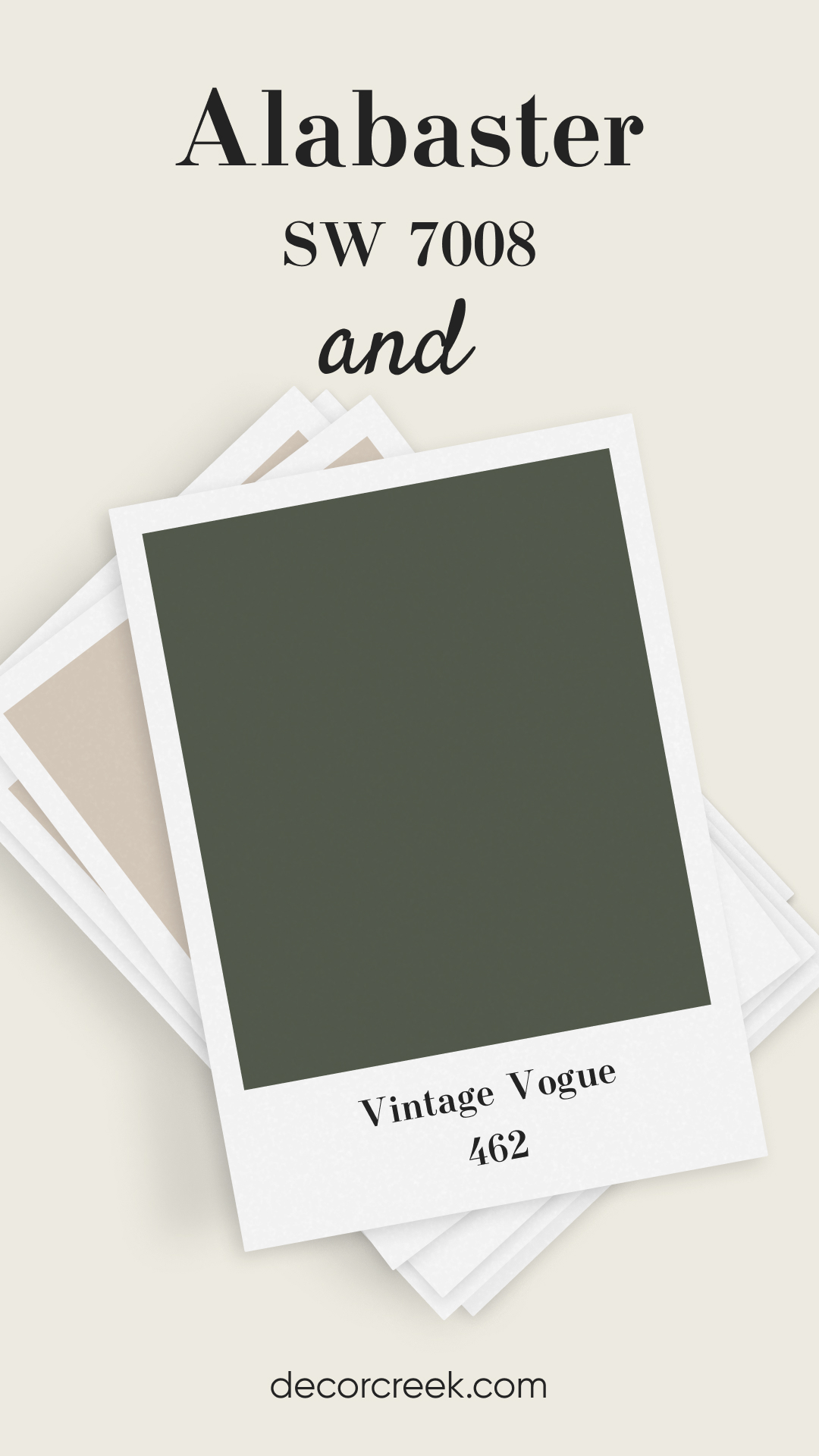
Alabaster SW 7008 and Vintage Vogue 462
Vintage Vogue is a deep, moody green that brings a touch of drama to Alabaster’s softness. This pairing is perfect for those who love a classic yet bold look. The warmth of Alabaster balances out the richness of Vintage Vogue, creating a sophisticated and inviting space. It’s great for accent walls, cabinets, or even as a stunning entryway color.
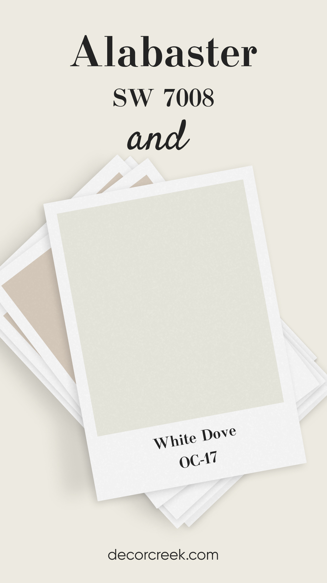
Alabaster SW 7008 and White Dove OC-17
White Dove is a soft, warm white that pairs effortlessly with Alabaster. Together, they create a light and airy feel without feeling too stark. This combination is perfect for those who want a gentle, monochromatic look. Alabaster adds warmth, while White Dove keeps things bright and fresh.
Ideal for bedrooms, living rooms, or kitchens where you want a clean, inviting feel.
Alabaster vs Other Popular Whites: A Comparative Insight
When choosing a white paint, it’s often helpful to compare similar shades to understand the subtle differences. Here, we’ll look at how Alabaster stands against a variety of other popular white and off-white colors. This comparison will help you see how Alabaster measures up and if it’s the right choice for your space.
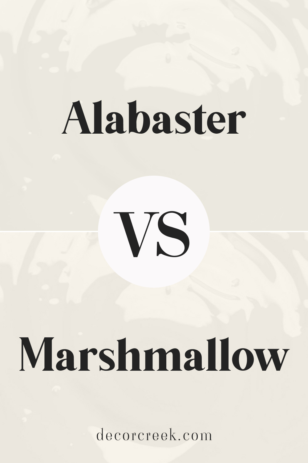
Alabaster vs Marshmallow (SW 7001)
Marshmallow is a warmer, creamier white compared to Alabaster. While both have soft undertones, Marshmallow has a hint of pink, making it feel cozier. Alabaster, on the other hand, offers a more neutral warmth, perfect for spaces where you want a clean yet inviting feel. If you’re aiming for a softer, romantic vibe, Marshmallow is the way to go. However, Alabaster remains more versatile in different lighting conditions.
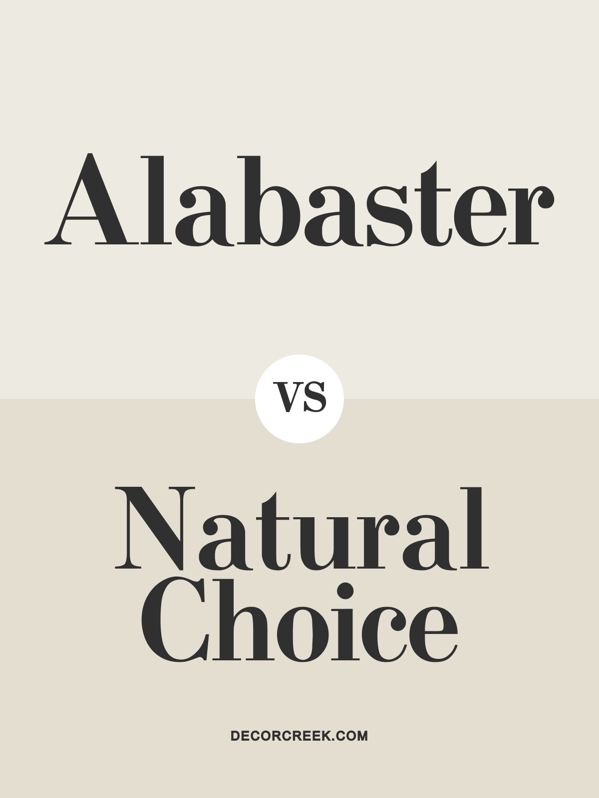
Alabaster vs Natural Choice (SW 7011)
Natural Choice is a beige-toned off-white, providing a warmer, more grounded feel than Alabaster. Alabaster’s slight gray undertone makes it feel a bit fresher and brighter, while Natural Choice leans toward a more traditional, earthy look. In low lighting, Natural Choice can appear a little darker, while Alabaster retains its light, airy quality. This makes Alabaster a great pick for rooms lacking natural light. Both colors work beautifully in cozy, welcoming spaces, but Alabaster offers more brightness.
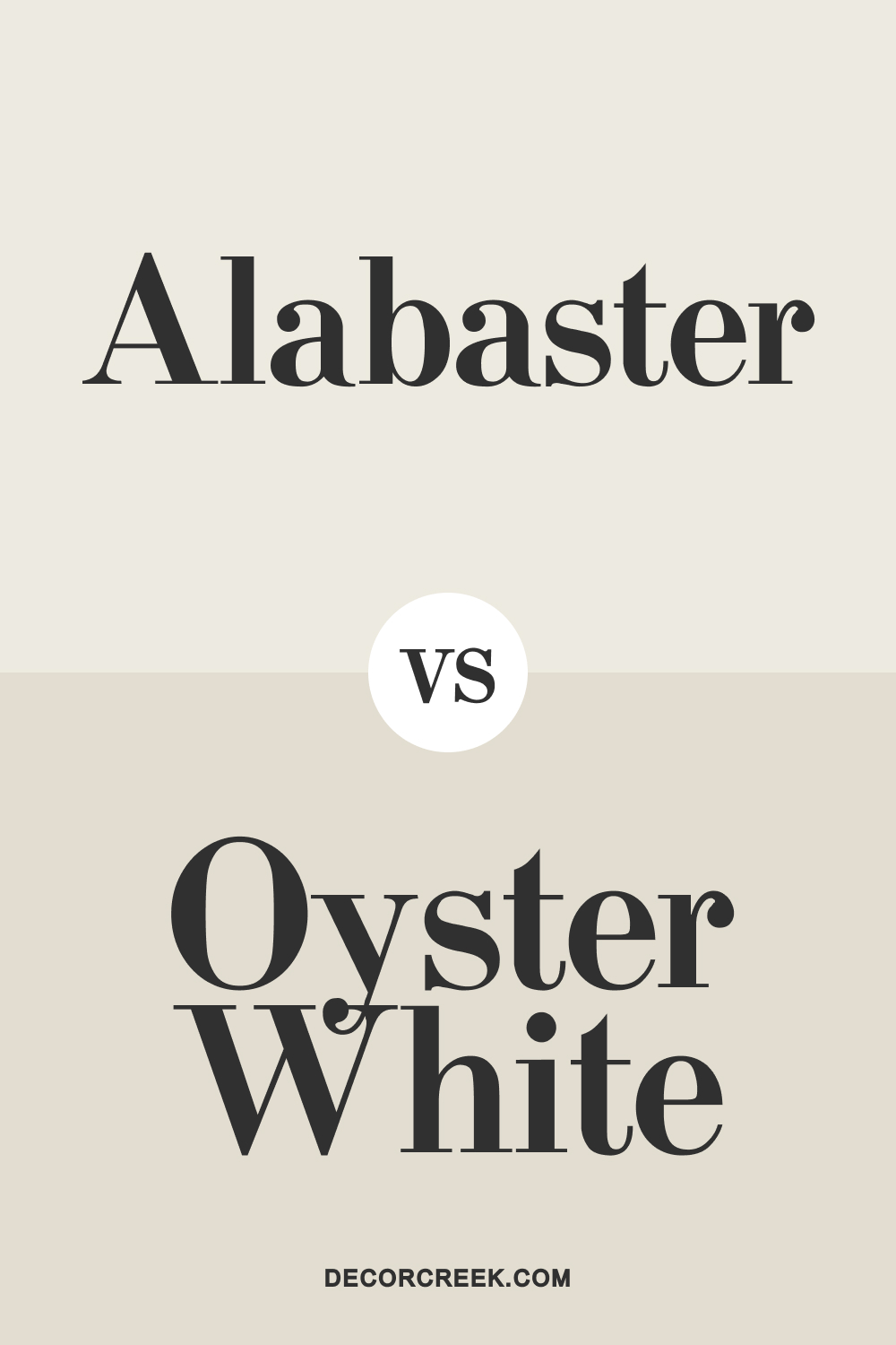
Alabaster vs Oyster White (SW 7637)
Oyster White has more beige undertones, making it a bit more grounded and less bright than Alabaster. While Alabaster feels soft and warm, Oyster White leans slightly toward a cooler neutral tone. If you want a color with more depth and a touch of greige, Oyster White might be the better choice.
Alabaster shines in spaces where you want a gentle, clean, and bright backdrop. These two colors pair well, with Alabaster working as the main wall color and Oyster White as an accent.
Alabaster vs Revere Pewter (HC-172)
Revere Pewter by Benjamin Moore is a popular greige with noticeable gray and beige undertones, making it significantly darker than Alabaster. While Alabaster is a soft white, Revere Pewter brings more depth and contrast, working beautifully as an accent or in more moody spaces.
When paired, they create a sophisticated, balanced look, ideal for modern and classic interiors. Choose Alabaster if you want a bright, neutral backdrop, and Revere Pewter for a bit more drama.
Alabaster vs True White (SW 7005)
True White is a clean, crisp white that feels much brighter and starker than Alabaster. Alabaster’s warm undertones soften the space, while True White provides a fresh, more contemporary vibe. This makes True White ideal for modern settings, while Alabaster works better in spaces needing a cozy, inviting feel. If you’re looking for a warm white with a bit of character, Alabaster is the one. True White, however, excels when you want a bright, gallery-like look.
Alabaster vs Ultra White (SW 7006)
Ultra White is a brilliant, bright white with cool undertones, offering a stark contrast to Alabaster’s warmth. This difference makes Ultra White feel very modern and sleek, while Alabaster leans more toward a soft and welcoming appearance. They both pair nicely together, with Alabaster as the wall color and Ultra White for trim or cabinetry, offering a bit of contrast.
Choose Alabaster for a softer feel and Ultra White for a clean, contemporary finish.
Sherwin Williams Zurich White vs Alabaster
Zurich White is a light beige with subtle warm undertones, making it richer and warmer than Alabaster. While Alabaster is brighter and more neutral, Zurich White feels a touch more earthy. These two colors work well in combination, with Alabaster on the walls and Zurich White for cabinetry or built-ins. Alabaster will keep the space feeling bright, while Zurich White adds warmth and depth.
Alabaster vs Swiss Coffee (Benjamin Moore OC-45)
Swiss Coffee is another warm off-white, but it has a stronger yellow undertone compared to Alabaster. This makes Swiss Coffee feel slightly creamier, while Alabaster maintains a cleaner warmth. If you’re looking for a white that’s not too stark but not overly yellow, Alabaster is the winner. Both colors are versatile, but Alabaster works better if you want a more neutral, soft white.
Alabaster vs Accessible Beige (SW 7036)
Accessible Beige is a light beige with a subtle gray undertone, making it much deeper than Alabaster. Alabaster’s lighter, warmer feel offers more brightness, while Accessible Beige provides a grounded, neutral base. This makes Alabaster an ideal choice for ceilings and trim when paired with Accessible Beige walls. Together, they create a harmonious, elegant look that’s perfect for any room.
Alabaster vs Ballet White (Benjamin Moore OC-9)
Ballet White is a light, warm neutral that leans more beige than Alabaster. It offers a soft, creamy warmth but isn’t as bright or clean-looking as Alabaster. These two shades can work together, with Ballet White adding a bit more depth. If you want a warm white that feels neutral without being stark, Alabaster is the go-to choice.
Alabaster vs Creamy (SW 7012)
Creamy is another soft, warm white that has a hint of yellow, making it feel richer and more buttery than Alabaster. Alabaster’s neutral warmth allows it to work in more versatile settings, while Creamy adds a cozier vibe.
This makes Alabaster suitable for bright, airy spaces, while Creamy excels in rooms where you want an extra touch of warmth. Both are excellent choices, but Alabaster is more adaptable.
Conclusion
Alabaster SW 7008 by Sherwin Williams is a versatile and timeless choice that can adapt to various styles and color pairings.
Its soft, warm undertones make it an inviting backdrop that works beautifully with different shades, from crisp whites to deeper, more dramatic hues.
Whether you want a subtle contrast or a bolder combination, Alabaster offers endless possibilities to create a home that’s truly yours.
