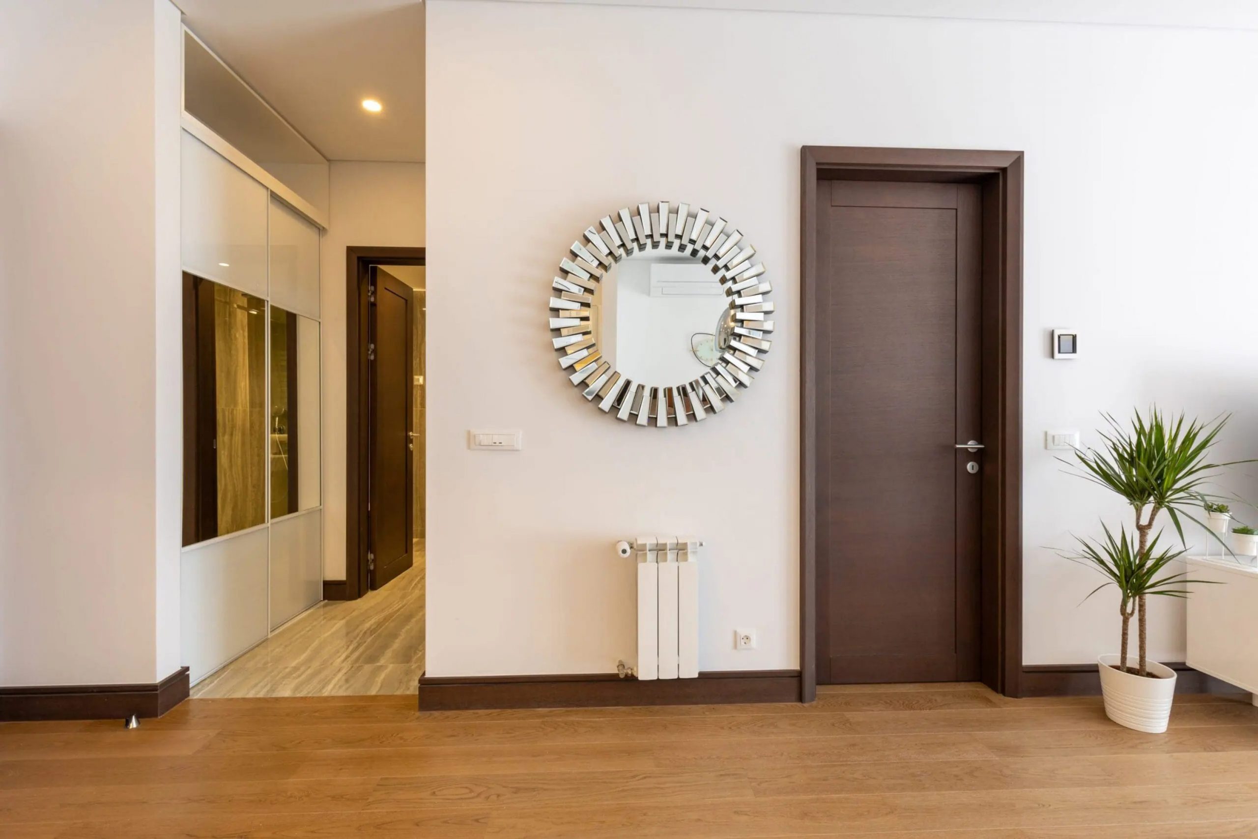
I have hand-picked the perfect colors for your living room doors to help you create a home that feels put together and stylish. Choosing a color for your living room doors might seem like a small detail, but it changes how your entire home feels. Most people forget that doors are like pieces of furniture that move.
When you pick a color that matches your walls and trim, the whole area starts to look like a professional put it together.
I see many homeowners stick with plain white because they are afraid of making a mistake. However, adding the right shade can make your room feel much friendlier and more finished.
You should think about how many times you look at your doors every single day. A fresh coat of paint on these surfaces can fix a room that feels boring or unfinished. It is a simple project that does not take much time but gives you a very big reward.
Your family will notice the difference as soon as they walk into the house after school or work. Small changes like this are the secret to a happy and pretty home.
Why I Trust Thoughtfully Chosen Door Colors to Tie the Living Room Together
I have spent years staging houses to make people fall in love with them the moment they walk inside. I trust specific door colors because they act as an anchor for your eyes. When the door color flows with the rest of the room, it makes the house feel organized and expensive.
A good color choice hides fingerprints and wear while making the ceiling look higher or the walls look wider.
It is the easiest way to make a house feel like a real home without spending a lot of money on new furniture. I have seen how a dark door can make a cheap room look like a million dollars. It helps pull all the different pieces of furniture together into one big story. You want your home to tell a story of comfort and style to everyone who visits. When the doors look good, the whole house feels like it was built with a lot of care.
It gives you a sense of pride every time you close the door for the night. This is why I always tell my clients to focus on their doors first.
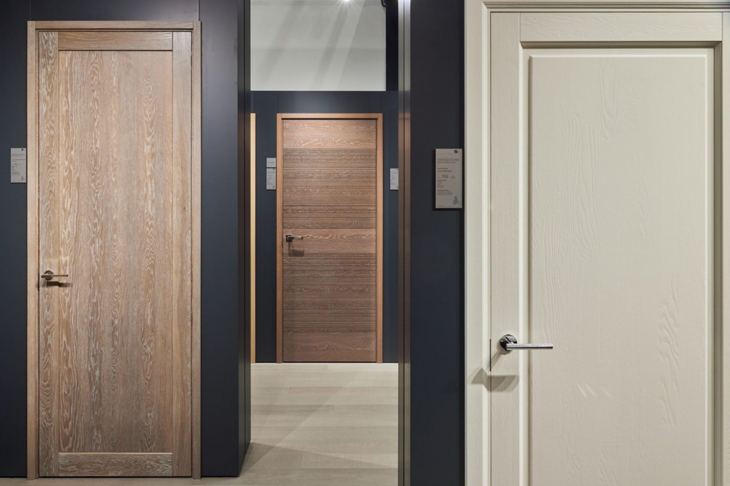
How I Choose the Right Door Paint Color for a Living Room
Picking the right paint starts with looking at your floors and your natural light. I always check how a color looks in the morning and again at night when the lamps are on. You want a color that stays pretty in all types of light. I also think about how the door looks when it is standing open.
It needs to match both the living room and the hallway behind it. I usually pick three colors that work as a team: one for the door, one for the walls, and one for the trim.
I carry paint samples around the room to see how they look next to the sofa and the curtains. You have to make sure the colors do not clash with the wood tones of your coffee table or bookshelf. If you have a lot of big windows, you can go a bit darker with your paint choices. In a room with small windows, I stick to lighter shades to keep things feeling bright.
Warm Neutrals For a Home That Feels Cozy And Calm
In my experience, these combinations are the best choice for families who want to feel relaxed the moment they step inside. I have used these warm mixes in many houses where the living room felt a bit too cold or empty. By painting the doors a slightly darker tan or beige, I create a soft look that stays pretty all day long.
I notice that these colors make the walls look softer and the furniture look more invited. My clients always tell me that these warm tones make their rooms feel like a big, soft blanket. I trust these sets because they never look yellow or dirty, even when the sun goes down.
They work so well because they use colors found in nature, like sand and stone. When I use these on doors, the whole room feels much more grounded and solid.
You will find that these neutrals go with almost any wood floor or rug you already have. It is my favorite way to make a house feel friendly without using bright or loud colors.
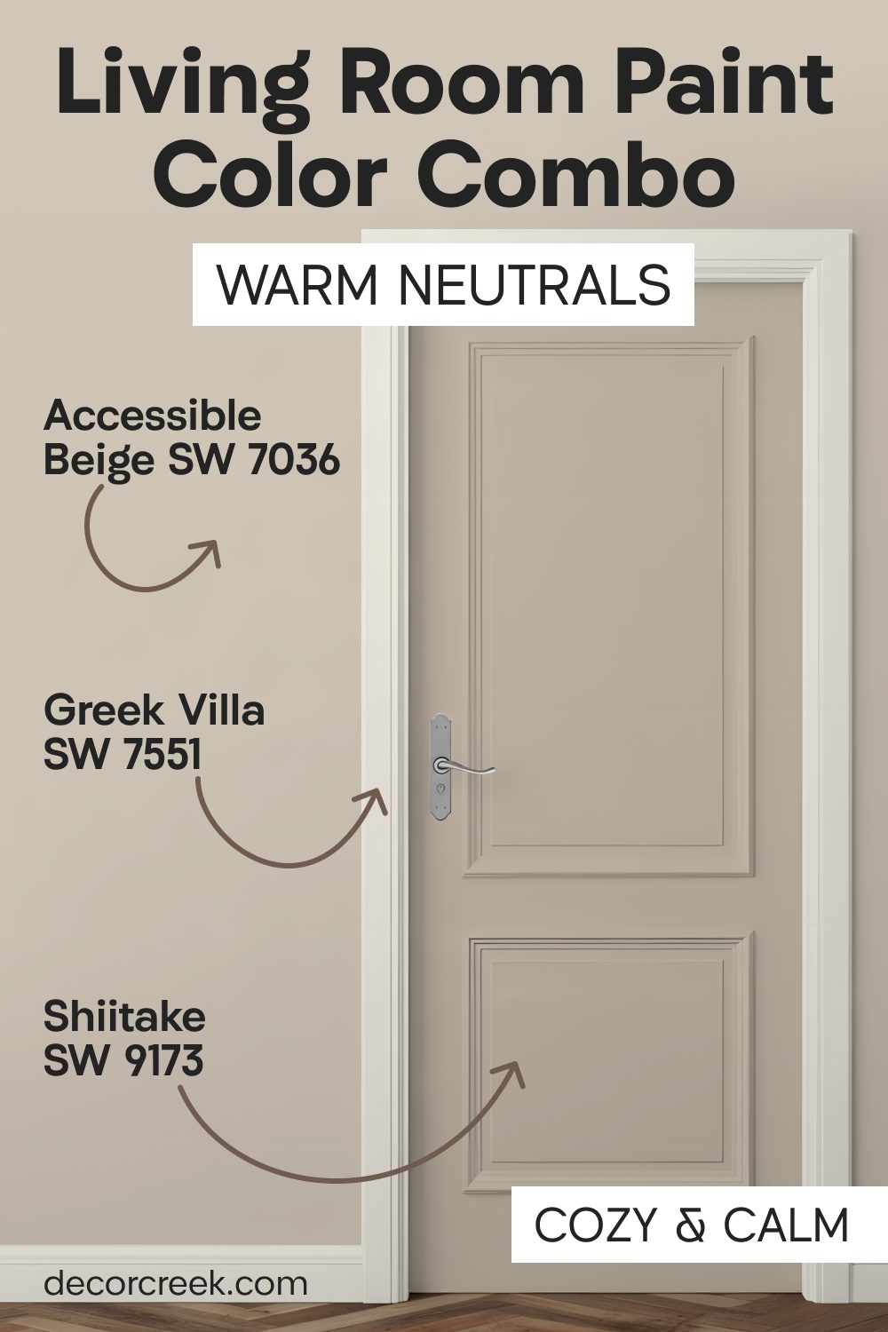
Accessible Beige SW 7036 + Shiitake SW 9173 + Greek Villa SW 7551
Accessible Beige SW 7036 is the color I suggest most often because it works with almost any rug or sofa. Shiitake SW 9173 adds a slightly darker stone color to the doors that makes the hardware look shiny.

Greek Villa SW 7551 is a soft white that keeps the corners of the room from looking too dark or heavy.

I love how these colors make a small living room feel much bigger than it actually is. The beige tones are friendly and do not fight with your colorful pillows or wall art.
Many people choose this set because it feels like a warm hug when you walk through the door. It creates a balance that makes the room feel clean but also very lived-in and comfortable.

This palette is great for families who want a neat look that is still very easy to maintain. Your doors will stand out just enough to look special without grabbing too much attention.
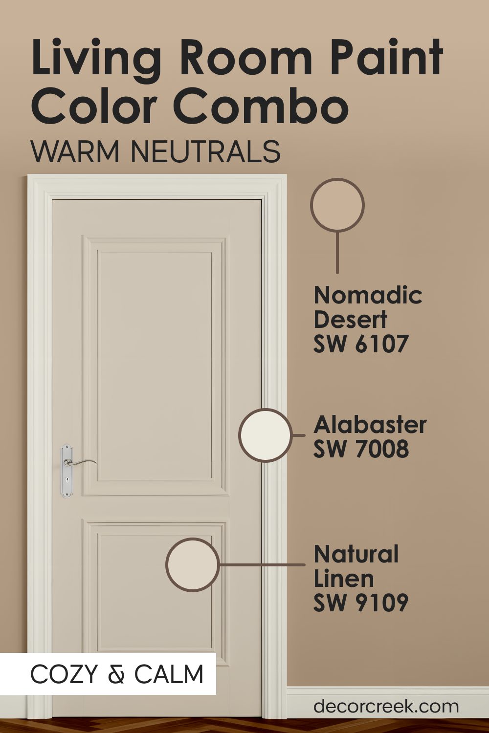
Nomadic Desert SW 6107 + Natural Linen SW 9109 + Alabaster SW 7008
Nomadic Desert SW 6107 provides a tan base that feels like warm sand under your feet. Natural Linen SW 9109 works on the walls to keep the sunshine feeling bright in the room. Alabaster SW 7008 stays on the trim to make the transition between the tan door and the walls look very crisp.

This combination reminds me of a beach house where everything feels relaxed and simple for the family.
You will notice that the tan shade hides dust better than a stark white door ever could. Sand colors like these help the living room feel grounded and sturdy instead of light and airy.

Every guest will feel invited to sit down and stay for a long time in this environment.
Using these three together ensures that your living room does not feel too cold or too yellow. It is a smart choice for rooms that get a lot of afternoon sun through the windows.

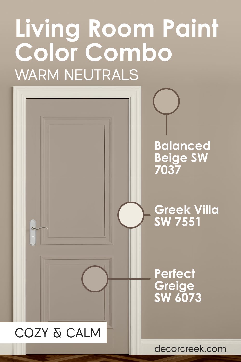
Balanced Beige SW 7037 + Perfect Greige SW 6073 + Greek Villa SW 7551
Balanced Beige SW 7037 is a deeper tan that looks wonderful on heavy wooden doors in a large room. Perfect Greige SW 6073 mixes gray and beige on the walls to give the room a modern feeling.

Greek Villa SW 7551 keeps the baseboards looking fresh and bright against the darker door and wall paint. This trio is perfect if you have light-colored wood floors or light gray carpeting in your home.

I think this look is very professional and makes a house feel like it was designed by an expert. The darker door color creates a nice frame for the entrance to your main living area. It makes the room feel expensive and well-planned without being too bright or loud.
You can use black or bronze handles on these doors to finish the look perfectly. It is a very safe choice that still has a lot of personality and warmth for your family.
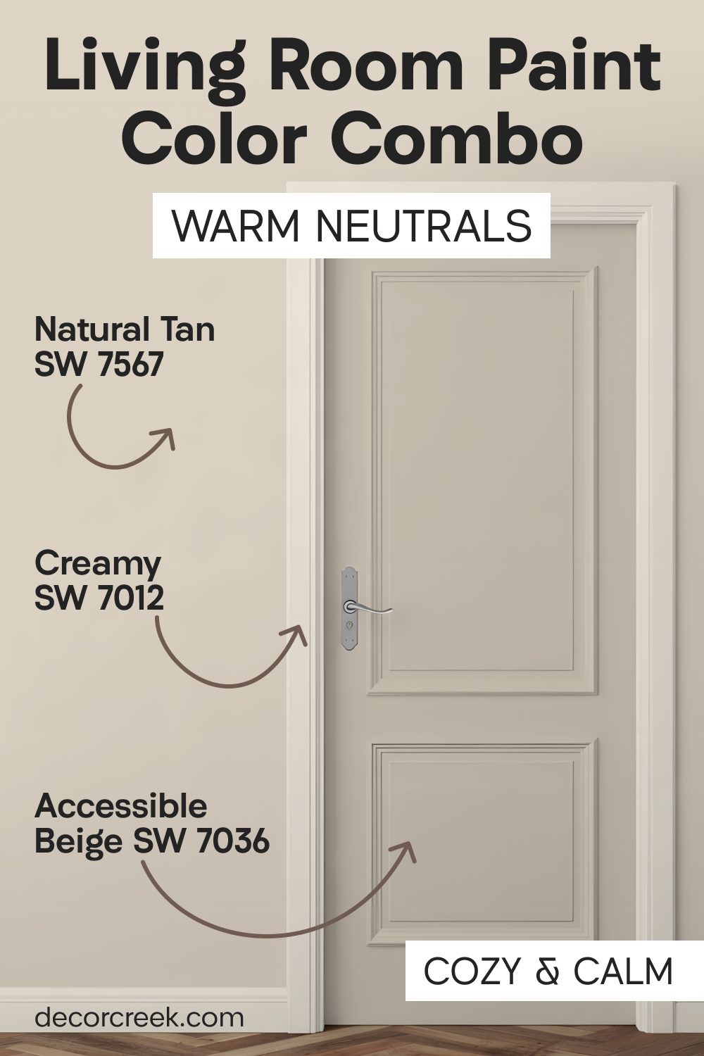
Natural Tan SW 7567 + Accessible Beige SW 7036 + Creamy SW 7012
Natural Tan SW 7567 has a wood-like warmth that makes the living room feel very natural and organic. Accessible Beige SW 7036 sits on the walls to provide a soft background for your family photos.

Creamy SW 7012 is a rich white that looks like vanilla ice cream on the trim and the ceiling. I like this mix for homes that have a lot of indoor plants or green decorations. The tan and beige colors make the green leaves pop and look very healthy and vibrant.
This set of colors is very soothing for people who want a quiet place to rest after work. It avoids the harsh feeling of cool grays or bright whites that can feel like an office.
Your living room will feel like a soft retreat where you can truly kick off your shoes. These colors stay looking good for many years even as styles change in the magazines.

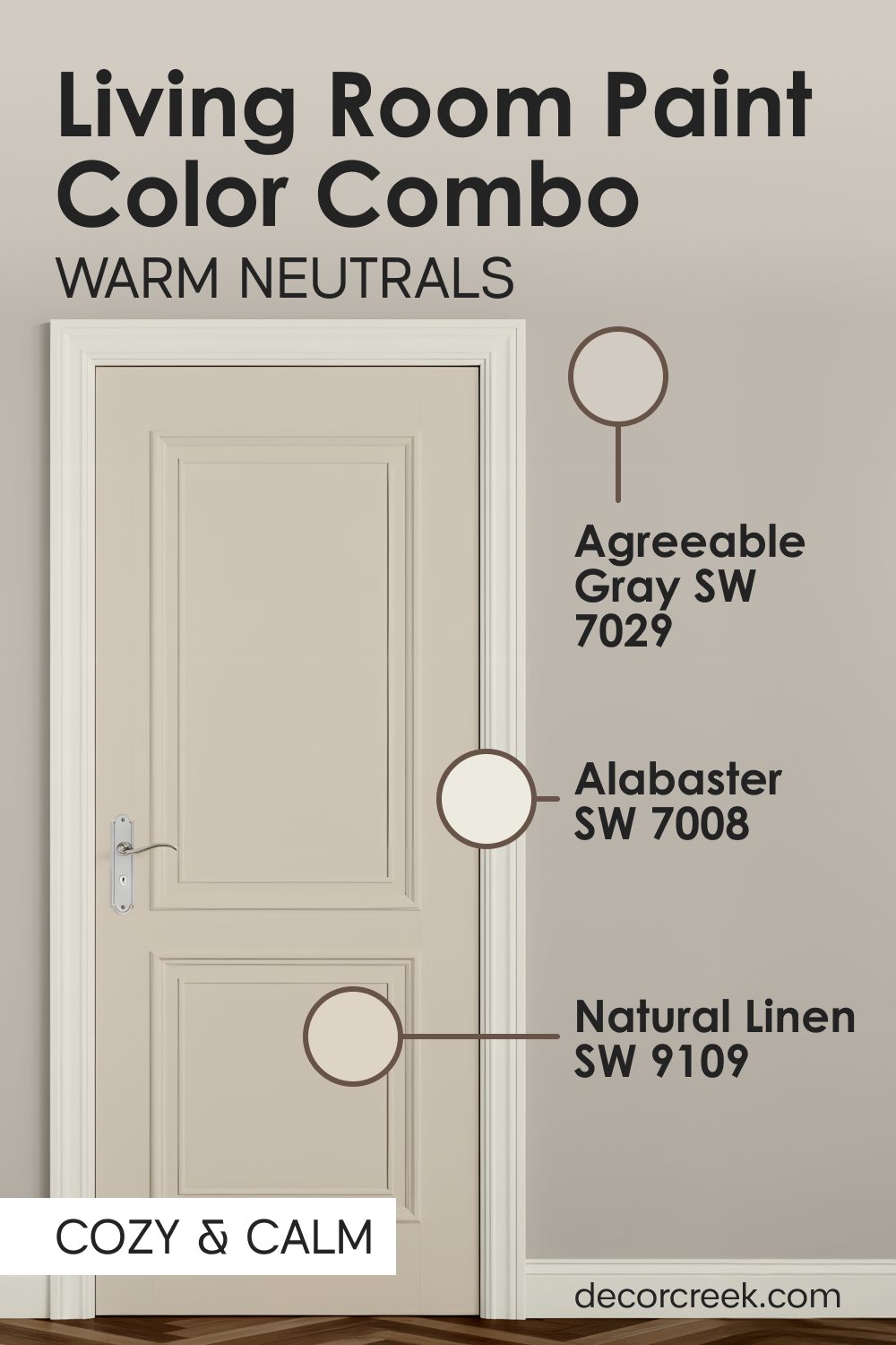
Agreeable Gray SW 7029 + Natural Linen SW 9109 + Alabaster SW 7008
Agreeable Gray SW 7029 is a very popular color that looks slightly different depending on your light bulbs. Natural Linen SW 9109 adds a bit of creamy warmth to the walls so the gray does not feel chilly.

Alabaster SW 7008 provides a clean white edge that separates the two soft colors on the walls and doors. This combination is great for houses that have a lot of blue or navy blue furniture. The gray on the door acts as a neutral bridge between the warm walls and the cool furniture.
I find that this palette makes a room feel very balanced and easy on the eyes. It is a great way to use gray without making your home feel like a concrete building. The linen walls keep things feeling soft and homey for everyone who visits you. You will love how the light bounces off these colors during the middle of the day.
Moody Shades For a Look That Is Dramatic And Cozy
I love using these dark and deep colors when I want to make a living room look very expensive and special. Many people are afraid of dark paint on doors, but I have seen it work wonders in dozens of homes. These heavy colors act like a beautiful frame for your life and your furniture.
When I put a dark bronze or iron color on a door, it makes the room feel much more private and safe. I find that these shades look amazing with gold lamps and warm light bulbs in the evening. They work well because they create a big change between the walls and the doors.
In my years of staging, I have learned that a dark door can make a room look much more professional.
These colors are also great at hiding little marks from pets or children. You will see that a dark door makes the ceiling feel like it is much higher than it really is.
It is a bold choice that I always suggest for people who want a home with a lot of character.
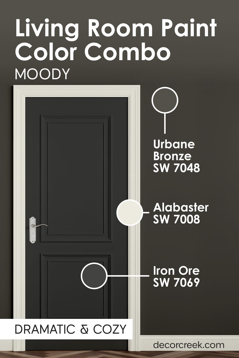
Urbane Bronze SW 7048 + Iron Ore SW 7069 + Alabaster SW 7008
Urbane Bronze SW 7048 is a dark and rich color that looks like a mix of brown and gray. Iron Ore SW 7069 is even darker and works well on the walls if you want a very bold look. Alabaster SW 7008 is necessary on the trim to provide a bright line so the room stays clear.

This palette is for people who want their living room to feel like a cozy cave or a private theater. I use this when a room has very high ceilings and needs to feel more intimate and small. The dark door color makes a huge statement and tells people that you have a very bold style.

It looks amazing with gold or brass lamps and picture frames scattered around the living room. You will find that dark colors actually make the walls feel like they are moving away from you. This creates a deep feeling that is very different from a standard white and bright living room.
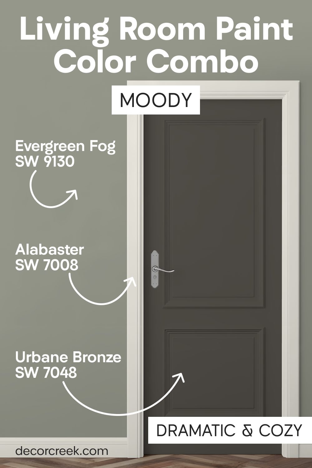
Evergreen Fog SW 9130 + Urbane Bronze SW 7048 + Alabaster SW 7008
Evergreen Fog SW 9130 is a dusty green that brings the feeling of the forest inside your house. Urbane Bronze SW 7048 goes on the doors to give the room a heavy and expensive feeling. Alabaster SW 7008 keeps the trim looking sharp so the green and bronze do not get too muddy.

This is a very trendy look that feels both old-fashioned and brand new at the same time. I love using this in homes that have big windows looking out at trees or a garden area. The green walls help the transition from the outside world into your comfortable living room feel very smooth.
The dark doors add a touch of drama that makes the room feel very special for parties. Guests will definitely notice the color of your doors and ask you what paint you used. It is a very brave choice that pays off by making your home look very unique.
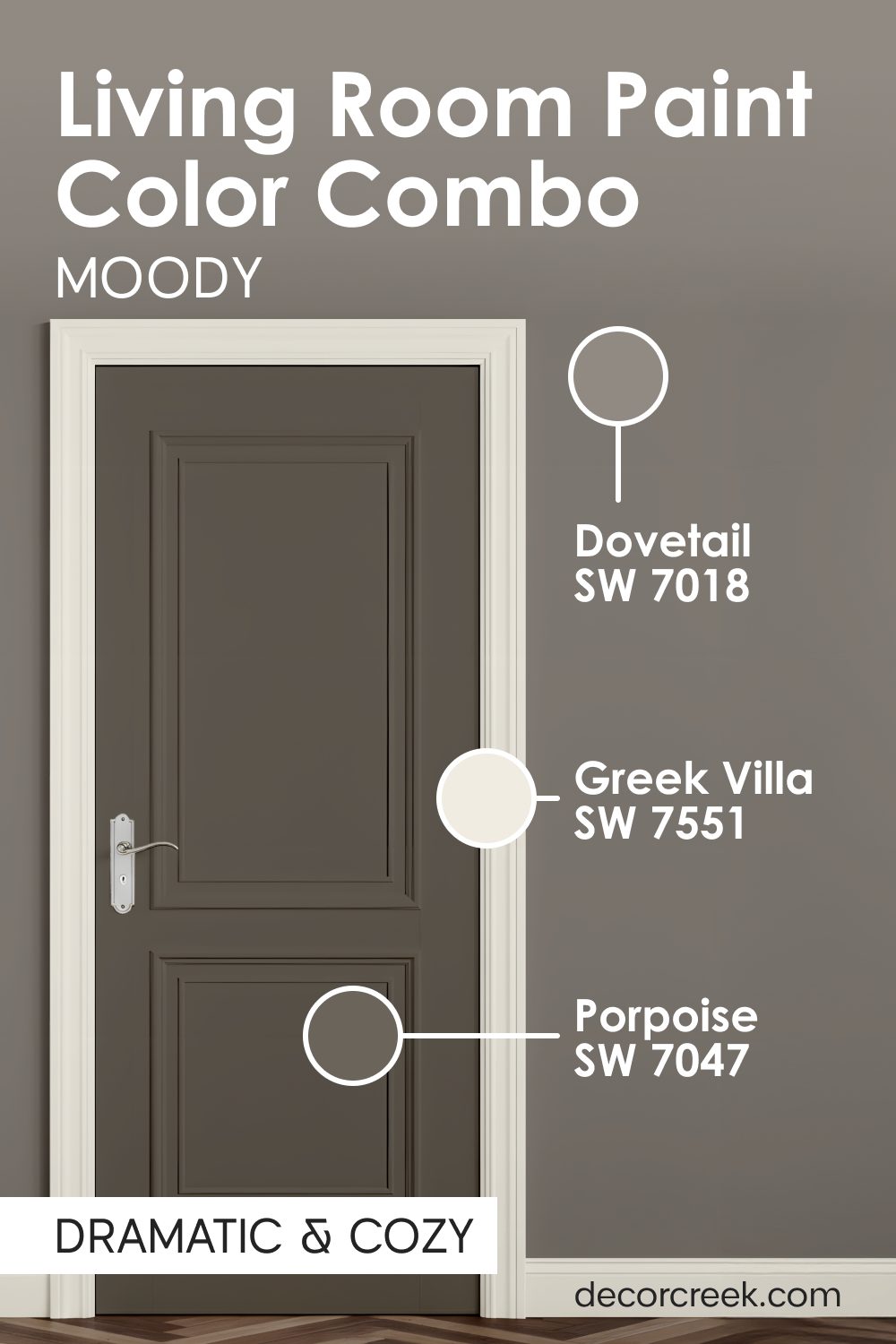
Dovetail SW 7018 + Porpoise SW 7047 + Greek Villa SW 7551
Dovetail SW 7018 is a medium gray that feels very solid and reliable on your living room walls. Porpoise SW 7047 is a darker gray-brown that I love to put on doors to create a focal point.

Greek Villa SW 7551 is the perfect white to keep the room from feeling too dark or gloomy in the winter. This color set works very well with leather furniture or dark wood coffee tables in the room.

I think it makes a room feel very mature and smart, like a library in a big mansion. The gray tones are very popular right now, but the touch of brown makes them feel much warmer. You can add a bright red or yellow pillow to the sofa to make the room feel fun.
These colors are great at hiding the mess that kids or pets might make on the doors. It is a practical choice for a busy home that still wants to look very stylish and cool.
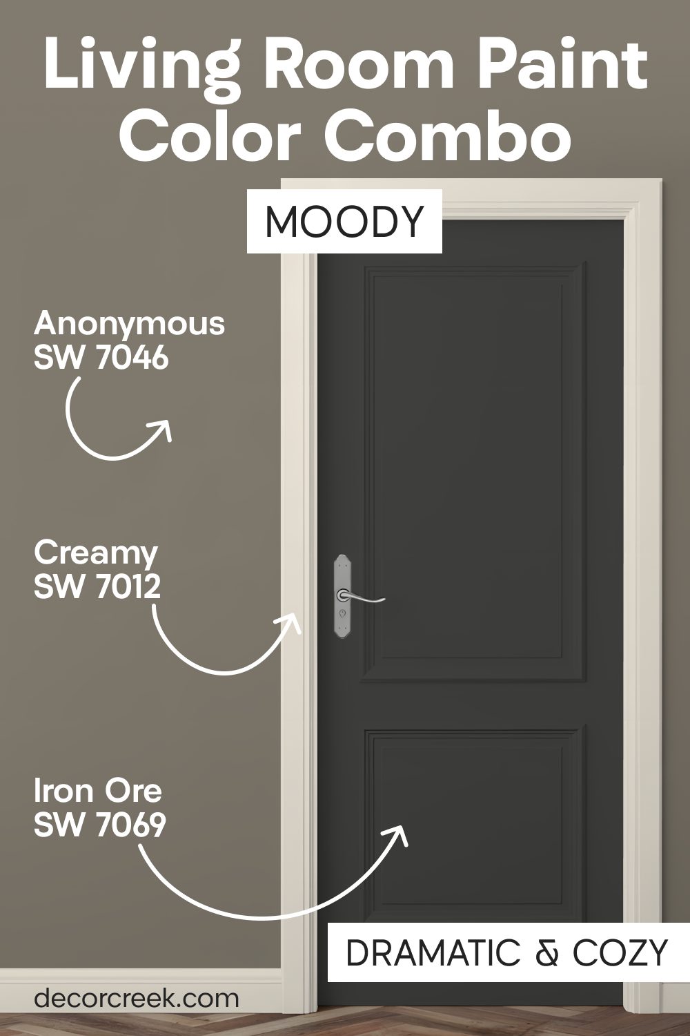
Anonymous SW 7046 + Iron Ore SW 7069 + Creamy SW 7012
Anonymous SW 7046 is a neutral color that sits right between green, gray, and brown on the walls. Iron Ore SW 7069 on the doors creates a very strong look that feels modern and very edgy.

Creamy SW 7012 adds a bit of softness back into the room so it does not feel too industrial or hard. I choose this when someone wants a room that feels very moody but still has a bit of warmth.
The iron color on the doors makes the door handles and hinges look like pieces of jewelry. It is a great way to make a standard door look like it is made of heavy metal or expensive stone. This palette works best in rooms that have lots of soft rugs and fabric to balance the dark paint.
It creates a very interesting look that changes as the sun moves across the sky during the day. You will enjoy how the door color stays deep and dark even when the lights are turned low.
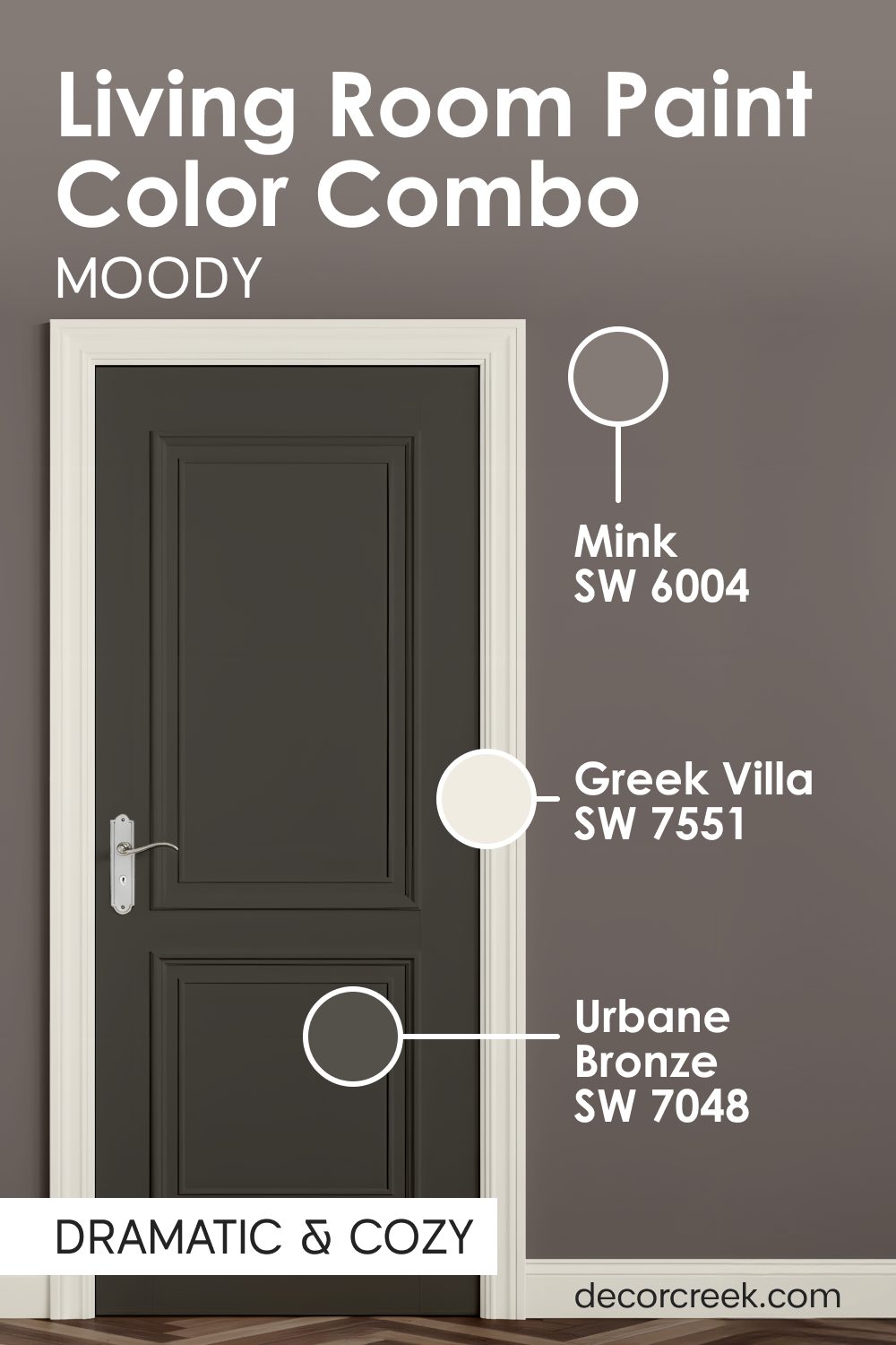
Mink SW 6004 + Urbane Bronze SW 7048 + Greek Villa SW 7551
Mink SW 6004 is a soft brownish-gray that feels very plush and luxurious on your living room walls. Urbane Bronze SW 7048 on the doors adds a layer of depth that makes the entrance look very grand.

Greek Villa SW 7551 provides the light you need to see the beautiful details in the darker paint colors. This combination reminds me of expensive chocolate or a very fancy hotel lobby in a big city.
I love how these colors wrap around you and make you feel safe and protected from the outside. The dark doors act as a beautiful frame for whoever is walking into the room to join the family.
It is a very sophisticated look that does not require a lot of expensive decorations to look finished. You can use light-colored curtains to add a bit of brightness against the darker mink walls. This is a great choice for someone who wants a living room that feels very high-end and special.
Neutrals That Keep Everything Clean and Balanced
When I work with homeowners who love a very neat and tidy look, I always reach for these light combinations. These mixes of white and light gray are the best way to make a room feel very fresh and full of light. I have used these palettes in small houses to make them feel much larger and more open.
These colors work well because they do not fight with each other for your attention.
I find that using different shades of white on the doors and walls makes the room look very layered and smart. It is a look that stays in style for a very long time, so you do not have to paint again next year. My experience shows that these colors make any piece of art on your walls look much better.
They create a very steady feeling that helps people feel more organized in their busy lives.
You will love how these colors catch the light from the windows in the morning. It is the perfect choice for a home that needs to feel very light and very peaceful every day.
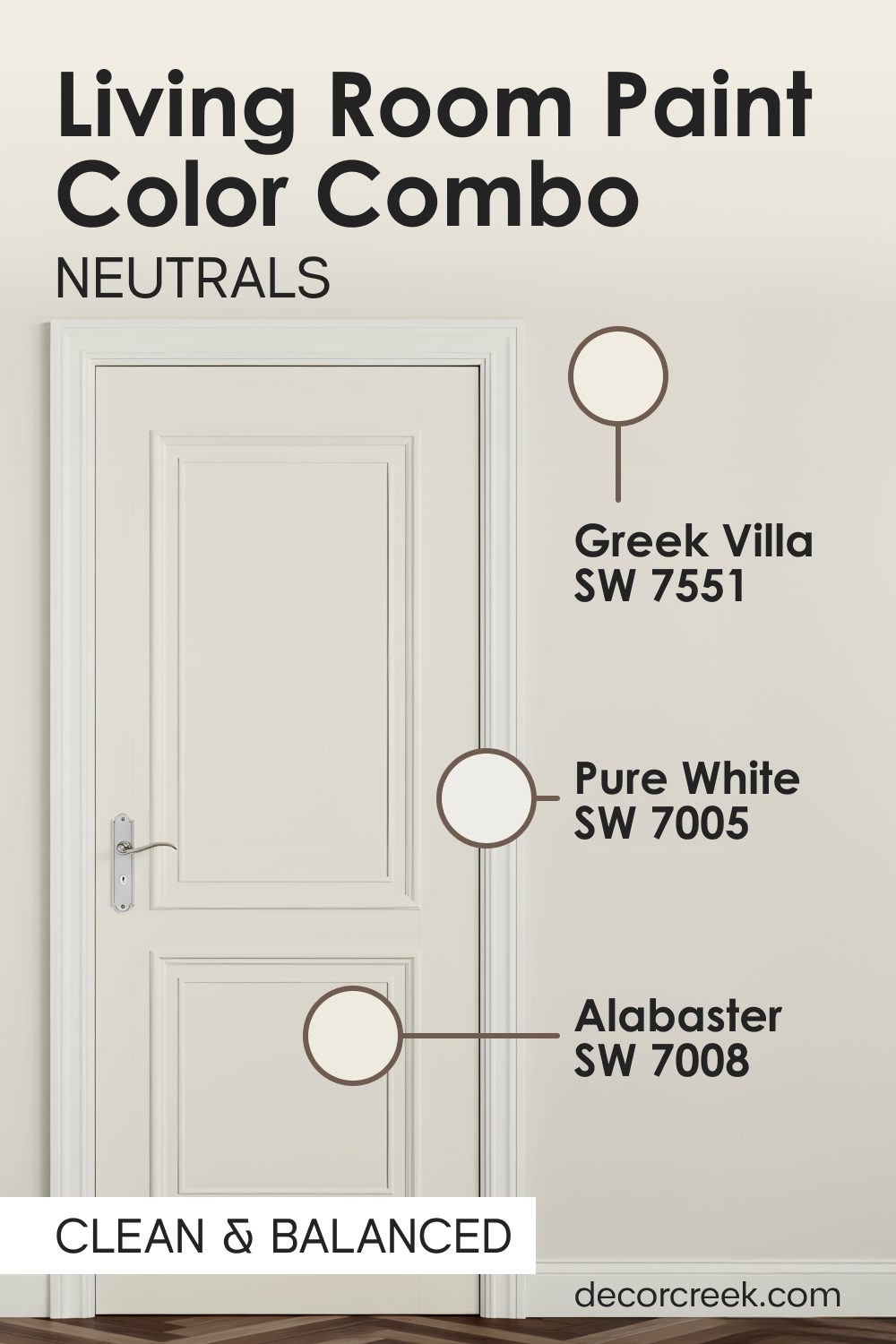
Greek Villa SW 7551 + Alabaster SW 7008 + Pure White SW 7005
Greek Villa SW 7551 is a very soft white that I put on the doors to make them look clean. Alabaster SW 7008 goes on the walls to provide just a tiny bit of contrast so the room has some shape.
Pure White SW 7005 is used on the trim to make the whole room look very bright and very sharp. This is the best choice for people who love a very tidy and minimalist style in their home. It makes the room feel like a blank canvas where you can add any color of furniture you want.
I find that this look is very refreshing and helps people feel more organized in their daily lives. The different shades of white prevent the room from looking like a plain hospital or a boring box.
It feels intentional and thoughtful because the whites are layered on top of each other very carefully. You will love how bright the room feels even on a cloudy day when there is not much sun.

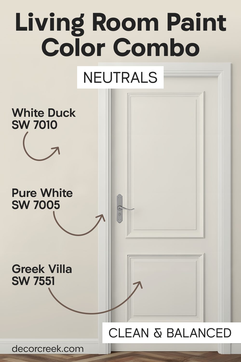
White Duck SW 7010 + Greek Villa SW 7551 + Pure White SW 7005
White Duck SW 7010 is a creamy off-white that has a little bit of gray hidden inside of it. Greek Villa SW 7551 on the doors makes the entrance look very soft and inviting for your family.

Pure White SW 7005 on the trim keeps the edges of the room looking very straight and very professional. This palette is perfect for a house that wants to feel light but not cold or like a museum.
I use this when a homeowner wants a very classic look that will never go out of style. It feels very airy and gives you plenty of room to breathe and think while you are relaxing.
The creaminess of the paint makes the light in the room feel very soft on your skin. It is a very flattering set of colors for both the people and the furniture in the living room. You can change your rug every year and it will always look great with these neutral colors.
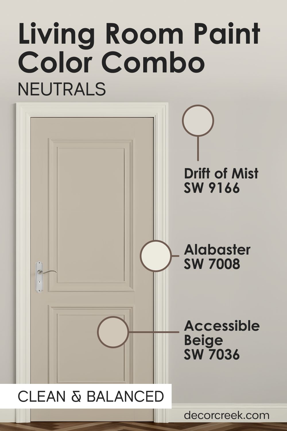
Drift of Mist SW 9166 + Accessible Beige SW 7036 + Alabaster SW 7008
Drift of Mist SW 9166 is a very light gray that looks like a morning fog on your living room walls. Accessible Beige SW 7036 on the doors adds a little bit of earthy warmth to the cool gray walls.

Alabaster SW 7008 on the trim provides a clean white line that makes the gray and beige look crisp. I like this mix because it uses both cool and warm tones to make the room feel very balanced.
It is a great choice for a house that has both wood floors and gray furniture pieces. The beige doors help the wood floors feel like they belong with the gray walls in the room. This palette is very easy to live with because it never feels too bright or too dark at any time. It creates a very steady feeling that makes the house feel very solid and well-built for the family.
Most people find this combination very pleasing because it does not demand any attention.
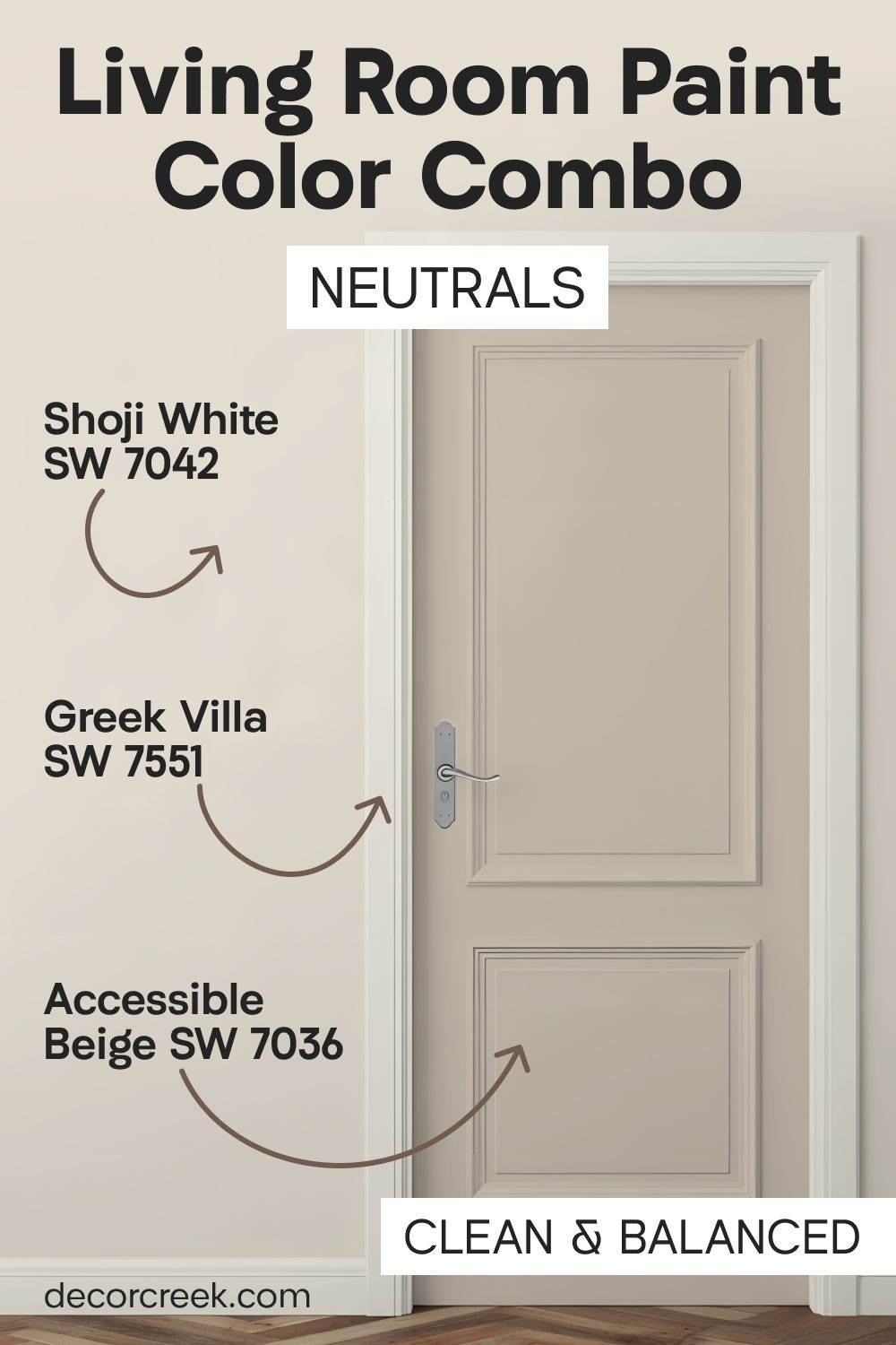
Shoji White SW 7042 + Accessible Beige SW 7036 + Greek Villa SW 7551
Shoji White SW 7042 is a warm white that almost looks like a very pale tan on your walls. Accessible Beige SW 7036 on the doors gives the room a bit of strength and keeps it from looking washed out.

Greek Villa SW 7551 on the trim adds a layer of brightness that helps define the shapes of the doors. This set of colors is inspired by natural materials like paper and stone and light-colored wood. I think it is a very smart choice for a modern home that wants to feel very grounded.
The warm whites make the room feel very friendly and open to anyone who walks inside the house. It works well with large windows and lots of natural light coming from the backyard or the street.
You will notice that the beige doors stay looking clean even if people touch them often. This is a very practical way to have a light room that is still very easy to keep up.
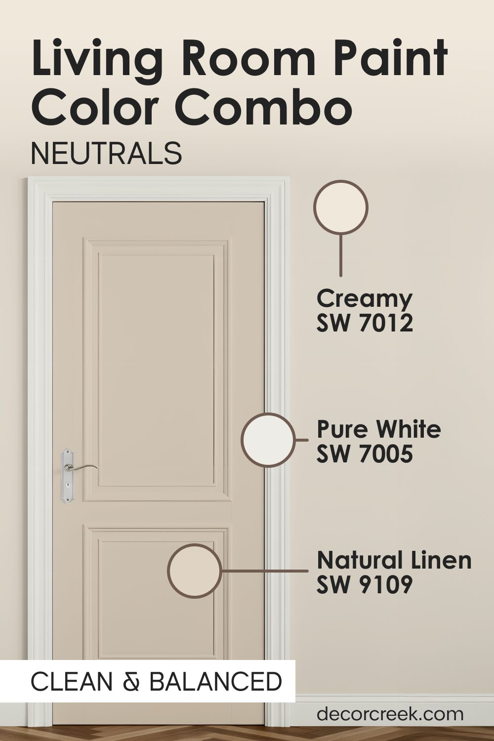
Creamy SW 7012 + Natural Linen SW 9109 + Pure White SW 7005
Creamy SW 7012 is a rich and warm white that makes the doors look very soft and very inviting. Natural Linen SW 9109 on the walls provides a textured look that feels like a cozy fabric or a blanket.
Pure White SW 7005 on the trim creates a sharp contrast that makes the creamy colors look very rich. I love this palette for a traditional home that has lots of big furniture and comfortable chairs. It makes the living room feel very established and like it has been there for a long time.
The linen and cream colors work together to make the light in the room feel very gold and warm. It is a great choice for evening relaxation when you want to dim the lights and watch a movie.
Your living room will feel very soft and very safe with these colors on the walls and doors. It is a very classic way to make a home feel like it is full of love and comfort.
Final Thoughts
Choosing a color for your living room doors is the final step in making your house look perfect. When the door matches the walls and the trim, it creates a flow that makes walking through your home a joy. You do not have to settle for boring white doors if you want something more interesting for your family.
Whether you like dark and moody colors or light and clean ones, there is a perfect set for you. Trust your feelings and pick the colors that make you feel the most at home when you sit down.
A little bit of paint on a door can change the whole personality of your living room in just one day.
You will be surprised at how much better your home feels with the right colors working together on every surface. It is the best way to show your own style to all your neighbors and friends without saying a single word. I hope this guide helps you find a look that you will love for many years to come as you relax in your house.
Remember that paint is not permanent, so you can always try a new shade if your tastes change later on.
Making your doors look beautiful is an investment in your own happiness and the comfort of your guests. Your living room deserves to look its best, and a fresh coat of paint is the easiest way to get there. Take your time, enjoy the process, and watch as your home begins to shine with a brand new energy.
