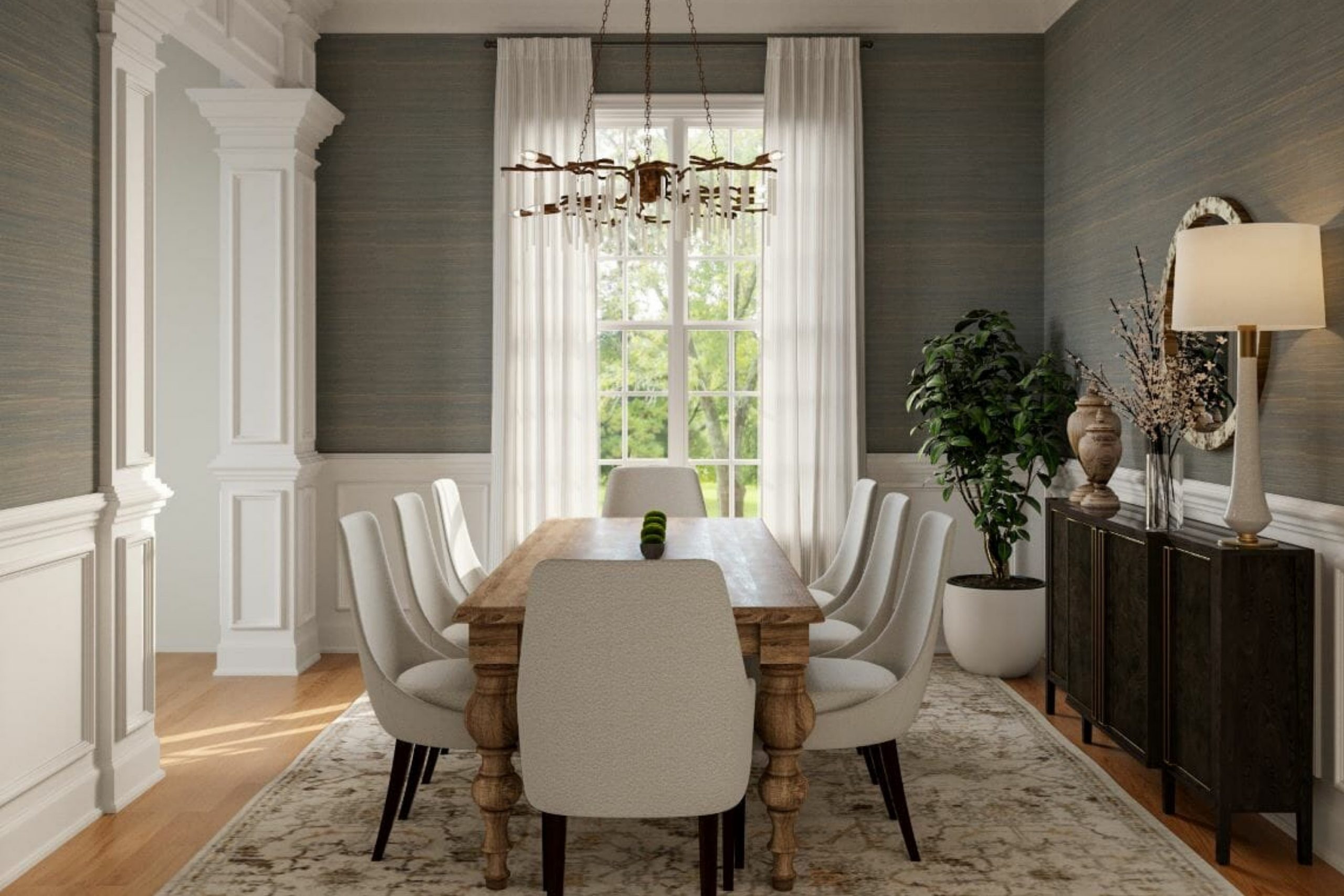
When I think about paint colors that make a home feel comfortable, I always come back to warm neutrals. These tones have a quiet strength — they don’t compete for attention, yet they make everything look more inviting. In 2026, warm neutrals are leading the way again because they fit every kind of style. From soft beiges to golden taupes and creamy whites, these shades add depth and calm to a room without feeling dull.
I love how they change with the light — bright and airy in the morning, soft and cozy by night. They blend perfectly with wood, stone, and natural fabrics like linen and wool.
More than anything, warm neutrals create an atmosphere of comfort and belonging.
Whether your home is modern, traditional, or farmhouse-inspired, these colors make each room feel connected and full of warmth.
Why I Believe Warm Neutrals Define the Feeling of a Home
Color shapes emotion. The moment you walk into a room, the tones on the wall tell a story about how you live. Warm neutrals speak in a gentle voice — one that says, “Relax, you’re home.” Over the years, I’ve seen how these shades bring families together. They make large rooms feel more welcoming and small ones feel balanced.
Warm neutrals are what I call “quiet connectors.” They let the textures and layers of your home shine — a woven rug, a wood table, a linen sofa.
These colors don’t ask for attention, yet they always feel elegant. When I use them, I’m not just choosing a paint color — I’m creating a mood. A home filled with warm neutrals feels grounded, calm, and personal.
How I Choose the Perfect Warm Neutral Paint Color for Each Space
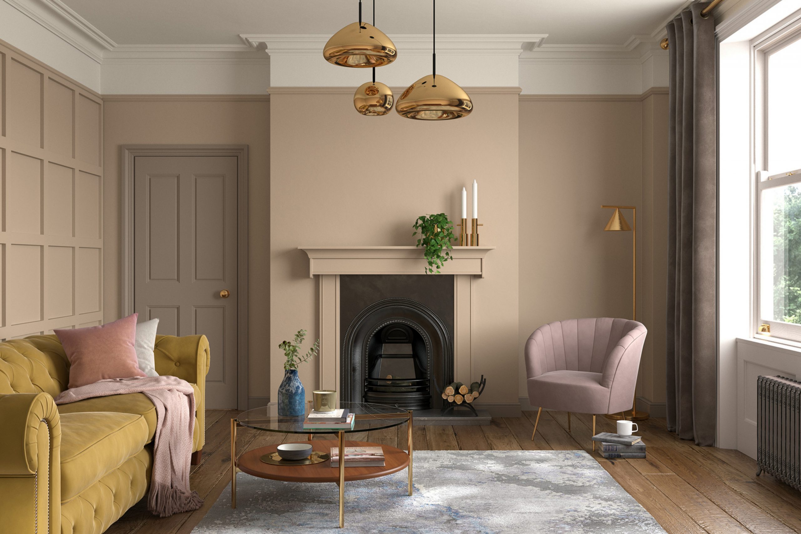
Choosing the right warm neutral is all about balance. I start by studying the light. Rooms that face north usually need warmer undertones — something with a golden or creamy tint. South-facing rooms already get warmth from the sun, so a softer beige or greige can work beautifully.
I also look at what’s already in the room — the floors, fabrics, and furniture all influence how a color feels. For example, a rich wood floor may call for a lighter wall, while a pale rug looks perfect against a slightly darker neutral.
My goal is to find a color that feels natural, like it was always meant to be there.
Warm neutrals can shift throughout the day, and that’s what makes them so special. Morning light brings out their brightness, and evening light deepens their softness.
When the color feels warm at every hour, you know you’ve found the right one.
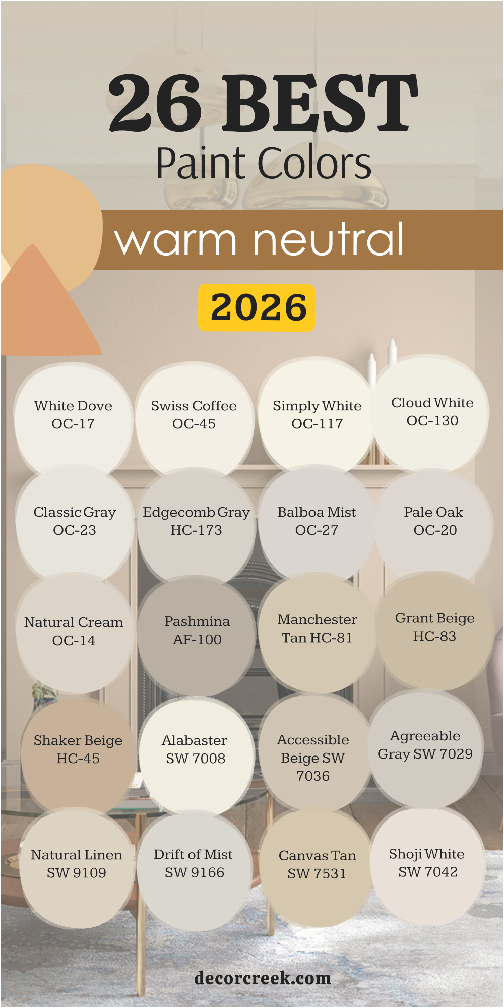
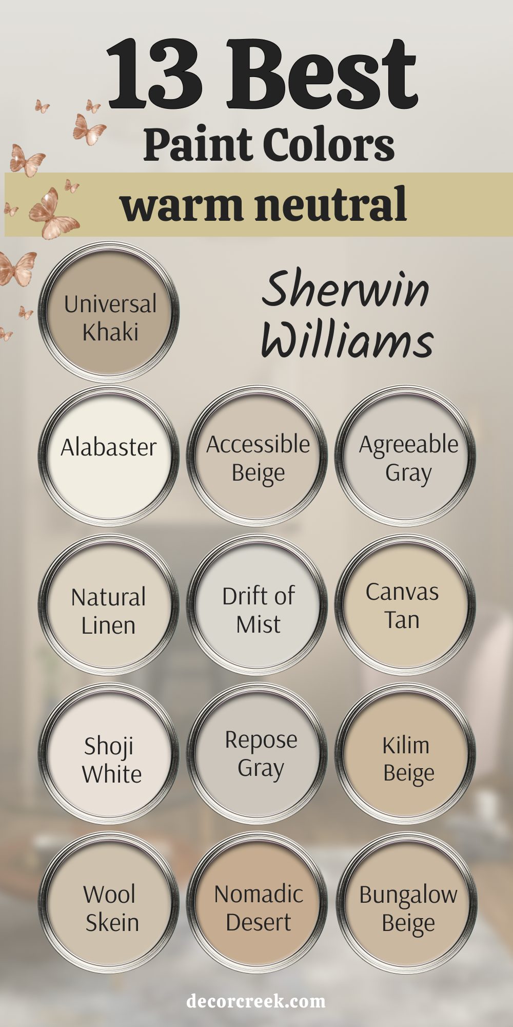
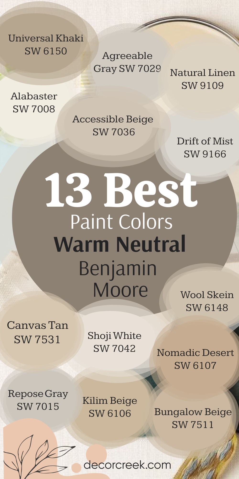
13 Best Warm Neutral Paint Colors by Sherwin-Williams
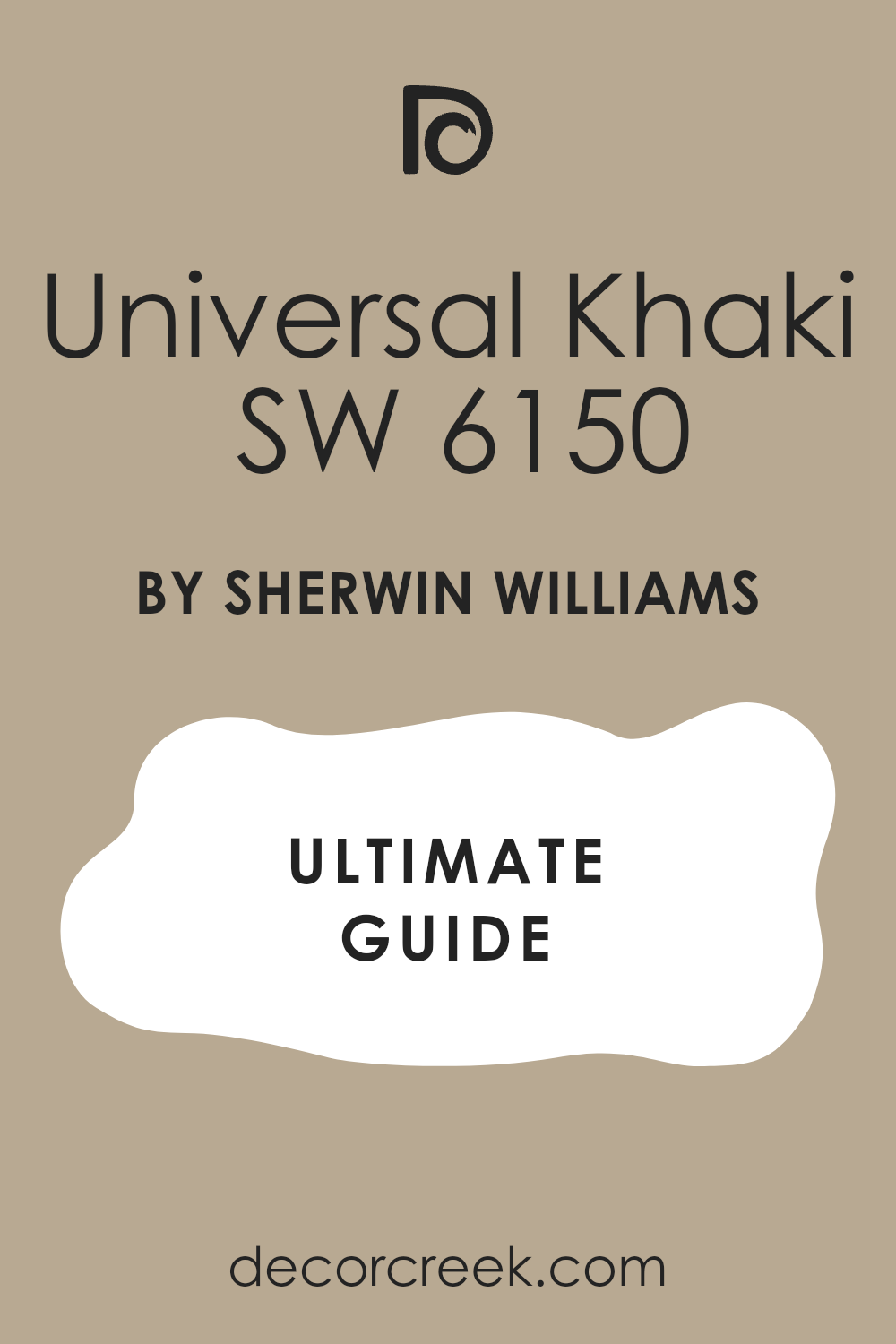
Universal Khaki SW 6150
Universal Khaki SW 6150 is one of those rare shades that feels strong yet soft at the same time. It has a warm, grounded base that instantly makes a room feel comfortable and connected. I love using it in living rooms or bedrooms where I want the color to add depth without feeling dark. It pairs beautifully with crisp white trim and light oak furniture.
This shade has a quiet richness that works in every type of home — modern, rustic, or classic.
In daylight, it feels earthy and welcoming; in the evening, it turns slightly cozier and more intimate. Universal Khaki creates that “settled in” feeling the moment you step inside. It’s steady, timeless, and full of heart.
🎨 Check out the complete guide to this color right HERE 👈
Alabaster SW 7008
Alabaster SW 7008 is one of the softest whites you can find. It has a touch of warmth that keeps it from feeling too bright or cold. I often use it when a client wants walls that glow gently in the light. It pairs beautifully with warm wood tones, brass finishes, and linen fabrics.
What I love most about Alabaster is its versatility. It looks elegant on walls but just as stunning on trim or cabinetry.
The color has a peaceful simplicity that fits beautifully in any style of home. Alabaster makes a room feel open, clean, and full of quiet warmth.
🎨 Check out the complete guide to this color right HERE 👈

Accessible Beige SW 7036
Accessible Beige SW 7036 is the perfect middle ground between beige and gray. It has just enough warmth to feel cozy but stays neutral enough to match almost anything. I love using it in bedrooms and family rooms because it feels inviting but sophisticated. It pairs perfectly with white trim and muted greens or blues.
This shade works beautifully in rooms with natural light. It has a soft glow that changes with the day, never feeling too heavy.
Accessible Beige is one of those dependable colors I return to again and again — calm, elegant, and easy to live with.
🎨 Check out the complete guide to this color right HERE 👈

Agreeable Gray SW 7029
Agreeable Gray SW 7029 is one of my most-used neutrals for a reason — it simply works everywhere. It blends gray and beige so effortlessly that it feels both modern and classic. I love using it in open-concept homes where it can connect one room to the next. It pairs beautifully with black accents, natural wood, and white trim.
The color feels warm without being yellow, balanced without being plain. It’s a perfect backdrop for any décor style.
Agreeable Gray makes spaces feel harmonious and relaxed, like everything fits together naturally. It’s the definition of comfort in color form.
🎨 Check out the complete guide to this color right HERE 👈

Natural Linen SW 9109
Natural Linen SW 9109 feels like sunshine filtered through fabric — soft, light, and full of warmth. It’s a creamy beige that works perfectly in bedrooms, kitchens, and living rooms. I love how it pairs with tan leather, wicker, and woven rugs. It gives rooms that natural, layered look that feels timeless and easy.
The best thing about Natural Linen is how it plays with light.
In the morning, it glows softly; in the evening, it deepens to a buttery tone.
🎨 Check out the complete guide to this color right HERE 👈

Drift of Mist SW 9166
Drift of Mist SW 9166 is one of those rare colors that always feels balanced. It sits between beige and gray but leans just warm enough to make a room feel comfortable. I love using it in bedrooms and hallways where I want brightness without starkness. It pairs beautifully with soft whites, warm woods, and brushed gold accents.
What makes Drift of Mist special is how adaptable it is — in morning light, it feels airy and open, while in the evening, it becomes cozy and grounded. It’s one of my favorite colors for creating flow through an entire home. Every time I use it, the space feels complete, calm, and quietly elegant.
🎨 Check out the complete guide to this color right HERE 👈

Canvas Tan SW 7531
Canvas Tan SW 7531 is warm, soft, and full of natural charm. It feels like sunlit sand — gentle, golden, and beautifully neutral. I love using it in bedrooms, dining rooms, or entryways where I want a welcoming mood. It pairs perfectly with creamy whites and warm metal finishes.
Canvas Tan brightens with daylight and softens under lamplight. It’s one of those shades that never feels heavy, no matter how much you use it.
I especially love how it highlights natural materials like oak, stone, or linen. Canvas Tan gives every home a relaxed and inviting energy that never fades.
🎨 Check out the complete guide to this color right HERE 👈

Shoji White SW 7042
Shoji White SW 7042 is a warm, creamy white with a touch of greige that adds depth. It’s not too stark or too yellow — just that perfect in-between that feels soft and lived-in. I love using it in bedrooms and kitchens where I want a clean, airy look that still feels warm.
It pairs beautifully with taupe or beige furnishings and works well alongside both cool and warm tones. Shoji White changes beautifully with light — glowing in the morning and turning creamy in the evening. It’s a go-to for creating timeless warmth with an easy elegance that fits any home.
🎨 Check out the complete guide to this color right HERE 👈

Repose Gray SW 7015
Repose Gray SW 7015 is one of those colors that adapts to every home. It’s a soft gray with a hint of warmth, which makes it incredibly versatile. I love using it in bedrooms, living rooms, or anywhere that needs a touch of sophistication. It pairs beautifully with crisp white trim and dark metal accents.
This color is subtle yet expressive. It feels cool in bright daylight but gains warmth as the light softens.
Repose Gray makes a home feel balanced, graceful, and effortlessly stylish. It’s one of those shades that quietly enhances everything around it.
🎨 Check out the complete guide to this color right HERE 👈

Kilim Beige SW 6106
Kilim Beige SW 6106 brings gentle warmth with a golden undertone that makes rooms feel cozy and rich. It’s perfect for living rooms and bedrooms where you want a soft glow on the walls. I love pairing it with dark wood furniture, ivory bedding, and aged brass fixtures.
Kilim Beige holds light beautifully and feels especially lovely at sunset. It has a welcoming charm that works in both modern and traditional homes. This shade adds that golden warmth that instantly makes a space feel lived in and loved.
🎨 Check out the complete guide to this color right HERE 👈

Wool Skein SW 6148
Wool Skein SW 6148 is a beautiful, creamy neutral that feels like the softness of natural fabric. It’s understated but full of character. I love using it in bedrooms and dining rooms where I want warmth without weight. It pairs perfectly with stone, wood, and pale textiles.
This color shifts gently with the light, from pale beige in the morning to a honeyed tone at dusk.
It’s one of those hues that blends effortlessly with everything, from classic to modern décor. Wool Skein brings warmth and ease to every home it touches.
🎨 Check out the complete guide to this color right HERE 👈

Nomadic Desert SW 6107
Nomadic Desert SW 6107 is rich, warm, and earthy — like the color of sunbaked clay. It adds depth and comfort without feeling dark. I love using it in cozy living rooms, reading corners, or anywhere that needs a sense of calm and stability. It pairs beautifully with creamy whites and rustic wood.
This shade glows softly in afternoon light and becomes deep and grounded at night. It’s full of warmth and presence but never feels heavy. Nomadic Desert makes a room feel wrapped in comfort — familiar, natural, and beautifully enduring.
🎨 Check out the complete guide to this color right HERE 👈

Bungalow Beige SW 7511
Bungalow Beige SW 7511 is one of those timeless colors that works in any setting. It’s a balanced beige with just a touch of peachy warmth. I love how it makes walls feel soft and welcoming without overpowering the décor. It pairs wonderfully with crisp whites, greens, and natural woods.
Bungalow Beige captures sunlight beautifully, adding quiet energy to the space. In the evening, it takes on a cozy glow that feels relaxing and homey.
It’s a shade that brings everything together — light, texture, and warmth — in perfect harmony.
🎨 Check out the complete guide to this color right HERE 👈
13 Best Warm Neutral Paint Colors by Benjamin Moore
White Dove OC-17
White Dove OC-17 is one of the most loved warm whites for a reason. It has just enough creamy warmth to soften a room without turning yellow. I love using it in bedrooms, kitchens, and living rooms where you want brightness with a gentle touch. It pairs beautifully with wood floors, beige upholstery, and gold accents.
White Dove reflects light in the most flattering way — crisp during the day and glowing at night. It’s timeless, but more importantly, it feels like home. This shade gives walls a soft elegance that makes every space feel peaceful and inviting.
🎨 Check out the complete guide to this color right HERE 👈

Swiss Coffee OC-45
Swiss Coffee OC-45 is a classic creamy white that feels comforting and familiar. It has a touch of golden warmth that adds glow to any room. I love using it in spaces that need softness, like bedrooms or family rooms. It pairs beautifully with beige, taupe, and natural wood accents.
In sunlight, Swiss Coffee feels airy and clean; under warm lighting, it becomes cozy and rich. It has a friendly charm that makes a home feel instantly welcoming. This shade proves that even a neutral white can have depth and character.
🎨 Check out the complete guide to this color right HERE 👈

Simply White OC-117
Simply White OC-117 is pure and fresh, yet never harsh. It’s a soft white that feels clean but still warm enough to live with comfortably. I love using it in bedrooms, kitchens, or hallways where brightness is key. It pairs perfectly with oak, brass, and light gray tones.
What makes Simply White special is its subtle balance — it feels bright but not stark, warm but not creamy. It brings a natural glow to the walls and makes every texture stand out. This is the kind of white that works beautifully in every home style, from minimal to classic.
🎨 Check out the complete guide to this color right HERE 👈

Cloud White OC-130
Cloud White OC-130 is a warm, milky shade that feels elegant and smooth. It’s perfect for homes that need a soft, neutral base that still carries warmth. I love using it in bedrooms and open living spaces with plenty of natural light. It pairs beautifully with muted browns, gold tones, and soft grays.
Cloud White makes a room feel clean and restful without being plain. It’s gentle in daylight and glows beautifully in the evening. This is one of those colors that never fights for attention — it quietly enhances everything around it.
🎨 Check out the complete guide to this color right HERE 👈

Classic Gray OC-23
Classic Gray OC-23 is one of my favorite warm grays. It has a delicate beige undertone that keeps it soft and comforting. I often use it in bedrooms or bathrooms where subtlety and warmth matter most. It pairs beautifully with white trim and pale wood tones.
This shade feels refined but approachable — modern without losing its warmth. It adapts beautifully to changing light, always staying balanced and elegant. Classic Gray gives rooms that perfect mix of calm and personality.
🎨 Check out the complete guide to this color right HERE 👈

Edgecomb Gray HC-173
Edgecomb Gray HC-173 is that perfect greige tone every designer loves. It feels warm, natural, and effortlessly balanced. I love using it in main living areas where I want a color that connects different rooms. It pairs perfectly with creamy whites, beige décor, and black or brass accents.
Edgecomb Gray feels cozy in the evening and light during the day. It has that rare ability to look sophisticated yet relaxed at the same time. It’s one of those “just right” colors that always feels welcoming and complete.
🎨 Check out the complete guide to this color right HERE 👈

Balboa Mist OC-27
Balboa Mist OC-27 is a soft, warm gray with a beautiful airy quality. It feels clean but not cold, making it a wonderful choice for bedrooms and dining rooms. I love how it pairs with taupe, white, and warm wood accents.
Balboa Mist changes beautifully with the light — fresh in the morning and soothing by evening. It’s perfect for open-concept homes because it flows naturally from one room to another. This color has a graceful simplicity that never goes out of style.
🎨 Check out the complete guide to this color right HERE 👈

Pale Oak OC-20
Pale Oak OC-20 is a soft beige-gray that feels gentle and luminous. It’s one of those neutrals that brings instant warmth to a space without standing out too much. I love using it in bedrooms, hallways, and cozy living areas. It pairs beautifully with creamy whites and brushed gold details.
The beauty of Pale Oak is its versatility — it looks elegant in every light. It has that quiet charm that makes rooms feel lived-in but refined. It’s a perfect color for homes that want warmth, comfort, and light all in one.
🎨 Check out the complete guide to this color right HERE 👈

Natural Cream OC-14
Natural Cream OC-14 is a warm, creamy beige with a soft glow that feels natural and homey. It’s wonderful for family rooms and bedrooms where you want coziness without heaviness. I love pairing it with crisp white trim and tan or brown accents.
This shade adds warmth while keeping the space open and bright. It feels earthy yet polished, making every room feel inviting and grounded. Natural Cream is one of those reliable colors that always brings out the best in a home.
🎨 Check out the complete guide to this color right HERE 👈

Pashmina AF-100
Pashmina AF-100 is a warm greige that feels rich and comforting. It’s deeper than most neutrals but still soft enough for everyday use. I love using it in bedrooms, offices, or dining rooms where I want a sophisticated atmosphere. It pairs beautifully with white trim and soft metallics.
In daylight, Pashmina feels earthy and elegant; at night, it deepens into a cozy, enveloping tone. It gives rooms that touch of luxury without trying too hard. Pashmina feels timeless, elegant, and deeply inviting.
🎨 Check out the complete guide to this color right HERE 👈

Manchester Tan HC-81
Manchester Tan HC-81 is one of Benjamin Moore’s classic warm neutrals. It has a gentle golden undertone that makes a room feel sunny and welcoming. I love using it in living rooms and bedrooms that need a soft, natural warmth. It pairs perfectly with creamy whites and natural textures.
Manchester Tan feels relaxed and cheerful during the day and glows beautifully in the evening. It’s perfect for homes that want to feel grounded yet open. This color captures the spirit of comfortable, everyday living.
🎨 Check out the complete guide to this color right HERE 👈

Grant Beige HC-83
Grant Beige HC-83 is a soft, earthy beige that feels classic and grounded. It’s rich enough to add warmth but still neutral enough to match everything. I love using it in entryways or family rooms where I want color with quiet confidence.
It pairs beautifully with white trim and dark furniture, creating balance and elegance. Grant Beige holds its tone well in any lighting, making it dependable and stylish. It’s one of those colors that feels familiar the moment you see it — steady, warm, and inviting.
🎨 Check out the complete guide to this color right HERE 👈

Shaker Beige HC-45
Shaker Beige HC-45 is a warm, golden beige that radiates comfort. It’s full of life but stays beautifully neutral. I love using it in bedrooms and dining rooms where warmth and depth matter most. It pairs wonderfully with cream, chocolate brown, and muted greens.
This shade feels cozy and organic, perfect for homes that want timeless warmth. In bright light, it glows softly; in low light, it feels rich and intimate. Shaker Beige gives every space that natural, effortless sense of warmth that makes people feel instantly at ease.
🎨 Check out the complete guide to this color right HERE 👈

My Final Thoughts on Choosing Warm Neutral Paint Colors for 2026
When I think about designing a home that feels truly welcoming, warm neutrals are always where I begin. These colors carry a sense of comfort that never fades — they make every room feel safe, open, and easy to love. In 2026, warm neutrals are more than just a trend; they’ve become the foundation of modern design.
People want homes that feel lived-in and peaceful, and these tones make that happen naturally.
What I love most about warm neutrals is their honesty. They don’t compete with décor or textures — they support them. Whether it’s a creamy white, a soft beige, or a cozy greige, these shades allow natural light and personal details to shine. They work in every style, from farmhouse to contemporary, blending effortlessly with wood, fabric, and metal.
I always tell my clients that picking a warm neutral is about feeling, not perfection. It’s about finding the shade that reflects your rhythm — the one that looks beautiful at sunrise and feels comforting by lamplight. The best part?
Warm neutrals never go out of style.
As I look toward 2026, I see more homes turning toward this palette of warmth and simplicity. These colors tell a story of comfort, connection, and authenticity.
A good neutral doesn’t just make a wall look pretty — it makes the whole room breathe. And that, to me, is what true design is all about.