When looking for a fresh color for my living room, I stumbled upon SW 6552 Dewberry by Sherwin Williams. If you’re anything like me, picking the right shade can be quite a challenge. Each color brings its own mood and atmosphere to a room, something I pay a lot of attention to. Dewberry is not just any purple; it has a deep, rich tone that isn’t too intense. This makes it an excellent choice for creating a cozy yet elegant room.
Since my living room has a good amount of natural light, this vibrant shade changes subtly from morning to evening, adjusting beautifully to the different lighting conditions. Equally important, it complements both modern and traditional decor, ensuring it fits smoothly with various furniture styles and accessories I have gathered over the years.
If you’re considering a makeover or even just a touch-up, thinking about the overall feel of your room with Dewberry might just be the right step. In a sea of endless choices, it stands out for its balance of warmth and depth, giving any room a calm yet bold character.
What Color Is Dewberry SW 6552 by Sherwin Williams?
Dewberry by Sherwin Williams is a vibrant, deep purple hue that brings a lively burst of color to any room. This rich shade is perfect for adding a touch of drama and personality to your decor. The color has a lively quality that works well in creative and energetic environments, making it an excellent choice for accent walls, furniture pieces, or even an entire room if you’re really daring.
Dewberry pairs beautifully with a variety of materials and textures. It looks stunning when combined with glossy finishes, metallic accents like gold or brass, and reflective surfaces which help to balance its intensity. For a more grounded approach, this color also coordinates well with natural wood tones, adding a warm contrast to its deep, cool purples.
In terms of interior styles, Dewberry shines in contemporary and eclectic settings. It can also add a modern twist to traditional rooms when used thoughtfully. This adaptable color works particularly well in living rooms, dining areas, and bedrooms where you want to make a strong style statement or create a focal point.
For those looking to create a cohesive look, consider pairing Dewberry with soft neutrals like creamy whites or light grays, which will help to soften and balance the boldness of the purple. Fabrics with texture like velvet or silk can also complement this color’s rich feel, enhancing the overall impact of your design.

Is Dewberry SW 6552 by Sherwin Williams Warm or Cool color?
Dewberry by Sherwin Williams is a deep, rich purple shade that brings a unique and cozy vibe to any room. This color has a warm undertone that makes it adaptable for both modern and traditional rooms.
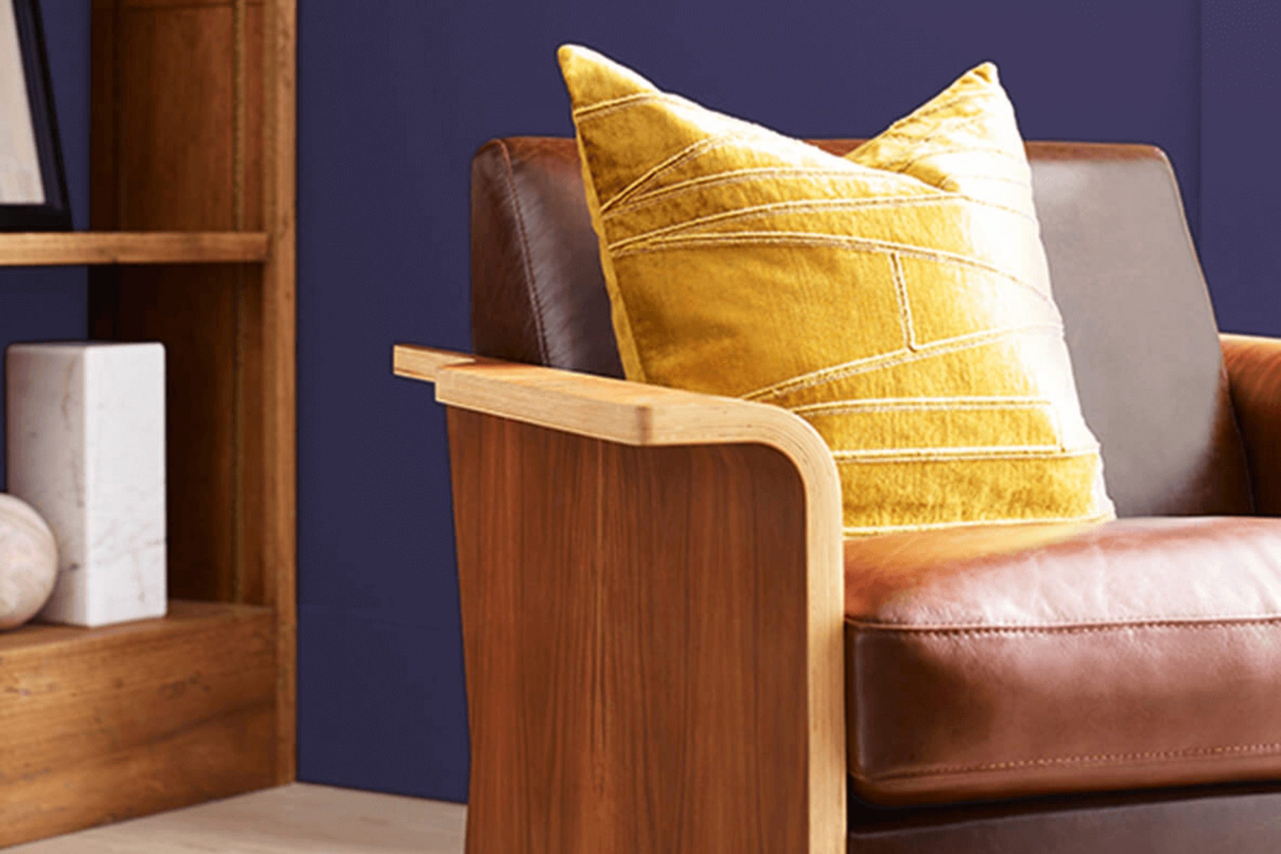
When used in homes, Dewberry can create a cozy corner in a living room or add depth to a bedroom. The hue is bold but not too intense, making it great for an accent wall or to add some color to smaller decorative elements like pillows or throws.
In rooms with lots of natural light, Dewberry can appear more vibrant, enhancing the overall feel of the room. In dimmer, more intimate rooms, it contributes to a more enclosed and snug atmosphere. This color pairs well with neutral tones such as whites, grays, and beiges, which helps to balance its intensity. Using Dewberry in your home can add a touch of personality and warmth, perfect for anyone looking to make their room feel welcoming and unique.
Undertones of Dewberry SW 6552 by Sherwin Williams
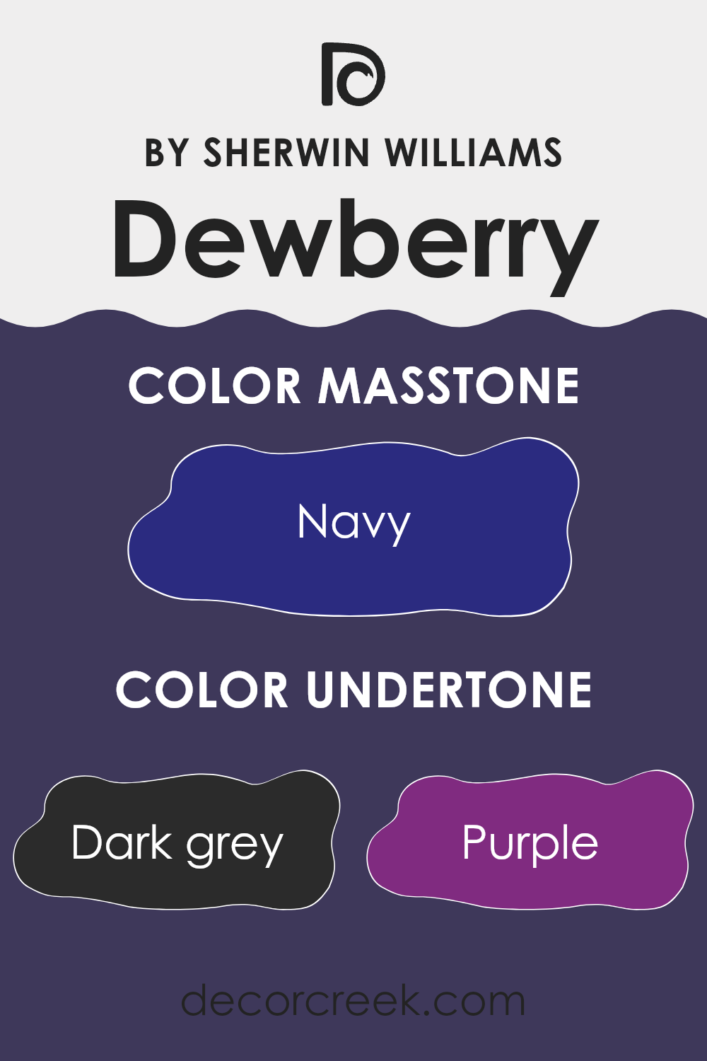
Dewberry is a unique paint color that has a mix of several undertones, making it adaptable and intriguing. The undertones include dark grey, purple, brown, dark turquoise, dark green, grey, olive, dark blue, violet, blue, and lilac. These undertones play a crucial role in how we perceive the color because they can shift in appearance under different lighting conditions.
In general, undertones influence how a color looks either warm or cool and can dramatically impact the mood and ambience of a room. For example, a color with warm undertones like brown or olive can make a room feel cozy and inviting, whereas colors with cool undertones such as dark blue or lilac can create a more calming and soothing atmosphere.
In the case of Dewberry on interior walls, these mixed undertones offer a dynamic and adaptable appearance. The subtle interplay of its undertones means that in bright light, the purples and blues might become more pronounced, giving the walls a lively feel. Conversely, in dimmer light, the darker undertones like dark grey and brown might be more noticeable, adding depth and warmth to the room.
Overall, Dewberry’s rich and varied undertones allow it to adjust beautifully to different rooms and styles, making it a great choice for anyone looking to add a touch of personality and depth to their interiors. Whether used in a bedroom, living room, or study, this color can enhance the visual experience of a room by responding uniquely to changes in lighting.
What is the Masstone of the Dewberry SW 6552 by Sherwin Williams?
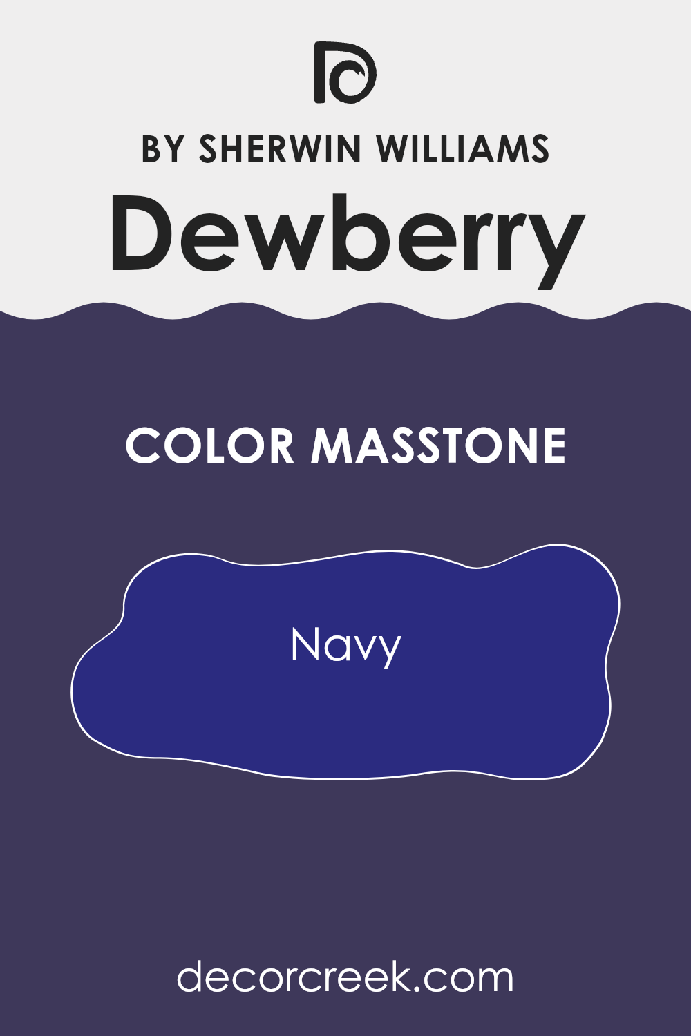
Dewberry SW 6552 by Sherwin Williams has a masstone of Navy, a deep blue shade that resembles a night sky. This rich, full-bodied color can have a significant impact on the atmosphere of a home. Its dark tone works well in rooms aiming for a calm, cozy feel, making it a great choice for bedrooms or private dens where relaxation is key.
In smaller rooms, using this dark blue can make the room feel more intimate and sheltered, ideal for creating a snug reading nook or a calming corner. However, in larger, well-lit areas, it can add a touch of drama without feeling too intense, especially when paired with lighter colors that balance its depth.
When used on accent walls, this navy shade can serve as a bold backdrop that makes artwork or furniture pop. It’s also adaptable to various decor styles, from modern minimalist to traditional. This flexibility makes it a reliable choice for those wanting to add a touch of depth and interest to their living environment without going too bold.
How Does Lighting Affect Dewberry SW 6552 by Sherwin Williams?
Lighting plays a crucial role in how we perceive colors. Colors can appear differently depending on whether they are under natural or artificial light. Natural light brings out the true hue of colors, while artificial light can alter this perception, depending on its intensity and color.
Consider a specific shade, Dewberry by Sherwin Williams. This color is a rich, deep purple. In natural light, Dewberry tends to look vibrant and can pick up subtle undertones like blues or reds depending on the time of day and weather conditions. Under artificial lighting, the color may appear darker or lighter depending on the type of bulb used. Warm lighting can make it look more reddish, while cool lighting might bring out more blue in the hue.
The orientation of a room also affects how Dewberry looks. In north-facing rooms, which get less direct sunlight and tend to have cooler light, this color can appear darker and deeper. This could make a room seem smaller or cozier. On the other hand, in south-facing rooms that receive abundant, warmer sunlight throughout the day, Dewberry can look lighter and more lively, making the room feel more open and welcoming.
In rooms facing east, where the morning light is warmer, Dewberry will start the day looking bright and warm, and become cooler as the day progresses. Conversely, in west-facing rooms, it will appear cooler in the morning light but gain warmth and depth with the intense, warm afternoon sunlight.
Given these dynamics, choosing where to paint this color can depend on what time of day the room is used most and what kind of mood or atmosphere you want to achieve. This understanding helps anyone deciding to use this color in their decorating plans.
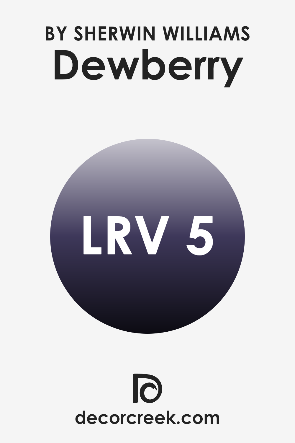
What is the LRV of Dewberry SW 6552 by Sherwin Williams?
LRV stands for Light Reflectance Value, which measures the percentage of light a paint color reflects back into a room. The scale for LRV runs from a low of 0%, which means no light is reflected, making the color very dark, to a high near 100%, where almost all light is reflected, making the color very light.
This value helps in guiding how a paint will look on your walls under different lighting conditions. A higher LRV means the color will appear lighter and can make a small room feel more open and airy. Conversely, a lower LRV can make a color look deeper and richer, but it might make a small room appear smaller and darker.
For the color Dewberry with an LRV of 4.575, expect it to absorb most of the light, contributing to a very dark hue on the walls. This means it can strongly affect the mood and ambiance of a room, making it feel cozy or a bit enclosed depending on the size of the room and the amount of natural light it receives. In rooms lacking in natural light, this paint might make the room feel even smaller and darker. Therefore, it would be ideal to use it in larger rooms or areas where you want to create a moody or intimate atmosphere, and pairing it with good artificial lighting could help balance the darkness of the color.
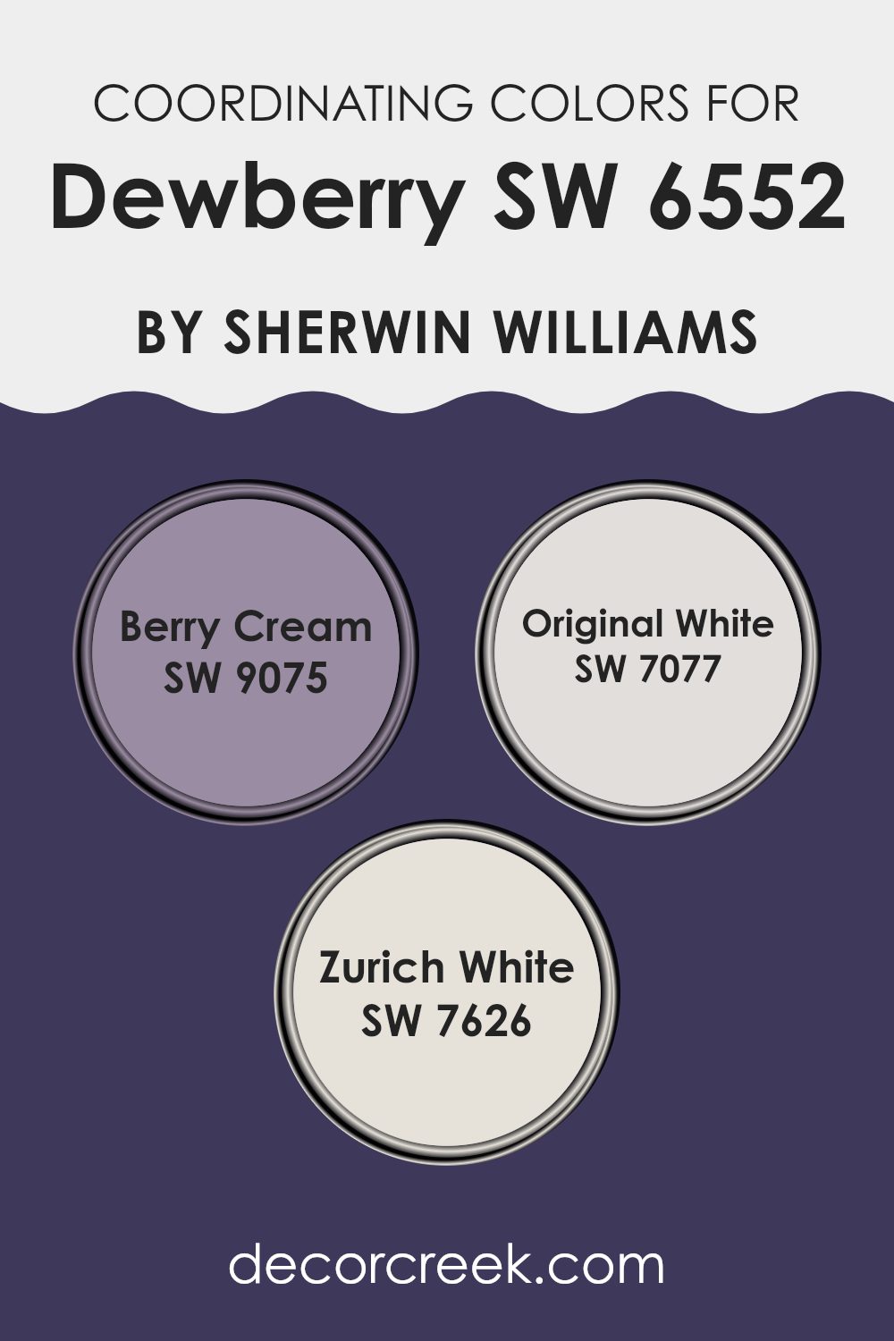
Coordinating Colors of Dewberry SW 6552 by Sherwin Williams
Coordinating colors are shades that complement and enhance the look of a primary color, ensuring a harmonious color scheme in your decor. When paired correctly, coordinating colors add depth and bring out the beauty of the main hue without overpowering it. In the case of Dewberry by Sherwin Williams, a variety of coordinating colors can be used to create a balanced and appealing visual experience.
Berry Cream is a soft and subtle shade that provides a gentle contrast to the vibrant tones of Dewberry, adding a touch of lightness to the overall look. It is ideal for creating a soothing atmosphere in rooms that benefit from a brighter, yet understated background. Original White, another coordinating color, offers a clean and crisp backdrop that allows the rich depth of Dewberry to stand out beautifully.
This classic white can help to refresh a room and bring out the color’s depth without competition. Lastly, Zurich White, which has a slightly warmer undertone, pairs nicely with Dewberry. It acts as a neutral yet inviting canvas, setting a warm and welcoming tone that complements the cooler undertones of Dewberry, making it an excellent choice for creating a cohesive look.
You can see recommended paint colors below:
What are the Trim colors of Dewberry SW 6552 by Sherwin Williams?
Trim colors are specific hues selected to highlight or complement the main wall color in a room, serving to emphasize architectural details such as door frames, window casings, and baseboards. Using the right trim colors can significantly impact the overall look of a room by creating a defined and finished appearance.
For the vibrant Dewberry by Sherwin Williams, softer trim colors like SW 8917 – Shell White and SW 7035 – Aesthetic White are excellent choices. These colors provide a subtle contrast that allows the rich tones of Dewberry to stand out, ensuring that the room feels cohesive and neatly put together without feeling too intense.
SW 8917 – Shell White is a gentle and creamy white that offers a fresh and clean appearance. Its warm undertones make it a universal pairing for deeper colors such as Dewberry, enhancing the room’s coziness while maintaining a light and airy feel. On the other hand, SW 7035 – Aesthetic White is a soft white with a slight grayish tint, providing a slightly more noticeable contrast against deeper shades. This color is perfect for those looking to add a hint of modern style to their room while keeping the look harmonious and balanced. Together, these trim colors work well with Dewberry to create environments that are both welcoming and stylish.
You can see recommended paint colors below:

Colors Similar to Dewberry SW 6552 by Sherwin Williams
Similar colors play a crucial role in interior design and aesthetics, especially when creating a harmonious color palette for any room. Placing similar shades together can create a smooth, cohesive look that enhances the overall feel of a room without causing a stark contrast. Using shades like Quixotic Plum, which adds a deep and subtle elegance, or Fully Purple, known for its vibrant, yet rich depth, allows decorators to achieve a balance of color intensity and visual comfort.
Kimono Violet offers a lighter, softer touch of purple, bringing a gentle flair to the palette, while Impulsive Purple gives that punch of color needed to make certain areas of a room stand out with a brighter, livelier purple. Similarly, Izmir Purple has a calming yet enchanting quality that helps in creating a soothing atmosphere.
Colors such as Mountain Fig and Concord Grape provide a deeper, almost romantic vibe with their lush, dark tones, which pair beautifully with lighter hues. Majestic Purple lives up to its name by imparting an air of regal beauty, and Dignified shows a classic, enduring appeal. Lastly, Valiant Violet has a vibrant presence that can add a sense of daring and personality to any room. Together, these shades create a diverse yet unified color story that can enhance the aesthetic value of any design scheme.
You can see recommended paint colors below:
- SW 6265 Quixotic Plum
- SW 6983 Fully Purple
- SW 6839 Kimono Violet
- SW 6832 Impulsive Purple
- SW 6825 Izmir Purple
- SW 9690 Mountain Fig
- SW 6559 Concord Grape
- SW 6545 Majestic Purple
- SW 6538 Dignified
- SW 6818 Valiant Violet
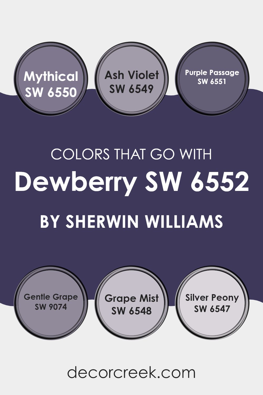
Colors that Go With Dewberry SW 6552 by Sherwin Williams
When you’re decorating a room, the colors you choose can have a huge impact on the atmosphere and mood of the room. Colors that complement Dewberry SW 6552 by Sherwin Williams play a significant role in achieving a balanced and appealing look. Dewberry SW 6552 offers a deep, vibrant hue that serves as a stunning foundation in any room. Pairing it with the right colors, such as SW 6550 Mythical, SW 6549 Ash Violet, or SW 6551 Purple Passage, can bring out its richness while creating a harmonious look.
Starting with SW 6550 – Mythical, this color is a slightly softer purple that mellows the intensity of Dewberry, providing a subtle transition in color that’s pleasing to the eye. SW 6549 – Ash Violet is a lighter, grayish-purple that brings a breezy and light contrast, perfect for creating a sense of openness. SW 6551 – Purple Passage, a deeper purple, works well with Dewberry, enhancing its depth without overpowering the room.
SW 9074 – Gentle Grape adds a muted tone, offering a delicate touch that complements the stronger hues in the palette. SW 6548 – Grape Mist brings in a touch of freshness and a whisper of color to brighten areas without creating a clash. Lastly, SW 6547 – Silver Peony introduces a hint of silvery pink, providing a soft, almost neutral alternative that still connects with the subtle complexities of purple. Together, these colors work cohesively to create a varied yet unified room that’s appealing and comfortable.
You can see recommended paint colors below:
- SW 6550 Mythical
- SW 6549 Ash Violet
- SW 6551 Purple Passage
- SW 9074 Gentle Grape
- SW 6548 Grape Mist
- SW 6547 Silver Peony
How to Use Dewberry SW 6552 by Sherwin Williams In Your Home?
Dewberry SW 6552, a unique paint color from Sherwin Williams, is a vivid shade of purple with a blend of blue undertones. This bright and cheerful color can add personality and flair to any room in your home.
Using Dewberry in a small room like a bathroom or an accent wall can create a bold statement without feeling too intense. It pairs well with light neutrals such as whites and grays, which can help to balance the intensity of the purple.
For those looking to add a bit of fun to their kitchen, consider painting the pantry door or kitchen island in Dewberry. This can introduce a pop of color that brings life to everyday rooms. Additionally, it works well in bedrooms when used behind a bed as a dramatic focal point, complemented by bedding in lighter shades to keep the room feeling airy. With the right accessories and lighting, Dewberry can make your home look stylish and lively.
Dewberry SW 6552 by Sherwin Williams vs Dignified SW 6538 by Sherwin Williams
Dewberry is a vivid, deep purple with a lively vibe, while Dignified is a robust purple with a subtle hint of gray, giving it a more restrained and muted appearance. Dewberry tends to stand out more, making it a great choice for areas or items that you want to highlight.
It’s bright and can really catch the eye, adding a pop of color to any room. Dignified, on the other hand, works well in environments where a more toned-down, yet still rich, color is desired.
It carries a sense of calm without being too loud, making it suitable for larger areas or rooms where a relaxing but stylish atmosphere is important. Both colors bring warmth and depth, but Dewberry offers a punchier hue compared to the more subdued tone of Dignified.
You can see recommended paint color below:
- SW 6538 Dignified

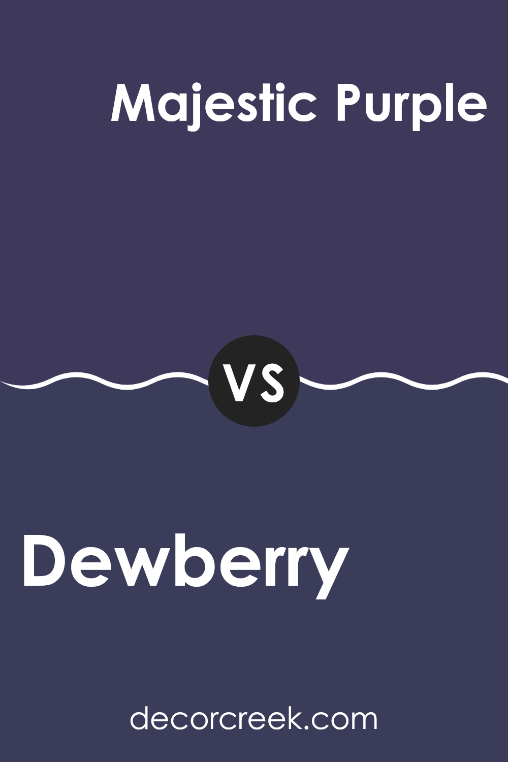
Dewberry SW 6552 by Sherwin Williams vs Majestic Purple SW 6545 by Sherwin Williams
Dewberry and Majestic Purple, both from Sherwin Williams, present unique shades of purple, each carrying its own charm and character. Dewberry leans towards a softer, more muted purple with subtle blue undertones, giving it a calm, soothing vibe.
It works well in rooms intended for relaxation or contemplation. On the other hand, Majestic Purple is darker and richer, filled with a royal feel that makes it stand out. This color is excellent for adding drama and depth to a room, making it perfect for accent walls or decorative highlights.
While Dewberry is gentle and understated, Majestic Purple is bold and dynamic, offering a striking contrast that could complement a variety of decorating styles. Both colors provide flexibility, though their distinct tones suit different preferences and uses in home décor.
You can see recommended paint color below:
- SW 6545 Majestic Purple
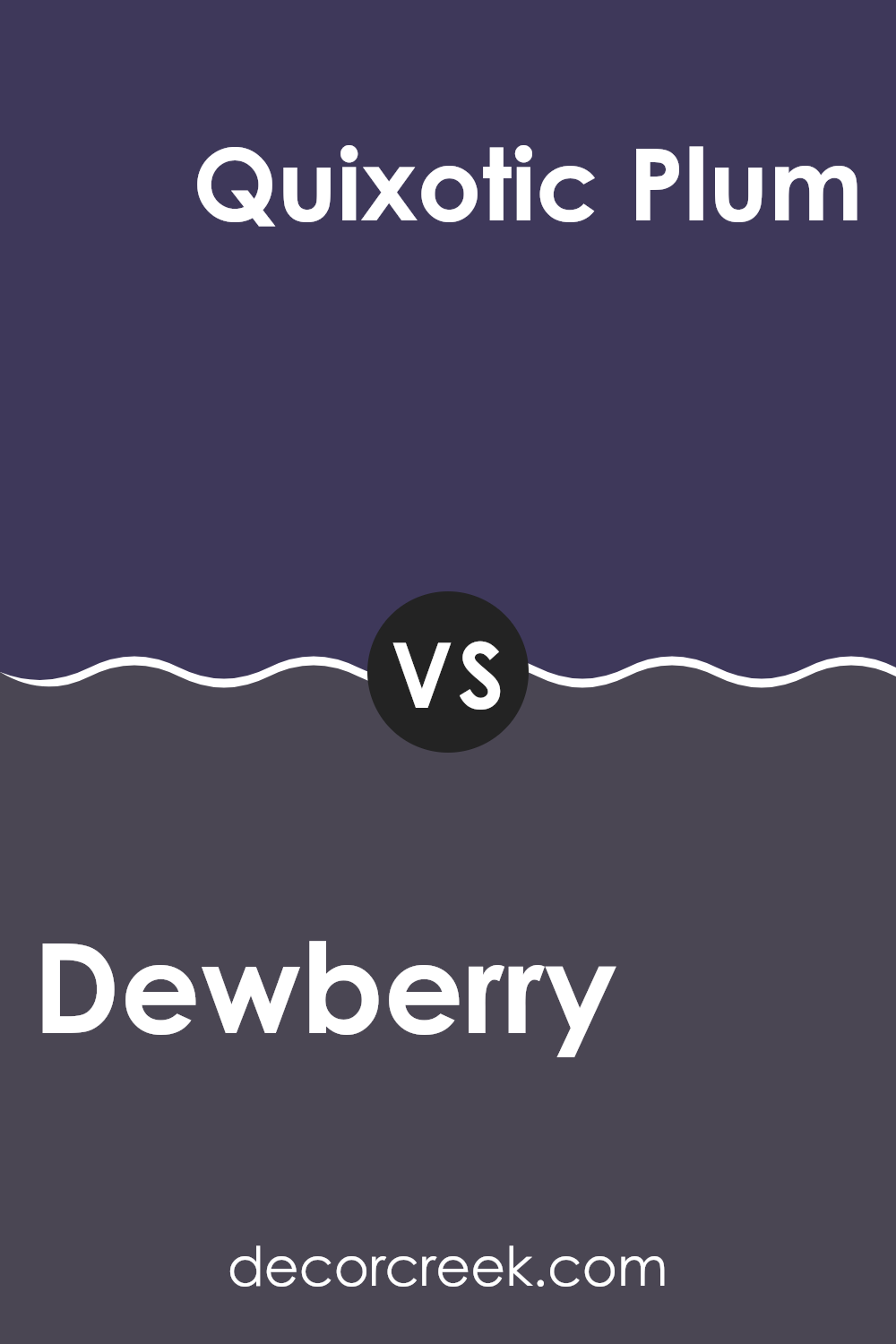
Dewberry SW 6552 by Sherwin Williams vs Quixotic Plum SW 6265 by Sherwin Williams
Dewberry and Quixotic Plum are two distinctive paint colors by Sherwin Williams. Dewberry has a lively, vibrant blue tone with hints of purple, making it stand out in a room. This color is quite energetic and can bring a cheerful feel to a room. It can work well in a kid’s room or a creative room where you want some brightness.
On the other hand, Quixotic Plum has a deeper, more intense purple shade. It’s a bold color that likely makes a strong statement when used on walls. This hue can give a room a cozy feel, making it ideal for places where you want a more intimate atmosphere like a bedroom or a dining area.
Both colors, while different, offer unique possibilities for decorating. Whether you prefer the brighter blues of Dewberry or the deeper purples of Quixotic Plum, each can create a distinct mood and style in your living room.
You can see recommended paint color below:
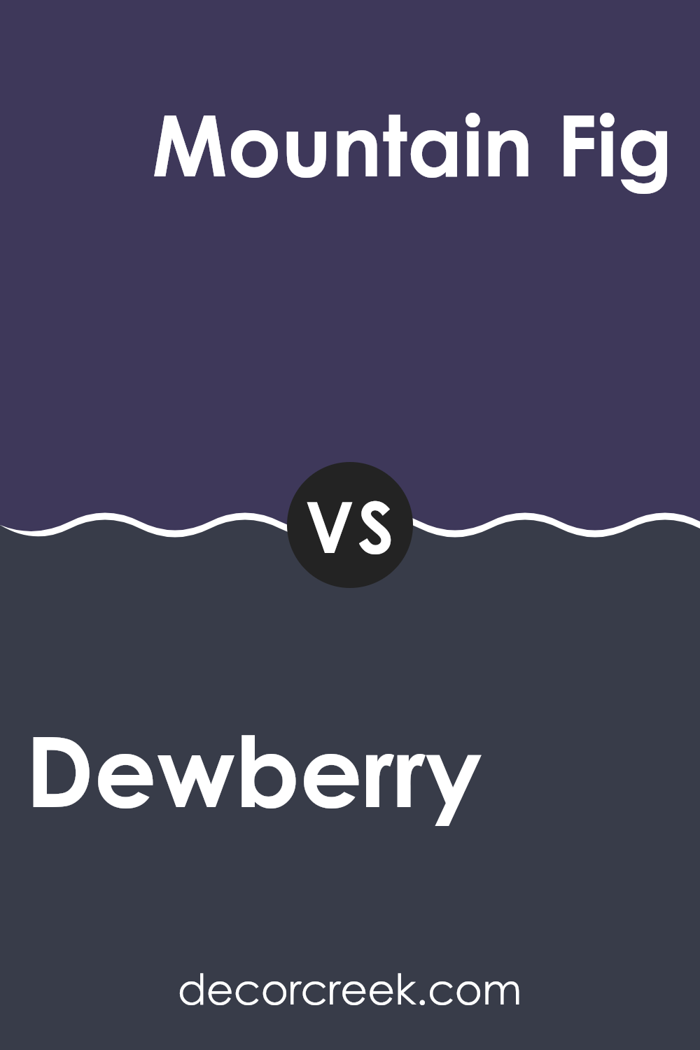
Dewberry SW 6552 by Sherwin Williams vs Mountain Fig SW 9690 by Sherwin Williams
Dewberry by Sherwin Williams is a rich, deep purple with a muted tone that creates a cozy and classic look. It’s a adaptable color that fits well in a bedroom or a study, offering warmth and a hint of elegance without being too intense.
On the other hand, Mountain Fig by Sherwin Williams has a greener, more earthy hue. It’s a darker shade that leans toward a deep olive, perfect for rooms where a natural, grounding color is desired, like living rooms or offices. While Dewberry brings a cooler, floral-inspired vibe, Mountain Fig has a more organic, woodsy feel.
Both colors lend themselves well to various decor styles, but their unique undertones and depth create distinctly different moods in a room. Dewberry might pair well with lighter, softer colors, whereas Mountain Fig works well with warm woods and rich neutrals.
You can see recommended paint color below:
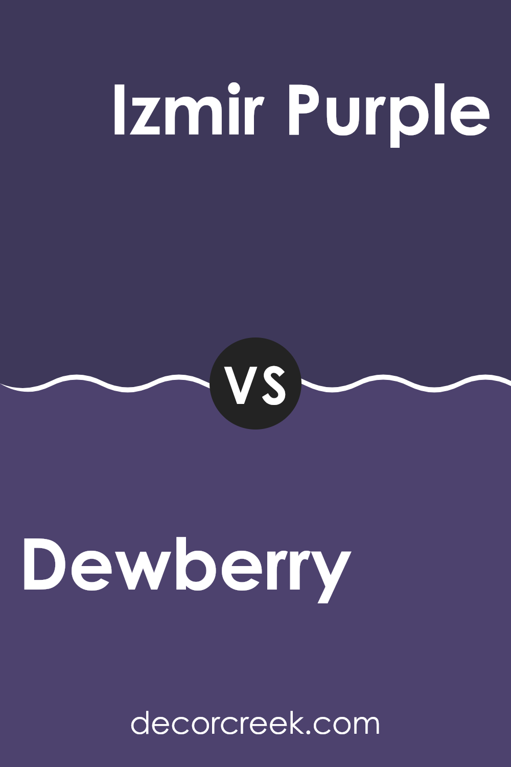
Dewberry SW 6552 by Sherwin Williams vs Izmir Purple SW 6825 by Sherwin Williams
Dewberry and Izmir Purple by Sherwin Williams are both shades of purple, but they have distinct characteristics. Dewberry is a softer, more subdued purple. It gives off a gentle and cozy vibe, making it a great choice for bedrooms or places where you want a calming effect.
On the other hand, Izmir Purple is a lot bolder and more vibrant. It stands out and carries an energetic feel, ideal for rooms where you want to make a statement, like an accent wall in a living room.
Both colors are adaptable and can be paired with various decor styles, but Dewberry works better for a subtle and warm look, whereas Izmir Purple fits in with more dynamic and lively designs.
You can see recommended paint color below:
- SW 6825 Izmir Purple
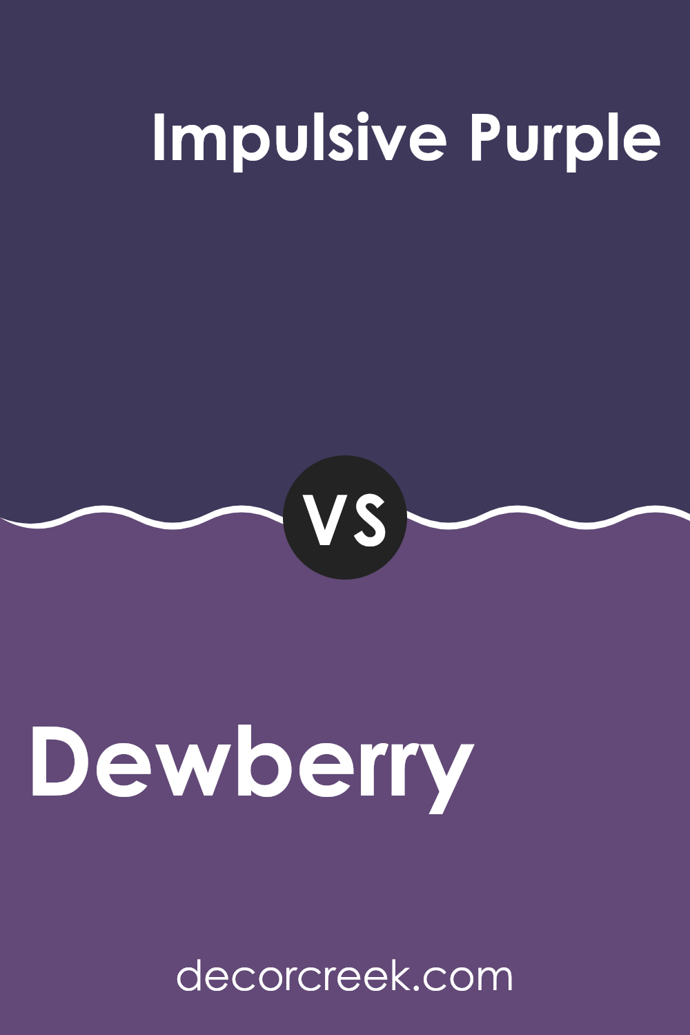
Dewberry SW 6552 by Sherwin Williams vs Impulsive Purple SW 6832 by Sherwin Williams
The colors Dewberry and Impulsive Purple by Sherwin Williams offer two distinct shades of purple that can create different moods in a room. Dewberry presents a muted, soft purple with gray undertones, making it a subtle choice that pairs well with a variety of decor styles. This adaptability makes it suitable for living areas, bedrooms, or any room where a calm, gentle atmosphere is desired.
On the other hand, Impulsive Purple is a more vibrant and deeper shade of purple. It has a bold, energetic feel, perfect for making a statement in a room. This color works well in areas where creativity or activity is encouraged, such as a home office or workout room. Its intensity can add a pop of color in rooms that need some liveliness.
Overall, while both colors belong to the purple family, Dewberry’s softer hue offers a more laid-back vibe, whereas Impulsive Purple is ideal for adding a dynamic, spirited touch to a room.
You can see recommended paint color below:
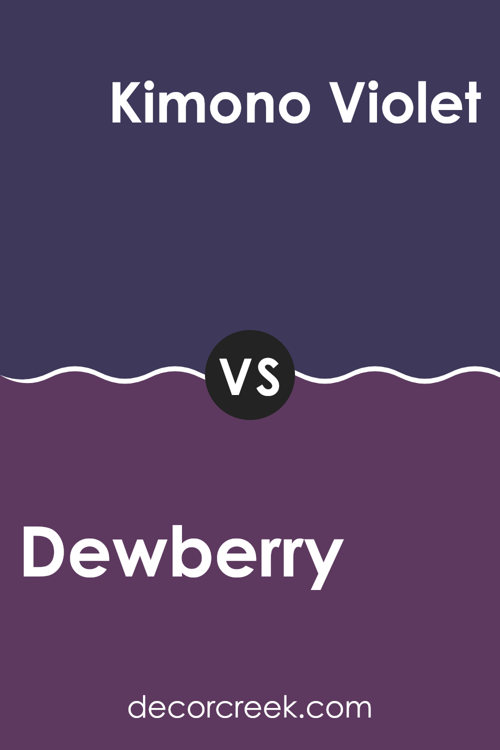
Dewberry SW 6552 by Sherwin Williams vs Kimono Violet SW 6839 by Sherwin Williams
Dewberry and Kimono Violet, both by Sherwin Williams, have distinct hues that can significantly affect the atmosphere of a room. Dewberry offers a muted, dusky purple that gives a soft and subtle ambiance, ideal for creating a calming environment in rooms like bedrooms or quiet study areas. It is less intense and leans towards a gentle, understated vibe.
On the other hand, Kimono Violet is a much deeper and richer purple. This color is bold and makes a statement, ideal for areas where you want to add personality and a touch of drama, such as a feature wall in a living room or dining area. Its deep tones can also make large rooms feel more cozy and inviting.
Both colors share a purple base, but their impact and usage can vary greatly depending on the room and the accompanying decor. While Dewberry works well in soft, relaxed settings, Kimono Violet is perfect for more vibrant, energetic rooms. Choose between them based on the mood you want to achieve in your room.
You can see recommended paint color below:
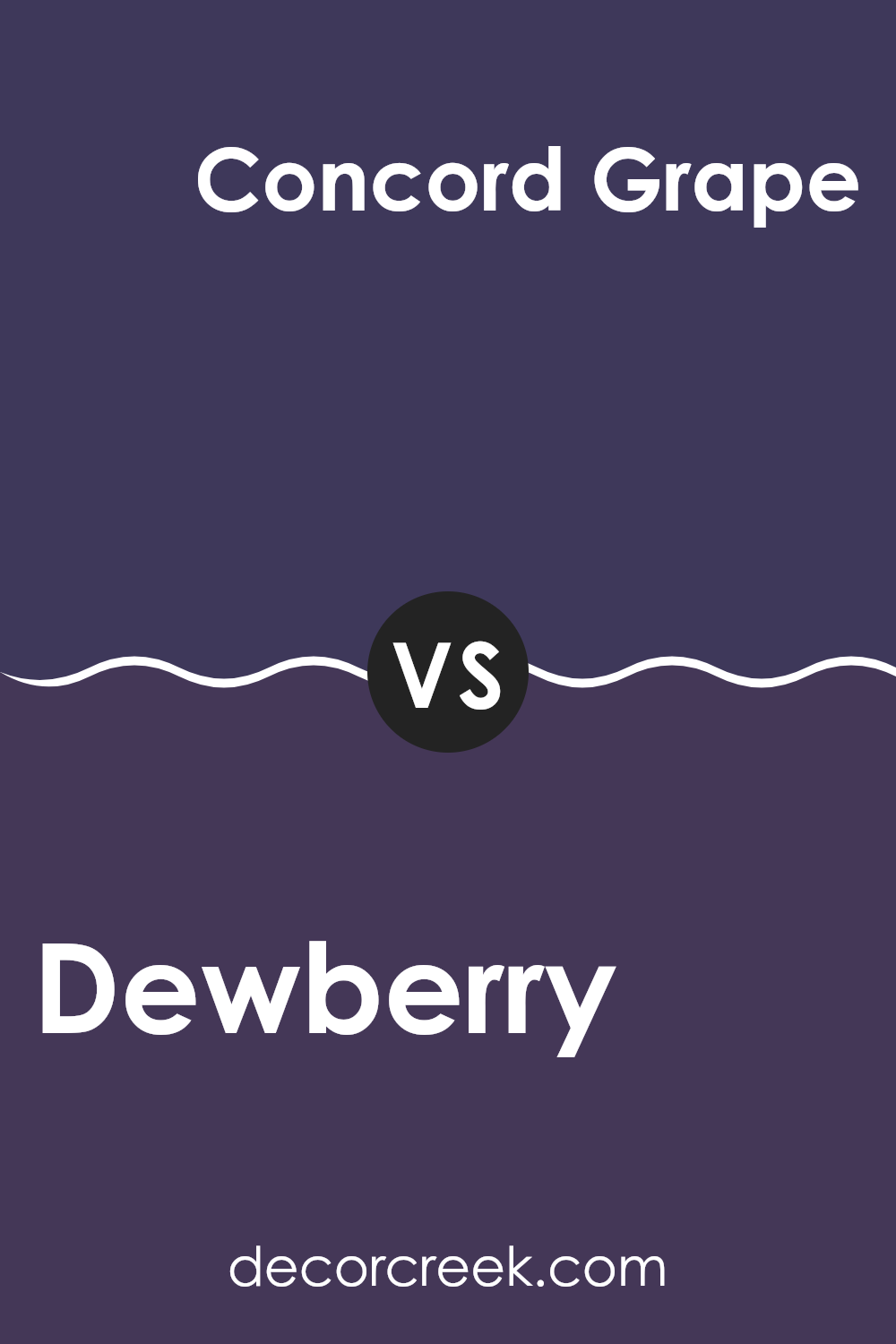
Dewberry SW 6552 by Sherwin Williams vs Concord Grape SW 6559 by Sherwin Williams
Dewberry and Concord Grape, both by Sherwin Williams, are similar yet distinct shades of purple. Dewberry has a lighter, more muted tone that leans towards a soft lavender. It’s a subtle hue, perfect for creating a calm and gentle ambiance in rooms like bedrooms or bathrooms.
On the other hand, Concord Grape is darker and richer, resembling the deep purple of grape skins. This color provides a bolder statement and suits areas where you want to add depth or a focal point, such as an accent wall in a living room.
While Dewberry offers a lighter, airier feel, Concord Grape brings an intense and eye-catching pop of color, making each ideal for different decorative purposes or moods within a home.
You can see recommended paint color below:
- SW 6559 Concord Grape
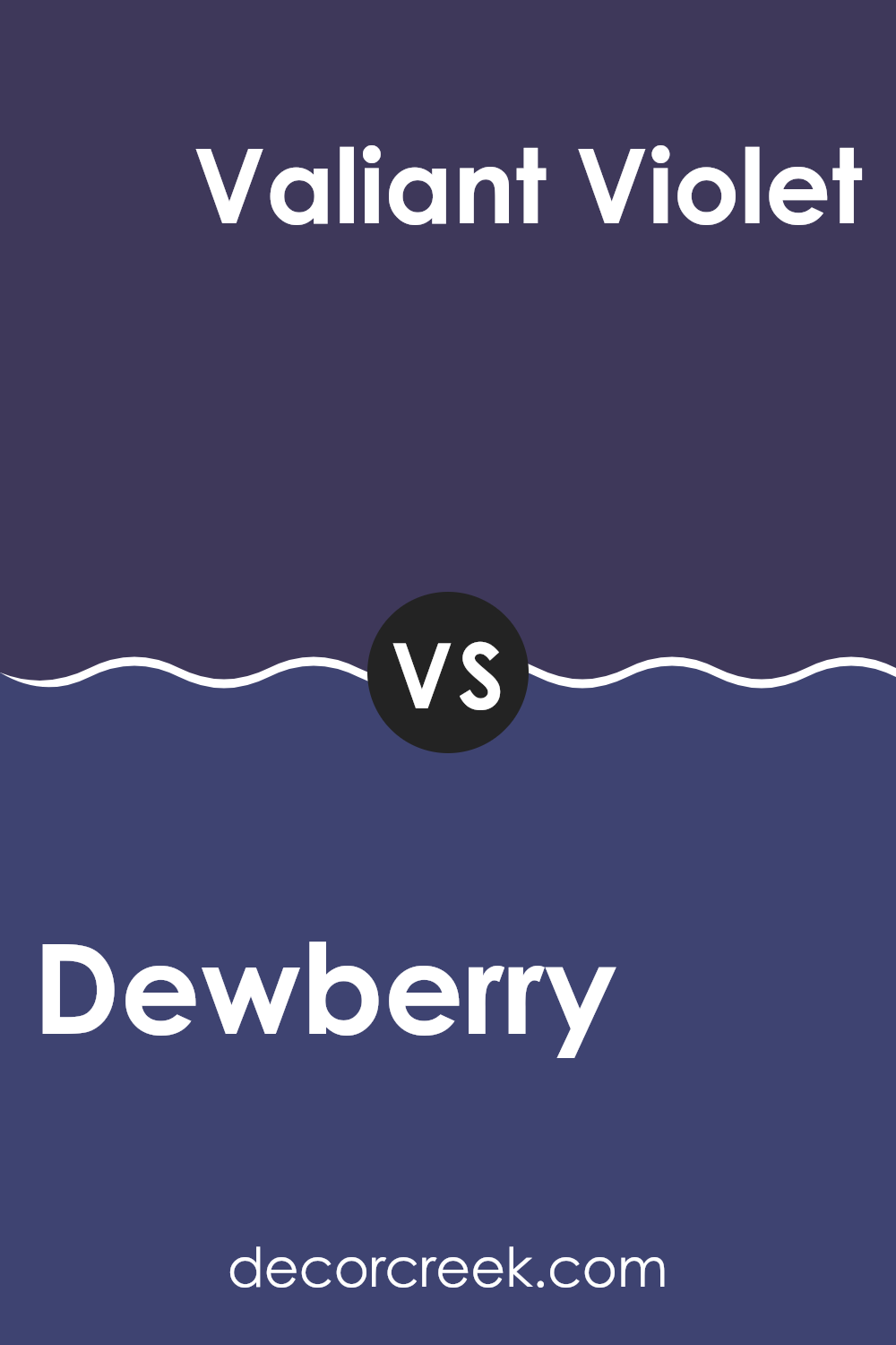
Dewberry SW 6552 by Sherwin Williams vs Valiant Violet SW 6818 by Sherwin Williams
Dewberry and Valiant Violet are both vibrant colors produced by Sherwin Williams, each offering a unique ambiance. Dewberry has a muted, soft blue-purple tone, which gives a gentle and calming feel. It’s subtle enough to be adaptable for various rooms without feeling too intense.
In contrast, Valiant Violet is a bolder and brighter shade of purple. It makes a strong statement and is more vivid, likely to catch the eye and add a sense of energy to any room. This color could be great for accent walls or décor pieces that you want to stand out.
Both colors have their charm and can work wonderfully depending on the mood you wish to create. Dewberry might be better suited for a peaceful area like a bedroom, while Valiant Violet could bring a lively burst of color to a more dynamic room like a living room or playroom.
You can see recommended paint color below:
- SW 6818 Valiant Violet
Dewberry SW 6552 by Sherwin Williams vs Fully Purple SW 6983 by Sherwin Williams
Dewberry and Fully Purple, both by Sherwin Williams, present two distinct shades of purple, each with its unique appeal. Dewberry is a deeper, muted purple with a subtle blue undertone, giving it a calm and gentle vibe. It’s an ideal choice if you’re looking for something that’s vivid yet not too bold, perfect for creating a cozy atmosphere in rooms like living rooms or bedrooms.
On the other hand, Fully Purple is a brighter, more vibrant shade. It has more intensity and leans towards a true purple that stands out more vividly against other colors. This makes it great for areas where you want to make a statement, like an accent wall or in a creative room to energize the room’s ambiance.
Both colors offer their distinct personalities, with Dewberry being more reserved and Fully Purple more outgoing, allowing you to choose based on the mood and purpose of your room. Whether you go for the understated elegance of Dewberry or the lively punch of Fully Purple, each color has the power to beautifully define a room.
You can see recommended paint color below:
After looking at SW 6552 Dewberry by Sherwin Williams, I’m really impressed with this paint color. Dewberry isn’t just any purple; it’s like a rich, berry color that can make a room feel warm and inviting. Whether you’re thinking about adding a splash of color to your bedroom or want to spruce up your living room, Dewberry could be a great choice.
This color is very friendly and not too bold, which means it won’t take over the room. Instead, it adds just the right amount of color to make the room interesting. It’s also a good match for lots of different styles and furniture, so you don’t have to worry about it clashing with what you already have.
In rooms with lots of light, Dewberry looks bright and cheerful, but in dimmer rooms, it can bring a cozy and quiet feel. It’s like having a adaptable friend who fits in well everywhere. If you like colors that feel warm and cozy, or if you just want to try something different from the usual pinks and blues, Dewberry might be just what you need.
All in all, SW 6552 Dewberry is more than just paint for walls; it’s a way to make your home feel more welcoming and cheerful. I’d definitely recommend it if you’re looking to add some personality to your rooms without going too bold. It’s a lovely color that fits in just right.

Ever wished paint sampling was as easy as sticking a sticker? Guess what? Now it is! Discover Samplize's unique Peel & Stick samples.
Get paint samples

