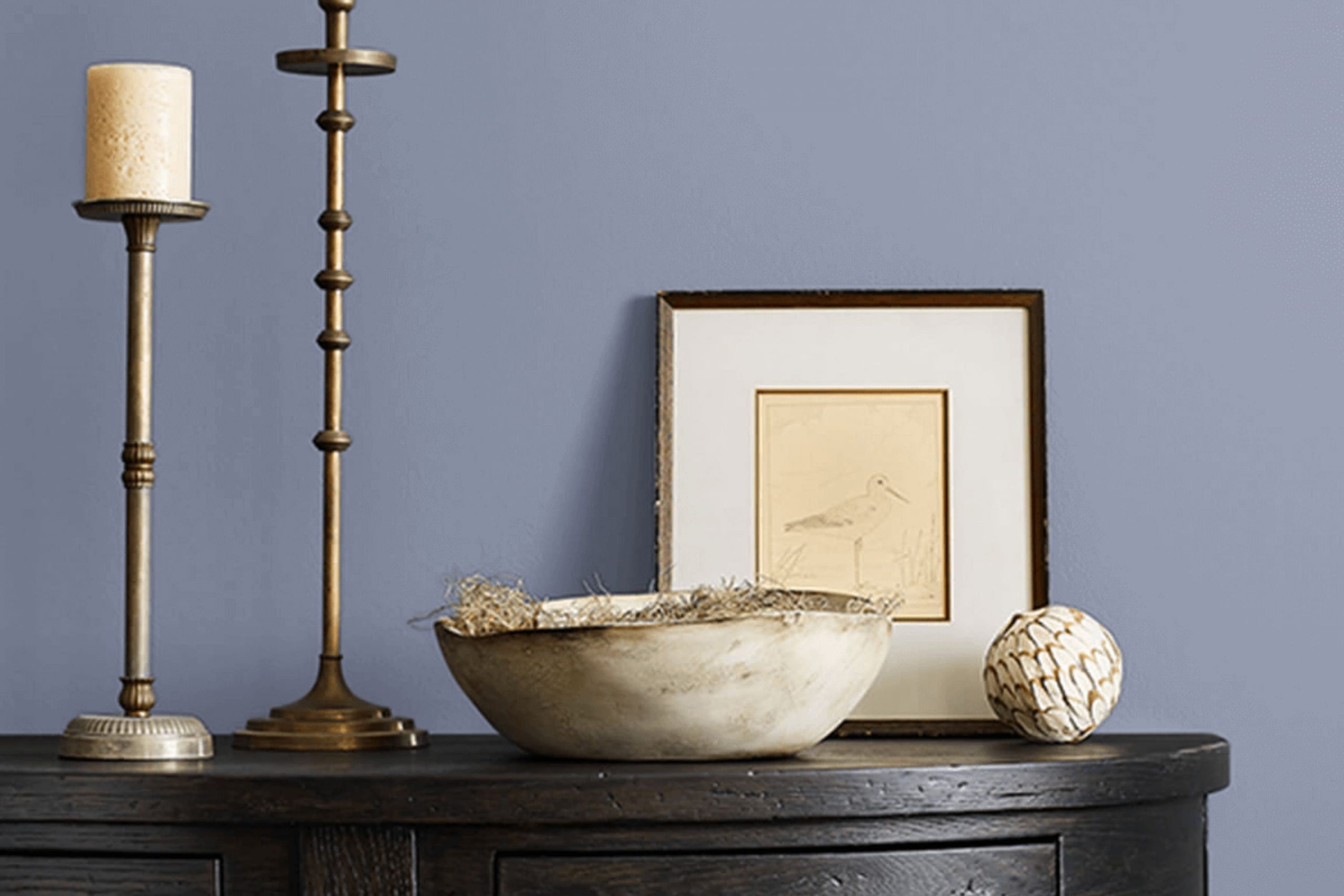
Are you intrigued by the soothing tones of SW 9073 Dusty Heather by Sherwin Williams? This shade, elegant yet understated, has become a favorite for those looking to add a touch of calmness to their living rooms. As a soft and flexible color, Dusty Heather offers a muted purple hue with grey undertones that works wonderfully in both traditional and contemporary settings.
In choosing paint colors, you might be aiming for a backdrop that will highlight your decor without overshadowing it. Dusty Heather excels in this role, providing just enough color to make a room feel inviting without overpowering it. Its subdued elegance makes it particularly effective for areas where you want to promote a calm and relaxing atmosphere, like bedrooms or home offices.
Moreover, since the color pairs beautifully with a range of other hues—from crisp whites to deep charcoals—it can effortlessly adapt to your existing decor or serve as an inspirational base for a new decorating scheme.
You’ll find that it’s not just the color itself but the way it interacts with light and area that can refresh a room into a more harmonious sanctuary.
What Color Is Dusty Heather SW 9073 by Sherwin Williams?
Dusty Heather by Sherwin Williams is a subtle and soft color that gently enhances any room with its soothing presence. This color resides in the grey-violet spectrum, reflecting a muted beauty that is flexible and calming. Dusty Heather is especially ideal for those looking to create a cozy, relaxed ambiance in their home.
This shade works beautifully in minimalist and Scandinavian-style interiors, where its understated elegance can truly shine. It also complements modern and traditional decor seamlessly, providing a backdrop that lets statement furniture or art pieces stand out. For a more layered, warm look, Rustic or Shabby Chic styles can also benefit from this color, as it aligns well with natural elements and textured materials.
In terms of material pairings, Dusty Heather pairs wonderfully with soft, plush fabrics like velvet or wool, enhancing the comfort factor of the room. It also looks elegant when matched with natural wood, which provides a warm contrast to its cooler tones. For a bit of shimmer, incorporating elements like brushed nickel or silver can add a subtle brightness to the overall decor.
Whether applied on walls, as an accent, or through decor items, this color offers a fresh yet classic appeal, making any room feel more welcoming and put-together.

Is Dusty Heather SW 9073 by Sherwin Williams Warm or Cool color?
Dusty Heather SW 9073 by Sherwin Williams is a warm, soft purple with gray undertones that gives it a somewhat muted, cozy feel. This particular shade is very flexible and works well in many areas of a home.
In living rooms or bedrooms, it adds a gentle, relaxing vibe without being too bold or overpowering. The subtle gray in the color helps to keep it neutral, making it easy to match with a variety of decor styles and colors. In bathrooms, it can bring a touch of warmth, making the room feel welcoming and comfortable.
Using Dusty Heather in smaller rooms like an entryway or hallway can make these areas appear more open and airy, as the light color can help to reflect light. It is also a great choice for a home office, providing a calm backdrop that’s not too distracting. Overall, this color is great for creating a cozy, inviting atmosphere in the home.
Undertones of Dusty Heather SW 9073 by Sherwin Williams
Dusty Heather is a flexible paint color that contains a symphony of subtle undertones. The way a color appears can often shift depending on its undertones, which are the underlying hues that, while often not immediately noticeable, greatly influence the overall perceived shade. For instance, a paint like Dusty Heather, with a diverse mix of undertones ranging from lilac to light gray, can appear differently based on lighting and surrounding colors.
The undertones in Dusty Heather are particularly noteworthy because they blend cooler elements like light blue, lilac, and light purple with warmer tones like pale pink and pale yellow. This mixture allows the color to adapt subtly to various decors and themes, maintaining its charm whether it’s used in a sunny kitchen or a dimly lit study.
When applied to interior walls, Dusty Heather brings out its lilac and light blue undertones, promoting a calm yet fresh atmosphere. In natural light, the mint and pale yellow undertones might become more noticeable, lending a gentle warmth to the room. Conversely, in artificial lighting, the cooler undertones, like light purple and light blue, might stand out, giving the room a cooler feel. Using Dusty Heather on walls is especially effective because it acts almost like a chameleon, adapting to the room’s furnishings and light conditions.
This adaptability makes it a popular choice for those seeking a color that offers both warmth and freshness without overpowering the room with too strong a hue. Dusty Heather’s blend of undertones supports a variety of looks, from relaxed and cozy to clean and fresh, proving it to be a smart and stylish choice for any interior room.
What is the Masstone of the Dusty Heather SW 9073 by Sherwin Williams?
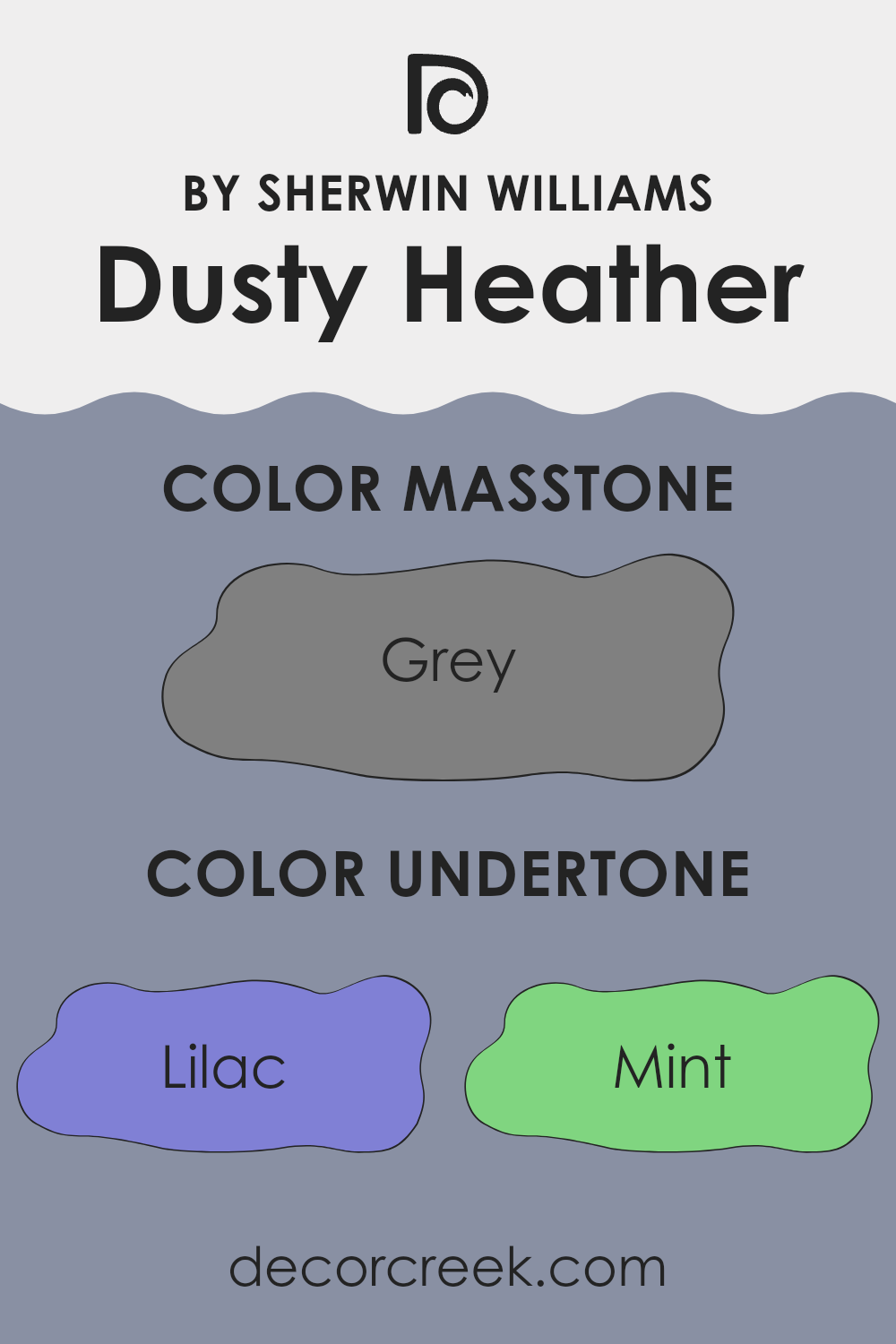
Dusty Heather SW 9073 by Sherwin Williams has a masstone resembling the shade of Grey (#808080). This neutral grey tone creates a calm and balanced atmosphere in any room. Since it’s a mid-tone grey, it effectively hides marks and smudges, making it an ideal choice for busy areas such as living rooms and hallways.
This color works well in homes because it is flexible. It easily pairs with a wide range of other colors, from bright accents to softer pastels, allowing for flexibility in decorating styles. Being a neutral shade, it also helps in making small rooms appear larger and more open, as it reflects light better than darker colors.
This characteristic makes it suitable for apartments and smaller living rooms. Additionally, grey tones can act as a backdrop, letting furniture and artwork stand out, making them excellent choices for those wanting a subtle yet effective look in their homes.
How Does Lighting Affect Dusty Heather SW 9073 by Sherwin Williams?
Lighting plays a crucial role in how we perceive colors. In general, colors can look dramatically different under various lighting conditions due to changes in light intensity and the color temperature of the light source.
Dusty Heather is a soothing, muted shade that acts like a chameleon depending on the lighting environment. Under artificial light, such as LED or fluorescent lights, this color may appear slightly more intense and warmer, revealing a cozier feel. This is due to the typically warmer color temperatures of interior lighting which can bring out the subtle red or pink undertones in the paint.
In natural light, however, the true essence of Dusty Heather comes alive. As natural daylight is generally cooler, this color will exhibit its true, soft grayish-lavender quality. Natural light tends to show the color in its most authentic shade, without the yellow or warm bias often cast by indoor lights.
When considering the orientation of rooms:
– North-facing rooms receive less direct sunlight, likely making Dusty Heather appear more muted and cooler, emphasizing its gray components. This can give a calm and gentle feel to the room.
– South-facing rooms are bathed in plentiful sunlight that can make this color warm up significantly, enhancing its lavender undertones, and making the room feel more inviting.
– In east-facing rooms, the morning light can make Dusty Heather look softer and more delicate. As the day progresses, the color might lose some of its vibrancy due to the decreasing intensity of light.
– West-facing rooms might present the most dramatic shift; with evening light tending to be warmer, the paint can look richer and slightly more purple.
Each shift in appearance under different lighting conditions and room orientations lets Dusty Heather offer a variety of ambiences, making it a flexible choice for many rooms.

What is the LRV of Dusty Heather SW 9073 by Sherwin Williams?
LRV stands for Light Reflectance Value, which is a measurement used to indicate how much light a paint color reflects or absorbs once it’s applied to a wall. A higher LRV means that the color reflects more light, making the room feel brighter, while a lower LRV means it absorbs more light, which can make a room look cozier but darker.
This value is crucial when choosing paint because it helps you understand if a color will make your room feel lighter and airier or more enclosed. Regarding the color with an LRV of 27.792, such as the mentioned shade, this is a relatively low value. This means that it does not reflect a lot of light, absorbing more instead.
In a practical sense, this would make the color appear quite deep and intense, which could be ideal for creating a moody or cozy atmosphere in a room. When applying a color like this to your walls, it’s important to have sufficient lighting, either natural or artificial, to ensure the room doesn’t feel too dark or cramped. This shade would be more suitable for larger rooms or areas where you want to establish a more intimate and warm feel.

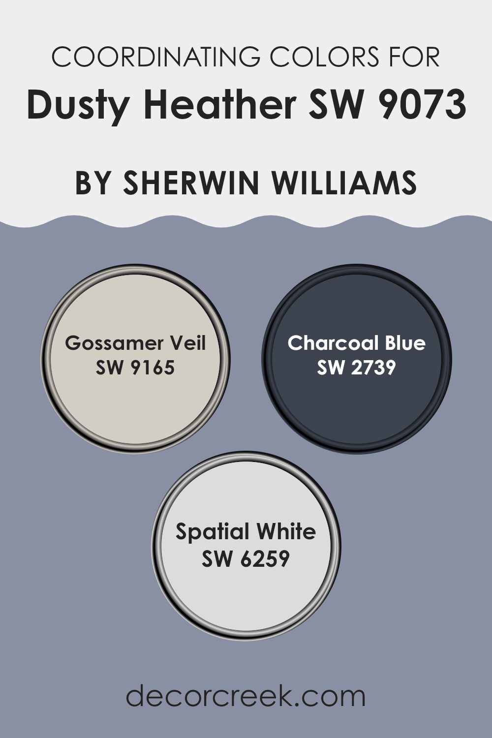
Coordinating Colors of Dusty Heather SW 9073 by Sherwin Williams
Coordinating colors are shades that complement a main color, enhancing the overall aesthetic of a room. By selecting colors that harmonize well with Dusty Heather, such as Gossamer Veil, Charcoal Blue, and Spatial White, you can create a cohesive and visually appealing palette.
These coordinating colors work by balancing out the hues and intensities, ensuring that none of the colors overpower each other, yet each brings its own unique contribution to the overall look. Coordinating colors are particularly useful in interior design, helping to connect different elements of a room or an exterior with seamless visual flow.
Gossamer Veil is a subtle gray that works well to complement brighter or darker colors by providing a soft backdrop that allows other colors to stand out. It’s a flexible color that can adapt to various settings, adding a touch of refinement without overpowering the senses. Charcoal Blue, on the other hand, is a deep, moody blue that adds depth and interest to the palette, perfect for creating a focal point or accentuating key features within a room.
Meanwhile, Spatial White is a clean and crisp white that offers a refreshing contrast to more saturated colors, bringing brightness and a sense of openness to any room. Together, these colors support and enhance the main hue while ensuring a balanced and harmonious environment.
You can see recommended paint colors below:
What are the Trim colors of Dusty Heather SW 9073 by Sherwin Williams?
Trim colors play a crucial role in accentuating the main color of any room, such as Dusty Heather by Sherwin Williams. By choosing appropriate trim colors, you can define and frame areas, breaking up areas effectively while also adding contrast that enhances the aesthetic of the room. For example, using SW 2832 – Colonial Revival Gray and SW 7004 – Snowbound as trim colors with Dusty Heather as the main wall color can create a more cohesive and dynamic look.
SW 2832, known as Colonial Revival Gray, is a neutral gray that helps in subtly defining the spatial architecture without overpowering the main hue of Dusty Heather. This trim color complements many color schemes due to its flexible nature.
On the other hand, SW 7004 or Snowbound is a clean, bright white that provides a crisp contrast to the richer tones of Dusty Heather, making the walls stand out and giving the room a fresh, appealing look. Both colors are excellent choices for trim, contributing to a well-rounded, visually pleasing environment.
You can see recommended paint colors below:

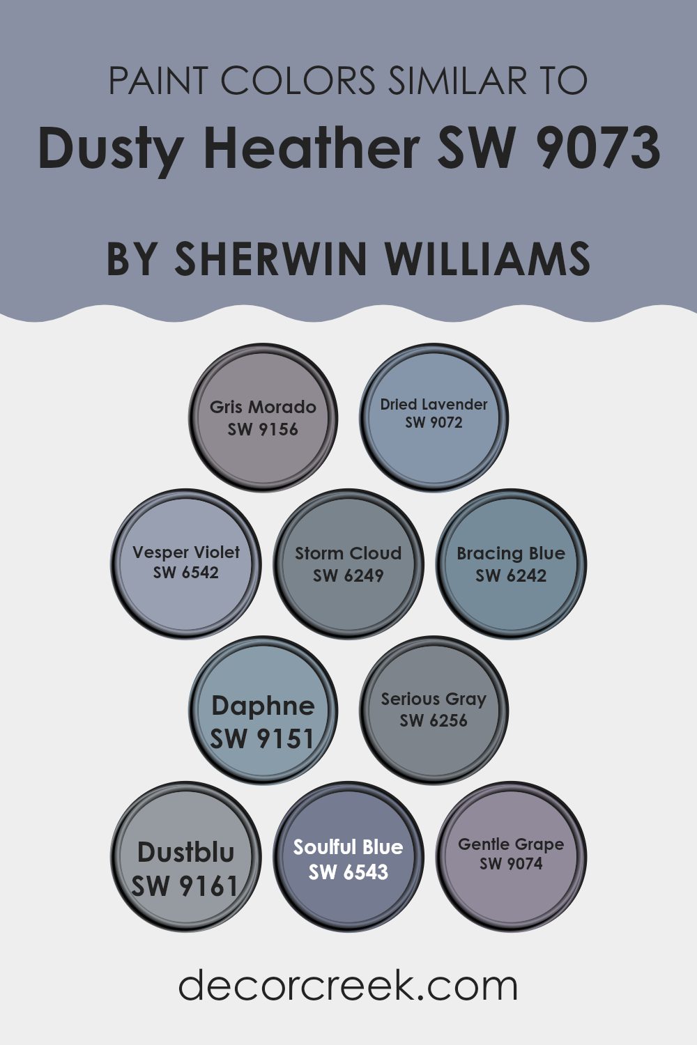
Colors Similar to Dusty Heather SW 9073 by Sherwin Williams
Choosing similar colors is crucial in creating a cohesive and appealing aesthetic in any room. Similar colors harmonize with each other, providing a consistent theme that can make a room feel more put-together and balanced. Colors like SW 9161 – Dustblu and SW 6543 – Soulful Blue are highly effective in this regard because they share a muted blue tone that is calming and subtle.
Colors such as SW 6256 – Serious Gray and SW 6242 – Bracing Blue complement each other as both exude a cool undertone, which seamlessly ties the environment together without overpowering the senses. SW 6249 – Storm Cloud, a deep grey-blue, works beautifully with SW 6242 – Bracing Blue, each deepening the ambiance of the room.
By maintaining a similar color palette, decoration and design choices become more aligned, giving a room a professional finish. SW 9072 – Dried Lavender and SW 6542 – Vesper Violet, both presenting gentle whispers of purple, blend well and are perfect for softening an area while adding a touch of warmth. SW 9156 – Gris Morado offers a dusky violet shade that is soothing and understated when teamed with SW 9074 – Gentle Grape, which provides a more pronounced violet hue.
SW 9151 – Daphne, with its richer blue tone, aids in creating depth, especially when used alongside more intense colors like SW 9161 – Dustblu. Utilizing colors that complement or are similar to each other helps in maintaining a visual flow that is pleasing to the eyes, thus enhancing the overall environment without clashing elements. By using colors like these, one can achieve a harmonious and inviting room.
You can see recommended paint colors below:
- SW 9156 Gris Morado
- SW 9072 Dried Lavender
- SW 6542 Vesper Violet
- SW 6249 Storm Cloud
- SW 6242 Bracing Blue
- SW 9151 Daphne
- SW 6256 Serious Gray
- SW 9161 Dustblu
- SW 6543 Soulful Blue
- SW 9074 Gentle Grape
Colors that Go With Dusty Heather SW 9073 by Sherwin Williams
Choosing the right colors that match with Dusty Heather by Sherwin Williams is crucial for creating a balanced and appealing color scheme in any room. Dusty Heather is a unique shade that can beautifully coordinate with various colors to achieve a harmonious look. The colors that pair well with Dusty Heather include Vesper Violet, Mesmerize, Soulful Blue, Starry Night, Majestic Purple, and Daydream, each adding its own charm and personality when used in decor.
Vesper Violet is a deep, cozy purple that brings warmth to the subtle tones of Dusty Heather, making areas feel more inviting. Mesmerize is a rich, vibrant blue that adds a pop of brightness, providing a striking contrast that enlivens any room.
Soulful Blue has a calm and gentle presence that complements the softness of Dusty Heather, perfect for creating a relaxed atmosphere. Starry Night is a bold, dark blue that can give a dramatic flair to interiors, pairing well with the muted tones of Dusty Heather for those looking to make a statement.
Majestic Purple is an intense, deep purple that pairs luxuriously with Dusty Heather, enhancing the elegance of any room. Lastly, Daydream is a light, airy purple that offers a dreamy quality, lightening the overall mood and pairing seamlessly with the subtleness of Dusty Heather. Through clever use of these colors, any living room can achieve a cohesive and visually appealing look.
You can see recommended paint colors below:
- SW 6542 Vesper Violet
- SW 6544 Mesmerize
- SW 6543 Soulful Blue
- SW 6540 Starry Night
- SW 6545 Majestic Purple
- SW 6541 Daydream

How to Use Dusty Heather SW 9073 by Sherwin Williams In Your Home?
Dusty Heather SW 9073 by Sherwin Williams is a gentle purple shade that offers a calming presence in any room. This flexible color can be an excellent choice for bedrooms, creating a cozy, soothing atmosphere that encourages rest and relaxation.
In living areas, Dusty Heather can complement neutral tones like grays and whites, adding a touch of softness and warmth to your social rooms. For a more modern twist, pairing it with bolder colors like deep greens or navy blues can make Dusty Heather pop, effectively highlighting focal points such as feature walls or furniture pieces.
In bathrooms, this color works well with bright whites or light grays to create a clean, fresh look. It’s especially effective in areas that receive natural light, where the color can show its depth throughout the day. Whether you’re updating a single room or giving your whole home a new vibe, Dusty Heather is a flexible choice that works well in various settings.
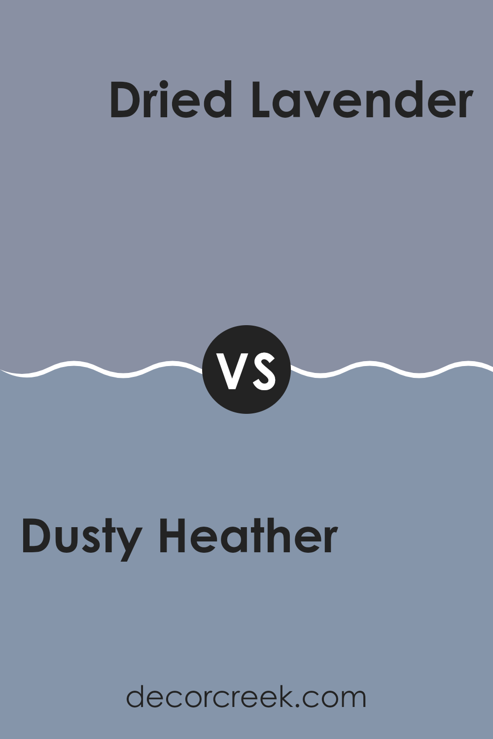
Dusty Heather SW 9073 by Sherwin Williams vs Dried Lavender SW 9072 by Sherwin Williams
Dusty Heather and Dried Lavender are two paint colors that are close in shades but carry distinct vibes. Dusty Heather is a slightly darker tone, leaning more into the gray family. It suggests a subtle, muted quality, much like you might imagine a peaceful, cloudy day.
On the other hand, Dried Lavender is a bit lighter and carries hints of purple. This color gives off a soft, gentle feel, resembling the delicate nature of lavender flowers.
Both colors are great for creating a relaxed atmosphere in any room, but while Dusty Heather might feel a bit more grounding, Dried Lavender offers a gentle uplift, like early morning light. They could pair well together in a room, creating layers of soothing colors, or could be used alone to set different moods.
You can see recommended paint color below:
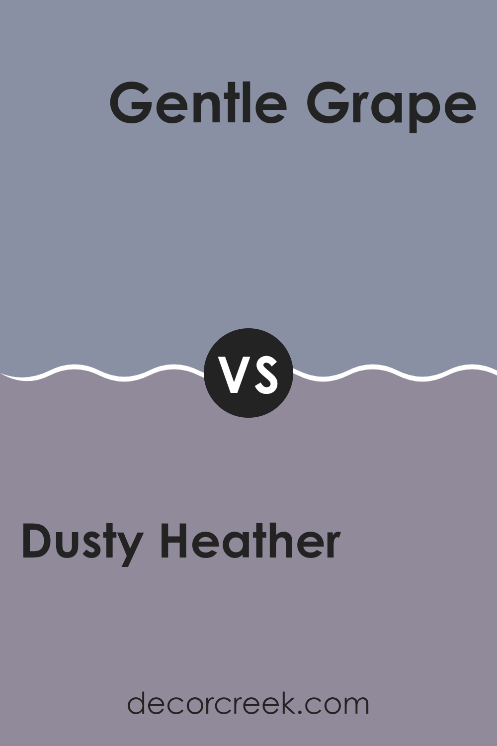
Dusty Heather SW 9073 by Sherwin Williams vs Gentle Grape SW 9074 by Sherwin Williams
Dusty Heather and Gentle Grape are two paint colors from Sherwin Williams that are quite similar but have distinct differences. Dusty Heather is a subdued, muted gray with a hint of lavender. It’s a very soft and gentle color, making it perfect for creating a cozy and calming atmosphere in a room.
On the other hand, Gentle Grape is slightly deeper and more vivid compared to Dusty Heather. It leans more towards a true purple, giving it a bit more presence and warmth. This color can add a touch of richness to a room without being too bold or overpowering.
Both colors work well in areas that aim for a relaxed feel. However, Dusty Heather might be better suited for those who prefer a more understated look, while Gentle Grape could be a great choice for someone wanting to subtly introduce more color into their environment.
You can see recommended paint color below:
- SW 9074 Gentle Grape
Dusty Heather SW 9073 by Sherwin Williams vs Bracing Blue SW 6242 by Sherwin Williams
Dusty Heather by Sherwin Williams is a soft gray with subtle purple undertones, giving it a gentle and soothing appeal. It’s a flexible color that fits well in areas like bedrooms and living rooms where a calm and relaxed atmosphere is desired.
On the other hand, Bracing Blue is a deeper, more pronounced shade that leans towards a navy tone. This color has a strength and depth that makes it excellent for creating focal points in a room or for use in areas that benefit from a bolder color choice, such as dining areas or accent walls.
While Dusty Heather provides a light and airy feel, Bracing Blue offers a more striking and dynamic aesthetic. Both colors can complement each other well, with Dusty Heather softening the intensity of Bracing Blue, making them a great pairing for a balanced and harmonious color scheme.
You can see recommended paint color below:

Dusty Heather SW 9073 by Sherwin Williams vs Serious Gray SW 6256 by Sherwin Williams
Dusty Heather by Sherwin Williams is a warm, muted purple-gray color that creates a cozy and inviting atmosphere in any room. It has a hint of lavender which makes it unique and appealing, especially for areas like bedrooms or living rooms where a soft, soothing touch is desired.
On the other hand, Serious Gray is a darker, more intense shade that leans more towards a true, deep gray. This color offers a strong foundation and gives a room a sense of grounding. It’s perfect for creating a bold statement, ideal for modern living rooms or a dramatic office room.
When comparing the two, Dusty Heather is lighter and warmer with subtle purple undertones, providing a gentle and cozy feel. Serious Gray, however, is cooler and more neutral, making it better for achieving a more formal or striking look. Both colors work well in a variety of decorating styles, but your choice would depend on the mood and functionality you want for your room.
You can see recommended paint color below:

Dusty Heather SW 9073 by Sherwin Williams vs Daphne SW 9151 by Sherwin Williams
Dusty Heather and Daphne are two intriguing colors from Sherwin Williams. Dusty Heather has a muted, soft gray tone with hints of purple, giving it a cozy and welcoming feel. It’s quite flexible and works well in areas that aim for a gentle and understated look.
On the other hand, Daphne is deeper and more vivid. It leans more towards a rich, bluish-purple, which makes it stand out more. This color can add a striking touch to any room, making it perfect for those wanting to add a bold statement.
While Dusty Heather brings a subtle warmth, Daphane offers a more dramatic flair. Both colors have their unique appeal, depending on the mood and style you want to achieve in a room.
You can see recommended paint color below:

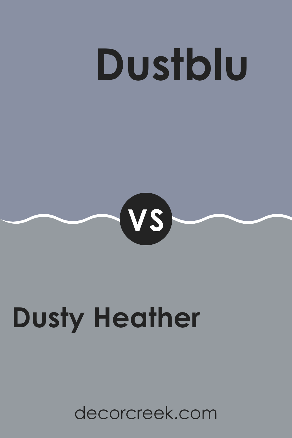
Dusty Heather SW 9073 by Sherwin Williams vs Dustblu SW 9161 by Sherwin Williams
The two colors, Dusty Heather and Dustblu, both by Sherwin Williams, offer subtle yet distinctly different hues for interior rooms. Dusty Heather is a soft gray with a touch of lavender, providing a gentle warmth that makes it ideal for creating a cozy atmosphere in rooms. Its understated elegance allows it to be flexible, fitting well in bedrooms or living areas.
On the other hand, Dustblu has a calm blue tone with a hint of gray, giving it a cooler presence that contrasts with the warmer undertones of Dusty Heather. Dustblu’s coolness can make a room feel more open and airy, which could be perfect for bathrooms or rooms intended to offer a sense of calm and freshness.
In summary, while both colors lend a muted sophistication to a room, Dusty Heather leans towards a warmer palette, making rooms feel snug and inviting. Dustblu, with its cooler and fresher vibes, is better suited for creating a relaxed and refreshing environment.
You can see recommended paint color below:
Dusty Heather SW 9073 by Sherwin Williams vs Soulful Blue SW 6543 by Sherwin Williams
Dusty Heather and Soulful Blue are two distinct colors from Sherwin Williams. Dusty Heather is a soft, muted purple with gray undertones, giving it a calm and gentle appearance. It blends well in areas that aim for a subtle yet cozy feel.
On the other hand, Soulful Blue is a richer, deeper shade of blue with a hint of gray. This color tends to add a soothing yet more pronounced touch to a room, providing a bit of color without overpowering the room.
Both colors offer unique vibes—Dusty Heather brings a lighter, airier feel, ideal for creating a relaxed environment, while Soulful Blue offers a sense of depth and focus, perfect for areas where you want a touch of elegance without going too bold. Combining them can provide a nice balance, using Soulful Blue as an accent to the lighter Dusty Heather.
You can see recommended paint color below:
- SW 6543 Soulful Blue

Dusty Heather SW 9073 by Sherwin Williams vs Gris Morado SW 9156 by Sherwin Williams
The main color Dusty Heather and the second color Gris Morado, both by Sherwin Williams, have distinct tones suited for different moods and areas. Dusty Heather is a soft, muted shade of gray with hints of purple, creating a cozy and welcoming feel.
It works well in bedrooms or living areas where a calm, gentle atmosphere is desired. On the other hand, Gris Morado is a darker gray that leans more towards purple, giving it a stronger presence. This color is great for areas that you want to give a bold, yet refined look, like dining rooms or entryways.
While both colors share a gray base, Dusty Heather offers lightness and subtlety, whereas Gris Morado provides depth and a bit of drama. They could complement each other well in a color scheme, providing balance between soft and vivid elements in your décor.
You can see recommended paint color below:

Dusty Heather SW 9073 by Sherwin Williams vs Storm Cloud SW 6249 by Sherwin Williams
“Dusty Heather” and “Storm Cloud” are two different shades offered by Sherwin Williams. “Dusty Heather” is a soft, muted purple with hints of gray that gives it a cozy and subdued appearance. It’s a light to medium shade that works well in rooms where you want a touch of color without overpowering the room.
On the other hand, “Storm Cloud” is a much darker and bolder color, resembling the deep, moody hues of a gathering storm. It’s a blend of navy and gray, making it perfect for creating a strong, striking feature in a room.
While “Dusty Heather” lends a gentle warmth to interiors, “Storm Cloud” offers more drama and intensity, potentially making it a good choice for accents or walls where you want to make a statement. Depending on your style and the mood you’re aiming for, each color has a distinct personality that can greatly affect the feel of a room.
You can see recommended paint color below:
- SW 6249 Storm Cloud

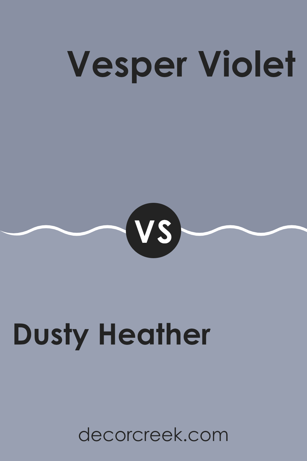
Dusty Heather SW 9073 by Sherwin Williams vs Vesper Violet SW 6542 by Sherwin Williams
The main color, Dusty Heather, is a soft, muted shade of gray with subtle hints of purple, creating a cozy and gentle atmosphere. This color is flexible, fitting well in various areas of a home such as bedrooms or living rooms, offering a calm and unassuming backdrop. It pairs well with both bright and dark colors, allowing for flexible decor options.
On the other hand, Vesper Violet is a deeper, more pronounced purple. It radiates a sense of richness and depth that can add a striking pop of color to a room. This hue is ideal for accent walls or decorative accents that aim to draw attention. Despite its boldness, it still maintains a certain softness, which prevents it from overpowering a room.
In comparison, while both hues have purple undertones, Dusty Heather leans towards a more understated and neutral look, making it easier to blend with various decor styles. Vesper Violet, offering more depth and focus, makes a statement and suits those looking to add a bit of drama and flair to their interiors.
You can see recommended paint color below:
In wrapping up, I really enjoyed learning all about SW 9073 Dusty Heather by Sherwin Williams. This color is a soft, gentle purple that makes any room feel cozy and welcoming. It’s not too bright or too dark, which makes it perfect for places where you want to relax, like bedrooms or living rooms.
If you’re thinking of adding a new color to your house, Dusty Heather could be a great choice. It works well with other colors, so it’s easy to match with furniture and decorations you already have.
Plus, it has a special, calm feeling that makes it unique compared to other purples. Whether you’re painting a whole room or just an accent wall, this color can definitely make your home look nicer. So, if you like the sound of a lovely purple shade, consider giving SW 9073 Dusty Heather a try.

Ever wished paint sampling was as easy as sticking a sticker? Guess what? Now it is! Discover Samplize's unique Peel & Stick samples.
Get paint samples

