Selecting the right paint color for your area can be a daunting challenge. I want to share some crucial insights about SW 6070 Heron Plume by Sherwin Williams, a choice you might be considering for its unique appeal.
This particular shade is a soft, nuanced gray with a warm undertone, making it highly adaptable for different areas of a home or office. Since the subtlety of the color can significantly affect the ambiance of a room, understanding its undertones and how they interact with light is essential for achieving the desired effect.
Before choosing Heron Plume for your next project, consider the lighting in your area. Natural light brings out the warmth in this color, while artificial light may highlight its cooler tones. This color works well in areas where you want to create a soothing and inviting atmosphere, like living rooms or bedrooms. Plus, it pairs beautifully with a wide range of decor styles from modern to traditional, providing a gentle backdrop that complements various textures and finishes.
I found that testing the color with samples in different areas and under various lighting conditions can help you see if Heron Plume aligns with your vision. Remember, the final look will also depend on your accessories and furniture, as these elements can either improve or overshadow the paint.
Is Heron Plume SW 6070 Right for My Home?
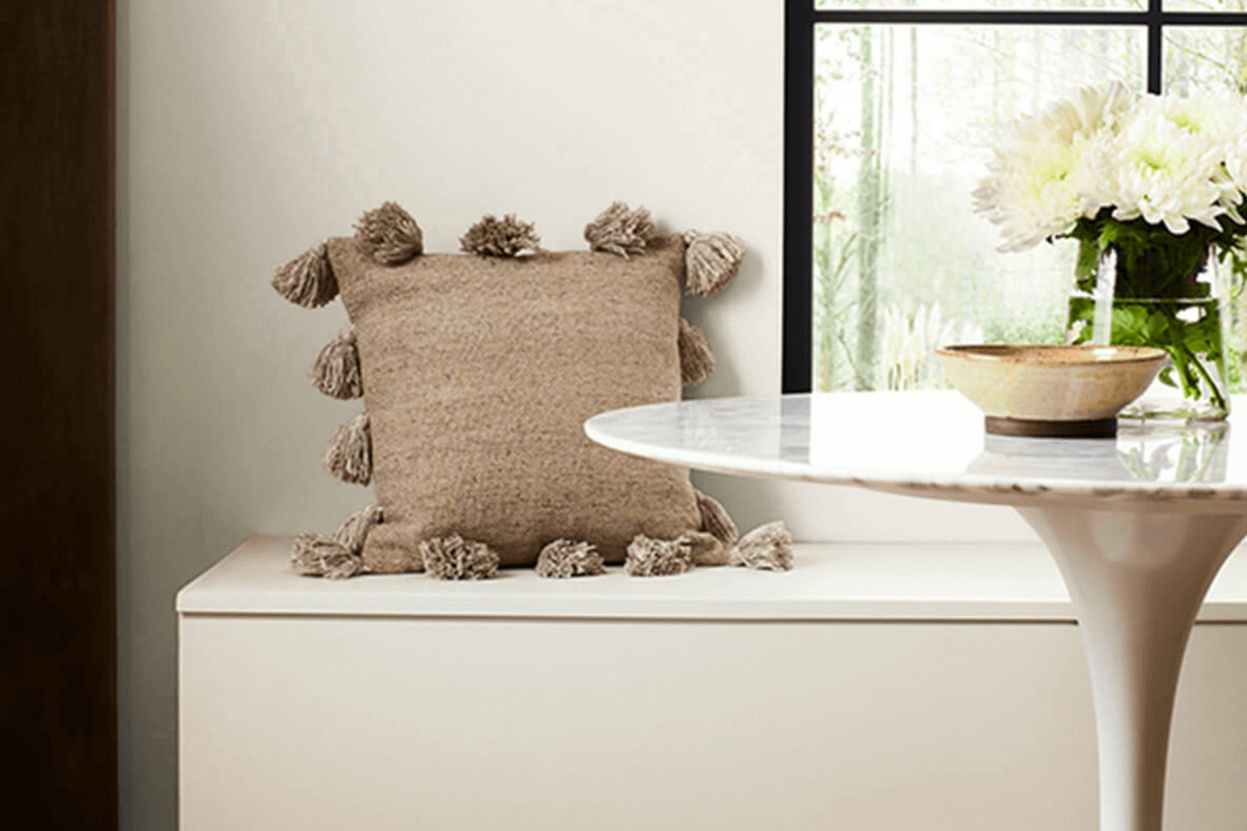
Heron Plume by Sherwin Williams is a soft, warm neutral paint color that holds a hint of beige mixed with gray. When I first saw it, I noticed how beautifully subtle and adaptable it was, making it the perfect backdrop for various interior styles. I think it shines best in casual and inviting areas, like a cozy contemporary living room or a classic, comfortable country kitchen.
From my experience, Heron Plume pairs exceptionally well with natural materials. Wood, whether it’s light oak, rich mahogany, or weathered barnwood, really brings out the warm undertones in the color. I also love using it in rooms with lots of natural light, as the color seems to change slightly with the shifting sunlight, adding a lovely dynamic feel to the area.
In terms of textures, soft linen curtains or plush velvet cushions create a delightful contrast with the smooth, understated elegance of Heron Plume walls. For a more organic aesthetic, combining it with woven wicker or rattan can add interesting visual layers to a room. This color also works well with both brighter accent colors for a spring-like feel or darker shades for a cozy, autumnal vibe. I’ve used it in both settings, and it’s amazing how well it adapts.
What are the right undertones of Heron Plume SW 6070 ?
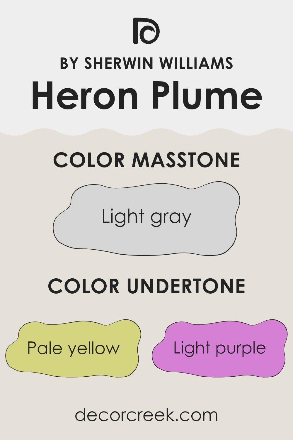
Heron Plume is a unique shade that contains a range of subtle undertones, which can significantly influence how it appears in different settings. Undertones are the colors that lie beneath the surface of what we initially see. They can make a paint color look warmer or cooler depending on the lighting and surrounding colors. Understanding these undertones is crucial when choosing a paint color as it helps predict how the color will behave in your area.
Heron Plume has undertones of pale yellow, light purple, light blue, pale pink, mint, lilac, and grey. This mix makes it a very adaptable color that can adjust to various environments and decor styles. In a room, these undertones can emerge based on the amount of natural light, the direction of the light, and even the colors of the furniture and accessories.
For instance, in a room with a lot of sunlight, the pale yellow or light blue undertones might become more noticeable, giving the room a brighter feel. In contrast, in an area with less natural light, the grey undertones might dominate, giving a more subdued appearance. When paired with similar tones, Heron Plume can create a harmonious look, while contrasting colors can draw out its complexity and depth. This adaptability makes Heron Plume a popular choice for interior walls, as it can complement a wide range of interior styles and preferences.
Best Coordinating Colors to use with Heron Plume SW 6070 by Sherwin Williams this year.
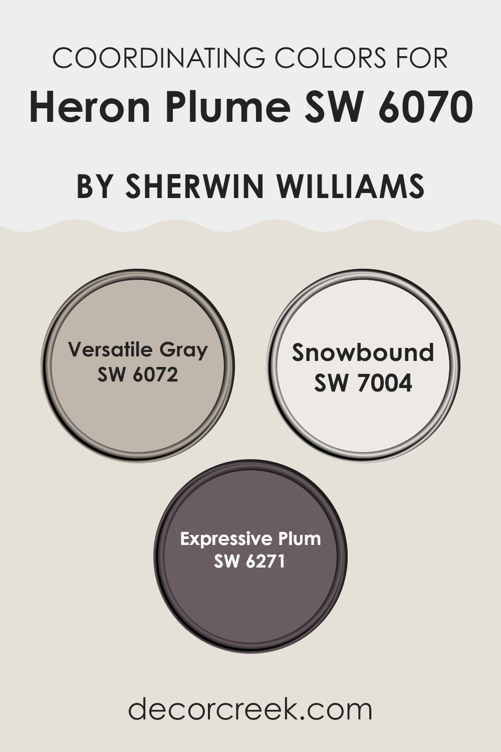
Coordinating colors work by complementing each other, creating a balanced and harmonious look in any area. These are colors that can work well together in different combinations without clashing. For instance, Heron Plume by Sherwin Williams pairs beautifully with shades like Adaptable Gray, Snowbound, and Expressive Plum. Each complementary color adds a unique touch while maintaining a cohesive atmosphere.
Adaptable Gray is a smooth, moderate gray that offers a neutral backdrop, making it a great base for interiors. It can help to subtly highlight the softer tones of Heron Plume. Snowbound is a vivid white with a slightly cool undertone, providing a crisp contrast that can make an area feel fresh and open.
Lastly, Expressive Plum brings a deep and rich tone into the mix, adding a sense of drama and depth which can be perfect for accentuating focal points or adding vibrancy to a room. Together, these colors create a flexible palette that can suit different styles and preferences, whether you’re looking to achieve a warm, inviting area or something with a bit more impact and contrast.
You can see recommended paint colors below:
- SW 6072 Versatile Gray
- SW 7004 Snowbound
- SW 6271 Expressive Plum
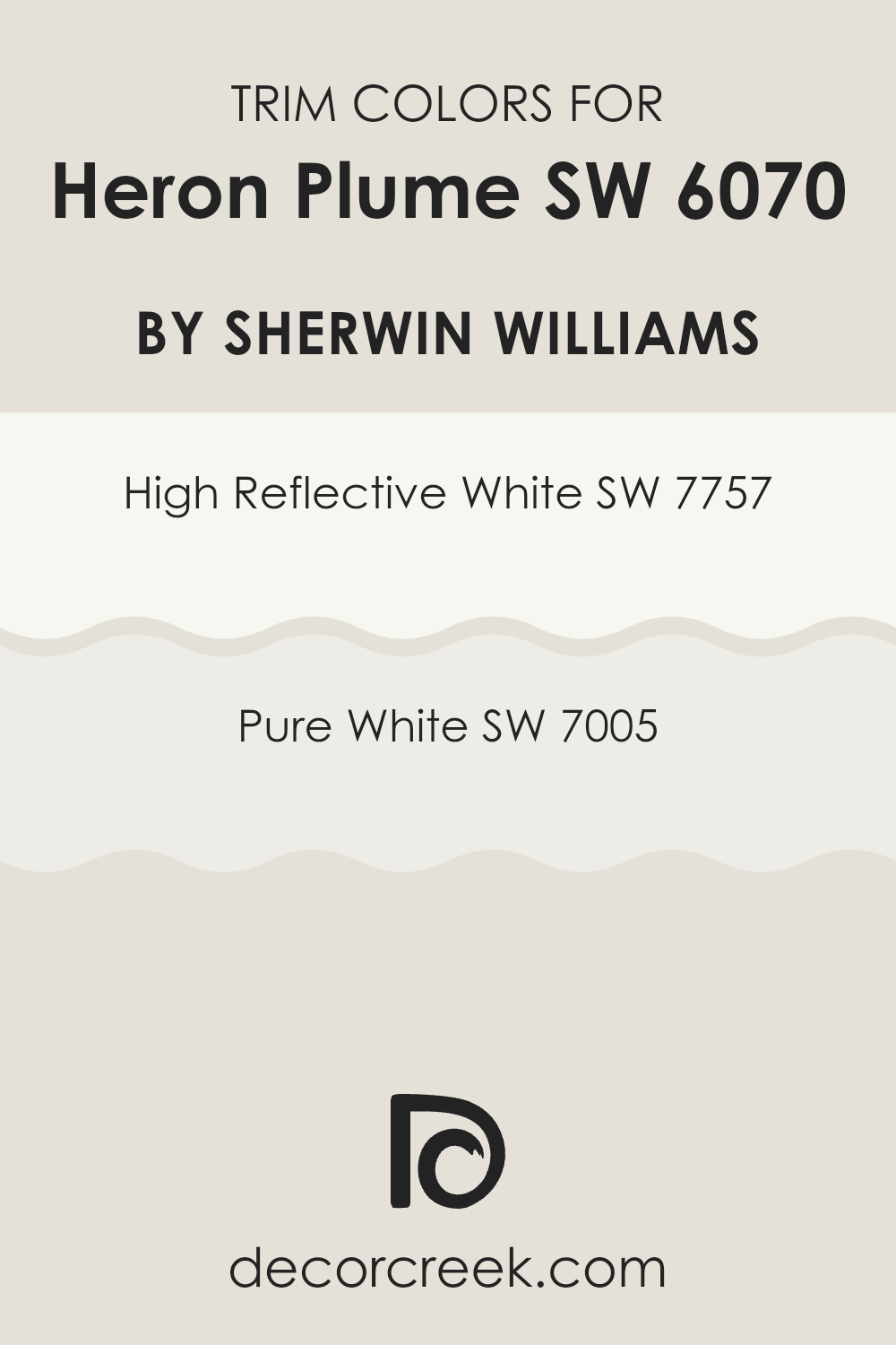
Trendy Trim Colors of Heron Plume SW 6070 by Sherwin Williams to use this year.
Trim colors are specific shades used on the moldings, door frames, window frames, and skirtings of a room to accentuate and complement the main color on the walls. In the case of Heron Plume by Sherwin Williams, which is a soft, warm neutral, using the right trim colors can enhance its warm tones and create a clean, cohesive look.
SW 7757 – High Reflective White and SW 7005 – Pure White are excellent choices for trim with Heron Plume as they offer a crisp contrast that can help define the areas and make the wall color stand out, adding visual interest and a sense of depth to the room.
High Reflective White (SW 7757) is a very bright, almost luminous white that reflects most light, giving it a brilliant, clear quality that can make any room feel more spacious and airy. Pure White (SW 7005) on the other hand, while still a clean white, has a slightly softer tone which works particularly well in balancing the warmth of Heron Plume without overpowering it. Both colors are adaptable and can be used in a variety of settings, improving the overall aesthetic of the area and ensuring that the walls look distinct and beautifully framed by the trim.
You can see recommended paint colors below:
Evergreen Colors Similar to Heron Plume SW 6070 by Sherwin Williams
Choosing similar colors for a painting or decorating project is crucial as it ensures a soft and cohesive look. Colors like Toque White, Pearly White, and Zurich White all provide gentle nuances that vary slightly from the base of Heron Plume. These subtle differences allow for a layered effect without creating stark contrasts, ideal for a harmonious atmosphere.
Grey Mist adds a hint of gray to the mix, offering a cool tone that pairs well with the warmer whites, while Mortar introduces a deeper gray that anchors the lighter shades. Sunbleached gives off a faded, almost vintage look, which can add a sense of warmth and history to an area.
Origami White, Moderne White, White Heron, and Sanctuary continue the theme of closely related hues. Origami White and Moderne White lean toward a neutral base, providing a clean canvas that brightens areas without being stark.
White Heron mirrors the crispness of a heron’s plumage, offering a touch that feels almost airy. Sanctuary, being slightly off-white with a hint of warmth, is perfect for creating a cozy and inviting area. These similar colors work together to create a fluid visual experience, making areas feel more expansive and interconnected. This approach allows for design flexibility, as these colors can blend smoothly or serve as slight contrasts to enhance the dimensions of a room.
You can see recommended paint colors below:
- SW 7003 Toque White
- SW 7009 Pearly White
- SW 7626 Zurich White
- SW 9625 Grey Mist
- SW 9584 Mortar
- SW 9585 Sunbleached
- SW 7636 Origami White
- SW 6168 Moderne White
- SW 7627 White Heron
- SW 9583 Sanctuary
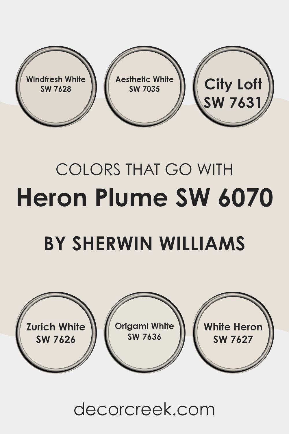
Colors that Go With Heron Plume SW 6070 by Sherwin Williams
Choosing colors that pair well with Heron Plume SW 6070 by Sherwin Williams is important because it helps create a harmonious and appealing color scheme in your area. Heron Plume is a neutral shade, acting as a adaptable backdrop that allows other colors to stand out while maintaining a cohesive look.
When used with other compatible shades such as Windfresh White, Aesthetic White, City Loft, Zurich White, Origami White, and White Heron, it results in a balanced and visually pleasant environment. These combinations can improve the aesthetic appeal of a room, make it feel more open and airy, and ensure that the design elements flow smoothly together without overpowering the senses.
Windfresh White has a crispness that can bring a fresh and clean look to an area, ideal for creating a bright and inviting atmosphere. Aesthetic White is slightly warmer, providing a soft, welcoming feel without overpowering the subtlety of Heron Plume. City Loft offers a slightly grayish tone, excellent for adding a bit of depth to rooms that benefit from a neutral yet impactful color.
Zurich White blends well with almost any color, offering flexibility in decor choices and a perfect base for either a traditional or modern look. Origami White adds a touch of complexity with its faint gray undertones, ideal for those who want a refined yet simple ambiance. Lastly, White Heron is very close to pure white, perfect for accentuating the open, airy feel of a room, and works great for trim and ceilings to highlight other colors.
You can see recommended paint colors below:
- SW 7628 Windfresh White
- SW 7035 Aesthetic White
- SW 7631 City Loft
- SW 7626 Zurich White
- SW 7636 Origami White
- SW 7627 White Heron
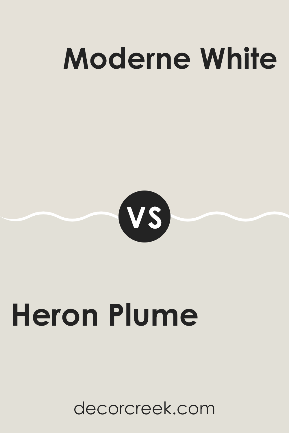
Heron Plume SW 6070 by Sherwin Williams vs Moderne White SW 6168 by Sherwin Williams
Heron Plume and Moderne White, both by Sherwin Williams, are subtle shades that can be used to create a calm and inviting atmosphere in any room. Heron Plume is a soft, warm gray with a hint of beige.
It’s a gentle color that can make an area feel cozy and welcoming. On the other hand, Moderne White is a bit brighter and crisper. This color has a clean, neutral tone that makes it very adaptable for different settings and styles.
It’s closer to white but still offers a touch of warmth to prevent a stark look. When compared, Heron Plume tends to add more warmth to a room, whereas Moderne White creates a lighter, airier feel. Both colors work well in a variety of lighting situations and pair nicely with other hues.
You can see recommended paint color below:
Heron Plume SW 6070 by Sherwin Williams vs White Heron SW 7627 by Sherwin Williams
Heron Plume and White Heron, both by Sherwin Williams, are close in hue but cater to different design needs. Heron Plume has a warm, soft tone, making it a subtle choice that blends well with a variety of colors.
It’s especially good in areas where a calming backdrop is needed without stark brightness. On the other hand, White Heron appears slightly brighter and crisper. Its clean and clear look helps it serve as a fresh and vibrant contrast, especially in areas aiming for a modern feel.
For those choosing paint shades, Heron Plume works well where you want gentleness and warmth, whereas White Heron is ideal for adding a refreshing clarity that can make other colors in the decor stand out.
You can see recommended paint color below:
Heron Plume SW 6070 by Sherwin Williams vs Grey Mist SW 9625 by Sherwin Williams
Heron Plume and Grey Mist are two distinct shades from Sherwin Williams. Heron Plume is on the softer side, with a light and airy vibe, making it perfect for creating a calm and welcoming atmosphere in any room. It has a warm undertone that makes areas feel cozy but still very light and open.
On the other hand, Grey Mist is a cooler tone, offering a more neutral backdrop. It’s slightly deeper than Heron Plume, which allows it to stand out a bit more in an area without becoming overpowering. Grey Mist can be a good choice for those wanting a hint of color while maintaining a clean and straightforward look.
Both colors work well in various settings, depending on the mood you want to set. Heron Plume is typically better for a softer, warmer feel, while Grey Mist is ideal for a more subtle, fresh look.
You can see recommended paint color below:
Heron Plume SW 6070 by Sherwin Williams vs Pearly White SW 7009 by Sherwin Williams
Heron Plume and Pearly White are two popular paint colors from Sherwin Williams that can subtly change the feel of a room. Heron Plume is a soft, warm gray with slight beige undertones, making it an excellent choice for creating a cozy and inviting atmosphere. It’s adaptable, working well in almost any area, whether you want a calm bedroom or a welcoming living room.
On the other hand, Pearly White is a bit lighter and has a creamy undertone that gives it a gentle warmth. This color is great for areas where you want to promote a bright and airy feel, like kitchens and bathrooms. It reflects light beautifully, helping to make small areas appear larger and more open.
Both colors are quite neutral, which means they can easily pair with a wide range of decor styles and other hues. Whether you choose Heron Plume for its slightly richer tone or Pearly White for its light, uplifting quality, both colors offer a classic backdrop for your home.
You can see recommended paint color below:
Heron Plume SW 6070 by Sherwin Williams vs Zurich White SW 7626 by Sherwin Williams
Heron Plume and Zurich White are two paint colors by Sherwin Williams that offer subtle differences for your walls. Heron Plume is a soft, warm neutral with a hint of beige. It provides a smooth and cozy feel, making it perfect for living areas where you want a touch of warmth without strong color.
On the other hand, Zurich White leans a bit cooler compared to Heron Plume. It’s almost a pure white, but it has just a dash of gray to soften its brightness. This makes Zurich White a great choice for areas where you want to create a clean and open atmosphere, such as kitchens and bathrooms.
When deciding between the two, consider the mood and functionality of the room. Heron Plume works well in areas that need a cozy or inviting feel, while Zurich White is ideal for areas that require a crisp, fresh look.
You can see recommended paint color below:
Heron Plume SW 6070 by Sherwin Williams vs Toque White SW 7003 by Sherwin Williams
Heron Plume and Toque White are both neutral shades from Sherwin Williams, but they have distinct tones that set them apart. Heron Plume is a soft, warm gray with a subtle beige undertone, giving it a cozy feel that’s great for creating a welcoming atmosphere in rooms like living areas or bedrooms. It’s light enough to make areas appear larger but still adds a touch of warmth.
On the other hand, Toque White is cooler compared to Heron Plume. It’s closer to a true white but has a hint of gray that prevents it from feeling stark or cold. Toque White works well in areas that get plenty of natural light, as it reflects the light beautifully, making the area feel bright and airy.
Both colors are adaptable for interior design and can work well in various decorating styles. However, Heron Plume’s warmth makes it better suited for cozy, intimate settings, while Toque White is ideal for achieving a clean, fresh look.
You can see recommended paint color below:
Heron Plume SW 6070 by Sherwin Williams vs Sunbleached SW 9585 by Sherwin Williams
Heron Plume and Sunbleached are two unique colors from Sherwin Williams. Heron Plume is a soft, light gray with a warm undertone. It creates a gentle, inviting feel, making it perfect for a cozy room or a quiet nook in the house. It’s adaptable, working well in both bright and dimly lit areas.
On the other hand, Sunbleached is a very light, muted orange. It has an understated vibrancy that can bring a subtle hint of energy to an area without overpowering it. This color is excellent for adding a touch of warmth to a room, particularly useful for areas that aim to be cheerful and welcoming.
When comparing the two, Heron Plume is more neutral, making it easier to match with a variety of decor styles and colors. In contrast, Sunbleached, with its warmer tones, pairs well with earthy, rustic, or coastal themes, offering a more specific charm. Both colors can brighten a room but in noticeably different ways.
You can see recommended paint color below:
Heron Plume SW 6070 by Sherwin Williams vs Origami White SW 7636 by Sherwin Williams
Heron Plume and Origami White are two stylish paint colors from Sherwin Williams. Heron Plume is a very soft, warm gray with a hint of beige. It’s quite neutral and highly adaptable, making it perfect for any room aiming for a subtle backdrop. It provides a calming, gentle atmosphere in an area without being too bold.
Origami White, on the other hand, is a light, warm white color that feels a bit fresher and brighter compared to Heron Plume. This shade leans more toward a clean, crisp feel, perfect for making an area appear more spacious and airy.
While both colors are beautifully understated, Origami White is likely the better choice if you’re looking for a brighter, more “white” look. In contrast, Heron Plume offers a warmer tone that works well in areas where a cozy, inviting feel is desired. Both are flexible for various design styles, depending on the mood you want to create.
You can see recommended paint color below:
Heron Plume SW 6070 by Sherwin Williams vs Sanctuary SW 9583 by Sherwin Williams
Heron Plume and Sanctuary by Sherwin Williams are two distinct shades that can really influence the feel of an area. Heron Plume is a soft, warm off-white. It has a gentle presence, easily pairing with other colors, making it a great choice for a light background in many rooms.
On the other hand, Sanctuary is a darker, more pronounced gray-green, providing a notable calmness while also allowing for a bold statement in decor. Its earthy tone brings nature’s peacefulness indoors and pairs well with natural elements like wood or stone.
When choosing between the two, consider how light or moody you want the room to be. Heron Plume brings light and airy vibes, whereas Sanctuary offers a touch of nature-inspired depth and richness.
You can see recommended paint color below:
Heron Plume SW 6070 by Sherwin Williams vs Mortar SW 9584 by Sherwin Williams
Heron Plume and Mortar by Sherwin Williams are two distinct colors that offer different moods and styles for rooms. Heron Plume is a soft, light gray with warm undertones, making it a gentle and calming color, ideal for creating a bright and airy feel in areas. It’s particularly good in small rooms or areas with little natural light, as it reflects light well, making the area appear larger.
On the other hand, Mortar is a much darker gray, providing a bold and strong presence. This color can add drama and depth to an area, making it a good choice for accent walls or rooms where a more striking, grounded feel is desired. Mortar works well in larger areas or places with plenty of natural light to prevent the room from feeling too dark.
In summary, Heron Plume and Mortar serve different purposes depending on the atmosphere you want to create. Heron Plume is ideal for a light, refreshing look, while Mortar is perfect for adding impact and depth.
You can see recommended paint color below:
After learning about SW 6070 Heron Plume by Sherwin Williams, I have a pretty good idea about how this paint color can change a room. Heron Plume is a soft, light gray that works almost like a magic trick, making small rooms look bigger and giving a calm feeling without making it boring. It’s gentle enough that it doesn’t take over a room, but it still adds something special.
This color goes well with almost any style, whether your room has lots of wood, modern metal touches, or comfy, soft furniture. Because Heron Plume is so easy to match with other colors, it’s great for areas like the living room or bedroom where you want everything to look nice together. Plus, it’s not too bright or too dark, so it feels just right.
If you’re thinking about giving your room a new look, Heron Plume is a solid choice. It’s simple to see why it’s liked by so many – it quietly does its job, making areas feel clean and open. So, painting your walls with Heron Plume could be a great step to make your room feel new and pleasant.
It truly is a wonderful color that fits easily in any home, helping to create a lovely and welcoming area for everyone.
Ever wished paint sampling was as easy as sticking a sticker? Guess what? Now it is! Discover Samplize's unique Peel & Stick samples.
Get paint samples

