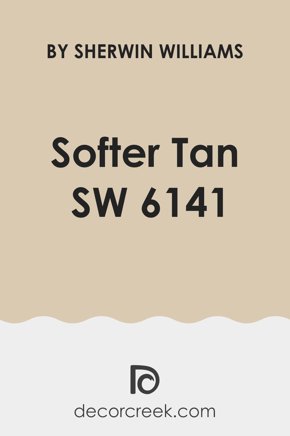
If you’re considering a new look for your walls, you might want to give SW 6141 Softer Tan by Sherwin Williams a thought. It’s a warm, inviting shade that can really brighten up a room and give it a cozy vibe. Before you rush out to buy a gallon or two, you should know a few things that might help you make a more informed decision.
First, consider the lighting in your room. Softer Tan can change its mood significantly under different lighting conditions. In natural light, it appears as a gentle beige with a soft, nurturing glow, whereas in artificial light, it might lean towards a deeper, more golden tone. It’s perfect if you want a room that feels welcoming at any time of the day.
Also, think about the existing elements and colors in your room. Softer Tan pairs beautifully with rich colors like navy or dark green, and it can also tie together furnishings in lighter woods or white accents. It’s a flexible shade, but like any color, how it interacts with your specific surroundings will make all the difference.
Remember, picking the right paint color isn’t just about following trends; it’s about creating a room that feels right to you. Softer Tan by Sherwin Williams is a great choice if you’re looking for something that offers warmth and flexibility.
Is Softer Tan SW 6141 Right for My Home?
Softer Tan is one of those cozy shades that brings a warm and welcoming vibe wherever it’s painted. It has a lovely, soft look that is neither too yellow nor too brown, making it a perfect neutral backdrop in any room. The lightness of this color keeps rooms looking open and airy, which is great for making smaller rooms feel a bit larger.
I find that Softer Tan works exceptionally well in interior styles that aim for a relaxed and comfortable atmosphere, such as rustic, modern farmhouse, and traditional. It’s particularly friendly in living rooms or bedrooms where the goal is to create a peaceful retreat. It complements natural materials beautifully — think wooden beams, leather furniture, and woven baskets — enhancing their textures without overpowering the senses.
For fabric and decor, I love pairing it with soft whites, deep blues, or even subtle greens. The softness of the tan invites a variety of materials like linen, wool, and velvet which all contribute to a layered, cozy look. It’s amazing how it supports an array of textures, making them stand out in the most delightful way. Whether used as a main color or an accent wall, Softer Tan is a flexible choice that helps craft appealing, comfy rooms that feel like home.
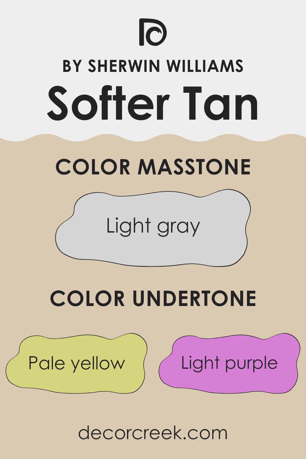
What are the right undertones of Softer Tan SW 6141 ?
Softer Tan is a warm, inviting shade that can subtly change its appearance based on the undertones present in the color. This paint has undertones of pale yellow, light purple, pale pink, light blue, mint, lilac, and grey, which can influence how it looks in different lighting and settings.
Undertones are the faint colors that lurk beneath the surface of the paint. They play a crucial role in how we perceive the main color. For example, a yellow undertone might make a color appear warmer and more welcoming, while a blue undertone could give it a cooler, calmer feel.
In the case of this particular paint, the array of undertones can make the walls look slightly different at various times of the day or in different kinds of room lighting. Pale yellow gives a soft, warm glow that makes rooms feel cozy. Light purple and pale pink can add a subtle hint of elegance without overpowering the senses, contributing to a gentle, refined atmosphere. Light blue and mint bring a fresh, airy feel, perfect for creating a relaxed room. Lilac infuses a touch of calmness, while the grey undertone helps in keeping the overall look grounded and neutral.
Using this paint on interior walls means the room can benefit from these multiple undertones. Depending on the furnishings, natural light, and other colors in the room, the walls can offer surprising reflections of these underlying colors, making the room lively yet comforting. This flexibility makes it a great choice for various rooms, from living areas to bedrooms.
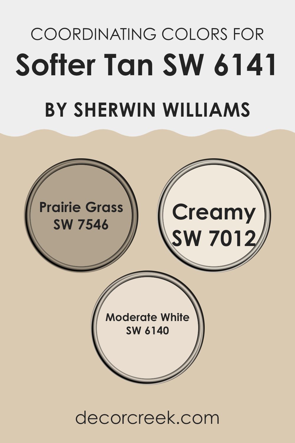
Best Coordinating Colors to use with Softer Tan SW 6141 by Sherwin Williams this year.
Coordinating colors are selected shades that pair well with a primary color to enhance the overall aesthetic of a room without overpowering it. Typically, these colors are chosen to create balance and harmony, offering a pleasing palette that allows the main color to stand out while the accents support the theme. For instance, if you choose a primary color like a warm beige, the coordinating colors could include a mix of soft greens, light creams, and gentle whites to complement it harmoniously.
Take SW 7546 – Prairie Grass, for example, which is a muted green that resembles the natural tones of dried grasslands. It’s perfect for adding a subtle hint of nature to a room without overpowering the senses. Then there’s SW 7012 – Creamy, a soft and light cream color that brightens rooms and brings a sense of lightness and open feel to the environment.
Lastly, SW 6140 – Moderate White offers a neutral backdrop, flexible and understated, making it an ideal choice for balancing stronger hues or serving as a subtle contrast to richer colors. These colors, when used together, ensure the room feels cohesive and thoughtfully designed.
You can see recommended paint colors below:
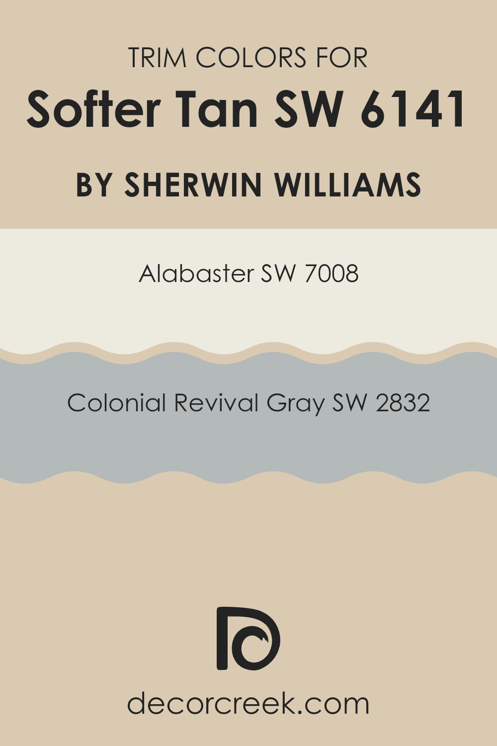
Trendy Trim Colors of Softer Tan SW 6141 by Sherwin Williams to use this year.
Trim colors refer to the hues selected for the detailing on features like door frames, window trims, skirting boards, and moldings. Opting for the right trim color can significantly accentuate the overall aesthetics of a room, enhancing the main wall color and adding a defined and finished look to the room.
For example, when paired with a neutral base color such as Softer Tan by Sherwin Williams, trim colors like SW 7008 – Alabaster and SW 2832 – Colonial Revival Gray can create a clean and stylish contrast that subtly highlights the architectural features of any room.
SW 7008 – Alabaster is a warm, soft white that provides a gentle contrast against richer and darker shades, making it ideal for creating a cozy and inviting atmosphere without overpowering the room. On the other hand, SW 2832 – Colonial Revival Gray offers a slightly deeper, classic gray tone that can help to outline features distinctly, injecting a sense of depth and interest into the room. Both of these colors have the capacity to complement Softer Tan beautifully, lending a polished and thoughtfully designed look to the surroundings.
You can see recommended paint colors below:
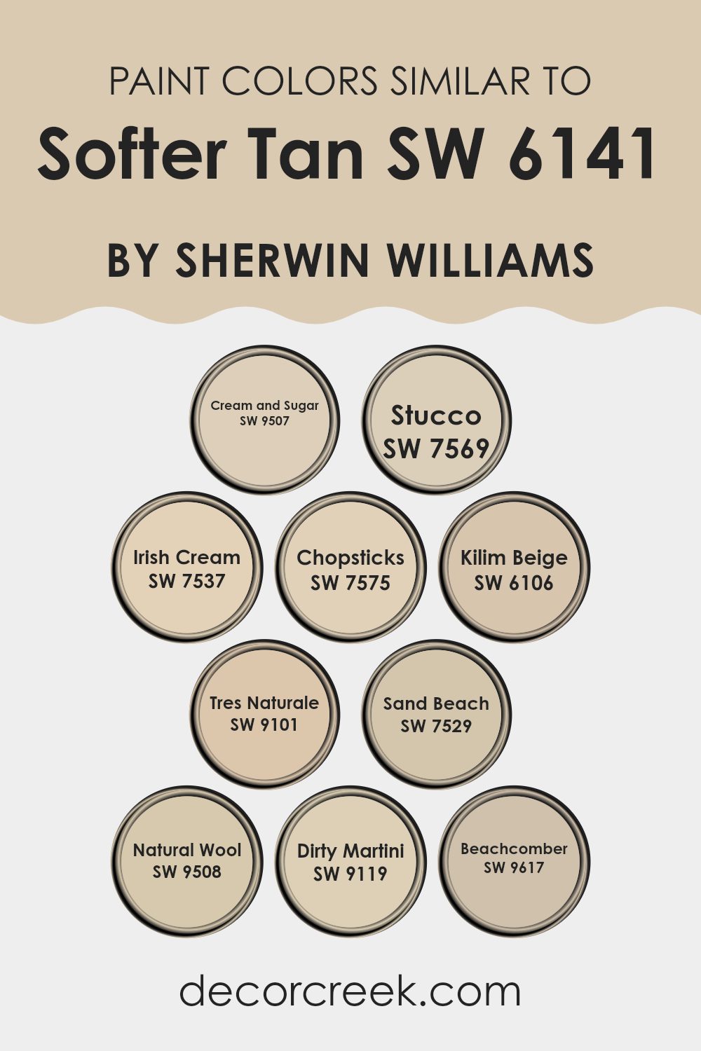
Evergreen Colors Similar to Softer Tan SW 6141 by Sherwin Williams
Using similar colors when decorating or planning a color scheme brings a sense of harmony and continuity to a room. Having shades like Cream and Sugar, which is a gentle off-white, creates a soft backdrop that is easy on the eyes. The inclusion of Stucco, a warm gray with earthy undertones, provides a subtle contrast that enriches the environment without overpowering it. Similarly, Irish Cream offers a muted, creamy hue that enhances the warmth of a room, making it cozy and welcoming.
Chopsticks, on the other hand, leans into a deeper, dusty taupe that anchors lighter shades like Softer Tan and brings a grounding effect to the color scheme. Kilim Beige is another flexible color with a sandy tone, perfect for adding a natural, understated vibe to the overall look.
With Tres Naturale, you get a hint of soft green, reminiscent of natural elements, which when paired with neutral colors, gives a fresh look. Sand Beach’s light sandy color is excellent at reflecting light, making rooms appear brighter. Natural Wool offers a clean, minimalistic grey, while Dirty Martini, a unique olive tone, and Beachcomber, a faded brown, add unexpected but harmonious pops of color to the palette. Selecting colors like these ensures the decor feels connected and flows beautifully from one room to another.
You can see recommended paint colors below:
- SW 9507 Cream and Sugar
- SW 7569 Stucco
- SW 7537 Irish Cream
- SW 7575 Chopsticks
- SW 6106 Kilim Beige
- SW 9101 Tres Naturale
- SW 7529 Sand Beach
- SW 9508 Natural Wool
- SW 9119 Dirty Martini
- SW 9617 Beachcomber
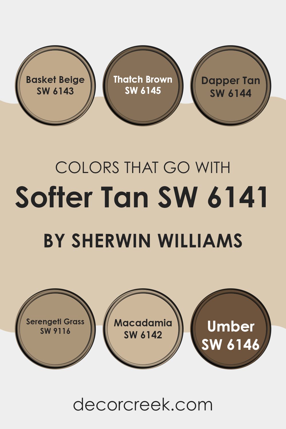
Colors that Go With Softer Tan SW 6141 by Sherwin Williams
Choosing the right colors to complement Softer Tan SW 6141 by Sherwin Williams is key to achieving a cohesive and inviting atmosphere in your living room. The selected colors, like Basket Beige and Macadamia, work by creating a seamless blend with Softer Tan, enhancing the warmth and welcoming nature of the room.
Basket Beige, a light and creamy hue, adds a subtle brightness, making it ideal for rooms that aim to maintain a soft and airy feel. In contrast, Macadamia offers a slightly deeper tone that enriches the environment without overpowering it, providing a perfect middle ground.
Colors such as Thatch Brown and Dapper Tan introduce a more rooted and earthy essence, giving the room a grounded and homely vibe. Thatch Brown, with its rich, deeper brown tone, pairs well with Softer Tan to give rooms a more defined and cozy appearance.
Dapper Tan, slightly lighter, carries a warm undertone that works well in areas where continuity and flow are necessary. For those looking to add a hint of nature, Serengeti Grass offers a muted green that resembles natural elements, bringing an outdoor feel indoors. Lastly, Umber, the darkest of the shades, can be used sparingly to create depth and focus in specific areas, such as accent walls or furniture, rounding out the palette beautifully.
You can see recommended paint colors below:
- SW 6143 Basket Beige
- SW 6145 Thatch Brown
- SW 6144 Dapper Tan
- SW 9116 Serengeti Grass
- SW 6142 Macadamia
- SW 6146 Umber
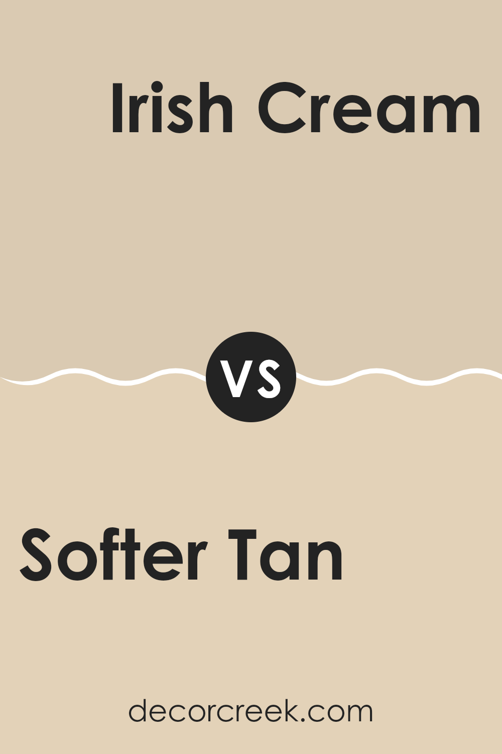
Softer Tan SW 6141 by Sherwin Williams vs Irish Cream SW 7537 by Sherwin Williams
Softer Tan and Irish Cream by Sherwin Williams are two neutral shades with distinct undertones and vibes. Softer Tan is a warm beige with a cozy and welcoming feel. It’s a flexible color that pairs well with various decor styles, making a room feel inviting without overpowering the senses.
On the other hand, Irish Cream has a slightly lighter and creamier tone. This color leans more towards a soft, off-white, offering a subtle hint of warmth that can brighten up a room gently.
While Softer Tan sets a more pronounced tone with its richer depth, Irish Cream provides a softer backdrop, ideal for those looking to add just a touch of color. Both paint colors are great for creating a calm environment and work well in areas like living rooms or bedrooms where comfort is key.
You can see recommended paint color below:
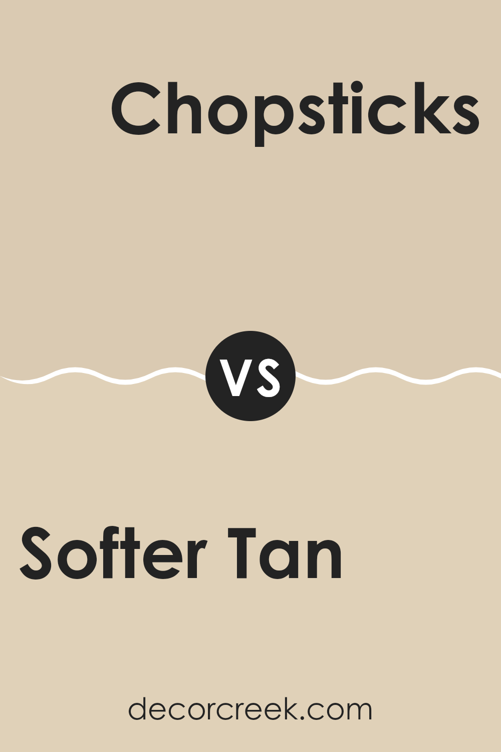
Softer Tan SW 6141 by Sherwin Williams vs Chopsticks SW 7575 by Sherwin Williams
The main color, Softer Tan, and the second color, Chopsticks, both by Sherwin Williams, offer subtle yet distinct tones suitable for creating warm and welcoming rooms. Softer Tan is a gentle, creamy hue that brings a calm, light warmth to a room, making it feel cozy and inviting.
It is an excellent choice for living areas or bedrooms where you want a soft, calming atmosphere. On the other hand, Chopsticks presents a slightly darker, more muted beige with a hint of gray. This color gives a slightly more grounded feeling and is great for rooms that you want to give a touch of modern warmth without going too dark.
While both colors are neutral, Softer Tan leans towards a lighter, creamier side, and Chopsticks edges towards a deeper, grayer shade. Each brings its unique touch to interiors, suitable for different tastes and design needs.
You can see recommended paint color below:
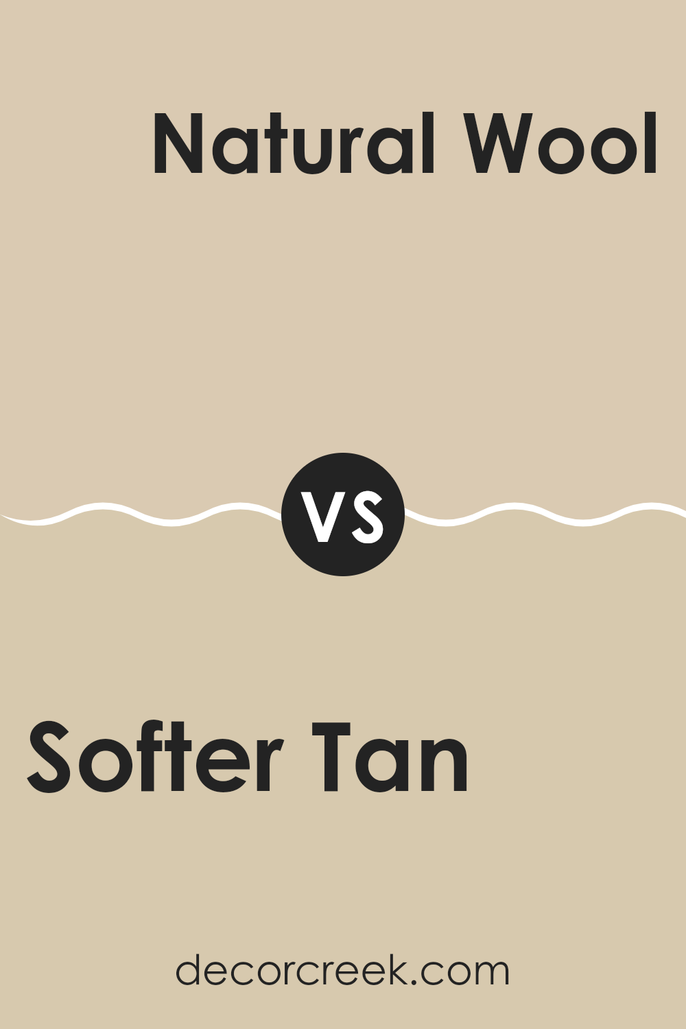
Softer Tan SW 6141 by Sherwin Williams vs Natural Wool SW 9508 by Sherwin Williams
The main color, Softer Tan, and the second color, Natural Wool, both by Sherwin Williams, share a warm neutral palette, but they have distinct tones and vibes. Softer Tan has a creamy, welcoming feel, with a hint of warmth that makes rooms cozy and inviting – perfect for living rooms or bedrooms where comfort is key. It blends well with various decor styles, enhancing wooden furniture and natural textures.
On the other hand, Natural Wool is a slightly lighter shade that gives a fresh, airy quality, making it ideal for smaller or less lit areas to help them appear more spacious. While Softer Tan provides a solid grounding effect, Natural Wool offers a subtle lift that can brighten up a room without overpowering it.
Both colors coordinate well with each other, allowing for a harmonious look across different rooms or in layered interior designs. In settings where a gentle, understated look is desired, combining these two colors can create a visually soft, yet cohesive atmosphere.
You can see recommended paint color below:
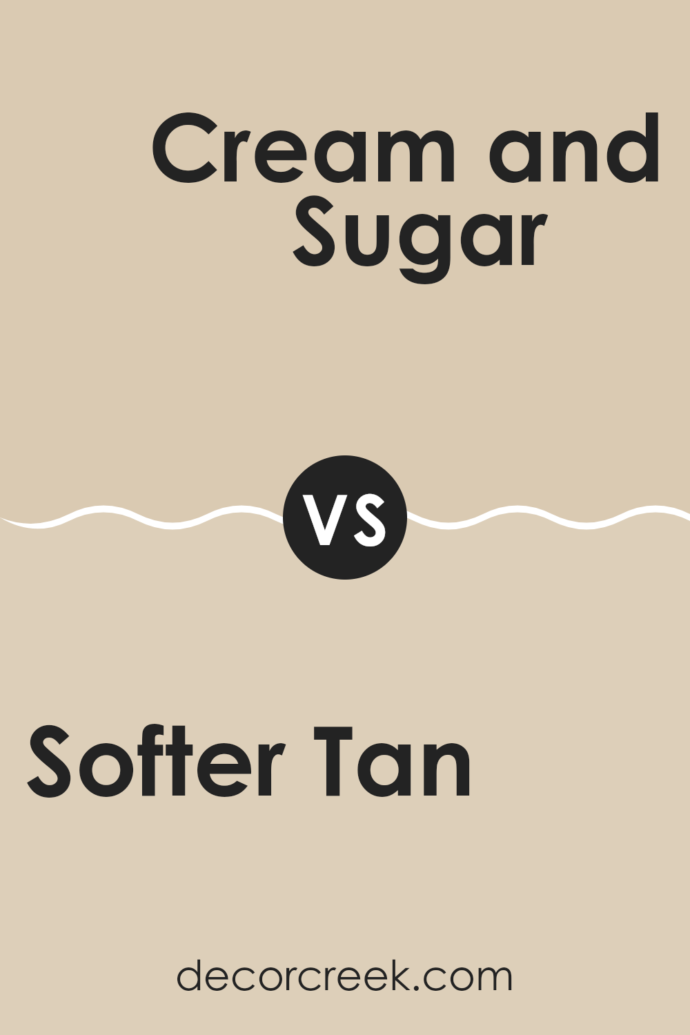
Softer Tan SW 6141 by Sherwin Williams vs Cream and Sugar SW 9507 by Sherwin Williams
Softer Tan and Cream and Sugar by Sherwin Williams are two neutral hues, but they each bring their unique style to a room. Softer Tan is a warm beige with cozy undertones that make a room feel welcoming. It pairs well with a variety of colors and can be used in any room to create a comfortable, relaxed vibe.
On the other hand, Cream and Sugar is a lighter and softer shade, akin to off-white. This color is ideal for making smaller rooms appear brighter and more open. Because of its very light tone, it serves as an excellent background for brighter colors or can be used alone for a clean, minimal look.
Both colors are flexible for decorating but serve different purposes based on the feeling you want to achieve and the size of the room you are working with.
You can see recommended paint color below:
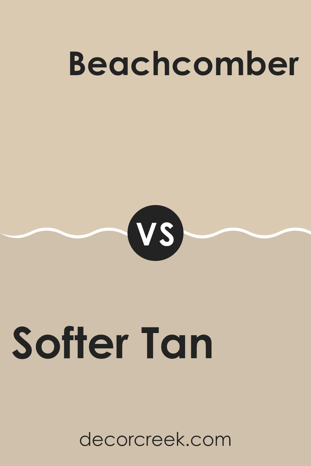
Softer Tan SW 6141 by Sherwin Williams vs Beachcomber SW 9617 by Sherwin Williams
The main color, Softer Tan, from Sherwin Williams is a warm, neutral beige. It has a comforting and welcoming feel, making it flexible for various rooms in a home. On the other hand, Beachcomber is also a neutral, but it leans towards a cooler, grayish tone.
This color is reminiscent of sandy shores and can give a room a calm, gentle atmosphere. When comparing Softer Tan and Beachcomber, Softer Tan offers a warmer hue that pairs well with many decorations and furniture, providing a cozy environment.
Beachcomber, however, offers a more subdued feel with its cooler undertones, suitable for a modern look that still maintains a relaxed vibe. Both colors are excellent choices for creating peaceful, inviting rooms but bring different moods depending on their undertones and warmth.
You can see recommended paint color below:
Softer Tan SW 6141 by Sherwin Williams vs Sand Beach SW 7529 by Sherwin Williams
The main color, Softer Tan, provides a warm, welcoming backdrop. Its gentle, light brown hue has a subtle creamy undertone that exudes a cozy and comforting feeling in any room. This color pairs well with a variety of decor styles, making it a flexible choice for any room.
On the other hand, Sand Beach is a bit darker and leans towards a khaki shade. It has a slightly more pronounced sandy color, giving a stronger sense of warmth. This makes it ideal for areas where you want to create a more pronounced, yet still neutral, presence.
Both colors work well in rooms that get a lot of natural light or rooms that need a touch of warmth. While Softer Tan might be better for a softer, lighter look, Sand Beach offers a bit more depth, making it suitable for accent walls or larger areas. They complement each other well, so using them together can create a layered, cohesive look that adds depth and interest to your home.
You can see recommended paint color below:
Softer Tan SW 6141 by Sherwin Williams vs Dirty Martini SW 9119 by Sherwin Williams
Softer Tan and Dirty Martini are two distinct colors by Sherwin Williams, each bringing its own unique vibe to a room. Softer Tan is a warm beige that feels cozy and welcoming. It’s a flexible shade that pairs well with a variety of decor styles, making rooms look inviting without overpowering them with color.
On the other hand, Dirty Martini has a richer, olive green tone that offers a touch of nature’s calmness while still adding personality. This color can make a statement in a room or be used as a subtle backdrop, depending on how it’s implemented.
When comparing these two, Softer Tan is lighter and tends to brighten up rooms, while Dirty Martini can either enhance a room’s warmth or add a subdued, earthy element. These qualities make them suitable for different purposes; Softer Tan excels in creating a soft, neutral base, and Dirty Martini works well when aiming for a more striking or cozy feel.
You can see recommended paint color below:
- SW 9119 Dirty Martini
Softer Tan SW 6141 by Sherwin Williams vs Stucco SW 7569 by Sherwin Williams
Softer Tan (SW 6141) and Stucco (SW 7569) from Sherwin Williams are two warm neutral colors, but they do have subtle differences. Softer Tan is lighter and has a creamy, almost beige look that brings a bright and airy feel to any room.
It’s perfect for creating a cozy and welcoming atmosphere without feeling too heavy. On the other hand, Stucco is darker and leans more towards a grayish taupe shade. This color can add a bit of depth to rooms, making it ideal for areas where you want a more grounded, calm feeling.
Both of these colors work well in a variety of rooms and can be paired with other shades to create a harmonious look. However, Softer Tan might be better in smaller or darker rooms to help make them appear larger and brighter, while Stucco could suit areas that benefit from a more subdued tone.
You can see recommended paint color below:
Softer Tan SW 6141 by Sherwin Williams vs Kilim Beige SW 6106 by Sherwin Williams
Softer Tan and Kilim Beige are both warm neutral colors from Sherwin Williams, but they have subtle differences. Softer Tan is a light tan that has a softer, more muted appearance, giving rooms a cozy and inviting feel. Its understated quality makes it a great choice for creating a calm and comfortable environment.
On the other hand, Kilim Beige has a slightly richer tone, leaning a bit more towards a beige that can add a touch of warmth to any room. It’s especially ideal for areas where you want to introduce a warm, welcoming backdrop that still feels light and airy.
Both colors pair well with a wide range of decor styles and can act as a base for various color schemes. Softer Tan might be preferable for those looking for a lighter, more neutral look, while Kilim Beige is suitable for those who desire a bit more warmth in their color choice. Either way, both shades provide a refined backdrop to any interior room.
You can see recommended paint color below:
Softer Tan SW 6141 by Sherwin Williams vs Tres Naturale SW 9101 by Sherwin Williams
Softer Tan and Tres Naturale are two paint colors from Sherwin Williams that offer distinct vibes for any room. Softer Tan is a warm beige with a welcoming, cozy feel. It’s great for creating a comfortable and inviting atmosphere in rooms like living rooms or bedrooms. This shade pairs well with various decor styles, adding a subtle, pleasing background color.
On the other hand, Tres Naturale is a deeper, more earthy beige. It leans towards a natural look, reminiscent of sandy landscapes or clay pottery. This color might suit areas where you want a bit more richness and depth on the walls, such as dining rooms or home offices.
While both colors provide a neutral palette, Softer Tan has a lighter, airier feel, ideal for smaller or less light-filled rooms to appear bigger and brighter. Tres Naturale, being a tad darker, provides a sense of warmth and grounding, suitable for larger rooms or rooms with plenty of natural lighting. These differences make them flexible for different uses and preferences in home decor.
You can see recommended paint color below:
- SW 9101 Tres Naturale
As I wrap up my thoughts on Sherwin Williams’ paint color SW 6141 Softer Tan, I have learned a lot about the gentle and warm feeling it can bring to a room. Softer Tan is not just any brown or beige; it’s like the cozy feeling of a soft blanket or the warm hug from a loved one. This color has a special way of making a room feel welcoming and calm without being too bright or too dark.
If you’re thinking about giving your room a new look, Softer Tan is an excellent choice because it works well with many other colors. Whether you want to paint your living room, bedroom, or even the kitchen, this color can do the trick. You can pair it with fun colors like blue or keep it mellow with soft whites and grays.
Overall, Softer Tan by Sherwin Williams is a great pick if you’re looking to make your room feel warmer and more inviting. It’s simple enough not to take over the room but still adds a nice touch of warmth and comfort. So if you’re looking for a paint color that feels like a cozy day inside, Softer Tan could be the way to go.
Ever wished paint sampling was as easy as sticking a sticker? Guess what? Now it is! Discover Samplize's unique Peel & Stick samples.
Get paint samples

