If you’re considering a fresh coat of paint and SW 7057 Silver Strand by Sherwin Williams has caught your eye, you’re likely pondering if it’s the right shade for your area. I understand the challenge of picking the perfect paint color—it can truly set the tone for your entire room. Before you make your decision, there are a few key points you should consider about Silver Strand.
Firstly, it’s vital to think about the lighting in your room. Silver Strand can look vastly different depending on the light, appearing more grey in some rooms and more of a soft blue in others. You’ll also want to think about the existing colors in your décor. This shade pairs beautifully with whites and creams, providing a calm and cohesive look, but might clash with brighter, more saturated colors.
Furthermore, consider the mood you’re aiming to create. Silver Strand gives a calm and soothing vibe, making it ideal for bedrooms or bathrooms where you seek relaxation. However, if you’re looking for something that makes a bolder statement, this might not be your go-to color.
By keeping these considerations in mind, you’ll be better equipped to decide if SW 7057 Silver Strand is the best fit for your decorating goals. Choosing a paint color is a significant decision, but understanding how it works in different settings and alongside various elements can help you make a choice you’ll be happy with for years to come.
Is Silver Strand SW 7057 Right for My Home?
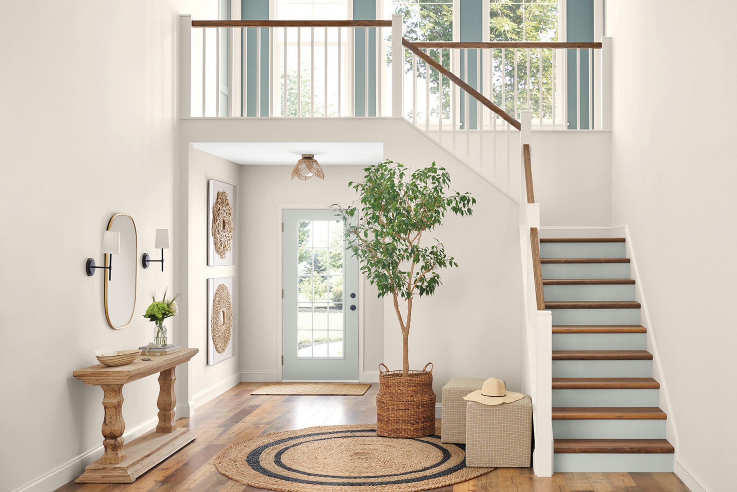
Silver Strand is a lovely, subtle gray with just a hint of green, giving it a calm and inviting quality. As a fan of adaptable colors in home decor, I find it has this chameleon-like ability to adjust to different areas and lighting, looking slightly more gray or green depending on the surroundings.
In my experience, this shade works beautifully in modern and coastal style interiors. It pairs really well with white trim, bringing out its vibrant side while maintaining an overall understated feel. I also love combining it with natural textures and materials, such as warm wood tones, linen fabrics, and stone accents. These combinations emphasize its earthy undertones, creating an organic and cohesive look.
Additionally, Silver Strand fits perfectly with metallic finishes like brushed nickel or aged brass, which bring out its subtle refined character without overpowering. Similarly, pairing it with soft, plush textiles can make a room feel more comfortable and welcoming, a perfect match for living rooms and bedrooms where you want to bring a sense of relaxation and ease.
For anyone redoing an area and looking for a color that supports a range of styles and materials, I definitely recommend giving Silver Strand a try. It’s remarkably adaptable and always seems to work nicely with whatever decor I add to it.

What are the right undertones of Silver Strand SW 7057 ?
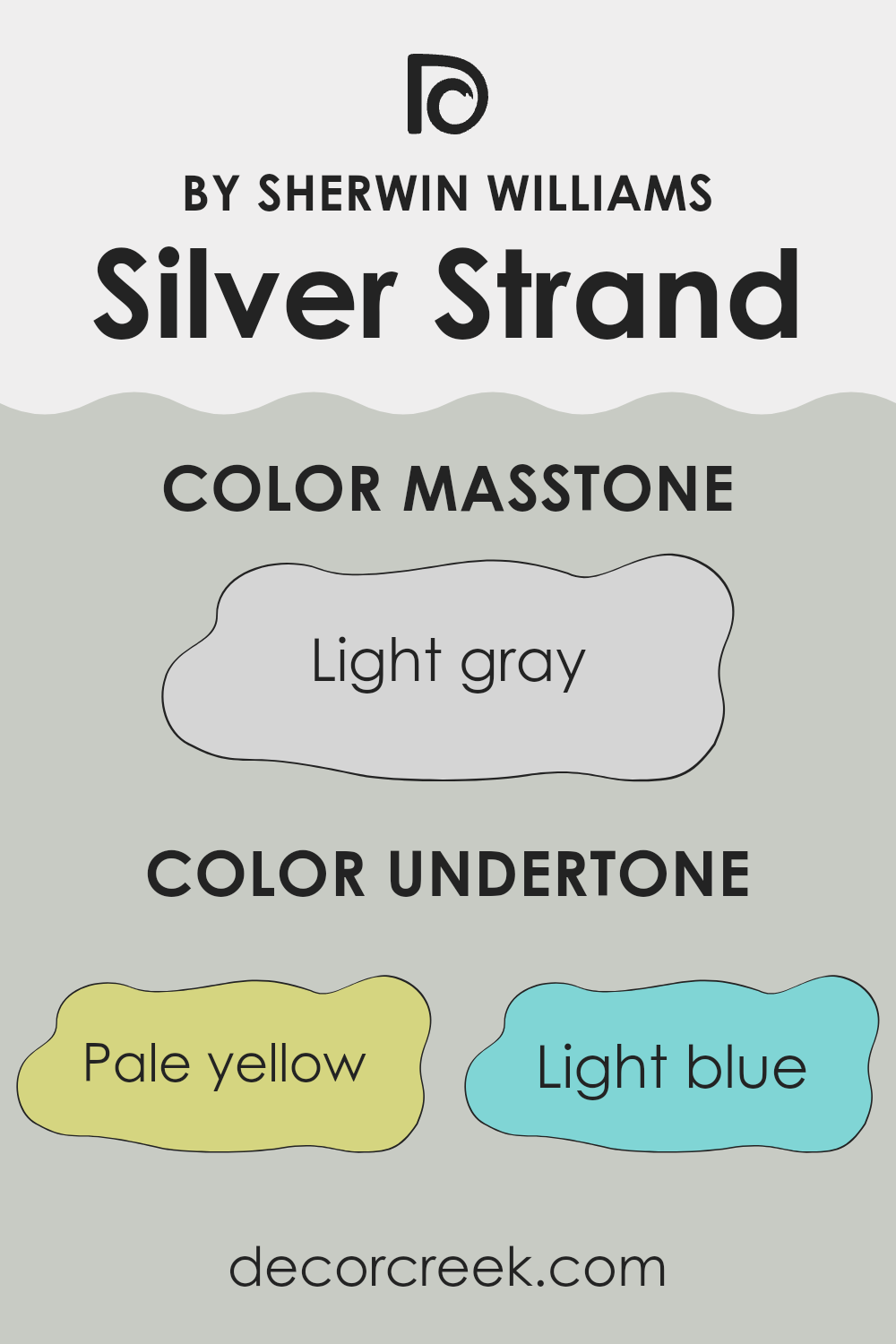
Silver Strand is a unique color with multiple undertones that can subtly influence the ambiance and appearance of a room. Undertones are slight hints of other colors that can be visible under different lighting conditions. This can significantly affect how we perceive the main color.
When it comes to Silver Strand, the undertones include pale yellow, light blue, light purple, mint, pale pink, lilac, and grey. These undertones can cause the color to shift slightly depending on the type of light in a room, whether it’s bright daylight or artificial light.
In an interior setting, these undertones help Silver Strand adjust to different styles and decors. For instance, the pale yellow and light blue undertones can make a room feel more airy and fresh, which is ideal for a living room or kitchen. On the other hand, the light purple and lilac undertones might bring out a softer, more subtle vibe, perfect for bedrooms.
The grey and mint undertones give the color a cool base, making it adaptable for various areas and complementing both modern and classic furnishings. As lighting changes throughout the day, these undertones can become more apparent, adding a dynamic character to the room. Overall, understanding the undertones of Silver Strand can help in choosing the right room and accompanying decor to best use the color to its fullest potential, improving the overall atmosphere of your home.
Best Coordinating Colors to use with Silver Strand SW 7057 by Sherwin Williams this year.
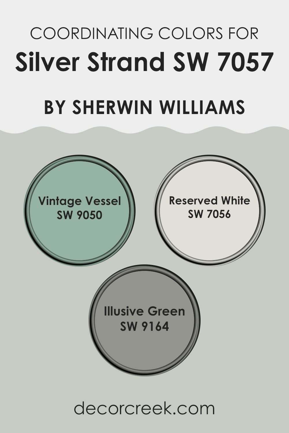
Coordinating colors are shades that are chosen to work harmoniously with a main color, enhancing the overall aesthetic appeal without overpowering it. In the case of Silver Strand by Sherwin Williams, an elegant hue, it pairs beautifully with tones like SW 9050 – Vintage Vessel, SW 7056 – Reserved White, and SW 9164 – Illusive Green.
These coordinating colors contribute to creating a pleasing palette that balances well with Silver Strand, allowing for a coherent look throughout an interior area. By picking such complementary shades, one can ensure that the areas feel coordinated and visually appealing.
Vintage Vessel is a deep, muted blue-green tone that brings a touch of earthiness to the palette, providing a rich contrast to the lighter tones. Reserved White, on the other hand, is a soft, clean white that offers brightness and a sense of freshness, working as a perfect backdrop for deeper colors. Illusive Green is a subtle, soft gray-green that adds a hint of natural color to a room without clashing with more subdued or neutral tones. Each of these colors supports and improves the main hue, Silver Strand, by creating a layered effect that adds depth and interest to the area.
You can see recommended paint colors below:
- SW 9050 Vintage Vessel
- SW 7056 Reserved White
- SW 9164 Illusive Green
Trendy Trim Colors of Silver Strand SW 7057 by Sherwin Williams to use this year.
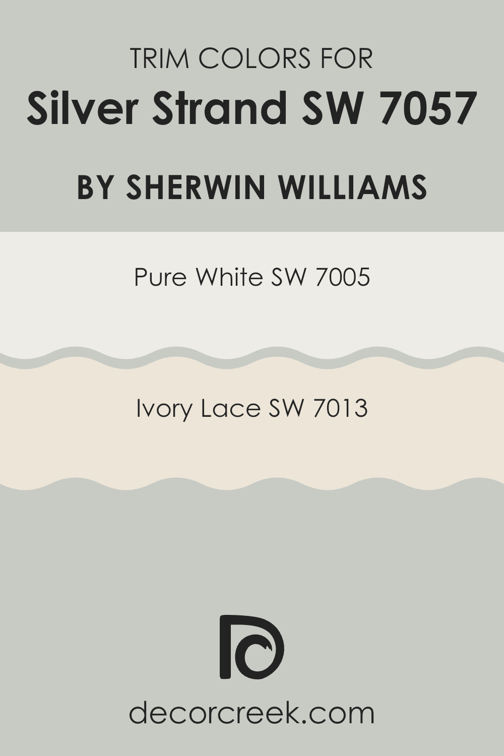
Trim colors, such as SW 7005 – Pure White and SW 7013 – Ivory Lace, play a crucial role in framing and accentuating the primary color of a room, like Silver Strand by Sherwin Williams. Choosing the right trim color can improve the aesthetic appeal of the walls by creating a clean, crisp border that highlights the wall color.
With a strategic use of trim colors, you can subtly define the architectural details of an area and add a finishing touch that complements the main wall color, thus giving a more finished and neat appearance to any room.
SW 7005 – Pure White is a bright, clean white that brings a sense of freshness and clarity to a room. It pairs beautifully with Silver Strand by providing a stark, clear contrast that can make the main color stand out more vividly. On the other hand, SW 7013 – Ivory Lace is a softer, warmer white with a hint of creaminess, offering a more subtle and gentle complement to the cooler tones of Silver Strand. Ivory Lace can soften the overall look and bring a cozy warmth to areas that favor a softer, more muted decor.
You can see recommended paint colors below:
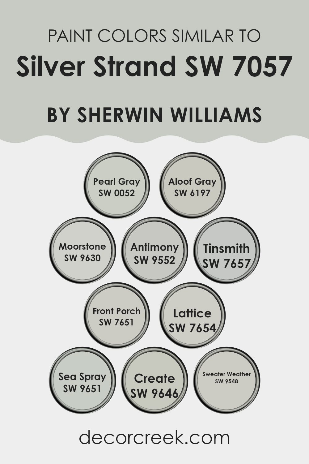
Evergreen Colors Similar to Silver Strand SW 7057 by Sherwin Williams
Similar colors are crucial in design because they create a sense of harmony and balance, facilitating a smooth visual transition in areas. These shades, which have enough contrast to stand subtly apart yet are close enough to complement each other, can achieve a cohesive look without the monotony of using a single color. When you use shades like Pearl Gray, Aloof Gray, or Moorstone, which are aligned in tone, you enrich the environment subtly while maintaining a unified appearance.
For instance, the gentle Pearl Gray offers a soft, almost mist-like appeal which contrasts subtly against the deeper Aloof Gray, reminiscent of a cloudy sky. Moorstone has a stronger, earthy quality that adds depth to this palette. Meanwhile, Antimony introduces a touch of warmer nuances, balancing the cooler gray tones.
Tinsmith and Front Porch share this finesse, with Tinsmith displaying a lighter, more airy gray while Front Porch brings in slightly more pronounced gray hues that suggest the shadowy sides of a balcony. Lattice is like a crosslink between these, bringing in elements from both to provide a connecting color that ensures fluidity.
Sea Spray and Create lean towards blue-gray nuances, evoking the feel of a misty shoreline and the creativity of a moody, artistic studio. Sweater Weather rounds out these choices with a cozy tone, referencing the comfort of a soft, warm knit on a chilly day. These shades together offer flexibility in decor while establishing a blueprint of subtle elegance and quiet beauty.
You can see recommended paint colors below:
- SW 0052 Pearl Gray
- SW 6197 Aloof Gray
- SW 9630 Moorstone
- SW 9552 Antimony
- SW 7657 Tinsmith
- SW 7651 Front Porch
- SW 7654 Lattice
- SW 9651 Sea Spray
- SW 9646 Create
- SW 9548 Sweater Weather
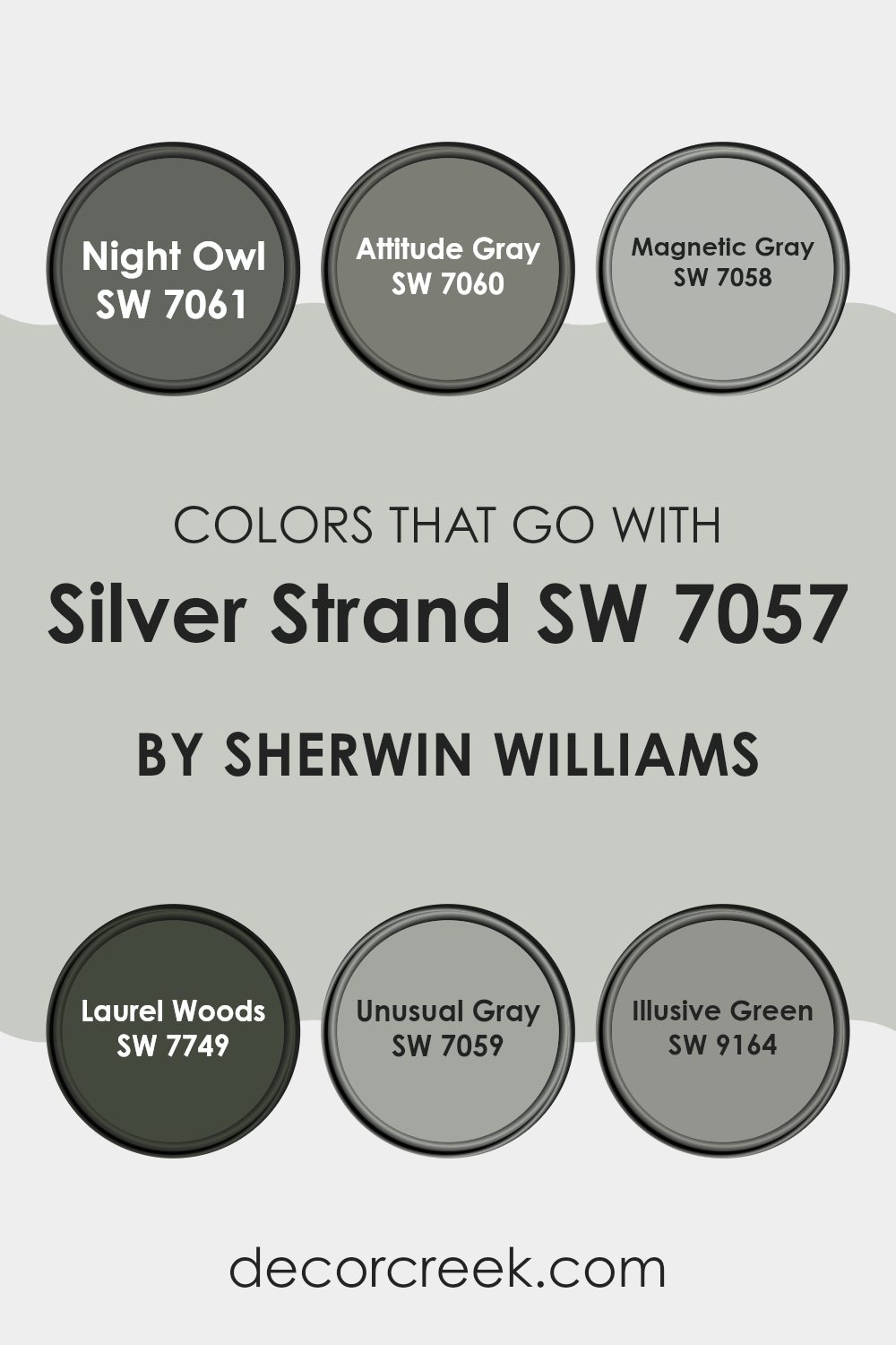
Colors that Go With Silver Strand SW 7057 by Sherwin Williams
Choosing colors that complement Silver Strand SW 7057 by Sherwin Williams can greatly improve the aesthetic of any area by creating harmony and balance. When paired effectively, these colors can set a specific mood or theme, making a room feel more inviting and cohesive. Color combinations are vital because they help in achieving a desired look and feel, whether for creating contrast or blending smoothly with the surroundings.
Night Owl SW 7061 is a deep grayish-blue that adds depth and intensity. It’s perfect when you want to add some drama or anchor lighter shades like Silver Strand. Attitude Gray SW 7060, as the name suggests, introduces a bold medium gray which can give a room a strong presence and pairs well with metallic or vibrant accent pieces.
Magnetic Gray SW 7058 is a lighter gray that works smoothly with Silver Strand to promote a seamless transition in areas that benefit from understated continuity. Laurel Woods SW 7749 offers a rich, deep green recalling the shade of forest foliage and provides a natural, grounding element that complements the silvery tones. Unusual Gray SW 7059 is another moderate gray with a hint of blue, and it’s perfect for those looking for a soft, neutral backdrop that is easy to accessorize. Lastly, Illusive Green SW 9164 brings in a subtle, muted green, ideal for bringing in elements of nature and freshness without overpowering the clean, calm palette set by Silver Strand.
You can see recommended paint colors below:
- SW 7061 Night Owl
- SW 7060 Attitude Gray
- SW 7058 Magnetic Gray
- SW 7749 Laurel Woods
- SW 7059 Unusual Gray
- SW 9164 Illusive Green
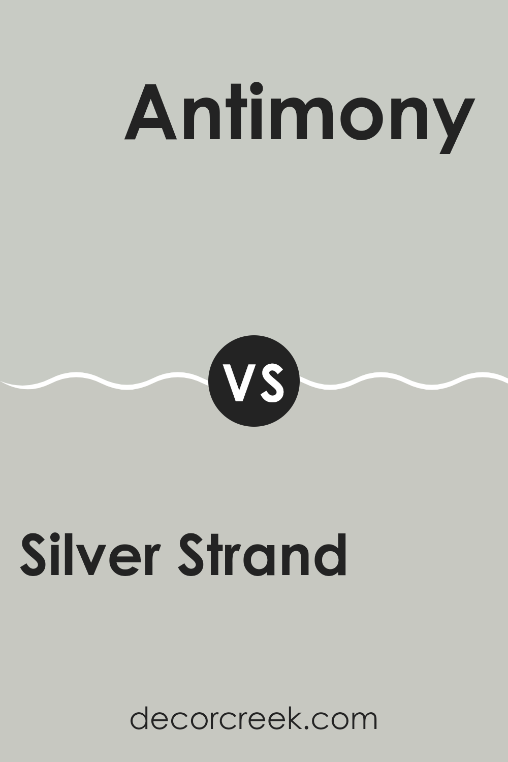
Silver Strand SW 7057 by Sherwin Williams vs Antimony SW 9552 by Sherwin Williams
Silver Strand and Antimony, both by Sherwin Williams, offer unique tones for different decorating needs. Silver Strand is a light gray with a subtle hint of green, providing a soft and calming effect that’s perfect for a relaxed look in areas like living rooms or bedrooms. It’s quite adaptable and can work well with a variety of decor styles.
On the other hand, Antimony is a darker, smoky blue with a touch of gray. This color lends a more grounded, moody feel to a room and is ideal for creating a striking impression. It’s excellent for feature walls or rooms where you want a bit more drama and personality.
Both colors pair well with a range of other hues and furnishings, allowing flexibility in design choices. While Silver Strand reflects more light and improves the sense of area, Antimony draws in the eyes, making it a focal point. Each color offers a unique atmosphere and can define a room’s vibe distinctly.
You can see recommended paint color below:
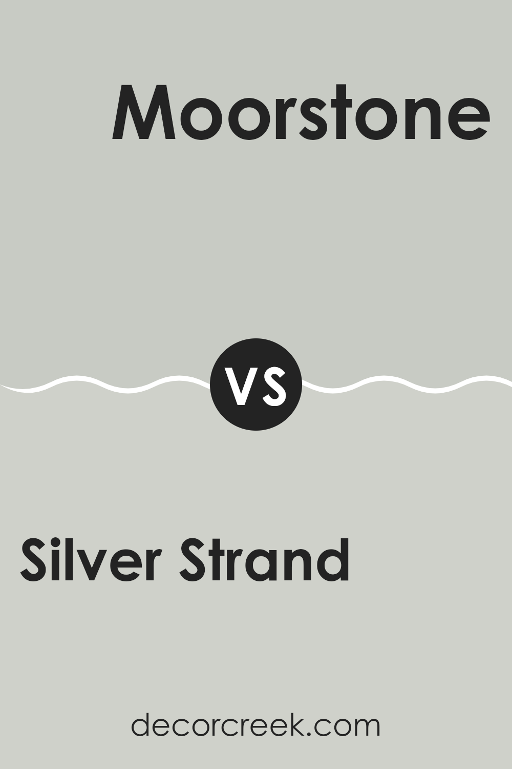
Silver Strand SW 7057 by Sherwin Williams vs Moorstone SW 9630 by Sherwin Williams
Silver Strand and Moorstone, both by Sherwin Williams, offer unique shades suitable for various decorating needs. Silver Strand is a soft, light gray with subtle blue and green undertones, giving it a fresh and airy feel perfect for creating a calming environment in places like bedrooms or living rooms.
In contrast, Moorstone is a much darker gray that leans toward a slate color. This shade can provide a strong foundation or accent in a room, offering depth and a sense of grounding without overpowering the area with darkness.
While Silver Strand reflects more light and can help make a small room appear larger and more open, Moorstone works well in larger areas or as an accent to create focus. Both colors work well with modern and traditional decor alike, making them adaptable choices for refreshing your area.
You can see recommended paint color below:
Silver Strand SW 7057 by Sherwin Williams vs Create SW 9646 by Sherwin Williams
Silver Strand and Create are both unique paint colors from Sherwin Williams, but they bring very different feel to areas. Silver Strand is a light gray with slight blue-green undertones, giving it an airy and fresh look. It’s adaptable for any room, working well in both bright and dimmer lighting, making areas feel open and clean.
On the other hand, Create is a bolder, saturated yellow. It’s a vibrant and cheerful color that can instantly make a room feel lively and energetic. It’s perfect for areas where you want to add a sense of sunshine or perk up a dull area.
While Silver Strand is more subdued and can be a backdrop for various decor styles, Create demands attention and would be used as an accent or in rooms where you want to bring a joyful, upbeat ambiance. Both these colors serve different purposes but are excellent choices depending on what atmosphere you’re aiming to achieve.
You can see recommended paint color below:
Silver Strand SW 7057 by Sherwin Williams vs Sweater Weather SW 9548 by Sherwin Williams
Silver Strand and Sweater Weather are two distinct paint colors from Sherwin Williams, each offering a unique vibe for room decor. Silver Strand is a light gray with subtle green undertones.
It feels fresh and calm, making it suitable for areas where you want a clean and airy look, like bathrooms or small offices. On the other hand, Sweater Weather is a darker shade that might remind you of a cloudy sky or stormy seas.
It’s a deeper color that can add a bit more drama to an area, ideal for creating a cozy, enclosed feel in places like bedrooms or living rooms. Both colors are adaptable and can be paired with various decor styles, but each serves better in different types of rooms depending on the mood you want to set.
You can see recommended paint color below:
Silver Strand SW 7057 by Sherwin Williams vs Sea Spray SW 9651 by Sherwin Williams
Silver Strand and Sea Spray by Sherwin Williams are two distinct paint colors, each bringing its unique vibe to an area. Silver Strand lies in the softer spectrum, presenting a light gray with subtle green undertones. This color is adaptable, working well in various settings without overpowering a room’s existing decor. It’s a great choice for someone looking to achieve a gentle backdrop that complements different styles and furnishings.
On the other hand, Sea Spray is a bit bolder. It’s a fresh green with a hint of blue, reminiscent of the ocean on a clear day. This hue adds a bit more personality and can be a focal point in a room. It’s perfect for those wanting to add a subtle splash of color while maintaining a calm and refreshing atmosphere.
In a nutshell, Silver Strand offers a subdued, adaptable background, while Sea Spray provides a touch of lively color without being too loud. Both colors can brighten and refresh a room but in different ways.
You can see recommended paint color below:
Silver Strand SW 7057 by Sherwin Williams vs Lattice SW 7654 by Sherwin Williams
Silver Strand and Lattice, both by Sherwin Williams, are distinct yet complementary shades of paint. Silver Strand is a light grayish-green, offering a soft and understated vibe that feels airy and light. It’s perfect for those looking to create a gentle, soothing atmosphere in a room without adding too much color intensity.
On the other hand, Lattice is a more defined gray with subtle blue undertones. This shade is slightly darker and cooler compared to Silver Strand, making it ideal for areas that benefit from a calm but more pronounced color presence.
Both colors work wonderfully in muted and modern decor styles, with Silver Strand bringing a hint of warmth due to its greenish tint, and Lattice providing a crisper, more neutral look. Together, they could complement each other nicely in a color scheme for a home, especially in areas that transition from outdoor to indoor areas.
You can see recommended paint color below:
Silver Strand SW 7057 by Sherwin Williams vs Pearl Gray SW 0052 by Sherwin Williams
Silver Strand and Pearl Gray are two paint colors offered by Sherwin Williams, each giving a unique touch to any area. Silver Strand falls into the category of light gray with subtle green undertones. This color is mild and calm, making it a adaptable choice for rooms that benefit from a soft, neutral backdrop. It’s particularly effective in areas that get plenty of natural light, as the light brings out its unique undertones.
On the other hand, Pearl Gray, despite its name, leans more toward a traditional gray. It has blue undertones which give the color a cooler feel compared to Silver Strand. Pearl Gray provides a clean and straightforward look, making it ideal for those who prefer something less complex and more straightforward in color dynamics.
Both colors are subtle and understated but differ mainly in their undertones. Silver Strand offers a hint of warmth with its green lean, whereas Pearl Gray stays cool with its blue hues. These qualities make them suitable for different room aspects and lighting conditions.
You can see recommended paint color below:
Silver Strand SW 7057 by Sherwin Williams vs Front Porch SW 7651 by Sherwin Williams
Silver Strand and Front Porch are both soothing tones of grey offered by Sherwin Williams, but each carries a unique vibe. Silver Strand sits on the lighter side with soft green undertones, making it perfect for a fresh feel in any room. This color is well-suited for places where you want calmness, like bedrooms or bathrooms. It reflects light gently, helping small areas appear larger and more inviting.
On the other hand, Front Porch, while also grey, veers toward a slightly bluer hue. This gives it a cooler presence, which can be great for creating a relaxed atmosphere in areas like living rooms or entryways. Although both colors provide a neutral palette, Front Porch has a bit of a shadowy vibe compared to the lighter touch of Silver Strand.
Both colors work well in a modern home setting, providing flexibility in decor choices and pair beautifully with a variety of accent colors, from bold to muted. Whether you go for Silver Strand’s gentle warmth or Front Porch’s cooler tone, each color has its charm, ready to be paired with other elements in your home for a stunning interior.
You can see recommended paint color below:
Silver Strand SW 7057 by Sherwin Williams vs Aloof Gray SW 6197 by Sherwin Williams
Silver Strand and Aloof Gray, both by Sherwin Williams, offer a subtle and calming presence but differ in their undertones and overall feel. Silver Strand sits comfortably between gray and green, leaning more toward a light, fresh gray with a soft green hint that makes it great for areas aiming for a gentle, nature-inspired vibe. Its brightness lends a refreshing and airy quality, especially in well-lit rooms.
On the other hand, Aloof Gray is a true gray that provides a cooler, more neutral backdrop. It lacks the green undertones of Silver Strand, steering more toward a classic gray look that fits smoothly in modern and minimalistic designs. Its cooler tones make it suitable for contemporary areas that benefit from a straightforward, clean aesthetic.
Both colors are adaptable, but Silver Strand works beautifully in areas where a touch of color is desirable without overpowering the senses, while Aloof Gray is perfect for achieving a more subdued, pure gray atmosphere.
You can see recommended paint color below:
Silver Strand SW 7057 by Sherwin Williams vs Tinsmith SW 7657 by Sherwin Williams
Silver Strand and Tinsmith, both by Sherwin Williams, are subtle and adaptable shades of gray. Silver Strand has a cool undertone that sometimes shows hints of green, creating a peaceful and mild atmosphere that works well in almost any area. It’s particularly refreshing and can help areas feel more open and airy.
On the other hand, Tinsmith is a bit more neutral compared to Silver Strand. With a slightly darker tone, it provides a stronger presence yet remains very adaptable. This color doesn’t shift much under different lighting, maintaining its steady gray appearance, which makes it perfect for providing a consistent look in areas that receive varying amounts of natural light.
Both colors give a clean and modern feel, making them excellent choices for interior designs that aim for a fresh, contemporary look. The contrast in their undertones and brightness levels allows them to complement each other when used in the same design scheme.
You can see recommended paint color below:
Summing up my thoughts on SW 7057 Silver Strand by Sherwin Williams, I can confidently say that it’s a fantastic paint color choice for anyone looking to freshen up their home. Silver Strand has this really lovely, soft gray tone with a hint of blue-green, which makes rooms feel cozy and inviting. It’s not too dark or too light, making it just perfect for all sorts of areas, from bedrooms and bathrooms to kitchens and living areas.
What’s great about Silver Strand is how nicely it works with different styles of furniture and home decors, whether you have modern pieces or more traditional stuff. It doesn’t clash with vibrant colors or patterns in furniture and decorations, which means you don’t have to buy new stuff to make your room look good. Also, it does a fantastic job at hiding small marks or dirt on the walls due to its subtle color blend, which is super helpful in areas that get a lot of use, like a busy family living room.
Overall, choosing Silver Strand is a smart pick because it not only looks beautiful but also adds a warm and welcoming vibe to a room. Plus, it’s a paint color that will likely still look great as time goes on and tastes change. So, it’s a winner in my book for anyone looking to paint their area a new color!
Ever wished paint sampling was as easy as sticking a sticker? Guess what? Now it is! Discover Samplize's unique Peel & Stick samples.
Get paint samples

