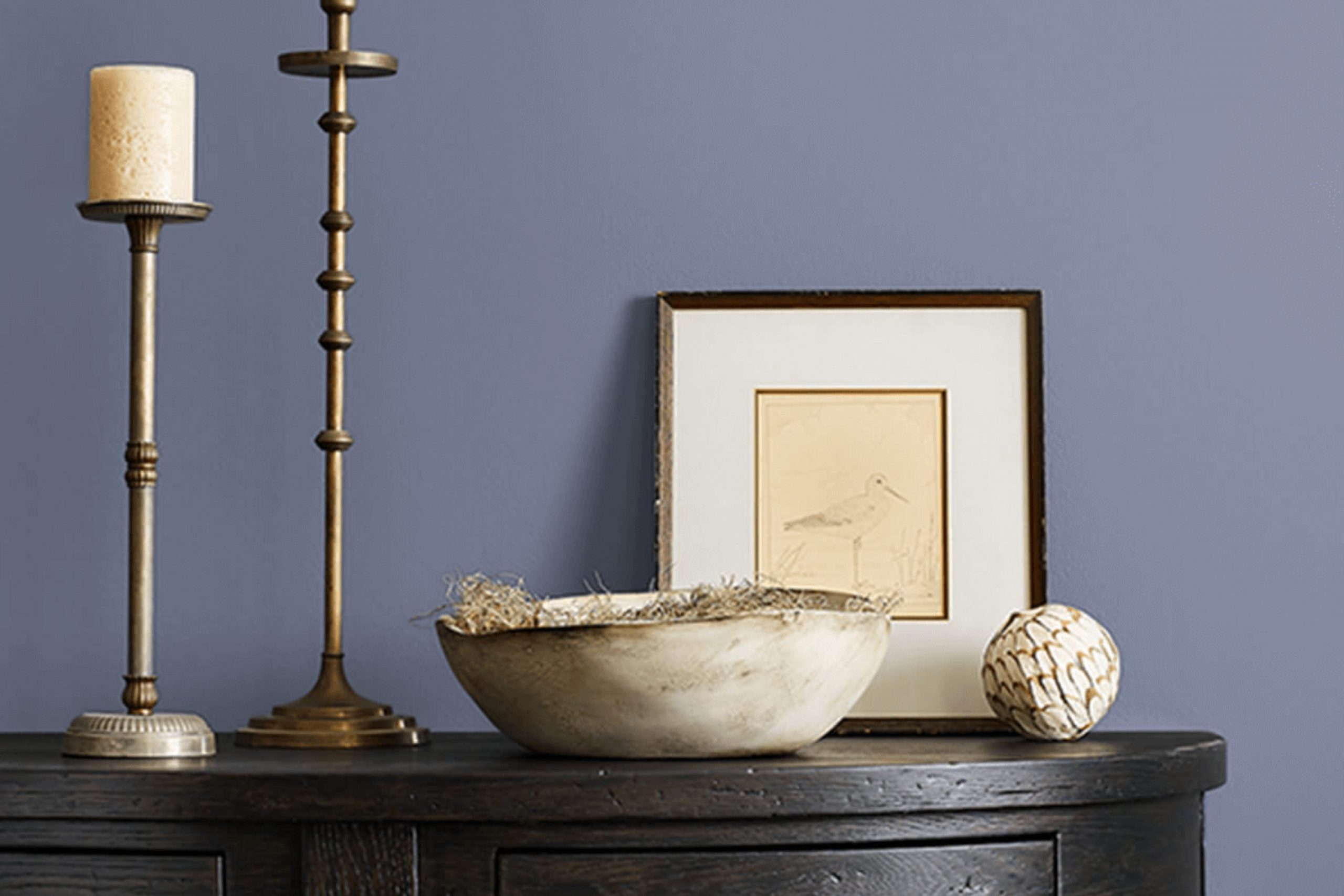
I recently had the opportunity to use SW 6543 Soulful Blue by Sherwin Williams, and I must say, it’s a unique shade of blue that stands out in the crowd. Unlike the typical blues that might remind you of the ocean or the sky, Soulful Blue has a depth that hints at something more introspective and personal. Working with this color, I found it added a quiet refined touch to the room, providing a calming backdrop that complemented both contemporary and traditional decor styles.
You might think choosing a paint color is just about matching it with your furniture, but it’s more than that. The right color can actually influence the mood of the room. Soulful Blue has a way of making rooms feel more inviting and comfortable without feeling too dramatic. It’s subtle enough not to feel heavy but still adds character through its richness.
If you’re looking to update your room without going for something too bold, Soulful Blue could be the perfect choice. It works beautifully in bedrooms, living rooms, or even kitchens, making any room feel more grounded yet still airy and open.
Whether you’re repainting a whole room or just an accent wall, consider how this color might enhance your home’s atmosphere.
What Color Is Soulful Blue SW 6543 by Sherwin Williams?
Soulful Blue by Sherwin Williams is a rich and calming color that stands out for its flexibility and subtle depth. This shade of blue has a gentle strength to it that brings a peaceful presence to any room. It’s not too bold, yet it holds enough character to make a statement, making it an excellent choice for a primary color in your decorating palette.
This color works wonderfully in many interior design styles. It’s perfect for coastal themes where its ocean-like tones complement light, airy fabrics and natural materials such as linen and rattan. In a modern farmhouse setting, Soulful Blue adds a touch of country charm when paired with distressed wood elements and soft, neutral textiles.
For a contemporary vibe, match Soulful Blue with sleek materials like glass or polished metals to create a clean and fresh look. It also pairs well with velvet or silk textures, adding a layer of luxury without feeling too intense.
Whether used for a feature wall, as a backdrop to art, or incorporated into accessories and furnishings, Soulful Blue provides a stable foundation that highlights wood, leather, and various fabrics. It helps to create a cozy, inviting atmosphere in homes, proving to be both flexible and stylish.
decorcreek.com
Is Soulful Blue SW 6543 by Sherwin Williams Warm or Cool color?
Soulful Blue by Sherwin Williams is a rich and lively shade of blue that adds a unique character to any room. This color has a warm undertone that makes it incredibly flexible for home decoration.
Whether you’re painting a bedroom, living room, or even a kitchen, Soulful Blue offers a fresh and appealing look. Unlike lighter blues, it provides a strong presence without feeling too intense, making it an excellent choice for accent walls or furniture pieces.
In homes, this color pairs well with neutrals such as white, gray, and beige, allowing it to stand out without clashing with other colors. It works particularly well in rooms that benefit from a pop of color to liven up the atmosphere. Additionally, because of its depth, Soulful Blue can help create a feeling of warmth and coziness, perfect for family rooms or dining areas. It’s a great choice for anyone looking to add a touch of personality and charm to their interior without going too bold.
Undertones of Soulful Blue SW 6543 by Sherwin Williams
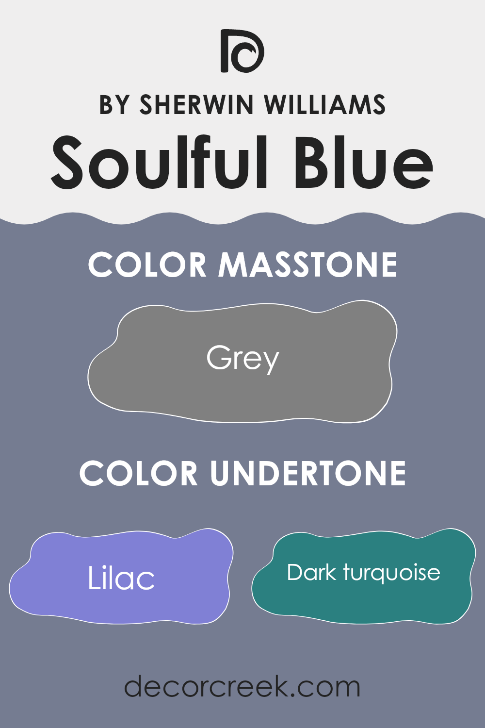
Soulful Blue by Sherwin Williams is a complex color with a rich palette of undertones. Undertones are subtle colors that lurk beneath the surface of the main color and can influence the overall look and feel in a variety of lighting situations. For Soulful Blue, there’s a wide spectrum of undertones ranging from lilac, pink, and various shades of blue and green, to deeper hues like navy and violet, as well as neutrals like light gray.
In interior settings, these undertones play a key role in how the color manifests itself. For instance, in a room with abundant natural light, the lilac and light blue undertones of Soulful Blue might make the walls appear softer and more inviting. In contrast, in rooms with less natural light or during evening hours, darker undertones like navy and dark turquoise might become more noticeable, giving a more grounded and cozy atmosphere.
Moreover, the mint and pale pink undertones can add a subtle freshness to the room, making it feel light and airy. On the other hand, undertones like olive or brown can provide a touch of warmth, which can make large rooms feel more intimate.
Positioning and neighboring colors can also affect how these undertones are perceived. For instance, placing Soulful Blue next to warmer colors might highlight its cool lilac or blue undertones, while pairing it with cooler tones could bring out its warmer brown or olive undertones.
Overall, the varied undertones of Soulful Blue make it a flexible color choice for interiors, offering a dynamic array of effects depending on its environment and complementing decor, thereby affecting the mood and character of any room.
What is the Masstone of the Soulful Blue SW 6543 by Sherwin Williams?
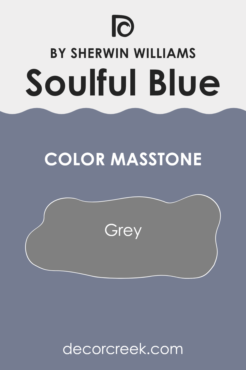
Soulful Blue SW 6543 by Sherwin Williams has a masstone, or primary color tone, of grey. This neutral backbone makes it a flexible choice for home interiors. The grey base in Soulful Blue means it pairs easily with a wide range of decor styles and colors, from bright and bold to soft and subtle.
When used on walls, it provides a calm and steady backdrop, allowing furniture and artwork to stand out. This hue absorbs and reflects light in a way that can make small rooms appear larger and give interiors a balanced, cohesive look.
Additionally, its grey undertones can help mask everyday wear and tear, making it a practical option for busy households. As a color that doesn’t lean too warm or too cool, it’s excellent for creating a cohesive look throughout a home, from the living room to the bedroom.
How Does Lighting Affect Soulful Blue SW 6543 by Sherwin Williams?
Lighting plays a crucial role in how colors are perceived in a room. The color Soulful Blue from Sherwin Williams is a good example to demonstrate the effect of different lighting conditions.
In artificial light, colors can look very different compared to natural light because the color temperature and intensity of artificial light varies widely. Soulful Blue will typically appear richer and slightly darker under most artificial lighting, emphasizing its cozy and snug attributes which can make a room feel welcoming during evenings.
In natural light, the appearance of Soulful Blue can change dramatically depending on the direction of the room’s windows. In rooms that face north, natural light is cooler and can make this shade appear slightly more muted and subtle. This can give the room a calm and peaceful vibe, especially if the room gets consistent but indirect light throughout the day.
Rooms that face south receive more intense, direct sunlight, which can bring out the vibrancy of Soulful Blue. Here, the blue might look brighter and more lively, creating a cheerful and energetic room that can be perfect for living areas or any room used frequently during the day.
In east-faced rooms, morning light can make Soulful Blue look soft and refreshing, providing a gentle start to the day. The color tends to appear more blue and vibrant in the morning but will subtly shift as the day progresses and becomes less intense toward the afternoon.
West-faced rooms will see the opposite effect. Soulful Blue will look more neutral and subdued in the morning, but as the sun sets, the color can look more intense and dynamic, potentially giving the room a more dramatic look in the evening light.
Overall, Soulful Blue’s perception is highly influenced by the light it’s exposed to, making it a flexible choice depending on the room’s orientation and lighting conditions.
What is the LRV of Soulful Blue SW 6543 by Sherwin Williams?
LRV stands for Light Reflectance Value, which is a measurement that tells you how much light a paint color reflects back into a room compared to how much it absorbs. In simpler terms, LRV helps you understand how light or dark a color will look once it’s on your walls.
It’s measured on a scale where black has a value of 0 (it absorbs all light) and white has a value of 99 (it reflects all light). The larger the LRV number, the lighter the paint will appear on your walls. This measurement is especially useful when choosing paint colors because it can help you predict how a color will change in appearance under different lighting conditions.
The LRV of Soulful Blue is 20.299, which means it is on the darker end of the scale. This relatively low LRV indicates that it absorbs a lot of light rather than reflecting it. Thus, when used on walls, Soulful Blue will appear quite deep and rich, giving a room a more enclosed and cozy feel. This attribute makes it a suitable choice for larger rooms or areas with ample natural light, where the depth of the color can add character without making the room feel too dark. However, in a small or dimly lit room, using a color with such a low LRV might make the room feel smaller and darker.

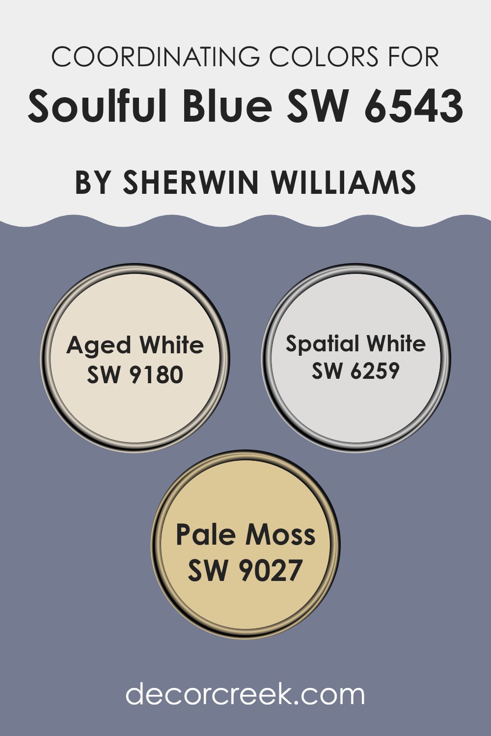
Coordinating Colors of Soulful Blue SW 6543 by Sherwin Williams
Coordinating colors are hues that complement each other when used together in a room, creating a harmonious and appealing visual experience. These colors often share a similar tone or intensity and can enhance the main color’s characteristics without feeling too heavy.
Sherwin Williams offers a palette of coordinating colors that pair well with Soulful Blue to create a flexible and attractive scheme for any room. When chosen wisely, these colors can subtly balance or punctuate the dominant hue of a room, enriching the overall ambience.
Aged White SW 9180 sets a soft, neutral backdrop that allows bolder colors like blue to stand out while giving the room a calm and cohesive feel. It’s a gentle off-white with a touch of warmth that prevents it from feeling stark or cold.
Spatial White SW 6259 is a cooler, almost airy white that provides a crisp, clean look, ideal for creating a sense of more openness and light in smaller or darker rooms. Lastly, Pale Moss SW 9027 brings in an earthy, subtle green that complements blues beautifully, adding a natural, calming touch to the environment. This approach to combining colors helps achieve a balanced, visually pleasing room.
You can see recommended paint colors below:
- SW 9180 Aged White
- SW 6259 Spatial White
- SW 9027 Pale Moss
What are the Trim colors of Soulful Blue SW 6543 by Sherwin Williams?
Trim colors play a crucial role in enhancing and defining the appearance of your main wall color. When used effectively, they frame the walls and create a sense of completeness in any room.
For a color like Soulful Blue, selecting suitable trim colors like SW 7035 Aesthetic White and SW 7004 Snowbound can make a significant difference. These trim colors provide a clear boundary and smooth transition that effectively highlights the richness of Soulful Blue, ensuring that the room feels balanced and neatly assembled.
Aesthetic White (SW 7035) is a soft, off-white shade that offers a gentle contrast which does not overpower the primary color. It is an excellent choice for creating a subdued yet distinct edge to areas painted with Soulful Blue, giving the room a fresh and polished look. On the other hand, Snowbound (SW 7004) is a brighter, clean white, bringing a sharper contrast that can make the blue seem more vibrant. This shade is ideal if you want to add a more dynamic feel to the room while still keeping a harmonious atmosphere.
You can see recommended paint colors below:

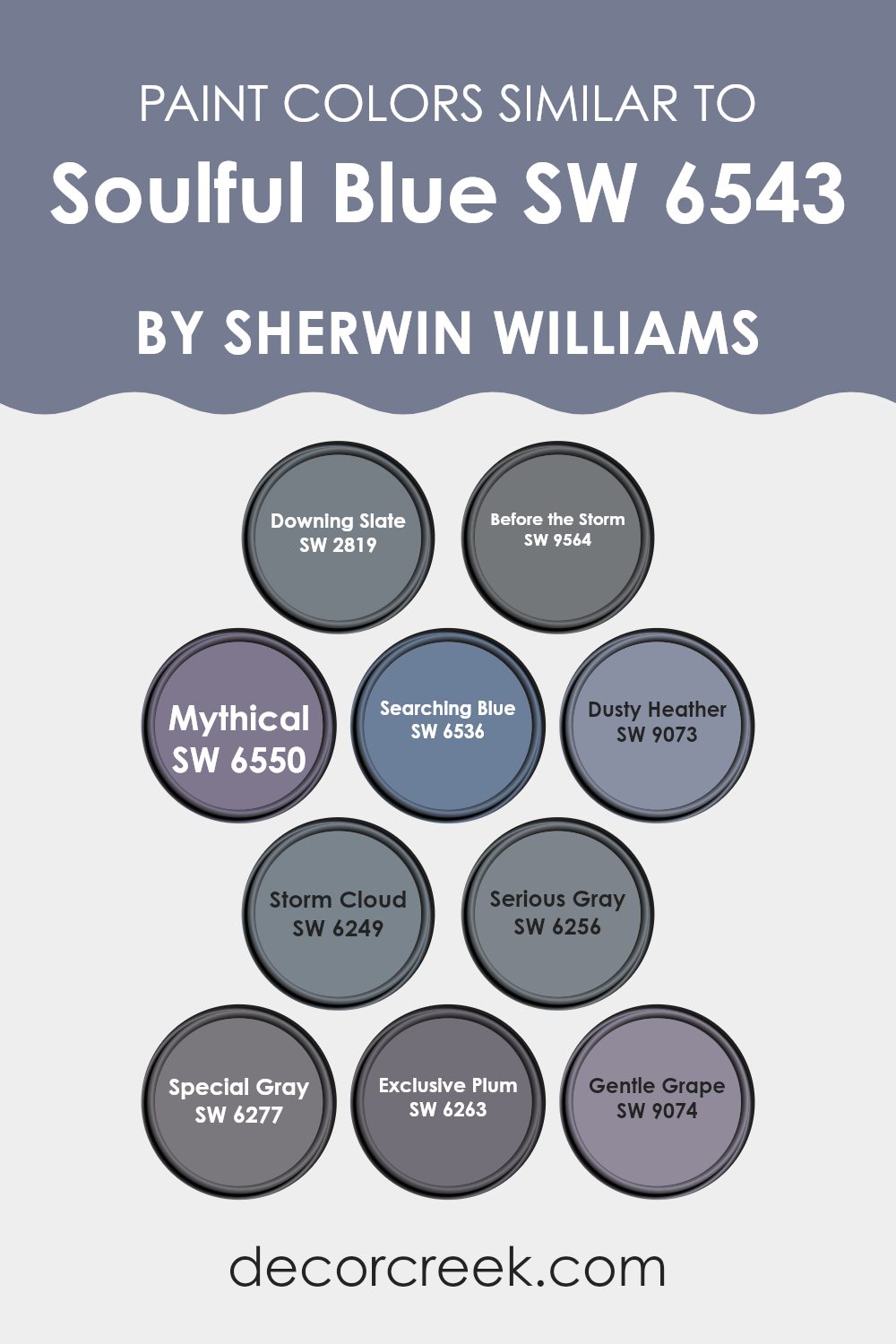
Colors Similar to Soulful Blue SW 6543 by Sherwin Williams
Using similar colors in a decorating scheme can create a harmonious and coherent look that feels comfortable and visually appealing. Colors that complement each other well, such as varying shades around a primary tone, produce a subtle and cohesive setting.
For example, Downing Slate, a muted shade of deep, slate blue, brings in depth and anchors lighter shades like the airy Mythical, which offers a hint of whimsical lilac. Before the Storm has a calm gray-blue hue that pairs beautifully with the more profound and grounded tones of Serious Gray, enhancing the mood without feeling too heavy.
Searching Blue’s slight lavender quality adds a touch of mystery and pairs wonderfully with Gentle Grape’s lighter, soothing violet tone, enriching a room’s character without clashing. Storm Cloud, a robust and dramatic gray-blue, can bolden an area while Exclusive Plum introduces a deeper, dusky purpleness that adds intrigue and depth. Dusty Heather provides a soft, understated purple that gently merges with its surroundings.
The subtle distinction of Special Gray brings a modern touch, and for those looking to create a nuanced yet impactful aesthetic, pairing it with finer shades like Mythical or Searching Blue works wonderfully. All these colors coordinate well, allowing each one to play a significant role in crafting a composed and welcoming setting.
You can see recommended paint colors below:
- SW 2819 Downing Slate
- SW 9564 Before the Storm
- SW 6550 Mythical
- SW 6536 Searching Blue
- SW 9073 Dusty Heather
- SW 6249 Storm Cloud
- SW 6256 Serious Gray
- SW 6277 Special Gray
- SW 6263 Exclusive Plum
- SW 9074 Gentle Grape
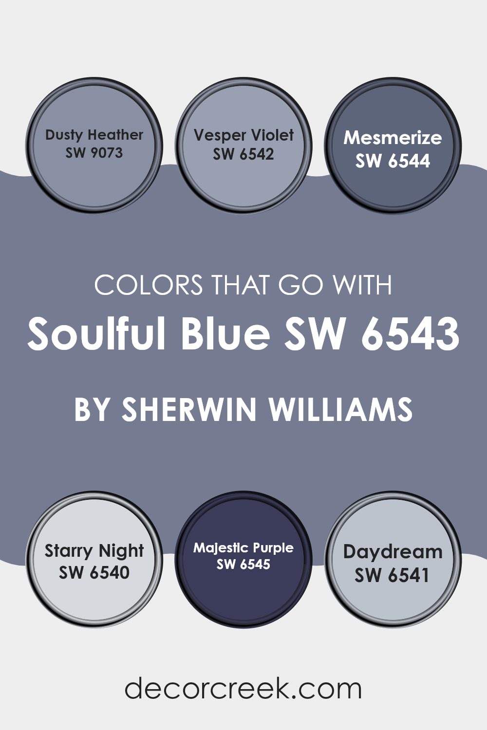
Colors that Go With Soulful Blue SW 6543 by Sherwin Williams
Choosing the right colors to complement Soulful Blue SW 6543 by Sherwin Williams is crucial because they help create a harmonious environment that feels connected and pleasant. Colors like Dusty Heather, Vesper Violet, Mesmerize, Starry Night, Majestic Purple, and Daydream each bring their unique appeal that enhances the beauty of Soulful Blue. These shades work together to offer a balanced and visually appealing palette that can make any room feel cozy and inviting.
Dusty Heather is a gentle gray with a hint of purple that provides a subtle contrast to Soulful Blue, making it ideal for a soft background or an accent wall. Vesper Violet has a deeper purple tone that adds a touch of richness and depth, making it perfect for accent pieces or draperies. Mesmerize is a vibrant and slightly deeper blue that can beautifully layer with Soulful Blue for a monochromatic scheme.
Starry Night, a bolder, dark blue with a vibrant energy, lends a striking look when used in furniture or accessories. Majestic Purple brings a regal and deeper purple hue that adds a luxurious feel to the room. Lastly, Daydream is a light, airy blue that offers a fresh and calm look, great for ceilings or furniture pieces. Together, these colors create a dynamic and balanced look that enhances the ambiance of any room decorated with Soulful Blue.
You can see recommended paint colors below:
- SW 9073 Dusty Heather
- SW 6542 Vesper Violet
- SW 6544 Mesmerize
- SW 6540 Starry Night
- SW 6545 Majestic Purple
- SW 6541 Daydream
How to Use Soulful Blue SW 6543 by Sherwin Williams In Your Home?
Soulful Blue by Sherwin Williams is a rich, deep blue color with a hint of gray. It brings a strong, yet calm feel to any room, making it ideal for both living areas and bedrooms. You might consider painting all the walls in a smaller room such as a bathroom or an accent wall in a larger room like the living room.
The color pairs beautifully with white trim and moldings, enhancing its depth and providing a clean contrast. For those who prefer a little uniqueness, combine it with soft yellows or light pinks for a charming palette.
Not only does it work well on walls, but it’s also great for furniture pieces or cabinetry, giving them a fresh, modern look without being too bold. This shade is flexible enough to fit with traditional décor as well as more contemporary styles, adding a touch of calm elegance to any home setup.
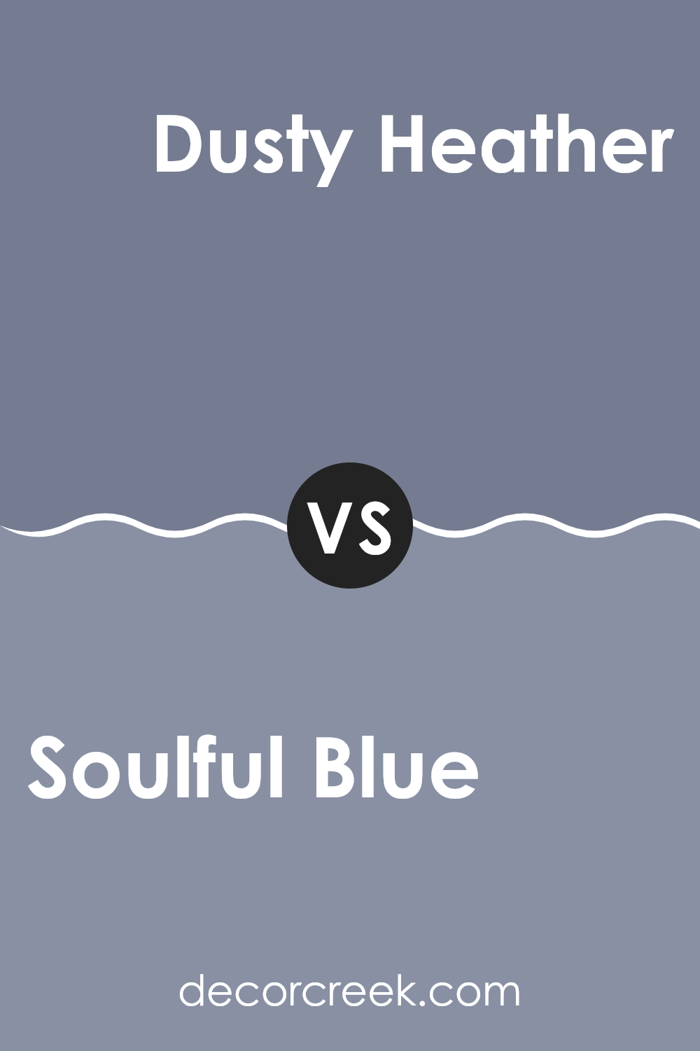
Soulful Blue SW 6543 by Sherwin Williams vs Dusty Heather SW 9073 by Sherwin Williams
Soulful Blue and Dusty Heather are two distinct colors offered by Sherwin Williams, each bringing its own unique vibe to a room. Soulful Blue stands out with its deep, calm blue tone that often reminds one of a quiet late evening sky, offering a sense of relaxation. It’s a flexible color that works well in many areas, especially suited for bedrooms or quiet sitting areas.
On the other hand, Dusty Heather is a subtler shade, characterized by its muted purple with gray undertones. This color leans more toward a neutral palette, making it perfect for those who prefer colors that aren’t too loud but still add a hint of personality. Dusty Heather works beautifully in rooms that aim for a gentle, soft appearance, like cozy corners or smaller rooms that you want to feel larger.
Both colors offer a cool palette but achieve it in different ways. While Soulful Blue provides a richer, more pronounced hue, Dusty Heather presents a lighter, calming option with its blend of purple and gray.
You can see recommended paint color below:
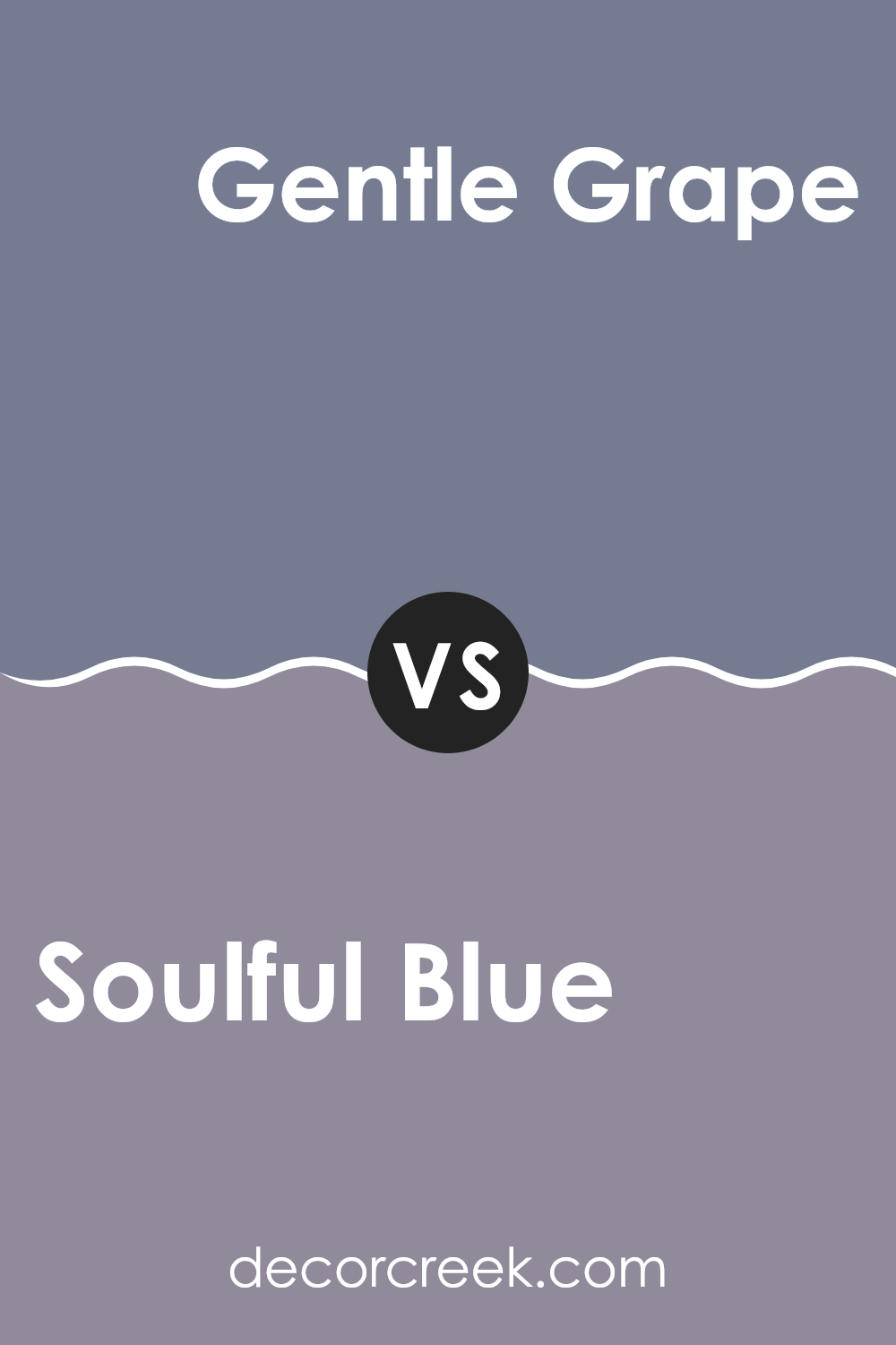
Soulful Blue SW 6543 by Sherwin Williams vs Gentle Grape SW 9074 by Sherwin Williams
Soulful Blue and Gentle Grape are two distinct colors from Sherwin Williams that offer different vibes for your room. Soulful Blue is a soft, muted blue with a hint of gray that gives it a calming, subtle presence. It’s perfect for creating a relaxed atmosphere in areas like living rooms or bedrooms.
On the other hand, Gentle Grape is a deeper shade, blending purple and gray tones, which adds a more pronounced and cozy feeling to any room. It’s great for adding some warmth and character, ideal for accent walls or cozy nooks.
While Soulful Blue leans toward a fresh, airy feel, Gentle Grape brings a touch of depth and coziness, making both colors flexible for various decorating styles yet distinct in their ambiance and mood-setting capabilities.
You can see recommended paint color below:
- SW 9074 Gentle Grape
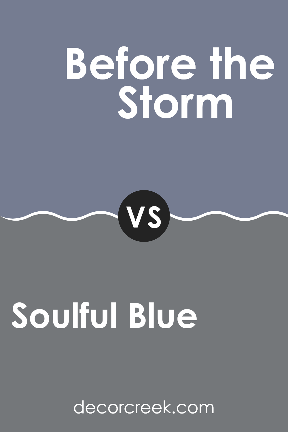
Soulful Blue SW 6543 by Sherwin Williams vs Before the Storm SW 9564 by Sherwin Williams
Soulful Blue is a gentle and soft shade of blue that gives off a calm and peaceful vibe, making it great for creating a relaxed atmosphere in rooms like bedrooms or living rooms. It has a light, airy quality that can help open up smaller rooms, making them feel more spacious.
On the other hand, Before the Storm is a darker, more dramatic blue. This color provides a stronger visual impact and lends a more striking and bold look to a room. It’s perfect for accent walls or areas where you want to make a statement without feeling too intense.
Comparing the two, Soulful Blue is more subdued and widely appealing, while Before the Storm leans toward a more dramatic and mood-setting tone. Both colors can be used effectively depending on the desired effect and the specific traits of the room they are applied in.
You can see recommended paint color below:
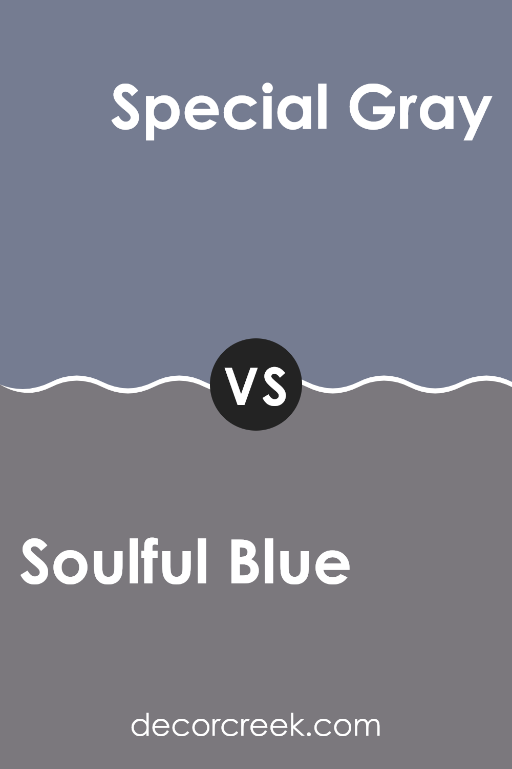
Soulful Blue SW 6543 by Sherwin Williams vs Special Gray SW 6277 by Sherwin Williams
Soulful Blue is a calming and gentle color that brings to mind a peaceful sky or a smooth sea. Its blue base is soothing, yet it carries a hint of warmth, making it a flexible shade for any room in the house. It’s light enough to make rooms feel open and airy while still adding a touch of color.
On the other hand, Special Gray is a deeper, bolder color with a gray base and complex undertones that might seem almost blue in certain lighting. This color is perfect for creating a strong, grounded feeling in a room. It works well in areas where you want to make a statement without using overly dark colors.
Together, these colors could work well in a complementary scheme—Soulful Blue adding lightness and Special Gray providing depth, each enhancing the other’s qualities in balance. Their aesthetics suit various decor styles from casual to elegant.
You can see recommended paint color below:
- SW 6277 Special Gray
Soulful Blue SW 6543 by Sherwin Williams vs Mythical SW 6550 by Sherwin Williams
Soulful Blue and Mythical are both colors by Sherwin Williams. Soulful Blue is a soft, muted blue with a hint of gray, which gives it a calm and gentle appearance. It mirrors the subtle shades of an early morning sky and is perfect for creating a peaceful and inviting atmosphere in a room. It’s flexible enough to be used in various rooms, including bedrooms and living areas.
On the other hand, Mythical is a richer, deeper blue, with a more vibrant and lively character. Its vivid tone resembles the blue of deep oceans or a clear nighttime sky. This makes it great for adding a pop of color and energy to a room. It stands out more than Soulful Blue and is ideal for those who want to add a statement shade to their décor.
In comparison, while both colors share a blue base, Soulful Blue is quieter and more subdued, whereas Mythical is bolder and more dynamic. Depending on your decor goals, each has its unique charm and uses.
You can see recommended paint color below:
Soulful Blue SW 6543 by Sherwin Williams vs Downing Slate SW 2819 by Sherwin Williams
Soulful Blue and Downing Slate, both from Sherwin Williams, offer unique tones that cater to different tastes and design needs. Soulful Blue is a gentle and airy shade of blue that brings a light and refreshing vibe to any room. It’s a color that can make a room feel open and relaxed, perfect for creating a peaceful environment.
On the other hand, Downing Slate is a much darker, almost charcoal-like shade. It leans toward a refined navy with hints of gray, making it a bold choice that can add depth and drama to a room. This color works well in areas where you want to make a strong visual impact or provide a grounding atmosphere.
Both colors can be used effectively in various home décor styles, whether you’re looking to brighten up a room with the softness of Soulful Blue or make a bold statement with the depth of Downing Slate. Each brings its own unique mood and can be the perfect backdrop depending on the ambiance you wish to achieve.
You can see recommended paint color below:
Soulful Blue SW 6543 by Sherwin Williams vs Storm Cloud SW 6249 by Sherwin Williams
Soulful Blue and Storm Cloud, both from Sherwin Williams, have distinctive tones that set different moods. Soulful Blue is a lighter, softer shade that gives a calm and gentle feel, making it perfect for creating a relaxed atmosphere in rooms like bedrooms or bathrooms. It has a welcoming vibe that offers a subtle hint of color without feeling too intense.
In contrast, Storm Cloud is a much darker, grayish-blue hue, which brings a stronger, more pronounced presence to a room. This color is great for adding depth and a touch of drama, making it ideal for accent walls or rooms where a bolder statement is desired. Its deeper blue tone pairs well with a variety of decorating styles, from modern to traditional, providing a flexible backdrop for different types of furniture and accessories.
Both colors are beautiful and can change how a room looks and feels, depending on what you’re going for. Whether it’s the lighter, airy feel of Soulful Blue or the deeper, impactful aura of Storm Cloud, each brings its unique charm to your home décor.
You can see recommended paint color below:
Soulful Blue SW 6543 by Sherwin Williams vs Serious Gray SW 6256 by Sherwin Williams
Soulful Blue and Serious Gray are two distinct paint colors from Sherwin Williams, each bringing its unique vibe to a room. Soulful Blue is a subtle, soft blue with a calming effect, making it great for bedrooms or bathrooms where you want a peaceful atmosphere. It’s light enough to make small rooms feel bigger and airy but has enough depth to add character.
On the other hand, Serious Gray is a deep, muted gray. This color is more neutral and flexible, fitting well in various settings like living rooms or kitchens. It pairs well with both bright accents and wood tones, making it a practical choice for those who like to change their decor often.
Overall, Soulful Blue adds a gentle hint of color and a soothing feel, while Serious Gray offers a strong, stable backdrop that works well with many styles and palettes. Each has its charm, depending on what you’re looking for in a room.
You can see recommended paint color below:
Soulful Blue SW 6543 by Sherwin Williams vs Exclusive Plum SW 6263 by Sherwin Williams
The color Soulful Blue is a soft, gentle blue that offers a soothing feel, which makes rooms look calm and cheerful. It is light enough to make rooms feel airy and open. On the other hand, Exclusive Plum is a deeper, richer shade that combines elements of both purple and gray. This color provides a sense of grounding and comfort, perfect for creating cozy corners or accent walls in a home.
While Soulful Blue is ideal for living areas, bathrooms, or bedrooms where a light, uplifting atmosphere is desired, Exclusive Plum works well in places where a cozier, more enclosed feel might be sought, like dens or dining rooms. The contrast between the two isn’t stark, but they each evoke different moods.
Soulful Blue reflects open skies and calm waters, and Exclusive Plum offers warmth and depth, reminiscent of a plush velvet. Together, these colors could complement each other within a home, offering variety and depth to different rooms.
You can see recommended paint color below:
- SW 6263 Exclusive Plum
Soulful Blue SW 6543 by Sherwin Williams vs Searching Blue SW 6536 by Sherwin Williams
The colors Soulful Blue and Searching Blue from Sherwin Williams are both appealing blues, but they each bring a unique vibe. Soulful Blue presents a soothing and gentle feel that makes you think of a calm, cloudy day.
It’s a soft bluish-grey that works well for creating a relaxed atmosphere in rooms where you want to unwind. On the other hand, Searching Blue has a livelier character with a brighter and more vibrant tone. This color resembles the clear blue sky on a sunny day, making it perfect for rooms where you want to add some cheer and energy.
While Soulful Blue is perfect for achieving a gentle and peaceful setting, Searching Blue is ideal for an invigorating and cheerful room. Both shades can certainly refresh any area, depending on the mood you aim to set.
You can see recommended paint color below:
After reading all about SW 6543 Soulful Blue by Sherwin Williams, I can truly say that I understand why it’s a favorite for many. This paint color is like a calm day at the beach or like looking up at the sky on a clear day. It’s peaceful and refreshing but also holds a touch of excitement, kind of like when you are about to start a cool new project at school.
This shade of blue can make any room in your house feel friendly and welcoming. It’s perfect for places where you relax, like your bedroom, or even for rooms where everyone gathers like the living room. The color is not too bright or too dark, it’s just right and brings a nice balance to any area.
Besides, Soulful Blue has a special way of mixing really well with lots of other colors. Whether it’s with light colors like white or tan, or even darker shades like gray or navy, it always looks good. So, you could use it to repaint a room and keep some of your old furniture or decorations without worrying about things not matching.
So, if you or your family are thinking about changing up a room or just want a fresh new look, Soulful Blue is a fantastic choice. It adds a cozy, cheerful vibe and makes your room look just as nice as it feels.

Ever wished paint sampling was as easy as sticking a sticker? Guess what? Now it is! Discover Samplize's unique Peel & Stick samples.
Get paint samples

