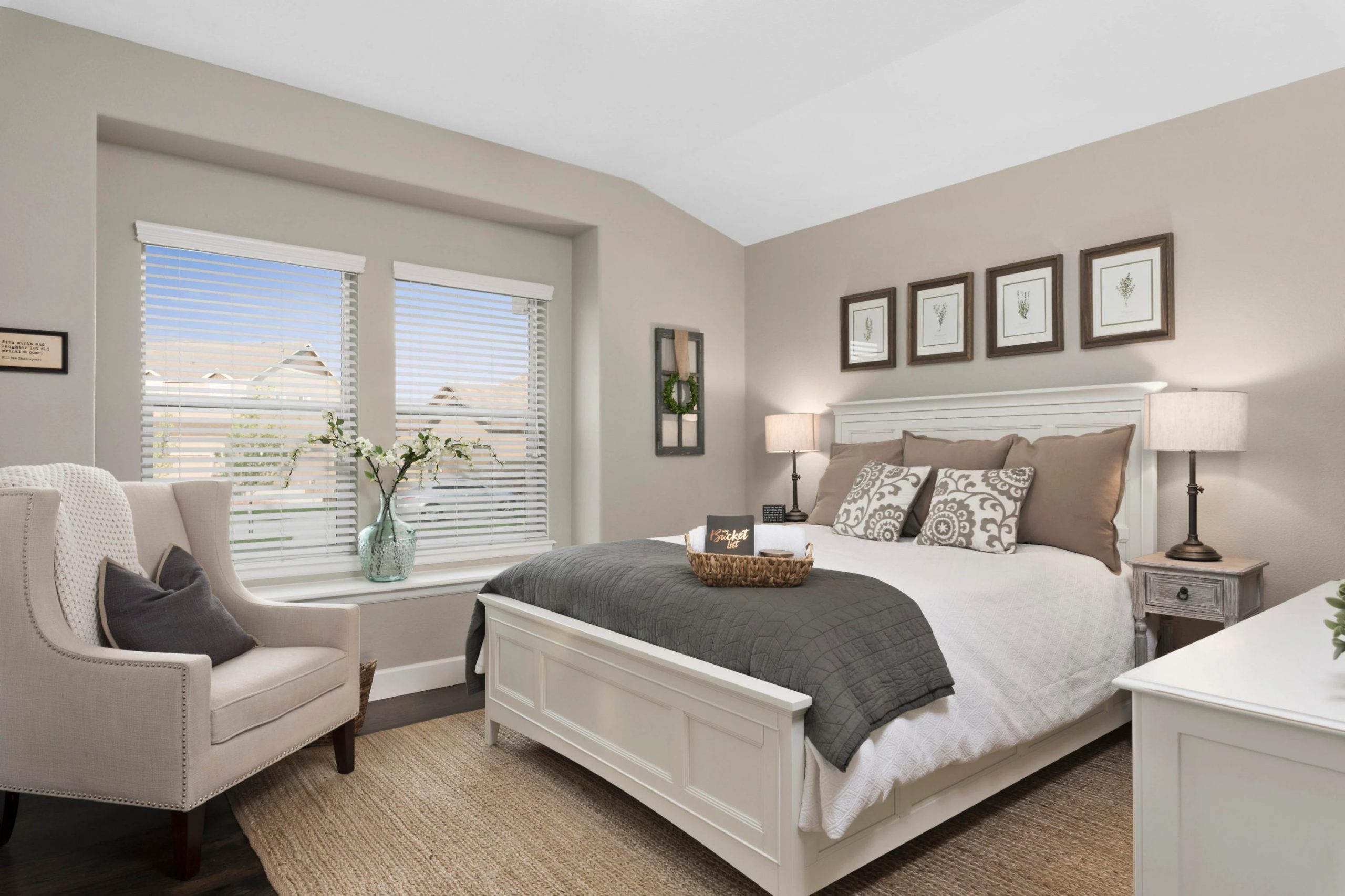
If you are thinking about refreshing your interior with a new color, SW 7641 Colonnade Gray by Sherwin Williams might be on your radar. This flexible gray shade can work wonders in almost any room, offering a balanced blend of warm and cool tones that makes it exceptionally adaptable to various lighting conditions and decor styles. Before you decide to go ahead with Colonnade Gray, it’s important to consider a few key aspects to ensure it aligns well with your vision and the specific characteristics of your rooms.
You need to think about the natural and artificial light your room receives, as this can significantly affect how Colonnade Gray looks. In rooms with plenty of sunlight, it tends to show more of its warm undertones, while in less lit areas, it can appear cooler.
Also, consider the existing elements and colors in your room. Colonnade Gray pairs beautifully with a wide range of hues and materials, but like any color, it has its best companions that enhance its true character. Whether it’s for a cozy bedroom or a sleek kitchen, getting a sample and testing it on different walls and under different lighting conditions is always a smart move.
This way, you can see for yourself how Colonnade Gray changes throughout the day and decide if it’s the right choice for your home.
Is Colonnade Gray SW 7641 Right for My Home?
I’ve been working with a fantastic paint color called Colonnade Gray by Sherwin Williams, and I’m eager to share some insights about its charm and adaptability. This shade is a neutral gray that balances warm and cool tones, making it incredibly flexible for various decorating styles. It has a mid-tone depth that provides a soothing backdrop without darkening a room too much.
In terms of interior styles, Colonnade Gray is a real chameleon. It works exceptionally well in modern and contemporary interiors due to its clean, crisp vibe. However, it’s just as at home in traditional settings, where it brings a fresh and updated look without clashing with more classic elements.
When it comes to pairing with materials and textures, Colonnade Gray is a natural partner for natural wood, whether you’re looking at oak floors or walnut furniture, enhancing the organic beauty of the wood. It also looks refined next to white trim and can make metallic accents, like brass or nickel, pop. For a softer look, I like combining it with plush textiles like velvet or wool in light colors like creams and soft blues, which really bring out the richness of the gray.
All in all, using Colonnade Gray is a great way to bring a fresh, cohesive look to your interior, bringing various design elements together with ease.
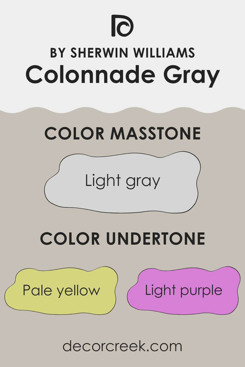
What are the right undertones of Colonnade Gray SW 7641 ?
Colonnade Gray by Sherwin Williams is a flexible paint color that can subtly shift in appearance under different lighting conditions due to its various undertones. Undertones are the colors that sit beneath the surface shade and can influence how the main color looks. The undertones in Colonnade Gray include pale yellow, light purple, light blue, pale pink, mint, lilac, and gray. These undertones add depth and complexity to the base gray color, making it suitable for many decor styles and environments.
When using Colonnade Gray on interior walls, the result can be quite dynamic. For instance, in a room with ample natural light, the pale yellow and light blue undertones might make the walls seem slightly cooler and more refreshing. In artificial light, the light purple or lilac undertones might become more noticeable, giving the room a subtly warmer feel. Furthermore, the presence of mint and pale pink undertones can soften the interior, making it feel more welcoming.
Understanding these undertones is crucial because they can influence your choice of furnishings and decorations. For instance, pairing Colonnade Gray with complementary colors that enhance its cooler undertones, like blues and greens, can create a harmonious look. Alternately, accenting with warmer hues like oranges or yellows can highlight the warmer undertones, giving the room a cozy vibe. Thus, recognizing how these undertones interact with both light and surrounding colors can help in achieving the desired atmosphere in an interior.
Best Coordinating Colors to use with Colonnade Gray SW 7641 by Sherwin Williams this year.
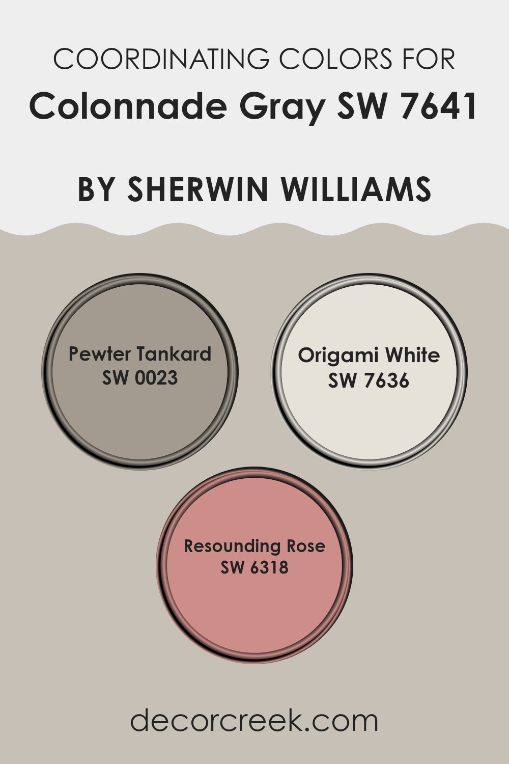
Coordinating colors are hues that complement each other and are often used together to create a balanced and harmonious look in décor. By selecting colors that coordinate well, like the ones suggested for Colonnade Gray by Sherwin Williams, you can achieve a visually appealing palette that ties different elements and rooms together smoothly. Using coordinating colors strategically can also enhance the overall aesthetics of a room, making it appear more put-together and pleasing to the eye.
A great example of a coordinating color is Pewter Tankard (SW 0023), a deep gray with a hint of warmth, making it a perfect complement to balance the cooler tones of Colonnade Gray. Next, Origami White (SW 7636) offers a clean and crisp backdrop that allows darker or brighter shades to pop, working excellently in interiors that aim for a fresh and open feel.
Lastly, Resounding Rose (SW 6318) provides a subtle touch of pink, bringing a gentle splash of color that suggests a comfortable and inviting atmosphere without overpowering the primary color scheme. Together, these colors support and enhance each other, offering diverse decorating options that can suit varying tastes and styles.
You can see recommended paint colors below:
- SW 0023 Pewter Tankard
- SW 7636 Origami White
- SW 6318 Resounding Rose
Trendy Trim Colors of Colonnade Gray SW 7641 by Sherwin Williams to use this year.
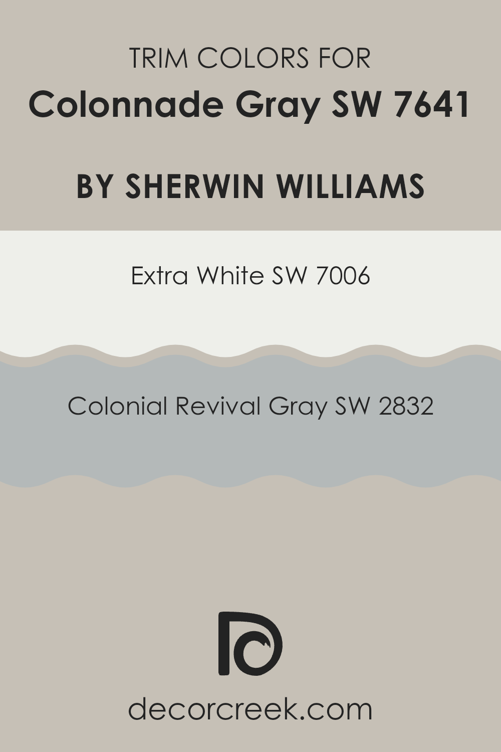
Trim colors, such as SW 7006 – Extra White and SW 2832 – Colonial Revival Gray, play a crucial role in defining the overall appearance of an interior when used alongside a primary color like Colonnade Gray from Sherwin Williams.
These trim colors help create visual boundaries and enhance architectural details, clearly drawing attention to features like doorways, moldings, and baseboards. By carefully selecting trim colors, you can accentuate or gently contrast with the main wall color, adding depth and character to the room’s overall look.
SW 7006 – Extra White is a clean and bright shade that provides a sharp contrast to Colonnade Gray, making it an excellent choice for a crisp, clear edge that can make the gray stand out and the room feel larger and more open. On the other hand, SW 2832 – Colonial Revival Gray offers a softer transition from Colonnade Gray; its slightly deeper tone complements the main color without a strong contrast, creating a more unified look throughout the room. Both options depend on the desired visual impact and the specific lighting and layout of the room.
You can see recommended paint colors below:
Evergreen Colors Similar to Colonnade Gray SW 7641 by Sherwin Williams
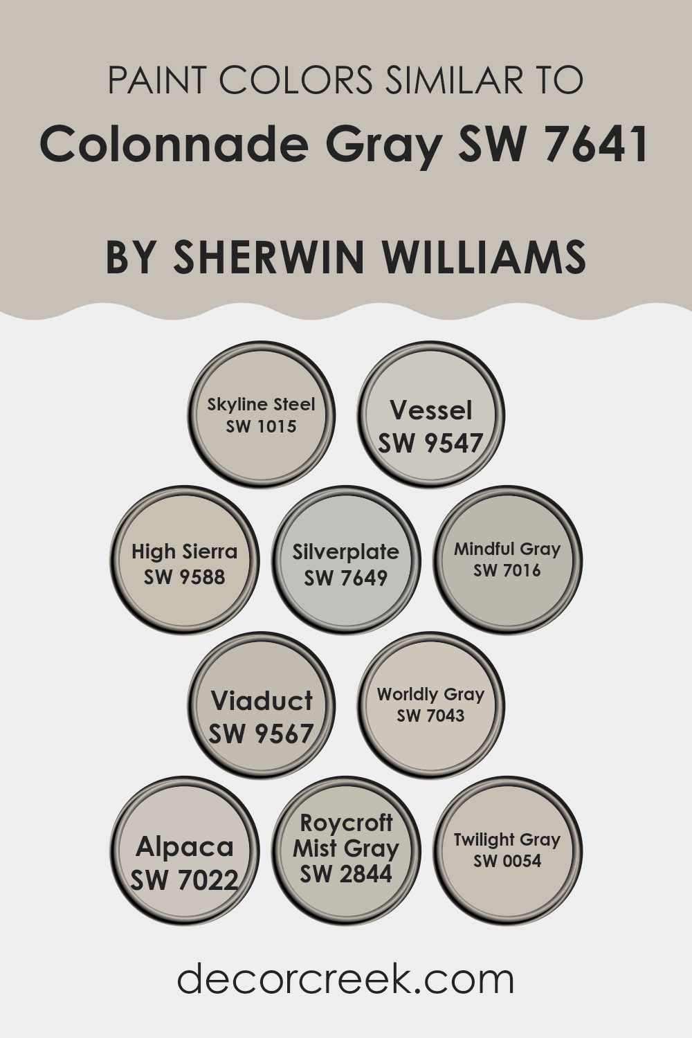
Similar colors are essential in design because they create a cohesive look and feel in any interior, allowing for a harmonious blend throughout an area. Using variations like Skyline Steel, Vessel, High Sierra, Silverplate, Mindful Gray, Viaduct, Worldly Gray, Alpaca, Roycroft Mist Gray, and Twilight Gray can help achieve a seamless visual transition from room to room, offering subtle contrasts without feeling too intense. These slight shifts in tone can make small rooms appear larger and help individual design elements stand out more clearly against a unified backdrop.
Skyline Steel gives off a lighter, nearly metallic hint, suggesting a soft shimmer that brings a fresh note into a room. Vessel, a deeper shade, adds a sense of weight and depth, making it ideal for highlighting areas that need a bold touch. High Sierra carries a gentle earthiness, inviting a calm and grounded mood. Silverplate presents a cooler, steel-like look that reflects modern style and clean lines.
Mindful Gray offers a balanced neutrality that works well in many settings. Viaduct has a moody depth that feels polished in rooms that call for strong presence. Worldly Gray stands out by blending warmth with a refined character, making it a good fit for shared areas. Alpaca brings a softer, welcoming warmth with its calm, comforting tone. Roycroft Mist Gray nods to classic design with a sense of history. Lastly, Twilight Gray introduces a soft dusk-like quality, ideal for creating a calming evening feel in bedrooms or cozy corners. This palette built around Colonnade Gray supports a look that flows naturally while still giving each room its own quiet personality.
You can see recommended paint colors below:
- SW 1015 Skyline Steel
- SW 9547 Vessel
- SW 9588 High Sierra
- SW 7649 Silverplate
- SW 7016 Mindful Gray
- SW 9567 Viaduct
- SW 7043 Worldly Gray
- SW 7022 Alpaca
- SW 2844 Roycroft Mist Gray
- SW 0054 Twilight Gray
Colors that Go With Colonnade Gray SW 7641 by Sherwin Williams
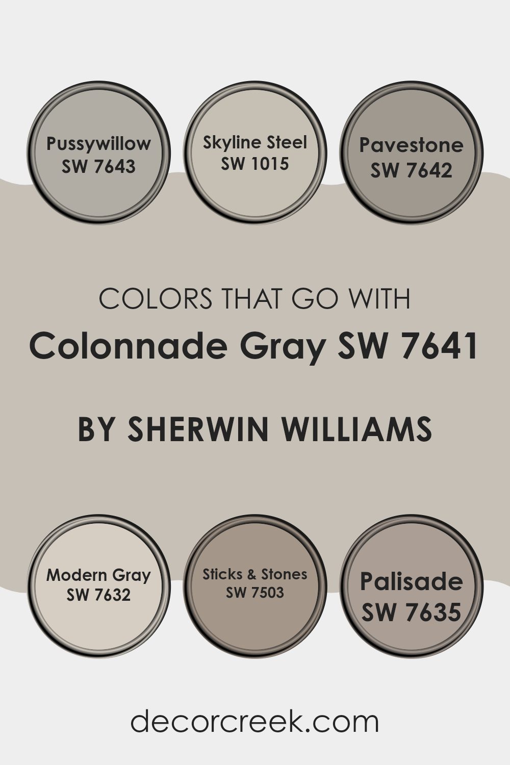
When choosing an adaptable neutral like Colonnade Gray SW 7641 by Sherwin Williams, the importance of coordinating colors cannot be overstated. The selected companion colors greatly influence the mood and style of a room, enhancing the gray’s contemporary appeal while offering either a calming or lively contrast. Colonnade Gray, a warm yet balanced gray, pairs beautifully with shades that can either soften or deepen its base tone.
Take for instance SW 7643 – Pussywillow, a deeper gray that adds depth when paired with Colonnade Gray, creating a subtle layering effect ideal for a cozy living room or an office. SW 1015 – Skyline Steel, on the other hand, is lighter and brings out the cooler undertones in Colonnade Gray, perfect for a breezy, open feel in a kitchen or bathroom. For those looking for contrast that still reflects nature, SW 7642 – Pavestone stands out as a strong complement, lending an earthy richness that works especially well in rooms with natural materials like wood or stone.
SW 7632 – Modern Gray is similar to Colonnade Gray but with a hint of creaminess, softening sharp lines and allowing a smooth flow between rooms. Meanwhile, SW 7503 – Sticks & Stones offers a darker, browner tone that warms up the interior significantly, making it ideal for a welcoming dining room. Lastly, SW 7635 – Palisade, a distinct taupe, introduces a gentle hint of color to the gray scheme, well suited for adding a touch of elegance to living areas or entryways. Each of these colors used with Colonnade Gray helps create rooms that feel full of character while remaining balanced and visually connected.
You can see recommended paint colors below:
- SW 7643 Pussywillow
- SW 1015 Skyline Steel
- SW 7642 Pavestone
- SW 7632 Modern Gray
- SW 7503 Sticks & Stones
- SW 7635 Palisade
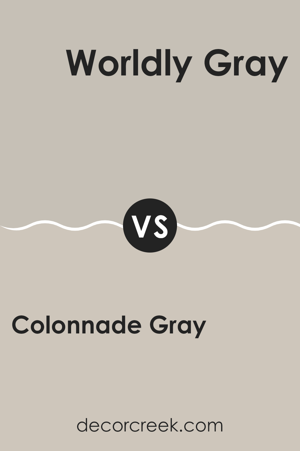
Colonnade Gray SW 7641 by Sherwin Williams vs Worldly Gray SW 7043 by Sherwin Williams
Colonnade Gray and Worldly Gray are both popular shades from Sherwin Williams, each offering a unique tone for interior rooms. Colonnade Gray is a lighter gray with a slight warm undertone, making it ideal for creating a bright and welcoming interior. This color reflects more light, which can make small rooms feel larger and more open.
On the other hand, Worldly Gray stands out with a deeper, taupe-based hue. This color is a bit warmer and can bring a cozy feel to any room. It pairs well with a wide range of décor, adding depth and warmth to the interior without feeling too heavy or dark.
Both colors are highly adaptable and can work beautifully in many settings, from modern to traditional. While Colonnade Gray is better for those looking for a lighter, airier feel, Worldly Gray is perfect for adding subtle warmth and refined character.
You can see recommended paint color below:
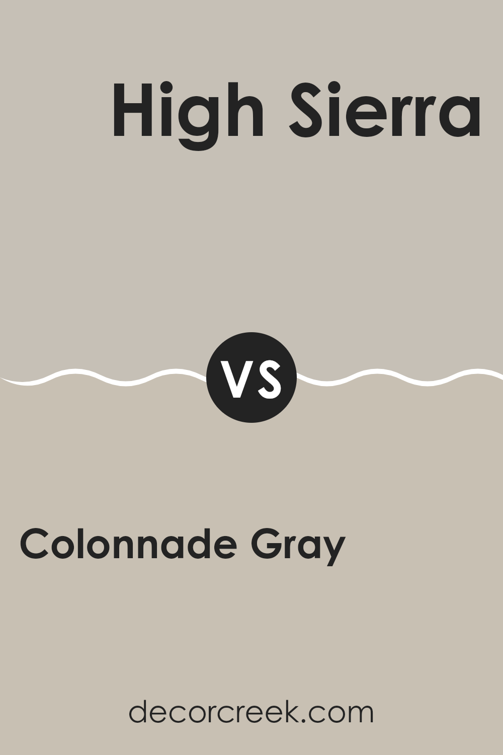
Colonnade Gray SW 7641 by Sherwin Williams vs High Sierra SW 9588 by Sherwin Williams
Colonnade Gray is a light to medium gray with subtle brown undertones. It is a flexible shade that creates a soft, welcoming vibe in any interior. It’s perfect for those who prefer a neutral backdrop that pairs well with both light and dark accent colors.
On the other hand, High Sierra is noticeably darker and reflects the natural, earthy tones of stone and soil. It has a strong presence due to its deeper saturation and works well in rooms that benefit from a cozier, more grounded feel.
While Colonnade Gray suits areas that need a lighter touch and openness, High Sierra offers a rich hue ideal for adding depth and warmth. Both colors are great choices but serve different aesthetic needs and moods within a home.
You can see recommended paint color below:
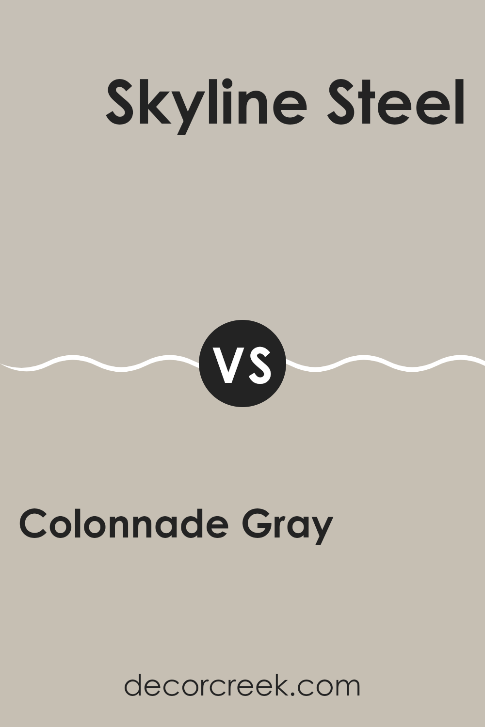
Colonnade Gray SW 7641 by Sherwin Williams vs Skyline Steel SW 1015 by Sherwin Williams
Colonnade Gray and Skyline Steel are two different shades by Sherwin Williams. Colonnade Gray is a warm gray that gives off a soft, welcoming feel; it’s not too dark or too light, which makes it quite flexible for various rooms.
On the other hand, Skyline Steel is lighter than Colonnade Gray and leans toward a cool gray. This color can make small rooms appear brighter and larger. Both colors are neutral, allowing them to pair well with a wide range of decor styles and colors.
While Colonnade Gray adds a hint of coziness to a room, Skyline Steel offers a fresh and clean look. Each serves a purpose depending on the mood or atmosphere you want to create in a room.
You can see recommended paint color below:
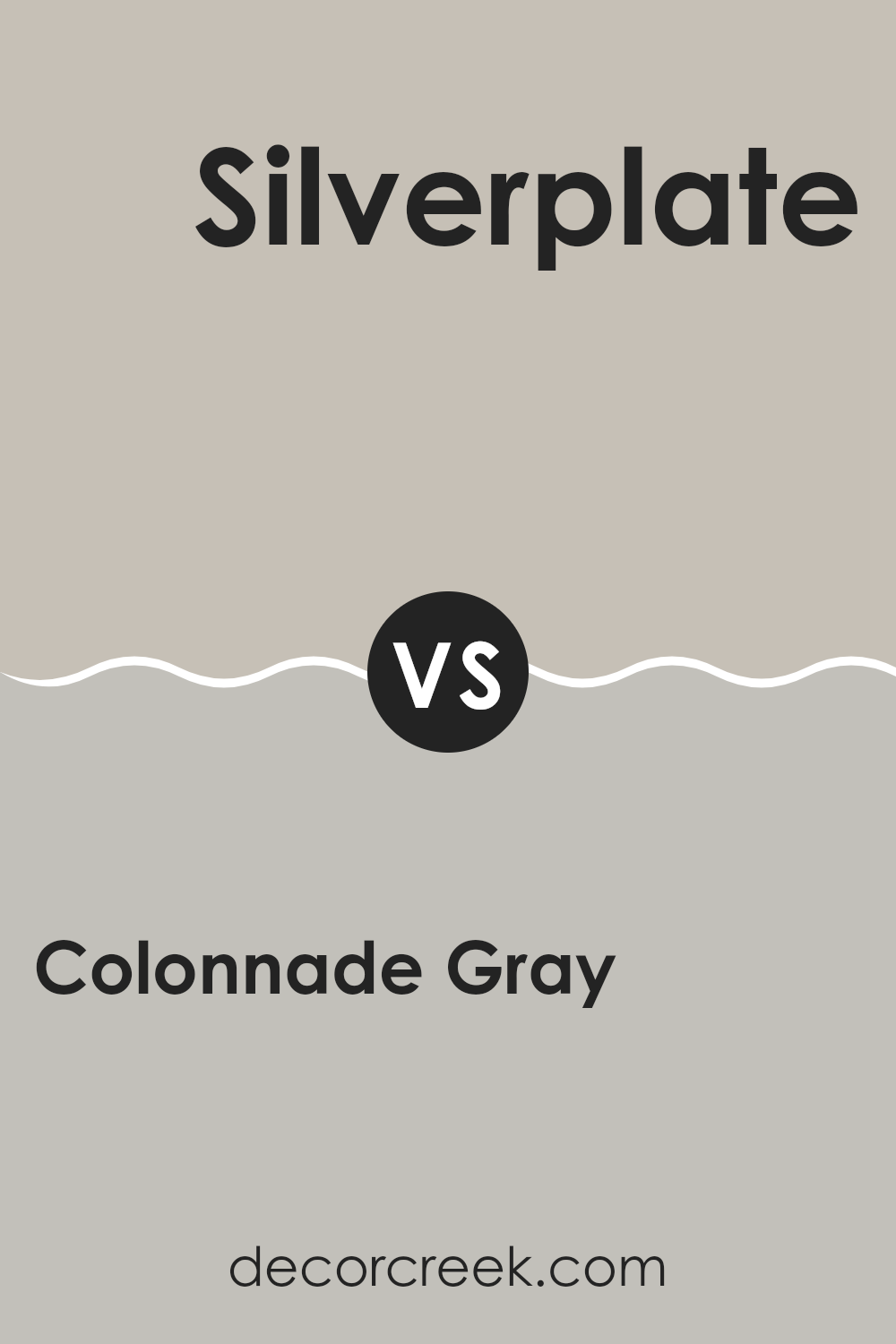
Colonnade Gray SW 7641 by Sherwin Williams vs Silverplate SW 7649 by Sherwin Williams
Main color – Colonnade Gray and second color – Silverplate, both by Sherwin Williams, offer subtle yet distinct hues for varied aesthetics. Colonnade Gray is a light to medium gray with a warm undertone, making it cozy and inviting.
It’s great for living rooms as it provides a soft backdrop that complements a wide range of decor. On the other hand, Silverplate has a cooler tone and is a shade darker.
This color suits modern and minimalistic designs, bringing a sharp and clean look to any room. While both grays can brighten up interiors, Colonnade Gray gives off a more welcoming warmth compared to the sleek, neutral vibe of Silverplate. Each color can work well in different areas of a home depending on the mood you’re aiming for.
You can see recommended paint color below:
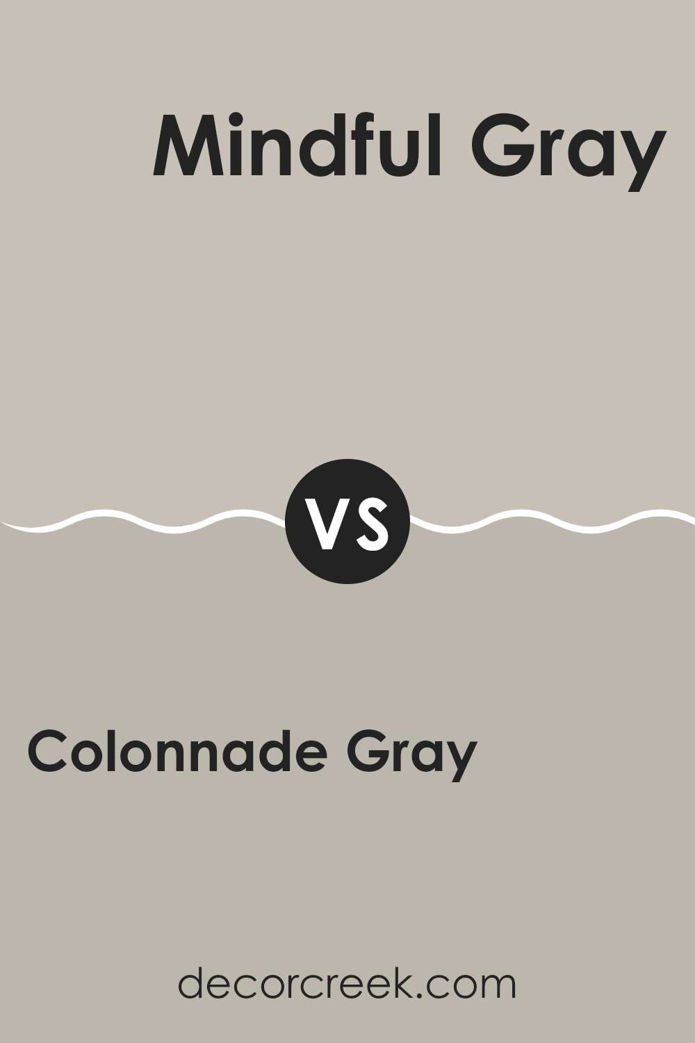
Colonnade Gray SW 7641 by Sherwin Williams vs Mindful Gray SW 7016 by Sherwin Williams
Colonnade Gray and Mindful Gray, both by Sherwin Williams, are two popular shades for those looking to add a touch of gray to their interiors. Colonnade Gray is a light gray color that offers a warm, inviting feel. It’s perfect for rooms where you want a cozy yet modern look.
On the other hand, Mindful Gray sits a bit darker on the spectrum compared to Colonnade Gray. Mindful Gray has a balanced mix of warm and cool tones, making it highly adaptable for different lighting conditions and design styles.
Both colors work well in various rooms, from kitchens to bedrooms, but the choice often comes down to how much natural light the room receives and personal preference. Colonnade Gray works best in rooms with ample light, enhancing the room’s brightness, whereas Mindful Gray might be more suitable for areas that need a bit more depth and definition without feeling too heavy.
You can see recommended paint color below:
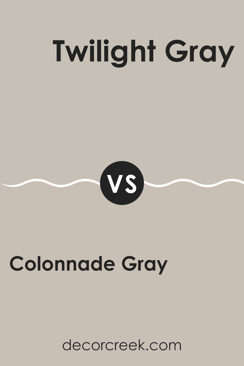
Colonnade Gray SW 7641 by Sherwin Williams vs Twilight Gray SW 0054 by Sherwin Williams
Colonnade Gray and Twilight Gray are both gray shades by Sherwin Williams, but they bring different moods and styles to interiors. Colonnade Gray is a light gray with a warm base that makes it flexible for various rooms.
It offers a soft and inviting feel, which works well in areas like living rooms or bedrooms. On the other hand, Twilight Gray is a much darker gray, giving it a more pronounced presence. This color suits rooms that aim for a stronger, more grounded aesthetic, like an office or a cozy nook.
Because of its depth, Twilight Gray can also help create a focal point or accent wall. While Colonnade Gray pairs well with a wide range of other colors due to its lighter tone, Twilight Gray works better for contrast with lighter shades or for adding depth to a color scheme.
You can see recommended paint color below:
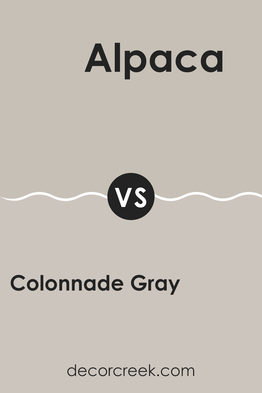
Colonnade Gray SW 7641 by Sherwin Williams vs Alpaca SW 7022 by Sherwin Williams
Colonnade Gray and Alpaca are two popular colors from Sherwin Williams, offering subtle yet distinct tones for interior rooms. Colonnade Gray presents a cooler shade that leans slightly toward a stone gray, providing a neutral backdrop that fits well in modern and traditional settings. It’s a flexible choice that complements both bright accents and muted designs, making it a solid option for any room.
On the other hand, Alpaca has a warmer tone, infused with hints of beige that soften its overall appearance. This color is excellent for creating a cozy atmosphere, making rooms feel more inviting and relaxed. It works especially well in living areas and bedrooms where a gentle and calm environment is desired.
Both colors maintain a low-key elegance, yet their warmth and coolness bring different moods to a room. While Colonnade Gray pairs nicely with sleek furniture and metal finishes, Alpaca matches beautifully with soft textiles and wooden elements.
You can see recommended paint color below:
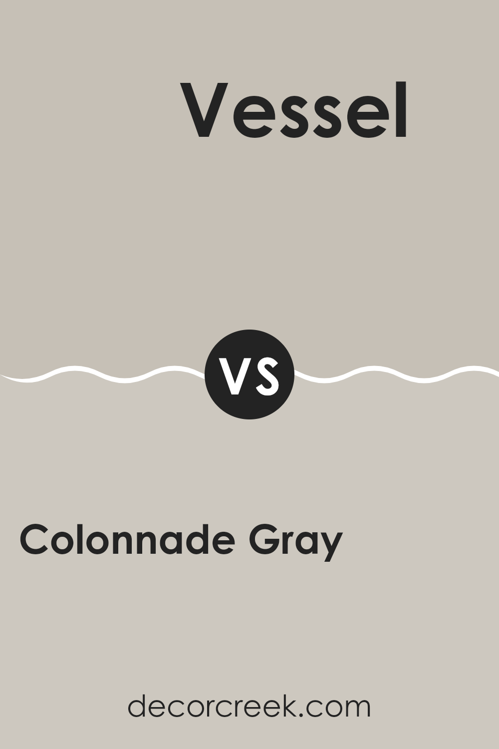
Colonnade Gray SW 7641 by Sherwin Williams vs Vessel SW 9547 by Sherwin Williams
Colonnade Gray and Vessel are both colors by Sherwin Williams, each offering a unique vibe for different rooms. Colonnade Gray is a light to medium gray with a warm undertone, making it a flexible choice for any room. It’s particularly appealing because it balances being noticeable yet gentle, allowing it to work well with many decor styles.
On the other hand, Vessel presents a darker, more intense gray with cooler tones. This makes it stand out more, creating a bold statement in a room. It’s ideal for accent walls or areas where a stronger color presence is wanted.
While both are shades of gray, their differences in depth and undertones mean they set different moods. Colonnade Gray brightens a room in a soft way, offering a calm backdrop, whereas Vessel draws the eye, adding depth and contrast. Depending on your room’s needs and lighting, either color could be the right fit.
You can see recommended paint color below:
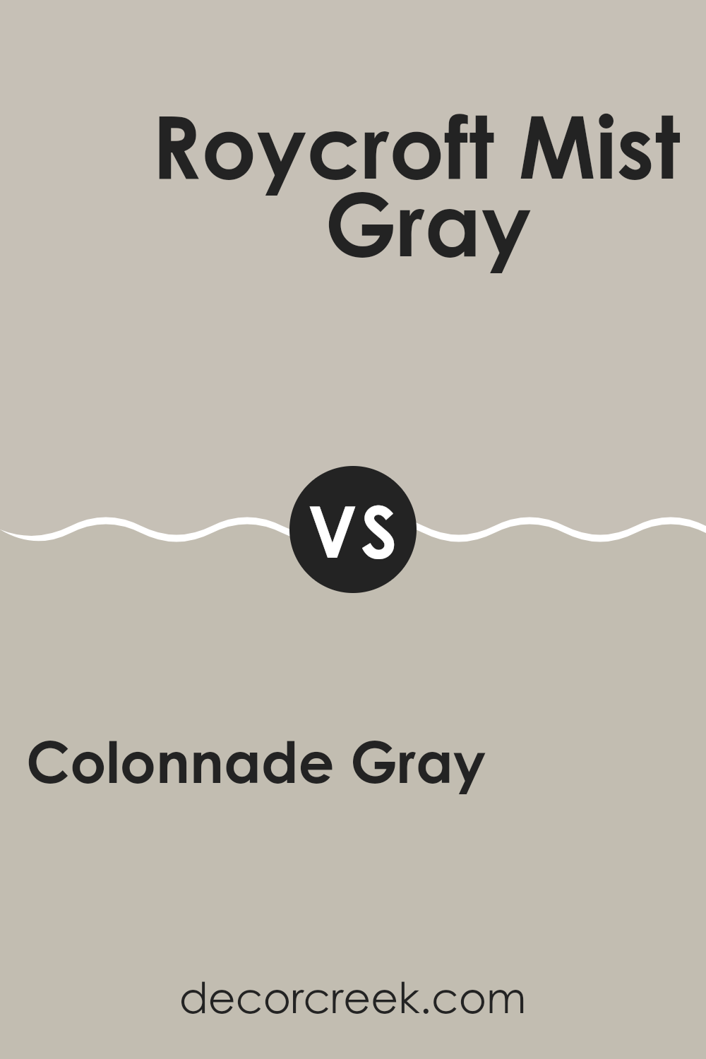
Colonnade Gray SW 7641 by Sherwin Williams vs Roycroft Mist Gray SW 2844 by Sherwin Williams
Colonnade Gray and Roycroft Mist Gray, both by Sherwin Williams, offer subtle differences in tone that could affect the mood in your interior. Colonnade Gray is a light to medium gray with warm undertones, making it a flexible choice for contemporary and traditional settings. It reflects a good amount of light, which can help make a small room feel more open.
On the other hand, Roycroft Mist Gray is darker and has a more pronounced presence, with neutral to slightly cool undertones. This color is ideal for adding depth and a sense of grounding to larger rooms or as an accent wall to create a focal point in a room.
When deciding between the two, consider the natural light in your room and the atmosphere you want to create. Colonnade Gray works well in many conditions and pairs easily with both bright and muted colors. Roycroft Mist Gray, being deeper, pairs well with light colors for contrast or similar tones for a unified look.
You can see recommended paint color below:
Colonnade Gray SW 7641 by Sherwin Williams vs Viaduct SW 9567 by Sherwin Williams
Colonnade Gray and Viaduct are both popular paint colors from Sherwin Williams, but they have quite distinct tones and effects in a room. Colonnade Gray is a warm gray with soft, beige undertones. It’s a flexible color that gives a room a cozy and inviting feel, making it a great choice for many areas in the home, including living rooms and bedrooms.
On the other hand, Viaduct is a much darker, steel gray color. This deep gray provides a bold and strong presence, creating a modern look that works especially well for accent walls or cabinets. Its depth can make smaller rooms feel more compact, so it’s often used in larger areas or rooms with plenty of natural light.
When deciding between them, consider the room’s size, the amount of natural light it gets, and the atmosphere you’re hoping to create. Colonnade Gray works well when you want a lighter, airier feel, while Viaduct is ideal for adding dramatic flair or giving larger rooms a grounded look.
You can see recommended paint color below:
To wrap things up, SW 7641 Colonnade Gray by Sherwin Williams is truly a color worth considering if you’re thinking about giving your room a fresh look. What makes it stand out is that it’s not just another plain gray. It carries a gentle touch of warmth that helps any room feel welcoming and cozy.
Whether you’re updating your living room, bedroom, or even your kitchen, Colonnade Gray has a natural way of fitting right in. It works well with many other colors too, which means choosing furniture or decorations feels easy and stress-free. It’s also not too dark or too light, so your room looks balanced and comfortable throughout the day.
All in all, painting your walls with Colonnade Gray feels like finding the right balance. It’s clean, it’s friendly, and it helps every corner of your room look more pulled together. So, if you’re thinking about choosing a new color, this one definitely deserves a spot on your list.

Ever wished paint sampling was as easy as sticking a sticker? Guess what? Now it is! Discover Samplize's unique Peel & Stick samples.
Get paint samples

