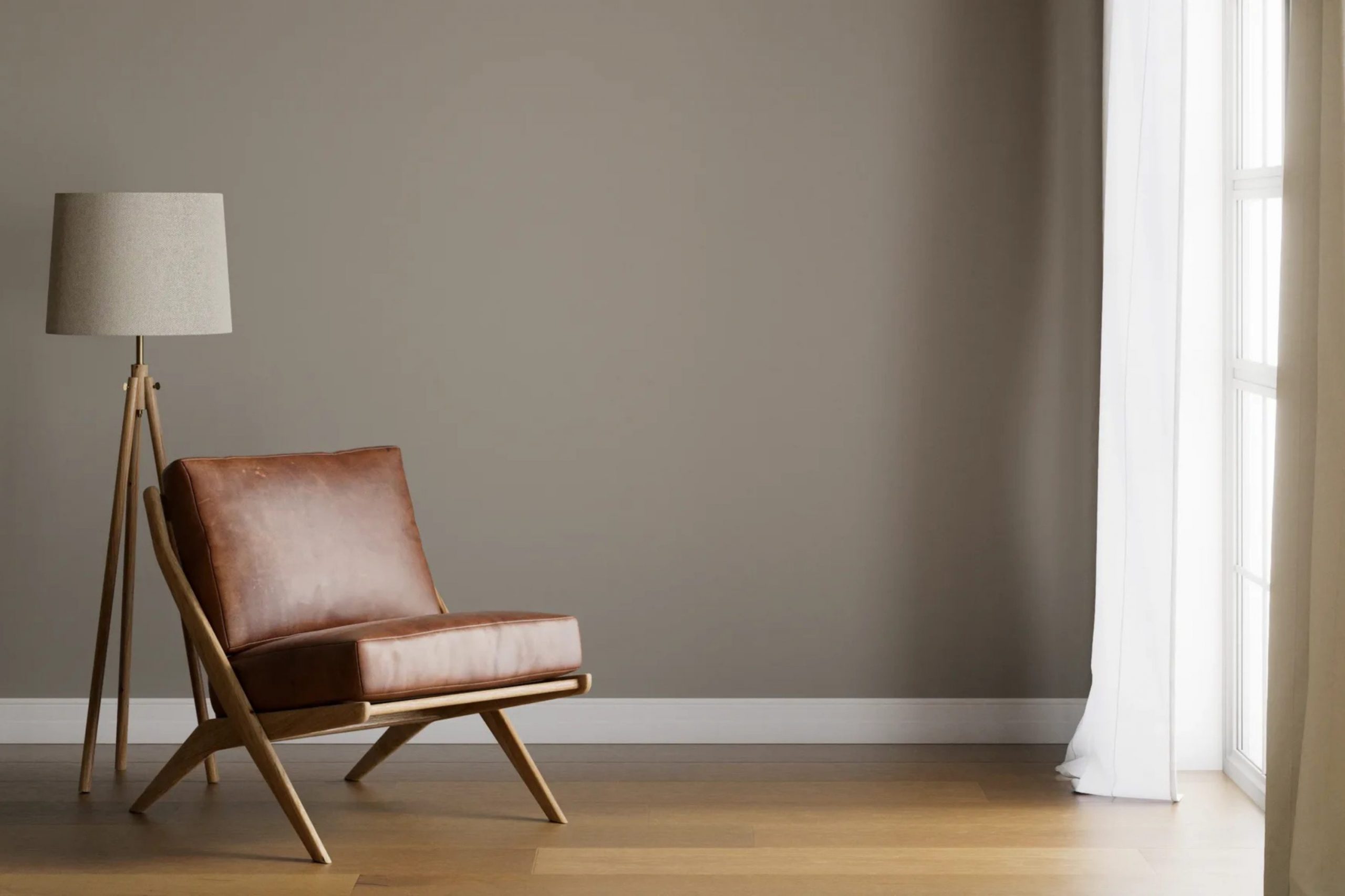
If you are considering refreshing your room with a new paint color, SW 7642 Pavestone by Sherwin Williams is a flexible choice that can work well with many interior styles. Before you decide to go with this specific shade, here are a few things you should know.
First, Pavestone is a warm, smoky gray with subtle brown undertones. This gives it a cozy feel, making it a great option for rooms where you want a calming and welcoming atmosphere. It is important to think about the lighting in your room because it greatly affects how this color appears. In natural light, the brown tones become more noticeable, adding soft warmth, while artificial lighting brings out its gray side.
In addition, Pavestone pairs nicely with a wide range of decor styles and complements many other colors, from bold hues to softer tones. It works especially well with natural elements like wood and stone. When planning your color palette, think about accessories and furniture to be sure they work together smoothly with this distinctive gray.
Choosing the right paint color can be challenging, but understanding the characteristics and flexibility of SW 7642 Pavestone will help you make a confident decision. Keep in mind that testing a small sample on your walls can show how this color changes with the shifting light in your room throughout the day.
Is Pavestone SW 7642 Right for My Home?
Pavestone by Sherwin Williams is one of those flexible grays with a balanced mix of warm and cool tones, making it incredibly adaptable for various rooms. It’s neither too dark nor too light, striking just the right note of neutrality. When I think of this color, I see it bringing a calm and understated sense of style to any room without overpowering any existing decor.
This hue works exceptionally well in minimalist and Scandinavian styles where simplicity and function lead the way. The subdued quality of Pavestone allows it to act as a beautiful backdrop for bold and vibrant colors or to blend smoothly with softer, muted tones. I personally love pairing it with natural materials like exposed wood, soft linens, and sleek metals to bring out its earthy undertones. It pairs beautifully with rich wooden furniture, making the room feel grounded and cohesive.
In an industrial style loft, Pavestone comes alive when combined with textures like brick, leather, and concrete. These elements highlight its strong character without making the area feel too cold or impersonal. Moreover, in modern and contemporary interiors, this color keeps a clean and crisp look, especially when paired with glass and polished metals.
All in all, Pavestone is a truly flexible choice that works wonderfully across different materials and interior styles.
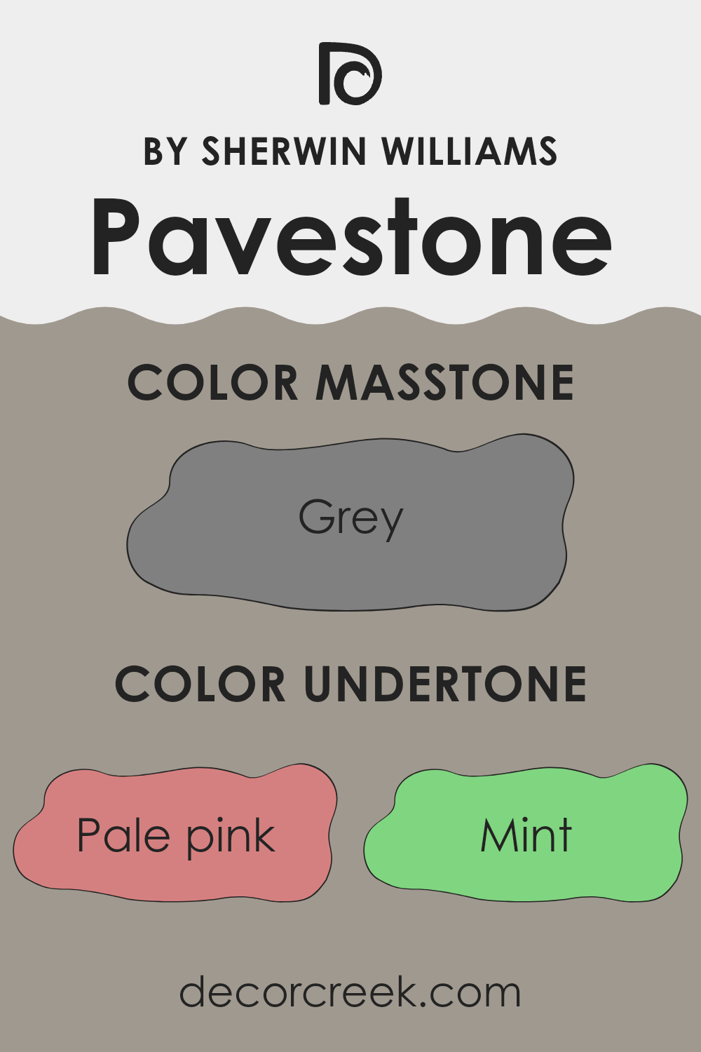
What are the right undertones of Pavestone SW 7642 ?
Pavestone, a popular paint color by Sherwin Williams, is flexible and widely used for interior walls. It has a unique balance of neutral gray with numerous subtle undertones that can influence how the color is perceived depending on the lighting and surrounding elements.
The undertones in a paint color are secondary colors that sit quietly beneath the surface and can become more noticeable under different lighting conditions or when placed next to other colors. For Pavestone, these undertones include hints of pale pink, mint, lilac, and several others. Each undertone shapes the overall look in small but meaningful ways.
In interior rooms, the variety of undertones in Pavestone can affect how the color adjusts to different settings and lighting conditions. For instance, in a room with plenty of natural light, the pale yellow or light blue undertones might make the walls seem brighter and more open. Under artificial light, the darker undertones like olive or dark turquoise can create a more grounded, cozy feel.
The way Pavestone reads can also shift based on the colors of the room’s decor and furniture. For example, placing it near greens and blues may pull forward similar undertones in the paint, creating a harmonious look, while pairing it with contrasting colors like red or orange can highlight its cooler qualities, making the room feel more dynamic.
Overall, the diverse undertones in Pavestone make it an adaptable choice for many interior styles and settings. It adjusts well to the mood you want to create in each room, whether it feels welcoming and warm or calm and minimal.
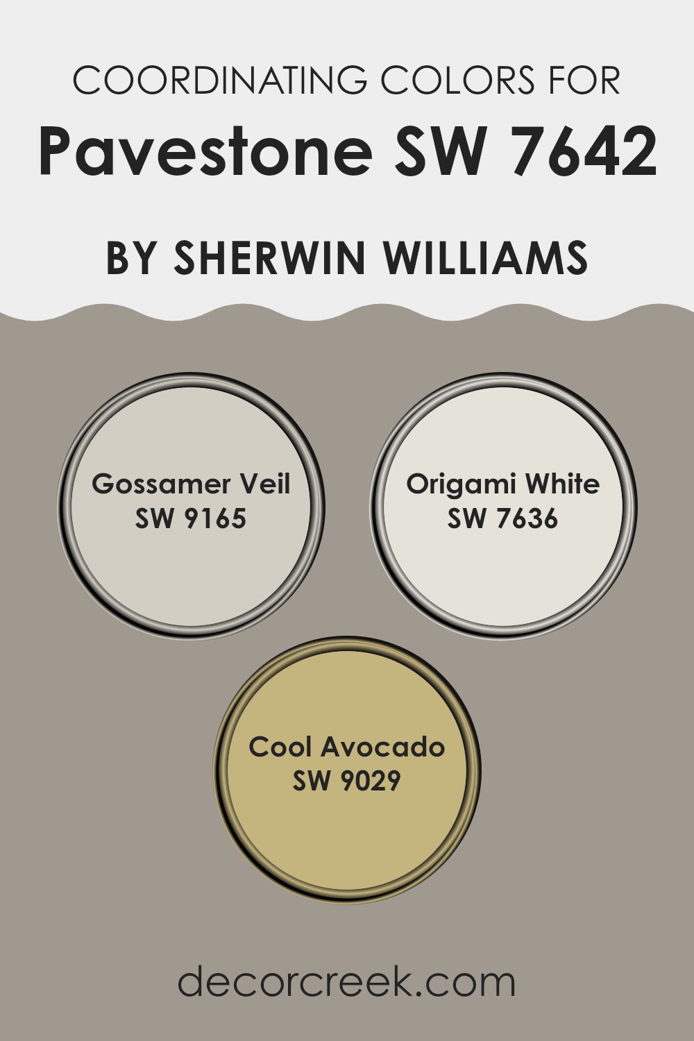
Best Coordinating Colors to use with Pavestone SW 7642 by Sherwin Williams this year.
Coordinating colors are colors that complement each other when used together in design schemes, helping to create a cohesive and balanced look. They usually share similar tones or are on opposite sides of the color wheel, offering a pleasing contrast. For instance, when paired with the neutral gray tone of Pavestone by Sherwin Williams, certain coordinating colors can enhance the overall feel of a room.
SW 9165 – Gossamer Veil is a soft gray with a warm undertone, which matches well with other neutrals and provides a subtle backdrop for richer or brighter colors. This color works smoothly with Pavestone as it shares the same underlying gray tone but with a lighter approach, making any room look open and airy.
SW 7636 – Origami White is another excellent coordinating color; it’s a clean and crisp white with just a hint of a warm undertone. This makes it perfect as a contrasting balance, giving a fresh and lifted feel to rooms that feature darker shades like Pavestone. Lastly, SW 9029 – Cool Avocado presents a bold choice, added to this palette for a touch of natural vibrancy. This deep, muted green gives a refreshing but balanced burst of color against more subdued hues like Pavestone, proving that even unlikely combinations can work harmoniously when paired correctly.
You can see recommended paint colors below:
- SW 9165 Gossamer Veil
- SW 7636 Origami White
- SW 9029 Cool Avocado
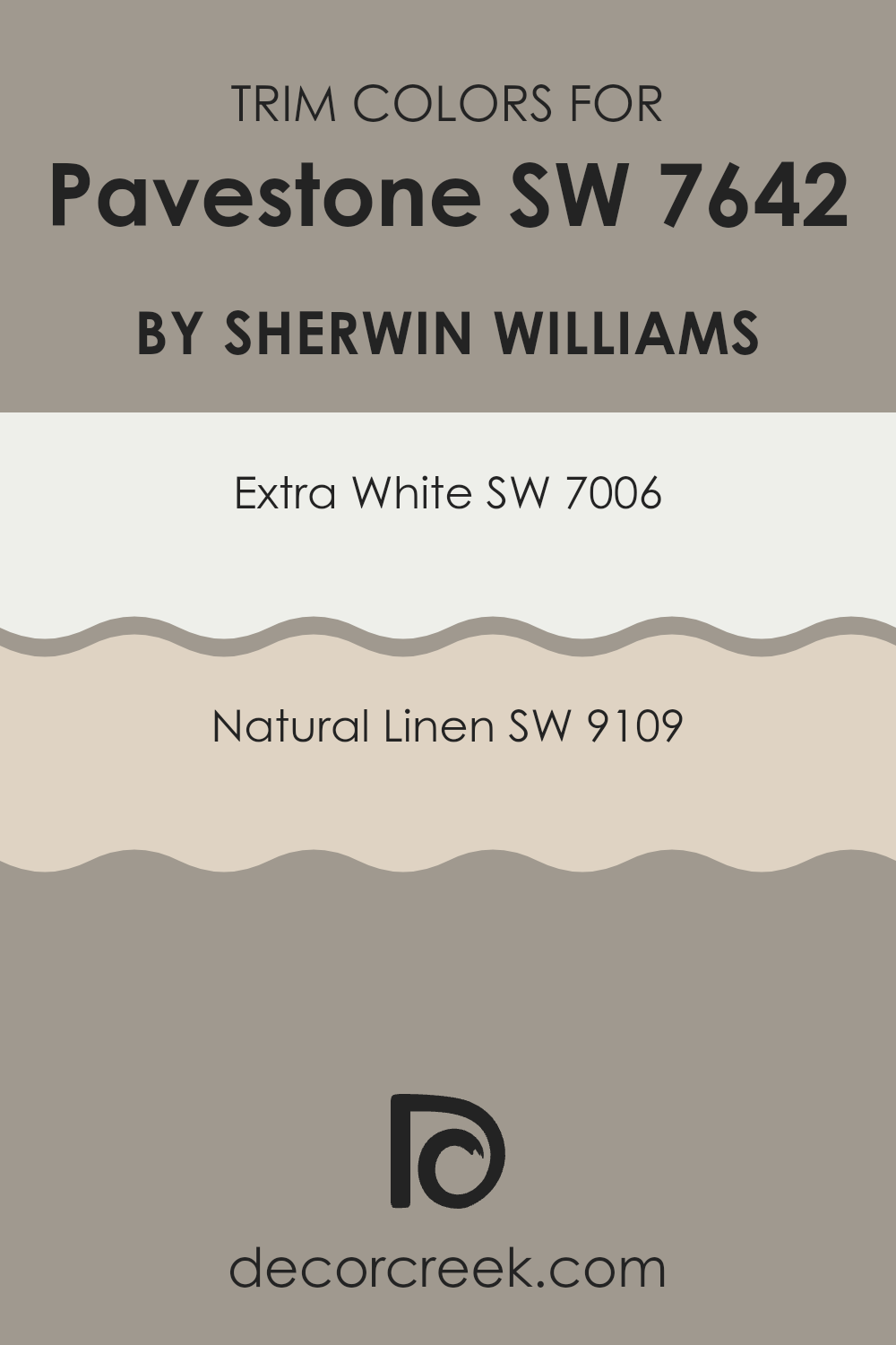
Trendy Trim Colors of Pavestone SW 7642 by Sherwin Williams to use this year.
Trim colors, like those recommended for use with Sherwin Williams’ Pavestone (SW 7642), are key in defining and highlighting the architectural features of a home. These colors help create a cohesive design that enhances both the interior and exterior of a building.
When selecting trim colors, it’s important to choose shades that properly complement the main color to achieve a balanced look. For instance, bold trim colors can frame windows and doors, making a clear visual distinction and adding more character to the room.
Extra White (SW 7006) is a crisp, clean white that provides a fresh contrast when used as a trim color with Pavestone. This bright white is great for creating a pronounced boundary around darker hues, helping features like moldings and frames stand out against softer wall colors. On the other hand, Natural Linen (SW 9109) offers a softer, warm cream color that gives off a gentle, inviting feel when paired with Pavestone. This color is perfect for creating a subtle yet noticeable boundary that supports a cozy and unified look in any styled home.
You can see recommended paint colors below:
Evergreen Colors Similar to Pavestone SW 7642 by Sherwin Williams
Similar colors play an important role in creating a cohesive and visually appealing design scheme, especially when using a base shade like Pavestone by Sherwin Williams. By incorporating hues that are close to Pavestone, such as Pewter Tankard or Smooth Stone, a designer can create a subtle yet effective shift in tone that adds depth and continuity in the room. This approach allows for a smooth visual flow throughout the interior, ensuring that all elements feel connected, which works especially well in settings where a calm and uniform look is desired.
Pewter Tankard is a medium gray that leans slightly toward a soft metallic sheen, bringing warmth to rooms without feeling too strong. Smooth Stone, on the other hand, offers a lighter option that creates a fresh, airy feel, ideal for small rooms or areas with limited natural light. Fawn Brindle adds a hint of earthiness with its warmer undertones, making it a great choice for cozy, inviting interiors.
Rushing River has a lively character with its deeper, more noticeable gray tones, perfect for accent walls or furniture pieces. Pewter Cast delivers a steel-like look that can introduce a mild industrial mood, while Acier shows a bolder, sturdier gray suited to modern and minimalist decor styles.
Keystone Gray, with its balance between light and dark, performs well under different lighting conditions, making it a flexible option for any room. Polished Concrete gives a crisp, clean appearance that echoes the look of real concrete, ideal for a modern edge. Intellectual Gray leans toward a softer, more muted setting, and Functional Gray completes the group by offering a straightforward, easy-to-use shade that works with many decor styles.
You can see recommended paint colors below:
- SW 0023 Pewter Tankard
- SW 9568 Smooth Stone
- SW 7640 Fawn Brindle
- SW 7746 Rushing River
- SW 7673 Pewter Cast
- SW 9170 Acier
- SW 7504 Keystone Gray
- SW 9167 Polished Concrete
- SW 7045 Intellectual Gray
- SW 7024 Functional Gray
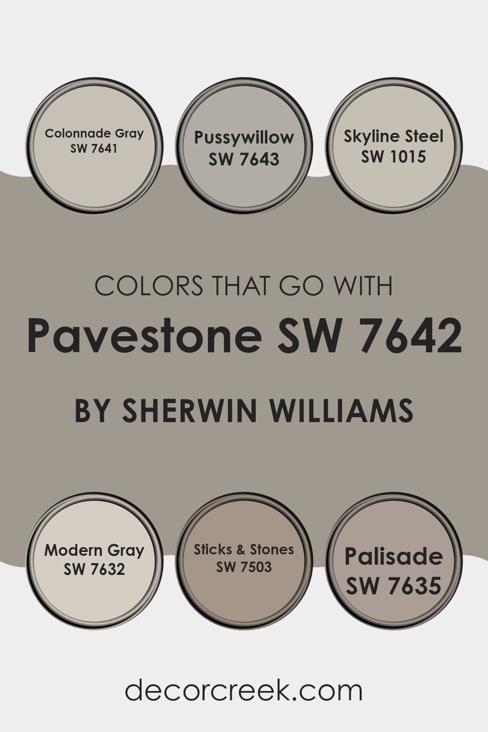
Colors that Go With Pavestone SW 7642 by Sherwin Williams
Choosing complementary colors for Pavestone SW 7642 by Sherwin Williams is important because it helps a room feel harmonious and well-coordinated. When colors work well together, they create a sense of balance and visual appeal, making any room more welcoming and pleasant. For instance, using shades such as Colonnade Gray, Pussywillow, Skyline Steel, Modern Gray, Sticks & Stones, and Palisade all pair nicely with Pavestone, allowing you to design a room that feels cohesive and thoughtfully planned.
Colonnade Gray is a light gray that creates a clean and neutral backdrop, making it a flexible partner for the deeper tone of Pavestone. Pussywillow, slightly darker and with a warm undertone, adds cozy depth to interiors, complementing Pavestone’s solid character. Skyline Steel, a soft gray with blue undertones, offers a gentle contrast that can brighten a room while still connecting back to the strong base of Pavestone.
Modern Gray is a mid-tone gray that bridges the gap between light and dark, blending easily with many decor styles. Sticks & Stones has a richer, earthier tone that brings warmth and a natural feel to interiors, strengthening the grounded look of Pavestone. Lastly, Palisade, with its subtle hint of purple, adds a touch of character, allowing for a creative yet balanced palette when paired with Pavestone’s grounding shade.
You can see recommended paint colors below:
- SW 7641 Colonnade Gray
- SW 7643 Pussywillow
- SW 1015 Skyline Steel
- SW 7632 Modern Gray
- SW 7503 Sticks & Stones
- SW 7635 Palisade
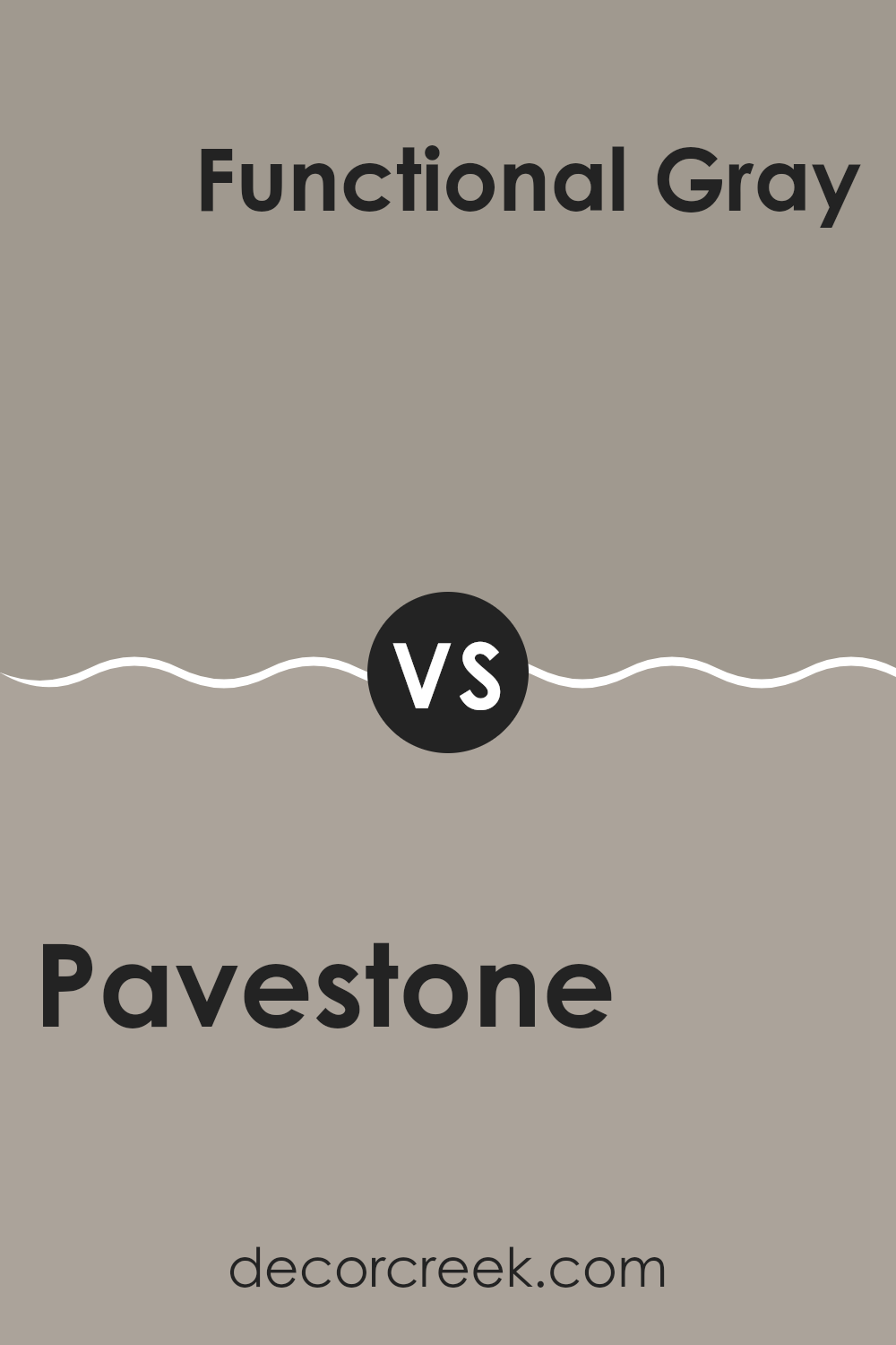
Pavestone SW 7642 by Sherwin Williams vs Functional Gray SW 7024 by Sherwin Williams
Pavestone and Functional Gray are both neutral colors by Sherwin Williams, but they have distinct tones. Pavestone carries a softer, lighter gray hue with a hint of brown, giving it a warm and inviting feel.
It’s flexible and works well in rooms where you want a cozy atmosphere. On the other hand, Functional Gray is a deeper shade that leans more toward a classic gray. This color is stronger and makes a bolder statement, yet remains neutral enough to work well across different decorating styles.
Functional Gray also has the ability to make other colors in a room stand out more. Both are great for creating a modern look in your home, but your choice depends on the mood you want to set: lighter and warmer with Pavestone or more pronounced and classic with Functional Gray.
You can see recommended paint color below:
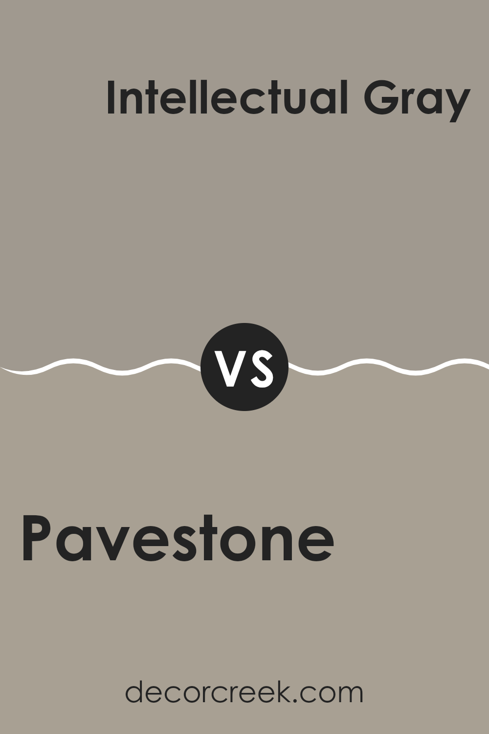
Pavestone SW 7642 by Sherwin Williams vs Intellectual Gray SW 7045 by Sherwin Williams
Pavestone and Intellectual Gray by Sherwin Williams are two distinct shades that can add a unique character to any room. Pavestone is a warm gray with a slight brown undertone, which makes it cozy and inviting. It works well for creating a comfortable, grounded atmosphere in rooms. On the other hand, Intellectual Gray has a cooler tone, leaning slightly toward green.
This color is ideal for those who prefer a more subtle, classic look that still carries a bit of warmth. Both colors are flexible and perform well under various lighting conditions, making them suitable for many different settings, from living rooms to bedrooms.
While Pavestone tends to create a homely feel, Intellectual Gray offers a more refined, understated look. These colors can also work beautifully together within the same color scheme, creating a balanced and harmonious result.
You can see recommended paint color below:
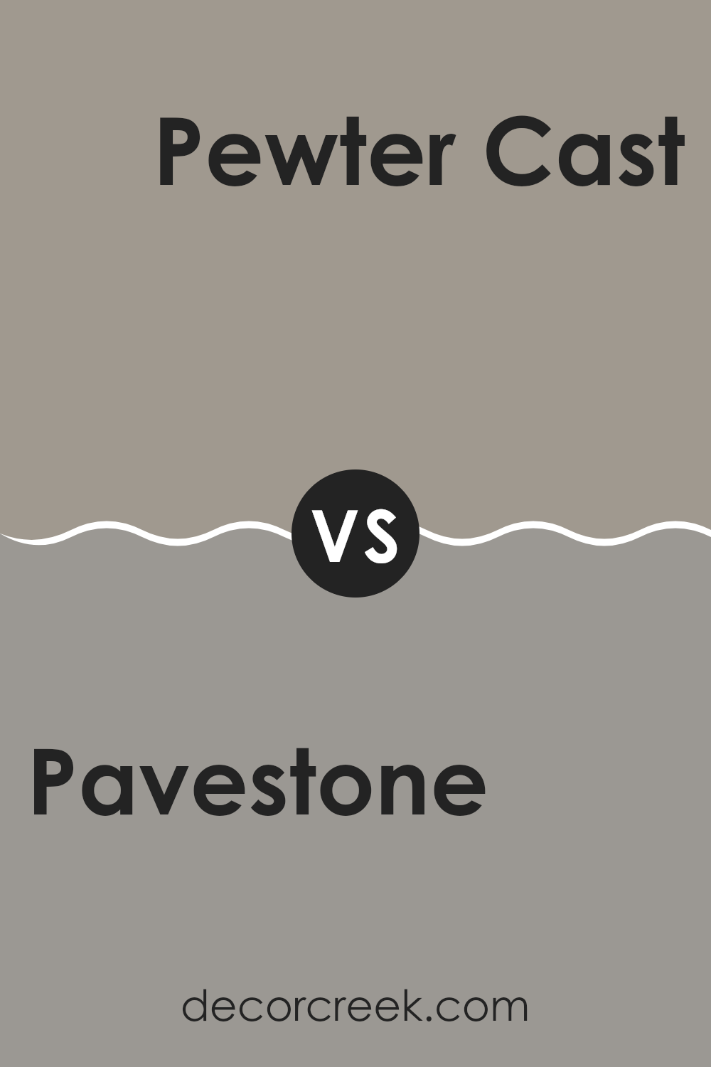
Pavestone SW 7642 by Sherwin Williams vs Pewter Cast SW 7673 by Sherwin Williams
The color Pavestone is a warm gray with a soothing taupe undertone, giving it a cozy, welcoming vibe that works well in many rooms, especially where you want a gentle neutral look. It pairs easily with brighter colors or can stand alone for a calm, monochromatic look.
On the other hand, Pewter Cast is a cooler gray that leans slightly toward the steelier side, making it appear more modern and crisp. This color is excellent for areas where a more defined, contemporary feel is desired, and it contrasts well with both warm and cool tones.
In comparison, Pavestone offers more warmth and is flexible for use in a relaxing style setting, whereas Pewter Cast works well in rooms that benefit from a sharper, more defined gray. The choice between them depends on whether you want a softer, more earthy environment or a sleek, modern look.
You can see recommended paint color below:
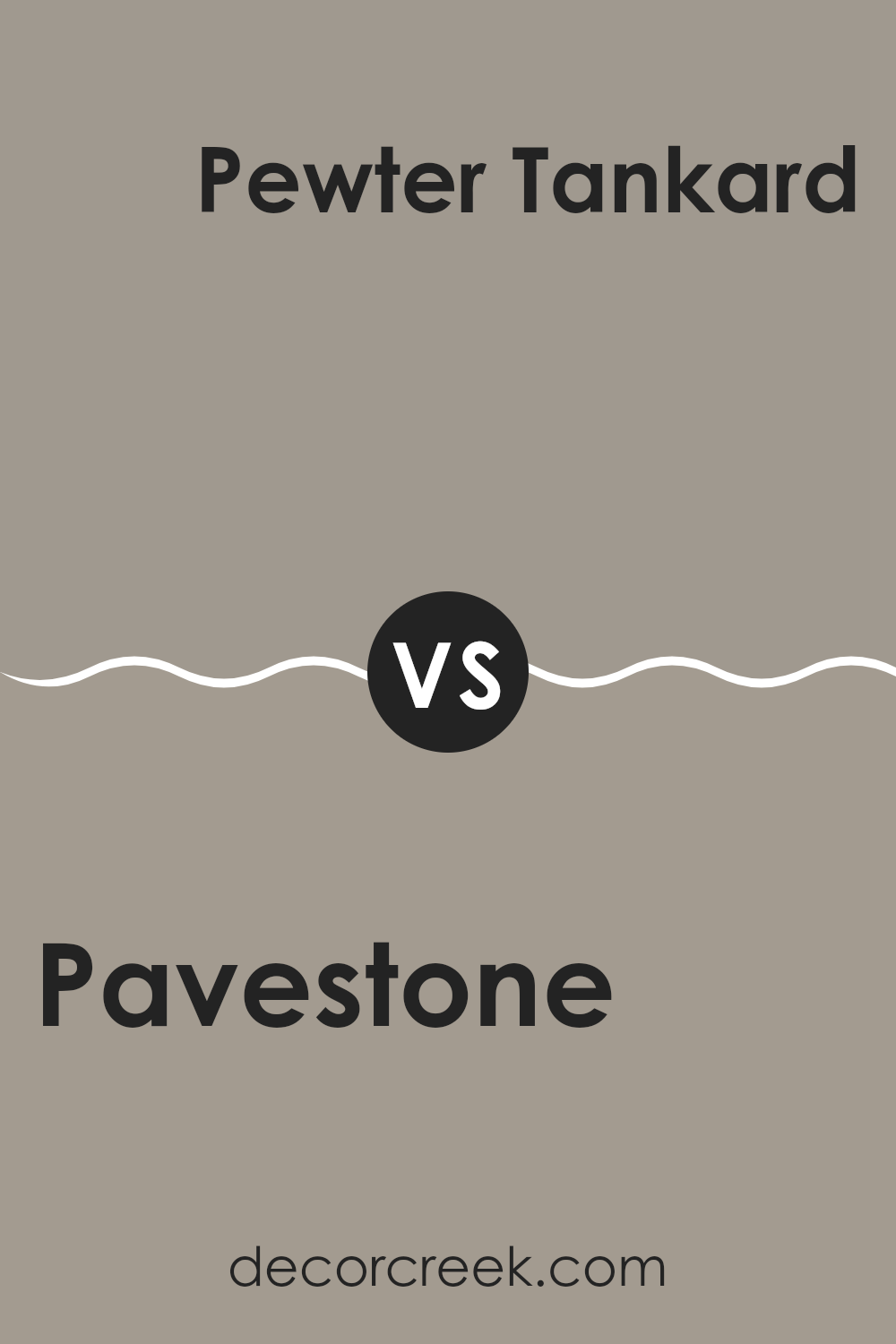
Pavestone SW 7642 by Sherwin Williams vs Pewter Tankard SW 0023 by Sherwin Williams
Pavestone is a gentle, warm gray that brings a sense of coziness and calm to any room. It has subtle brown undertones, making it soft and adaptable for different rooms like living rooms or bedrooms.
On the other hand, Pewter Tankard is a deeper gray with a noticeable green undertone that adds a unique twist. This color is darker than Pavestone, making it a great choice for creating a statement or defining an area.
Pewter Tankard can provide a striking contrast when used alongside lighter colors or in a monochromatic gray color scheme. Both colors suit modern and traditional styles, but Pavestone’s warmth makes it easier to use across many decor styles, while Pewter Tankard’s distinct tone works well for bolder, more defined looks.
You can see recommended paint color below:
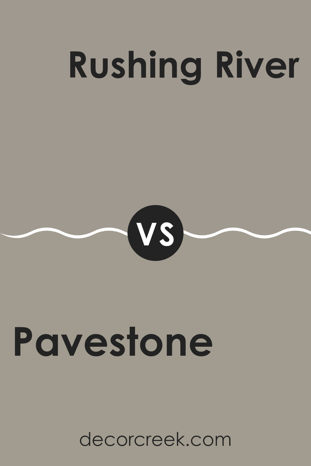
Pavestone SW 7642 by Sherwin Williams vs Rushing River SW 7746 by Sherwin Williams
Pavestone SW 7642 and Rushing River SW 7746 by Sherwin Williams are both neutral colors, but they bring quite distinct vibes to a room. Pavestone is a deeper, warmer gray with brown undertones, making it a cozy and welcoming choice for areas such as living rooms or bedrooms. It pairs well with soft whites and rich woods, providing a comforting atmosphere.
On the other hand, Rushing River is a cooler, lighter gray with subtle blue-green undertones. This color feels refreshing and pairs beautifully with brighter whites or metallic accents for a more modern and open feel. It’s perfect for bathrooms or kitchens where you want a clean, crisp look.
Together, these colors can work well in a home where you want a balance of warmth and freshness, using Pavestone in areas meant for relaxation and Rushing River where you want a brighter, more open setting.
You can see recommended paint color below:
Pavestone SW 7642 by Sherwin Williams vs Fawn Brindle SW 7640 by Sherwin Williams
Pavestone and Fawn Brindle, both by Sherwin Williams, are subtly distinct neutral shades. Pavestone presents itself with a cooler undertone, giving it a slightly more grayish cast. This cool neutrality makes it flexible for rooms that aim for a modern and clean look.
In contrast, Fawn Brindle leans toward a warmer spectrum with its earthy brown undertones, offering a cozy, welcoming vibe that’s perfect for living areas or bedrooms.
Both colors are muted enough to serve as excellent backdrops for various decor styles, but the key difference lies in their temperature tones: Pavestone is cooler and more reserved, while Fawn Brindle is warmer and more inviting. This makes Pavestone a better fit for a contemporary, sleek aesthetic, while Fawn Brindle suits a homier, more rustic feel. Choosing between them depends on the atmosphere you want to create in your room.
You can see recommended paint color below:
Pavestone SW 7642 by Sherwin Williams vs Polished Concrete SW 9167 by Sherwin Williams
Pavestone and Polished Concrete are two distinct shades offered by Sherwin Williams. Pavestone is a warm gray with a slightly earthy tone, making it cozy and welcoming. It has hints of brown, which add depth and help it blend well in rooms that aim for a natural and subtle feel.
On the other hand, Polished Concrete is cooler and mirrors the look of real concrete with its more neutral and muted gray appearance. This color is great for achieving a clean and modern look, as it provides a sleek backdrop that supports contemporary designs.
Both colors are flexible, but while Pavestone tends to warm up a room, Polished Concrete delivers a crisp, cool quality that can make rooms feel more open and airy. Depending on the atmosphere you want to create, either color can work beautifully in many settings, from homes to offices.
You can see recommended paint color below:
Pavestone SW 7642 by Sherwin Williams vs Acier SW 9170 by Sherwin Williams
“Pavestone” and “Acier” are two different shades by Sherwin Williams. “Pavestone” is a warmer gray with subtle brown undertones, which gives off a cozy and inviting vibe. It’s a flexible color that can easily complement various decor styles and works well in many areas of a home, like living rooms or bedrooms.
On the other hand, “Acier” has a cooler tone, leaning more toward a steel gray. This shade can bring a more modern and clean look to rooms, making it a great choice for contemporary homes. It particularly stands out when used in rooms that aim for a minimalistic or industrial aesthetic.
Comparing the two, “Pavestone” tends to add warmth to a room, making it feel more homely, while “Acier” offers a sleeker, more polished finish. Both colors provide a strong foundation for interior design, but your choice depends on the mood and style you want to achieve in your room.
You can see recommended paint color below:
Pavestone SW 7642 by Sherwin Williams vs Smooth Stone SW 9568 by Sherwin Williams
Pavestone and Smooth Stone are two great paint options from Sherwin Williams that add a lot of character to any room. Pavestone is a bit darker, with its warm gray tones giving a cozy and inviting feel to interiors.
It works well in areas where you want a more grounded, subtle backdrop that doesn’t demand too much attention. In contrast, Smooth Stone is lighter and has a softer appearance. This color is perfect for making small rooms appear bigger and brighter.
Smooth Stone brings a light, airy feel to interiors, helping create a relaxed environment. Both colors are highly adaptable and can work beautifully in many different parts of a home, from living rooms to bedrooms, depending on the mood you wish to set. They pair well with a variety of decor styles and offer a clean, modern look while still feeling homey.
You can see recommended paint color below:
Pavestone SW 7642 by Sherwin Williams vs Keystone Gray SW 7504 by Sherwin Williams
Pavestone SW 7642 and Keystone Gray SW 7504 are two popular colors by Sherwin Williams, each offering a unique look. Pavestone is a mid-tone gray that has a slightly cooler, almost stony color. This makes it great for modern and minimalistic rooms. It has a subtle depth that works well in varied lighting conditions, making rooms feel open yet grounded.
Keystone Gray, on the other hand, is a warmer shade of gray with hints of beige. This warmer tone can make a room feel cozy and welcoming. It pairs well with natural materials like wood and stone, enhancing the inviting quality of a room.
Both colors are flexible and can be used in various decor styles, from contemporary to traditional. However, the choice between Pavestone and Keystone Gray often comes down to the atmosphere you want to create—cool and sleek with Pavestone or warm and comfy with Keystone Gray. Each color stands out in its ability to set a mood and complement a room’s overall look.
You can see recommended paint color below:
In wrapping up our chat about SW 7642 Pavestone by Sherwin Williams, I want to highlight how awesome this paint color really is for any home. Pavestone is not just a random gray; it’s a special mix that looks calm and welcoming, which makes rooms feel cozy and put-together. Whether you’re painting a bedroom, a living room, or even the kitchen, Pavestone works well everywhere.
What’s really cool about it is that it fits in with lots of different styles and colors. If your room has lots of blues, greens, or even yellows, Pavestone will look great with them. It’s like that one friend who gets along with everyone at a party.
Finally, if you’re thinking about giving your room a new look, Pavestone is a trustworthy choice because it’s not too dark and not too light—it’s just right. This color can make your furniture and decorations stand out in a good way, which means you will enjoy spending time in your room.
So, Pavestone by Sherwin Williams is a fantastic choice if you want to make your home look neat and cozy without too much fuss.
Ever wished paint sampling was as easy as sticking a sticker? Guess what? Now it is! Discover Samplize's unique Peel & Stick samples.
Get paint samples

