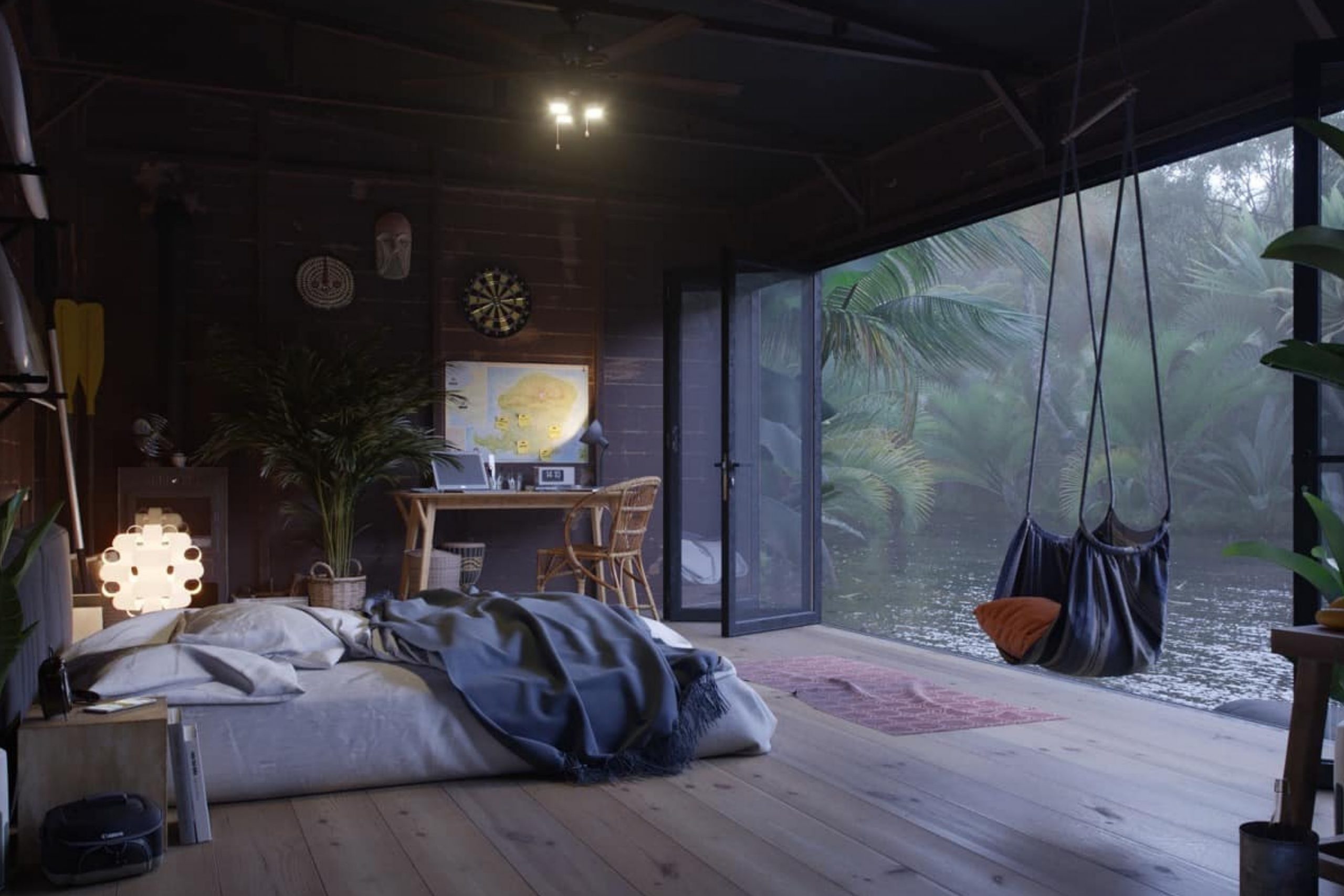
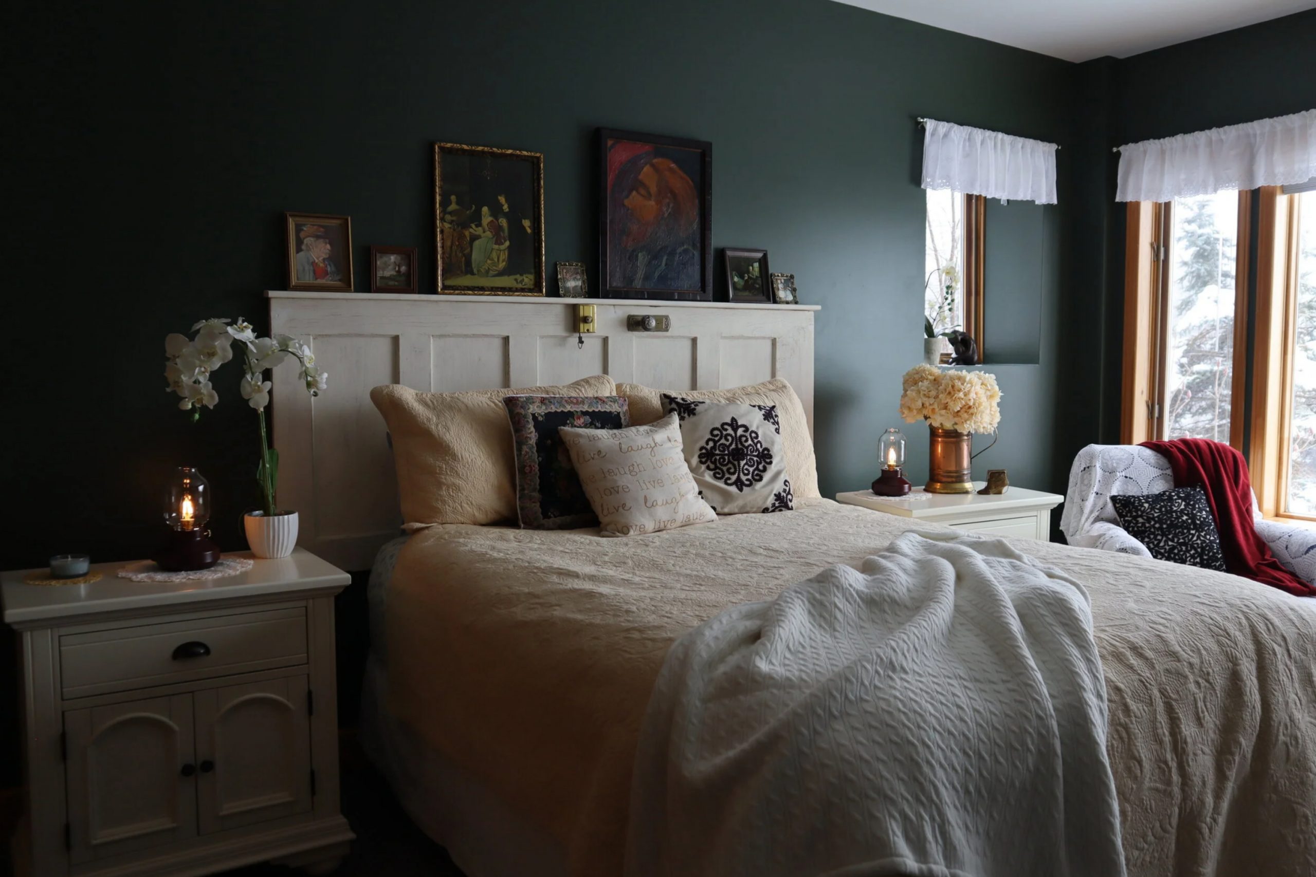
Dark bedrooms have always spoken to me in a special way. There’s something about being wrapped in deep colors that makes me feel grounded and safe. I find that a darker palette not only creates warmth but also adds personality to a bedroom. The goal is not to make the room heavy, but instead to make it feel restful and inviting.
A well-chosen dark tone can highlight textures, fabrics, and lighting in ways lighter shades never could.
In this article, I’ll share my favorite ideas for creating a dark cozy bedroom with colors that feel both romantic and stylish.
Why I Believe Dark Bedrooms Feel So Comforting
For me, dark bedrooms are like a warm blanket at the end of a long day. When I walk into a room painted in rich, deep shades, I feel like the world slows down. These colors quiet the mind and help the body prepare for sleep. They also make furniture, art, and soft linens stand out in a beautiful way.
I believe the comfort comes from how these shades remind us of nightfall, a natural signal for rest. Choosing the right dark color is a way to build a safe retreat that still looks stunning.
How I Pick the Right Shades and Details for a Cozy Bedroom
When I select colors for a cozy bedroom, I start with how I want the room to feel—romantic, moody, or intellectual. I balance darker walls with textures like velvet, wood, or linen so the room doesn’t feel flat. Lighting also matters; golden lamps or soft sconces bring out the richness of the paint. I make sure to choose tones that pair well with the bedroom’s size and natural light.
Even a small room can feel wonderful with deep shades if styled with care. It’s all about choosing colors that make you want to stay and rest.
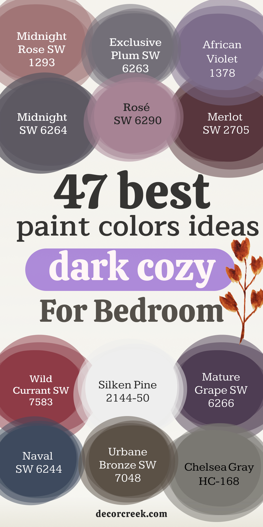
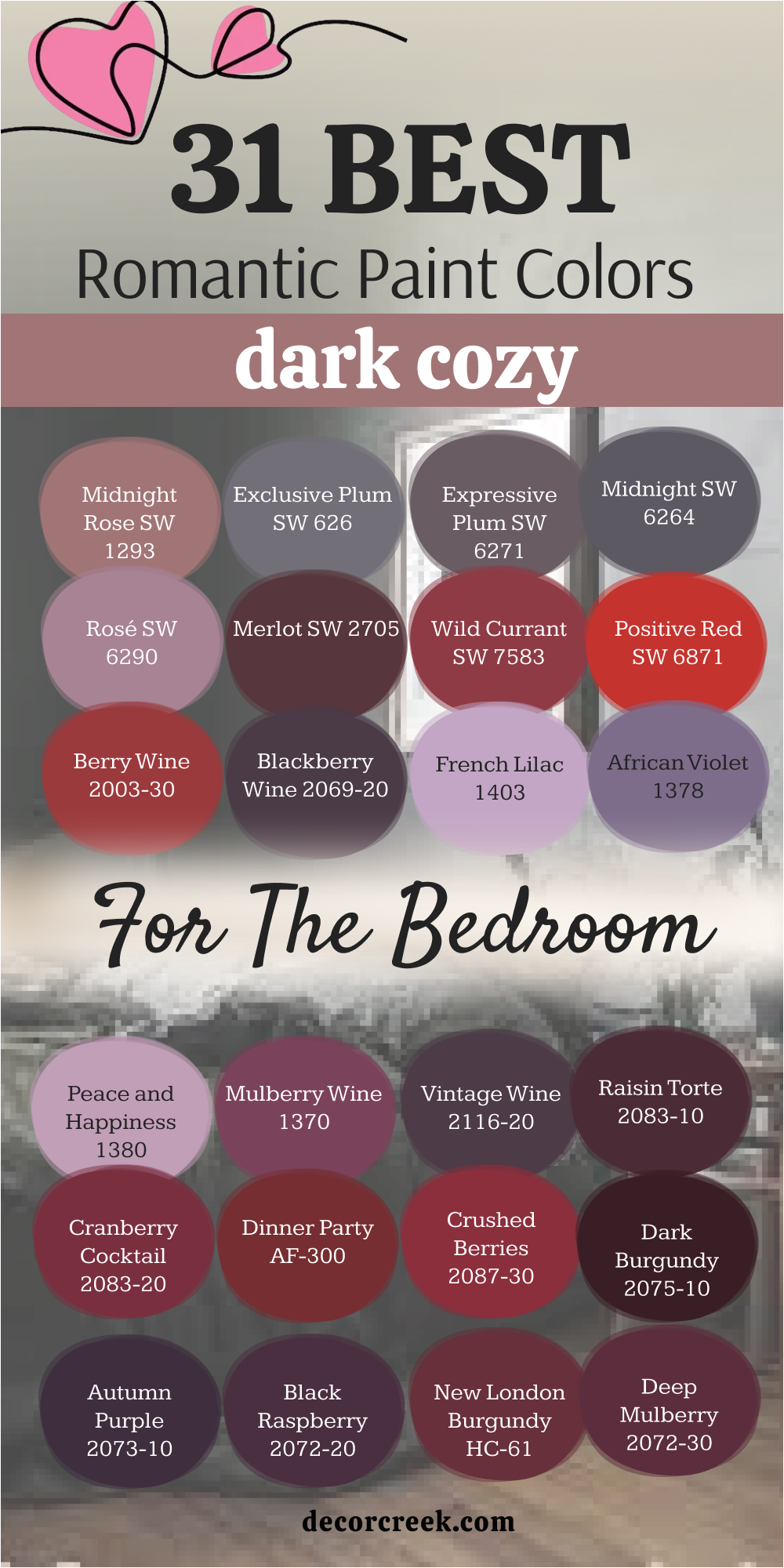
31 Romantic Color for the Dark Cozy Bedroom
Midnight Rose SW 1293
Midnight Rose is a color that feels both soft and dramatic at once. It carries a muted rosy undertone that warms up the darkness without making it too bold. I love how it makes a bedroom feel almost like it’s wrapped in a vintage velvet curtain. Paired with gold accents or creamy linens, it creates a setting filled with charm. This shade works beautifully in both large and small rooms, keeping them cozy.
Midnight Rose is perfect when you want a romantic mood without going too heavy.
Exclusive Plum SW 6263
Exclusive Plum has a rich purple depth that feels artistic and intimate. I often use it in bedrooms that need a touch of character without being loud. Its balance of cool and warm undertones makes it flexible with different décor styles. With warm lighting, it glows in a way that feels very inviting.
It brings a touch of mystery that suits a quiet night. Exclusive Plum is one of my favorite shades for creating a personal retreat.
Expressive Plum SW 6271
Expressive Plum is a color that seems to speak in hushed tones. It’s deeper than a simple violet and creates a wonderful backdrop for wood furniture or iron accents. I find it adds weight to a room in a way that feels secure and steady. This is a shade I reach for when a client wants something romantic but also strong.
By adding white bedding or brass lamps, the whole look softens. Expressive Plum turns a bedroom into a space for both rest and reflection.
Midnight SW 6264
Midnight is a classic dark purple that feels timeless in a bedroom setting. It reminds me of deep skies just after sunset. I love pairing it with silvery grays or soft pinks to balance the depth. This color feels grounding but never dull. It works especially well in rooms with tall headboards or dramatic drapery.
Midnight is one of those shades that makes a bedroom feel both bold and soothing.
Rosé SW 6290
Rosé is soft yet grounded, a romantic pink with a darker base. Unlike brighter pinks, it holds warmth that makes it fit beautifully in a cozy bedroom. I’ve used it to add a touch of gentle charm while keeping the overall mood calm. With warm wood floors and golden lighting, it feels like a quiet evening glow.
Rosé is a wonderful choice when you want color without it becoming too playful. This shade always adds tenderness to the room.
Merlot SW 2705
Merlot brings the richness of deep red wine into the bedroom. It instantly creates a mood that feels luxurious and warm. I find it especially striking with candlelight or vintage chandeliers.
Merlot pairs beautifully with creamy whites or even dark woods. The richness of this shade makes a room feel more intimate. It’s perfect for anyone who wants a romantic, classic setting.
Wild Currant SW 7583
Wild Currant is a vibrant yet deep red that carries energy while still feeling cozy. I like using it in bedrooms where warmth is the goal. It looks striking against dark furniture and creates a cocoon-like effect.
Even though it’s bold, it doesn’t feel harsh in a dimly lit room. The depth of the shade makes fabrics look richer too. Wild Currant creates an atmosphere full of warmth and charm.
Positive Red SW 6871
Positive Red is a brighter take on romance for the bedroom. It carries enough depth to stay grounded, but it’s lively enough to keep the room interesting. I’ve used it to highlight one wall while keeping the others more neutral.
The effect is bold without being overwhelming. With soft fabrics and gold details, it turns striking and elegant. Positive Red brings energy while still keeping the bedroom cozy.
Berry Wine 2003-30
Berry Wine has a juicy, ripe tone that feels indulgent. It brings both richness and warmth into the bedroom. I love how it works with velvet pillows or dark wood frames.
This shade adds depth without feeling too heavy. It balances passion and comfort beautifully. Berry Wine is a color that makes a bedroom feel like a hidden retreat.
Blackberry Wine 2069-20
Blackberry Wine is a darker, more mysterious tone that leans toward purple. It feels sophisticated and bold while keeping the bedroom inviting.
I find it pairs perfectly with lighter linens or metallic accents. The color’s richness makes it ideal for rooms meant for rest and thought. It has a grounding effect that feels steady and secure.
Blackberry Wine is a perfect choice for a moody, intimate setting.
French Lilac 1403
French Lilac is soft but still fits in the dark romantic palette. It carries enough depth to feel cozy while adding a gentle charm.
I love using it in bedrooms that need a little softness with their darkness. It pairs well with ivory bedding and gentle lighting. This shade feels nostalgic and comforting. French Lilac adds tenderness without losing warmth.
African Violet 1378
African Violet brings an exotic richness to the bedroom. It’s deeper than simple purple, with a grounded base that feels steady. I often pair it with black accents or warm metals to highlight its strength.
The shade feels romantic yet confident. It’s perfect for bedrooms that need both charm and a touch of boldness. African Violet is always memorable in a dark cozy setting.
Peace and Happiness 1380
Peace and Happiness is a warm purple with hints of pink. I find it brings joy into the bedroom without being too bright. It looks wonderful with cream bedding or natural wood.
This color adds both coziness and a sense of calm joy. It’s perfect for someone who wants comfort with a soft romantic touch.
Peace and Happiness always lifts the mood of the room.
Mulberry Wine 1370
Mulberry Wine feels deep and velvety, like a glass of rich red. I often use it in bedrooms where warmth and romance are the goals. It pairs beautifully with dark woods and soft lighting.
The color feels rich but not too heavy. It creates a bedroom that feels both inviting and elegant. Mulberry Wine is a classic choice for romance.
Vintage Wine 2116-20
Vintage Wine is a moody color that feels mature and grounded. It carries depth with a hint of softness that keeps it approachable. I love using it in bedrooms with antique furniture.
The color highlights textures like velvet and silk. It creates a dramatic setting that still feels comfortable. Vintage Wine brings history and romance into a cozy bedroom.

Raisin Torte 2083-10
Raisin Torte is a deep, dark purple with brown undertones. It feels earthy while still being elegant. I find it perfect for bedrooms with rustic or classic furniture.
Its grounded quality makes the room feel steady and warm. Paired with linen or leather, it creates a sophisticated look. Raisin Torte makes a bedroom feel strong and inviting.
Cranberry Cocktail 2083-20
Cranberry Cocktail adds a lively punch of red with depth. It brings warmth and energy to a dark cozy bedroom. I like using it for accent walls or small alcoves.
It pairs well with white or cream to balance the brightness. With darker décor, it feels bold and romantic. Cranberry Cocktail adds vibrance to the cozy palette.
Dinner Party AF-300
Dinner Party feels like a celebration in paint form. It’s a red that carries elegance and depth, perfect for romantic bedrooms. I love pairing it with gold accents or plush bedding.
The color creates a sense of warmth that feels welcoming. It makes a bedroom glow with charm and intimacy. Dinner Party always adds personality to the room.
Crushed Berries 2087-30
Crushed Berries is a rich tone that blends red and purple. It’s playful but also grounded, making it ideal for a cozy setting. I’ve used it in bedrooms with modern as well as classic décor.
The color adds depth to fabrics and makes lighting stand out. It feels both romantic and stylish. Crushed Berries always makes a strong impression.
Dark Burgundy 2075-10
Dark Burgundy feels traditional and elegant. It brings a strong sense of richness to a bedroom. I like to use it in spaces with wood accents or vintage furniture.
The color feels both warm and grounding. With soft lighting, it glows in a way that feels comforting. Dark Burgundy is a classic shade that never loses appeal.
Autumn Purple 2073-10
Autumn Purple is a deep, earthy purple that feels connected to nature. It creates a grounded and steady feeling in the bedroom. I find it beautiful with natural fabrics like linen or wool.
The color works well in rooms that need warmth without too much drama. It pairs nicely with lighter tones for balance. Autumn Purple makes the bedroom feel rich and comfortable.
Black Raspberry 2072-20
Black Raspberry is bold and striking. It leans dark but has a lively undertone that keeps it interesting. I love using it with both modern and vintage bedroom styles.
The color highlights textures and fabrics beautifully. It feels dramatic yet still cozy. Black Raspberry brings a spark of passion to the dark palette.
New London Burgundy HC-61
New London Burgundy feels stately and rich. It’s a deep shade that carries tradition and elegance. I often pair it with antique wood or gold details.
The color makes a bedroom feel more grounded and sophisticated. It brings warmth that feels secure. New London Burgundy is perfect for a classic cozy setting.
Deep Mulberry 2072-30
Deep Mulberry is a strong purple tone that carries warmth. I like to use it when a room needs both coziness and depth. It pairs well with dark woods and metallic accents.
The shade feels mature and rich without being heavy. It highlights the room’s character beautifully. Deep Mulberry turns any bedroom into a cozy retreat.
Supernova SW 6805
Supernova is a dark blue-purple that feels mysterious and bold. It adds character to a bedroom instantly. I find it works beautifully with silver or chrome accents.
It’s a shade that creates both romance and drama. With soft lighting, it feels almost magical. Supernova always adds intrigue to a cozy bedroom.
Grape Harvest SW 6285
Grape Harvest feels grounded and earthy, like ripe fruit at dusk. It has warmth while still keeping a moody edge. I often use it in bedrooms with layered fabrics and natural wood.
The shade feels romantic without being flashy. It adds richness to the room while keeping it inviting. Grape Harvest is a steady, beautiful choice.
Carnelian SW 7580
Carnelian is a deep red that glows with warmth. It feels like a gemstone brought to life on the walls. I love pairing it with dark furniture and soft lighting.
The shade makes a bedroom feel intimate and luxurious. It works especially well in smaller bedrooms where coziness matters. Carnelian brings richness and warmth to any dark cozy setting.
Fine Wine SW 6307
Fine Wine is a rich, velvety red that feels indulgent. It’s a color that instantly warms up the bedroom. I’ve used it with cream fabrics and wood tones to balance its strength.
The depth of the shade feels romantic and inviting. It makes a room feel cozy while still elegant. Fine Wine always adds charm and intimacy.
Dahlia SW 6806
Dahlia is a vibrant purple with a deep base. It feels bold but still suits a cozy bedroom. I find it works well with both modern and traditional décor.
The shade makes fabrics and lighting stand out in a beautiful way. It adds energy while keeping the room restful. Dahlia is a color full of charm and personality.
Mature Grape SW 6266
Mature Grape carries a dark purple tone that feels grounded. It has a serious, elegant presence in the bedroom. I love pairing it with black furniture or soft metallics.
The shade feels romantic in a quiet way. It makes a bedroom look rich and well-styled. Mature Grape is perfect for a steady, cozy atmosphere.
Plum Brown SW 6272
Plum Brown blends purple with earthy undertones. It feels grounded and warm, perfect for a restful bedroom. I often use it with leather or rustic wood accents. The shade creates a feeling of intimacy and comfort.
It balances richness with stability. Plum Brown is a beautiful finish to a cozy, romantic palette.
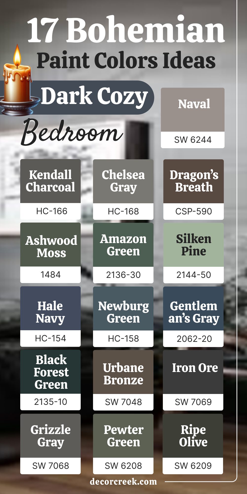
17 Bohemian Paint Color Ideas for the Dark Cozy Bedroom
Kendall Charcoal HC-166
Kendall Charcoal is a dark gray with a warm undertone that feels earthy. It fits perfectly in a bohemian bedroom with layered fabrics and natural textures.
I love how it pairs with wood, rattan, and woven rugs. The color creates a grounded backdrop without feeling cold. It lets brighter décor stand out beautifully. Kendall Charcoal feels like a steady base for a cozy bohemian retreat.

Chelsea Gray HC-168
Chelsea Gray carries a rich, warm depth that suits bohemian styling. It feels soft enough for comfort but dark enough for drama.
I find it works well with colorful throws, patterned pillows, and rustic furniture. The color gives the bedroom a steady, calm foundation. It pairs especially well with brass and wood details. Chelsea Gray always adds character to a dark cozy bedroom.
Dragon’s Breath CSP-590
Dragon’s Breath is bold, earthy, and perfect for dark cozy bedrooms. It has a brown-gray base that feels rich and moody.
I love using it in rooms with eclectic décor, as it grounds all the layers. The color works beautifully with plants, rugs, and textiles.
It creates a cocoon-like setting that feels safe. Dragon’s Breath always brings warmth and depth.
Ashwood Moss 1484
Ashwood Moss is a deep green that feels natural and inviting. It’s a wonderful backdrop for bohemian décor filled with wood and natural fibers.
I often pair it with linen curtains and textured bedding. The color feels both cozy and refreshing.
It connects the room to earthy elements in a beautiful way. Ashwood Moss makes the bedroom feel grounded and calm.
Amazon Green 2136-30
Amazon Green is bold but still cozy in a dark bedroom. It carries a richness that pairs perfectly with global and eclectic pieces. I love using it with woven baskets, patterned quilts, and warm lighting.
It adds vibrance without being too sharp. The color makes a bedroom feel full of life while still restful. Amazon Green adds a natural energy to bohemian styling.
Silken Pine 2144-50
Silken Pine is a softer green that brings gentle warmth. Even though it’s lighter than some, it still feels cozy with the right textures. I use it as a backdrop for natural woods and soft fabrics.
The color feels earthy and nurturing. It balances brightness with coziness. Silken Pine is perfect for a softer bohemian bedroom.
Hale Navy HC-154
Hale Navy is a strong blue that carries sophistication and comfort. I like using it in bohemian bedrooms with colorful accents and layered fabrics. It pairs beautifully with mustard, rust, or burgundy tones.
The depth of this color feels secure and rich. It makes the bedroom feel stylish and warm at the same time. Hale Navy is a versatile and grounding choice.

Newburg Green HC-158
Newburg Green is a moody teal that feels both artistic and earthy. It’s wonderful for a bedroom filled with eclectic treasures. I find it pairs well with patterned bedding and warm wooden tones.
The color feels steady but still interesting. It creates a cozy, layered atmosphere. Newburg Green is a bohemian favorite for a reason.

Gentleman’s Gray 2062-20
Gentleman’s Gray is a deep, inky blue that feels dramatic yet cozy. It creates a strong backdrop for layered décor. I love it with woven textiles, plants, and golden accents.
The color feels secure and stylish. It turns a bedroom into a personal retreat. Gentleman’s Gray makes every detail stand out in the best way.

Black Forest Green 2135-10
Black Forest Green is a powerful shade that feels rooted in nature. It makes a dark cozy bedroom feel like a quiet escape. I love pairing it with wood furniture and earthy accents. The color feels steady and bold without being harsh. It highlights textures and natural elements beautifully.
Black Forest Green adds richness to any bohemian bedroom.
Urbane Bronze SW 7048
Urbane Bronze is earthy, warm, and deeply grounding. It feels perfect for a bohemian bedroom filled with layered fabrics and natural wood.
I like to pair it with warm lighting and patterned textiles.
The color brings depth while letting brighter décor shine. It feels strong but inviting. Urbane Bronze always creates a stylish and cozy setting.

Iron Ore SW 7069
Iron Ore is one of my favorite near-black shades. It adds drama without feeling flat. I often use it in bedrooms where eclectic accents and layered fabrics need a strong backdrop.
The color makes the room feel grounded and intimate.
Paired with warm lighting, it feels rich and cozy. Iron Ore is a perfect foundation for bohemian design.

Grizzle Gray SW 7068
Grizzle Gray is a smoky tone that blends gray with green undertones. It feels earthy and pairs beautifully with bohemian textures.
I love how it looks with macramé, rattan, and patterned rugs.
The color feels both strong and soft at once. It gives depth without being too dark. Grizzle Gray is an excellent bohemian bedroom color.

Pewter Green SW 6208
Pewter Green is rich and calming with an earthy base. It works beautifully in cozy, layered bedrooms. I like using it with wooden accents and warm fabrics. The color makes a bedroom feel connected to nature.
It pairs wonderfully with global-inspired décor. Pewter Green creates a secure, grounded setting.

Ripe Olive SW 6209
Ripe Olive is a deep, earthy green that feels natural and warm. I find it perfect for bedrooms that need coziness with character.
The color works well with rustic or handmade pieces. It makes a bedroom feel like a retreat filled with comfort. Ripe Olive highlights textures in a lovely way. This shade is always a grounding choice.

Naval SW 6244
Naval is a deep navy blue that feels both classic and cozy. I love how it pairs with bohemian textiles and earthy wood accents.
The color brings drama without feeling cold. It balances strong tones with a secure, restful mood. With golden light, Naval feels rich and elegant. It’s one of my favorite dark cozy shades.

Bunglehouse Blue SW 0048
Bunglehouse Blue carries a historic, moody feel perfect for a bohemian bedroom. It’s deep but soft enough to pair with patterned accents. I love using it with natural fabrics and eclectic décor.
The color feels rich and comforting. It highlights warmth in textures and lighting.
Bunglehouse Blue creates a bedroom full of character and charm.

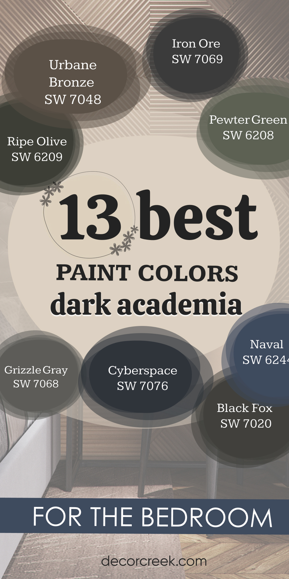
13 Best Dark Academia Paint Colors for the Bedroom
Urbane Bronze SW 7048
Urbane Bronze feels scholarly and deep. It reminds me of old libraries filled with wooden shelves. The shade grounds the bedroom with warmth and stability.
I love pairing it with leather furniture and golden light.
It creates a setting that feels thoughtful and rich. Urbane Bronze fits perfectly with the dark academia mood.
Iron Ore SW 7069
Iron Ore is nearly black, making it ideal for a moody, intellectual setting. It feels bold but never flat. I like how it pairs with dark woods and antique accents.
This shade makes a bedroom feel private and reflective.
It’s a perfect backdrop for bookshelves or vintage art. Iron Ore adds depth and intensity to the dark academia style.
Pewter Green SW 6208
Pewter Green feels like an aged study color, grounded and steady. It pairs beautifully with leather chairs, rustic wood, and old-world décor. I love how it creates warmth without losing depth.
The shade feels thoughtful and secure.
In bedrooms, it adds richness and calm. Pewter Green is one of my favorite academic tones.
Ripe Olive SW 6209
Ripe Olive feels historic, almost like the walls of an old university. It’s earthy and grounded with a strong presence. I find it pairs beautifully with warm fabrics and heavy drapes.
The color makes a bedroom feel deep and reflective. It adds seriousness without feeling dull. Ripe Olive is a perfect fit for dark academia interiors.
Grizzle Gray SW 7068
Grizzle Gray blends strength and softness. It feels moody but approachable, perfect for academic-inspired bedrooms. I love using it with bookshelves, wool blankets, and antique accents.
The color creates a thoughtful, quiet mood. It’s a shade that feels strong without being harsh. Grizzle Gray works beautifully in dark academia settings.
Naval SW 6244
Naval feels scholarly and classic. Its deep navy tone is both bold and comforting. I love using it in bedrooms with vintage maps, leather, and brass lamps.
The color brings richness without being too dark. It feels steady, like the walls of an old study. Naval is a strong part of the dark academia palette.
Cyberspace SW 7076
Cyberspace is a near-black navy that feels serious and stylish. It creates a dramatic backdrop for academic-inspired décor. I often pair it with bookshelves, artwork, and vintage textiles.
The color feels grounded but never dull. It adds intensity and focus to the room. Cyberspace is perfect for a scholarly, moody bedroom.

Black Fox SW 7020
Black Fox blends brown and black for a soft but deep effect. It feels like aged wood or worn leather. I love using it in bedrooms with antique desks and heavy fabrics. The color feels steady and comforting.
It adds warmth while keeping the moody tone. Black Fox fits beautifully into a dark academia theme.

Hale Navy HC-154
Hale Navy is strong and bold with a timeless quality. It feels scholarly without being too heavy. I often pair it with wood, plaid, or brass for a classic study look. The color adds depth and comfort to the bedroom.
It’s a shade that always feels rich and inviting. Hale Navy brings academic charm in the best way.
Kendall Charcoal HC-166
Kendall Charcoal is grounded and sophisticated. It feels serious in the best way. I love using it with dark wood furniture and textured bedding. The color gives the room depth without taking over.
It feels like a perfect balance of strength and warmth. Kendall Charcoal is a staple for dark academia bedrooms.
Dragon’s Breath CSP-590
Dragon’s Breath is earthy and full of character. It reminds me of worn leather and old libraries. The shade makes a bedroom feel strong and rich. I often pair it with heavy curtains and brass lighting.
It has a historic, intellectual presence. Dragon’s Breath is a bold and perfect fit for this style.
Black Forest Green 2135-10
Black Forest Green feels like a hidden study in the woods. It’s deep and moody, full of character. I find it beautiful with wooden accents and soft lighting. The color makes the bedroom feel secure and scholarly.
It pairs well with both classic and rustic décor. Black Forest Green carries the depth of dark academia.
Amherst Gray HC-167
Amherst Gray is a thoughtful shade of gray with historic charm. It feels steady and refined. I love pairing it with vintage furniture and soft rugs. The color makes a bedroom feel strong yet inviting.
It’s perfect for a quiet retreat filled with books and study pieces. Amherst Gray is an excellent finish to a dark academia palette.

Final Thoughts on Dark Cozy Bedroom Ideas
A dark cozy bedroom is more than just a design choice—it’s about creating a personal retreat. I believe the right shade can make you feel safe, cared for, and inspired. From romantic reds to bohemian greens and deep academia grays, these colors tell stories on the walls. What matters most is how the room feels when you step inside.
For me, a dark bedroom should wrap you up like the night itself.
When chosen with care, these ideas turn a bedroom into a comforting, stylish sanctuary.