
I have hand-picked the perfect colors for your kitchen doors and cabinets to help you create a space that feels both functional and incredibly stylish. Choosing a color for your kitchen doors might seem like a small detail, but because the kitchen is the heart of the home, it changes how your entire family starts their day. Most people forget that doors and cabinetry are the largest visual surfaces in the room.
When you pick a color that matches your walls and trim, the kitchen stops looking like a workspace and starts looking like a professional designer put it together. I see many homeowners stick with plain white because they are afraid of grease or making a mistake.
However, adding the right shade can make your kitchen feel much friendlier and more finished.
Your family will notice the difference as soon as they walk in for breakfast. Small changes like this are the secret to a happy and pretty home where everyone wants to gather.
Why I Trust Thoughtfully Chosen Door Colors to Tie the Kitchen Together
I have spent years staging houses to make people fall in love with them, and the kitchen is always the selling point. I trust specific door colors because they act as an anchor for the room. When the door color flows with the cabinets and the rest of the walls, it makes the house feel organized and expensive.
A good color choice hides fingerprints and everyday wear while making the kitchen feel more spacious. It is the easiest way to refresh the room without a total renovation.
I have seen how a moody door can make a simple kitchen look like a custom-built masterpiece. It helps pull your countertops, backsplash, and appliances together into one big story. When the doors look good, the whole house feels like it was built with a lot of care.
How I Choose the Right Door Paint Color for a Kitchen
Picking the right paint starts with looking at your countertops and your natural light. I always check how a color looks in the morning during breakfast and again at night under the stove lights. You want a color that stays pretty even when you are cooking. I also think about how the door looks when it is standing open toward the pantry or the dining room.
I usually pick three colors that work as a team: one for the doors/cabinets, one for the walls, and one for the trim. I carry paint samples to the kitchen island to see how they look next to the tile and the flooring.
If you have a lot of stainless steel or dark appliances, you can use warmer tones to balance the “cold” metal. In a kitchen with small windows, I stick to lighter shades to keep the workspace feeling bright and clean.

Warm Neutrals For a Kitchen That Feels Soft and Welcoming
In my experience, these combinations are the best choice for families who want to feel relaxed and comfortable the moment they step into the heart of the home. I have used these warm mixes in many houses where the kitchen felt a bit too cold, clinical, or empty. By painting the doors a slightly darker tan or beige, I create a soft, layered look that stays beautiful and inviting all day long, regardless of how the light shifts.
I notice that these specific colors make the kitchen walls look softer and the surrounding furniture, like your breakfast nook or bar stools, look more inviting to guests. My clients always tell me that these warm tones make their kitchens feel like a big, soft blanket or a cozy cafe where they want to linger over coffee. I trust these sets implicitly because they never look yellow or dirty, even when the sun goes down and the warm evening lamps are turned on.
They work so well because they use colors found in nature, like sand, weathered stone, and natural linen. When I use these on kitchen doors, the whole room feels much more grounded, solid, and high-quality. You will find that these neutrals go with almost any wood floor or stone tile you already have in place.
It is my favorite way to make a kitchen feel friendly and upscale without using bright or loud colors that might become tiring over time.
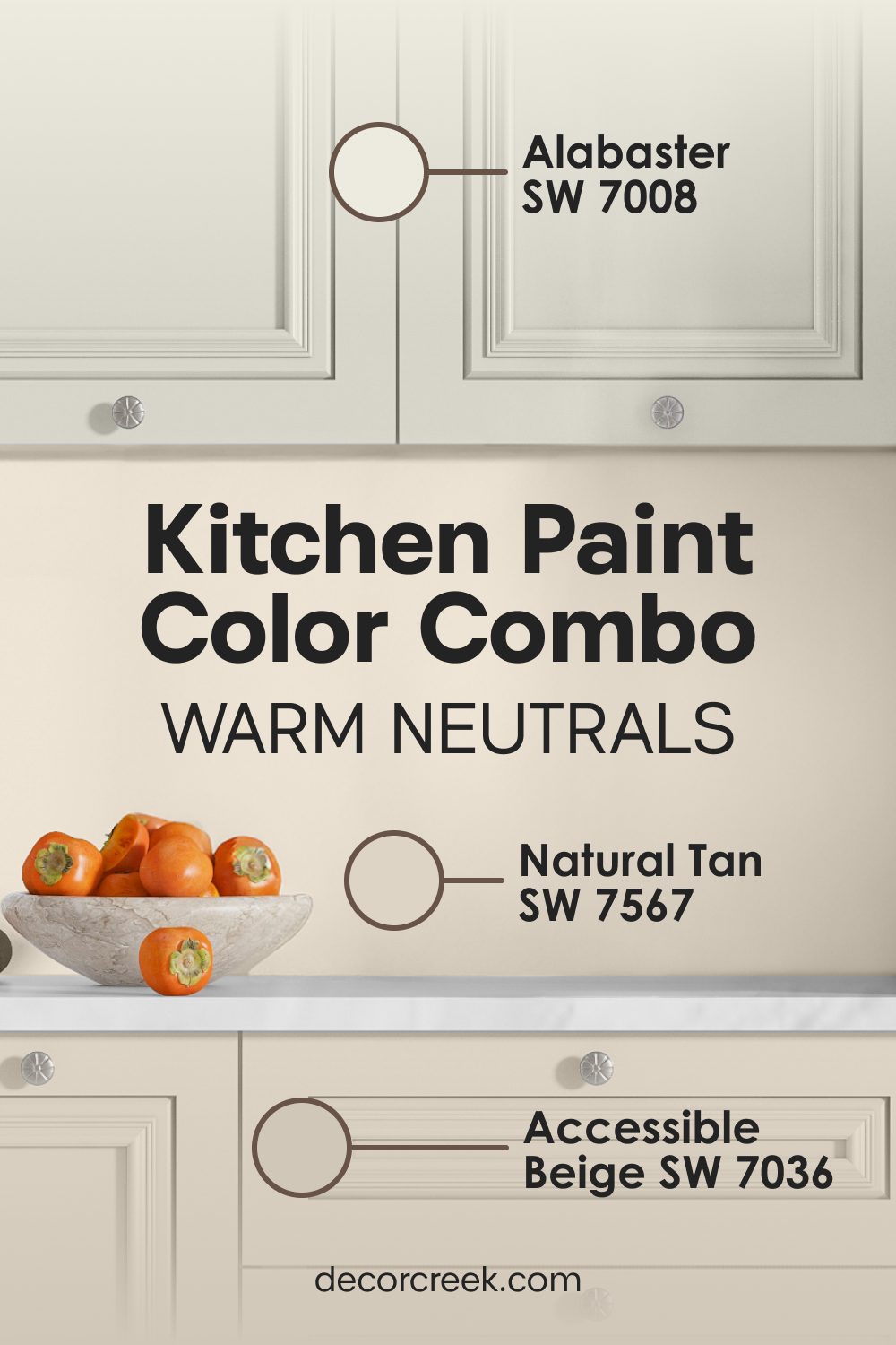
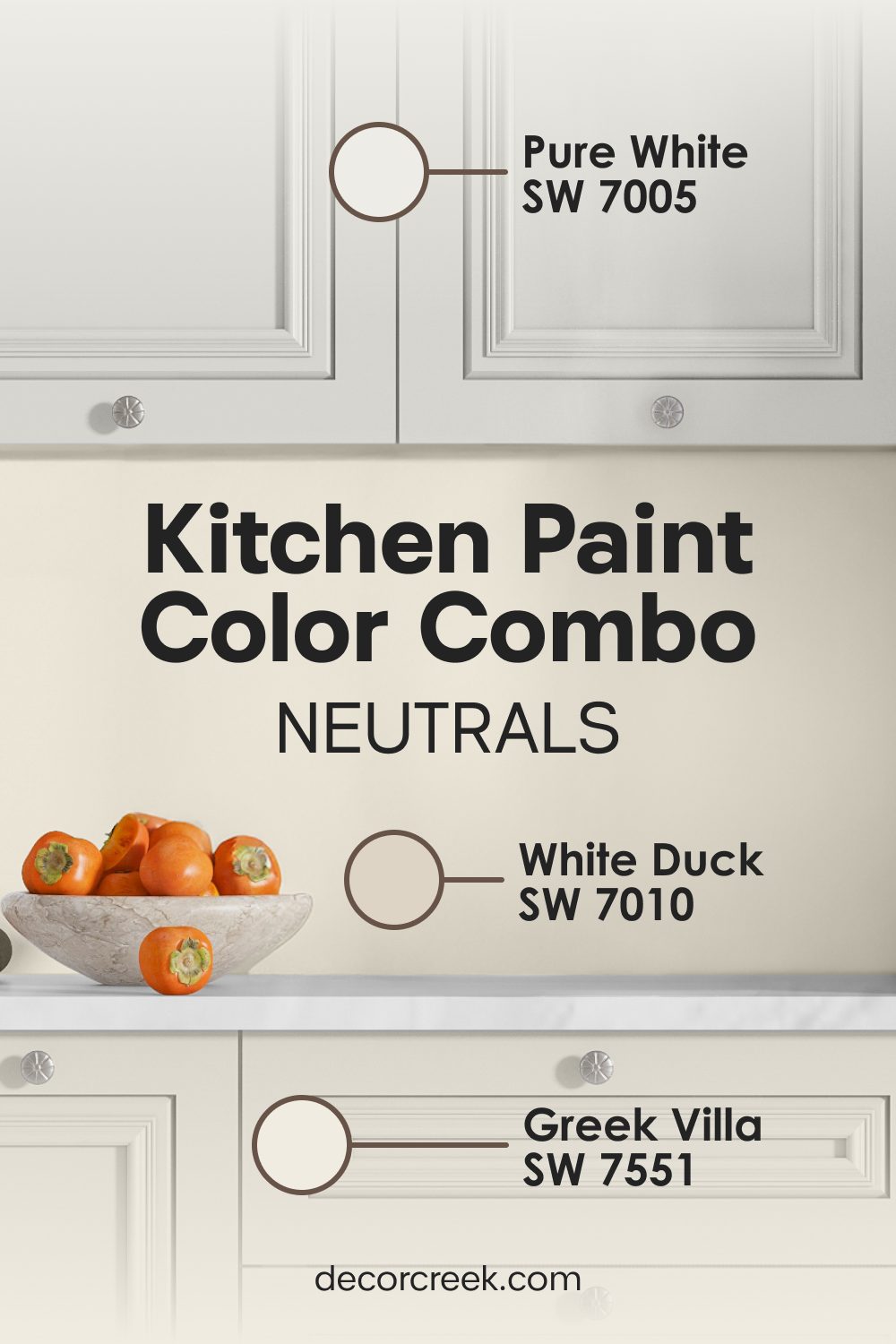
Natural Tan SW 7567 + Accessible Beige SW 7036 + Alabaster SW 7008
Natural Tan SW 7567 has a distinct wood-like warmth that makes any kitchen feel very natural and organic. I often suggest this for homes that want to bring a bit of the outdoors inside.
Accessible Beige SW 7036 sits beautifully on the walls to provide a soft, creamy background that highlights your family photos or decorative spice racks. Alabaster SW 7008 is a rich, celebrated white that looks like vanilla cream on the trim and the ceiling.

I especially like this mix for kitchens that have a lot of indoor herbs or green accents. The tan and beige colors make the green leaves of your plants pop and look very healthy and vibrant.
This set of colors is incredibly soothing for people who want a quiet, peaceful place to prepare meals after a long day at work. It avoids the harsh, sterile feeling of cool grays that can sometimes make a kitchen feel like an office or a hospital.

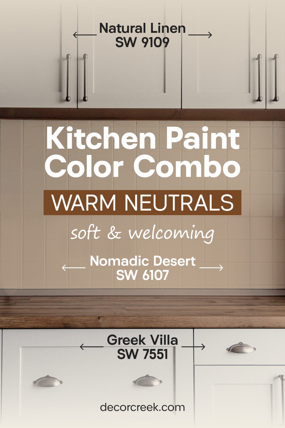
Nomadic Desert SW 6107 + Natural Linen SW 9109 + Greek Villa SW 7551
Nomadic Desert SW 6107 provides a tan base for the doors that feels like warm sand under your feet on a summer day. It is a sturdy color that gives the door a sense of importance.

Natural Linen SW 9109 works on the walls to keep the sunshine feeling bright and airy throughout the room. Greek Villa SW 7551 stays on the trim to make the transition between the tan door and the linen walls look very crisp and intentional.

This combination reminds me of a beautiful Mediterranean villa where everything feels relaxed and simple for the family to enjoy. You will notice that this specific tan shade hides kitchen dust and light splashes much better than a stark white door ever could.
Sand colors like these help the kitchen feel grounded and permanent instead of light and temporary. Every guest will feel invited to sit down at the island and stay for a long time in this welcoming environment.

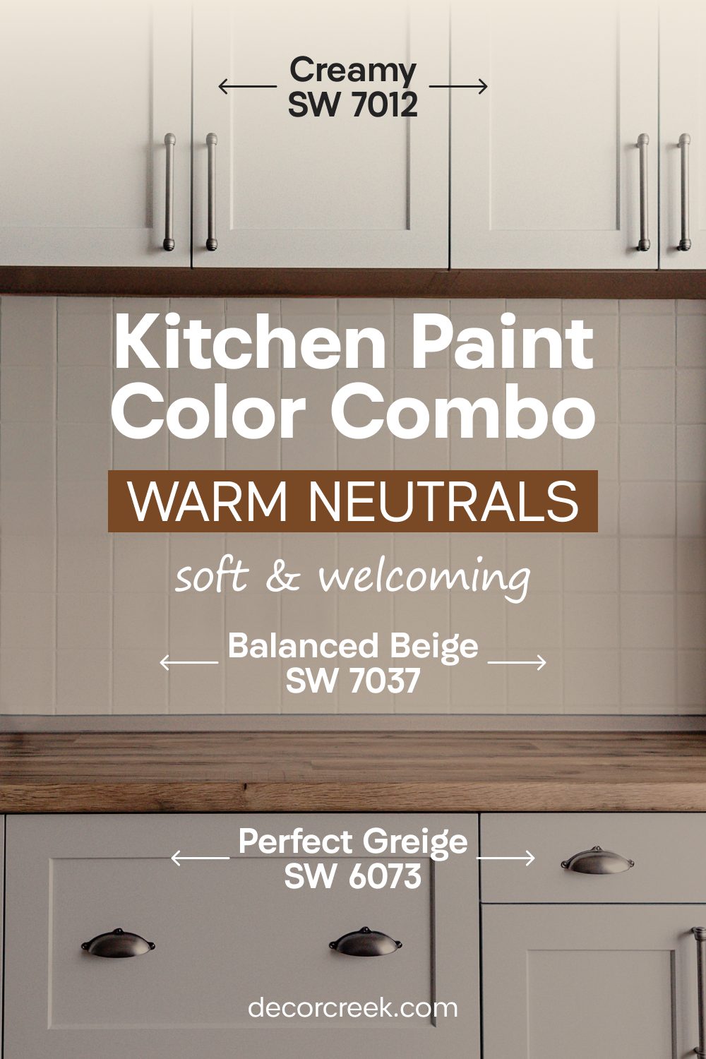
Balanced Beige SW 7037 + Perfect Greige SW 6073 + Creamy SW 7012
Balanced Beige SW 7037 is a deeper, more sophisticated tan that looks wonderful on heavy pantry doors or the main entrance to a large kitchen.

Perfect Greige SW 6073 mixes gray and beige on the walls to give the room a modern, updated feeling while keeping it warm. Creamy SW 7012 keeps the baseboards and door frames looking fresh and bright against the slightly darker door paint.

This trio is the perfect solution if you have light-colored wood floors or light gray stone countertops in your home. I think this look is very professional and makes a house feel like it was designed by an expert staging team.
The darker door color creates a nice frame for the entrance to your cooking area, making it feel expensive and well-planned. You can use black or bronze handles on these doors to finish the look with a touch of modern elegance.

Kilim Beige SW 6106 + Natural Linen SW 9109 + Alabaster SW 7008
Kilim Beige SW 6106 is a classic, timeless color that adds a sense of history and warmth to any kitchen it touches. It is a very reliable shade that doesn’t change drastically in different lighting conditions.

Natural Linen SW 9109 on the walls keeps the atmosphere feeling light and approachable, ensuring the room never feels too dark. Alabaster SW 7008 on the trim provides a clean, white edge that helps define the architecture of the room.
I find that this palette works exceptionally well in traditional homes with classic cabinetry and wooden details. It creates a very steady, calm feeling that makes the house feel solid and well-built for a growing family. Most people find this combination very pleasing because it is balanced and does not demand constant attention, allowing your kitchen accessories to be the stars of the show.

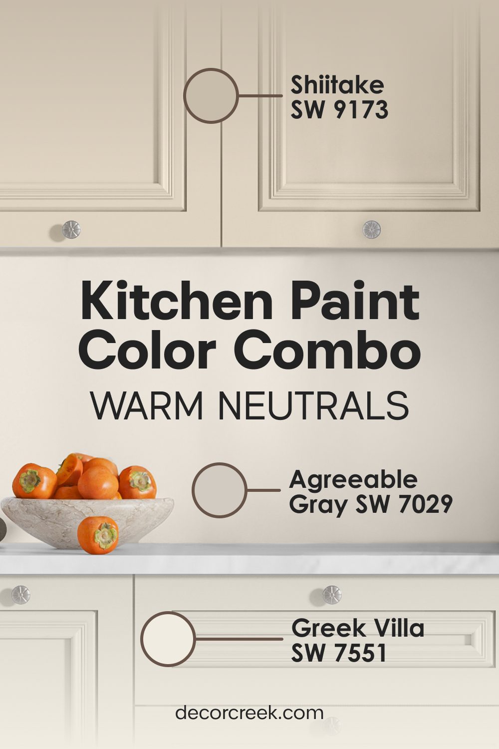
Agreeable Gray SW 7029 + Shiitake SW 9173 + Greek Villa SW 7551
Agreeable Gray SW 7029 is one of the most popular colors in the world because it adapts so well to its surroundings. On a kitchen door, it looks clean and modern without being cold.

Shiitake SW 9173 adds a slightly darker stone color to the walls, providing a beautiful depth that makes the Greek Villa SW 7551 trim stand out. This combination is great for kitchens that have a lot of stainless steel appliances or chrome fixtures.

The gray tones on the door act as a neutral bridge between the warm wall tones and the cool metal of the stove and fridge. I find that this palette makes a room feel very balanced and easy on the eyes during the bright midday sun. It is a sophisticated way to use gray tones while ensuring the kitchen remains a warm and homey place for everyone who visits you.
Moody Shades For a Look That Is Bold and Dramatic
I absolutely love using these dark and deep colors when I want to make a kitchen look very expensive, dramatic, and special. Many homeowners are initially afraid of dark paint on their doors, but I have seen it work wonders in dozens of high-end homes and renovations. These heavy, saturated colors act like a beautiful, dark frame for your life and your kitchen furniture. When I put a dark bronze or iron color on a door, it instantly makes the room feel much more private, quiet, and safe.
I find that these moody shades look amazing when paired with gold lamps, brass cabinet handles, and warm light bulbs in the evening. They work so well because they create a powerful visual change between the light walls and the deep doors. In my years of staging and designing, I have learned that a dark door can make even a standard, budget-friendly kitchen look like a custom architectural masterpiece.
These colors are also incredibly practical for a high-traffic area like a kitchen because they are great at hiding little marks, scuffs, or fingerprints from pets and busy children. You will also see that a dark door can create a visual illusion that makes the ceiling feel higher than it really is.
It is a bold, brave choice that I always suggest for people who want a home with a lot of character and a story to tell.
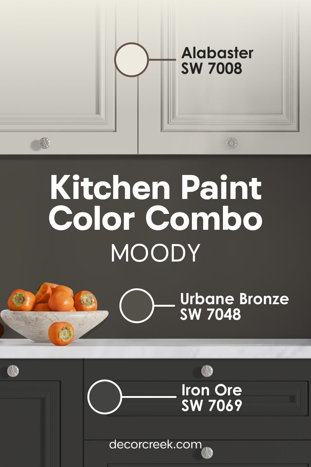
Urbane Bronze SW 7048 + Iron Ore SW 7069 + Alabaster SW 7008
Urbane Bronze SW 7048 is a dark, rich, and soulful color that looks like a perfect mix of chocolate brown and deep gray. Iron Ore SW 7069 is even darker and works beautifully on the walls if you want a kitchen that feels very bold and cutting-edge.

Alabaster SW 7008 is absolutely necessary on the trim to provide a bright, clean line so the room stays defined and doesn’t feel like a dark cave. This palette is designed for people who want their kitchen to feel like a high-end lounge or a private chef’s studio.

I use this when a room has plenty of natural light and can handle the weight of dark paint. The dark door color makes a huge statement and tells everyone that you have a very confident and sophisticated sense of style. It looks incredible with gold or brass hardware scattered around the room.
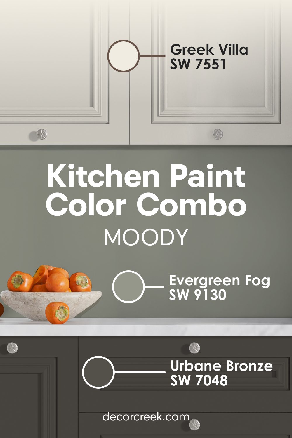
Evergreen Fog SW 9130 + Urbane Bronze SW 7048 + Greek Villa SW 7551
Evergreen Fog SW 9130 is a stunning, dusty green that brings the calming feeling of a misty forest right into your kitchen. It is a very trendy look that feels both old-fashioned and brand new at the same time.

Urbane Bronze SW 7048 goes on the doors to give the room a heavy, grounded, and expensive feeling that complements the green perfectly. Greek Villa SW 7551 keeps the trim looking sharp so the green and bronze colors do not blend together or look muddy.
I love using this in homes that have large windows looking out at a garden or a backyard with lots of trees. The green walls help the transition from the outside world into your home feel very smooth and natural. The dark doors add a touch of drama that makes the kitchen feel very special for hosting dinner parties or holiday gatherings.
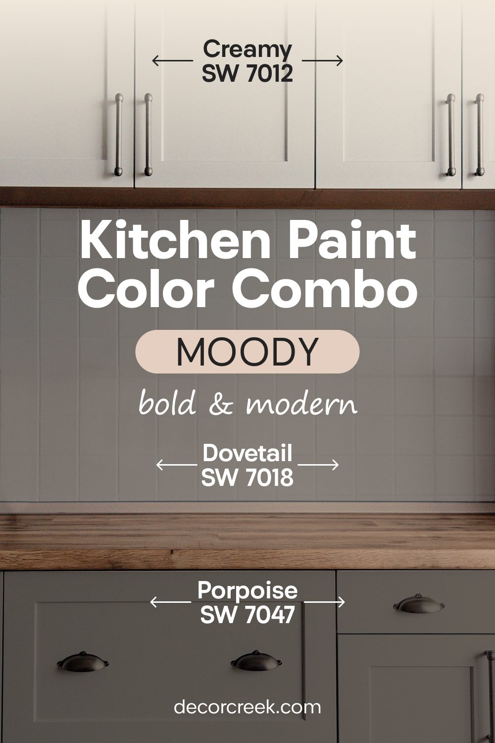
Dovetail SW 7018 + Porpoise SW 7047 + Creamy SW 7012
Dovetail SW 7018 is a medium, reliable gray that feels very solid and trustworthy on your kitchen walls. Porpoise SW 7047 is a darker gray-brown that I love to put on pantry or cellar doors to create a strong focal point in the room.

Creamy SW 7012 is the perfect warm white to keep the entire space from feeling too dark or gloomy, especially during the winter months. This color set works very well with leather bar stools, dark wood countertops, or walnut cabinetry.

I think it makes a kitchen feel very mature, smart, and intentional. The gray tones are very modern, but the hint of brown in the Porpoise paint makes them feel much more welcoming and much less industrial. It is a practical and stylish choice for a busy home that wants to look cool and collected.
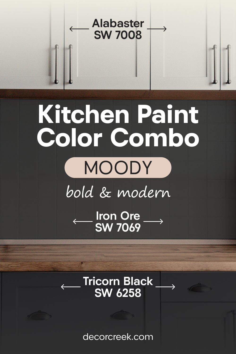
Iron Ore SW 7069 + Tricorn Black SW 6258 + Alabaster SW 7008
This combination is for the homeowner who truly loves high-contrast, modern design. Iron Ore SW 7069 on the walls provides a deep charcoal backdrop that is softened just enough to be livable.
Tricorn Black SW 6258 on the doors is the ultimate “true black” that makes a huge, unforgettable statement in the kitchen. Alabaster SW 7008 on the trim provides the necessary “pop” of light that keeps the room looking clean and architectural.

I find that this palette makes the kitchen hardware—whether it’s silver, gold, or matte black—look like expensive jewelry. It is a very brave choice that pays off by making your home look incredibly unique and fashion-forward. You will love how the light reflects off the black doors during different times of the day.
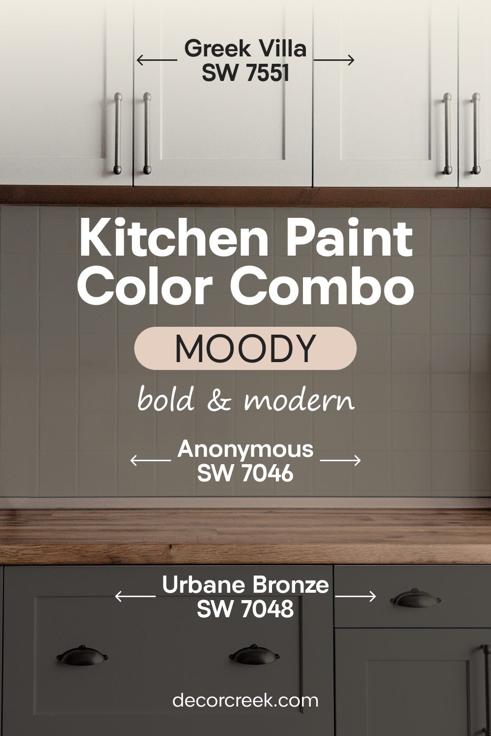
Anonymous SW 7046 + Urbane Bronze SW 7048 + Greek Villa SW 7551
Anonymous SW 7046 is a fascinating neutral color that sits right between green, gray, and brown depending on the light. It provides a complex and interesting background for your kitchen walls.

Urbane Bronze SW 7048 on the doors creates a very strong, anchored look that feels modern and edgy. Greek Villa SW 7551 adds a bit of softness back into the room so the dark doors don’t feel too heavy or overwhelming.
I choose this combination when someone wants a room that feels very moody and artistic but still has a hidden sense of warmth. The bronze color on the doors makes standard door handles look very special. This palette works best in kitchens that have plenty of natural materials like stone, wood, or woven baskets to balance the deep paint tones.
Neutrals That Keep Everything Fresh and Timeless
When I work with homeowners who love a very neat, tidy, and organized look, I always reach for these light and airy combinations. These mixes of white, cream, and very light gray are the best way to make a kitchen feel fresh, hygienic, and full of natural light. I have used these palettes in many small kitchens to make them feel much larger and more open than they actually are.
These colors work perfectly because they do not fight with each other for your attention; instead, they work together to create a harmonious background. I find that using different shades of white and light neutrals on the doors and walls makes the room look very layered, expensive, and smart. It is a classic look that stays in style for decades, so you never have to worry about your kitchen looking “dated” next year.
My experience shows that these light colors make any colorful fruit bowls, flowers, or kitchen accessories look much more vibrant and beautiful. They create a very steady, calm feeling that helps people feel more organized in their busy daily lives. You will love how these colors catch the morning light while you are making breakfast.
It is the perfect choice for a home that needs to feel very light, very clean, and very peaceful every single day.
White Duck SW 7010 + Greek Villa SW 7551 + Pure White SW 7005
White Duck SW 7010 is a beautiful, creamy off-white that has a tiny bit of gray hidden inside, making it very sophisticated on the walls. Greek Villa SW 7551 on the doors makes the entrance to the pantry or kitchen look very soft and inviting for your family.

Pure White SW 7005 on the trim keeps the edges of the room looking very straight, very sharp, and very professional. This palette is perfect for a house that wants to feel light but not “cold” like a museum. I use this when a homeowner wants a classic, high-end look that will never go out of fashion.
It feels very airy and gives you plenty of room to breathe while you are busy cooking. The creaminess of the paint makes the light in the room feel very soft and flattering.

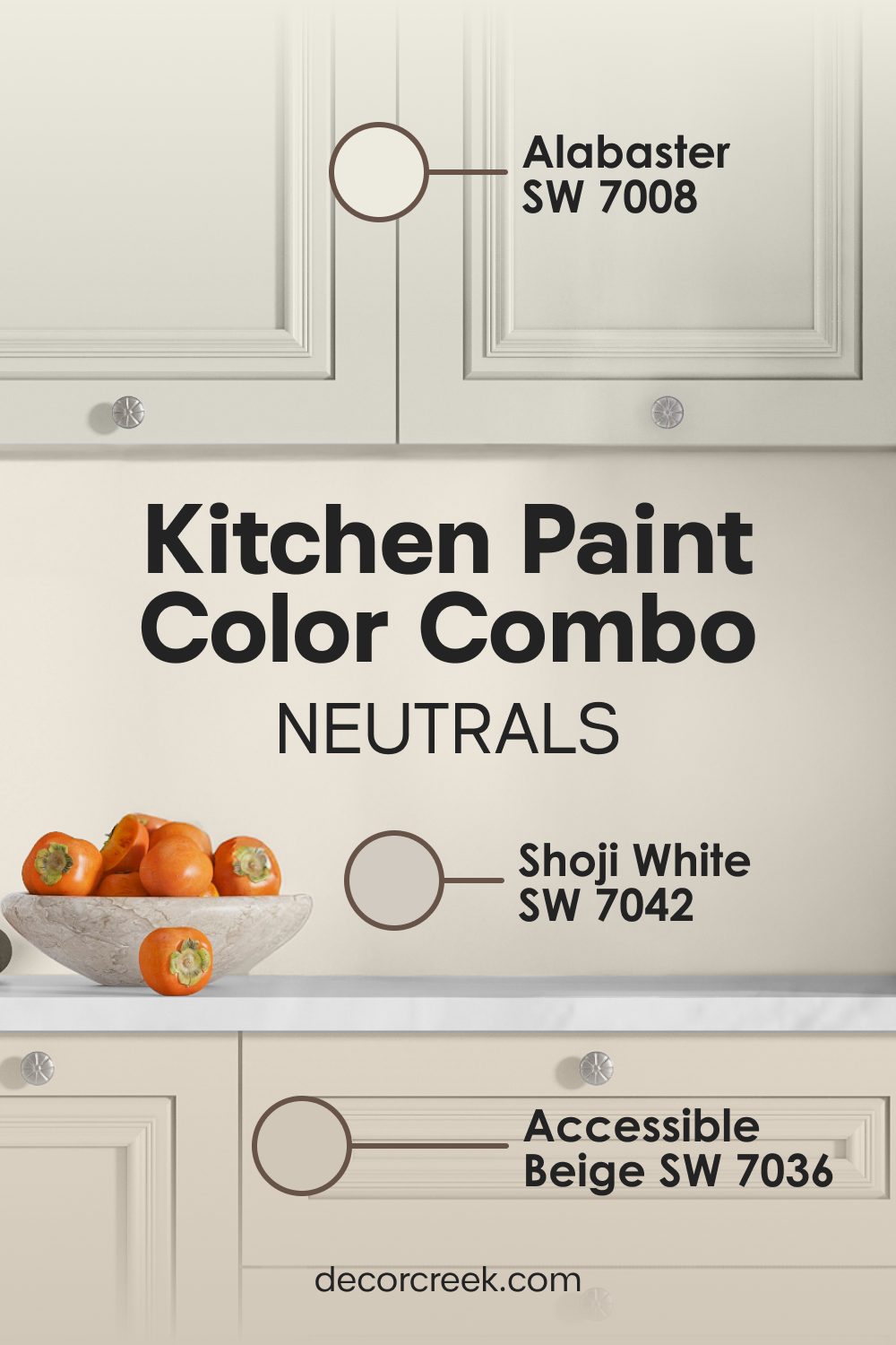
Shoji White SW 7042 + Accessible Beige SW 7036 + Alabaster SW 7008
Shoji White SW 7042 is a warm, glowing white that almost looks like a very pale tan on your walls, providing a cozy but light atmosphere. Accessible Beige SW 7036 on the doors gives the kitchen a bit of visual strength and keeps it from looking “washed out” or boring.

Alabaster SW 7008 on the trim adds a final layer of brightness that helps define the shapes of the cabinets and doors. This set of colors is inspired by natural materials like paper and stone, and it is a very smart choice for a modern home that wants to feel grounded.
The warm whites make the room feel very friendly and open to anyone who walks inside. You will notice that the beige doors stay looking clean even if they are touched often throughout the day.
Drift of Mist SW 9166 + Agreeable Gray SW 7029 + Greek Villa SW 7551
Drift of Mist SW 9166 is a very light, ethereal gray that looks like a soft morning fog on your kitchen walls. Agreeable Gray SW 7029 on the doors adds a little bit of earthy warmth to the cool gray walls, preventing the room from feeling chilly.

Greek Villa SW 7551 on the trim provides a clean white line that makes the gray and beige look crisp and intentional. I like this mix because it uses both cool and warm tones to make the room feel perfectly balanced.
It is a great choice for a kitchen that has both modern stainless steel appliances and traditional wood floors. This palette is very easy to live with because it never feels too bright or too dark at any time of day.

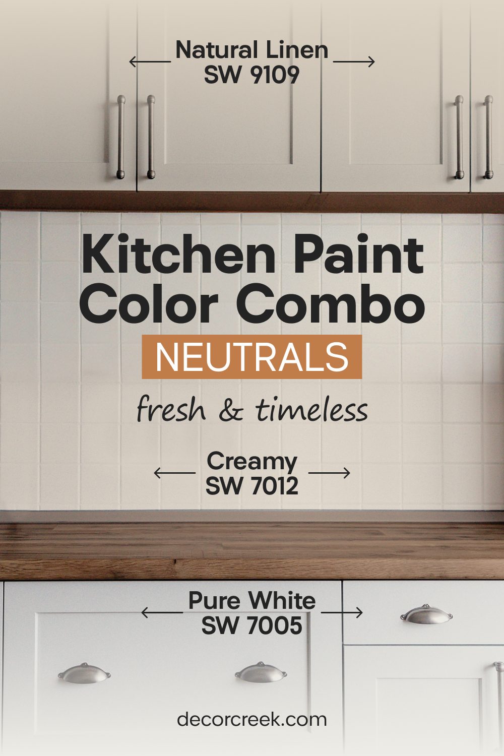
Creamy SW 7012 + Natural Linen SW 9109 + Pure White SW 7005
Creamy SW 7012 is a rich and warm white that makes the doors look very soft, thick, and inviting. Natural Linen SW 9109 on the walls provides a textured look that feels like a cozy fabric or a comfortable apron.
Pure White SW 7005 on the trim creates a sharp contrast that makes the creamy and linen colors look very expensive and rich. I love this palette for a traditional home that has lots of wooden details and classic kitchen furniture.
It makes the space feel established and “timeless,” as if it has been the heart of the home for many years. The linen and cream colors work together to make the light in the room feel gold and warm, even on a cloudy day.
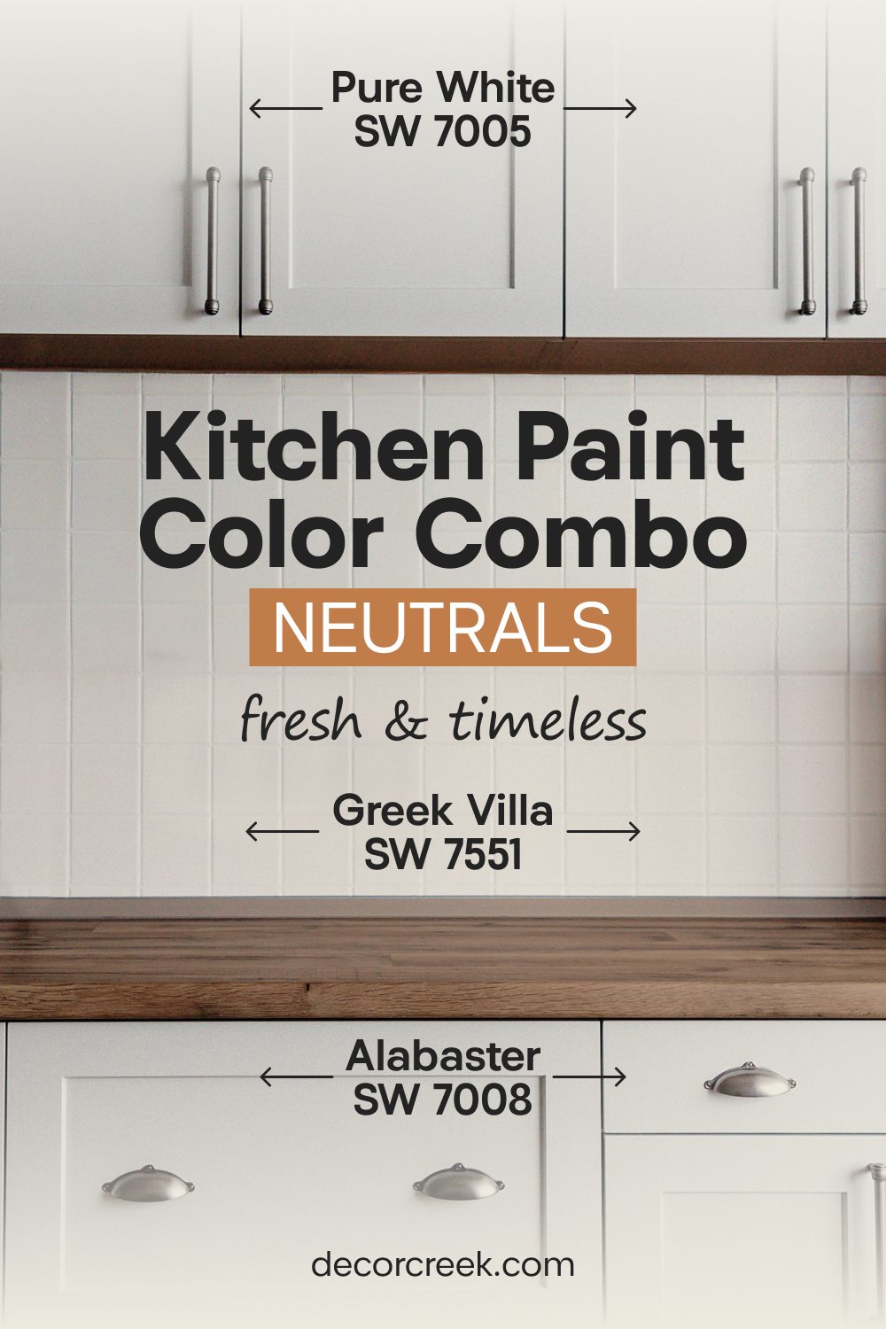
Greek Villa SW 7551 + Alabaster SW 7008 + Pure White SW 7005
This is the ultimate selection for those who love a “layered white” look. Greek Villa SW 7551 is a soft white that I put on the doors to make them look clean and bright. Alabaster SW 7008 goes on the walls to provide just a tiny bit of depth so the room has some shape and dimension.
Pure White SW 7005 is used on the trim to make the whole room look very sharp and very organized. This is the best choice for people who love a minimalist or “Scandi” style in their home.
It makes the kitchen feel like a blank canvas where you can add any color of decor you want. The different shades of white prevent the room from looking boring, making it feel intentional and thoughtful instead.
My Final Thoughts about Best Paint Colors for Kitchen Doors
Choosing a color for your kitchen doors is the final, essential step in making your home look absolutely perfect, intentional, and fully cohesive. When the door color carefully matches the walls and the surrounding trim, it creates a seamless visual flow that makes every single minute spent cooking, cleaning, or dining in the kitchen a true joy for the whole family.
You definitely do not have to settle for standard, boring white doors if you want to create something much more interesting, unique, and personalized for your household to enjoy every day. Whether you prefer the deep, sophisticated mystery of dark and moody colors or the airy, refreshing brightness of light and clean ones, there is a perfect, hand-picked set waiting for you in this guide.
A little bit of fresh paint on a door surface can completely change the whole personality, mood, and energy of your kitchen in just one single day of focused work. You will be genuinely surprised at how much more professional, expensive, and high-end your home feels once you see all the right colors working together in perfect harmony.
I truly hope this guide helps you find a signature look that you will love and appreciate for many years to come as you relax and create memories in your house. It is wonderful how such a simple project can provide a lasting sense of pride every time you walk into the room or host a guest. Taking the time to coordinate these small details shows that your home was built with genuine care and a focus on lasting, beautiful style.
