White paint seems simple—until you try to pick one. I’ve seen this happen in so many homes. You hold up the first swatch and it looks clean. Then the next one feels warmer. The third looks too sharp. It’s easy to get stuck. That’s why I put together this guide.
These are the 48 best white paint colors from Sherwin Williams that people are loving this year.
Each one can change the mood of a room in its own way.
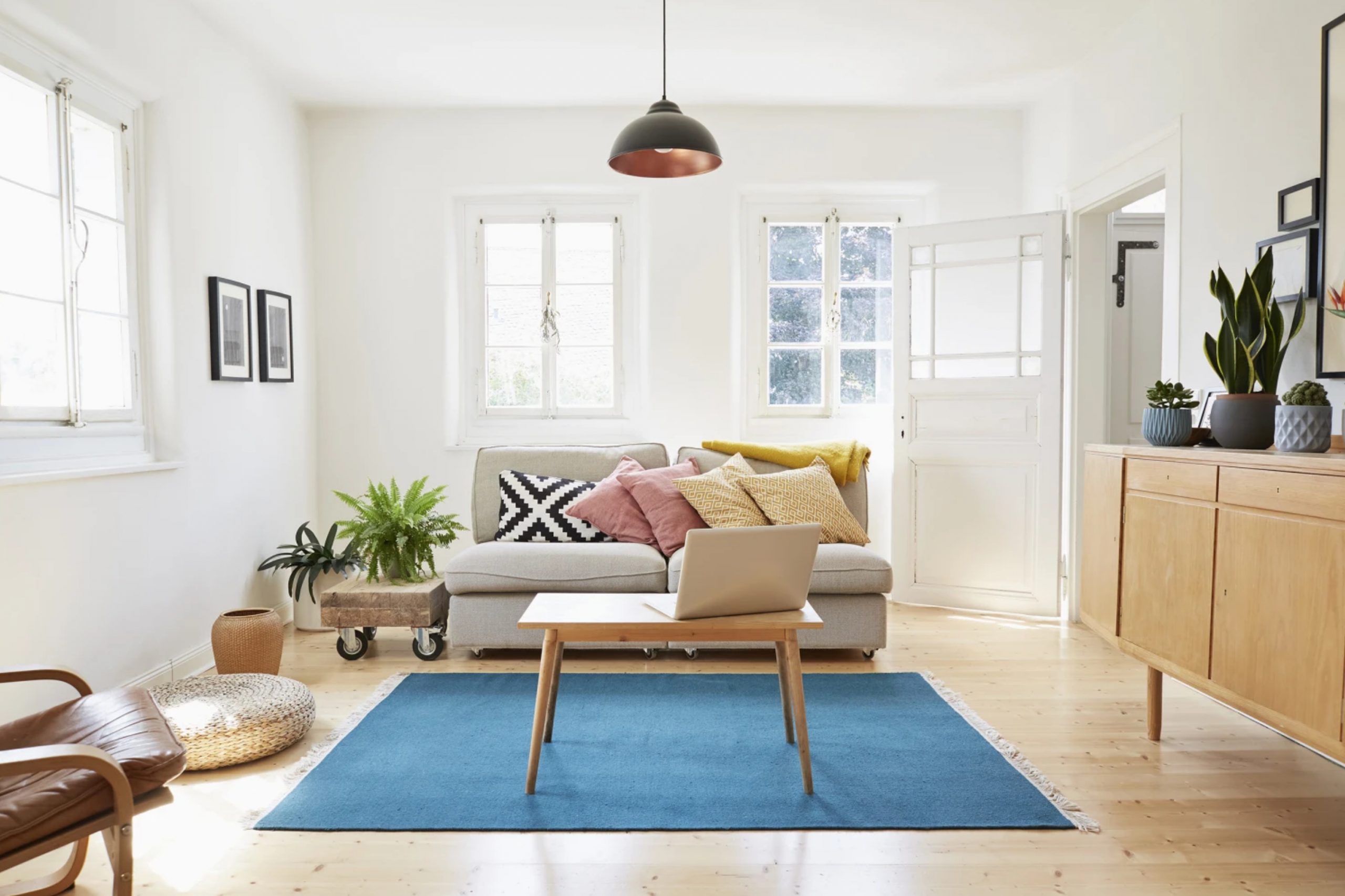
Why White Paint Still Wins This Year
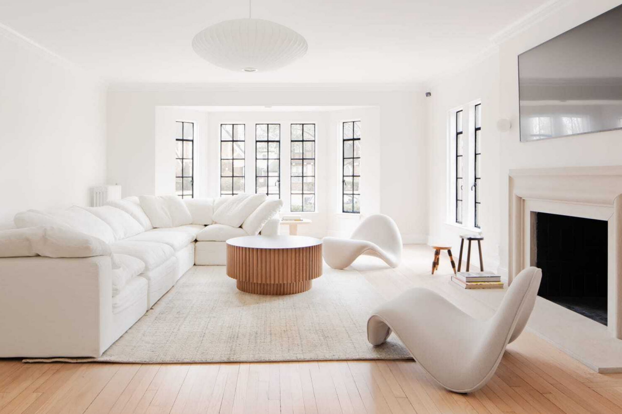
White always finds a way to stay in style. It makes rooms feel open, clean, and fresh, which is something everyone wants right now. It also works with anything—from wood floors to modern tile to vintage lights. But not all whites are the same.
Some feel cozy, others feel crisp. Some look great in morning sun, while others glow under warm lights. That’s why I still love white paint: it gives you choice without making a room feel busy.
People want their homes to feel easier. White makes that happen.
How to Pick Your Favorite White
Start with your light. Natural sun? Lamps only? Both? That changes everything. Then think about the room—do you cook in it? Sleep in it? Just walk through?
White reacts to everything around it. What looks bright in the store might look yellow at home, or even gray. That’s okay.
You don’t need to pick fast. Grab a few samples. Try them on the wall. Look at them morning and night. You’ll know when one feels right. That’s the one to go with.
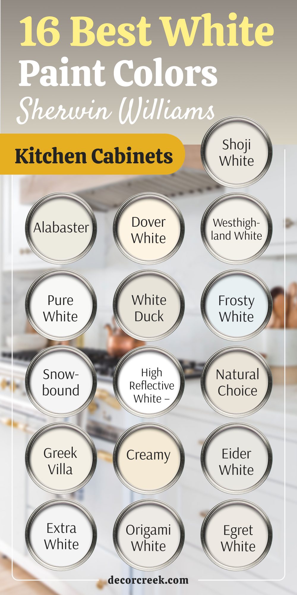
16 Best White Paint Colors For Kitchen Cabinets By Sherwin Williams
Alabaster – SW 7008 Feels Soft and Familiar
Alabaster brings warmth without turning yellow. It makes cabinets feel gentle but not plain. I love using it when kitchens have wood floors or brass handles. It pairs well with other warm whites too. Alabaster doesn’t try too hard—it just works.
My advice: Use Alabaster if you want your kitchen to feel cozy without being beige.

Pure White – SW 7005 Looks Crisp Without Feeling Cold
Pure White is clean but not sharp. I like it when people want a modern kitchen without making it look sterile. It works well with gray counters and black pulls. It also hides scuffs better than you’d think. Pure White holds up beautifully with lots of sunlight.
My advice: Try this one if your kitchen has natural light and you want a soft, modern look.

Snowbound – SW 7004 Leans Just Cool Enough
Snowbound brings a little softness but keeps things bright. It’s perfect for kitchens that feel dark or shadowy. I’ve used it in tight rooms and it helps bounce the light. It looks beautiful with chrome or nickel. Snowbound doesn’t overpower—just lifts the room.
My advice: Choose Snowbound if your kitchen needs brightness but still feels better with cool tones.

Greek Villa – SW 7551 Warms Up White Without Beige
Greek Villa is cozy but still fresh. I turn to this color when someone wants white that doesn’t feel too clean. It adds heart to kitchens without bringing in too much yellow. I like it with creamy walls and oak floors. Greek Villa is easy on the eyes.
My advice: Go with Greek Villa if you want a soft, creamy white that still looks bright.

Extra White – SW 7006 Brings The Brightest Feel
Extra White is just that—extra bright. I only recommend it in kitchens with great lighting. It gives that true white look many people ask for. It matches well with cool marble or glass tile. But be ready—it shows everything.
My advice: Use Extra White if you want the brightest, cleanest look and don’t mind keeping it spotless.

Dover White – SW 6385 Feels Soft Like Butter
Dover White leans warm and cozy. It makes kitchens feel like home. I use it a lot in older homes or when there are warm metals nearby. It blends with creamy tones without looking too yellow. Dover White keeps things friendly.
My advice: Pick Dover White if you want your kitchen to feel soft and welcoming from the first glance.

White Duck – SW 7010 Feels Natural and Balanced
White Duck has a slight gray touch that keeps it grounded. I love it in kitchens that get afternoon sun. It won’t glare but still feels bright. It pairs well with darker countertops. White Duck is one of my favorites for soft contrast.
My advice: Choose White Duck if you like soft whites that never look too cool or too warm.

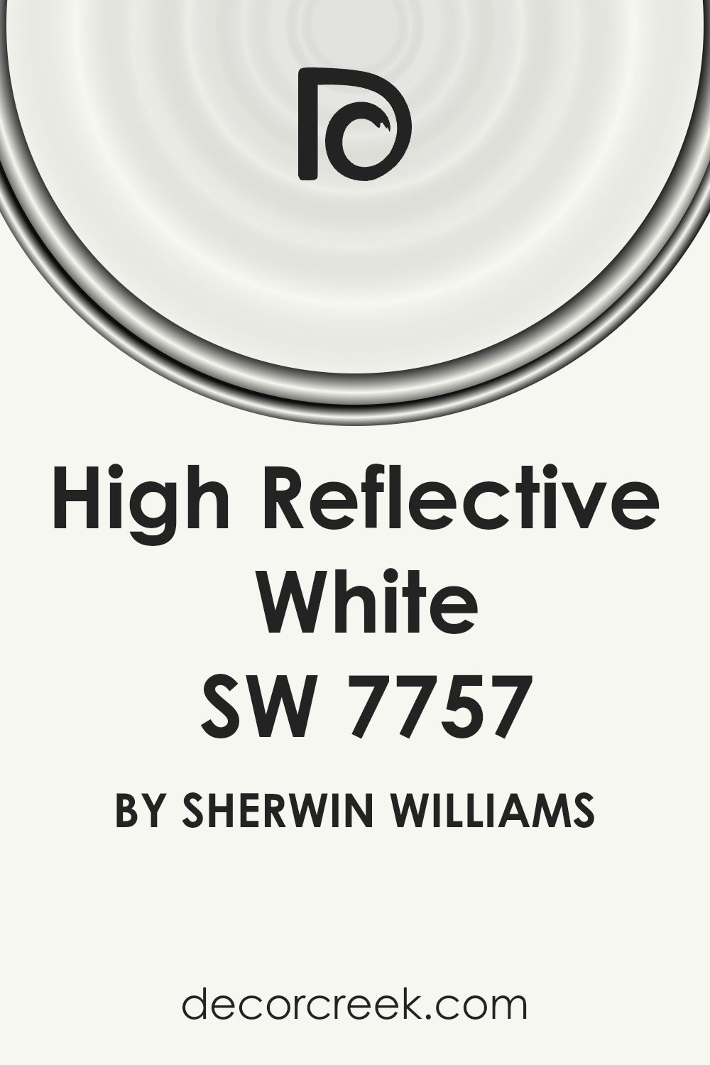
High Reflective White – SW 7757 Is The Whitest White
High Reflective White is strong and bold. It’s for those who want that gallery-white look. I use it when the goal is contrast—black and white, for example. It pops under direct lighting and shines next to clean surfaces. Not soft, but very fresh.
My advice: Only use this one if you want bright contrast and don’t mind its sharpness.
Creamy – SW 7012 Is Just That—Creamy
Creamy feels inviting. I turn to it when people want white that feels lived-in. It works well with warm flooring and brushed gold. The color hides wear and still looks clean. Creamy doesn’t demand attention—it gives comfort.
My advice: Go with Creamy if you want cabinets that feel cozy and don’t need constant cleaning.

Origami White – SW 7636 Blends Warm and Cool
Origami White is hard to label—and that’s why I like it. It works with both warm and cool accents. I’ve used it when we weren’t sure about the metals yet. It holds its shape in any light. Origami White fits almost everything.
My advice: Pick this one if you’re mixing finishes and want a safe color that pulls it all together.

Shoji White – SW 7042 Softens Modern Kitchens
Shoji White brings calm to bold kitchens. I use it when the tile is busy or there’s a lot going on. It has a whisper of beige that helps tone things down. It doesn’t shout—just settles in. Shoji White gives room to breathe.
My advice: Try Shoji White if your kitchen already has strong colors or patterns and needs balance.

Westhighland White – SW 7566 Feels Traditional in the Best Way
Westhighland White has a classic look. It brings grace to shaker cabinets and farmhouse sinks. It’s not flashy, but it holds a room together. I like it in kitchens with warm woods and soft lighting. Westhighland White is warm without being yellow.
My advice: Go with Westhighland White if your kitchen leans classic and you want something that just fits.

Frosty White – SW 6196 Cools Things Down Gently
Frosty White has a hint of gray-blue, and that can be a good thing. I use it when kitchens feel too yellow or brown. It plays nicely with gray tile and brushed nickel. It looks better the longer you look at it. Frosty White has a quiet charm.
My advice: Use this if your kitchen has a lot of warm colors and you want to balance them gently.

Natural Choice – SW 7011 Brings Cozy Without Cream
Natural Choice is one of my go-tos. It gives just enough warmth to soften a room. It works well in older homes or next to exposed wood beams. It’s the kind of color that makes people feel at ease. Natural Choice fits many moods.
My advice: Pick this one when you want warmth that still feels neutral and clean.

Eider White – SW 7014 Carries A Hint of Gray
Eider White is gentle with a tiny twist. That twist is a cool undertone, just enough to give it depth. I like it in homes with slate or darker tile. It balances light and shadow beautifully. Eider White surprises people in a good way.
My advice: Go for Eider White if you want white with just a tiny modern edge.

Egret White – SW 7570 Makes Kitchens Feel Calm and Clean
Egret White stays soft without looking dull. It brings together beige, gray, and white in one smooth tone. I use it when I want a bit more depth. It works with granite, wood, or stainless steel. Egret White gives just the right touch.
My advice: Choose Egret White if you want your cabinets to feel simple but not flat.

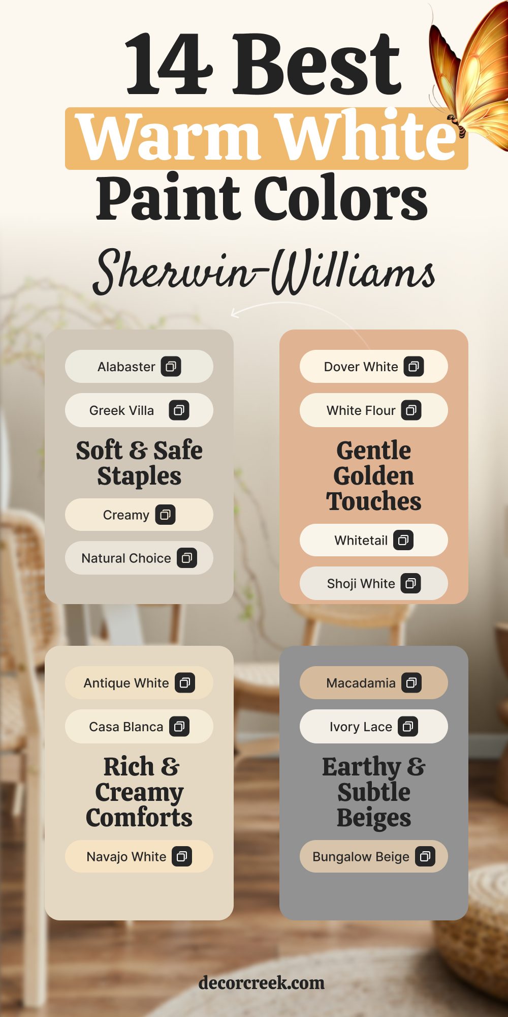
14 Best Warm White Paint Colors Sherwin Williams
Alabaster – SW 7008 Feels Cozy Without Going Yellow
Alabaster gives warmth in a quiet way. It works great in both light and dark rooms. I love using it when people want soft, easy color that doesn’t feel beige. It blends with wood, tile, or painted trim. This one always feels inviting, never plain.
My advice: Pick Alabaster if you want a warm white that works with everything but still feels soft.

Greek Villa – SW 7551 Brings a Gentle Glow
Greek Villa is smooth and calm with just a touch of cream. It looks lovely in sunlit rooms, especially with wood floors or linen fabrics. It’s warm without being too warm, which makes it flexible. I find it’s a safe pick when people feel unsure.
My advice: Choose Greek Villa if you want soft white warmth that still feels light and fresh.

Shoji White – SW 7042 Feels Like a Hug
Shoji White has a bit more beige in it, which makes it feel cozy. It’s perfect when you want white walls that don’t feel empty. I’ve used it in bedrooms, entryways, and even kitchens. It softens every room without making it dark.
My advice: Try Shoji White if white walls feel too bare and you want something warmer.

Dover White – SW 6385 Feels Like Warm Milk
Dover White has a soft, golden undertone that makes it glow. It’s not yellow, but it leans that way just enough to feel friendly. I like using it in older homes or rooms with classic furniture. It brings comfort without losing brightness.
My advice: Use Dover White if your room feels cold and needs a cozy lift.

Creamy – SW 7012 Gives a Gentle Cream Finish
Creamy lives up to its name. It’s soft, warm, and easy to live with. I often use it in living rooms and kitchens where people gather. It pairs beautifully with warm woods and brass. This color makes everything feel calm and together.
My advice: Go with Creamy if you want a warm white that’s smooth and comforting.

Natural Choice – SW 7011 Balances Softness and Warmth
Natural Choice has a hint of beige but still feels like white. It works great in homes with lots of light and wood accents. It feels earthy without being dark. I turn to it when I want something classic that still feels personal.
My advice: Pick this one if you like warm whites but want them to feel grounded too.

White Flour – SW 7102 Feels Fresh From the Start
White Flour leans just a bit creamy but stays bright. It doesn’t pull yellow, and it never looks flat. I love using it in kitchens, bedrooms, or even ceilings. It catches the light in a soft way that lifts the whole room.
My advice: Try White Flour if you want warmth without giving up on brightness.

Casa Blanca – SW 7571 Adds a Touch of Depth
Casa Blanca brings more color than others on this list, but still sits in the warm white group. It has strong beige undertones, which give a cozy feel. I use it in bigger rooms with lots of natural light. It holds its own while staying soft.
My advice: Choose Casa Blanca if your room feels big and you want a warm color that doesn’t get lost.

Navajo White – SW 6126 Gives Off a Vintage Feel
Navajo White has an old-fashioned softness I really enjoy in the right home. It’s warm, creamy, and feels like something you’d find in a cottage or farmhouse. It pairs well with deep wood tones and soft fabrics.
My advice: Use Navajo White if you’re going for charm and warmth with a touch of nostalgia.

Antique White – SW 6119 Feels Cozy and Collected
Antique White is a rich cream that brings instant comfort. It works well with antique pieces or soft traditional decor. I like using it in rooms that need warmth and character. It leans beige, but still stays light.
My advice: Go with Antique White if you want warmth that feels lived-in and settled.

Whitetail – SW 7103 Feels Like Sunshine Indoors
Whitetail is a happy warm white. It doesn’t feel heavy or yellow—it just feels bright and cheerful. I love it in hallways, bathrooms, or anywhere that needs a little life. It plays well with golds, woods, and warm neutrals.
My advice: Pick Whitetail if you want a white that brings a bit of cheer into the room.

Macadamia – SW 6142 Leans Rich and Creamy
Macadamia is deeper than a true white but still soft enough to use widely. It adds strength and depth without being loud. I use it when people want something cozier than basic white, especially in larger rooms.
My advice: Choose Macadamia if you want cabinets or walls that feel full and warm but not too dark.
Ivory Lace – SW 7013 Is Light With Just Enough Warmth
Ivory Lace is bright, but not stark. It has a creamy touch that softens its look just right. I like it in bedrooms and dining rooms. It helps the room feel full without looking like too much color.
My advice: Use Ivory Lace if you want white walls that feel soft and still airy.

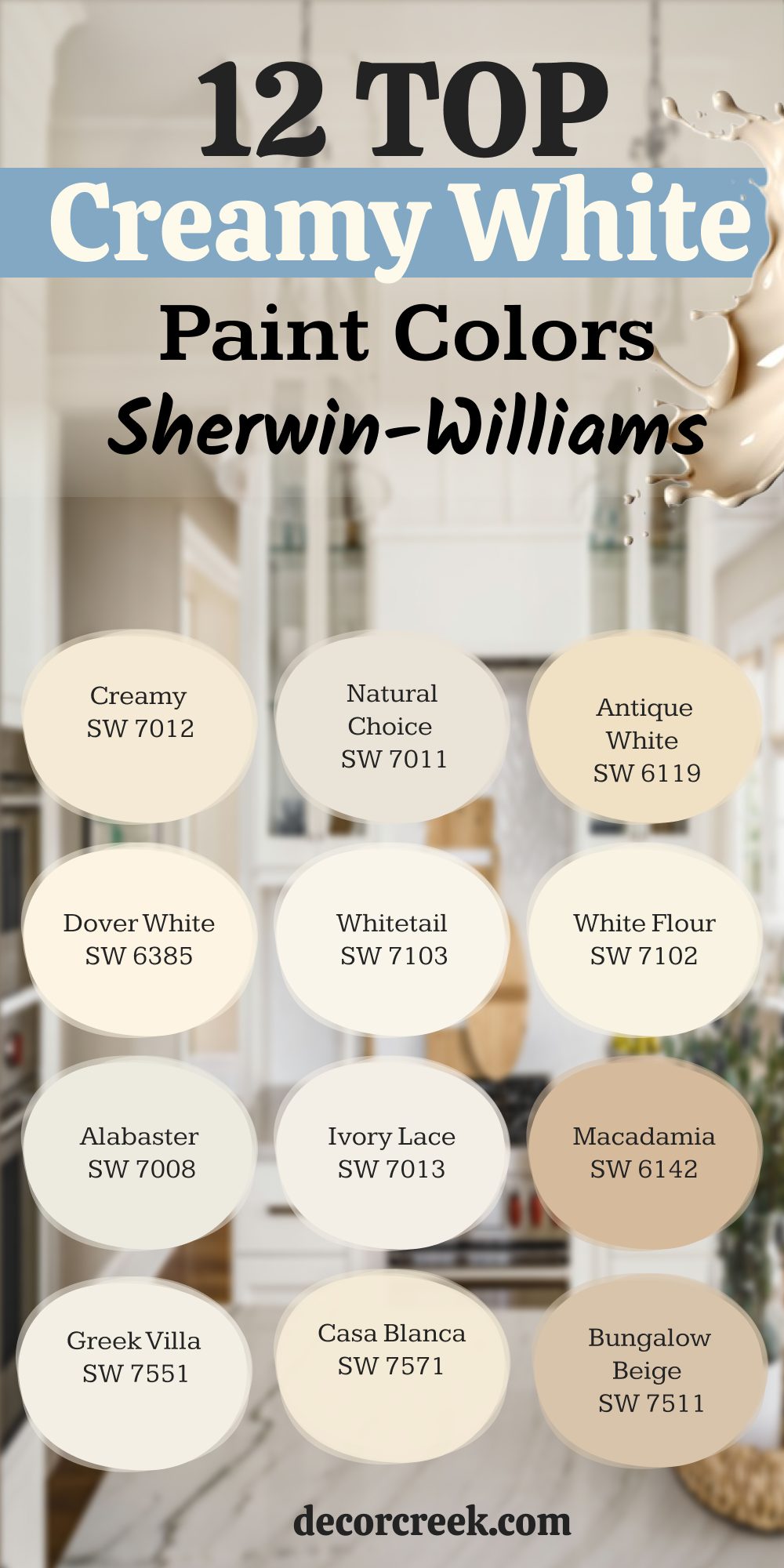
12 Top Creamy White Paints by Sherwin Williams
Creamy – SW 7012
Creamy is one of those colors that instantly feels familiar. It brings a gentle warmth to any room without pulling yellow. I’ve used it in kitchens, nurseries, and cozy living rooms. It plays well with soft textures and natural wood. It doesn’t scream for attention—it settles in.
My advice: Choose Creamy if you want a creamy white that always feels soft and easy.

Dover White – SW 6385
Dover White feels soft and buttery, with just a touch of golden warmth. It works well in homes that lean traditional or classic. I love it with warm metals, soft rugs, and lots of natural light. It gives off comfort without being heavy. Dover White stays gentle even in big rooms.
My advice: Use Dover White if your rooms feel cold and need a warmer touch.

Alabaster – SW 7008
Alabaster is creamy without feeling too creamy. It has a soft glow that works in almost any room. I love it with gold handles, natural wood, and linen curtains. It looks fresh in daylight and warm under soft bulbs. It always feels safe, but never boring.
My advice: Pick Alabaster if you want one color that works in every room.

Greek Villa – SW 7551
Greek Villa is bright but has just enough cream to keep it warm. It feels cheerful and soft at the same time. I’ve used it in bedrooms and kitchens with warm floors. It pairs nicely with brass or matte black. Greek Villa helps the whole room feel welcoming.
My advice: Try Greek Villa if you want light walls that still feel warm.

Natural Choice – SW 7011
Natural Choice has a creamy feel with a hint of beige. It’s calm, warm, and a little earthy. I love how it pairs with wood beams and neutral fabrics. It doesn’t try to be bright, but it never looks dull. It brings an easy softness to the room.
My advice: Go with Natural Choice if you like cozy but not yellow.

Whitetail – SW 7103
Whitetail has a creamy glow that makes rooms feel happy. It brings in light without looking sharp. I like it with warm tiles, woven textures, and soft lighting. It feels fresh and gentle at the same time. Whitetail is easy to live with.
My advice: Pick Whitetail if you want something creamy that still feels light and bright.

Ivory Lace – SW 7013
Ivory Lace looks soft but always polished. It works great in bedrooms or dining rooms with gentle decor. I’ve used it with classic furniture and soft white trim. It has a smooth feel that never looks too yellow. Ivory Lace keeps the room feeling graceful.
My advice: Try Ivory Lace if you want warmth that looks clean and put-together.

Casa Blanca – SW 7571
Casa Blanca is a deeper creamy white with strong warmth. It feels full and cozy in wide rooms. I’ve used it in homes with big windows and terracotta floors. It holds its color in bright light and never gets lost. Casa Blanca adds character.
My advice: Choose Casa Blanca if you want your walls to feel rich but still soft.

Antique White – SW 6119
Antique White feels like a warm memory. It has a soft golden base that makes rooms feel comfortable. I use it in interiors with old books, soft sofas, and vintage touches. It brings a deep creamy warmth without turning brown. It makes rooms feel lived-in.
My advice: Go with Antique White if you want a color that feels personal and homey.

White Flour – SW 7102
White Flour is creamy and bright at the same time. It works great in nurseries, kitchens, or sunrooms. I love how it reflects light but still brings warmth. It looks clean, not cold. White Flour is safe, soft, and cheerful.
My advice: Pick White Flour if you want creamy warmth with a light, happy feel.

Macadamia – SW 6142
Macadamia leans more into beige but still reads as soft and creamy. It makes bigger interiors feel smaller in the best way. I like it with deep wood cabinets and warm tile. It has strength without being dark. Macadamia feels settled and strong.
My advice: Use Macadamia if you want a deeper cream that still feels easy on the eyes.
Bungalow Beige – SW 7511
Bungalow Beige is right between a creamy white and a soft beige. It doesn’t feel gray, and it never feels cold. I’ve used it with white trim and natural baskets. It makes rooms feel comfortable and clean. It’s easy to pair with other warm shades.
My advice: Choose Bungalow Beige if plain white feels too sharp but you’re not ready for full beige.

My Final Thoughts on Choosing the Right White
Picking the right white is harder than it looks—but it’s also one of the most rewarding choices you can make for your home. I’ve seen how much it can change the feeling of a room, just by getting the tone right. Some whites feel soft and safe.
Others feel sharp and clean. There’s no one perfect white for everyone—and that’s okay.
Think about how you want your room to feel. Think about the light. Think about the little things like your floors, your handles, your fabrics. Hold samples up on the wall. Look at them in the morning and at night. Don’t rush.
The best white is the one that makes you feel good when you walk into the room. The one that feels like you. That’s always the right choice.
