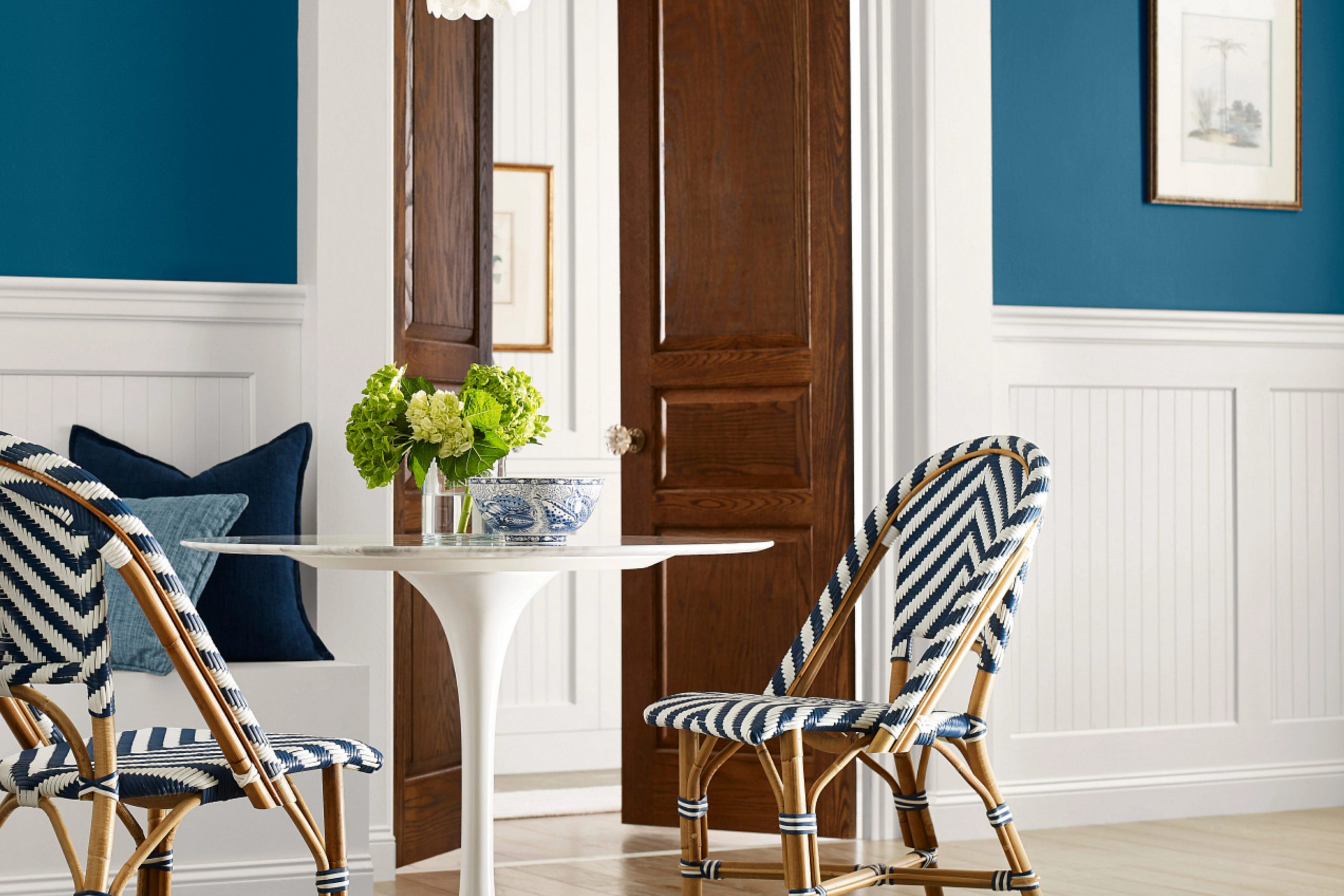
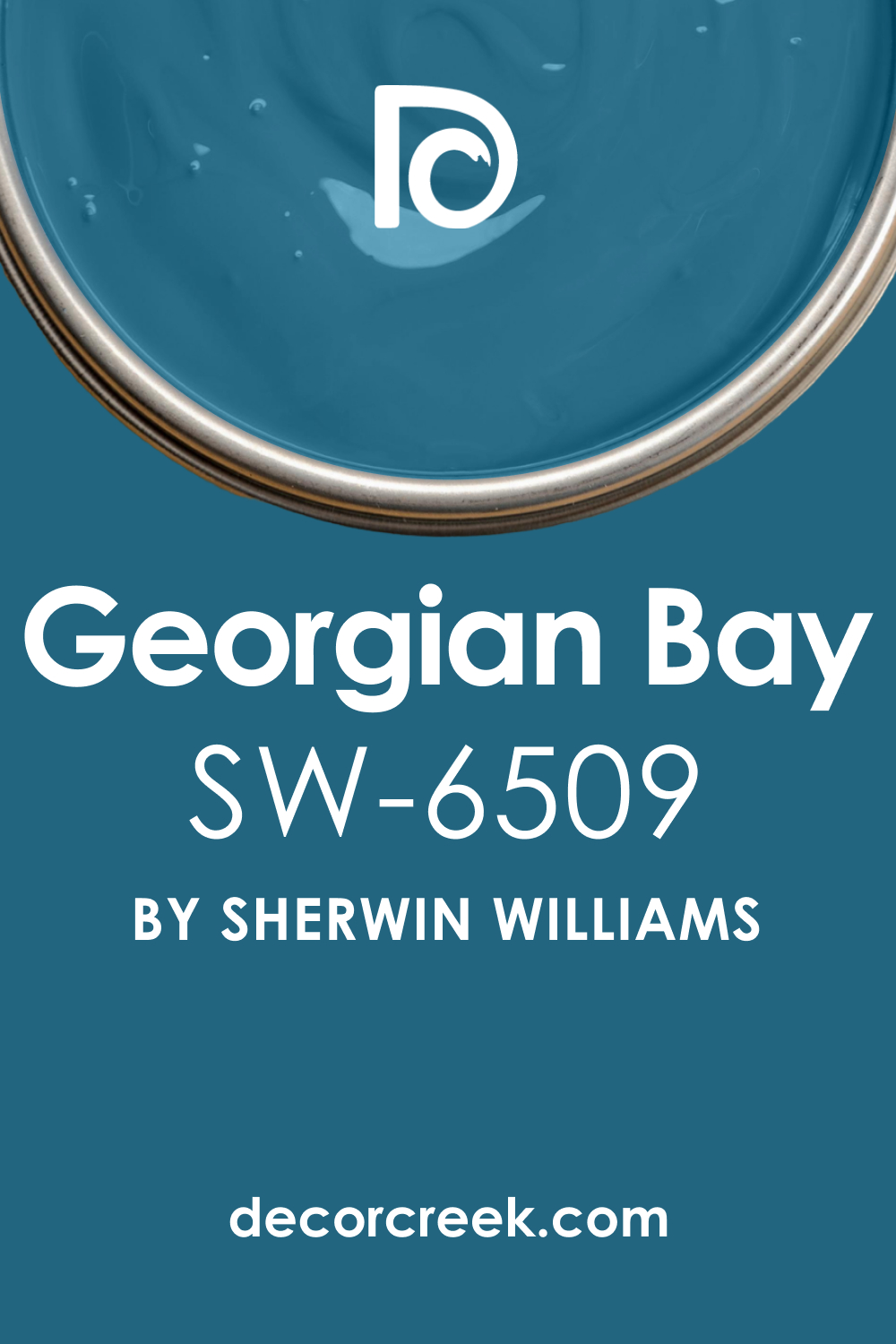
In the world of home decor and design, color selection is paramount, and one shade that stands out for its sophistication and elegance is Sherwin-Williams’ SW 6509 Georgian Bay. This rich, timeless hue exudes an air of sophistication that brings a distinct charm to any space it graces.
Whether applied to a home’s exterior or used to create an interior design statement, Georgian Bay has the ability to transform spaces into zones of tranquility and grace.
What Color Is SW 6509 Georgian Bay?
SW 6509 Georgian Bay is a deep, medium-dark blue that instantly brings to mind the grandeur of Georgian architecture and design. This color has a traditional feel to it, conjuring images of stately homes with their carefully curated aesthetics. There is a dignified elegance to this shade, making it a strong yet versatile color choice for a multitude of spaces.
At the same time, Georgian Bay carries a hint of calmness, often associated with the color blue. Its depth and darkness lend an air of tranquility, making it an excellent choice for spaces where calm and relaxation are prioritized. From bedrooms to living rooms, this color brings a serene elegance that balances its grandeur with a sense of peace and relaxation.
Ever wished paint sampling was as easy as sticking a sticker? Guess what? Now it is! Discover Samplize's unique Peel & Stick samples.
Get paint samples

Is It a Warm Or Cool Color?
SW Georgian Bay, like many blues, is a cool color. It has a calming effect, often associated with the sea and the sky. Its cool nature makes it a fantastic choice for balancing out warm tones and creating a relaxing environment.
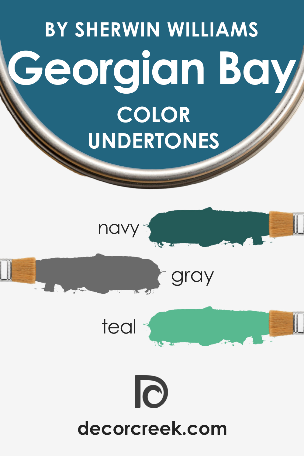
Undertones of SW 6509 Georgian Bay
SW Georgian Bay carries several undertones that contribute to its overall appearance:
- Navy: This undertone helps ground the color and adds to its traditional appeal.
- Gray: The presence of gray softens the color, contributing to its calming and tranquil vibe.
- Teal: A subtle hint of teal adds a touch of complexity and modern flair to the otherwise traditional shade.
Undertones can greatly influence how we perceive color. They subtly add depth and dimension, making a color appear different under varying lighting conditions and when paired with other colors. Georgian Bay’s undertones make it versatile, allowing it to harmonize with a range of color palettes.
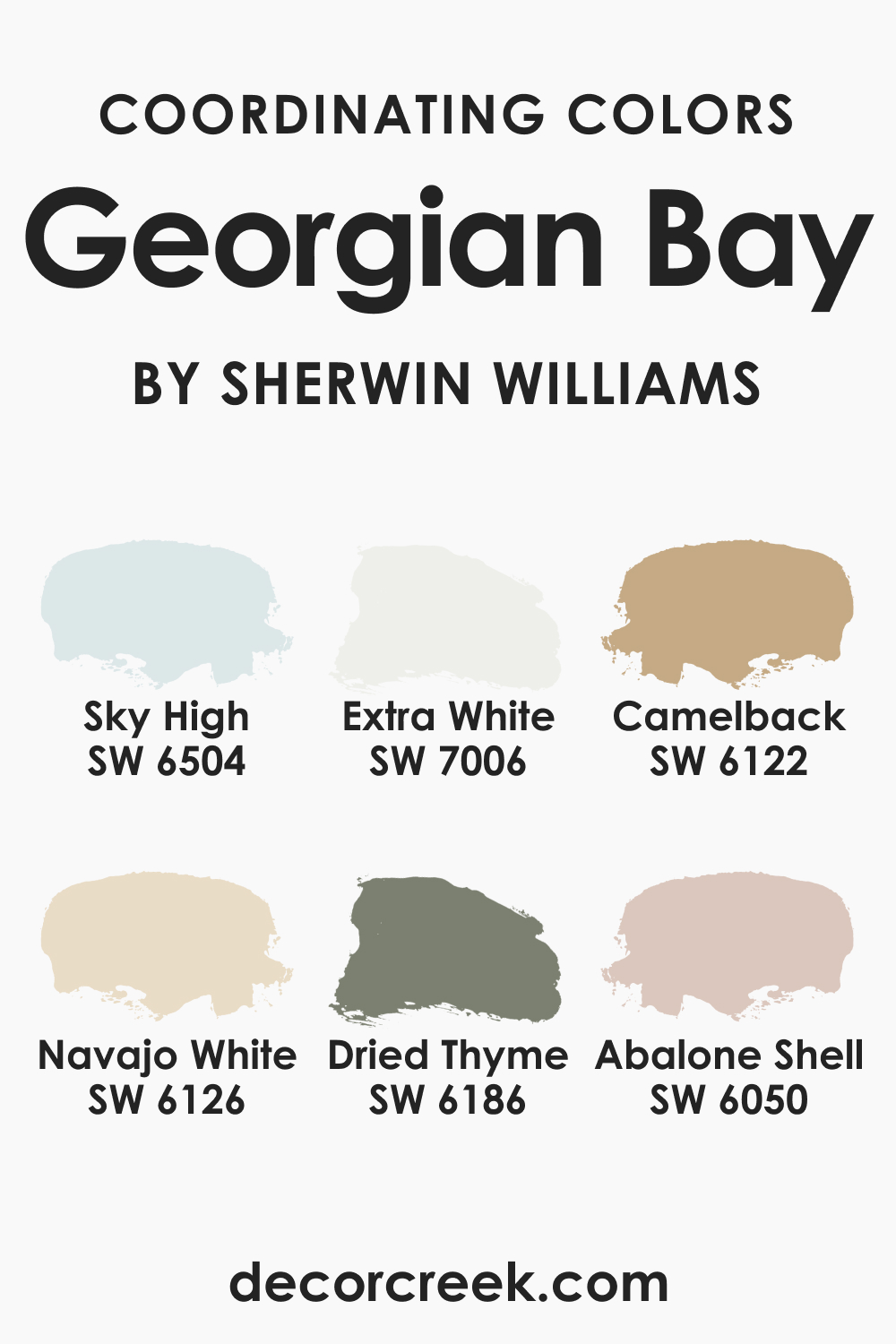
Coordinating Colors of SW 6509 Georgian Bay
SW Georgian Bay pairs beautifully with a range of colors:
- SW 6504 Sky High : This light, airy blue creates a stunning contrast with Georgian Bay, bringing out its depth and richness.
- SW 6126 Navajo White : A warm, neutral white, Navajo White provides a striking balance to the coolness of Georgian Bay.
- SW 6122 Camelback : This warm, medium-light beige adds a neutral touch that works well with Georgian Bay’s traditional appeal.
Additionally, consider pairing SW Georgian Bay with:
- SW 6186 Dried Thyme : A muted, earthy green that adds a natural, grounding element to the palette.
- SW 6050 Abalone Shell : A soft, warm beige that balances the depth of Georgian Bay.
- SW 7006 Extra White : A pure, bright white that adds crispness and creates a sharp contrast with Georgian Bay.
Coordinating colors are shades that work harmoniously with a main color, helping to create a balanced and cohesive look. They can be used to enhance the main color, provide contrast, or add depth and interest to a space.
How Does Lighting Affect SW 6509 Georgian Bay?
Lighting plays a significant role in how we perceive colors. Under bright, natural light, SW Georgian Bay appears more vibrant, and the subtle teal undertone might become more apparent. In spaces with less natural light or under artificial light, the color can appear darker, and the gray and navy undertones may become more noticeable. Always consider the lighting conditions of your space when choosing to use Georgian Bay.
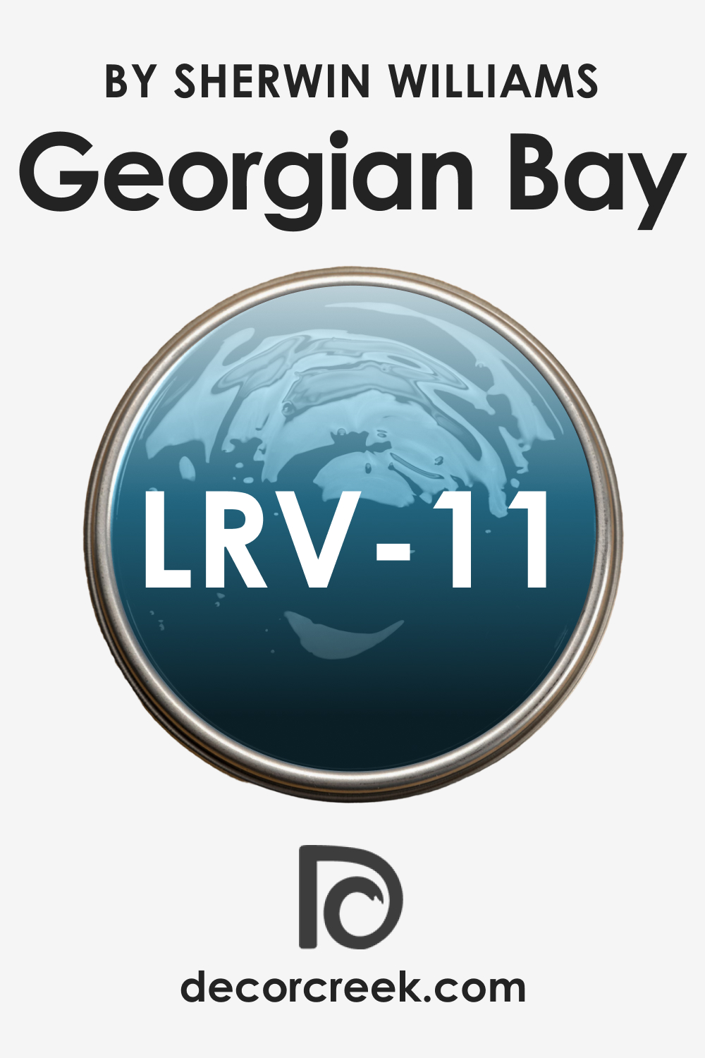
LRV of SW 6509 Georgian Bay
The Light Reflectance Value (LRV) of color measures how much light it reflects. Georgian Bay has an LRV of 11, which indicates that it is a medium-dark color. It absorbs a significant amount of light, resulting in a richer, more saturated appearance.
Because of its low LRV, Georgian Bay can create a sense of intimacy and coziness in a room. It’s ideal for creating a dramatic impact in larger spaces, but can also work in smaller rooms, provided it is balanced with lighter colors or good lighting.
LRV – what does it mean? Read This Before Finding Your Perfect Paint Color
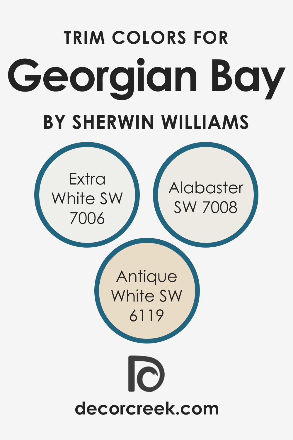
Trim Colors of SW 6509 Georgian Bay
Choosing the right trim color is crucial in creating a cohesive look. When it comes to SW Georgian Bay, the following shades make excellent trim colors:
- SW 7006 Extra White : A bright, clean white that provides a crisp contrast against the depth of Georgian Bay.
- SW 7008 Alabaster : A subtle, creamy white that offers a softer transition.
- SW 6119 Antique White : A muted, warm white that complements the traditional appeal of Georgian Bay.
Trim colors can define and highlight architectural features, create a sense of continuity, and add to the overall aesthetic of a space. They work to frame and accent the main color, enhancing its appearance.
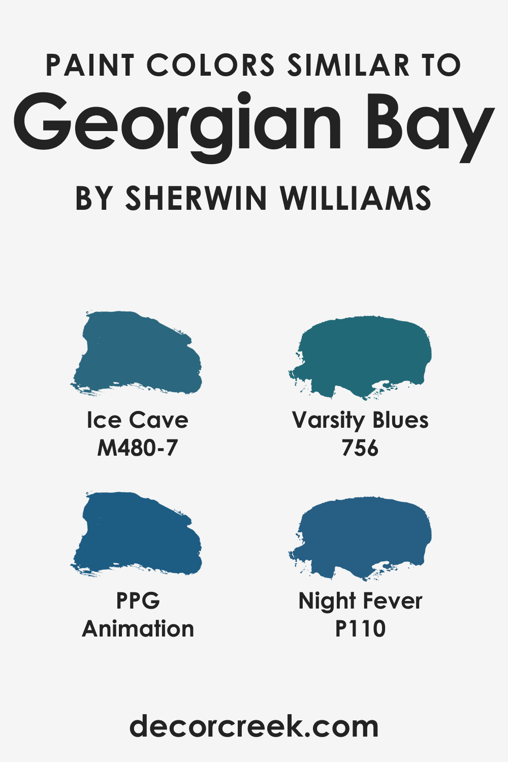
Colors Similar to SW 6509 Georgian Bay
Identifying colors similar to SW Georgian Bay can provide more options for achieving your desired look. Some similar colors might include:
- Behr Ice Cave
- BM Varsity Blues
- PPG Animation
- Valspar Night Fever
These colors carry the same sense of depth and sophistication but may have slightly different undertones or saturation levels. Understanding similar colors can offer flexibility when designing a space, particularly if availability or specific undertone preferences are factors.
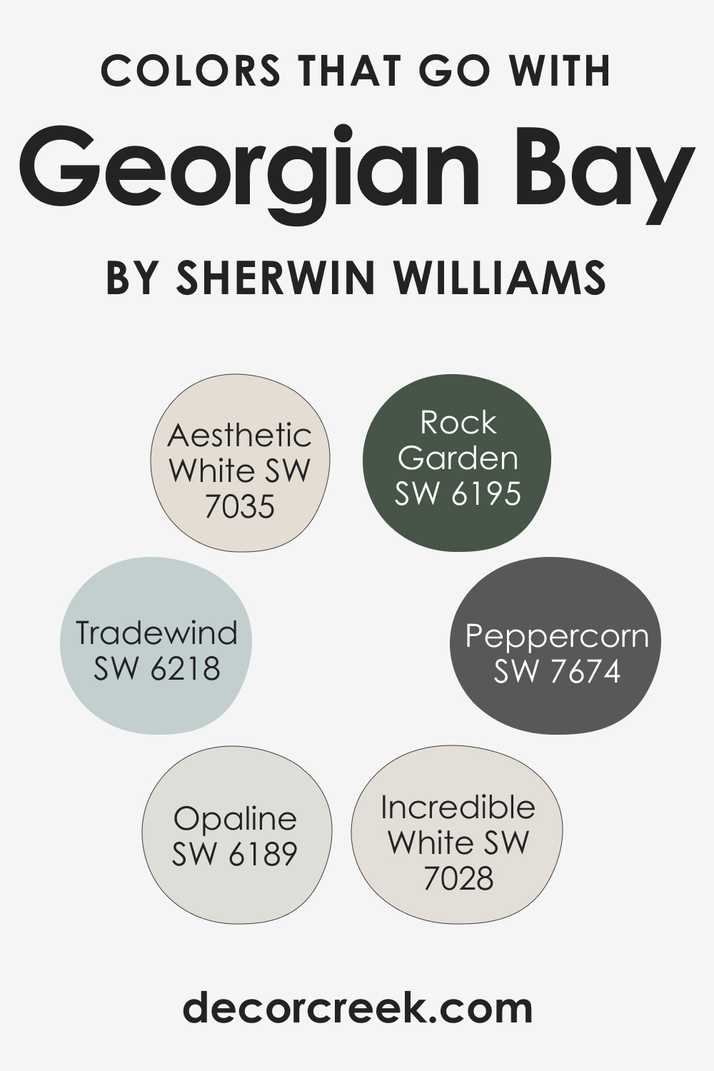
Colors That Go With SW 6509 Georgian Bay
When it comes to SW Georgian Bay, a range of colors can harmonize beautifully:
- SW 7035 Aesthetic White – This muted, warm white can offer a striking contrast to the richness of Georgian Bay.
- SW 6189 Opulent White – This is a light beige that pairs well with the depth of Georgian Bay.
- SW 7028 Incredible White – This neutral, light greige can be an excellent complement to Georgian Bay for a modern and elegant look.
- SW 6218 Tradewind – A softer, more muted blue, Tradewind can complement Georgian Bay by keeping the color scheme within the same family but adding some variety.
- SW 6195 Rock Garden – A rich, muted green that can offer an earthy contrast to the coolness of Georgian Bay.
- SW 7674 Peppercorn – This deep, warm gray can provide a sophisticated contrast to Georgian Bay, especially in a modern setting.
Combining colors that work well together can result in a balanced, aesthetically pleasing design. This is particularly important in open-concept spaces or rooms that flow into one another, where color cohesion contributes to a sense of unity and harmony.
How to Use SW 6509 Georgian Bay In Your Home?
SW Georgian Bay is a versatile color that can be used in various rooms and with various design styles. It shines in traditional and classic designs due to its stately appeal but can also work well in modern or coastal aesthetics due to its soothing nature.
Its depth makes it an excellent choice for large living spaces, creating a sense of coziness and sophistication. In bedrooms, SW Georgian Bay can create a serene, relaxing atmosphere. For exteriors, this color lends a sense of grandeur and timeless appeal. It can also add drama to kitchen cabinets or provide a tranquil backdrop in bathrooms.
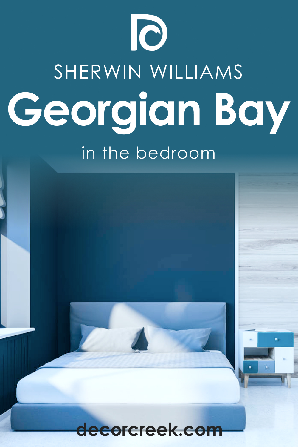
How to Use SW 6509 Georgian Bay in the Bedroom?
In bedrooms, it creates a serene, restful environment. When used on all walls, the color can make the room feel like a calming retreat. Pair it with lighter furnishings and bedding to prevent the room from feeling too dark. If you prefer a less saturated look, consider using Georgian Bay as an accent wall behind the bed.
For a modern twist, combine Georgian Bay with light, warm wood tones, and brass or gold accents. If you prefer a more traditional look, pair it with rich, dark woods and silver or pewter accents.
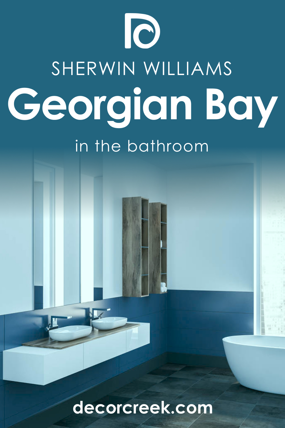
How to Use SW 6509 Georgian Bay in the Bathroom?
In bathrooms, Georgian Bay can create a spa-like ambiance. Use it on the walls or vanity to bring in a touch of sophistication. To keep the room feeling light and open, pair it with bright white trim and light-colored fixtures.
Consider using Georgian Bay in a half bath for a dramatic effect. Pair it with brass or gold accents for a touch of glamour or with chrome for a more modern look.
How to Use SW 6509 Georgian Bay in the Living Room?
SW Georgian Bay can add depth and sophistication to a living room. It works particularly well in larger living spaces where its richness can create a sense of coziness. For a balanced look, use lighter furniture and accent pieces.
To create a unique focal point, consider using Georgian Bay on a feature wall or fireplace surround. For a more contemporary look, pair it with warm neutrals and modern furniture pieces.

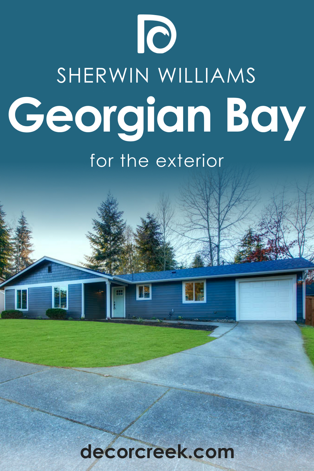
How to Use SW 6509 Georgian Bay for an Exterior?
SW Georgian Bay can give the exterior of your home a timeless and sophisticated look. It works particularly well on traditional home styles, such as Georgian and Colonial, and stands out beautifully against both lush green landscapes and snowy winter scenes.
Pair it with white trim for a classic look, or try a light, warm gray for a modern twist. Use it on the front door for a less committed yet impactful approach.
How to Use SW 6509 Georgian Bay for the Kitchen?
In the kitchen, Georgian Bay can add a touch of elegance and depth. Use it on the walls or cabinets for a striking effect. To keep the space feeling light and open, use a lighter color on the upper cabinets or walls.
Pair Georgian Bay with a white or light gray backsplash and light-colored countertops. For a more dramatic look, consider using it on an island or as an accent color on lower cabinets.

How to Use SW 6509 Georgian Bay for the Kitchen Cabinets?
SW Georgian Bay can bring a unique touch to kitchen cabinets. It pairs beautifully with brass or gold hardware for a sophisticated, timeless look. If you have an island, painting it Georgian Bay can create a beautiful focal point.
For a more modern approach, pair Georgian Bay cabinets with light-colored walls and countertops. For a traditional look, try it with a warm, neutral countertop and backsplash.

Comparing SW 6509 Georgian Bay With Other Colors
Comparing Georgian Bay with other colors can help visualize its potential in different spaces. When paired with a similar color like SW 6244 Naval, Georgian Bay might appear more traditional due to its gray undertone. Compared with a lighter blue like SW 6504 Sky High, the richness and depth of Georgian Bay become more pronounced.
When compared to a neutral color like SW 6126 Navajo White, the soothing nature of Georgian Bay shines through. Check out how this color compares with several other hues.
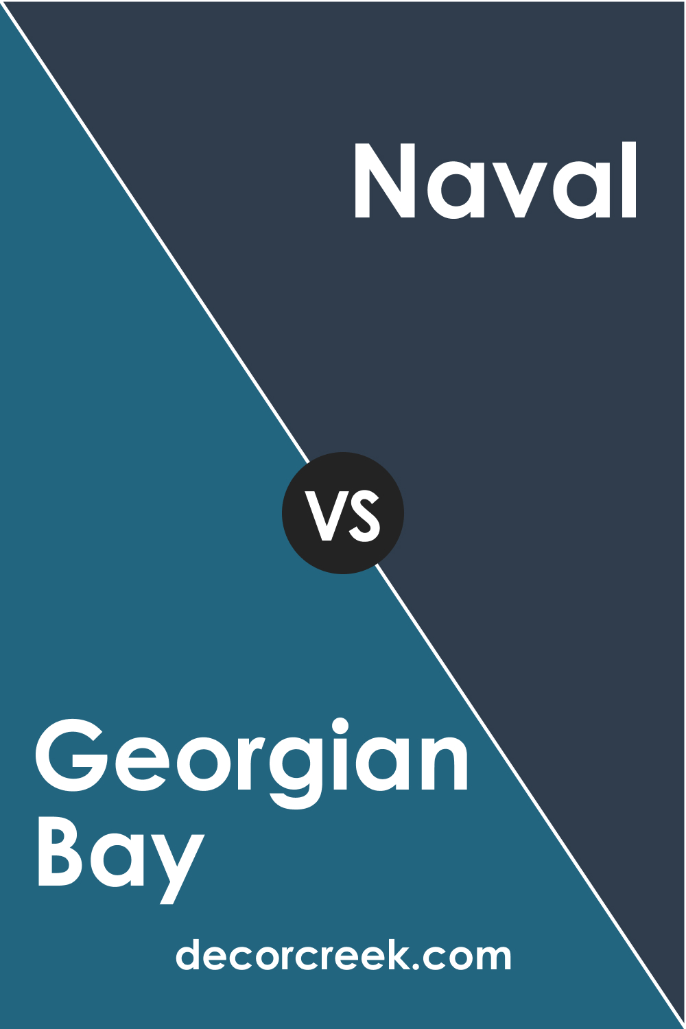
SW 6509 Georgian Bay vs. SW 6244 Naval
When compared to Naval , a dark navy color, Georgian Bay tends to appear lighter and somewhat grayer. While both colors share a classic feel, Naval’s intensity brings a more dramatic touch to interiors. Naval is well-suited for those seeking a deeper, more saturated blue, while Georgian Bay serves well in spaces where a softer, less bold blue is desired.
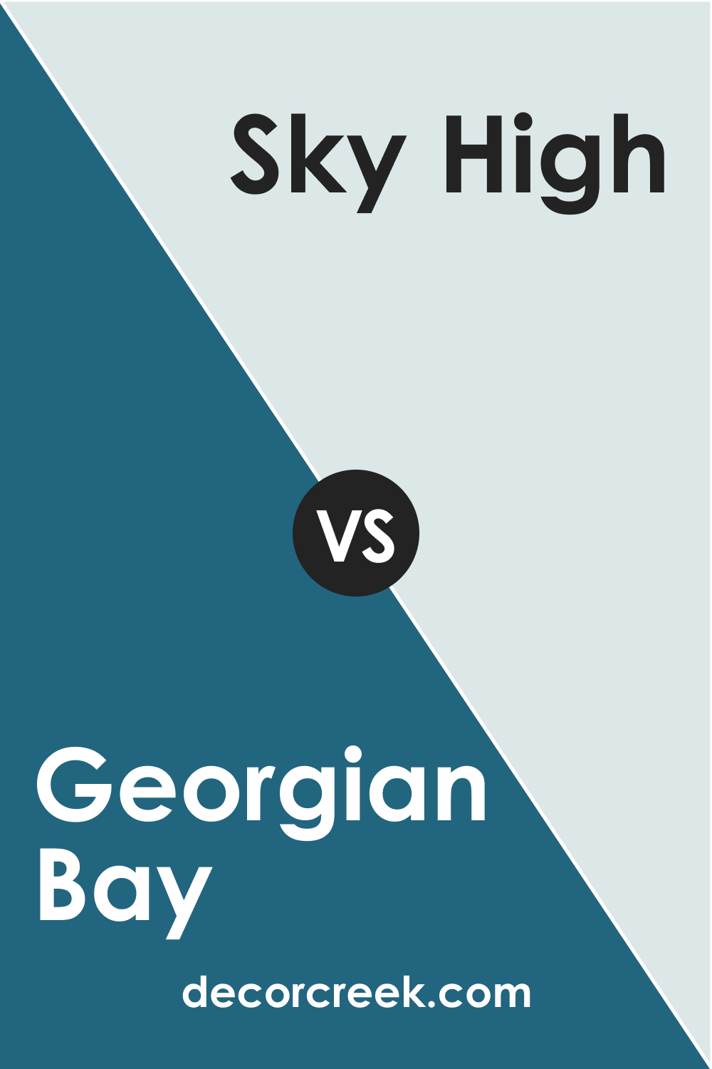
SW 6509 Georgian Bay vs. SW 6504 Sky High
SW Sky High is a lighter, more airy shade of blue. When compared to Georgian Bay, it presents a more whimsical, beachy vibe. The contrast between these two shades showcases the depth and sophistication of Georgian Bay. Sky High is perfect for creating a light, serene atmosphere, while Georgian Bay works excellently in spaces where a richer, more traditional feel is wanted.
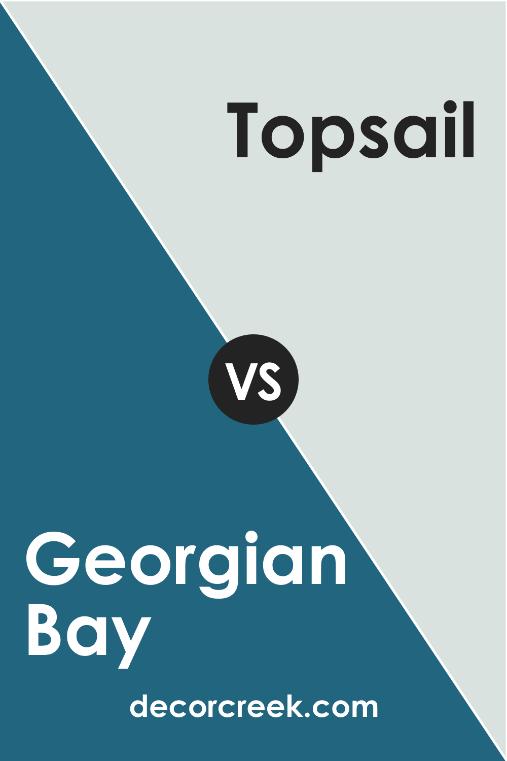
SW 6509 Georgian Bay vs. SW 6217 Topsail
SW Topsail is a soft, muted blue with a hint of green undertone. Next to Georgian Bay, Topsail feels lighter and more coastal. While both colors can bring tranquility to a space, Topsail lends itself to a casual, breezy aesthetic, while Georgian Bay conveys a sense of stately elegance.
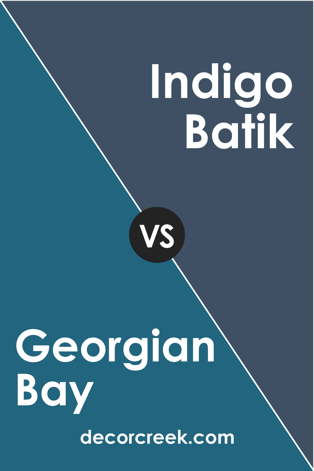
SW 6509 Georgian Bay vs. SW 7602 Indigo Batik
SW Indigo Batik is a deep , indigo blue that has a more vibrant undertone compared to Georgian Bay. Its rich, vibrant nature can add a more dramatic effect in a room. Compared to Indigo Batik, Georgian Bay appears more muted and traditional, offering a subtle elegance that can be both cozy and sophisticated.
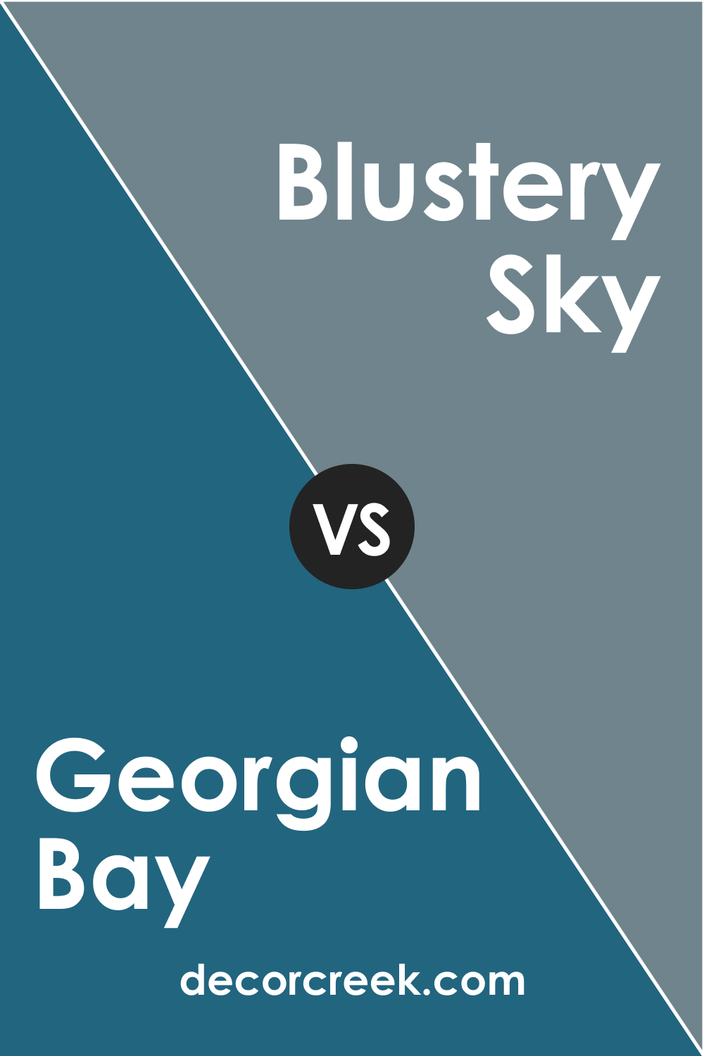
SW 6509 Georgian Bay vs. SW 9140 Blustery Sky
SW Blustery Sky is a gray-blue color that has a more dominant gray undertone. When compared to Georgian Bay, Blustery Sky may come across as cooler and more muted. If you prefer a color that feels closer to gray but still maintains a touch of blue, Blustery Sky could be a good option. However, for spaces where a richer, more noticeable blue is desired, Georgian Bay is the perfect choice.
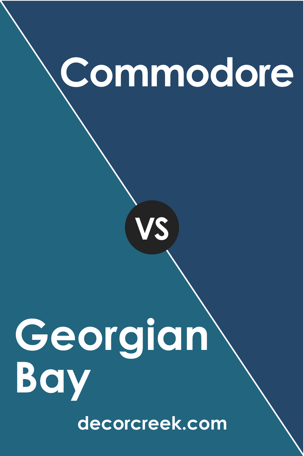
SW 6509 Georgian Bay vs. SW 6524 Commodore
SW Commodore is a deep, rich blue, leaning toward royal blue. It is brighter and more vibrant than Georgian Bay. If you’re looking for a color to create a strong, eye-catching aesthetic, Commodore is a suitable choice. However, if you prefer a more subdued, traditional feel, Georgian Blue is the way to go.
Conclusion
Sherwin-Williams’ SW 6509 Georgian Bay is a color of depth, tradition, and tranquility. Whether it’s used in a bedroom to create a serene retreat, in a living room to bring in sophistication, or on an exterior to evoke a sense of timeless grandeur, this color never fails to impress.
With its versatile nature and the ability to pair beautifully with a range of colors, Georgian Bay is a stunning choice for those looking to bring elegance and a touch of history into their spaces.

Ever wished paint sampling was as easy as sticking a sticker? Guess what? Now it is! Discover Samplize's unique Peel & Stick samples.
Get paint samples
Frequently Asked Questions
⭐What color is SW 6509 Georgian Blue?
SW 6509 Georgian Blue is a medium-dark blue color that leans toward a classic navy. It carries a hint of gray, which gives it a slightly muted, sophisticated feel. This color evokes a sense of tranquility, depth, and elegance.
⭐What are the best rooms to paint SW 6509 Georgian Blue?
Georgian Blue is a versatile color that can be used in various rooms. It works well in bedrooms for a serene, restful environment. In living rooms, it adds depth and sophistication, while in kitchens, it can bring an elegant touch when used on walls or cabinets. This color also makes a grand statement on home exteriors.
⭐What colors coordinate well with SW 6509 Georgian Blue?
Georgian Blue pairs beautifully with a range of colors. For a balanced look, try SW 6504 Sky High, SW 6126 Navajo White, and SW 6122 Camelback. It also coordinates well with a variety of neutral shades and can pop against crisp white trims.
⭐What is the LRV of SW 6509 Georgian Blue?
The Light Reflectance Value (LRV) of SW 6509 Georgian Blue is 11. This medium-dark color absorbs a significant amount of light, giving it a rich, saturated appearance.
⭐What undertones does SW 6509 Georgian Blue have?
SW 6509 Georgian Blue has subtle gray undertones with a hint of teal in certain lighting conditions. These undertones give the color its depth and timeless appeal.


