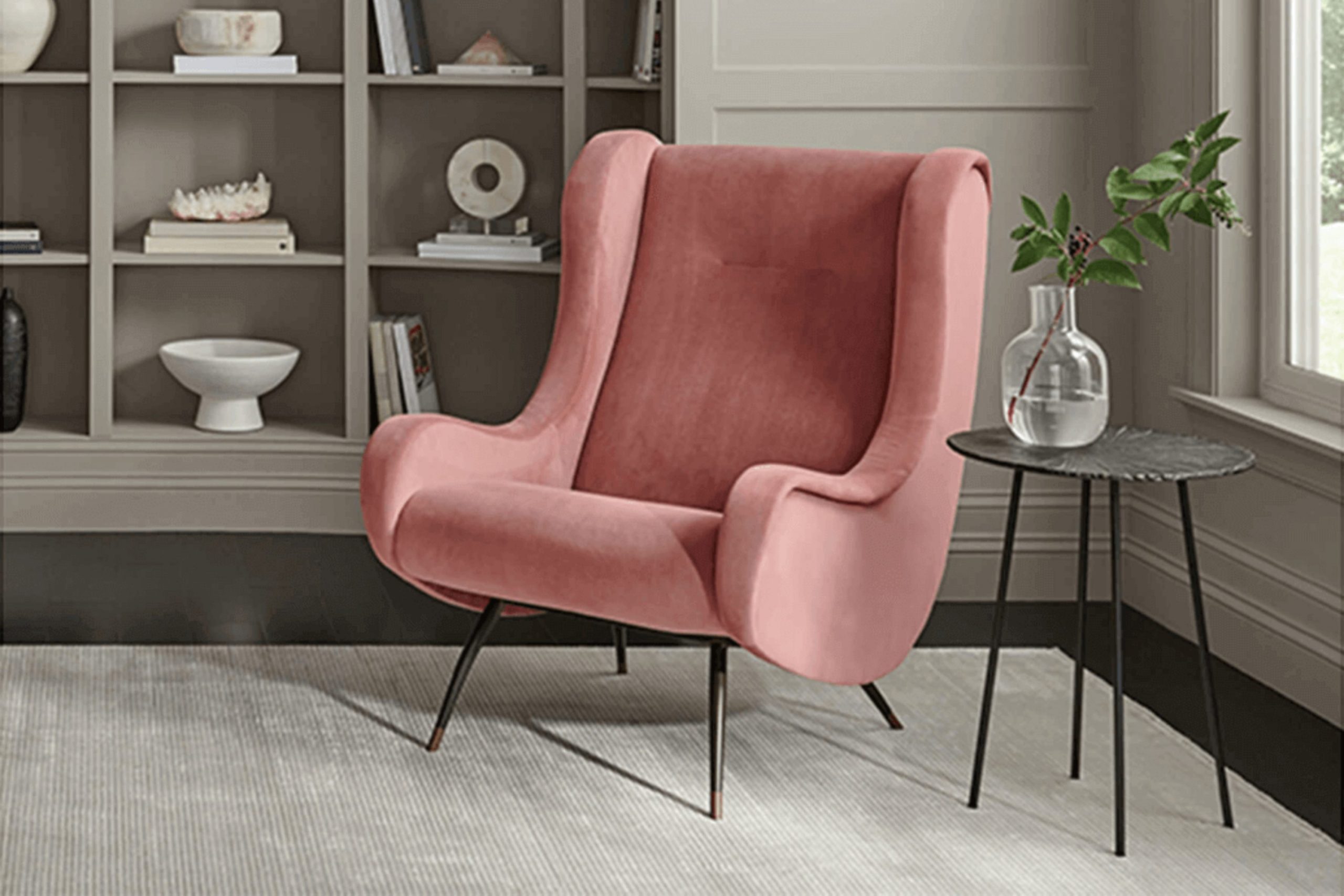
If you’re considering Sherwin Williams SW 7017 Dorian Gray for your next painting project, there are a few things to keep in mind before you decide. This shade of gray offers a balanced mix of warm and cool tones, making it a flexible option for any room. Whether you’re updating your living room, bedroom, or kitchen, Dorian Gray pairs well with many décor styles and color palettes.
Its ability to shift under different lighting is also worth noting. In rooms with plenty of natural light, it looks lighter and softer, while in areas with less light, it shows a deeper and richer gray. This adaptable nature makes it a dependable choice for larger projects where lighting may change from room to room.
Before you begin painting, test this color on several walls to see how it looks throughout the day. The gentle shifts in tone will help you decide if it suits your home.
Keep this flexible gray in mind as you plan your next home update. It could be the ideal backdrop you’ve been searching for.
Is Dorian Gray SW 7017 Right for My Home?
Dorian Gray SW 7017 by Sherwin Williams is a beautifully balanced medium gray that feels just right for flexible design use. It’s almost like a chameleon, gently shifting in different settings while always keeping a calm and steady mood without feeling cold or distant. I see it as a very flexible shade that fits smoothly into my projects, especially when I work on modern, minimalist, or transitional interiors. Its quiet refinement allows it to stand out or blend in, depending on how the room around it is styled.
I enjoy pairing Dorian Gray with natural materials and textures. It looks lovely with light woods for a Scandi-inspired style or darker woods for a moodier touch. When I want soft contrast, I choose accessories in white or black, which work beautifully with this gray. Metal accents, especially brushed nickel or stainless steel, also pair nicely, adding a soft shine that doesn’t feel overpowering.
Fabrics are key in balancing the cool undertones. I often bring in rich textures like velvet or wool in contrasting or matching shades to add warmth and depth to rooms painted in Dorian Gray. This method helps shape welcoming rooms that feel carefully styled and comfortable. It’s a shade I return to again and again to enhance a room without making the design feel complicated.

decorcreek.com
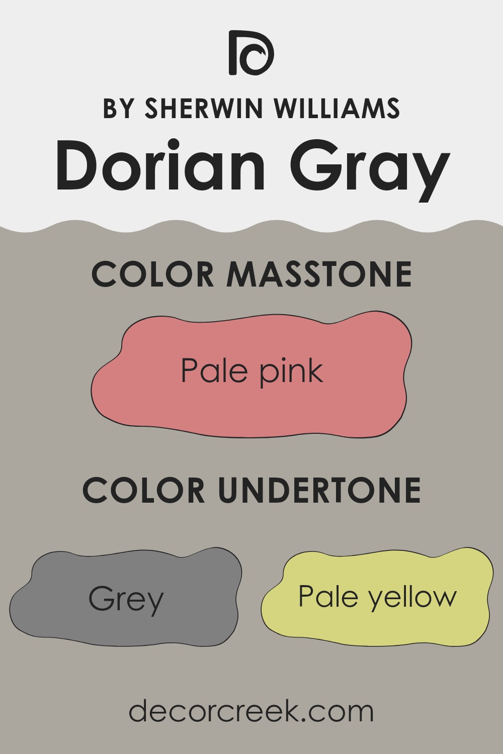
What are the right undertones of Dorian Gray SW 7017 ?
Dorian Gray SW 7017 by Sherwin Williams is a well-loved paint color that brings a special mix of depth and neutrality to any room. This shade carries many undertones that gently shape how it looks on your walls, depending on the lighting and nearby décor.
Knowing these undertones helps you use the color with confidence in your home. Dorian Gray includes hints of grey, pale yellow, mint, light purple, lilac, light gray, light blue, orange, olive, yellow, light green, pink, purple, fuchsia, violet, red, and brown. These layers give the shade its richness and flexibility.
For example, the grey base keeps the backdrop neutral and easy to style with many furnishings. Pale yellow and light blue hints can add a soft touch of warmth or freshness. Meanwhile, light red and brown notes may show up under warm lighting, giving the color a deeper look.
On interior walls, Dorian Gray creates a balanced background that gently shifts throughout the day. At times it appears more purely gray, and at other moments it reveals warmer or cooler touches. This adaptable nature makes it a dependable option for living rooms, bedrooms, or any area where light plays an important role. Overall, Dorian Gray gives a room a strong base along with quiet visual interest. It’s a thoughtful choice for anyone wanting to update their room with a shade that feels steady yet layered, without feeling overpowering.
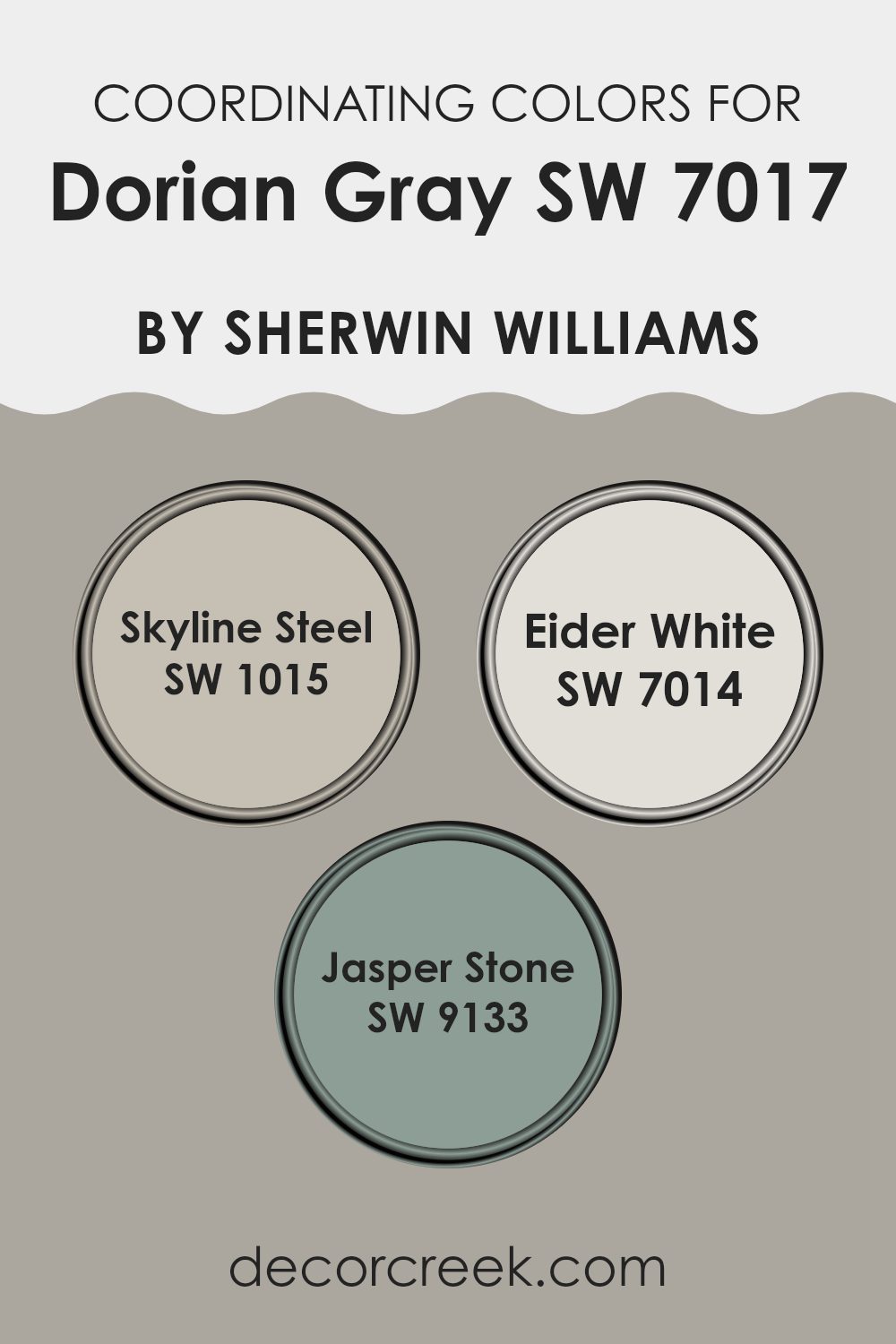
Best Coordinating Colors to use with Dorian Gray SW 7017 by Sherwin Williams this year.
Coordinating colors are shades that work in harmony with a main color to build a balanced and connected look in interior design. When selecting them, it’s important to think about the overall style and the mood you want to shape in a room. For the adaptable and popular shade Dorian Gray by Sherwin Williams, a few well-chosen coordinating colors can truly enhance this neutral base.
Skyline Steel is a soft gray that blends smoothly with Dorian Gray, helping create a light and open feel without strong contrast. It’s a lovely option for making smaller rooms feel more spacious or for keeping the backdrop calm and steady. Eider White offers a gentler touch, with its airy white tone that softly brightens the grounded presence of Dorian Gray.
This shade works beautifully on trim, ceilings, or anywhere you want to add light without feeling overpowering. Lastly, Jasper Stone brings in natural depth with its green-gray tone. It pairs nicely with the cool character of Dorian Gray while adding a fresh, organic layer, making it a great choice for accent walls or decorative details. Together, these shades form a balanced and appealing palette that supports the style and adaptability of rooms painted in Dorian Gray.
You can see recommended paint colors below:
- SW 1015 Skyline Steel
- SW 7014 Eider White
- SW 9133 Jasper Stone
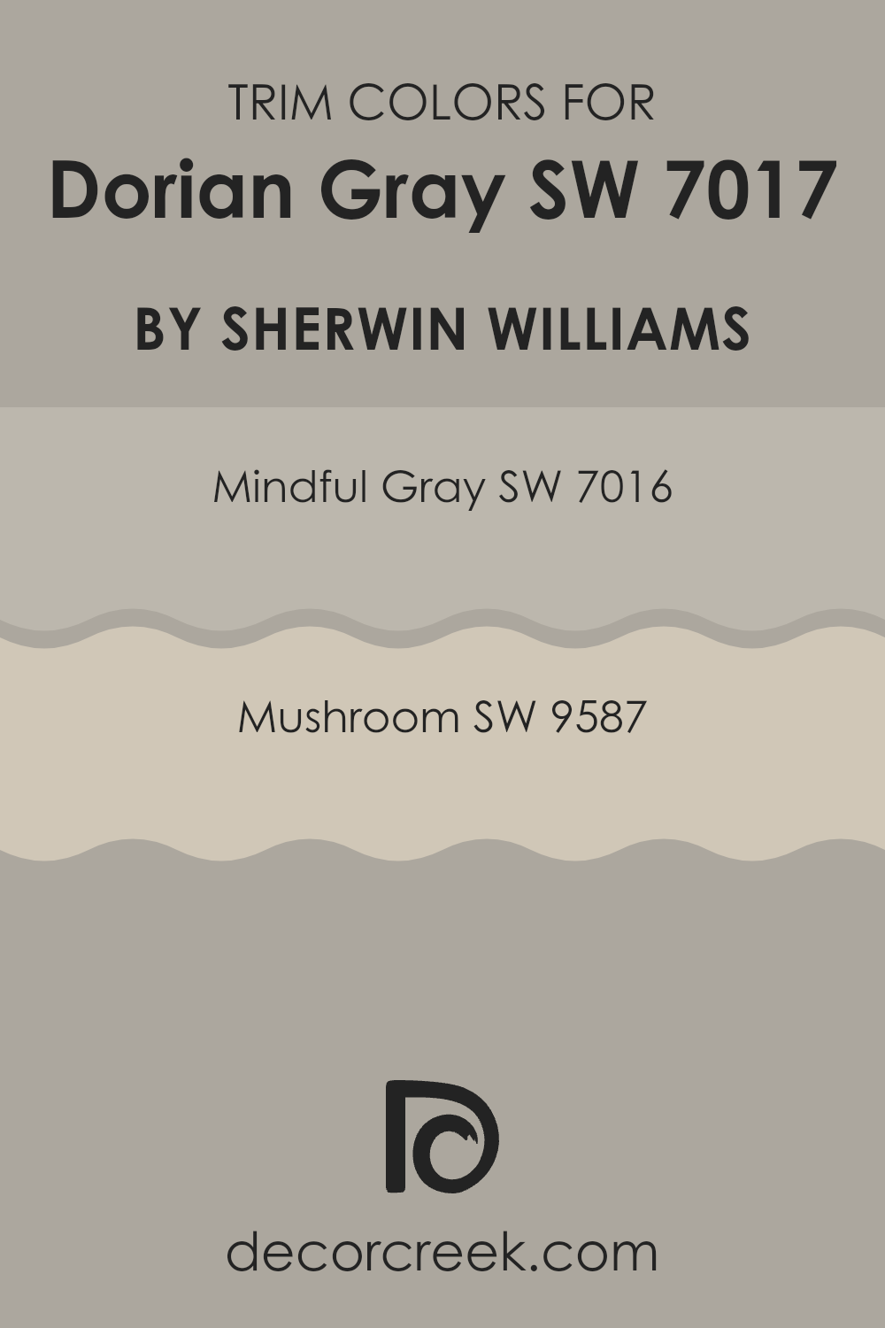
Trendy Trim Colors of Dorian Gray SW 7017 by Sherwin Williams to use this year.
Trim colors are selected to complement or contrast the main color used on walls, improving the overall look of a room. When considering Dorian Gray by Sherwin Williams, a neutral yet distinct shade, choosing the right trim color can define and highlight the architectural details of your room. SW 7016 – Mindful Gray and SW 9587 – Mushroom are strong choices for this purpose.
Mindful Gray serves as a lighter, softer grey that can smoothly blend with Dorian Gray, creating a subtle difference that highlights baseboards, moldings, and doors without feeling overpowering. In contrast, Mushroom offers a warmer tone, giving a gentle yet noticeable contrast that can add depth and interest to the room’s look, making it ideal for those who want a clearer but still balanced difference against the cooler tones of Dorian Gray.
Mindful Gray is a flexible shade of grey with enough warmth to keep it from looking too cold, making it a reliable partner for many rooms and lighting conditions. Mushroom, as a warm, earthy taupe, brings a natural and welcoming feel, perfect for shaping a cozy atmosphere while still keeping a modern touch. Both colors support the main shade without taking attention away from it, creating a connected yet engaging color scheme that improves the visual appeal and mood of any room painted in Dorian Gray.
You can see recommended paint colors below:
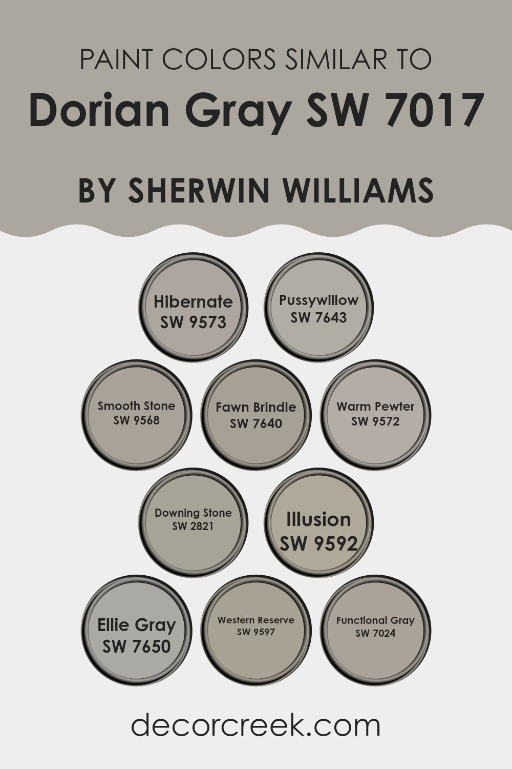
Evergreen Colors Similar to Dorian Gray SW 7017 by Sherwin Williams
Similar colors play an important role in interior design by building a harmonious and connected look. Choosing shades like Sherwin Williams Dorian Gray and its related tones helps every element in a room blend smoothly, creating a mood that feels calm and inviting. This method works especially well when aiming for balance without the sharp breaks that often come with strong contrasts. By using soft shifts of one main hue, designers can add depth and dimension while keeping a steady theme.
For example, SW 9573 – Hibernate is a deep grey that brings a warm and cozy feeling to any room, perfect for shaping a snug mood. SW 7643 – Pussywillow offers a slightly lighter tone that still holds warmth, flexible for areas that need a softer touch. Another option, SW 9568 – Smooth Stone, shows a gentle grey that supports a subtle and polished look.
SW 7640 – Fawn Brindle moves toward a taupe-gray, adding a refined earthy tone. In comparison, SW 9572 – Warm Pewter presents a medium shade that connects darker and lighter hues, giving more freedom in design. SW 2821 – Downing Stone blends grey and beige in a way that feels adaptable and quietly elegant. SW 9592 – Illusion is a lighter gray that gives a fresh feeling without drifting far from the base color.
SW 7650 – Ellie Gray leans cooler, adding a modern edge to the palette. Meanwhile, SW 9597 – Western Reserve carries a dustier tone, bringing a hint of classic charm. Finally, SW 7024 – Functional Gray is a reliable shade that works well with many décor styles, making it a trusted choice for designers. Together, these colors form a varied yet unified group of options, all connected to the balanced beauty of Dorian Gray.
You can see recommended paint colors below:
- SW 9573 Hibernate
- SW 7643 Pussywillow
- SW 9568 Smooth Stone
- SW 7640 Fawn Brindle
- SW 9572 Warm Pewter
- SW 2821 Downing Stone
- SW 9592 Illusion
- SW 7650 Ellie Gray
- SW 9597 Western Reserve
- SW 7024 Functional Gray
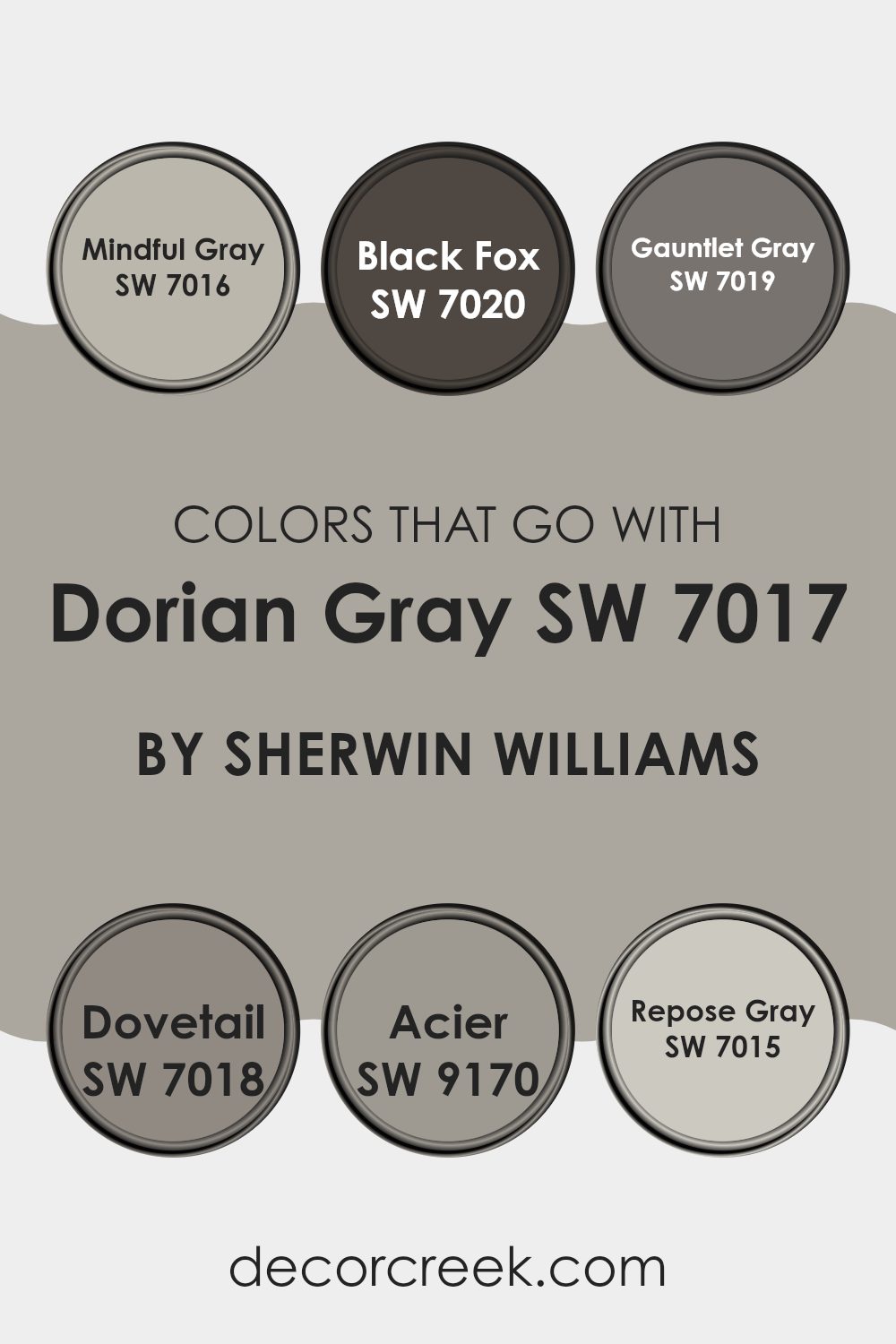
Colors that Go With Dorian Gray SW 7017 by Sherwin Williams
Choosing complementary colors for Dorian Gray SW 7017 by Sherwin Williams matters because it helps build a balanced and harmonious look in any room. Dorian Gray is a adaptable neutral shade with a blend of gray and a soft hint of warm undertones, making it a strong base for many palettes. When paired with the right tones, it can enhance the overall mood of a room and create a connected, pleasing design.
Mindful Gray SW 7016 is a lighter gray that works smoothly with Dorian Gray, creating a soft shift from light to deeper tones. It gives gentle contrast, ideal for rooms that need subtle change without feeling overpowering. In contrast, Black Fox SW 7020 brings bold depth with its dark gray shade.
This pairing can add drama and richness, perfect for highlighting details or shaping a focal point. Gauntlet Gray SW 7019, close in depth but slightly different in tone, adds character without fading into the background, making it a smart choice for nearby walls or furniture. Dovetail SW 7018 offers a deeper gray that helps create a layered and refined look.
It works beautifully on trim or cabinetry to add quiet definition to a room. Acier SW 9170 stands out with cool steel tones, giving a crisp and modern feel that contrasts nicely with the warmer side of Dorian Gray. Lastly, Repose Gray SW 7015 is a light and airy gray that brings freshness, keeping darker shades like Dorian Gray from making the room feel too heavy.
Together, these shades provide flexible options for many styles. Whether you want a soft flow of grays or a bold contrast with darker tones, these pairings help shape a strong and balanced interior palette.
You can see recommended paint colors below:
- SW 7016 Mindful Gray
- SW 7020 Black Fox
- SW 7019 Gauntlet Gray
- SW 7018 Dovetail
- SW 9170 Acier
- SW 7015 Repose Gray
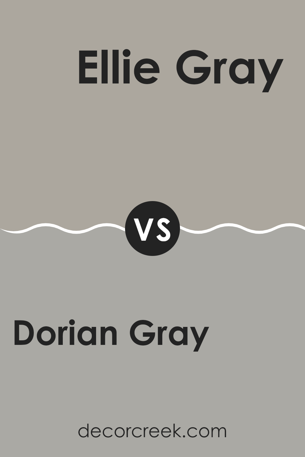
Dorian Gray SW 7017 by Sherwin Williams vs Ellie Gray SW 7650 by Sherwin Williams
Dorian Gray and Ellie Gray are two paint colors from Sherwin Williams, each with its own character. Dorian Gray is a warm gray tone that feels welcoming and cozy, making it a lovely choice for rooms where comfort matters, such as living rooms or bedrooms. It works well with many décor styles and helps enhance a room with a calm, comforting mood without feeling too dark.
In contrast, Ellie Gray has a cooler undertone, giving it a crisper appearance. It’s a strong option for modern rooms or areas where you want a cleaner and more refreshed feeling, like bathrooms or kitchens. Its lighter and cooler tone can also help smaller rooms feel a bit more open.
When comparing the two, Dorian Gray brings a warmer and more inviting mood, while Ellie Gray delivers a sharper and cleaner look. Either shade can improve the style of your home, depending on your taste and where you choose to use it.
You can see recommended paint color below:
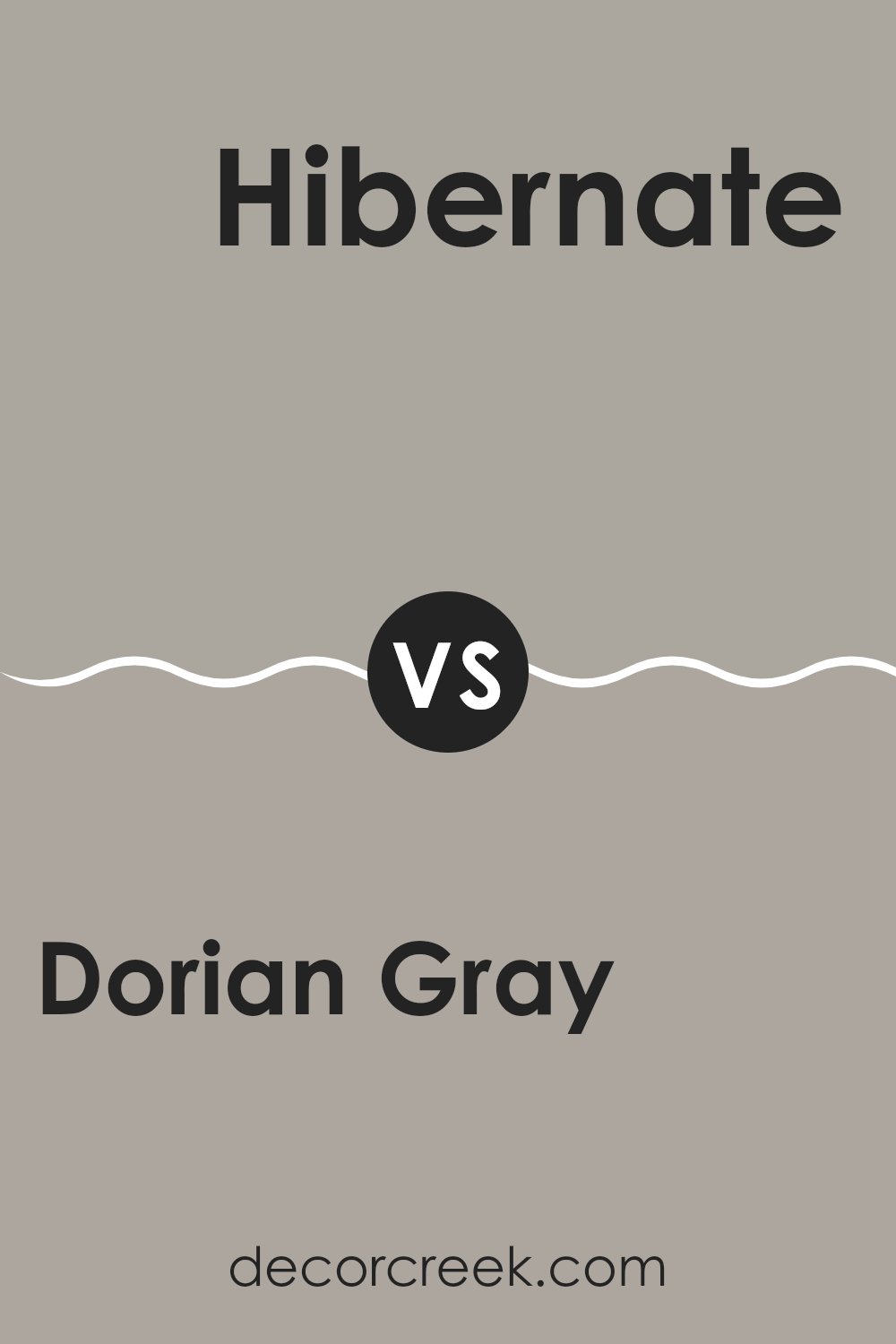
Dorian Gray SW 7017 by Sherwin Williams vs Hibernate SW 9573 by Sherwin Williams
Dorian Gray and Hibernate are two distinct paint colors by Sherwin Williams. Dorian Gray is a mid-tone gray with warm undertones. It’s flexible and works well in many rooms, offering a calm and welcoming mood without feeling too dark.
In contrast, Hibernate is a much deeper shade that leans toward charcoal or even black, ideal for shaping a cozy and grounded feeling in a room. Hibernate absorbs more light, which makes it a strong choice for accent walls or smaller areas where you want to add depth.
While Dorian Gray suits larger areas or works well as a base because of its lighter and softer presence, Hibernate is better for focal points due to its bold character. The decision between them depends on the mood you want to create in your room.
You can see recommended paint color below:
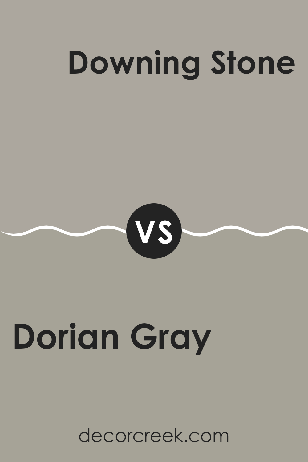
Dorian Gray SW 7017 by Sherwin Williams vs Downing Stone SW 2821 by Sherwin Williams
Dorian Gray and Downing Stone, both by Sherwin Williams, are two distinct shades. Dorian Gray is a mid-tone gray with a neutral and balanced base that doesn’t lean too warm or too cool. This makes it a flexible option for many rooms, pairing easily with a wide range of décor styles.
In contrast, Downing Stone is a deeper, muted beige with a touch of gray, giving it a richer and slightly warmer look. This shade is a lovely choice for shaping a cozy and welcoming mood in a room.
While Dorian Gray brings a more modern and clean style suited for contemporary homes, Downing Stone offers a more classic feel, perfect for traditional interiors. Both colors adjust well to different lighting, showing how easily they can fit into many home styles.
You can see recommended paint color below:
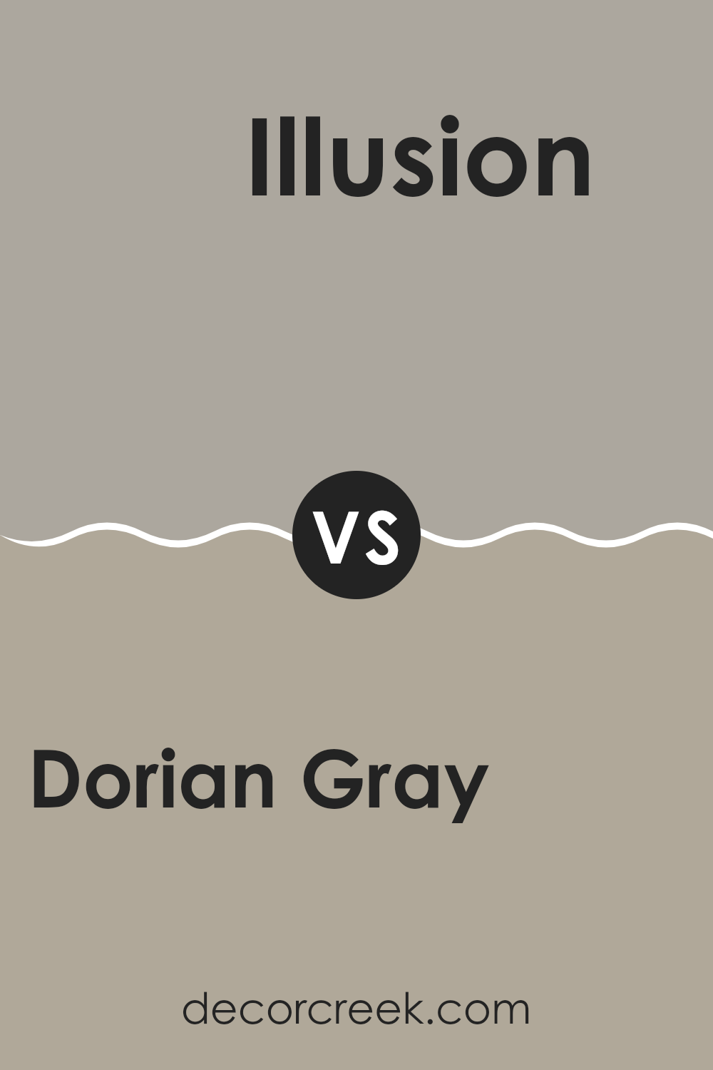
Dorian Gray SW 7017 by Sherwin Williams vs Illusion SW 9592 by Sherwin Williams
Dorian Gray and Illusion are two distinct paint colors by Sherwin Williams, each bringing its own mood to a room. Dorian Gray is a neutral shade that sits between gray and beige. This makes it very flexible and suitable for many decorating styles, working well in almost any room to create a cozy and welcoming feeling.
In contrast, Illusion is a much deeper, almost charcoal gray with a stronger and bolder character. This shade is ideal for accent walls or areas where you want to make a statement without turning to bright colors.
Illusion can make smaller rooms feel more enclosed, so it’s best used in larger or well-lit rooms to prevent a tight feeling. Together, these two shades can work nicely, with Dorian Gray softening the strength of Illusion and helping shape a balanced and modern design.
You can see recommended paint color below:
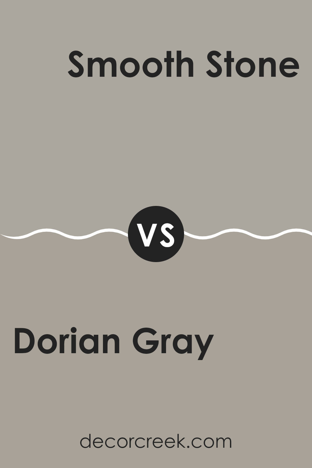
Dorian Gray SW 7017 by Sherwin Williams vs Smooth Stone SW 9568 by Sherwin Williams
Dorian Gray and Smooth Stone are two shades from Sherwin Williams with soft differences in tone and mood. Dorian Gray is a warmer gray that brings a cozy feeling, ideal for shaping a welcoming setting in living rooms or bedrooms. It’s slightly deeper, which adds comfort and a steady presence to a room.
In contrast, Smooth Stone has a lighter and softer look that makes it a great option for smaller rooms or areas meant to feel more open. It reflects more light, helping a room seem larger and brighter. Both shades pair nicely with many décor styles and can be matched with brighter accents for a balanced result.
Whether you prefer the snug and inviting mood of Dorian Gray or the light and airy feel of Smooth Stone, each shade offers its own appeal, depending on the room’s purpose and lighting.
You can see recommended paint color below:
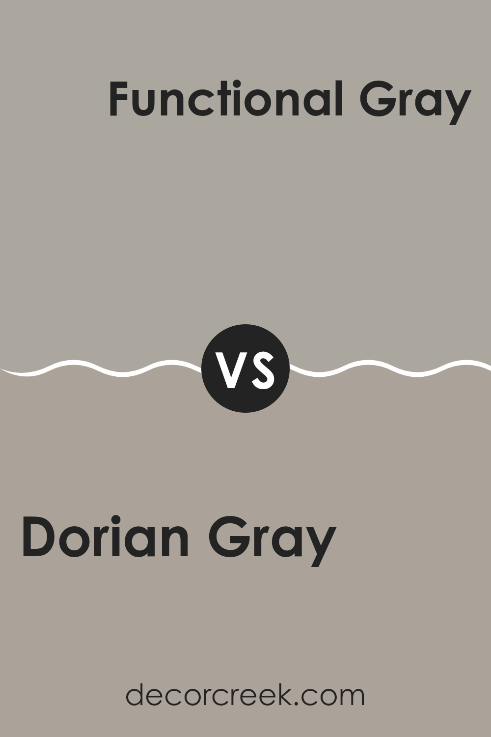
Dorian Gray SW 7017 by Sherwin Williams vs Functional Gray SW 7024 by Sherwin Williams
Dorian Gray and Functional Gray are two distinct shades by Sherwin Williams. Dorian Gray is a soft, medium gray with a warm undertone, making it a flexible and welcoming choice for many rooms. It works especially well in living areas and bedrooms, where a cozy mood is important.
In contrast, Functional Gray has a deeper and cooler tone. It brings a stronger presence to a room with its darker gray look. This shade is a great option for areas that benefit from a more defined and bold style, such as dining rooms or home offices.
Both colors pair well with many décor styles and other shades, but the decision depends on the mood you want to create. Dorian Gray gives a lighter and warmer touch, while Functional Gray offers a deeper and cooler character.
You can see recommended paint color below:
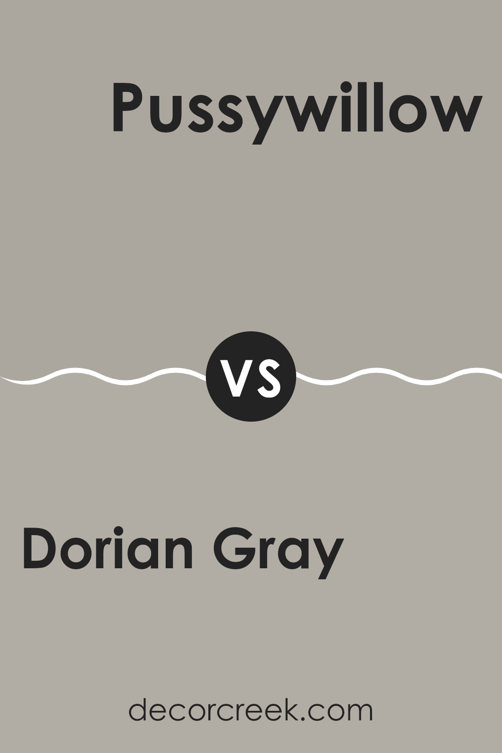
Dorian Gray SW 7017 by Sherwin Williams vs Pussywillow SW 7643 by Sherwin Williams
Dorian Gray and Pussywillow are both shades by Sherwin Williams, but they present different tones that can shape the mood of a room. Dorian Gray is a warmer gray with soft brown undertones, giving it a cozy feeling that works nicely in living areas or bedrooms where you want a comforting setting.
In contrast, Pussywillow is cooler and slightly lighter than Dorian Gray. It shows gentle blue undertones, making it a good choice for a modern style or for rooms with plenty of natural light, as it helps create a more open and airy feel.
Both colors are flexible and neutral, so they pair easily with many décor styles and other shades. The warmth of Dorian Gray builds a more welcoming and snug mood, while the cooler and lighter Pussywillow can make a room feel more spacious and fresh. Depending on the atmosphere you want to create, either shade could be a great choice.
You can see recommended paint color below:
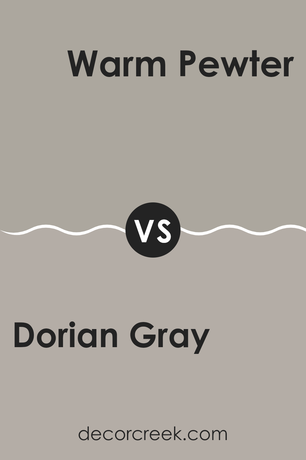
Dorian Gray SW 7017 by Sherwin Williams vs Warm Pewter SW 9572 by Sherwin Williams
Dorian Gray is a balanced medium gray that offers a neutral backdrop, suitable for many rooms in your home, welcoming everyday comfort. It’s a flexible shade that pairs well with both bold and muted colors, making it easy to use in rooms with different lighting and décor styles.
Warm Pewter, in contrast, is a darker gray with a warmer tone, ideal for shaping a cozy and inviting mood. This shade works beautifully in areas where you want to add depth and warmth, such as living rooms and bedrooms.
Although both are gray, Dorian Gray leans toward a true neutral, giving a crisp and clean look. Warm Pewter, however, has a richer and slightly earthy quality that can make a room feel more enclosed and personal. Depending on the mood you want to create, Dorian Gray is great for a light and open feel, while Warm Pewter helps refresh a room into a more grounded and intimate setting.
You can see recommended paint color below:
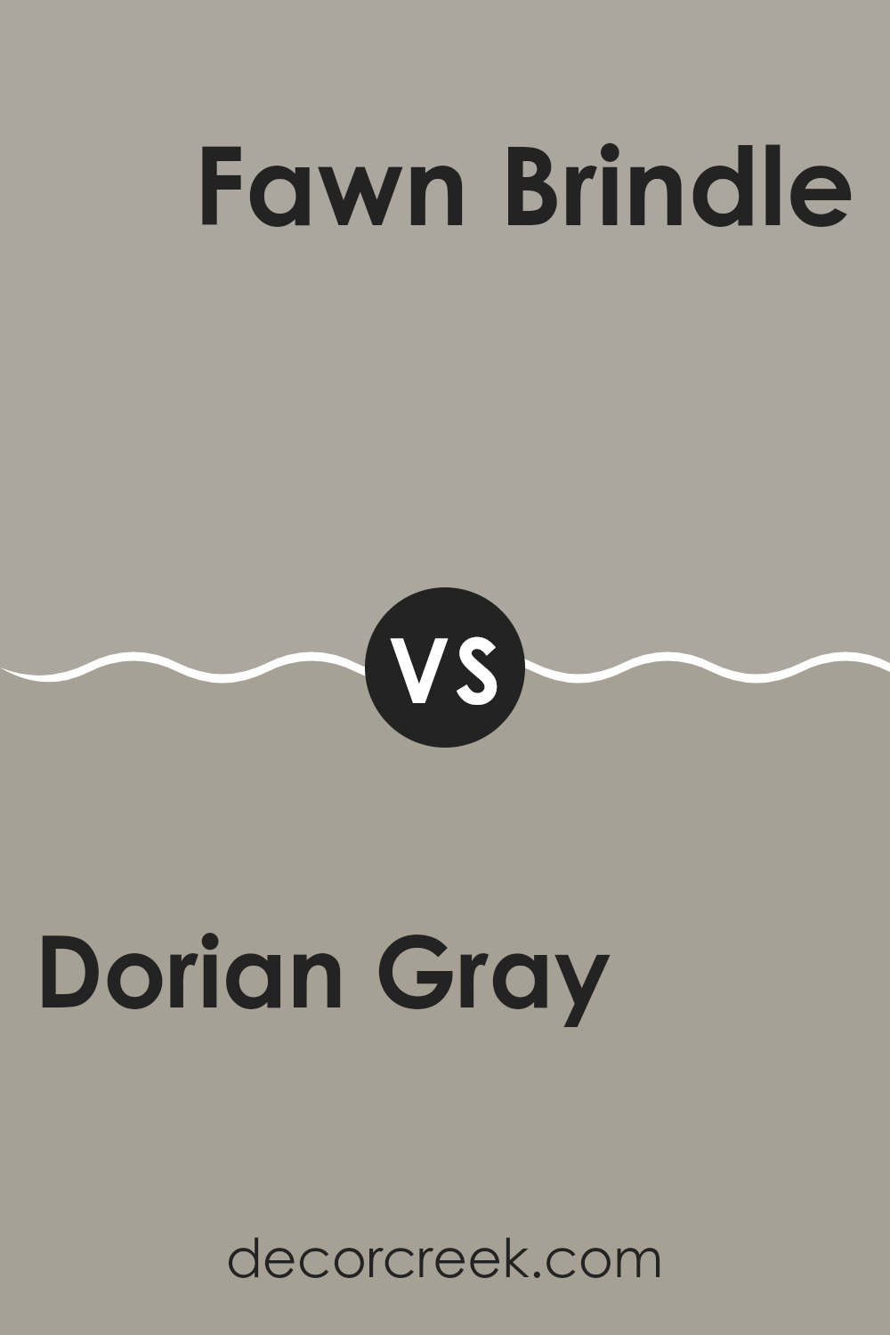
Dorian Gray SW 7017 by Sherwin Williams vs Fawn Brindle SW 7640 by Sherwin Williams
Dorian Gray and Fawn Brindle, both by Sherwin Williams, are subtle and refined shades, yet they bring different tones to a room. Dorian Gray has a balanced, medium gray tone that feels modern and simple. It’s an adaptable color that works well in any room without feeling overpowering.
In contrast, Fawn Brindle is a warmer shade, blending gray with earthy brown undertones to shape a cozy and welcoming mood. This color is ideal for those who want to add a touch of warmth to their rooms without choosing something too dark.
Both shades act as beautiful neutral backdrops, but Dorian Gray delivers a cooler and more neutral look, while Fawn Brindle introduces warmth that can refresh a room into a more inviting setting. The decision between them depends on the mood you want to create and the other colors in your design plan.
You can see recommended paint color below:
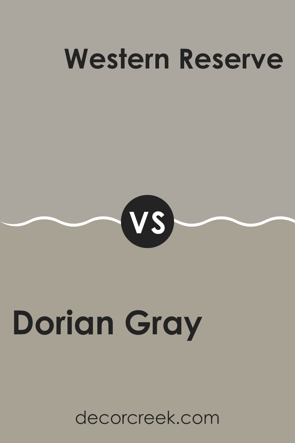
Dorian Gray SW 7017 by Sherwin Williams vs Western Reserve SW 9597 by Sherwin Williams
Dorian Gray and Western Reserve are both colors by Sherwin Williams, each with its own character. Dorian Gray is a mid-tone gray that provides a steady, neutral backdrop suitable for any room, giving a modern yet cozy feel. It balances warm and cool tones, making it a flexible option for pairing with many décor styles.
In contrast, Western Reserve is a much darker shade. It leans toward a rich, deep green with gray undertones, adding drama and intimacy to a room. This shade is ideal for shaping a focal point or bringing depth to a larger room.
In short, while Dorian Gray is a reliable neutral that works well in many uses, Western Reserve delivers a stronger statement, perfect for highlighting key areas or for smaller rooms like a study or den. Both shades offer unique ways to style an interior room.
You can see recommended paint color below:
After studying SW 7017 Dorian Gray by Sherwin Williams closely, I found it to be a fantastic paint choice for anyone wanting to refresh a room or an entire home. What stands out about Dorian Gray is how it balances a calming mood without feeling too bright; it’s perfect if you want your walls to have a mature look without going too dark or dull.
Dorian Gray sits comfortably in the middle—it’s not as light as some grays, yet not very dark either, which makes it a flexible option for areas like the living room or bedroom, and it can even suit a kitchen. It pairs nicely with many shades, from bold colors to softer tones. This makes it easy to coordinate with furniture and décor you already have, a smart pick for many homes.
Overall, SW 7017 Dorian Gray by Sherwin Williams is a strong choice if you want a paint color that feels clean and polished, yet warm and welcoming. It helps refresh a room into a comfortable backdrop for everyday life without drawing too much attention. It leaves a room feeling balanced, fresh, and cozy all at once.

Ever wished paint sampling was as easy as sticking a sticker? Guess what? Now it is! Discover Samplize's unique Peel & Stick samples.
Get paint samples

