If you’re considering a fresh coat of paint for your room and SW 7075 Web Gray by Sherwin Williams has caught your eye, there are a few things you should know to make an informed choice. As someone who has frequently used different shades to refresh rooms, I’ve learned that understanding a paint’s undertones, lighting effects, and compatibility with your existing decor is crucial.
SW 7075 Web Gray is not just a simple gray. It has a complexity that can shift under various lighting conditions, showing hints of blue or even green. It’s important to check how it looks in your specific room at different times of the day. I recommend testing a sample on your wall and observing it over a day or two.
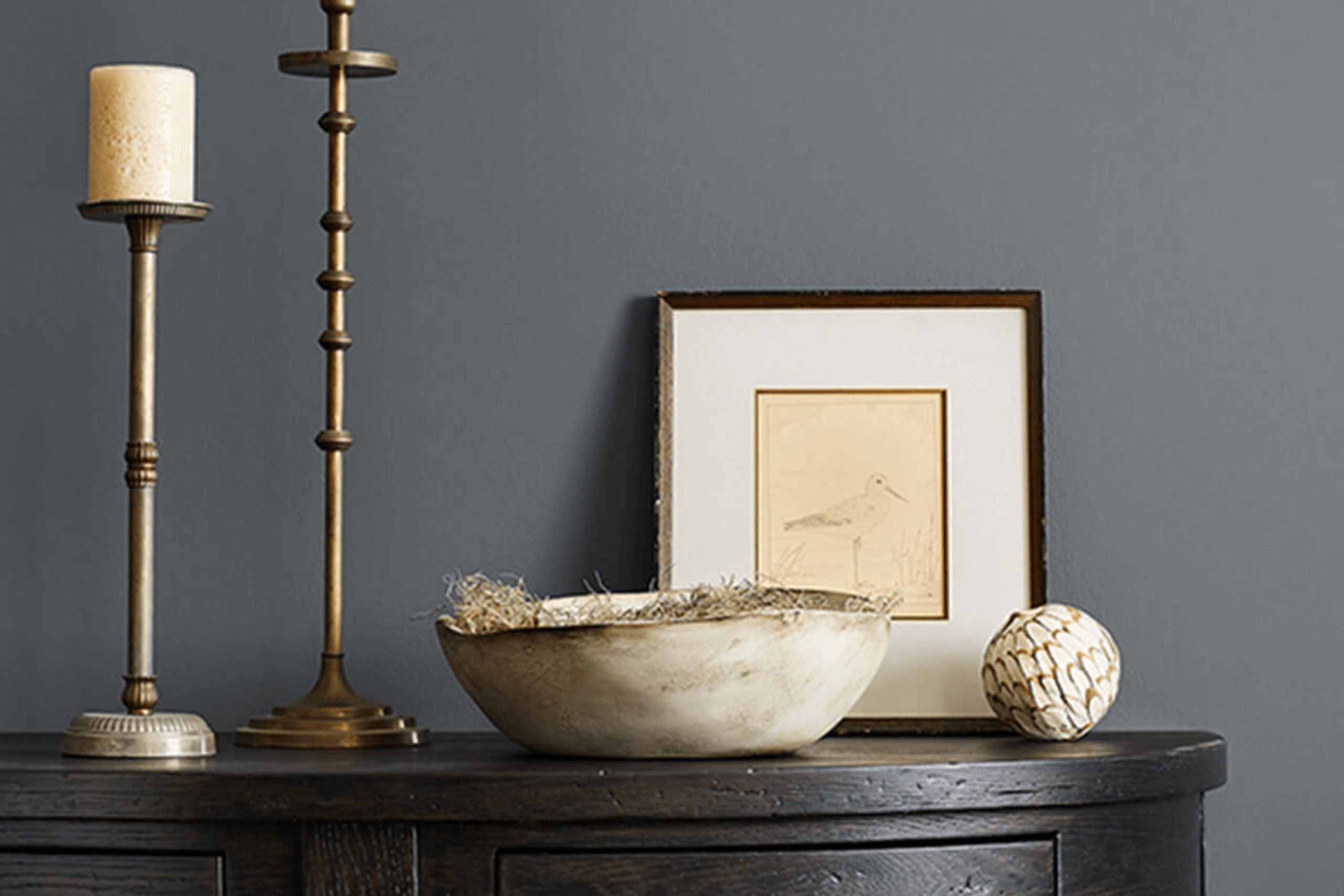
Equally important is considering what you already have in the room. Web Gray pairs beautifully with a wide range of colors, but it’s especially striking against whites and wood tones, giving a sleek and modern feel while still feeling warm.
It’s a flexible choice that can help you achieve a look that feels both cozy and stylish.
Is Web Gray SW 7075 Right for My Home?
I recently came across a color that has truly impressed me with its flexibility and unique charm: Web Gray by Sherwin Williams. It’s a deep, true gray that provides a striking backdrop in any room, complementing a wide array of design styles. I find that it balances beautifully between being bold and understated, making it a fantastic choice for many rooms.
In terms of interior styles, Web Gray shines in modern and minimalist environments. Its crisp, clean hue pairs beautifully with sleek, contemporary furnishings and pops of color through artwork or textiles. Additionally, it works incredibly well in industrial settings, where its strength complements exposed brick, steel accents, and reclaimed wood.
As for materials and textures, this color goes particularly well with natural elements. I’ve seen it matched with light, sandy woods and it creates a stunning contrast. When paired with soft, plush fabrics like wool or velvet, it introduces a comforting, cozy feel to the room. Shiny materials like chrome or glass also play well against its matte finish, adding a touch of glamour without feeling intense. Overall, Web Gray has been a delightful addition to my design toolkit, adapting easily to various themes and enhancing every project I use it in.

What are the right undertones of Web Gray SW 7075 ?
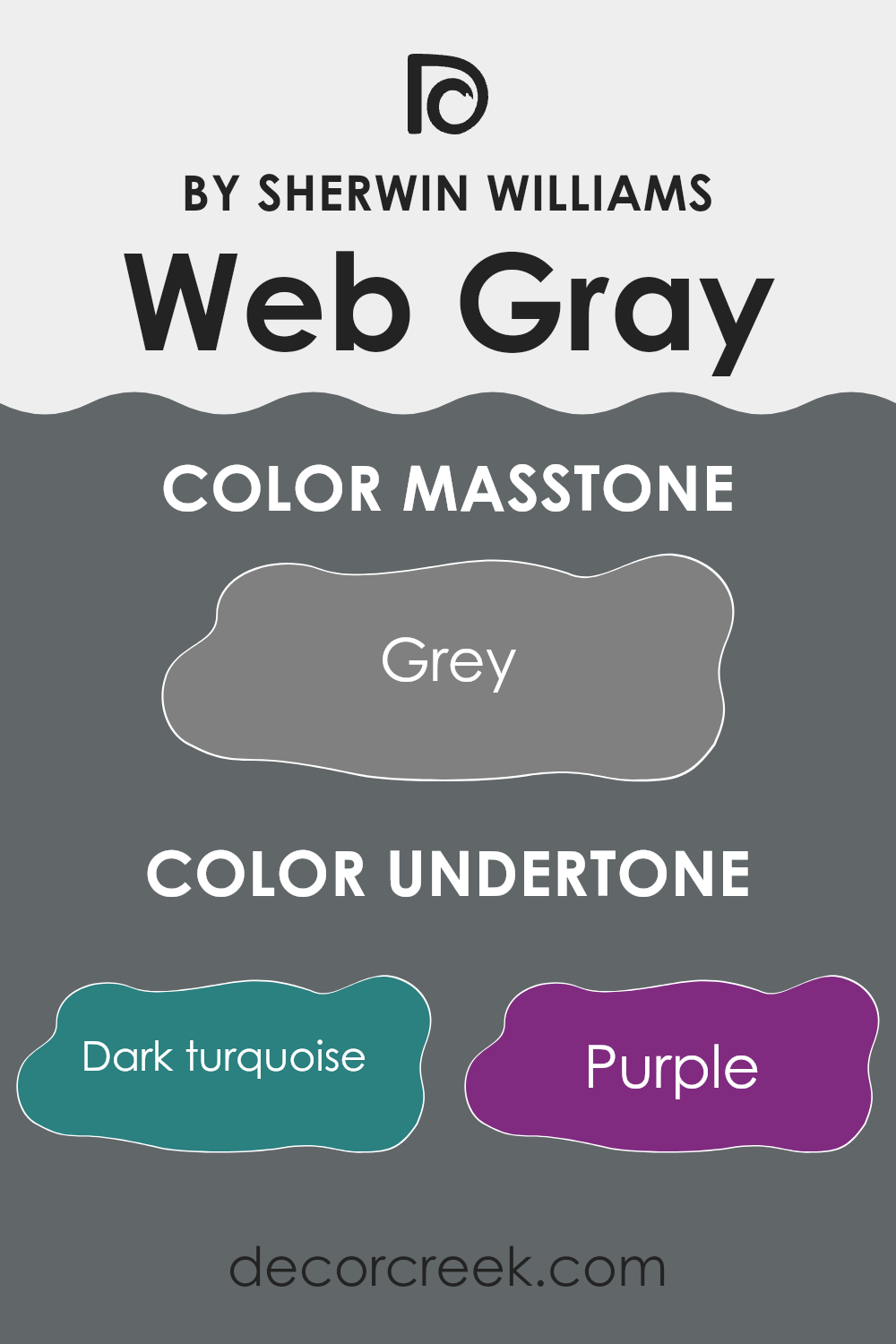
Web Gray SW 7075 is a flexible paint color that brings a nuanced spectrum of shades depending on the lighting and accompanying decor. At its core, Web Gray is a deep, neutral gray, but it carries multiple undertones which can subtly influence the perception of the color in a room.
Undertones are the underlying qualities of a color that can emerge under different lighting conditions, or when placed next to other colors. They are crucial in determining how a color will ultimately look on your walls. For Web Gray, these undertones include shades of dark turquoise, olive, navy, dark green, brown, and dark grey, among others. These subtle hues can cause the primary gray color to appear cooler or warmer, depending on which undertone is dominant.
When painted on interior walls, Web Gray’s multifaceted undertones offer a unique advantage. In a room with ample natural light, the cooler undertones like blue, lilac, or light turquoise might become more noticeable, giving the room a fresher look. In contrast, in a room with warmer lighting, undertones like brown, orange, or pale pink might stand out, providing a cozier feel.
This makes Web Gray a particularly adaptable choice for diverse design schemes. Whether you are looking to create a calm, grounding environment or a dynamic, engaging area, the undertones can subtly influence the atmosphere through their interaction with light and surrounding colors. Thus, selecting furniture, decorations, and additional paint colors that align with the desired undertones can help in achieving the intended ambiance of the room.
Best Coordinating Colors to use with Web Gray SW 7075 by Sherwin Williams this year.
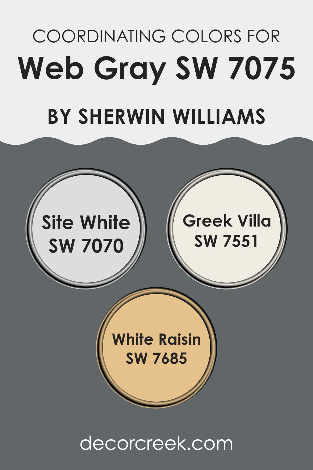
Coordinating colors are hues that complement each other and help create a harmonious color scheme in a design or decorating project. When paired correctly, these colors enhance the overall aesthetic and balance of an interior room. For a muted and flexible palette, Web Gray by Sherwin Williams can be beautifully complemented with coordinating colors such as Site White, Greek Villa, and White Raisin, each offering a unique contribution to the decor.
Site White is a soft, clean shade that pairs well with darker tones, bringing a sense of freshness and light to any room. It’s particularly useful in areas where natural light is abundant, as it reflects light gently, enhancing the room’s airy feel. On the other hand, Greek Villa offers a slightly warmer tone, reminiscent of a sun-bathed Mediterranean house.
Its creamy nature makes it ideal for cozy, inviting rooms while still keeping the look very neutral and easy to pair with various decor elements. Lastly, White Raisin has a subtle, warm undertone that works beautifully with more neutral grays like Web Gray. It adds a touch of warmth to the color scheme, making the room feel more inviting and lived-in, perfect for family rooms or a welcoming kitchen.
You can see recommended paint colors below:
- SW 7070 Site White
- SW 7551 Greek Villa
- SW 7685 White Raisin
Trendy Trim Colors of Web Gray SW 7075 by Sherwin Williams to use this year.
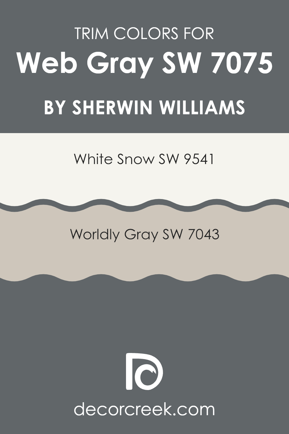
Trim colors are specifically chosen to highlight or complement the primary colors of a wall or an exterior. In the case of a deep and bold color like Web Gray by Sherwin Williams, selecting the right trim colors can significantly impact the overall look of a room. Trim colors like White Snow and Worldly Gray by Sherwin Williams are excellent choices, as they can create subtle yet compelling contrasts that bring balance and refinement to the strong base color.
White Snow SW 9541 is a clean and bright white that provides a crisp border to Web Gray. It helps to distinguish architectural details and features by providing a fresh, clear line that makes the deeper tones stand out, which is ideal for both interiors and exteriors.
On the other hand, Worldly Gray SW 7043 is a soft, neutral gray that offers a more subtle transition from the darker Web Gray. This color pairs well by softening edges and adding depth without creating too sharp a contrast, which is perfect for a harmonious and pleasing visual experience.
You can see recommended paint colors below:
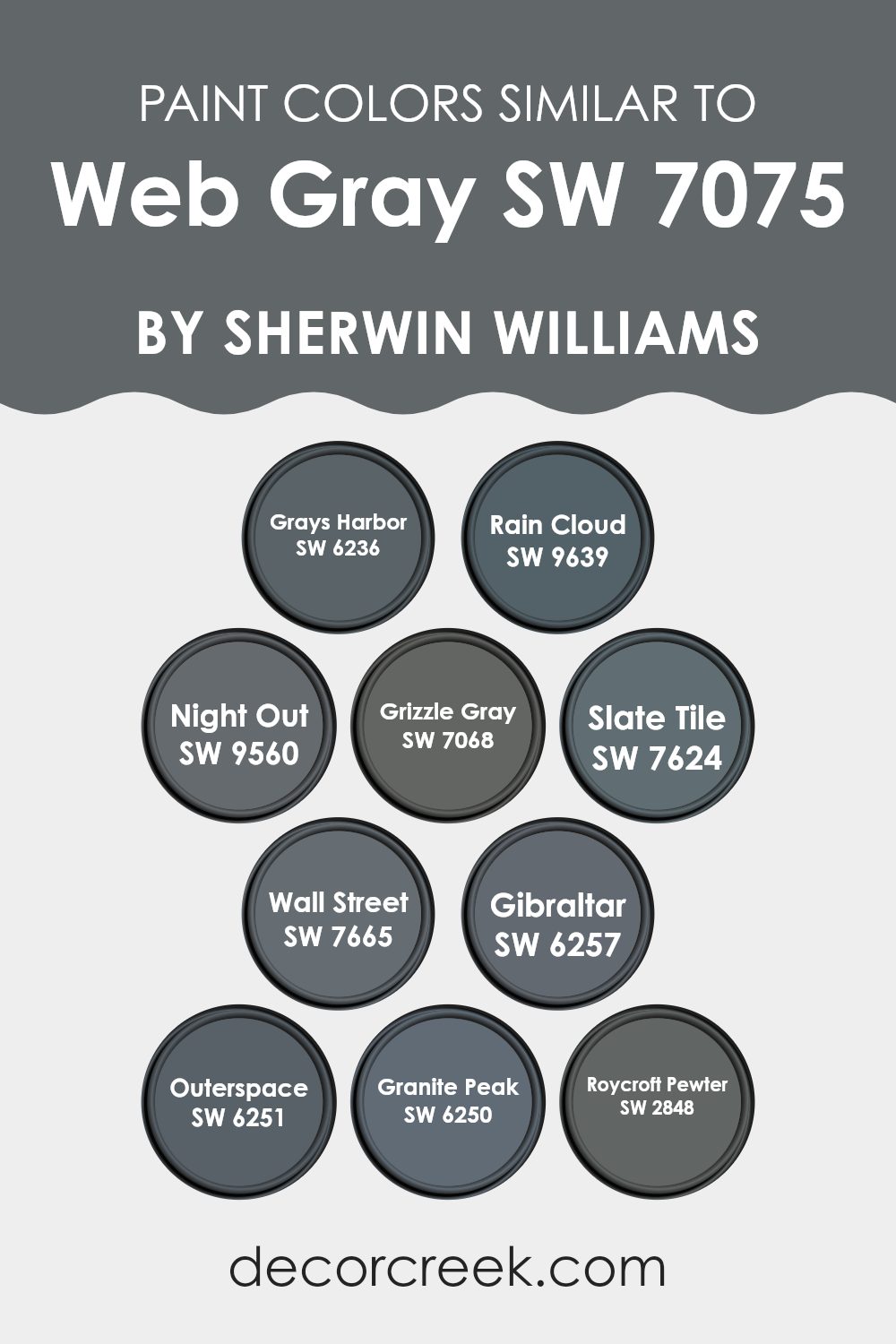
Evergreen Colors Similar to Web Gray SW 7075 by Sherwin Williams
Similar colors are important in design because they create a sense of harmony and continuity in a room. Using shades like those similar to Sherwin Williams’ Web Gray 7075, for example, can help achieve a cohesive look without sharp contrasts that may disrupt the visual flow. These similar hues often share a base tone but vary in brightness or saturation, allowing for depth and dimension without straying too far from a chosen color theme.
Colors like Grays Harbor (SW 6236) and Rain Cloud (SW 9639) are great examples, each adding subtle differences that can enhance texture and light in a room. Grays Harbor is a deep, moody gray that adds a touch of drama, while Rain Cloud provides a slightly lighter, airier feel. Night Out (SW 9560) and Grizzle Gray (SW 7068) lean toward the darker spectrum, ideal for creating a bold, grounding effect in a room.
Moving toward the blue-gray side, Slate Tile (SW 7624) and Wall Street (SW 7665) offer a polished yet inviting atmosphere, with Slate Tile showing a hint of blue undercurrents. Gibraltar (SW 6257) and Outerspace (SW 6251) are more on the stone gray side, perfect for those who prefer a natural, earthy vibe in their decorating scheme. Lastly, the sturdier tones of Granite Peak (SW 6250) and Roycroft Pewter (SW 2848) round out the options with their rich yet muted essences, suitable for adding both elegance and a grounding presence to any room.
You can see recommended paint colors below:
- SW 6236 Grays Harbor
- SW 9639 Rain Cloud
- SW 9560 Night Out
- SW 7068 Grizzle Gray
- SW 7624 Slate Tile
- SW 7665 Wall Street
- SW 6257 Gibraltar
- SW 6251 Outerspace
- SW 6250 Granite Peak
- SW 2848 Roycroft Pewter
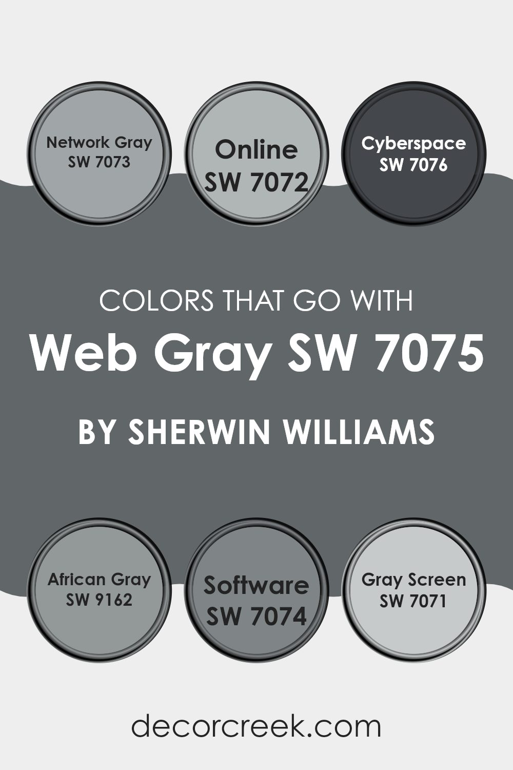
Colors that Go With Web Gray SW 7075 by Sherwin Williams
When selecting colors that go well with Web Gray SW 7075 by Sherwin Williams, it’s key to think about creating a harmonious and seamless look in your room. Colors like Network Gray, Online, Cyberspace, African Gray, Software, and Gray Screen are specifically coordinated to complement Web Gray, ensuring that each shade works together to enhance the overall look without feeling intense. These colors can set a mood, define a room, or add depth, depending on how they are used alongside the primary color, Web Gray.
Network Gray SW 7073 brings a slightly lighter tone that can help to brighten rooms subtly while maintaining a professional appearance, perfect for modern office rooms and minimal living areas. Meanwhile, Online SW 7072 offers a soft, almost airy gray that works well in areas where natural light is abundant, lending a gentle, open feel. Cyberspace SW 7076, on the darker end, provides a bold contrast, ideal for accent walls or furniture pieces, giving a touch of drama and definition.
African Gray SW 9162 has a warm undertone that makes it cozy, suitable for bedrooms and study areas where comfort is a priority. Software SW 7074 strikes a mid-tone balance, flexible enough for any room, promoting a sleek, contemporary vibe. Lastly, Gray Screen SW 7071 is a light gray that can open smaller or darker rooms, providing a sense of increased roominess. Each of these colors has their unique character yet ensures they don’t clash with the main shade, Web Gray, making for a cohesive and stylish palette.
You can see recommended paint colors below:
- SW 7073 Network Gray
- SW 7072 Online
- SW 7076 Cyberspace
- SW 9162 African Gray
- SW 7074 Software
- SW 7071 Gray Screen
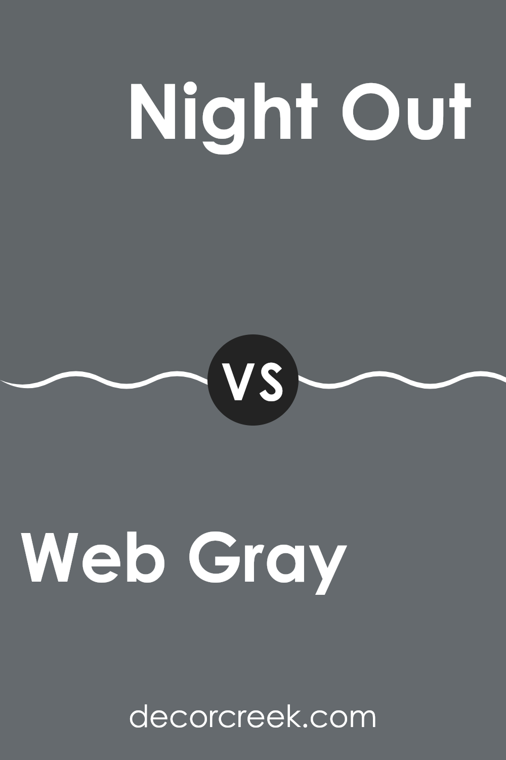
Web Gray SW 7075 by Sherwin Williams vs Night Out SW 9560 by Sherwin Williams
Web Gray SW 7075 and Night Out SW 9560 are two distinct shades from Sherwin Williams. Web Gray is a deep, neutral gray that provides a strong, stable look to any room. It’s dark but not overly somber, making it flexible for various uses, from an accent wall to cabinetry.
On the other hand, Night Out is a much darker shade, treading close to black. This color is perfect for creating dramatic, bold statements in a room, ideal for making features stand out or for use in small doses to add depth.
While both colors offer a sense of grounding, Night Out leans toward a more intense, striking presence due to its near-black tone, contrasting with Web Gray’s more muted and widely appealing gray. Each can set a different mood and is suitable for different purposes depending on the effect you’re aiming for in a room.
You can see recommended paint color below:
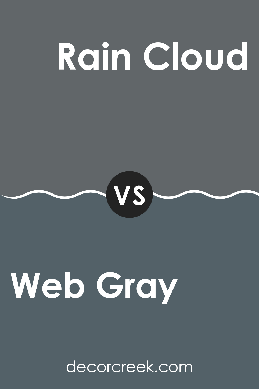
Web Gray SW 7075 by Sherwin Williams vs Rain Cloud SW 9639 by Sherwin Williams
Web Gray and Rain Cloud are two distinct paints you can pick for your room, both from Sherwin Williams. Web Gray is a deep, charcoal gray that offers a bold and strong feel to any room. It’s perfect if you want a color that stands out or if you’re looking to create a dramatic backdrop.
In contrast, Rain Cloud is a light, cloudy gray that gives a softer and more subtle feel. This color is great for rooms where you want a calm, light atmosphere without making it feel too heavy.
Both colors work well in modern settings, but where Web Gray brings depth and prominence, Rain Cloud adds a gentle touch of neutrality, making it easier to match with a wide variety of decor. Depending on your room’s need for intensity or lightness, either could be a suitable choice.
You can see recommended paint color below:
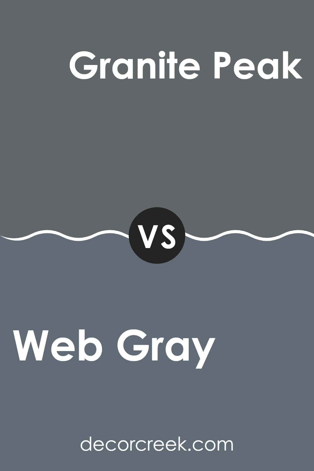
Web Gray SW 7075 by Sherwin Williams vs Granite Peak SW 6250 by Sherwin Williams
The two colors, Web Gray and Granite Peak, both by Sherwin Williams, present unique shades of gray but with distinct undertones and depth. Web Gray is a deep, dark gray that leans toward a charcoal color. It is bold and can give a strong base in rooms, making it ideal for accent walls or furniture.
On the other hand, Granite Peak is a lighter gray that has a blue undertone, providing a cooler appearance. This color works well in various settings, giving a fresher look that can add subtle character to rooms without feeling too intense.
Both colors can complement each other in a room, where Granite Peak can soften the intensity of Web Gray, creating a balanced and modern look in any part of a home. Whether used separately or together, these colors offer flexible options for decorating.
You can see recommended paint color below:
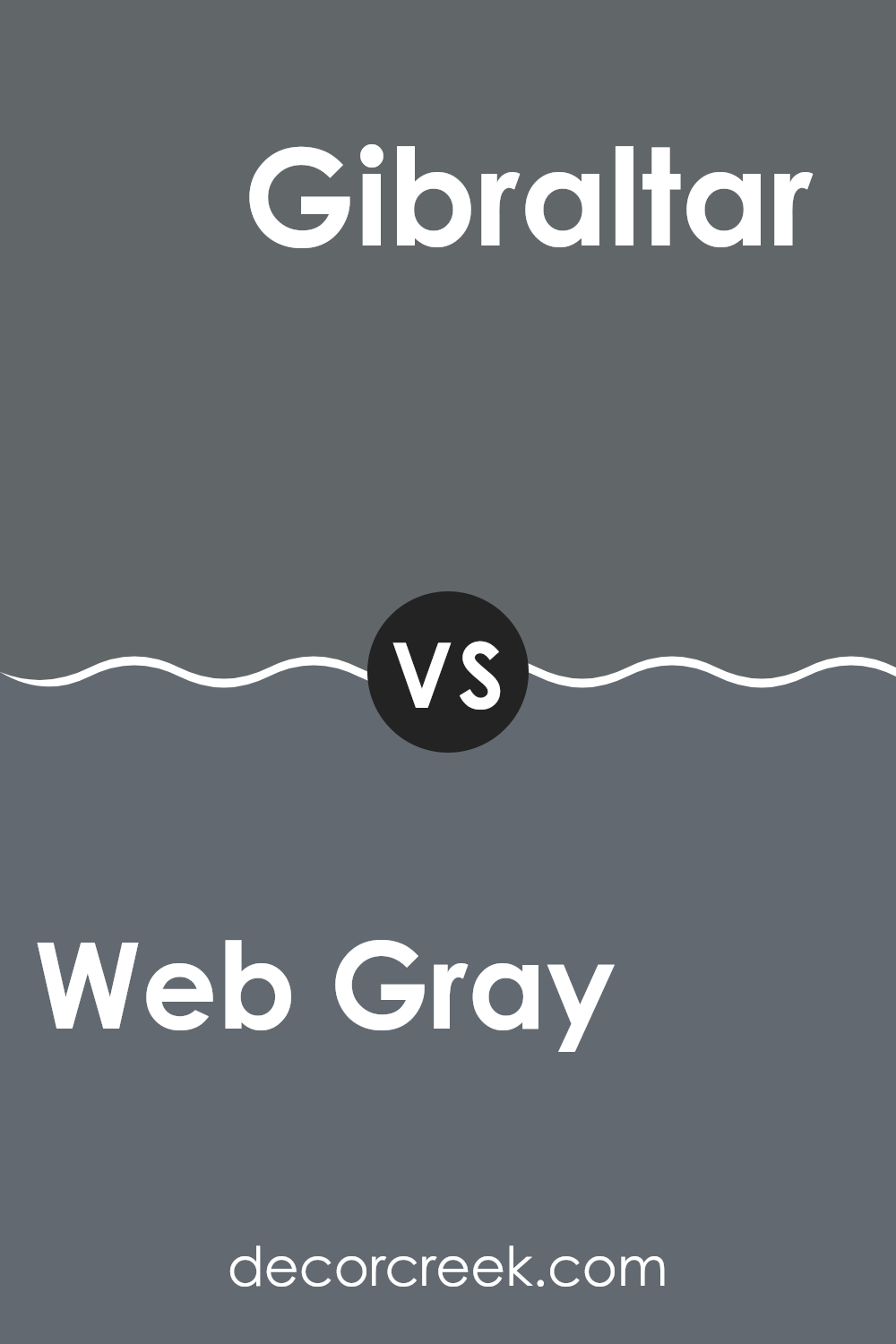
Web Gray SW 7075 by Sherwin Williams vs Gibraltar SW 6257 by Sherwin Williams
The colors Web Gray and Gibraltar, both by Sherwin Williams, present unique shades for interior design. Web Gray is a deep charcoal gray that offers a bold, strong look. It immediately draws attention due to its intense and dark tone, making it perfect for accent walls or furniture pieces that you want to stand out.
In contrast, Gibraltar is a slightly lighter shade of gray with a hint of blue. This color is more subdued and has a calming effect, making it an excellent choice for areas where you want to encourage relaxation, like bedrooms or bathrooms.
Although both are grays, Web Gray provides a more striking, dramatic effect, while Gibraltar offers a soothing, gentle ambiance. Together, they can create a balanced and harmonious grayscale palette, with Gibraltar softening the intensity of Web Gray, depending on how they’re used in a room.
You can see recommended paint color below:
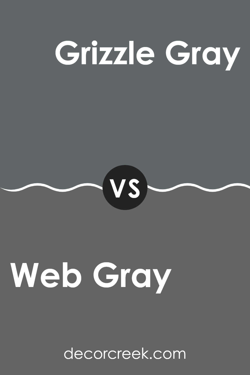
Web Gray SW 7075 by Sherwin Williams vs Grizzle Gray SW 7068 by Sherwin Williams
Web Gray and Grizzle Gray are both shades from Sherwin Williams. Web Gray is a dark, subtle gray that can make a strong statement in a room without feeling too intense. It offers a steady, solid tone that works well in rooms aiming for a modern yet understated look.
On the other hand, Grizzle Gray is a shade darker with a hint of blue undertone, lending it a slightly cooler feel. This color is great for adding depth to a room, making it appear more polished and grounded. Its coolness provides a fresh look, making it suitable for areas like kitchens and bathrooms where cleanliness and freshness are often emphasized.
Both colors are highly flexible, making them easy to use in various design styles, from contemporary to industrial. They pair well with bright whites for a crisp look, or with warm wood tones for a more cozy, inviting environment.
You can see recommended paint color below:
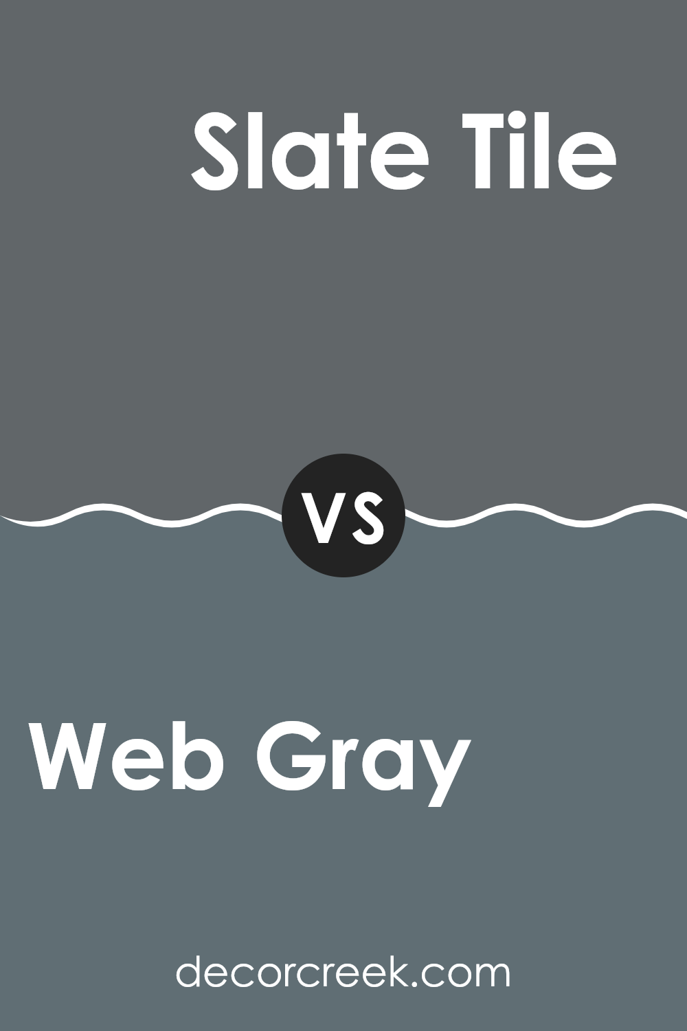
Web Gray SW 7075 by Sherwin Williams vs Slate Tile SW 7624 by Sherwin Williams
Web Gray and Slate Tile, both by Sherwin Williams, are distinct in appearance despite being shades of gray. Web Gray presents a darker, near charcoal hue, making it a strong choice for areas that benefit from a bold, grounding effect.
Contrastingly, Slate Tile leans toward a slightly lighter, blue-infused gray, offering a cooler, more subtle ambiance. This color would work well in rooms intended to feel open and calm without feeling too intense. Both shades pair well with a variety of decor styles and other colors, but their impact in a room will differ.
Web Gray, being deeper and more intense, can make large rooms feel more intimate and cozier, while Slate Tile, with its hint of blue, might help smaller rooms appear brighter and more welcoming. The choice between them depends primarily on the desired atmosphere and light conditions of the room.
You can see recommended paint color below:
Web Gray SW 7075 by Sherwin Williams vs Wall Street SW 7665 by Sherwin Williams
Web Gray and Wall Street, both by Sherwin Williams, offer distinct shades that could significantly affect the atmosphere of a room. Web Gray is a dark charcoal gray that provides a strong, bold look and can make a room feel cozy and enclosed.
It might be ideal for a room that you want to feel warm and intimate. On the other hand, Wall Street is a slightly lighter shade of gray that leans toward blue undertones. This color can bring a more open and airy feeling to a room while still keeping that modern vibe perfect for professional or personal rooms.
Both colors pair well with whites and other neutrals but will offer different vibes depending on the lighting and accompanying decor. Therefore, while both are grays, Web Gray offers a more classic depth, and Wall Street adds a subtle hint of color due to its blue undertones.
You can see recommended paint color below:
Web Gray SW 7075 by Sherwin Williams vs Roycroft Pewter SW 2848 by Sherwin Williams
Web Gray and Roycroft Pewter, both by Sherwin Williams, are distinctly different shades of gray that can create unique atmospheres in a room. Web Gray is a much darker gray, showing a strong, bold presence which can make a dramatic impact in a room.
It is ideal for someone looking to make a statement or anchor a room with a deep, noticeable color. On the other hand, Roycroft Pewter is lighter and softer, providing a more subtle and gentle feel which can make a room seem more open and airy.
This color is great for those who prefer a less intense color scheme that still retains a touch of gray’s modern effect. Both colors are flexible and can be used in various settings, from modern to traditional, but the choice between them largely depends on the desired mood and size of the room.
You can see recommended paint color below:
Web Gray SW 7075 by Sherwin Williams vs Outerspace SW 6251 by Sherwin Williams
Web Gray and Outerspace, both by Sherwin Williams, offer distinct shades that can significantly alter the mood of a room. Web Gray is a deeper, bolder gray that brings a strong presence to a room. It has a certain richness that makes it ideal for areas where you want to make a statement, like in a living room or dining area.
On the other hand, Outerspace is a softer, lighter gray with a hint of blue. This color is great for creating a more relaxed and gentle atmosphere, making it perfect for bedrooms or bathrooms where a calming effect is desired.
While Web Gray leans toward a more dramatic and intense look, Outerspace offers a lighter, airier feel. Choosing between them depends on the vibe you’re looking for in your room—vibrant and bold with Web Gray, or calm and gentle with Outerspace.
You can see recommended paint color below:
Web Gray SW 7075 by Sherwin Williams vs Grays Harbor SW 6236 by Sherwin Williams
Web Gray and Grays Harbor are both gray colors by Sherwin Williams, but they have different tones that might suit various decorating styles. Web Gray is a darker gray that could make a strong statement on walls or cabinets, giving a room a bold look without feeling too intense. It’s a solid choice for someone looking to establish a firm, defined look in their room.
Grays Harbor, on the other hand, is a shade lighter than Web Gray. This color is still in the gray family but has a slightly softer feel, which can be perfect for creating a welcoming and comfortable atmosphere. It might be more flexible for rooms that get a lot of use, like living rooms or kitchens, as it pairs well with many different colors and finishes.
Overall, whether you choose Web Gray or Grays Harbor will depend on the mood you want to set in your room. Darker Web Gray is more dramatic, while lighter Grays Harbor is more laid back.
You can see recommended paint color below:
In conclusion, SW 7075 Web Gray by Sherwin Williams is a really cool color to use if you want to make a room feel cozy and stylish. It’s a gray color, but not just any gray – it has a bit of a deep, rich tone that makes it perfect for rooms like living rooms or bedrooms. It can also make other colors in the room stand out more, like if you have colorful pillows or a bright rug.
I found that when you paint a room with Web Gray, it sort of acts like a warm hug, making the room feel inviting and comfortable. It’s also a good choice because it goes well with many other colors. Whether you have furniture that’s dark or light, this gray will complement it nicely.
Using SW 7075 Web Gray can change the feel of a room without making it feel too cramped or dark. It’s just the right kind of gray if you want something that feels warm and snug, but still looks clean and modern. So, if you’re thinking about giving your room a new look, Web Gray is a great color to consider. It’s easy to see why so many people like it—it really makes a room look and feel nice!
Ever wished paint sampling was as easy as sticking a sticker? Guess what? Now it is! Discover Samplize's unique Peel & Stick samples.
Get paint samples

