The bathroom is far more than just a functional space for brushing your teeth or taking a quick shower. It’s your personal sanctuary of self-care, the place where you prepare for the day ahead with the first light and finally relax and recharge in the evening, washing away the day’s stress.
The color you choose for this intimate space can dramatically alter your mood and emotional state while you’re in it.
For 2026, the dominant trend favors shades that instill a sense of happiness, deep restfulness, and reliable stability.
Designers are moving away from fleeting fads in favor of enduring, emotional colors. I have carefully compiled a comprehensive list of 27 top shades, ranging from the purest, crispest whites to the most saturated and luxurious dark hues.
These colors are guaranteed to transform your bathroom, making it look stylish, expensive, and feel completely brand new.
The Designer’s Choice: Why We Trust Sherwin-Williams and Benjamin Moore for Bathroom Paints
When working on homes for clients or prepping a house for sale, I always use Sherwin-Williams and Benjamin Moore paints, especially in a wet room like a bathroom. Why? Because regular wall paint just won’t cut it when facing humidity and steam every day.
- They Fight Moisture: Both companies make special paints—like Benjamin Moore’s Aura Bath & Spa—that are built to fight mold and mildew. This keeps the walls looking fresh and clean for years.
- They Look Better, Longer: These premium paints give a tough, smooth finish that you can wipe down easily. They resist stains and scratches, which is important for a busy household.
- The Colors Are Perfect: The colors from these brands have a depth that cheaper paints just don’t have. They hold their true color, whether you have a bright window or just electric lights, making your bathroom look rich and thoughtfully designed.
Mastering the Palette: How to Choose the Perfect Paint Color for Your Bathroom
Picking the right bathroom color means you have to think like a pro. Here is my simple guide to making the perfect choice:
- Look at the Light: The sun’s light changes the color of paint all day. If your window faces north, the light is cool and blue, so you need a warmer paint color to balance it out. If the window faces south, the light is warm, and you can pick cooler colors that will still look bright.
- Think About the Feeling: Do you want a lively powder room or a main bath that feels like a spa resort? Lighter shades make a room feel airy and open, while deeper, richer colors create a cozy, luxurious feel.
- Match the Permanent Stuff: You must pick your paint color after you pick your tiles, countertops, and flooring. These big, fixed items have certain undertones (pink, yellow, blue, or green), and your paint has to match them perfectly. If your tile looks a bit pinkish, a green paint will clash.
- Test the Colors Big: Don’t just look at a tiny chip. Buy a sample can and paint a large square (at least 1 foot by 1 foot) on your wall. Look at that square at different times: in the morning, in the evening, and with the vanity lights on. This is the only way to know if you will truly love the color.
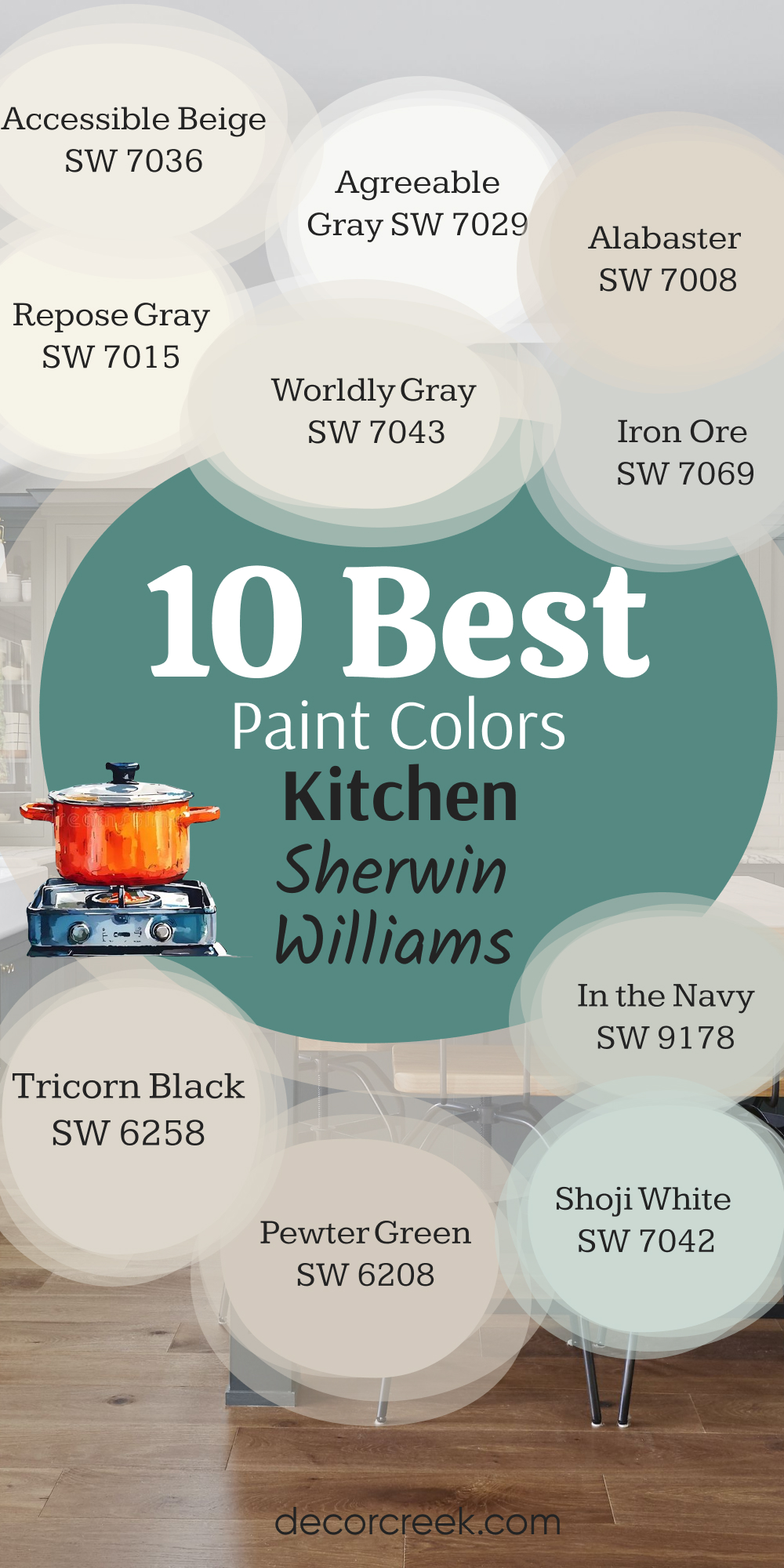
10 Best Bathroom Paint Colors by Sherwin-Williams
Here are 10 dependable colors from Sherwin-Williams that I use again and again to make bathrooms look amazing:
Alabaster SW 7008
Alabaster SW 7008 is my go-to choice for a white that is never cold or stark. This shade has a lovely, creamy warmth that makes small bathrooms feel bright and welcoming without looking yellow. It works well with almost any type of hardware, from shiny chrome to brass. This color brings a soft, pleasant glow, especially when used on both walls and trim for a flowing look.
It is perfect if you want your shower tile or unique flooring to be the main focus. This hue prevents the bright artificial lights in the evening from feeling too harsh.
It provides a clean backdrop that makes colorful towels or artwork really pop. It is a safe choice that always looks expensive and current, regardless of changing fads. This particular white is especially wonderful in bathrooms with natural wood vanities, as it highlights their beautiful grain. This is the ideal white that brings a soft, inviting light into any room.
🎨 Check out the complete guide to this color right HERE 👈

Agreeable Gray SW 7029
Agreeable Gray SW 7029 is the perfect neutral shade that mixes gray and beige beautifully. This shade is a favorite because it stays perfectly balanced, never looking too cold and blue or too warm and yellow. It pairs well with either white or dark cabinets, making it incredibly versatile for any design.
This color offers just enough pigmentation to feel cozy without dominating the room’s fixtures. It looks particularly nice next to marble countertops with gray or tan veining.
This greige works well in both large master bathrooms and tiny powder rooms. It is a fantastic choice if you want one color to run through your whole house for connection. This shade makes every other color you put near it—like green plants or navy towels—look fantastic. It is a trusted color that keeps rooms feeling fresh and sophisticated year after year. This perfect neutral gives your bathroom a polished look that appeals to everyone.
🎨 Check out the complete guide to this color right HERE 👈

Accessible Beige SW 7036
Accessible Beige SW 7036 is a comforting warm neutral that has just a hint of gray to keep it modern. This is the shade I choose when a client wants warmth but doesn’t want anything that looks old-fashioned or dated. This color feels cozy and grounded, like a warm blanket wrapping the room.
It looks wonderful when paired with crisp white trim and oil-rubbed bronze fixtures. This hue is great for large master bathrooms where you want a relaxed, earthy feeling.
It keeps its lovely warm pigment even in rooms that get cooler north-facing light. This beige helps highlight natural textures like wicker baskets and linen curtains. It is perfect if you want to move away from gray but still need a true neutral. This shade brings a feeling of rich comfort and ease into your daily routine. It is a pigment that makes any bathroom instantly feel more inviting.
🎨 Check out the complete guide to this color right HERE 👈

Repose Gray SW 7015
Repose Gray SW 7015 is a versatile gray that leans slightly warm, making it feel very current. This shade has a complexity that allows it to shift beautifully, sometimes showing a hint of beige and sometimes a hint of blue. It is an excellent choice for a contemporary bathroom paired with modern fixtures and clean lines.
This gray is light enough to keep a room feeling open but dark enough to provide contrast against white trim. This pigment works best in a matte or eggshell finish to keep the mood relaxed.
It looks absolutely stunning when you use it on vanity cabinets with a pure white countertop. This shade is a gray that resists looking blue or icy, which is a major benefit in any room. It is a professional favorite for creating a refined and elegant background. This color can handle both gold and silver hardware equally well. It is a beautiful, easy gray that works well in almost every kind of light.
🎨 Check out the complete guide to this color right HERE 👈

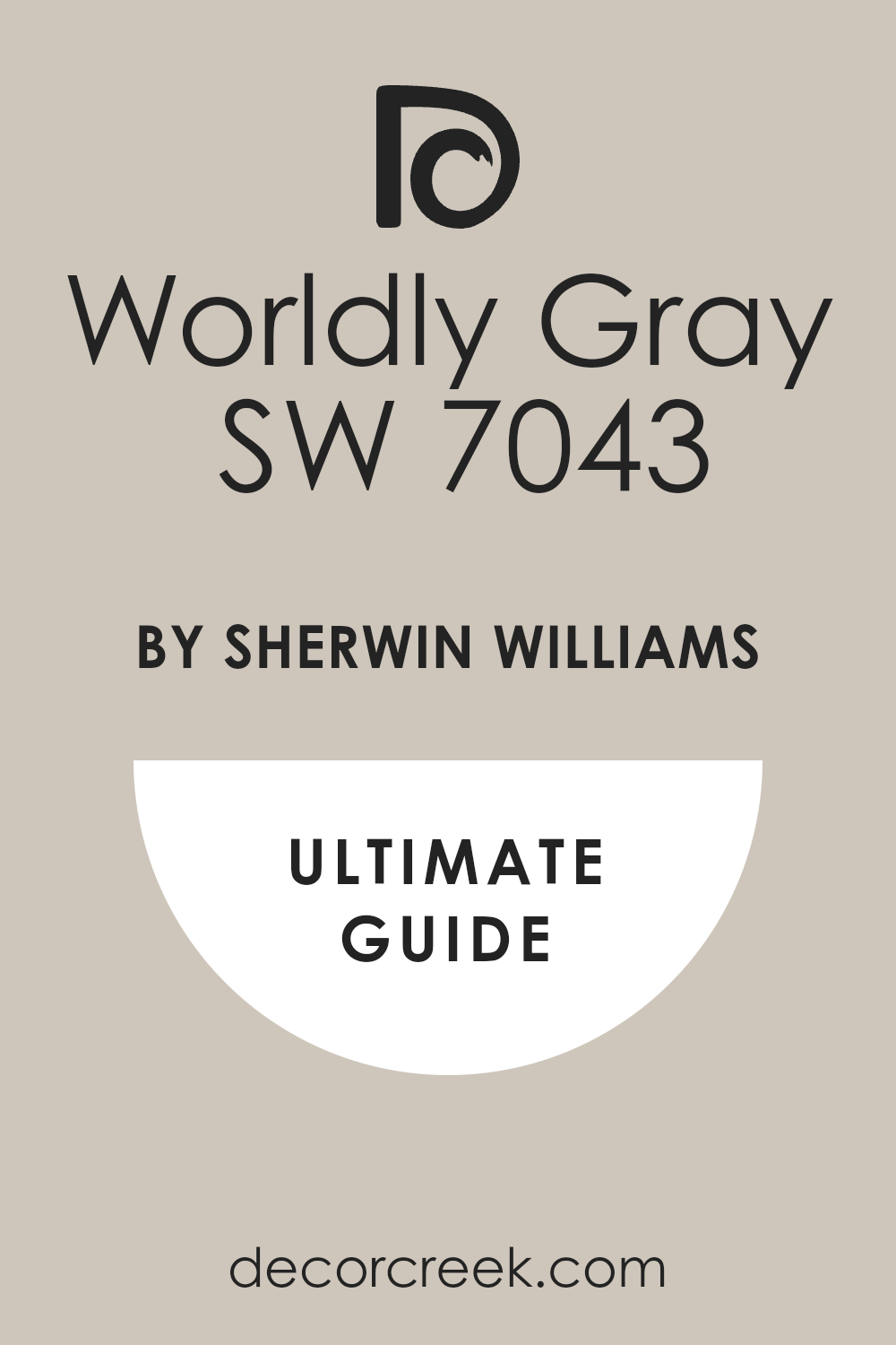
Worldly Gray SW 7043
Worldly Gray SW 7043 is a true balanced gray-beige that never disappoints. This is a reliable medium neutral, making it easy to pair with most flooring and tiles. It is fantastic for hallways that lead into a bathroom, keeping the color flow smooth.
This shade has a grounding quality that makes a bathroom feel settled and complete. It shows its beige side more strongly in sunny rooms and its gray side in dim light.
This pigment is a great solution when you are unsure if you should go with gray or tan. It provides a gentle contrast that highlights architectural details like window frames. This is a safe choice that avoids current fads while still looking utterly modern. It works perfectly for creating a layered look with different shades of white. This dependable color creates a lovely background for daily life.
🎨 Check out the complete guide to this color right HERE 👈
Iron Ore SW 7069
Iron Ore SW 7069 is a dramatic, charcoal gray that is nearly black, offering intense depth. This is the ultimate choice for a small powder room where you want to create a rich, luxurious mood. It makes every piece of metal—especially gold or brass—shine brilliantly against it.
This color has subtle brown undertones that keep it from feeling too cold or stark black. It looks amazing when paired with white subway tile and light wood elements.
This is a daring pigment that brings a sense of high style and sophistication. It makes a strong statement, even when used only on a vanity cabinet or an accent wall. This deep tone needs plenty of artificial light to keep the room from feeling too dark during the evening. It provides a visual punch that guests will definitely remember after they leave. This is an excellent choice if you are ready to be bold and add some serious style.
🎨 Check out the complete guide to this color right HERE 👈

Tricorn Black SW 6258
Tricorn Black SW 6258 is a pure, clean black that makes a powerful statement. This color is best used in a high gloss or semi-gloss finish to reflect light beautifully and make it look intentional. It is stunning on a vanity cabinet for a truly modern and elegant centerpiece.
This shade provides the maximum contrast possible against bright white walls or fixtures. It works well in both masculine and sophisticated feminine bathroom designs.
This is a serious pigment that brings immediate style and visual weight to the room. It is a great color for an accent wall if your bathroom gets a lot of natural light. This hue is a sure way to add a crisp, graphic punch to a neutral design. It is a classic shade that designers use for its ability to define and ground a room. This bold color is perfect for homeowners who love a modern flair.
🎨 Check out the complete guide to this color right HERE 👈

Pewter Green SW 6208
Pewter Green SW 6208 is a deep, grounded green that feels organic and restorative. This is a wonderful choice for creating that popular, spa-like feeling in a master bath. It has a soft, muddy undertone that keeps it from looking too bright or loud.
This shade pairs beautifully with white, cream, and even light gray marble elements. It is perfect for painting cabinets to give a bathroom a custom, expensive appearance.
This hue is a favorite among clients who want to bring a little bit of nature inside their home. It provides a rich pigment that feels soothing and very easy on the eyes. This green looks incredible with antique brass fixtures, giving the room an aged, settled feel. It is a lovely shade that is full of character and visual interest. This color offers a beautiful, rich feeling that never goes out of style.
🎨 Check out the complete guide to this color right HERE 👈

In the Navy SW 9178
In the Navy SW 9178 is a classic, deep navy blue that feels rich and traditional. This is a perfect choice for adding a pop of rich color to a neutral room like a powder bath. It feels sophisticated and refined, especially when paired with polished nickel hardware.
This pigment is fantastic on lower cabinets with a crisp white color on the upper walls. It makes a bold statement without being as severe as a true black.
This is a comforting color that reminds people of deep water and the night sky. It is great for adding depth and personality to a standard builder-grade bathroom. This blue can be used on all walls in a small room to create a cozy, defined mood. It looks stunning with white or light gray tile, which makes the contrast pop. This is a powerful color that always feels tailored and perfectly finished.
🎨 Check out the complete guide to this color right HERE 👈

Shoji White SW 7042
Shoji White SW 7042 is a creamy off-white with warm, pleasing undertones. This shade is a fantastic solution if a pure white feels too bright or cold for your bathroom. It has a gentle warmth that makes it a perfect pairing for natural stone or rustic wood.
This color acts like a soft, neutral blanket, making the room feel cozy and inviting. It is an excellent choice for a master bath where you want a very light but not sterile look.
This pigment ensures that any shadows in the room appear soft gray instead of harsh blue. It is one of the best colors for keeping a room light while adding depth. This shade works well in both traditional and modern homes because it is so balanced. It is a color that brings a lovely, soft light to the walls and trim. This pigment provides the perfect bright background without being glaring or cold.
🎨 Check out the complete guide to this color right HERE 👈

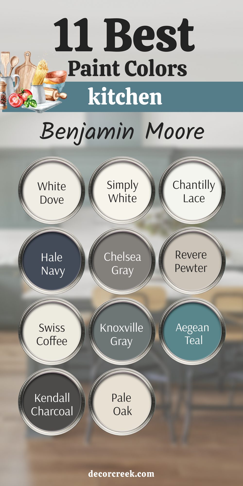
11 Best Bathroom Paint Colors by Benjamin Moore
Here are 11 fantastic colors from Benjamin Moore that designers rely on for creating gorgeous bathrooms:
White Dove OC-17
White Dove OC-17 is a beloved soft white that carries just a hint of creamy warmth. This is a perfect choice if you want a white that feels cozy rather than cold and sterile. It is incredibly versatile and works well on both the walls and the cabinet in different sheens.
This color has a very slight gray undertone that keeps it from ever looking yellow in bright light. It is the top-selling white for a reason: it simply makes every room look clean and refined.
This hue is great for large bathrooms where you want the light to bounce everywhere. It contrasts nicely with dark fixtures while still feeling gentle and welcoming. This is a wonderful color to pair with marble that has warmer veining patterns. It provides a beautiful, airy feel that is essential for a relaxing bathroom. This is a high-quality white that is a classic for both modern and traditional styles.
🎨 Check out the complete guide to this color right HERE 👈

Simply White OC-117
Simply White OC-117 is a clean, crisp white that has a sunny, bright feel. This is the best white for making a smaller room feel bigger and full of light. It has a slight yellow undertone, which makes it feel incredibly lively and cheerful.
This color won the Color of the Year award because it’s so dependable and attractive. It is great for highlighting colorful accessories or artwork on the wall.
This shade feels very clean and pure, making it perfect for a modern, uncluttered look. It is ideal for rooms that don’t get much natural light, as it helps brighten them up. This pigment looks wonderful when used alongside shiny metal fixtures like chrome or polished nickel. It provides a bright background that makes any bathroom look instantly refreshed. This is a truly crisp white that brings pure, beautiful light.
🎨 Check out the complete guide to this color right HERE 👈

Chantilly Lace OC-65
Chantilly Lace OC-65 is the closest you can get to a true, pure white without any strong undertones. This is an excellent choice for a cool, airy, and very contemporary bathroom design. It is often used by designers for trim because of its crisp, clean brightness.
This is the brightest white on this list and reflects the most light in a room. It is great for showcasing pure white or gray marble for a high-end look.
This shade is best used in bright, naturally lit rooms to avoid looking too stark. It makes a beautiful contrast with very dark cabinet colors like navy or black. This color provides a very graphic, defined line when painted next to a wall pigment. It is a fantastic choice for a simple, minimalist design that needs pure color. This brilliant white gives a feeling of pure perfection.
🎨 Check out the complete guide to this color right HERE 👈

Hale Navy HC-154
Hale Navy HC-154 is a famous, rich navy blue that is both classic and striking. This is one of my favorite colors for painting the vanity cabinet in a master bathroom. It has a slight gray undertone that makes it feel serious and traditional, not childish. This color looks amazing when used on all four walls of a small powder room for a jewel box effect.
It contrasts beautifully with bright white countertops and fixtures, making them look even whiter. This pigment is a comforting color that gives a feeling of being enveloped and cozy.
It is a reliable dark color that works well with wood tones and metallic finishes. This blue is a simple way to add depth and sophistication to any bathroom design. It is great for homeowners who want a bold color without committing to black. This is a truly beautiful and dependable navy blue.
🎨 Check out the complete guide to this color right HERE 👈

Chelsea Gray HC-168
Chelsea Gray HC-168 is a medium-dark gray that has a strong, powerful presence. This is a wonderful color for adding weight and a sense of permanence to a bathroom. It works best in a larger bathroom or a room that receives lots of natural light. This color has a rich, earthy undertone that keeps it from feeling too cold or metallic.
It is a very popular choice for painting cabinets or an accent wall in a modern bathroom. This shade provides a great background for showcasing artwork or unique mirror frames.
It is a stylish pigment that looks particularly good next to dark wood furniture pieces. This color gives a refined, sophisticated mood that makes the room feel expensive. It is a dependable dark neutral that complements both warm and cool colors. This strong gray helps ground the entire room’s design.
🎨 Check out the complete guide to this color right HERE 👈

Revere Pewter HC-172
Revere Pewter HC-172 is a classic, light gray-beige that works almost everywhere. This is the original “greige” that designers have relied on for decades due to its perfect balance. It is a perfect choice if you want a neutral that shows off its pigmentation without being too dark.
This color has a wonderful ability to shift its appearance based on the light in the room. It is light enough to keep a small room airy but still rich enough to feel intentional.
This hue is a very popular choice for walls when the cabinet is painted bright white. It is a cozy, warm shade that is never boring or plain. This pigment is a great selection for creating a gentle, flowing feel from room to room. It provides a beautiful, soft look that appeals to almost everyone. This is a famously balanced and dependable neutral color.
🎨 Check out the complete guide to this color right HERE 👈

Swiss Coffee OC-45
Swiss Coffee OC-45 is a famous creamy white that brings a warm, comforting feel. This is a great choice if you find most bright whites too cold or too glaring for your taste. It has a gentle yellow-beige undertone that makes the room feel soft and inviting. This shade is excellent for bathrooms that have dark or rustic wood elements you want to highlight.
It is often used on trim and walls to create a soft, layered look with different paint sheens. This color gives the illusion of candlelight, making the room feel soft and flattering in the evening.
It is a top choice for creating a gentle, vintage or traditional look in the bathroom. This white works well with natural textures like linen, wicker, and natural stone. It is a fantastic choice for giving your bathroom a soft, creamy background. This warm white gives a feeling of rich quality.
🎨 Check out the complete guide to this color right HERE 👈

Knoxville Gray HC-160
Knoxville Gray HC-160 is a deep, complex color that sits between blue, gray, and green. This is a favorite among designers for painting a striking, colorful vanity cabinet. It has a beautiful depth that changes depending on the light hitting the wall. This shade is an excellent choice for a coastal or traditional home where you want a rich color.
It makes a strong statement without being overly bright or distracting. This color works well with white trim and gold or brass hardware for a polished look.
It provides a moody, interesting backdrop for a plain white bathtub or sink. This is a sophisticated pigment that feels custom and perfectly tailored.
It is great for adding personality and depth to a boring or plain bathroom. This is a beautiful, grounded color that is full of character.
Aegean Teal 2136-40
Aegean Teal 2136-40 is a beautiful mix of blue, green, and gray that feels rich and exotic. This shade was a Benjamin Moore Color of the Year because it is so comforting and unique. It is a wonderful choice for a powder room where you can afford to use a bolder pigment.
This color has a vibrant quality that makes it feel cheerful and happy, even when used on all walls. It looks incredible with bright white elements, which makes the color truly pop.
This teal is great for adding a refreshing, vivid look to a plain bathroom. It feels warm and inviting, unlike many other shades of blue. This hue works well in both large and small rooms and is guaranteed to draw attention. It is a fantastic color to pair with natural wood or woven baskets. This is a lively color that is perfect for homeowners who like a bit of fun.
🎨 Check out the complete guide to this color right HERE 👈
Kendall Charcoal HC-166
Kendall Charcoal HC-166 is a deep, handsome charcoal gray with rich, grounding undertones. This is an ideal choice for creating a striking, high-contrast look in a modern bathroom. It is a truly dramatic color that brings immediate visual impact and depth. This color is best used in bathrooms that receive a good amount of daylight to keep the room from feeling too dark.
It has a slightly warm, earthy hint that keeps it from looking like a cold battleship gray. This shade looks amazing when used on a vanity cabinet with white or light gray stone countertops.
It makes metal fixtures, especially chrome and brass, stand out vividly. This is a sophisticated alternative to pure black for a homeowner who wants richness. It provides a powerful backdrop that makes a statement about your design style. This is a seriously beautiful and deep color choice.
🎨 Check out the complete guide to this color right HERE 👈

Pale Oak OC-20
Pale Oak OC-20 is a very light, airy gray-beige that is incredibly gentle. This is a perfect neutral for walls when you want a pigment that is barely there but still has depth. It has a slight hint of pink-violet undertone that makes it feel warm and welcoming. This is an excellent choice for a master bathroom where you want a very soft, soothing atmosphere.
This is a truly beautiful and restful color that makes the room feel soft and open. It works beautifully with white trim and fixtures without creating a harsh contrast.
This shade is light enough to keep the room airy even if you have no natural light at all. This is a soft background pigment that makes every decorative item look better. It is a favorite among designers for creating a refined, light-filled environment. This perfect gentle color gives a feeling of total relaxation.
🎨 Check out the complete guide to this color right HERE 👈

My Final Guide: The Ultimate Bathroom Paint Colors for 2026
Choosing the perfect color for your bathroom means picking a shade that works with the light, matches your fixtures, and makes you happy every time you see it. For 2026, the trend is toward colors that are rich, restful, and deeply personal.
If you love bright and airy rooms, stick to Alabaster SW 7008 or White Dove OC-17. If you are ready for deep, bold color, choose Hale Navy HC-154 or Iron Ore SW 7069. And if you want a perfect neutral that works with everything, you cannot go wrong with Agreeable Gray SW 7029 or Revere Pewter HC-172.
Any of these 21 shades will give your bathroom a professional, stylish look that will last for many years. Which beautiful color will you choose for your home?