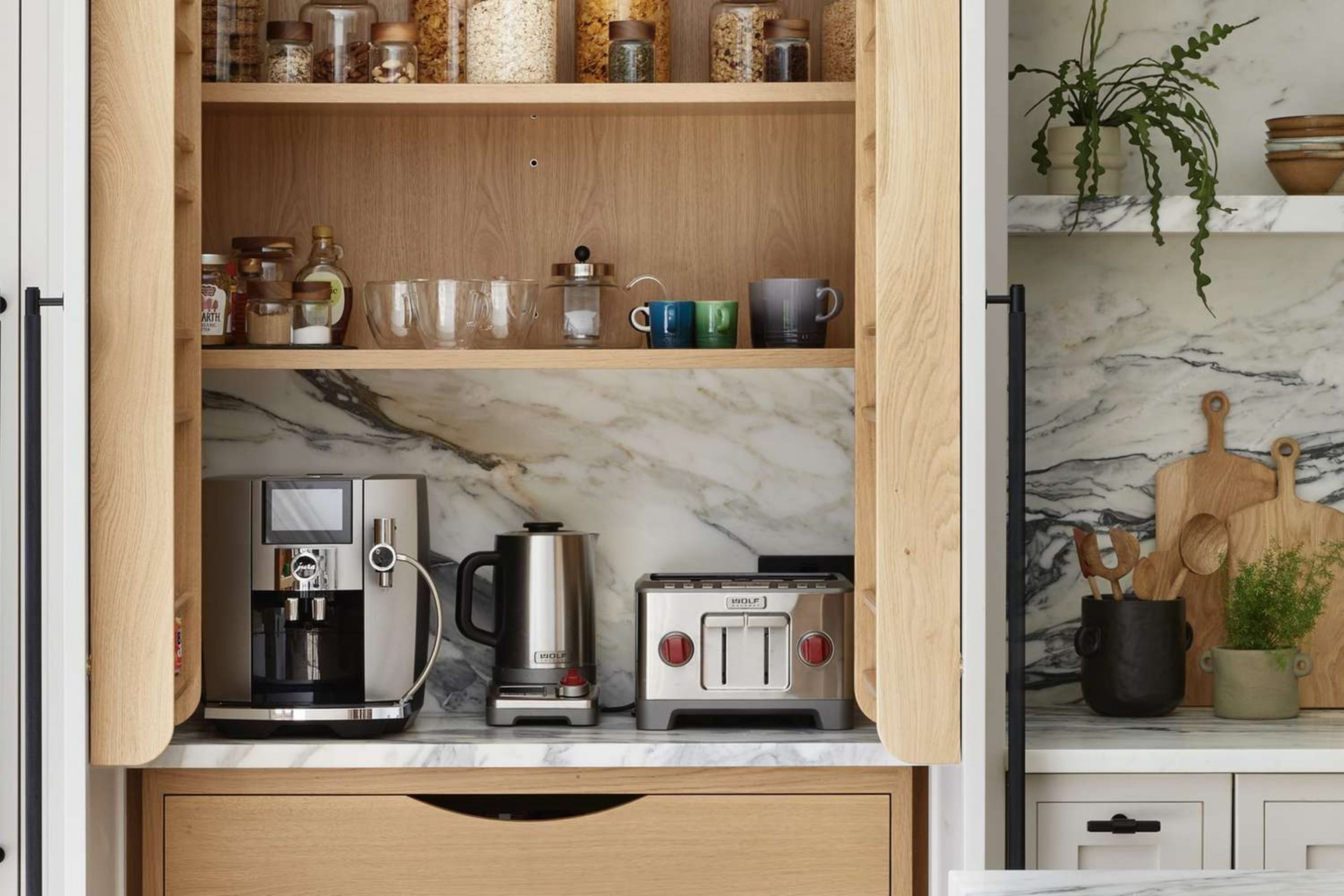
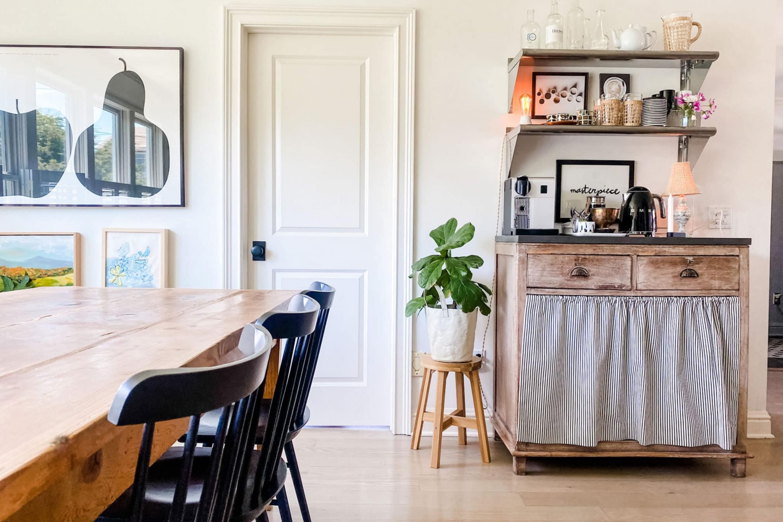
Finding the right look for your morning brew spot makes the whole day start better. I see so many people struggle to pick a paint that works with their machine and mugs.
Your kitchen should feel like your favorite local shop where you actually want to spend time.
Picking a color is the fastest way to make that little corner look like a pro designed it. I want you to feel proud when you walk toward your espresso machine every single morning.
Creating this special spot is about more than just caffeine; it is about how you feel during those first few minutes of the day.
A well-designed nook can make a small kitchen feel much more expensive and organized without a full remodel. I believe that every home deserves a tiny place for joy and great design.
Why I Always Trust Sherwin-Williams and Benjamin Moore for the Best Coffee Station Paint Colors
I have spent years staging houses and I always grab cans from these two brands first. Their paint stays on the wall even when you splash a bit of milk or get steam from the kettle nearby. The colors look exactly like the little paper cards in the store which saves you from big mistakes.
You get a thick coat that hides old marks on your walls with very little work. These brands offer rich pigments that make even a tiny wall look expensive and high-end. I trust them because they make my job easier and your home much prettier.
When you use quality paint, you do not have to worry about the finish fading or peeling from the heat of your coffee equipment. The way these paints grip the surface means your kitchen stays looking fresh for much longer than with cheap alternatives.
I always tell my clients that spending a few extra dollars on the right brand saves hours of frustration later.
How I Choose the Perfect Lasting Shade for an Aesthetic Coffee Station Corner
I look at the light in your kitchen before I ever open a paint lid to ensure the mood is right. A dark corner needs a pick-me-up while a bright sunny spot can handle something very deep and moody. I think about the color of your coffee mugs and your machine to make sure everything matches.
You want a color that makes you feel awake and ready to take on the world. My goal is to find a shade that stays stylish for years so you do not have to repaint next summer. It is all about how that specific wall makes you feel when you are half-awake and waiting for your caffeine fix.
I usually check how the paint looks in the early morning and again under the evening light. This helps me find a balance that feels warm and inviting no matter what time it is.
Your coffee station is the heart of your morning routine, so the color should be something you truly love seeing every single day.
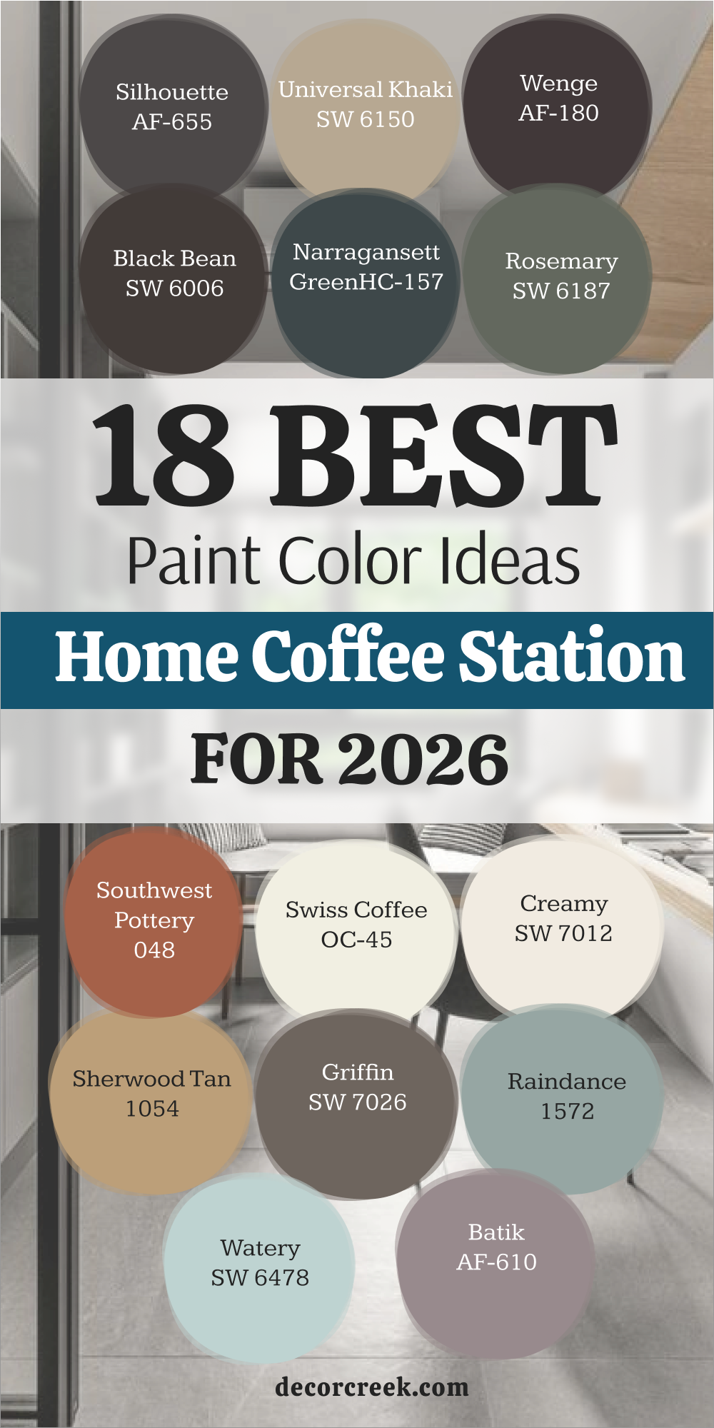
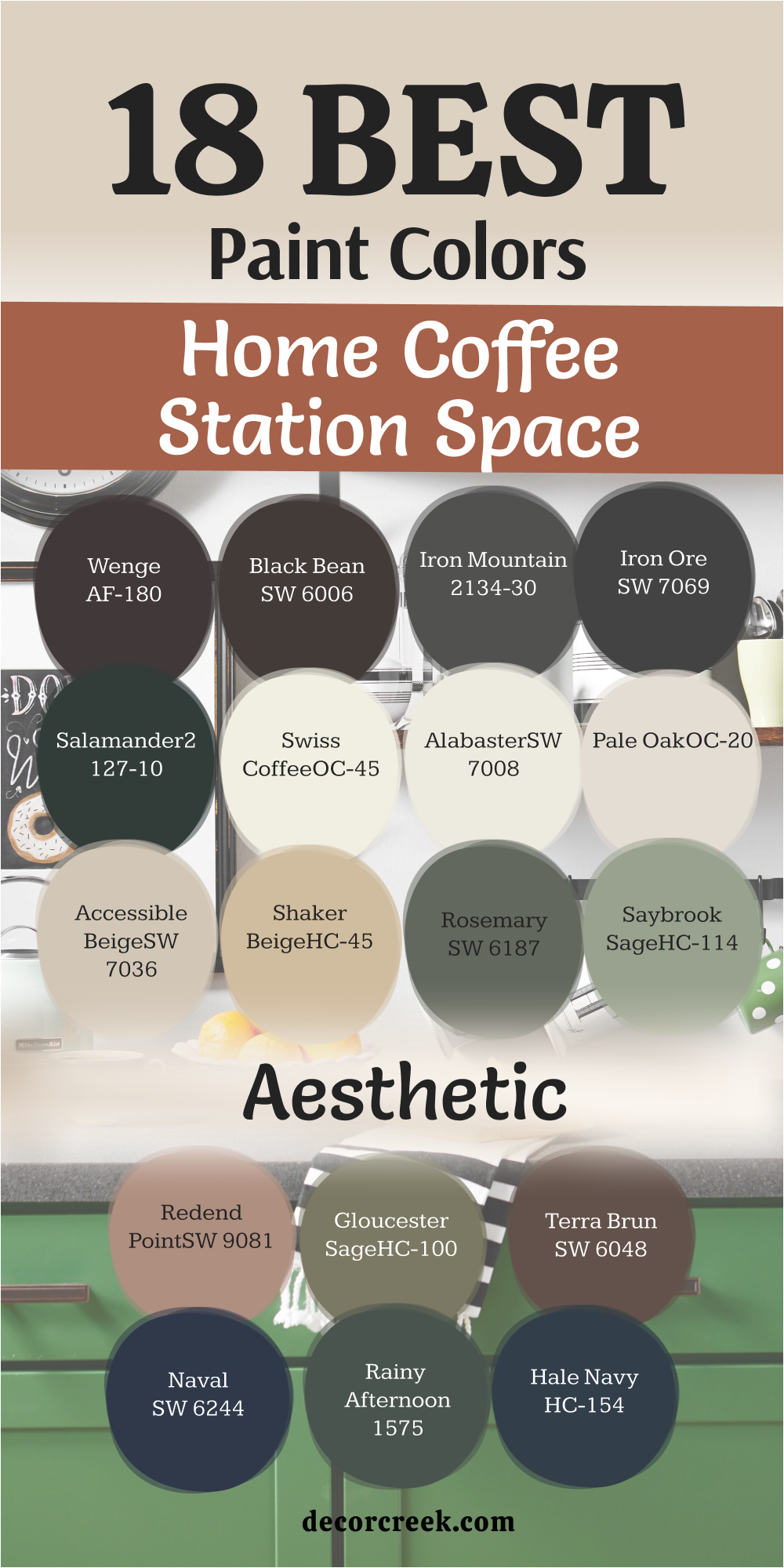
18 Paint Color Ideas For The Home Coffee Station For 2026
Silhouette AF-655
This deep glow looks exactly like a dark roast bean ready for grinding. It works perfectly if you have brass spoons or gold handles on your cabinets. The shade creates a cozy feeling that wraps around you while the water boils.
It hides small stains from coffee grounds better than almost any light shade on the market. The wall looks very fancy when you put it behind white floating shelves for contrast. It makes your silver espresso machine stand out like a piece of art on display.
This hue brings a sense of mystery to a boring kitchen wall that needs life. It feels heavy and solid which gives the corner a lot of character and grit. Using this helps define where the kitchen ends and your coffee zone begins clearly. It is my top pick for a bold 2026 renovation project that needs drama.
Best used in: kitchens, dining rooms, accent walls, and home offices
Pairs well with: Steam AF-15, Silver Satin OC-26, Gray Owl OC-52, and light oak wood The key rule of this color for a bold look is to use it where you want the morning light to feel rich, deep, and focused.
🎨 Check out the complete guide to this color right HERE 👈
Universal Khaki SW 6150
This grounded neutral offers a vibe that reminds me of unbleached coffee filters. It is a smart pick if you want a look that is not just plain white. The tone works well with black metal racks and wooden stirrers for an organic feel.
It feels warm like a fresh muffin sitting on the counter waiting for you. This paint stays looking clean even if the kids touch the walls with sticky hands. It balances out bright overhead lights so they do not feel too harsh at dawn.
People always ask about this color because it feels so inviting and natural to the eye. It makes small kitchens feel larger without losing that cozy kitchen energy we love. The shade matches with almost any tile you already have on your backsplash today. It is the safest bet for a look that stays stylish for a very long time.
Best used in: laundry rooms, entryways, kitchens, and cozy reading nooks
Pairs well with: Shoji White SW 7042, Iron Ore SW 7069, and natural stone textures The key rule of this color for a neutral style is to use it where you want the sun to feel warm, steady, and light.
🎨 Check out the complete guide to this color right HERE 👈

Wenge AF-180
This chocolate punch hits the wall with a feeling that is very rich and expensive. It is the choice I make when a client wants their home to feel like a hotel. There is a tiny bit of purple deep inside that makes it look different throughout the day.
It creates a stunning backdrop for white ceramic pour-over drippers and glass jars. This tone turns a simple shelf into a professional-looking barista station in minutes. It feels soft and velvety once the paint dries on the surface of your wall.
This is the best way to add drama to a small area without painting the room. It helps your colorful coffee canisters pop against the dark and moody background. The finish makes the steam from your milk frother look beautiful in the early light. It is a bold choice that pays off every time you walk into the kitchen.
Best used in: master bedrooms, powder rooms, furniture flips, and coffee nooks
Pairs well with: Chantilly Lace OC-65, Revere Pewter HC-172, and copper accents The key rule of this color for a moody style is to use it where you want the corner to feel dark, private, and high-end.
🎨 Check out the complete guide to this color right HERE 👈

Black Bean SW 6006
This intense shade brings the dark power of a double shot of espresso to your walls. It is an organic choice that feels much softer than a cold industrial black finish. The color looks incredible with light wood shelves or butcher block counters in the kitchen.
It creates a focal point that draws every person toward the coffee machine area. This paint stays looking sharp and clean despite the daily mess of a busy house. It provides a high-contrast look that makes your white mugs shine like new.
The mood feels very modern and sleek for a house built in a busy city. It is a great choice if you want to hide old mismatched cabinet holes or marks. The wall warms up when the sun hits it during the bright afternoon hours. It is a classic dark neutral that never feels out of place in a home.
Best used in: exterior doors, kitchen islands, accent walls, and pantries
Pairs well with: Alabaster SW 7008, Creamy SW 7012, and honey-toned wood The key rule of this color for a modern style is to use it where you want the shadows to feel deep, clean, and strong.
🎨 Check out the complete guide to this color right HERE 👈

Narragansett Green HC-157
This heritage shade feels like a cozy library corner in a very old and grand house. It looks dark blue in some lights and deep green in others during the day. The color gives your coffee station a very stable and traditional feeling for your guests.
It pairs perfectly with old brass grinders and vintage jars found at local shops. This is the color I use to make a new kitchen feel like it has real history. It makes white marble counters look bright and very clean against the dark paint.
The hue stands out as a sophisticated choice for anyone who loves dark and rich tones. It works well if you have a lot of green plants near your coffee equipment. This creates a moody environment that is perfect for slow Sunday mornings at home. It is a color that feels both very trendy and very old-fashioned at the same time.
Best used in: front doors, dining rooms, library shelves, and kitchen cabinets
Pairs well with: Simply White OC-117, Stonington Gray HC-170, and gold hardware The key rule of this color for a classic style is to use it where you want the wall to feel old, heavy, and wise.
🎨 Check out the complete guide to this color right HERE 👈
Rosemary SW 6187
This deep leafy shade brings the garden right into your kitchen corner for a fresh start. It feels very natural and helps you relax while you wait for your morning drink. The paint looks stunning with terracotta pots and handmade clay mugs on the counter.
It is dark enough to be bold but green enough to feel friendly to guests. This color works as a bridge between your indoor area and the trees outside. It makes wood grain look richer and more vibrant than it did with white paint.
This is a popular choice for 2026 because people want more earthy tones inside. It covers walls easily and gives a very smooth finish that feels soft to touch. The look reminds me of fresh herbs and healthy living in a country house. It is the perfect pick for an organic and textured coffee station in any kitchen.
Best used in: cabinets, mudrooms, bedrooms, and accent walls
Pairs well with: Eider White SW 7014, Greige tones, and raw wood elements The key rule of this color for an organic style is to use it where you want the kitchen to feel alive, green, and fresh.
🎨 Check out the complete guide to this color right HERE 👈

Southwest Pottery 048
This baked clay look feels like a warm desert morning before the heat hits. It adds a pop of warmth to a kitchen that feels too white or cold to the touch. The color makes your coffee station feel like an artisan shop in a sunny village.
It looks beautiful with black iron brackets and simple wood planks for shelves. The wall glows when you turn on small under-cabinet lighting in the evening. This is an energetic color that helps you get moving when you feel tired.
It hides dust and fingerprints very well in areas that get used every single day. The shade feels traditional but looks very fresh in a modern or new home. It creates a friendly spot where guests will want to linger and talk for a while. This is my favorite way to add heat without using bright orange or loud yellow.
Best used in: accent walls, kitchens, sunrooms, and furniture
Pairs well with: White Dove OC-17, Black HC-190, and woven baskets The key rule of this color for a warm style is to use it where you want the room to feel sun-baked, dry, and cozy.
Cordovan Brown ES-62
This deep wine color feels very luxurious and mature for a dedicated drink station. It makes a coffee nook look like a secret corner in a fancy city restaurant. The paint pairs well with dark walnut wood and shiny chrome accents on machines.
It brings a lot of moodiness to a kitchen that has plenty of big windows. This shade hides any splashes from dark liquids like coffee or red tea perfectly. It feels very high-end and works as a great conversation starter for visitors.
The richness adds a layer of depth that light colors just cannot provide at all. It looks best when you use it on a single wall right behind your brewer. This creates a bold statement that says you care about good design and style. It is the color for anyone who wants a truly unique and dark coffee nook.
Best used in: dining rooms, bars, studies, and accent walls
Pairs well with: Pure White SW 7005, Tricorn Black SW 6258, and silver metals The key rule of this color for a rich style is to use it where you want the vibe to feel heavy, red, and expensive.
Swiss Coffee OC-45
This creamy white feels like the thick foam on top of a hot latte. It is my most trusted color for making a small kitchen look bright and large. The tone has just enough warmth to keep the corner from feeling like a cold office.
It works with any color of coffee machine you happen to own or buy later. This paint reflects light into the rest of the room to make it feel very open. It makes the texture of wooden shelves and mugs really stand out to the eye.
This is a classic choice that you will never get tired of looking at every day. It feels soft and gentle on the eyes first thing in the early morning light. The finish is very easy to touch up if you ever get a small nick. It is the ultimate backdrop for a clean and tidy coffee station in a small home.
Best used in: whole houses, kitchens, hallways, and trims
Pairs well with: Gray Owl OC-52, Hale Navy HC-154, and warm oak floors The key rule of this color for a clean style is to use it where you want the morning to feel bright, soft, and easy.
🎨 Check out the complete guide to this color right HERE 👈

Creamy SW 7012
This soft off-white feels like a big warm hug in paint form for your kitchen. It is less yellow than some bones but warmer than a bright stark white. The shade makes your coffee station feel like a peaceful part of the main home.
It works perfectly with antique jars and vintage silver spoons on display. This color helps a small kitchen corner feel much less crowded and tight. It is a very forgiving color that hides imperfections in old or bumpy walls.
The look is beautiful when paired with light blue or soft green coffee mugs. It keeps the mood light even on a very rainy or dark winter morning. This is a staple for designers who want a homey and friendly kitchen look. It is the perfect choice for a simple and bright coffee area that feels safe.
Best used in: bedrooms, kitchens, living rooms, and cabinets
Pairs well with: Urban Bronze SW 7048, Naval SW 6244, and antique brass The key rule of this color for a soft style is to use it where you want the kitchen to feel quiet, kind, and light.
🎨 Check out the complete guide to this color right HERE 👈

Sherwood Tan 1054
This golden shade brings a sun-baked energy that feels like a warm afternoon in a cozy cafe. It is the perfect mid-tone for a kitchen that needs a bit of color without being too dark or heavy. The paint makes natural wood grains in your shelving look much deeper and more expensive than they are.
It reminds me of the light brown sugar you might sprinkle on top of a hot latte. This color stays looking fresh even when the kitchen gets busy with breakfast and heavy steam. It provides a steady background that does not distract you from your morning brewing tasks.
The warmth in this hue helps balance out cold stainless steel appliances or white quartz counters. It creates a welcoming vibe that makes guests want to grab a mug and stay for a while. You will notice how it glows beautifully when the morning sun hits that specific corner of the room. It is a reliable and cheerful choice for anyone who wants a kitchen that feels full of life.
Best used in: kitchens, breakfast nooks, hallways, and living rooms
Pairs well with: White Heron OC-57, Van Buren Brown HC-70, and black hardware The key rule of this color for a golden style is to use it where you want the light to feel warm, baked, and very friendly.
Griffin SW 7026
This deep neutral offers a muddy brown tone that feels very solid and grounding for a kitchen. It is much more interesting than a basic gray because it has a hidden warmth that feels like cocoa. The shade looks very sophisticated when paired with white cabinets or light marble backsplashes.
It hides every single splash and fingerprint which makes it great for a high-traffic drink station. This paint provides a professional look that reminds me of a high-end espresso bar in the city. It creates a strong focal point that helps organize all your coffee jars and machines in one spot.
The color feels very stable and does not change much even as the lighting shifts throughout the day. It is a fantastic choice for a modern home that needs a bit of earthy character on the walls. The finish looks rich and thick which gives the whole corner a very high-quality feeling. It is my go-to for a look that is both very bold and very neutral at the same time.
Best used in: exterior trim, study walls, kitchen islands, and accent nooks
Pairs well with: Shoji White SW 7042, Urban Bronze SW 7048, and copper details The key rule of this color for a grounded style is to use it where you want the corner to feel heavy, solid, and very calm.
🎨 Check out the complete guide to this color right HERE 👈

Raindance 1572
This muted blue-green shade brings a restorative feeling to your morning routine before the house gets loud. It has a heavy gray undertone that keeps it from looking like a bright nursery color. The paint looks stunning when paired with light oak shelves and white ceramic coffee drippers.
It creates a soft and cool backdrop that makes the steam from your kettle look almost magical. This color works well in kitchens that have a lot of natural light coming through the windows. It feels very fresh and clean which is exactly what you want when you start your day.
The tone is light enough for a tiny corner but has enough color to make a real statement. It reminds me of a misty morning in a quiet garden where everything is still and peaceful. You can use this color to make a small kitchen feel much more open and airy than it really is. It is a beautiful choice for someone who wants a bit of color that still feels very grown-up.
Best used in: bedrooms, bathrooms, kitchen cabinets, and cozy corners
Pairs well with: Cloud White OC-13, Wedgewood Gray HC-146, and silver accents The key rule of this color for a fresh style is to use it where you want the morning to feel cool, light, and very clean.
Watery SW 6478
This airy blue brings a light and breezy feeling to your coffee station like a clear sky. It is a very cheerful color that helps you wake up with a positive attitude every morning. The shade makes small kitchens feel much larger because it reflects so much light back into the room.
It looks great with white machines and light-colored wood accessories on your counter. This paint feels very restorative and helps lower the stress of a busy morning rush. It is a popular pick for 2026 because it brings a sense of the outdoors into your home.
The color stays looking bright even on dark winter days when the sun is not shining. It provides a clean and crisp background for your collection of colorful coffee mugs. You will love how it makes the whole kitchen feel updated and modern without a lot of effort. It is the perfect choice for a coffee nook that needs to feel light, happy, and very open.
Best used in: bathrooms, sunrooms, laundry areas, and kitchen accents
Pairs well with: Pure White SW 7005, Sea Salt SW 6204, and light blonde woods The key rule of this color for an airy style is to use it where you want the room to feel big, blue, and very bright.
🎨 Check out the complete guide to this color right HERE 👈
Batik AF-610
This dusty mauve-rose brings a soft and sophisticated look that feels like a pink-tinted latte. It is a very unique choice that adds a lot of personality to a small kitchen corner. The shade has a gray base that keeps it from being too sugary or sweet to the eye.
It looks incredible with dark charcoal accents or black coffee equipment on the counter. This color creates a warm and inviting atmosphere that feels very modern and high-end. It is a great way to add a feminine touch that still feels mature and stylish for a kitchen.
The paint hides light dust well and gives the wall a very smooth and velvety appearance. It reminds me of the soft light at sunset when everything feels quiet and relaxed. People will notice this color right away because it is so different from the usual kitchen neutrals. It is a beautiful pick for anyone who wants a coffee station that feels soft, warm, and very artistic.
Best used in: bedrooms, dressing rooms, accent walls, and creative nooks
Pairs well with: Flint AF-560, Steam AF-15, and dark walnut wood The key rule of this color for an artistic style is to use it where you want the vibe to feel soft, pink, and very trendy.
First Crush CSP-310
This tender blush brings a very subtle warmth that feels like the first light of a summer day. It is a very pale shade that acts like a neutral but has a much heartier soul than plain white. The color makes your coffee station feel like a boutique cafe in a big city.
It looks beautiful with brass hardware and white marble tops for a very clean look. This paint helps a cramped kitchen corner feel much more pleasant and less enclosed. It has a glow that makes your skin look good when you are standing there making your brew.
The shade is very easy to live with and does not get tiring even after many years. It provides a soft backdrop that allows your colorful espresso pods and jars to be the stars. You will appreciate how it adds a hint of sweetness to the room without being too loud. It is a perfect choice for a bright and happy coffee area that feels very welcoming.
Best used in: bedrooms, nurseries, kitchens, and small alcoves
Pairs well with: White Opulence OC-69, Gray Owl OC-52, and gold details The key rule of this color for a tender style is to use it where you want the light to feel kind, soft, and very light.
Iron Ore SW 7069
This soft charcoal gray brings a very strong and modern anchor to your kitchen corner. It is a very popular choice because it looks expensive and hides every single mark on the wall. The shade feels much more inviting than a flat black because it has a tiny bit of warmth in it.
It makes your white mugs and silver machines look like high-end gallery pieces on the shelf. This paint creates a very professional barista look that makes the whole house feel updated. It is the best choice for a high-contrast style that feels very bold and intentional.
The color stays looking sharp even when the kitchen is a mess with grounds and beans. It provides a deep background that makes any wood shelf look bright and very high-quality. You will love the way it defines the coffee area as its own special zone in the room. It is a classic choice for a modern and sleek home that wants to look its absolute best.
Best used in: front doors, kitchen islands, accent walls, and cabinets
Pairs well with: Alabaster SW 7008, Extra White SW 7006, and light wood tones The key rule of this color for a strong style is to use it where you want the corner to feel dark, sharp, and very modern.
🎨 Check out the complete guide to this color right HERE 👈

Pale Oak OC-20
This sophisticated greige brings a very light and clean feeling that works in any kitchen. It is one of the most flexible colors I use because it changes with the light to stay perfect. The shade has enough warmth to feel cozy but enough gray to stay very modern.
It makes a small coffee station look tidy and well-organized even with a lot of jars. This paint reflects a lot of light which helps you see what you are doing while brewing. It looks beautiful with both dark and light wood shelves depending on your personal style.
The color is very easy to match with any flooring or tile you already have in place. It feels very high-end and reminds me of a clean and quiet morning in a nice hotel. You can trust this color to stay in style for a very long time without needing a change. It is the ultimate neutral for a coffee nook that needs to feel bright, clean, and very stylish.
Best used in: open floor plans, kitchens, bedrooms, and whole houses
Pairs well with: Chantilly Lace OC-65, Revere Pewter HC-172, and black accents The key rule of this color for a flexible style is to use it where you want the room to feel open, clean, and very easy.
🎨 Check out the complete guide to this color right HERE 👈

18 Aesthetic Paint Colors For The Home Coffee Station Space
Wenge AF-180
This chocolate punch hits the wall with a feeling that is very rich and expensive. It is the choice I make when a client wants their home to feel like a hotel. There is a tiny bit of purple deep inside that makes it look different throughout the day.
It creates a stunning backdrop for white ceramic pour-over drippers and glass jars. This tone turns a simple shelf into a professional-looking barista station in minutes. It feels soft and velvety once the paint dries on the surface of your wall.
This is the best way to add drama to a small area without painting the room. It helps your colorful coffee canisters pop against the dark and moody background. The finish makes the steam from your milk frother look beautiful in the early light. It is a bold choice that pays off every time you walk into the kitchen.
Best used in: master bedrooms, powder rooms, furniture flips, and coffee nooks
Pairs well with: Chantilly Lace OC-65, Revere Pewter HC-172, and copper accents The key rule of this color for a moody style is to use it where you want the corner to feel dark, private, and high-end.
🎨 Check out the complete guide to this color right HERE 👈
Black Bean SW 6006
This intense shade brings the dark power of a double shot of espresso to your walls. It is an organic choice that feels much softer than a cold industrial black finish. The color looks incredible with light wood shelves or butcher block counters in the kitchen.
It creates a focal point that draws every person toward the coffee machine area. This paint stays looking sharp and clean despite the daily mess of a busy house. It provides a high-contrast look that makes your white mugs shine like new.
The mood feels very modern and sleek for a house built in a busy city. It is a great choice if you want to hide old mismatched cabinet holes or marks. The wall warms up when the sun hits it during the bright afternoon hours. It is a classic dark neutral that never feels out of place in a home.
Best used in: exterior doors, kitchen islands, accent walls, and pantries
Pairs well with: Alabaster SW 7008, Creamy SW 7012, and honey-toned wood The key rule of this color for a modern style is to use it where you want the shadows to feel deep, clean, and strong.
🎨 Check out the complete guide to this color right HERE 👈
Iron Mountain 2134-30
This dark gray has a heavy stony feel that makes your kitchen look very solid and well-built. It is the perfect middle ground for someone who wants a dark wall that is not quite black. The color works beautifully with stainless steel machines and gray stone countertops.
It creates a professional look that reminds me of a modern city espresso bar. This paint is very thick and covers up old scuffs or stains on the wall with ease. It makes the bright colors of your coffee pods or tea boxes stand out very clearly.
The shade feels cool and refreshing which helps you wake up on a hot morning. It provides a sharp look that stays in style no matter how much you change your decor. You will notice how it adds a sense of weight and purpose to a small kitchen corner. It is a smart pick for a modern home that needs a clean and strong focal point.
Best used in: kitchen cabinets, front doors, home offices, and accent walls
Pairs well with: Simply White OC-117, Stonington Gray HC-170, and cool wood tones The key rule of this color for a stony style is to use it where you want the corner to feel heavy, cool, and very sharp.
🎨 Check out the complete guide to this color right HERE 👈

Iron Ore SW 7069
This soft charcoal gray brings a very strong and modern anchor to your kitchen corner. It is a very popular choice because it looks expensive and hides every single mark on the wall. The shade feels much more inviting than a flat black because it has a tiny bit of warmth in it.
It makes your white mugs and silver machines look like high-end gallery pieces on the shelf. This paint creates a very professional barista look that makes the whole house feel updated. It is the best choice for a high-contrast style that feels very bold and intentional.
The color stays looking sharp even when the kitchen is a mess with grounds and beans. It provides a deep background that makes any wood shelf look bright and very high-quality. You will love the way it defines the coffee area as its own special zone in the room. It is a classic choice for a modern and sleek home that wants to look its absolute best.
Best used in: front doors, kitchen islands, accent walls, and cabinets
Pairs well with: Alabaster SW 7008, Extra White SW 7006, and light wood tones The key rule of this color for a strong style is to use it where you want the corner to feel dark, sharp, and very modern.
🎨 Check out the complete guide to this color right HERE 👈
Salamander 2050-10
This deep teal-black brings a moody and mysterious look to your morning coffee ritual. It is a very complex color that can look green, blue, or black depending on your light bulbs. The paint makes gold and brass accents look incredibly rich and very expensive.
It creates a dark and cozy corner that feels like a hidden nook in a secret garden. This color is bold enough to make people stop and look whenever they enter the kitchen. It provides a high-end background for a collection of vintage mugs or glass jars.
The shade stays looking fresh and clean even in a busy kitchen with a lot of steam. It adds a lot of character to a boring wall and makes the whole room feel more designed. You will love how it changes throughout the day as the sun moves across your kitchen. It is the perfect choice for someone who wants a dark color with a lot of soul and depth.
Best used in: powder rooms, kitchen islands, study walls, and furniture
Pairs well with: White Dove OC-17, Revere Pewter HC-172, and dark wood textures The key rule of this color for a deep style is to use it where you want the corner to feel dark, green, and very moody.
🎨 Check out the complete guide to this color right HERE 👈

Swiss Coffee OC-45
This creamy white feels like the thick foam on top of a hot latte. It is my most trusted color for making a small kitchen look bright and large. The tone has just enough warmth to keep the corner from feeling like a cold office.
It works with any color of coffee machine you happen to own or buy later. This paint reflects light into the rest of the room to make it feel very open. It makes the texture of wooden shelves and mugs really stand out to the eye.
This is a classic choice that you will never get tired of looking at every day. It feels soft and gentle on the eyes first thing in the early morning light. The finish is very easy to touch up if you ever get a small nick. It is the ultimate backdrop for a clean and tidy coffee station in a small home.
Best used in: whole houses, kitchens, hallways, and trims
Pairs well with: Gray Owl OC-52, Hale Navy HC-154, and warm oak floors The key rule of this color for a clean style is to use it where you want the morning to feel bright, soft, and easy.
🎨 Check out the complete guide to this color right HERE 👈
Alabaster SW 7008
This warm white offers a soft and inviting look that is not too yellow or too cold. It is a very balanced color that makes your coffee station feel like a natural part of the house. The paint reflects a lot of light which is great for small corners that do not have windows.
It looks beautiful with farmhouse-style shelves and woven baskets on the counter. This color stays looking clean and helps your kitchen feel very organized and tidy. It is a favorite among designers because it works with almost every other color in the world.
The shade feels very kind and soft when the sun hits it in the afternoon. It provides a neutral background that allows your colorful mugs and machines to shine. You will appreciate how it makes the whole kitchen feel fresh without being too bright. It is the perfect choice for a coffee nook that needs to feel light, soft, and very inviting.
Best used in: living rooms, kitchens, hallways, bedrooms, and farmhouse exteriors
Pairs well with: Iron Ore SW 7069, Agreeable Gray SW 7029, Natural Linen SW 9109, and warm wood tones The key rule of this color for a farmhouse style is to use it where you want natural light to feel kind, soft, and inviting throughout the day.
🎨 Check out the complete guide to this color right HERE 👈

Pale Oak OC-20
This sophisticated greige brings a very light and clean feeling that works in any kitchen. It is one of the most flexible colors I use because it changes with the light to stay perfect. The shade has enough warmth to feel cozy but enough gray to stay very modern.
It makes a small coffee station look tidy and well-organized even with a lot of jars. This paint reflects a lot of light which helps you see what you are doing while brewing. It looks beautiful with both dark and light wood shelves depending on your personal style.
The color is very easy to match with any flooring or tile you already have in place. It feels very high-end and reminds me of a clean and quiet morning in a nice hotel. You can trust this color to stay in style for a very long time without needing a change. It is the ultimate neutral for a coffee nook that needs to feel bright, clean, and very stylish.
Best used in: open floor plans, kitchens, bedrooms, and whole houses
Pairs well with: Chantilly Lace OC-65, Revere Pewter HC-172, and black accents The key rule of this color for a flexible style is to use it where you want the room to feel open, clean, and very easy.
🎨 Check out the complete guide to this color right HERE 👈
Accessible Beige SW 7036
This reliable neutral brings a warm and earthy feeling that never looks too yellow. It is a very practical color that hides small marks and dust in a busy kitchen area. The shade works perfectly with dark wood counters or black coffee machines.
It makes your coffee station feel like a stable and permanent part of your home design. This paint provides a soft look that is very easy on the eyes when you first wake up. It pairs well with white trim and helps small spaces feel much more comfortable.
The color feels very grounded and reminds me of a warm latte with a lot of milk. It is a popular choice for families because it stays looking good even with a lot of use. You will like how it adds a bit of color to the walls without being too bold or loud. It is a great choice for a kitchen that needs to feel warm, neutral, and very steady.
Best used in: living rooms, kitchens, hallways, and whole home interiors
Pairs well with: Alabaster SW 7008, Urban Bronze SW 7048, and Cadet SW 9143 The key rule of this color for a steady style is to use it where you want the kitchen to feel warm, neutral, and very solid.
🎨 Check out the complete guide to this color right HERE 👈

Shaker Beige HC-45
This deep tan brings a classic and traditional look to your dedicated coffee corner. It has a lot of warmth that makes the kitchen feel very cozy during the cold months. The color looks amazing with copper kettles and wooden bread boards on the counter.
It provides a rich background that makes white cabinets look very crisp and clean. This paint is very forgiving and covers up old wall problems with a thick layer of color. It reminds me of a fresh batch of cookies or a warm caramel sauce for your coffee.
The shade stays looking very solid and does not shift much when you turn on the lights. It creates a very friendly atmosphere where you can enjoy your morning drink in peace. You will appreciate how it adds a sense of history and quality to a newer kitchen. It is a perfect pick for someone who loves a warm, traditional, and very cozy coffee nook.
Best used in: living rooms, kitchens, dining rooms, and traditional homes
Pairs well with: Cloud White OC-13, Hale Navy HC-154, and antique bronze The key rule of this color for a traditional style is to use it where you want the kitchen to feel warm, old, and very cozy.
🎨 Check out the complete guide to this color right HERE 👈

Rosemary SW 6187
This deep leafy shade brings the garden right into your kitchen corner for a fresh start. It feels very natural and helps you relax while you wait for your morning drink. The paint looks stunning with terracotta pots and handmade clay mugs on the counter.
It is dark enough to be bold but green enough to feel friendly to guests. This color works as a bridge between your indoor area and the trees outside. It makes wood grain look richer and more vibrant than it did with white paint.
This is a popular choice for 2026 because people want more earthy tones inside. It covers walls easily and gives a very smooth finish that feels soft to touch. The look reminds me of fresh herbs and healthy living in a country house. It is the perfect pick for an organic and textured coffee station in any kitchen.
Best used in: cabinets, mudrooms, bedrooms, and accent walls
Pairs well with: Eider White SW 7014, Greige tones, and raw wood elements The key rule of this color for an organic style is to use it where you want the kitchen to feel alive, green, and fresh.
🎨 Check out the complete guide to this color right HERE 👈
Saybrook Sage HC-114
This soft green-gray brings a very peaceful and natural feeling to your kitchen wall. It has a dusty look that makes it feel very sophisticated and not too bright or loud. The color looks beautiful with white dishes and light wooden shelves for a clean look.
It reminds me of fresh sage leaves or a quiet morning in the country. This paint helps a small kitchen corner feel more like a special and private zone. It works well with both silver and gold hardware on your coffee machine or cabinets.
The shade feels very refreshing and helps you start your day with a clear mind. It is a classic color that looks great in both old houses and very modern ones. You will love how it brings a hint of the outdoors inside without being too green. It is a perfect choice for a coffee station that needs to feel soft, natural, and very peaceful.
Best used in: bedrooms, bathrooms, kitchen cabinets, and exterior siding
Pairs well with: Simply White OC-117, Revere Pewter HC-172, and dark wood The key rule of this color for a soft green style is to use it where you want the morning to feel cool, green, and very light.
🎨 Check out the complete guide to this color right HERE 👈

Redend Point SW 9081
This sandy rose brings a warm and earthy glow that feels like a desert sunset. It is a very unique neutral that adds a lot of personality to a small kitchen corner. The shade has a lot of brown in it which keeps it from looking too pink or like a nursery.
It looks incredible with black iron accents and natural clay mugs on the shelf. This color creates a very warm and inviting atmosphere for your morning routine. It is a popular pick because it feels very modern but also very grounded and natural.
The paint gives the wall a soft and textured appearance that is very pleasing to the eye. It reminds me of the light on a canyon wall during the late afternoon hours. People will notice this color right away because it feels so artistic and high-end. It is a beautiful pick for anyone who wants a coffee station that feels warm, sandy, and very trendy.
Best used in: accent walls, bedrooms, kitchens, and living rooms
Pairs well with: Kestrel White SW 7516, Foothills SW 7514, and natural textures The key rule of this color for a desert style is to use it where you want the kitchen to feel warm, sandy, and very trendy.
🎨 Check out the complete guide to this color right HERE 👈

Gloucester Sage HC-100
This dark olive-brown brings a very strong and traditional look to your coffee station. It is a heavy color that makes a small corner feel very solid and well-defined. The shade looks amazing with copper accessories and dark walnut shelving.
It reminds me of an old-world cafe or a library in a grand country house. This paint provides a deep and rich background that hides splashes and stains very well. It feels very high-end and adds a lot of quality to a simple kitchen wall.
The color stays looking very consistent and does not change much in different lights. It creates a moody environment that is perfect for a slow and quiet morning brew. You will appreciate how it makes your white mugs and silver machines look very sharp. It is the perfect pick for someone who loves a dark, green, and very traditional coffee nook.
Best used in: exterior siding, kitchen cabinets, libraries, and accent walls
Pairs well with: Simply White OC-117, Stonington Gray HC-170, and brass hardware The key rule of this color for a heavy style is to use it where you want the corner to feel dark, green, and very solid.
🎨 Check out the complete guide to this color right HERE 👈
Terra Brun SW 6048
This deep earthy brown brings a rich and grounded feeling to your kitchen corner. It looks exactly like a dark soil or a heavy piece of dark chocolate on the wall. The color works beautifully with light wood shelves and white ceramic coffee drippers.
It creates a very warm and stable atmosphere that feels very cozy in the morning. This paint is very bold and makes a big statement even in a small area. It hides every single fingerprint and coffee splash which makes it very practical for daily use.
The shade feels very high-quality and gives the corner a professional barista look. It reminds me of a rustic cafe in a small village where everything is handmade. You will love the way it adds a sense of history and warmth to your modern kitchen. It is a perfect choice for a coffee station that needs to feel dark, brown, and very grounded.
Best used in: kitchen islands, front doors, accent walls, and furniture
Pairs well with: Alabaster SW 7008, Accessible Beige SW 7036, and copper accents The key rule of this color for a brown style is to use it where you want the kitchen to feel dark, earthy, and very solid
Hale Navy HC-154
This classic dark blue brings a very high-end and nautical look to your coffee corner. It is one of the most popular dark colors because it always looks sharp and expensive. The shade works perfectly with white marble counters and shiny brass hardware.
It reminds me of a high-end coffee shop on a busy city street corner. This paint provides a strong and stable background that makes your equipment look like art. It is dark enough to be bold but blue enough to feel very clean and crisp.
The color stays looking very modern and does not go out of style over time. It helps define the coffee area as a special and important part of your kitchen design. You will love how it makes the whole room feel more updated and professional. It is a classic choice for a coffee nook that needs to feel dark, blue, and very high-end.
Best used in: kitchen cabinets, front doors, dining rooms, and whole houses
Pairs well with: Simply White OC-117, Coventry Gray HC-169, and gold accents The key rule of this color for a navy style is to use it where you want the corner to feel dark, blue, and very sharp.
🎨 Check out the complete guide to this color right HERE 👈

Naval SW 6244
This deep navy brings a very bold and modern feeling to your dedicated drink station. It is a very strong color that makes a small kitchen wall look very deep and wide. The shade looks incredible with light wood shelves and white ceramic pour-over jars.
It reminds me of the deep ocean or a clear night sky over a quiet house. This paint creates a high-contrast look that makes your silver machines really shine. It is a popular choice for 2026 because it feels very stable and confident on the wall.
The color stays looking very clean and hides any dark splashes from your espresso. It provides a professional look that makes your guests think you hired a designer. You will love how it adds a lot of drama to your home without being too overwhelming. It is the perfect pick for a coffee station that needs to feel dark, blue, and very modern.
Best used in: kitchen islands, bathrooms, front doors, and accent walls
Pairs well with: Alabaster SW 7008, Agreeable Gray SW 7029, and light oak wood The key rule of this color for a bold blue style is to use it where you want the wall to feel dark, blue, and very clean.
🎨 Check out the complete guide to this color right HERE 👈

Rainy Afternoon 1575
This dark blue-green brings a moody and restorative look to your early morning routine. It has a lot of gray in it which makes it feel very sophisticated and not too bright. The color looks stunning with white shelves and gold-colored coffee accessories on the counter.
It reminds me of a quiet day at home when the rain is hitting the windows. This paint helps a small kitchen corner feel like a cozy and private sanctuary. It works well with both dark and light wood textures in your kitchen design.
The shade feels very refreshing and helps you start your day with a peaceful mind. It is a unique color that adds a lot of personality and soul to your coffee station. You will love how it makes the whole corner feel more designed and intentional for your use. It is a beautiful choice for a coffee nook that needs to feel dark, cool, and very peaceful.
Best used in: bedrooms, kitchen cabinets, home offices, and cozy nooks
Pairs well with: Steam AF-15, Silver Satin OC-26, and dark walnut wood The key rule of this color for a rainy style is to use it where you want the morning to feel dark, cool, and very quiet.
🎨 Check out the complete guide to this color right HERE 👈
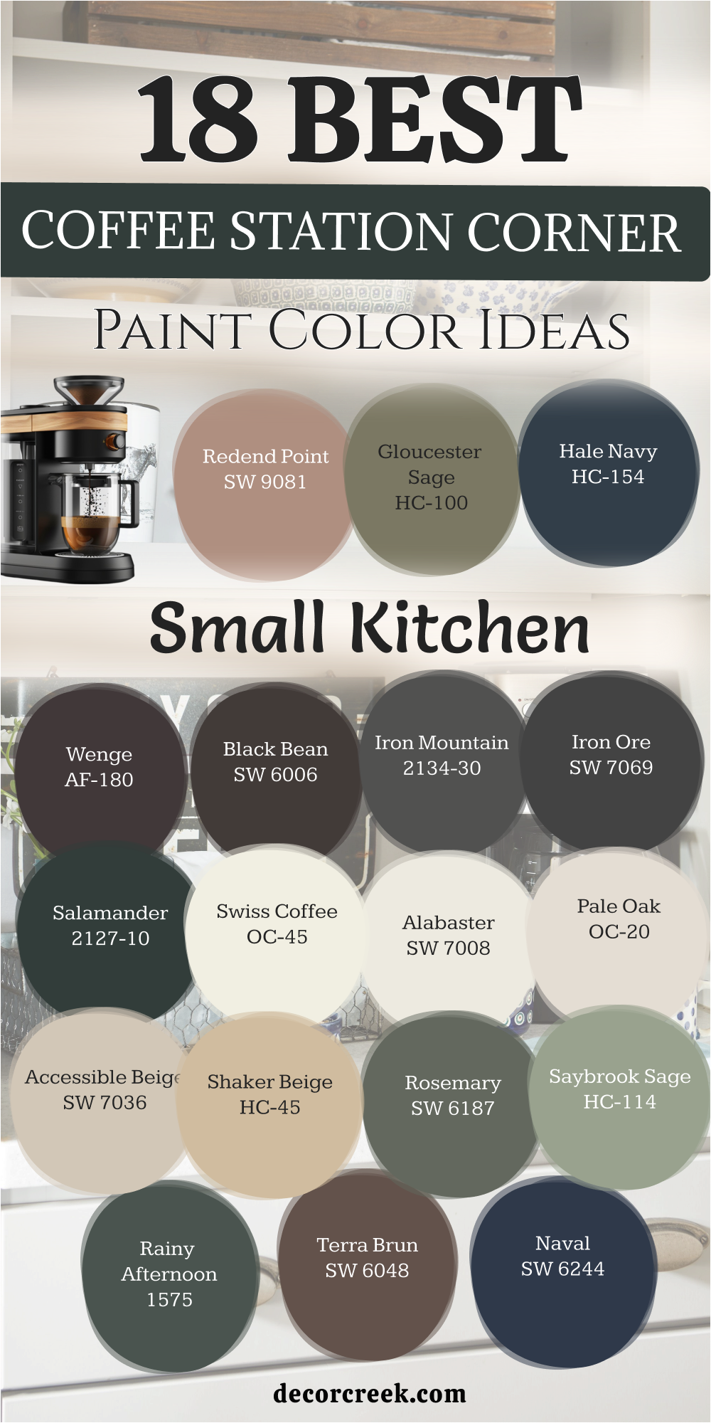
18 Paint Color Ideas For The Coffee Station Corner In The Small Kitchen
Wenge AF-180
This chocolate punch hits the wall with a feeling that is very rich and expensive. It is the choice I make when a client wants their home to feel like a hotel. There is a tiny bit of purple deep inside that makes it look different throughout the day.
It creates a stunning backdrop for white ceramic pour-over drippers and glass jars. This tone turns a simple shelf into a professional-looking barista station in minutes. It feels soft and velvety once the paint dries on the surface of your wall.
This is the best way to add drama to a small area without painting the room. It helps your colorful coffee canisters pop against the dark and moody background. The finish makes the steam from your milk frother look beautiful in the early light. It is a bold choice that pays off every time you walk into the kitchen.
Best used in: master bedrooms, powder rooms, furniture flips, and coffee nooks
Pairs well with: Chantilly Lace OC-65, Revere Pewter HC-172, and copper accents The key rule of this color for a moody style is to use it where you want the corner to feel dark, private, and high-end.
🎨 Check out the complete guide to this color right HERE 👈
Black Bean SW 6006
This intense shade brings the dark power of a double shot of espresso to your walls. It is an organic choice that feels much softer than a cold industrial black finish. The color looks incredible with light wood shelves or butcher block counters in the kitchen.
It creates a focal point that draws every person toward the coffee machine area. This paint stays looking sharp and clean despite the daily mess of a busy house. It provides a high-contrast look that makes your white mugs shine like new.
The mood feels very modern and sleek for a house built in a busy city. It is a great choice if you want to hide old mismatched cabinet holes or marks. The wall warms up when the sun hits it during the bright afternoon hours. It is a classic dark neutral that never feels out of place in a home.
Best used in: exterior doors, kitchen islands, accent walls, and pantries
Pairs well with: Alabaster SW 7008, Creamy SW 7012, and honey-toned wood The key rule of this color for a modern style is to use it where you want the shadows to feel deep, clean, and strong.
🎨 Check out the complete guide to this color right HERE 👈
Iron Mountain 2134-30
This dark gray has a heavy stony feel that makes your kitchen look very solid and well-built. It is the perfect middle ground for someone who wants a dark wall that is not quite black. The color works beautifully with stainless steel machines and gray stone countertops.
It creates a professional look that reminds me of a modern city espresso bar. This paint is very thick and covers up old scuffs or stains on the wall with ease. It makes the bright colors of your coffee pods or tea boxes stand out very clearly.
The shade feels cool and refreshing which helps you wake up on a hot morning. It provides a sharp look that stays in style no matter how much you change your decor. You will notice how it adds a sense of weight and purpose to a small kitchen corner. It is a smart pick for a modern home that needs a clean and strong focal point.
Best used in: kitchen cabinets, front doors, home offices, and accent walls
Pairs well with: Simply White OC-117, Stonington Gray HC-170, and cool wood tones The key rule of this color for a stony style is to use it where you want the corner to feel heavy, cool, and very sharp.
🎨 Check out the complete guide to this color right HERE 👈
Iron Ore SW 7069
This soft charcoal gray brings a very strong and modern anchor to your kitchen corner. It is a very popular choice because it looks expensive and hides every single mark on the wall. The shade feels much more inviting than a flat black because it has a tiny bit of warmth in it.
It makes your white mugs and silver machines look like high-end gallery pieces on the shelf. This paint creates a very professional barista look that makes the whole house feel updated. It is the best choice for a high-contrast style that feels very bold and intentional.
The color stays looking sharp even when the kitchen is a mess with grounds and beans. It provides a deep background that makes any wood shelf look bright and very high-quality. You will love the way it defines the coffee area as its own special zone in the room. It is a classic choice for a modern and sleek home that wants to look its absolute best.
Best used in: front doors, kitchen islands, accent walls, and cabinets
Pairs well with: Alabaster SW 7008, Extra White SW 7006, and light wood tones The key rule of this color for a strong style is to use it where you want the corner to feel dark, sharp, and very modern.
🎨 Check out the complete guide to this color right HERE 👈

Salamander 2050-10
This deep teal-black brings a moody and mysterious look to your morning coffee ritual. It is a very complex color that can look green, blue, or black depending on your light bulbs. The paint makes gold and brass accents look incredibly rich and very expensive.
It creates a dark and cozy corner that feels like a hidden nook in a secret garden. This color is bold enough to make people stop and look whenever they enter the kitchen. It provides a high-end background for a collection of vintage mugs or glass jars.
The shade stays looking fresh and clean even in a busy kitchen with a lot of steam. It adds a lot of character to a boring wall and makes the whole room feel more designed. You will love how it changes throughout the day as the sun moves across your kitchen. It is the perfect choice for someone who wants a dark color with a lot of soul and depth.
Best used in: powder rooms, kitchen islands, study walls, and furniture
Pairs well with: White Dove OC-17, Revere Pewter HC-172, and dark wood textures The key rule of this color for a deep style is to use it where you want the corner to feel dark, green, and very moody.
🎨 Check out the complete guide to this color right HERE 👈
Swiss Coffee OC-45
This creamy white feels like the thick foam on top of a hot latte. It is my most trusted color for making a small kitchen look bright and large. The tone has just enough warmth to keep the corner from feeling like a cold office.
It works with any color of coffee machine you happen to own or buy later. This paint reflects light into the rest of the room to make it feel very open. It makes the texture of wooden shelves and mugs really stand out to the eye.
This is a classic choice that you will never get tired of looking at every day. It feels soft and gentle on the eyes first thing in the early morning light. The finish is very easy to touch up if you ever get a small nick. It is the ultimate backdrop for a clean and tidy coffee station in a small home.
Best used in: whole houses, kitchens, hallways, and trims
Pairs well with: Gray Owl OC-52, Hale Navy HC-154, and warm oak floors The key rule of this color for a clean style is to use it where you want the morning to feel bright, soft, and easy.
🎨 Check out the complete guide to this color right HERE 👈
Alabaster SW 7008
This warm white offers a soft and inviting look that is not too yellow or too cold. It is a very balanced color that makes your coffee station feel like a natural part of the house. The paint reflects a lot of light which is great for small corners that do not have windows.
It looks beautiful with farmhouse-style shelves and woven baskets on the counter. This color stays looking clean and helps your kitchen feel very organized and tidy. It is a favorite among designers because it works with almost every other color in the world.
The shade feels very kind and soft when the sun hits it in the afternoon. It provides a neutral background that allows your colorful mugs and machines to shine. You will appreciate how it makes the whole kitchen feel fresh without being too bright. It is the perfect choice for a coffee nook that needs to feel light, soft, and very inviting.
Best used in: living rooms, kitchens, hallways, bedrooms, and farmhouse exteriors
Pairs well with: Iron Ore SW 7069, Agreeable Gray SW 7029, Natural Linen SW 9109, and warm wood tones The key rule of this color for a farmhouse style is to use it where you want natural light to feel kind, soft, and inviting throughout the day.
🎨 Check out the complete guide to this color right HERE 👈
Pale Oak OC-20
This sophisticated greige brings a very light and clean feeling that works in any kitchen. It is one of the most flexible colors I use because it changes with the light to stay perfect. The shade has enough warmth to feel cozy but enough gray to stay very modern.
It makes a small coffee station look tidy and well-organized even with a lot of jars. This paint reflects a lot of light which helps you see what you are doing while brewing. It looks beautiful with both dark and light wood shelves depending on your personal style.
The color is very easy to match with any flooring or tile you already have in place. It feels very high-end and reminds me of a clean and quiet morning in a nice hotel. You can trust this color to stay in style for a very long time without needing a change. It is the ultimate neutral for a coffee nook that needs to feel bright, clean, and very stylish.
Best used in: open floor plans, kitchens, bedrooms, and whole houses
Pairs well with: Chantilly Lace OC-65, Revere Pewter HC-172, and black accents The key rule of this color for a flexible style is to use it where you want the room to feel open, clean, and very easy.
🎨 Check out the complete guide to this color right HERE 👈
Accessible Beige SW 7036
This reliable neutral brings a warm and earthy feeling that never looks too yellow. It is a very practical color that hides small marks and dust in a busy kitchen area. The shade works perfectly with dark wood counters or black coffee machines.
It makes your coffee station feel like a stable and permanent part of your home design. This paint provides a soft look that is very easy on the eyes when you first wake up. It pairs well with white trim and helps small spaces feel much more comfortable.
The color feels very grounded and reminds me of a warm latte with a lot of milk. It is a popular choice for families because it stays looking good even with a lot of use. You will like how it adds a bit of color to the walls without being too bold or loud. It is a great choice for a kitchen that needs to feel warm, neutral, and very steady.
Best used in: living rooms, kitchens, hallways, and whole home interiors
Pairs well with: Alabaster SW 7008, Urban Bronze SW 7048, and Cadet SW 9143 The key rule of this color for a steady style is to use it where you want the kitchen to feel warm, neutral, and very solid.
🎨 Check out the complete guide to this color right HERE 👈
Shaker Beige HC-45
This deep tan brings a classic and traditional look to your dedicated coffee corner. It has a lot of warmth that makes the kitchen feel very cozy during the cold months. The color looks amazing with copper kettles and wooden bread boards on the counter.
It provides a rich background that makes white cabinets look very crisp and clean. This paint is very forgiving and covers up old wall problems with a thick layer of color. It reminds me of a fresh batch of cookies or a warm caramel sauce for your coffee.
The shade stays looking very solid and does not shift much when you turn on the lights. It creates a very friendly atmosphere where you can enjoy your morning drink in peace. You will appreciate how it adds a sense of history and quality to a newer kitchen. It is a perfect pick for someone who loves a warm, traditional, and very cozy coffee nook.
Best used in: living rooms, kitchens, dining rooms, and traditional homes
Pairs well with: Cloud White OC-13, Hale Navy HC-154, and antique bronze The key rule of this color for a traditional style is to use it where you want the kitchen to feel warm, old, and very cozy.
🎨 Check out the complete guide to this color right HERE 👈
Rosemary SW 6187
This deep leafy shade brings the garden right into your kitchen corner for a fresh start. It feels very natural and helps you relax while you wait for your morning drink. The paint looks stunning with terracotta pots and handmade clay mugs on the counter.
It is dark enough to be bold but green enough to feel friendly to guests. This color works as a bridge between your indoor area and the trees outside. It makes wood grain look richer and more vibrant than it did with white paint.
This is a popular choice for 2026 because people want more earthy tones inside. It covers walls easily and gives a very smooth finish that feels soft to touch. The look reminds me of fresh herbs and healthy living in a country house. It is the perfect pick for an organic and textured coffee station in any kitchen.
Best used in: cabinets, mudrooms, bedrooms, and accent walls
Pairs well with: Eider White SW 7014, Greige tones, and raw wood elements The key rule of this color for an organic style is to use it where you want the kitchen to feel alive, green, and fresh.
🎨 Check out the complete guide to this color right HERE 👈
Saybrook Sage HC-114
This soft green-gray brings a very peaceful and natural feeling to your kitchen wall. It has a dusty look that makes it feel very sophisticated and not too bright or loud. The color looks beautiful with white dishes and light wooden shelves for a clean look.
It reminds me of fresh sage leaves or a quiet morning in the country. This paint helps a small kitchen corner feel more like a special and private zone. It works well with both silver and gold hardware on your coffee machine or cabinets.
The shade feels very refreshing and helps you start your day with a clear mind. It is a classic color that looks great in both old houses and very modern ones. You will love how it brings a hint of the outdoors inside without being too green. It is a perfect choice for a coffee station that needs to feel soft, natural, and very peaceful.
Best used in: bedrooms, bathrooms, kitchen cabinets, and exterior siding
Pairs well with: Simply White OC-117, Revere Pewter HC-172, and dark wood The key rule of this color for a soft green style is to use it where you want the morning to feel cool, green, and very light.
🎨 Check out the complete guide to this color right HERE 👈
Redend Point SW 9081
This sandy rose brings a warm and earthy glow that feels like a desert sunset. It is a very unique neutral that adds a lot of personality to a small kitchen corner. The shade has a lot of brown in it which keeps it from looking too pink or like a nursery.
It looks incredible with black iron accents and natural clay mugs on the shelf. This color creates a very warm and inviting atmosphere for your morning routine. It is a popular pick because it feels very modern but also very grounded and natural.
The paint gives the wall a soft and textured appearance that is very pleasing to the eye. It reminds me of the light on a canyon wall during the late afternoon hours. People will notice this color right away because it feels so artistic and high-end. It is a beautiful pick for anyone who wants a coffee station that feels warm, sandy, and very trendy.
Best used in: accent walls, bedrooms, kitchens, and living rooms
Pairs well with: Kestrel White SW 7516, Foothills SW 7514, and natural textures The key rule of this color for a desert style is to use it where you want the kitchen to feel warm, sandy, and very trendy.
🎨 Check out the complete guide to this color right HERE 👈
Gloucester Sage HC-100
This dark olive-brown brings a very strong and traditional look to your coffee station. It is a heavy color that makes a small corner feel very solid and well-defined. The shade looks amazing with copper accessories and dark walnut shelving.
It reminds me of an old-world cafe or a library in a grand country house. This paint provides a deep and rich background that hides splashes and stains very well. It feels very high-end and adds a lot of quality to a simple kitchen wall.
The color stays looking very consistent and does not change much in different lights. It creates a moody environment that is perfect for a slow and quiet morning brew. You will appreciate how it makes your white mugs and silver machines look very sharp. It is the perfect pick for someone who loves a dark, green, and very traditional coffee nook.
Best used in: exterior siding, kitchen cabinets, libraries, and accent walls
Pairs well with: Simply White OC-117, Stonington Gray HC-170, and brass hardware The key rule of this color for a heavy style is to use it where you want the corner to feel dark, green, and very solid.
🎨 Check out the complete guide to this color right HERE 👈
Terra Brun SW 6048
This deep earthy brown brings a rich and grounded feeling to your kitchen corner. It looks exactly like a dark soil or a heavy piece of dark chocolate on the wall. The color works beautifully with light wood shelves and white ceramic coffee drippers.
It creates a very warm and stable atmosphere that feels very cozy in the morning. This paint is very bold and makes a big statement even in a small area. It hides every single fingerprint and coffee splash which makes it very practical for daily use.
The shade feels very high-quality and gives the corner a professional barista look. It reminds me of a rustic cafe in a small village where everything is handmade. You will love the way it adds a sense of history and warmth to your modern kitchen. It is a perfect choice for a coffee station that needs to feel dark, brown, and very grounded.
Best used in: kitchen islands, front doors, accent walls, and furniture
Pairs well with: Alabaster SW 7008, Accessible Beige SW 7036, and copper accents The key rule of this color for a brown style is to use it where you want the kitchen to feel dark, earthy, and very solid.
Hale Navy HC-154
This classic dark blue brings a very high-end and nautical look to your coffee corner. It is one of the most popular dark colors because it always looks sharp and expensive. The shade works perfectly with white marble counters and shiny brass hardware.
It reminds me of a high-end coffee shop on a busy city street corner. This paint provides a strong and stable background that makes your equipment look like art. It is dark enough to be bold but blue enough to feel very clean and crisp.
The color stays looking very modern and does not go out of style over time. It helps define the coffee area as a special and important part of your kitchen design. You will love how it makes the whole room feel more updated and professional. It is a classic choice for a coffee nook that needs to feel dark, blue, and very high-end.
Best used in: kitchen cabinets, front doors, dining rooms, and whole houses
Pairs well with: Simply White OC-117, Coventry Gray HC-169, and gold accents The key rule of this color for a navy style is to use it where you want the corner to feel dark, blue, and very sharp.
🎨 Check out the complete guide to this color right HERE 👈
Naval SW 6244
This deep navy brings a very bold and modern feeling to your dedicated drink station. It is a very strong color that makes a small kitchen wall look very deep and wide. The shade looks incredible with light wood shelves and white ceramic pour-over jars.
It reminds me of the deep ocean or a clear night sky over a quiet house. This paint creates a high-contrast look that makes your silver machines really shine. It is a popular choice for 2026 because it feels very stable and confident on the wall.
The color stays looking very clean and hides any dark splashes from your espresso. It provides a professional look that makes your guests think you hired a designer. You will love how it adds a lot of drama to your home without being too overwhelming. It is the perfect pick for a coffee station that needs to feel dark, blue, and very modern.
Best used in: kitchen islands, bathrooms, front doors, and accent walls
Pairs well with: Alabaster SW 7008, Agreeable Gray SW 7029, and light oak wood The key rule of this color for a bold blue style is to use it where you want the wall to feel dark, blue, and very clean.
🎨 Check out the complete guide to this color right HERE 👈
Rainy Afternoon 1575
This dark blue-green brings a moody and restorative look to your early morning routine. It has a lot of gray in it which makes it feel very sophisticated and not too bright. The color looks stunning with white shelves and gold-colored coffee accessories on the counter.
It reminds me of a quiet day at home when the rain is hitting the windows. This paint helps a small kitchen corner feel like a cozy and private sanctuary. It works well with both dark and light wood textures in your kitchen design.
The shade feels very refreshing and helps you start your day with a peaceful mind. It is a unique color that adds a lot of personality and soul to your coffee station. You will love how it makes the whole corner feel more designed and intentional for your use. It is a beautiful choice for a coffee nook that needs to feel dark, cool, and very peaceful.
Best used in: bedrooms, kitchen cabinets, home offices, and cozy nooks
Pairs well with: Steam AF-15, Silver Satin OC-26, and dark walnut wood The key rule of this color for a rainy style is to use it where you want the morning to feel dark, cool, and very quiet.
🎨 Check out the complete guide to this color right HERE 👈
My Final Thoughts About 18 Paint Color Ideas For The Home Coffee Station
Designing your coffee station should be a fun project that makes your home feel more like you. You do not need a huge budget to change the mood of your kitchen with a fresh can of paint, as even a small quart of the right shade can completely redefine how you experience your morning ritual.
These 18 colors for 2026 offer a mix of bold drama and soft comfort for any style you like, giving you plenty of options to match your personality and your favorite espresso machine. I always suggest trying a small sample on your wall before you commit to the whole thing because the texture of your walls and the direction of your windows can change how a color looks once it dries.
The way the light hits the paint at 7 AM is the most important test for a coffee nook, as this is the exact moment when you need the environment to feel the most welcoming and supportive. Take your time and choose a shade that makes you smile when the coffee starts to drip, ensuring that your first task of the day happens in a setting that brings you genuine joy.
Your home deserves a little corner that is dedicated just to your happiness and your favorite drink, acting as a personal sanctuary in the middle of a busy house. No matter which brand you pick, these shades will help you create a beautiful and functional part of your kitchen that looks like it was designed by a professional.
I hope this list helps you find the perfect match for your mugs and your morning routine so that every cup feels like a special treat. Making your house look staged and professional starts with these small intentional choices that reflect your high standards and your love for a good brew. By focusing on this one small area, you are creating a lasting impact on the overall feel of your living area and your daily mental well-being.