If you are thinking about refreshing your room with a new paint color, SW 7568 Neutral Ground by Sherwin Williams is a choice worth considering. Before you commit to this shade, let me share some insights about its flexibility and how it could impact the feel of your home.
Neutral Ground is a warm, soft beige that offers a subtle and soothing backdrop for both modern and traditional interiors. I’ve noticed how it beautifully complements a wide range of color schemes and decor styles, making it an excellent base for creative design ideas.
Additionally, it interacts quite dynamically with different lighting conditions, which can significantly affect its appearance throughout the day. Keep in mind that the true essence of this color can best be appreciated in person, so I highly recommend testing it in your room to see how it adapts to its unique characteristics and lighting.
This approach will help you make a well-informed decision that you’ll be pleased with in the long run.
Is Neutral Ground SW 7568 Right for My Home?
Neutral Ground SW 7568 is a color that feels like a warm hug. It’s a soft, light beige that has a gentle hint of gray, which makes it incredibly flexible for many homes. I love this color because it’s like a blank canvas, allowing other elements of the room to shine, yet it’s cozy enough to stand alone as a soothing backdrop.
In terms of interior styles, Neutral Ground really stands out in rooms that aim for a modern, minimalist, or even a farmhouse aesthetic. It brings a sense of calm without being too stark, which is perfect for creating a welcoming environment. For a modern look, I pair it with clean lines and reflective surfaces like glass and metal.
It also looks stunning in a room with exposed wood accents, as in a farmhouse style, adding warmth and a touch of rustic charm.
Materials and textures that go well with Neutral Ground are natural wood, linen, and soft, plush fabrics.
These combinations create a subtle contrast that enriches the room without overpowering it. I’ve seen Neutral Ground walls paired with dark wood floors, and the balance it achieves is just beautiful—neither too bright nor too dim.
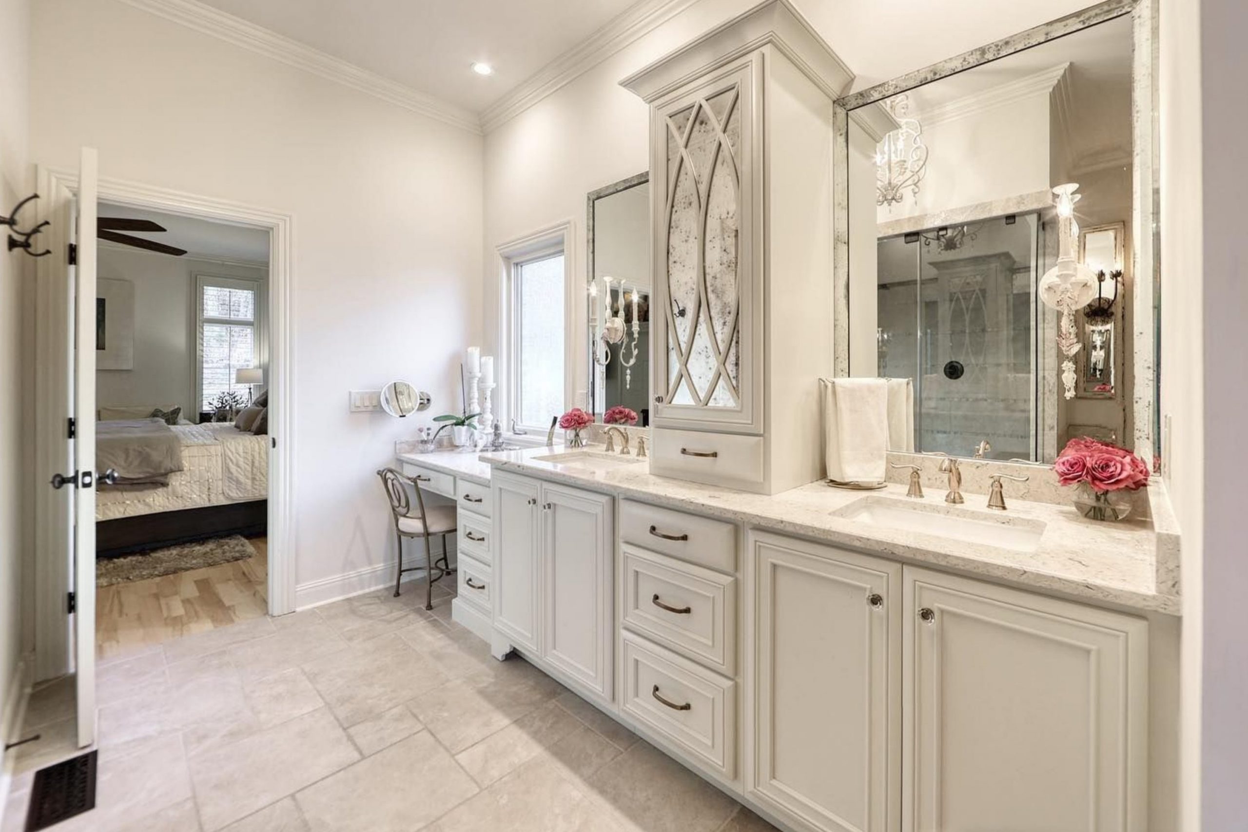
I find that it also pairs nicely with ceramic tiles and stone features, making it a great choice for bathrooms and kitchens too.
decorcreek.com
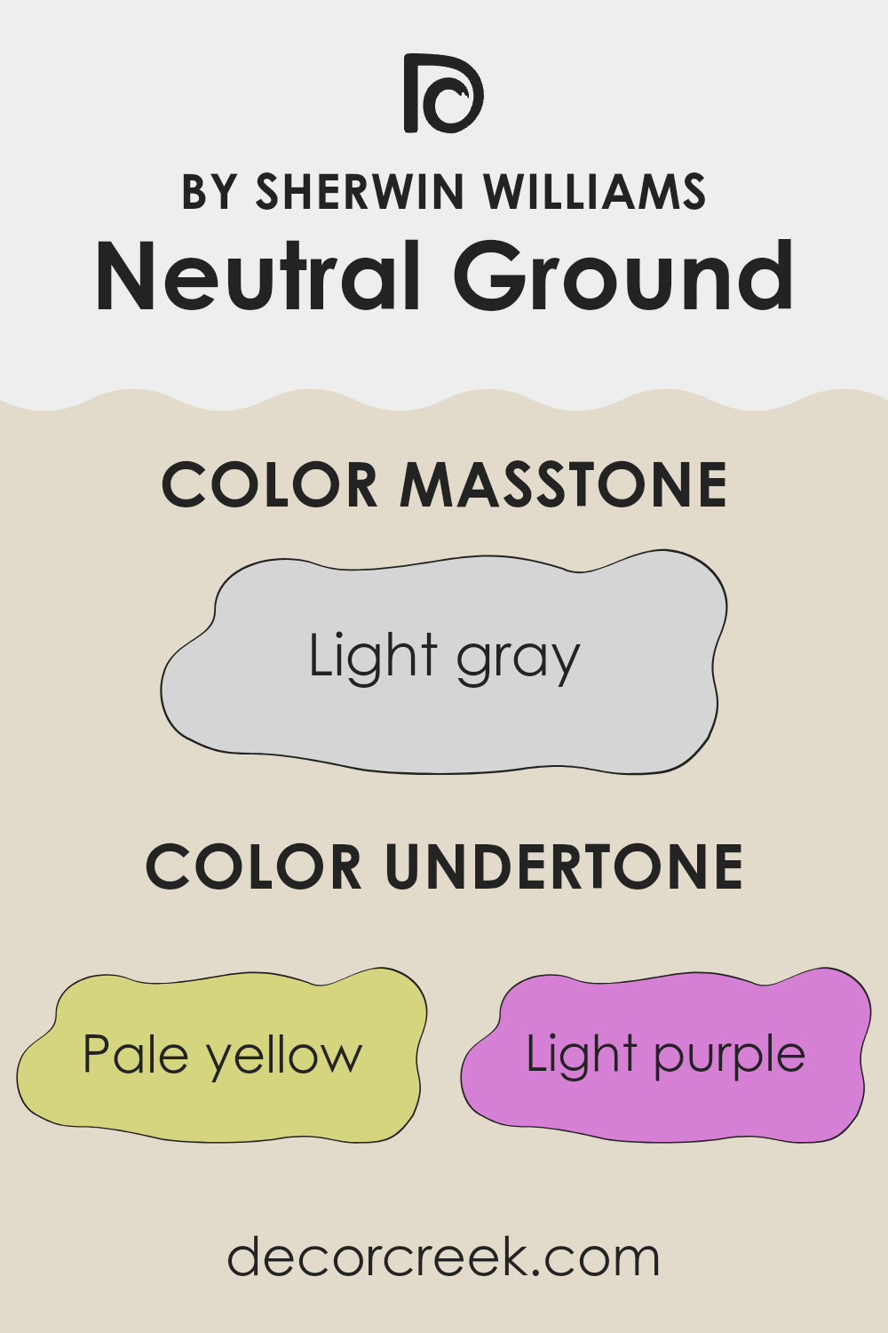
What are the right undertones of Neutral Ground SW 7568 ?
Neutral Ground is a flexible paint color that subtly reflects different hues depending on the lighting and surrounding colors. Its undertones include pale yellow, light purple, light blue, pale pink, mint, lilac, and grey. These undertones are faint color hints that influence how the main shade appears in various conditions.
Undertones play a crucial role in how we perceive color. For instance, a color with a pale yellow undertone may look warmer and more welcoming, while a grey undertone can make a color appear cooler and more neutral. The mixture of undertones in Neutral Ground means that this color can adapt quite flexibly within a room, subtly shifting its appearance based on lighting changes throughout the day and the colors around it.
When Neutral Ground is used on interior walls, its complex undertones interact uniquely with the room’s light and furnishings. In a room with ample natural light, the paler undertones like light blue and mint might become more pronounced, giving the room a fresher feel.
Conversely, in artificial light, the warmer undertones like pale yellow and pale pink might stand out, creating a cozier atmosphere. This makes Neutral Ground a great option for rooms that serve multiple purposes or have varying light conditions. As the color subtly shifts, it supports various decor styles and color schemes, making it a reliable choice for any room.
decorcreek.com
Best Coordinating Colors to use with Neutral Ground SW 7568 by Sherwin Williams this year.
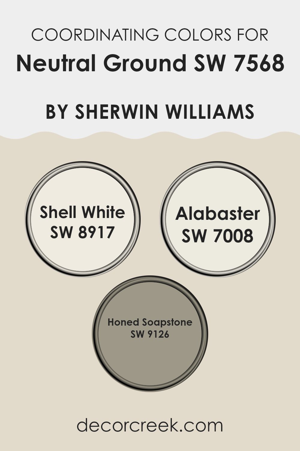
Coordinating colors are selected shades that harmonize well with a main color to enhance the overall aesthetic of a room. When a main color is chosen for a room, such as Neutral Ground, coordinating colors like SW 8917 – Shell White, SW 7008 – Alabaster, and SW 9126 – Honed Soapstone are perfect for adding depth and contrast while maintaining a seamless look. These colors work by balancing the visual appeal, adding subtle diversity without overpowering the primary color. Their role is crucial in achieving a cohesive design scheme.
Shell White is a soft and light hue that complements more grounded tones such as Neutral Ground by providing a clean, refreshing look. It works beautifully on trim or as an option for ceilings to give a lift to the surroundings.
Alabaster, on the other hand, offers a slightly warmer touch, akin to an ivory or off-white that pairs well with a variety of decor elements, creating a cozy and inviting atmosphere. Lastly, Honed Soapstone is a deeper, greyish tone that provides an excellent contrast to Neutral Ground, ideal for accent walls or furniture, adding a firm anchor to the lighter shades in the room. Together, these colors create a harmonious flow through the room, enhancing the overall decorating style.
You can see recommended paint colors below:
- SW 8917 Shell White
- SW 7008 Alabaster
- SW 9126 Honed Soapstone
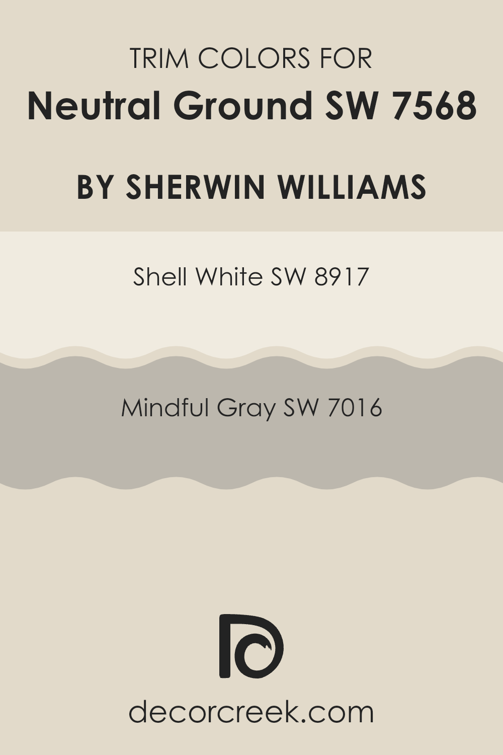
Trendy Trim Colors of Neutral Ground SW 7568 by Sherwin Williams to use this year.
Trim colors are the shades used for the architectural details and accents of a room, including baseboards, door frames, window sills, and crown moldings. Choosing the right trim color is crucial as it frames the room, highlights architectural features, and complements the main wall color, creating a cohesive look and feel.
For a flexible palette like Neutral Ground by Sherwin Williams, selecting complementary trim colors such as Shell White or Mindful Gray enhances the overall aesthetic while providing a subtle contrast that can make the primary color stand out more effectively.
Shell White, with its softly warm hue, adds a gentle brightness to rooms painted in Neutral Ground, making it an ideal choice for a clean and inviting look that isn’t stark or overpowering. On the other hand, Mindful Gray offers a deeper contrast, with a balance of warm and cool tones that enhance depth and definition in a room.
This shade is particularly effective in adding a touch of elegance without overpowering the main color, ensuring that the aesthetics remain light and approachable. This thoughtful use of trim colors can draw the eye to the craftsmanship of your home while harmoniously blending with the main wall color for an integrated appearance.
You can see recommended paint colors below:
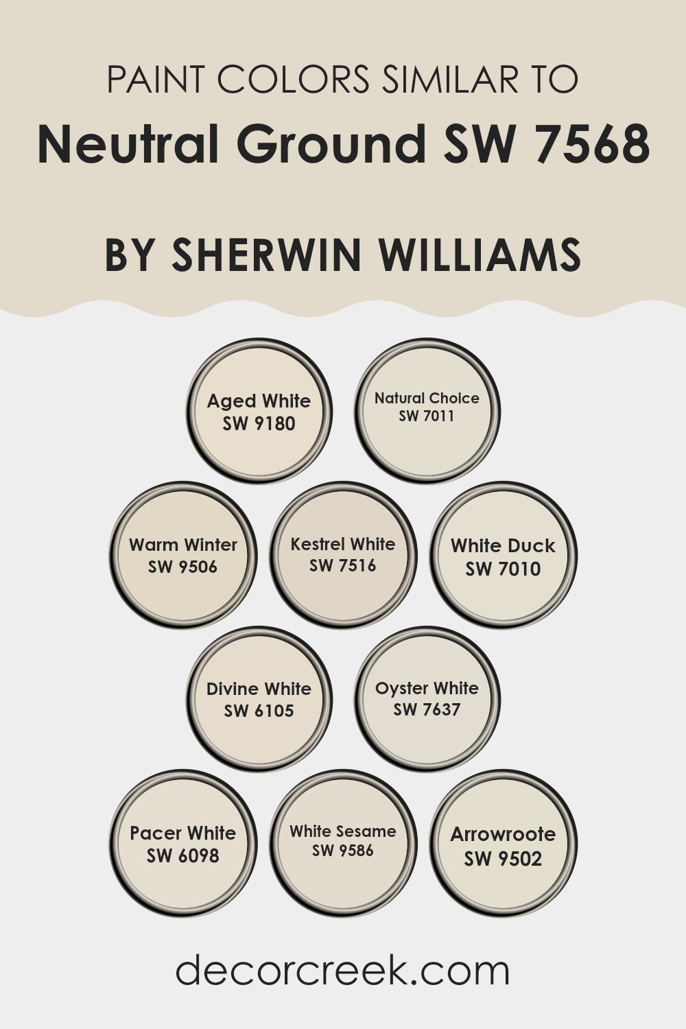
Evergreen Colors Similar to Neutral Ground SW 7568 by Sherwin Williams
Choosing similar colors helps create a harmonious and cohesive look in any room, making the transition between rooms feel seamless and comforting. Similar colors to Neutral Ground by Sherwin Williams, such as Aged White and Natural Choice, play a crucial role in establishing a smooth visual flow. Aged White has a touch of beige, softening rooms with a warm, gentle hue, while Natural Choice offers a slightly deeper tone, providing a subtle backdrop that complements a range of decor styles.
Colors like Warm Winter and Kestrel White add depth and variability when paired together. Warm Winter carries a cozy feel that’s slightly richer than the typical off-white, ideal for creating a welcoming atmosphere. Kestrel White leans toward a gray base, offering a cool contrast to warmer tones while maintaining the light airiness of the room.
Adding shades like White Duck and Divine White can further enhance this palette with their unique undertones; White Duck brings a hint of creaminess, perfect for adding a soft, soothing touch, and Divine White shines with a slight golden glow, enriching rooms with its warm elegance. Oyster White, Pacer White, White Sesame, and Arrowroot each contribute to this collective with their own special traits, from Oyster White’s subtle grayish tint to Arrowroot’s faintly sandy hint, rounding out a spectrum that easily coordinates while allowing each color to stand distinct.
You can see recommended paint colors below:
- SW 9180 Aged White
- SW 7011 Natural Choice
- SW 9506 Warm Winter
- SW 7516 Kestrel White
- SW 7010 White Duck
- SW 6105 Divine White
- SW 7637 Oyster White
- SW 6098 Pacer White
- SW 9586 White Sesame
- SW 9502 Arrowroote
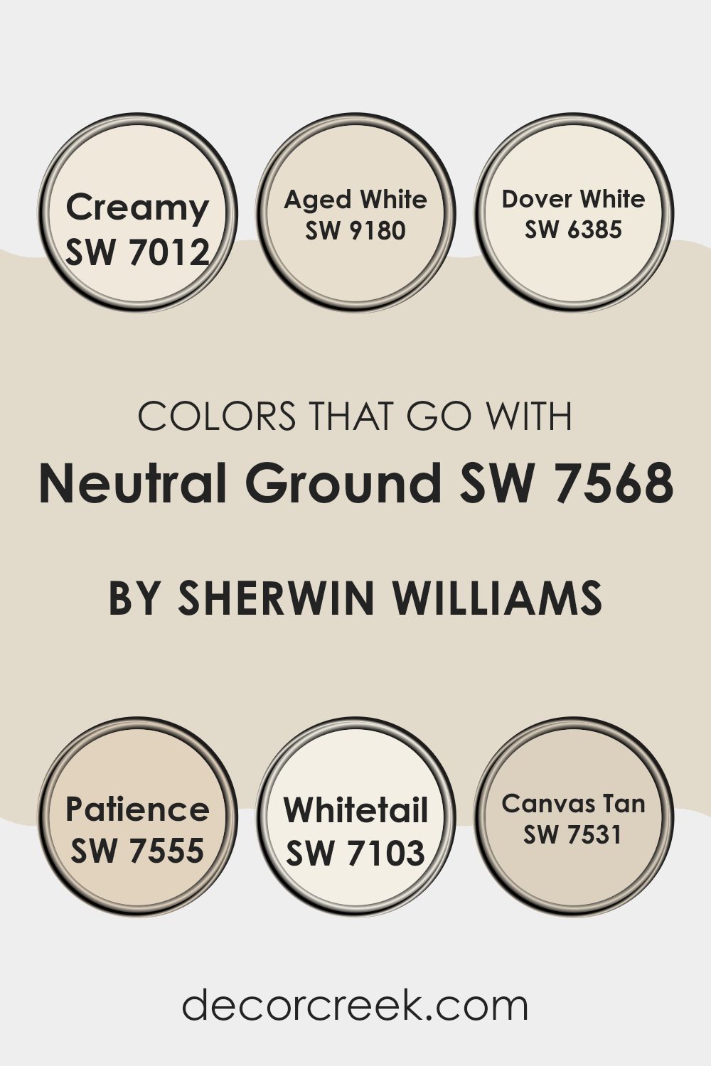
Colors that Go With Neutral Ground SW 7568 by Sherwin Williams
Neutral Ground SW 7568 by Sherwin Williams is a flexible shade that serves as a perfect backdrop for a variety of colors, enhancing the overall appeal and coherence of any room. When paired with compatible colors, Neutral Ground is brought to life, helping to create a cohesive and comfortable atmosphere. Colors such as Creamy SW 7012, Aged White SW 9180, Dover White SW 6385, Patience SW 7555, Whitetail SW 7103, and Canvas Tan SW 7531 are particularly effective partners, each adding its unique charm to the mix.
Creamy SW 7012 is a soft buttery color that adds a gentle warmth, creating a cozy feel when combined with Neutral Ground. Aged White SW 9180 offers a washed-out, almost heritage feel that recalls the beauty of an earlier time, adding a touch of nostalgia to the surroundings. Dover White SW 6385 is a bright, clean white that injects freshness and brightness, contrasting subtly with Neutral Ground.
Patience SW 7555 is a richer, deeper neutral that supports creating a more layered and textured effect. Whitetail SW 7103 offers a stark, clear brightness that helps in lightening up rooms, making them appear larger. Lastly, Canvas Tan SW 7531 is an earthy tone that combines well with Neutral Ground to provide a natural, grounded look. Each of these colors works in harmony with Neutral Ground to create settings that are inviting and visually interesting, proving why matching colors carefully is crucial for any decor.
You can see recommended paint colors below:
- SW 7012 Creamy
- SW 9180 Aged White
- SW 6385 Dover White
- SW 7555 Patience
- SW 7103 Whitetail
- SW 7531 Canvas Tan
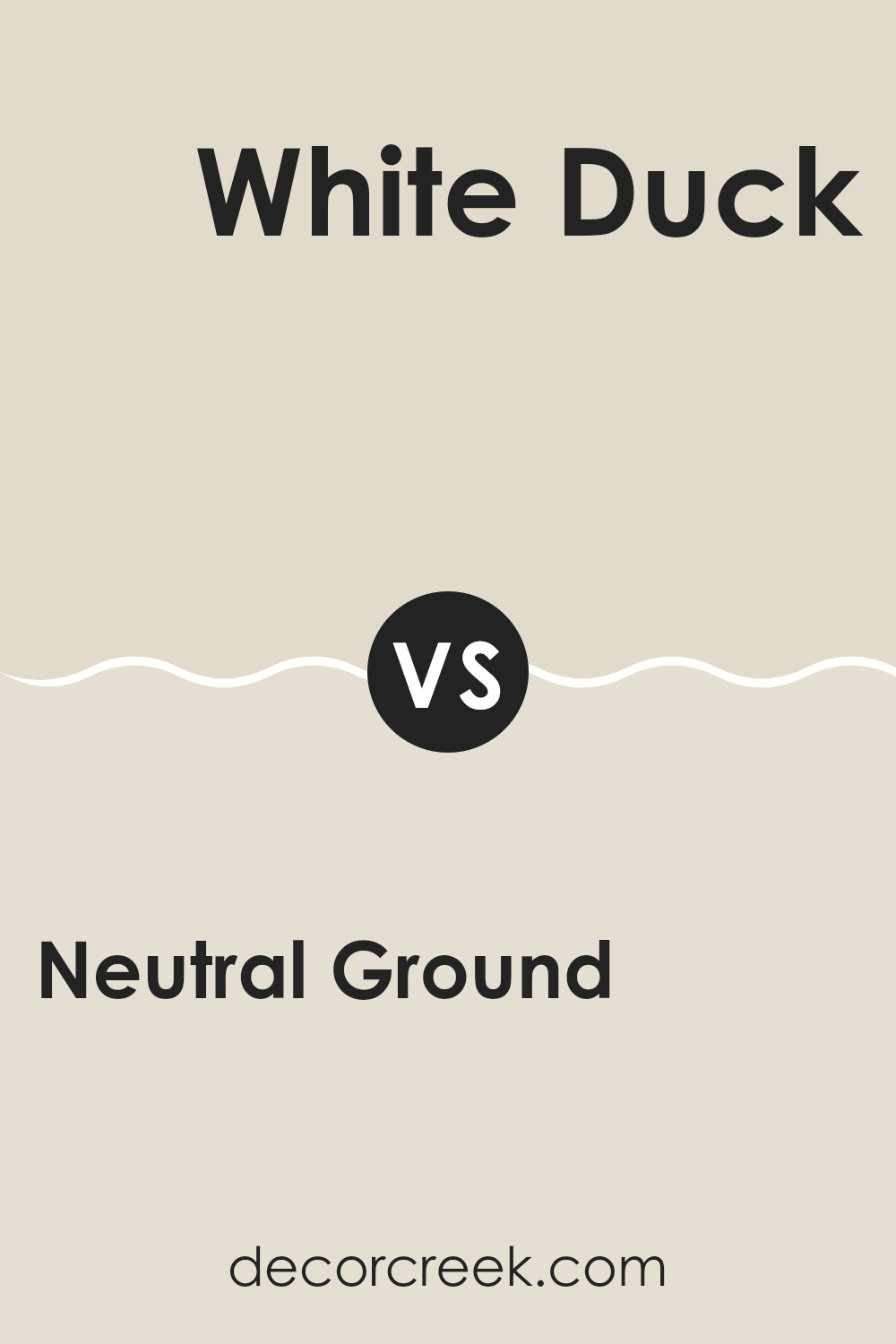
Neutral Ground SW 7568 by Sherwin Williams vs White Duck SW 7010 by Sherwin Williams
Neutral Ground and White Duck are both paints by Sherwin Williams that share a subtle, soothing vibe, but they differ slightly in tone and warmth. Neutral Ground has a warm beige look, making it cozy and inviting for any room, pairing well with various decor styles from modern to classic.
On the other hand, White Duck leans more towards a softer, lighter color with gray undertones. It can make small rooms appear larger and is excellent for creating a clean, airy feel in a home.
While Neutral Ground offers some warmth and depth, White Duck provides a more neutral base, which can be beneficial for highlighting other elements of interior design such as art or furniture. Choose Neutral Ground for a warm, nestled feel, or White Duck if you prefer a fresher, open atmosphere.
You can see recommended paint color below:
Neutral Ground SW 7568 by Sherwin Williams vs Aged White SW 9180 by Sherwin Williams
Neutral Ground and Aged White are two paint colors by Sherwin Williams that both offer a calm and subdued palette, but they have different tones and vibes. Neutral Ground is a light beige color that provides a warm and inviting feel.
It’s a flexible hue that pairs well with a broad range of decor styles and other colors, making it a popular choice for any room. Aged White, meanwhile, leans towards a slightly darker, creamy shade. This color has a hint of yellow, giving it a soft and cozy appearance.
It’s perfect for creating a welcoming atmosphere in rooms like living rooms or bedrooms. While Neutral Ground offers a slightly more modern and fresh look, Aged White provides a traditional feel with its rich, deeper tone. Both colors can work beautifully in different settings depending on the mood you’re aiming to create.
You can see recommended paint color below:
Neutral Ground SW 7568 by Sherwin Williams vs Warm Winter SW 9506 by Sherwin Williams
Neutral Ground and Warm Winter by Sherwin Williams are two unique shades, each bringing its own flair to a room. Neutral Ground is a light beige that provides a soft, subtle backdrop to any room. It works well in rooms that aim for a clean and simple aesthetic, making the room feel relaxed and welcoming without demanding attention.
On the other hand, Warm Winter is a deeper, cozier beige that adds a touch of warmth to the walls it adorns. This color is perfect for creating a cozy ambiance, making it ideal for living areas or bedrooms where you want to feel snug and comfortable.
While both colors share a beige base, Neutral Ground is lighter, enhancing rooms with an airy feel, whereas Warm Winter, being slightly darker, offers a sense of warmth and intimacy. Choosing between them depends on the mood and tone you’re hoping to achieve in your room.
You can see recommended paint color below:
Neutral Ground SW 7568 by Sherwin Williams vs Pacer White SW 6098 by Sherwin Williams
Neutral Ground and Pacer White are two popular colors from Sherwin Williams, each offering a unique backdrop for any room. Neutral Ground is a soft beige with a warm undertone which can make a room feel cozy and inviting. It’s flexible, working well in rooms like living rooms or bedrooms, blending seamlessly with various décor styles.
On the other hand, Pacer White leans towards a creamy white shade with subtle hints of beige, making it slightly warmer than a pure white. This color is excellent for areas that need to feel brighter and more open, such as kitchens or small rooms. It reflects light beautifully, helping to make rooms appear larger.
While both colors are neutral, Neutral Ground offers a slightly deeper hue that can add a touch of warmth to a room, whereas Pacer White is ideal for creating a light, airy feel. Depending on the atmosphere you want to create, either color could be a perfect choice.
You can see recommended paint color below:
Neutral Ground SW 7568 by Sherwin Williams vs Divine White SW 6105 by Sherwin Williams
Neutral Ground and Divine White are both popular paint colors by Sherwin Williams, often chosen for their calming and subtle qualities. Neutral Ground is a soft beige with a slightly gray undertone, making it a very flexible color.
It’s perfect for creating a warm and inviting atmosphere in any room without feeling too heavy or intense. On the other hand, Divine White is a gentler shade, leaning more towards a creamy off-white. This color is ideal for rooms where you want a hint of warmth, but with a brighter, more open feel. Both colors work well in different lighting situations and pair easily with other hues.
However, Divine White tends to lighten up rooms more significantly than Neutral Ground, which offers a bit more depth and warmth. Overall, choosing between the two depends on how much warmth or brightness you want to introduce into your room.
You can see recommended paint color below:
Neutral Ground SW 7568 by Sherwin Williams vs White Sesame SW 9586 by Sherwin Williams
Neutral Ground and White Sesame, both by Sherwin Williams, each offer their unique shade ideal for distinct decorative moods. Neutral Ground stands out as a soft, warm beige that provides a cozy and inviting feel ideal for creating a comfortable and grounded environment. Its subtle hint of warmth perfectly complements various decor styles, making it a flexible choice for any living room.
On the other hand, White Sesame is a lighter color with a cooler tone. It resembles a very light gray or off-white, providing a clean and fresh look that can make small rooms appear larger and brighter. This color is perfect for modern rooms or places where you want a crisp, minimalistic aesthetic without going pure white.
Both colors work well in different settings, with Neutral Ground leaning towards traditional and rustic tones and White Sesame more suited for contemporary, minimal designs. The choice between them depends on the mood you want to set and the characteristics of the room you’re decorating.
You can see recommended paint color below:
Neutral Ground SW 7568 by Sherwin Williams vs Natural Choice SW 7011 by Sherwin Williams
Neutral Ground SW 7568 and Natural Choice SW 7011, both by Sherwin Williams, are two colors that provide a subtle and warm feel to any room. Neutral Ground has a slightly beige tone which gives it a warm presence without being too dark or overpowering. It’s a great choice for those looking for something soft that still adds a touch of warmth to their rooms.
On the other hand, Natural Choice is a lighter shade, leaning more towards a soft, off-white. It’s perfect if you want to brighten up a room while maintaining a cozy, inviting atmosphere. Virtually neutral, it pairs well with almost any decor and brings a fresh, clean look to the interior.
Both colors are incredibly flexible and work well in a variety of settings, whether you aim to paint a sunny living room or a quiet bedroom. Deciding between them would depend on how much warmth and depth you want to introduce into your room.
You can see recommended paint color below:
Neutral Ground SW 7568 by Sherwin Williams vs Kestrel White SW 7516 by Sherwin Williams
Neutral Ground and Kestrel White are both colors by Sherwin Williams that offer subtle and calm tones for any room. Neutral Ground is a light beige that leans towards a warm gray, making it a flexible choice for rooms where you want a cozy yet bright atmosphere. It’s great for living areas and bedrooms as it pairs well with both bright and dark accents.
On the other hand, Kestrel White is a bit cooler compared to Neutral Ground. It still belongs to the neutral palette but has a slight undertone of green, which gives it a fresh feel. This color is excellent for rooms that get a lot of natural light, as it can enhance the openness and airy feel of the room.
Both colors work well in a variety of decorating styles, from modern to traditional, and can be used for walls, trim, or cabinets. However, if you’re aiming for a warmer, inviting look, Neutral Ground might be the better choice, while Kestrel White could be preferable for a cleaner, crisp backdrop.
You can see recommended paint color below:
Neutral Ground SW 7568 by Sherwin Williams vs Arrowroote SW 9502 by Sherwin Williams
Neutral Ground and Arrowroot are both paint colors from Sherwin Williams, offering distinct vibes for different decorating needs. Neutral Ground is a light beige that has a warm, welcoming feel, perfect for making a room feel cozy and inviting without being too bold. It’s very flexible and can work well in any room, complementing various decor styles and color palettes.
On the other hand, Arrowroot is a shade that leans more towards a muted ivory with a subtle hint of yellow. This color is great for rooms where you want to add a touch of brightness while keeping the overall palette soft and light. It’s especially good in rooms that get a lot of natural light, as it can make the room appear more airy and open.
Both colors are great choices if you’re looking for neutral options that provide a clean and calm background, but the warmth of Neutral Ground is better for a cozy atmosphere, while the lighter, brighter Arrowroot is ideal for creating a more open and airy feel.
You can see recommended paint color below:
Neutral Ground SW 7568 by Sherwin Williams vs Oyster White SW 7637 by Sherwin Williams
Neutral Ground and Oyster White are both subtle, calming colors from Sherwin-Williams, each offering a unique feel for interior rooms. Neutral Ground is a warm beige with earthy undertones that create a cozy and welcoming vibe. It’s very adaptable, making it an excellent choice for any room, complementing various decor styles and other colors easily.
On the other hand, Oyster White is a lighter, softer shade, akin to an off-white with gray undertones. This color provides a clean and airy feel, ideal for making smaller rooms appear larger and brighter. It’s perfect for those looking for a minimalist or modern look without the starkness of pure white.
Together, these colors can work harmoniously to set a relaxed mood while offering a subtle contrast – warm versus cool – allowing you to highlight specific areas or features of a room. Each paint is flexible enough to be used across various settings, from bedrooms and living rooms to kitchens.
You can see recommended paint color below:
After studying SW 7568 Neutral Ground by Sherwin Williams, I’ve learned a lot about this paint color and what makes it special. Neutral Ground is a very calm color that isn’t too bright or too dark, making it perfect for any room in your house. It works well in places like the living room or bedroom because it makes these areas feel warm and welcoming.
This color is unique because it can match with almost everything. Whether you have dark furniture or bright curtains, Neutral Ground will still look good. It’s like a friendly color that gets along with other colors easily. People often choose it for their homes because it makes decorating simple. You can add colorful pillows or artwork, and everything still looks nice together.
Another great thing about Neutral Ground is how it changes with the light. During the day, it can look a little lighter, and at night, it gives off a cozy feel. This means it’s not just one color all the time; it sort of changes and adapts, which is pretty cool.
In conclusion, Neutral Ground by Sherwin Williams is a great choice if you want a paint color that is easy to work with and looks good always. It’s a friendly color that makes your rooms feel just right, not too bright and not too dark, and it helps everything else in the room stand out in a good way. It’s definitely a smart pick for anyone thinking about giving their home a new look.
decorcreek.com
Ever wished paint sampling was as easy as sticking a sticker? Guess what? Now it is! Discover Samplize's unique Peel & Stick samples.
Get paint samples

