Choosing the right paint color for your home can feel challenging with so many shades available. Today, I want to share some essential tips about SW 7562 Roman Column by Sherwin Williams, a popular choice that might catch your interest.
As you consider this warm and flexible off-white shade, you’ll want to think about the lighting in your room. Natural light brings out the subtle nuances of Roman Column, making it appear brighter during the day. In the evening, under artificial lighting, it tends to take on a cozier, creamier tone.
Another crucial aspect to consider is the existing colors in your room, including your furniture and decor. Roman Column pairs beautifully with soft pastels and bold hues alike, giving you flexibility in your design choices. It’s also important to test the paint in your specific room. Purchase a sample to apply on different walls to observe how it changes throughout the day under varying light conditions.
Lastly, think about the finish you prefer. A matte finish will give a softer look, while a glossier finish can make the room feel more vibrant. Each finish affects the way light interacts with the paint, so consider what atmosphere you want to create in your room.
Armed with these tips, you’re better prepared to decide if SW 7562 Roman Column is the right choice for your decorating project.

Is Roman Column SW 7562 Right for My Home?
Roman Column by Sherwin Williams is a gentle off-white color with soft, creamy undertones. It’s a flexible shade that’s warm and inviting, making it perfect for creating a cozy atmosphere in a home. I find that it brings a sense of calm without being too stark, unlike a pure white.
This color works beautifully in a variety of interior styles. It’s particularly ideal for modern farmhouse, traditional, and transitional decor. It provides a subtle backdrop that complements bold accent colors and can be styled in different ways depending on the accessories and furniture you pair with it.
In terms of materials, Roman Column pairs well with natural wood, adding warmth and a touch of rustic charm to rooms. In a kitchen or living room, pairing it with exposed wooden beams or hardwood floors can really highlight its creamy warmth. For a more refined look, I love using it with white marble or polished granite. The contrast between the softness of the paint and the gloss of these materials creates an appealing balance.
Textures such as linen or wool also match well with Roman Column. These materials bring in depth and interest, ensuring the room feels welcoming and not too flat. Soft upholstery or heavy drapes in these textures make rooms feel more lived-in and cozy, perfectly complementing the paint’s creamy nature.
decorcreek.com
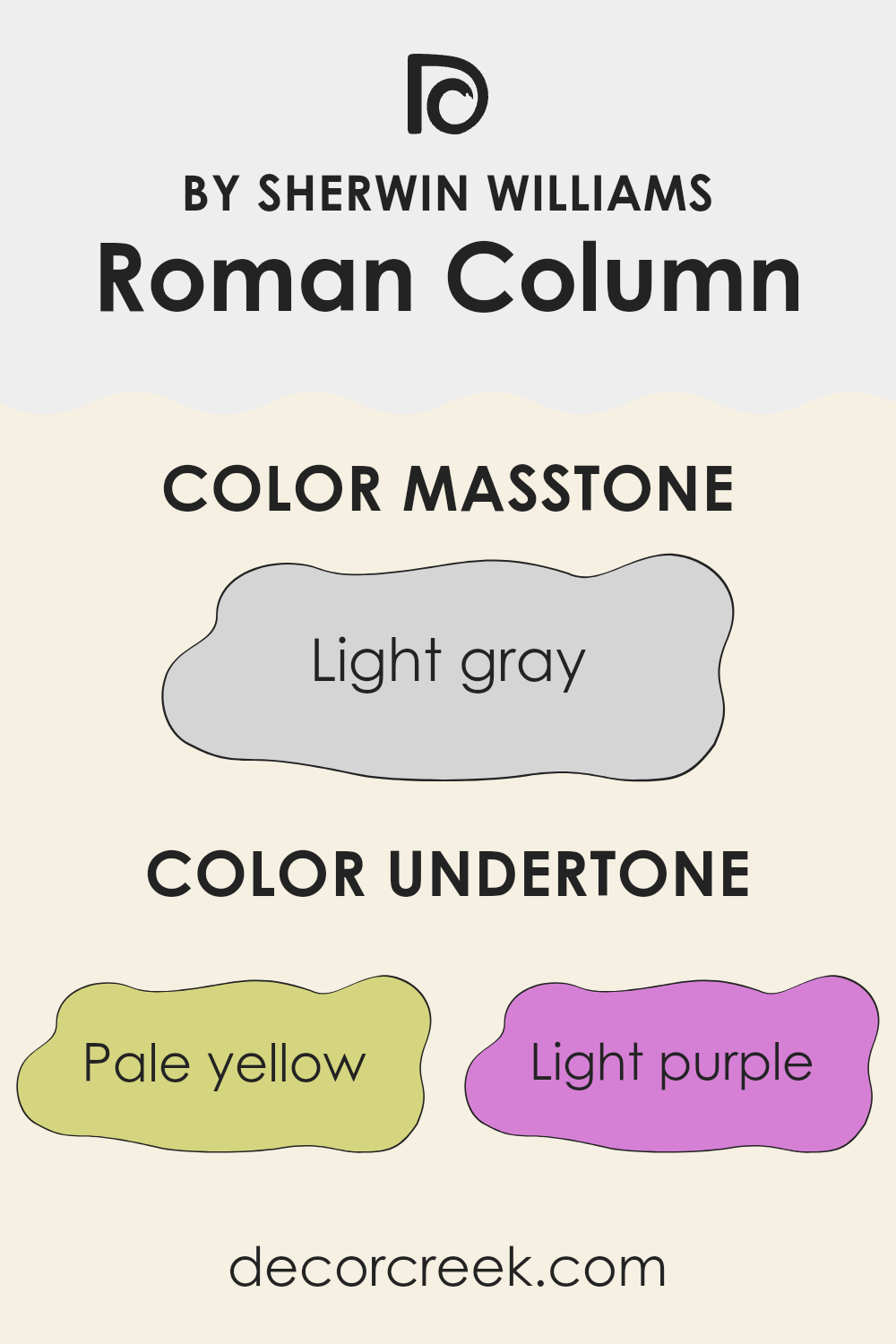
What are the right undertones of Roman Column SW 7562 ?
Roman Column SW 7562 by Sherwin Williams is a flexible and warm white paint that brings a soft and subtle atmosphere to any room. At first glance, this paint appears to be a straightforward white, but it actually carries a rich blend of undertones that can subtly influence the appearance and feel of your room.
Undertones are secondary colors that influence the main hue of a paint color, though they might not be immediately noticeable. In Roman Column SW 7562, these undertones include pale yellow, light purple, light blue, pale pink, mint, lilac, and grey. Each undertone plays a role in casting different shades under various lighting conditions, affecting the way we perceive the primary color.
For example, the pale yellow and pale pink undertones can warm up a room, making it feel cozier and more welcoming. On the other hand, light purple and lilac add a hint of coolness, which can make the wall paint feel fresh and calming. The mint and light blue undertones offer a refreshing touch, whereas grey can ground the color with a neutral balance, preventing it from feeling too vibrant or too strong.
When applied to interior walls, Roman Column SW 7562’s diverse undertones interact with both natural and artificial light, shifting subtly throughout the day. This effect can make the walls intriguing as the color seems to change, providing a dynamic backdrop for furniture and decor.
Whether in a sunny kitchen or a dimly lit bedroom, these undertones help create an engaging and adaptable environment that complements various design styles and color schemes.
decorcreek.com
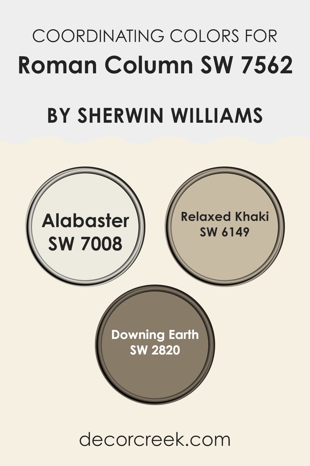
Best Coordinating Colors to use with Roman Column SW 7562 by Sherwin Williams this year.
Coordinating colors are those that complement each other while being used together in decor, creating a harmonious blend. When colors coordinate, they enhance the overall aesthetic of a room without feeling too strong.
For instance, if you choose a neutral base like Roman Column by Sherwin Williams, picking coordinating colors like Alabaster, Relaxed Khaki, or Downing Earth can help achieve a balanced look. Each coordinating color supports the other, allowing for a design that is pleasing to the eye and creates a coherent visual flow throughout the room.
Alabaster is a clean and bright shade that brings a light and airy feel to any room, making it an excellent choice for trimmings or larger areas to increase the sense of room. Relaxed Khaki, as the name suggests, is a soft and warm beige that introduces a gentle depth, working well in areas that aim for a subtle, understated look.
Downing Earth is a strong terracotta color, perfect for adding a touch of warmth and natural style, particularly effective in areas where a bolder statement is desired. Each of these shades complements Roman Column by offering either contrast or continuity, ensuring that the color scheme flows smoothly without any jarring transitions.
You can see recommended paint colors below:
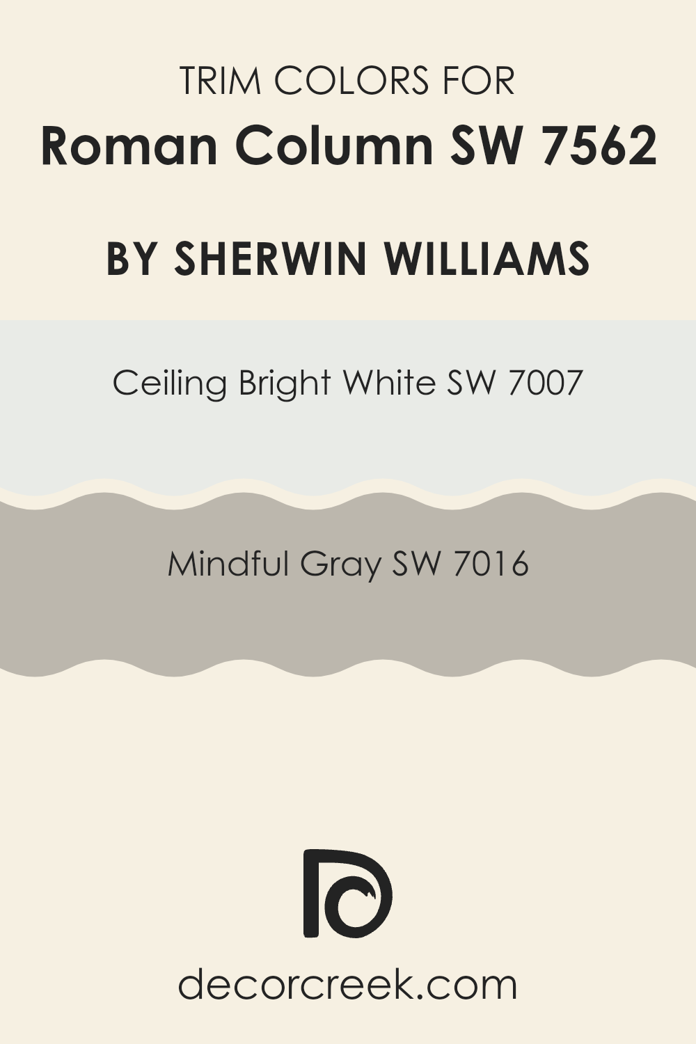
Trendy Trim Colors of Roman Column SW 7562 by Sherwin Williams to use this year.
Trim colors are essential accents in home decor that outline and highlight architectural features, such as door frames, moldings, and baseboards. When paired with a base color like Roman Column by Sherwin Williams, trim colors can improve the overall look and create a cohesive feel throughout the room. Choosing the right trim colors can sharpen the outline of an area, provide a subtle contrast, or add a distinctive character to the room.
For the Roman Column hue, options like Ceiling Bright White and Mindful Gray from Sherwin Williams make excellent trim choices. Ceiling Bright White is a crisp, clean white shade that delivers a fresh and airy feel to any room, making it ideal for a sharp and clear trim that brings out other colors without feeling too strong.
Mindful Gray, on the other hand, is a gentle gray that offers a slight contrast with a hint of warmth. This color is perfect for creating a harmonious yet distinct border around ceiling or floor edges, nicely framing the overall layout of the room.
You can see recommended paint colors below:
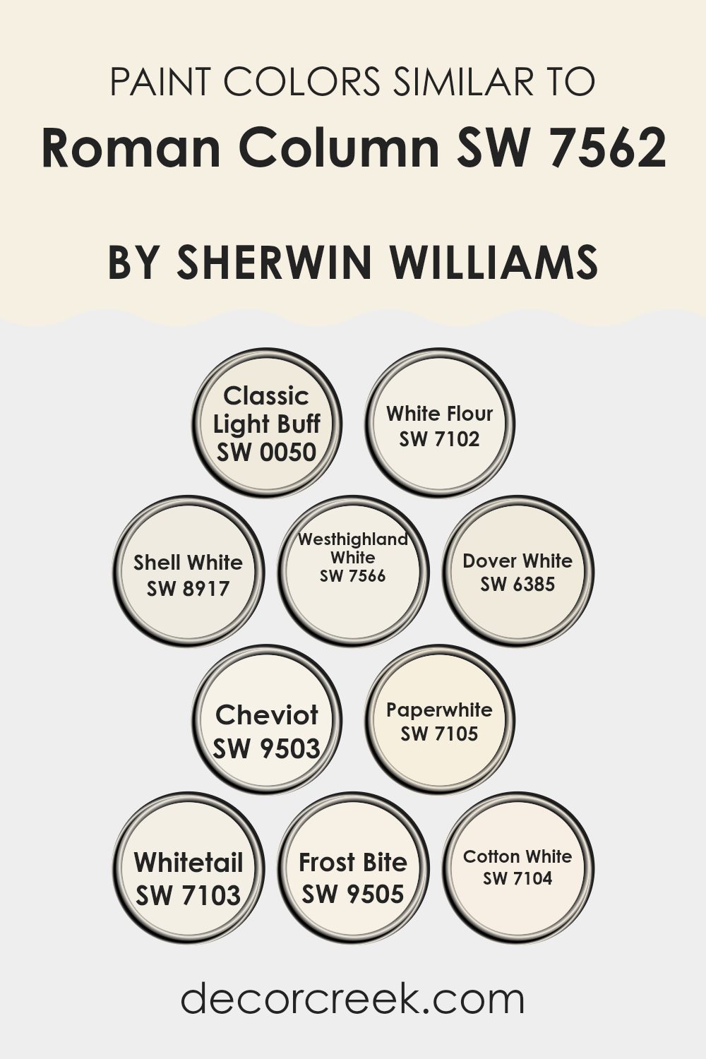
Evergreen Colors Similar to Roman Column SW 7562 by Sherwin Williams
Similar colors play a crucial role in design by creating a cohesive and harmonious environment. When colors like Classic Light Buff, White Flour, and Shell White are used together, they offer a subtle variety while maintaining a unified look, making the room feel balanced without stark contrasts. These shades are especially effective in achieving a calm and coherent atmosphere, which is great for areas where you want to promote relaxation or concentration.
For instance, Classic Light Buff is a warm, inviting shade that reflects light beautifully, making it a good choice for living areas or entryways. White Flour is a soft, clean white that works well in any setting, providing a fresh and airy feel. Shell White has a slightly creamy tone, ideal for areas that need a touch of warmth.
Westhighland White is another gentle white with a hint of warmth, perfect for creating a cozy vibe. Dover White offers a hint of yellow, giving it a sunny character that can brighten rooms. Cheviot is a neutral, very light gray, flexible for modern areas. Paperwhite and Whitetail are both pure and crisp whites, excellent for trim or areas where stark simplicity is desired.
Frost Bite brings a cooler, almost icy tone, suited for modern and minimalist looks. Lastly, Cotton White is a clean, straightforward white that easily complements other hues, useful across various applications from kitchens to bedrooms.
You can see recommended paint colors below:
- SW 0050 Classic Light Buff
- SW 7102 White Flour
- SW 8917 Shell White
- SW 7566 Westhighland White
- SW 6385 Dover White
- SW 9503 Cheviot
- SW 7105 Paperwhite
- SW 7103 Whitetail
- SW 9505 Frost Bite
- SW 7104 Cotton White
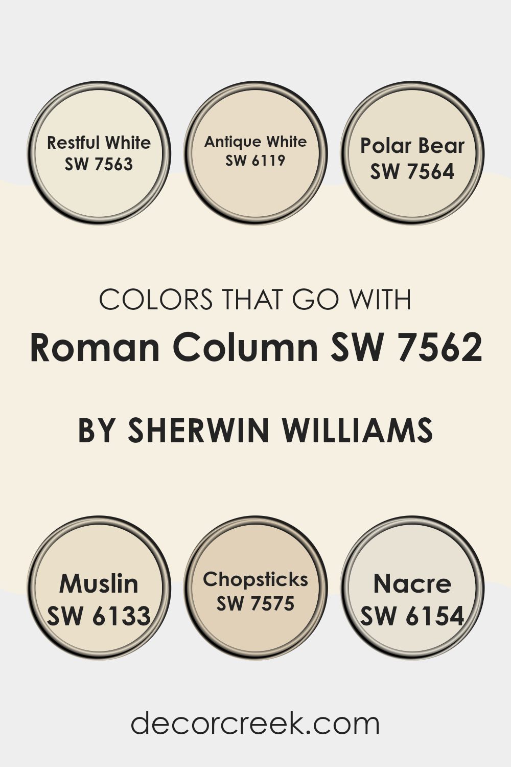
Colors that Go With Roman Column SW 7562 by Sherwin Williams
Selecting the right colors to complement Roman Column SW 7562 by Sherwin Williams is essential for achieving a harmonious and appealing look in your room. This neutral shade serves as a perfect backdrop, allowing other colors to stand out without feeling too strong. For example, Restful White SW 7563 enhances the softness of Roman Column, adding a fresh and clean appearance to the interiors. Antique White SW 6119, slightly warmer, brings a cozy and inviting feel, ideal for living rooms or bedrooms.
Another great companion is Polar Bear SW 7564, which introduces a crisp brightness to areas, offering a subtle contrast that’s still very much in harmony with Roman Column. For those looking for a bit more warmth, Muslin SW 6133 is a suitable choice; it adds depth and warmth without creating a stark contrast.
Chopsticks SW 7575 offers a deeper, earthier tone that pairs well with Roman Column for those looking to add some grounding elements to their palette. Lastly, Nacre SW 6154 is a soft pearl-like shade that blends beautifully, improving rooms with a soft, natural glow. Each of these colors works together to create a cohesive and inviting atmosphere, making your decorating choices easier and more effective.
You can see recommended paint colors below:
- SW 7563 Restful White
- SW 6119 Antique White
- SW 7564 Polar Bear
- SW 6133 Muslin
- SW 7575 Chopsticks
- SW 6154 Nacre
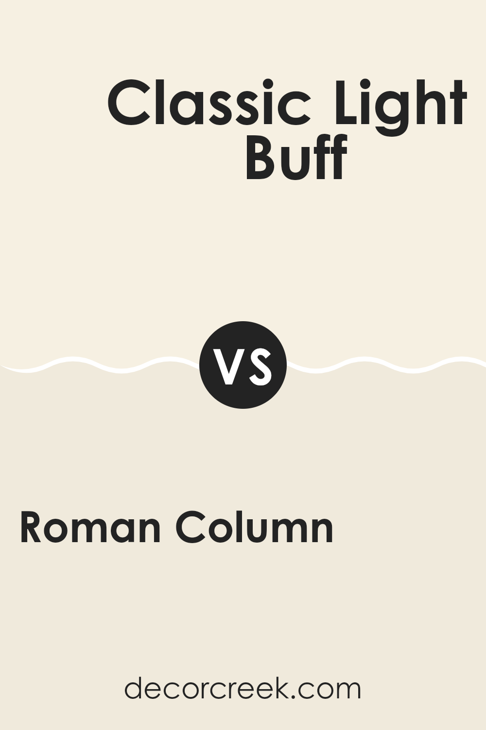
Roman Column SW 7562 by Sherwin Williams vs Classic Light Buff SW 0050 by Sherwin Williams
Roman Column and Classic Light Buff are both neutral colors from Sherwin Williams with subtle differences. Roman Column is a soft, creamy beige with warm undertones, making it a cozy choice for any room.
It tends to bring a gentle, inviting vibe to areas, working well where you want a calm and inviting atmosphere. On the other hand, Classic Light Buff is slightly lighter and has a more neutral base that leans towards sandy tones. It reflects light beautifully, helping to make small rooms appear larger and more open.
While both colors are flexible and work well in various decor styles, Roman Column offers warmth, whereas Classic Light Buff provides a more muted backdrop, perfect for highlighting other design elements in a room. These shades can complement each other nicely in areas where balance and light are key.
You can see recommended paint color below:
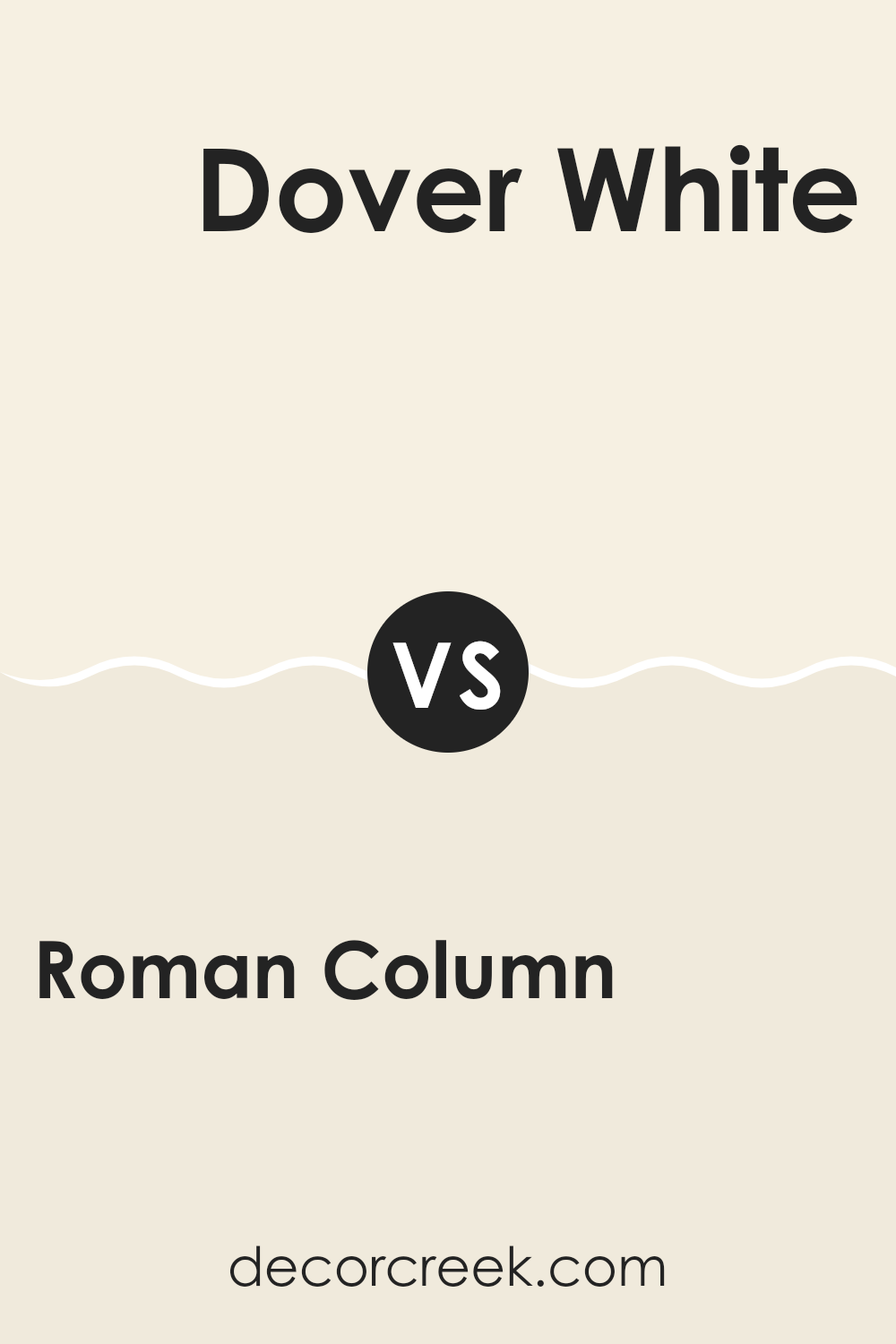
Roman Column SW 7562 by Sherwin Williams vs Dover White SW 6385 by Sherwin Williams
Roman Column and Dover White are two popular colors by Sherwin Williams, each giving off its unique vibe. Roman Column is a soft, warm beige that provides a cozy and welcoming feel to any room.
It’s an excellent choice for those who want a neutral background that pairs easily with other colors. In contrast, Dover White is a brighter white with a touch of cream, making it an ideal choice if you want to brighten up a room and give it a fresh, clean look.
This color is fantastic for areas that receive a lot of sunlight, as it reflects light beautifully and can make small areas appear larger. While both colors are neutral, Roman Column leans towards a more earthy tone, whereas Dover White heads towards a more classic white palette. Choosing between them depends on the kind of atmosphere you want to create: warm and grounded or bright and airy.
You can see recommended paint color below:
Roman Column SW 7562 by Sherwin Williams vs Frost Bite SW 9505 by Sherwin Williams
Roman Column is a soft, neutral beige with warm undertones, making it a flexible choice for many settings. It’s a comforting color that works well in areas meant for relaxation or concentration, like living rooms or home offices.
On the other hand, Frost Bite presents a stark contrast as it is a crisp, fresh white with cool undertones. This color is ideal for creating a bright and airy feel, making areas appear larger and more open.
It is particularly effective in modern designs or minimalist decor, where a sense of openness and simplicity is key. When comparing both, Roman Column offers a cozy warmth, while Frost Bite provides a clean, refreshing look. Together, they could complement each other in a room that balances coziness with brightness.
You can see recommended paint color below:
Roman Column SW 7562 by Sherwin Williams vs White Flour SW 7102 by Sherwin Williams
Roman Column and White Flour, both by Sherwin Williams, are both warm-toned paints, but they offer different vibes for interior areas. Roman Column is a soft beige that brings a cozy and inviting aura to a room, making it perfect for living areas and bedrooms where you want a neutral backdrop that feels welcoming. This color is richer and has more depth compared to White Flour.
On the other hand, White Flour is a clean and crisp white that has a hint of warmth to make it less stark. It’s great for areas that aim to feel fresh and open. It works really well in kitchens and bathrooms or any room you want to appear brighter and more spacious.
These two colors can work beautifully together, with Roman Column providing a subtle contrast against the lighter White Flour, suitable for anyone wanting to keep their room grounded in neutrals while ensuring it feels light and airy.
You can see recommended paint color below:
Roman Column SW 7562 by Sherwin Williams vs Cotton White SW 7104 by Sherwin Williams
Roman Column and Cotton White are two paint colors offered by Sherwin Williams. Roman Column is a soft beige with a warm undertone. It’s a flexible color that fits softly into any room without feeling too strong next to other design elements. On the other hand, Cotton White is a more neutral white.
It has a very light gray tint that gives it a clean, crisp look. While both colors are quite subtle and work well in various decor styles, Roman Column adds a touch of warmth that makes a room feel cozy. Cotton White, however, provides a brighter, more open feeling.
These differences make Roman Column ideal for creating a comforting atmosphere, whereas Cotton White is perfect for areas that aim for a fresher, more airy vibe. In conclusion, choosing between them depends on whether you want the warmth of a beige or the crisp brightness of a near-pure white.
You can see recommended paint color below:
Roman Column SW 7562 by Sherwin Williams vs Westhighland White SW 7566 by Sherwin Williams
Roman Column and Westhighland White are two neutral hues from Sherwin Williams, each bringing a subtle and soothing presence to any room. Roman Column is a soft cream, a warmer tone that provides a cozy, inviting ambiance to areas. Its gentle warmth can make large rooms feel more intimate yet remains light enough to keep small areas from feeling cramped.
On the other side, Westhighland White is brighter and leans more towards a pure white with just a hint of warmth. It’s excellent for areas that aim to achieve a clean, fresh look, as it reflects more light and can help make a room appear larger and more open.
These colors can complement each other beautifully in a home. You might use Roman Column in a living area or bedroom for its comforting warmth, while Westhighland White could be perfect for kitchens, bathrooms, or trim to bring a crisp, clean contrast. Together, they offer a balanced palette that can easily flow from room to room.
You can see recommended paint color below:
Roman Column SW 7562 by Sherwin Williams vs Whitetail SW 7103 by Sherwin Williams
Roman Column and Whitetail by Sherwin Williams are both neutral shades, but they offer different vibes for your room. Roman Column is a soft beige with a warm undertone that gives it a cozy yet fresh look.
This color is great for creating a welcoming atmosphere in any room, especially in areas where you want a calm and airy feel. On the other hand, Whitetail is much lighter, leaning towards a creamy white. It’s an excellent choice if you’re aiming for a brighter and more open feel in your room.
Whitetail can really help to make a small room appear bigger and is perfect for areas that get less natural light. When used together, these two colors can complement each other nicely, with Roman Column bringing depth and warmth, while Whitetail adds brightness and a sense of openness.
You can see recommended paint color below:
Roman Column SW 7562 by Sherwin Williams vs Cheviot SW 9503 by Sherwin Williams
Roman Column and Cheviot are two paint colors from Sherwin Williams that have their unique charm. Roman Column is a soft and warm beige. It’s a neutral color, meaning it’s very flexible and can fit in with almost any decor style without feeling too strong. It gives off a cozy, welcoming vibe that makes it perfect for living rooms and bedrooms.
Cheviot, on the other hand, is a pale gray that leans slightly towards green. This color is also neutral but offers a cooler tone compared to Roman Column. It’s a great choice for rooms that need a calm, clean look such as a modern kitchen or bathroom.
While both colors are great for creating a relaxed environment, Roman Column adds warmth to a room, making it feel snug and comfortable. Cheviot provides a fresher, cooler feel, suitable for a room that aims for a more contemporary look. Depending on the mood you want to create, either color could be the right choice.
You can see recommended paint color below:
Roman Column SW 7562 by Sherwin Williams vs Paperwhite SW 7105 by Sherwin Williams
Roman Column and Paperwhite, both by Sherwin Williams, present a subtle contrast in shades that enhance different aspects of a room. Roman Column is a soft, creamy beige. It offers a warm, inviting backdrop that works well in nearly any room, making areas feel cozy and grounded.
On the other hand, Paperwhite is a true, bright white. It acts as a clean, crisp neutral, perfect for making rooms appear larger and brighter. While Roman Column adds warmth, Paperwhite provides a fresh, clear look that can help other colors in the decor stand out.
Choosing between them depends on whether you prefer a cozy warmth or a sharp, fresh feel in your room. Both colors are flexible and can easily blend with various decor styles and color palettes.
You can see recommended paint color below:
Roman Column SW 7562 by Sherwin Williams vs Shell White SW 8917 by Sherwin Williams
Roman Column and Shell White are two colors from Sherwin Williams that share a neutral tone but differ slightly in their warmth and brightness. Roman Column has a creamy base that gives off a warm and soft look, making it ideal for areas where you want a cozy and welcoming atmosphere. It’s perfect for living rooms or bedrooms where you aim for a gentle and light feel.
On the other hand, Shell White is lighter and has a crisp, clean quality to it. This color is excellent for creating a bright and airy feel, making any room feel more spacious. It works beautifully in bathrooms and kitchens, where a fresh and clean appearance is often desired.
Both colors are flexible and neutral, making them easy to match with various decor styles and other colors. Roman Column offers a hint more warmth, while Shell White leans towards a clean, minimalistic look. These attributes make them favorites for those looking to refresh their walls with something that feels both neutral and inviting, yet clearly distinct in warmth and tone.
You can see recommended paint color below:
As I finish talking about SW 7562 Roman Column by Sherwin Williams, I feel that this color is really special. It’s a kind of off-white, kind of like the soft color of vanilla ice cream, that makes any room feel warm and welcoming. I used this paint in my own living room and it made the area look bigger and brighter. It’s not just a regular white; it has a touch of cream that adds a cozy feeling to the walls.
This paint can really make your house feel like a home. It works great in places like the living room or bedroom because it pairs well with all sorts of colors, from bright reds to deep blues. It’s like that one friend who gets along with everyone. Plus, cleaning up any marks or dirt off the walls is easy, which is super handy.
In summary, SW 7562 Roman Column is a smart choice if you want a color that makes your room feel cozy, bigger, and brighter, while also being easy to maintain. It’s a paint that can make any room feel more like your own special spot.
I’m really glad I chose it for my home, and I think others who choose it will be happy with it too!
decorcreek.com
Ever wished paint sampling was as easy as sticking a sticker? Guess what? Now it is! Discover Samplize's unique Peel & Stick samples.
Get paint samples

