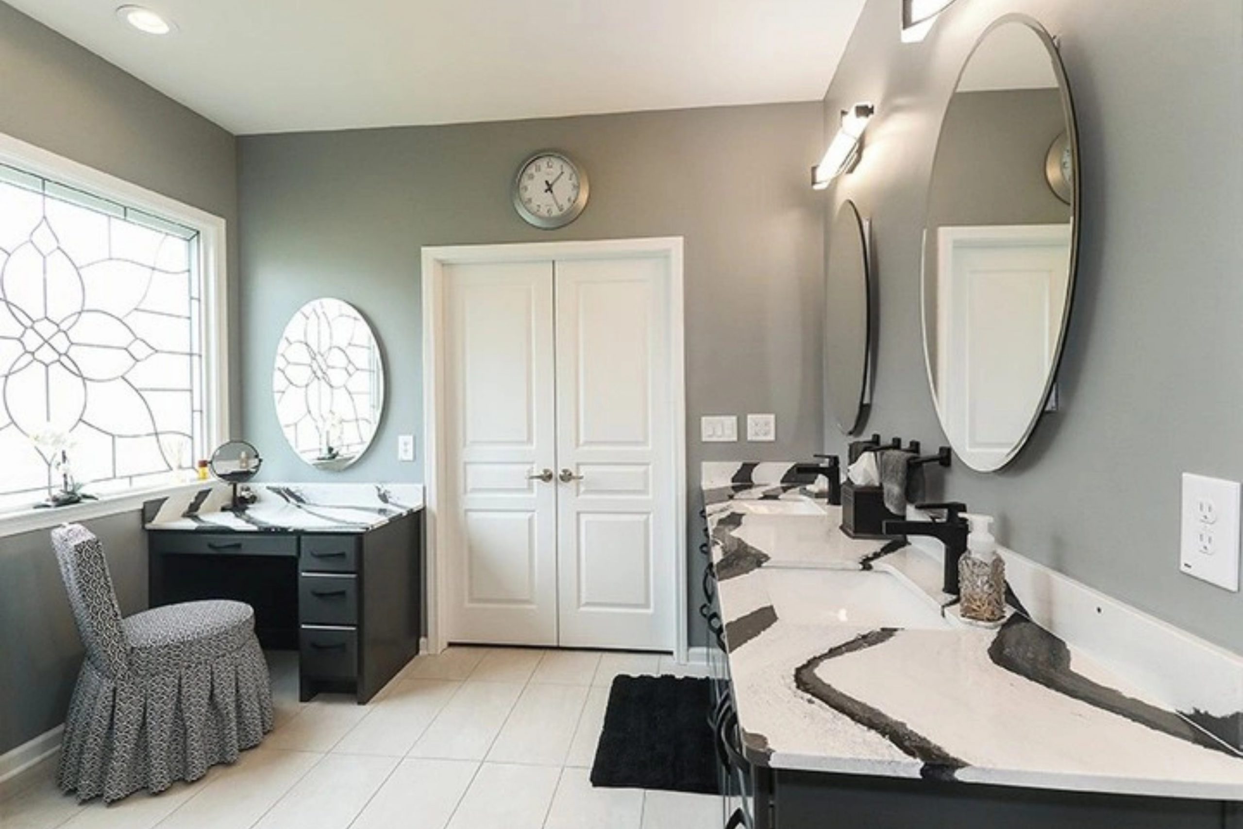
If you’re considering refreshing your room with a new paint color, SW 7066 Gray Matters by Sherwin Williams is a choice worth considering. Let me share a few insights to help you decide whether it’s the right fit for your home. Known for its flexibility, Gray Matters is a balanced, mid-tone gray that can blend smoothly into many design styles, whether you aim for a modern or traditional look. It works as an excellent neutral base, allowing you to mix and match with other colors and decor elements with ease.
Moreover, the color’s ability to adjust goes beyond style; it also performs well in different lighting conditions. Whether your room is filled with natural daylight or relies on artificial lighting, Gray Matters keeps its unique charm without leaning too cool or too warm. This quality is especially helpful in rooms that serve multiple purposes throughout the day.
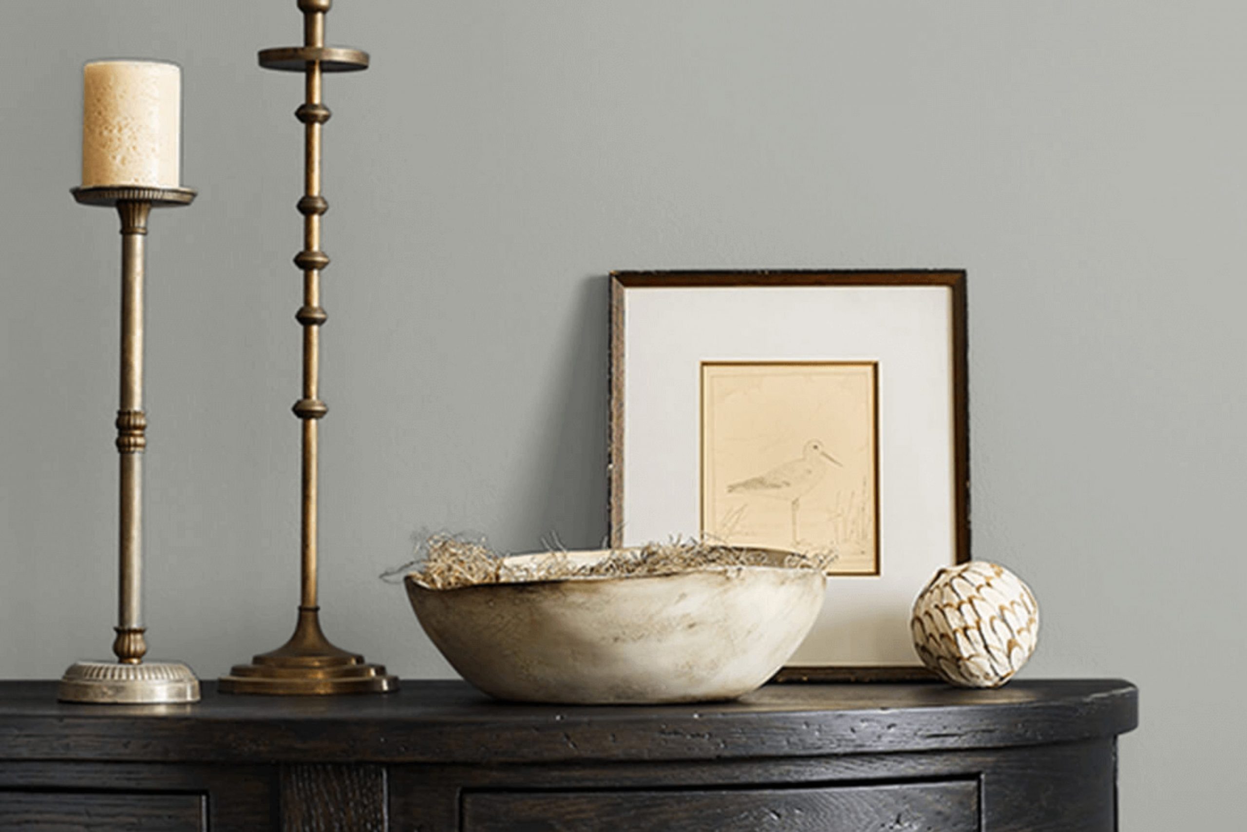
Lastly, remember to consider the existing elements in your room like flooring, fixtures, and furniture. Gray Matters offers a subtle backdrop that tends to highlight and complement these components rather than compete with them.
By keeping these points in mind, you’ll be better prepared to decide if SW 7066 Gray Matters is the best choice for your decorating project.
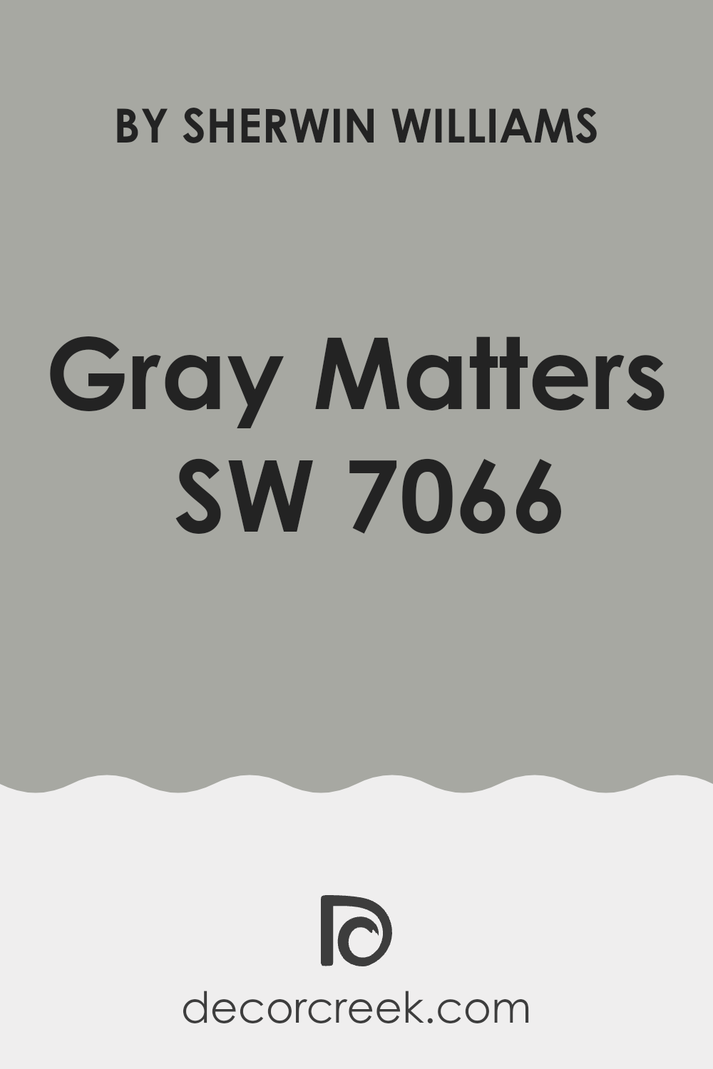
Is Gray Matters SW 7066 Right for My Home?
Gray Matters is a hue that effortlessly combines subtlety with a strong presence. This color strikes a balance between not being too dark or too light, which makes it incredibly flexible. I find it has a modern edge while still feeling warm and inviting, which is great for creating a cozy yet contemporary room.
In terms of interior styles, Gray Matters is a fantastic choice for minimalist designs due to its clean and understated nature. It has this unobtrusive quality that allows other elements in a room to stand out. I also love using it in industrial settings; it pairs beautifully with exposed metals and rustic woods, enhancing the raw textures without overpowering them. Additionally, it works well in Scandinavian-inspired interiors, where it complements soft pastels and natural wood tones, maintaining a light, airy feel.
I’ve had great success pairing Gray Matters with a variety of materials and textures. In living rooms, plush velvets or soft wools in furniture items look stunning against this color, making the room feel more inviting. In kitchens, combining it with marble countertops or stainless steel fixtures creates an interesting mix of textures that are both practical and visually appealing. It’s also a great backdrop for artwork, as it helps highlight the colors and details of the pieces without competing with them.
What are the right undertones of Gray Matters SW 7066 ?
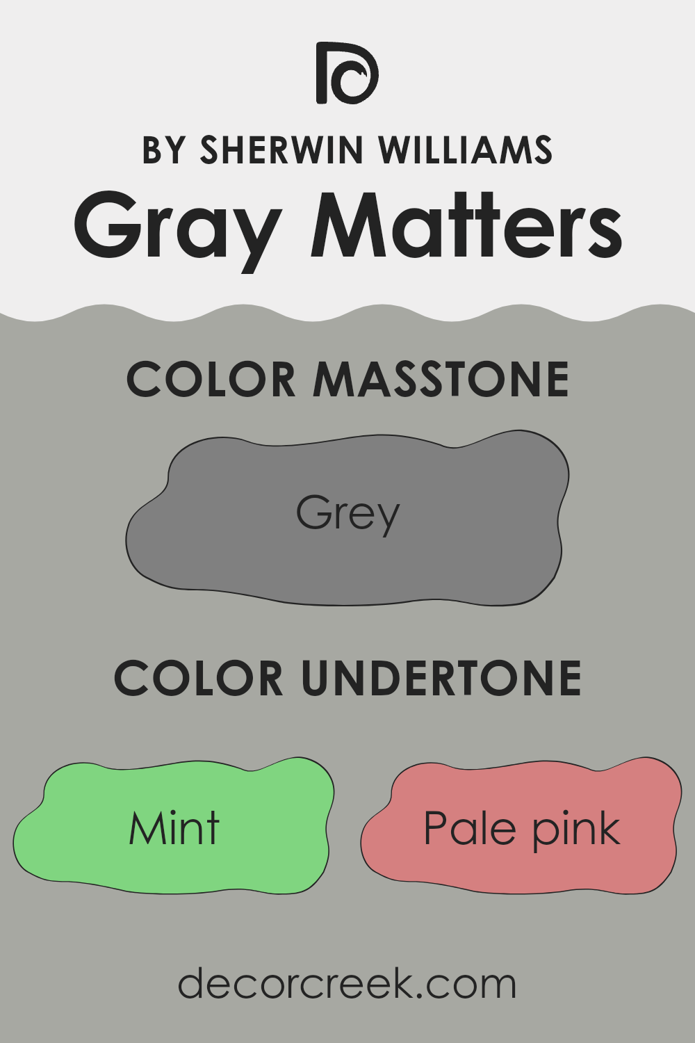
Gray Matters, a flexible neutral paint shade, subtly shifts in appearance depending on its surrounding colors and lighting. What makes it particularly unique is its range of undertones. Undertones are the colors sitting beneath the surface of the paint that can appear in certain lighting or when placed next to other shades. These undertones influence how the color looks and feels in a room.
The undertones in Gray Matters can range from cool to warm. For instance, the mint and light blue undertones bring a cool crispness, making the gray feel more refreshing and airy. On the other hand, pale pink and pale yellow undertones add a hint of warmth, giving the gray a cozier, more inviting appeal. This blend allows Gray Matters to work well in different settings.
When used on interior walls, the impact of these undertones becomes more noticeable. In a room with natural light, the cooler undertones may become more dominant, making the walls feel fresh and lively. In artificial light, the warmer tones can stand out more, creating a softer and more comforting atmosphere.
In addition, the choice of decor and nearby colors can either strengthen or soften these undertones. For example, placing dark green or navy accents near Gray Matters can highlight its cooler mint or light blue undertones, while elements in brown or pale pink can pull forward its warmth, helping the room feel more balanced and welcoming.
Overall, the layered undertones of Gray Matters make it a highly adaptable color option, suitable for many interior styles and moods, depending on the surrounding elements and lighting conditions.
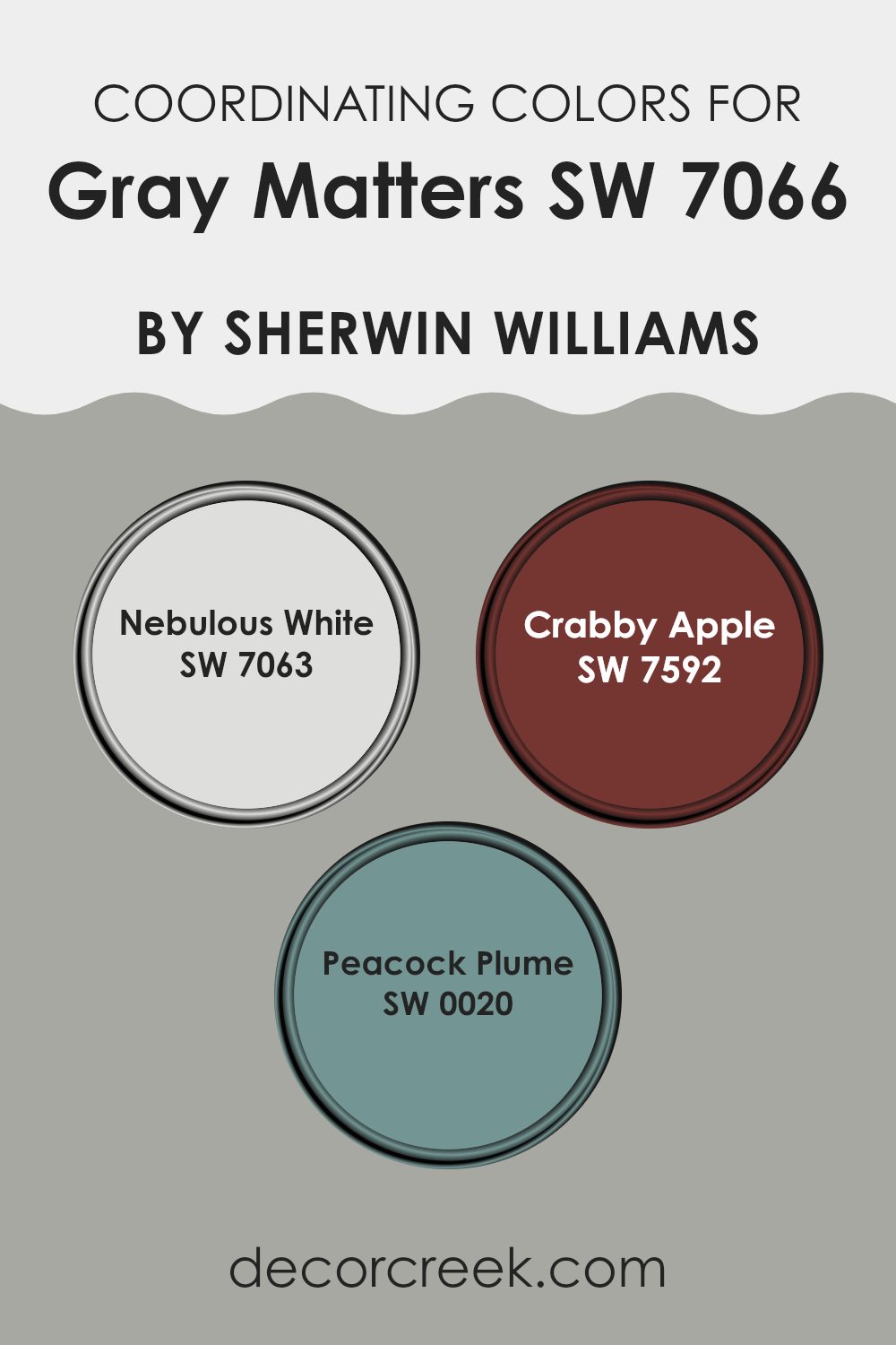
Best Coordinating Colors to use with Gray Matters SW 7066 by Sherwin Williams this year.
Coordinating colors are selected to complement a primary color, in this case, Gray Matters from Sherwin Williams. These coordinating shades are chosen to harmonize with the main color, enhancing the overall color scheme of a room by adding contrast, depth, or soft continuity. The idea is to balance the color palette, ensuring that the rooms feel connected and visually pleasing.
Nebulous White SW 7063 is a light and airy color that provides a gentle contrast to the stronger tone of Gray Matters, brightening up rooms without feeling too strong. It works well in areas where you want a touch of freshness without straying too far from a muted palette.
Crabby Apple SW 7592 offers a richer, deeper contrast, with its warm, deep red hue that brings a bold pop of color, ideal for accents like doors or furniture. Peacock Plume SW 0020 is a vibrant and striking teal that adds a lively burst of color, perfect for an eye-catching wall or decorative accents, bringing energy into any room. These colors, when used together, ensure a dynamic yet cohesive look that can liven up any living area.
You can see recommended paint colors below:
- SW 7063 Nebulous White
- SW 7592 Crabby Apple
- SW 0020 Peacock Plume
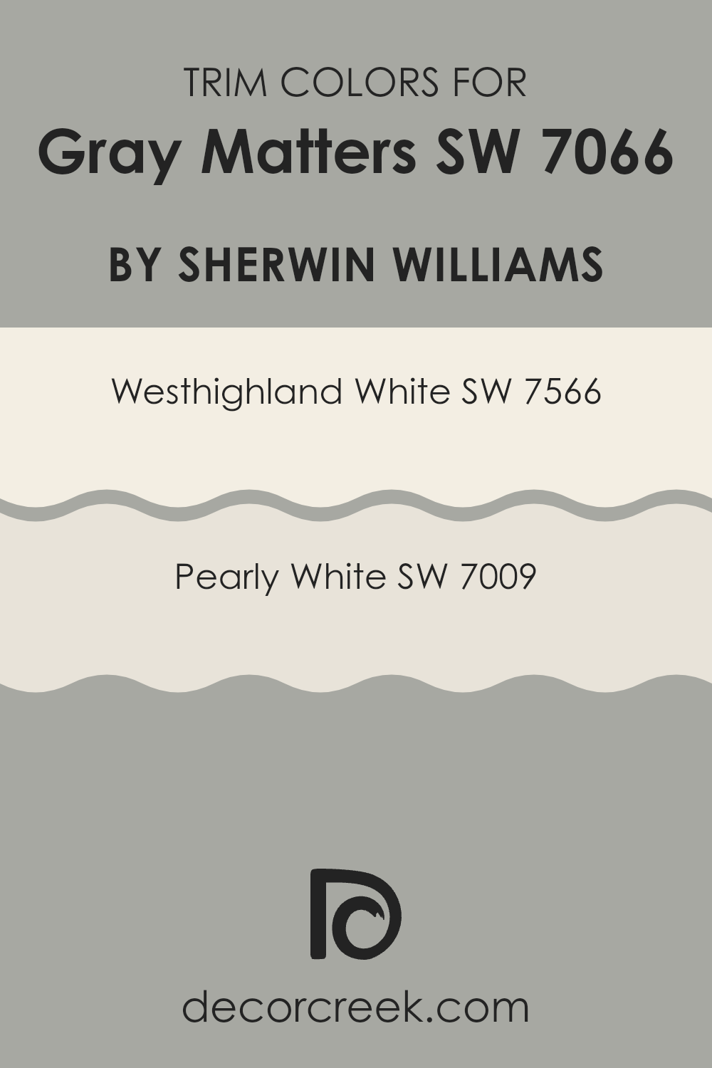
Trendy Trim Colors of Gray Matters SW 7066 by Sherwin Williams to use this year.
Trim colors are specifically chosen accent colors used to highlight and complement the main color of a wall or room, and they are crucial for enhancing the architectural features of a room, like door frames, moldings, and baseboards.
When using Gray Matters, a flexible neutral gray from Sherwin Williams, choosing the right trim colors can significantly affect the overall look and feel of a room. Selecting a lighter trim color can help create a subtle yet effective contrast that makes architectural details stand out without feeling too strong against the main color theme.
SW 7566 Westhighland White is a warm, creamy white that offers a calming contrast against the cooler tones of Gray Matters, providing a gentle break between wall color and trim that results in a balanced yet noticeable effect. On the other hand, SW 7009 Pearly White is a softer, slightly muted white with subtle undertones that work well with the depth of Gray Matters, ensuring that the trim gently stands out against the gray without appearing too stark. These lighter white shades not only highlight the clean edges and lines of the room’s trim but also help create a more open and welcoming atmosphere.
You can see recommended paint colors below:
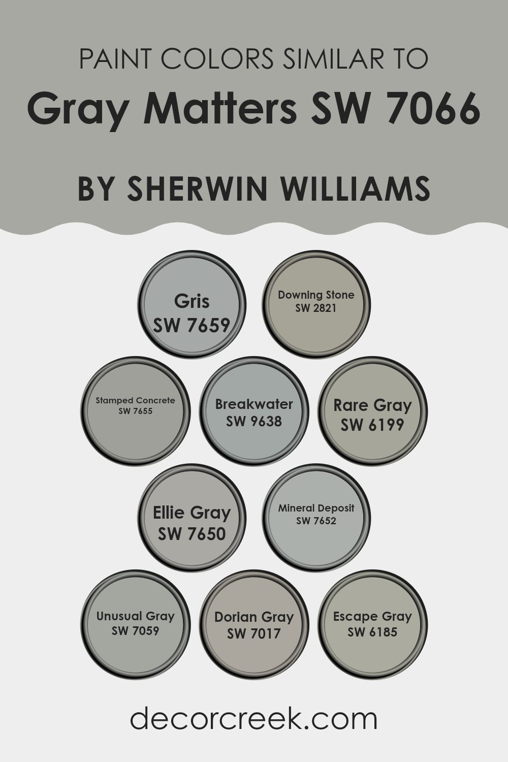
Evergreen Colors Similar to Gray Matters SW 7066 by Sherwin Williams
Similar colors create a harmonious and balanced atmosphere in any room, fostering a sense of continuity and flow. When decorating with shades like Gris, Downing Stone, and Stamped Concrete, the subtle variations in gray provide a gentle contrast that can enhance textures and shapes within a room without feeling too intense. For instance, Gris offers a soft, light gray hue that is flexible and calm, making it ideal for creating a soothing backdrop. Downing Stone has a slightly warmer tone, adding depth and warmth, helping rooms feel cozy and inviting.
Expanding the palette further, colors such as Breakwater and Rare Gray introduce delicate undertones that complement Gray Matters, lending a unique character to each area. Breakwater brings a hint of blue, reminiscent of a misty seashore morning, perfect for a peaceful retreat. Rare Gray includes green undertones that can cool a room subtly while keeping its neutral base.
Ellie Gray is a deeper gray that provides a strong foundation for bold accent colors, while Mineral Deposit offers a lighter, almost airy feel with its cooler undertones. In addition, Unusual Gray, Dorian Gray, and Escape Gray range from medium to darker tones, giving designers a rich spectrum to build layers or focal points in their design plans, enhancing visual interest while maintaining a cohesive overall look.
You can see recommended paint colors below:
- SW 7659 Gris
- SW 2821 Downing Stone
- SW 7655 Stamped Concrete
- SW 9638 Breakwater
- SW 6199 Rare Gray
- SW 7650 Ellie Gray
- SW 7652 Mineral Deposit
- SW 7059 Unusual Gray
- SW 7017 Dorian Gray
- SW 6185 Escape Gray
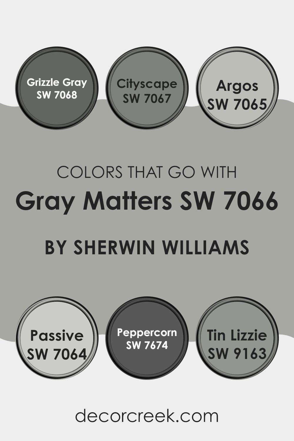
Colors that Go With Gray Matters SW 7066 by Sherwin Williams
Choosing the right colors to complement Gray Matters SW 7066 by Sherwin Williams can significantly enhance the aesthetic appeal of any room. Carefully selected shades can create a harmonious balance, offering a pleasing visual flow from one room to another. Each accompanying color either contrasts with or blends into Gray Matters, depending on the desired effect, making it suitable for many decorating styles and personal preferences.
Grizzle Gray SW 7068 provides a darker, more assertive shade that can ground a room, giving it depth and a sense of sturdiness. Cityscape SW 7067 is a cool, urban gray that pairs well with Gray Matters for a minimalistic, modern vibe, bringing calm without feeling too bold. Argos SW 7065 offers a lighter, softer gray that gently supports the main color, ideal for creating a smooth transition between areas.
Passive SW 7064 is another light option that can brighten rooms while still maintaining a clean and simple look. Peppercorn SW 7674, much darker, adds a sense of drama and intensity, perfect for highlighting focal areas like accent walls. Lastly, Tin Lizzie SW 9163 is a mid-tone gray that smoothly connects light and dark shades, ensuring every element in the room feels visually connected.
You can see recommended paint colors below:
- SW 7068 Grizzle Gray
- SW 7067 Cityscape
- SW 7065 Argos
- SW 7064 Passive
- SW 7674 Peppercorn
- SW 9163 Tin Lizzie
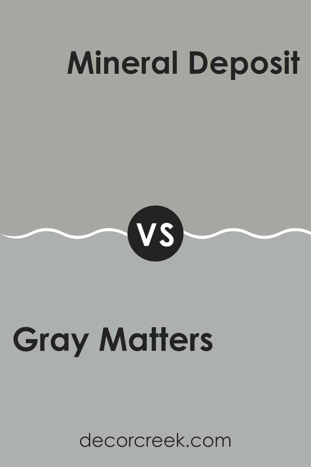
Gray Matters SW 7066 by Sherwin Williams vs Mineral Deposit SW 7652 by Sherwin Williams
Gray Matters and Mineral Deposit are two popular shades from Sherwin Williams. Gray Matters is a medium gray with a cool undertone that gives it a crisp, clear look. This color is very adaptable, making it a great choice for many rooms in a home or office. It can pair well with brighter colors or serve as a standalone neutral for a clean and simple aesthetic.
On the other hand, Mineral Deposit is a lighter shade of gray with blue undertones. This combination gives it a slightly more distinct feel compared to Gray Matters, providing a subtle hint of color. Mineral Deposit can help make a room feel airy and open, ideal for small rooms or areas with less natural light.
Though both are gray shades, Gray Matters holds a more traditional gray look, whereas Mineral Deposit offers a hint of blue, making each unique in setting the room’s mood and style. Both can work beautifully in modern decor schemes or be included in more classic settings depending on how they’re styled.
You can see recommended paint color below:
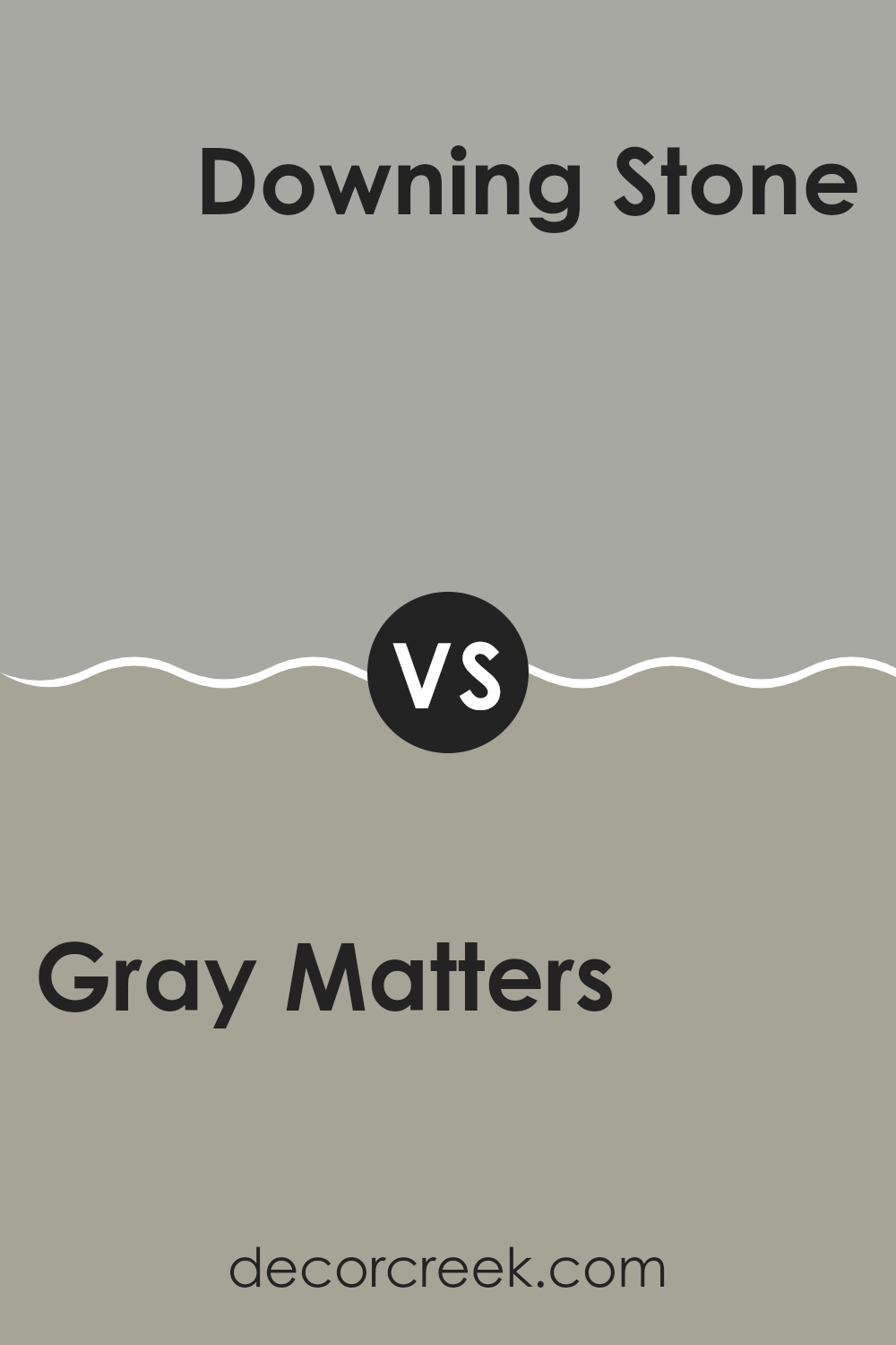
Gray Matters SW 7066 by Sherwin Williams vs Downing Stone SW 2821 by Sherwin Williams
Gray Matters SW 7066 and Downing Stone SW 2821 are both gray shades from Sherwin Williams, but they have distinct tones and vibes. Gray Matters has a lighter, more neutral gray quality that works well in rooms where you want a clean, straightforward backdrop.
It’s flexible and blends smoothly with other colors, making it great for living rooms, kitchens, and bathrooms. On the other hand, Downing Stone is a deeper gray that carries a hint of warmth.
This color is perfect when you want to create a cozy atmosphere, ideal for dens or bedrooms where a slightly darker color helps with relaxation. It pairs nicely with warm wood tones and richer colors. Both colors are understated yet provide a solid foundation for decorating, allowing you to build your room with various decor elements without the walls clashing or overpowering.
You can see recommended paint color below:
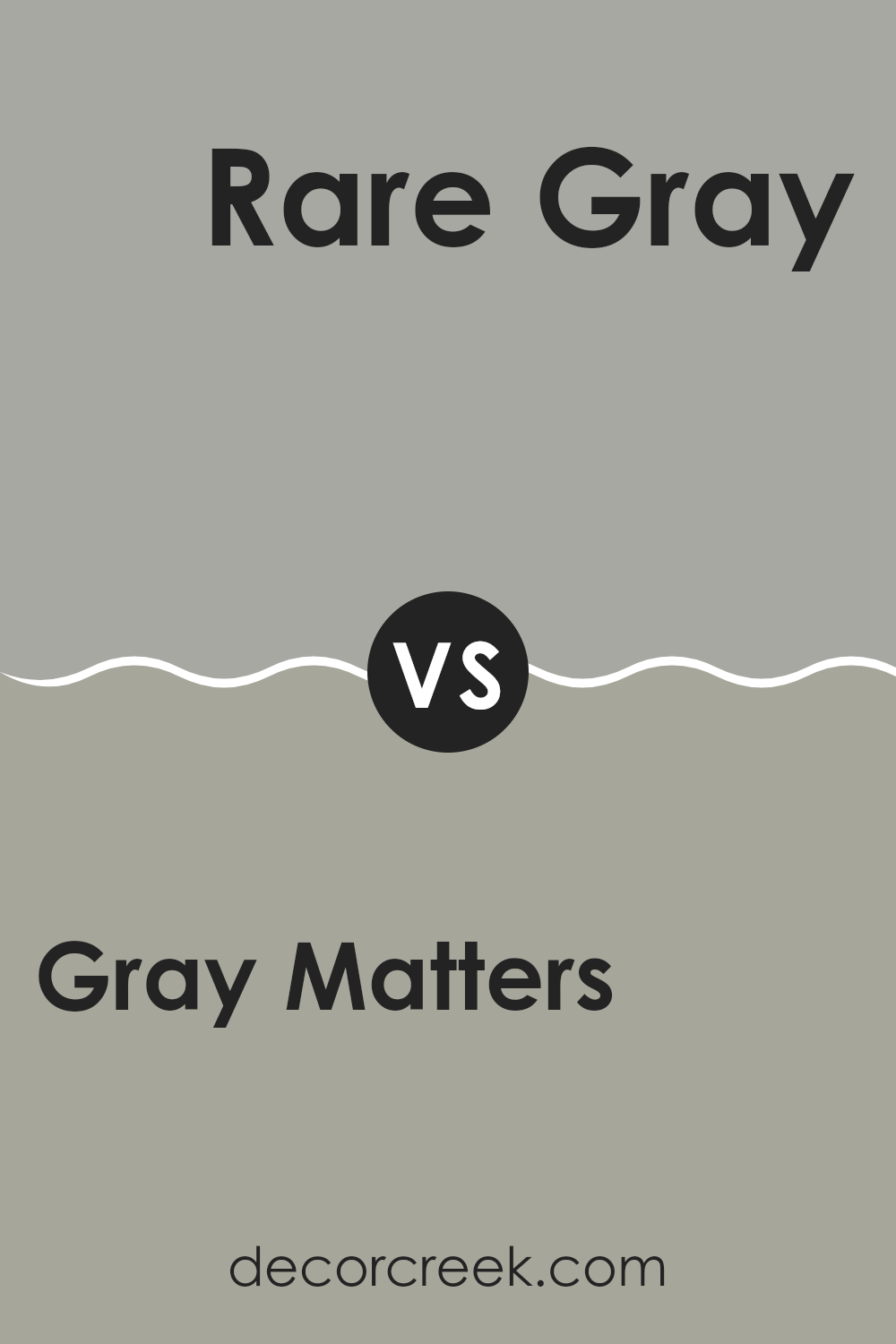
Gray Matters SW 7066 by Sherwin Williams vs Rare Gray SW 6199 by Sherwin Williams
Gray Matters and Rare Gray, both colors by Sherwin Williams, offer distinct shades of gray suitable for a variety of rooms. Gray Matters presents a lighter, softer gray that brightens rooms and brings a fresh, airy feel. It has a cooler undertone, making it ideal for interiors where a modern and clean appearance is desired.
In contrast, Rare Gray has a deeper, warmer tone that can make rooms feel cozier and more inviting. It contains hints of green, giving it a unique character compared to more straightforward grays. This color works well in areas where a more snug and homey atmosphere is preferred.
While both paints share the flexibility of gray, their differences in shade and undertone provide options for either a lighter, crisper environment or a warmer, more enveloping one. These two colors can help achieve different vibes in your décor, depending on your personal style and the specific needs of your room.
You can see recommended paint color below:
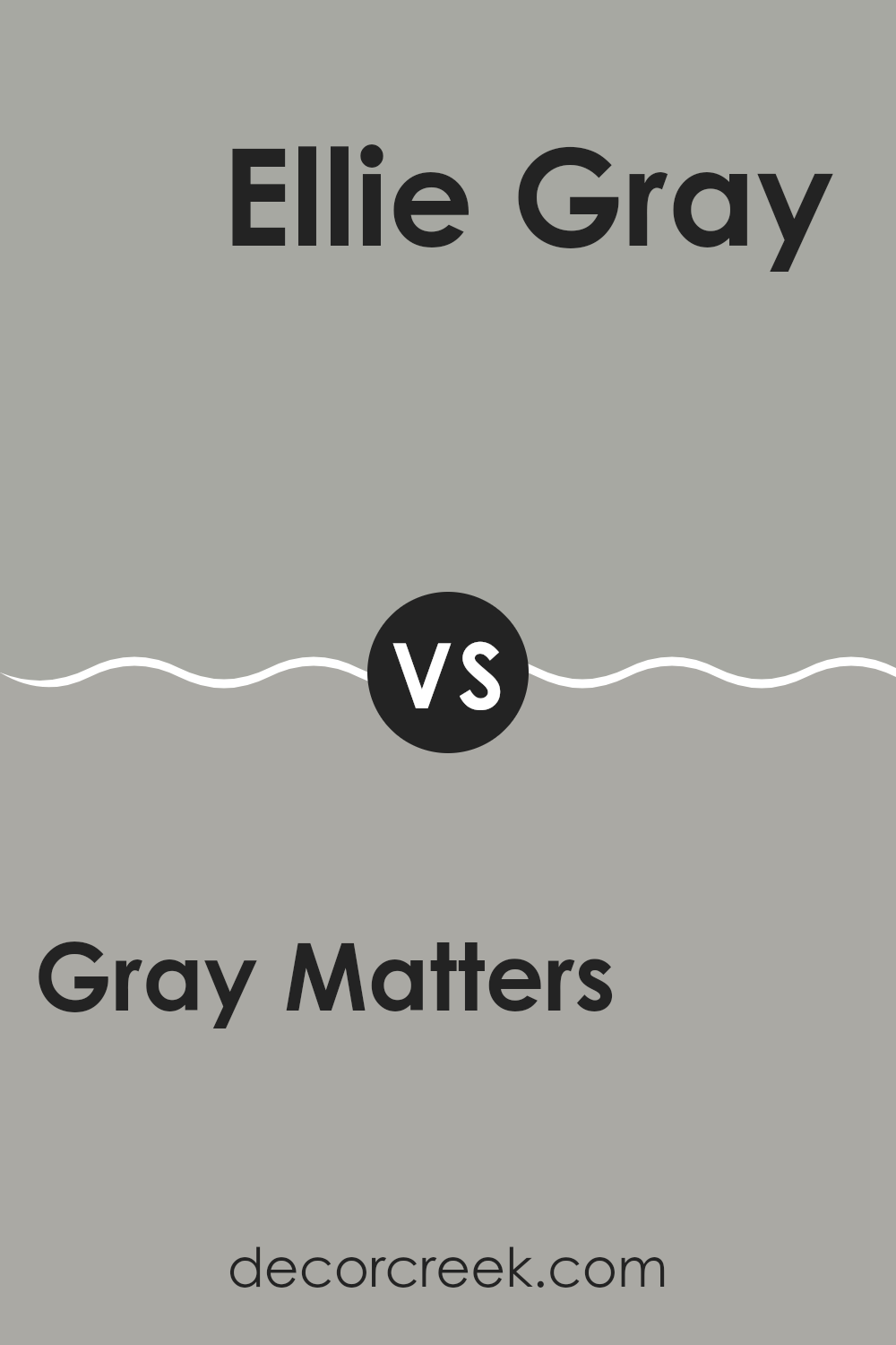
Gray Matters SW 7066 by Sherwin Williams vs Ellie Gray SW 7650 by Sherwin Williams
Gray Matters and Ellie Gray are two shades offered by Sherwin Williams. Gray Matters is a lighter gray that brings a fresh and calming feel to a room. It’s a flexible color that can fit well in many settings, whether in a living room, a kitchen, or an office. This shade pairs nicely with both bright colors and darker, contrasting tones.
Ellie Gray, on the other hand, is a deeper gray with subtle blue undertones, which can add a bit more depth and character to a room. It works particularly well in areas that benefit from a more defined or cozy atmosphere like a bedroom or a study. This color can help highlight artwork or furniture, creating a more dynamic look.
Both colors are neutral and can work well together in different parts of a home to create a coherent but varied color scheme. The choice between them can depend on the amount of natural light a room gets or the overall look you’re aiming for.
You can see recommended paint color below:
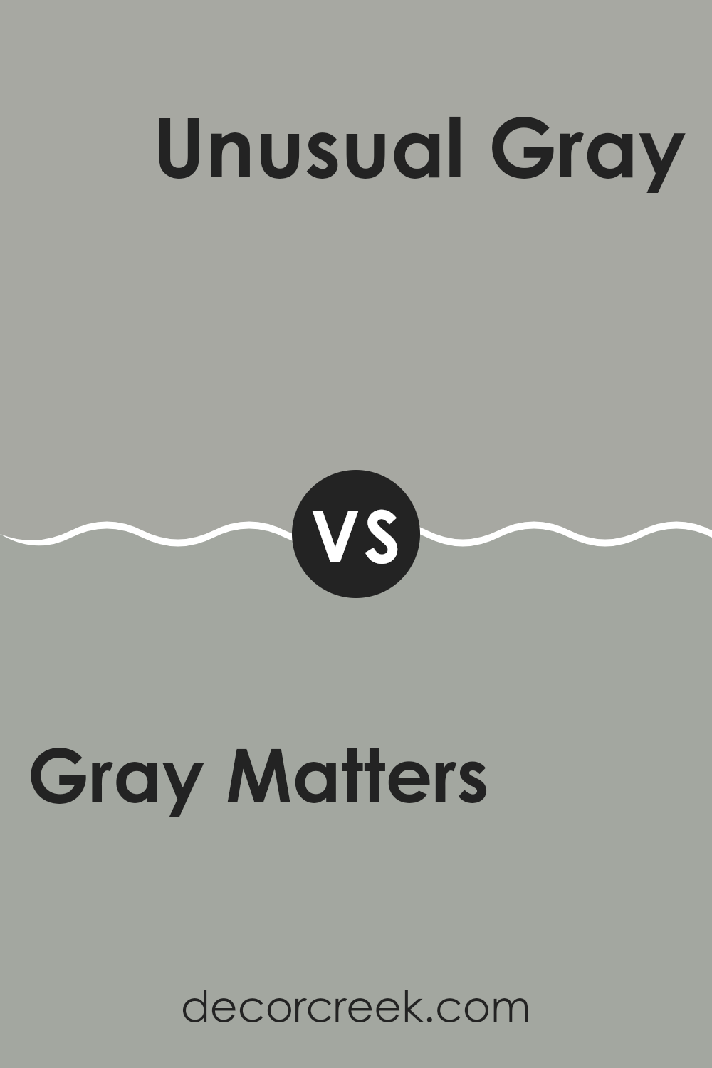
Gray Matters SW 7066 by Sherwin Williams vs Unusual Gray SW 7059 by Sherwin Williams
Gray Matters and Unusual Gray are both gray paint colors from Sherwin Williams, but they have distinct tones that set them apart. Gray Matters is a cooler gray that has subtle blue undertones, giving it a crisp look.
This makes it a great choice for rooms where you want a modern, fresh vibe. On the other hand, Unusual Gray has a warmer tone with green undertones, making it feel more inviting and cozy. It’s a great option for creating a welcoming atmosphere in rooms where you spend a lot of time relaxing.
Both colors reflect light well and can help make a small room appear larger. They are flexible enough to be used in various rooms, from kitchens to bedrooms, and complement a wide range of decor styles. Whether you choose Gray Matters for its clean, cool presence or Unusual Gray for its warm, enveloping feel, both paints offer a fresh take on the classic gray palette.
You can see recommended paint color below:
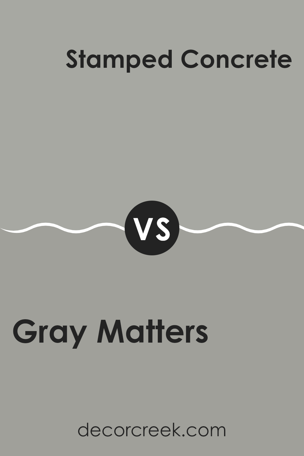
Gray Matters SW 7066 by Sherwin Williams vs Stamped Concrete SW 7655 by Sherwin Williams
Gray Matters and Stamped Concrete, both from Sherwin Williams, present subtle variations in the realm of gray paints. Gray Matters is a lighter shade that can make small rooms appear larger and more open. It reflects more light, which can brighten rooms that don’t get a lot of natural sunlight.
On the other hand, Stamped Concrete is a darker gray that offers a more grounded and cozy feel. It’s ideal for creating a defined, cozy atmosphere in a room. While Gray Matters works well in rooms like bathrooms and kitchens, Stamped Concrete might be better suited for dens or bedrooms where a more enclosed, warm feeling is desired.
Both colors provide neutral backdrops, allowing for flexibility in decorating with different colors and textures. Each shade has its own unique effect, making them flexible for various design needs.
You can see recommended paint color below:
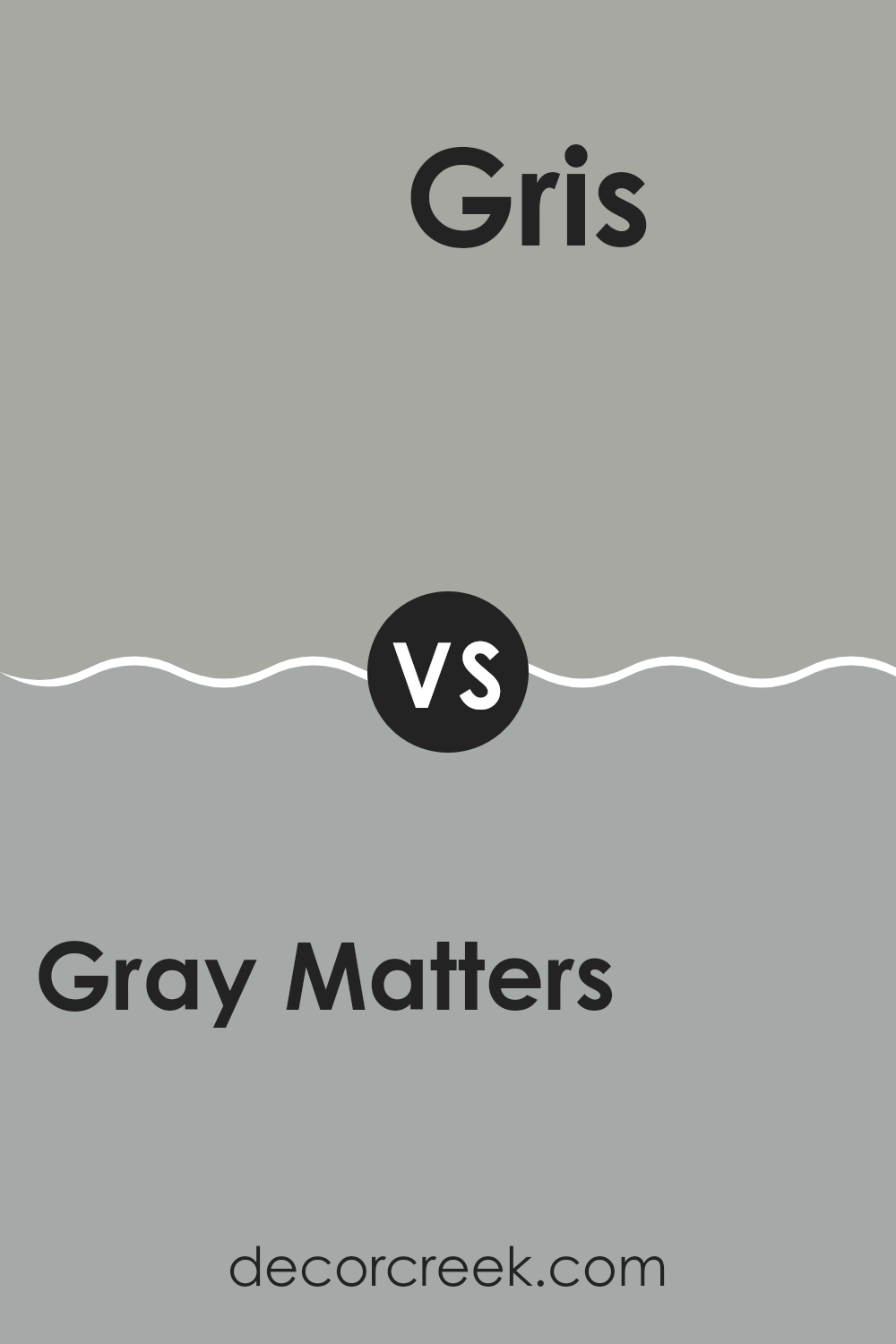
Gray Matters SW 7066 by Sherwin Williams vs Gris SW 7659 by Sherwin Williams
Gray Matters and Gris are two colors by Sherwin Williams that present different vibes of gray. Gray Matters is a mid-tone gray that leans slightly toward blue, giving it a cooler appearance.
It has a clean and crisp look, making it ideal for modern and minimalistic rooms. On the other hand, Gris is a softer gray with warmer undertones. This color offers a more welcoming and cozy feel, suitable for areas where you want a gentler atmosphere, such as living rooms or bedrooms.
Both colors are flexible and can work well in various settings. They can be used as main hues in a room or paired with brighter colors for accents. The choice between the two largely depends on the kind of mood you want to set: cooler and sharper with Gray Matters, or warmer and softer with Gris.
You can see recommended paint color below:
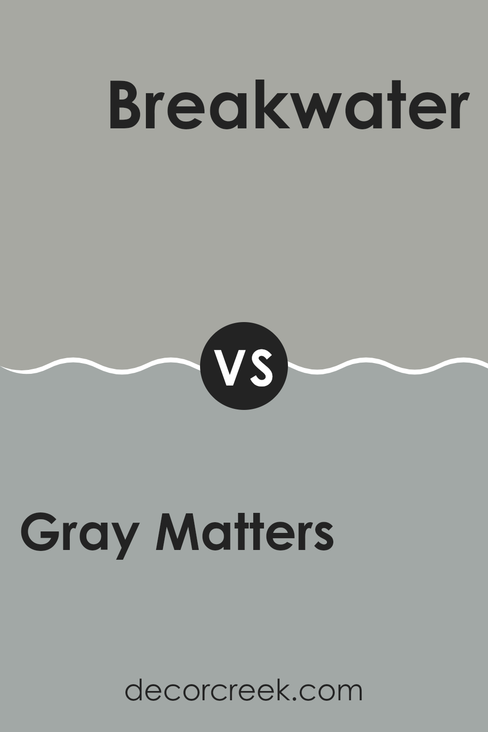
Gray Matters SW 7066 by Sherwin Williams vs Breakwater SW 9638 by Sherwin Williams
Gray Matters and Breakwater are two distinct paint colors by Sherwin Williams. Gray Matters is a neutral gray shade that’s flexible and easy to match with various decor styles. It’s neither too dark nor too light, making it a good choice for rooms where you want a balanced, muted backdrop. This color can make rooms feel more open and clean, as it doesn’t overpower other design elements in a room.
On the other hand, Breakwater is a calming blue with a touch of gray. It has a relaxing effect, and it’s perfect for creating a restful environment. This color works well in bedrooms and bathrooms where a gentle, refreshing look is desired. It’s also great for achieving a coastal vibe, as it pairs beautifully with whites and natural materials like wood.
Both colors offer their own unique feel: Gray Matters brings subtle warmth and simplicity, while Breakwater adds a refreshing and gentle touch to interiors.
You can see recommended paint color below:
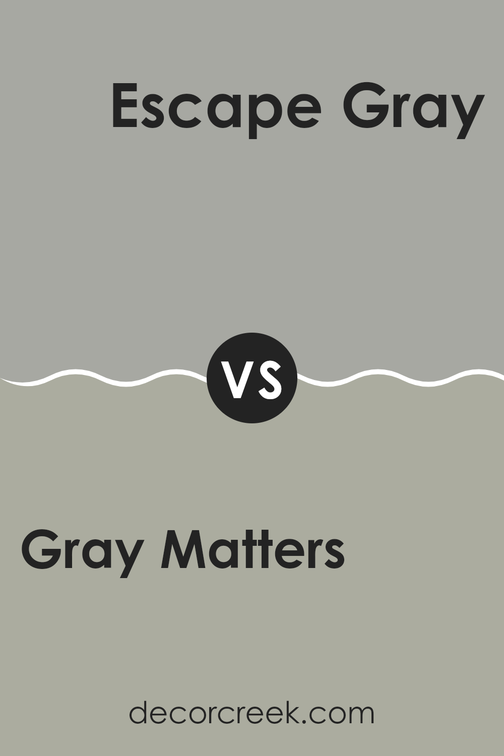
Gray Matters SW 7066 by Sherwin Williams vs Escape Gray SW 6185 by Sherwin Williams
Gray Matters and Escape Gray are two distinct paint colors, both by Sherwin Williams. Gray Matters is closer to a neutral, mid-tone gray. It has a cool undertone, making it flexible for rooms that aim for a modern, clean look. On the other hand, Escape Gray leans toward being a warmer gray, with a hint of green. This warmth makes it ideal for creating a cozy and inviting atmosphere in rooms.
Both colors are quite adaptable and can complement a variety of decor styles and other colors. However, the choice between them may depend on the mood you want to set for the room and the natural light available, which can emphasize their cool or warm undertones.
Gray Matters is better suited for a more straightforward, possibly more contemporary environment, while Escape Gray works well if you’re aiming for a slightly more relaxed, warm setting.
You can see recommended paint color below:
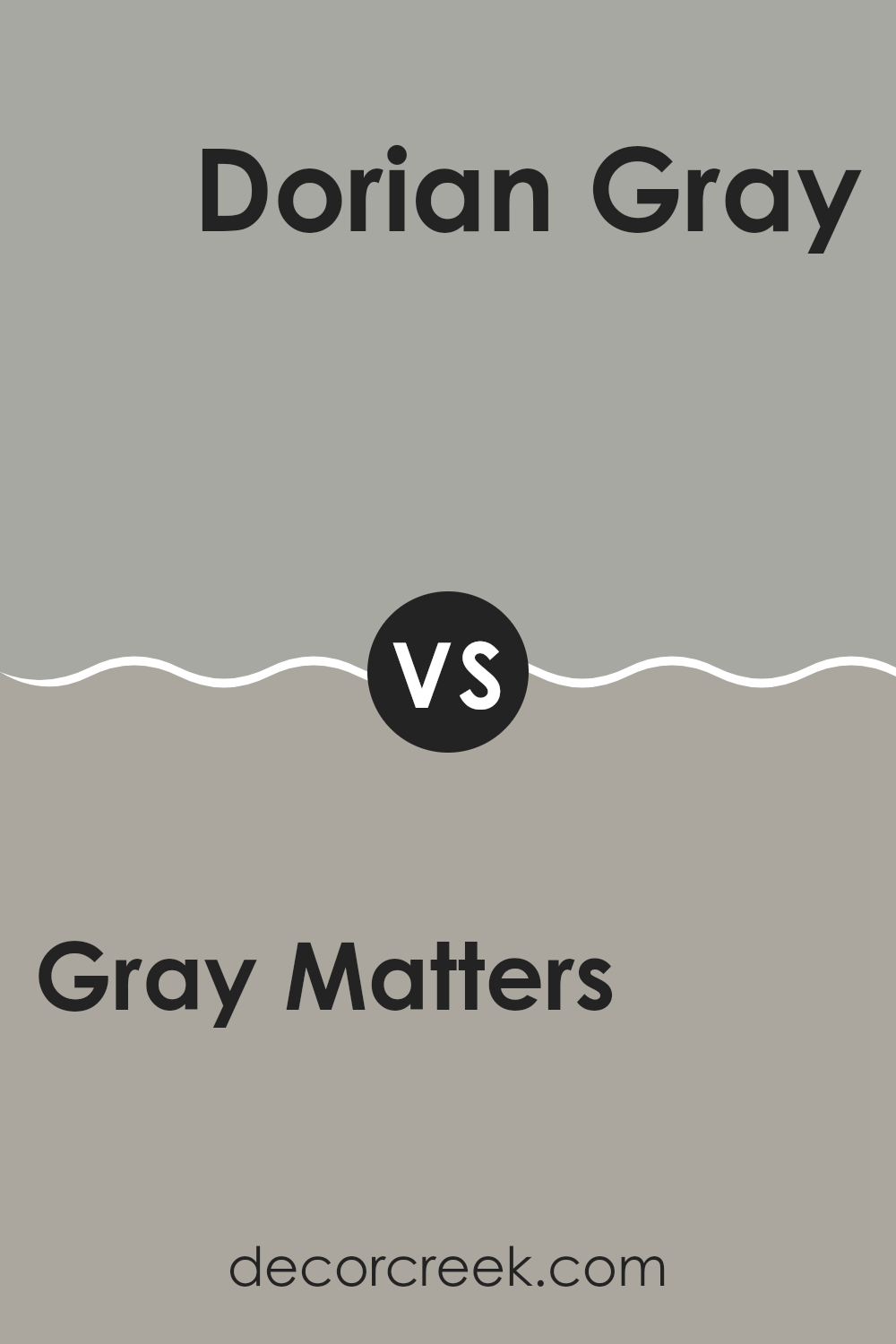
Gray Matters SW 7066 by Sherwin Williams vs Dorian Gray SW 7017 by Sherwin Williams
Gray Matters and Dorian Gray are both popular shades by Sherwin Williams, but they have distinct characteristics. Gray Matters is a lighter, softer gray that brings a sense of calm and neutrality to any room.
It’s an excellent choice if you want to create a gentle backdrop that doesn’t overpower other design elements. On the other hand, Dorian Gray is a deeper gray that offers a stronger statement. This color provides a bolder look, making it perfect for adding drama and depth to a room.
While both colors can work beautifully in various settings, your choice depends on the mood you want to set. Gray Matters works well in smaller, more brightly lit rooms to keep them airy and open, whereas Dorian Gray is ideal for larger rooms or areas where you want a more anchored, robust feel.
You can see recommended paint color below:
In wrapping up my thoughts on SW 7066 Gray Matters by Sherwin Williams, this color really stands out as a fantastic choice for anyone wanting to refresh their home with a new look. Gray Matters is a gentle, soft gray that works beautifully in just about any room. Whether you’re painting your living room, bedroom, or even the kitchen, this color adds a calm, cozy feeling.
One of the best things about Gray Matters is how well it plays with other colors. You can pair it with bright colors like yellows or blues for a fun, lively vibe, or with dark hues for a more grown-up, professional look. This paint is also great because it doesn’t get dirty too quickly, which means it stays looking nice longer.
Overall, if you’re thinking of changing up a room or even your entire house, Gray Matters is a solid choice. It’s easy to apply, and it covers the walls smoothly, making your painting project less of a hassle and more fun. This color has definitely made me fall in love with my home all over again, and I think it can do the same for you.
So why not give your walls a little refresh? With Gray Matters, you’re sure to be happy with the outcome.
Ever wished paint sampling was as easy as sticking a sticker? Guess what? Now it is! Discover Samplize's unique Peel & Stick samples.
Get paint samples

