
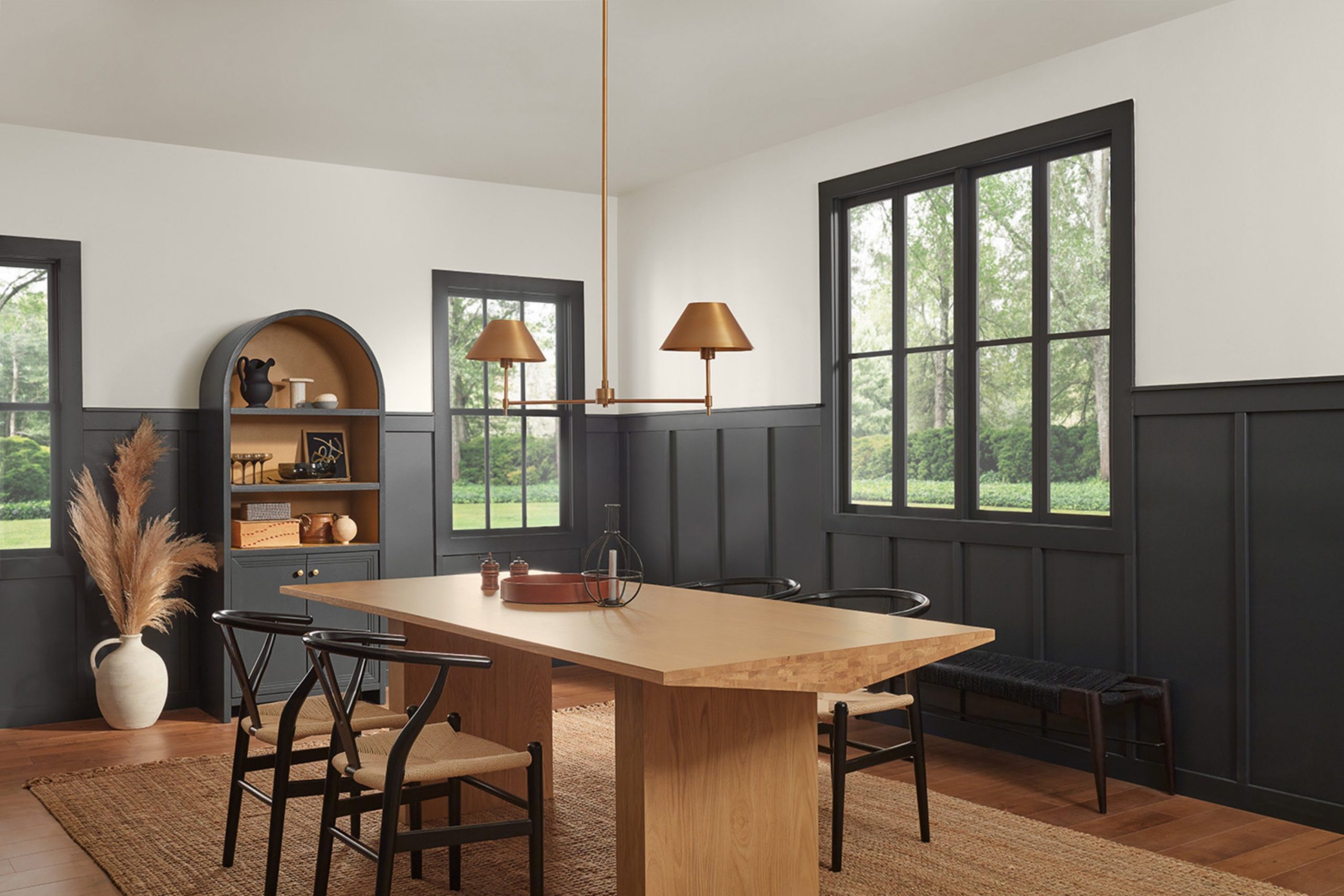
Selecting the right paint color can sometimes feel stressful with so many options available. One intriguing shade to consider is SW 7069 Iron Ore by Sherwin Williams. This rich, deep gray almost borders on charcoal and can add a refined and dramatic flair to any room. Before you decide to refresh your home with this bold hue, it’s important for you to understand how it interacts with various lighting conditions and design elements.
Iron Ore can look vastly different depending on the natural and artificial light your room receives, turning from a soft, muted gray in bright light to a more intense, almost black shade in dimmer settings. Additionally, coordinating colors and decor can either enhance or soften its impact.
So, if you’re thinking about using Iron Ore, you’ll want to test it in your specific environment to see how it truly appears throughout the day. Choosing a paint color isn’t just about visual appeal; it’s about creating a mood and enhancing your living area to fit your personal style.
Is Iron Ore SW 7069 Right for My Home?
Iron Ore is a deep, complex gray that almost borders on black, offering a strong statement in any room where I use it. I appreciate its flexibility and the way it brings a crisp, clean feel when applied. Its deep hue makes it a favorite for creating striking contrast, particularly in modern and minimalist designs, where its boldness pairs well with streamlined furniture and neutral palettes.
I love using Iron Ore in a variety of interior styles. It works exceptionally well in industrial settings because its darkness complements metallic elements like stainless steel, copper, and brushed nickel. It’s also a standout choice in Scandinavian interiors, where I contrast its depth with light woods and soft whites to create a cozy yet modern look.
Material-wise, Iron Ore pairs beautifully with natural textures. In rooms where I use this color, I like to add elements of rough-hewn wood, leather, and woven fabrics to bring warmth and depth to the room. These materials help soften the strength of Iron Ore, creating a balanced, inviting environment.
Overall, Iron Ore is a dynamic choice that I find widely appealing in many uses, from accent walls and exterior trims to cabinetry and doors. It’s a reliable pick for anyone wanting to make a statement with color.
What are the right undertones of Iron Ore SW 7069 ?
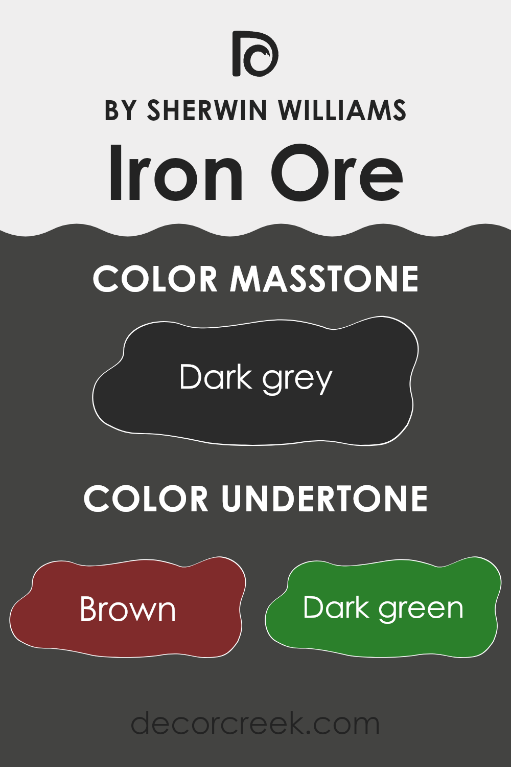
Iron Ore is a unique dark gray shade that has subtle hints of various colors, giving it an intriguing depth. These underlying tones include brown, dark green, navy, olive, dark turquoise, purple, and grey. These undertones play a crucial role in how the color is perceived and can change depending on the lighting and surrounding colors. For example, in a room with natural light, you might notice the grey and navy undertones coming through, giving the walls a cooler appearance. In artificial lighting, the warmer tones like brown and olive might stand out more, giving the room a cozier feel.
When Iron Ore is used on interior walls, the impact of these undertones becomes quite evident. In an area that receives a lot of sunlight during the day, the walls might appear slightly lighter and bring out the cooler blues and greens. At night under warm lighting, the walls could seem richer and more inviting due to the brown and olive tones.
This chameleon-like ability allows Iron Ore to adapt very well to different settings and decor, making it flexible for use in homes. Whether it’s a study, bedroom, or living area, this color helps create a solid backdrop that complements a wide range of furnishings and decorations.
This adaptability is what makes tone-rich colors like Iron Ore a popular choice for those looking to add visual interest and depth to their rooms.
Best Coordinating Colors to use with Iron Ore SW 7069 by Sherwin Williams this year.
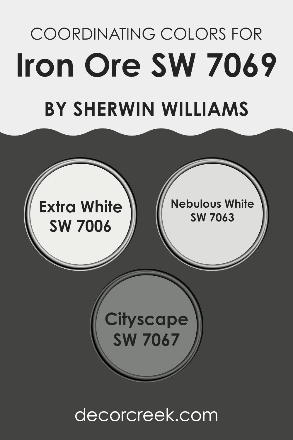
Coordinating colors are those that complement each other well when used together in a color scheme. They are selected to create a balanced and harmonious look. Typically, these colors are either from the same color family or they contrast well with each other, achieving a visually appealing effect. When choosing coordinating colors for Iron Ore, a dark grayish tone, using shades like Extra White, Nebulous White, and Cityscape can enhance the room beautifully while maintaining visual interest and balance.
Extra White is a crisp and clean shade that brings out a fresh and light element to counterbalance the deep tones of Iron Ore. It is perfect for trims, ceilings, and even as a main wall color in rooms that aim for a sharp, clear appearance. Nebulous White, on the other hand, offers a softer approach with its subtle gray undertones.
This color is ideal for creating a smoother transition between deeper shades and lighter hues, making it an excellent choice for living rooms where a soft contrast is desired. Cityscape, with its mid-tone gray quality, smoothly connects the light and dark aspects of a room’s palette. It works well to unify the range from white to near-black, adding a cohesive yet distinct layer to any interior.
You can see recommended paint colors below:
Trendy Trim Colors of Iron Ore SW 7069 by Sherwin Williams to use this year.
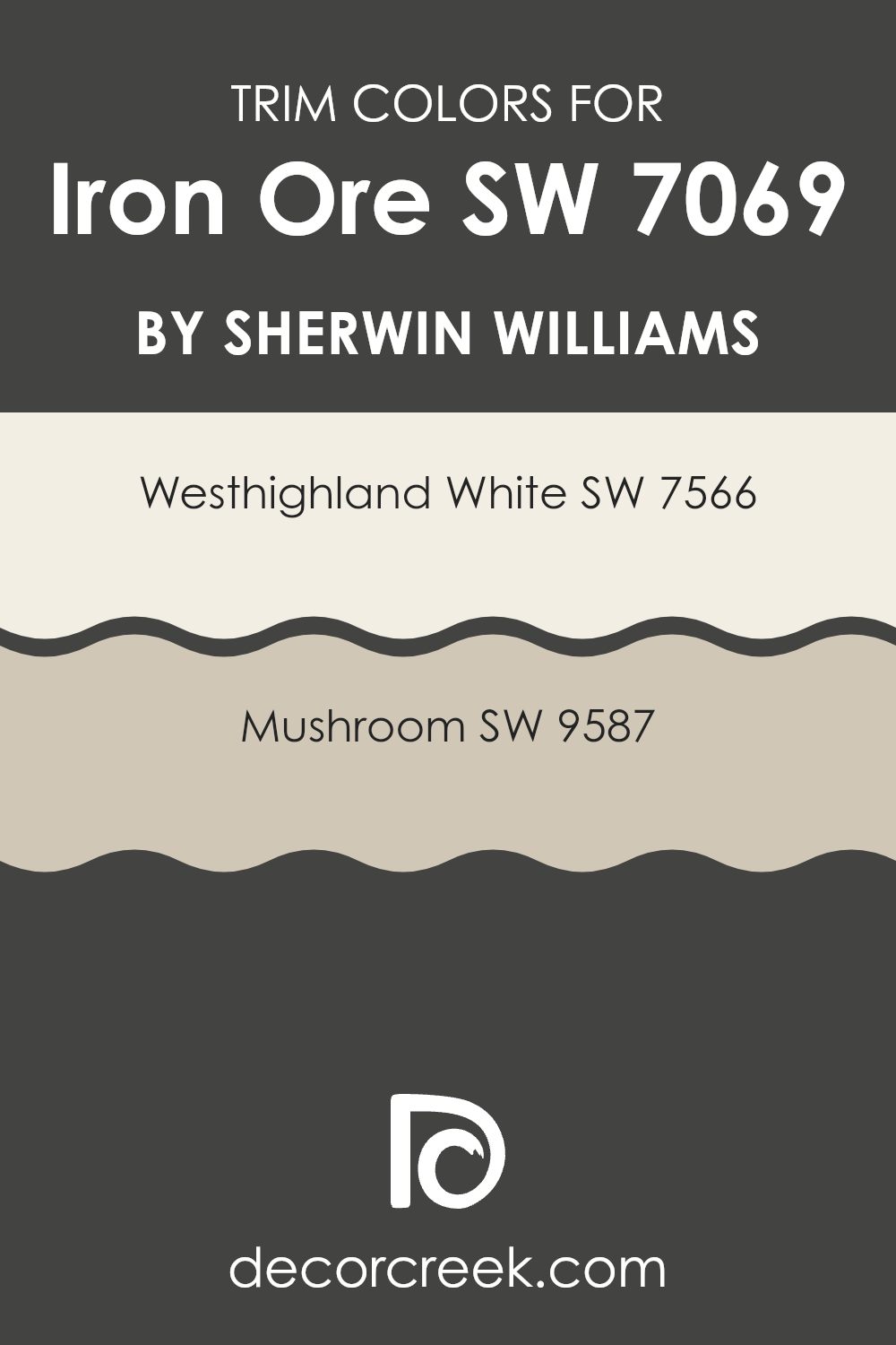
Trim colors are selected hues used to detail or highlight architectural elements such as door frames, window frames, and baseboards of a room, distinguishing these features from the main wall color. In the case of a deep, charcoal hue like Iron Ore by Sherwin Williams, choosing the right trim colors can strongly affect the overall look of the room by adding contrast and drawing attention to architectural details. Carefully chosen trim colors can help define areas, outline windows and doors more clearly, and create a unified look that supports the primary color.
Two suitable trim colors for Iron Ore are Westhighland White and Mushroom by Sherwin Williams. Westhighland White, SW 7566, is a vivid, creamy white that offers a sharp contrast, making it an excellent choice for brightening rooms and highlighting trim details.
It provides a clean and crisp border that allows dark wall colors to stand out. Mushroom, SW 9587, on the other hand, is a warm, earthy taupe that brings a refined and natural feel. It pairs well with darker tones, adding a grounding effect that softens the transition between walls and trim, which is ideal for creating a more blended and cohesive atmosphere.
You can see recommended paint colors below:
Evergreen Colors Similar to Iron Ore SW 7069 by Sherwin Williams
Similar colors in interior design play a vital role in creating a harmonious and cohesive atmosphere in any room. When colors closely relate to each other on the color spectrum, such as variations of dark grays and earthy greens, they help unite the room’s aesthetic without overpowering with contrast. This is especially effective in rooms where a subtle distinction between surfaces is needed to add depth and interest without causing visual fragmentation.
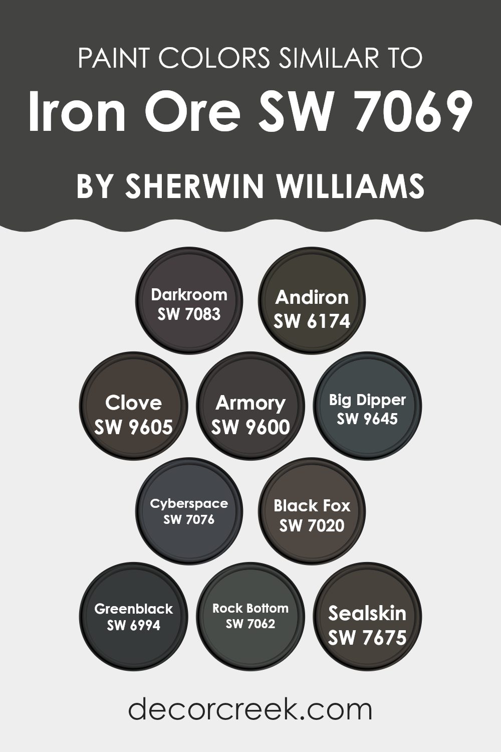
Take, for instance, the color Darkroom (SW 7083), which offers a deep gray that mirrors the hue of a shadowy film development area, providing a perfect backdrop for accentuating more vibrant décor elements. Andiron (SW 6174) features a slightly lighter shade of gray that retains some of the somberness of a rainy day, suitable for creating a calm, reflective room. Clove (SW 9605) and Armory (SW 9600) both bring an earthier, brown-based tone to interiors that benefit from warmth and traditional appeal, while Big Dipper (SW 9645) introduces a deep, celestial blue for a touch of mystery.
Cyberspace (SW 7076) carries a very dark blue that may call to mind the deep sea, ideal for a striking, bold statement. Black Fox (SW 7020), meanwhile, presents a charcoal black with hints of brown, blending well with natural materials like wood or linen. Greenblack (SW 6994) adds intrigue with a murky green that works well in areas that benefit from a hint of nature-inspired tones.
Rock Bottom (SW 7062) provides a strong foundation with its deep charcoal, suitable for grounding brighter or lighter shades. Finally, Sealskin (SW 7675) showcases a rich, dark chocolate brown, offering a lush, inviting presence that works beautifully in rooms designed for relaxation and comfort. Each of these colors, while distinct, shares a similar depth and intensity, making them excellent companions in design and allowing for interiors that feel cohesive yet layered with subtle variation.
You can see recommended paint colors below:
- SW 7083 Darkroom
- SW 6174 Andiron
- SW 9605 Clove
- SW 9600 Armory
- SW 9645 Big Dipper
- SW 7076 Cyberspace
- SW 7020 Black Fox
- SW 6994 Greenblack
- SW 7062 Rock Bottom
- SW 7675 Sealskin
Colors that Go With Iron Ore SW 7069 by Sherwin Williams
Choosing the right colors to complement Sherwin Williams Iron Ore SW 7069 is crucial for creating a harmonious and appealing interior. Iron Ore is a deep, dark gray with a touch of warmth that pairs beautifully with a range of dark shades. These colors not only enhance the depth of Iron Ore but also help create a cohesive look that can make any room feel well put together and stylish.
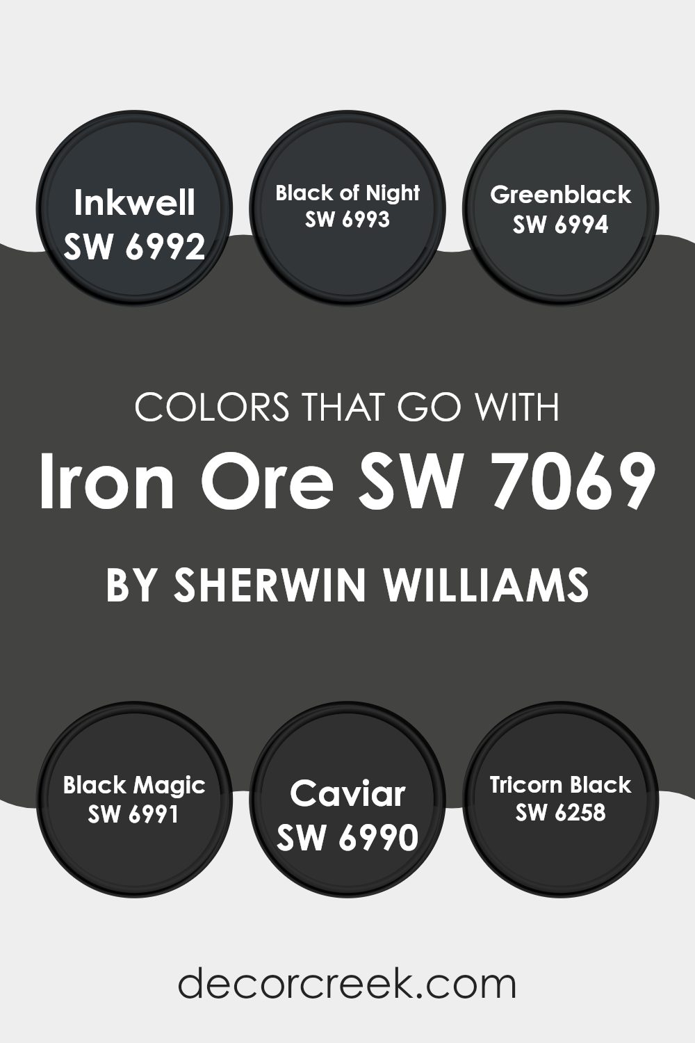
Starting with SW 6992 – Inkwell, this color is a deep blue-black that adds a mysterious and rich dimension when combined with Iron Ore. It’s perfect for adding a touch of drama without feeling too intense. SW 6993 – Black of Night offers a pure, deep black that provides a striking contrast to the softer gray of Iron Ore, making it ideal for accent walls or furniture.
SW 6994 – Greenblack is a unique blend of black with subtle green undertones, offering a natural, grounding effect that complements the gray tones beautifully. SW 6991 – Black Magic has a clear, strong black that works seamlessly with Iron Ore to create a modern, monochromatic look.
SW 6990 – Caviar, another refined black shade with a slightly softer edge than Black Magic, works well in rooms that blend classic and contemporary elements. Finally, SW 6258 – Tricorn Black stands out with its soft, matte finish, providing a subtle variation in texture and sheen when used alongside the richer Iron Ore. Each of these colors helps set a specific mood and style, making your color choices not just decorative but also essential to the overall design aesthetic.
You can see recommended paint colors below:
- SW 6992 Inkwell
- SW 6993 Black of Night
- SW 6994 Greenblack
- SW 6991 Black Magic
- SW 6990 Caviar
- SW 6258 Tricorn Black
Whole House Paint Color Palette Centered On Iron Ore SW 7069
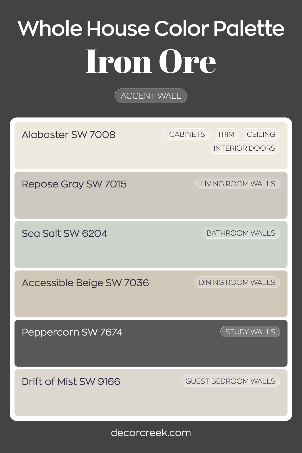
Iron Ore SW 7069 creates a striking accent wall that anchors the entire home. Alabaster on cabinets, trim, ceilings, and interior doors keeps the overall look sharp and clean. Repose Gray in the living room balances the contrast with a soft, steady gray.
Sea Salt in the bathroom introduces a gentle wash of green-blue, offering lightness against the darker accents.
Accessible Beige in the dining room warms up the palette, while Drift of Mist in the guest bedroom keeps things airy and relaxed.
Peppercorn in the study adds another deep layer that complements Iron Ore beautifully.
The result is a thoughtful blend of light neutrals and bold charcoals. Dark focal points stand out without taking over, supported by soft grays and warm beiges throughout the home.
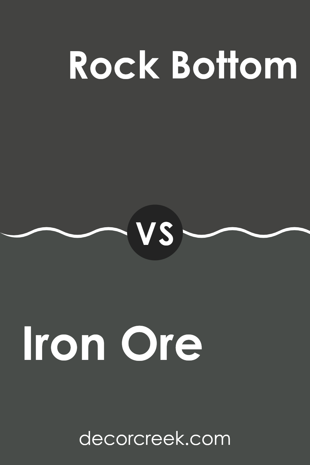
Iron Ore SW 7069 by Sherwin Williams vs Rock Bottom SW 7062 by Sherwin Williams
Iron Ore SW 7069 and Rock Bottom SW 7062 are both made by Sherwin Williams and they fit perfectly for those looking for darker shades. Iron Ore is a deep, rich gray that almost looks black, depending on the lighting.
It’s strong and bold, perfect for making a statement in any room. Rock Bottom, by contrast, is a softer dark gray. It’s not as intense as Iron Ore and carries more of a charcoal feel, which gives it a lighter and more approachable look.
Both colors are highly adaptable and can be used in many areas, from kitchens to bedrooms or even exteriors. Iron Ore works well where a dramatic impact is desired, while Rock Bottom suits areas where a toned-down yet noticeable color is needed. These grays can also act as a backdrop that allows brighter colors or wood finishes to stand out.
You can see recommended paint color below:
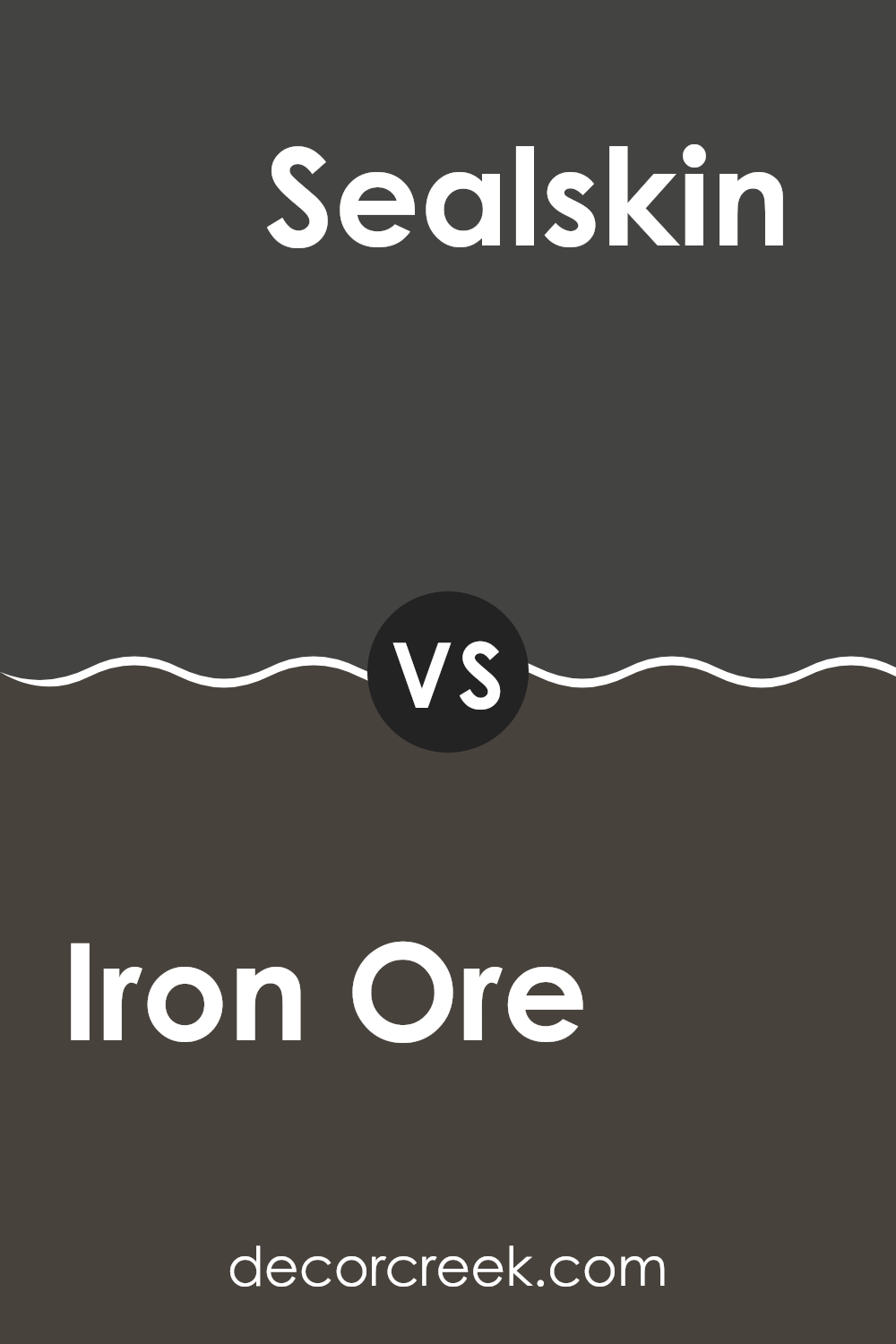
Iron Ore SW 7069 by Sherwin Williams vs Sealskin SW 7675 by Sherwin Williams
Iron Ore and Sealskin are both dark, rich colors by Sherwin Williams, but they have different tones that set them apart. Iron Ore is a soft black with grey undertones, giving it a milder, more muted appearance.
It’s perfect for creating a cozy, grounding effect in a room without the sharpness of a true black. Sealskin, on the other hand, leans toward a warmer range with chocolate brown undertones that bring a comforting, inviting feel. It works well in areas where you want to add warmth and depth.
Both colors are flexible and work beautifully as accent shades or for painting entire rooms. Whether in a modern setting or a more traditional interior, choosing between Iron Ore and Sealskin depends on whether you prefer a cooler or warmer atmosphere. Both are popular choices for adding dramatic flair to interiors.
You can see recommended paint color below:
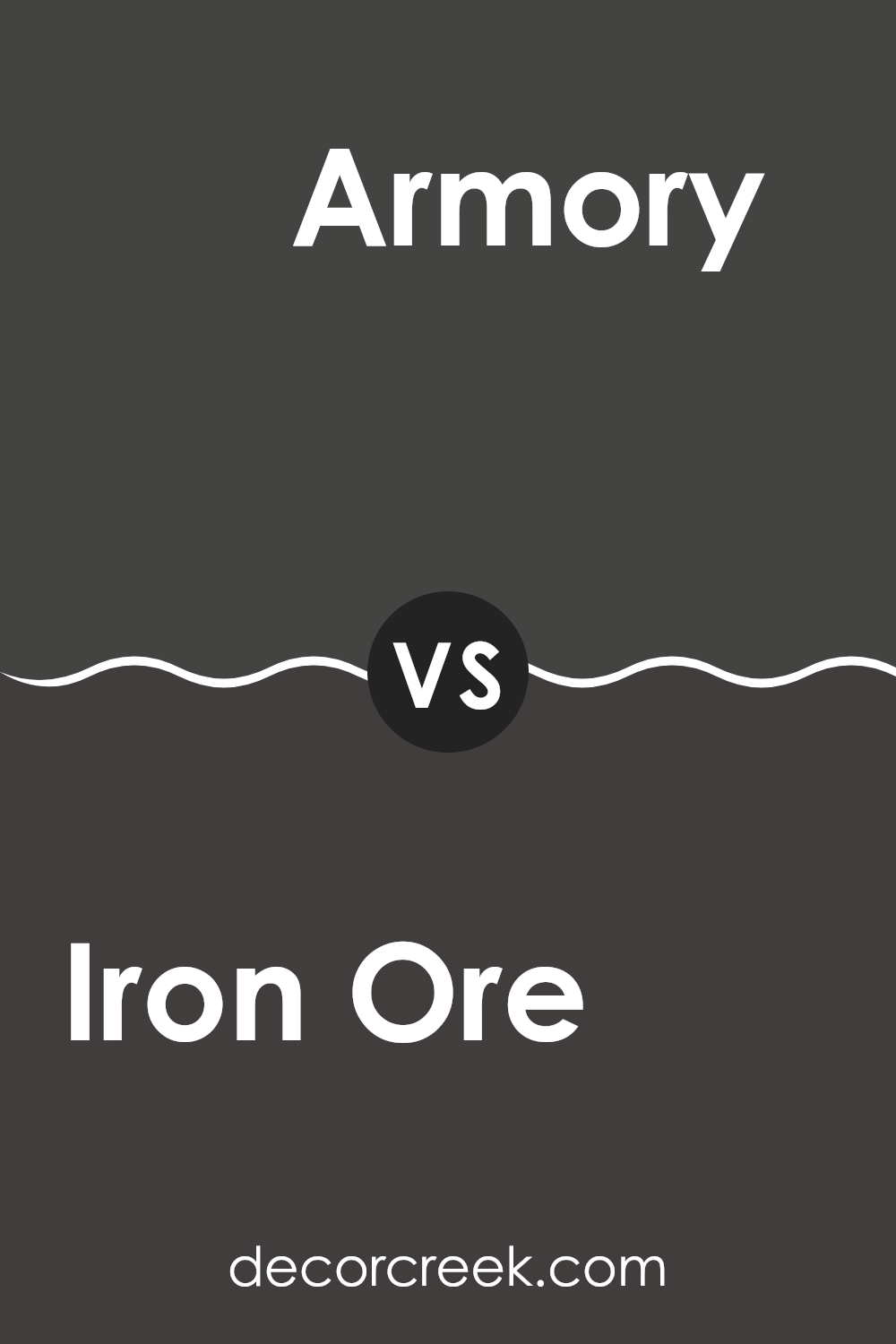
Iron Ore SW 7069 by Sherwin Williams vs Armory SW 9600 by Sherwin Williams
Iron Ore and Armory, both by Sherwin Williams, are two distinct shades that suit different preferences in color palettes. Iron Ore is a deep, almost charcoal gray that gives a strong and classic feel to rooms. It’s ideal for anyone wanting to create a bold statement, working especially well in modern designs that use plenty of whites or lighter shades for contrast.
Armory, by contrast, is a darker, more muted navy blue. This color is well suited for those who prefer cooler tones, adding a calm and cool quality to a room without feeling too intense. It works especially well in rooms designed for rest and focus, such as studies or bedrooms.
Both colors have their own appeal, but while Iron Ore leans toward a stark, minimalist mood, Armory introduces a hint of color while still keeping a sense of quiet elegance. This makes each one suitable for different design goals and personal preferences.
You can see recommended paint color below:
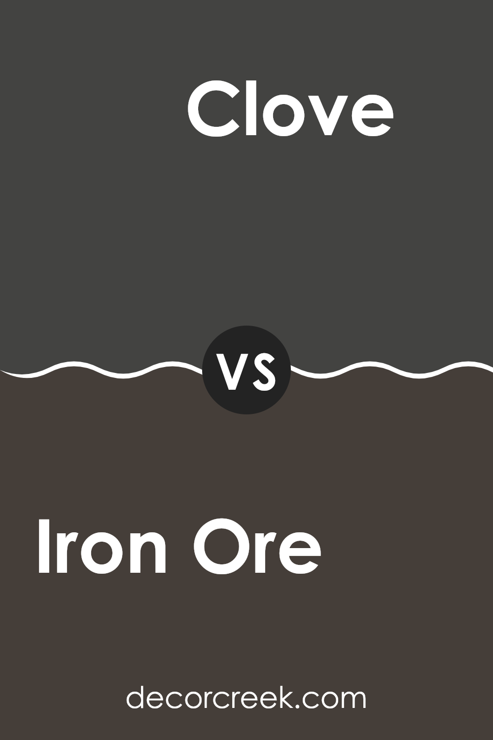
Iron Ore SW 7069 by Sherwin Williams vs Clove SW 9605 by Sherwin Williams
Iron Ore and Clove, both from Sherwin Williams, have unique tones that can enrich various rooms. Iron Ore has a deep, almost charcoal-like gray with a hint of warmth, making it a strong choice for accent walls or exterior trims. It creates a bold statement and pairs well with a broad range of colors, offering a flexible option for modern decor.
Clove, on the other hand, is richer and deeply rooted in brown with a dusky undertone. It creates a cozy and welcoming ambiance, ideal for living rooms or bedrooms. Its earthy character helps shape a relaxed environment, making it perfect for areas where comfort is key.
Both colors offer distinct vibes—Iron Ore leans toward a more striking, bold look, while Clove brings a softer, more inviting feel. Their impact depends on how and where they are used, with each adding its own unique character to interiors.
You can see recommended paint color below:
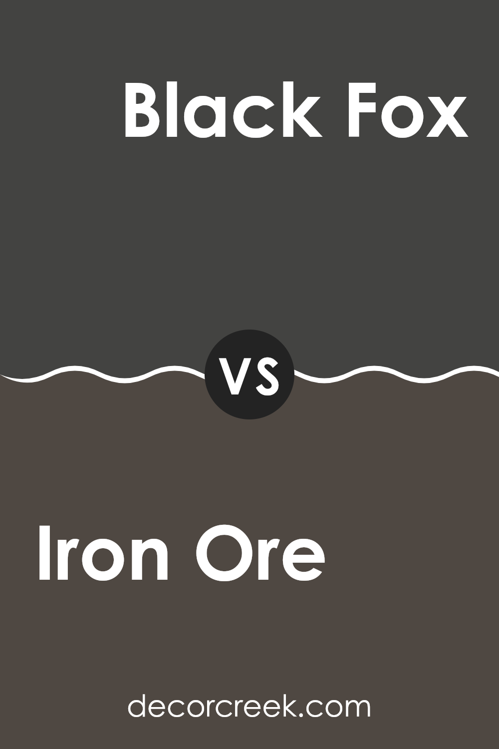
Iron Ore SW 7069 by Sherwin Williams vs Black Fox SW 7020 by Sherwin Williams
Iron Ore and Black Fox are two popular dark shades from Sherwin Williams, both leaning toward the neutral spectrum. Iron Ore is a soft black with subtle charcoal undertones, making it a flexible choice for interior or exterior rooms. It presents a shadowy, deep gray look that pairs well with a variety of colors and materials, creating a strong but not overpowering background.
Black Fox, on the other hand, sits closer to a true black but carries a generous dose of chocolate brown. This dark chocolate-brown tone softens its impact, making it a warmer and more inviting option compared to harsher blacks. It is ideal for those looking to add a sense of coziness through deeper hues.
Both colors can make a room feel grounded and secure, but Iron Ore offers a slightly lighter and cooler appearance, helping rooms feel more open, while Black Fox creates a cozier and more intimate atmosphere.
You can see recommended paint color below:
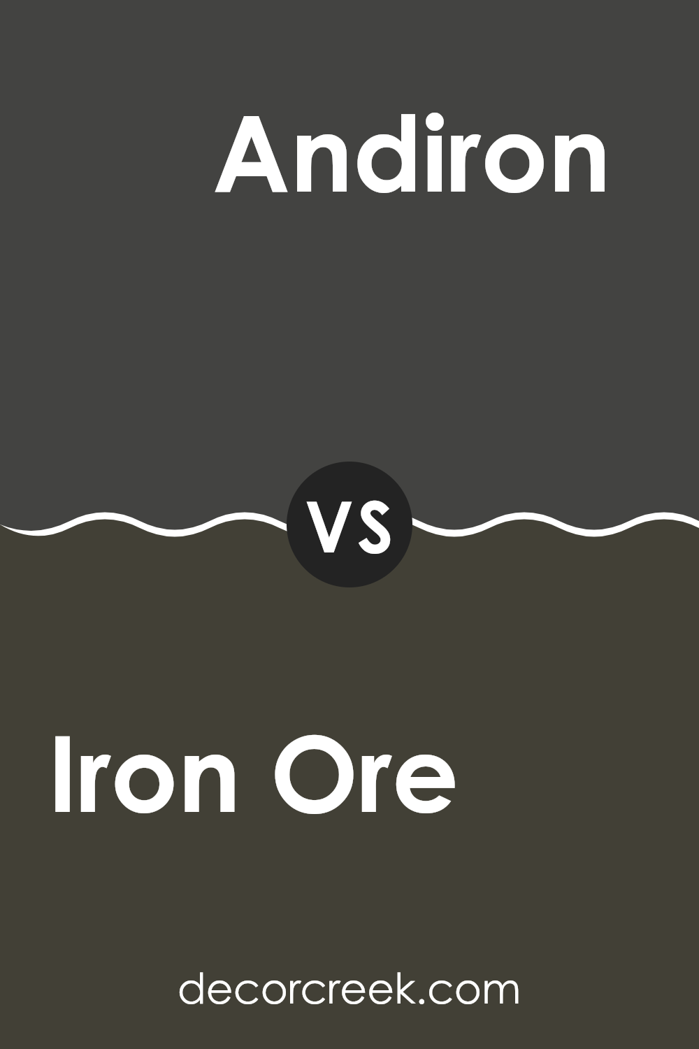
Iron Ore SW 7069 by Sherwin Williams vs Andiron SW 6174 by Sherwin Williams
Iron Ore and Andiron, both by Sherwin Williams, are unique in their own right. Iron Ore is a darker shade, often resembling a soft, dark charcoal or slate. It’s perfect for making a bold statement in a room, adding depth to walls or furniture.
In contrast, Andiron is a lighter grey, leaning more toward a mid-tone. It offers a subtler approach, ideal for rooms where a less intense color is desired, while still providing a modern feel.
When used in decor, Iron Ore works well for grounding rooms or as an accent color on features like doors or cabinets. It pairs nicely with brighter colors to create a balanced look. Andiron, with its softer hue, is flexible enough for larger areas, such as living room walls or even as an exterior paint option, where it blends smoothly with natural surroundings. Both colors provide a stylish and clean look, yet each brings its own distinct character to a room.
You can see recommended paint color below:
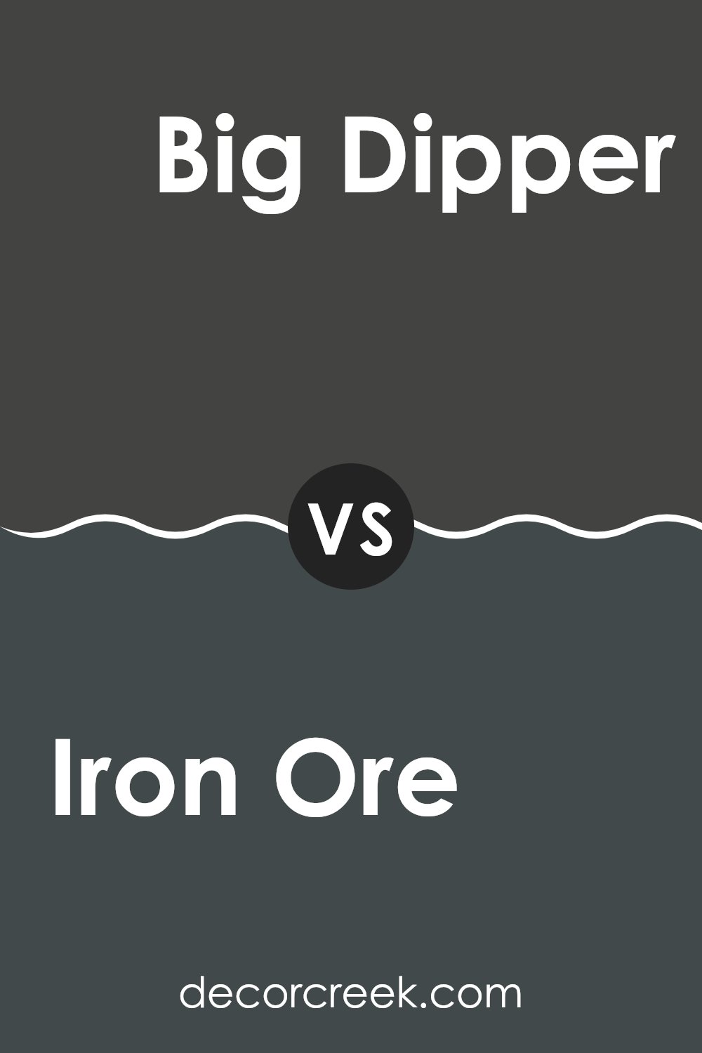
Iron Ore SW 7069 by Sherwin Williams vs Big Dipper SW 9645 by Sherwin Williams
Iron Ore and Big Dipper, both from Sherwin Williams, offer distinct moods due to their different shades. Iron Ore is a dark, almost black gray that provides a strong, bold look. It’s perfect if you want to make a dramatic statement in a room or on an exterior. It pairs well with bright colors for a striking contrast, or with soft neutrals for a more subdued style.
Big Dipper, on the other hand, is a lighter gray with a hint of blue. This color is much softer and is excellent for creating a calm and inviting atmosphere. It works well in areas meant to feel peaceful and relaxing, such as bedrooms or bathrooms.
While both colors share a gray base, Big Dipper’s blue undertone adds a fresh and airy feel that differs greatly from the deep intensity of Iron Ore. Together, these colors can work well in an interior that balances bold impact with calm comfort.
You can see recommended paint color below:
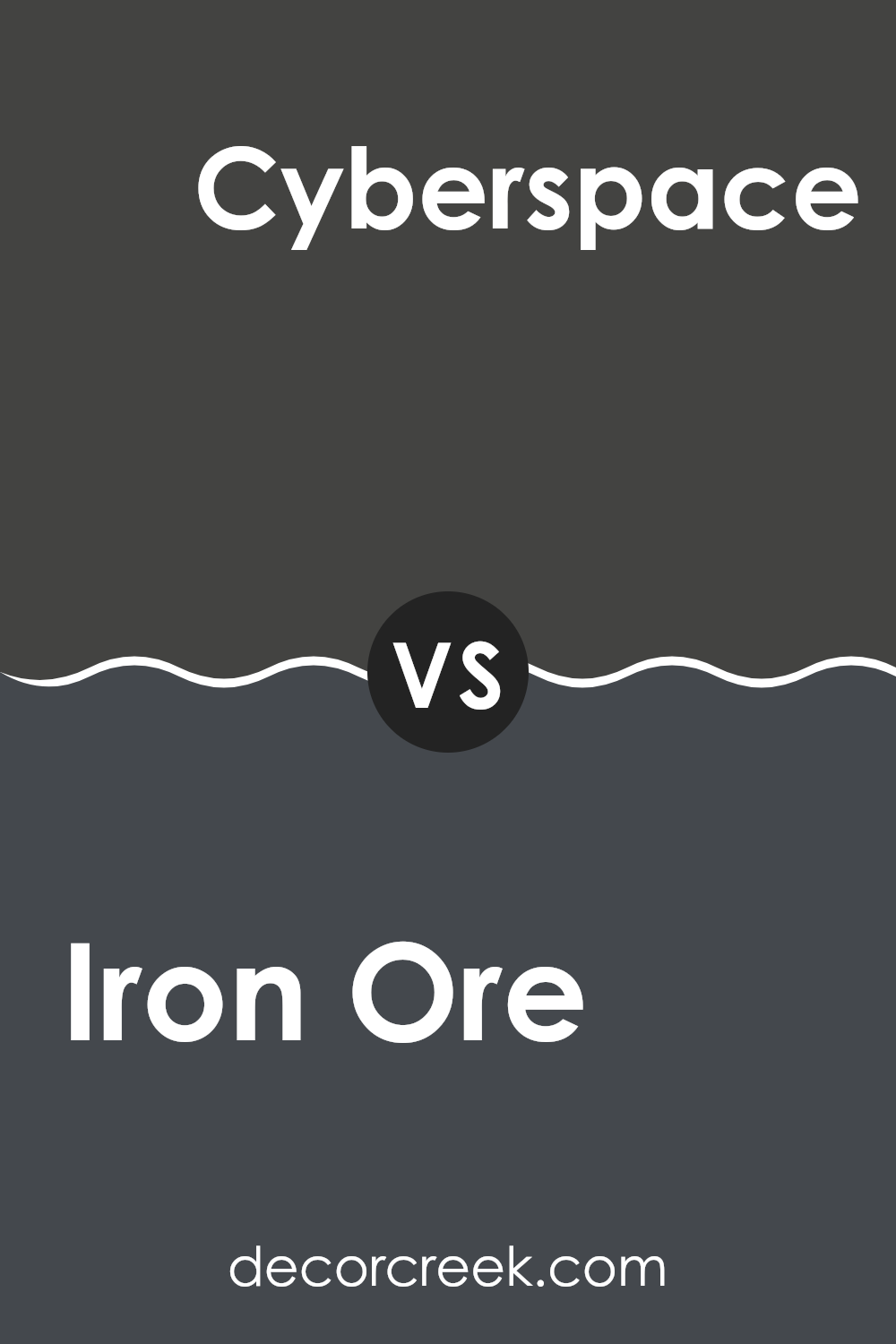
Iron Ore SW 7069 by Sherwin Williams vs Cyberspace SW 7076 by Sherwin Williams
Iron Ore and Cyberspace by Sherwin Williams are both dark hues, but they have distinct differences. Iron Ore is a deep, dark gray with a slight brownish undertone. This color has a warm feel to it, making it cozy and welcoming in rooms that need a touch of depth without becoming too strong. It’s flexible and works well in a variety of settings, from exteriors to accent walls.
Cyberspace, on the other hand, is a cooler shade, closer to a true charcoal. It has blue undertones that give it a more modern and crisp appearance. This makes it an excellent choice for a contemporary look, especially in areas that aim for a sleek, stylish finish.
Both colors are quite dark and can be used to make a dramatic statement in your decor. However, the choice between them comes down to the desired overall temperature of the room—warm with Iron Ore or cooler with Cyberspace.
You can see recommended paint color below:
Iron Ore SW 7069 by Sherwin Williams vs Darkroom SW 7083 by Sherwin Williams
Iron Ore and Darkroom are both dark colors from Sherwin Williams, but they have distinct differences. Iron Ore is a soft, charcoal gray that has a bit of warmth to it, making it quite flexible for rooms that want a strong but not overpowering backdrop. It works well in both indoor and outdoor settings, complementing wood and metal accents nicely.
Darkroom, on the other hand, leans more toward a deep, saturated maroon or burgundy, offering a moodier and more intense feel. This color is great for creating a dramatic and cozy atmosphere, ideal for rooms like dining areas or small reading nooks where you want a touch of drama and a moody aesthetic.
While both colors are dark, Iron Ore is more neutral, providing a subtle and warm gray tone. Darkroom delivers a richer, almost velvety feel due to its red undertones. This makes Darkroom stand out more and gives it a distinct presence in a room compared to the more understated and flexible gray of Iron Ore.
You can see recommended paint color below:
Iron Ore SW 7069 by Sherwin Williams vs Greenblack SW 6994 by Sherwin Williams
Iron Ore by Sherwin Williams is a deep, dark gray with a strong presence, almost resembling the color of dark charcoal. It gives a bold yet neutral backdrop, which can be used effectively in many settings, from modern living rooms to a cozy bedroom. It pairs very well with lighter colors and wood finishes, offering an appealing contrast.
Greenblack, also by Sherwin Williams, leans more toward a very dark green shade, though it is so deep that it can sometimes appear almost black. This color has an earthy base that works well in rooms meant to feel connected to nature or have an outdoor influence. It’s an excellent option for adding depth to a room, and it works well in areas that benefit from a hint of green without feeling too intense.
Both of these colors are quite dark, but while Iron Ore stays firmly within the gray family, Greenblack introduces a natural note through its subtle green undertones. Choosing between them depends on whether you prefer a straightforward neutral or a touch of color within your darker palette.
You can see recommended paint color below:
To wrap things up, my look at SW 7069 Iron Ore by Sherwin Williams has shown me how special this color really is. It’s a dark and bold gray with hints of blue and green, almost like the shade of a storm cloud. Because it’s deep and strong, it works very well on exterior walls and can also make a striking statement indoors on features like cabinets or an accent wall. This color pairs well with many other shades, making it easy to use across different design styles.
Iron Ore is also a great option because it doesn’t show dirt easily. You can use it in high-traffic areas of the home without worrying about it looking worn. It’s durable enough to handle everyday bumps and marks, which is a big advantage.
Overall, whether you’re updating a single room or the exterior of your home, SW 7069 Iron Ore delivers a bold and interesting look without feeling too extreme. It can give any area a refreshed appearance while still feeling warm and welcoming.

Ever wished paint sampling was as easy as sticking a sticker? Guess what? Now it is! Discover Samplize's unique Peel & Stick samples.
Get paint samples

